S.
Reading edition
SAMARITAN.
It is the opinion of many of the most eminent Hebrew scholars, that this alphabet is the one made use of by the ancient Hebrews, and with which Moses himself wrote the Pentateuch; and that the Hebrew letters at present in use are those of the Chaldees of Babylon, introduced by Ezra in consequence of the Jews having forgotten their own characters during the Captivity. It agrees with the Hebrew and Syriac, in respect to the number and power of the letters, though it differs as to their forms, as may be seen from the annexed table:
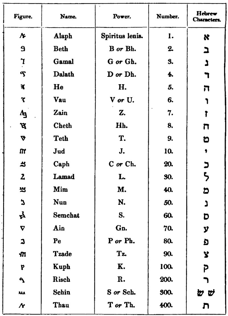
Figure. Name. Power. Number. Hebrew Characters.
ࠀ Alaph Spiritus lenis. 1. א
ࠁ Beth B or Bh. 2. ב
ࠂ Gamal G or Gh. 3. ג
ࠃ Dalath D or Dh. 4. ד
ࠄ He H. 5. ה
ࠅ Vau V or U. 6. ו
ࠆ Zain Z. 7. ז
ࠇ Cheth Hh. 8. ח
ࠈ Teth T. 9. ט
ࠉ Jud J. 10. י
ࠊ Caph C or Ch. 20. כ
ࠋ Lamad L. 3O. ל
ࠌ Mim M. 40. מ
ࠍ Nun N. 50. נ
ࠎ Semchat S. 60. ס
ࠏ Ain Gn. 70. ע
ࠐ Pe P or Ph. 80. פ
ࠑ Tzade Tz. 90. צ
ࠒ Kuph K. 100. ק
ࠓ Risch R. 200. ר
ࠔ Schin S or Sch. 300. שׂ שׁ
ࠕ Thau T or Th. 400. ת
It will be readily perceived that this is one of the most simple of the Oriental alphabets, as there are no initials or medials, as is the case with the Arabic and Syriac; there are no letters lengthened for the sake of ornament, as in the Hebrew and Chaldee; and there are no finals.
With respect to pronunciation, ࠀ ࠇ and ࠏ seem to differ very little from each other, if we may judge from their frequent permutation.
In writing the numbers, they follow the Hebrew system of notation, with this exception, that for 15 they use both ࠄࠉ (10 and 5) with the Syrians, and ࠅࠈ (9 and 6) with the Jews.
The Samaritans are altogether destitute of vowel points, and their power is to be collected from the cognate languages.
The quiescents are the same in Samaritan as in Hebrew and Chaldee, namely, four, ࠀ, ࠄ, ࠅ, ࠉ. The situations and the points, by which each becomes quiescent, are the same as in Hebrew.
The Samaritans use also certain points and lines in writing, partly for the sake of distinction, and partly of abbreviation. The points are as follow:—
1. A thick point placed near the top of the letter distinguishes one word from another, thus ࠰ࠄࠄࠋࠀ ࠰ࠓࠌࠀࠅ and God said.
2. An imperfect sentence is indicated by two transverse points, in this manner, ࠰࠰ࠌࠉࠌࠋ saying—
3. A period or perfect sentence is marked by two perpendicular points, thus, ࠱ࠄࠌࠅࠄࠕ ࠰ࠉࠐࠀ ࠰ࠋࠏ upon the face of the deep.
4. The beginning of every verse is marked by an asterisk, as, -¦-ࠅࠀࠌࠓ࠰ࠀࠋࠄ࠰ And God said.
5. In long paragraphs a third point is added to the period, thus, ¦-, and in order to point off sections various lines are made use of, as :>-, ¦-—, in which much is left to fancy.
A line drawn above a letter denotes:—
1. That words with two meanings must not be received in their more general signification, as, ࠓࠓࠓ̅ࠓ bedebher, in pestilence, not ࠁࠃࠁࠓ bedabhar, in a word; ࠌࠔ̅ Sem, for a proper name, not an appellative; ࠋࠀ̅ El, for the name of God, and not the preposition.
2. Apocope, or elision of a letter, as, ࠕ̅ࠀ for ࠄࠕࠀ atta, thou; ࠏ̅ࠔࠉࠅ for ࠄࠏࠔࠉࠅ and he looked back.
3. The mark of a quiescent letter, as, ࠉࠅ̅ࠔ he placed.
4. The substitution of one letter for another, as, ࠕ̅ࠌࠔ for ࠄࠌࠔ his name.
The preceding observations are abridged from the “Synopsis Institutionum Samaritanarum” of George Otho, printed at Frankfort-on-the-Main, 1707.
Samaritan in the British Founderies.
English. Oxford.
Pica. Caslon. Grover, to James, to Fry, to Thorowgood and Besley; cut for Walton’s Polyglot.
Small Pica. Fry, to Thorowgood and Besley.
SANSKRITA.
The term Sanskṛita seems to have been given to the language so called by way of pre-eminence, and to distinguish it from the vulgar dialects called Prākṛita. The former is an epithet implying elegance and perfection, and the latter the contrary.
Several of the provinces of India have alphabets distinct from each other, in which they not only write their particular dialects, but even Sanskṛita. Indeed most of the alphabets, properly Indian, agree in the number, order, and power of their letters, with the Dēva-nāgari, the one here used, because it is that in which Sanskṛita is most commonly written, and which is the most elegant and approved.
All languages of the Hindu class are read from left to right.
THE ALPHABET.
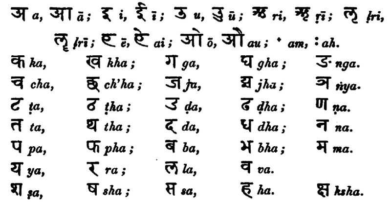
अ a, आ ā; इ i, ई ī; उ u, ऊ ū; ऋ ri, ॠ ṛī; ऌ ḷri,
ॡ ḷrī; ए ē, ऐ ai; ओ ō, औ au; ॱ am, ः ah.
क ka, ख kha; ग ga, घ gha; ङ nga.
च cha, छ ch’ha; ज ja, झ jha; ञ ṇya.
ट ṭa, ठ ṭha; ड ḍa, ढ ḍha, ण ṇa.
त ta, थ tha; द da, ध dha; न na.
प pa, फ pha; ब ba, भ bha; म ma.
य ya, र ra; ल la, व va.
ष ṣa, श sha; स sa, ह ha. [#] ksha.
In speaking of the letters individually, it is the practice to use the term कार: kārah (make, form) after each of their names as here exhibited: thus the vowel अ a, is called अकार: a-kārah; and the consonant क ka, ककार: ka-kārah.
OF THE VOWELS.
The simple vowels are reckoned five; for which there are ten characters: अ a, इ i, उ u, ऋ ṛi, ऌ ḷri, to denote the short sounds; and आ ā, ई ī, ऊ ū, ॠ ṛī, ॡ ḷrī their corresponding long sounds, which are directed to be held twice the time of the short.
Most of the vowels, occasionally, assume a very different shape from that exhibited in the alphabet, which the following arrangement may serve to explain.
As Initials.
अ आ इ ई उ ऊ ऋ ॠ ऌ ॡ ए ऐ ओ औ
As Medials and Finals.
ऻ ि ी ु ू ृ ॄ ॖ ॗ े ै ो ौ
Initials, Medials, and Finals, in composition with a Consonant.
अक aka, आका ākā, इकि iki, ईकी īkī, उकु uku, ऊकू ūkū, ऋकृ ṛikṛi, ॠकॄ ṛīkṛī,
ऌकॢ ḷrikḷri, ॡकॣ ḷrīkḷrī, एके ēkē, ऐकै aikai, ओको ōkō, औकौaukau.
In this manner the vowels may be combined with any other consonant.
As the letters have the same powers in composition which are given to them in the alphabet, and do not, as in our language, change their sound with their situation, a few observations on the pronunciation of each character in due order, may enable a person to read with tolerable accuracy and ease.
अ a, the first letter in the alphabet, has that obscure short sound which the French give to e, in the particle le, and which is very common in our language, though there be no distinct character for it; as in the words money, honey, and some others, where it is represented by o; and in but, shut, and the like, where u is the substitute. The letter अ never makes its appearance but as an initial; for when the sound of it is required after a consonant, as a medial or final, it is pronounced with it as in the alphabet; it being an invariable rule, that every open consonant, not followed by another vowel, must be pronounced as if अ a were written after it.
आ ā should have the same sound as is given to the former, held twice the length. It occurs, as a medial, in the word काला kāla, Time, the first syllable of which is pronounced nearly like the English word call. As a medial and final its character is [#].
इ i, and ई ī, are two characters to note the sound which the Italians give to the vowel i. The former is to be pronounced short, like ee in meet (encounter), and the latter long, like the same letters in meet (fit). After a consonant, as a medial and final, as has been already observed, they are changed to ि and ी , which are placed as in the words मणि: manih, A jewel, and देवी dēvī, A goddess.
उ u, and ऊ ū, are to be articulated like oo in the English words foot, and fool. After a consonant they are usually subjoined; as in पुत्र: putrah, A son, and भू: bhūh, The earth; but occasionally, particularly after र r, on the side, thus रु ru, रू rū.
ऋ ṛi, and ॠ ṛī. The first of these sounds short, somewhat like ri in rit; and the second is the same held twice as long. ॠ ṛi short occurs in ऋत ṛita, Right, True. The other is very rarely used, except it be in the oblique cases of some nouns. In our characters a dot under the ṛ may serve to distinguish them from the syllables रि ri and री rī. As medials or finals they are always placed under their consonants, in this form, नृ nṛi, नॄ nṛī.
ऌ ḷri, and ॡ ḷrī. The short power is found in the word कॢप्त kḷripta, which the learned of Bengal soften into kḷipta, and which, probably, is the true pronunciation of it. The long form seldom, if ever, occurs but in grammars. Here too a dot under the ḷ will serve as a distinction, when we would explain them.
ए ē, though classed among diphthongs, differs not from the simple sound of e in where; and so it is pronounced in [###] dēvah, A god. It is said to be a compound of अ a and इ i.
ऐ ai is a diphthong, and is always sounded as the letter i in our alphabet; but it will be better to represent it by ai. There is an example of it in the word रै: raih, Wealth.
ओ ō differs not from our o held long, as in stone; though it is said to be a diphthong composed of अ a and उ u.
औ au is decidedly a diphthong, having the power of ow in the word how; which in these letters would be written thus, हौ hau.
Here properly end the vowels, for ं am, and : ah, are, correctly speaking, rather substitutes for the nasals, and ह ha, when silent, at the end of a syllable. They are called अनुस्वार: anuswārah, and विसर्ग: visargah. The one occurs in the pronouns अहं aham, I, and त्वं twam, Thou, and the other in स: sah, He.
OF THE CONSONANTS.
The first five-and-twenty consonants are distributed into five classes, in the plural number called वर्गा: vargāh; in speaking of which, they are named after the first letter of each class: the first class being called कवर्ग: ka-vargah, the class of क ka; the second चवर्ग: cha-vargah, the class of च cha; and so for the rest. Some grammarians use the first letter of each class combined with उ, to denote all the letters in each class respectively, as, कु ku, for the first; चु chu, for the second; टु ṭu, for the third; तु tu, for the fourth; and पु pu, for the fifth class.
The First Class, or Gutturals, क ख ह घ ङ.
क ka has the precise sound of hard c, but is better expressed by k, the power of which not being liable to change.
ख kha has the same sound uttered with greater force, as if combined with the letter ह ha. Ignorant transcribers are very apt to confound it with the letter श sha.
ग ga is the hard g, as sounded in gun.
घ gha is the same aspirated.
ङ nga is equivalent to ng in king. Generally speaking, every other nasal is resolved into this, before any letter of this class; or, at least, to be pronounced like it. In Dēva-nāgari manuscripts, it is, when silent, for the most part represented by the single dot [ं] अनुस्वार: anuswāra.
The Second Class, or Palatals, च छ ज छ ञ.
च cha has the exact power we express by ch, as in church.
छ ch’ha is the former aspirated.
ज ja has the power of g soft, as in Giles; but will be more certainly expressed by j, as in James.
छ jha is the aspirate of the former.
ञ ṇa. This is the proper nasal of this class, which in composition is sounded rather softer than ङ nga, It seems to be formed by pressing the whole breadth of the tongue into the hollow of the palate, the tip turned downwards, and forcing the sound through the nose, with the mouth open. It is chiefly used before letters of its own class; but in Dēva-nāgari manuscripts, as is the case with the other nasals, it is generally expressed by [ं] anuswārah. It seldom appears with another consonant immediately before, or a vowel after it: indeed there are but few instances of it, (except in grammatical compositions,) one of which is in the root ज्ञा jnā, signifying know, and its derivatives, where the character ज्ञ is said to be a compound of ज ja and ञ ṅa, the just articulation of which is found so difficult, and the sound so harsh, that it is frequently softened into gyā, as if written ग्या. As the sound of ण before another consonant approaches nearer to that of n than any other letter, it may be represented by it, with a mark over it, thus, ṅ.
The Third Class, or Cerebrals, ट ठ ड ढ ण.
This series of consonants is pronounced by turning and applying the tip of the tongue far back against the palate; which producing a hollow sound, as if proceeding from the head, it is distinguished by the term मूर्द्धन्य mūrddhanya, which Mr. Halhed, in his Grammar of the Bengal Language, has translated cerebral.
ट ṭa has the sound of t, articulated as above directed.
ठ ṭha is the same aspirated.
ड ḍa differs from the common d only in the above particular. In Bengal it is generally pronounced like a very obtuse r.
ढ ḍha is the same aspirated.
ण ṇa is distinguished from the common n by the manner of producing it, as above.
In our letters those of this class may be conveniently expressed by a dot under ṭ, ḍ, ṇ.
The Fourth Class, or Dentals, त थ द ध न.
त ta is the common dental t.
थ tha is the former aspirated.
द da has the power of our d.
ध dha is the aspirate of द da.
न na is the common n. It is sometimes, like the other nasals, represented by anuswāra [ं].
The Fifth Class, or Labials, प फ ब भ म.
प pa corresponds with p.
फ pha is the former aspirated. In writing foreign words with these characters, this letter is used for the sound of f.
ब ba. This letter is very often confounded with व va. Its power is that of b.
भ bha is the aspirate of ब ba.
म ma is m. When silent it is often expressed by [ं] anuswāra; as in संवत् samvat, A year, an æra.
The Semi-Vowels, य र ल व.
य ya. This letter, which is a palatal, like our y (with which it corresponds), is often put in the place of इ i and ई ī. Its proper power is that of y in yarn; but in Bengal they generally pronounce it as we do j, confounding it with ज ja.
र ra is our r. It is esteemed a cerebral. In composition it frequently assumes two other forms. In the middle of a word, immediately preceding another consonant, it is mounted upon its head in this shape [#], when it is optional in the writer to double the letter with which it so coalesces: as in the word कार्य्य kāryya, An affair, which is pronounced kārya. After a consonant it is always subjoined in this shape [#], as in the word प्रकार prakāra, A sort or manner. This letter, in grammars, is generally called रेफ rēpha.
ल la answers to our l. It is ranked among dentals.
व va is generally pronounced like v, and is then a dento-labial; but when subjoined to another consonant, it is often necessarily articulated as our w, it being then frequently the natural substitute for उ u before another vowel; as द्वौ ḍwau, Two.
The Sibilants and Aspirate, ष ष स ह.
ष ṣa. The proper sound of this letter is produced by applying the tip of the tongue to the fore-part of the palate, and passing the voice as in pronouncing our s, from which it may be distinguished by a dot under it, thus, ṣ. It is a palatal.
ष sha is generally pronounced as sh in shoe; but in the western parts of India it is frequently articulated like, and confounded with ख kha. It is a cerebral.
स sa has precisely the power of s in Saint, and is esteemed a dental.
ह ha is h. At the end of a word, when silent, it is represented by [ः] visarga. It is classed among gutturals. This properly is the last letter in the alphabet, [#] ksha, as before observed, being a compound character.
There is another letter, not usually given in the Dēva-nāgar alphabet, in this form, ॡ, which seems to have a power similar to that of the surd, or Welsh ll. It occurs in the Vēdas, and is included in some of the provincial alphabets.
OF COMPOUND CONSONANTS.
The sound of अ a, it has been already mentioned, is given to every open consonant, not followed by another vowel; but as it must often happen that a word ends with a consonant, or that two or more consonants meet together without a vowel between them, it is proper the learner should know what is done in these two cases. If a word terminates in a consonant, the vowel is cut off by a small mark of elision, such as is seen under क ka in the word वाक् vāk, Speech, which written without it, thus, वाक, would be pronounced vāka. If two or more consonants meet together, it is a general rule that they coalesce, and form a compound character. Sometimes it so happens that the simple letters are not to be traced in the compound, instances of which occur in [#] ksha, and क्ष jṅa, which are composed of क and श, and ज and ण; but, in general, the shapes of the letters are so little altered, that they may be easily discriminated. There are several modes of forming these compounds: sometimes it is found convenient to put one letter under the other, and at others to blend them together, thus, द्ध; but the most usual way is to place them in their natural order, yet so that their bodies, as well as heads, may be in contact, omitting the final upright stroke of every letter that has one, except the last. In the word कार्त्स्न्यं kārtsnyam, Wholeness, there is a coalition of no less than five consonants; namely, र, त, स, न, and य; ra, in a new shape, is mounted upon the head, and त ta, स sa, and न na, deprived of their upright strokes, thus, [#] [#] [#], are connected, and finally united to य ya. A little practice will render this subject familiar to the learner.
OF EXTRANEOUS CHARACTERS.
One stroke, thus [#], or two, thus [#], serve to divide hemistichs and distichs.
A sort of sigma, in this shape, [#], is frequently used as an apostrophe, to show that a vowel has been dropped by rule.
A character like a crescent, with a dot between its horns, thus, ँ, is occasionally put over a consonant, which by the rules of orthography has been substituted for a nasal.
In the Vēda other diacritical marks are used, which do not occur in common books. A small perpendicular line over a vowel, thus अ॑, denotes that it is to be pronounced high; a parallel line drawn under a vowel, thus अ॒, denotes that it should be pronounced low; and a curved line over a vowel, thus [#], indicates that it must be pronounced in a manner to partake of both the former. The intention of these three marks seems to be the same as what was originally designed by the acute, the grave, and the circumflex accents. A figure of three is sometimes put after a vowel, thus अ३, or three lines over it, thus [#], to show that it is to be held longer than usual, as in calling, or crying.
Two dots, thus ः, called visarga (विसर्ग:), are used to denote a final [#]. They are occasionally represented in this manner [#].
A single dot over a letter, thus अं, is called anuswārah (अनुस्वार:), and denotes a final nasal.
The numerical figures are, १ २ ३ ४ ५ ६ ७ ८ ९ ० 1 2 3 4 5 6 7 8 9 0
In the Vēdas, the character for ं anuswāra, before व, स, ह, and र, is in this form, [#]; so for [###] is written [###].
A Grammar of the Sanskrita Language, by Charles Wilkins, LL.D. F.R.S. 4to. 1808.
Sanskrit in the British Founderies.
English. Caslon; cut for Dr. Wilkins, Oriental Librarian to the East India Company.
SAW.
A small thin saw, with a back to strengthen it, to cut furniture with. I would have the blade much narrower than it generally is, so broad only as to cut fairly through the furniture, before the back stops it from cutting deeper by resting on the saw block; it would then prevent the saw block from being cut so much as it generally is in a careless manner, sometimes even through at the front, till the saw comes in contact with the stone, and is spoiled.
SAW BLOCK.
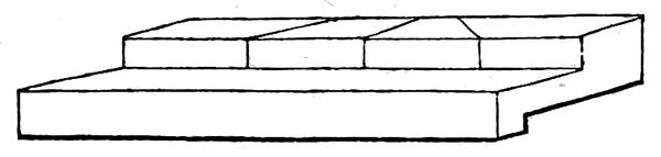
A piece of wood on which to cut furniture to certain lengths; it is similar to a carpenter’s mitre block, with the addition of a cut at right angles. The customary place for using it is on the fore edge of the imposing stone.
SAXON,
or Anglo-Saxon. The Anglo-Saxon alphabet contains twenty-three letters; Q not being originally a Saxon letter.
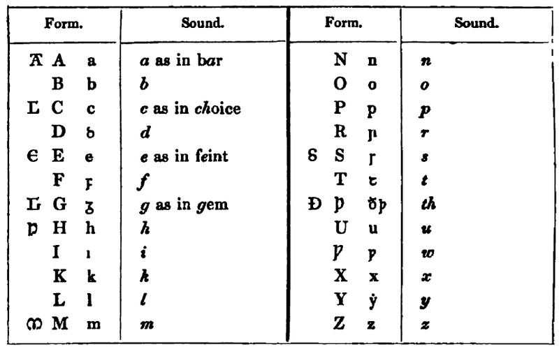
Form. Sound. Form. Sound.
[A] A a a as in bar N n n
B b b O o o
[C] C c c as in choice P p p
D ꝺ d R ꞃ r
[E] E e e as in feint [S] S ꞅ s
F ꝼ f T ꞇ t
[G] G ᵹ g as in gem Ð Þ ð þ th
[H] H h h U u u
I ı i Ƿ ƿ w
K k k X x x
L l l Y ẏ y
[M] M m m Z z z
For anꝺ the Saxons used these abbreviations, ⁊ and [#]; for þaꞇ and þæꞇ they wrote ꝥ; and for oððe or, and the termination lıce ly, they wrote ł; as ł or; and ꞅoðł for ꞅoðlıce truly.
[Note.] We also find uł for or; Ƿıłłm. for Ƿıllelm, William; and [H]æł, for [H]ælenꝺ, Jesus; ł stands for leoꝼeꞅꞇan, φίλτατοι, amicissimi, most friendly or beloved; apł, ap̃, or ap°, for apoꞅole, an apostle; apłar, apostles; [H]ieꞃłm, Jerusalem,; ꞅcıł, a shilling, money.
When an m was omitted, they made a short stroke over the preceding letter; as þā for þam.
[Note.] There are many other abbreviations and connectives; such as æꝼꞇ̃ æꝼꞇeꞃ, after; allm̃ allmıhꞇıᵹ, almighty; am̃, amen; ancen, ancenneꝺe, only begotten; b, b̵, bıꞅc̃, bıꞅcop, a bishop; bꞃoð, bꞃođ, bꞃoþeꞃn, brethren; caꞃc̃, caꞃceꞃne, a prison; cꝼꞇ, [#], Cꞃıꞅꞇ, xꞃeꞅ, Cꞃıꞅꞇeꞅ, Christ, Christ’s; c̃ƿ, cƿæð, saith; [#] for ꝺæᵹ, a day; ꝺꝺ, ꝺđ, David; ꝺꞃīh, ꝺꞃıhꞇ̃, Lord; ꝺñꞅ ꝺꞃıhꞇneꞅ, Lords; ꝼ̃ ꝼoꞃ, for, on account of; ᵹ̃, ᵹeaꞃe, a year; Iħr, Ihc̃, Jesus; ꞅ. [M]. ꞅeınꞇe [M]aꞃıe, St. Mary; ꞅ. p. St. Peter; ƿũꞇ, ƿuꞇoꝺlıce, certainly, &c. See Thwaites, p. 1.
In studying the Anglo-Saxon tongue, it is of great consequence to remark, that the inevitable changes introduced by the lapse of time through successive ages; the existence of the three great dialects, and their frequent intermixture; the variety of Anglo-Saxon writers, and their little acquaintance with each other; but, above all, their total disregard of any settled rules of orthography; have occasioned many irregularities in the language, and thrown difficulties in the way of the learner, which at first sight appear truly formidable; but, on closer inspection, these difficulties present no insuperable obstacle.
The principal difficulty consists in this: The Anglo-Saxon writers often confounded some letters, and used them indifferently for each other. This is the case to a most surprising extent with the vowels and diphthongs; so that the consonants, though often treated in the same manner, form the only part of the language which possesses any thing like a fixed and permanent character.
Remarks on the Change of the Consonants required for derivation and declension.
B.
B, F, or U, are often interchanged; as
Bebeꞃ, beꝼoꞃ, a beaver. Iꝼıᵹ, ıueᵹ ivy. Obeꞃ, oꝼeꞃ, oueꞃ, over. [E]bolꞅan, eꝼolꞅan to blaspheme. Foꞇ, uoꞇ a foot.
C.
C often interchanges with G, K and Q; as
Ðonceꞅ, þonᵹeꞅ thoughts. [C]ẏð, kẏð kindred. [C]ẏnınᵹ, kẏnınᵹ a king. Aceꞃ, Akeꞃ a field. [C]ƿen, quen, a queen, wife, &c.
C and CC are also often changed into H, or Hh, before ꞅ or ð, and especially before ꞇ; as Sꞇꞃehꞇon they strewed, for ꞅꞇꞃecꞇon, from ꞅꞇꞃeccan. Ahꞅıan for acꞅıan or axıan to ask. ꞅehđ for ꞅecđ seeks, from ꞅecan to seek.
In Dan. Sax. C changes into ᵹ, h, hƿ and k; and ch changes into h.
D.
D and T are often used indiscriminately for each other, and Ð is changed into ꝺ, especially in verbs; as ꞅeođan to boil or seeth; ꞅoꝺen boiled, ıc cƿæđ I said; þu cƿæ đe thou saidst. he ƿẏꞃđ he is or becomes; þu ƿuꞃꝺe thou becomest.
F.
In Dan. Sax. F changes into b and p.
G.
G is often changed into h and ƿ; as [H]eꞃeꞇoha for heꞃeꞇoᵹa a leader; Dahum for ꝺaᵹum with days; Geꞅƿıᵹan to be silent; ᵹeꞅuƿoꝺe he was silent or dumb; ꞅoꞃh for ꞅoꞃᵹe sorrow.
G interchanges with I and Y, when I has a sort of a consonant sound; as ᵹeo, ıeo or ıu yore, formerly; ᵹeoᵹuđ, ıeoᵹuđ youth; ᵹeoc, ıoc or ıuc yoke.
G is often suppressed before n, or ᵹn lengthened into ᵹen; as þẏꞅıᵹne, Þẏꞅıne from þyꞅꞅ or þıꞅ this, and ænıᵹne, aenıne, from aenıᵹ any. G is often added to words that end with ı, as hıᵹ for hı they; and on the contrary G is often omitted in those words which end in ıᵹ; as ꝺꞃı for ꝺꞃıᵹ or ꝺꞃẏᵹ, dry.
In Dan. Sax. G is sometimes dropped, or changed into C, H, or K; and GS into X.
H.
[H] is sometimes changed into ᵹ; as þaᵹ for þah he grew or throve, from þean to grow.
In Dan. Sax. [H] is sometimes added to words, and sometimes dropped; or it is changed into c, ᵹ, ch, or k; and [H]u into ƿ.
K.
The Saxons originally expressed the sound of the modern K by C. As C also stood for a soft sound, it was difficult to know when it was to be sounded hard, and when soft. To remove this difficulty, the Danes and Normans introduced the letter K to denote the hard sound of C.
L.
L and N are often written double or single without any distinction at the end of monosyllables; but this reduplication ceases when words are lengthened, so that a consonant follows; as ƿell or ƿel well; ealle or al all (omnis); ealne, all (omnem); also ıc ꞅẏlle, þu ꞅẏlꞅꞇ, he ꞅylđ, I sell, thou, &c.
In Dan. Sax. L is sometimes put for R.
M and N.
In Dan. Sax. these two letters are sometimes interchangeable; and N is occasionally dropped.
P.
The Saxon p and ƿ are easily mistaken for each other, both in MSS. and on coins; and even in printed books great care is sometimes necessary to distinguish these letters.
In Dan. Sax. P changes occasionally into B and U.
Q.
Q is not an original Saxon letter, and very seldom occurs in MSS.; Cw and Cu were commonly employed where Q is now used.
R.
R in Dan. Sax. is occasionally added to words, and is sometimes changed into L.
S.
S and Z are merely variations of the same original letter. The Z is only the S hard.
In Dan. Sax. Ss, Ð, or X are sometimes substituted for S.
T.
T in Dan. Sax. occasionally changes into D and Ð.
W.
In Dan. Sax. W changes into F and Ui; We into oe, u, ue; Wi, into u, uu; Wa, into uıæ, ƿæ; Wr, into war; and Wu, into u.
X.
X is sometimes supplied by cꞅ; as neoꞃcꞅen for neoꞃxen quiet. In Dan. Sax. X interchanges with S.
Z.
Z is only the S hard. See S.
Remarks on the Vowels and Diphthongs.
If the consonants,—those natural sinews of words and language,—suffer such changes, it may safely be presumed, that those flexible and yielding symbols, the vowels, would be exposed to still greater confusion; a confusion almost sufficient to induce one to imagine that they are of no weight or authority, in Anglo-Saxon orthography.
A.
A kind of Italic a is much used in Anglo-Saxon MSS. Where we now use A or E, the diphthongs Æ, Œ, and Ea continually occur in Anglo-Saxon; but Œ more frequently in Dan. Sax.
The vowel A and its diphthongs thus interchange.
A and O. See under O.
A and Æ: as ac, æc an oak; aceꞃ, æceꞃ a field; habban to have, ıc hæbbe I have; ꞅꞇan a stone; ꞅꞇænen stony; laꞃ doctrine; læꞃan to teach; an one; æniᵹ any one.
Æ and EA: as æ, ea water; æc, eac eternal.
Æ and Œ: as aeᵹhƿeꞃ, ceᵹhƿeꞃ everywhere; aeᵹhƿilc, oeᵹhƿilc every one.
Æ and Y: as ælc, ẏlc each one.
In Dan. Sax. these occur indifferently:—A, æ, e, ea, o, eo; Æ, e, ıe, œ, o, ea, ue.
E.
E interchanges with [Æ]. It is often added to the end of Anglo-Saxon words where it does not naturally belong, and it is as often rejected where it does.
Eo is changed into ẏ and e, and ea into e, but more usually into ẏ.
[E]aðe, eðe easily; and ceaᵹreꞃ, cereeꞃ a castle.
[S]eolꝼ, ꞅelꝼ, ꞅẏlꝼ self; ꞅẏllan, ꞅellan to give, sell, &c.
Neah near; nehꞅꞇ nearest; ealꝺ old; ꞅe ẏlꝺꞃa the elder; ƿealꝺan to rule, he ƿelꞇ or ƿẏlꞇ he rules; leaꞅ loose, lẏꞅan to loose; ᵹeleaꝼa belief, ᵹelẏꝼan to believe.
In Dan. Sax. these occur indifferently:—E, a, eo, ce, O, u, as, ea, ẏ; ea, eo, ı, ẏ; eau, eoƿ; ee, e; eı, œ, ı; eo, a, e, ı, ıƿ, u; eu, ẏƿ.
I.
I is interchanged with e and y; as
Iᵹlanb, eᵹlanb, ẏᵹlanb an island; eꝼel, ẏᵹel evil; ıꞃþımᵹ, eaꞃþımᵹ, ẏꞃþlınᵹ a farmer; ꞃen rain, ꞃınan to rain; beꞃnan to burn, bẏꞃnan to set on fire; cƿeþan to say, þu cƿyꞅꞇ, cƿıꞅꞇ, thou sayest.
In Dan. Sax. these occur indifferently: I, ıa, ıo, eo, ẏ; ıœ, ıe, œ; ıuh, eoƿ.
O.
O is changed into u, e and ẏ, and eo into ẏ; but sometimes into a, especially before n in a short or terminating syllable.
Oꝺe and oꝺ, into aꝺe and aꝺ; ꝺom ᵹudgment, ꝺeman to judge; ꝼꞃoꝼeꞃ comfort, ꝼꞃeꝼꞃtan to comfort; ꝼoc a foot, ꝼec feet; boc a book, bee books; ꞅcoꞃm a storm, ꞅcẏꞃman to storm; ᵹolꝺ gold, ᵹẏlꝺen golden; ƿoꞃb a word, anꝺƿyꞃꝺan to answer; ƿeoꞃc a work, ƿẏꞃcean to work; heoꞃb or hẏꞃꝺe a herd; ıoc, ıuc me a yoke; leƿan, ᵹoƿan to show; man and mon a man; lanᵹ and lonᵹ long; ꞅanꝺ and ꞅonꝺ sand.
In Dan. Sax. these occur:—O, a, e, I, u; œ, æ, e, o, ue, ƿe; oea, eo; oƿe, uu.
U.
U is sometimes converted into ẏ: as ꞅcꞃuꝺ clothing, ꞅcꞃyꝺan to clothe; cuþ known, cẏþan to make known.
In Dan. Sax. these are used indiscriminately:—U, ꝺ, ꝼ, o, oƿ, ƿe, ƿı, ƿu; ue, æ, œ, ƿe; uı, ƿ; uu, oƿe.
Y.
The Anglo-Saxon Y is the Greek Υ (upsilon), or, as the French call it, y Greque. The ẏ was not dotted in the oldest MSS.
Y is sometimes changed into u.
In Dan. Sax. these occur:—Y into e, ea, ı; and Yƿ into eu.
Further Remarks on the Letters.
The preceding observations on the consonants and vowels will render the following peculiarities less surprising, and may perhaps explain their causes.
The final letters of words are often omitted: as ƿomb, ƿom; ƿæᵹ or ƿeᵹ, ƿe.
A vowel near, or at the end of a word, is often absorbed by the preceding or succeeding consonant, especially if that consonant be a semi-vowel; but either that or the nearest vowel is still understood: as Luꝼꞅꞇ for luꝼaꞅꞇ lovest; luꝼð for luꝼað loveth; and other verbs in the 2d and 3d persons. Geƿꞃıxl for ᵹeƿꞃıxle changes; ꞅuꞅl ꞅuꞅel sulphur; ꞅƿæꝼl for ꞅƿæꝼel sulphur; bloꞅm for bloꞅma a blossom; boꞅm for boꞅum bosom; boꞇl for boꞇle a village, house, &c.; bꞃıꝺl for bꞃıꝺel a bridle.
Contractions of words are common: as N’ẏꞅꞇe for ne ƿıꞅꞇ knew not; n’æꝼꝺe for ne hæꝼeꝺ had not; ẏꞃn’ð for ẏꞃneð runneth.
In Dan. Sax., on the other hand, monosyllables are sometimes changed into longer words: as ƿꞃað anger, wrath, lengthened into ƿaꞃað. Other words contract two syllables into one; as cẏnınᵹ into kẏnᵹ a king.
The different letters suffer a very frequent change of position: as ꞇınꞇeꞃᵹe, ꞇınꞇꞃeᵹe pain; þıꞃꝺa, þꞃıꝺꝺa third.
A very great variety exists in writing the same word by different Anglo-Saxon authors, as will appear from the following examples: ᵹeoᵹeþe, ᵹeoᵹoð, ᵹeoᵹuð, ᵹeᵹoþe, ıoᵹoð, ıuᵹuð youth; mæneᵹeo many, a multitude, is written mæneᵹo, mænıᵹeo, mænıᵹo, mænıᵹu, mænıo, mænıu, mænẏᵹeo, maneᵹeo, maneᵹu, manıᵹe, manıᵹo, manıᵹu, meneᵹeo, meneᵹo, meneᵹu, menıᵹeo, menıᵹo, menıᵹu, menıo, menıu.
Adjectives in the comparative degree end indifferently in aꞃ, æꞃ, eꞃ, ıꞃ, oꞃ, uꞃ, or ẏꞃ; and the superlative in aꞅꞇ, æꞅꞇ, eꞅꞇ, ıꞅꞇ, oꞅꞇ, uꞅꞇ, or ẏꞅꞇ.
Active participles end in anꝺ, anꝺe, ænꝺ, ænꝺe, enꝺ, ınꝺ, onꝺ, unꝺ or ẏnꝺ; and passive participles in aꝺ, æꝺ, eꝺ, ıꝺ, oꝺ, uꝺ, or ẏꝺ.
So also, [H]e ꝺıelꝼ, ꝺealꝼ, ꝺelꝼ or ꝺalꝼ he dug; and læꞅƿenꝺe, læꞅƿıᵹenꝺe, læꞅᵹenꝺe or læꞅıenꝺe feeding; ıc ƿuꞃpe, ıc ƿeoꞃpe, ıc ƿẏꞃpe, or ıc ƿeꞃpe I cast away; man, mon a man; he mæᵹe or muᵹe he may; he ꞅıᵹ, ꞅı, ꞅıe, ꞅe, ꞅıo, or ꞅeo he is; ꞅınꝺon, ꞅenꝺon, ꞅıenꝺon, ꞅınꞇ, ꞅıenꞇ, ꞅınꝺ, ꞅın, ꞅıen, ꞅeon, are.
Some short words assume very different meanings: as bıᵹ, bıᵹe, bẏᵹe, beᵹ, beaᵹ, beah and beh, which, according to their connexion, signify indifferently, a turning, a crown, a gem, a bosom, buy, he turned, he submitted, &c. from buᵹan, to turn, bow, &c.—The Elements of Anglo-Saxon Grammar. By the Rev. J. Bosworth, M.A. F.A.S., 8vo. 1823.
“The Saxon capitals which vary from those now used are C, E, G, H, M, and W. The small letters are d, f, g, r, s, t, and w, which are all Roman, except the Ƿ, ƿ, and some notes of abbreviations used by the Saxons, as Ð ð, þ th, ꝥ that, &c. Many other abbreviations were used by the Saxons. These notes of abbreviation are not the original members of an alphabet; they were the result of later reflection, and were introduced for dispatch.
“By an attentive observation of the different specimens of writing in England, we perceive the several gradations of change, by which one form of a Roman character has imperceptibly changed into another. The Saxon ƿ, says Mr. Whitaker, seems to have been only the Roman V at first, and to have been lengthened into the Saxon character, and enlarged into the present Roman W, by bringing the principal stroke somewhat lower, and closing the top in the one, and by redoubling the whole in the other. The W is unknown, both to the Latin and its daughter languages, the French, the Spanish, and the Italian: it is composed of two characters, namely of the V or U doubled.
“The writing which prevailed in England from the coming of St. Augustin, in 596, to the middle of the eleventh century, is generally termed Saxon, and may be divided into five kinds, namely, the Roman Saxon, the set Saxon, the running hand Saxon, the mixed Saxon, and the elegant Saxon.”—Astle.
Elegant Saxon.—This writing was adopted in England in the tenth century, and was continued till the Norman conquest; but was not entirely disused till the middle of the thirteenth century.
All subsequent Saxon writers endeavour to keep as near as possible to the form of the letters in a book of Saxon Homilies in the Lambeth Library (No. 439), written in the tenth century. There is a beautiful specimen in the MSS. of the Rev. E. Thwaites, M. A. to be found in the Harleian MSS., at the British Museum (No. 1866). It is described in Nichols’s Lit. Anec., vol. iv. p. 140, as “one of the most lovely specimens of modern Saxon writing that can be imagined.”—Bosworth, p. 20.
About the year 1567, John Daye, who was patronized by Archbishop Parker, cut the first Saxon types which were used in England. In this year Asserius Menevensis was published by the direction of the archbishop in these characters; and in the same year Archbishop Ælfric’s Paschal Homily; and, in 1571, the Saxon Gospels. Daye’s Saxon types far excel in neatness and beauty any which have been since made, not excepting the neat types cast for F. Junius at Dort, which were given by him to the University of Oxford. Astle, p. 224.—Bosworth.
“The Saxon types which were used in printing St. Gregory’s Homily, having been burnt in the fire which consumed Mr. Bowyer’s house and all his printing materials [Jan. 30. 1712-13], Lord Chief Justice Parker was so munificently indulgent, as to be at the expence of cutting a new Saxon type for Mrs. Elstob’s Saxon Grammar, from fac similes by Mrs. Elstob; the punches and matrices of which Mr. Bowyer’s son presented, by the hands of Edward Rowe-Mores, esq; to the University of Oxford. See the Archæologia Antiq. Soc vol. i. p. xxvii.”—Gent. Mag., Oct. 1778, p. 455. Note.
Saxon Upper Case.
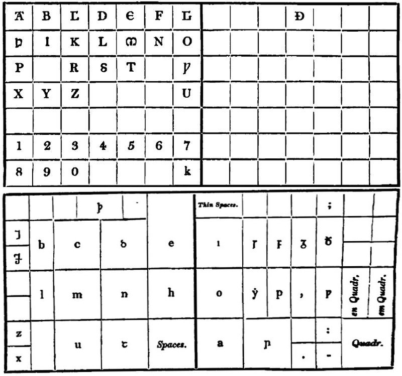
Saxon Lower Case.
Saxon in British Founderies.
Double Pica.—Fry, to Thorowgood and Besley.
Great Primer.—Fry, to Thorowgood and Besley.
English.—Caslon. Fry, to Thorowgood and Besley. Oxford. Wilson.
Pica.—Caslon. Fry, to Thorowgood and Besley. V. and J. Figgins. Oxford. Wilson.
Small Pica.—Fry, to Thorowgood and Besley. V. and J. Figgins. Oxford. Wilson.
Long Primer.—Caslon. Fry, to Thorowgood and Besley. V. and J. Figgins. Wilson.
Brevier.—Caslon. Fry, to Thorowgood and Besley. V. and J. Figgins. Wilson.
SCALE OF PRICES.
The following scale of prices is copied literally from the official scale published by the master printers in 1810. The alteration in the scale in 1816, as well as the subsequent alterations and explanations have been also accurately copied from the official notifications issued to the trade by the committee of master printers.
“Scale of Prices for Compositor’s Work,
“Agreed upon at a General Meeting of Master Printers, at Stationers’ Hall, April 16, 1810; commencing on all Volumes or Periodical Numbers begun after the 30th Instant.
“Art. 1. All works in the English language, common matter, with space lines, including English and Brevier, to be cast up at 5¾d. per 1000; if in Minion 6d. per 1000; in Nonpareil 6¾d. Without space lines, including English and Brevier, 6d. per 1000; in Minion 6¼d. in Nonpareil 7d.; in Pearl, with or without space lines, 8d.; Heads and Directions, or Signature lines, included. A thick space to be considered an en in the width, and an en to be reckoned an em in the length of the page: and where the number of letters amounts to 500—1000 to be charged; if under 500, not to be reckoned: and, if the calculation at per 1000 shall not amount to an odd threepence, the odd pence to be suppressed in the price of the work; but where it amounts to or exceeds threepence, there shall be sixpence charged. Em and en quadrats, or whatever is used at the beginning or end of lines, to be reckoned as an em in the width.
“2. Works printed in Great Primer to be cast up as English; and all works in larger type than Great Primer, as half English and half Great Primer.
“3. All works in foreign languages, though common type, with space lines, including English and Brevier, to be cast up at 6¼d. per 1000; if in Minion 6¾d.; Nonpareil 7½d. Without space lines, including English and Brevier, 6½d.; Minion 7d.; Nonpareil 7¾d.; and Pearl, with or without space lines, 8¾d.
“4. English Dictionaries of every size, with space lines, including English and Brevier, to be paid 6¼d.: without space lines, 6½d. (In this article are not included Gazetteers, Geographical Dictionaries, Dictionaries of Arts and Sciences, and works of a similar description, except those attended with extra trouble beyond usual descriptive matter.) Dictionaries of two or more languages, of every size, with space lines, including English and Brevier, to be paid 6½d.: without space lines, 6¾d.; if smaller type than Brevier, to take the proportionate advance specified in Article 1.
“5. English Grammars, Spelling Books, and works of those descriptions, in Brevier or larger type, with space lines to be paid 6d. per 1000; without space lines 6¼d.: if in two languages, or foreign language, with space lines 6¼d.; without space lines 6½d.
“6. Small-sized Folios, Quartos, Octavos, and works done in Great Primer, or larger type (English language,) which do not come to seven shillings when cast up at the usual rate, to be paid as follows: English, and larger type, not less than 7s.; Pica 8s. 6d.: English 12mo. to be paid not less than 10s. 6d.; and Pica not less than 11s. 6d. per sheet.
“7. Reviews, Magazines, and works of a similar description, consisting of various sized letter, if cast up to the different bodies, to be paid 2s. 6d. per sheet extra.
“8. Pamphlets of five sheets and under, and parts of works done in different houses, amounting to not more than five sheets, to be paid 1s. per sheet extra; but, as it frequently occurs that works exceeding a pamphlet are often nearly made up without a return of letter, all such works shall be considered as pamphlets, and paid for as such.
“9. Works done in Sixteens*, Eighteens, Twenty-fours, or Thirty-twos, on Small Pica and upwards, to be paid 1s. 6d. per sheet extra. If on Long Primer, or smaller type, 1s. per sheet extra. Forty-eights to be paid 2s. per sheet extra, and Sixty-fours 2s. 6d. per sheet extra.
* The following resolution of the committee of the association of master printers is published in their fourth report, [3d July, 1840,] “That in Book-work two Forms of Double Foolscap be considered as one sheet.”
“10. Works requiring an alteration or alterations of margin, to be paid, for each alteration, 1s. per sheet to the Pressmen if altered by them, and 6d. to the Compositor, as a compensation for making up the furniture; if altered by the Compositor, then he is to be paid 1s. for the alteration, and the Pressmen 6d. for the delay.——This article to be determined on solely at the option of the employer.
“11. Bottom Notes consisting of twenty lines (or two notes, though not amounting to twenty lines) and not exceeding four pages, in every ten sheets, in quarto or octavo:—one page (or two notes, though not amounting to one page) and not exceeding six pages, in twelves:—two pages (or two notes, though not amounting to two pages) and not exceeding eight, in eighteens or above, to be paid 1s. per sheet; but under the above proportion no charge to be made. Bottom Notes, consisting of ten lines (or two notes, though not amounting to ten lines) in a pamphlet of five sheets or under, and not exceeding two pages, to be paid 1s. per sheet extra. Quotations, Mottos, Contents to Chapters, &c., in smaller type than the body, to be considered as Notes. [Where the notes shall be in Nonpareil or Pearl, in twelves, the number of pages to be restricted to four; in eighteens to five pages.]——This article is intended only to fix what constitutes the charge of 1s. per sheet for Bottom Notes*: all works requiring a higher charge than 1s. for Bottom Notes are to be paid for according to their value.
* The following interpretation of this article of the scale is given in a resolution of the committee of the master printers association, published in their fourth report, [3d July, 1840,] viz. “‘That there must be two Notes in every 10 sheets of a work to constitute the charge of 1s. per sheet for notes.’ E. g. if there should be only two notes, less than 20 lines each, in a work of more than 10 sheets, such work would not be liable to any charge for notes.”
“12. Side Notes to Folios and Quartos not exceeding a broad quotation, if only chap. or date, and not exceeding three explanatory lines on an average in each page, to be paid 1s. per sheet; in Octavo, if only chap. or date, and not exceeding three explanatory lines on an average in each page, 1s. 6d. per sheet. Cut-in Notes, in smaller type than the body, to be paid for in a similar manner.——Side and Bottom Notes to many, particularly historical and law works, if attended with more than ordinary trouble, to be settled between the employer and journeyman.
“13. Greek, Hebrew, Saxon, &c. or any of the dead characters, if one word and not exceeding three lines in any one sheet, to be paid for that sheet 1s. extra; all above to be paid according to their value.
“14. Greek with space lines, and without accents, to be paid 8½d. per 1000, if with separate accents 10d.; without space lines, and without accents, 8¾d.; with accents, 10¼d.; the asper not to be considered an accent. [If Dictionary matter, to take one halfpenny advance.]
“15. Hebrew, Arabic, Syriac, &c. to be paid double: Hebrew with points to be cast up as half body and half points doubled.
“16. Music to be paid double the body of the sonnet type.
“17. Index matter, though but one measure, to be paid 2s. per sheet extra.
“18. Booksellers’ Catalogues (in whatever language) to be cast up at 7d. per 1000, not including the numbering.
“19. Night work to commence and be paid for, from ten o’clock till twelve, 1s.; all after to be paid 3d. per hour extra till Six.—Morning work, commencing at four o’clock, to be paid 1s. extra.—Sunday work, if not exceeding 6 hours, to be paid for 1s.; if for a longer time, 2d. an hour.
“20. Jobs of one sheet or under (except Auctioneers’ Catalogues and Particulars) to be cast up at 7d. per 1000; if done in smaller type than Brevier, to take the proportionate advance specified in Article 1; if in foreign language, of one sheet or under, (except Auctioneers’ Catalogues,) to be cast up at 8d. per 1000; if done in smaller type than Brevier, to take the proportionate advance specified in Article 1.
“21. Where two pages only are imposed, either opposite to or at the back of each other, they shall be paid for as two pages; but if with an indorse, or any other kind of matter constituting a third, then to be paid as a sheet if in Folio; a half sheet if in Quarto, and so on.
“22. Broadsides, such as Leases, Deeds, and Charter-parties, above the dimensions of crown, whether table or common matter, to be paid the double of common matter; on crown and under, to be paid one and one half common matter.—The indorse to be paid one fourth of the inside page, as common matter.
“23. All Corrections to be paid 6d. per hour.
“24. The Imprint to be considered as two lines in the square of the page.
“25. Different volumes of the same work to be paid for distinctly, according to their value.
“Abstract of the Scale.
Key to Column Headers—
A. = Common.
B. = Foreign.
C. = English.
D. = 2 Languages, or Foreign.
E. = Without Accents.
F. = With Accents.
Dictionaries. Grammars, &c. Greek.
A. B. C. D. C. D. E. F.
d. d. d. d. d. d. d. d.
English to} { leaded 5¾ 6¼ 6¼ 6½ 6 6¼ 8½ 10
Brevier } { solid 6 6½ 6½ 6¾ 6¼ 6½ 8¾ 10¼
Minion { leaded 6 6¾ 6¾* 7 *
{ solid 6¼ 7 7 * 7¼*
Nonpareil { leaded 6¾ 7½ 7½* 7¾*
{ solid 7 7¾ 7¾* 8 *
Pearl { leaded 8 8¾ 8¾ 9
{ or solid
Notes constituting the Charge of One Shilling per Sheet.—See Article 11.
4to. and 8vo. { 20 Lines } and not exceeding 4 Pages in 10 Sheets.
{ or 2 Notes }
12mo. { 1 Page } and not exceeding 6 Pages in 10 Sheets.
{ or 2 Notes }
18mo. or above { 2 Pages } and not exceeding 8 Pages in 10 Sheets.
{ or 2 Notes }
Pamphlets { 10 Lines } and not exceeding 2 Pages in 5 Sheets.”
{ or 2 Notes }
A modification of the Compositors’ Scale took place in 1816, and the following notification was issued to the Trade:—
“At a Meeting of Master Printers held this day, pursuant to notice, for the purpose of taking into consideration the state of the Trade in general, in consequence of the alteration in the times;
“It was the opinion of this Meeting, that it would be highly expedient that, after the 19th of February, the following modification of the Compositors’ Scale of Prices of 1810, as far as regards Reprints, should take place.
“All Reprinted Works to be paid Three Farthings per 1000 less than the Scale of 1810. All Manuscript or Original Works shall continue to be paid for as at present.
“January 2. 1816.”
The following resolution is copied from Hansard’s Typographia:
“At a Meeting of the Committee of Master Printers held March 11, 1816.
“It having been stated that doubts had arisen in the minds of several Masters as to what should be considered ‘Reprinted Works,’—Resolved, That they be informed that, under the above Resolutions, all ‘Reprinted Works’ were meant to be comprehended, whether printed sheet for sheet or otherwise; it being understood, that, in cases where the copy is rendered peculiarly troublesome by intricate manuscript insertions, a reasonable allowance may be made for the same to the Compositor.”
Reprints, according to the Resolution of January 2, 1816.
Key to Column Headers—
A. = Common.
B. = Foreign.
C. = English.
D. = 2 Languages, or Foreign.
E. = Without Accents.
F. = With Accents.
Dictionaries. Grammars, &c. Greek.
A. B. C. D. C. D. E. F.
d. d. d. d. d. d. d. d.
English to} { leaded 5 5½ 5½ 5¾ 5¼ 5½ 7¾ 9¼
Brevier } { solid 5¼ 5¾ 5¾ 6 5½ 5¾ 8 9½
Minion { leaded 5¼ 6 6 * 6¼*
{ solid 5½ 6¼ 6¼* 6½*
Nonpareil { leaded 6 6¾ 6¾* 7 *
{ solid 6¼ 7 7 * 7¼*
Pearl { leaded 7¼ 8 8 8¼
{ or solid
* In the Abstract under the head “Dictionaries,” the prices for Minion and Nonpareil are erroneous, being one farthing too much; this error passed unnoticed, till the publication of the “Third Report of the Committee of the Association of Master Printers” in 1839, where it is corrected. I have given the Scale as originally published.
“Scale of Prices for Presswork,
“Agreed upon at a General Meeting of Master Printers, at Stationers’ Hall, Feb. 8, 1810; commencing on all Volumes or Periodical Numbers begun after the 28th Instant.
“FOLIOS. 1000 750 250.
ON MEDIUM OR DEMY. and upwards. and 500.
d. d. d.
Not exceeding 52 Pica Ems, upon Small Pica and upwards 5 5½ 6
If on Long Primer, Bourgeois, or Brevier 5½ 6 7
All above 52 Pica Ems, upon Small Pica and upwards 5½ 6 7
If on Long Primer, Bourgeois, or Brevier 6 6½ 7
Long Primer and upwards, on Copy or Crown 5 5½ 6
“QUARTOS.
ON MEDIUM OR DEMY.
Not exceeding 40 Pica Ems, upon Long Primer and upwards 5 5½ 6
If on Bourgeois or Brevier 5½ 5½ 6
All above 40 Pica Ems, and not less than Long Primer 5½ 5½ 7
If on Bourgeois or Brevier 6 6 7
Brevier and upwards, on Copy or Crown 5 5½ 6
“OCTAVOS.
ON MEDIUM OR DEMY.
Not exceeding 24 Pica Ems, upon Small Pica and upwards 5 5½ 6
If on Long Primer, Bourgeois, or Brevier 5 5½ 7
All above 24 Pica Ems, on Brevier or upwards 5½ 6 7
If less than Brevier 6 6½ 8
Brevier and upwards, on Copy or Crown 5 5½ 6
“TWELVES.
ON MEDIUM OR DEMY.
Not exceeding 21 Pica Ems, upon Long Primer and upwards 5 5½ 7
If on Bourgeois or Brevier 5½ 6 7
All above 21 Pica Ems, upon Long Primer and upwards 5½ 7 8
If on Bourgeois or Brevier 6 7 8
Long Primer, Bourgeois, or Brevier, on Copy or Crown 5 5½ 7
“EIGHTEENS.
If not less than Small Pica 5 5½ 7
If on Long Primer, Bourgeois, or Brevier 5½ 6 7
If less than Brevier 6 7 8
“TWENTY-FOURS AND THIRTY-TWOS.
If not less than Small Pica 5½ 6 7
If on Long Primer, Bourgeois, or Brevier 6 7 8
If less than Brevier 6½ 8 9
“POCKET BOOKS,
OCTAVO.
Post or Crown, 21 Pica Ems wide, 35 long 5 6 7
TWELVES.
Pot, such as Lady’s and Christian Lady’s.
Table Part, 6mo. 35 Pica Ems wide, 26 long 5 6 7
Miscellany Part, 16 ditto wide, 26 long 5 6 7
Copy, Christian Gentleman’s, 26 wide, 35 long 5 6 7
“SCHOOL BOOKS.
TWELVES.
Copy or Crown, not exceeding 17 Pica Ems wide, 31 long, nor less than Brevier 5 6 7
OCTAVO.
Copy or Crown, not exceeding 21 Pica Ems wide, nor less than Long Primer 4¾ 5½ 6
N. B. School Books on Copy or Crown are defined to be, Palairet’s French Grammar, Chambaud, Salisbury Spelling Book, Fox’s Lessons, Ward’s Latin Grammar, and all of a similar description.
“ALMANACKS. d.
Royal Broadsides 7
Demy Ditto, Size Wing or Cambridge 5½
Goldsmith, Calendar Form 5½
Ditto, Prog. 5
Twelves Demy, 19 Ems wide, 34 long, Calendar 5½
Ditto, Prog. 5
Ditto, Crown, Size Rider 5
Octavo Foolscap, 20 Ems wide, 34 long, Cal. and Prog. 5
“BILLS IN PARLIAMENT.
From No. 4 inclusive to any No. under 100 4½
If 100, and under 200 5
If 200 or 250 5½
Above 250, and under 400 4½
If 400 or 500 5
If above 500, and under 700 4½
If 700 or 750 5
All above 750 4½
“N. B. Side Notes to be reckoned in the Width; Bottom Notes not to be regarded.
Works on Royal Paper to be paid One Halfpenny per Hour more than the above Prices.
Ditto on Foolscap or Pot, not less than 1000 Number, and wrought at one Pull, 4½d.
Ditto in Square Pages (like Entick’s Dictionary) and Works for the Public Offices, to be advanced One Halfpenny per Hour on the Scale of 1800.
Fine Paper of the same Size, if included within the Token, not to be charged extra; but, if of a larger Size, then to be paid according to the Scale.
Three or more Proofs pulled at one Time to be charged 4d. per Form; and, if made ready, to be charged as a Token.
Cards, large or small, to be paid 6½d. per 100.
Jobs without points to be paid 4½d. an hour.
Double Crown or Royal Broadsides, not exceeding 100 Number, to be paid 1s. 6d.; if more than 100, to be paid 1s. per 100.
Demy Broadsides, not more than 100, to be paid 1s.; above 100, and not exceeding 500, to be paid 10d. per 100; if above 500, to be paid at the rate of 1s. 9d. per Token.
Broadsides requiring three Pulls to be paid one-third more.
No Form to be deemed a Broadside that comes in at one Pull at the Common Press.
Night-work to commence and be paid for, from Ten o’clock till Twelve, 1s.; all after to be paid 3d. an Hour extra till Six.—Morning work, commencing at Four o’Clock, to be paid 1s. extra.—Sunday work, if not exceeding 6 hours, to be paid for 1s.; if for a longer time 2d. an hour.
“It is to be distinctly understood that no Advance shall take place on any Works but those which are paid by the Scale.”
An alteration in the prices of the first column took place in 1816, and the following notification of it was made:—
“At a Meeting of Master Printers held this day, pursuant to notice, for the purpose of taking into consideration the state of the Trade in general, in consequence of the alteration in the times;
“It was the opinion of this Meeting, that it would be highly expedient that, after the 19th of February, the following modification of the Pressmen’s Scale of Prices of 1810, as far as regards all Numbers exceeding the first 1000, should take place.
“Every Token above the first Four Tokens to be paid One Halfpenny per hour less than the Scale of 1810.
“January 2. 1816.”
ASSOCIATION OF MASTER PRINTERS. 4. Pemberton Row, Gough Square. December 10. 1838.
Sir,
I herewith transmit to you an Extract from the Proceedings which have taken place at a Special Meeting of the Committee convened this day for the purpose of “considering the case of the Refusal of the Compositors in Mr. Bentley’s Office to work upon his Magazine; and with a view to Conformity of Practice in our several Offices.”
“The Committee of Master Printers being informed that claims have been made by Compositors in some Offices for all Wrappers and Advertising Sheets to be set up by such Compositors only as were employed on the Periodicals to which they are attached, it was
“Unanimously Resolved,
“That such claim on the part of the Compositors is an innovation on the antient and accustomed usages of the Trade, and wholly incompatible with that control which a Master has a right to exercise over the mode of conducting his own business; and that such claim will in future be resisted by every Member of this Committee.”
“It having been stated by Mr. Bentley, that the Compositors in his Office had refused to proceed with his Magazine in consequence of his having acted on the general understanding of the Committee, that the Compositors were not entitled to the Standing Advertisements in Periodicals,
“It was Resolved,
“That Compositors are not entitled to such Standing Advertisements, or to any Standing Matter, such claim being also contrary to the antient and established practice of the Trade.
“That the above Resolutions be circulated among the Members of the Association, and that they be strongly recommended to act with the Committee in carrying them into effect.”
I am, Sir, Your obedient Servant, W. M‘DOWALL, Hon. Sec.
Extract from
“Third Report of the Committee of The Master Printers’ Association to the Annual General Meeting, held at Anderton’s Coffee House, July 5. 1839.”
“In adverting to the dispute respecting Wrappers, which originated in a case submitted at the Monthly Meeting in December, the Committee feel it to be due to the Members of the Association to acknowledge the ready support which they have on all occasions afforded them. To that firm co-operation on their part, no less than to the reasonableness of the Deputation appointed by the Compositors to confer with the Committee, may be attributed the very satisfactory adjustment of a question which had been a source of serious disagreement in several Offices.
“The following are the Regulations ultimately agreed upon, a copy of which has been sent to each Member of the Association:—
“That the Companionship on a Magazine or Review be entitled to the first or title-page of the Wrapper of such Magazine or Review; but not to the remaining pages of such Wrapper, nor to the Advertising Sheets which may accompany the Magazine or Review.
“That Standing Advertisements or stereo-blocks, if forming a complete page, or, when collected together, making one or more complete pages, in a Wrapper or Advertising Sheet of a Magazine or Review, shall not be chargeable: the Compositor to charge only for his time in making them up. The remainder of the matter in such Wrapper or Advertising Sheet, including Standing Advertisements or stereo-blocks not forming a complete page, to be charged by the Compositor, and cast up according to the 8th or 20th Rules of the Scale, as they may respectively apply. But the charge of 2s. 6d. as given by Rule 7. is not to be superadded.
“With regard to Standing Matter, the Committee adhere to their Resolution of December 10th, 1838.”
Having thus given an accurate copy of the official scale of 1810, with the alterations and explanations of the master printers, to the present time, I shall now add the explanation published by the London Union of Compositors, of the different articles of the scale.
Article I.] “In casting up a work, although it be printed in half sheets, it is cast up in sheets; in jobs less than a sheet, however, the casting-up is confined to the job, and the compositor loses or gains the five hundred letters, or the threepence (as stated in Art. 1.) as the case may chance to be.
“By the term common matter is understood the usual description of Bookwork, and not such matter as Appeal Cases, Bills in Parliament, &c. for which peculiar and distinct charges are made.—See Appendix.
Space Lines.—The reason of pearl being always paid the same price (whether leaded with a lead equal to its own body in thickness, or without a lead) has often excited surprise; but this surprise will cease when we learn that in the year 1810, when an advance of one halfpenny on leaded, and three farthings on solid took place, no advance whatever was made on the price of pearl, which consequently when solid, which it most frequently is, does not have that advance which was granted in 1810; and the compositor in casting it up at 8d. receives only the price which was paid thirty years back. In 1805, the difference between the price of nonpareil and pearl was seven farthings; in 1810, the difference was one penny.
Head and White Lines.—The head or folio line and the white or direction line are invariably reckoned in the square of the page. Head lines, when set up in a smaller type than the body of the work, are charged one shilling per sheet; and if any justification of figures, &c. occur, an allowance is made for extra trouble; but if the head be in larger type than the text, no extra charge can be made.
“Reprints.—Annual Reports of societies, with lists of subscribers, &c. are not reprints. If the copy for a book be print-copy, but derived from various sources, such book is an original work, and paid for as manuscript. Works with MS. insertions are paid extra per sheet—not less than 1s.,—but if materially altered or much interlined, or consisting of half manuscript and half reprint, are considered as original works, and paid for as if they were all manuscript. Reprinted pamphlets (when more than one sheet) are subject to the reduction above specified. No reduction is made for printed copy introduced into magazines, reviews, &c.
“Diamond.—It is the custom of the trade to pay tenpence per thousand for diamond, whether leaded or unleaded.
“Ruby.—This description of letter is not common, but it is paid an intermediate price allowed for those bodies between which it is cast; thus, a ruby (which is less than nonpareil and larger than a pearl) is cast up at 7½d. leaded or unleaded.”
Art. II.] “This mode of casting up works, which was agreed to in 1796, applies also to jobs, but not to large-letter display broadsides, the charge for which will be found in the Appendix.”
Art. III.] “In the scale of 1805, foreign works in bourgeois and brevier were paid one farthing per thousand extra; but in 1810 one price was established for type from english to brevier inclusive.
“Works in the German language and common type are paid the same as other foreign works; but if the German character be employed, it is paid as Greek without accents. The same price is also paid for the Irish character.”
Art. IV.] “The words ‘of every size,’ allude to the dimensions of the page; because formerly (that is, by the scale of 1801) duodecimo and eighteenmo dictionaries were paid one halfpenny per thousand more than those set up in octavo or quarto.
“In framing the above article, it was intended that such gazetteers or dictionaries of the arts and sciences as were attended with any extra trouble beyond usual descriptive matter should be paid the above dictionary price; and therefore, such gazetteers or dictionaries as contain many references, italics, contractions, &c. take the advanced price as dictionary matter.
“If the above works are in two columns an extra charge of not less than one shilling per sheet is made for column matter.”
Art. V.] “There is a strange anomaly in this article. It was intended to allow the compositor one farthing per thousand extra for the trouble occasioned by the admixture of italic, the frequent occurrence of single letters and monosyllables in grammars, spelling books, &c.; but if a compositor be employed on a grammar wholly in a foreign language, it is paid no more for than if it were a foreign work (see Article III.) It should, however, to be consistent, be allowed the halfpenny for foreign, and the farthing for grammar, and be cast up at 6½d. with space lines, and 6¾d. without space lines.
“The extra farthing per thousand for this kind of work is not to pay for column matter; but two column matter, in grammars, spelling-books, &c. is charged not less than one shilling per sheet; three and not exceeding four columns are charged one and one half; and above four columns are charged double.
“School Arithmetics, as well as the works above specified, are cast up at the above prices.
“If the works specified above be in smaller type than brevier, they take the advance granted for such type in Article I.”
Art. VI.] “By the words ‘cast up at the usual rate,’ is meant works cast up without their extras; and though this article specifies small sized works in the English language, the principle is applied to foreign works also; and if foreign works amount only to the sums specified, they are entitled to an advance according to the number of thousands they contain as regulated by Art. 3. of the scale. For example, if a foreign folio or 8vo. work, in english type, without space lines, contain 13,000 letters, it would come to 7s. 0½d. Now, as the same work in the English language would come to 6s. 6d. and would consequently obtain by this Article an advance of 6d., so the foreign work is entitled to the like advance, and is paid 7s. 6d.; if it were not so, the compositor would not receive anything for the work being in a foreign language.”
Art. VII.] “The mere circumstance of a work being a periodical publication does not entitle it to the charge of 2s. 6d. per sheet. To justify this charge, the text must consist of two bodies, and be cast up to their respective founts. Publications, however, of more than one sized letter must not be cast up as all one body, to avoid the payment of the 2s. 6d. per sheet, but must be charged according to the proportion of type they contain, with the 2s. 6d. allowed by this article for the bodies.
“Reprints of this description of work (if more than a sheet) are cast up at three farthings per thousand less than the current number, but the 2s. 6d. per sheet is charged. No deduction, however, is made for printed copy introduced into the current numbers of these works.
“In Reviews, Magazines, &c. where leads are only occasionally used, or when used only in a small portion of the publication, no deduction is made.
“Reviews, Magazines, &c. are entitled to the charge for notes, although such notes are set up in one of the bodies used in the text.
“All matter pulled in galleys or slips is made up at the expense of the employer.”
Art. VIII.] “Parts of works done in different houses, when unequal in their nature, are cast up according to the respective merits of the different parts; and if a sheet, or less than a sheet, it is considered a job, and cast up at the price specified in Art. XX. of the scale.
“The expression ‘nearly made up,’ is indefinite; but in works where two-thirds of the matter are made up, one shilling per sheet is charged upon the whole.
“In works of two or more volumes, when the letter of the first volume is all made up, and used for the second, no charge can be made for making up letter.”
Art IX.] “This article does not apply to half sheets or sheets of double foolscap, double demy, &c. imposed as sixteens, as these are cast up and take the extras as octavo. Sixty-fours and forty-eights, in whatever type, are paid 2s. 6d. the former, and 2s. the latter, per sheet, extra.”
Art X.] “This article allows the employer to give the alteration either to the pressman or to the compositor; but it more properly belongs to the compositor, and the general practice of the trade is for the compositor on the work to make the alteration. The article does not apply to cases where a re-imposition or transposition of pages is required; in all such cases the compositor is entitled to charge his time.”
Art XI.] “This article is by general acceptation understood to mean that, in a quarto or octavo volume, there must be one note of twenty lines, or two shorter ones, to constitute any charge, and that there must be on an average more than four pages in every ten sheets to carry a higher charge than one shilling a sheet; that is, in a work of forty 8vo. sheets, more than sixteen pages; for a fresh calculation is not made for every ten sheets. If, therefore, two notes, or one note of twenty lines, occur in an octavo or quarto volume—and two pages or two notes in eighteens and smaller-sized works, one shilling per sheet is paid for such works throughout.
“Where the notes exceed the quantity stipulated in the above article, an additional sixpence per sheet is charged, until the quantity of note entitles the compositor to a further advance, when, in order to ascertain what that advance should be, the whole of the notes are measured off, and cast up as a distinct body, and one shilling per sheet is charged for placing.
“For example—A work of twenty sheets containing eighty pages of notes, or four pages in each sheet, is cast up as three-fourths pica (the body) and one-fourth long primer (the notes), as follows:
Per sheet.
Pica, 40 by 40, at 6d. comes to 16s. ¾ths = £ 0 12 0
Long primer, 50 by 50, at ditto is 20s. ¼th = 0 5 0
By letters 0 17 0
Making up, or placing notes 0 1 0
£ 0 18 0
“The usual rule for the type for notes is two sixes less than the text; i. e. English text has Small Pica notes; Small Pica text, Bourgeois notes; Long Primer text, Brevier notes; but when under this size a proportionally less quantity of note is required to constitute the above charges. Thus—If in a work set in Small Pica, the notes should be set in Brevier, which is three sizes less than the text; the same number of thousands should be composed for 1s. per sheet, as would be equivalent to the number of thousands contained in the four pages of Bourgeois, i.e. if the four pages of Bourgeois contain 10,000 letters, no more than that number of brevier should be composed without an increased charge.
“To compensate the compositor for time employed in making up, altering references, &c., the notes, although in the same size as any type used in the text, take the charge of 1s. per sheet.
“Notes upon notes, when set up in a smaller type than the note, are charged according to the rule laid down for notes.”
Art XII.] “In casting up a work with side-notes, the side-notes are not reckoned in the width of the page.
“Side-notes are cast up as double—that is, the length and breadth of the side-notes are taken, multiplied, and the product doubled. When the space between the notes do not exceed a broad quotation it is reckoned in measuring off the notes. The side-note width of the guard line and head lines are reckoned in measuring the depth of the notes. The reglets or leads between the text and side-note are reckoned in the width of the text, when the side-notes are cast up. One shilling per sheet for side-notes, in addition to their being cast up as double, is allowed for placing.
“Under-runners from side-notes are reckoned in the side-note, and paid 3d. each, in addition.
“When the bottom notes to law works, &c. are attended with extra trouble, in consequence of numerous contractions, an extra is paid.”
Art. XIII.] “The Saxon language is mentioned only in regard to the charge of one shilling per sheet, while works wholly done in that language seem to have been unintentionally omitted in the Scale; they are, however, paid the same as Greek without accents, according to Article XIV.
“The term ‘dead characters’ is extremely indefinite; and the charge allowed by this article is not limited to the languages of such nations as are extinct, but includes all languages for which roman or italic type is not employed, such as Sanskrit and other oriental characters; also German, Irish, &c. &c.
“This article defines only what charge is to be made for Greek, Hebrew, Saxon, &c. when introduced in small quantities in various parts of a sheet,—such as single words, half lines, or lines. If there be one word, and not more than three lines, the charge is one shilling for each character, in every sheet in which those characters occur: all above three lines is paid according to their value, preserving the 1s. per sheet for the first three lines. When the quantity of Greek, Hebrew, Saxon, &c. amounts to two-thirds, interspersed throughout the sheet, it is paid as all Greek, or an equivalent price allowed for the admixture.
“As it occasionally occurs that words in Greek, &c. are obliged to be set up in a different sized fount to the body of the work, when such is the case, extra is paid for justification.
“For the convenience of employers, and that each sheet of a work may be paid the same price, it is sometimes the practice to ascertain the quantity contained in the work, and put an average price upon each sheet. This was not formerly the general custom, nor is it, indeed, commendable, since by this mode it often happens that the task of setting up that part of a work containing the greatest quantity of Greek, &c. falls into the hands of those who have had no share of the lighter parts of the work, and thus endless and bitter disputes are caused by one man being called upon to perform that labour for which another has received the reward. The article limits the charge to ‘that sheet,’ and therefore a work in which small portions of Greek, &c. are introduced, should be charged according to the particular quantity in each sheet.”
Art. XIV.] “By ‘separate accents’ is meant the use of distinct accents with kerned letters.
“The composition of grammars being attended with extra trouble, ¼d. per 1000 is allowed for them. Therefore Grammars in Greek, Hebrew, &c. take the advance specified in Article V. Thus, a Greek grammar without space lines and accents is paid 9d. per 1000.
“Jobs in Greek, &c. of one sheet or under are also paid 1d. per thousand more than the prices above stated.
“It has been contended that works in Greek, Hebrew, &c. not being common matter, were not intended to be subject to the reduction upon reprints; but as the same advantage accrues to a compositor upon reprint Greek as upon reprint English, it is just that the reduction should be made; and therefore Greek, &c. set up from printed copy, is subject to the modification of the Scale proposed by the masters in 1816.”
Art. XV.] “The phrase ‘paid double’ signifies double the price of common matter. Although Hebrew with points is alone stated to be cast up as half body and half points doubled; yet Syriac, or any other language or character with points, is cast up in the same manner.
“Of the mode of casting up a work with points, the following is an example:—Supposing the work to be set up in small pica Hebrew with nonpareil points, it is cast up as half small pica and half nonpareil, that is, each page is charged as if it were a page of small pica and a page of nonpareil.
“Grammars, Dictionaries, &c. in these languages are cast up at double the price specified in Article V.
“This article applies only to works, or where several pages appear together. Small quantities of Arabic, Syriac &c. are paid according to Article XIII.”
Art. XVI.] “That is, if the sonnet type be long primer, the square of the page is taken as long primer, and the amount which the sheet or job would be paid as long primer is doubled.
“The rule is, however, but little applicable to the present style of letter-press music printing, the composition of which is now usually paid an ad valorem price, as double the price of sonnet type would not pay. Indeed, in music wholly instrumental, Art. 16. would be useless as a guide, as there would be no sonnet type employed.”
Art XVII.] “The charge of 2s. per sheet for Index matter does not include the charge for columns or tabular; and indexes cast up as tabular or table are charged 2s. in addition to what they come to by letters.”
Art. XVIII. “The expression, ‘not including the numbering,’ does not mean that the numbers are not to be reckoned in the square of the page, but that when the bookseller sends in his copy without numbers at the beginning of the article, or with incorrect numbers, and the compositor is required to alter them, or put in the numbers, he is entitled to make an extra charge for such numbering; in other words, 7d. per thousand does not include the charge for the trouble occasioned to the compositor by altering or marking in the numbers prefixed to the books.
“If a booksellers’ catalogue only make a sheet, or less than a sheet, it is cast up at no more than 7d. per thousand.
“Booksellers’ lists or advertisements are charged as a job at 7d. per thousand when only making a sheet or under; but if done in smaller type than brevier, they take the proportionate advance specified in Article 1.
“When notes or remarks in smaller type are inserted in a bookseller’s catalogue, they are paid the same as bottom notes.
“Catalogues in two columns are paid one shilling per sheet for columns.
“The words ‘in whatever language,’ mean that the foreign languages, where roman type is used, viz. Latin, Italian, French, &c. take no extra charge; but Greek, Hebrew, Syriac, &c. are paid according to Article 13.”
Art. XIX.] “The compositor’s day’s work is reckoned twelve hours; if, therefore, business require it, the compositor on the piece works from 8 till 10 in the evening, and from 6 to 8 in the morning, without any extra charge; but if required to come before 6, or called to work after 10, he immediately claims 1s., because he has already worked two hours beyond the ordinary time, without any extra charge. Sunday work, for any portion of time less than six hours, is paid 1s.
“Compositors on the establishment, when required to work beyond the recognised hours, are entitled to charge extra.—See Appendix.”
Art. XX.] “Auctioneers’ Catalogues and Particulars, of whatever extent, or whether leaded or unleaded, are cast up at 6d. per 1000; if any smaller type or other extras occur in a catalogue, they are paid in the same way as extras upon bookwork. The conditions in smaller type, when standing, are paid as an ordinary page of the catalogue; but if set up, are charged according to the type in which they are set.
“Jobs are not cast up as sheets or half sheets, but according to the number of pages they may contain. They are also subject to the regulations in Art. 1.—‘A thick space,’ &c. see Art. 1. to the end of that Article.”
Art. XXI.] “This article has occasionally been misconstrued; and it has been supposed that if any matter be on the third page, the compositors ought to charge the job as four pages; this, however, is not the case—for, in jobs, it requires matter on three pages, in order that they may be charged as four. Thus, a circular of two pages, printed on the first and third page, is only charged as two pages; but if there be matter on the first, second, and third, it is charged as four; or if there be matter on the first and second, and an indorse on the fourth, it is charged as four. This definition will appear correct when it is observed that the indefinite article is used in the scale, which does not say, constituting the third, but constituting a third.”
Art. XXII.] “This article means that ‘common matter’ or undisplayed broadsides, when set up in type ‘such as’ is used for leases, deeds, &c. are to be charged, if larger than crown, the double of common matter, but if on crown or under, to be paid one and one-half common matter; and if table, to be paid for as double. That this is the true interpretation of this article is evident from the introduction of the words ‘whether table or common matter,’ which were not in the scale of 1805, and which were inserted to prevent more than double being charged for broadside tables above the dimensions of crown. In Ireland, table broadsides above medium are paid treble; but by the above article, however few or numerous the columns may be, the charge is to be that of double common matter.”
Art. XXIII.] “When blank pages at the end of a work are filled up on its return from the author with fresh matter, or booksellers’ lists, or advertisements, the compositor charges the value of the matter, deducting the price of the blank, excepting the time for making up the blank. Matter driven out by the insertion of leads is charged by the compositor, but his time in doing so is not chargeable.
“The compositors on a work are entitled to correct the author’s proofs.”
Art. XXIV.] “In jobs, it is sometimes necessary to put the imprint nearly at the extremity of the paper, leaving a large blank between the last line and the printer’s name. In all such cases, the blank is not cast up, but the job is considered to be two lines longer than the last line of matter. Previous to 1805, the imprint was not cast up when it had a large blank before it; but as the compositor frequently had to set up the imprint, it was agreed that he should charge two lines for it.”
As the Scale of 1805 may be useful as an article of reference, I give it literally from an official copy which has been in my possession from that time.
Regulations and Scale of Prices for Compositors’ Work,
AS ADJUSTED AND AGREED TO IN FEBRUARY 1805.
“Article 1. All works in the English language, common matter, including English and Brevier, to be cast up, as settled in December 1800, at fivepence farthing per thousand; if in Minion (being a type not very prevalent), to be cast up at fivepence halfpenny; in Nonpareil, sixpence farthing; and Pearl, eightpence; Heads and Directions, or Signature lines, included. A thick space to be considered an en in the width, and an en to be reckoned an em in the length of the page: and, where the number of letters amounts to five hundred, a thousand to be charged; if under five hundred, not to be reckoned: and if the calculation at per thousand shall not amount to an odd threepence, the odd pence to be suppressed in the price of the work; but where it amounts to or exceeds threepence, there shall be sixpence charged.
“2. Works printed in Great Primer to be cast up as English; and all works in larger type than Great Primer as half English and half Great Primer.
“3. All works in a foreign language, though common type, to be cast up at fivepence three farthings per thousand, including English and Long Primer; if in Bourgeois or Brevier, sixpence per thousand; Minion, sixpence farthing; Nonpareil, sevenpence; and Pearl, eightpence three farthings.
“4. English Dictionaries of every size to be paid fivepence three farthings per thousand. (In this article are not included Gazetteers, Geographical Dictionaries, Dictionaries of Arts and Sciences, and works of a similar description, except those attended with extra trouble beyond usual descriptive matter.) Dictionaries of two or more languages of every size to be paid sixpence per thousand. If smaller type than Brevier, to take the proportionate advance specified in Article 1.
“5. English Grammars, Spelling Books, and works of those descriptions, in Brevier or larger type, to be cast up at fivepence halfpenny per thousand; if in two languages, or foreign language, to be cast up at fivepence three farthings per thousand.
“6. Small sized Folios, Quartos, Octavos, and works done in Great Primer or larger type (English language) which do not come to six shillings when cast up at the usual rate, to be paid as follows: English and larger type, not less than six shillings; Pica, seven shillings and sixpence: English Twelves to be paid not less than nine shillings and sixpence; and Pica not less than ten shillings and sixpence per sheet.
“7. Reviews, Magazines, and works of a similar description consisting of various sized letter, if cast up to the different bodies, to be paid two shillings per sheet extra.
“8. Pamphlets of five sheets and under, and parts of works done in different houses, amounting to not more than five sheets, to be paid one shilling per sheet extra; but, as it frequently occurs that works exceeding a Pamphlet are often nearly made up without a return of letter, all such works shall be considered as Pamphlets, and paid for as such.
“9. Works done in Sixteens, Eighteens, Twenty-fours, or Thirty-twos, on Small Pica and upwards, to be paid one shilling and sixpence extra per sheet. If on Long Primer, or smaller type, one shilling per sheet extra. Forty-eights to be paid two shillings per sheet extra, and Sixty-fours two shillings and sixpence per sheet extra.
“10. Works requiring an Alteration or Alterations of Margin, to be paid for each Alteration one shilling to the Pressmen if altered by them, and sixpence to the Compositor, as a compensation for making up the Furniture; if altered by the Compositor, then he is to be paid one shilling for the Alteration, and the Pressmen sixpence for the delay. This article to be determined on solely at the option of the Employer.
“11. Bottom Notes consisting of twenty lines (or two Notes, though not amounting to twenty lines), and not exceeding four pages, in every Ten Sheets, in Quarto or Octavo:—One page (or two notes, though not amounting to one page) and not exceeding six pages, in Twelves:—Two pages (or two notes, though not amounting to two pages) and not exceeding eight, in Eighteens or above; to be paid one shilling per sheet:—But under the above proportion no charge to be made. Bottom Notes consisting of ten lines (or two notes, though not amounting to ten lines) in a Pamphlet of five sheets or under, and not exceeding two pages, to be paid one shilling per sheet extra. Quotations, Mottos, Contents to Chapters, &c. in smaller type than the body, to be considered as notes. [Where the Notes shall be in Nonpareil or Pearl, in Twelves, the number of pages to be restricted to four; in Eighteens, to five pages: and, if the number of sheets or notes in a volume shall exceed what is stipulated, to take the proportionate advance.]
“12. Side Notes to Folios and Quartos not exceeding a broad quotation, if only chap. or date, and not exceeding three explanatory lines on an average in each page, to be paid one shilling per sheet; in Octavo, if only chap. or date, and not exceeding three explanatory lines on an average in each page, one shilling and sixpence per sheet. Cut-in Notes in smaller type than the body to be paid for in a similar manner.
“Side and Bottom Notes to many, particularly Historical and Law Works, if attended with more than ordinary trouble, to be settled between the Employer and Journeyman.
“13. Greek, Hebrew, Saxon, &c. or any of the dead characters, if one word and not exceeding three lines in any one sheet, to be paid for that sheet one shilling extra: all above to be paid ad valorem.
“14. Greek without accents to be paid eightpence per thousand; if with separate accents, ninepence halfpenny per thousand: the Asper not to be considered an Accent.
“15. Hebrew, Arabic, Syriac, &c. to be paid double:—Hebrew with Points to be cast up as half Body and half Points doubled.
“16. Music to be paid double the body of the sonnet type.
“17. Index Matter, though but one measure, to be paid one shilling per sheet extra.
“18. Booksellers’ Catalogues to be cast up at sixpence per thousand, not including the numbering.
“19. Em and En Quadrats, or whatever is used at the beginning or end of lines, to be reckoned as an Em in the width.
“20. Night Work to commence and be paid for, from Eleven o’clock till One, one shilling; till Two, one shilling and sixpence; and threepence per hour extra till Six.—Morning Work, commencing at Four o’clock, to be paid one shilling extra.—Sunday Work to be paid twopence per hour, provided it amount to not less than one shilling.
“21. Jobs of One Sheet or under (except Auctioneers’ Catalogues and Particulars) to be cast up at sixpence halfpenny per thousand; if done in smaller type than Brevier, to take the proportionate advance specified in Article 1.
“22. Jobs in Foreign Language, of One Sheet or under (except Auctioneers’ Catalogues) to be cast up at sevenpence halfpenny per thousand; if done in smaller type than Brevier, to take the proportionate advance specified in Article 1.
“23. Where Two Pages only are imposed, either opposite to or at the back of each other, they shall be paid for as Two Pages; but if with an Indorse, or any other kind of matter constituting a third, then to be paid as a Sheet, if in Folio; a Half-sheet if in Quarto; and so on.
“24. Broadsides, such as Leases, Deeds, and Charter Parties, above the dimensions of Crown, to be paid the double of common matter; on Crown and under, to be paid one and one-half common matter.—The Indorse to be paid one-fourth of the inside page.
“25. All Corrections to be paid sixpence per hour.
“26. The Imprint to be considered as two lines in the square of the page.
“27. Different Volumes of the same work to be paid for distinctly, ad valorem.
“This Scale to commence on Monday, the fourth day of March 1805.
“Any Disputes that may arise in future, we agree to refer to the Decision of the Committee of Masters.
“On behalf of the Masters. “On behalf of the Compositors.
(Signed) John Nichols (Signed) Edward Davenport
Luke Hansard James Atkinson
Thomas Bensley Charles Fagan
George Woodfall Samuel Charles Fawcett
Charles Baldwin William Magrath
Thomas Gillet Philemon Chalk
David Nathan Shury Charles Higly
William Ruffy. Henry Dench.”
SCALEBOARD.
Is that kind of scale commonly sold by some ironmongers in bundles; and of which, the scabbards for swords are made: the Compositor cuts it quadrat high, and to his length.—M. Till within these last few years it was supplied by the Printers Joiners in bundles of sixty sheets each, four feet long, and varying in width from five inches to ten; it is now supplied in slips quadrat high. In Moxon’s time it appears to have been used to branch out matter as we use leads at present, but, as these are so much superior, they have superseded it in that department; and it is now seldom employed, except in forms next the crosses, to facilitate the making of register at press, and in making margin uniform.—See Paper.
Scandic. See Runic.
SCLAVONIAN,
or Illyrian alphabet, “is ascribed to St. Jerom The Bulgarian letters were originally the same with the Sclavonian. There are several letters in these alphabets, which seem to be of northern original, which are adapted to sounds peculiar to the languages of the people descended from the Scythians who settled in Europe.”—Astle. See Servien. Russian.
SCRIPT.
The name of a class of types, which, as the appellation implies, is an imitation of writing. The French call it Anglaise.
There is no character connected with our language on which so much labour has been expended within the last twenty-five years as on this. The old Scripts were so notoriously stiff and formal, that they could hardly be said to bear any other resemblance to writing than in the mere shapes of the letters; these were cast on a square shank, with all the ascenders and descenders hanging over the body, which is styled kerned. These kerned letters, having no support, were liable on pressure to break off, and the fount became so disfigured thereby that the use of Script was abandoned by almost common consent. In 1815 Messrs. Firmin Didot and Sons introduced a new Script, cut with great freedom, and cast on a rhomboidal shank, with triangular blocks having a corresponding angle on one side, and the other two sides forming a right angle, with which to justify the beginnings and endings of lines. In order to enable the printer to form complete words without any apparent junction, a great number of parts of letters, parts of common words, and double letters, were added to the regular alphabet; thus encumbering the plan with such a variety of sorts that it required great care, and was very tedious to compose correctly.