Part 2 — CHAPTER XVII INSCRIPTIONS IN STONE (By A. E. R. Gill) Treatment & Arrangement — The Three Alphabets — Size & Spacing — The Material — Setting Out — Tools — A Right Use of the Chisel — Incised Letters & Letters in Relief — The Sections of Letters — Working in situ.
Reading edition
CHAPTER XVII INSCRIPTIONS IN STONE (By A. E. R. Gill) Treatment & Arrangement — The Three Alphabets — Size & Spacing — The Material — Setting Out — Tools — A Right Use of the Chisel — Incised Letters & Letters in Relief — The Sections of Letters — Working in situ.
TREATMENT & ARRANGEMENT
Treatment.—Inscriptions are carved in stone for many uses: for Foundation Stones and Public Inscriptions, for Tombstones and Memorial Inscriptions, for Mottos and Texts, for Names and Advertisements, and each subject suggests its own treatment.
Names and Advertisements should be easily read, and usually entirely unornamental. The Treatment of Texts, Memorial Inscriptions, Foundation Stones, &c., may, according to the needs of the case or the opportunities of the carver, be either simple or elaborate.
Colour and Gold may be used both for the beauty of them and, in places where there is little light, to increase legibility.
Arrangement.—There are two methods of arranging Inscriptions: the “Massed” and the [p390] “Symmetrical.” In the former the lines are very close together, and approximately equal in length, and form a mass. Absolute equality is quite unnecessary. Where the lines are very long it is easy to make them equal; but with lines of few words it is very difficult, besides being derogatory to the appearance of the Inscription. In the “Symmetrical” Inscription the length of the lines may vary considerably, and each line (often comprising a distinct phrase or statement) is placed in the centre of the Inscription space.
Short Inscriptions,such as those usually on Tombstones or Foundation Stones, may well be arranged in the “Symmetrical” way, but long Inscriptions are better arranged in the “Massed” way, though, sometimes, the two methods may be combined in the same Inscription.
THE THREE ALPHABETS
The Roman Alphabet, the alphabet chiefly in use to-day, reached its highest development in Inscriptions incised in stone (see Plate I.), and it became absolutely suited to the material.
Besides ROMAN CAPITALS, it is necessary that the letter-cutter should know how to carve Roman small-letters119 (or “Lower case”) and Italics, either of which may be more suitable than Capitals for some Inscriptions.
Where great magnificence combined with great legibility120 is required, use large Roman Capitals, [p391] Incised or in Relief, with plenty of space between the letters and the lines.
Where great legibility but less magnificence is required, use “Roman Small-Letters” or “Italics,” or Roman Capitals, either small, or close together, or both.
All three Alphabets may be used together, as, for instance, on a Tombstone, one might carve the Name in Capitals and the rest of the Inscription in Small-Letters, using Italics for difference.
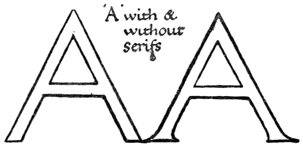
Fig. 209.
Beauty of Form may safely be left to a right use of the chisel, combined with a well-advised study of the best examples of Inscriptions: such as that on the Trajan Column (see Plates I., II.) and other Roman Inscriptions in the South Kensington and British Museums, for Roman CAPITALS; and sixteenth and seventeenth century tombstones, for Roman small-letters and Italics.121 If the simple [p392] elementary form of the letter be cut firmly and directly, it will be found that the chisel will suggest how that form may be made beautiful. This may be shown, for example, by an attempt to carve a quite simple Incised letter with no Serifs and with all the strokes equally thick. In making the ends of the strokes nice and clean it will be found that there is a tendency to spread them into Serifs, and the letter is at once, in some sort, beautified (see fig. 209).
SIZE & SPACING
Drawing out.—Take paper and pencil, or what you will, and write out the words of the Inscription in Capitals, or small-letters (or both), without any regard to scale or the shape of the space the Inscription is to go in. The carver will then see easily of what letters and words his Inscription is composed. Next draw the shape of the Inscription space (say to 1 inch or 112 inch scale), and in that space set out the Inscription, either “Massed” or “Symmetrical,” as has been decided. The drawing should be neither scribbled nor elaborated. A good plan is to cut the lead of the pencil to a chisel shape. The natural thicks and thins of the letters (see p. 44) may then be produced easily and quickly. The carver will thus be able, after a little experience, to calculate quite easily what size he will be able to carve his letters, what space he will be able to leave between the lines, and what margins he can afford.122 [p393]
The Size of Lettering depends on where it is to go (i.e. outdoors or indoors, far away or near), the material to be used, and the space at the carver’s disposal.
Out of Doors letters should not, as a rule, be less than 114 inch high, more if possible.123
Indoors smaller lettering may be carved, but even then 1 inch is quite small enough, and that only in marble, slate, or the finest stones.
In such stones as Ancaster or Ham-Hill it is not possible to carve good letters less than 3 inches high.
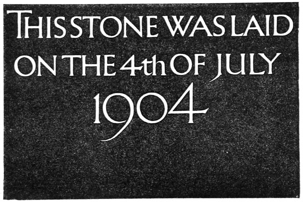
Fig. 210.
More than one size of letter may be used in the same Inscription to give emphasis to certain words, thus: on a Foundation Stone the Date (see fig. 210), [p394] and on a Tombstone the Name (see fig. 211), may be made larger than the rest.
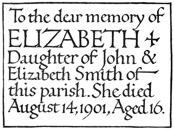
Fig. 211.
Spacing.—Proper spacing is essential to a good Inscription. As a general rule, Roman letters should not be crowded together. Space should be left between each, varying according to the letters—a narrower space between two O’s, for example, and, generally, a wider space between two straight letters. The lines may be about the height of the lettering apart (see Plate I.) or pretty close together (see Plate XXIV.).
Margins.—If the Inscription is to be carved in a panel, the surrounding mouldings take the place of margins, and the lettering may fill the panel (see fig. 211). If any space be left, let it come, as it [p395] naturally will, at the bottom. If the lettering is not to be in a panel, the margins depend primarily on what the carver can afford, and where the Inscription is to go. Every case must be treated on its own merits, but as a general rule one may say that the bottom margin should be the widest and the top margin the narrowest.
THE MATERIAL
The best quality a stone can have, from a letter-cutter’s point of view, is fineness or closeness of texture, combined with freedom from holes and flints or occasional shells, and the letter-cutter will do well to choose the stone himself, if possible, having regard to this quality.
The following is a list of a few of the best stones for outdoor and indoor use:—
Outdoors or Indoors. Portland.—Especially good for lettering on account of its fineness and its excellent weathering qualities, for it not only hardens on the surface, but also becomes quite white if exposed to wind and rain, thus showing very clearly any differences of light and shade. Hoptonwood Slate Fine and hard: good weathering qualities. Great delicacy may be attained in these. Ancaster Ham-Hill Ketton Only suitable for large lettering.
Indoors only. Clunch Chalk Very fine and delicate work may be done in these. Bath.—A cheap stone, and easily carved; but unsuitable for small lettering. Marbles and Alabasters.—Excellent for Inscriptions indoors, but much colour or veining tends to confuse lettering.
SETTING OUT
The stone being ready for the setting out, i.e. smoothed and cleaned, lines are ruled on it for the lines of lettering and margins with a pencil or point. If the Inscription is to be arranged “Symmetrically,” a centre line is ruled from top to bottom.
The carver should rule and set out one line and carve that before ruling another, as pencil marks are liable to be rubbed off by the hand in carving.124
In “Setting Out,” the spacing of the letters is thought of rather than their forms. And though the beginner may find careful drawing helpful, the forms which may best be produced with the chisel are found only by practice and experience (p. 399).
TOOLS
The chisels needed for simple work are flat chisels of the following sizes:—
116 inch,
14 inch,
38 inch,
12 inch,
1 inch.
The shanks should be about 7 inches long.
It will be found useful to keep a few “Bull-nosed” chisels (see 7, fig. 212) for use in cutting curves, and a few “skewed” chisels (8, fig. 212) for use in cutting the background of Raised letters, as a chisel of that shape is more easily used in a corner.
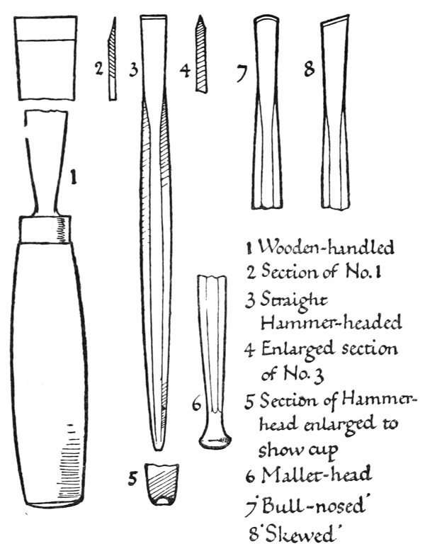
Fig. 212.
The chisels are either Hammer-headed or Mallet-headed, or they may have wooden handles [p397] (see fig. 212, and pp. 401–2). The Hammer-headed are the most used, and a good number should be procured. The best are made with cupped ends, to prevent them from slipping on the hammer (see 5, fig. 212). [p398]
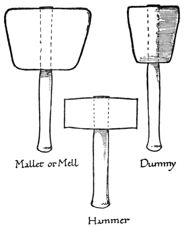
Fig. 213.
Temper and Sharpness.—Above all things the chisels must be of the right temper, and sharp.125 They may be tempered by a smith or tool-maker—if the craftsman can do it for himself, so much the [p399] better. They are sharpened on a piece of Grit-stone (hard York stone, for instance) with water. The Temper of a chisel may be seen by the colour (blue shows a soft or low-temper, straw colour a hard or high temper), and felt by the way it rubs on the Grit-stone (a hard tool will slide easily over the stone, while a soft one will seem to stick or cling).126
Mallets.—A wooden mallet or Mell, a Zinc mallet or Dummy, and an iron or steel hammer are required (fig. 213).
The Mell is made wholly of wood, and should, for letter cutting, be about 512 inches in diameter.
The Dummy has a head of zinc and a wooden handle. It should be about 212 inches in diameter.
The hammer should be about the same size and weight as the Dummy.
A RIGHT USE OF THE CHISEL
The workman must find out, for himself, how best to use his tools. In the ordinary way, it is best to hold the chisel at an angle of about 45° with the surface of the stone—in the manner shown in fig. 214—in cutting both straight stems and curves. The chisel is held firmly (usually in the left hand, with the little finger about an inch from the cutting end of the chisel) and tapped rather than banged, and lightly rather than heavily.
The best way to cut a letter is to start at the extreme left-hand point of the bottom Serif, and, working upwards, to cut the left side of the stroke first. Then start similarly at the extreme right-hand point of the bottom Serif, and cut the right side of the stroke. Then finish the Serifs. [p400]
When cutting a curve, cut the inside first (fig. 214), and start as near the narrowest part of the curve as possible.
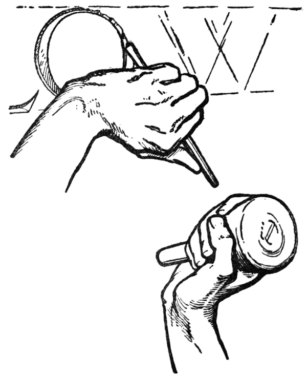
Fig. 214.
In Incised letters unnecessary junctions of the parts may be avoided (see fig. 215). Where they are necessary, as in a capital E, or in a small y, cut [p401] away from the junction or down on to it, rather than towards it.
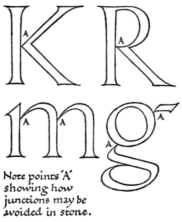
Fig. 215.
The Mallet-headed and wooden-handled chisels are used with the Mell for large work and for cutting surfaces. [p402]
The Hammer-headed chisels are used with the hammer for ordinary work, and with the Dummy for small and delicate work.
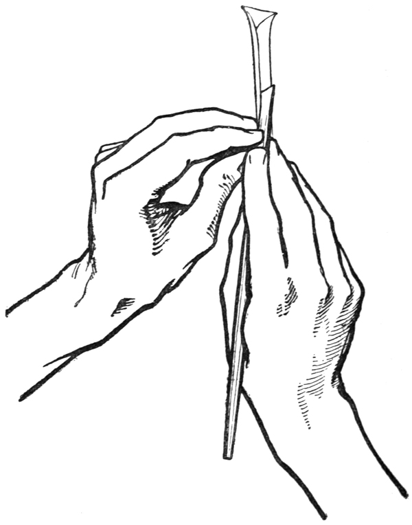
Fig. 216.
A Mallet or Dummy is not used in carving chalk, but the chisel is pushed; the right hand doing the pushing, and the left hand guiding and steadying the chisel (see fig. 216). If the chisel [p403] were struck, the surface of the chalk would flake off.
In cutting an Incised Inscription with the ordinary “V” section (see fig. 217), use one size of chisel throughout. The width of the chisel should generally be about the width of the letter stem required. More elaborate sections necessitate the use of several sizes of chisels.
INCISED LETTERS & LETTERS IN RELIEF
Inscriptions may be Incised or in Relief, that is, sunk or raised.127 The modus operandi and the time spent in carving the actual letters are the same in either case, but whereas when the Incised letter is carved there is nothing more to be done, after the carving of the Raised letter there is still the stone surrounding it (i.e. the background) to be dealt with, and this may simply be carved smooth,128 or, if our imagination be strong enough, and our hand have the cunning, it may become under the tool a field of roses and lilies in which the letters are set.
Other things being equal, it becomes a question of economy which form of lettering one will carve, as the necessity of dealing with the background of a Raised Inscription, while more than doubling the opportunities of the carver, at least doubles the time spent in carving.
Raised lettering will show out more clearly than Incised lettering where there is little light. [p404]
Roman Capitals are more adapted for carving in Relief than are Roman small-letters or Italics, which are directly derived from the pen.
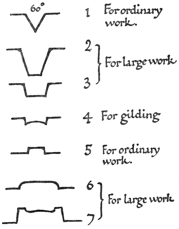
Fig. 217.
Raised lettering is more allied to ordinary carving, while Incised lettering may be thought of as writing in stone. [p405]
THE SECTIONS OF LETTERS
For Incised letters, a “V” section (1, fig. 217) of about 60° is best for regular use; deeper rather than shallower. The letters may with advantage be cut a little deeper towards the Serifs (see fig. 218).
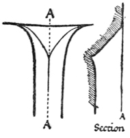
Fig. 218.
Although the simple “V” section is the most useful, other sections may be used for large letters (i.e. letters more than 6 inches high), or letters in a very fine material (2 & 3, fig. 217).
If the lettering is to be gilded, and the stone will permit of it, Section 4 (fig. 217) is a good one to use. Only the curved part is to be Gilded, and not the small bevelled sides.
For Raised letters, the best and most useful section is No. 5; the slightly bevelled sides tell as part of the letter. Experience, and the weathering conditions, will suggest the amount of Relief to be given. For letters 112 inch high, out of doors, 316 inch of relief is ample, and if there be good light 18 inch is enough. Excessive relief looks clumsy.
Sections Nos. 6 and 7 are suitable only for large letters; and elaborate sections should as a rule be used only for letters standing alone.
WORKING IN SITU
If possible the carver should work in situ. When that is impracticable,129 he should consider most carefully where his Inscription is to go. [p406]
In an Inscription which is much above the eye level, the letters may be narrower in proportion to their height, and the horizontal strokes extra thick to allow for foreshortening. (See also pp. 351, 270.)
The advantages of working in situ are great, for by so doing the carver sees his job as he works under the same conditions of light and environment that it will finally be seen under, and the work is more likely to become a part of the place because it has grown there.
And it is good to carve an Inscription on the actual wall of a fine building, and better still to work in the inspiriting atmosphere of building in progress, or to work in the open air where the artificial notions of workshop or studio are dissipated and the feeling of life and freedom gained.
FOOTNOTES TO APPENDIX B: