Part 2 — CHAPTER XIV GOOD LETTERING——SOME METHODS OF CONSTRUCTION & ARRANGEMENT Good Models — The Qualities of Good Lettering — Simplicity — Distinctiveness — Proportion — Beauty of Form — Beauty of Uniformity — Right Arrangement — Setting Out & Fitting In — “Massed Writing” & “Fine Writing” — Even Spacing — Theory & Practice.
Reading edition
CHAPTER XIV GOOD LETTERING——SOME METHODS OF CONSTRUCTION & ARRANGEMENT Good Models — The Qualities of Good Lettering — Simplicity — Distinctiveness — Proportion — Beauty of Form — Beauty of Uniformity — Right Arrangement — Setting Out & Fitting In — “Massed Writing” & “Fine Writing” — Even Spacing — Theory & Practice.
GOOD MODELS
If lettering is to be rightly constructed and arranged, the study of good models is essential. Some of the writing and lettering in the old MSS., and the letters used on various old tombstones and brasses, weeded of archaisms, will be found almost perfect models. Yet to select one of these from the many which are “more or less” good, requires much discrimination.
It is suggested below that the essential virtues of good lettering are readableness, beauty, and character. If, then, we can discover some of the underlying qualities which make for these, our choice will at least be better considered, and instead of [p238] forming our “style” on the first type of letter that pleases, we shall found our work on a good model, full of possibilities of development.
The Roman Capital (Chap. XV.).—The ancestor of all our letters is in undisputed possession of the first place: but it is open to comparatively few to make a practical study of its monumental forms by means of cutting inscriptions in stone with a chisel.
The Pen-formed letters are more easily practised, and the mastery of the pen acquired in the practice of a root form—such as the half-uncial—is the key to the majority of alphabets (which are pen developed) and to those principles underlying the right construction and arrangement of lettering, which it is our business to discover.
Doubtless a “school” of lettering might be founded on any fine type, and a beautiful alphabet or fine hand might be founded on any fine inscription: but the practical student of penmanship may be sure of acquiring a knowledge of lettering which would be useful to any craftsman concerned with letters, be he printer, book-illustrator, engraver, or even inscription carver.
THE QUALITIES OF GOOD LETTERING
The first general virtue of lettering is readableness, the second, fitness for a given Use. And the rational basis of the following summary is the assumption that such fitness is comprised in beauty and character, and that a given piece of lettering having readableness, beauty, and character has the essential virtues of good lettering.
The qualities on which these virtues seem chiefly to depend, and their special significations in the case of plain writing, may be set forth as follows:— [p239]
THE QUALITIES OF GOOD WRITING
RIGHT FORM READABLENESS 1. Simplicity: As having no unnecessary parts (and as being simply arranged: see 6). 2. Distinctiveness: As having the distinguishing characteristics of each letter strongly marked (and the words distinctly arranged: see 6). 3. Proportion: As having no part of a letter wrongly exaggerated or dwarfed (and as the lettering being proportionally arranged: see 6). BEAUTY 4. Beauty of Form: As having beautiful shapes and constructions, so that each letter is an individual and living whole (not a mere collection of parts) fitted for the position, office, and material of the object bearing the inscription. 5. Beauty of Uniformity: As the assimilation of the corresponding parts—“bodies,” “limbs,” “heads”—and as the “family likeness” of the different letters, so that they go well together.
RIGHT ARRANGEMENT BEAUTY 6. Beauty of Arrangement: As having a general fitness in the placing, connecting, and spacing of letters, words, and lines, in the disposal of the lettering in the given space, and in the proportioning of every part of the lettering and its margins.
RIGHT EXPRESSION CHARACTER 7. Essential qualities of (Hand and Pen) work: As being genuine calligraphy, the direct outcome of a rightly made and rightly handled pen. (See p. 278.) 8. Freedom: As having skilled and unaffected boldness. (See pp. 122, 327, 323, 369.) 9. Personality: As having the characteristics which distinguish one person’s hand from another’s. (See also pp. 278, 323.)
[p240]
This summary, while not presuming to define the Virtues, or achieve Beauty by a formula, does indicate some guiding principles for the letter-maker, and does suggest a definite meaning which may be given to the terms “Right Form,” “Right Arrangement,” and “Right Expression” in a particular craft.
It is true that “Readableness” and “Character” are comprised in Beauty, in the widest sense; but it is useful here to distinguish them: Readableness as the only sound basis for a practical theory of lettering, and Character as the product of a particular hand & tool at work in a particular craft.
The above table, therefore, may be used as a test of the qualities of any piece of lettering—whether Manuscript, Printing, or Engraving—provided that the significations of those qualities on which “Character” depends be modified and adapted to each particular instance. It is however a test for general qualities only—such as may help us in choosing a model: for as to its particular virtue each work stands alone—judged by its merits—in spite of all rules.
SIMPLICITY (As having no unnecessary parts)
Essential Forms and their Characterisation.—The “Essential Forms” may be defined briefly as the necessary parts (see p. 275). They constitute the skeleton or structural plan of an alphabet; and One of the finest things the letter-craftsman can do, is to make the Essential Forms of letters beautiful in themselves, giving them the character and finish which come naturally from a rightly handled tool. [p241]
If we take the “Roman” types—the letters with which we are most familiar—and draw them in single pencil strokes (as a child does when it “learns its letters”), we get a rough representation of their Essential Forms (see diagram, fig. 142).
Such letters might be scratched with a point in wax or clay, and if so used in practice would give rise to fresh and characteristic developments,53 but if we take a “square cut” pen which will give a thin horizontal stroke and a thick vertical stroke (figs. 10 and 40), it will give us the “straight-pen,” or simple written, essential forms of these letters (fig. 143).
These essential forms of straight-pen letters when compared with the plain line forms show a remarkable degree of interest, brought about by the introduction of the thin and thick strokes and gradated curves, characteristic of pen work.
Certain letters (A, K, M, N, V, W, X, Y, and k, v, w, x, y) in fig. 143 being composed chiefly of oblique strokes, appear rather heavy. They are lightened by using a naturally “slanted” pen which produces thin as well as thick oblique strokes. And the verticals in M and N are made thin by further slanting the pen (fig. 144).
To our eyes, accustomed to a traditional finish, all these forms—in figs. 143 and 144, but particularly the slanted pen forms—look incomplete and unfinished; and it is obvious that the thin strokes, at least, require marked terminals or serifs. [p242]
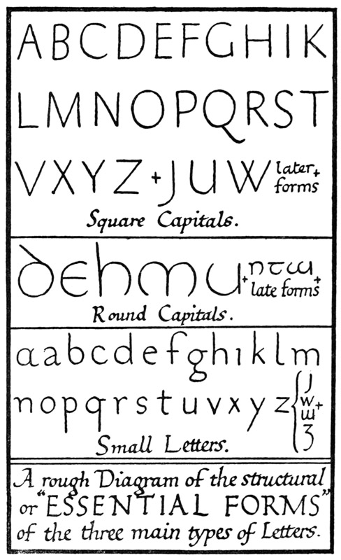
Fig. 142.
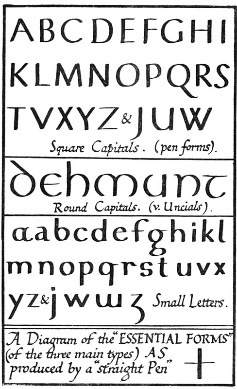
Fig. 143.
[p244]
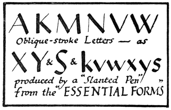
Fig. 144.
Finishing-Strokes.—The pen naturally produces a variety of finishing-strokes—“heads,” “feet,” serifs, &c.—each type of which strongly characterises the alphabet in which it is employed.
The main types (fig. 145) are—
(a) Hooks or beaks.
(b) Straight (or curved) strokes, thick or thin according to the direction of the pen.
(c) Triangular “heads” (and “feet”), straight or slanted, and more or less curved and sharpened.
(d) Thin finishing-curves, horizontal or oblique.
To give uniformity to the various letters of an alphabet it is necessary to treat similar parts as consistently as possible throughout (see No. 5, p. 239). And the remarkable way in which “heads” impart a “family likeness” to letters closely resembles the same phenomenon among human beings (see pp. 324, 254).
If we consider the four types of serif, as applicable to straight-pen writing, we find— [p245]
(a) Hooks or Beaks Suitable only for certain parts of certain letters (and for informal writing).
(d) Thin Finishing-Curves
(b) Straight (or Curved) THIN Strokes Informal (or Ornamental).
(c) Triangular “Heads” Formal and capable of imparting great elegance and finish.
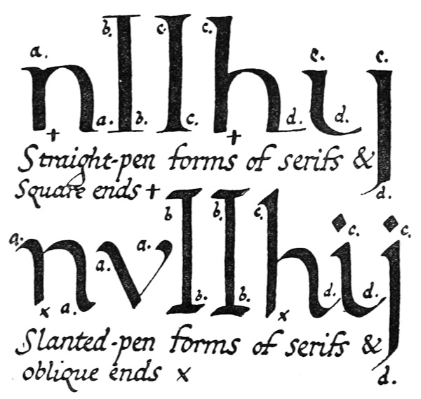
Fig. 145.
For a formal, straight-pen writing, therefore, we may assume that a form of triangular head is, on the whole, the most suitable, while some of the letters may be allowed to end naturally in finishing hooks and curves. [p246]
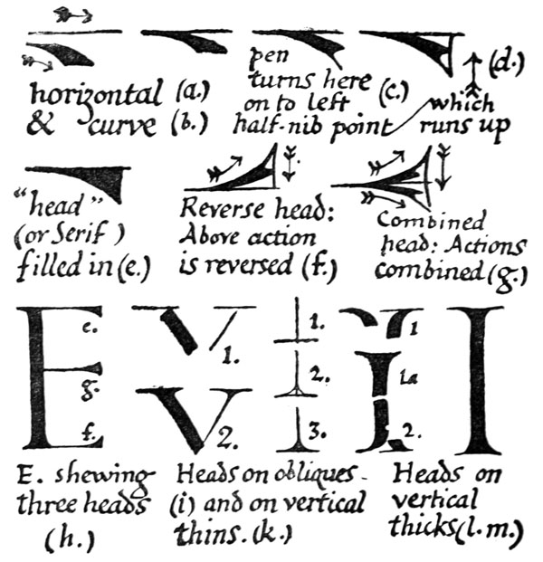
Fig. 146.
Heads are easily built up at the ends of thick strokes, but some practice is required to enable a penman to make them on the thin strokes properly and skilfully. On the thin horizontals they are made with an almost continuous movement of the point of the nib from the thin stroke itself (see (a) to (h) fig. 146) closely resembling the termination of some of the thin strokes in the Irish half-uncial (Plate VI.). On the thin oblique or vertical stems a thin crossing stroke is first made, and then shaped [p247] with the pen point to meet the stem (see (i) and (k) fig. 146).
We may write out the letters now with their suitable serifs, and we see that the Pen character and finish, given to the “Essential, or Skeleton, Forms” (fig. 142) result in a very formal and highly finished alphabet (fig. 147).
Slanted-pen characters and serifs (see fig. 145)—
(a) Hooks or Beaks Suitable for most of the letters, but tending to be informal.
(d) Thin Finishing-Curves
(b) Straight (or Curved) THICK Strokes Formal and strong.
(c) Triangular Heads Formal and suitable for small-letters, and free capitals (see fig. 168).
The alphabets (fig. 148), produced from the skeleton forms (fig. 142) by the slanted pen, while not having such a conscious air of finish as the straight-pen letters, are much easier to write, and have in a greater degree the virtues of strong,54 legible, natural penmanship.
They are eminently suitable for general MS. work (see p. 305) when the beginner has mastered an early form of round-hand (see pp. 70, 304).
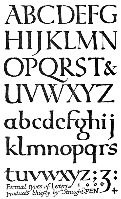
Fig. 147.
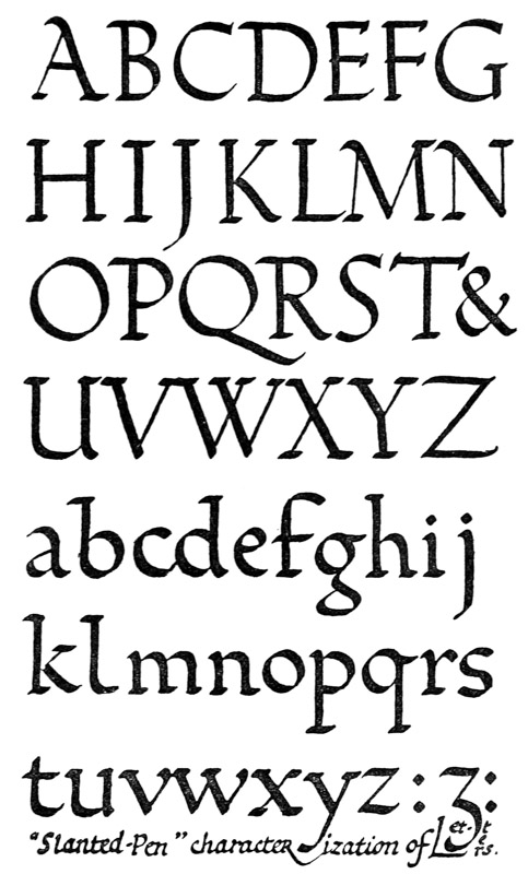
Fig. 148.
DISTINCTIVENESS (As having the distinguishing characteristics of each letter strongly marked)
The “Characteristic Parts” are those parts which most particularly serve to distinguish one letter from [p250] another (fig. 149). We should therefore, when constructing letters, give special attention to their preservation, and sometimes they may even be accentuated with advantage—always with an eye to the life-history, or evolution, of the letter in question, and allowing for the influence of the special tool with which it is to be made (see Proportion, below).
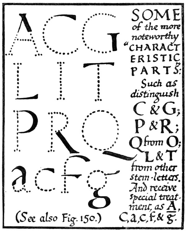
Fig. 149.
PROPORTION (As having no part of a letter wrongly exaggerated or dwarfed—see pp. 274, 277–78)
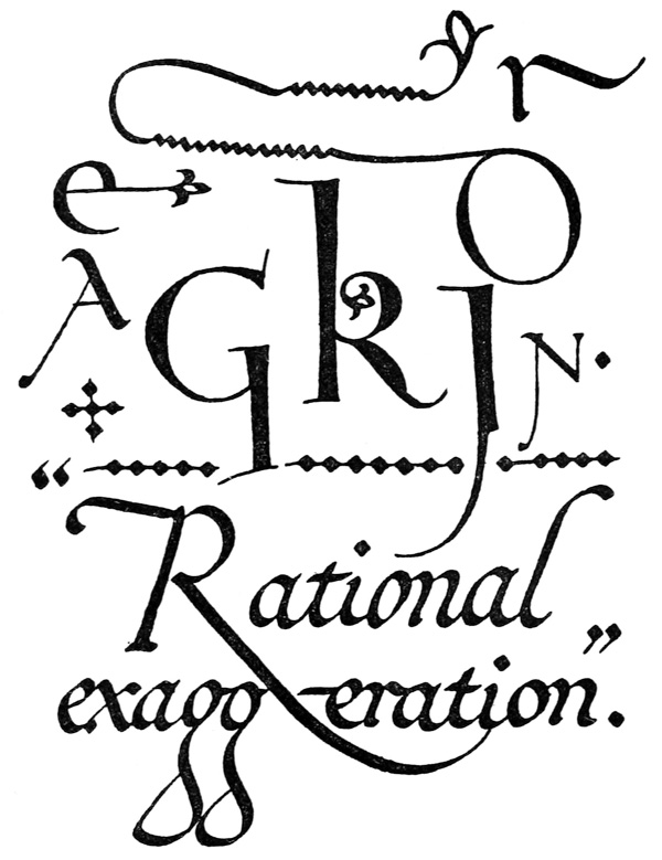
Fig. 150.
The right proportioning of letters entails the preservation of their Essential Forms and their Characteristic Parts, and, provided these are not [p252] seriously interfered with, a certain amount of exaggeration (and dwarfing)55 is allowable in special cases; particularly in ornamental writings, and Pen-flourished capitals or terminal letters (see figs. 79 and 125).
Rational exaggeration usually amounts to the drawing out or flourishing of tails or free stems, or branches—very often to the magnifying of a characteristic part (see fig. 150, & pp. 250, 331). It is a special form of decoration, and very effective if used discriminately.
BEAUTY OF FORM (As having beautiful shapes and constructions, so that each letter is an individual and living whole (not a mere collection of parts) fitted for the position, office, and material of the object bearing the inscription)
To choose or construct beautiful forms requires good taste, and that in its turn requires cultivation, which comes from the observation of beautiful forms. Those who are not accustomed to seeing beautiful things are, in consequence, often uncertain whether they think a thing beautiful or not. Some—perhaps all of us—have an intuition for what is beautiful; but most of us have to achieve beauty by taking pains.
At the least we are apt to be misled if we label abstract forms as essentially beautiful or essentially ugly—as by a mistaken recipe for beauty. For us as craftsmen “achieving beauty by taking pains,” means acquiring skill in a special craft and [p253] adapting that skill to a special piece of work. And perhaps the surest way to learn, is to let our tools and materials teach us and, as it were, make beautiful shapes for us.
“Inside Shapes.”—The beauty of a letter depends very much on its inside shape—i.e. the shape of the space enclosed by the letter form. As this is often overlooked, it may be briefly referred to. Frequently when it seems difficult to say what is wrong with a piece of bad lettering, a glance at the inside shapes will reveal the fault. In simple writing, if the pen be properly cut and properly held, these shapes will generally take care of themselves, and internal angles or asymmetrical lines which occur are characteristic of that particular form of penmanship, and not accidental (b, fig. 151).
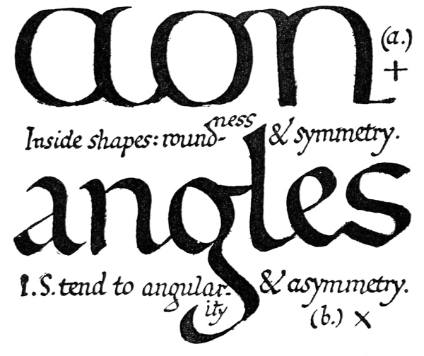
Fig. 151.
[p254]
In making Built-up letters—which have both outer and inner strokes—the inner strokes should generally be made first (see p. 121).
Plain and Ornamental Forms.—Not only for the sake of readableness, but to promote a beautiful and dignified effect, the forms of letters are kept simple when the text is long. And, generally, the less frequent the type, the more ornamental may be its form (see pp. 126, 210, 298, 330).
BEAUTY OF UNIFORMITY (As the assimilation of the corresponding parts—“bodies,” “limbs,” “heads”—and as the “family likeness,” of the different letters, so that they go well together)
Right uniformity makes for readableness and beauty, and is the result of good craftsmanship.
Readableness.—Where the text letters are uniform, the reader is free to give his attention to the sense of the words, whereas the variations in an irregular or changing text are distracting.56
Beauty.—The abstract beauty-of-uniformity may be said to lie in this, that the different letters, or individual elements, “go well together.” The beautiful effect of uniform lettering is thus caused by the united forces, as it were, of all the letters.
Good Craftsmanship.—A pen, or other letter-making tool, being handled freely and regularly, the uniform movements of the tool in similar cases will produce uniform strokes, &c. (On the other hand, the interruption and loss of freedom to the [p255] writer who is irregular, or who forces an unnatural variety,57 results in inferior work.)
RIGHT ARRANGEMENT
BEAUTY OF ARRANGE- MENT (As having a general fitness in the placing, connecting, and spacing of letters, words, and lines, in the disposal of the lettering in the given space, and in the proportioning of every part of the lettering and its margins)
The particular fitness of a given inscription depends upon considerations of its particular office, position, material, &c. (see pp. 100, 351). For general use, however, the craftsman has certain regular modes of disposing and spacing the lettering, and proportioning the whole. And, as in constructing individual letters, so in treating lettering as a whole, he endeavours to give his work the qualities that make for readableness: viz. simplicity, distinctiveness, and proportion.
Simplicity in the Disposal of the Lettering.—For convenience of construction, reading, or handling, the simple, traditional arrangement of lettering is generally followed in dealing with flat surfaces (paper, vellum, &c.):58—
Distinctiveness in the Spacing of the Lettering necessitates sufficient interspaces: the following common spacing of Letters, Words, Lines, &c., may be modified to suit special circumstances.
Letters, as a rule, are not equidistant, but their interspaces are approximately equal (a, fig. 152).
Words, commonly one letter-space apart (b and c).
Lines of Capitals, frequently half (d) or whole (e) letter-height apart. Lines of Small-Letters, commonly ascenders and descenders just clearing (f).
Divisions of Text a clear line apart, or marked by a difference in colour or size (see figs. 94, 96, 186, &c.).
Proportion in the Treatment of the Whole Inscription.—The spacing-proportions referred to above apply to lettering generally, but the proportions of an inscription as a whole involve the consideration of a special case. Example:—
The Proportions to be Considered in the Case of a Manuscript Book (see pp. 100–108, 341, &c.).
(1) Size and shape of the Book and its page (proportion of width to height) (see p. 103). (Set by custom, use of Book, size of material, &c.) (see figs. 69, 70, and pp. 101, &c.).
(2) Width of Margins— Proportions— (a) to each other. (b) to size of page. (c) to the lettering. (a) (Commonly about 112 : 2 : 3 : 4) (see fig. 70, and pp. 103–7). (b) (Frequently about, or more than, half the area of the page).
(3) Size of Writing— Proportion of height of letter to length of line. (Set by page, and margin, and number of words in the line; usually more than four words to the line) (see pp. 107–8).
(4) Number of lines— Proportion of text to page. (Set by page, margin, and height-of-letter, and modified by treatment of spacing) (see pp. 108, 262).
(5) Size of Large Capitals, Initials, &c. (Set by Small-Letter; commonly one, two, three, or more of the writing-line-spaces high) (see footnote, p. 221).
(6) Size of Decorative Divisions of the Text (marked by different treatment, colour, ornament, &c.). (Set by page, &c.; usually such Division is relatively small or large—as a definite “heading,” or a whole page) (see p. 132).
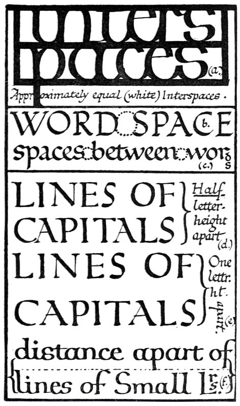
Fig. 152.
SETTING OUT, & FITTING IN
Ruling.—The approximate sizes of margins and letters, and the number of lines of text, having been estimated, guiding lines are ruled on the surface (see p. 343)—a right and a left vertical marginal line, with the necessary number of horizontals between them. (In the case of a manuscript, these lines are ruled faintly (or grooved), and are left to form a feature of the page; for inscriptions on other materials than paper, parchment, &c., they are generally removed after setting-out.)
Setting-out.—An inscription of any size, or one requiring complex or very nice arrangement, is set-out in faint, sketchy outline of lead pencil or chalk. Simple writing is not set-out, but such slight calculation or planning as is necessary is carried out mentally, or on a scrap of paper. By practice the scribe, like the compositor, can fit his lettering to the given space with ease and accuracy. For writing and (to a large extent) printing, both combine setting-out and the act of “lettering” in one operation. And this shows how practice gives foreknowledge of the “mechanical” part of the work, leaving the mind free to take pleasure in its performance; and also how slight—if necessary at all—is the experimental setting-out of simple forms required by the practised workman.
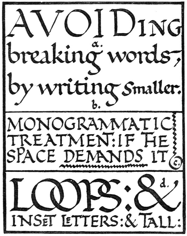
Fig. 153.
Dividing Monosyllables.—In simple writing—the beauty of which depends on freedom rather than on precision—I think that even such an awkward word as “through” should not be broken. If the space at the end of a line is insufficient, it should be left blank, or be filled in with a dash of the pen. But in the case of words in LARGE CAPITALS, especially in title-pages and the like, where spacing [p259] is more difficult, and smooth reading less essential, any word may be divided at any point if the necessity is sufficiently obvious. But (even when the division is syllabic) breaking words, as interfering with the ease of reading, may often be avoided with advantage, and divisions which give accidental words, especially when they are objectionable, as [p260] “TH-ROUGH,” or “NEIGH-BOUR,” should not be allowed. Among other ways of dealing with small spaces, without breaking words, are the following:—
Ending with Smaller Letters.—The scribe is always at liberty to compress his writing slightly, provided he does not spoil its readableness or beauty. Occasionally, without harming either of these, a marked difference in size of letter may be allowed; one or more words, or a part of one, or a single letter, being made smaller (a, b, fig. 153; see also Plate V.).
Monogrammatic Forms, &c.—In any kind of lettering, but more particularly in the case of capitals, where the given space is insufficient for the given capitals, monogrammatic forms resembling the ordinary diphthong Æ may be used; or the stem of one letter may be drawn out, above or below, and formed into another (c, fig. 153).
Linking.—Letters which are large enough may be linked or looped together, or one letter may be set inside another, or free-stem letters may be drawn up above the line (d, fig. 153, but see p. 26).
Tying up.—One or more words at the end of a line of writing—particularly in poetry (see p. 95)—may be “tied up,” i.e. be written above or below the line, with a pen stroke to connect them to it (fig. 67).
Care must be taken that none of these methods lead to confusion in the reading. Their “Quaintness”—as it is sometimes called—is only pleasing when their contrivance is obviously made necessary.
“MASSED WRITING” & “FINE WRITING”
We may distinguish two characteristic modes of treating an inscription, in which the treatment of the letter is bound up with the treatment of the spacing (fig. 154). [p262]
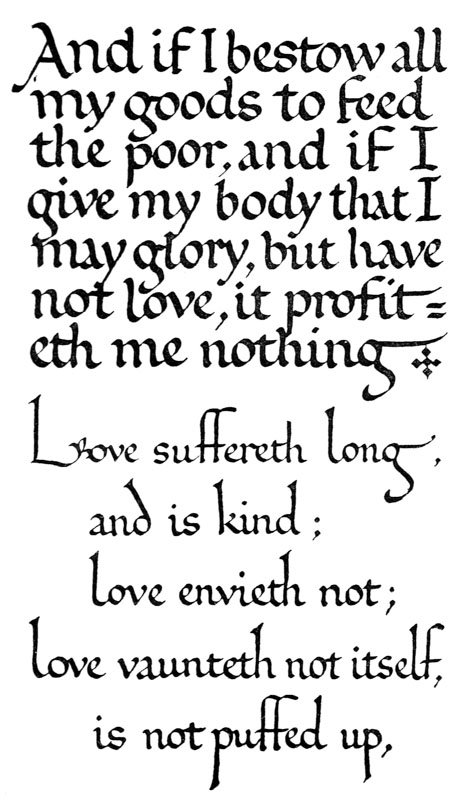
Fig. 154.
“Massed Writing” (Close Spacing).—The written or printed page is very commonly set close, or “massed,” so that the letters support and enforce one another, their individual beauty being merged in and giving beauty to the whole. The closeness of the letters in each word keeps the words distinct, so that but little space is required between them,59 and the lines of writing are made close together (ascending and descending stems being shortened, if necessary, for this purpose).
“Fine Writing” (Wide Spacing).—An inscription in “Fine Writing” may be spaced widely to display the finished beauty of the letters, or to give free play to the penman (or letter-craftsman). It consists generally of a number of distinct lines of Writing (or other lettering).
The two modes may be contrasted broadly, thus—
MASSED WRITING (Lines near together.) FINE WRITING (Lines spaced and separated.)
Has an effect of richness, depending on tone of mass and close, even spacing. Has an effect of elegance, depending on form of letters and distinct arrangement of lines.
Simple method (for ordinary use); saving of time and space, suited for long inscriptions or small spaces. Refined method (for special use); lavish of space and time, suited for large spaces or short inscriptions.

Lines generally of equal length, or if some fall short, end-fillings may be used—gaps are avoided if possible. Lines may be of unequal length, giving irregular, right-hand edge, as in poetry (see p. 263)—gaps allowed on either side.[p263]
Ascending and descending stems—medium or short: serifs simple, and not strongly marked. Stems—medium or long: long stems often a marked feature, ending in carefully made heads and feed, or flourishes.
Suited for slanted-pen forms of “gothic” tendency, and heavy, black writing (example, “black letter”).* Suited for straight and slanted pen forms of “roman” tendency, and slender, light writing (example, “Italic”).*
Requires generally contrasts of colour or weight (p. 330), and will bear more and heavier illumination (Line-fillings, Initials, Borders, &c.). Allows variety in size of Letters (see pp. 298, 328): its typical treatment is as plain, fine lettering—better without heavy Borders, &c. (p. 299).
* Note.—Both modes are suited for Roman Capitals and Small-Letters.
These two modes may not have been recognised by the ancient letter-craftsmen: their comparison here is intended chiefly as a stimulus to definite thought, not as a hard-and-fast division of two “styles”; for there may be any number of possible compromises between them. In practice, however, it will be found convenient to distinguish them as two modes of treating LINES OF WRITING which produce markedly different effects, the one, as it were, of COLOUR, the other of FORM.
Plates XI., XIII., XIV., XV., XVII. may be taken as examples of “Massed Writing,” Plates IV., V., VI., VII., IX., (XXI.) of “Fine Writing”; the other plates suggest compromises between the two.
Poetry (see p. 95), or any text consisting of, or which is conveniently broken up into unequal lines, may be treated as “Fine Writing.” There is no objection to a straight left-hand edge with an irregular right-hand edge,60 where the cause of the irregularity [p264] is natural and obvious, and no fault of the scribe’s. Such an arrangement, or rather, straightforward writing, of poetry is often the best by virtue of its freedom and simplicity (see p. 371).
In many cases, however, a more formal and finished treatment of an irregular line text is to be preferred (especially in inscriptions on stone, metal, &c.), and the most natural arrangement is then an approximately symmetrical one, inclining to “Fine Writing” in treatment. This is easily obtained in inscriptions which are previously set-out, but a good plan—certainly the best for MSS.—is to sort the lines of the text into longs and shorts (and sometimes medium lines), and to set-in or indent the short lines two, three, or more letters. The indentations on the left balance the accidental irregularities on the right (fig. 154, and Plate IV.), and give an appearance of symmetry to the page (see Phrasing, p. 384).
Either mode of spacing (close or wide) may be carried to an unwise or ridiculous extreme. “Leading” the lines of type was much in vogue a hundred years ago, in what was then regarded as “high-class” printing. Too often the wide-spaced line and “grand” manner of the eighteenth-century printer was pretentious rather than effective: this was partly due to the degraded type which he used, but form, arrangement, and expression all tended to be artificial. Of late years a rich, closely massed page has again become fashionable. Doubtless there has been a reaction in this from the eighteenth century to an earlier and better manner, but the effect is sometimes overdone, and the real ease and comfort of the reader has been sacrificed to his rather imaginary æstheticism.
By attaching supreme importance to readableness, [p265] the letter-craftsman gains at least a rational basis for his work, and is saved from the snares which lurk in all, even in the best, modes and fashions.
EVEN SPACING
In the spacing of a given inscription on a limited surface, where a comparatively large size of letter is required, what little space there is to spare should generally be distributed evenly and consistently (a, fig. 155). Lavish expenditure of space on the margins would necessitate an undue crowding61 of the lettering (b), and wide interspacing62 would allow insufficient margins (c)—either arrangement suggesting inconsistency (but see p. 352).
Note.—A given margin looks larger the heavier the mass of the text,63 and smaller the lighter the mass of the text. And, therefore, if lettering be spread out, as in “Fine Writing,” the margins should be extra wide to have their true comparative value. The space available for a given inscription may in this way largely determine the arrangement of the lettering, comparatively small and large spaces suggesting respectively “Massed Writing” and “Fine Writing” (see p. 262).
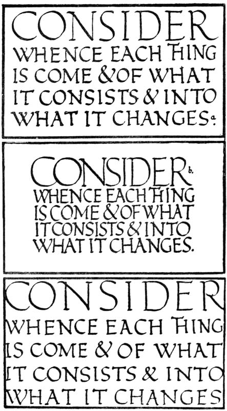
Fig. 155.
In certain decorative inscriptions, where letters are merely treated as decorative forms—readableness [p267] being a matter of little or no moment—the treatment of the spacing is adapted to a particular surface; and, for example:—
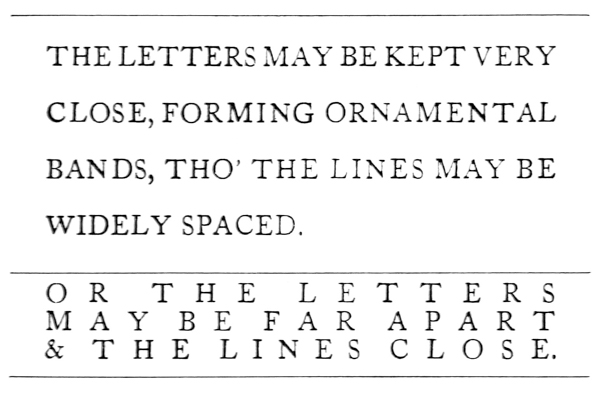
Fig. 156.
THEORY & PRACTICE
The above discussion of theories and “rules” for the construction and arrangement of good lettering is intended to suggest some useful methods—not to provoke excessive fitting or planning, but rather to avoid it. Straightforwardness is perhaps the greatest virtue in a craft, and whatever “rules” it may break through, it is refreshing and charming.
An excellent example for the scribe or inscription maker is the method of an early printer, who had only four or five sorts of type—say, “Small-Letters” and “Capitals” (Roman and Italic) and “Large Capitals,” and who, without any elaborate “design,” simply put his types into their proper [p268] places, and then pulled off his pleasant sheets of “commonplace” printing.
The scribe should choose the best and simplest forms and arrangements, and master them before going further; he should have a few definite types “at his finger tips,” and, for everyday use, a matter-of-course way of putting them down on paper.
Ambiguity is one of the greatest faults in a craft. It comes often from vague ambitions. One may be inspired by good ambitions, but the immediate concern of the craftsman is to know what he is capable of doing at the present, and to do it.
Let the meaning of your work be obvious unless it is designed purely for your own amusement. A good craftsman seeks out the commonplace and tries to master it, knowing that “originality” comes of necessity, and not of searching.