Part 1 — CHAPTER VII VERSAL LETTERS & COLOURED CAPITALS Development of Versals — General Analysis of Versals — Notes on Construction of Versals — Spacing & Arrangement of Versals.
Reading edition
CHAPTER VII VERSAL LETTERS & COLOURED CAPITALS Development of Versals — General Analysis of Versals — Notes on Construction of Versals — Spacing & Arrangement of Versals.
DEVELOPMENT OF VERSALS
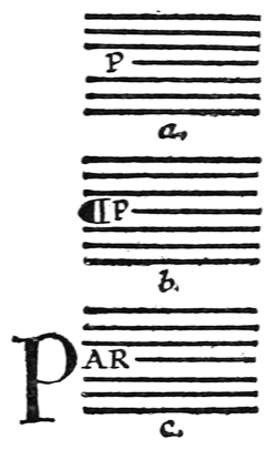
Fig. 78.
The earliest books consisted of a number of lines of continuous writing in capital letters. There were seldom any divisions of the text—into paragraphs, chapters, or the like—or even of one word from another; nor were important words distinguished by larger initials. The first division of paragraphs was made by a slight break in the text and a mark; later, the first letter of the first complete line of the new paragraph was placed in the margin and written larger. When “small-letters” were evolved, capitals ceased to be used for the body of the text, and became distinguishing letters for headings and important words. [p113]
The capitals written at the beginnings of books, chapters, and paragraphs grew larger and more ornamental, and at length were made in colour and decorated with pen flourishes. Such letters, used to mark the beginnings of verses, paragraphs, &c., were called “Versals.”23
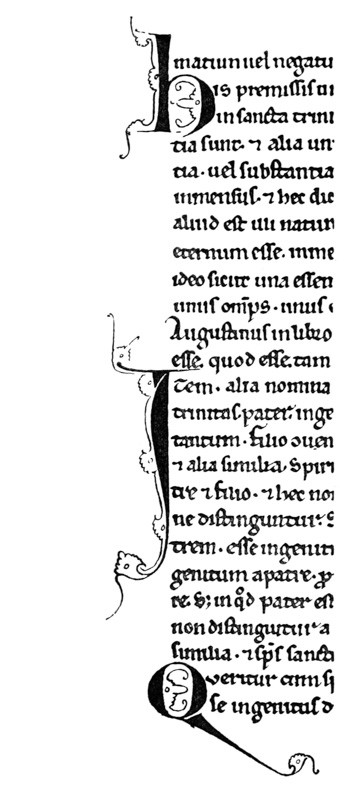
Fig. 79. (13th century).
In modern printing and ordinary writing the first line of a paragraph is generally indented (a, fig. 78), but the earlier method of employing a special mark or letter (b or c) is more effective, and it might very well be used, even in modern printed books, for fine editions. Affording a legitimate opening for illumination and book-ornament, it was (and is) the natural method for the penman, who, starting with these useful capitals, by flourishing them—in their [p114] own colour, or by dotting, outlining, or ornamenting them, with a contrasting colour (see fig. 79, from an old MS.), evolved the Illuminated Initial.
Types of Versal Letters (examples: Plates IX., X., XI., XII., and fig. 1, 78 to 94, 150, 161, 165, 166, 189).—The earlier Versals had very simple and beautiful pen shapes, and are the best models for the modern penman to follow. After the fourteenth century they were often fattened and vulgarised and overdone with ornament. In this way they not only lost their typical forms; but their “essential forms”—as letters derived from the Roman Alphabet—became much disguised and confounded (see fig. 128).
GENERAL ANALYSIS OF VERSALS
1. THE LETTERS (Pen-made), Built-up, Ornamental (coloured), “Gothic” Capitals (Round and Square forms).
2. HORIZONTALS—
STRAIGHT: Medium—commonly the width of the nib.
CURVED: Thin—the thin stroke of the pen.
3. PERPENDICULARS: Built-up, slightly curved in on either side.
4. SERIFS: Long, thin, slightly curved.
5. LONG STEMS: Various (see p. 119, & figs. 84, 90).
6. SPACING—
Letters & Words: Various (see figs. 89, 92, 166).
Lines: Usually one or more of the line-spaces apart (see pp. 126, 128).
7. ARRANGEMENT: Singly: set in text or margin, or part in both (fig. 86).
Grouped: after large initials (fig. 92).
In Lines: wide or close, often one word to the line (fig. 89).
8. MEASUREMENTS: Stem width: commonly two or three widths-of-nib across thinnest part (fig. 165).
O height: commonly one, two, or more of the line-spaces.
9. COMPONENT PARTS: A has approx. 10 strokes & filling.
B has approx. 8 strokes & filling.
C has approx. 7 strokes & filling.
and so on (see fig. 81).
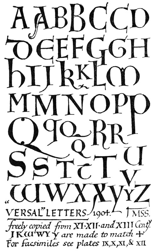
Fig. 80.
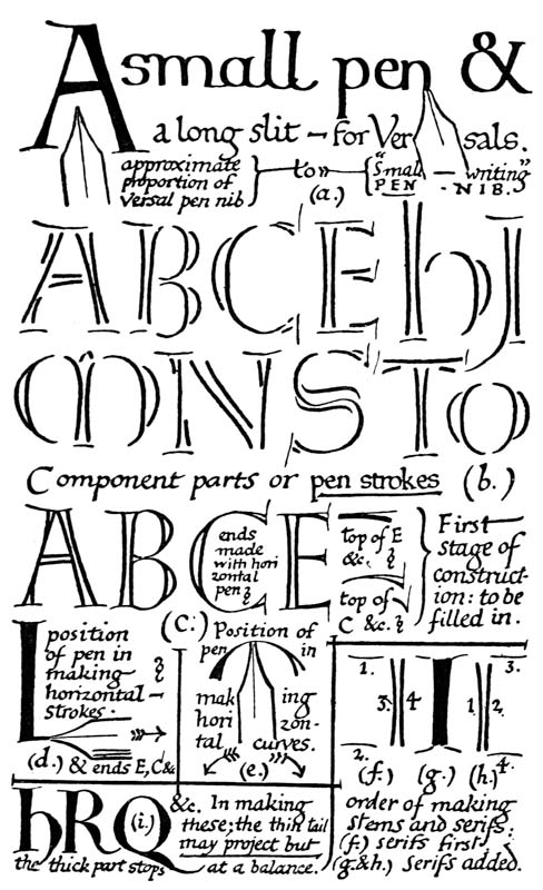
Fig. 81.
NOTES ON CONSTRUCTION OF VERSALS (See figs. 80, 81, 85, 165)
Versal Letters are properly built-up (p. 291) with true pen-strokes (b, fig. 81). Drawn or painted, they acquire a different character (p. 292). Their office being to mark important parts of the text, they are generally distinguished by colour and freedom of form—tending to curves and flourishes.
The pen has an extra long slit (12 inch to 34 inch), and the writing-board may be lowered (see fig. 46, b) to permit of the thick, liquid colour running out freely. The nib is of the ordinary shape (but not too oblique), and generally rather less in width than the nib used for the accompanying text (a, fig. 81).
The outlining strokes are quickly written and immediately filled in, each letter being loaded well with the colour, which thereafter dries evenly, with a slightly raised “flat” surface. The liquid colour should be fairly thick (see colour, p. 176).
“Gothic lettering” is a term used for “Black-letter” and related types, as distinguished from “Roman” types. “Gothic” capitals tend to roundness, the small-letters to angularity, but in each the abrupt change from thick to thin strokes, and the resulting contrast of stroke, are characteristics—the result of pen work.24 In Versals this contrast is marked; the ends of the thinner strokes spread (see Addenda, p. 25, & cross-bar of A, fig. 71), and the heavy parts are crossed by thin serifs. Versals may retain their pen character and yet approach [p119] the “Roman Letter” (p. 294), or be changed into the ornate “Lombardic” (p. 34). They are capable of great variety, and the “round” or “square” D, E, H, M, and W may be used at pleasure.
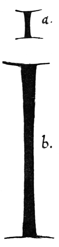
Fig. 82.
The Stems curve in slightly on either side. When they are very tall the mid part may be quite straight, imperceptibly curving out towards the ends (b, fig. 82). This gives an effect of curvature throughout the length, while keeping the letter graceful and straight. The head of a stem (especially of an ascender) should be slightly wider than the foot (fig. 83). This applies generally to every sort of built-up capitals.
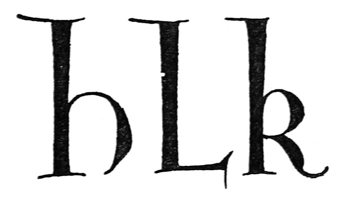
Fig. 83.
The stem width may be nearly the same in Versals of different heights (a, fig. 84): generally the letters tend to become more slender in proportion as the letters grow taller (b). Very large Versals (or initials) are often made with a hollow stem to avoid a heavy appearance (L, fig. 84). [p120]
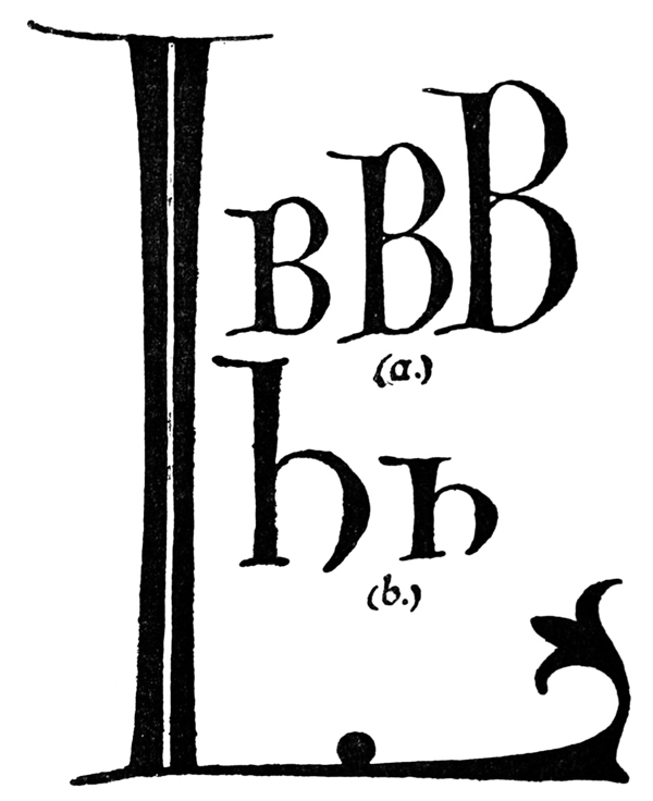
Fig. 84.
The Serifs are long and slightly curved in ornamental forms (fig. 79): shorter, and nearly straight in stiffer forms (fig. 166). In many cases the serifs appear to have been written first, the stems being added between them (f, fig. 81)—in old MSS. the stems often show ragged ends crossing the serifs. Sometimes the serif appears to have been added to the stem in two pieces, half on either side springing from the corners of the stem (g). The safest way seems to be the complete finishing stroke added to, and forming sharp angles with, the stem (h).
Arms or Branches.—Width of nib at start, and built-up at free end. (Pen horizontal, figs. 81, 165). [p121]
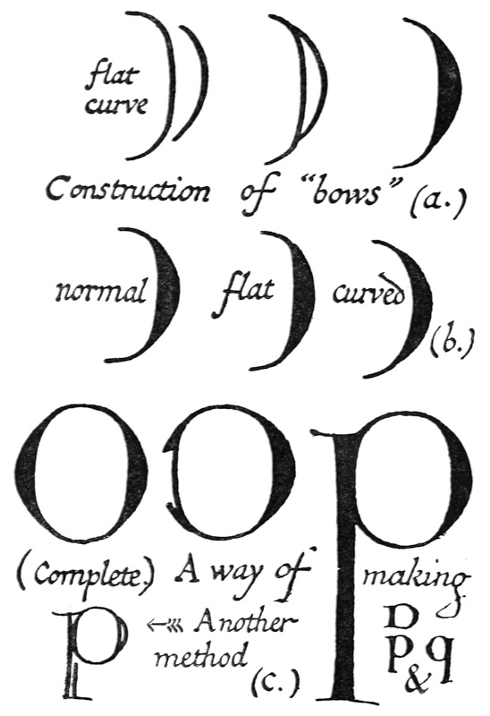
Fig. 85.
The Bows or Curves of Versals (and of built-up letters generally) are begun with the inside stroke—a rather flat curve: and finished with the outer stroke—a pronounced curve (a, fig. 85). This preserves [p122] the continuity of the interior curve, together with the clean contrast of the thick and thin strokes (see inside shapes, p. 253). The normal form may be flattened or curved a little (b), but exaggeration in either direction produces a degraded form. Part round letters, as D, P, and q, may be begun with a complete inner oval, or a nearly completed O (to which the stem is added); this preserves their interior symmetry (c).
The beauty and quality of Versal letters depends very much on their freedom; touching-up or trimming after they are made is apt to spoil them; and when good letters are made with a free hand, minute roughnesses, which are due to their quick construction, may be regarded as shewing a good rather than a bad form of care-less workmanship (see (c) fig. 164).
SPACING & ARRANGEMENT OF VERSALS
(Allowing for the special treatment of Versals called for by the extreme freedom and elasticity of their pen forms, the following remarks apply generally to the spacing and arrangement of coloured capitals in written pages)
Versals accompanying Small Text are generally dropped below the writing-line, so that their tops are level with the tops of the small letters (fig. 86).
Sizes of Versals.—Letters which are of the same importance—i.e. serve the same purpose—are usually of like size and form throughout; and the more important a letter, the more it tends to be elaborated and decorated (see figs. 90, 92).
Special words in Text marked by Versals.—Where coloured capitals are used throughout the text (fig. 92), the colours are usually varied (pp. 134, 185). [p123]
Line beginnings marked by Versals.—Where every line on a page begins with a coloured capital, the majority of the forms are kept rather plain (see (5) p. 136). They may be effectively treated as a band of simple or variegated colour (p. 136). This is a common treatment for a list of names or a poem; sometimes, especially if there are many lines, simple-written capitals (p. 297) may be used instead of Versals.
Verses or Paragraphs may be marked by Versals set in the text (a), or part in margin, part in text (b), or wholly in the margin (c, fig. 86). The marginal capital is the simplest, and it has the advantage of leaving the page of text entire; it may, however, sometimes be desirable to break the continuity by an inset capital, especially in cases of closely written text, or of stanzas not spaced apart (see p. 138).
The first word of a paragraph, which is begun with a Versal, is often completed in simple-written capitals of the same colour as the text (a, fig. 86).
Various ways of marking Paragraphs.—(a) The paragraph marks , ¶, preferably coloured, may be used instead of (or even with) Versals (comp. fig. 95); (b) by one word or line (or several words or lines) of simple-written (or built-up) capitals in black or colour (see fig. 93); (c) by some suitable ornament (see fig. 87); (d) in many cases it is well to have spaces between the paragraphs or verses (see p. 138).
Line-Finishings at the ends of Verses, &c. (pp. 205, 425), may be made with the Versal pens and colours. [p124]
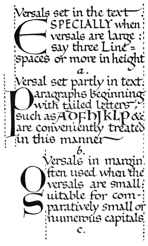
Fig. 86.
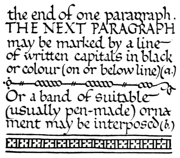
Fig. 87.
[p125]
To mark Chapters (or even Books), extra large Versals (fig. 88) may be used, in lieu of more elaborate initials. Smaller Versals may be grouped round about, beside or inside initials (p. 208 & fig. 92).
Headings and Pages in Capitals (see also pp. 128, 132).—Each line of capitals is generally kept uniform throughout its length,25 though different lines vary in size and colour (see fig. 89). If it be possible it is well to keep the individual word entire [p126] and to let the heading or page contain the complete initial phrase or sentence (see fig. 91).
Generally the greater the number of capitals the plainer their forms are kept, and the closer their spacing. It is best to keep to the regular method of spacing the lines of Versals one of the writing-line spaces (or more) apart—though in special cases the Versals may be independent of the writing-lines.
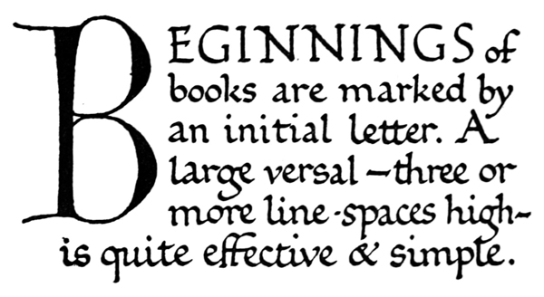
Fig. 88.
Spacing Out.—Coloured letters and ornaments are usually put in after the plain MS. has been written. A very little practice enables the scribe accurately to guess the amount of space which he should leave for the Versals, &c., whether it is designed to have several lines of them, or a single letter only on the page. A few pencil marks may be used to settle a doubtful point, but an elaborate sketching or setting out in pencil spoils the freedom of the work. [p127]