Part 1 — CHAPTER V ACQUIRING A FORMAL HAND: (4) PRACTICE Practice — Scripts I. & II. — Arranging & Ruling a Single Sheet — Problem I. (a Sheet of Prose) — Problem II. (a Sheet of Poetry) — Spacing & Planning Manuscript.
Reading edition
CHAPTER V ACQUIRING A FORMAL HAND: (4) PRACTICE Practice — Scripts I. & II. — Arranging & Ruling a Single Sheet — Problem I. (a Sheet of Prose) — Problem II. (a Sheet of Poetry) — Spacing & Planning Manuscript.
PRACTICE
In acquiring a formal writing the penman should have two paper books constantly in hand: one for the study of the forms of letters, the other for both the letters and their arrangement. The first should contain large and very carefully made writing—with perhaps only one word to the line; the second [p086] should have smaller and quicker writing, neatly arranged on the pages, with four or five words to the line. (See MS. Books, Chap. VI.)
A broad nib is used in preference to a narrow one, so that the characteristics of true pen-work are brought out and the faults made clear. A fine, light handwriting is often very pretty, but it is certain to mislead the novice in penmanship (see p. 324).
Having acquired a formal hand the penman may modify and alter it, taking care that the changes are compatible, and that they do not impair its legibility or beauty. Such letters as are obsolete he replaces by legible forms akin to them in feeling, and, the style of the selected type becoming very naturally and almost unconsciously modified by personal use, he at length attains an appropriate and modern Formal-Handwriting. The process of “forming” a hand requires time and practice: it resembles the passage of “Copy-book” into “Running” hand, familiar to us all (see p. 323).
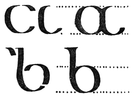
Fig. 58.
SCRIPTS I. & II.
Having cut the nib of a reed or large quill to the exact width required for the thick stroke, copy the component strokes of the letter (Script I.), and [p087] immediately make the complete letter: go through the whole alphabet in this way several times (fig. 58). Next join the letters together (see p. 73) [p088] to form words—writing always between ruled lines (fig. 59 & p. 414).

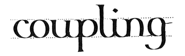
Fig. 59.

Fig. 60.
Script II. is similarly practised: the letters are grouped (p. 82) to form words (fig. 60).
Next make a neat page of large writing, and, if possible, write such a page every day. The more definite and methodical practice is, the better. “Practising” anyhow, on scraps of paper, does more harm than good.
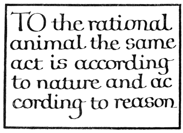
Fig. 61.
ARRANGING & RULING A SINGLE SHEET
The size of an inscription is commonly settled before the arrangement of the text is planned out, being determined by considerations of its future position and office, or by custom and use (see pp. 100–103 & 351). [p089]
The proportions of the writing, spacing, and margins will likewise properly settle themselves (see pp. 265, 103, 107), but where the size of the sheet only is fixed, we have, broadly speaking, to decide between “large” writing with “small” margins (fig. 61), and “small” writing with “large” margins (fig. 62).
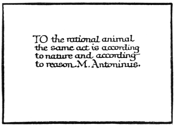
Fig. 62.
Generally a compromise is arrived at and the proportions are more evenly balanced (fig. 63).
Ruling (see also pp. 258, 99).—The mode of ruling marginal lines and writing lines is shown in fig. 65. The ruling should be light, but firm and accurate. A fine pen, or hard pencil, or a blunt point may be used. Where the writing lines are double (as for round hands, p. 304), it is best to have a double ruling point (see fig. 77). Two hard pencils firmly [p090] lashed together make a convenient tool for large work: the distance between the points is easily adjusted by means of a small wedge.
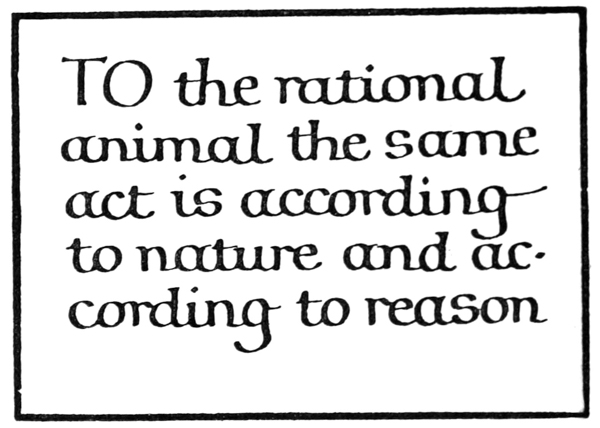
Fig. 63.
PROBLEM I. (A SHEET OF PROSE)
To write out the Pater noster (50 words) in a formal round-hand (arranged in “mass” of equal lines) on a sheet of “foolscap” (i.e. 17 inches high and 1312 inches wide).
If the size of the writing be considered of the first importance, a few words are written out in a script chosen to suit the subject, the space, &c., and these are measured to find the area which the whole text so written would occupy (fig. 64). The size of the script is then modified, if necessary, to suit the available area. [p091]
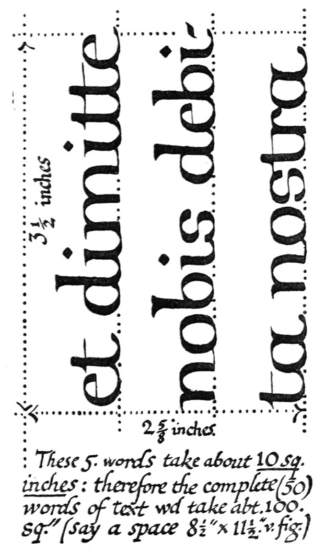
Fig. 64.
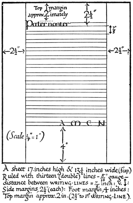
Fig. 65.
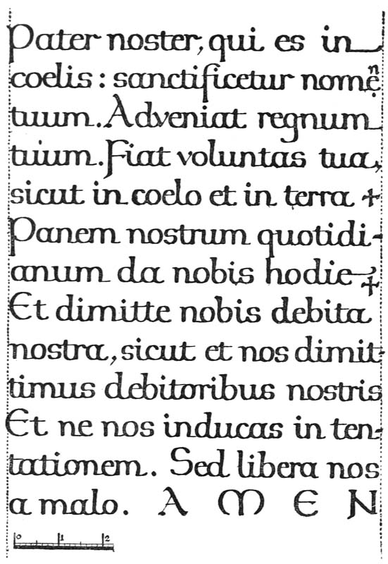
Fig. 66.
[p094]
Frequently it is desirable first to determine the sizes of the margins. These depend on various considerations of the position and office of the MS., but more particularly on the size of the sheet and the character of its future environment14 (see p. 351).
The top and side margins may be of equal width—or the top may be a little less (see a, fig. 70). Ample space should be allowed for the foot margin, which is generally about twice the width of the top, but may vary in different cases, according as the text falls short of or encroaches upon it (see pp. 352, 342). For a plain foolscap sheet: sides (each) 212 inches, top (approx.) 2 inches, and foot (approx.) 4 inches, may be taken as suitable margins (fig. 65).
The width of the sheet (1312 inches) less the two side margins (212 inches each) gives the length of the writing lines (1312 – 5 = 812 inches). One or two such lines are written experimentally in a suitable script (say, 516 inch), and the average number of words per line (four) is found.
The number of words in the complete text (fifty) will determine the number of lines: an extra line or so may be allowed for safety (504 = 1212, say, thirteen). The spacing of these is calculated—
516 in. writing requires about 78 in. (close) spacing (p. 79): Thirteen lines at 78 in. gives 1138 in. = depth of text: 1138 in. from 17 in. leaves 558 in.15 for head and foot margins
—and if the space is not sufficient, the writing is made a little smaller. If, on the other hand, the [p095] marginal depth left over were excessive, the writing might be made a little larger in order to fill up the space.
PROBLEM II. (A SHEET OF POETRY)
To write out “He that is down, needs fear no fall,” in a formal round-hand on a sheet of foolscap (i.e. 17 inches high × 1312 inches wide).
Here there are three verses of four lines each: these with two space lines, left between the verses, give a total of fourteen lines (fig. 67).
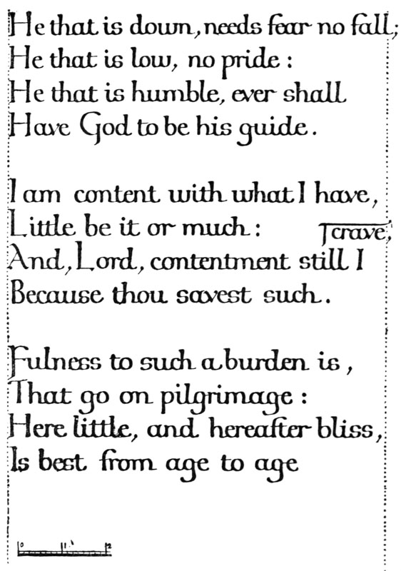
Fig. 67.
A poem has a given number of lines of various lengths, and only very strong reason or necessity can justify our altering its proper form (e.g. by breaking up the lines) in order to make a mass of equal lines. Such theoretical margins as are possible in the treatment of prose can therefore seldom be observed in writing out a poem, and, unless the height or the width of the sheet can be altered, there is apt to be an excess of margin in one or the other direction. When such excess margin is obviously unavoidable, no objection can be made to its appearance. Poetry may conveniently be treated as “fine writing” (see p. 263).
If the size of the writing be considered of the first importance, several of the longer lines (e.g. the first and the eleventh in the poem given) are written on a piece of paper in the size of writing preferred (say, 14 inch). By laying this paper on the given sheet, it is seen whether such lines would allow of sufficient side margins. (If they would not, the writing may be made smaller.)
The height of the writing (14 inch) must allow of the full number of lines (fourteen) being properly [p097] spaced on the sheet (17 inches) with sufficient head and foot margins. This is calculated—
14 in. writing requires approximately 34 in. spacing (p. 79): Fourteen lines at 34 in. gives 1012 in. = depth of text: 1012 in. from 17 in. leaves 612 in. for head and foot margins
—and if the space were not sufficient, the lines might be made a little closer, or the writing a little smaller (or, if necessary, the blank lines might be left out between the verses; p. 123).
The Sizes of the Margins.—It will be seen that the above method is primarily for settling a length of line which will allow of sufficient side margins. The process can be reversed; if necessary, the side margins are made of a given width, thus determining the exact length of the line, the size of writing which this line allows being found experimentally.
Note.—The extra long lines may slightly encroach on the right-hand margin: the effect of this is balanced by the falling short of other lines.
SPACING & PLANNING MANUSCRIPT
In penmanship great nicety of spacing and arrangement is possible. The ascending and descending strokes may be shortened or drawn out, the spaces between letters and words may be slightly increased or decreased, the lines may be written near or far apart, and the letters may be written with a broader or narrower nib.
Elaborate spacing and planning, however, should not be attempted at first, and straightforward, undesigned work is often the best. The student is apt to waste time writing out an elaborate draft [p098] in order to ascertain how to space the matter. This is a mistake, because if written well, it is a waste of good writing on a mere draft; if written ill, it is bad practice. The briefer experiments and calculations are, the better, though the simplest problem always requires for its solution a calculation or process of guess and trial (such as suggested in the preceding pages). Practice will make people very good guessers, and the best work of all is done when the worker guesses rightly, and follows his guesses with the actual work, itself the trial and proof of accuracy.