Part 1 — CHAPTER XII THE DEVELOPMENT OF ILLUMINATION44 The Development of Illumination — Line-Finishings — Initial Letters — Borders & Backgrounds.
Reading edition
CHAPTER XII THE DEVELOPMENT OF ILLUMINATION44 The Development of Illumination — Line-Finishings — Initial Letters — Borders & Backgrounds.
THE DEVELOPMENT OF ILLUMINATION
An art or craft is so largely dependent on the tools and materials which are used by the craftsman, that we may reasonably say that it begins with the tools and materials, through which it has been produced. Now, “illumination” can be traced back step by step to simple penmanship. And its true development is most graphically sketched by Ruskin (“Lectures on Art,” No. V.) when he says—
“The pen . . . is not only the great instrument for the finest sketching, but its right use is the foundation of the art of illumination. . . . Perfect illumination is only writing made lovely; . . . But to make writing itself beautiful—to make the sweep of the pen lovely—is the true art of illumination;” And also that those who have acquired “a habit of deliberate, legible and lovely penmanship in their daily use of the pen, . . . may next discipline their hands into the control of lines of any length, and, finally, add the beauty of colour and form to the flowing of these perfect lines.” [p205]
LINE-FINISHINGS
Line-finishings are used to preserve the evenness of the text when lines of writing fall short. When the space left is small, or occurs in the middle of a sentence, a quick stroke of the pen—often a continuation of the last letter, or springing from it—is sufficient (fig. 125); but where there are many and long gaps (as, for example, in a psalter at the ends of the verses), they may be filled in with dots (see Plate VIII.) or flourishes (a, b, c, fig. 126) either made in black with the script pen, or with another pen, in colour or gold.
Line-finishings commonly echo the treatment of the initials (see p. 181). In twelfth-century MSS. long delicate flourishes are commonly found, in red, blue, or green—matching the colours of the Versals, and probably made with the same pen. The latter being rather finer than the text pen keeps these flourishes from appearing too prominent (see e, f, fig. 126).
Such work should be simple and characteristic pen-work, showing the thicks and thins and crisp curves, the result of the position of the pen, which is usually “slanted” (see p. 43).
Bands of pen-made “geometrical” patterns—used with rather close writing—may be very simple and direct, though appearing pleasantly elaborate (see figs. 87 and (g) 126, Plate XIV., and pp. 215 & 25).
INITIAL LETTERS (See also pp. 16, 48, 112–14, 124, 134, 181, 188–193, 193–99, 211–15, and the Collotype Plates)
The development of Illumination proper was—and still is—bound up with the growth and decoration of the Initial Letter.
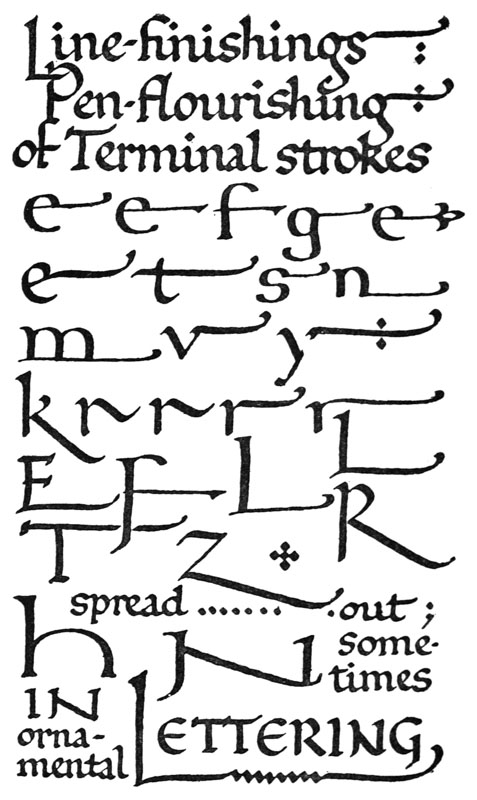
Fig. 125.
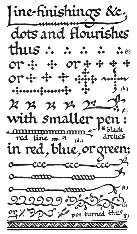
Fig. 126.
[p208]
The first step in this development is the mastery of the pen-made Versal letter, and the right treatment of simple coloured capitals (see chapters VII., VIII., and X.). The next step is their elaboration. The simplest ornamental treatment is found in the flourishing of a terminal of the initial letter (fig. 150), or the arrangement of the remaining letters of the word inside or beside it. Pen flourishes may consist of the simplest curved and zigzag strokes (sometimes springing from the actual letter: see p. 251), ending with a “twirl” of the pen in a loop or a “bud” (figs. 150, 79); or they may strike out a sort of formal floral pattern, filling or surrounding the initial (fig. 92), and such a pattern in its turn may spring from the letter into the margin, and grow into a complete “illuminated border” (see p. 199).
Hollow Letters.—A large capital is often made hollow, primarily with a view to lightening its appearance, which might be rather heavy if the letter were made solid (p. 119). The hollow—which is commonly left plain (i.e. the colour of the paper or parchment)—may be a mere line, straight or curved or zigzag (fig. 189), or a pattern, or lettering (fig. 89). Sometimes it is made large and filled in with a contrasting colour, leaving a white line, however, between the two colours. And sometimes half the letter is made in one colour, and the other half (on the opposite side of the hollow centre) is made in a contrasting colour. A “hollow” letter (especially if very large) may be strengthened and improved by a filling of colour or ornament. (Addenda, p. 25.)
“Woven” Forms.—A simple form of ornament (related to “Basket work”) which effectually strengthens the construction of a hollow letter—without impairing its lightness—consists in a crossing [p209] and “weaving” or knotting of its actual parts (fig. 127).
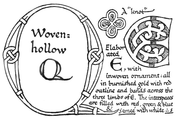
Fig. 127.
The elaborated (in fig. 127) is from a 10th or 11th century MS. (Brit. Museum, Egerton, 608). The Initial and its inwoven ornament cut up the background into a number of distinct parts (distinctly coloured). Note also that the entire background is contained by the Initial.

The “knot” (fig. 127), or a basket-work ornament, is sometimes used as an arbitrary starting-point for a filigree border (see p. 428) where an initial is lacking.
Variety in Initials.—The sizes and styles of the initials which are used for the same purpose throughout the book vary very slightly or not at all. Generally, the more important the division which the [p210] initial marks, the larger the initial and the more ornate (p. 298). A slight complexity in the opening letter or word of a book does not seriously interfere with the readableness of the book as a whole. The general rule is followed that the greater the number of (decorative) forms the plainer they are kept (see p. 126), and if a book contained an “initial” on every page, it would be both an artistic and a working economy (if there were many pages) to make the majority of them rather plain.
But however simple the treatment of the initials may be, there is still room for considerable variety of form or ornament or type—as “round” or “square” letters (see fig. 80, and especially Plate XI.). Such variety is found in the best work; it adds a liveliness and charm which are quite lacking where there is unnecessary or mechanical repetition.
“Lombardic” versus Roman Capitals.—The round, fat letters which are known as “Lombardic” (see fig. 1, and Plates XV., XVII.) have been generally used for “illuminated initials” in Northern Europe since the thirteenth century. But—though they are capable of very beautiful treatment—they are rather doubtful models for us to follow. The fact that such letters will always pack neatly into a square niche or background—though an obvious convenience—is not an unmixed advantage. And the majority of examples show a debased type of Letters—often so unlike their originals, and so like one another, as to be scarcely readable. For the sake of readableness the stems should be made longer (fig. 128). The more slender “Roman” type of initial, commonly used in Italy (Plate XVIII.), is in every way a more legible letter. The Roman Alphabet still remains the finest [p211] model, and it is better that fine lettering should be almost too slender and delicate, than that it should be at all heavy or clumsy.
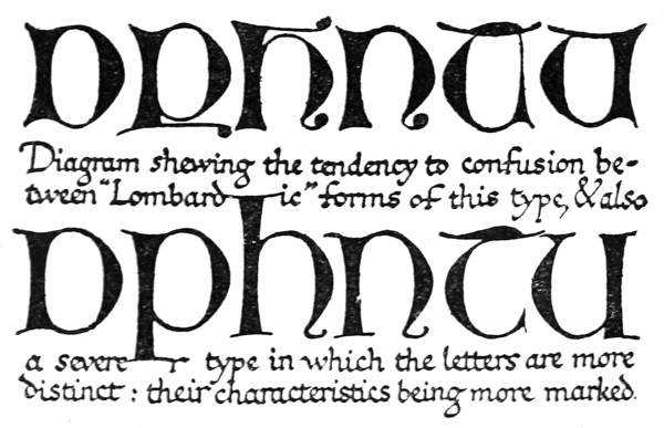
Fig. 128.
BORDERS & BACKGROUNDS
The illuminated border was originally an extension or branching out of the initial decoration. It commonly occupied the greater part of the left-hand margin, and from thence it extended into the head45 or foot margin (or into both), or completely surrounded the text, and even the eight margins of a [p213] complete opening are sometimes covered with illumination. In late and modern usage the border is frequently separated from the initial, constituting a “framing border.”46
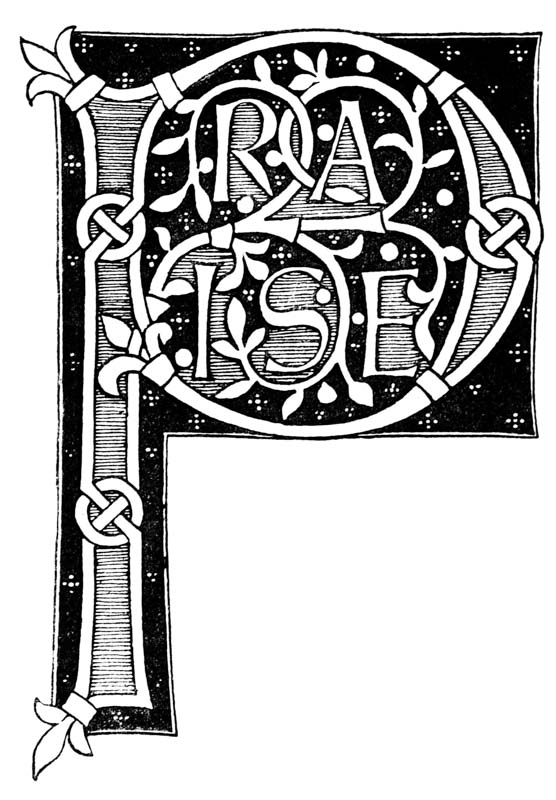
Fig. 129.
Note.—This diagram suggests a simple treatment of an initial word in colours and gold. The graphic method employed by heralds for indicating these—by lines and dots—is here discarded for the stronger contrasts of black, white, and “grey.”
The letters contained inside the initial P are kept distinct—(1) crimson (“grey” in diagram) being used solely for the patches of ground adjoining the (gold) letters, and for filling the hollow part of the (gold) P, the whole word stands out in crimson and gold; (2) the floral pattern is also in gold, but it does not cover or hide any part of the word.
The remaining ground is green inside and blue outside the P. The dots are in red on the green ground, in cream with a red centre dot on the blue.


The gold throughout is outlined black, and the blue ground has a black outline, separated from it by a white line.
In some MSS. there are two side-borders on a page, one springing from the Initials on the left, the other sending branches into the gaps on the right (see Plates XVII., XVI.). In some cases the two pages of an opening are balanced by a side-border in each of the wide side margins (p. 428).
Backgrounds of Initials (see pp. 188–193, 421–23) and borders are treated very similarly. It may be noted that, where a solid-stem pattern cuts up the ground into small pieces, these are often painted in different colours—commonly red, and green, and blue (see pp. 209, 430). And the groups of dots (fig. 129)—in white or other colours—may fill the interstices of a background, putting the finishing touch to the even covering and pleasant intricacy of the decoration (comp. p. 201). Or little flowers and leaves may be used instead—growing from a thin (white) stem which appears to twine throughout the main pattern—just as the smaller plants in a hedge creep and twine among the larger stems. There is no better model in nature for the illuminator than a country hedgerow. [p214]