Part 2 — NOTES ON THE COLLOTYPE PLATES (Note.—In order to make the illustrations [whether of facsimiles or enlargements] as large and as full as possible, I have sacrificed “appearance” to use and allowed most of the collotype plates, and many of the diagrams in the book, to encroach on the margins.—E. J.)
Reading edition
NOTES ON THE COLLOTYPE PLATES (Note.—In order to make the illustrations [whether of facsimiles or enlargements] as large and as full as possible, I have sacrificed “appearance” to use and allowed most of the collotype plates, and many of the diagrams in the book, to encroach on the margins.—E. J.)
GENERAL NOTE.—All the plates are in facsimile as to size (or nearly so, allowing for errors in reproduction) except I., II., XXII., and XXIV., which had to be reduced, and therefore only portions of the MSS. can be shown. Note.—All the MSS. are on “Vellum” (see p. 173). In order to get a better impression of the size and general proportion of a MS., the student might reconstruct it—or at least mark off the margins, text, &c.—on paper, from the measurements given. Or a sheet of paper might be cut to the size of the given page or opening, with an aperture (in its proper place) through which the plate might be viewed.
The plates are arranged in chronological order as nearly as possible. They are intended briefly to illustrate the Development of the Formal Book Hands from the Roman Capital and the General Development of the Illuminated MS.: I hope, moreover, that, fragmentary as they are, they will prove usefully suggestive in regard to the Arrangement of Text and Lettering and Ornament. The wonderful effect of the colouring cannot be given here, but, in any case, the illuminator should look at some original MSS. Several of the MSS. from which the plates are taken are exhibited in the British Museum.
PLATE I.—Portion of Inscription on base of Trajan Column,130 Rome, circa 114 A.D. Scale approx. 19th linear.
THE STONE (within the internal line of the moulding): 3 feet 9 inches high, and 9 feet 34 inch long. [p410]
THE BORDERS.—The lettering practically fills the panel (see p. 352): the surrounding moulding is approx. 4 inches wide.
THE LETTERS (for their forms see next note).
First two lines: 412
Second two lines: 438
Fifth line: 418
Last line: 378 All approximate heights, inches
THE SPACES (between Lines) decrease from 3 inches to 234 inches. A decrease in the height of the letters from the top to the foot line is common in early inscriptions (see figs. 203–205). Several reasons for this suggest themselves: (a) (Sometimes the beginning words, being farther from the reader, may require to be larger). (b) The architectural beauty of a large heading (comp. stem heads, p. 288). (c) The importance of beginnings generally (there is very often a marked difference between the upper lines containing important words and the rest of the inscription: comp. figs. 197, 91).
Note.—The WORDS are separated by triangular points (p. 384).
PLATE II.—Alphabet from Trajan Inscription. (Circa 114 A.D.) Scale approx. 16th linear. (See note above.)
THE “TRAJAN” ALPHABET.— Very fine letters for inscriptions in stone: possibly painted before incision (see p. 292); see also remarks on Roman Capitals, pp. 268–296, and note:—
SERIFS.—Small and carefully curved.
THIN PARTS about half the width of the thick stems (pp. 375, 285).
A (M and N), pointed (p. 280).
B—a very beautiful form, with large lower bow (p. 278).
C, G, and (D)—Upper parts rather straight (p. 281).
E and F—mid arm slightly shorter than upper arm.
E and L—lower serif pointed out (p. 282). [p411]
LO (shown sideways in collotype) and LT show L’s arm projecting under next letter.
M—pointed: slightly spread (p. 284), distance apart of points above equal to inside distance of stems below.
N—pointed: practically no difference in thickness of vertical and oblique parts (p. 285).
O—very beautiful: width slightly less than height (p. 270); slightly tilted (as are all the other curved letters: see p. 285).
P—Bow not joined to stem below (first P rounder topped).
Q—tail carried under V (U).
R—large bow: straight tail, with finishing-curve (p. 291).
S—leans forward slightly (p. 286).
Proportions of widths to heights (comp. with pp. 269–273)
OCDGMNQ width slightly less than height.
ARTV width approx. 16th less than height.
BX width rather more than half height.
P width approx. equal half height.
LS width slightly less than half height.
EF width approx. 37ths of height.
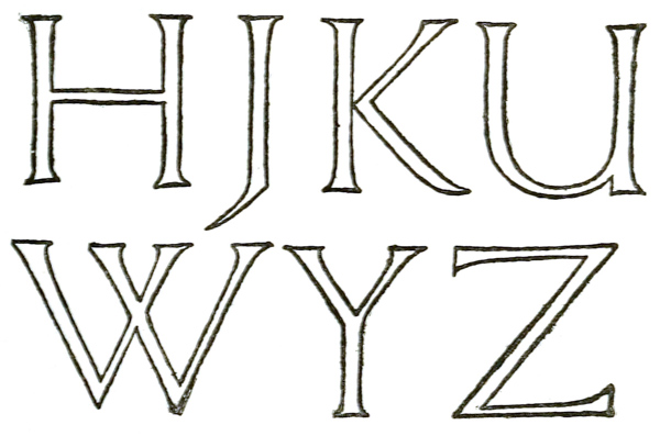
Fig. 219.
H, (J), K, (U), W, Y, Z are not present in the inscription. A rough diagram (fig. 219) is given below showing approximately suitable forms for these (Re junction of U in stone; see p. 400, & fig. 215). [p412]
PLATE III.—Written Roman Capitals, Fourth or Fifth Century. (Virgil’s “Æneid”).
(From a facsimile in the Palæographical Society’s Publications, 1st Series, Vol. II., Pl. 208, of a MS. in the library of S. Gall, Switzerland. See also “Greek and Latin Palæography,” p. 185.)
LETTERS.—Simple-written (slanted-pen) Roman “Square Capitals.”
WORDS in early MSS. were not separated (p. 112).
LINES ruled with a hard point (p. 343). The letters appear to have been written between every alternate pair (p. 299), but slightly over the line.
A very handsome writing which might still be used for special MSS. (see pp. 304, 300, 299).
PLATE IV.—Uncial Writing, probably Italian Sixth or Seventh Century. (Latin Gospels). Brit. Museum, Harl. MS. 1775.
(Shown in Brit. Mus. Department of MSS., Case G, No. 11.)
THE VOLUME contains 468 leaves (7 inches by 434 inches).
MARGINS, Approx.: Inner 58 inch, Head 78 inch, Side 98 inch, Foot 88 inch. (They may have been cut down by the binder.)
WRITING.—A fine round Uncial MS. (pp. 38, 302), arranged in long and short lines.
Note.—On many of the letters there are fine hair-line curved tails and flourishes, which are scarcely visible in the photograph. (These tails were also used in the earlier Uncial shown in fig. 5—see also Addenda, p. 23.)
SECTIONS.—Marked by built-up letters of an Uncial type, and numbered, mR cxxiiii to mR cxxvi (with references to “Harmonies”). The passage is S. Mark xi. 21–25. [p413]
PLATE V.—Uncial Writing, probably Continental Seventh Century. (Gospel of S. John). Ex libris Stonyhurst College. (See also enlargement, fig. 169.)
(From a facsimile in the Palæographical Society’s Publications, 1st Series, Vol. II., Pl. 17.)
THE VOLUME contains 90 leaves, approx. 538 inches by 358 inches. The Inner margin is approximately 12 inch wide.
WRITING.—A very beautiful pointed (slanted-pen) Uncial. The “pointed” character of the letters, which yet retain their typical roundness, give this writing a peculiar charm. Note the top of the P has a marked angle, and the M and H, and even the O, have this slightly or strongly.
RULING.—Single lines, rather wide (p. 305).
ARRANGEMENT.—Certain of the lines are indented one letter (p. 264).
LARGE LETTERS.—On verso Col marking a “Chapter” is built-up in red, on recto the three large letters (marking sections) are simply written with the text pen (p. 299). (The passage is S. John xi. 46–56.)
PLATE VI.—Half-Uncial (Irish), Seventh Century. “Book of Kells” (Latin Gospels). Ex libris Trinity College, Dublin.
(From a facsimile—part of Pl. XLVII.—in “Celtic Ornaments from the Book of Kells,” by the Rev. Dr. T. K. Abbott.)
THE LEAVES—which are cut down and much damaged—measure 13 inches by 10 inches.
WRITING.—A beautiful and highly finished (approx. straight pen) Half-Uncial (pp. 40, 304), tending to ornamental and fanciful forms whenever opportunity offered. (Note the treatment of inde.)
ARRANGEMENT.—Long and short lines: wide spacing. [p414]
THE LETTERS combine extreme gracefulness with an unusual appearance of strength. This is mainly due to the ends of all the strokes being finished; the thick strokes have large, triangular heads (p. 327) on the left, and bases broadened by an additional stroke below on the right (thus ). And the horizontal thin strokes are either finished with a triangular terminal (p. 246), or run on into the next letter—joining the letters together.

The extreme roundness of the letters is contributed to by their being written between DOUBLE LINES (pp. 304, 88), the upper line of which tends to flatten the tops.
The pen not being quite “straight” (see footnote, p. 304), together with a tendency to pull the left hand curves, gives a characteristic shape to the letters
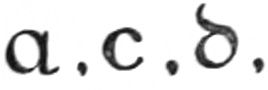
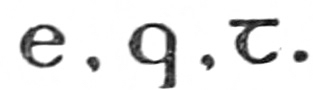
THE ILLUMINATION throughout the book is most elaborate and beautiful. Each division has an entire Initial page occupied with the first few letters. The COLOURS were “paled green, red, violet, and yellow, intense black, and white, but no gold”: see description of Celtic MSS., p. 40, Bradley’s “Illuminated Letters and Borders,” and also the Palæographical Society’s 1st Series, Vol. II., Pl. 55–58, 88, 89.
This notable book may be taken as an example of the marvellous possibilities of pen-work and complex colour-work (see p. 216).
In considering the value of the writing as a model, it may be noted that its highly finished nature demands practised skill on the part of the copyist, and that though modern Irish writing (for which it would be an excellent model) still employs these letters would be apt to look peculiar in English. The Kells MS. however, might be used, and a very beautiful ornamental hand (p. 304) might be founded on this writing. [p415]
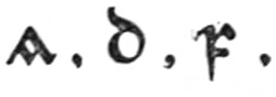
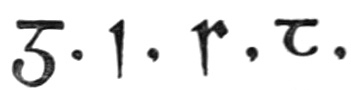
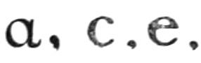
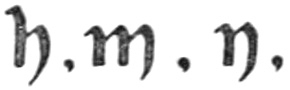
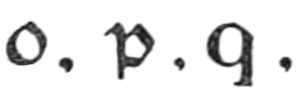
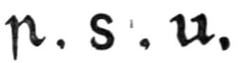
PLATE VII.—Half-Uncial (English), circa 700 A.D. “Durham Book” (Latin Gospels). Brit. Mus., Cotton MSS. Nero D. IV.
THE VOLUME contains 258 leaves (1312 inches by 978 inches).
THE WRITING is an English—or rather Anglo-Irish—Half-Uncial, written at Lindisfarne (Holy I.) under Irish influence (p. 40). ARRANGEMENT—two columns of 24 lines—long and short—to the page (note how eis is got into the fifth line): wide spacing.
The writing bears a strong resemblance to that of the “Book of Kells,” but is generally much plainer; it is also less graceful, being heavier and wider in proportion. The “Book of Kells” O is a circle, while the “Durham Book” O is considerably wider than its height, and all the other letters are correspondingly wide. The RULING in both books consists of double lines, ruled with a hard point on both sides of each leaf.
THE ILLUMINATION also resembles that of the “Book of Kells” (see opposite), but a small amount of gold is employed in it. (See also Palæographical Society’s 1st Series, Vol. II., Pl. 3–6, 22.)
Note.—The “Gloss,” or interlinear translation, is in the Northumbrian dialect, and was put in in the tenth century, more than 200 years after the book was written.
A hand founded to some extent on the “Durham Book” hand is given in Chap. IV. as an easy copy: see figs. 49, 50.
PLATE VIII.—English Tenth-century Writing. (Psalter). Brit. Mus., Harl. MS. 2904. (See enlargement, fig. 172). (Shown B. M. Grenville Lib. Case 2, No. 9.)
THE VOLUME contains 214 leaves (1314 inches by 10 inches), 18 lines to the page; probably written at Winchester in late tenth century. (Pl. reduced scale 89ths.)
WRITING.—An extremely good, formal, “slanted-pen” writing, having great freedom (note the very slight [p416] slope forward) and simplicity. This type of letter may be regarded as a link between the Half-Uncial and the Roman Small-Letter (see p. 310).
THE RULING: single lines (see footnote, p. 305).
THE LETTERS show very strongly the effects of the “slanted pen” (see pp. 43, 305). Note the heavy shoulders and feet in , &c., and the thick horizontals in , The curved tops or arches are flattish and strong: the thick strokes end in points and are hooked below, thin strokes scarcely appear except as the finishing strokes of , while end in small heavy hooks. Note generally the tendency to internal angles and external roundness (examples, ).
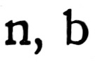

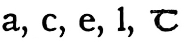

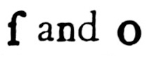
Note particularly the junctions and accidental crossings of the strokes (seen best in the enlargement, fig. 172) as bearing on the mode of construction of the letters (see p. 84).
Note the fine shape of the amperzand (: 3rd line).

THE ILLUMINATION (see Characteristics of Winchester Illumination, or “Opus Anglicum,” pp. 82, 83, Bradley: “Illuminated Letters and Borders”). All the CAPITALS beginning the verses are in raised, burnished gold, in the margin. The titles are in red in fancy “Rustic Capitals” (p. 297). The Line-Fillings consist of groups of red dots, in threes ().

This extremely legible MS. would form an almost perfect model for a modern formal hand ( being substituted for long , and the straight for the curved (see fig. 183): the removal of the flourish would also help readableness). And though it is somewhat large and heavy for ordinary use, it is good for practising, and might be developed into a form resembling any of the more difficult later forms (Plates IX., X., XX.).


PLATE IX.—English Writing, dated 1018. Two portions of a Charter of CNUT. Brit. Museum. (See also enlargement, fig. 173.) [Pl. reduced scale 1112ths.]
(Shown in Brit. Mus., Department of MSS., Case V., No. 3.)
THE WRITING resembles that in Plate VIII. [p417] (see above), but is more slender and rounder—the pen being a little less slanted, and the arches more curved, and showing more of the thin stroke. The ascenders and descenders are longer, the heads are more marked, and there is a general elegance and distinction, due perhaps to the MS. being a charter. Charter-hands are generally more showy and less legible than Book-hands, but in this hand there is great legibility, and a very few changes (similar to those suggested above) would make it quite suitable for modern use. Its relation to the Roman Small-Letter is obvious.
Notes.—The (black) were probably built-up with the writing pen.
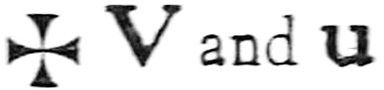
The forms of a, e, g, (h), r, may be noted as differing considerably from the tenth-century hand.
The combined ra (in the 4th line) is curious; and the r in Anglorum—this r (which represents the Bow and Tail of R) commonly follows the round letters b, o, p, in “Gothic” writing: there is another curious form in the linked in cartula (last line).

The word CNUT and several other names are in ornamental “Rustic” Capitals (see p. 297).
The two lines of English from another part of the charter have very long stems and ornamental serifs, giving a very decorative effect (see footnote, p. 326).
PLATE X.—Italian (first half of) Twelfth-century Writing. (Homilies and Lessons). Brit. Mus., Harl. MS. 7183. (See also enlargement, fig. 174.)
(Shown in Brit. Mus., Department of MSS., Case C [lower part], No. 101.)
THE VOLUME.—Homilies and Lessons for Sundays and Festivals from Advent to Easter Eve—contains 317 leaves (approximately 2112 inches by 15 inches); two columns, each of 50 lines, to the page. The MARGINS are, approximately, Inner 114 inch, Head [p418] 114 inch, Side 314 inches, Foot 414 inches (between columns 118 inch: see Plate). The portion of a page, shown in Plate X., consists of the last eleven lines, second column, of folio 78.
WRITING.—This has all the qualities of good writing (p. 239) in a marked degree, and I consider it, taken all round, the most perfect and satisfactory penmanship which I have seen.
Its simplicity and distinctiveness are very marked, so also are its character and freedom. There is an almost entire absence of artificial finish—the terminals are natural hooks, beaks and “feet” made with a fine sleight of hand (p. 311)—and its very great beauty of form is the natural outcome of good traditions and eminently satisfactory craftsmanship.
Notes.—The letters are very wide, and the inside shapes differ considerably from those of the tenth-century MS. (above)—with which, however, there is a considerable affinity (see p. 416).
The f is longer than the ſ, the g has a very fine form with a closed loop, the r is sharpened, the t straight.
Small (Uncial) CAPITALS um follow the Versal; the serifs on the S and E are made with dexterous movements of the nib (p. 246), and resemble those on the Versal C. V and U are both used for the consonant (V).
There are very few VERSALS in this book: the C shown is in red (which has been smudged).
The large “ILLUMINATED INITIALS” in the book are in yellow, blue, and red, and appear to me to be comparatively poor, at least, to fall short of the perfection of the MS.
Of this writing, Sir Edward Maunde Thompson (“Greek and Latin Palæography,” pp. 271–2) says:—
“The sense of grace of form which we perceive in the Lombardic writing of Italy is maintained in that country in the later writing of the new minuscule type, which assumes under the pens of the most expert Italian scribes a very beautiful and round even style. This style, though peculiarly Italian, extended [p419] its influence abroad, especially to the south of France, and became the model of Spanish writing at a later time. We select a specimen from a very handsome MS. of Homilies of the first half of the 12th century (Pal. Soc. ii. pl. 55), written in bold letters of the best type, to which we shall find the scribes of the fifteenth century reverting in order to obtain a model for their MSS. of the Renaissance. The exactness with which the writing is here executed is truly marvellous, and was only rivalled, not surpassed, by the finished handiwork of its later imitators.
“It will of course be understood that this was not the only style of hand that prevailed in Italy. Others of a much rougher cast were also employed. But as a typical book-hand, which was the parent of the hands in which the greater proportion of carefully written MSS. of succeeding periods were written in Italy, it is to be specially noticed.”
(P. 284)—“we give a specimen of a hand of the Italian Renaissance, a revival of the style of the eleventh or twelfth century, and a very successful imitation of a MS. of that period. It was this practice, followed by the scribes of the Renaissance, of reverting to that fine period of Italian writing (see p. 272) to find models for the exquisitely finished MSS. which they were compelled to produce in order to satisfy the refined taste of their day, that influenced the early printers of Italy in the choice of their form of type.”131
(P. 285)—“in the comparatively small number of extant literary MSS. of a later date than the close of the [fifteenth] century it is noticeable that a large proportion of them are written in the style of the book-hand of the Italian Renaissance—the style which eventually superseded all others in the printing press. The scribes of these late examples only followed the taste of the day in preferring those clear and simple characters to the rough letters of the native hands.”
PLATE XI.—English (late) Twelfth-century Writing, with flourished Capitals. (Breviary). Brit. Mus., Royal MS. 2. A. x.
(Shown in Brit. Mus., Department of MSS., Case D, No. 111.)
THE VOLUME—sometimes called the St. Albans or Albanus Psalter—contains 200 leaves (678 inches by [p420] 478 inches); twenty-seven lines to the page, some pages have two columns. MARGINS, approximately, Inner 58 inch, Head under 12 inch (see Plate), Side 114 inch (part occupied by Versals), Foot 118 inch.
THE WRITING is fairly legible, but approaches Black Letter (p. 331) too nearly to be of use to us for ordinary purposes. Note the ornamental Semi-Rustic Capitals in text. Note the RULING of the two head lines and of the foot line is carried into the margin.
THE VERSALS.—The main interest lies in the varied forms of the Versals, which are most beautifully made in red and green alternately. There is one elaborate gold initial in the book, and several Versals in blue and white (hollow: see p. 208).
The five ’s—and the D in the text—on this page (folio 85b) by no means exhaust the varieties of D alone, and there are very many varieties of the forms of the other letters. On some pages each line begins with a small Versal, while the more important Initials are much larger, varying in size and ornament.

THE CONSTRUCTION of the Versals is unusually slender, curved, and gradated. A rather fine pen seems to have been used (p. 292), and though the letters are upright, the natural tendency to slant the pen can be detected in the thickening of the thin parts—above, on the right, and below, on the left—giving the suspicion of a tilt to the O.
The O-part of each was made first, and the tail added. This is very obvious in the D in the text, where a stem was added to O to make D.


Note the dots inside the Versals, one above and one below. Originally these may have been intended to effect—or hide—the junction of the thin strokes, by a twirl of the pen at the end of the first stroke and the beginning of the second, thus . Their use is very common in Versal forms (see fig. 189), and besides being decorative in the ordinary sense, they may be said to [p421] strengthen the thin parts (much as the weakest part of the loop in an old key was thickened for strength).


Note the right-hand Bows of the ’s are made thinner, as though the Rubricator had been afraid of running into the text in making their last curves—such an expert, however, may well have had a better reason for it.
PLATE XII.—Illuminated Initial in a Flemish MS. A.D. 1148. (Latin Bible). Brit. Museum, Addl. MS. 14790.
(Shown in Brit. Museum, Department of MSS., Case C, No. 91.)
THE VOLUME—the third, and most interesting, of this MS. Bible (Numbered 14788–89–90)—contains 223 leaves (17 inches by 1178 inches). MARGINS, approximately, Inner 118 inch, Head (cut) 1 inch, Side 238 inches, Foot 312 inches. (Between columns 1516 inch.)
THE WRITING is a not very legible “Gothic.” The zigzag tendency exhibited, especially by the word niniuen (Niniveh), second line, is unsuited for such formal writing (see p. 484). The rapid placing of the Heads of the letters is such that they appear broken and partly detached from the stems. The VERSALS are of a good type.
THE INITIAL is a monogrammatic ET. The arms of the round terminate in leaves folded back, its form is hollow and inwoven (p. 208), and gives rise to foliage, which fills the interior—passing over the fish and behind Jonah. Note also how the jaws of the fish are interlaced, and how compactly all the parts are put together.

The close application of the background to the curves adds to the general compactness, and together with its spacing from the straight front balances the masses (p. 424): it may be compared to the even spacing of curved and straight strokes (see fig. 53). There is an extension of the background to hold the fish’s tail. [p422]
THE COLOURS—
Initial, Foliage, Fish: red: outlined & lined; Parchment left plain.
Jonah: black: outlined & lined; Parchment left plain.
Bands on Initial, gold, outlined red.
Hollows in Initial, gold, outlined red.
Backs of folded leaves: gold, outlined red.
Outer background: paled green.
Dots on outer ground: red.
Inner background: paled blue.
We may not, I think, attempt to imitate the complex 12th-century decoration of this initial (see p. 196), but the treatment of the elements of form and colour is very suggestive, and the whole piece of lettering is characteristic of the grand style in which a book was at that time begun. The ARRANGEMENT of the letters themselves is very simple, and might be made good use of (fig. 220).
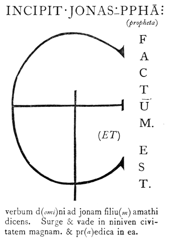
Fig. 220.
[p423]
PLATE XIII.—English (2nd half) Thirteenth-century Writing and Illumination. (Latin Bible). Ex libris S. C. Cockerell.
THE VOLUME—probably written at York—contains 427 leaves (8 inches by 512 inches): two columns to the page: MARGINS, approx.: Inner 58 inch, Head 58 inch, Side 78 inch, Foot 1716 inch. (Between the columns 38 inch.) The pages have been cut down.
THE WRITING is very small, and there are many contractions.132 In the thirteenth and fourteenth centuries the whole Bible, written in this fashion, was often small enough to be carried in the pocket. Note the closed and the form of &. The page is RULED with 50 lines; the 49 lines of writing lie between these, so that in each case the ascenders touch the line above, and the descenders, the line below. Note the double lines in the Foot margin (see p. 343).


VERSALS.—A very narrow type is used in the narrow margins: the example shown is in red, flourished blue; it begins the second chapter (Et angelo ephesi, c.), which is also marked by coloured Roman Numerals at the side (II). The page heading is “APOCA” in small red and blue Versals.

THE ILLUMINATED INITIAL is “historiated”—i.e. it contains a picture illustrating the text, viz. a representation of S. John writing to the Seven Churches—purely conventional forms, or rather symbols, for the most part, are used and beautifully fitted into the available space. The greater size and more careful drawing of the human figure (the centre of interest) is characteristic of a fine convention. The slope of the vellum page on which S. John is writing, and even the manner in which the quill is held, are such as would naturally be employed by a scribe (see frontispiece, & p. 67). [p424]
The capitals of the pillars mark the position of the cross-bar of A. The top serif is carried up and forms a bud, which gives rise to leaf-like flourishes; the free thin stem runs down forming a grotesque, which gives out a leaf-like tongue. In either case the object—in every sense recreative—is a renewal of interest in the designed, elongated, growth of the forms.
Note the curved thickening of A’s left stem ends nearly level with the foot of the right stem. This gives balance to the letter (see R, fig. 81 & A, fig. 189), and preserves the essential form, which suffers no distortion by the thinner continuation below.
Note the balancing of the background mass on the straight and curved sides of the Initial (as in Plate XII., see above); also the extension and shape of the background accompanying the drawn out parts of the letter.
COLOURS of Initial—
Right stem: red with white lines and patterns.
Left stem and serif: blue with white lines and patterns.
L. stem, lower half, & dragon: pale “lake.”
The background (counter-charged)
outer: pale “lake.”
inner: blue.
lower extension: blue.
final flourish: pale “lake.”
Band (dark) down left side, dragon’s wings, 6 “berries,” halo, seat, tops of pillar caps: burnished gold.
Leaves (dark) & pillar caps: red.
Small stems & leaves: green.
Here again no natural work would come of a modern attempt to imitate so complex a “design”—natural and even inevitable 600 years ago. But the spirit of delicacy and fantasy, the ingenious contrivance, and the balancing and disposal of form and colour shown by the antique art, may well be matter for imitation by the modern draughtsman-illuminator, and even by the mere penman.
PLATE XIV.—Thirteenth-century Line-finishings: Pen-work. (Psalter). Brit. Museum, Royal MS. 1. D. x.
THE LINE-FINISHINGS (see p. 205), of which there are very many throughout the book, all in red or blue pen-work, are very varied. Nine kinds are shown in the plate (which represents about a quarter of a page), and three others from the same MS. are given in figs. 87 (b) and 126 (f, g).
The directions of the thick and thin strokes indicate a pen held at right angles to its usual position (almost “upside down,” in fact: see fig. 126, g), and the penmanship exhibits great speed and lightness of hand—the rapidity and skill are indeed quite remarkable (e.g. in the Lion in the eighth line).
Note that, though the writing occasionally runs into the margin, the line-finishings stop at the marginal-line.
The photograph shows red dark and blue light: e.g. the Bird is red, the Lion and the Fish are blue. The fifth Line-finishing is a red filigree with blue “berries”—it can hardly be described as a “floral growth,” as the “branching” is reversed: the rubricator gained speed and uniformity by the simple repetition of the whorls all along the line—the upper branches were probably put in afterwards, and the “berries” were added later when he was making the blue Line-finishings.
The more complex decoration (not shown in the plate) in this MS. is inferior to the penmanship: the small background Capitals with which the verses begin—presumably put in by a different hand—are more pretentious, and do not match the Line-finishings.
General Note.—When a space occurs at the end of a line of writing, it is often best to leave it, and in a plain MS., if it be “well and truly” written, there is no objection to varying lengths of line (see pp. 263, 371). But a book, such as a Psalter, divided into many short verses—in which the last line usually falls short of the marginal [p426] line—offers a fair field for such simple and effective decoration. (See also pp. 428, 486, fig. 130, and Plate XXIII.)
PLATE XV.—English Writing and Illumination, circa 1284 A.D. (Psalter). Brit. Museum, Addl. MS. 24686.
THE WRITING is a fine, freely formed, “Gothic” (p. 331). Note, the i’s are “dotted.” Note the double MARGINAL LINES (p. 343).
THE SMALL INITIALS are of the “Lombardic” type (p. 210), in which the Serifs are much thickened and ornamented. Note the tails of the Q’s are turned to the left to clear the writing. The LINE-FILLINGS match the small initials (p. 193).
THE LARGE INITIAL, &c.—The plate shows the end of the fourteenth and beginning of the fifteenth Psalm ( ). Note “Arabic” numerals (15) in margin.
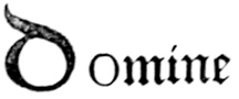

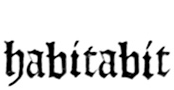
The tail of the Initial is formed of a dragon, the head of which rests on the O-part: its wings project into the inner margin (and these in the plate, which shows a fragment of a verso page, run into the fold between the pages): the tail (together with the background) descends till a convenient point is reached from which the lower scroll-work springs. The tail, wing, and claws above, belong to a magpie which is perched on the initial.
THE DRAWING: see reference to this at p. 203, and below.
Sir Edward Maunde Thompson (p. 39, “English Illuminated MSS.”) says of this—
“—the Additional MS. 24686 in the British Museum, known as the Tenison Psalter, from its having once formed part of the library of Archbishop Tenison. This psalter is one of the most beautiful illuminated English manuscripts of its time, but unfortunately only in part, for it was not finished in the perfect [p427] style in which it was begun . . . in the first quire of the text the ornamentation is of peculiar beauty. . . .”133
“—the progress of the art [since the earlier part of the thirteenth century] . . . is . . . manifest. There is more freedom in the drawing, the stiffness of the earlier examples is in great measure overcome; and the pendant has thrown out a branch which has already put forth leaves. A great variety of colours, blue, rose, vermilion, lake, green, brown, as well as burnished gold, is employed in the composition of the large initial and its accompanying pendant and border, and the small initials are of gold laid on a ground of blue or lake, and filled with lake or blue; while the ribbons which fill up the spaces at the ends of the verses are alternately of the same colours and are decorated with patterns in silver on the blue and in gold on the lake.”
“The group of the dismounted knight despatching134 a gryphon, which has proved too much for the horse, upon whose dying body the expectant raven has already perched, is tinted in lighter colours. It is an instance of the use to which marginal space was put, particularly by English artists, for the introduction of little scenes, such as episodes in romances or stories, games, grotesque combats, social scenes, &c., often drawn with a light free hand and most artistic touch. Without these little sketches, much of the manners and customs, dress, and daily life of our ancestors would have remained for ever unknown to us.”
PLATE XVI.—Italian Fourteenth-century MS., Brit. Mus., Addl. MS. 28841.
THE VOLUME: one of two (the other numbered 27695), a Latin treatise on the Virtues and Vices (The miniatures, drawings, &c., probably by “the Monk of Hyères,” Genoa). The vellum leaves have been separated, and are now preserved in paper books. The leaf illustrated shows a margin of vellum of less than 316 inch all round (the plate).
The decorative borders are much more naturalistic in [p428] form and colouring than any other old illumination that I have seen (see reference to Plate XVI., p. 203).
The foliage is a delicate green, the berries are dark purple, the single fruits plain and pale orange-red; the two beetles in crimson and brown are made darker and too prominent in the photograph. The bands of small “Lombardic” Capitals are in burnished gold.
Note how skilfully and naturally the upper corners of the border are managed, and also the beautiful way in which the branches run into and among the text (see p. 213).
PLATE XVII.—French Fifteenth-century Writing, with Illuminated Borders. Ex libris E. Johnston.
THE PAGE 912 inches by 618 inches: MARGINS, approx.: Inner 118 inch, Head 138 inch, Side 238 inches, Foot 278 inches (the edges have been slightly cut down). The marginal lines (from head to foot of the page) and the writing lines are RULED in faint red.
THE WRITING is a late formal “Gothic”—the thin strokes have evidently been added (p. 47). The written Capitals are blotted with yellow (see p. 140). The ILLUMINATED INITIAL Q is in blue, white lined, on a gold ground, contains a blue flower and five ornaments in “lake.” The LINE-FILLINGS are in blue and “lake,” separated by a gold circle, triangle, or lozenge.
THE FILIGREE ILLUMINATION springs from the initial in the narrow margin, and from a centre ornament (see “knot,” fig. 127) in the wide side margin. The side margins are treated similarly on either page (see p. 213); the inner margins are generally plain. This repetition gives to the pages a certain sameness—which is a characteristic rather than a fault of the treatment.
The border on the recto of the vellum leaf shows through on the verso or back of the leaf. The main lines of the first border, however, are freely traced and [p429] followed on the verso (and so nearly hidden) by the second border. This is also suggestive of the more rapid methods of book production in the 15th century.
COLOURS—
Stems, tendrils, &c.: black.
Leaves ivy-shaped lanceolate: burnished gold, outlined black (p. 187). plain. furred.
Flowers, buds, centre ornaments, &c.: (See p. 182.) blue, “lake,” or green tempered with white, and shaded with pure colour; white markings; the forms not outlined.
This type of illumination is discussed in pp. 197–202. Its chief points are its simplicity and rapidity. A penman or a novice in illuminating can, by taking a little pains, beautify his MSS. easily and quickly; and he may perhaps pass on from this to “higher” types of illumination.
PLATE XVIII.—Italian Fifteenth-century Writing and Illumination. (Perotti’s translation of Polybius). Ex libris H. Yates-Thompson.
THE VOLUME consists of 174 leaves (1318 inches by 9 inches); 35 lines to the page. The plate shows a portion of the upper part of the Initial (recto) page.
THE WRITING.—The Capitals are simple-written, slanted-pen “Roman”—slightly ornamental—forms. They are freely copied on a large scale in fig. 168: see p. 297. The Small-letters match the Capitals—they are “Roman” forms with a slight “Gothic” tendency. Both these and the Capitals would make very good models for free Roman hands.
THE INITIAL is a “Roman” A in burnished gold. Note the exceedingly graceful shaping of the limbs, the ornamental, V-shaped cross-bar, and the absence of serifs (see fig. 116). [p430]
The “White Vine Pattern” (see p. 202), most delicately and beautifully drawn, interlaces with the letter and itself, and covers the BACKGROUND very evenly. The interstices of the background are painted in blue, red, and green, and its edge is adapted to the slightly projecting flowers and leaves. There are groups ( and ) of white dots on the blue parts of the background.


THE BORDER (of which a small part is shown) is approximately 12 inch wide in the narrow margin at the side of the text—it is separate from the Initial. It extends above and below the text, where its depth is greater, matching the greater depth of the margins. Its treatment is similar to, though perhaps a little simpler than, that of the Initial decoration.
PLATE XIX.—Italian MS., dated 1481. Ex libris S. C. Cockerell.
“Part of a [verso] page from a book containing the Psalter of St. Jerome and various Prayers, written and decorated by Joachinus de Gigantibus of Rotenberg in 1481 for Pope Sixtus IV. Joachinus was employed at Naples by Ferdinand I., and there are other fine examples of his work at the British Museum and the Bibliothèque Nationale, Paris. In each of these, as well as in the present book, he states that he was both scribe and illuminator.”—[S. C. C.]
THE VOLUME contains 31 leaves (612 inches by 434 inches): MARGINS, approx.: Inner 78 inch, Head 78 inch, Side 112 inch, Foot 134 inch. (The head margin, together with the edge of the book-cover, is shown in the plate.)
THE WRITING.—Very clear, slightly slanted-pen “Roman.” Note the blending of b and p with e and o (see fig. 76, & p. 77). The CAPITALS are quite simple and plain, made (in (A)NIMA CHRISTI and in text) in black with the text pen. Note the long, waved serifs (see p. 289). The last two lines of the preceding prayer are made in burnished gold with a larger pen.
[Continued on p. 481