Part 2 — CHAPTER XV THE ROMAN ALPHABET & ITS DERIVATIVES The Roman Alphabet — Proportions of Letters: Widths — Upper & Lower Parts—Essential or Structural Forms — Characterisation of Forms — Built-Up Forms — Simple-Written Capitals — Uncials — Capitals & Small-Letters — Early, Round, Upright, Formal Hands — Slanted-Pen Small-Letters — Roman Small-Letters — Italics — Semi-Formal Hands — Of Formal Writing Generally — Decorative Contrasts — Ornamental Letters.
Reading edition
CHAPTER XV THE ROMAN ALPHABET & ITS DERIVATIVES The Roman Alphabet — Proportions of Letters: Widths — Upper & Lower Parts—Essential or Structural Forms — Characterisation of Forms — Built-Up Forms — Simple-Written Capitals — Uncials — Capitals & Small-Letters — Early, Round, Upright, Formal Hands — Slanted-Pen Small-Letters — Roman Small-Letters — Italics — Semi-Formal Hands — Of Formal Writing Generally — Decorative Contrasts — Ornamental Letters.
The Roman Alphabet
The Roman Alphabet is the foundation of all our alphabets (see Chapter I.). And since the full [p269] development of their monumental forms about 2000 years ago, the Roman Capitals have held the supreme place among letters for readableness and beauty. They are the best forms for the grandest and most important inscriptions, and, in regard to lettering generally, a very good rule to follow is: When in doubt, use Roman Capitals.
The penman may with advantage devote some study to a fine monumental type of Roman Capital (such as that of the Trajan Column Inscription: Plates I. and II.), and endeavour to embody its virtues in a built-up pen form for use in MSS. (p. 294).
PROPORTIONS OF LETTERS: WIDTHS
The marked distinction between the “Square” and the “Round” forms, and the varying widths of the letters—as seen in the early inscriptions,64 are characteristic of the Roman Alphabet. We may broadly distinguish Wide and Narrow letters thus—
WIDE O Q C G D “Round.”
M W “Square.”
H (U) A N V T (Z)
NARROW B E F R S Y (X)
I J
K L P
[p270]
The “Round” Wide Letters—O, Q, C, G, D.—
O may be regarded as the Key letter of an alphabet. Given an O and an I of any alphabet, we can make a very good guess at the forms of the other letters.
In fine Inscriptions the external line of O is commonly an almost perfect circle (see Plate II.)—i.e. its height and width are equal. This may be regarded as the ideal shape, though a slight widening or narrowing of the letter (fig. 157) is quite permissible.65
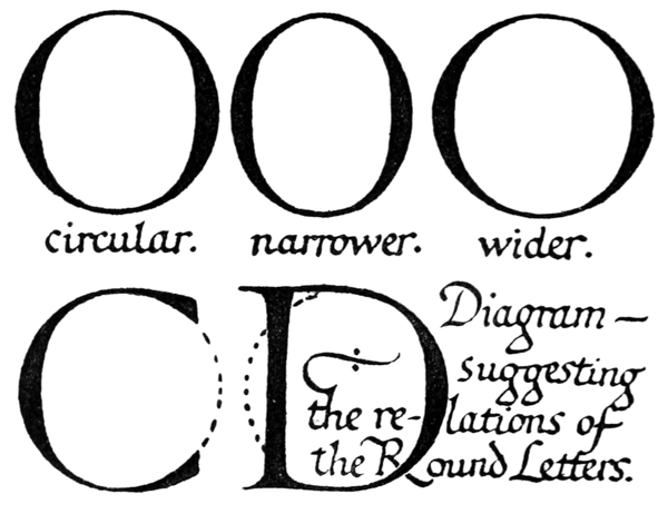
Fig. 157.
Q, C, G, and D follow the proportions of O [p271] very nearly, and, though C, G, D are a little narrower, they have the same effect of roundness and width.
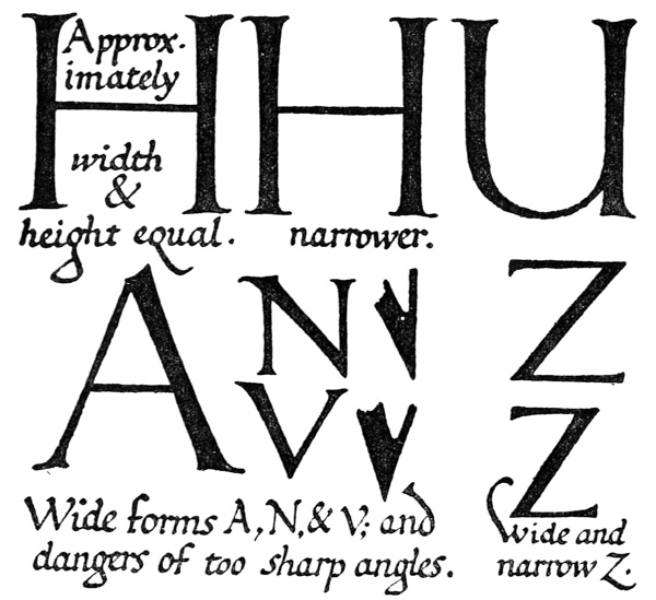
Fig. 158.
The “Square” Wide Letters—M, W, and H, (U), A, N, V, T, (Z)—
M & W Their mean width is properly about equal to their height.
H Width equal to, or a little less than, height (fig. 158), but if made too narrow it would look heavy, being double-stemmed.
(see pp. 287, 284) resembles H.

A, N, & V are double-stemmed, and have internal angles, moreover, which would become too sharp—and tend to close [p272] up—if they were made too narrow (fig. 158).
T The cross-bar—the characteristic part of T—projects a fair way on either side of the stem.
Z Either wide or (moderately) narrow (fig. 158).
The Narrow Letters, B, E, F, R, S, Y (X) (see fig. 159).
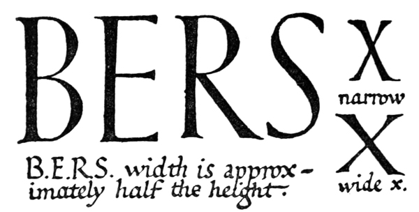
Fig. 159.
There is a point of division in these letters about the middle of the stem or a little above (see p. 273), and we may argue that each being composed, as it were, of two little letters—which are half-height, they are proportionately half-width: and this will be found approximately correct. B may be said to consist of one little D on the top of another, averaging respectively half the height and width of a full-sized D.
E, F, & R follow the proportions of B (see also E, 4, p. 282). [p273]
S may be made of one little tilted O on the top of another—joined together and having the superfluous parts removed.
Y is like a little V upon a little I.
X Either narrow or wide (fig. 159).
The Narrow letters, K, L, and P—
These forms are related to the B, E forms, but it is permissible to make them a little wider to give clearance to the angles of the K and force to the single arm and loop—the characteristic parts (see fig. 149)—of L and P.
UPPER & LOWER PARTS
In the letters B, E, H, K, X (A), F, R, P (S), Y there is generally a tendency to enlarge the lower part, the cross-bar—or division—being set above mid-height. This tendency may reasonably be accounted for as follows:—
The natural division of B, E, H, K, & X, regarded as abstract forms, would be symmetrical—i.e. at the centre of the stem.66 In order that its apparent position may be central, however, it is necessary, for optical reasons, to make [p274] its actual position above the centre.67 And further, by a reasonable enlargement of the lower part, these letters acquire a greater appearance of stability.
It would be well, I think, for the letter-craftsman to begin by making such divisions at the apparent centre (i.e. very slightly above mid-height; see E, F, X, Plate II.), so keeping most nearly to the essential forms (see p. 275). Later he might consider the question of stability (see B, Plate II.). The exaggerated raising (or lowering) of the division associated with “Art Lettering” is illegible and ridiculous.
A The lower part is essentially bigger, and the cross-bar is not raised, as that would make the top part disproportionately small.
F usually follows E, but being asymmetrical and open below it may, if desired, be made with the bar at—or even slightly below—the actual centre.
R In early forms the bow was frequently rather large (see Plate II.), but it is safer to make the tail—the characteristic part—more pronounced (see Plates III., XXIV.).
P The characteristic part of P is the bow, which may therefore be a little larger than the bow of R (see Plate III.).
S In the best types of this letter the upper and lower parts are approximately equal; there is a tendency slightly to enlarge the lower [p275] part. (In Uncial and early round-hands the top part was larger: see Plates IV. to VII.)
Y varies: the upper part may be less than that of X, or somewhat larger.
ESSENTIAL OR STRUCTURAL FORMS The essential or structural forms (see p. 240) are the simplest forms which preserve the characteristic structure, distinctiveness, and proportions of each individual letter.
The letter-craftsman must have a clear idea of the skeletons of his letters. While in every case the precise form which commends itself to him is matter for his individual choice, it is suggested in the following discussion of a typical form—the Roman B—that the rationale of his selection (whether conscious or unconscious) is in brief to determine what is ABSOLUTELY essential to a form, and then how far this may be amplified in the direction of the PRACTICALLY essential.
The letter B reduced to its simplest (curved-bow) form—i.e. to the bare necessity of its distinctive structure—comprises a perpendicular stem spanned by two equal, circular bows (a, fig. 160).
In amplifying such a form for practical or æsthetic reasons, it is well as a rule not to exceed one’s object—in this case to determine a reasonable (though arbitrary) standard essential form of B, having a distinctive and proportionate (f) structure. We may increase the arcs of the bows till their width is nearly equal to their height (b), make their outer ends meet the ends of the stem (c), and their inner ends coincide (d). Raising the division till its apparent position is at or about the middle of the stem entails a proportionate increase of width in the lower part, and a corresponding decrease in the upper part (e).
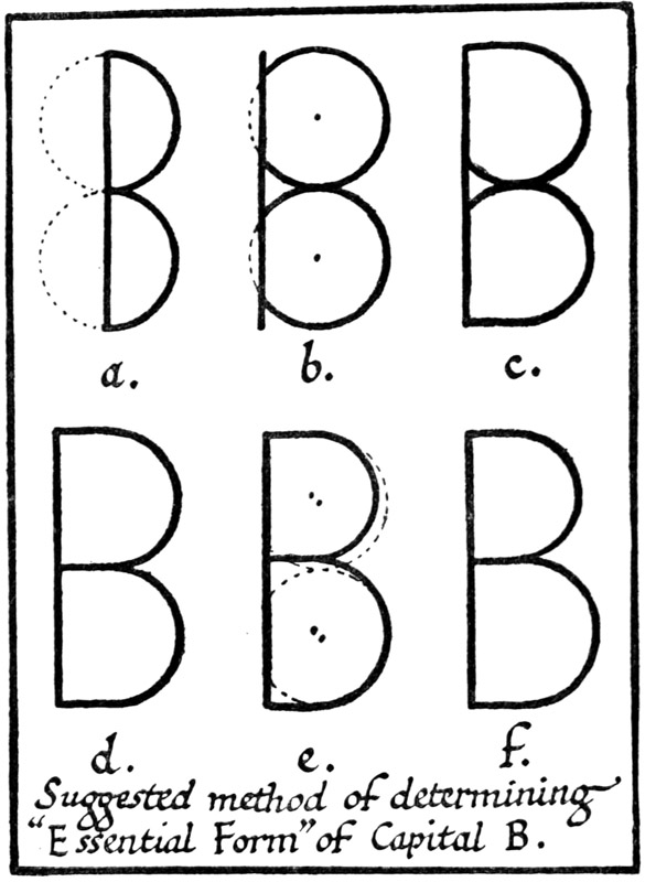
Fig. 160.
The very idea of an essential form excludes the unnecessary, and its further amplification is apt to take from its distinctiveness and legibility. Where no limits are set, modification is apt to become [p276] exaggeration. And, though special forms and ornamental letters may be produced by “reasonable exaggeration” (k, l, m, fig. 161), if the tool be kept [p278] under proper control, yet, generally, such structural changes do not improve the appearance of the plain letter forms.
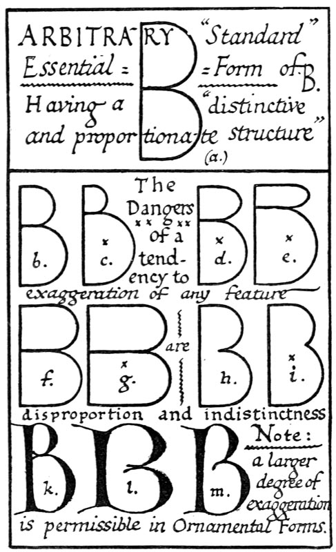
Fig. 161.
We may test our “Standard” (a, fig. 161) by considering the effects of further amplification.
(1) Raising the division68 slightly is permissible (b, fig 161)—too much makes the top part disproportionately small (c).
(2) Widening both bows, or separating their junction from the stem, tends to dissociate the bows from the stem, making the letter less distinctive (g and i, fig. 161).
Widening and narrowing are both allowable and occasionally desirable, but assuming that a standard or ideal width can be approximately determined, it is well to keep to it for common and ordinary use.
CHARACTERISATION OF FORMS (See also Built-Up Forms, pp. 291–6, and pp. 240, 253)
That the tool69 gives character and finish to the Essential Forms of letters, can easily be proved by a little practical experience of the natural action of a properly cut pen (see figs. 142 to 148, and 162). And the penman—or indeed any other letter-maker—is advised to allow the pen to train his hand to [p280] make the proper strokes automatically: then he may begin to master and control the pen, making it conform to his hand and so produce Letters which have every possible virtue of penmanship and are as much his own as his common handwriting.
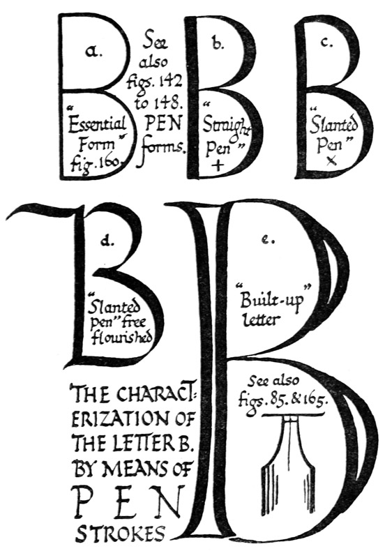
Fig. 162.
Most of the letters in a good alphabet have specially interesting or characteristic parts (p. 250), or they exhibit some general principles in letter making, which are worth noting, with a view to making good letters, and in order to understand better the manner in which the tool—whether pen, chisel, or brush—should be used.
The characterisation of the Roman Capital Form. Note.—The large types below are indices—not models.
A
1. A pointed form of A, M, and N (see Plate II.) may be suitable for inscriptions in stone, &c., but in pen work the top is preferably hooked (fig. 167), beaked (fig. 147), or broken (fig. 158), or specially marked in some way, as this part (both in Capital A and small a) has generally been (fig. 189).
2. The oblique strokes in A, K, M, N, R, V, W, X, Y, whether thick or thin, are naturally finished with a short point inside the letter and a long, sharp point, or beak, outside (see serifs of oblique strokes, p. 289).
3. The thin stem may be drawn out below for an occasional form (see F, 3).
B
1. B, D, R, and P are generally best made round-shouldered (fig. 162 & Addenda, p. 26).
2. B, D, E, F, P, R (and T) have generally an angle between the stem and the top horizontal, while [p281]
3. below in B, D, E (and L) the stem curves or blends with the horizontal.
4. See O, 2.
C
1. C, G, and S; the top horizontals or ‘arms’ may be straighter than the lower arms, or vice versâ (see figs. 167 and 206).
2. C, G, and S; the inside curve is best continuous—from the ‘bow’ to the ends of the ‘arms’—not being broken by the serifs, and
3. it is best to preserve an unbroken inside curve at the termination of all free arms and stems in built-up Roman Capitals. In C, G, S, E, F, L, T, and Z the upper and lower arms are curved on the inside, and squared or slightly pointed outside (the vertical stems curve on either side) (fig. 163).
4. ‘Arms’ are best shaped and curved rather gradually out to the terminal or serif, which then is an actual part of the letter, not an added lump (p. 289).
5. See O, 2.
D
1. See B, 1.
2. See B, 2 and 3.
3. The curve may be considered as springing from the foot of the stem, and may therefore for an occasional form be separated from the stem at the top (D, fig. 177).
4. See O, 2.
E
1. See B, 2 and 3.
2. See C, 3 and 4.
3. The lower limb in E, L (and Z) is often drawn out: these, however, are properly to be regarded as occasional or special [p282] forms: the lower serif of this type commonly points out (see figs. 206, 188).
4. E’s three arms (& F’s two) are approximately equal in length in the best early forms (Plate II., &c.).
F
1. See B, 2.
2. See C, 3 and 4 (and E, 4 above).
3. One or more (the development of the letter and tradition may decide which) of the free stems of A, F, G, H, I, J, K, L, M, N, P, R, T, V, W, X, Y may be drawn out for occasional forms (see fig. 188).
4. The elongated stems of F, I, J, P, T, Y may hang below the line, or they may (occasionally) stand on the line and overtop the other letters.

1. See C, 1, 2, 3, and 4.
2. The stem may be drawn out below the line (F, 3).
3. The stem sometimes forms an angle with the lower ‘arm’ (this is safest: see fig. 148), sometimes they blend (fig. 147).
4. The point of the lower ‘arm’ may project a very little beyond the stem to mark the outer angle.
5. The wholly curved “gothic” (and also the other round letters: see p. 119) may be introduced occasionally among Roman Capitals.

6. See O, 2.
H
The left-hand stem is occasionally drawn out above (F, 3 & comp. fig. 3), and
2. this form is sometimes associated with an ornamental cross-bar (fig. 189).
3. H and N may slightly widen out above.
I
1. The stem may be drawn out above or below (F, 3 and 4).
2. See J, 2.
J
1. The stem or tail may be drawn out (F, 3 and 4).
2. Note.—With regard to the use of I for J (and V for U): this is associated so much with the Latin usage, that it is perhaps permissible still in Latin.70 But for modern English, in which these letters are strongly differentiated, the tailed J and the round U are to be preferred. Besides the suspicion of affectation attaching to the other mode, its strangeness gives an appearance of awkwardness—almost amounting to illegibility—to common words, such as “A QVAINT IVG” or “IAM IAR.” And, at the least, very careful [p284] discrimination is desirable: “IVBILATE” may pass, but “IVIVBE” is not really readable.
3. The tail of the J may be slight, provided it be distinct, and the second stem of the U may match the first (fig. 158); the ugly and in common use need not be copied.


4. See also Tails, pp. 289–291.
K
1. The stem is sometimes drawn out above (F, 3).
2. Both arms are occasionally lengthened, and the width of the letter increased, by joining the thin arm to the stem lower down; the thick arm, or tail, then springs from the side of the thin arm (compare ). This tends away from the essential, and is therefore a less safe form.

3. The tail may be curved or drawn out occasionally (see Tails, pp. 289–291).
4. Serifs on arms. See A, 2.
L
1. See B, 3.
2. See C, 3 and 4.
3. See E, 3.
4. See F, 3.
M
1. The stems are commonly slightly spread out to give greater clearance for the inner angles. An occasional form is much spread out .

2. Note.—There are inscriptional forms of M [p285] and N without the top serif (Plate II.). But the pen forms and others have top serifs, and these commonly extend outward—tending to beaks (see A, 1 and 2)—rather than in. (V, W, X, Y (and N) show a similar tendency—see p. 289.)
3. The thin stem of M is occasionally drawn out (F, 3).
N
1. Sec C, 3 and 4.
2. See H, 3.
3. See M, 2, and A, 1 and 2.
4. The first stem is drawn out below the line for an occasional form (most suitable for an Initial Letter): the right-hand stem is very occasionally raised (when a final letter) (F, 3).
5. Note.—The stems of N (the only vertical thins—not counting M’s—in the Roman Capitals) tend sometimes to be thicker: see Plate II.
O
1. O is the key letter of the curved forms and, in a sense, of the whole alphabet (p. 270). The upright form——may be regarded as the ideal simple letter.

2. Very commonly, however, O is tilted——(see fig. 163), and when this is the case, all the curved letters—B, C, D, G, P, Q, R, S, U—are correspondingly tilted (see Plate II.). The tilted form is more easily made, but both are good forms.

P
1. See B, 1 and 2.
2. See O, 2.
3. (P with stem below line (see Plate IV.) must not be allowed to confuse with D) (see F, 3 and 4). [p286]
4. The bow of P appears to be attached (to the stem) above: in certain forms it is slightly separated from the stem below: see Plate II.
Q
1. Q resembles O with a tail: see O.
2. There are many characteristic varieties of the tail: see Tails (pp. 289–291).
3. Note.—Q being always followed by U, it is convenient often to deal with the two letters together. (See Plate II.)
R
1. See B, 1 and 2.
2. See O, 2.
3. In the form nearest the essential, the junction of the Bow and the Tail touches the stem. If the tail springs from the curve of the bow (Plate II.) greater care in construction is necessary (compare K). The treatment of the tail is very important. It may end in a serif (see A, 2), or it may be curved and pointed (see Tails, pp. 289–291). It may be drawn out (see fig. 50).
4. See F, 3 (& comp. fig. 169).
S
1. See C, 1, 2, 3, and 4.
2. See O, 2 (and p. 273).
3. S very often leans slightly forward.
T
1. See B, 2.
2. See C, 3 and 4.
3. Drawing out of stem: see F, 3 and 4.
4. Note.—The right arm is occasionally extended—to fill a line—when T is a terminal letter (in this case it is generally made lighter, and the left arm heavier—somewhat as in the Uncial T, figs. 56 & 188). [p287]

1. Note.—The curve—if it be modelled on the common tilted O (see O, 2)—is thin where it meets the second stem.
2. (V for U). See J, 2, 3, and footnote.
3. The foot of the second stem projects on the right only, and gives clearance to the angle of the curve on the left. Sometimes the second stem ends in a hook or beak, which (very occasionally) is drawn out below.
V
1. See M, 2, and A, 2.
2. The thick stem may be drawn up (F, 3), in which case the thin commonly curves over for strength (see figs. 89, 95).
3. (See note on V for U, under J.)

1. See M, 2, and A, 2.
2. The best form is of two V’s crossed, .
3. The first or both the thick stems may be drawn up and the thins curved over (see V, 2).
X
1. See M, 2, and A, 2.
2. There is sometimes a slight curving in of the stems, especially the thin stem (see fig. 80).
3. The thin stem is sometimes drawn out below (F, 3), and commonly curved.
Y
1. See M, 2, and A, 2.
2. See F, 3 and 4. (Y with stem below line (see Plate V.) must not be allowed to confuse with V.)
3. An occasional rather interesting form [p288] of Y has the arms curving out and ending in points (see fig. 167).

1. See C, 3 and 4.
2. The lower arm of Z is sometimes drawn out (see E, 3): it may be curved and pointed (or flourished).
General Remarks on the characterisation of the Roman Capitals and related forms (see fig. 163).71
VERTICAL STEMS.—(a, fig. 163) Thick (excepting in the thin stemmed N (and M)).
(b) Slightly curved in on either side (see fig. 116), or appearing so because of the outward curve of the serifs (see figs. 204, 206).
(c) A fine effect is obtained when the stem is made wider above than below (see p. 119).
(d) Free stems occasionally are drawn out (see above, F, 3 and 4, and pp. 251, 260, 332).
OBLIQUE STROKES or STEMS.—Thick, to the left , thin, to the right / (see A, K, &c.), otherwise like vertical stems (above)—(see also SERIFS (e) below).

HORIZONTALS, ARMS, BRANCHES, or BARS.—Thin: free ends sometimes drawn out and flourished (see figs. 125, 188).
BOWS and CURVES.—Gradated, and following the O (see pp. 44, 121, 270, 285).
SERIFS or FINISHING STROKES.—(a) Note.—Serifs of some sort are practically essential to the proper characterisation of an alphabet (see figs. 147, 148, 162), and should generally have a certain uniformity (p. 324). [p289]
(b) The serifs, &c., of simple-written forms are treated at p. 244 (see fig. 145).
(c) In Versals and certain other forms the mode of making requires the serif to be a distinct addition to the letter (see figs. 116, 166).
(d, fig. 163) In the finest built-up A B Cs serifs are treated as the actual finishing and shaping of the ends of the stems and branches, rather than as added parts (see C, 3 & 4, p. 281 and p. 240). This particularly affects the construction of the thin strokes (see figs. 165, 167).
(e) The serifs of the oblique strokes in A, K, M, N, R, V, W, X, Y are commonly not placed centrally, but projecting in the direction of the stroke (i.e. away from the letter, thus: ), branching out from the parent stem (see tails, below), and avoiding an acute angle (as ). This has tended to produce hooks and beaks (see fig. 163), which are often used for the oblique strokes, particularly of A and N (see figs. 189, 158), and the tails of K and R (see below).


(f) There is a similar natural tendency to hook or flourish the terminals of vertical stems on the left, particularly of B, D, I, J, K, L, P, R; less often of E, F, H. A very interesting and beautiful effect may be obtained by delicately curving down the upper serifs on the left (like thin beaks). Such serifs are sometimes very slightly turned up on the right, and it may be noted that this tendency of the “horizontals” to curve up and forward is natural and characteristic of freely made, vigorous lettering (see Uncial T, pen dashes, &c., figs. 169, 125, &c.).
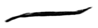
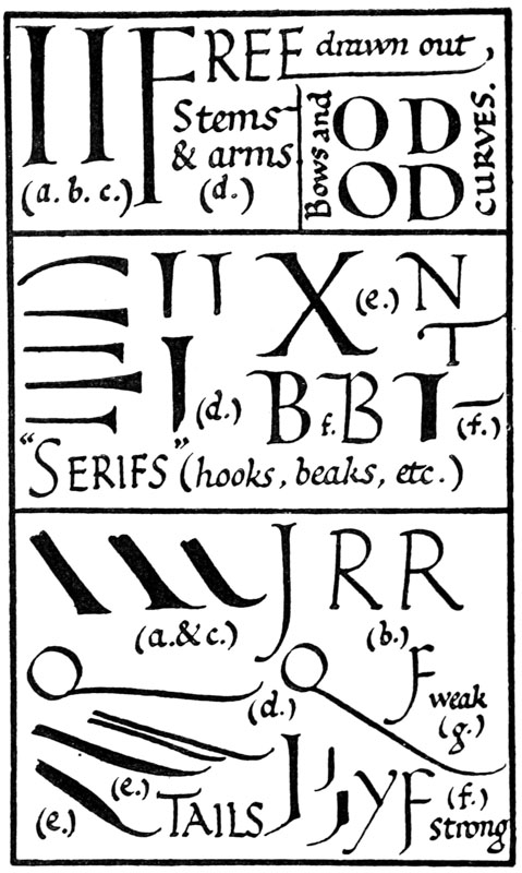
Fig. 163.
TAILS.—(a) The tails of K, Q, R [p291] (and J)—and the strokes in A, F, G, I, M, N, P, Y, &c., which may be drawn out tail-wise—play an important part in the right construction, and the occasional decoration, of plain lettering. They may end either in serifs or in curves (see SERIFS (e), above, and fig. 188).
(b) Note.—It is a characteristic of vigorous forms that branches, &c., stand out well from their stems (pp. 219, (e) 289, (N) 271), and a good tail should stand out well from the letter (K, Q, fig. 167).
(c) An excellent form of tail for ordinary use, combining strength and grace, consists of a (strong) straight stroke ending more or less abruptly in a (graceful) finishing curve.
(d) An extraordinarily long tail requires a slight double curve to take off its stiffness.
(e) A good tail may be made by the addition of a double curved stroke on the under side of a straight tail (or of a single curve above).
(f) In treating the tail of J, or the drawn-out stems of A, F, G, I, M, N, P, Y, it is important to preserve the essential straightness of the stems. Therefore, if a finishing curve be used, its size is related to the length of the straight stroke, and, unless this be extraordinarily long, the curve is usually made rather small and abrupt. A curve which is too large is apt to weaken the form and “pull it out of the straight” (g, fig. 163).
BUILT-UP FORMS
Built-up Letters are composed of compound strokes (c, d, fig. 164); Simple-written Letters of simple strokes (a, b).
The Pen being an instrument which produces [p292] definite thick and thin strokes on a smooth surface, is perfectly adapted to the construction of either simple or compound forms; other tools, such as the stylus, needle, graver, &c., produce various scratches, stitches, or cuts, generally of the nature of rather varying thin strokes, and to produce thick strokes a building-up process is required.
In making built-up forms the control exerted by the tool is less obvious, and more depends upon the craftsman, who must therefore use greater care and judgment. Not only is it possible, but, occasionally, it may be desirable to depart from the more obvious tool-forms; though generally the more simply and naturally tool-made a form is, the better it is.
The fine early inscriptions are supposed to have been first drawn or painted (in outline) and then cut into the stone. The chisel forms were doubtless affected in this way by brush (and indirectly by pen) forms, but these were of the simplest—nothing was sketched in that was unfitted for the chisel to make into a natural and true chisel-form.
The action of the brush or “pencil” to a certain extent resembles that of the pen, but their effects are really distinct. In contrasting pen-made and brush-made letters, we may observe that a pen form tends to abrupt changes from thin to thick: a brush form to gradation (fig. 164). The pen particularly affects curved strokes (comp. a & b), generally making them more quick and abrupt (or even broken, see * * c), than brush curves. The brush will give more graceful and finished but less uniform letters (see p. 376).
The character of a pen-letter depends greatly on the nib-width (p. 324), and narrow, medium, or broad nibs are used according to the type of letter required. [p293]
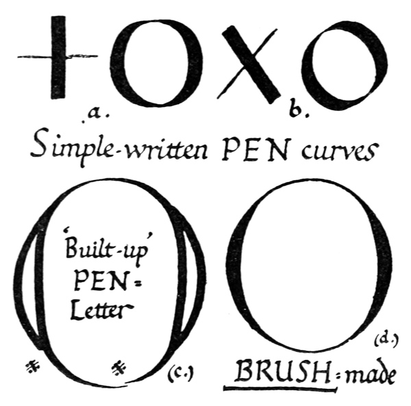
Fig. 164.
A narrow nib may be used for special (built-up) Initials and Capitals, which are drawn rather than written (a, fig. 165). The horizontal arms (made by the pen held horizontally) are markedly affected, and if a very fine nib were used, the necessity of strengthening and thickening them would tend further to reduce the pen character.
A broad nib gives strong, uniform pen-letters (b).
For ordinary use letters are perhaps best made with a “medium” nib (c). The width of the ordinary writing-pen, or rather narrower, gives a good proportion for initials, &c. (see pp. 118, 218).
In MS. books the early built-up Capitals were [p294] commonly of a rather severe type—approaching the Roman Capital, but having the sharp contrast between the thicks and the thins characteristic of pen-letters (fig. 166). They make very simple and effective “Versals.”
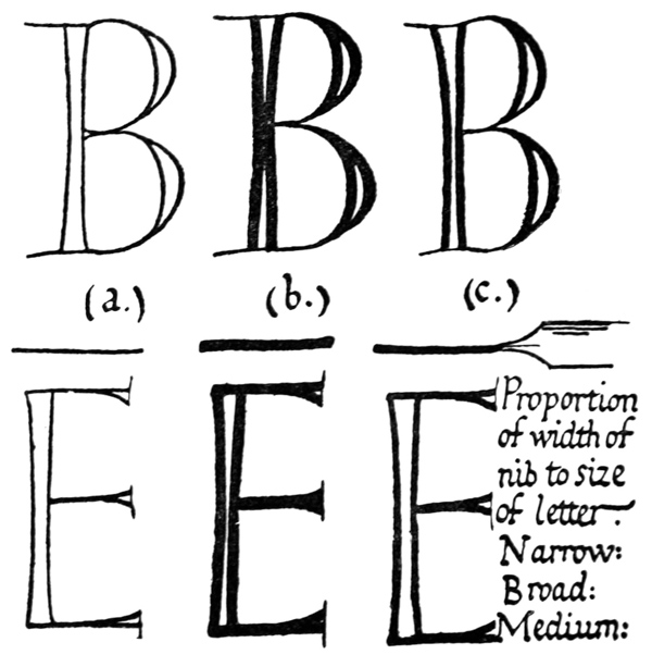
Fig. 165.
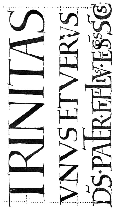
Fig. 166.—Pen-capitals from a tenth-century MS. (writing-lines dotted in fig. to show spacing method).
A more highly finished type of pen-made Roman Capital may be made by blending the serifs and stems (d, p. 289): it is nearer to the inscriptional form, but it exhibits a more curved and supple [p296] outline, which comes of natural pen-strokes (fig. 167).
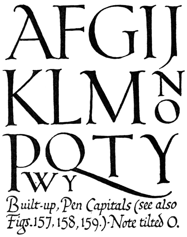
Fig. 167.
The remarks in Chapter VII. on the treatment of the more elastic “Gothic” Versal (a free variety [p297] of the Roman) may be taken as applying generally to (Coloured) Built-up Capitals—due allowance being made for the characteristic differences of the various types.
SIMPLE-WRITTEN CAPITALS
“Rustic Capitals” (fig. 4) may be referred to here as typical, simple-written capitals. Though not a very practical form,72 they are full of suggestions for a semi-ornamental lettering in which the pronounced treatment of the heads and feet might be a feature (comp. fig. 203). They were used as ornamental letters for titles and the like (see Plates VIII., IX., &c.) for centuries after they had gone out of ordinary use.
Simple-written Roman Capitals.—(Examples: Plates III., XVIII., XIX., XXI., figs. 147, 148, 168, 175, 179. See also pp. 247, 429.)
Uncials.—(Examples: see p. 300.)
Simple-written Capitals ordinarily conform to the writing line—as set by the small text (p. 82). This applies even where several words in capitals have to be inserted in the small text, though in special cases where these might look too crowded such capitals might be written on alternate lines.
Used for Initial Words, headings, whole pages, or books, in black or colour, they are written with greater freedom and accorded more special treatment (see pp. 298, 299).
Simple-written Capitals are best composed of sharp, clean, pen-strokes: they may be quite plain [p298] or more or less decorative (fig. 168), subject to the general rule that the fewer the number of letters or the more ornamental their office, the more elaborate and fanciful may be the forms employed (see p. 294).
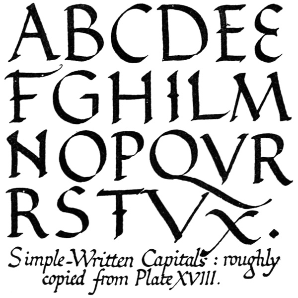
Fig. 168.
A freely used pen naturally produces occasional varieties for special or ornamental purposes: these tend to elegance and drawn out flourished strokes (p. 331); they vary chiefly in being extra large.73 [p299] Several of these may be used with fine effect in a page of plain Capitals, their “weight” (and generally their colour) being the same as that of the text (see Plate V., and p. 328).
Whole Books or Pages written in Capitals.—A very grand effect may be produced by these at the expense of a little more time and material than a Small-letter MS. entails. The lines of writing are commonly made one-letter-height apart: this requires ordinary simple ruling—the capitals being written between every alternate pair of lines (see p. 412).
Such writing may conveniently be treated as “Fine Writing” (p. 262). It justifies the use of wider margins. It is generally more difficult (and less necessary) to keep the right-hand edge as straight as a small text permits. The irregularities of this edge may be balanced by setting out in the left margin the first letters of sentences, verses, and the like (see p. 264). Such initials may be written larger or more ornamentally as suggested above; or, if built-up Letters are required, plain, rather slender Roman Capitals are the most suitable: these look best in burnished gold.
Perhaps the finest and most beautiful work which the penman can produce, is a book written entirely in gold74 capitals75 on purple vellum (see pp. 164, 175). This is only possible in special cases, but a book rightly so made being illuminated from within, has an incomparable simplicity and grandeur, surpassing that of the finest post-decorated and illuminated manuscripts. [p300]
UNCIALS Examples: Plates IV., V.; fig. 5, 169 (enlarged); (modified, fig. 56).
Uncials are typical pen-capitals.76 Though not of such practical use as the simple-written Roman Capitals, their great possibilities and their beauty make them worth practising. (See Round, Upright, Formal Hands, p. 304.)
Their use is limited by two considerations—
First: that while the round are essentially legible (p. 239), people generally are not accustomed to them, and may find them hard to read; and

Secondly: that have ascending and descending strokes which are apt to become too pronounced and give an unpleasant appearance of “tailiness” to a page of Uncial Writing (in English, see footnote, p. 326).
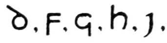
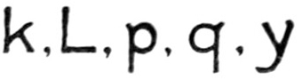
The first difficulty may be met by keeping Uncials for special MSS.—for private use—and introducing them sparingly or not at all in Service Books, Placards, &c., where ease and quickness of reading are essential.
The appearance of “tailiness” (not so obvious in Latin) may be avoided by making the tails shorter and keeping the lines of writing well apart. Or freely made Roman Capitals without tails (see D, tail-less, fig. 57) may be substituted for one or more of the chief offenders. [p302]
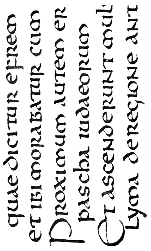
Fig. 169.—Part of Plate V. (q.v.), enlarged three times linear.
Uncials may be “round” (see Plate IV., fig. 5, and p. 304), or “pointed” (see fig. 169, and p. 413).
CAPITALS & SMALL-LETTERS
During the development of Small-Letters from Capitals but little distinction was made in their use, and such capital forms as N and R were freely and promiscuously used in the round minuscule writings, together with the small-letters n and r (see Plates VI., VII.). On the other hand, Small-Letter forms were frequently written larger and used as initials. In Irish and Anglo-Irish MSS. these were filled inside with green, yellow, or red, and surrounded outside with red dots, or otherwise decorated with colour (see fig. 7, and Plate VI.).
In early MSS., therefore, one does not find an alphabet of Simple-Written Capitals, which is peculiar to a given small text. But we may employ a kindred capital—such as the round Uncial for the round Half-Uncial. And a fitting alphabet may always be constructed, from the “Roman” or “Uncial” types of Capitals (footnote, p. 300), by taking the same pen with which the small-letters have been made and using it in a similar manner: “straight” for “straight-pen” writing, and “slanted” for “slanted-pen” writing (see figs. 147, 148).
When in doubt as to the type of Capital—for any purpose—use Roman Capitals.
EARLY, ROUND, UPRIGHT, FORMAL HANDS Examples: Half-Uncials—fig. 6 (Roman); Plate VI. (Irish), Plate VII. (English) fig. 170 later; see also pp. 40, 44, 413–415. Uncials (Plate IV. and p. 38). [p304]
The main types are the “round” Uncial and Half-Uncial, commonly written with an approximately “straight pen.”77 They are generally treated as fine writing (p. 262), and written between ruled lines: this has a marked effect in preserving their roundness (see p. 414).
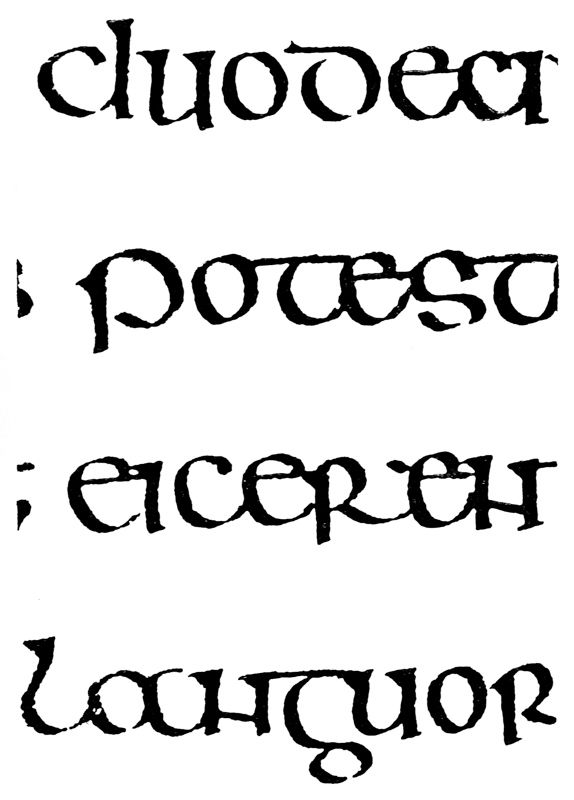
Fig. 170.—Part of an English eight-century MS. (British Museum, Case C, No. 68), enlarged three times linear.
They are very useful as copy-book hands (see p. 70), for though the smooth gradation of their curves, their thin strokes, and their general elegance unfit them for many practical purposes, yet their essential roundness, uprightness, and formality afford the finest training to the penman, and prevent him from falling into an angular, slanting, or lax hand. Their very great beauty, moreover, makes them well worth practising, and even justifies their use (in a modernised form) for special MSS., for the more romantic books—such as poetry and “fairy tales”—and generally where speed in writing or reading is not essential.
With an eye trained and a hand disciplined by the practice of an Irish or English Half-Uncial, or a modified type, such as is given in fig. 50, the penman may easily acquire some of the more practical later “slanted-pen” types.
“SLANTED-PEN” SMALL-LETTERS (Typical Examples:— Carlovingian ninth-century MS.—Fig. 8 (enlarged, fig. 171): [p305] English tenth-century MS.—Plate VIII. (enlarged, fig. 172): English eleventh-century MS.—Plate IX. (enlarged, fig. 173): Italian twelfth-century MS.—Plate X. (enlarged, fig. 174).)
The use of the “slanted pen” generally produced stronger, narrower, and stiffer letters. Its effects are detailed in pp. 43–47, and fig. 11, and may best be studied in the tenth-century example (fig. 172—the letter forms are described on p. 416).
In the Carlovingian MS.—which does not show these effects in any marked degree—we may note the wide letter forms, the wide spacing, the long stems (thickened above by additional strokes), the slight slope of the letters, and the general effect of gracefulness and freedom (see fig. 171). Carlovingian MSS. may be said to represent a sort of mediæval copy-books, and their far-reaching influence on writing makes them of great interest to the modern penman, who would, moreover, find one of these hands an excellent model for a free “formal hand.”
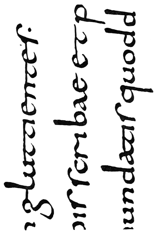
Fig. 171.—Part of fig. 8, enlarged three times linear (see p. 305).
For practical purposes the “slanted-pen” letter is generally superior to the “straight-pen” letter. The “slanted-pen” letters have greater strength and legibility, due mainly to the presence of the thick horizontals—often equal in width to the verticals. Their use saves both space and time, as they are narrower, and more easily and freely written78 than the straight-pen forms.
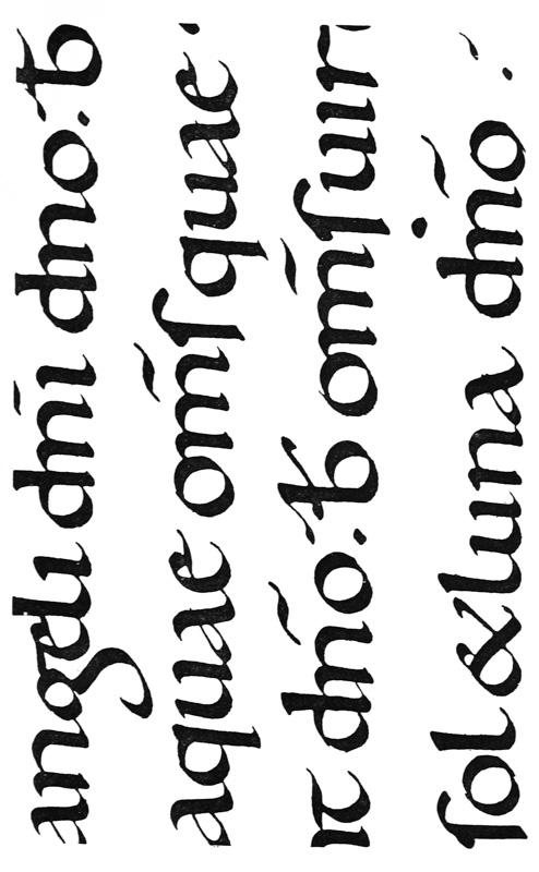
Fig. 172.—Fig. 12, enlarged twice linear (see p. 305 & Plate VIII.). Note: top line is cut down.
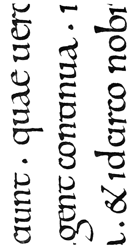
Fig. 173.—Part of Plate IX. (Charter of CNUT), enlarged three times linear (see p. 416).
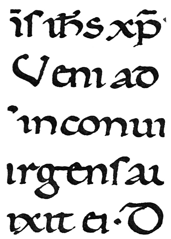
Fig. 174.—Part of Plate X., enlarged three times linear (see pp. 417–419).
The real importance to us of these early types [p310] lies, I think, in their relation to the Roman Small-Letter (pp. 418–19 & 429–83), and their great possibilities of development into modern formal hands approaching the “Roman” type.
ROMAN SMALL-LETTERS Ex.: (Italian) Plates XIX., XX. (15th century); figs. 175, 176 (16th century): figs. 147, 148 (modern MS.).
The Roman Small-Letter is the universally recognised type in which the majority of books and papers are printed. Its form has been in use for over 400 years (without essential alteration) and as far as we are concerned it may be regarded as permanent.
And it is the object of the scribe or letter-maker gradually to attain a fine, personal formal hand, assimilating to the Roman Small-Letter; a hand against the familiar and present form of which no allegations of unreadableness can be raised, and a hand having a beauty and character now absent or unfamiliar. The related Italic will be mastered for formal MS. work (p. 315), and the ordinary handwriting improved (p. 323). These three hands point the advance of the practical, modern scribe.
The Roman Small-Letter is essentially a pen form (and preferably a “slanted-pen” form; p. 305), and we would do well to follow its natural development from the Roman Capital—through Round Letters and Slanted-Pen forms—so that we may arrive at a truly developed and characteristic type, suitable for any formal manuscript work and full of suggestions for printers and letter-craftsmen generally.
A finished form, such as that in Plate XX.—or even that of fig. 175—would present many [p311] difficulties to the unpractised scribe, and one who so began would be apt to remain a mere copyist, more or less unconscious of the vitality and character of the letter. An earlier type of letter—such as that in Plate VIII.—enables the scribe to combine speed with accuracy, and fits him at length to deal with the letters that represent the latest and most formal development of penmanship.
And in this connection, beware of practising with a fine nib, which tends to inaccuracy and the substitution of prettiness for character. Stick to definite pen strokes, and preserve the definite shapes and the uniformity of the serifs (p. 324): if these be made clumsily, they become clumsy lumps. It may be impossible always to ascertain the exact forms—especially of terminals and finishing strokes—for the practised scribe has attained a great uniformity and some sleight of hand which cannot be deliberately copied. But—whatever the exact forms—we may be sure that in the best hands they are produced by uniform and proper pen strokes.
ITALICS Ex.: Plate XXI., and figs. 94, 177, 178 (enlarged).
Italics79 closely resemble the Roman Small-Letters, but are slightly narrowed, slightly sloped to the [p314] right, and very freely written (commonly with a “slanted pen”). The serifs generally consist of slight natural terminal hooks, &c.—though in p and q a finishing stroke is sometimes added. Ascending and descending strokes (in b, d, f, h, k, l, g, j, p, q, y) are commonly rather long, and often end in curves, sometimes in flourishes (fig. 177).
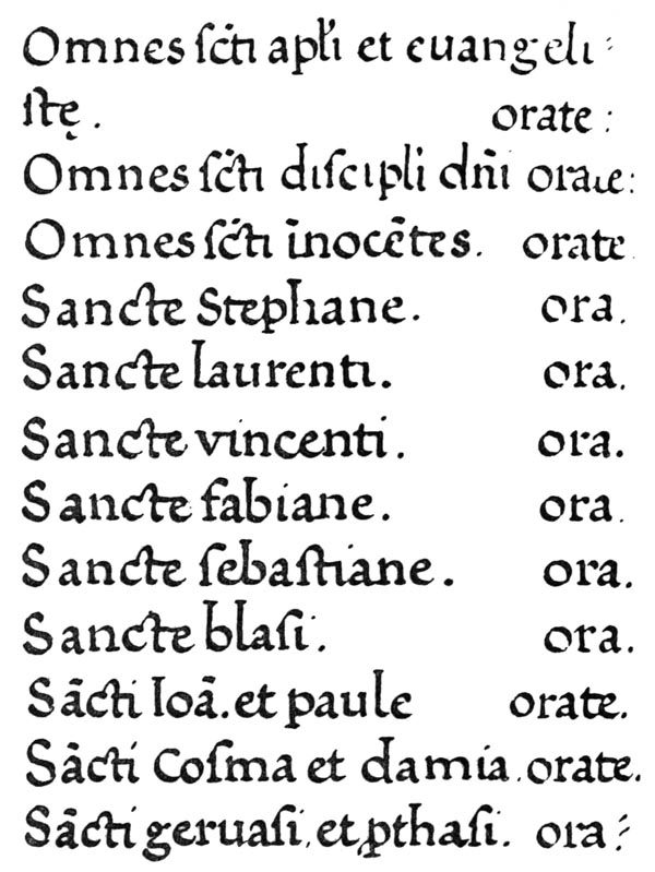
Fig. 175.—Italian Prayer Book: 16th century (see opp. p. & p. 345).
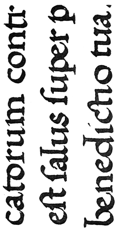
Fig. 176.—(From same MS. as fig. 175, enlarged three times linear.)
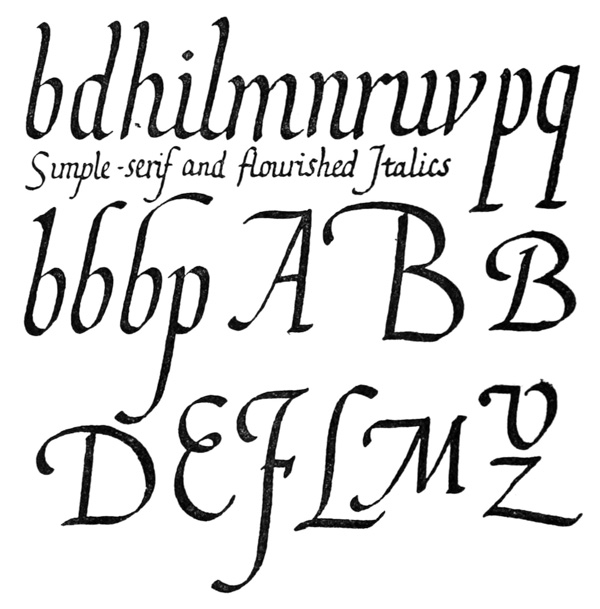
Fig. 177.
The lines of writing are generally widely spaced—allowing for the long stems: the bodies of the letters being narrow are generally rather closely packed, and frequently the lines of writing appear [p315] as almost continuous light but compact writing, while the ascenders and descenders and parts of the Capitals may be flourished freely in the spaces between the lines—sometimes filling them with ornamental pen work, which contrasts strongly with the extreme plainness and regularity of the bodies.
Italic Capitals are a variety of the Roman Capitals, slightly sloped (frequently less sloped than the accompanying small-letters), and sometimes much flourished (fig. 177). The types modelled on the latter were called by printers in the seventeenth century, “Swash Letters.”
Use of Italics.—In printing they served at first to mark such portions of the text as—
Introductions, Prefaces, Indexes, Notes, and subsequently were used for Quotations, Emphasising, Words not part of the Text (e.g. Chapter headings in the Bible, &c.).
In MSS. when it is not desirable to alter the character, Red Writing (see p. 130) may be substituted for italics. Italics—either in black or red—go best with “Roman” characters.
Like the Roman Small-Letter, the Italic is a generally recognised and accepted form: this and other considerations, such as the peculiar elegance and charm of the letters, their formal relation to modern handwriting, their compactness and economy of space in the line, and the fact that they may be written easily and with extreme regularity—being indeed the most rapid of formal hands—are practical reasons for a careful study of the type, and justify the writing of certain MS. books entirely in Italics. [p317]
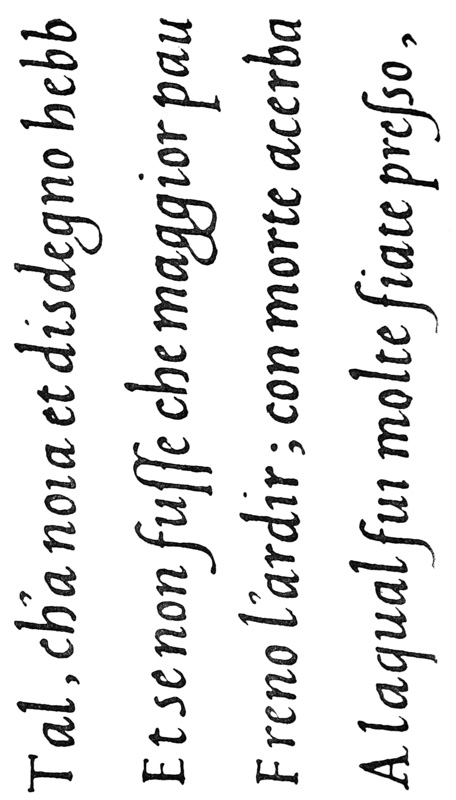
Fig. 178.—Part of Plate XXI., enlarged, (approx.) four times linear (see p. 483).
SEMI-FORMAL WRITING
Figs. 179, 180, and 181 are taken from a sixteenth-century Italian MS.80 written in a semi-formal cursive hand in dark brown and red-brown inks (probably originally nearer black and red), on 150 leaves of fine paper.
The proportions of the Book,81 together with the good writing, have a very agreeable effect, and are interesting as being used by a writer over 300 years ago. The extra width of the side margins may have been allowed for annotations—some notes were written in by the scribe himself.
Page = 1118 inches high, 8 inches wide.
Margins Inner (78 inch + 38 inch allowed for Small Capitals) = 114 inch (approximate). Top = 138 inch (constant). Side = 234 inch (approximate). Foot = 3 inch (approximate).
Writing-Line Space nearly 516 inch high: length (varies), average 4 inches.
Text Column nearly 634 inches high, consisting of 22 lines of MS.
Character of the Writing.—The good shapes of the letters, their great uniformity, and their easy yet formal arrangement, mark this MS. as the work of a skilful penman. But, while pen character of a sort is very evident, the writing approaches the stylographic (apparently a rather narrow blunt nib was used), and the absence of definite thicks and thins distinguishes it from all the formal hands hitherto discussed: it may conveniently be termed Semi-formal.
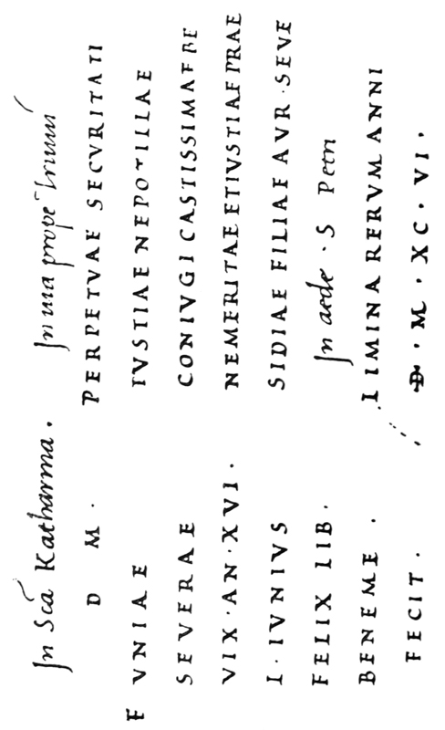
Fig. 179.
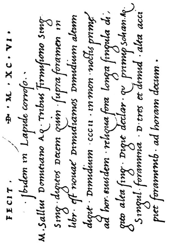
Fig. 180.
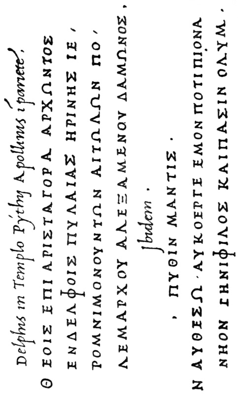
Fig. 181.
[p321]
Construction.—The rapidity and uniformity of this writing are largely due to an extremely easy zigzag movement of the pen, such as is natural in writing m, n, and u—the final upstroke usually running on into the next letter. Note particularly that the round letters c, d, e, g, o, q generally begin with a nearly straight down stroke—like the first part of u—to which tops are added (see fig. 182). In the case of a, the first stroke curves forward to meet the second. [p322]
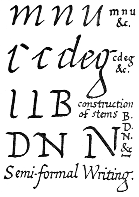
Fig. 182.
In the straight-stemmed capitals B, D, E, F, H, I, L, M, N, P, R, and T, the first stroke is made rather like an (showing the tendency to a zigzag) the foot of which is generally crossed horizontally by a second stroke making a form resembling —on this as a base, the rest of the letter is formed (see fig. 182). This tends to preserve the uniformity of the letters: and gives a fine constructive effect, as, for example, in the letter .


General Remarks.—The semi-formal nature of such a MS. would seem to permit of a good quill—not necessarily sharp—being used with the utmost freedom and all reasonable personal sleight of hand; of soft tinted inks—such as browns and brown-reds; of an un-ruled page (a pattern page ruled dark, being laid under the writing paper, will, by showing through, keep the writing sufficiently straight), and of a minimum of precision in the arrangement of the text. And in this freedom and informality lie the reasons for and against the use of such a hand. There is a danger of its becoming more informal and degenerating because it lacks the effect of the true pen in preserving form.82 But, on the other hand, it combines great rapidity and freedom with beauty and legibility: few printed books could compete in charm with this old “catalogue,” which took the scribe but little longer to write than we might take in scribbling it.
Many uses for such a hand will suggest themselves. Semi-formal documents which require to [p323] be neatly written out, and Books and Records of which only one or two copies are required, and even Books which are worthy to be—but never are—printed, might, at a comparatively low cost, be preserved in this legible and beautiful form.
It suggests possibilities for an improvement in the ordinary present-day handwriting—a thing much to be desired, and one of the most practical benefits of the study of calligraphy. The practical scribe, at any rate, will prove the advantages of being a good all-round penman.
OF FORMAL WRITING GENERALLY
On Copying a Hand.—Our intentions being right (viz. to make our work essentially readable) and our actions being expedient (viz. to select and copy the simple forms which have remained essentially the same, leaving the complex forms which have passed out of use—see pp. 195–6), we need not vex ourselves with the question of “lawfulness.”83
Where beautiful character is the natural product of a tool, any person may at any time give such character to a useful form, and as at this time a properly cut and handled pen will produce letters resembling those of the early MSS., we may take as models such early, simple pen-forms as have remained essentially the same,84 and copy them as closely as we can while keeping them exact and formal.
Finally, personal quality is essential to perfect workmanship, but that is the natural and gradual—sometimes [p324] scarcely visible—departure from a model, that comes of practice and time.
Forms of Letters: component pen-strokes.—In a good hand the chief component strokes—stems, bows, and serifs—are repeated again and again (see pp. 244, 254)—this is essential to the uniform character and the quickness of the writing. When substituting a new for an old letter a naturally used pen will produce such common pen-strokes, giving the desired “family likeness” to the new letter85 (b, fig. 183).
Proportion86 of Thick Strokes.—The broader the thick stroke is in proportion to the height of a letter, the more the form of the letter is controlled and affected by the pen (c, fig. 183). For training and practice, therefore, the wide nib is the most useful. A narrower nib (d or e) allows of more freedom and variety, and there is a great charm in slender lettering—this the trained scribe may essay (see Plate XX., and p. 482).
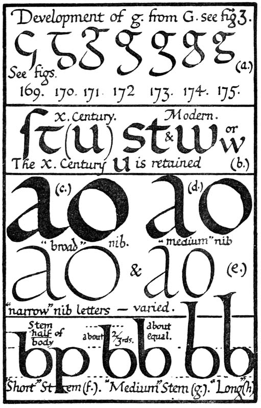
Fig. 183.
Proportion86 of Stem Height.—The character of a writing depends very much on whether the stems are short, medium, or long. The stems of b and p may be as short as half the height of the bodies (f, fig. 183); a medium stem for ordinary use might be two-thirds of, or equal to, the height of the body (g). Stems may be drawn out to almost any [p326] length, and may constitute a decorative feature of the writing, as in the Anglo-Saxon87 MS., Plate IX. (See p. 331, and fig. 188.)
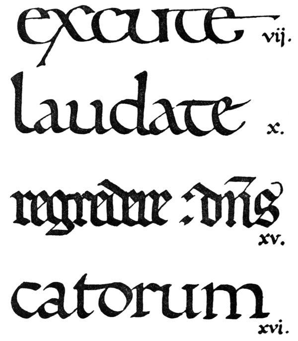
Fig. 184.
Distinct Lines of Writing.—The line—especially in MS. books—is really a more important unit than [p327] the page; and the whole question of the arrangement of Lettering hinges on the right treatment of the lines. One is particularly struck by the distinctness of the lines of writing in the old MSS., due mainly to—
(a) The binding together of the letters in the line—commonly by strong serifs or heavy “shoulders” and “feet” (see figs. 11, 184, and p. 414).
(b) Packing the letters well together (see pp. 77, 262).
(c) Spacing the lines sufficiently apart (see pp. 262–265).
It is a good rule (especially when practising) to space the lines fairly widely. Really fine writing shows generally to greater advantage if not too much crowded, and there is more danger of making reading hard by crowding the lines, than by crowding the words (see fig. 156).
Whatever mode of treatment be followed, each line should be written with as much freedom as possible, the simplest straightforward writing being preferable to that which is over-arranged.
DECORATIVE CONTRASTS
The decorative treatment of lettering generally involves contrasts of size, weight, colour, or form—that is, of large and small, heavy and light, variously coloured, or variously shaped letters. As a general rule, marked contrasts are best; a slight contrast may fail of its effect and yet be sufficiently noticeable to give an unpleasant appearance of irregularity.
Contrasts of Colour (see pp. 144, 180).—Note that, while it is convenient to distinguish “colour”—as red, blue, green, &c.—weight strictly involves [p328] colour: built-up or heavy letters in black show extra black beside lighter writing, while the latter appears grey in comparison (see figs. 197, 186); in red writing the heavy letters appear red, the lighter letters, pink (see fig. 90).
Contrast of Size.—The simplest decorative contrast is that of LARGE88 letters with smaller letters (fig. 185); the strokes being of equal, or nearly equal, weight, there is an harmonious evenness of tone throughout. Where the large letters are very much larger, their parts are made somewhat heavier to keep their apparent “weight” approximately equal (see p. 486). This is one of the most effective treatments for inscriptions generally (see p. 299, and Plates V. and XXIV.).
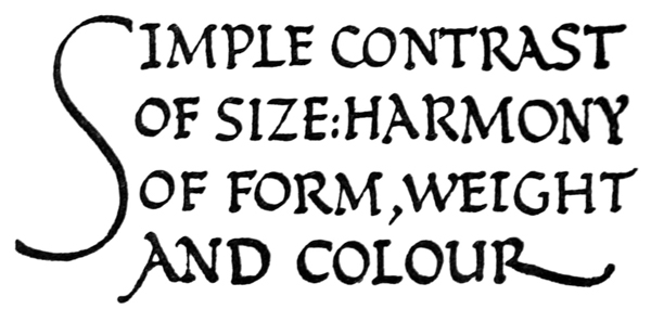
Fig. 185.
Contrasts of “weight” and size.—In simple writing these are obtained by using two sizes of pen—the small, light letters being used for the bulk of the [p329] text, the larger heavier letters being used for occasional words or lines (or vice versâ). This is a very effective simple treatment for MSS. (fig. 186).
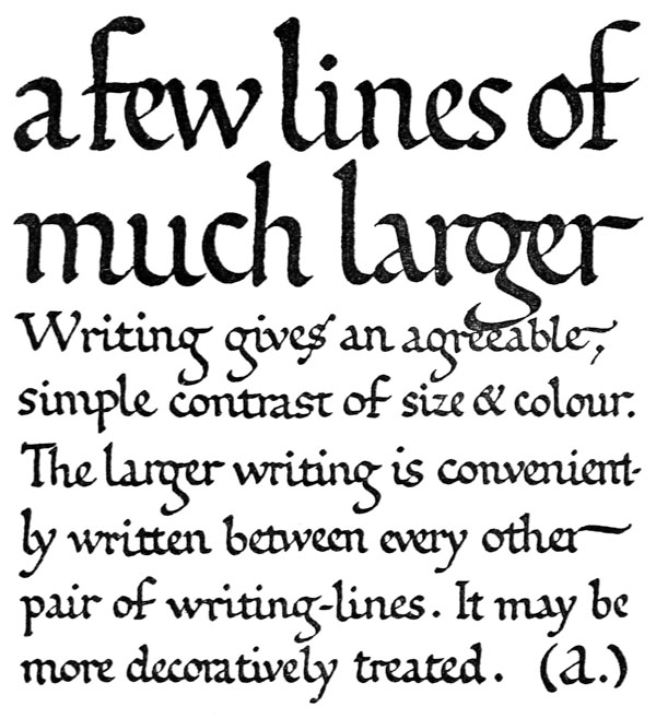
Fig. 186.—(See also fig. 191.)
The occasional letters may be more decoratively treated (see Responses and Rubrics, p. 345) by introducing the further contrasts of colour (p. 144) or form (p. 336). [p330]
Contrasts of form, “weight,” and size.—These are generally obtained by the use of large built-up Capitals, together with a simple-written (or ordinarily printed) text (fig. 187).
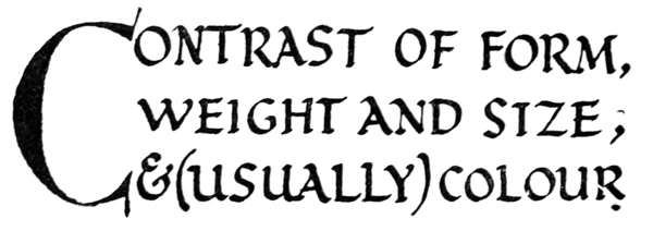
Fig. 187.
A marked contrast usually being desirable, the built-up capitals (especially if black) are kept quite distinct from the rest of the text (see fig. 197): if they are scattered among the other letters they are apt to show like blots and give an appearance of irregularity to the whole. As a rule, the effect is improved by the use of red or another colour (see figs. 91, 93).
Contrast of form—for decorative purposes—is usually combined with contrast of weight (e.g. “Gothic,” heavier, p. 336) or size (e.g. Capitals, larger, p. 371).
ORNAMENTAL LETTERS (See Chaps. VII., VIII., X., XII., & pp. 34, 251, 26)
To give ornament its true value we must distinguish between ordinary occasions when simplicity and directness are required, and special occasions when elaboration is desirable or necessary.
The best way to make ornamental letters is to [p331] develop them from the simpler forms. Any plain type may be decoratively treated for special purposes—some part or parts of the letters usually being rationally “exaggerated” (p. 252). Free stems, “branches,” tails, &c., may be drawn out, and terminals or serifs may be decorated or flourished (fig. 203).
Built-Up Forms.—Even greater license (see fig. 161) is allowed in Built-Up Letters—as they are less under the control of the tool (p. 292)—and their natural decorative development tends to produce a subordinate simple line decoration beside or upon their thicker parts (fig. 189 & p. 26). In MSS. the typical built-up, ornamental form is the “Versal” (see Chap. VII.), which developed—or degenerated—into the “Lombardic” (fig. 1). Here again it is preferable to keep to the simpler form and to develop a natural decorative treatment of it for ourselves.
“Black Letter” or “Gothic,” still in use as an ornamental letter (fig. 190), is descended from the fifteenth-century writing of Northern Europe (Plate XVII.). A better model may be found in the earlier and more lively forms of twelfth and thirteenth century writing (fig. 191).
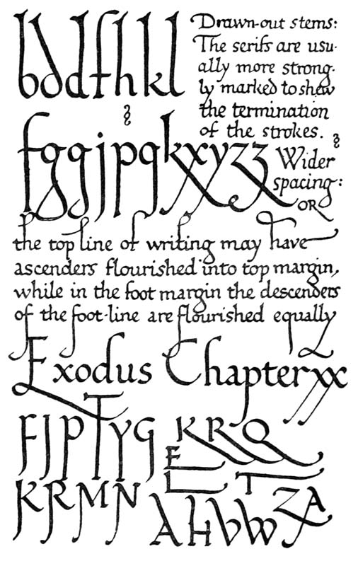
Fig. 188.—(See also figs. 125 and 150.)
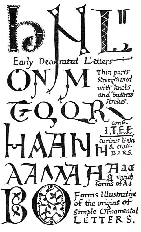
Fig. 189.—(See also Plates VI., XI., XXII., figs. 79 and 84, and p. 420.)
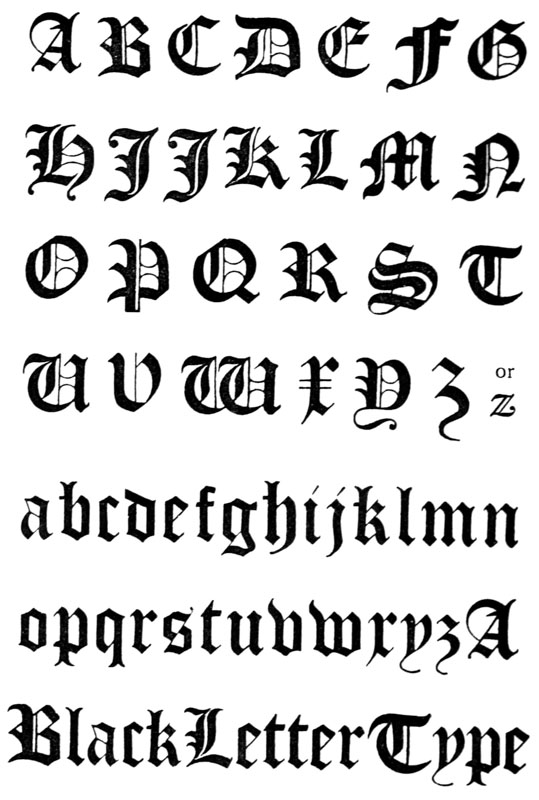
Fig. 190.—Ordinary Modern “Black Letter” Type (see p. 331).
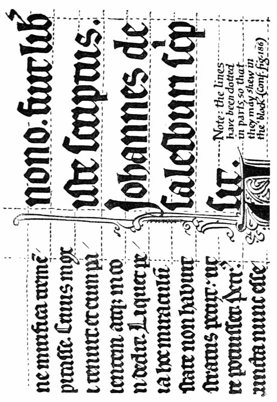
Fig. 191.—MS. written by an English Scribe, in 1269, at Mons, in Hainault—Part of Colophon in large text. (B. M. Egerton, MS. 2569. Reduced five-sixths Scale.)
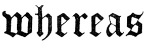
Rightly made, and used, it is one of the most picturesque forms of lettering—and therefore of ornament—and besides its ornamental value, there is still in the popular fancy a halo of romance about “black letter,” which may fairly be taken into account. Its comparative illegibility, however,—due mainly to the substitution of straight for curved strokes—debars it from ordinary use.89 Though its [p336] distinction in form and colour (p. 327) from ordinary small lettering, make it useful in arresting attention; as in a legal document, where the clauses are marked by
&c.
Its most effective use, however, is as pure ornament—when it does not matter whether the words are easily read or not. For mottoes, &c., painted or carved on walls or furniture, and for ornamental borders round tapestry hangings, tombs, book-covers, bowls, flagons, plates, &c., bands of such ornamental lettering are extremely decorative (see footnote (2), p. 255, & also p. 364).
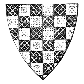
Fig. 191a.—Shield of Arms of Earl de Warrenne, Castle Acre Priory, Norfolk (Gold and blue chequers, diapered—see p. 215): reproduced, by permission, from Boutell’s “English Heraldry,” No. 68.
FOOTNOTES TO PART II: