Part 1 — CHAPTER XI A THEORY OF ILLUMINATION Illumination — “Barbaric, or Colour-Work, Illumination” — “Filigree, or Pen-Work, Illumination” — “Natural, or Limner’s, Illumination.”
Reading edition
CHAPTER XI A THEORY OF ILLUMINATION Illumination — “Barbaric, or Colour-Work, Illumination” — “Filigree, or Pen-Work, Illumination” — “Natural, or Limner’s, Illumination.”
ILLUMINATION
It is convenient to give a wide meaning to the word when we speak of an “illuminated manuscript,” for the scribe works with a very free hand, and when he wishes to decorate his pages he can [p194] write the words themselves in red, green, or blue, as easily as he could have written them in black. He can take a clean pen and a new colour and initial and “flourish” any part of the work to his heart’s content. He may acquire the art of laying and burnishing gold, and no possible brilliance of effect is denied him—within the limits of his skill as an illuminator (see also pp. 298–299).
A limited number of specially prepared printed books can likewise be illuminated. But the greater the number of copies, the less labour may be spent on each one, and the more their illumination tends to be simple “rubrication”—adding coloured capitals, flourishes, and the like (see p. 127). And, if a large edition is to be decorated, the printer must be content to use black, or black and red, in woodcut or “process” work (see pp. 365, 372).
Illumination proper may be defined as the decoration by hand, in bright gold or colours, of writing or printing.
There are three broad types of illumination, which for want of better terms I distinguish as “Barbaric” (or colour-work), “Filigree” (or pen-work), and “Natural” (or limner’s). These types run naturally one into another, and they may be blended or combined in every possible way, but it is convenient to consider them and the distinctive treatments which they involve separately.
“BARBARIC, OR COLOUR-WORK, ILLUMINATION” (See also pp. 203, 208, 209, 215–18, 414, 421, 422)
This is mainly a colour treatment in which forms seem to be regarded chiefly as vehicles for [p195] colour. Its effect appeals to the senses, rather than to the imagination; and such interest as the forms have lies greatly in their skilful disposal or intricate arrangement. Sometimes in their fantasy—where organic forms are introduced—as the “great fish” in the act of swallowing Jonah (in order to make the T of ET), Plate XII. This type of illumination appears to have reached its climax of barbaric splendour in the twelfth and thirteenth centuries.
Though its revival nowadays might seem a little out of keeping with the more sedate and grown-up point of view of modern life, we cannot doubt that it is still lawful to decorate our work with the brilliance and splendour of gold and colours. Whether it is expedient or not depends upon how it is done: to justify our work, it must succeed; it must be bright and splendid, and really gladden our eyes. And we must really take pleasure in the making of it, for if we do not, we can hardly expect that it will give pleasure to others.
Simple and Complex Forms.—Between simple forms—which are in a sense permanent—and complex forms—which are always changing—it is necessary to make a careful distinction.
An equilateral triangle drawn by “Euclid” and one drawn by a modern Senior Wrangler are, or ought to be, practically the same thing. If the ancients made an ornamental band of geometrical forms, that is no bar to us; we also are at liberty to make decorative bands of circles, lozenges, or triangles.
The ancient Romans made a capital A—its essential form (see fig. 142) two strokes sloped together and joined by a cross-bar (very like the [p196] “Pons Asinorum”), it could hardly be simpler—they used chisels and pens, which gave it its more characteristic and finished form. If we use chisels and pens properly we shall get a similar result—not absolutely the same—for no two chisels or two hands can be quite the same—but closely resembling it and belonging to our own time as much as to any other.
The essential form of the “Roman” A is a purely abstract form, the common property of every rational age and country,41 and its characterisation is mainly the product of tools and materials not peculiar to the ancient Romans.
But when there is any real complexity of form and arrangement, or sentiment, we may reasonably suppose that it is peculiar to its time, and that the life and virtue of it cannot be restored.
It was common enough in the Middle Ages to make an initial A of two dragons firmly locked together by claws and teeth. Such forms fitted the humour of the time, and were part of the then natural “scheme of things.” But we should beware of using such antique fantasies and “organisms”; for medieval humour, together with its fauna and flora, belong to the past. And our own work is only honest when made in our own humour, time, and place.
There are, however, an infinite variety of simple abstract forms and symbols, such as circles, crosses, squares, lozenges, triangles, and a number of Alphabets, such as Square and Round Capitals, [p197] Small Letters—upright and sloping—which—weeded of archaisms—we may use freely. And all these forms can be diversified by the tools with which they are made, and the manner in which the tools are used, and be glorified by the addition of bright colours and silver and gold. Very effective “designs” can be made with “chequers” and diaper patterns, and with the very letters themselves. And I have little doubt that an excellent modern style of illumination is quite feasible, in which the greatest possible richness of colour effect is achieved together with extreme simplicity of form.
“FILIGREE, OR PEN-WORK, ILLUMINATION” (See also pp. 205–208, 209, 218–20, 425, 428–29; figs. 79, 92, 125–26, 150, 188–89; Plates XI., XIII., XIV., XVII.)
This is a type of illumination which can safely be attempted by one who, having learnt to write, is desirous of illuminating his writing; for it is the direct outcome of penmanship (see p. 204), and consists mainly of pen flourishes, or semi-formal lines and shapes which can be made with a pen, suitably applied to the part to be decorated. Its effect may be very charming and restful: no colour standing out as in a positive colour scheme, no individual form catching the eye; but the whole having a richness of simple detail and smooth colouring more or less intricate and agreeably bewildering.
It may be compared to the tooling of a book-cover, both in the method of producing it, and in its effect. A book-binder has a number of stamps which bear the simplest forms and symbols, such as [p198] little circles and “leaves” and stars and curved lines, and with these simple elements he builds up a pleasant “design,” which he tools, usually in gold-leaf, upon the cover.
The scribe can vary the forms which his pen produces, and the colours which he gives them, with a freedom that the set form and the method of using the binder’s tools do not allow. But the skilled penman will find that his pen (or, at any rate, his penmanship) largely determines the forms of his freest flourishes and strokes, and that the semi-formal nature of such ornament demands a certain simplicity and repetition of form and colour, which do not unduly tax his skill as a craftsman.
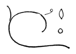
Fig. 121.
Suppose, for example, that the scribe wishes to illuminate the border of a page of writing. He may choose a limited number of simple, pen-made forms for the elements of his design; say, a circle, a “leaf,” and a “tendril,” and a few curved flourishes and strokes (fig. 121), and with these cover the allotted space evenly and agreeably. [p199]
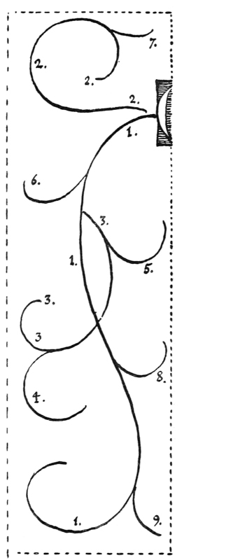
Fig. 122.
The ornament being treated as though it were a sort of floral growth, requires a starting point or “root.” The initial letter is the natural origin of the border ornament, the stalk of which generally springs from the side or from one of the extremities of the letter. The main stem and branches are first made with a very free pen, forming a skeleton pattern (fig. 122).
Note.—The numbers in the diagram indicate the order in which the strokes were made. The main stem (111) sweeps over and occupies most of the ground; the secondary stem (222) occupies the remainder; the main branches (333, &c.) make the occupation secure. [p200]
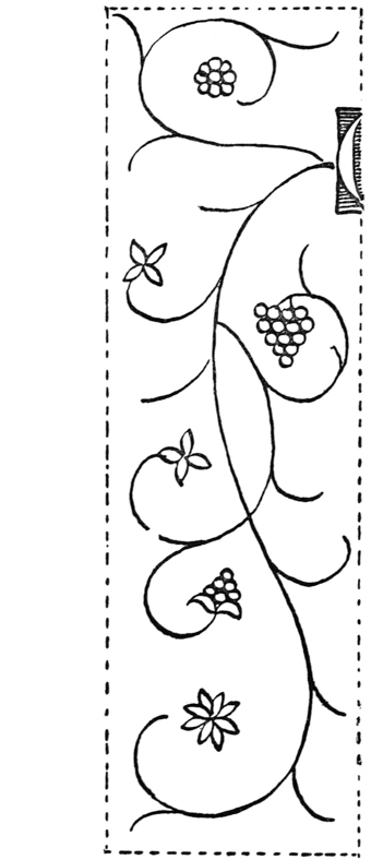
Fig. 123.
Next the minor branches are added to cover the space evenly, and then the flowers, fruit, and buds—made up of combinations of the “leaves,” circles, &c.—are more or less evenly disposed in the spaces formed by the large, round curves at the ends of the branches (fig. 123). [p201]
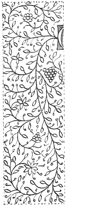
Fig. 124.
The “leaves” are placed all over, wherever there is convenient room for them (just as the leaves of a real plant are). Then the stalks of the leaves are added, and, lastly, the interspaces are filled with “tendrils,” which greatly contribute to the pleasant intricacy of the design (fig. 124). [p202]
Colour Schemes.—The safest treatment of such a “design” is in black and gold (see p. 187). The leaves, which are kept rather flat, may be outlined after gilding. The flowers, &c., may be made up in red and blue (tempered with white: see p. 182). This is the colour treatment of the example, Plate XVII.
If the leaves are green, the stem and outline may be more delicately drawn in pale or grey-brown ink, and the green may be a delicate pale olive or grey-green. (A strong, black stem with bright green leaves is apt to look crude and hard.) In such a delicate green plant border, delicate blue and red flowers, and one or two rather flat gold “berries” (single, or in threes) may be placed.
A very effective colour decoration of a much simpler type may be made in red and green (or blue) pen-work—using the pen and the colours with which the Versal letters and line-finishings are made. A red flourished stem with red leaves or tendrils, and green berries (or leaves), or a green stem with green leaves and red berries.
A floral pattern may also be made in plain burnished gold—both stem and leaves—not outlined (p. 187 & Plate XXII.).
A more complex decoration resembling the “floral filigree” has a “solid” stem in light or dark colour on a dark or light ground (or on a gold ground), as suggested in the rough diagram, fig. 120.
The examples of Italian fifteenth-century work in Plates XVIII. and XIX. show a related type of illumination, known as the “white vine pattern.” Very carefully and beautifully drawn, it strongly suggests natural form.
“NATURAL, OR LIMNER’S,42 ILLUMINATION” (See also pp. 212, 219–21, 227, 423–24, 426–28, 486; figs. 131a–141; Plates XV., XVI., XXIII.)
This, the finest type of illumination, has very great possibilities; and it is to be hoped that some craftsmen, who have the necessary skill, will find an opening for their work in this direction. [p203]
Plate XV. is a thirteenth-century example of the transition from the “barbaric” to the “natural.” The dragon-tailed initial with its wonderful scroll-work and “ivy-leaf” being the perfection of barbaric form, carrying brilliant colour and serving to support and frame the delicate and beautiful drawing which it contains.43 But in the drawing itself the skill of a fine illuminator combines with the fancy of a cunning draughtsman to satisfy an æsthetic taste and appeal to the imagination.
Plate XVI. shows a rare, and singularly beautiful, treatment of an Italian fourteenth-century MS. decorated with plant and insect forms (p. 427).
Plate XXIII. (modern) show a border of wild roses and climbing plants: the colour treatment in the original is very brilliant (see p. 486).
The “natural” type depends very much on the beauty and interest of its form; and a draughtsman before he had become an illuminator, might be content to decorate MSS. and printed books with pen drawings only faintly coloured or tinted; but when he had mastered the limitations which the craft would impose on his drawing for pure and bright colour, there is no degree of brilliance, even unto “barbaric splendour,” which he might not lay upon his trained and delicate forms. [p204]