Part 1 — CHAPTER XIII “DESIGN” IN ILLUMINATION “Design” — Elementary Patterns in Decoration — Scale & Scope of Decoration — Of “Designing” Manuscripts, Generally.
Reading edition
CHAPTER XIII “DESIGN” IN ILLUMINATION “Design” — Elementary Patterns in Decoration — Scale & Scope of Decoration — Of “Designing” Manuscripts, Generally.
“DESIGN”
Perhaps the nearest right definition of “design” is “contrivance”—applied to the actual doing of the work, rather than to the work when done: “decoration” (when that is the sense intended) is a safer word,47 because it implies “of something.” And generally that “something” lies at the root of the matter. For example: “illuminated initials” and “illuminated borders,” so called, are really illuminating: they are properly a decoration of manuscript or print.
To consider a “piece-of-decoration” as a thing existing apart from that which it decorates, as something drawn or copied, and, so to speak, stuck on to the finished work, is as unnatural as it would be to contemplate the flame-of-a-candle as a thing apart from the candle. [p215]
The finest decoration is really part of the work itself, and may be described as the finishing touches given directly to the work by the tools which are properly employed on it.
The illuminator has, as a rule, to decorate a given manuscript with pen or brush work—it may be with the simplest pen flourishes, or with the most elaborate figure “design.” How to make that illumination part of the work, he can learn only by patient practice and by careful handling of his tools.
ELEMENTARY PATTERNS IN DECORATION
Nearly all simple Decoration consists of a comparatively limited number of elements—simple forms and pure colours—which are built up into more complex forms to occupy an allotted space. A primitive type of such built-up decoration is seen in the dotted patterns, which are found in every age—in the remains of the most ancient art, and in the shell decorations which children make on the sands at the present day. Examples of dotted “backgrounds” in the “Durham Book” are shown in fig. 130 (a and b). Chequers and Diapers—in which two or more elements are employed—are related patterns.48 (See also Addenda, p. 25 & fig. 191a.)
A simple way of filling a band (or long narrow [p216] space) is to run a zigzag line along it (c). This may be treated either as a line or wavy stem, which may send out buds, leaves, or flowers into the spaces (g), or as two series of triangles which may be “countercharged” (f).49 A second zigzag, cutting the first, would produce two series of triangles and a central row of lozenges (d). And it is not a very great step from this to the “twist” where the two lines pass over and under, the lines being made “solid” in white or gold on a coloured background (e, fig. 130). The main difference appears to be that while the one is of the nature of an abstract form, the other suggests a concrete form, such as might be made with twisted cords or rods.
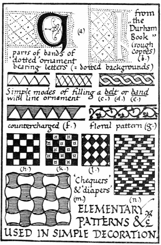
Fig. 130.
These primitive patterns never become antiquated; they are still the root forms of “design,” and the pleasant even covering of a given space by simple elements—which is their métier—accounts for much of the unconscious pleasure which we take in good bricklaying or sewing or writing, and in a thousand things, where “many littles make a mickle.”
For their decorative possibilities in Illumination we can experiment in the most delightful way—framing our writing with bands of countercharged triangles in burnished gold, and blue and white, or with golden zigzags on a blue ground, or chequering backgrounds with scarlet and blue, and trying a hundred and one other ways (p. 197). Such patterns have been made the most of in Heraldry, [p218] an art which in itself would form a foundation for a splendid and complete scheme of Illumination.
SCALE & SCOPE OF DECORATION
Penmanship.—Many of the most beautiful MSS. were made in pen-work throughout.50 And it is well that the penman should stick to his pen as much as is possible. Not only does it train his hand to make pen ornaments, the forms of which are in keeping with the writing, but it helps to keep the decoration proportionate in every way. It is an excellent plan for the beginner to use the writing-pen for plain black capitals or flourishes, and to make all other decoration with similar or slightly finer pens than the one used for the writing.
Again, the direct use of the pen will prevent much mischievous “sketching.” Sketching is right in its proper place, and, where you know exactly what you wish to do, it is useful to sketch in lightly the main parts of a complex “design” so that each part may receive a fair portion of the available space. But do not spoil your MS. by experimental pencilling in trying to find out what you want to do. Experiments are best made roughly with a pen or brush on a piece of paper laid on the available space in the MS., or by colouring a piece of paper and cutting it out to the pattern desired and laying it on. Such means are also used to settle small doubts which may arise in the actual [p219] illuminating—as to whether—and where—some form or some colour should be placed on the page.
Filigree, Floral, & other Decoration.—The acquired skill of the penman leads very naturally to a pen flourishing and decoration of his work, and this again to many different types of filigree decoration more or less resembling floral growths (see figs. 125, 126; pp. 197–202; Plates XI., XVII.).
Now all right decoration in a sense arranges itself, and we may compare the right action of the “designer’s” mind to that necessary vibration or “directive” motion which permeates the universe and, being communicated to the elements, enables the various particles to fall into their right places: as when iron filings are shaken near a magnet they arrange themselves in the natural curves of the magnetic field, or as a cello bow, drawn over the edge of a sand-sprinkled plate, gathers the sand into beautiful “musical patterns.”
And to most natural growths, whether of plants or ornament, this principle of self-arrangement seems common, that they spread out evenly and occupy to the greatest extent possible their allotted space. Branches and leaves most naturally grow away from the stem and from each other, and oppose elbows and points in every direction. In this way the growth fits its place, looking secure and at rest—while in disconnected parallels, or branches following their stem, there is often insecurity and unrest.51 (See also Addenda, p. 25.)
For example: a circular space is filled more [p220] decoratively by a cross (a, fig. 131) than by a contained circle; a square is better filled by a “lozenge” or a circle (b and c) than by a smaller square set square and parallel (compare the diapering of the chequers in fig. 191 a). A circular or square space might be filled on this principle with a filigree arrangement such as is suggested by (d, fig. 131). Note.—In the case of two curves in the ornament touching (either internally or externally) they may be linked at this point by a (gold) band or circle or lozenge (e, fig. 131, see also Plate XVII.).
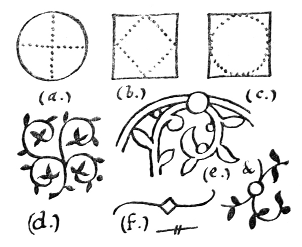
Fig. 131.
Miniatures and Drawing.—In drawing and painting, the difficulty which is apt to beset the illuminator is how to strike a balance between “Naturalism” and “Conventionalism,” so called. While the only criterion is good taste, we may be guided by certain general principles.
To limit the number of elements in a “design”—whether of form or colour—is nearly always an [p221] advantage (pp. 177, 181, 198). And the miniaturist, while depicting the nature of a plant, usually limits the number of its branches and leaves and shades of colour. Every part of a “design” should be drawn clearly and distinctly, and in proportion to the whole. The miniaturist, therefore, usually draws in careful outline every branch and leaf, making the whole proportional with the MS. which it decorates.
In fact, the qualities of good illumination are the same as the qualities of good writing—Simplicity, Distinctiveness, Proportion, &c. (see p. 239). And the “convention” (here literally a coming together) required is only such as will make the drawing and colouring of the illumination and the form and colour of the writing go well together.
Note.—Figs. 135 to 141 (woodcuts—with part of the text—from a Herbal printed at Venice in 1571 [p. 369]) and figs. 132, 133, and 134a (wood engravings by T. Bewick, printed 1791) are suggested as examples of drawing—of plants and animals—suitable for book-decoration (see also figs. 134b, c, d; Plates XV., XVI., XXIII., and notes on “limner’s illumination,” p. 203).
OF “DESIGNING” MANUSCRIPTS GENERALLY
Cultivate the simplest and most direct methods, and make “rules of thumb”52 for work-a-day use, to carry you successfully through all routine or ordinary difficulties, so that your hand will be trained and your mind free and ready to deal with the harder problems when they arise. [p222]
Use a limited number of pure, bright colours, and keep your work clean, neat, and definite.
Go straight ahead, trusting to workman-like methods, and not calculating overmuch. Do the work in a regular order, settling, first, the general scheme, the size of the book, the writing, and the margins; then when you are ready—
1. Prepare the sheets (see pp. 99, 110, 167).
2. Write the text—leaving spaces for decoration.
3. Write in— (a) The coloured writing. (b) The coloured capitals. (c) The line-finishings.
4. Illuminate—Following a regular order in the various processes involved— (a) The Initials. (b) Line-finishings. (c) The Borders.
5. Bind the book (p. 346), or have it bound, in order to make a real and finished piece of work.
Practise an artistic economy of time and space: usually the quicker you write the MS. the better it is. Allow sufficient margins to make the book readable and handsome, but not so wide as to make it appear fanciful. Allow sufficient ornament, not overloading the book with it. Let the ornament be of a type suited to the book and to the subject—not too painstaking or elaborate in an ordinary MS.; not too hasty and slight in an important work.
Endeavour to strike a balance between what may be called “practical” and “ornamental” considerations: an illuminated MS. is not meant to be entirely “practical,” but it is a greater failure if made entirely “ornamental.” Let the text be readable in every sense, and let the ornament beautify it: there should be give and take, as it were, and that most desirable quality—“sweet reasonableness.” [p223]
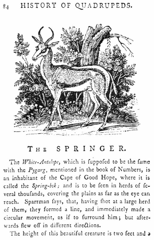
Fig. 132.
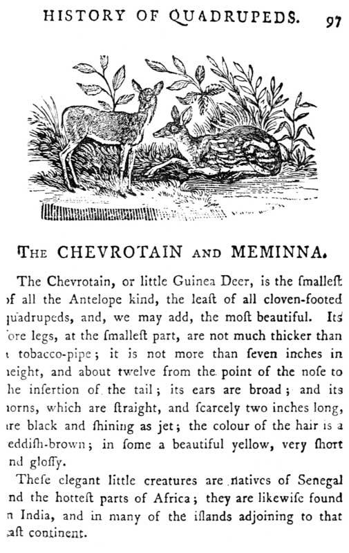
Fig. 133.
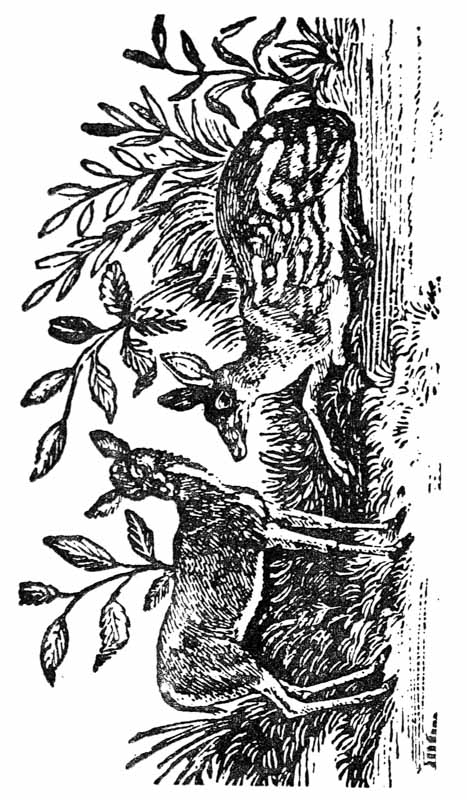
Fig. 134. Part of Fig. 133. Enlarged twice linear.
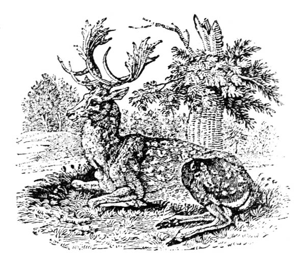
Fig. 134a.
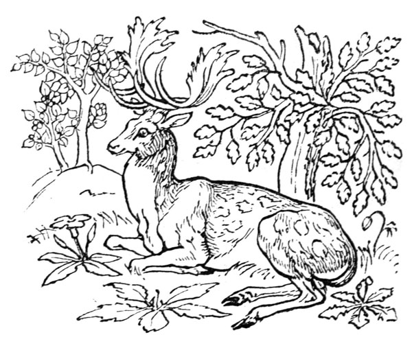
Fig. 134b.
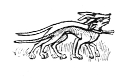
Fig. 134c. (This and fig. 134d are copies from a thirteenth century MS. in the possession of Mr. Yates-Thompson.)
“The intricacies of a natural scene (fig. 134 a—after Bewick) may be simplified when rendered in such a simple medium as the pen drawings of a MS. (comp. fig. 134 b). Figs. 134 c & d are old examples of strong, simple drawing. Students should practise themselves by translating figs. 132, 133 into fine, Quill-pen drawings.”—(N. R.)
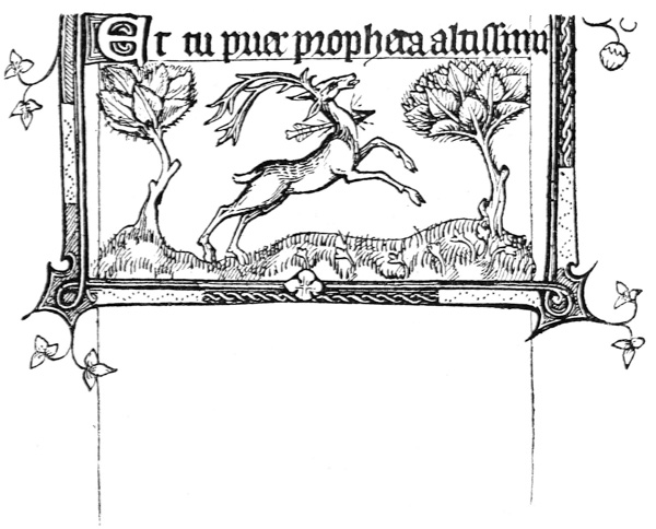
Fig. 134d.
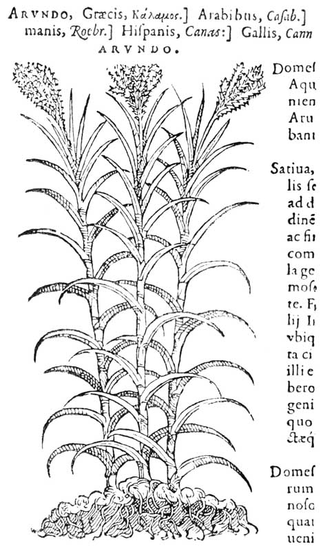
Fig. 135.—The Reed.
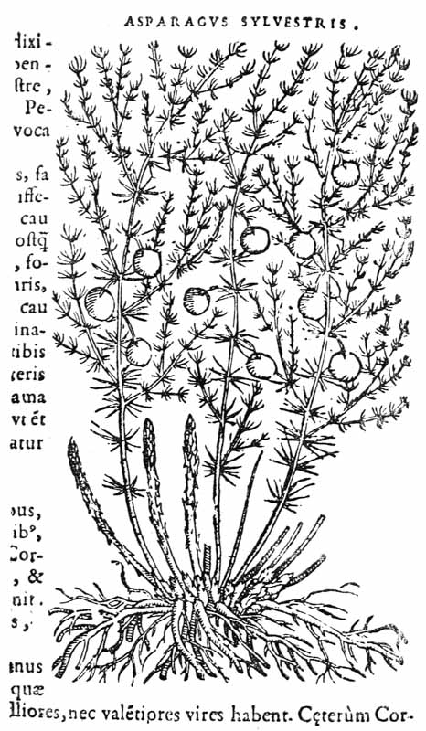
Fig. 136.—Asparagus.
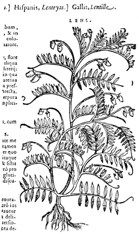
Fig. 137.—The Lentil.
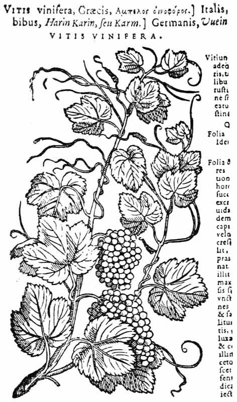
Fig. 138.—The Vine.
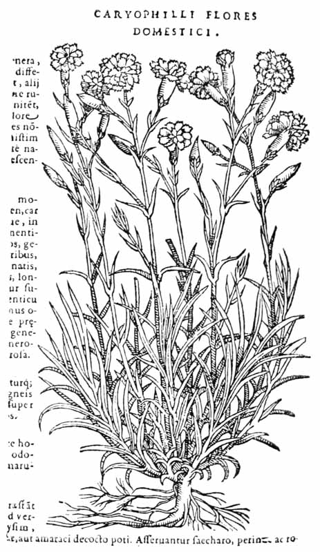
Fig. 139.—The Carnation.
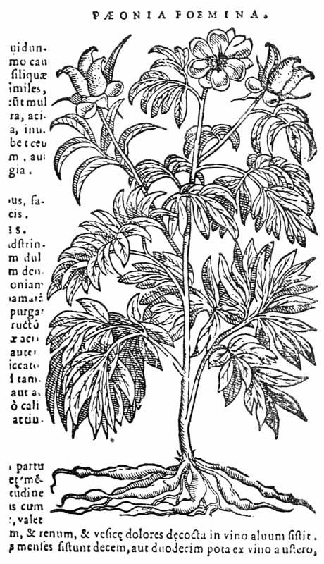
Fig. 140.—The Peony.
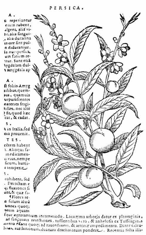
Fig. 141.—The Peach.
FOOTNOTES TO PART I: