PAUL A. BENNETT On Type Faces For Books
Reading edition


It is simple enough to understand that type, paper and ink are components of book printing. But not so easy to comprehend the reasons for the variety of papers available, nor the many dozens of type faces offered for book composition.
The reasons for this great variety are partly functional, partly aesthetic, and competitive. Papers differ in many ways—color, finish, opacity, strength and bulk are some of them.
Type faces differ, too, and for equally valid reasons. There are the important design and style differences that comprise the old style, transitional and modern faces suitable for books. And distinctions in weight or "color"; distinctions in roundness, in degree of compactness, and distinctions in legibility, and in size.
To the designer of books, type face selection is important in relation to the character of the text to be printed. The size of type selected, and the amount of "leading," or space between its lines, has a bearing upon the number of pages the manuscript will make.
Some shorter manuscripts, for instance, need to be "driven out" or padded, to make the book appear greater in content than it actually is, to justify its price. Others need every possible degree of compression to get the manuscript into a lesser number of pages, which, in turn, means fewer "forms" to print, fewer "signatures" to bind, and less paper to use.
To turn from the functional use of type to the aesthetic, and also make a rather loose analogy, one may think of the type face as a garment with which the designer dresses the author's words.
In this instance the designer selects a type face to develop an "allusive" format—to reflect something of the style of the period of the manuscript. Bruce Rogers, the greatest master of allusive book-making, in his "Paragraphs on Printing" points out that in a small way this is "like planning the stage setting for a play.
"An up-to-date style for an ancient text would compare with staging Hamlet in modern dress. However novel and effective in its own way, you feel it to be strange, and this sense of strangeness is an annoying distraction; you are forced to think of the setting and the designer rather than the text."
It is easier to suggest a feminine appeal with types like Estienne or Fairfield or Garamond, than with less decorative faces such as Baskerville, Bodoni or Janson. Yet it is foolish to go too far in this direction. Strictly speaking, there are no definitely feminine or masculine types—the way type is handled has much to do with the mood it evokes. And it is dangerous to pin labels on types without knowing a great deal of their background and derivation.
The idea of using many distinguished types for the composition of this book was deliberate: The intent was to demonstrate, on a uniform paper surface and under identical printing conditions, the "behavior" of twenty of the finest types of our time.
And to afford a basis for comparison that might not only illumine some of the points mentioned, but also provide reference specimens of these notable book faces. To that end, a complete alphabet showing in caps and lower-case of each face is included, with a brief account of its background and development.
Not every essay will be equally appealing, typographically. Yet the variety of faces used in setting them seems more successful than would be the less sensitive treatment of uniform typography. Reading the articles and studying the performance of the individual types should provide an increased appreciation of the part typography plays in developing the book's format.
In this present instance, the designer has chosen one basic "background" face, Janson, for the majority of the essays. And has "interleaved," so to speak, many of the essays set in different types. This treatment lessens any tendency toward uneven color and spottiness, and minimizes some of the potential "scrap book" feel of many differing type specimens.
The problem of coupling face with essay was carefully considered. There could be none but the obvious selection of the author's own design in connection with five of the essays: Electra for W. A. Dwiggins' "Investigation into the Physical Properties of Books"; Perpetua for Eric Gill's "Typography"; Times Roman for Stanley Morison's "First Principles of Typography"; Deepdene for Frederic Goudy's "Types and Type Design"; and Centaur for the extracts from Bruce Rogers' Paragraphs on Printing.
Some background on the type selections for other essays may be of interest: Monticello, a recutting of one of the earliest American types, was a natural and excellent choice for Lawrence Wroth's "First Work with American Types," as was Bembo, one of Beatrice Warde's favorite faces for her "Printing Should Be Invisible." Bell, which Mr. Updike was one of the first to use with distinction—he called it Mountjoye when he acquired it in 1903—was the choice for his "Some Tendencies in Modern Typography."
The selection of Poliphilus for Sir Francis Meynell's "Some Collectors Read" seemed appropriate in recognition of the many fine Nonesuch books he had set in English Monotype faces; while that of Baskerville for John Winterich's essay on Franklin as printer and publisher was because Baskerville was a type Franklin greatly admired. Caledonia, an original Dwiggins face influenced by Scotch Roman, was the more subtle choice for Scot printer James Shand's revealing account of George Bernard Shaw's relations with his printer—more appropriate to Shand's preference and background, than would have been the choice of Caslon or Fournier, in which Shaw's books have been set.
The brief mention of old style, transitional and modern faces may need amplification. And also the descriptive terms Linotype and Monotype, which are trade-marked words that indicate methods of composition.
In Linotype, the product is an actual line of type, called "slug" in printer's parlance. This is produced by one machine, from matrices assembled through finger action on a keyboard. In operation, the assembled line moves to the mold for casting and the matrices are then returned (distributed) to their channels in the magazine for use in other lines.
In Monotype, the product is individual pieces of type—letters and spaces assembled into a line of many elements, as in hand type. The Monotype machine consists of two units: the keyboard (which resembles a type-writer) punches holes in a roll of paper, not unlike that in a player piano. This roll is then fed into the casting unit, where it functions by controlling levers which bring the matrix of each character into position for casting letters and spaces in sequence in the lines.
The distinctions between type faces called old style, transitional or modern,
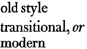
are apparent at a glance to the technician. Just as, for instance, you distinguish instantly between a Scandinavian, a Latin-American, or a Mongolian. Analysis may indicate that the chief factor in your instant recognition of these types is memory of features.
So too in type faces. Here the differences are more minute, and essentially a matter of design distinctions: the weight and relation of thick and thin strokes, the treatment and stress of curves, and the handling of "serifs." There is little difference in the actual shapes of letters, which is as it should be.
One of the more lucid accounts of the development of letter forms is W. A. Dwiggins' "The Shapes of Roman Letters," included in his Mss. by WAD. Illustrations from this minor classic are used here by permission.
Remember that most of the letter forms we meet are modifications of written letters, shaped by pen action. Some differences in the details of serif treatment are indicated by these Dwiggins drawings:

a b c d
a shows a commonly designed serif detail, much better handled by natural pen action in b. The arch of a letter, frequently handled in type as c, is more crisp and attractive in d, the natural pen form.
In type, serifs help carry the eye in a horizontal direction, a designer friend points out, setting up a "flow" from letter to letter within the word, and from word to word across the line.
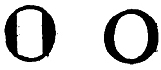
e f
Contrast the "degenerate, commonly used" form of o shown in e, with the more attractive pen form in f. Here is graphic distinction in the treatment and stress of curves.
The two most common classes of type faces are "old style" and "modern." The "transitional," a merging of the old style form into the modern—is typified by the illustration of Bulmer, between the Janson and Bodoni specimens used for the visual presentation on page 404.
Our old style faces descend from the early Italian Roman types and differ in minor details and "national" characteristics. Among the old style faces used in this book are Bembo and Centaur, which reflect the Italian form; Estienne, Granjon and Garamond, which reflect the French form; Caslon and Janson, typical of the English-Dutch form; and Fairfield and Times Roman, as differing expressions of contemporary old style types.
Modern faces, the result of a swing of taste in the opposite direction, stemmed from an effort to copy in type the letters of eighteenth-century copper-plate engravers. Bodoni, the classic form of the modern, is included in its lighter rendering, named Bodoni Book. The first English modern, named Bell, is also included; together with two contemporary moderns, the Dwiggins-designed Electra and Caledonia faces, cut by Linotype. All three are less severe than Bodoni and retain elements of the transitional form in some letters.
The two really transitional faces included are the classic Baskerville, and Monticello, which verges somewhat more to the old style character.
"Letters," as Mr. Dwiggins illustrates graphically, "are made out of thick 'stems,' thin 'hair-lines,' loops and 'serifs,' or finishing strokes."
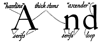
How the variations that produce the different styles of Roman types actually came about is easily understood by seeing how the nib of the pen is slanted to write an old style letter like Caslon (g), as against holding it at right angles to the written line for the modern letter, such as Scotch (h):
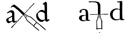
g h
Differences in curve and finish are a natural result of these two pen positions.
As Mr. Dwiggins explains: "In writing lower-case 'a,' for example, the stroke begins at the little bulb at the upper left-hand corner, passes over the arch at the top, descends to form the straight stem, and finishes with an upward flick; a second motion forms the loop. As the line moves, it swells and thins in accordance with the shape of the pen and the direction of the movement.
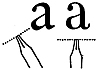
i j
"In the Caslon letter (i), the swelling at the top begins at the bulb or dot; the arch expands throughout its whole curve; the loop has a decided tilt, as has the finishing stroke.
"In the Scotch letter (j), the arch is a thin line; the expansion does not begin until the downward stroke of the stem; the swelling of the loop is at right angles to the line of writing, and the letter ends with a perpendicular flick.
"In the 'b,' one notices the difference in the loops and in the serifs at the tops of the letters.

k l
"The typical 'old style' serif at the top (k) tilts as the pen is tilted; the loop is a tilted sweep of the slanted pen; while the serif and loop of the 'modern' letter (l) partake of the perpendicular position of the pen. These characteristics of tilt or perpendicularity appear in all the lower-case letters and to a limited extent in the capitals."
To check the distinctions in different characters in the following twenty types, a magnifying glass will be helpful.
"The artistic quality of a type letter," Mr. Dwiggins concludes, "is determined by its degree of grace of line and proportion. The standards of grace and proportion are to be looked for in the natural motions of the pen. But the quality called art is dependent, too, upon the artist's appreciation of the material in which he works—namely metal. The draughtsman does not attempt to copy exactly the form of his pen-written model, but modifies the pen form to a shape suitable to its final state—that of a metal punch."