A. F. JOHNSON Title Pages: THEIR FORMS AND DEVELOPMENT
Reading edition


From One Hundred Title Pages: 1500-1800, selected and arranged with an Introduction and Notes by A. F. Johnson. Copyright 1928 by John Lane, The Bodley Head, Ltd. Reprinted by permission of the publisher.
It is a curious fact that the title page was evolved at a comparatively late date in the history of the book, and is indeed almost unknown before the printed book. There are a few examples among early surviving manuscripts of a separate leaf being used for the title, but they are quite exceptional, and even these give the title on the back of this leaf. The usual practice of the calligrapher was to give any information considered desirable as to the author and the date and place of the making of the manuscript in the colophon. This practice was taken over by the printers, although in the first years of the new art they frequently said nothing as to place of printing, probably with the deliberate intention of concealing the fact that the book was produced by mechanical means. The title page as we know it, giving the title, author's name and an imprint, being, in fact, a kind of advertisement of the book, was not well established until some years after 1500....
The title page owes its origin, according to one theory, to the fact that printers found it necessary to protect the first leaf of the text. Whereas a manuscript would be bound as soon as the calligrapher had finished the text, most of the copies of a printed edition were delivered to a book-seller in sheets, and many might remain unbound for years. Hence arose the practice of beginning the book on the second leaf or on the back of the first leaf. The first page could then be used for the purpose of advertising the book, for the fully-developed title page arose out of a commercial need. A few early examples of the addition of a brief title on the first page are known, the first being that of a Bull of Pope Pius II, printed by Fust and Schöffer at Mainz in 1463. But the blank title leaf is found for many years after that date, and to the end of the fifteenth century a title leaf containing a brief description in a few words is common. As late as 1548 we find the brothers Dorici at Rome printing several volumes of the works of Cardinal Bembo with the title on the back of the first leaf. An edition of the Vulgate printed at Venice in 1487 by Georgius Arrivabene offers an example of the most rudimentary form of a title page, with the single word Biblia on the first leaf.
The example of Ratdolt at Venice, who in 1476 printed a Calendar of Regiomontanus with woodcut borders and an imprint on the first leaf, was not followed by contemporary printers. Even this solitary case hardly presents a title page in the form in which we know it, since the leaf, in place of a title, has a poem in praise of the book. Of the fully developed title page, giving title, author and full imprint, Dr. Haebler, the German authority on incunabula, knows of only one instance in the fifteenth century, a book by Johannes Glogoviensis printed by Wolfgang Stöckel at Leipzig in 1500; the title itself, however, is cut on wood.
The lettering of the simple fifteenth-century title page was often that of the text of the book, or sometimes a larger, heading type was used. Very frequently the words were cut on wood, and since for the printer it was as easy to print from a block containing a design in addition to a brief title, the woodcut illustration on the first leaf soon followed. The examples of the John Lydgate, printed by Pynson, c. 1515, and of the Deceyte of Women, printed by Abraham Vele about 1550, are typical title pages of popular books of the earlier printers. In Spain especially this combination of title and illustration, in that country often an heraldic cut, both cut on wood, became the fashion and persisted for many years in the next century. Scenes from school life often illustrated educational texts, while a school of woodcutters at Florence designed a famous series of illustrations which decorated the title pages of devotional tracts by Savonarola and other works. The first printers' devices, the two shields of Fust and Schöffer and the double cross rising out of a circle at Venice, were added to the colophons, and it was only when the French printers began to use large devices surrounded by borders, for which there was no room on the last leaf, that the printer's name, or at least mark, began to appear on the title page. Thus one further step was taken towards the title page as we know it.
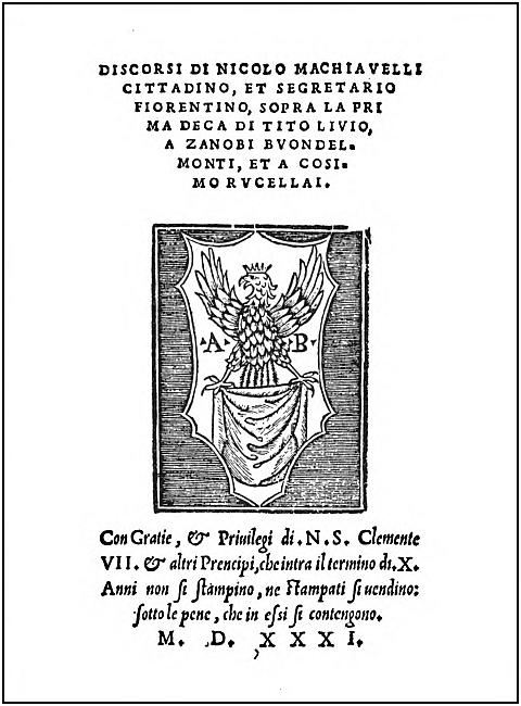
MACHIAVELLI, SOPRA LA PRIMA DECA DI TITO LIVIO, ANTONIO BLADO, ROME, 1531. The formal Italic below the device, designed by Lodovico Vincentino, the calligrapher, was used in many of Blado's books. It has been revived and is known as Blado Italic. (Size, 5-1/2x8-1/4 inches.)
The sixteenth century is especially the age of the woodcut title-border (or metal-cut, for the material used for blocks was frequently metal). The practice of decorating the first leaf of the text with a woodcut border had been started by Ratdolt at Venice, and after 1490 was common among the printers of that city. In fact, several of the borders originally used for an opening were actually converted into title-borders after 1500. During the following century the variety of borders used in all the countries where printing was practised is remarkable. In Germany especially, during the years of the Reformation, when the printing press was unusually active, a very large number of decorative borders were cut, many of them by artists of the first rank, including even Dürer and Holbein. The work of the Holbeins and Urs Graf at Basle is well known to English book collectors. Perhaps less familiar is the work of Hans Baldung Grien, Hans Weiditz and Daniel Hopfer at Strasbourg and Augsburg, and that extraordinary series of designs which appear on the Luther tracts printed at Wittenberg and on similar works produced in Saxony. Many of these borders are highly successful as decorative pieces. The fact that they are less familiar to us may be accounted for by two circumstances. In the first place the earlier book collectors were almost all collectors of the classics, and the first writers on the history of printing, except in the matter of the invention of printing, approached the subject from the point of view of the student of the Greek and Roman classical writers. In the second place the German printers cut themselves off from Western Europe by clinging to the gothic letter after Italy, France and finally England had adopted Roman and Italic, even for books in the vernacular....
There is one point about the early woodcut borders which must seem strange to the printer of today, and that is the suitability of the decoration to the subject matter of the book. The sixteenth-century printer naturally found it economical to ignore the fact that a border originally intended for a Bible was not suitable for a medical work. He did not regard it as incongruous to use a border depicting scenes from Greek mythology on a French medieval romance. Even a printer of the class of Jean de Tournes uses the same piece on the title page of a Xenophon and of a book of French verse. Nor was the average printer very particular about the state of a block. Especially in England, where the general standard was lower than on the Continent, a damaged block would be used as long as it held together.
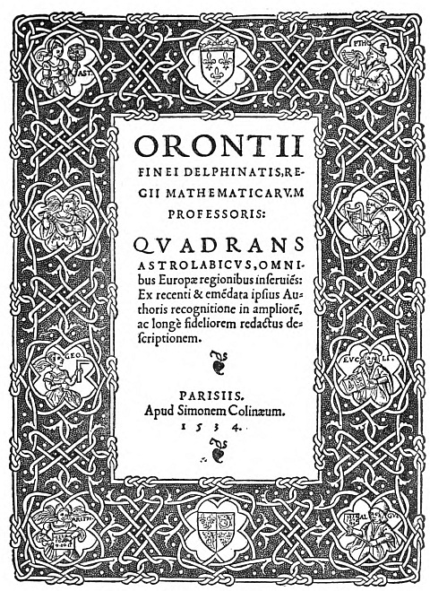
O. FINE, QUADRANS ASTROLABICUS, S. DE COLINES, PARIS, 1534. The border was probably designed by the author. His mathematical diagrams are generally decorated with leaf forms like the "petits fers" of this title. (Size, 7-5/8x11-5/8 inches.)
In the second half of the century two rival fashions of decoration were developed which finally banished the woodcut border, first the method of decoration by type ornaments or printers' flowers, and secondly the engraved title page. There is one example of type ornament known even in the fifteenth century, in an Aesop printed at Parma in 1483. After 1500, examples of borders made up of separate cast pieces are fairly frequent and are especially common in England in the books of Wynkyn de Worde and his contemporaries. But it is not until about 1560 that we find borders built up of type ornaments worked into arabesque patterns. It seems to have been Robert Granjon, the engraver of types at Paris and Lyons, who cut arabesque fleurons, divided them up and built up fresh patterns out of their component parts. The use of printers' flowers in borders is found at most centers of printing towards the end of the century and obtained its greatest popularity in the Netherlands and in England. Many fine examples are found in English books from about 1570 for the next fifty years. Joseph Moxon, who wrote on English letter-founding in 1683, tells us that they were considered old-fashioned in his day. They were revived again in the eighteenth century by P. S. Fournier at Paris, who cut many new designs which were copied all over Europe. Fournier's flowers could be built up to form all manner of ornaments and were more adaptable than the arabesques of the sixteenth century, when the original unit always resulted in the same pattern. Just as Granjon had devised a method of decorating without the use of the woodcut block, so Fournier designed his new flowers in order that printers might dispense with engraved vignettes. However, the vogue of the Fournier designs had a shorter life, and may be said to have been killed by the classical school of printing of the end of the century.
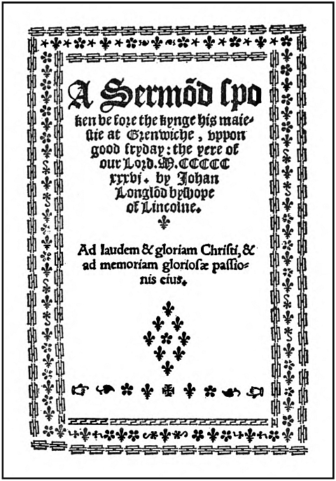
J. LONGLOND, A SERMON, LONDON, 1536. Wynkyn de Worde and his contemporaries used cast pieces as ornaments, at least from 1504. Although their use was frequent, the arrangement of this title page is uncommon. (Size 5-1/4x7-1/4 inches.)
Engraving on copper was practised in the fifteenth century, but the engraved title page originates about 1550. Curiously enough, the earliest known engraved border occurs in an English book, the Anatomy of Thomas Geminus, printed in London in 1545. In the following year we find a second example, cut by
Corneille de La Haye for Balthazar Arnoullet at Lyons, where there was a remarkable group of engravers at work about this time. From 1548 the books of Enea Vico printed at Venice begin the fashion in Italy, where, after 1550, examples are fairly numerous. In the Netherlands also, beginning with the work of Hubert Goltzius at Bruges, they are met with almost as frequently as in Italy. It was, perhaps, Christopher Plantin at Antwerp who, more than any other printer, made the engraved title-border the fashion for all larger and more important publications. But it is with the seventeenth century especially that engraved borders are associated. The Elzevirs used them even on their pocket editions, while at the other extreme the massive volumes issued at Amsterdam and at Paris in the reign of Louis XIV are almost invariably introduced by an elaborate engraved frontispiece....
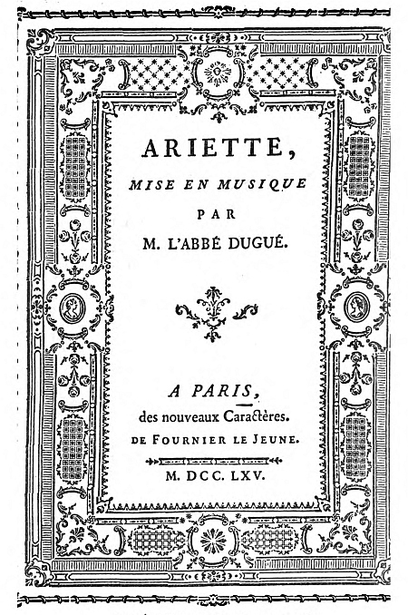
DUGUÉ, ARIETTE, FOURNIER, PARIS, 1765. This rather ornate border shows what could be done with Fournier's new type ornaments. (Size, 7-1/4x10-1/4 inches).
Perhaps the worst examples of these overloaded frontispieces are to be found in German books of the period. Often, also, the engraved border is only a bastard title, the proper title page being set up in type. The earlier examples, dating from the sixteenth century, are in general the best, being simpler and not yet overburdened with a mass of detail. The good taste of the eighteenth century brought about a reform. But at Paris most books of this period had a typographic title page and the work of the famous school of French engravers was lavished on the illustrations. However, the engraved vignettes of that age were often very effectively used. Even Baskerville did not always disdain the vignette, and it was the last form of decoration abandoned by Bodoni.
One other form of decoration may be mentioned, that of metal rules. Rules have been used occasionally at almost all periods, by Geofroy Tory, for example, among others. But as far as title pages are concerned they are found most often in the seventeenth century.
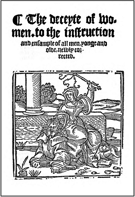
THE DECEYTE OF WOMEN, A. VELE, LONDON, C. 1550. The combination of black-letter and a woodcut is a usual title page in an early English book. This undated example is probably mid-century, as the printer, Vele, is not heard of before 1548. The cut seems to date much earlier. (Size, 5-1/4x7-1/2 inches.)
The purely typographic title page is naturally of greater interest to the modern producer of books. At all periods the title page which was effective mainly by the arrangement of type has been common, and at most periods there have been printers who preferred to dispense with ornament of any kind. In the sixteenth century the books of the Paris printer, Michel de Vascosan, illustrate this severer manner, and the classical style of the great printers at the close of the eighteenth century was likewise independent of decoration. Some sort of arrangement of the letters displayed on the title page suggested itself from the first, and very soon various shapes were tried. Perhaps the commonest arrangement was the conical one, or the so-called hour-glass shape, in which the lines of type begin by being long, to become short at the center, lengthening again in the imprint at the foot. Others have preferred a natural arrangement, printing the matter exactly as if on a page of the text. Geofroy Tory, a book producer whose work was of great importance in the history of the book, seems to have been against the fashion of his day in his choice of the natural layout. It has certainly been the usual custom to aim at some sort of pattern in the division of the lines of type. In this respect the earlier printers had one advantage which was not enjoyed by their successors. They felt no difficulty about dividing a word in a title, even when the second part of the word was to be set in a different size or even a different kind of type. Frequently we find examples of such breaks in words as custom has made impossible for the modern printer. The simplification of the task for whoever was responsible for the layout is obvious. One rule which seems to have been almost universally observed is that the mass of the type must be in the top half of the page and not evenly distributed. [Page 69.]
Equally important with the distribution of the matter is the question of the kind of type to be used, the sizes of type, upper- or lower-case, and the number of different fonts. The simplest manner of using the letter employed in the text met with little favour and was soon displaced by the use of larger types and especially by the use of capitals. The heavy, square Roman capitals, like those of Froben at Basle, for the first line, with smaller capitals for succeeding lines, were more or less customary in Northern Europe in the first quarter of the sixteenth century. In some countries a mixture of a "lettre de forme" and Roman capitals was not unusual at the same period. With the introduction of the new Garamond romans at Paris about 1530 began the fashion of using the Canon and Double Canon sizes of the lower-case letters for titles. In the seventeenth century we find large and heavy Roman capitals again in favour, often balanced by a woodcut ornament or a basket of flowers. This century, undoubtedly the worst in the history of typography, notwithstanding the Elzevirs, is especially remarkable for its crowded title pages. It had become the custom to give as much information as possible about the contents of the book and the qualifications of author, editor, etc., and the printer took the opportunity of displaying as large a variety of his types as possible. No doubt the use of title pages as posters for advertising is partly responsible for the custom. It has been established by documentary evidence that such methods of advertising books were usual in England and in Germany, and probably this was so in other countries also. Incidentally it may be pointed out that the posting up of title pages accounts for some of the early collections, such as that of Bagford, now in the British Museum. Bagford has been attacked for his vandalism in mutilating books for the sake of his hobby, but it now appears that he may have been quite innocent of the charge. In any case the result on the title page as a specimen of typographical arrangement was deplorable....
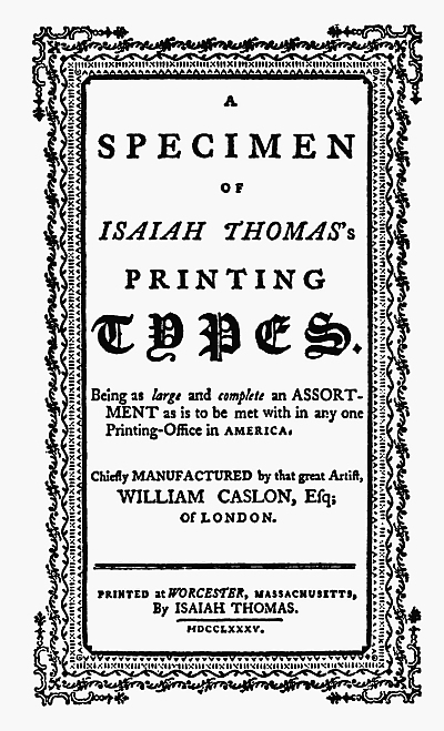
ISAIAH THOMAS, A SPECIMEN OF PRINTING TYPES, WORCESTER, 1785. As with most type specimens, this early American title page displays many different types and flowers. (Size, 5-3/8x7-5/8 inches.)
With the eighteenth century title pages became simpler and letters became lighter, and the result is again work as good in its different style as that of the sixteenth century. The eighteenth century is certainly a great period in the history of book production, with its center in Paris. In England the influence of Caslon and Baskerville at length raised our typography to a level with Continental work. For one innovation P. S. Fournier is mainly responsible, the introduction of outline and other decorative capitals which were so successfully used at Paris. At the end of the century we have the work of the Didots and Bodoni, the classical school, whose technical achievement has hardly been surpassed at any period. One may cavil at their conception of the ideal shape of letters, one may dislike their excessive use of hair lines and their flat serifs, but it must be admitted that as practical printers and type-cutters their work was of first rate quality. These classical printers were proud of their types and wished them to stand alone. Bodoni, who at the beginning of his career used ornaments copied from Fournier and engraved vignettes, in his later years more and more abandoned decoration and outline letters. The classical title page is composed in Roman capitals of varying size, but without the admixture of lower-case letters or italics and without the aid of decoration. Like Baskerville, these printers considered that type is itself sufficiently interesting to stand alone.