CARL PURINGTON ROLLINS American Type Designers and Their Work
Reading edition


Published by The Lakeside Press 1947-1948. Reprinted by permission of the publisher.
A piece of paper about two inches square, originally pinned to the manuscript of the Rev. Ezra Stiles's diary in the Yale University Library is all that remains of the first original American type design. It is a proof of letters made by Abel Buell, a Connecticut Yankee, in 1769.[35] Buell was his own designer, punch cutter, and caster, since in his day, as for many years after, the making of type was entirely a hand operation. Not the least exacting part of the work was the cutting of the punch on the end of a short bar of softened steel. It was not until the invention of the Benton pantograph punch-cutting machine in 1885 that any other method was known. All type made before 1885 was therefore dependent on hand punch cutting, and the designer of the type was almost always the same man who cut the punches.
Who these type designers were after Buell is a matter of uncertainty and obscurity. The first type specimen book in America was that of Binny & Ronaldson of Philadelphia, issued in 1812; and from then almost to our own day the type foundries have taken the credit for the type designs which they have offered for sale. Type designers, like architects, got no credit; possibly Modesty, with a backward glance at old specimen books, raised a warning finger, and the designers were willing to let the foundries have whatever glory there was.
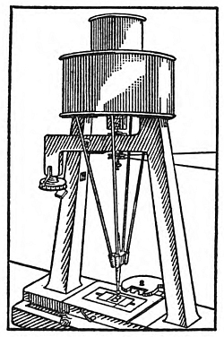
The Punch Cutting Machine. Courtesy George Macy Publications.
Abel Buell and his contemporaries and successors followed the general trends in design in the arts as a whole. The Greek Revival and the Victorian Age, marked by the two great expositions at London and Philadelphia with their crudities and extravagancies in design, found echoes in our imitative craft of printing. So it is not surprising that type design began to improve, along with the other arts, with the advent of the '90's. We have always followed European and especially English models, and it is natural that the upheaval in type design in England under Morris's influence had immediate repercussions here. But while imitations of Kelmscott types were soon on the market, two surprisingly original American designs appeared at the same time as the imitations. About 1894 or 1895 the Central Type Foundry of St. Louis introduced a face which became widely used, called (for no better reason than attends the christening of most type faces) "De Vinne." It is of unknown parentage, though there is some reason to suppose that it descended from the Elzevirs; but it was a face of character and distinction. At the same time the same foundry brought out another design which had an acknowledged father—Will Bradley. Of this face it has been said that it has "remarkably bold letters, with peculiarities of form never before attempted." Thus we have in the De Vinne and the Bradley faces two fresh and distinctively American types, destined to be the forerunners of many others. And in one case the name of the designer was definitely attached.
With the invention of the pantograph punch cutter, type design became an "art" rather than a craft, and as might be expected the personality of the designer became for various reasons more important. It is not without interest that the chief designer of the American Type Founders Company—a man responsible for almost the whole type output of that foundry for many years—Morris Fuller Benton, was the son of the man whose machines were responsible for this revolution in type design. For it was the two basic machines invented and developed by Linn Boyd Benton which made it possible for those unskilled in the intricacies of type making to provide the basic designs for type. The machines were very ingenious, and the designs partook of the "faultily faultless, icily regular" perfection of the mechanical device. This method of making type faces involved the drawing of the design and the making of two or three patterns in thin brass of the outline of the letter—each pattern good for several sizes of type, and slightly modified for another group of sizes. This is the way in which modern type is designed. It is the reason why such a type series as "Cheltenham," designed by the architect Bertram G. Goodhue in 1900 for the Mergenthaler Linotype Company, while very expertly handled in the details, seems monotonous in mass; whereas the Caslon type of the original cutting shows all the inevitable variations of hand work.
A survey of the types of the first quarter of the present century, made by the Editor of the Inland Printer in 1927, displays 161 type faces brought out by seven or eight of the leading foundries between 1900 and 1925. Of these, it was possible to name the designers of 72, almost all from the Barnhart Brothers & Spindler foundry of Chicago, whose records seem to have been in better shape, or whose generosity was more spontaneous. Oswald Cooper, Sydney Gaunt, Will Ransom, Robert Wiebking, and George Trenholm were the chief names. It is unfortunate that the names of the designers of the types put out by the American Type Founders Company have not been preserved except in rare instances. Of course, Benton was responsible for the greater portion, and on the aesthetic side they occasionally scored a triumph as in the case of the "Cloister" face.
The list included in the Inland Printer's survey fails to include some of the outstanding designs of the period. Goodhue's "Merrymount" was done in 1894, but after 1900 we have Mr. Rogers's "Centaur," Mr. Hunter's odd but forceful types (properly cut on punches by the designer), the output of the rapidly growing composing-machine industry, and Frederic W. Goudy's fifty designs completed in that quarter century. Goudy's output of six score type designs in fifty years is an amazing record, one probably never equalled. Such designs as those for "Goudy Modern," "Goudy Text," and "Hadrian" would establish his reputation. He had his limitations as a designer—most of his designs lack a certain crispness—but his versatility was extraordinary.
In the years since 1925 new designers have come to the fore: Blumenthal with his "Emerson," Dwiggins with his "Electra" and "Caledonia," Ruzicka with his "Fairfield," and Chappell with his "Lydian." This brief survey cannot hope to mention all types or designs which American designers have contributed, but it is well to see if any tendencies can be detected.
The type which Buell made in 1759, as well as the type of his immediate successors into the first decades of the nineteenth century, were mainly variations on the so-called "modern romans" of Didot, Bodoni, Austen, and Thorowgood. As the artistic styles in design in general, not alone in type, gradually lost the evolutionary force which has developed letter forms through the centuries, eccentricity and anarchy came into play. The nineteenth-century types as shown in the specimen books of Bruce, Connor, Farmer, etc., and exhibited in all their grotesque horror in Fred Phillips' "Old-fashioned Type Book," had no legitimate parentage, and they are as well relegated to the bizarre and pseudo-nostalgic advertisement. The result of the Kelmscott "revival" was to turn attention to type forms of the past which could be revived for modern use, and the type designers after 1900 did a remarkable piece of work in introducing good type faces. The advertisers have been eager to use new and novel faces, and have greatly stimulated this activity, even in many cases over-exciting it. The most interesting result has been the renewed interest in calligraphy. First directed toward new forms of script, the truer form of broad pen lettering is now beginning to influence type design, to free it from too slavish a devotion on the one hand to the serif, and on the other to a too-free rejection of the serif altogether. Such a face as Mr. Chappell's "Lydian" is an example of real advance in design, and if one could adduce European examples, more could be cited.
American designers have not developed many new or good book faces; such types as Oxford, Centaur, Emerson, Fairfield, Electra, are the exception. Their efforts have been given to the drawing of display and advertising types—too often not to the enrichment of the printer's repertory. It is quite as true now as in the past that distortions of the normal Roman letter form in the direction of extra condensed or extra heavy or very light mono-line letters result in eccentricities which have no permanent value. On the other hand such novel type designs as Garamond Bold Italic, Hadriano, the newspaper Ionics, and Lydian are meritorious additions to the printer's fonts. When it is realized that eccentricity and originality are not the same thing, we may expect from our increasingly intelligent designers indigenous types of usefulness and charm.
FOOTNOTES: