OSCAR OGG A Comparison of Calligraphy & Lettering
Reading edition


Copyright 1947 by the American Artist. Reprinted by permission of the publisher and author.
Superior writing and able lettering have never made inconsequential literature valuable, nor have poorly conceived, incompetent calligraphy and lettering ever invalidated good literature. Letters which are well considered, expertly executed, conscientiously fitted to their purpose, however, can create visually a spiritual state in a reader which will influence him to be receptive to the message he reads. It may even be possible that beautiful writing, aside from the intense pleasure it gives us as graphic art, helps to make uninspired authors seem more profound.
Perhaps it is this realization that has made graphic artists in recent years exhibit a notable increase in interest in American "calligraphy." The quotes are intentional. So much which is not calligraphy has had the term applied to it and so much which is calligraphy has been considered something else, that some sort of evaluation and comparative definition now appears to be wise.
The aura of romance which has surrounded the tools, the methods, and the products of the scribe has tended, we believe, to place them in the eyes of practicing letter artists somewhat higher in the scale of the arts than those of the letterer. Hence the "lettering man" likes to call himself a "calligrapher." This same snobbishness is often evident between easel painters and illustrators, between book illustrators and magazine illustrators, between book designers and advertising typographers. And all of it is false. By simple definition lettering and writing are related but certainly not competitive arts.
Calligraphy is "beautiful writing."
Lettering, in modern usage, refers to built-up, designed forms.
Stanley Morison, in the Encyclopaedia Britannica, says: "Calligraphy is the art of fine writing. Writing is a means of communication by agreed signs; if these signs or symbols are painted or engraved on stone or wood [or paper] we have that extension and application of writing known as lettering, i.e. a script generally formed with mechanical aids such as the rule, compass, and square. But it is the essence of hand-writing that it be free from such, though not from all, government.... Calligraphy may be defined as freehand in which freedom is so nicely reconciled with order that the understanding eye is pleased to contemplate it."
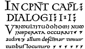
The same nib was used for built-up and written forms in this freely rendered fragment of a ninth-century manuscript.
Built-up and written forms each have their place. One of the tenets of fine letter art is that the forms be in perfect taste; that is, that the letter and its method of production be in harmony with its use. A delicately drawn cursive is as out of place on a subway card advertising a cough remedy as is a poster egyptienne on the title page of a small volume of romantic poetry. To assume, however, that either the written or the drawn form is the more aristocratic is unsound. To attempt a representation of either by the other is likewise illogical. Written letters, based on traditional manuscript usage, are more serious in concept than their less restrained contemporary built-up characters and do not permit of the same unconcern with anatomical discrimination. Both, properly executed, can be superb examples of letter art—and both can be terrible.
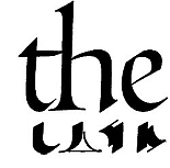
A simple Roman, executed entirely with a broad nib. Characteristic strokes employed in writing the above.
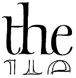
A similar letter designed and built up using a brush. Characteristic outlines to be filled in for above.
The growing practice of calling all script-like letters "calligraphy" is unjust to writing and lettering alike. Particularly the practice of producing with a pointed pen or brush the built-up, tricked-out impersonations of broad nib writing must be abandoned if the art of making letters is to remain honorable.
Having defined, then, the general limitation of the terms, let us look at some of the principal differences in character between the two. Historically, we find them side by side. Since they were both produced by scribes and illuminators working in like tradition, there was no question of fitness one with the other. Both stemmed from the same source and were produced with the same type of tool. They were necessarily in harmony.
Contemporarily, however, much lettering is executed by craftsmen who neither know or care about the historical background of the alphabet. The responsibility for this lies, we believe, as much with the purchaser as with the producer of letters. The art director, working in a viciously competitive field, demands of the letterer something "different." The result is usually a built-up form which has little in common with its ancestors, either in shape or method of production. But, if it is handsome in itself, it may have a real affinity for a text of type. A written element may also serve beautifully as a foil for the rigidity of a type page.
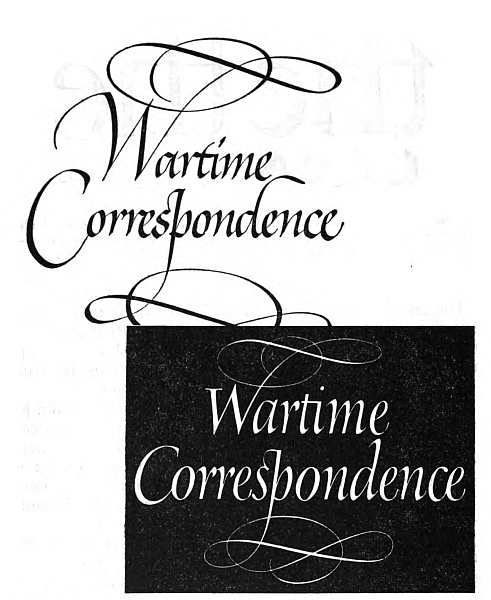
These two treatments of a title are by no means the only likely ones by either method. The lower form was actually used. The letter was designed in the spirit of the type which was used in conjunction with it. Perhaps if a written title had been chosen, one based on an Italian rather than an English hand would have been more suitable. The great difference in these two treatments is that the written serves as a contrast, while the built-up harmonizes with the type on the page.
To establish further the variance between calligraphy and lettering, a brief inspection of the methods of production may be advantageous. The designed form is conceived as a drawing—it is a device which may be finished up with any instrument at hand. The only limitation which the designer must not exceed is the recognizability of the particular letter.
The written form depends upon tradition for letter shape and upon tool for letter character. Distortion is possible and poor form not unusual, but since the pen is essentially the letter-making tool, the natural action of a properly cut pen eliminates at least some of the opportunities for improbable forms.
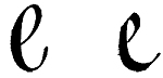
These two letters, enlarged from the two renderings of "Wartime Correspondence," illustrate the control which is exerted by the cut and size and handling of a square nib upon the calligraphic form as opposed to the freedom from constraint in the built-up treatment. The tool decided the shape of the first. A careful patterning of curves and weights to conform to the type of the book page (Poliphilus) determined the second. A Soennecken steel pen was used for the written, and a pointed brush for the built-up.
The calligraphic and the built-up approach to the execution of a book title may indicate how each may be employed frankly and honestly without recourse to camouflage to procure particular effects. The size, general weight, and disposition of the letters are indicated in the rough layout. The artist who executes the built-up rendering will keep the weight of letters even by constant checking of one against the other. The calligrapher will cut a reed or pen to this weight and thus maintain even color.
It will be noted that the designed form is completely and finally established in the penciled form. The laying-out for the written form is less accurate and is the product of a double pointed tool, set to the width of the nib to be used. In any but a very tight design such as this, the pen-executed letter requires rather less preliminary penciling than is here indicated. A line for the bottom of the letters is usually sufficient.
It has been impossible to crowd all one should like to write on this subject into these few words. If, however, this first voicing of a need for a sane concept of the relations between lettering and calligraphy has even the smallest influence, the author will bear with pleasure the rightful criticism of incompleteness.
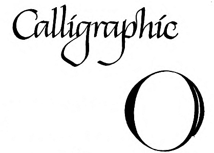
The width of the nib is that of the widest part of the down-stroke. Strokes 5 and 6 fill the openings thus left.
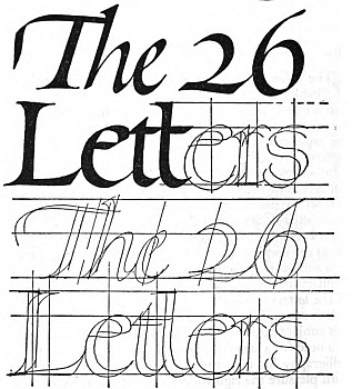
Layout and demonstration of the written form (calligraphic).
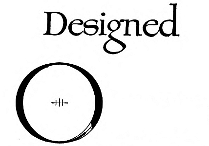
The center line is drawn by compass. Width of the swell is arrived at by moving the point 1/2 this width to right and left.
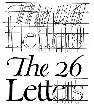
Layout and demonstration of the designed form (lettered).