HOLBROOK JACKSON THE TYPOGRAPHY OF WILLIAM MORRIS
Reading edition


From The Printing of Books by Holbrook Jackson. Copyright 1938 by Cassell & Company, Ltd. Reprinted by permission of the publisher. First read as a paper, at the William Morris Centenary Dinner of the Double Crown Club, London, May 2, 1934.
William Morris is an ironic figure. His achievements not only missed their mark, but hit marks he was not aiming at. His printing is no exception. The masterpieces of the Kelmscott Press which he aimed at making "useful pieces of goods" were typographical curiosities from birth, and so far removed from the common way of readers that they have become models of what a book should not be.
He was a Bibliophile, or more exactly, a typophile whose affections became unruly in the presence of decorated incunabula, and, although he was outwardly correct towards pure printing, his heart was not there. According to Sir Sydney Cockerell he flirted with the idea of a folio edition of The Earthly Paradise, "profusely illustrated by Sir Edward Burne-Jones," a quarter of a century before the inception of the Kelmscott Press. His personal taste was much the same then as later, although he continued to pay homage to good as distinct from fine printing. It was the "essence of my undertaking," he said, "to produce books which it would be a pleasure to look upon as pieces of printing and arrangement of type." Thus inspired by the example of "the calligraphy of the Middle Ages, and the earlier printing which took its place," and in spite of his passion for decorated books he observed that the early printed books "were always beautiful by force of the mere typography, even without the added ornament with which many of them are so lavishly supplied."
Much has been made of the emphasis he laid upon the book as an organic assembly of paper, type, and binding. But although few printers or publishers in the nineteenth century had insisted upon the excellence of these ingredients, as he did, the architectonic principle had never been wholly ignored. But in the main it was unconsciously observed. Deliberation is evident in the construction of the Pickering books, in the Keepsakes and Table Books of the thirties and forties, in the illustrated books of the sixties, and the later productions of the Daniel Press; and, if we may leave England for a moment, in such convenient publications as those of Bernhard Tauchnitz, where there is rectitude to satisfy the demands of the most austere of functionalists.
It was not, then, the architectonics of the Kelmscott books which evoked a typographical revolution. Nor was it the pursuit of beauty which always haunted Morris's intentions. "I began printing books," he said, "in the hope of producing some which would have a definite claim to beauty." Many printers and publishers of the time would have claimed as much. Bad taste in the arts and crafts is invariably the result of beauty-mongering, and the more costly books of the nineteenth century are littered with beauty from cover to cover.
Neither was it originality. Morris never sought to be original. He was a revivalist, and all his work is derivative. There is nothing new even in that, for all the arts and crafts are derivative, and originality is apt to be a myth and often a nuisance. Morris was even less original than many other earnest innovators, and the Kelmscott books are derivatives twice removed. They are modern variations of the early printed books of northern Europe, as they in turn were but mechanical imitations of the manuscripts which preceded the invention of movable types.
Nor again was there anything peculiar even in that, for all mechanical evolution seems to proceed in the same manner. The earliest railway carriages followed the lines of the stage-coach; the earliest steamships were schooners and brigantines with funnels and paddle-boxes; and the earliest motor-car was a horseless-carriage complete with tail-board. It is not surprising to learn that the earliest printed books were imitations of manuscripts, but it is surprising to find a nineteenth-century printer of genius imitating the imitations.
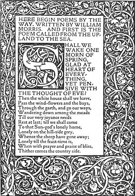
A page from Poems By The Way, written by Morris and set in the Kelmscott Golden type. This small quarto was the first book printed at the Press in two colors, black and red. Issued in October, 1891, in an edition of 300 copies on paper and 13 on vellum.
There is, however, more than one difference between these mechanical devices and the Kelmscott books. The engineers copied because they could not think of anything better. Now and then they even made concessions to beauty, in the form of superadded decorations, much as Morris did. But there was a marked difference between them, for Morris knew better. Although to him beauty meant decoration or ornament, yet in the first edition of The Roots of the Mountains he actually produced an undecorated book of great distinction. The book is not only admirable in itself, but it has had a better influence on recent typography than all the Kelmscott books together. Morris himself was delighted with the book. He declared it to be "the best-looking book issued since the seventeenth century," and added: "I am so pleased with my book, typography, binding, and must I say it, literary matter, that I am any day to be seen huggling it up, and am become a spectacle to Gods and men because of it." His enthusiasm rings true, but this was a passing fancy, for even then he was in hot pursuit of more opulent beauties.
It was the magnificence of the Kelmscott adventure which impressed and influenced printers, professional and amateur, and resuscitated the curious vogue for so-called "Private Press" books artificially rarefied and deliberately beautified. But, in spite of many extravagances and some few absurdities, the Kelmscott influence has been beneficial. Morris reasserted sound principles, and the richness of his books helped to secure their acceptance. "The road of excess leads to the palace of wisdom." The style of the books themselves, because of their massive individuality, must always provoke differences of opinion, but in the house of books there are many mansions, and room for all tastes, whims, and even fads.
I prefer my books pocketable, flexible, and legible. In the Kelmscott books these qualities are not sufficiently balanced. Each is there in some measure, but something is invariably added to weaken proportion. William Morris (or worse, Burne-Jones) is always getting between reader and author. I like my Chaucer neat. Morris produced Chaucer as Henry Irving and Beerbohm Tree produced Shakespeare. I suspect that enthusiasts for such productions are not readers. The idea is supported by the fact that the majority of Kelmscotts are still in mint state; it is not easy to meet a copy bearing the honourable and endearing scars of use.
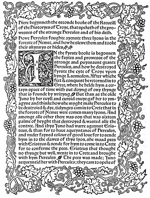
A page from the first book printed in the Kelmscott Troy type, The Recuyell of the Histories of Troye, a large quarto printed in black and red and published by Bernard Quaritch in 1892. The edition: Two volumes, 300 copies on paper and 5 on vellum. "As to the matter of the book," wrote Morris, "it makes a thoroughly amusing story, instinct with medieval thought and manners."
Legibility is relative, as I am reminded by my own experience, for myself when young did eagerly frequent Pickering's Diamond Classics—a practice I should probably have defended with conviction based upon sight rather than insight. I take a different view today, not only of miniature types, but of rules and spacings generally. Morris granted the necessity of legibility. In this he differed from another poet and amateur of printing, Robert Bridges, who used Gothic characters for the Daniel Press edition of his poems to induce slow ingestion. Morris believed that solidity of type and setting made for easy reading. By solid type he meant "without needless excrescences" or "the thickening or thinning of the line," which, with reservations, can be defended. Density of type area is a different matter and, if I admit charm, I reserve the right to question even aesthetical propriety in favour of legibility. The solid page is impressive: solidity inspires confidence, but confidence, as we know, is often illusion and not always guiltless of trickery. The first edition of The Roots of the Mountains would probably have been more readable with than without rules.
But although legibility must always be the first rule of printing, there are other important principles. Morris summed them up in the word "beauty" with impressive but dubious results, because of his predilection for ornamentation. Any plain space for him was an opportunity for decoration, or, in Ruskin's words, for "the expression of man's joy in his work." He would go out of his way to make books bigger than they need be so that he might have more space to fill with his and Burne-Jones's illustrations. His type-faces became picturesque, his margins inclined to pomposity, and his paper was pretentious. The Kelmscott books are overdressed. They ask you to look at them rather than to read them. You can't get away from their overwhelming typography, and, even if you could, you might still be cheated of your author by their high-minded purpose, for in addition to being the creations of an impressive genius the Kelmscott books were protests against the logical conclusions of mechanical book-production.
All these things are hindrances to reading, and I still believe that to be read is the destiny of a book, and that reading is best when you are least conscious of print or paper or binding. Since the Kelmscott books are not likely to induce that condition they must remain museum pieces, typographical monuments—beautiful and ineffectual angels beating in the void their luminous wings in vain.
COMPOSED IN EMERSON TYPES