James Shand AUTHOR AND PRINTER: G.B.S. AND R. & R. C.: 1898-1948
Reading edition
From Alphabet and Image: 8, Winter, 1948. Copyright by Art and Technics, Ltd. Reprinted by permission of the author and publisher.
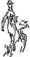
Topolski's drawing from the illustrated Penguin Pygmalion.
Author and printer, publisher and book-seller; these conjunctions flow too easily from the pen. They cover an immeasurable sum of human experience, both melancholy and magnificent, in the long history of the book trade; they should be used with more reserve.
Fortunately for the reader, the writer is no doctor in bibliography expounding the perils and diseases of textual transmission, but a typographical reporter, with an interim case-history of a particular author, a particular printer and a healthy body of work in progress.
Our author is George Bernard Shaw, sometime of Dublin: our printer, R. & R. Clark, now, as always, of Edinburgh. The association is unique in more than a geographical sense; in time it covers fifty years; in space it defies quantitative analysis. Bernard Shaw's quota, if consigned to the Society of Authors, would probably make that body independent of the publishing trade for years to come.
Miss Marjorie Plant has pointed out, in her always readable economic history, The English Book Trade, that there was once a time when "the person who was of no account whatever in the early years of the book industry was the author." At a later period when the printer was dominated by book-seller and publisher, Dr. Johnson wrote in The Gentleman's Magazine in 1739, "We can produce some who threatened printers with their highest displeasure for having dared to print books for those who wrote them!"
In the history of English literature the relations of author, printer and publisher have often been bitter and obscure, posing many problems in bibliography and textual criticism. Dr. McKerrow, introducing the literary student to bibliography, suggests that "the best way of obtaining a clear and lively comprehension of the processes by which the books of Shakespeare's time were produced" would be by actually composing a sheet or two in exact facsimile of an Elizabethan quarto and printing it on a hand-press. "Once he does this," he adds, "he will find that the material book, apart altogether from its literary content, can be a thing of surprising interest."
The surprise of Dr. McKerrow's student trying to disentangle the impositions by which the Penguin edition of more than a million copies of Shaw's plays were produced on modern perfector printing presses and automatic folding machines would indeed be considerable. Nevertheless it is to be doubted whether there are as many bibliographical vagaries and obscurities in Shaw as in the folios and quartos of Shakespeare. Certainly there is something of the same fascination in the printing and production of the "material" books of the later playwright; apart from the literary antics of an ebullient Irish author with that most emotional of all romantic characters: seemingly hard-headed Scots printers.
Since we are presenting the romance of playwright and printer, without benefit of publisher, let us set our characters in their dramatic place and scene. The place is Edinburgh; the scene R. & R. Clark; the principal characters, Edward Clark, Bernard Shaw and William Maxwell; with a faint echo off-stage from that habitual bankrupt, Grant Richards, later deserted for the more solid attractions of a "commissioned" Constable.
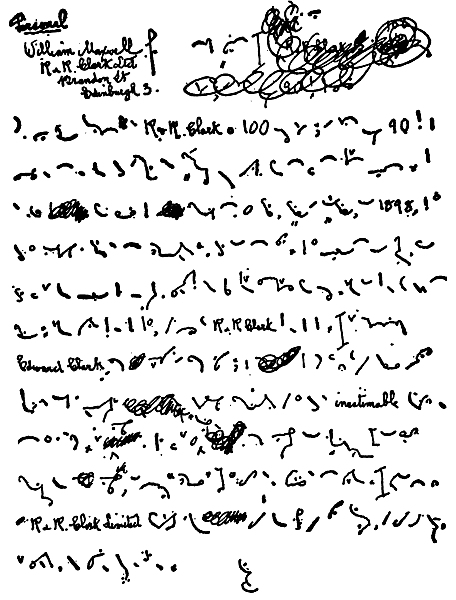
Shaw's original shorthand draft of his letter to Maxwell on the centenary of R. & R. Clark in 1946.
Professor G. M. Trevelyan, in one of those two brilliant chapters on Scotland in his English Social History, points out that rapidly developing eighteenth-century Edinburgh "was hardly less important than London in the British field of letters."
Mr. Stanley Morison, speaking in Edinburgh in 1944 on the subject of The Typographic Arts, pointed out that the first history of typography ever written for the instruction of the trade was James Watson's The Art of Printing, published in Edinburgh in 1713.[39] A few years later the Edinburgh book-seller, Alexander Donaldson, who set up shop in the Strand and put Edinburgh printed classics on sale at 30 per cent to 50 per cent below the usual prices, was largely responsible for the creation of a "permanent and enlarged printing and type-founding industry in Edinburgh." Mr. Morison also asserts that in the last quarter of the eighteenth century Scotland led the interest in technicalities of printing.
The first edition of the Encyclopaedia Britannica, printed in Edinburgh in 1771, was brought out by "a Society of Gentlemen of Scotland." John Bell's British Poets and British Theatre were printed at the Apollo Press by Gilbert Martin, an Edinburgh printer of whom Mr. Morison would gladly know more.
"The social, imaginative and intellectual life" of Scotland in the early nineteenth century centred largely in Edinburgh on Burns and Scott, Adam Smith and The Edinburgh Review. The familiar publisher names, Ballantyne, Blackwood, Chambers, Constable, Nelson, were also printers. In type-founding, Miller & Richards' Scotch Roman cut in 1803, and the later Old Style, were widely used throughout the trade, at home and abroad, right up to the present day.
It was in 1846, six years before Alexander Phemister cut the now famous Old Style, that Robert Clark, with a loan of £200, laid the modest foundations of R. & R. Clark. After serving his apprenticeship in Montrose as compositor and pressman (what is called in the Edinburgh trade a "twicer") he sought experience in London as a journeyman, before returning to Edinburgh to start his own business. His London experience must have been of some value to him because it was not long before he and his partner, James Kirkwood, had developed an active business with London publishers: Macmillans, Bentley, John Murray, Smith Elder, A. & C. Black, amongst others.
Robert Clark's policy of providing fine quality, with conscientious service at the highest possible price, no doubt contributed to the financial success of a rapidly developing business which moved to the present printing works at Brandon Street in 1883. Robert Clark's only surviving son, Edward, took over sole control after his father's death in 1894. William Maxwell first appears on the scene at this time, entering R. & R. Clark as a shorthand writer in 1892.
It was in 1892 that Shaw's first play, Widowers' Houses, was produced; 1898 when Plays Pleasant and Unpleasant, published by Grant Richards, were printed by R. & R. Clark.
Few living authors nowadays can claim continuous direct relations with one printer over a period of fifty years. Books are now the product of mechanical composing machines, automatic printing presses, and mechanized binderies. They require expert control by experienced production staffs dealing with many different paper-makers, printers and binders. For this reason alone the printed works of such a productive author as Bernard Shaw are a remarkable exception to the general rule in the highly-organized printing and publishing trades.
Commission publishing is the resort of authors whose reputation guarantees a lucrative circulation and who can afford the necessary capital. Shaw now deals directly with his printer and binder, buying and paying for his own composition, machining, paper and binding.
Shaw had always very definite ideas about the format of his books and, with the complete and friendly co-operation of his present publisher, has dealt continuously with R. & R. Clark since 1898. Clarks are now 102, Shaw 92, Maxwell 75; this unique association of author and printer is also a competition in longevity.
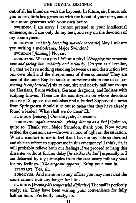
Page from the Standard Edition, which began publication in 1931, in Fournier small pica, 1-1/2 points leaded, large crown octavo, 5x8 inches.
The influence of Bernard Shaw on our time has been profound; in the theatre, in films and in broadcasting. The circulation of his printed works has been immense. His direct collaboration with his printer over a long period is of more than professional interest to publishers, printers and bibliographers. This unique author-printer relationship provides an unusual aspect for us of the wit, vigour and working methods of one of the most successful authors and playwrights of our time; demonstrating also in no uncertain terms the integrity, craftsmanship and mechanical resource of the printing house of R. & R. Clark, so soundly based and flexibly developed over the last hundred years in the solid traditions of the Edinburgh book-printing trade.
In 1946, on the occasion of the centenary of R. & R. Clark, Shaw wrote of that renowned Edinburgh printing firm, "Ever since it printed my first plays, Pleasant and Unpleasant, in 1898, it has been as natural a part of my workshop as the pen in my hand." Few printers can ever have received so eloquent a tribute from so eminent an author.
As a young author, Shaw's experiences with publishers had not been exactly encouraging. Between 1879 and 1883, as regularly as clockwork, at the rate of one a year, they rejected all his novels. The climate in publishing at that time is best described by Shaw himself writing to Daniel Macmillan in 1943. The letter is quoted in full in Charles Morgan's The House of Macmillan; a small portion bears reprinting here. After describing how Meredith turned him down for Chatto's without extenuating circumstances; how Blackwood accepted his first novel but reneged; how Smith Elder were polite and asked to see future efforts, Shaw goes on to write: "I am now one of the few who personally remember the Grand Old Men of the publishing world of that day: Alexander Macmillan, Longmans and Bentley. They were so powerful that they held the book-sellers in abject subjection, and were denounced by Walter Besant and his newly-organized Society of Authors as remorseless sharks. When they died and were succeeded by their sons, the hereditary system did not always work as well as it did in Bedford Street; and the book-sellers got the upper hand. John Murray's Byronic prestige was so select that I did not dream of trying him until years later, when I was an author of some note and had already helped to bankrupt three publishers. I offered him Man and Superman. He refused in a letter which really touched me. He said he was old-fashioned and perhaps a bit behind the times; but he could not see any intention in my book but to wound, irritate and upset all established constitutional opinion, and therefore could not take the responsibility of publishing it. By that time I could command sufficient capital to finance my books and enter into direct friendly relations with the printers (this began my very pleasant relations with Clarks of Edinburgh). I took matters into my own hands and, like Herbert Spencer and Ruskin, manufactured my books myself, and induced Constables to take me "on commission."
Sidney and Beatrice Webb sent Shaw to their Edinburgh printer. An informative and amusing correspondence reprinted at length by Grant Richards in Author Hunting reveals how he was ruled and educated by Shaw in the choice of type, "Morris" margins, specimen pages, paper and other details of production. Holbrook Jackson has pointed out in an article in number four of The Fleuron that Shaw's books followed the model of William Morris's Roots of the Mountains, printed in Caslon Old Face at the Chiswick Press in 1892. Shaw, Socialist intimate and admirer of Morris, was also in close touch with Emery Walker, and familiar no doubt with the typographical ideas of Morris, Walker and Cobden-Sanderson, first elaborated in Edinburgh in 1889 at a meeting of the National Association for the Advancement of Art, and later published in Arts and Crafts Essays printed in Edinburgh in 1893.
In preliminary discussions of the production of Plays Pleasant and Unpleasant, Shaw insisted on a trade union printer. Grant Richards doubted whether a union house could do justice to his ideal of the book beautiful. "I had few notions of what makes a union house," wrote Grant Richards. "I do not think I had a union house on my list. The problem shifted to the question of fair wages, and R. & R. Clark were approved." Shaw, in a letter to Grant Richards in 1897, observed, "Clark is all right; a first-rate house. I enclose a letter which you can hold as a certificate of compliance with my fair wages clause."...
Edward Clark doubtless also got much entertainment from his dealings with a teetotal, non-smoking, vegetarian, Socialist of an author. There is a story that, on one specimen, Shaw's instructions for close and mechanically-equal spacing between words were so precisely followed by the pragmatical Scots, that at the end of some closely spaced lines the definite article "the" was divided "t-" and "he" turned over, and the indefinite article "a-" with "n" turned over. Shaw's comment when returning the specimen, as Maxwell tells the story, was, "Excellent; but please do not go so far as to prove the author is really a damn fool." Shaw denies the story; nevertheless, true or untrue, it has a Shavian flavour.
Shaw's choice of Caslon for his original edition was inevitable. We know that he picked up the pre-Kelmscott formula ready-made from William Morris; but, unlike the founding fathers of the private press movement, he lacked the unearned income to indulge in a privately-cut type-face. In 1897 we must remember that there were only two text-types available in most book-houses: Old Style or Modern. More often than not, before mechanical type-setting, there was not even any choice. Publisher and author often had to accept the type of which there happened to be, at any given moment, the greatest amount of "dis."
Shaw's original hand-set page in type-founder's Caslon, long primer solid, stood up to thirty years' constant use. To our post-war eyes, conditioned by authorized economy standards, the precise and consistent setting of the plays, with their even Roman small caps, lower-case italics in square brackets, with occasional lower-case Roman words letter-spaced, has considerable nostalgic typographical charm. Here is sense and sensibility in book-making, well ahead of its typographical time. Of course, there are many people, William Maxwell and Bernard Newdigate amongst them, who protested that long primer Caslon set solid was too small and too difficult to read. But Shaw proved faithful to his original style and to his original setting until the plates wore out. He liked a colourful block of letter-press without white "rivers." He complains that modern printing ink is not black enough.
In the middle twenties when the project of a Limited Collected Edition was discussed, Shaw still preferred Caslon, but agreed to a larger size, pica solid, on a larger page, medium octavo. But, and to William Maxwell it was a considerable but, Shaw specified hand-setting. As a disciple of William Morris, Shaw objected to setting his books by machine. Our William from Edinburgh thereafter called on Shaw with two different specimen pages, one hand-set in original Caslon and one "machine-justified" in Monotype Caslon. Both were submitted to Shaw without saying which was which. The suspected Monotype "justification" was preferred. Maxwell triumphed. Emery Walker, consulted by letter, also approved the machine-set page.
What a victory for the machine! Or rather, what a subtle example of Maxwell's typographical tact and persuasiveness! The re-setting of the whole of Shaw by hand would have been an inexcusable and expensive drudgery. Maxwell convinced Shaw that the mechanical composing machine could equal hand-setting in typographical quality and close spacing between words and sentences.
The devotion to Monotype Caslon in the middle twenties seems strange to us now, looking back from a wealth of typographical equipment, including Bembo, Bell and Times. But if we look round the literature of the trade at that time, particularly at The Fleuron, we note that Caslon in its Monotype version had a vogue, almost a kind of typographical Indian summer. The Fleuron number one was set in the "then fashionable" design known as Garamond; number two in Baskerville; numbers three and four reverted to Caslon. When Mr. Stanley Morison took over the editing of numbers five, six and seven, and the printing moved from Curwen to Cambridge, the final volumes were all set in Fournier.
It was about this same time that William Maxwell told Shaw that his old Caslon plates were worn out and suggested complete resettings in a new Standard Edition in large crown octavo in small-pica Fournier 1-1/2-points leaded. In the final choice of type for the Standard Edition, we detect again how Shaw trusted William Maxwell's judgment and accepted his advice. No doubt there was an improvement in readability over the original edition, but my own feeling is that the Standard Edition, as at present printed, has none of the evocative charm of the original edition. It may be that the Sundour binding seems prosaic. But Shaw, disgusted by the fading of his green covers, was converted to Sundour by a Winterbottom director emphasizing that not even the Indian sun could change it.
When Shaw first saw Maxwell's specimens for the new Standard Edition in various type-faces, Caslon, Baskerville, Scotch Roman, Old Style and Fournier amongst others, he replied, "I like them all but I'll stick to Caslon until I die: and after I am dead you can do what you like." Fortunately, Shaw is still alive and the Standard Edition is in Fournier.[40]
I cross-examined William Maxwell closely and at some length on this switch from Caslon to Fournier. His persuasive and peculiar ability to get his own way, even in face of such a do-or-die statement of Shaw's, must be remarked here. I am afraid, however, the only light I can throw on this, the greatest typographical conversion of all time, is that Maxwell himself is very fond of Fournier italics. Maxwell is no hard-headed Scot. He comes from the soft Hyperborean north, where the Gulf Stream makes the fuchsias grow six feet high. When he confesses to an affair with an elegant French type there isn't much chance for even an Irish author, much less the English public, to break up the "auld alliance." Thus Shaw's Standard Edition, now running into some thirty-five volumes, began publication in Fournier in 1931 and has steadily reprinted in this type and format at intervals ever since.
In an article on "Author and Printer" in the eleventh impression of the ninth edition of Collins's Authors' and Printers' Dictionary Dr. R. W. Chapman observes: "The prolixity of modern writing, fostered by cheap paper and print, by the habit of making books out of articles and lectures, by the use of typewriters and stenographers, is a positive evil."
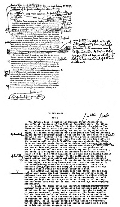
Shaw's meticulous proofreading is indicated by this heavily-corrected proof of On the Rocks, with a complete retyping of the passage below.
Shaw's method, probably verging on the diabolical to Dr. Chapman, is to write everything first in shorthand. A double-spaced typescript then becomes his working copy, to be sent to the printer only after careful emendation and revision, in Shaw's always clear hand.
The manuscripts, typescripts, galley, page and final press proofs, indeed the whole apparatus of the Shavian "workshop" in William Maxwell's collection, show the great pains Shaw takes in writing and revising before setting. His meticulous proof reading is as characteristic as the clarity of his proof correction. William Maxwell tells me that Shaw's first-proof corrections are often heavy, sometimes involving considerable re-setting and re-make-up. But wherever lengthy excisions or additions are made in final proofs, Shaw is always careful to supply the exact number of words; sometimes in shorter corrections counting individual letters in substituted words in order to avoid over-running and re-justification.
By all the standards of Horace Hart and Howard Collins, Shaw would qualify as an admirable and expert author in the technical aspect of his relations with his printer—except, perhaps, for Dr. Chapman's scholarly strictures on prefatorial prolixity and diabolonian authorship.
Shaw's plays are drafted in what he calls Author's Shorthand (simplified Pitman); typed by his secretary; revised; printed; and passed for press after two more revisions. For rehearsal, fifty copies are struck off as "By a Fellow of the Royal Society of Literature." If more are required they are "By Bernard Shaw." These sets are "privately printed." Alterations and additions in rehearsal and during the run of the play are incorporated as final corrections before publication.
One of the most interesting Shaw exhibits in William Maxwell's possession is the original of the filmscript of Pygmalion. Shaw allowed no hand but his own on the scripts of his films. The corrected copy of the play, with alterations in dialogue and time scheme for the screen and the additional scenes and sequences, is in itself remarkable visual evidence of Shaw's nimble-witted inventiveness. Few playwrights at the age of eighty-five have tackled so successfully the transition into another medium, cooperating with director and producer to present in all its freshness and verve the authentic Shavian touch on both sound-track and screen.
The original edition, the Limited Collected edition, the Standard edition, form the bulk of Shaw's printed works; his printed ephemera are not my concern here. There are, however, various editions of what we might call out-of-the-run-plays-and-prefaces books: The Intelligent Woman's Guide, Everybody's Political What's What, the two-column quarto editions of the Prefaces and The Complete Plays, the illustrated Black Girl, the illustrated Good King Charles's Golden Days (there was also an illustrated edition of Geneva printed by the Chiswick Press) and the illustrated Penguin edition of Pygmalion. "Omnibus" editions of the Plays and Prefaces have been published by Odhams, cheap editions by Penguin; and Back to Methuselah by the Oxford University Press in World's Classics. The Odhams omnibus was reprinted from Shaw's plates; the Penguin editions were re-set in Times.
The Intelligent Woman was instructed in Caslon on a page dimension decided by William Maxwell; a binding design by Douglas Cockerell; and a four-colour half-tone jacket from an original drawing by Eric Kennington of a nude female Intelligencer looking down a well. She, needless to add, had a much less shapely figure than the Black Girl.
The typography of The Intelligent Woman's Guide (1928) is in the Caslon formula. We need only note in passing that the drop initials at the beginning of chapters are tightly fitted and spill over into the margins. The binding suggests that too much Cockerell can spoil a trade binding. The jacket was regrettable: the externals of this book seem out of character with the rest of Shaw's production. A more acceptable popular edition, printed from the same plates, with reduced margins in small demy octavo, was published a year later in 1929.
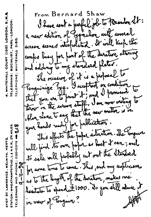
Shaw's note on the corrected Pygmalion filmscript in which he altered the dialogue and time scheme, providing additional scenes and sequences for the film as shown in the two pages following.
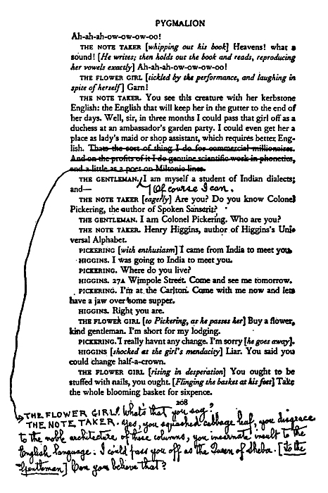
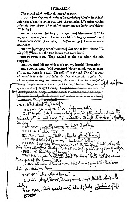
The two-column edition of the Complete Plays, set in Scotch Roman in quarto, is a skillful piece of book-making; a pleasant, readable page, which William Maxwell can appropriate entirely to his own credit. For size, weight and general colour the Scotch Roman was eminently successful for all the plays in one volume, not too heavy in the hand, in a format which makes for easy reference and re-reading.
The contrast of the two-column Fournier setting of the Prefaces with the two-column setting of the Complete Plays in Scotch Roman is to the advantage of the Scotch Roman. The small pica Fournier is too large in relation to the width of the column and, to my eye, does not look at all happy in this two-column setting.
Everybody's Political What's What provides us with an interesting example of the close collaboration in proof-reading between William Maxwell, his press-readers and Shaw. Shaw, to illustrate some argument, asserted erroneously that so many codfish were being caught at one period that great quantities were being thrown back into the sea. Maxwell pointed out that codfish were never thrown back into the sea; they are salted, dried, preserved and disposed of in many other ways. Shaw, hazy about varieties, intended fish in general and not codfish in particular.
Also in this book, Shaw mentioned that when an outsider wins a race, book-makers lose. William Maxwell, no mean expert in the making of these other kinds of "books" and having absorbed, no doubt, from Edward Clark some knowledge and appreciation of "the sporting spirits," questioned this; and innumerable letters from punters and bookies overloaded Shaw's letterbox. He re-worded the passage to silence the rule-of-thumb practitioners.
We have all been afflicted from time to time in prefaces and authors' notes with the names of odd people who have also "read the proofs." There can be few authors who get the benefit of skilled press-reading and skilled scrutiny from a managing director so knowledgeable about fish and about "bookies." The codfish and "bookie" stories are an interesting indication of how every page of Shaw's goes through a double sieve at Brandon Street, such is the passion of Scots for accuracy in type-setting. The Scots' passion for perfection in press-work comes to light in this association with the production of The Black Girl.
Some time prior to 1932, Shaw asked Maxwell to suggest an engraver-illustrator for this Voltairean tale; Maxwell suggested John Farleigh. With that thorough attention to detail characteristic of the Scot, he not only ensured that Shaw should have an illustrator capable of interpreting his ideas, he also took care that the engravings, paper and ink should all be happily matched and tested. By accepting full responsibility for the typography of the illustrated page, he undoubtedly produced an illustrated Shaw of a quality and at a price which was a credit to author and printer.
My typographical feelings about The Black Girl are mixed. The engravings seem rather too heavy for the Fournier setting; it may be an odd observation to make about a Shaw book, but the illustrations overload the text of this slim book; the binding is too much and too black. Shaw's own wash drawings of the Black Girl are much more subtle in suggestion than John Farleigh's white line. But there was little doubt about the success of The Black Girl with a large public. It is an interesting and successful example of a short book with text and illustrations printed at one impression, and without any complications in binding.
The contrast between Farleigh's sharp white line and Topolski's loose black squiggle in the illustrated edition of Good King Charles's Golden Days demonstrates what I mean by the rigidity of The Black Girl page. Shaw as an author is impossible to illustrate; he can only be annotated and decorated. There is an engaging light-hearted quality about Topolski's cosmopolitan draughtsmanship which seems to suit Shaw better than Farleigh's engravings.
Maxwell's earliest recollection of meeting Shaw is of going to see Mrs. Shaw at the Adelphi about the printing of her translations of some plays by Brieux, the author of Damaged Goods. Shaw had written an introduction to them.
In the centenary letter to William Maxwell in November 1946, Shaw wrote: "I remember Edward Clark very kindly and very well; but it was with you that our business relations developed into a cordial personal relationship which has been of inestimable value to me as an author...."
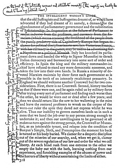
Correction in popular edition of The Intelligent Woman's Guide showing careful count of words and letters for exact fit of substituted passage.
William Maxwell at an early stage in his career became aware of the printer's responsibility to the author. Clark's work for Robert Louis Stevenson must often have been recollected and discussed. Many other authors have passed through Brandon Street on their way. It is one of the doubtful pleasures of a book-printing establishment to deal direct with authors. Maxwell has had his full share of that kind of mixed pleasure and responsibility with Hardy, Kipling, the Webbs, Sir James Frazer, Hugh Walpole, Virginia Woolf, Charles Morgan, Osbert and Edith Sitwell.
I began with an Edinburgh book-printer; I conclude with an honorary LL.D. of Edinburgh University. In 1947 that ancient University conferred on William Maxwell that honour which he values above any personal recognition. It was a deserved compliment to R. & R. Clark and to Scottish printing as a whole.
No man is self-made; but so far as any one individual can by his own efforts raise the standard of his trade, the renown of his firm and add to the lustre of his native city, Dr. William Maxwell has done so by his devoted and sedulous years in the service of many authors and many publishers....
This inadequate typographical report is in no sense intended to be either accurate or inclusive. Nor do I make any claim for startling innovations in graphic design or any particularly noteworthy contributions to typography. This productive association has covered fifty of the most inventive years in the mechanical development of book-printing; Bernard Shaw himself wrote, "I have not had to think about my printing. I have left it to do itself, which means that R. & R. Clark had to do it." All the same he thought a lot about it.
I may well conclude with the final paragraph of Shaw's letter to William Maxwell of November 1946. "Long may you and R. & R. Clark Ltd. flourish after we have said our last farewell which we shall both, I hope, be still too busy to attend to."
COMPOSED IN CALEDONIA TYPES
FOOTNOTES: