NUMBERS.
Reading edition
It is always a pleasant task to any one who realizes the magnitude of the debt under which the whole world lies to the printing-press to enumerate the many great and noble men who have served God and their country as printers. The biographical difficulty is in the selection, for every country has its typographical roll of fame, upon which are inscribed numbers of names of heroes of the Press, who, instead of courting fortune, have spent laborious and self-denying lives with the sole object of diffusing that knowledge by which ignorance is dispelled, and man raised above the beast. Such names should be household words. An account, necessarily brief, of a few of them is here attempted.
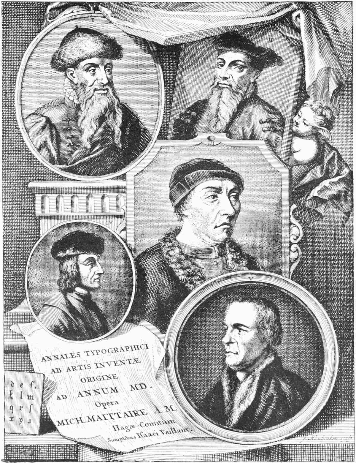
PORTRAITS OF COSTER, GUTENBERG, FUST, ALDUS AND FROBEN.
(From
Maittaire
)
HOLLAND.
I believe this to have been the premier country in typographical development. Some one printed those old Dutch fragments which carry with them their own certificates of birth; and even if it is difficult to prove the printer to have been Laurens Janszoon Coster, his works remain, and “Costeriana” is a well understood and convenient term by which to designate them.
GERMANY.
Of the celebrated trio, Gutenberg, Fust and Schœffer, who invented what Fichet, Rector of the Sorbonne (who also was their contemporary), calls “a new sort of printing,” Schœffer alone was left after 1468. Other Germans were however at work then or soon after. Pfister and Sensenschmidt were printers at Bamberg; Zainer was hard at work at Augsburg; Eggestein and Mentelin at Strasbourg; and Vendelin at Spire. These are well known names; but still better known is that prolific typographer, Ulric Zell, of Cologne, whose workshops seem to have been a training college for young printers all over Europe, and whose works are so numerous that no writer has yet mastered their bibliography. So little cared he for worldly fame that he scarcely ever put his name to a book printed by him, although the individuality of his types and the “get up” of his works announce their parentage as plainly as if certified in a Colophon “Per me Ulric Zell.” Before leaving Cologne, we will only mention P. de Olpe, Therhoernen and Koelhoff, all famous printers. After the first two generations, however, Germany pursued the new art in a sober manner, no name appearing of surpassing merit until the middle of the sixteenth century.
“Optime meritus” was the description attached by Rothscholtz to the portrait of Sigismund Feyerabend (1527-1587), of Frankfort-on-the-Maine. A learned and able man, with great artistic taste, he employed the best engravers of the day to illustrate his books, which became famous throughout all Europe, and are now held in great esteem by bibliographers.
John Petreius, of Nuremberg (1497-1550), is a name which should not pass unrecorded. He was an excellent typographer, and especially noted for the correctness with which he printed in Greek and Latin. He was a practical printer in a very real sense, for he made his own presses, cast his own types, and manufactured the ink with which he printed. His extensive correspondence shows that the most celebrated scholars of the age were in constant communication with him, on terms of close friendship. When he died they wrote, as was then customary among Scholars, many classical epitaphs to his memory.
Anton Koburger, too, was very famous, and perhaps the most prolific of all Germany’s fertile printers. He worked at Nuremberg, where he kept twenty-four presses employed. All his books are of great excellence, and he is specially noted for his Bibles, of which he issued twelve editions.
In the same city Albert Dürer erected a press, at which he printed the text to his own wonderful engravings. After his death his widow carried on the business for some years.
In modern times Germany has given us Emmanuel Breitkopf, who, about 1750, improved greatly the hand-press, and invented a new set of music types; while H. Brockhaus, at Leipzig, has a European renown as printer and typefounder.
ITALY.
In this country the printing-press originated, as we have seen, with Sweynheym and Pannartz, first at Subiaco and then at Rome, who from 1465 to 1474 issued many editions of the Classics. In addition to the famous names already recorded when noticing the introduction of the art into Italy, Ulric Hahn, Philip de Lignamine, Silber, Planck and Riessinger, noted typographers of the fifteenth century, deserve mention. But the lustre of all fades before the fame of the celebrated Aldus Pius Manutius Romanus. This great printer was born at Bassanio, in the Roman States, in 1449. He studied for many years in Rome, and from that fact assumed the name of Romanus. In 1482 he lived in the same house as Picus Mirandulus, and afterwards abode with Prince Alberto Pio, who allowed him to adopt the name “Pius.” Being strongly impressed with the potentialities latent in the printing-press, he determined, about 1489, to devote his whole attention to the publication of classical literature. After organising in Venice the most complete printing-office hitherto seen, he began his typographical career by the issue of the Greek Grammar of Lascaris. This was in 1494. In the prologue to that book Aldus declares the determination of himself and his co-workers in the following noble words:—“We have determined henceforth to devote all our lives to this good work. I call God to witness that my sincere desire is to do good to mankind, as indeed I hope has already been shown by my past life. I will indeed labour continuously to make constant progress; for although we might have chosen a tranquil country life, we have preferred a life busy and full of hard work. A good and learned man will not give himself up to base pleasures, but to work and to do something worthy. Cato has said truly, ‘Man’s life may be compared to a sword; use it and it keeps bright; neglect it and rust will soon be its destruction.’ Therefore if work seem sometimes irksome to a man, let him be sure of this—that sloth would be much more detrimental to him than the hardest kind of labour.”
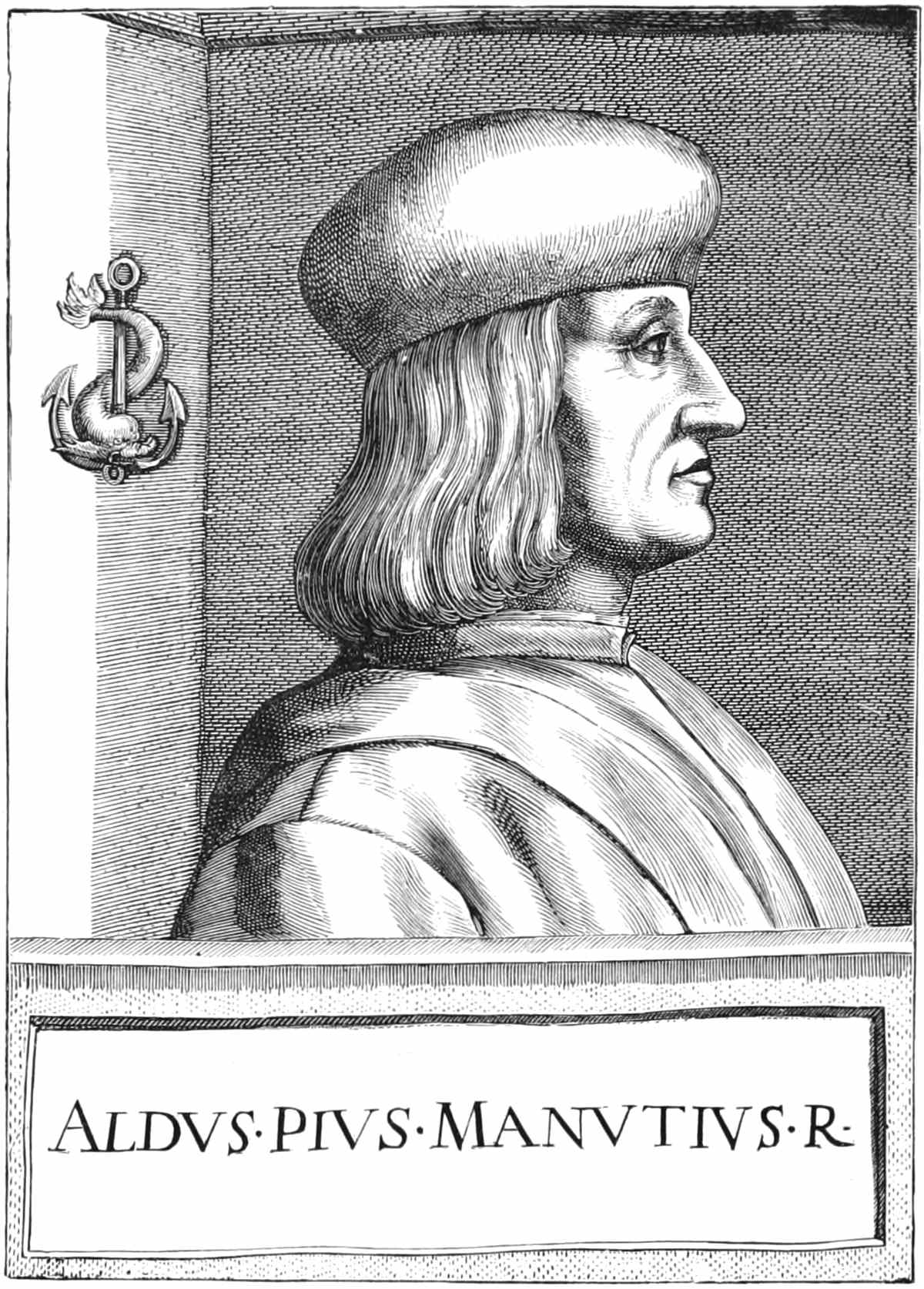
PORTRAIT OF ALDUS.
These were words from the heart of Aldus, and in this conviction he worked until his death. In 1501 he established an academy of learned men and scholars. Constantinople had just fallen into the hands of the Turks, and among the Christian refugees were many scholars of fame and repute. To these Aldus offered a safe and quiet asylum, asking from them in return that a portion of their time should be devoted to the collation of manuscript copies of the classics, which in the course of time had become very erroneous through the carelessness of successive copyists. He also employed them in reading his printed proofs and revising them for the press. In this way many good scholars lived on terms of great friendship with Aldus, and were entirely supported by him. Surely modern lovers of literature owe an incalculable debt of gratitude to Aldus for preserving by these means an accurate text of the great classical writers of antiquity.
The expense of this great undertaking was of course very great; and partly to reduce the cost of production, and partly to place copies of the books he printed within the reach of poor scholars, Aldus employed the artist Giovanni de Bologna to design for him a new and compressed type which would enable him to print nearly two pages in the same space as one. From the country of its birth this letter has ever since been known as Italic. Its elegant shape has been much, perhaps too much, admired. The appearance is somewhat marred by the invariable use of Roman capitals, which, throughout a page of Italic, is certainly not agreeable to the eye.
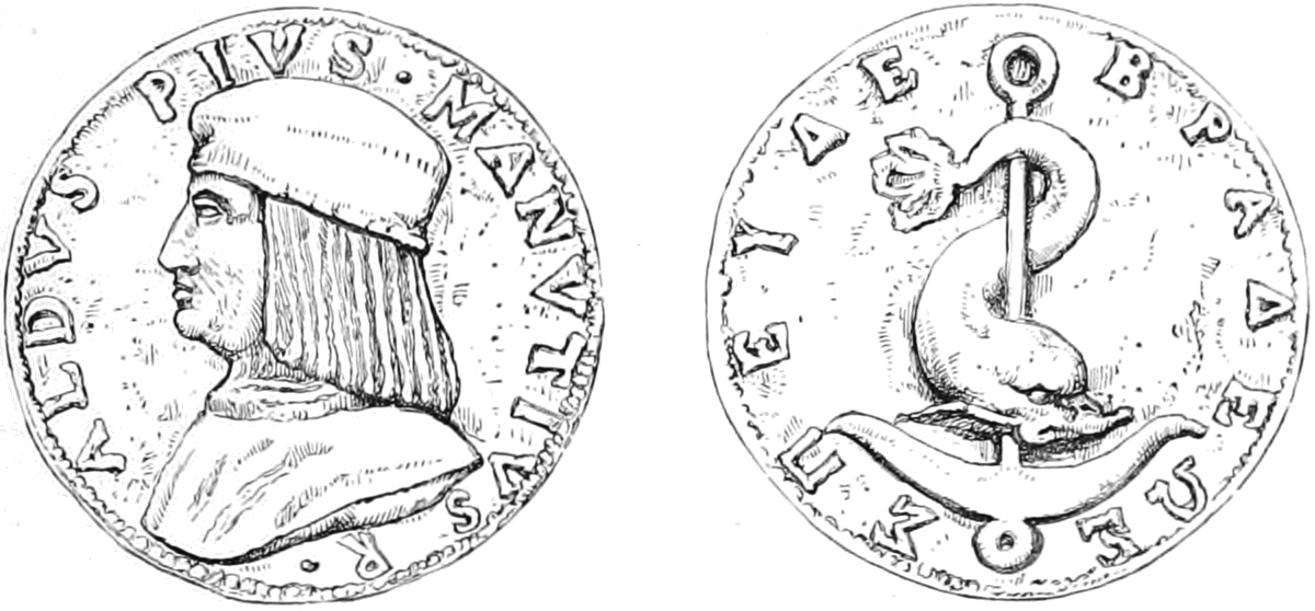
THE MEDAL OF ALDUS.
The fame of Aldus’s printing-office soon spread throughout Europe, and his little pocket editions of the Greek and Latin classics were esteemed as much for the beauty of their dress as for the accuracy of their text. The visits of the curious, as well as of the learned, became at last so troublesome that Aldus placed the following notice over the chief entrance: “Whoever you are that wish to see Aldus, be brief; and when business is finished go away; unless indeed you are able and willing to assist him as Hercules did Atlas in his need: and even then remember that whoever gains here a footing must work hard and with perseverance.”
Aldus himself took no relaxation; scarcely would he afford himself any sleep until fatigue compelled him to rest. He died in 1515, the King of Printers, with an immortal halo surrounding him.
Aldus adopted for his device an anchor, with a dolphin twisted round it. This emblem is justly celebrated in the annals of typography under the name of the Aldine anchor, and is very appropriate to the work of a Printer. The dolphin is the emblem of swiftness, on account of the rapidity with which it cleaves the waves. The anchor is the emblem of stability and reliance. So the printer should be speedy at his work, but consider his plans carefully and soberly. This was admirably summarised in the motto adopted by Aldus—“Festina lente” (Hasten slowly). On a rare contemporary medal the motto appears in Greek, “ΣΠΕΥΔΕ ΒΡΑΔΕΩΣ.”
Another great Italian Printer was Giambattista Bodoni, whose name certainly stands next to that of Aldus. He was the son of a Piedmontese printer, and was born in 1740, the year when all Europe celebrated the Jubilee of Printing. At the age of eighteen he was working as a compositor at the Propaganda Printing-office, Rome, where he did good service by studying hard to learn the Oriental languages, and then restoring to a proper condition for use the fine collection of Oriental types in that office, which had long been in a state of confusion. It was about this time that he turned his attention to the art of engraving new types, in which he soon showed great talent. In 1768 he was placed by the Duke of Parma at the head of his new printing-office, which he soon rendered the most famous in Europe. He devoted great attention to the shape of his Greek types, for which he took as a model the most beautiful manuscripts obtainable. His “Homer” is perhaps the work which gained him more renown among scholars than any other. In his “Manuale Tipografico,” which is a specimen book of all his types, some copies of which were printed on pure vellum, the lover of typographical excellence as presented by elegantly-shaped letters, glossy ink, and faultless press-work, may revel to his heart’s content. Bodoni died in 1813.
As a curious freak of fickle fashion, we must notice the recent fate of a most interesting collection of books, all from the press of Bodoni, collected during many years by the Marquis Saporiti della Sforzesca. These were sent to London and sold publicly in December, 1886. The number of separate works was over 500, including, with hardly an exception, specimens of the whole produce of the Parmese Press. No such a collection has ever before been brought to the hammer, and had it been sold in Dr. Dibdin’s time, when Bodoni’s fame was at its height, there can be little doubt that £2,000 at least would have been realised. Today, when “black-letter” governs the market, and sentiment rules over taste, Bodoni’s master-pieces of typography are of less money-value than a Seven Dials ballad. The whole of the Marquis’s collection realised in the gross but £50 7s., a sum far below the prime cost of two or three volumes, and hardly enough to pay for printing the sale catalogue.
Italy may well be proud of still another typographical son. G. Viessieux, of Milan, who lived 1779 to 1863, if not remarkable for excellence of workmanship, was successful, notwithstanding great opposition from the ruling classes, in obtaining for his native country that inestimable boon—freedom of the press.
FRANCE.
We have already noticed the introduction of the art to Paris, where it spread with rapidity even in the lifetime of Ulric Gering. Antoine Verard is celebrated for beautiful editions, many of them with splendid illuminations; but space would fail to speak of Simon Vostre, of Pigouchet, of Dupré, of the artistic and learned Geoffrey Tory, of the martyred Dolet, Moel, and many other worthy printers.
But of all the great printers that France has produced, there are none of whom their countrymen may feel more proud than the family of the Estiennes, who flourished from 1502-1664. The two most celebrated were Robert I and Henri I, father and son. They both printed, not for lucre, but from real love of their work and classic literature. So intimately indeed is the biography of these two great men associated with the mental growth of the nation that, as Feugère says, “it rises to the dignity of history.”
Henri I was the founder of the family. He printed and published at Paris for twenty years, and laid the foundation of the family fame during the period 1502-1522.
Robert I, his eldest son, succeeded in 1526 to his father’s printing-office, placing over his door a printer’s mark, afterwards of world-wide fame. It was an olive-tree, with the motto “Noli altum sapere sed time” (“Be not high-minded, but fear”). He married a daughter of another famous Parisian printer, Badius Ascensius, he whose printer’s mark—a printing-press, two pressmen, and a woman composing types—is well known to all lovers of old books. (See p. 54.) It is curious to note that all three of the daughters of Badius married printers. For thirty-three years Robert Estienne worked hard as author, collator, corrector, printer, and publisher, producing volumes which for beauty of workmanship and accuracy of text may vie with the productions of any other press. So important were the Greek authors which he for the first time collated and printed, that the publication of those classics may be almost said to have begun with him. It was to some extent the same with Latin authors. Thus with Greek, with Latin, with Bibles, with dictionaries and grammars, Robert Estienne was the father of such a series of works as have never been equalled before or since. Patronised and favoured by Francis I, it was the high opinion of his capabilities, added to the desire to outshine the efforts of other countries, which induced the King to defray out of the public purse the expenses of a new series of specially cast Greek types. With this view Angelo Vergecio, the most artistic penman of his time, was engaged to design the models for the letters; and the cutting of the punches was entrusted to Garamond, one of the most skilful engravers of his day, who himself was a good scholar, and had taught Greek to Henri Estienne when a boy.
The production of beautiful and correct editions of the Bible formed a special feature of the labours of Robert Estienne; and this, thanks to the hatred of the priests, whose stronghold was in Sorbonne, brought upon him the bitterest persecution. To print the Latin Vulgate for every one to read was bad enough, but when Robert Estienne published his three-column Polyglot, with Hebrew on one side and Greek on the other—Christ between two thieves, as they called it—their rage knew no bounds. So fierce was the persecution that had our printer stayed in Paris, he would probably have been, like Dolet, burnt alive. So in 1551, having under various pretences sent away his family, he despatched his types also, and quietly followed to Geneva, where, although subjected to many annoyances, chiefly due to his own ill-considered opposition to the civil government, he was allowed to print without hindrance. Here he embraced the Protestant faith; and in 1559, after a life of manly and unselfish labour, embittered by the persecution of those who ought to have been his best friends, but sweetened by the knowledge that his toils and sufferings were for the benefit of mankind, he died.
Henri II succeeded his father at an early age, and followed in his footsteps. He travelled extensively in all the chief countries of Europe, returning laden with new MSS. and new ideas, which were soon apparent in his books. At one time he worked for about a year in the printing-office of Paulus Manutius, after which he returned to Geneva, devoting himself with fresh energy to his work. His father left him the Genevan printing-office on condition of his carrying it on in that city. This restriction was very irksome to him, and what with quarrelling with the authorities and constant journeyings, his business greatly declined, and in 1570 he was insolvent, dying some years later. The work he got through in his prime was immense, and often prolonged for so many hours at a time as seriously to injure both mind and body. His mental attainments and general knowledge were very great, but employed fitfully.
The old typographical fame of France has been well maintained in more modern times by the Didot family, whose history from 1713 to the present time is the history of French printing for that period. Pierre Didot (1761-1853) not only emulated Bodoni in the beauty of his workmanship, but took extreme care—more, indeed, than the great Italian Printer—to have accuracy of text. He was an excellent classical scholar, and himself read for press the works of which he was most proud.
Nor must we omit to mention his nephew, Ambrose Firmin Didot, who, in addition to his intimate knowledge of classic literature, was a good antiquarian, learned in bibliography, a first-rate connoisseur of old engravings, and a weighty writer upon all subjects connected with his own art.
France indeed may well be proud of her position in typographical history. Other cities may boast of individual celebrities, an Aldus, or the Elseviers, a Plantin, a Bodoni, or a Baskerville. But at Paris, from Gering, through Verard, Badius, Ascensius, Kerver, the Estiennes, Dolet, the great Didot family, and numerous others, there has been such an unbroken succession of great and famous printers as must always command the wonder and admiration of posterity.
It should be added that several French printers, in modern times, have laboured for the mental improvement of the men and boys employed by them, and with considerable success. The efforts of M. A. Chaix, of Paris, in this direction have received emphatic acknowledgment from the State and all philanthropists.
Sebastian Cramoisy, who by the order of Louis XIII founded the Royal Printing-office, must not be overlooked; nor must Antoine Vitré, who combined excellence of typefounding with excellence of printing. He was the first in all France to print with Syriac types. His famous Polyglot Bible of 1645 keeps his memory green among bibliophiles.
SWITZERLAND
May justly pride herself on being the mother of Parisian, and therefore of French, typography. To one of her sons, Ulric Gering, who, with two companions left Basle, and began printing at the Sorbonne, France owes her first press. At Basle, too, Jean Amerbach gained great reputation in the beginning of the sixteenth century, as also did Operinus. But the most famous printer was John Froben, of Basle, who was justly proud of his accuracy. Competition, and consequent reduction in price, were evils strongly felt and resented by Froben. In his Preface to the Concordance of 1525 appears the following dialogue, which is somewhat curtailed from the original:—
“Customer.—Well, Froben, what book have you there?
Froben.—One which is equally your interest to buy as mine to sell.
Customer.—Something quite new, then?
Froben.—Neither new nor old, for it is both.
Customer.—You talk in riddles.
Froben.—It is a book called ‘The Concordance to the Sacred Scriptures.’
Customer.—Why, that has been printed ever so many times.
Froben.—True! but if I have reprinted it, it is for the good of all. The sun itself does not appear every day, when it does shine it is just the same sun, while my book here is a decided improvement on the usual text.
Customer.—You can assure me of its correctness.
Froben.—You know that it is almost an impossibility to ensure positive freedom from error, but if the care I have bestowed upon it has not been thrown away you will find it very correct. Moreover, there is more in it than in the previous edition.
Customer.—I congratulate you, but I fear you will get but little credit for all your labour; besides, do you not find so much toil hastens old age?
Froben.—What matters it? ’Tis my destiny. And if she does bring me old age and its troubles, you have the power to ease them.
Customer.—Indeed, how?
Froben.—By purchasing this volume at once, and thanking me for offering it to you.
Customer.—But have you no compunction in thus selling your own child?
Froben.—Not the least. It was for you and not myself that I begot it.
Customer.—What is its price?
Froben.—Stoop, and I will whisper it in your ear.
Customer.—Oh! goodness; much too dear.
Froben.—There! take it home and look at it. If you then repent your bargain I will return your money.
Customer.—You could not say fairer.
Froben.—Everyone can be prodigal of words, but Froben holds to what he promises.
Customer.—Here, then, is the purchase-money in full tale.
Froben.—And here is the book in good condition, and I hope we shall both be pleased.”
THE NETHERLANDS.
J. Bellaert, of Haarlem, 1483, is the first printer whose name we find in Dutch typographical annals; and of the numerous other names in the fifteenth and sixteenth century, but few call for special notice.
Perhaps the most celebrated printer who flourished in Holland was Abraham Elsevier, who was born at Leyden in 1592. Baillet calls him “the Prince of Printers, not only in Holland, but throughout all Europe,” and no doubt for many years that character was true. The family flourished for more than one hundred and thirty years as printers, and to this day some of the books which issued from their presses are among the chief treasures of the bibliophile.
W. J. Blaeu, in the early part of the seventeenth century, was not only remarkable for the excellence and diminutive size of the books he issued, but deserves honourable mention for greatly improving the old wooden presses used in his day.
The “Pensioners” of Holland and the “Doges” of Venice were important persons in their day; that day has passed, and now who thinks much about them? But our Elseviers and Aldines live still, not in name only, but as vital realities; and their books continue to be prized not only for their beauty and rarity, but for the standard accuracy of the text.
BELGIUM.
After the printers who first brought the art to Belgium we meet with no one of special note until the time of Christopher Plantin, (Portrait on p. 76.) who founded a family of printers of world-wide fame. His great Polyglot Bible of eight folio volumes, published in 1569-72, is a wonder of erudition and good workmanship. The last descendant of the family, Ed. Moretus, has lately disposed of the old house and all its contents to the town of Antwerp, who have opened it to the public as a museum, where may be seen five portraits of the family painted by Rubens, and many other noteworthy objects of art and typography. No one should visit Antwerp without paying a visit to this most interesting museum.
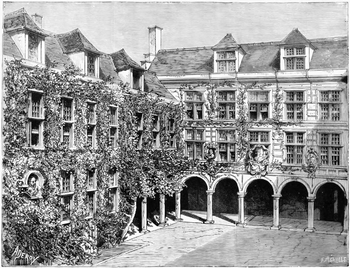
THE PLANTIN MUSEUM, AT ANTWERP.
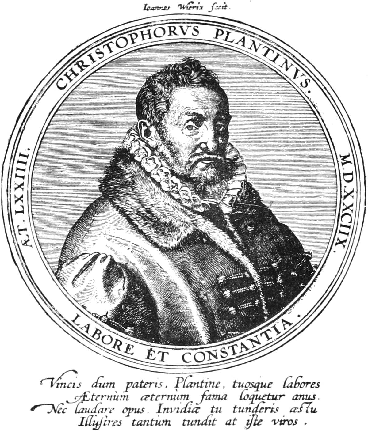
PORTRAIT OF CHRISTOPHER PLANTIN.
SPAIN.
The only name of great repute in this country is that of Ibarra, who printed some excellent books at Madrid in the Bodoni style. He died in 1785.
ENGLAND.
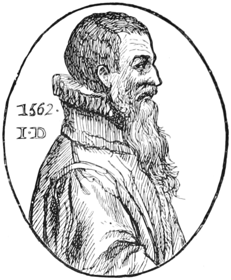
After the death of Caxton, in 1491, his workmen set up for themselves. Wynken de Worde, who succeeded his master, was the most celebrated, and issued many hundreds of books. Dibdin, some seventy years ago, quoted over 400, and there are probably now more than 600 known to bibliographers, the whole sadly in want of an enthusiast who would devote a few years to their study. Pynson and Wolffe were prolific typographers, and John Day, the printer of the Reformation, gave to the world over 350 books. In the 16th century, however, the Government interfered and placed the Press under severe restrictions, upon pretence of stopping treasonable and heretical publications. A series of barbarous enactments soon reduced printing to a dangerous and unremunerative employment. The effects were seen at once by the degraded condition to which both master printers and their workmen were reduced; ignorance and incapacity being the leading characteristics of the craft, instead of learning and intelligence. Thus, while in France and Germany the printer held an honourable position, above that of the trader, in England he was a mere slave to the Stationers, to whom Government deputed tyrannical powers of oppression and suppression.
PORTRAIT OF JOHN DAY. 1562.
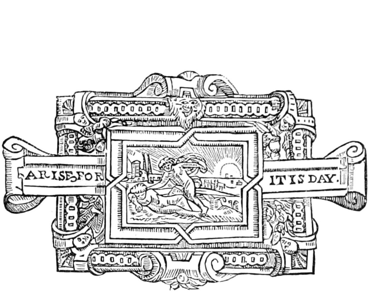
JOHN DAY’S TRADE MARK.
With the restoration of freedom a great improvement took place; and the names of John Cave, who originated the Gentleman’s Magazine, the Woodfalls, John Nichols, Bensley, Baskerville, and others, raised the fame of English printers to a great height. The Spottiswoode family are also celebrated in our typographical annals, and none more so than the philosopher, the antiquarian, the great man of science, the hard working printer, and the warm friend, William Spottiswoode, F.S.A., F.R.S., who died in 1881.
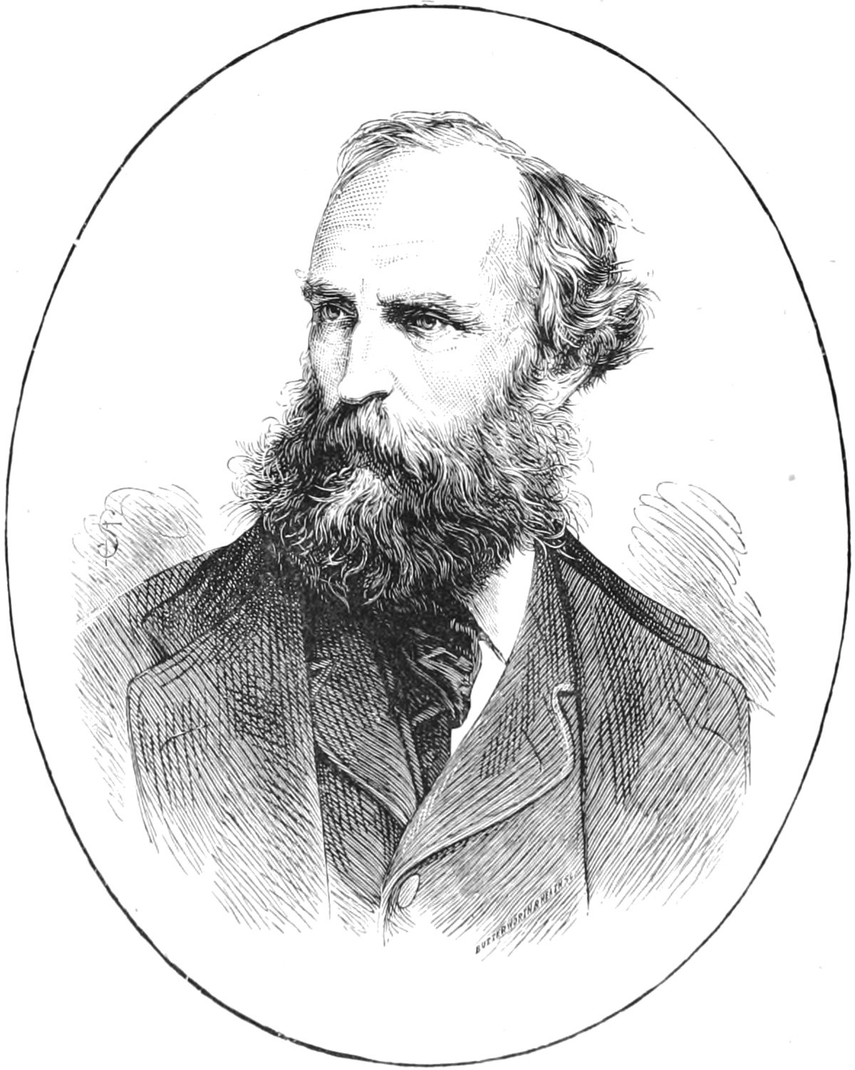
WILLIAM SPOTTISWOODE.
AMERICA.
In the New World, the most famous name in the annals of printing is that of Benjamin Franklin, who, as a lad, learned his trade in the printing-office of Samuel Palmer, in London, in 1724. On his return to his native country two years later, he entered into business as a printer in Philadelphia. His literary and scientific tastes soon made him a man of mark, and America to this day claims few more distinguished sons than the philosopher and statesman, one of whose chief boasts it was that he had served his time at the press. The actual press at which he worked in London is still in existence, and is preserved by his countrymen, as a precious relic, in the Smithsonian Institute, at Washington. (See a cut of this press on p. 56.)
In our own days, America has, in the person of Theo. L. De Vinne, of New York, a worthy type of the enlightened and artistic printer.
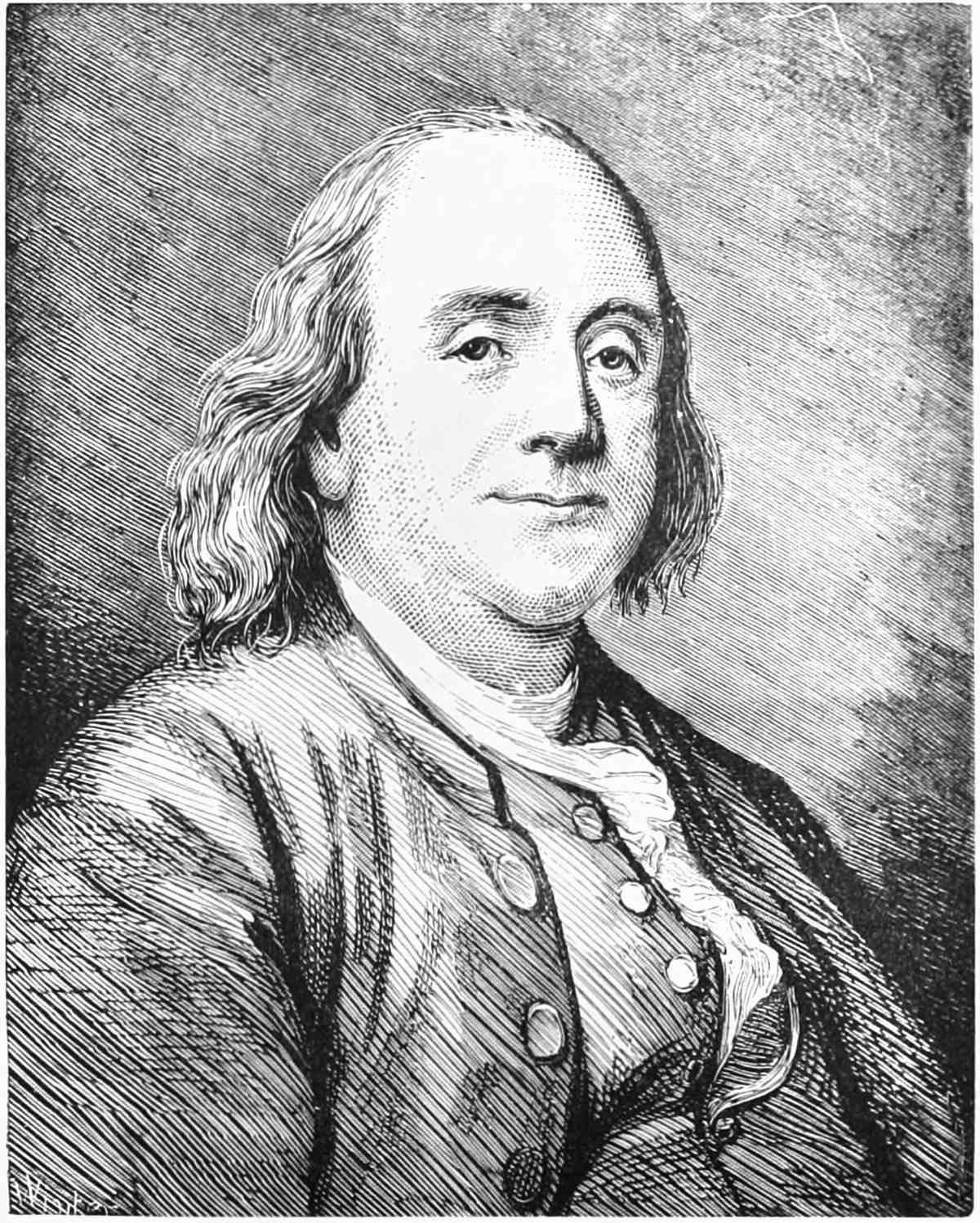
BENJAMIN FRANKLIN.
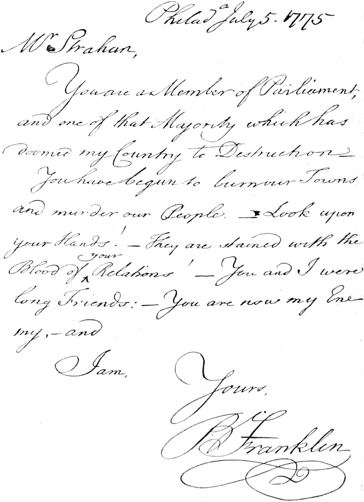
FAC-SIMILE LETTER OF BENJAMIN FRANKLIN.
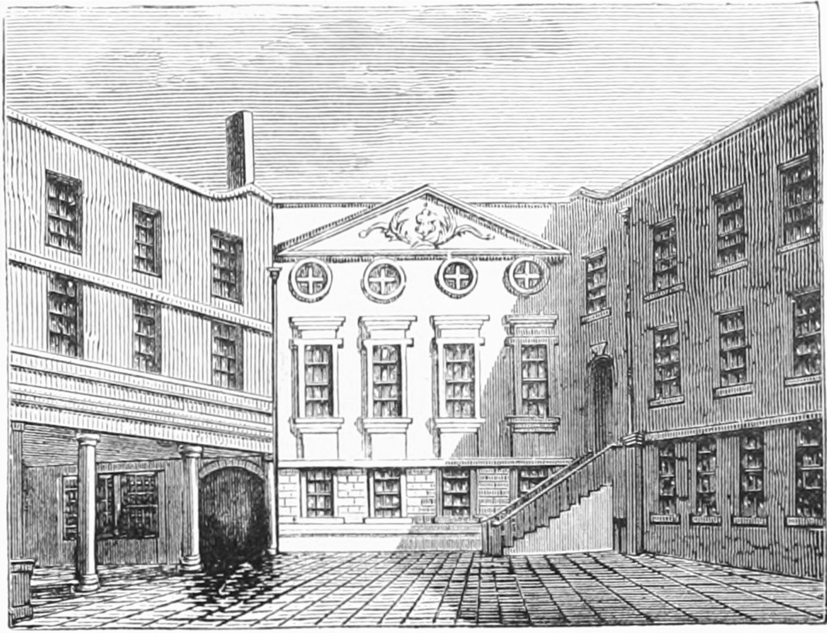
STATIONERS’ HALL.
DEUTERONOMY.
“They have sought out many inventions.”— Eccles.