Chapter IX
Reading edition
THE MASTER PRINTER.
The question of the exact spot upon which England’s first printing press was established has already been discussed. The well-known advertisement of Caxton, which states that pies of Salisbury use were on sale at the “Red-pale,” in the almonry, at Westminster, not only indicates the position of his house, but also the sign by which it was known. The precise appearance of the almonry in the fifteenth century must be to some extent imaginary, but we know that almshouses were there, and probably two or three structures besides that occupied by Caxton.
We will now ask the reader to imagine fourteen years passed since Caxton first began working at his new art. It is not difficult to picture the wooden building in the almonry occupied by his sedate but busy workmen. We can look in at yonder window, and see the venerable master printer himself “sittyng in his studye where lay many and dyuerse paunflettis and bookys.” The great towers of Westminster Abbey cast their shadow across the room, for he is an early riser and already at work upon his translation of the new French romance, called “Eneydos.” The “fayre and ornate termes” of his author give him “grete plasyr,” and he labours, almost without intermission, till the low sun, blazing from the western windows, warns him of the day’s decline. Again, we watch him pass with observant eye through the rooms where his servants are at work; we see the movements of the compositors, who ply their rapid fingers close to the narrow windows; we hear the thud-thud of the wooden presses as the workmen “pull to” and “send home” the “bar,” discussing meanwhile the latest news; and we sympathise with the binder, who, hammering away at the volume between his knees, looks in despair at the ever-increasing progeny of his master’s art. Piles of books and printed “quayers” rise on all sides, and many a wise head is ominously shaken at the folly of supposing that purchasers can be found for so many books. Nevertheless Caxton pursues his busy course, ever at work with mind and body, preparing copy for the press, and guiding and instructing his workmen in the art which he had learned in Bruges at “grete charge and dispense,” and the practices of which are to be explained in the following chapter.
Of all the workmen employed at the “Red-pale,” the names of three only have descended to us.
Wynken de Worde, who was probably a native of the town of Worth in Belgium, appears to have been the chief man. When he entered Caxton’s service is unknown; it was probably at an early age, as he was still living in the year 1535. In 1491 he succeeded to the stock in trade of his deceased master, but he did not append his own name to his books until 1493. He used many varieties of Caxton’s “mark.”
Richard Pynson speaks respectfully of Caxton as “my worshipful master.” He at first set up a press just outside Temple Bar, and used Caxton’s device in his books.
William Copland remained for some time after Caxton’s death in the service of Wynken de Worde. He, too, in his prologue to “Kynge Apolyne of Thyre,” mentions “my master Caxton.” Doubtless there were many others, and some have supposed that Machlinia, Lettou, and Treveris were among the number; but there is no evidence that these printers were ever reckoned among Caxton’s workmen.
We come now to the mechanical means by which, during fourteen years, Caxton carried on his business. Was the process of book-making the same as it is at the present time? What sorts of types, and how many founts were used? How were the types made, and what were their sizes? Did the compositors use upper and lower case, sticks, chases, brass rule, reglets, furniture, and the various appliances of a modern composing-room? What were the presses like, and the practices of the pressmen? And lastly, In what form were Caxton’s books issued to the public? To most of these questions it would, at first sight, seem as though no definite answer could be given; but when attention is directed to the books themselves, undesigned, and therefore most trustworthy, evidence will be found in them as to many technical customs and peculiarities of the early printers.
Before the invention of printing, the art of book-making, mechanically considered, was divided into three departments: the manufacture of the material upon which to write, almost entirely parchment or vellum; the ink making and the writing, the scribe being his own ink maker; and the binding. Illuminators there were, of course, but their work was merely ornamental, and by no means necessary to the idea of a book. In monasteries famous for the diffusion of learning all these branches were carried on together. So has it been with printers, who, from the infancy of their art to the present time, have occasionally included everything necessary to a perfect book in one establishment. If all the trades which, either directly or indirectly, are called into operation by printers were to be enumerated, few indeed would be omitted; nevertheless, the absolute necessaries for the production of a book are—the material upon which to print, the types and presses with which to print, and the workmen to handle them. We will, therefore, consider Caxton’s books under the following heads:—
The paper. The types. The compositor. The press, the pressman, and the ink. The bookbinder. To these may be added, although not as necessary assistants: The rubricator, illuminator, and wood-engraver.
THE PAPER.
Fortunately, there is no need to enter here upon the obscure origin of the manufacture of paper. The only question which concerns us is—What kind of paper did Caxton use, and whence did he obtain it? He certainly had several sizes; the largest, which was probably found too unwieldy, was used only for the first two editions of the “Golden Legend,” an uncut copy of which, in the University Library at Cambridge, gives 22 × 15¾ inches for the full measurement of a whole sheet. The large size of this book was, doubtless, suited to its intended use—in the public services of the church. He likewise used several smaller sizes, which varied according to the moulds in which the sheets were made, from 18½ × 13 inches to 16 × 11 inches.
The quality of the paper varied considerably, though not to the extent apparent in the books as they now exist—chemical “doctoring” and washing, which have in many instances been resorted to for cleansing purposes, having weakened and rotted much of the paper so treated, whilst the untouched specimens remain strong and fibrous. We observe in books still in the original bindings, and apparently untouched, that the paper was rough—sometimes very rough—on the surface, with long hairs frequently imbedded in it, and marks where many more had been removed; of a strong fibrous texture, unbleached, and of a clear mellow whiteness, indicating an absence of colouring matter in the pulp.
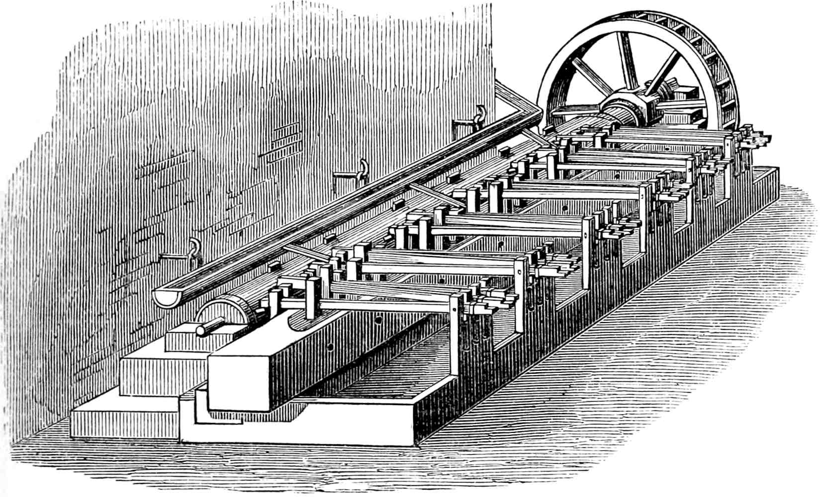
The accompanying woodcut shows a paper-mill of this period. A water-wheel was arranged to turn a wooden shaft upon which were rows of cogs which continually lifted up to the height of a few inches a number of wooden pestles, and then let them fall upon the material, which was always in shallow water. The whole of the fibre was thus retained with its length and strength uninjured. When the pulp was ready it was taken up, in small quantities, into the hand-mould, and formed into a sheet. There would be no difficulty whatever in making paper nowadays in a similar manner, only no one in the trade would spare the time and labour, and no one out of the trade would pay for the cost and trouble of its production.
The unevenness in thickness and colour to which the manufacture was liable at this early period, appears to have necessitated a sorting of the sheets after they came from the mill; those nearest to each other in colour and weight being put together. This system of selection was adopted occasionally for single copies, economy being doubtless the inducement. When two or three examples of a book can be compared together this fact is often very evident, as in the two copies of “The Knight of the Tower” which are in the British Museum, where the variation in quality is too great to be accounted for except by this practice of selection. Several other instances show that Caxton, when preparing to print a new volume, told off the paper separately for certain copies. This custom also accounts for the astonishing variety of water-marks frequently found in one volume.
Some possessors of uncut specimens of Caxton’s press have imagined them to be “large-paper copies,” but we have no evidence that Caxton designedly printed special copies, except, perhaps, in the instances of the vellum “Doctrinal” and “Directorium,” hereafter to be noticed, but of these the appearance is by no means that of livres de luxe.
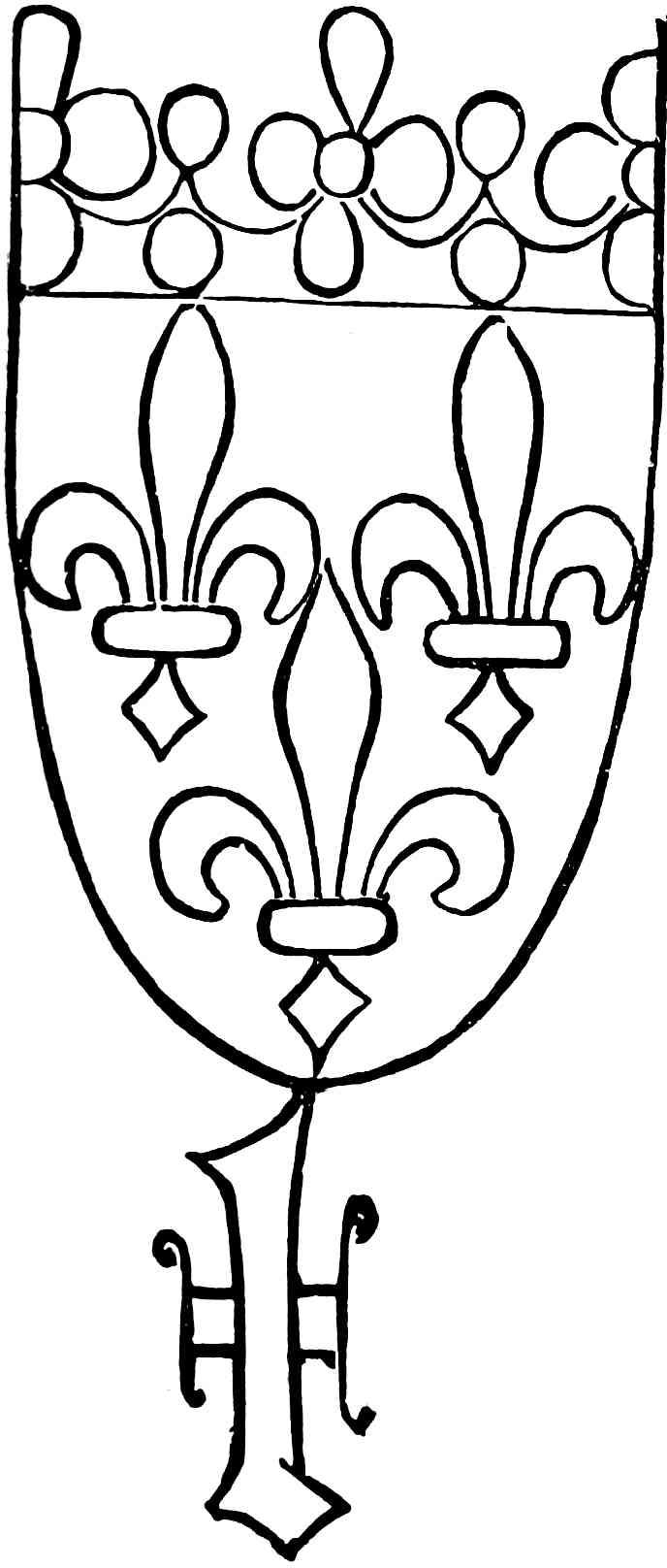
Watermarks are of much less value in bibliography than some writers have imagined. In but very few instances can a limit of time be fixed for their use; and as the marks might be repeated, or the paper itself kept for any length of time, and imported to any place, they cannot be used as evidence either of the date when, or the place where, a book passed through the press. The arms of France—three fleurs-de-lis on a shield, surmounted by a crown—which appear as a watermark in “Le Recueil des Histoires de Troyes,” have been adduced by M. Bernard as evidence of the French origin of the printed work. He was doubtless unaware that the same watermark appears in “The Recuyell,” “Canterbury Tales,” 1st edition, “Mirrour,” 1st edition, “Jason,” “Chronicles,” “Polycronicon,” “Speculum Vitæ Christi,” “Dictes,” 2nd edition, and many others, embracing the whole of Caxton’s typographical career. When, however, paper bears the arms of a nation or a city, we may, in such a case, fairly conjecture, although not with certainty, the seat of its manufacture. It appears likely that all Caxton’s paper was imported from the Low Countries, and it was in all probability purchased from some old connection in the great mart of Bruges. But wherever obtained, there was a great intermixture of qualities, including the make of several mills. We have never yet seen one of Caxton’s books in which the same watermark runs through the whole volume, and in many cases the variety is astonishing. Thus, in a copy of the first edition of the “Canterbury Tales,” now in the library of Mr. Huth, there appear no less than fifteen distinct watermarks.
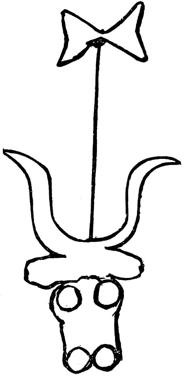
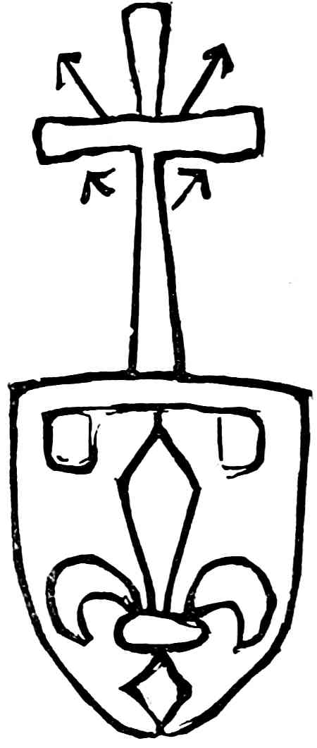
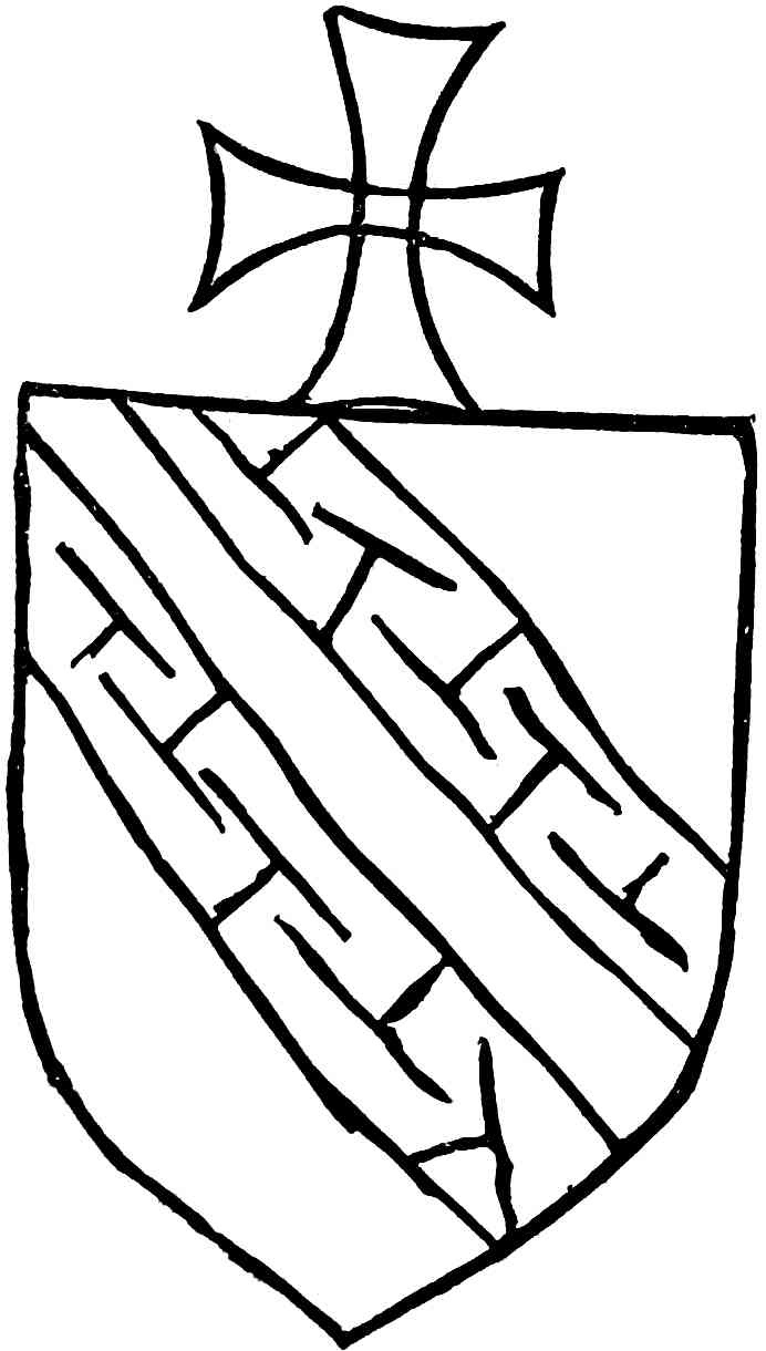
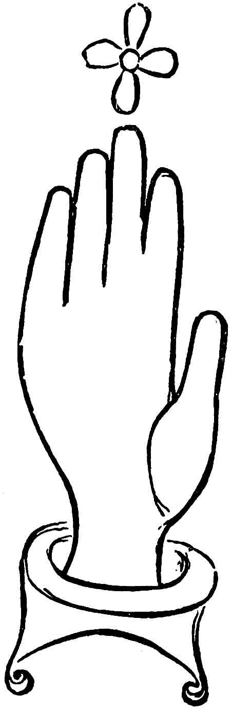
A few of the marks found in Caxton’s books are here given. As already remarked, they indicate the Low Countries as the land of their origin, and most of them are found also in the block-books, the works of Colard Mansion, Gerard Leeu, and other early printers.
No. 1. The Bull’s Head, which appears in the earliest specimens of paper known, and was a favourite symbol with paper makers of the fourteenth and fifteenth centuries. The varieties of it are very numerous.
No. 2. The Arms of John the Fearless, son of Philip the Hardy. As eldest son the field is charged with a label: the superimposed cross referring to his crusade in 1395.
This and the six succeeding marks have a direct connection with the riding dynasty in Flanders and the Low Countries.
No. 3. The letter p is very common in Caxton’s books, and is perhaps the initial of Philip the Good; although paper bearing a p had also been made in the reign of Philip the Hardy. Its varieties are very numerous.
No. 4. The letter y is thought by Sotheby to be the initial of Ysabel, third wife of Philip the Good.
Mr. Sotheby, in his list of Caxton’s watermarks, mentions the p and y combined, as occurring in the British Museum copy of “Jason.” During a careful search, however, in the same copy, I was unable to detect any such mark.
No. 5. The Unicorn—a symbol of power adopted by Philip the Good, who chose two unicorns as supporters of his coat-of-arms. The same figure was used extensively as an ornament in his palace and furniture.
No. 6. The Arms of France. These were frequently used by paper-makers of the Low Countries, probably in reference to the direct descent of the House of Burgundy from the Kings of France.
No. 7. The Arms of Champagne. This province was ceded to the Duke of Burgundy in 1430 by the King of France.
No. 8. The Hand, over which is a single fleur-de-lis, the peculiar badge of the House of Burgundy.
In Caxton’s books the p is the most common among the watermarks, the order of frequency among the others being as follows:—The Hand or Glove; the Arms of Champagne; the Bull’s Head; the Arms of France; the Greyhound; the Arms of John the Fearless; Shears; a Pot; an Anchor; an Unicorn; a Bull; a Cross; Grapes; a Pelican, &c.
No. 1. No. 2.
No. 3. No. 4.
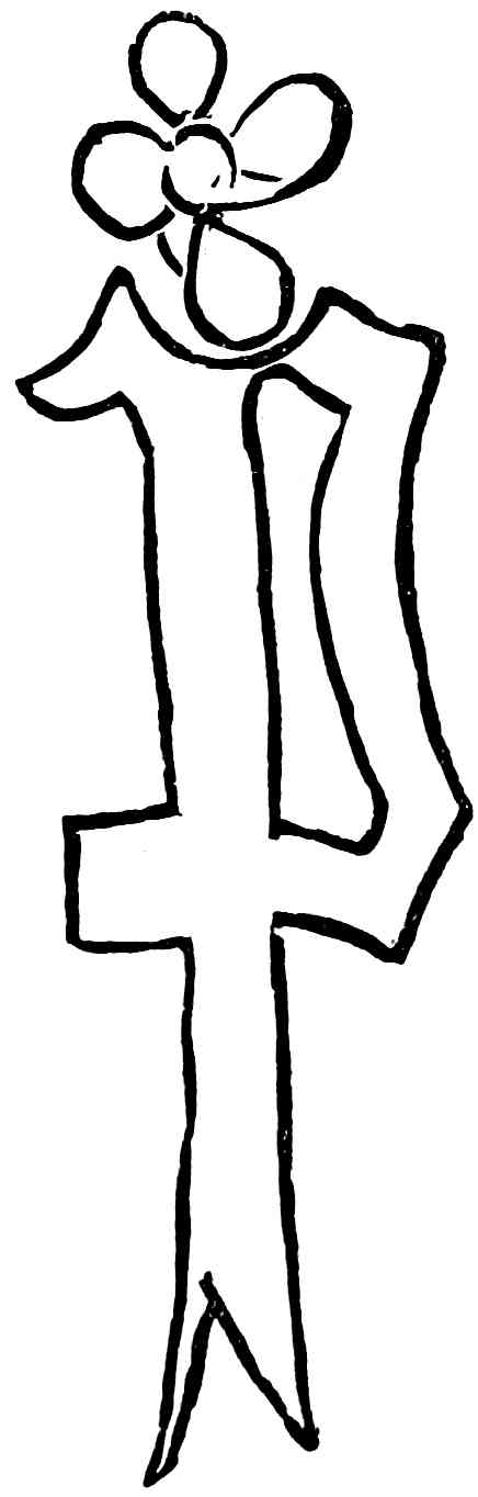
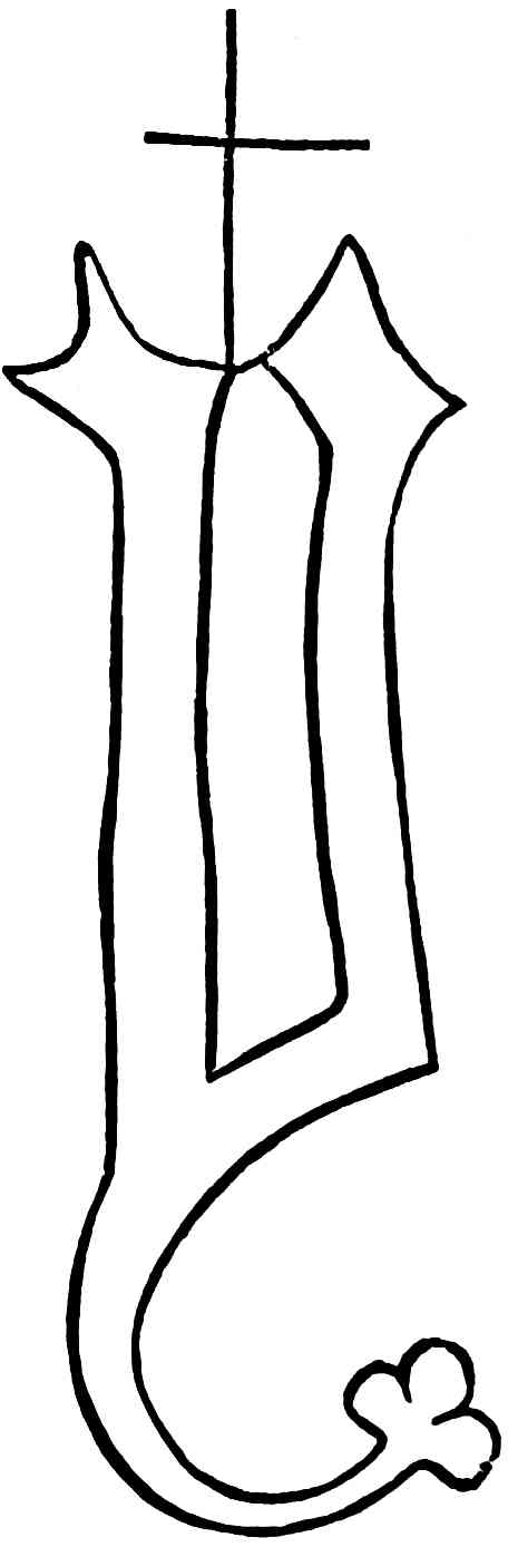
No. 5.
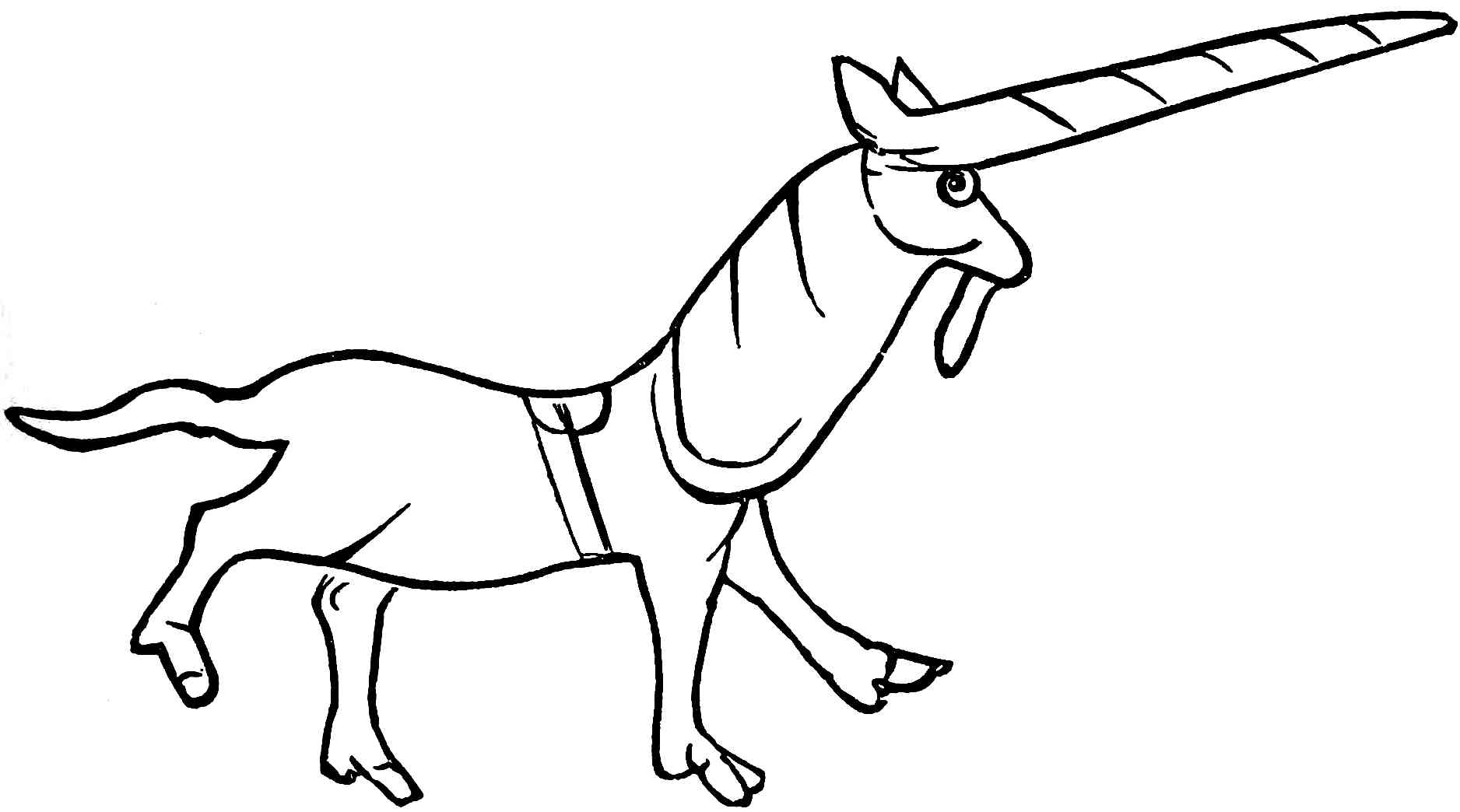
No. 6. No. 7.
No. 8.
The reader curious on this point may see numerous other watermarks figured by Mr. Sotheby in the third volume of his “Principia Typographica.” Many of these are merely variations of the mark, the paper being made in the same mould. An accidental injury, or even the wear and tear of the mould by constant use, often caused a contortion of the wires. In rare instances the watermark occurs uninjured in shape, but quite at the edge of the paper. This has been accounted for by supposing the fine wires which held the watermark in its place on the mould to have become loosened by decay, or some accident, and so allowed the mark to slide along the face of the mould, but it is more probably caused by the use of large sheets of paper cut down to a smaller size.
Of the value of paper in Caxton’s time we may form some idea from the prices paid by the directors of the Ripoli press, at Florence, between 1474 and 1483. An original “Cost book” of this establishment is still extant in the Magliabechian library at Florence. It is one of the most interesting documents connected with early typography, and has been edited and published by the Padre Vincenzio Fineschi. From this it appears that the following nine sizes or qualities of paper were then in use, the English prices given being about the present equivalent, reckoning the lira at 3s 9d.
PER REAM.
1. Large paper of Bologna in common folio, about £1 4 2
2. Middling ditto ditto 0 13 2½
3. Small ditto ditto 0 11 3
4. Paper of Fabriano, with a crossbow for watermark 0 12 4½
5. Ditto, with a cross for watermark 0 8 7½
6. Paper of Colle 0 8 7½
7. Paper of Prato 0 9 4½
8. Paper of Pescia, with spectacles for watermark 0 10 10½
9. The same, with a glove for watermark 0 9 0
Zanetti quotes a document, dated 1483, which states the price of paper in Florence to have been, at that period, for “Carta reale, quaderni 10 ... 3 lir. 6 sol. 8d;” and for “Carta da scrivere il quaderno ... 18 sol.;” that is, royal paper about 12s 5d per ten quires, and writing paper 3s 4½d per quire.
The first paper maker in England was John Tate. He manufactured specially for Caxton’s successor, Wynken de Worde, who thus announces the fact in his edition of “Bartholomæus de Proprietatibus,” printed about the year 1498:—
“And John Tate the younger, Joye mote he broke, Whiche late hath in Englond doo Made this paper thynne, That now in our englisshe This boke is prynted Inne.”
Tate, who died in 1514, and whose will is preserved in the principal registry of the Court of Probate, left considerable property, several of his legacies being in paper.
It is somewhat remarkable that Caxton should have made so sparing a use of vellum for his books, and should have been so indifferent about the quality of the skins which he did employ. The only examples known are a copy of the “Doctrinal of Sapience,” at Windsor Castle, for a long time thought to be unique, and a “Speculum vitæ Christi,” now in the British Museum, to which may be added a few slips on which Indulgences are printed.
THE TYPES.
The question of the invention of moveable types, like that of the origin of paper, is one into which we have no need here to enter. The majority of writers on this subject having been unacquainted with the characteristics of type, have strayed far and wide in the discussion. M. Bernard, however, writing as a practical printer, has done much to dispel numerous misapprehensions, and especially that common error of supposing that the first moveable types were cut in wood.
We now proceed to lay before the reader the earliest notices of typefounders, and such evidence as may explain the mechanics of typefounding in the fifteenth century, especially with reference to the types of Caxton.
Perhaps no part of the Typographic Art is hidden in more utter darkness than the early manufacture of the types. Considerable secrecy no doubt accompanied all the operations of the first printers, and was maintained down to a comparatively late period. Moreover, it was but natural that the results of the new art should hold a more prominent place in men’s minds than the processes by which those results were produced; and thus, although printers and printing were often mentioned, we find nothing concerning the mechanical part of typefounding anterior to that curious little book of trades, with illustrations by Jost Amman, which was issued at Frankfort in 1568. The author, in the few lines which accompany the illustration, omits all reference to the process, but, from the woodcut of the “Schrifftgiesser” and his tools, we shall draw some practical inferences concerning early typefounding.
Whether Caxton, whose account of his first typographical venture is contained in the prologue to the Third Book of “The Recuyell,” made himself acquainted with the manufacture as well as with the use of his types there is no evidence to prove. He simply remarks, “Therefore I have practysed and lerned at my grete charge and dispense to ordeyne this said book in prynte.” If he only procured types and presses, and acquired the requisite knowledge to control their use, it no doubt cost him a large sum. The probability is that his first two founts were cast at Bruges according to his instructions, and that he brought the second over with him to Westminster. But, when once settled in his native country, we may well consider whether he would not, for convenience sake, have become his own typefounder. No stray hint or remark can be found to incline us to the one opinion or the other. Several generations of printers passed away before we find in any work the slightest allusion to English typefounders. The earliest appears in Archbishop Parker’s preface to Asser’s Chronicle of King Alfred, where, in speaking of the Saxon types with which the book was printed, the editor states that as far as he knew, Day, the printer, was the first to cut them:—“Iam verò cum Dayus typographus primus (& omnium certè quod sciam solus) has formulas æri inciderit: facilè quæ Saxonicis literis perscripta sunt, iisdem typis diuulgabuntur.” This leads us to suppose that John Day was only one typefounder among others, and that therefore the art was at that time by no means a new one in England. Seventy years later we find typefounding a distinct trade in London, and under rigid Government protection, as we learn from the following decree:—
“Decreed by the Court of Starre-Chamber, 11th July, 1637:—
“That there shall be Four Founders of letters for printing and no more.
“That the Archbishop of Canterbury or the Bishop of London, with Six other High Commissioners, shall supply the places of those four as they shall become void.
“That no master Founder shall keep above two Apprentices at one time.”
Despite this restrictive care, however, the typefounders of Holland and Flanders supplied English Printers with better types than native art could produce, until the establishment of a foundry by the first Caslon.
The only English author before the rise of encyclopædias, who described the process of type manufacture was Joseph Moxon. This ingenious author, writing in 1683, gives an account of the whole Art of Printing, as practised in an improved style by himself, and devotes several chapters to the various methods of punch cutting, matrix sinking, and type founding. The process then adopted was very similar to that still in use, and differed greatly from that of Caxton, or Caxton’s typefounder. The practice of Moxon, like that of modern typefounders, was to cut each letter in relief on a piece of steel to form the punch—to strike this punch into a small piece of copper, which made the matrix—and then to fit this matrix to the bottom of an iron mould into which the liquid metal was poured. The mould, which formed the shank of the type, was capable of a sliding adjustment, width wise, to the width of the various letters (from an i to an Æ); the depth or size of the body always remaining the same throughout the fount. Thus, by using each matrix successively in the same mould, exactness in size of body was insured.
The want of this exactness, indicated by the uneven appearance of the lines, and other considerations, lead to the conclusion that the fifteenth-century printers did not practise this method, but it is very difficult even to speculate upon the process which they did employ. The examination of many specimens has led me to conclude that at first two distinct schools of typography existed together. The ruder consisted of those printers who practised their art in Holland and the Low Countries, and who, by degrees only, adopted the better and more perfect methods of the school founded in Germany by the celebrated trio—Fust, Gutenberg, and Schœffer. None of these divulged the secrets of their art. One fact, however, we know with certainty, and that is, that the German school employed the very best artists that Europe could produce to cut the patterns, or rather punches, for their types. In an interesting tract from the pen of Sir Anthony Panizzi it is proved that the celebrated Bolognese goldsmith, medallist, and painter, Francia, was the artist who cut all the Aldine types, the elegance of which will for ever associate the name of Aldus with the perfection of printing. From the “Cost Book” of the Ripoli press, at Florence, we find also that steel, iron, and tin were used in the manufacture of types about 1480. But the English printers, whose practice seems to have been derived from the Flemish school, were far behind their contemporaries in the art. Their types show that a very rude process of founding was practised, and the use, as will be described presently, of old types as punches for new, evinces more of commercial expediency than of artistic ambition.
That Caxton’s types were really cast is evident from identity in the face of the same letter, where even a flaw may be noticed as recurring continuously; but the material of which the matrices were formed must be to a great extent conjectural. M. Bernard has given an interesting account of some successful efforts to cast letters in sand, but his specimen has not a single overhanging letter in it, and, from its size, was certainly much easier to produce than would have been the small types of Caxton; yet in one respect, the “bad lining,” or irregular heights of the letter, it has an interesting similitude to Caxton’s types. In the office of Messrs. Caslon there are still in existence some large Roman capital letters (about 3-line pica), which an old workman assured me he had himself used in by-gone years to form sand-moulds for type, a practice then by no means uncommon.
We will now turn to the little book of engravings already mentioned as giving the earliest notice of the art. We there see somewhat of the practices of the Frankfort typefounders in 1568. The woodcut shows that even a century after the invention of the art there was an important difference from the modern plan, although probably the principle of punch, matrix, and mould was the same. There is a small furnace, with the pan of metal sunk in the top; by the side are the bellows, basket of charcoal, and tongs. Close to the typefounder is the bowl into which he drops each type as it is cast; and the artist has correctly drawn these types with the “break” of the letter still attached. The workman holds the mould in his left hand, and is pouring in metal from a ladle. On the table at his back is what appears to be a nest of very shallow drawers, which hold the matrices in alphabetical arrangement, while upon the top of the drawers are three or four matrices for immediate use. On the wooden shelves opposite are three moulds, some sieves, and crucibles. The sieves were probably for sifting the sand in which might be cast the large types, and in which the small ingots for use in the melting pot would be run. The main interest of this woodcut lies in the type moulds, in which we notice a difference in shape from those now used; while the absence of the long wire spring which holds the matrix firm up to the mould indicates that, during its use, the matrix was a fixture in the mould. The foremost of the three moulds on the shelf shows in its side a hole which may possibly have been used for the insertion of a matrix.
As the early moulds were so dissimilar to those of modern use, let us look to the types themselves for evidence. Anticipating the result of the analysis of the various founts used by Caxton (which will follow in its proper place) we find the conclusion inevitable that hard-metal punches were not used, and that even types themselves were used either as punches, or in some analogous way for the production of new founts. The use of large types to form matrices in sand (as in the case of Messrs. Caslon’s foundry, above alluded to), was not uncommon in bygone years; and that letters of a much smaller size can also be effectively employed as punches is interestingly illustrated by the shifts to which Benjamin Franklin, America’s pioneer-printer, was put in the early days of the Transatlantic press. Franklin thus narrates his own practice: “Our printing-house often wanted sorts, and there was no letter-foundry in America; I had seen types cast at James’s in London, but without much attention to the manner; however, I contrived a mould, and made use of the letters we had as puncheons, struck the matrices in lead, and thus supplied, in a pretty tolerable way the deficiencies. I also engraved several things on occasion.”
The metal of which Caxton’s types were cast can only be conjectured. The probability is that it was soft, and if even so soft as lead it would have been sufficiently durable to have performed the work for the small impression required of each book. In demonstration of this the author procured, by the kindness of Messrs. Figgins, a fount of their Caxton types in pure lead, and composed a page of Caxton’s “Chess Book,” working it in the usual way, at a common hand press, and numbering each impression as it came from the tympan in order to note its gradual wear. The paper was royal cartridge of the common rough quality, and was worked dry. After 500 pulls, perceiving no appreciable wear, the author stopped the experiment, being sufficiently satisfied.
Our conclusions then, in respect of the founding, are mainly negative. The moulds were unlike those now in use, and the punches were not of steel. The process, whatever it may have been, admitted of contrivances incompatible with our present mode; and we conjecture that the type-metal, if not of lead, was yet sufficiently soft to allow of it being easily trimmed up with a chisel. This trimming up, so often visible in type No. 2*, misled the late Mr. Vincent Figgins, who, when examining the second edition of the “Game and Play of the Chess,” came to the erroneous conclusion that the whole book was printed from types cut separately by hand, a conclusion which he would never have adopted had he extended his examination to other and earlier works of Caxton in the same types.
Let us now see what the founts of types really were that Caxton used.
When we look at the long list of English authors who have written upon early typography, and when we recognise among the names those of Moxon, Palmer, Smith, Bowyer, Nichols, Stower, Watson, Hansard, and Timperley, all of whom were, as printers, practically acquainted with the art which employed their pens, it is a matter of some surprise that nothing like a correct account of Caxton’s types appeared. Nor is it less remarkable that the only history of English typefounding is that by Rowe Mores, a well-known antiquarian, who was brought up for the Church, and who devoted many of the later years of his life to the collection of old moulds and matrices. He purchased all the whole stock of the last of the old race of letterfounders, Mr. James, of Bartholomew Close, whose extensive collection was said to date from the days of Wynken de Worde; and it is much to be regretted that, after the death of Mr. Mores, his collections were not preserved intact. His catalogues of matrices existing in his own day, or in his own possession, are probably exact enough; but his account of the types used by Caxton and Wynken de Worde is full of errors.
During Caxton’s career as a printer, viz., from about 1476 to 1491-2, or a period of seventeen years, he used eight separate founts or castings of letters. These eight founts we have called, according to their chronological appearance, No. 1, No. 2, No. 2*, No. 3, No. 4, No. 4*, No. 5, and No. 6.
If we divide them into character of letter we find three classes:—
1st. Type No. 1 is distinct in character, and unlike any other known type. On comparison with a manuscript in the holograph of Colard Mansion, of Bruges, M. Bernard came to the conclusion that it was formed upon the handwriting of that celebrated caligrapher.
2nd. Types 2, 2*, 4, 4*, and 6, are of the same character as the early type of Colard Mansion, known as “gros bâtarde.”
3rd. Types 3 and 5 were designed, like the characters of the Bible and Psalter of the early Mentz printers, upon the Church Text of the scribes, and approach nearer than any other of Caxton’s types to what modern printers call “black letter.”
If, however, we divide the eight founts into distinct cuttings, we find five:—
1st. Type No. 1.
2nd. Type No. 2, modified first into No. 2*, and again into No. 6.
3rd. Type No. 3.
4th. Type No. 4, modified into No. 4*.
5th. Type No. 5.
Type No. 1.
Although we believe that Caxton had less to do with this than with any of the later types, yet, as it is the first with which his name is associated—as it is that by using which he obtained a knowledge of the art of printing—and as it is the type of the first English-printed book,—it is clothed with an interest peculiarly its own.
The only books printed with this fount are five:—
The Recuyell of the Histories of Troy 1472-74
The Game and Play of the Chess, 1st edition 1475-76
Le Recueil des Histoires de Troyes 1475-76
Les Fais du Chevalier Jason after 1476
Les sept Pseaulmes penitenciaulx after 1476
From the rarity of “Les Fais du Jason,” only one copy being in England, and that inconvenient for prolonged examination, its peculiar features, if any, are not noticed in the following remarks.
The first thing we observe in type No. 1 is, that its general appearance is more free and manuscript-like than would be thought the case from the square-set figure of each individual letter. This is, to a considerable extent, caused by the great variety of letters, there being only five for which there were not more than one matrix, either as single letters or in combination: for, although the differences between the various matrices of the same letter may be but very slight, we have here the fundamental principle of freedom, namely, a recurrence of modified sameness. The execution of the type is good, sharp, and decided, with sufficient difference between the repetitions of the same letter to indicate independence of tracing or mechanical contrivance; hence probably the work of one accustomed to cut letters. The body of the type, which is identical throughout the five books, is the same as the recognised Great Primer of modern printers.
The complete fount embraced at least 163 sorts, of which we remark upon the following:—
ā is not used in the English books, but often occurs in the French books.
ē is not used in “The Recuyell” or the “Chess Book,” but often occurs in “Le Recueil” and “Les sept Pseaulmes.”
K is often used for an R in the French books, but always correctly in the English books.
Ω.—This incongruous and badly-cut letter appears about twelve times, in various grades of bad casting, before the recto of folio 36 of “The Recuyell,” after which it is not found.
R is only found in the English books, where it is sometimes used for a K.
Arabic numerals do not occur in this fount.
There are only three marks of punctuation, which may be called—the comma, or oblique stroke (/), the colon (:), and the full point (.). They are used arbitrarily as to power, and in numerous varieties of combination, such as,
&c., &c.

From the foregoing remarks it will be seen that there are certain letters peculiar to the English and others peculiar to the French books printed in this type; and as these are not in any way attributable to the fashion of the language, the fact strongly corroborates the opinion that, although from the same printer, the compositor, and perhaps the cases, were changed.
Type No. 2.
This was the first fount used in England when Caxton set up his presses at the “Red-pale” in the Almonry, and, before remarking upon its peculiarities, we will give a list of the books known to have been printed from it. Of these, as will be shown further on, there are two easily-distinguished classes; those printed first, with type No. 2, and those printed afterwards, with a re-casting of the fount, which we call type No. 2*.
TYPE No. 2.
Les quatre derrennieres choses ante 1477
History of Jason circa 1477
Dictes and Sayings of the Philosophers, 1st edition 1477
Horæ, 1st edition circa 1477
Canterbury Tales, 1st edition ante 1478
Moral Proverbs 1478
Anelida and Arcyte circa 1478
Boethius de Consolatione Philosophiæ 1478
Propositio clarissimi Johannis Russell ante 1479
Stans Puer ad Mensam ante 1479
Parvus Catho and Magnus Catho, 1st edition ante 1479
Ditto ditto 2nd edition ante 1479
The Horse, the Sheep, and the Goose, 1st edition ante 1479
Ditto ditto 2nd edition ante 1479
Infancia Salvatoris ante 1479
The Temple of Glass ante 1479
The Chorle and the Bird, 1st edition ante 1479
Ditto 2nd edition ante 1479
The Temple of Brass ante 1479
The Book of Courtesy, 1st edition ante 1479
TYPE No. 2*.
Cordial 1479
Laurentius Gulielmus de Saona de Nova Rhethorica, circa 1479
Dictes and Sayings of the Philosophers, 2nd edit., circa 1480
An Indulgence 1480
Parvus Catho and Magnus Catho, 3rd edition circa 1480
Mirrour of the World, 1st edition 1480
Reynard the Fox, 1st edition 1480
Tully of Old Age, and of Friendship 1481
The Game and Play of the Chess, 2nd edition circa 1481
This type has a more dashing, picturesque, and elaborate character than type No. 1. It is an imitation of the “gros-bâtarde” type of Colard Mansion, with some variation in the capital letters, which are extremely irregular, not only in size but also in design, some being of the simplest possible construction, whilst others have spurs, lines, and flourishes.
The general appearance of type No. 2 is very different from that of No. 2*, many letters in the earlier fount having a bolder and thicker face than in the later; and the fact of there being a perfect division of the books into two distinct classes prevents our attributing this difference to either wear of type or faulty printing—the former would be gradual, the latter irregular.
On comparing the two classes, letter by letter, we find several single and compound letters occurring in the one and not in the other. Thus en (not final) is peculiar to the first class, while two forms of k without a loop in the head, double ll without loops, th, wa, we, and wo are found in the second class only. Other letters are so entirely different that a single example is convincing of their not having been printed from the same founts; and the remainder, although often very nearly alike, so constantly preserve some slight characteristic peculiar to each section, that a close examination of numerous instances, after making allowance for faulty printing, leads to the conclusion that no letters of the first section are identical with those of the second.
A minute examination discloses the general fact, that the letters of Type No. 2* are somewhat thinner than those of Type No. 2, and that, in numerous instances, the tops, the descending tails, and the titles generally, have been truncated. For example, examine the letter f and its combinations in the two types; the second shows always a thinner-faced letter than the first. Again, notice how the tops of the various d s, the tails of en and in, and the tails generally appear in the second state. Observing that the two founts (2 and 2*) are never mixed, and that all the books dated before 1479 occur in Type No. 2, and all those dated after 1479 No. 2*, the two types appear to indicate two distinct periods; and, taking into consideration the peculiarities just noticed, it would seem that, upon the types becoming worn, some of the best were selected, trimmed up with a graver, and used for making matrices for a new casting. If this were not the case, how should we account for the new fount being so nearly like the old? for, the two not having been used together, there was no reason for such care to make them match.
The body of Type No. 2 is the same as that of Type No. 2*, and is exactly equal to two lines of “Long Primer” (Caslon’s standard), which is very near to “Paragon.” A complete fount of Type No. 2 consisted of 217 sorts, and Type No. 2* of 254 sorts.
The &c of Type No. 1, which, if it occurred at all, might have been expected in the first fount used in England, is found only in books printed with Type No. 2*.
We may notice here that the sorts Iz, ez, br, and others, presume an intended French use of Type No. 2, a probability strengthened by the th, and the combinations of w, being later additions to the fount in No. 2*.
Type No. 3.
This grand type, which was in use from about 1479 to 1483, has perhaps less direct interest for us than any of the others. No English book in this type is known, and until a very recent period it was considered merely as a supplementary fount used by Caxton for headings, &c. But the discovery of a “Psalterium,” fragments of a “Horæ,” and a “Directorium” proves that three works at least were printed entirely with this fount. Upon these, especially the “Psalterium,” and upon the headings of “Boethius,” the “Golden Legend,” and “Tully,” the following remarks are based.
The small letters are an exact copy of those cast by the early German founders, Fust and Schœffer, and are equally well executed. The capital letters, however, are very unlike Fust’s, being for the most part a modification of the Flemish “Secretary,” as already presented to us in the gros-bâtarde type of Colard Mansion.
The body is identical, or very nearly so, with type No. 2, and is used with it to distinguish proper names, &c., in the “Cordial” and in “Tully,” but, having a much larger face, it is never in line.
The complete fount comprised 194 sorts. The stops generally are smaller than those of type No. 2, which is remarkable, as the face of the letter is much larger.
This type was intended for Latin works, as the contractions sufficiently prove. All the books we have in it are in Latin, except headings in the first edition of the “Golden Legend,” &c., and proper names, as in the “Cordial” and “Tully.” Used almost entirely for Church Service books, it does not seem to have been much in favour with Caxton; but upon his death his successor, Wynken de Worde, came into possession of it, and used it continually.
Type No. 4.
Types No. 4 and 4* may be spoken of generally as one, there being the same intimate connection between them as between Nos. 2 and 2*; unlike them, however, there is a slight variation in the body, type No. 4 being, as compared with the re-casting of it, or type No. 4*, as 20 is to 19. In other words, the body of type No. 4 is rather smaller than that of Type No. 4*. This of course would only be possible by direct intention with modern typefounders, who use the same moulds and matrices for as many founts of the type as are required; but as is shown in the chapter on typefounding, the moulds and matrices were in those days very different.
The engraving of the types is neat, and appears to have been executed by the same hand that cut type No. 2; but there is this difference between the second states of the two founts—type No. 2* was, as already shown, cast from matrices formed by the use of old casts of type No. 2 as punches, after being trimmed by hand, but for types Nos. 4 and 4* there is the strongest evidence of the same punches having been used, and therefore the variation of body is the more remarkable, as it would have been as easy to make the re-casting agree in size with the original as to make the letters of each fount agree among themselves. The variation, however, is a fact.
The body of type No. 4 is very near indeed to modern English (Caslon’s standard), and is the smallest of any used by Caxton. The re-casting, or type No. 4* (which loses 1 in 20—that is to say, 19 lines of type No. 4* take up only the same depth as 20 of type No. 4), is exactly two lines of minion. The total number of sorts in type No. 4 appears to have been 194, and in No. 4* 187, a few sorts not having been re-cast.
We will now give a list of the works for which this type, in its two states, was employed.
TYPE No. 4.
The Chronicles of England, 1st edition 1480
The Description of Britain 1480
An Indulgence 1481
Curia Sapientiæ circa 1481
Godfrey of Boloyne 1481
The Chronicles of England, 2nd edition 1482
Polycronicon 1482
The Pilgrimage of the Soul 1483
A Vocabulary 1483
Servitium de Visitatione circa 1483
Confessio Amantis (mostly) 1483
Sex Epistolæ (mostly) 1483
The Knight of the Tower (partly) 1484
TYPE No. 4*.
The Festial, 1st edition 1483
Quatuor Sermones, 1st edition 1483
Confessio Amantis (partly) 1483
The Knight of the Tower (mostly) 1484
Caton circa 1484
Golden Legend circa 1484
Death-Bed Prayers circa 1484
Æsop 1484
Order of Chivalry circa 1484
Canterbury Tales, 2nd edition circa 1484
Book of Fame circa 1484
The Curial circa 1484
Troylus and Creside circa 1484
Life of our Lady circa 1484
Life of St. Winifred circa 1485
Life of King Arthur 1485
Life of Charles the Great 1485
Paris and Vienne 1485
The commas have a notable chronological bearing. The short comma (⸝) was used alone up to the second edition of the “Chronicles,” in 1482—is used occasionally with the long comma (/) in 1483—and disappears entirely after that year.
A good test by which to distinguish 4 and 4* is the shape of the lower-case w; the letter with the curled top distinguishing the book at once as belonging to type No. 4, whereas its absence is a sure sign that the type is No. 4*.
Type No. 4* makes its first appearance among Caxton’s founts in a very peculiar manner. In the autumn of 1483 he was engaged in printing two works, Gower’s “Confessio Amantis” and the “Knight of the Tower.” At sig. y of “Confessio Amantis” we find that the inmost sheet is in type No. 4*, the three other sheets of the section being in type No. 4. Several pages in sig. z; are also in No. 4*, and on sig. z iiij recto the first column is in No. 4, while the second column is in No. 4*. This mixture of founts by no means proves that the two were in use at the same time; it only shows that before the cases containing type No. 4 were finally emptied out to make room for the new fount, one compositor had worked ahead of his fellows, who had not finished their taking of copy when the new letter supplanted the old. The table, although placed at the commencement of the book, was necessarily printed last, and therefore, as a matter of course, we find type No. 4* used for it. In the “Knight of the Tower,” sig. f introduces the new fount to us, all that follows, as well as the introductory matter, being type No. 4*.
Type No. 5.
There is much similarity of design between this and type No. 3, the likeness between some of the letters being so close as to lead to the conclusion that one artist cut both.
The books printed in this letter are as follows:—
The Royal Book circa 1487
The Book of Good Manners 1487
Directorium Sacerdotum, 1st edition circa 1487
Speculum Vitæ Christi circa 1488
Commemoratio Lamentationis circa 1488
The Doctrinal of Sapience 1489
Horæ circa 1490
Servitium de Transfiguratione circa 1491
In the 2nd edition of the “Golden Legend” (1487?), all the headings, both of chapters and pages, are in this type.
Type No. 5 has no exact counterpart in the bodies of modern founders. The nearest would be two lines of brevier, than which it is slightly larger, losing one line in thirty-five. The total number of sorts in use appears to have been 153. The comparative scarcity of double letters is very noticeable. No Arabic numerals are used.
The large Lombardic capitals used with this fount have a bold and striking appearance. Unlike any former fount of Caxton’s, they are all cast with the largest face the body will bear, and without the least beard. They are used, more or less, in every book printed with this type, although in some books (e.g. “Royal” and “Speculum”) they appear very seldom. They do not look at all well when used as initials to a word, on account of their size preventing them ranging with the sequent letters, and this may have been the cause why Caxton, except in the “Directorium,” made a very sparing use of them, save indeed that he converted them into quadrats. For this purpose they were doubtless adapted by some shortening process, which, however, has not prevented them cropping out continually in the blank spaces of the head lines and signature lines, where they often assume a very puzzling appearance. In the latest books printed with type No. 5 these Lombardic capitals appear as red initials, printed at a separate operation. This use for them was, doubtless, the invention of Caxton’s successor, Wynken de Worde, who appears to have inherited his master’s working materials.
Type No. 6.
The body of this fount is great primer (Caslon’s standard) within a shade, being almost the same as type No. 1. The number of sorts in the fount is, for Caxton, very small, amounting to only 138. It may be called Caxton’s last fount, for it came into use in 1489, and was used for books up to 1491, the date of Caxton’s death. Indeed, there seems good reason for supposing that for some time after Caxton’s death it served his successor, Wynken de Worde. With it the following works were printed:—
The Fayts of Arms 1489
Statutes of Henry VII circa 1489
The Gouvernal of Health circa 1489
Reynard the Fox, 2nd edition circa 1489
Blanchardin and Eglantine circa 1489
The Four Sons of Aymon circa 1489
Directorium Sacerdotum, 2nd edition circa 1489
Eneydos circa 1490
The Fifteen Oes, &c. circa 1490
The Dictes and Sayings of the Philosophers, 3rd edition circa 1490
The Mirrour of the World, 2nd edition circa 1490
Divers Ghostly Matters circa 1490
The Art and Craft to know well to Die circa 1491
The Book of Courtesy, 2nd edition circa 1491
The Festial, 2nd edition circa 1491
Quatuor Sermones, 2nd edition circa 1491
The Chastising of God’s Children circa 1491
A Treatise of Love circa 1491
We have in this fount another remarkable instance of the contrivances employed by the early typefounders. A new fount was required, but whether Caxton gave the founders instructions concerning its size, or whether the fount was cast first, and then sold to our printer, there seems no possibility of discovering; but this we can prove from the pages themselves, that the greater portion of type No. 6 was made from the punches, or from old letters of Caxton’s Nos. 2 and 2*. The body is rather smaller, nine lines occupying the same depth as eight lines of No. 2; and it is amusing to observe the shifts and contrivances resorted to for reducing those letters which, in type No. 2, occupied the full body. For instance, the A, M, and N have the flourish which passes under the letter brought close up to the letter itself. The K was also treated in the same way, but the violence used has damaged the flourish so much that, in most instances, it broke away; in some cases, however, it remains in a most pitiable and crippled condition. The corresponding flourish in the B has been boldly cropped off. F and J are strangely transformed, evidently by a blow on the soft metal, lengthwise. A few characters altogether new appear, and a few interpolations from other founts, besides a quaint set of Lombardic capitals, among which occurs now and then a letter from the Lombardic fount used with type No. 5. The total number of sorts was 141.
But here the question may very naturally be asked, How do we know that the books in the foregoing lists which are without date, without place, and without printer’s name, although printed with the same types as those of Caxton, are not really from the workshop of another printer, who had obtained his material from the same source as our printer? The evidence is entirely negative, but it is nevertheless very strong.
When a new branch of industry becomes sufficiently developed, one of the immediate consequences is a division of labour. Thus typefounders became separated from printers, as soon as the latter became sufficiently numerous to keep the former in constant employment. The earliest printers were almost of necessity their own typefounders, and it appears that they each made or otherwise exclusively possessed those patterns of types which they used. There is certainly no evidence that prior to the end of the 15th century the types of one printer were at the same time in use by another. This exclusive use of types has been accepted as a fact by the best authorities, and has been of great use to the bibliographer in identifying the printer of books sine ullâ notâ, for a printer may thus be recognised at once by his types, just as a man may be distinguished by his handwriting.
THE COMPOSITOR.
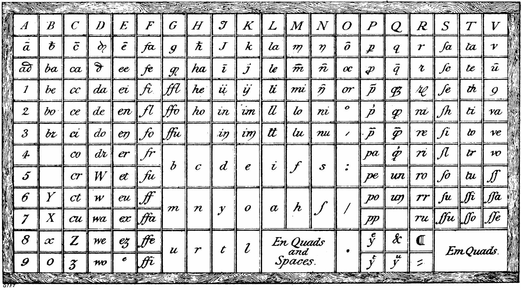
We will now suppose a fount of type delivered over to the compositors to be laid in the cases, an operation requiring much more care than in the present day, on account of the numerous double letters and combinations. One result of the combinations would be to equalise the size of the boxes, as the letter “e” for instance, which now requires the largest box, would then most frequently occur in combination with one of the consonants, and not be used alone oftener than many other letters. Counting the respective numbers used of each sort throughout many pages of different books, the fact is ascertained that single vowels and single consonants were more often required than any one particular combination. Arranging a case on the basis that the sorts most in use should be placed before the compositor in the position most accessible to his fingers, and remembering that in all the old representations of a “case” there is no division into upper and lower as now, we arrive at the accompanying plan, which is doubtless a tolerably exact representation of a compositor’s case as used by Caxton. There are 209 boxes, which would lead to some little difficulty in keeping “clean cases;” and one need feel no surprise at finding wrong letters so often making their appearance in Caxton’s pages. The combinations of in, ni, un, nu, nn, im, mi were often found in the wrong boxes, and have brought down to the present day the strongest evidence against the usefulness of logotypes.
Plate VII.
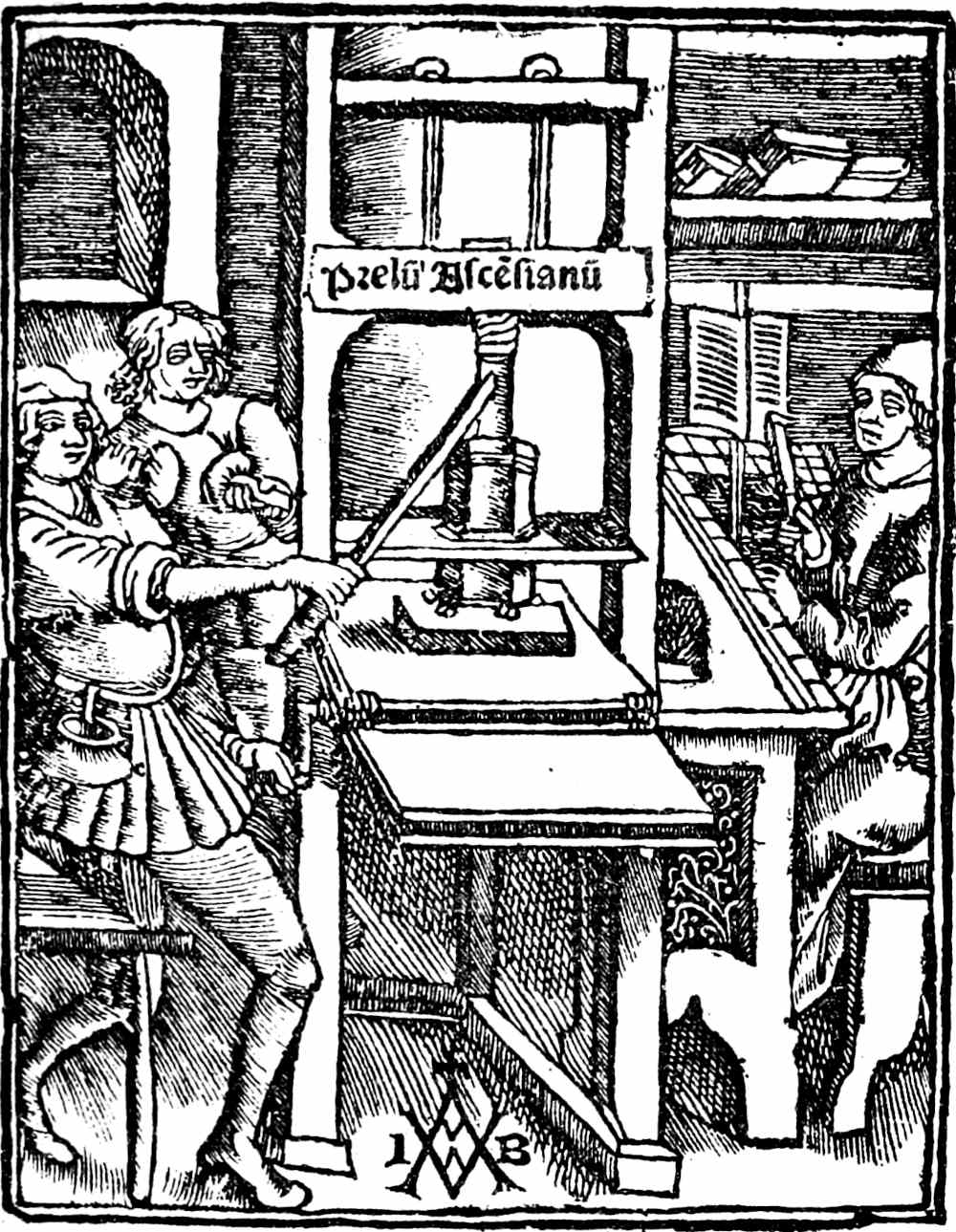
The oldest known representation of a Printing Press. Paris, 1507.
Luther’s Press. Augsburg, 1522.
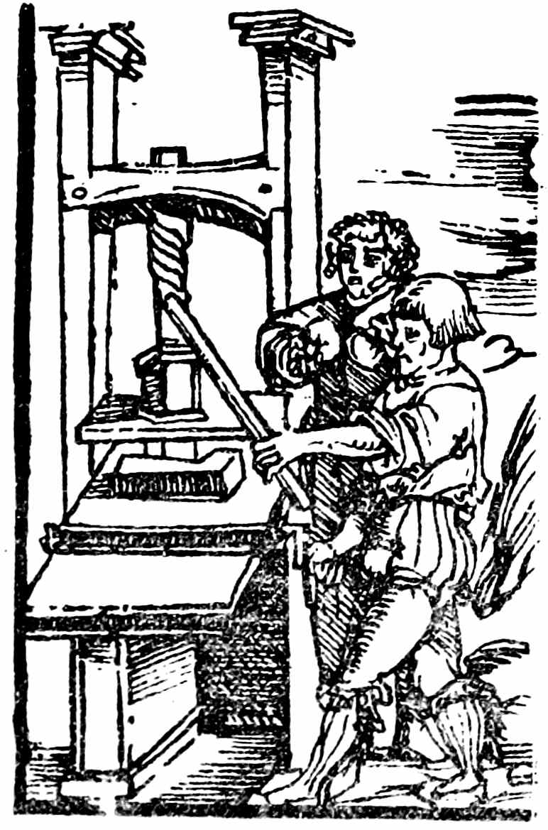
In the earliest representation of a printing office the press is always made the most prominent object; very often, however, as in Plate VII, with a compartment for the compositor. Figure 1 is the earliest instance, and we there see a compositor at work. Before him is the case divided into even boxes, and raised on a cleft stick is the copy. The composing-stick is in his right hand, doubtless owing to the engraver not having reversed the drawing from which he copied: it is held correctly by the man in Plate VIII. We have already noticed the use of a composing-stick and setting-rule, and the evenness of lines consequent thereon. It was not adopted at Westminster until 1480, although Caxton must often have seen the improved appearance which lines of an even length gave to the page in the numerous works previously issued from all the Continental presses. He would, doubtless, have imitated them had his mechanical appliances permitted; but we do not find evenness of page until the arrival of type No. 4, in the year 1480; and then, probably for the first time, composing-sticks, setting-rules, and chases were seen in the Westminster printing office. Before this the types were no doubt, as M. Bernard has shown to be the case in the later block books and the early examples of Dutch printing, taken straight from their boxes, and placed side by side in a sort of coffin, made of hard wood, with a stout bottom, and screws at the foot to tighten the page when completed. The width of the page could not be extended beyond the internal measurement of the “coffin,” but might be reduced at pleasure by placing down either side a straight piece of wood. The length of the page would be regulated in a similar manner, by varying the thickness of the foot-block against which the screws worked.
Plate VIII.
The “Prelum Ascensianum.” Paris, 1520.
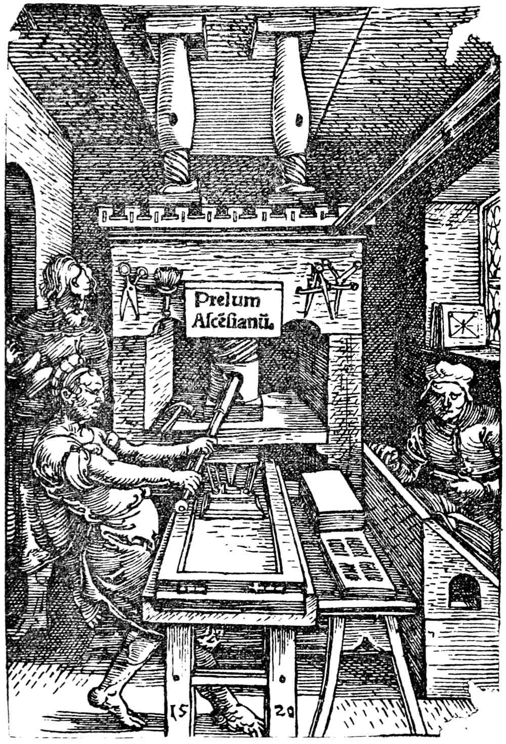
Let us, then, imagine the workman with his wooden box before him. The further end would be slightly raised, to keep the types from falling forward. He begins at the left-hand corner, and adding, from the case, letter to letter, soon gets to the end of the first line, and, not having room for the next word, makes it quite tight with quadrats or spaces. Then comes the second line, and this, as well as all the rest, would not be so easy. Placing rough types upon rough types admits of very little shifting or adjustment, and to this fact, I imagine, we must attribute the practice of leaving the lines of an uneven length in early books. Any attempt to push along the words of a line in order to introduce more space between them, without some plan of easing the friction, would be certain to break up the line altogether—and so the lines were left just as they happened to fall, whether full length or short. Sometimes, when a word would come into the line with a little reduction of the space between the last two words, the space was reduced accordingly; but more often a syllable at the end of the line was contracted, such as “men” into “mē,” or “vertuous” into “vertuoꝰ.” Most often the compositor, knowing the practice to be understood by his readers, would finish his line with just so many letters as his measure would take, and accordingly it is common to find words divided thus:—why-|che th|at w|ymen w|iche m|an. But when once the “setting-rule” was brought into use all that was altered, and the various words of a line could be pushed about, and the spaces between them augmented or reduced with ease. Having completed his proper number of lines, the foot-piece would be placed after the last line for the foot-screws to work upon, and the “form” would be ready for press. There being a bottom to the box, nothing could fall out, and, although doubtless not very tight in some parts, the sloppy ink then used would not, like modern stiff ink, draw up any loose letters.
If the sides of these coffins, or wooden boxes, were equal in height with the types they enclosed, they would, like them, leave their mark on the paper. This was the case in some of the early Dutch block-books, where the sides of the chase appear occasionally printed in the margin. I have searched in vain for any marks of the chase in the margins of Caxton’s books. But whatever method he used—whether he screwed up the types in wooden boxes, or whether he used iron chases,—one thing is very plain in nearly every book he issued, either the “justification” was bad, or the pages were “locked up” very loosely, for quadrats and spaces are continually “working up” and showing themselves.
The composing-sticks were originally of hard wood, without any sliding adjustment; one set, all the same, were for folio pages, another for quarto, another for octavo.
“Reglets,” or thin pieces of hard wood the length of a line, appear never to have been used. When a “white” line was wanted under a chapter head or over a colophon, em quadrats were ranged side by side for the purpose, and very often capital letters which had been reduced in height for the purpose, although often not sufficiently. These low capitals would often work up while at press, and make undesirable appearances in very conspicuous places. For examples the reader may examine the “Royal Book,” and “Speculum Vitæ Christi,” in the British Museum.
The “balls” with which the page was inked before taking an impression appear to have undergone no change in shape or make from the earliest times until the very beginning of the present century. When, however, the flexible composition now in use was invented it soon entirely superseded the old plan, and now it is a matter of great difficulty to find an old pair of balls. These balls were hollow hemispheres of wood with a handle. Wool was fitted into the hollow, upon which the skin, or “pelt,” was nailed on the side more than half-way round; then more wool was pushed in till the skin was quite tight: the last nails were then hammered in, and the balls fit for use.
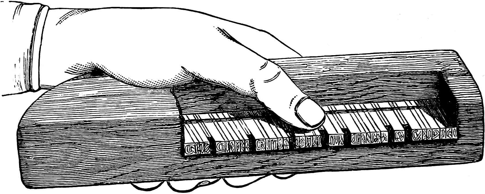
WOODEN COMPOSING-STICK.
The page having been completed by the compositor, it went to press in its chase or wooden box without any further operation. The business of “reader” as yet was not. All the workmen’s blunders and errors, the turned letters, the wrong sorts, and the numerous literal mistakes were left uncorrected. Even whole lines were occasionally omitted by the workman, and the omission remained throughout the edition, affording indisputable evidence that “proof sheets” after composition were quite unknown. At page 125 of Lewis’s “Life of Caxton,” we read concerning our printer—“As he printed long before the present Method of adding the Errata at the End of Books was in Use and Practice, so his extraordinary Exactness obliged him to take a great deal more Pains than can easily be imagined; for, after a Book was printed off, his way was to revise it, and correct the Faults in it with red Ink, as they then used to correct their written Books. This being done to one Copy, he caused one of his Servants to run through the whole Impression, and correct the Faults he had noted with a Stanesil or Red-lead Pencil, which he himself afterwards compared with his own corrected Copy, to see that none of the Corrections he had made were omitted.” A most laborious task indeed, had so foolish an idea ever entered the mind of so practical a man as Caxton; but the whole assertion is a mere fiction, started by Bagford, adopted by Lewis, and repeated by every subsequent writer, without a shadow of evidence to support it. The only books in which manuscript additions were made at the time of publication were the “Polycronicon” and “Mirrour of the World.” The former, in the majority of copies, has the year of the world and the regnal year engrossed in red ink on the side margins; and the latter, in the woodcut of the seven concentric circles which represent the astronomical heavens, has the names of the celestial spheres written in black ink between each circle. But although I have examined about five hundred of Caxton’s books, I have never seen anything approaching to a grammatical correction coëval with the date of the book.
Many people have been puzzled by the abnormal punctuation in Caxton’s books. As a rule he employed three points, the comma, the colon, and the period or full point. Notwithstanding these three varieties, Caxton appears to have been entirely ignorant of any, even the most archaic, principle of punctuation. Nor indeed could we expect anything else unless we suppose him, in a literary sense, far in advance of his age.
In order to place ourselves as level as possible with the ideas of the fifteenth century regarding punctuation, it will be necessary to trace the use of points to their origin.
Like everything else, including the invention of printing, punctuation was no sudden discovery: on the contrary, it had a most feeble and protracted infancy. The earliest known manuscripts are without points, and all the words run on without spaces between them. The confusion which resulted led to the plan of separating the words by a single dot. Then a space between the words superseded the dot, which was turned to another use, viz., to show the end of a phrase or sentence. The Greek grammarians were the first to notice that sentences might be divided into parts or limbs. They called a complete sentence a period, a limb was a colon, and a clause a comma. But these divisions were for centuries but theoretical, the most careful writers paying but little attention to them, and the scribes, commonly, none. Ælius Donatus, who lived in the fifth century of the Christian era, and wrote a grammar which served as a text-book for all Europe until long after the invention of printing, was the first to distinguish by points the three divisions of the Greek grammarians. He did not, however, get beyond the dot, which he placed at the bottom of the line to designate the comma, in the middle of the line for the colon, and at the top of the line for the period.
In the ninth and tenth centuries the oblique stroke as a comma, and the double dot for a colon, came into use by careful writers; the majority, however, used either no points at all or the dot in all its positions without discrimination. Often the dot at the top of the line was the only division for all parts of a sentence. The remembrance of these various practices among the writers of books will serve to explain many of the peculiarities of punctuation in our early-printed books.
The multiplication of books by the printing-press brought out strongly the anomalies of punctuation, but it was half a century later before any general system was adopted. The first printers were not grammarians, nor can they be expected to show a knowledge of punctuation in advance of their age. Even those learned printers, Aldus, Manutius, and Henry Stephens, were quite ignorant of systematic punctuation, as their books plainly show; so that we need not think any the worse of Caxton or our other early printers if in this respect they too were very faulty. When, however, system at last was developed, it was to the printers and not to the authors that the improvement was due.
Turning now to the books of Caxton, we find, as already stated, that he employed three points. His commas were long (/) or short (⸝) strokes; his colon was like ours, one dot over another; and his period was a lozenge-shaped dot at top. All these were used very capriciously; in fact, Caxton made very little distinction between them, nor did his workmen. Each compositor seems to have kept his points all in one box, and to have used them at haphazard. We find even a head line with one comma before, and another after it. Full points are commonly used in the same way. The full point at top often shows the middle of a sentence, and not seldom we see a dance of all the points used thus .:.//˙:˙/⸝ celebrate the conclusion of a book or chapter, the compositor apparently regarding them as ornamental devices.
Some of Caxton’s books are entirely without points, notably those in poetry or in Latin. In others the full point or the colon is used exclusively. In “Paris and Vienne” only the long comma is seen. His long and short commas are used without any variation of meaning. The semicolon did not exist for Caxton, although something like it appears once in his great heading type. The paragraph mark (¶) as showing the commencement of a fresh sentence, and the coloured initial which answered the same purpose, did good duty for the full point. The hyphen is frequently met with, and where the line was crowded, Caxton often employed the colon, which was half the thickness, in lieu of it.
Not until we are well into the sixteenth century do we find printers adopting an acknowledged system of graduated points; and our surprise that standard authors like Chaucer and Lydgate should have ignored all systematic punctuation must be greatly modified when we remember that, after four centuries of the printing-press, modern authors and printers have their vagaries, and that even now no two authorities agree as to the correct usage of the points of punctuation.
PRESSES, PRESSMEN, AND PRINTING-INK.
The method adopted by the earliest printers to obtain impressions from their blocks was to lay the sheet to be printed on the already inked block, and to rub it carefully. Wood-engravers of the present day take proofs in the same manner. The plan was continued for block printing many years after the invention of moveable types. The method of obtaining an impression by a direct pressure downwards is generally supposed to have been synchronous with the use of moveable types. Mr. Ottley, however, describes several of the earliest wood-blocks, which he had no doubt were printed by means of a press. Of one he states, “I am in possession of a specimen of wood engraving, printed in black oil colour on both sides the paper by a downright pressure, which I consider to have been, without doubt, printed in or before the year 1445.” There can be no question, therefore, that the earliest type-printers found a press ready to their hands; but as we have no description of the mechanism of the early presses, we must, as in the instance of typefounding, have recourse to the first dated engravings. The earliest representations of a printing-press are found in the works of Jodocus Badius Ascensius, the celebrated printer of Paris. Two of these are delineated in Plates VII and VIII, whereof the earlier is found as a printer’s device in the title of a work dated 1507. The large press, Plate IX, having upon its basement the date 1520, was taken from the Bagford collection, and has hitherto been generally considered as the earliest representation of a printing-press. The small press was taken from a tract of Luther’s dated 1522. The other comes also from the Bagford fragments, and appears to be about the middle of the sixteenth century, as the mechanism of the spindle is evidently improved. It is represented here, however, principally on account of the figure of a typefounder seen through a door in the background, a feature very rarely pourtrayed: I have not been able to trace the work for which this woodcut was designed. In all these presses the principle is the same. There is a simple worm screw, with a long pin for a lever; the head of the press and the table bear the pressure, and the “hose,” as the transverse piece between the screw and the platen was called, served to steady the downward pressure. The girths, drum, and handle served to run the table out and in, and the tympans and frisket were identical in principle, if not in appearance, with those now used. In Plate IX we see some of the pressman’s appliances exposed to view. There is the shears for cutting out his tympan-sheet, and for general purposes; next to it is a pick-brush for cleaning out picks in the type; a pair of compasses for accurately testing the “furniture” between the pages; and, lastly, a screw point for making “register.”
Plate IX.
From a German Book of Trades, A.D. 1568.
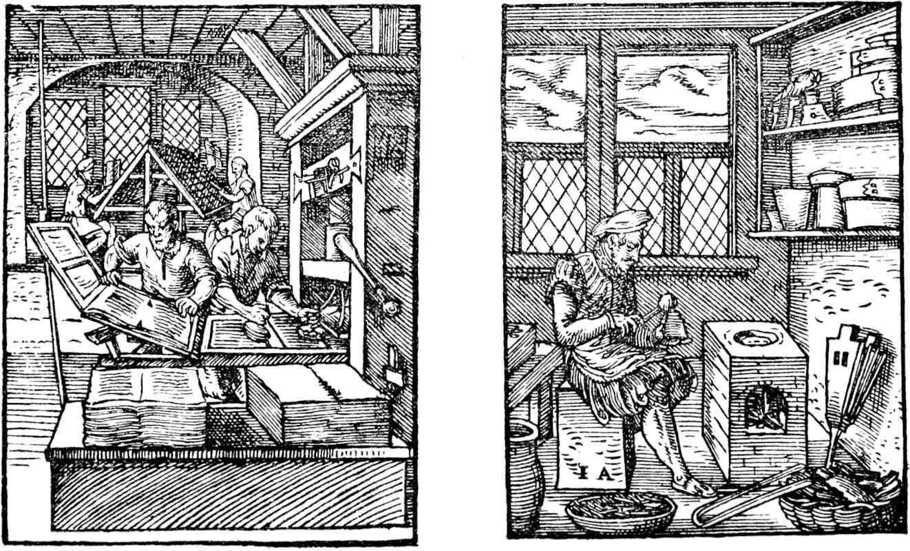
To each press is assigned two workmen; one is pulling lustily at the bar, while the other is distributing ink upon the balls previously to beating the form. The two heaps of printed and white paper, in Fig. 2, appear to our modern notions very awkwardly placed, being both on the off side of the press, so that the workman had to reach over the form whenever he took up or laid down a fresh sheet of paper. As however this peculiarity is represented continually, and so late as the seventeenth century, it was doubtless a common custom.
Plate X.
Scheme of Caxton’s Type Case.
No doubt the ink was better and the impression harder in the time of these presses than in Caxton’s time. His ink was of the weakest description, and the amount of power required for a “pull” of the press proportionately weak, the one necessitating the other. His presses, in the earlier part of his printing career, did not take more than a post folio page; and, with a very sloppy ink, the pull, if strong, would have made a confused mass of black instead of a legible impression. As it is, the ink has been almost invariably squeezed over the edge of the letters, and has contorted their shape. Few indeed, although practical men, would imagine the deceptive nature of an impression taken from new types with weak ink and light pressure. In such a case the type appears at one time much thicker than it is, from the “spuing” of the ink—at another time battered, with some portion of it broken—and again, to use a technical term, as if it were all “off its feet.”
The representation of the “Printer” in the “Book of Trades,” 1569, shows that the presses then were fitted with both “tympans” and “frisket;” and many signs lead to the belief that similar appliances were used by Caxton’s workmen. In short pages we often find a few lines of matter put at the bottom, which was blocked out by the frisket, and answered the purpose of a “bearer.” Several instances occur in the “Godfrey,” at the Public Library, Cambridge; also in the “Life of Our Lady,” at the British Museum. In “Speculum vitæ Christi” we actually find “a bite,” half of the bottom line remaining unprinted.
We have already noticed that only one page at a time was worked in the earlier part of Caxton’s career, although later, at the probable introduction of Wynken de Worde, two pages were managed. This necessitated great care in getting the unsigned pages in their right places, and that such care was needed is proved by several instances of transposition.
Before leaving this portion of our subject, a peculiarity probably connected with the mechanism of the press must be noticed. A small hole at the four corners of each sheet appears in every book printed with type No. 1. Such holes (first noticed by Mr. Tupper) have not been observed in any books printed with the later types, except “Quatre derrennieres choses.” The employment of points by modern pressmen to obtain accuracy of register, and the punctures (called “point holes”) in the paper, consequent upon the use of them, are well known. The holes under notice certainly suggest a similar practice.
After due time allowed for the ink to dry upon the paper, the printed sheets passed into the hands of the binder, whose operations come next under consideration.
THE BOOKBINDER.
The art of bookbinding had not in England, in the fifteenth century, reached the perfection seen in the beautiful Continental specimens of the same period. Nor indeed was any uncommon binding required for the cheap productions of Caxton’s press. His sheets were not, as in modern practice, pressed between glazed boards after being printed, but went, without further process, from the press side to the hands of the binder. The few specimens which have reached us in a pristine state show the indentation, more or less distinct, made by the types. The edition of “Eneydos,” 1490, was hurried through the binder’s hands so soon after the first section (which, containing the prologue and table, necessarily went to press last) was printed, that all the leaves of that section, in every copy I have seen, show a very bad “set-off” from the type on the opposite pages.
To enable the binder to collate the sheets of each section correctly, it was the custom, as well with the scribes as with the printers, to place distinguishing marks on the first page of each sheet; these were called signatures, and as Caxton used only 4ns for his books, the binder (as a rule) was sure that when he had got sheets a j, a ij, a iij, a iiij, together his section was complete. Some printers, who were irregular as to the number of sheets in a section, adopted the plan of signing the centre sheet of every section upon the third as well as the first page, so that the binder by this distinguishing mark might directly see the number of sheets intended for each section, however great the irregularity. In such cases the 4n would be signed on the first five rectos, leaving only three unsigned. Caxton, however, never adopted this plan, his sections always containing the same number of unsigned as of signed leaves. The sheets having been collected into sections, the signatures served again to collate the sections into volumes, the only use for which they are now retained. All the early books from Caxton’s press are described as unsigned, because the signatures were not printed, but inserted in manuscript at the extreme bottom of the page.
The modern binder begins by folding all his sheets into quarto, octavo, &c., according to the size of the book, each folded sheet making a section; they are then collated and bound. In Caxton’s books the collation of the sheets preceded the folding. It has been already observed that the quarto sizes were treated, both in printing and binding, as folio, the paper being cut in half before going to press. The type was so arranged that when three, four, or five sheets were folded one inside another, quirewise, the pages should be in their proper sequence. The open sheets of each section being gathered were knocked even, and folded in the middle. This adoption of one plan for books of all sizes was in accordance with the old usage of the scribes, who necessarily cut their vellum sheets to the intended size before the manuscript was commenced, and varied their sections from three sheets, if very thick, to six or seven, if very thin. The section of three sheets was called “ternio”—of four sheets “quaternus”—of five sheets “quinternus”—and so on. Caxton adopted the “quaternus” or “quaternion” for all his books, using a larger or smaller section only if the beginning or end required it. Wynken de Worde, however, made frequent use of the ternion.
From the foregoing remarks we see that the ternion and quaternion must necessarily be arranged in the order of the following diagrams, by consulting which the reader may easily know the pages belonging to any given sheet.
A Ternion—Three sheets of paper folded in half, quirewise, or one inside another. This gives six leaves, or twelve pages.
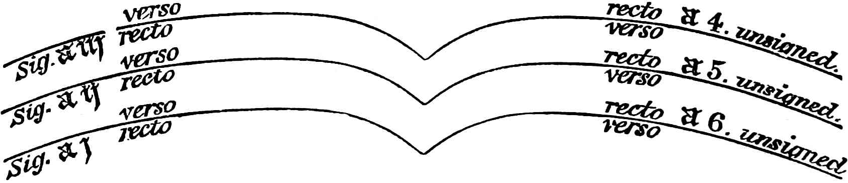
A Quaternion—Four sheets of paper folded in half, quirewise, or one inside another. This gives eight leaves, or sixteen pages.
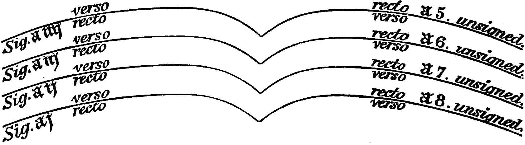
If this arrangement be kept in mind it will be found very useful in many ways. For instance, it is often important to know whether a leaf preceded the first printed page, and, if so, whether the blank leaf found in many volumes is that leaf. It is plain that if a quaternion was adopted for the first section, then the first and the eighth leaf would belong to the same sheet of paper; and therefore if sig. a 8 had a watermark sig. aj should not have any; if aij had a watermark, a 7 should be without, and so on with aiij and a 6, and with aiiij and a 5, where we arrive at the middle sheet of the section, and where a careful examination in the fold will certainly show the thread of the binder, always a true sign of the centre. These indications are often the only decisive evidence of the completeness or incompleteness of a volume, and enable us to decide, even where printed signatures are wanting, the true collation of a book.
Catchwords are not found in any of Caxton’s books, although here and there a word by itself at the foot of a page may look very like one; but in every instance this word will be found to form an integral part of the text, and therefore in no sense a catchword, which by its very nature must be treated as the first word of the next page.
In paper manuscripts of the fifteenth century it is not uncommon to find vellum used for the inmost sheet of each section, or to find a slip of parchment pasted down the centre of each section. This was to give an increase of strength to the back where the binder’s thread would be likely to tear through the paper. Instances where these slips are used are common in “unwashed” specimens from Caxton’s press. The manuscript volume at Althorp, containing “Propositio,” is treated so throughout, and in the quarto poems at Cambridge the marks of the paste, where the slip was torn away at the rebinding of the volume, are very visible.
The earliest pictorial representation of a binder at work is displayed in the little “Book of Trades,” to which reference has already been made; but as there is nothing in it peculiar to the age we will pass on to the material of the covers. This was very frequently only a stiff piece of parchment, with the edges turned in, and a blank leaf pasted down inside as a lining. A few books still remain in this state, just as issued from the “Red-pale” by Caxton. Such are the copies of “Tully de Senectute” in Queen’s College, Oxford; the “Art and Craft,” “Directorium,” and the “Game and Play of the Chess,” in the Bodleian; and the “Godfrey of Boloyne” in the library of Mr. Holford. If intended to be more durable, Caxton used “boards” sometimes made of oak, or beech, and sometimes (fortunately for bibliographers) of waste sheets from the press pasted together. These were covered with brown sheepskin, upon which was a simple pattern of circles, or crosses, or dragons, &c. Instances may still be seen in the 2nd edition of the “Festial” at the British Museum; in the “Servitium de Transfiguratione,” lately purchased for the same library; in the 2nd edition of the “Mirrour of the World,” at Bristol; and at other libraries. In the last-mentioned volume four leaves of the unique “Fifteen Oes” were used as linings for the inside of the boards. An account of a “Boethius,” of which the interior of the covers was composed entirely of “waste sheets,” is given in the description of that work.
When bound, we may consider that the book was generally ready for delivery to the purchaser. It was so with all Caxton’s later publications, but the earlier books still required the services of the rubrisher.
THE ILLUMINATOR, THE RUBRISHER, AND THE WOOD-ENGRAVER.
It has already been noticed that, in the latter half of the fifteenth century, the great development of book manufacture led to a corresponding division of labour. Thus in Bruges we find there were Scrivers, or persons who wrote the text only of books, Verlichters, or Rubrishers, who probably confined their attention to illuminated capitals, and Vinghette makers (miniatores), who were artists capable of designing and painting subjects. In only one instance do the books of Caxton suggest the idea that the services of the Vinghette maker were to have been employed. At the commencement of his edition of Gower’s “Confessio Amantis” (sig. 1, 4), the prologue of the author is begun more than half-way down the page. The blank was evidently intended for a design of some sort, possibly for a large woodcut, after the fashion of Colard Mansion, who printed all the great cuts to his “Ovid” by a separate working. As a rule, however, Caxton’s books required no help from the vinghette maker, although he certainly employed, so late as 1485, the services of a rubrisher, to insert the initial letters at the beginning of chapters, and to make paragraph marks in appropriate places. For this purpose a vermilion ink was nearly always used, although occasionally a light blue alternated. For the initial of the first chapter a square space was left equal to the depth of four or five lines of type: for succeeding chapters a space of two lines was generally considered sufficient.
The first use of woodcut initials was in 1484, after which year they were never (except on rare occasions when a sort ran short) omitted. Caxton had only two or three of each letter, and sometimes only one, as may easily be seen by the recurrence of a particular initial. Some of them have their heavy blackness relieved by a few white dots punctured in the face of the letter, a practice frequently adopted by the German school to lighten the groundwork of early woodcuts. Caxton’s initials are varied in shape, and often elegant in design, but with the exception of the floriated A at the beginning of the “Order of Chivalry,” and “Æsop,” and perhaps the B in “Eneydos,” they demand no especial notice. A few of them are given here.
The woodcut illustrations to Caxton’s books have not received much attention from the writers on the early history of wood engraving. Strutt, Singer, and Ottley in his “Enquiry” have omitted to notice them. Dibdin and Jackson have devoted a few pages to their consideration; and Ottley, in the posthumous work on the “Invention of Printing,” has some interesting remarks on the early use of the art in England. His opinions are enforced by a facsimile of some rude woodcuts in his own possession, which he believed to have been executed as early as the celebrated S. Christopher of 1423. From his arguments we may conclude that although no great amount of vitality can be attributed to the art of wood engraving in England in the early part of the fifteenth century, it nevertheless was known and practised by native artists; and that the use of native talent for Caxton’s books was therefore possible.
At the same time it requires no artistic education to see that there is a great similarity in general appearance between the illustrations in some of the early Dutch books, and the woodcuts of Caxton’s “Chess Book,” “Golden Legend,” and others. In the “Troy Book,” folio, printed at Augsburg in 1483, and the French-printed “Æsop,” 1476, the broad outline and heavy black feet of the figures at once suggest a similarity of style if not identity of artist. But whether Caxton’s cuts be native or foreign, there can be little doubt of the origin of the designs. His artist merely copied the outlines found in the manuscript from which the book was being (or to be) printed. At that period there were a certain number of standard works always in demand, and for each of these the illuminators had a conventional treatment, which appears repeated over and over again in different books. To those who have examined the illuminated manuscripts of the fifteenth century, executed in the Low Countries (of which there are numerous examples in the Royal Collection of the British Museum), the identity of design and treatment in Caxton’s engravings will be evident.
It is somewhat remarkable that woodcut illustrations preceded the use of woodcut initials in Caxton’s books by about four years. In the “Fables of Æsop,” 1484, we meet with printed initials for the first time, while woodcuts, illustrative of the text, had been used in great abundance for the “Golden Legend,” the “Chess Book,” the “Mirrour of the World,” 1st edition, and “Parvus et Magnus Catho,” the last dating about 1481.
The following is a list of all the books printed by Caxton with woodcut illustrations:—
Parvus et Magnus Catho, 3rd ed. 1481? Two designs.
Mirrour of the World, 1st ed. 1481 Numerous designs.
The Game and Play of the Chess, 2nd ed. 1481? Sixteen designs.
Golden Legend 1484 Very numerous designs.
Canterbury Tales, 2nd ed. 1484 Very numerous designs.
Æsop 1484 Very numerous designs. Initials first used.
Order of Chivalry 1484 Large floriated A.
Royal Book 1487? Seven small designs.
Speculum vitæ Christi 1488? Numerous designs.
Doctrinal of Sapience 1489 Two designs.
Horæ, 3rd ed. 1490? A fragment, with one design.
Servitium Transfiguratione 1490? One small design.
The Fifteen Oes 1490? The Crucifixion cut and borders.
Mirrour of the World, 2nd ed. 1490? Old cuts reprinted.
Divers Ghostly Matters 1490? One small design.
Had Caxton’s opportunities allowed, he would probably have used the wood-engraver’s art to a much greater extent. The above table shows that in 1481, when he first employed woodcuts, he also discontinued them; that in 1484 he again, for one year only, used them; and that in 1487 they took a permanent position in his typography. This seeming capriciousness was probably owing to the difficulty experienced in obtaining the services of a wood engraver.
The engravings in 1481, 1484, and partly in 1487-8, appear to have come from the hand of the same artist. In the last year, however, we find considerable improvement, as shown in the illustrations to the “Royal Book,” and “Speculum Vitæ Christi;” but Caxton’s best specimen of the wood-engraver’s art, and one which has been much praised by Dibdin, and especially Jackson, for its composition and feeling, is the well-known “Crucifixion.” This design is frequently seen in the books of Wynken de Worde, who received great credit for it until its earlier use was discovered as a frontispiece to Caxton’s “Fifteen Oes.”
The largest woodcut known to have been used in Caxton’s books is the Assembly of Saints, at the beginning of all the editions of the “Golden Legend,” and the smallest, of which there are four, are found in illustrations to the text in the “Speculum vitæ Christi.”
This portion must not, however, be dismissed without a few words upon that most interesting of all Caxton’s woodcuts, the large device. Caxton used but one; the small device, of a similar design, which is commonly attributed to him, and which is first seen in the “Chastising of God’s Children,” being certainly not earlier than 1491, in which year he died.
The interpretation of the device offers a question by no means of easy solution. We may dismiss, as unworthy of serious notice, the suggestions that the figures should be reversed to read 1447, or that the 74 or 47 refers to Caxton’s age and not to a particular year. The problem to be solved is, does the design mean 74, and if so, why did Caxton use the year 1474 on his device? Bibliographers have hitherto assumed that it must be in reference to the introduction of printing into England, and quote the colophon to the 1st edition of the “Chess Book” in support of the argument. But, as already shown, the date of the “Chess Book” refers to the translation of the work, the printing having been certainly accomplished later at Bruges, and probably in 1476, Caxton’s settlement at Westminster not having occurred until late in that year, or in 1477.
The first to suggest that this mark had no reference whatever to Arabic figures was Mr. Bradshaw of Cambridge; and his opinion has of late received an interesting and curious confirmation. Mr. Adin Williams of Kempsford, in the course of some antiquarian researches, took a rubbing of a monumental brass in Standon Church, Herts, and was struck by the resemblance which a part of it bore to Caxton’s well-known mark. The brass is in bad condition, but it is easily deciphered, and is in memory of John Felde, alderman of London, who, like Caxton, was a mercer. The alderman is represented kneeling, with two sons and a daughter behind him. Above, on one side, are the family arms; on the other is his trade mark as a mercer. The surrounding legend is:—“John Felde, Alderman of London, Merchaunt of the Staple of Caleis. Dyed m. cccc. lxxvij.”
The mark of Felde is here given, the dotted line only being imaginary; and beside it, for the sake of comparison, is a reduction of Caxton’s mark. It will be seen that if the top pennant of Felde’s mark were cut away, and the loop added, we should then have a close resemblance to the so-called figures in Caxton’s device. That Felde’s mark is a combination of conventional forms then commonly used by merchants is undeniable; and Caxton’s device is doubtless of a similar character. It is his personal seal, and the central part is probably the very same mark as that used by him when, as Governour of the English Nation, he stamped every bale of British goods which entered or issued from the city of Bruges.
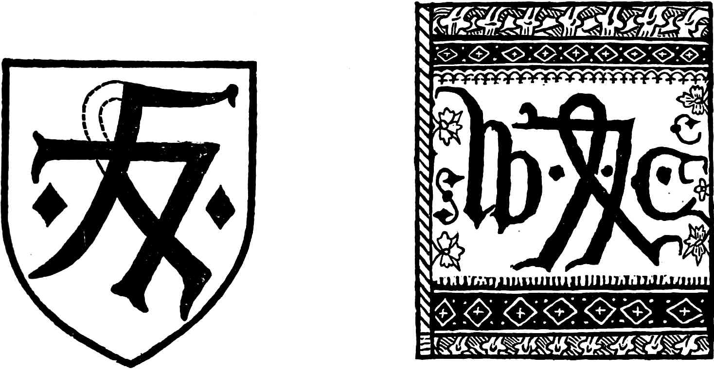
The debate upon Caxton’s device has until lately been confined to the central portion, the surroundings having been by general consent considered merely as ornamentation. In all probability this view is correct; but, as hidden meanings have been discovered in these side ornaments, no apology is needed for their introduction here, however fanciful they may be. Mr. Madden, of Versailles, a well-known writer upon all matters of palæotypography, says in one of his letters[12] that the ornament to the left of the W is clearly the letter S, while that on the opposite side is a C.
These initials, he feels sure, refer to the words Sancta Colonia, the city in which he supposes Caxton to have learned his art. Not so, says another critic; S. C. must surely mean the Staple of Calais, that great wool-mart of which, like Felde, Caxton was a merchant; the freedom of which was a privilege he might well be proud of, and which would give him certain important rights in the importation of books.
Ah! says critic No. 3, but Caxton held an important post in the city of Bruges, and had to place his official seal on all English goods imported or exported, so that, in remembrance of this, S. C., or “Sigillum Caxtoni,” would be very appropriate initials on his trade mark.
These guesses are more amusing than instructive, and it should be remembered that Roman capitals were not used by Caxton in any of his works, nor indeed in those of his English contemporaries.
The opinion that the interlacement is only a trade mark is much strengthened by the discovery of its original use. In 1487, Caxton wishing to print a Sarum Missal, and not having the types proper for the purpose, sent to Paris, where it was printed for him by W. Maynyal, who in the colophon states plainly that he printed it at the expense of William Caxton, of London. When the printed sheets reached Westminster, Caxton wishing to make it quite plain that he was the publisher, engraved his design and printed it on the last page, which happened to be blank. This is the first occasion on which it is known to have been used. The unique copy of this Missal is in the possession of Stephen Legh, Esq., M.P., and was exhibited at the Caxton celebration in 1877.
The following list of books in which the device is found shows that it was not until the end of Caxton’s typographical life that he adopted this distinguishing mark.
Missale ad Usum Sarum 1487
Speculum vitæ Christi circa 1488
Doctrinal of Sapience 1489
The History of Reynard the Fox, 2nd edition circa 1489
Directorium Sacerdotum, 2nd edition circa 1489
Eneydos 1490
The Dictes and Sayings, 3rd edition circa 1490
The Mirrour of the World, 2nd edition circa 1490
Divers Ghostly Matters circa 1490
The Festial, 2nd edition circa 1490
Four Sermons, 2nd edition circa 1490
St. Katherine of Senis circa 1491
The magnum opus of Caxton was undoubtedly the edition of “The Golden Legend,” 1484. The translation alone of this great work must have been no slight task, while, as to number of leaves and size of both paper and printed page, it far exceeded his edition of “King Arthur,” which was the next largest. The smallest pieces of his printing now extant are “The Advertisement” and the “Indulgences.”