PART TWO
Reading edition
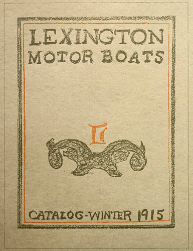
EXAMPLE 16 Layout sketched with colored crayons for a catalog cover
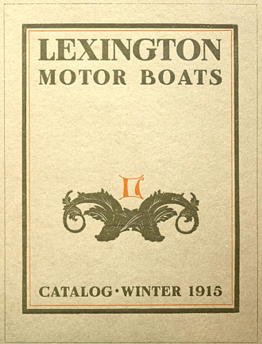
EXAMPLE 17 The cover printed as indicated by layout sketch
35
THE “LAYOUT” MAN
How does the work of the typographer of the twentieth century compare with productions of the past? In the belief of some the good typographer, like the good Indian, is dead. The truth is that much of the printing done during the first four hundred years was not well done. While the same proportionate result still prevails, the ancient did not have the excuse of the modern—lack of time; nor has the modern the excuse of the ancient—lack of facilities. However, while poor work in any century or any industry is explainable, it is not excusable.
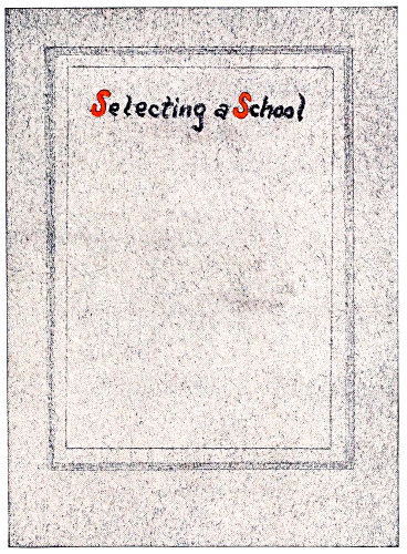
EXAMPLE 1 Booklet cover page laid out with pencil and crayon on gray stock
Someone said, “The man who attained his ambition did not aim high enough.” Perfection is not attainable, but it should be the goal in our race. Many typographers are doing good work, altho each is doing it differently. No one is producing perfect typography; but when perfection is the pacemaker no result can be commonplace.
The good typographers of the past had the spirit of the master craftsman and their product was inspired. The modern printer to succeed needs only the inspiration that comes of study, hard work and love of his trade.
Inspired work, however, is generally the result of preparation.
Artists and advertising men realize the necessity of careful preparation for the process of printing, but typographers as a class evidently do not. If they did they would do even better work and make bigger profits possible. Every printshop should have a “layout” man.
In spite of the fact that much good printing is done today, fully nine-tenths of the product is partially unsatisfactory because of lack of preparation. When a business man decides to erect an office building he does not immediately go to a building contractor and tell him to build it. He first consults an architectural engineer, examines drawings and exchanges opinions, and when the building contractor starts his work everything has been planned and specified.
Should printing be done in a less thoro manner? Is not the making of a book, catalog or business card each proportionately as important and as well entitled to proper attention as the larger undertaking? Good typography cannot be produced if preparation is slighted.
Quality printing is not accidental. Shops famed for the artistic excellence of their product have maintained their “shop style” despite changes in the force of workmen and executives, and this individuality, or “shop style,” as it is termed, has been obtained and retained only because the copy has been carefully prepared and the work has been intelligently laid out by some qualified person (artist, ad-writer or typographer) who understands shop preferences in the matter of style. It is the “institutional idea.”
In printshops extensive enough to allow of the expense, one or more layout men should be employed, and in the smaller concerns the head job compositor or foreman could do the work. Solicitors, when artistically fitted, could in special cases lay out their own jobs of printing, as personal contact with the customer peculiarly fits them to do it satisfactorily. The important thing, anyway, is to please the customer. While the art side of the practice of typography is important, it is not all important. Typography is also a business.
If the customer’s tastes and prejudices were ascertained beforehand, many of the changes now made after jobs are in type, frequently causing inharmonious arrangements, could be avoided. The average printer rarely parallels the experiences of a few fortunate printing concerns which, 36when receiving an order for a booklet or catalog, are told the amount of the appropriation and given carte blanche.
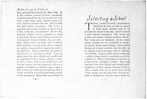
EXAMPLE 3 EXAMPLE 2 Anticipating the appearance of the printed page by utilizing old booklets or preparing specimen sheets of text matter which are cut to proper size and pasted in position. The headings are roughly sketched with pencil
Orders for much of the better class of work are obtained thru “dummies” submitted by printers or solicitors. The customer advises a certain number of such persons that he is in the market for a booklet and would like to receive suggestions. Each competitor prepares a “dummy” on the stock and in the binding intended for the completed booklet. The cover design is roughly sketched or otherwise indicated and the inside pages prepared to represent the finished job.
Let us imagine ourselves in a printshop of medium size, which cannot afford the regular services of an artist. From the composing-room force take the most artistic and practical job compositor and install him at a desk. If there is not sufficient desk work to occupy his full time, arrange with him to fill in spare time at the case. In selecting a man for the position it should be remembered that few typographers have qualifications combining artistic perception and thoro workmanship. It is in a great measure true that a nervous, artistic temperament unfits a typographer for thoro, finished work at the case or stone, while on the contrary, a calm, precise, methodical disposition is often accompanied by lack of imagination. 37Each workman should have opportunity to do that which he can do best. He of the artistic temperament should lay out the jobs, and he of the mechanical turn of mind should construct them.
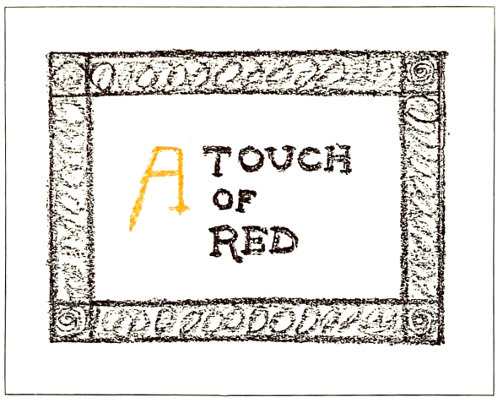
EXAMPLE 5
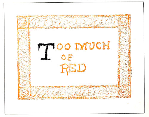
EXAMPLE 6 Ascertaining color combination by means of crayons. The colder color should predominate
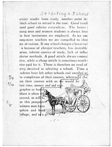
EXAMPLE 4-a After pasting in illustration and counting the lines for machine composition. Reduced from the original
The proprietor or other person in authority should discuss with the layout man the subject of shop style in typographical arrangement. The matter of type equipment should also be gone over, as nothing hinders the layout man so much as to be compelled to use type-faces selected by another having ideas widely different. It is important that the type equipment be appropriate and sufficient for the class of work done. An equipment of a half dozen harmonizing faces of type is far better than one of two dozen ill-assorted faces. Good typography is to a large extent dependent upon the type-faces used.
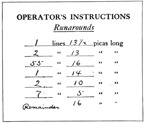
EXAMPLE 4-b Instructions to operator
The layout man should make a study of the personality and tastes of a customer. He should meet all such that come into the office, and arrange to call once upon each of the regular customers. He must keep in close touch with conditions in the composing-room, so that in the discharge of his duties he does not call for type-faces already set out of the cases, or not a part of the equipment.
The mechanic and the artist, to do satisfactory work, must have a certain working outfit. The layout man is no exception; while he could perhaps manage with only a lead pencil and foot rule, it would be foolish to do so. His work will be expedited if he has an assortment of good crayons; hard, medium and soft lead pencils; a pair of shears, a T-square, a gelatine triangle, a type-line gage, a table for giving the number of words to an inch in the various size type bodies; and a library of books and periodicals on printing, especially of those showing examples of type designs. To provide him also with a set of water colors, a jar of Chinese white, a bottle of gold paint, a bottle of india ink and several brushes would not be extravagance.
It would be economical and wise if several sample sheets of each kind of stock were kept near his desk in a portfolio or convenient drawer. Book papers could be cut in quarters, cover papers in halves, and cardboard in various convenient sizes, all ready to be used at an instant’s notice. Several each of ruled headings, cut cards and other standard goods should also be included. In laying out jobs, especially large runs, he should make them of such size as will cut from the sheet with little or no waste. If an order is to be rushed, he should ascertain if the stock may be had without delay.
WORDS TO THE SQUARE INCH
Sizes of Type—SOLID
SQUARE INCHES 5 POINT 6 POINT 7 POINT 8 POINT 9 POINT 10 POINT 11 POINT 12 POINT
1 69 47 38 32 28 21 17 14
2 138 94 76 64 56 42 34 28
4 276 188 152 128 112 84 68 56
6 414 282 228 192 168 126 102 84
8 552 376 304 256 224 168 136 112
10 690 470 380 320 280 210 170 140
12 828 564 456 384 336 252 204 168
14 966 658 532 448 392 294 238 196
16 1104 752 608 512 448 336 272 224
18 1242 846 684 576 504 378 306 252
20 1380 940 760 640 560 420 340 280
22 1518 1034 836 704 616 462 374 308
24 1656 1128 912 768 672 504 408 336
26 1794 1222 988 832 728 546 442 364
28 1932 1346 1064 896 784 588 476 392
30 2070 1410 1140 960 840 630 510 420
32 2208 1504 1216 1024 896 672 544 448
34 2346 1598 1292 1088 952 714 578 476
36 2484 1692 1368 1152 1008 756 612 504
Sizes of Type—LEADED with 2-point leas
SQUARE INCHES 5 POINT 6 POINT 7 POINT 8 POINT 9 POINT 10 POINT 11 POINT 12 POINT
1 50 34 27 23 21 16 14 11
2 100 68 54 46 42 32 28 22
4 200 136 108 92 84 64 56 44
6 300 204 162 138 126 96 84 66
8 400 272 216 184 168 128 112 88
10 500 340 270 230 210 160 140 110
12 600 408 324 276 252 192 168 132
14 700 476 378 322 294 224 196 154
16 800 544 432 368 336 256 224 176
18 900 612 486 414 378 288 252 198
20 1000 680 540 460 420 320 280 220
22 1100 748 594 506 462 352 308 242
24 1200 816 648 552 504 384 336 264
26 1300 884 702 598 546 416 364 286
28 1400 952 756 644 588 448 392 308
30 1500 1020 810 690 630 480 420 330
32 1600 1088 864 736 672 512 448 352
34 1700 1156 918 782 714 544 476 374
36 1800 1224 972 828 756 576 504 396
EXAMPLE 7
Table for ascertaining the number of words to square inches. Use of this table in laying out booklets and catalogs will not only save time but will minimize the chance of a miscalculation
38
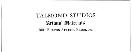
EXAMPLE 8 Notehead as set without instructions from layout man The three specimens on this page lack relation in design
For an example of the workings of the layout system we will suppose that the principal of a local business college has brought in typewritten copy of about a thousand words to be made into a small booklet. A little questioning brings out the information that the customer desires something attractive, refined, and of good quality. He does not want a cheap job, and neither has he money to spend upon expensive de luxe booklets.
The layout man looks over his sample papers and finds that there is on hand a ten-cent white antique paper 25 × 38 inches in size. Taking a quarter sheet he folds it repeatedly until the leaf appears to be about the proper size. Measuring it he finds it to be 4¾ × 6¼ inches. The leaf is then trimmed to 4⅜ × 5⅞ inches (thus allowance should always be made for trimming the edges after binding).
For the cover the layout man selects from his samples a medium gray antique stock of good quality. The cover stock should harmonize in finish with the paper on the inside. In this instance an antique finished stock is selected to cover the antique finished paper on the inside. Many are the booklets that would have been improved by attention to this rule of harmony. However, a rough finished cover stock and a smooth inside paper is not as inartistic a combination as a smooth cover stock and a rough inside paper.
The cover stock selected in this instance is 20 × 25 inches in size, and an eighth of this sheet folded once gives a leaf 5 × 6¼ inches. Deciding to have the cover lap three-sixteenths of an inch over the edges of the inside leaves, it is trimmed to 49⁄16 × 6¼ inches.
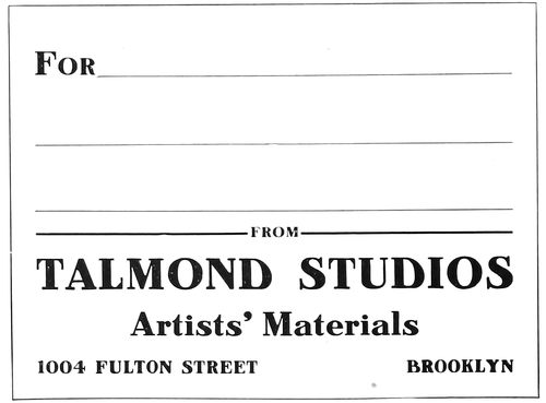
EXAMPLE 10 Label as set without instructions
On one of the inside leaves a page is penciled off, the layout man judging how much of the paper should be covered by print. For cheap work it is generally necessary to crowd the matter into the least possible number of pages, and in such case narrow margins are allowed. For the better quality of work, liberal margins are necessary to proper results. A page should set toward the top and binding edges, the margins at these places being each about the same. The margin at the right edge should be a little more than at the top and back, and the margin at the bottom should be a little more than at the right edge. For the booklet now supposed to be in course of preparation, 2¾ × 4 inches has been determined as the proper size of the type-page. Each page thus requires eleven square inches of type-matter. The layout man refers to the table (Example 7) which gives the number of words to a square inch and ascertains that eleven square inches of ten-point type, the lines separated by two-point leads, should accommodate one hundred and seventy-six words. Multiplying this number by six, allowing two pages at the front of the booklet for the title, etc., he finds the booklet will take 1,056 words, about the number of words in the copy supplied.
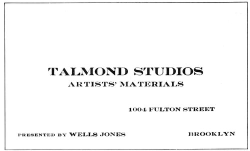
EXAMPLE 9 Business card as set without instructions
For a booklet of this kind the type should be no smaller than ten-point. Instead of stinting margins and sacrificing legibility, as is often done in endeavoring to force copy into a limited number of pages, additional leaves should be added.
The cover and inside papers having been prepared in the proper size and number of leaves, the dummy is stitched with wire or sewed with silk floss as may be desired. The arrangements of the title-page, the first text-page and a page entirely text matter are indicated in proper position by means of pencil and crayon; or for booklets of a large number of pages it is well to set the first text-page in type and paste a proof of it in the dummy, getting by this means the customer’s approval of both type-face and general effect.
The appearance of the printed page may be anticipated by pasting in position a type-page cut from another booklet already printed. (Examples 2 and 3.) In a shop where much booklet work is done, it would be a convenience to the layout man if a number of specimen pages, set in the available body type (both solid and leaded), were printed for use in preparing dummies. These specimen pages should be about 5½ × 7 inches, a size that would make them usable for most purposes.
The cover arrangement was sketched on the gray stock 39(Example 1), the border being represented by the gray lines of a hard lead pencil. The type line was indicated by means of a soft black lead pencil and an orange crayon. Ornaments are not specified because they are better omitted on booklets where dignity is the principal feature.
The dummy booklet thus completed is submitted to the customer and when approved goes to the workrooms with the copy. The compositor, make-up man, stockman, pressman and binder have no excuse for any misunderstanding, as, generally speaking, they have merely to duplicate the dummy. The labor of the estimate man, too, is lessened, as the dummy booklet affords a substantial basis upon which to figure the cost.
The plan of making a dummy booklet, just explained, can be adapted to many jobs, but of course it should be varied to suit special requirements.
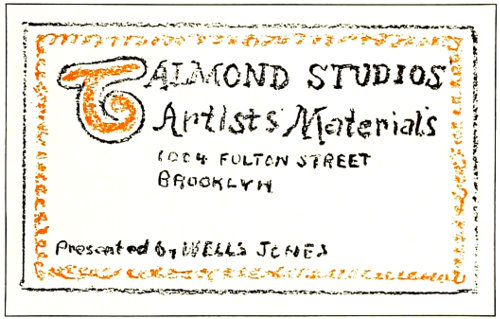
EXAMPLE 12 Business card as laid out
In cases of periodicals and voluminous catalogs, dummy sheets should be printed with the outlines of the page indicated by light-faced rule. With such sheets the layout man is enabled quickly to paste in position prints of the illustrations and text matter from the galley proofs. Getting his instructions in such methodical manner the make-up man can do his work without confusion of orders, and the proofreader’s task is made easy.
When illustrations are provided to be incorporated in the text matter there is more or less trouble in making up the pages. To center all illustrations so as to avoid changing the width of the type lines is easy but not always artistic. It is economical to have plates made the full width of type matter, but the printer is seldom consulted until after the plates are made. However, various sizes of illustrations may be attractively grouped on facing pages and the type-matter filled in around them. This method may appear difficult because the text matter is often composed on machines; but it is not difficult if prepared in this manner: Take the prepared body-type sheets, cut them to the required page size, paste them to the dummy sheets, and upon the pages of text matter thus presented fasten the prints of the illustrations in proper positions. The body-type sheets need not be used on pages for which there are no illustrations; in such instances merely the number of lines to a page is ascertained. Example 4-a demonstrates how the print of the illustration is placed over the body-type page, and the “step” shape of the pencil lines shows how the boundaries of the type lines are made to fit the outline of the illustration. The length of type lines should always be ascertained with the pica (twelve points) as the unit of measurement.
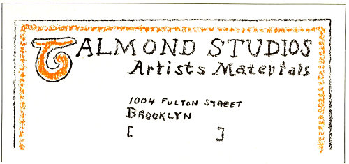
EXAMPLE 11 Notehead as laid out for compositor. The three specimens on this page are related in design
Supposing Examples 2, 3 and 4 to be dummies of pages, the composition of which is to be done on the linotype or monotype machine, the layout man with his pica measure starts at the initial letter T and measures and counts the lines, noting the results in the margins. (See Example 4-a. The page as shown is slightly reduced, hence the lines do not measure as set forth.) The figures are copied from the margins onto a slip and will then appear as shown in Example 4-b.
This plan emphasizes the necessity of a layout man as a member of the executive staff in the modern printshop. It may be a simple procedure to reset run-around matter at the moment it is needed by the make-up man, but it is an expensive habit.
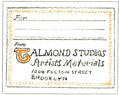
EXAMPLE 13 Label as laid out
The average stationery job is sometimes given scant attention in the larger printshops where long runs on cylinder presses overshadow it in importance. This condition leads to unsatisfactory results and the customer is the sufferer; his stationery as a whole is likely to be not only inartistic but a patchwork of typographic styles and arrangements. To illustrate this: A dealer in artists’ materials orders at various times letterheads, business cards and package labels, and the copy is sent to the workrooms with no instructions about style. Assuming that a different compositor gets each order, the jobs are composed as shown in Examples 8, 9 and 10. These specimens 40are above the average in arrangement, but are faulty in that they have no relation to each other in appearance; have nothing distinctive in their typography that identifies the business card with the letterhead or the label.
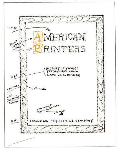
EXAMPLE 14 Layout of a cover-page, with instructions in detail as to material to be used. Reduced from original
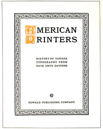
EXAMPLE 15 Cover-page as set from the instructions. Reduced from original
How different the results had an artistic layout man prepared each order before it was given to the compositor. Examples 11, 12 and 13, roughly sketched with pencil and crayon, demonstrate what could have been done. With stationery thus harmoniously treated a business house would be given credit for individuality and progressiveness.
In a printshop doing a good class of work (every printshop should endeavor to do that) the layout man ought to make a study of color harmony. Not that it is necessary for him to attend an art school or devote most of his time and attention to experimenting with prisms and light rays; charts and tables which help to solve the color problem are easily obtainable. After a little study and practice he will learn that while red, yellow and blue (the primary colors) harmonize with each other, mixtures of two or all three give shades that are more pleasing. Olive-green (an art shade) substituted for blue, in combination with orange, produces an artistic blend in place of the gaudiness which otherwise would prevail. This because olive-green is a mixture of blue and orange; a relationship in color composition is established and contrast lessened.
A black page increases in interest with the addition of a touch of red, and for this purpose vermilion is recommended. The vermilion shade of red is approximated by mixing white with orange-red.
The colored crayons with which the layout man should be supplied are exceedingly useful in determining color combinations. The eye is a reliable guide in this matter, if it is carefully trained to recognize color harmonies. It should be easy to distinguish the right from the wrong color treatment in Examples 5 and 6. The colder color should always predominate; backgrounds of bright red and bright yellow are difficult to harmonize with any color of ink excepting black.
From the insert (Examples 16 and 17) will be seen how a color combination may be roughly sketched on the actual stock to be used and the finished result indicated without setting a line of type or inking a roller.
When the page is set in type it is well to have the proofs in the colors and on the stock to be used, but it is unnecessary to separate the design into several forms to do so. For a job such as Example 15, for instance, two proofs may be pulled, one in black and one in orange, and the initial cut out of the sheet printed in orange and pasted in position on the sheet printed in black. Another and a more satisfactory way is to ink the entire page with black, then clean the black from the initials, and ink them with orange by means of a finger. It may be relevant to suggest that the human skin is ideal for inking purposes, and that a printer’s composition roller is an imitation of its qualities.
The layout man, in addition to the study of ink harmony, should learn to blend colors and tints of paper stock. He should know that a buff or cream inside paper reflects the color of a yellow-brown cover stock, and hence makes a prettier combination than white inside paper and brown cover stock. Another important point is the color blending of a tipped-on illustration and the stock acting as a background. The prevailing shade in a color illustration should be matched by the background or by a surrounding border, or by both.
When laying out advertisements or other display pages the size of the type-face should be written in the margin (Example 14). Practice will enable the layout man intuitively to approximate the size needed.
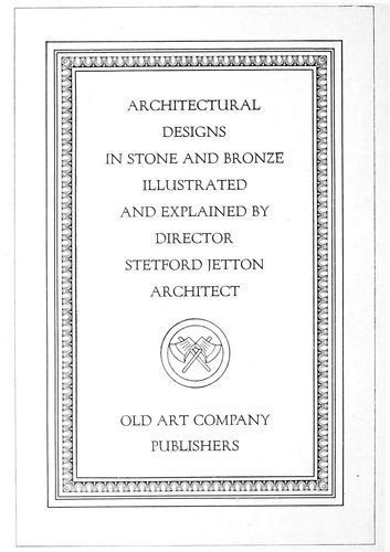
EXAMPLE 20 An architectural subject appropriately treated
41
HARMONY AND APPROPRIATENESS
In music there is that which the Germans call “Leit-motif”—the guiding theme in the construction or interpretation of musical compositions. The “Leit-motif” finds a parallel in the central idea or motive governing the composition of a building, a painting, a book or a job of printing. If Gothic is selected as the style of architecture for a building, every detail from the arches to the smallest bit of ornamentation is kept in harmony with the central idea of construction. If the building is to be Colonial, every detail is made appropriate to the Colonial motive.
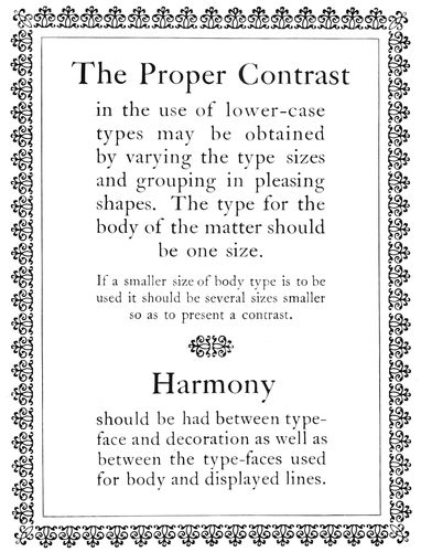
EXAMPLE 18 To obtain Harmony it is frequently necessary to use but one series of type, and either all capitals or all lower-case
The person is legion who undervalues the importance of harmony and appropriateness. Houses are furnished without regard to a general plan and furniture is added because it strikes the fancy at the moment of purchase. A Morris chair in dull-finished wood, a Louis XV table with dainty curves and gilt luster, and a mahogany or ebony piano case are gathered in motley discord on an oriental rug. And when this same person has printing done, or does it himself, there is again revealed an utter disregard for the things that make for harmony.
What is appropriate? There are times when it is difficult to give an unprejudiced answer, especially when an idealistic art interpretation of the appropriate is combatted by the homely reasoning of a tiller of the soil. As a finishing touch to the classic architecture of the agricultural building at Washington the words Fructus, Cereales, Forestes and Flores were carved in suitable places on the structure. The secretary of agriculture noticed the Latin words and forthwith ordered the architect to have them recarved in the English—Fruits, Grains, Woods and Flowers. Now there are those who say the words as modified suggest a sign on a country store. The architect probably reasons that the words as originally carved were purely decorative, and in their English form are not only unnecessary but are about as poetic as a page of stock quotations in a newspaper or a package of little pig sausages.
It requires a discriminating judgment to distinguish between the appropriate and inappropriate. The plain people of one of the new sections of New York City were astounded recently to find the street signs bearing such names as Socrates, Horatius, Poseidon, Aphrodite, Pericles and Seleucus. Names such as Wall Street, Broadway, Bowery and Fifth Avenue are unobjectionable, but Seleucus Street and Pericles Street—!
Typographers frequently go wrong in the use of the old Roman V. The V as part of the words PVBLIC LIBRARY on a stone building excites no comment; it seems appropriate and in good taste; but as part of the words PVRE MILK on a grocer’s letterhead it tempts the risibility in our natures. After all, good judgment is one of the most valuable assets a man can possess.
Harmonious and appropriate results in printing are brought about by discreet selection and use of these three elements: type, ink, paper. It is one thing to ink the type and pull an impression on paper, and it is another thing to do it properly. It makes a difference what type is used, what ink is used, and what paper is used. There are hundreds of type-faces, many colors and qualities of inks, and a variety of finishes and qualities of papers.
As to type-faces: Printers of law briefs and legal blanks need the formal, legible modern romans. Printers making a specialty of commercial stationery, wedding invitations and calling cards need scripts and engravers’ romans. Printers whose chief product is high-class announcements and booklets cannot do without old-style romans, italics and text faces. When everything in printing from the diminutive calling card to the massive 42catalog is solicited many styles of type-faces are needed.
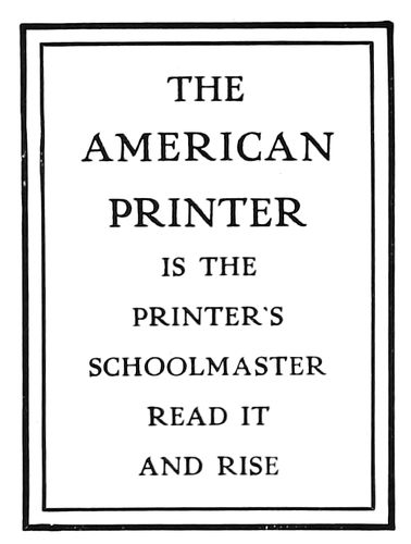
A Harmony. The heavy line and the light line are found in the construction of both border and type-face.
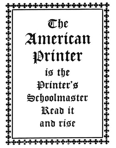
B Harmony. The black, pointed characteristic is a peculiarity of both type-face and border.
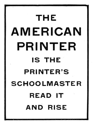
C Harmony. Type-face is made of strokes of one width; border is composed of one line of similar width.
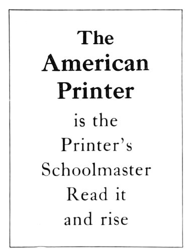
D Harmony. The two type faces are of the same design; one is stronger in tone.
E Harmony. The two type faces are of similar design; one is slanted and slightly altered to obtain contrast.
F Near-harmony. Type faces are sufficiently similar in design to blend if contrasting sizes are used.
G Incongruous. Border has no characteristics that can be found in the italic type-face.
H Incongruous. There is no relation in the style of these two type-faces; one has serifs, the other none.
I Incongruous. Letters not related in design: one is condensed, the other extended. EXAMPLE 19—Harmonious combinations, and combinations that are incongruous
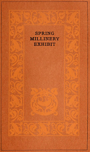
EXAMPLE 21 A booklet cover, the coloring and typography of which is suggestive of the subject
As to inks: There are inks ground in strong varnish for bond papers, inks ground in soft varnish for coated papers, and heavy opaque inks for dark cover papers, and it makes a deal of difference if they are not used appropriately. And then, in the matter of harmony of colors there is a subject for much study. The wise printer will use good black inks and enliven his jobs with mere touches of orange or vermilion. Black and orange are always pleasing in combination and look well on most papers. There are pitfalls in the use of numerous colors, and until the subject of color harmony is understood by the printer he will wisely adhere to black and orange.
As to papers: Wove and laid antique papers, white and buff tinted, are appropriate for announcements and booklets in combination with old-style type-faces and black and orange inks. Dainty papers of linen finish in combination with delicate engravers’ type-faces, are appropriate for milliners, florists, jewelers and others catering to the esthetic tastes of women. Dull-finished coated papers are considered more artistic than highly enameled ones, and there are those who prefer it as being more restful to the eyes.
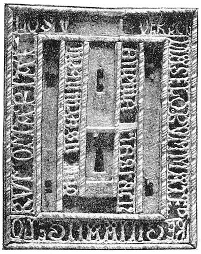
EXAMPLE 23 An old lock-plate
It is a stupendous undertaking, in face of the multitudinous elements that are part of the production of printed work to point out a path that will lead to good typography. There are many printers doing good work and each of them has probably arrived at his point of attainment by a different route. There is no royal road to learning. The student may be assisted, but whether he succeeds depends to a great degree upon himself. He must have an open mind, good judgment, and a liking for simplicity.
Simplicity is synonymous with good typography and its path is a straight and narrow one. He who would do worth-while typography must decide wisely when accepting the good things offered by his friends, the paper man, type man and ink man. They are generous in their offerings and willingly assist the doubting one in deciding; but confidence in his own judgment is a necessary qualification for the typographer who would attain success.
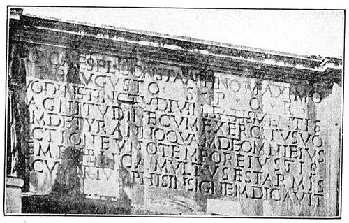
EXAMPLE 24 Inscription on a Roman arch
The ideal printshop is that one which contains only harmonious type-faces, ink colors and paper stock. This ideal condition being impossible except in a small shop, the best alternative is to have all type-faces as nearly harmonious as possible. It would be wise to build upon the body type as a foundation. Choose a body face that will be suitable for most purposes, and then select a series or family of display types that harmonize with it. If Caslon Old Style is chosen as the body letter, Caslon bold, Caslon italic and Caslon text will afford variety in display while retaining harmony. (Of course the large display sizes of the Caslon Old Style should be included.) The Cheltenham family probably provides the greatest variety of harmonizing faces. Scotch Roman is a dignified and legible letter, and supplemented by its italic and the larger display sizes is a satisfactory face for many purposes. Old Style Antique is a useful letter where a black tone is desired and is pleasing in its original form. There are many artistic letters now to be had that give the effect of hand-lettering, which are admirable for distinctive advertising literature.
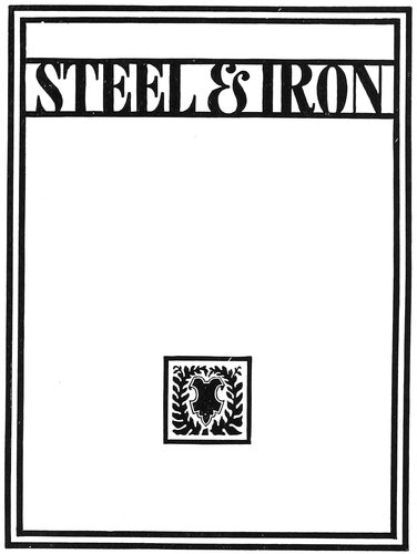
EXAMPLE 22 Type-design for catalog cover suggested by the old lock-plate
While harmony of type-faces is essential, yet a certain amount of contrast is desirable. At one time it was customary to alternate a line of capitals with one of lower-case. This arrangement gave contrast, but not harmony. The best results are obtained by the use of either all capitals or all lower-case. As explained in the chapter “When Books Were Written,” our alphabet in its original Roman form consisted of capital letters only. Lower-case letters, also known as minuscules, are the result of evolution, and in form differ materially from the capitals. Custom decrees that a capital letter be used to begin an important word otherwise in lower-case, but with this exception either kind is better used alone.
Example 19 illustrates harmonious combinations of type-faces and borders and also presents several incongruous features.
Section A is an all-capital scheme enclosed in a border of heavy and light rule. A border such as this owes its origin to the panels used by the Romans to surround inscriptions on stone, and as these inscriptions were in capital letters only, the appropriateness of the treatment is manifest. As the letter is also formed of heavy and light strokes the harmony is enhanced.
In section B there is harmony from both the historic 44and artistic viewpoints. The black text face, representing as it does the direct result of the evolution from capital letters, is appropriately used only in its lower-case form. The use together of text capitals is objected to on the ground of illegibility. This black text face (correctly called Gothic) is historically associated with ecclesiastical printing, and the border, consisting of pointed crosses of black tone, blends with the pointed black letters of the type-face.
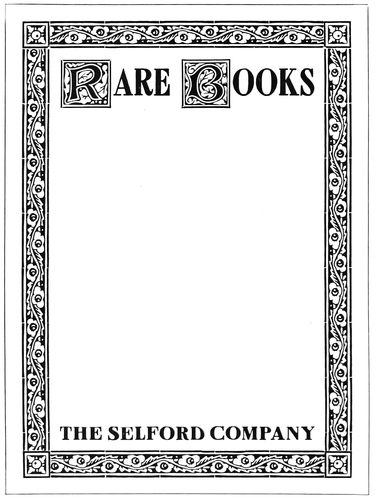
EXAMPLE 25 Cover-page for a catalog of books, using type imitations of woodcut initials and borders
Section C shows a plain letter of modern cut known erroneously as gothic. Containing no serifs, it lacks a feature which has always been considered necessary to beauty in type-faces. As a harmonious border for this face there is nothing better than a plain rule of the width of the type strokes.
The next three panels demonstrate such harmony as may exist between type-faces of different series:
D.—This panel shows Caslon bold in combination with Caslon roman, and demonstrates the close harmony existing between type-faces of the same family.
E.—Another demonstration of the harmony of the family types.
F.—Harmonious, to a certain extent.
The type and rule in the next panel do not harmonize for these reasons:
G.—The border is too black and square in form. Italic, because of the slant of its letters, looks better not surrounded by a border, but when one is used it should be light and contain some of the characteristics of the italic.
In all cases where ornamental borders are used more finished results are obtained if a rule separates the border from the type, as in Section B.
The next two panels present the “horrible examples,” which are defective for these reasons:
H.—The type-face of the upper group has nothing in common with that of the lower group. That of the upper group is a distinctive old-style roman, with serifs, and is set in lower-case, while that of the lower group is a plain black modern letter, without serifs, and is set in capitals. The main display should never be lighter in tone than the less important type matter.
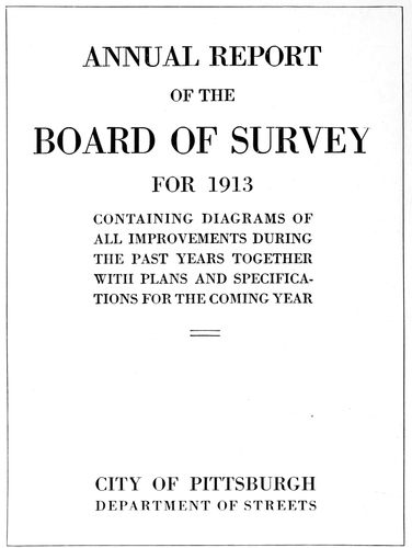
EXAMPLE 26 A plain page without ornament or decorative types, for a plain purpose
I fails to harmonize because the type-face of the lower group is slightly extended and the one of the upper group is condensed. The shape of the letters of a type-face should conform to the shape of the page, and so far as possible to the shape of the companion letter, when one is used. Condensed letters should be avoided except for pages that are long and narrow, and an extended letter should not be used except on a wide page.
There are more typographic sins committed thru violation of the laws of appropriateness than in any other way. In this regard it would not be difficult to make out cases against the best of typographers, whose sins are washed away by good work in other respects. As in architecture, where one part of a building bears relation to all other parts, so in typography there should be a motive that blends all elements in serving one well-defined purpose. The phrase “Is it appropriate?” prominently displayed above the type cabinets, over the presses, in the stock-room, and over the layout man’s desk, would help to keep in mind this important requirement.
An architectural motive was suggested by the copy for Example 20, and type-face and decorative border were selected that the motive should be emphasized. The architecture of the Romans was frequently embellished with inscriptions (see Example 24), and in modern architecture the panel of Roman lettering is a feature; the lettering is generally all capitals of the same size, of a style near that of the ancient lettering; and the panel 45is outlined with molding, plain or decorative. Serving a purpose equivalent to the architect’s panel molding, the type or rule border is a valuable addition to a page of type. A page of display type or a halftone not surrounded by a border is like an oil painting without a frame. The egg-and-dart border around Example 20 is historically associated with architecture. The type-face is a Roman capital letter designed by Fred. W. Goudy from an inscription found in the ancient Forum at Rome.
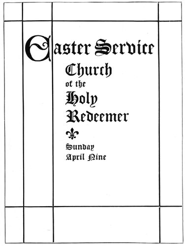
EXAMPLE 27-a Treatment appropriate for a church program, in style based upon old ecclesiastical manuscript books. (See specimen below.)
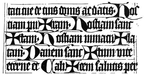
EXAMPLE 27-b Portion of a page of an old manuscript missal
Bismarck was called the “Iron Chancellor” because of his great strength of character and unbending will. Strength instantly associates itself with the mention of iron or steel, hence the motive for the construction of Example 22. It may be interesting to know that the design of this page was further suggested by the old lock-plate (Example 23). A printer with imagination can absorb ideas from many sources. The lock-plate is not literally reproduced in type, but a few of its features, including the key-hole, were borrowed and conventionalized. An artist-designer does not copy his models closely; they serve the purpose of suggesting shape and treatment and his imagination does the rest.
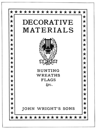
EXAMPLE 28 Cover-page for a catalog of decorative materials, suggesting festive gatherings, music and waving flags
For the cover of a small catalog listing rare books, a typographic motive is found in the woodcut borders and initials of the early printers. Example 25 shows what may be done with type-foundry material on such a cover. The border is of black tone and the type and initials are given the strength that harmonizes with it.
Old books suggest discolored leather, dusty shelves and plain men, and it is an abrupt change to the subject of millinery, with its bright colored feathers, ribbons and delicate finery. The milliner ornaments his salesroom with vines and flowers and dainty colors, and the printer gets his typographic motive from such sources. Example 21 illustrates a booklet cover treated thus appropriately. The page size is unconventional, the coloring is dainty, and the type lines are neatly diminutive.
As a millinery store is unlike an office in which are maps and blue prints and legal documents, so typography for these two purposes should be unlike. Example 26 is a page severely plain and non-sentimental. The types are merely to tell something in a blunt manner. There is needed no touch of decoration or color to interest the reader, because those who read it would do so whatever the treatment. This is the only example in the present chapter in which the advertising element is unimportant. The page may be commonplace because it need not be anything else, altho it is well to do good work even here.
From the surveyor’s office our journey of instruction takes us into a church during an elaborate Easter service. Light filtered of its brightness by stained glass windows; high-placed Gothic arches pointing toward the sky; soft organ-music—all these create an atmosphere 46of solemnity and harmony. A program or pamphlet for use during a church service should be as appropriate to the environment as a Book of Common Prayer or Bible. Typographic treatment good as shown in Examples 22, 26 or 28 would be ridiculous for a church program. Example 27-a shows a page historically appropriate. The type-face is peculiarly fitting because of its pointed form, and also for the reason that a letter of similar design was used by medieval scribes on ecclesiastical books (see Example 27-b). The crossed rules, which should be printed in orange-red, are adapted from the guide lines as made by the scribes for marking the position of a page on the sheet.
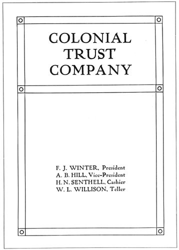
EXAMPLE 30 Title-page in semi-Colonial style, appropriate for use with a cover design such as Example 29
When a holiday crowd is gathered, dignity is put aside and all enter into the festive spirit of the occasion. Here is the motive for the typographic treatment of a booklet or catalog of decorative materials as presented by Example 28. It would be excessive emphasis of appropriateness to print such a page in a combination of bright red and blue. The colors should be softened. The page would look well printed in a deep blue with a flat blue tint overprinting the star border.
There is room for improvement in the support typographers give artists in the production of booklets and catalogs. In many cases title-pages are constructed with no regard to the motive suggested by the design on the cover. Bibliophiles judge a book not only by the excellence of its execution, but by the harmonious unity that may be expressed in every detail, from the literary contents to the last bit of tooling worked on the cover. The type, ornamentation, paper, ink, margins, leather, the arrangement of the title-page and the cover treatment, all must be selected and utilized in expression of a dominant central motive. The same rule presents the key to good typography in job work. Example 29 shows the Colonial arch adapted as the border of a booklet cover. The artist gives this treatment to the cover because of the motive suggested by the name “Colonial Trust Company,” and when the title-page is set it would be a mistake not to use some Colonial arrangement. Example 30 blends with Example 29 and is modified from the old Colonial title-page treatment just enough to give it a modern appearance without sacrificing the old-time atmosphere. The border suggests both the widely-spaced rules of the Colonial printers and the architectural pillars of Example 29. No letter spacing is used, despite the temptation offered.
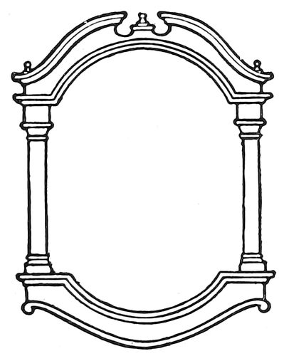
EXAMPLE 29 The Colonial arch
Discussion of the subject of harmony and appropriateness could be extended much further than is allowed by these limits. Pages could be filled with descriptions of instances in which the compositor had erred in treating typography and ornamentation inharmoniously or with an unimaginative appropriateness. The use of angelic ornaments on Y. M. C. A. printing, where something more substantial is desirable; the double-meaning that may be read into the use of a horseshoe ornament on a printer’s letterhead; the placing of illustrations of live fish, lobsters and animal food on banquet programs—these are a few of the things that might be mentioned.
High-class catalogs have been marred by the use of stock decorative initials which were at variance with the other decoration. In order to save a few cents both printer and customer are inclined to use stock decoration that happens to be on hand at the moment. Hundreds of dollars are spent on the work and then for the sake of saving thirty cents (the cost of a harmonious initial or ornament) many dollars in effectiveness are sacrificed. Another way of injuring the appearance of a book is to use a type-face on the title-page that does not harmonize with that used for the body matter and the sub-headings. In order to secure complete harmony even the lettering on the cover should blend in style with that used for the title-page, sub-headings and text pages.
Altho strict adherence to the laws of harmony and appropriateness is necessary in the production of good work in any field of endeavor, Americans seem to be really proud when they violate such laws. We all know the person who dresses in a slouchy manner because he read somewhere that Horace Greeley dressed that way. And there is the modern politician who wears a slouch hat and constantly carries a quid of tobacco in his mouth because Henry Clay did so. There are also house-organ publishers who use inharmonious and inappropriate type-faces and decoration because Elbert Hubbard thus treats the cover of the Philistine.
It is not a question of the sort of clothes a person actually needs to go from one end of a street to another—Lady Godiva reached her destination with no clothes at all—yet we often admire a person dressed harmoniously and in good taste without knowing the reasons for our admiration. As there is art in tailoring and in the selection of clothes, there is also art in printing, and he who investigates will find that the great natural laws of beauty apply even to typography, which some by their work seem to think requires no more thought than ditch-digging.
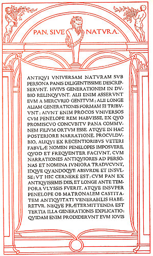
EXAMPLE 43 Uniform tone in classic typography. Page by Bruce Rogers
47
TONE AND CONTRAST
This chapter is a story of the alpha and omega of color—white and black. Since the creation of the world, when light first illumined the darkness, these two colors (if I may call them colors) have been emblematic of extremes—white, the symbol of purity and goodness, black of impurity and evil. White and black represent extremes in color. Mixing of all the color rays of the solar spectrum produces white, and mixing of all the colors in the solid form of printing ink produces black. From this contrast of white and black maybe drawn a lesson in color. (Example 31.) Light represents warmth, darkness cold. As the colors are toward light they are warm; as they are toward darkness they are cold. Red becomes warmer as it takes on an orange hue, and colder as it takes on a purple hue. A warm color should be contrasted with a cold color—as orange with black. The further in tone the color is from black the more it contrasts with the black. As an illustration: Orange is more pleasing than a deeper shade of red as a companion color for black. Blue, purple or green, selected to be used with black, must be lightened with white ink to get the desired contrast.
EXAMPLE 31 Contrast in color and tone
White and black as a combination are and ever have been popular with writers, printers and readers. Fully nine-tenths of the newspapers, books, catalogs and other forms of reading matter are printed with black ink on white stock. It is coincident that optical necessities require for best results in reading a black-and-white combination, and black ink and white paper are more cheaply and easily produced than other colors of ink and paper.

EXAMPLE 32 An example of uniform tone and contrast of black and white. Page by F. W. Kleukens, Darmstadt
This chapter is also an illustrated sermon on uniformity of tone or depth of color, in which is pointed out the necessity of bringing many spots of black or gray into harmonious relation. The esthetic importance of uniformity of tone is universally recognized. Choirs are robed in white and black; fashion has its uniform clothing for the hours and functions of the day and night; theater choruses and the soldiery are living masses of uniform tone and color. As uniformity is important in these things, so is uniformity important in the tone of a page of printing. A type-page exhibiting a variegated mass of black and gray tones is not unlike a squad of recruits in different styles of clothing marching irregularly; while on the contrary a type-page of uniform tone and arrangement maybe likened to a uniformly equipped regiment of soldiers marching with rhythmic tread.
A page of display typography composed of a mixture of irregular gray and black tones is inexcusable in the sight of the art-loving reader. As combinations of inharmonious type-faces are wrong, equally so are combinations of incongruous tones. For the sake of contrast and variety in typography, art principles are too often ignored, the printer confessing to ignorance or lack of ingenuity. Contrast is necessary, but it may be had without sacrificing uniformity. Again making use of a military simile: soldiers are marched in platoons, companies, battalions and regiments that the monotony of solid formation may be broken; type is arranged in groups and paragraphs for similar reasons. While an absolutely solid page of type may present a pleasing tone, a slight break in the regularity is desirable for reading purposes. Thus art makes concession to utility, but such concession should always be granted reluctantly. There is classic authority for the arrangement of the type lines in Example 20 of the preceding chapter, but on the majority of printing jobs it is necessary to compromise with utility and emphasize important words, as in Example 19-a of the same chapter. The secret of producing artistic typography in these practical times is to pilot the ideas of the customer into artistic channels; emphasize the words he wants emphasized, but do it in a way that will result in creditable typography. There is a right way and there is a wrong way 48of arranging type, and too many typographers arrange type the wrong way and unjustly blame the customer for the result.
EXAMPLE 34
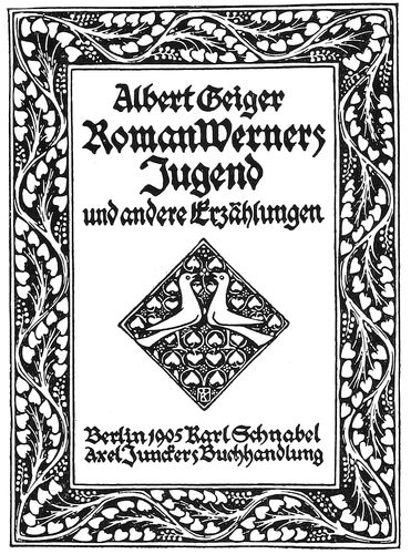
The effectiveness of uniformly black tone on a background of white is well illustrated on the beautiful book title shown as Example 32, in which even depth of color is consistently maintained. There is not a weak spot on the page; border, ornament and lettering are of equal tone, and the white background is reflected thru the black print in agreeable contrast. The Germans are masters in their treatment of contrast and uniform tone, and he who bewails the limitations of black and white printing should ponder over the results shown by this specimen from over the sea.
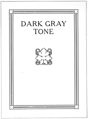
Here is a practical demonstration of the workings of the theory of uniform tone in typography. Example 33 displays four ornaments, each of a different tone or depth of color. One of the customs when constructing a booklet cover-page to be ornamented, is first to select an ornament that is appropriate in design and of proper proportions. Upon this ornament the page is constructed, and it dictates the characteristics of the border and of the type-face; its tone determines the tone of the entire page. This is also true of a trademark furnished by the customer, altho such plates are frequently so inartistic that a compromise is necessary.
EXAMPLE 35
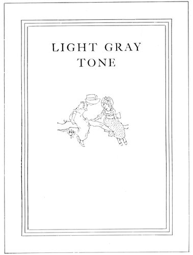
Assuming that a cover-page is to be designed and that ornament A has been selected for use on the page, a rule border is chosen with triple lines approximating the strength of those in the ornament. (Example 34.) The lines are very thin, and white space is a large factor in producing a tone that is light and dainty, in keeping with the subject of the illustration. A perfect result would be obtained with a type-face of very thin strokes, yet Caslon capitals, slightly separated to let in white space, give good results.
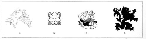
EXAMPLE 33 Four ornaments, each of a different depth of tone, used in the construction of the four pages shown as examples 34, 35, 36 and 37
49
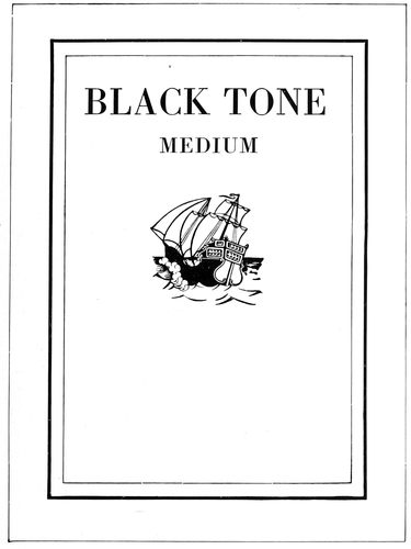
EXAMPLE 36
The ornament shown as B has been formed of lines darker than those used in the first ornament, and a mass of white forms a spot of contrast. Rules of the proper tone are selected and a border unit adopted that reflects the spot of white in the ornament. (Example 35.) Cheltenham capitals maintain the tone scheme. In this case, as in others, the type-face is a trifle stronger in tone than ornament and border. This is well. Type-lines on a cover are usually of more importance than the decoration.
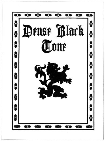
EXAMPLE 37
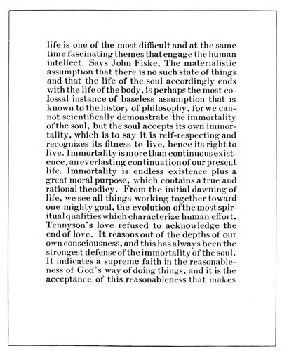
EXAMPLE 38. Dark tone—solid
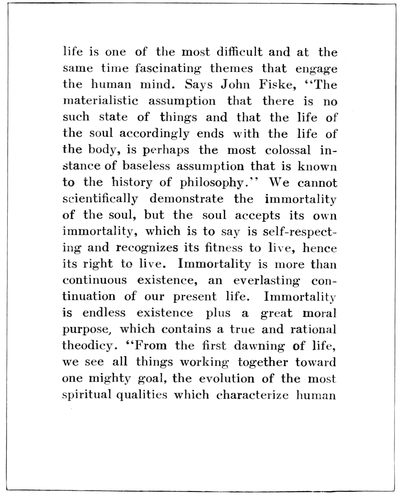
EXAMPLE 39. Light tone—spaced Two extremes of tone on book pages. The same type-face is used on both pages; the spacing between words and lines alters the tone
50
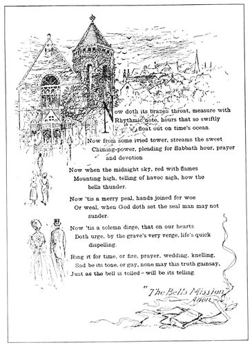
EXAMPLE 40 A page by J. H. Kehler, in which illustration and text are blended in uniform tone
Ornament C differs from ornament A in that it is composed of light lines contrasted with solid blacks. A border is made of a light line and a dark one, and the Bodoni type-face, containing light and heavy strokes in contrast with a white background, assists in producing a decidedly pleasing medium black tone (Example 36).
This combination of ornament, type and rule demonstrates there is considerable tone beauty in a well-selected contrast of light and dark lines when set off by liberal white space between lines and in the background.
The dense black tone of ornament D is duplicated in the dark-line border filled with black decorative units (Example 37). The black-printing Chaucer Text reflects not only the tone but the decorative characteristics of ornament and border. The tone of this example approximates that of the German page (Example 32).
These four examples afford an interesting study in uniform tone.
As the tone or depth of color increases from the light gray of Example 34 to the dense black of Example 37, it will be observed that the contrast between the print and the paper background also increases. This leads to the subject of contrast. What amount of contrast is needed on the ideal job of printing? There is conflict between art and utility on this question, but there need be none. Art demands that the print be a part of the paper upon which it is impressed, much as the plant is a part of the earth in which its roots are buried, and utility demands that the print shall be strong and clear that reading may be made easy. The artist-printer lessens the contrast between print and paper by printing with gray ink on gray stock, brown ink on light brown stock, and so forth. The utility printer gets the maximum of contrast by printing with black ink on white stock. As printing is both art and business some compromise must be made, and it is this: On two-color printing have all reading matter in the stronger color and subdue the color of the decoration so that the contrast between the paper and the print of the reading portion of the page is softened by this intermediate tone. Black print on white paper is made artistic by impressing the print firmly on antique paper. This roots the print to the paper, and the result is more idealistic than that presented by the print daintily set upon the surface of glossy, enameled papers.
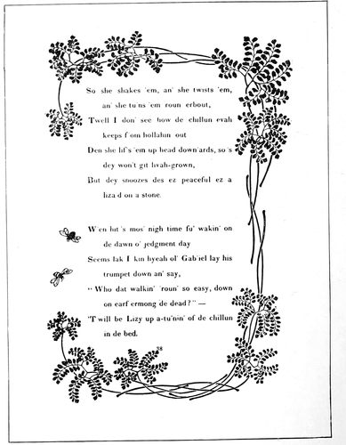
EXAMPLE 41 The spotted black tone of the border is reflected in the treatment of the text. The tone is made uniform by printing the border in a light color. Page by University Press, Cambridge
Lack of artistic feeling among typographers and customers is responsible for unpleasant contrasts in tone. A dense black illustration or initial will be set in a page of light gray reading matter, or type of black tone will be used on a page with an illustration of light lines. Great contrast in any detail of typography is not art but eccentricity; this statement may be made plain by a comparison. One winter’s day when the conventional folk of New York were wearing clothing of a somber hue, they were startled by the appearance among them of Mark Twain in a suit of white. Six months later the humorist’s garb would have excited no comment, but the black clothed mass of humanity around him emphasized the whiteness of his attire, and the conspicuousness thus produced separated him from his surroundings and made him an object of curiosity. Such things are done by great men to show their disregard for custom and by others because they are foolish or are advertising something; but it is common-sense right from Cervantes to do when in Rome as the Romans do (meaning that printed work which both attracts and repels by its gaudy, unconventional appearance is not nearly so good or desirable as the more conventional printed work which 51tastefully and quietly presents its message in subdued tones). One man will become widely known because he has dived from a big bridge or gone over Niagara Falls; another because he has painted a great picture or modeled a great statue. The one thrills, the other impresses. It may be easier to produce typography which attracts attention by contrast, but such results do not bring the lasting satisfaction that comes from typography thoughtfully and artistically designed.
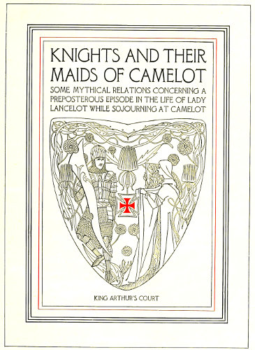
EXAMPLE 44 A study in uniformity of tone as found in combinations of type and decoration
EXAMPLE 42 The tone of the illustration and type-face is here blended. Card by School of Printing, Boston, Mass.
Several other points are suggested by Examples 34 to 37. A page for a cover should be of darker tone than a page to be used as a title inside the book; this where the body-type of the inside pages is of the customary gray tone. A cover placed upon a book to protect it suggests strength, and the typography of the cover should conform to this suggestion. The reason for the uniform tone presented by each of the four examples above mentioned is another important point. Were the border darker than the ornament and type lines, the ornament darker than the border and type lines, or the type lines darker than the ornament and border, there would not be uniformity of tone, and a consequent loss in the effectiveness that comes from tone harmony.
The tone of a massed page is of vital importance in the typography of a book, and a happy medium is somewhere between the under-spaced black type-page of Morris and the over-spaced hair-line type-page against which the Morris page was a protest. Examples 38 and 39 show the manner in which the tone of a page may be controlled by spacing. In Example 38 the page is moderately spaced between words and lines and in Example 39 the page is liberally spaced, presenting two extremes and vividly picturing the manner in which spacing influences the page tone.
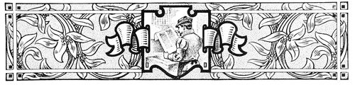
The tone of the pen-and-ink outline illustration in Example 40 is admirably duplicated in the typographical treatment accorded the page. The result would not have been so satisfactory if there had been no quad lines to break the solidity of the page.
The spotted black tone of the decorative border in Example 41 is reflected in the typography of the page, a result obtained by using a bold-faced body-type and separating the words with a liberal amount of space. However, the tone would not be equal printed in one color, but by printing the border in a lighter color the tones are equalized. Here is a suggestion for obtaining even tones. Where one portion of the page is bolder than the other, print it in a lighter shade of ink, or if any part of a type-page must be printed in a lighter color, set that part in a type-face of darker tone (Example 47).
Job printers should be interested in Example 42, as it is a good presentation of the theory of uniform tone. The effect of the open-line illustration is duplicated in the spaced Jenson capitals and cross lines. The result would have been even better had the small groups on both sides of the illustration been slightly letterspaced and the line at the bottom spaced less.
Example 43, on the insert, is a classic interpretation of uniform tone. The architectural design is formed of lines about the same strength as the strokes of the type-face and the massed capital letters admit sufficient light to give them a tone near to that of the open-spaced border.
Example 44 (insert) is a pleasing blend of tone and characteristics. The delicate light-gray tone of the Camelot type-face is closely matched in the decoration and border, and altogether this is an almost perfect exemplification of the subject of this chapter. It is seldom that an artist so carefully considers the characteristics of a type-face and reproduces these characteristics in so admirable a manner as was done in this instance.
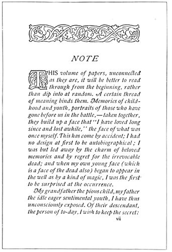
EXAMPLE 45 In which the tone of the initial and headpiece is lightened to near that of the text portion. Page by Heintzemann Press, Boston
Initials and headpieces should approach closely the tone of the type-page of which they are parts. Example 45 shows such a combination, with the tone of the decoration just a trifle darker than that of the text portion. An initial has other duties to perform than merely to look pretty; it must direct the eye to the beginning of the reading matter. In the manuscript books of the Middle Ages, written without paragraphs, the starting point of a new thought was denoted by an initial more or less elaborate. The utilitarian purpose thus served by the initial 52is reason for making it a trifle darker than the remainder of the page. However, if there is great contrast in tone, the page will be difficult to read because of the initial claiming too much attention. The effect would be much like attempting to listen to one speaker while another is calling and beckoning.
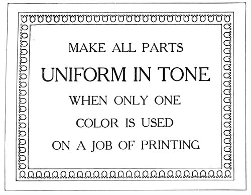
EXAMPLE 46
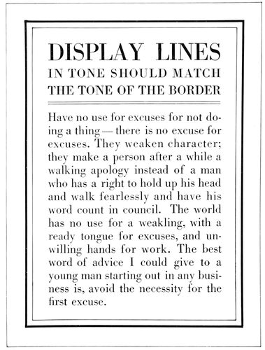
EXAMPLE 48 Display lines in tone should match the border
Every rule has its exception and I wish to record one in the matter of uniform tone. On a page composed of display lines and a large amount of reading matter it is an offense against legibility to set the reading matter in a type-face of black tone to correspond with the display lines, considerable contrast being necessary in such cases to make reading easy. (Example 48.) Notwithstanding this exception in the case of reading matter, uniform tone should be retained between display lines and border.
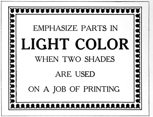
EXAMPLE 47
If a catalog is illustrated (and the majority are) it is important to have the illustrations prominent on the page, sacrificing tone to utility if necessary. Sometimes the illustrations are printed in dense black and the remainder of the page in gray or brown. While this causes the illustrations to stand out in relief—an important point when machinery is depicted—it should not be forgotten that the type matter must be read.
In advertising composition it is seldom possible to have an even tone on the entire page. The New York Herald advertising pages are unique in this respect. Outline type-faces are used, and all illustrations are redrawn in outline before they are published. This serves to give a uniformly gray tone to the pages, but the advertisers are not enthusiastic over the effects. While other newspapers may not be able to maintain uniform page tone, it is possible at least to have each advertisement present a tone uniform in its displayed parts and border, and the good typographer will secure such effects. The gray shaded type-faces now available should enable printers and publishers to obtain tone uniformity where gray effects are desired and large type sizes used.
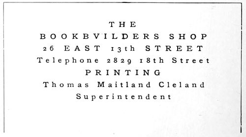
EXAMPLE 49 Equal spacing is necessary to obtain uniform tone
Irregular letterspacing has been the cause of many pages of unsatisfactory tone. In a displayed page where one line is spaced between letters, all lines should be similarly spaced. Example 49 presents a decidedly unconventional letterhead by reason of the letterspacing, and it illustrates the point that all lines should be spaced equally. It may be well to warn job compositors inclined to imitate the style of this heading that there are few customers who would concede any merit to such an arrangement, and it should be used sparingly. Unconventional treatment, even tho good along the lines of the style chosen, is not always appreciated.
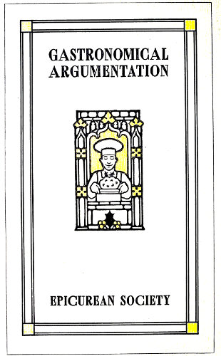
EXAMPLE 58 In which the ornament, the border and the type-face are in proportion
53
PROPORTION, BALANCE AND SPACING
Symmetry is necessary to beauty. This law of esthetics is as applicable to typography as to sculpture and architecture. Proportion and balance—the things that make for symmetry in typography—are obtained only by giving the work more attention than seems necessary to the average producer and buyer of printing.
Why should the printer worry about esthetics—about symmetry? What has art to do with printing, anyway? Questions such as these find too frequent voice in the printing trade, coming from the employee whose interest and ambitions end when he “gets the scale,” and the employer who is satisfied merely to deliver so many pounds of paper and ounces of ink for so much money. Pity the man whose work is drudgery and who denies that art and beauty are meant for him. He has his antithesis in the man who, appreciating the higher blessings, neglects to give value to the more common and practical things.
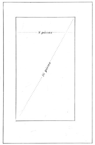
EXAMPLE 50 One method of determining the page length. The page should measure diagonally twice its width
There have always been two opposing classes—in religion, politics, art, music, business. On all questions one portion of humanity is “for” and the other “against,” mostly because of the influence of environment upon tastes and interests. Mozart’s and Beethoven’s music charms and enthuses and also lulls to sleep. One class should try to understand the other. Each has good reasons for its preferences, but none at all for its prejudices. The painter Rubens, gathering inspiration in the courts of royalty, portrayed luxury and magnificence. Millet, painting in a barn, pictured poverty, sorrow and dulled minds. What pleased one found little sympathy in the other. During the Middle Ages learned men talked, wrote and thought in Latin, and when it was proposed to translate the Scriptures into the language of the masses these men held up their hands in horror.
Not so many years ago the book printer looked upon the job printer as the Roman patrician looked upon the plebeian, but the job printer has absorbed dignity and typographic taste from the book printer. While the book printer’s highest ideal is a volume with uncut leaves ornamenting the book shelves of the collector, the job printer’s mission is to be all things to all men. He prints the refined announcements of art schools one day and another day finds him placing wood type to tell the story of a rural sale of articles “too numerous to mention.”
There should be more sympathy between the book printer and the job printer, and also between the printer who regards his calling as a business and the printer who regards it as an art. The employer and employee who consider printing only a means to an end and that end money, are as near right and as near wrong as they who produce art printing for art’s sake and forget the pay envelop and the customer’s check. The first starve their souls, the last their bodies.
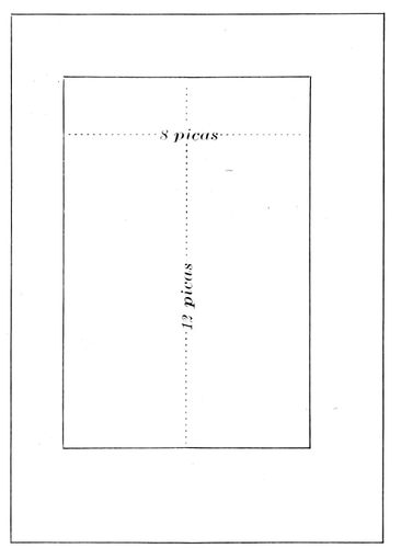
EXAMPLE 51 Another method of determining the page length. The length of the page should measure fifty per cent more than its width. These examples also present proportionate margins, the foot margin in each instance being the largest
The printer who does things artistically in an economical manner “strikes twelve” (in the slang of Elbert Hubbard). Printing need not be shorn of beauty to be profitable to both printer and customer, tho beauty too conspicuous turns attention from the real purpose of the printed job—which, in the case of a booklet, is the message the words convey. An equestrian statue of Napoleon should feature the great conqueror, not the horse, but would be impossible with the horse left out.
Art is essential to printing; so are Uncle Sam’s specimens of steel engraving. The more art the printer absorbs the larger should grow his collection of these engravings. Study of art arouses ambition; ambition brings better and harder work. It reveals in the typographer the difference between mere lead-lifting and the artistic selection and arrangement of types. The boy who sweeps the floor and does his best is nearer art-heaven than he who sets type and cares not how he does it.
The printer who determines to learn about art—who 54makes continued effort to find the reason why one man’s work is good and another’s is not, will be surprised and gratified at the new world that unfolds itself as he studies. He will find that altho having eyes, he has really seen only as he has appreciated. There is no easy road to the appreciation of the beautiful. Art does not consist merely of a set of rules to be observed; there are few beacon lights placed by those who have trod the road. Beyond a certain point the novice must depend upon intuition or “feeling.” Great painters have been asked their method of producing masterpieces, and have been unable to explain.
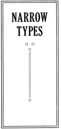
EXAMPLE 53 In which vertical lines predominate
In introducing the subject of “Proportion” it is well first to dispose of book pages. In olden times the sizes of books were known by the number of folds to a sheet of paper about 18 × 24 inches. A book made from such sheets, folded once into two leaves, was known as a folio volume and measured about 12 × 18 inches. Folded twice into four leaves, a quarto, measuring 9 × 12 inches. Folded three times into eight leaves, an octavo, measuring 6 × 9 inches. Paper is now made in a variety of sizes, which allow of individual preferences being satisfied. For the sizes of catalogs 9 × 12 and 6 × 9 are becoming standard. The sizes do not depart far from the rule of proportion which holds that the width of the page should be two-thirds its length.
Examples 50 and 51 illustrate two widely-used methods of determining page lengths. By the first method (Example 50) the page should measure diagonally twice its width. In this instance the width being eight picas, the diagonal measurement is sixteen picas. By the second method the length of the page should measure fifty per cent more than its width. Here the width being eight picas, the length is twelve picas. These measurements may or may not include the running titles or folios.
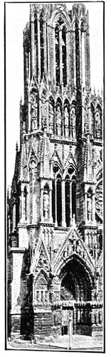
EXAMPLE 54 Compare with Example 53
If only small margins are possible, the page (exclusive of running title) should be about centered, with a slight inclination toward the head and back. But when margins are reasonably ample the page should set liberally toward the head and back; the margins of the head and back (exclusive of the running title) should be about the same, the outer side margin should be fifty per cent more than the back margin, and the foot margin one hundred per cent more than the back margin. Various explanations of this rule have been put forward, a few of which are: The old book-owner making marginal notations as he read, needed wide margins for the purpose. Early manuscript books were bound on wood, and this wood was extended at the foot and used to hold the book when reading. Two pages being exposed to view were treated as one page, much as double columns are now treated. As book illuminators required room for their handiwork the margins may have thus originated. The principal reason why we should observe such margins is that the arrangement has the sanction of long usage and the approval of the best bookmakers since books were written.
The job printer, it is reasonable to suppose, is more interested in proportion as it refers to display typography. He asks: What relation has type, in the shape of its face, to the page of which it is a part? And the answer is: A type-face should conform in the proportion of its letters to the proportion of the page. Let us thoroly understand this. In Example 52 there are shown three widths of type—condensed, medium and extended. The type of medium width is more used than the condensed or extended kind, and most pages have a proportion such as Example 55. From viewpoints of both economy and art, the type-face of medium width should be given preference when selecting type equipment. Condensed types are properly proportioned for use as headings in the narrow columns of newspapers and for narrow folders and booklets.
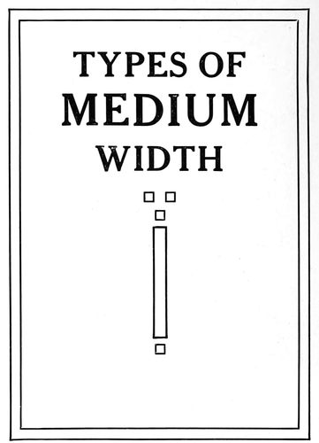
EXAMPLE 55 The conventional page shape, with type and ornament in proportion
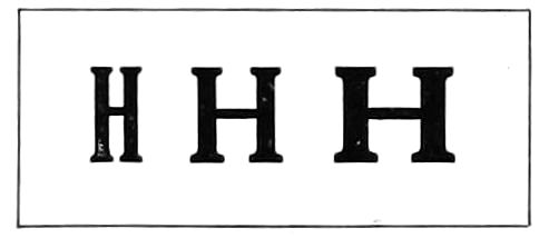
EXAMPLE 52 Three widths of type-faces
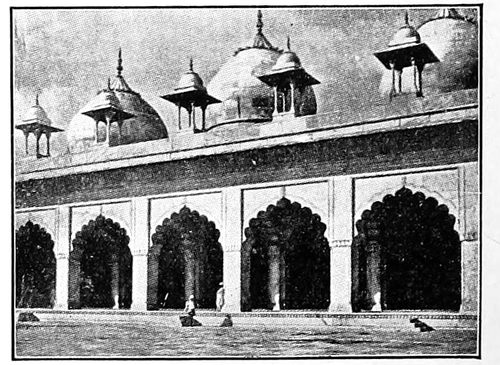
EXAMPLE 57 Compare with Example 56
Many of the laws that are necessary to good typography also govern the other arts. As an instance, in architecture it is requisite that a tall and narrow building contain a preponderance of vertical lines, a feature most noticeable in church buildings of Gothic style (Example 54). Because the extent of vertical lines is greater than that of horizontal ones in a condensed type-face, such a face is proper for a long and narrow page (Example 53). The proportion of page shown by Example 55 is about that met with most frequently in printing production. Here the vertical lines are in a slight majority, but it is interesting to observe that in Example 56 where the page is more wide than long, horizontal lines are more numerous than vertical ones.
55
EXAMPLE 56 In which horizontal lines predominate
It is not always possible to follow out in every detail the requirements of proportion. Architects must sacrifice much in the interests of utility and in deference to the wishes of their clients. Printers must do likewise, but as a rule they travel farther from true art principles than do architects. Consider the contrasting proportions of the structures in Examples 54 and 57. In Example 54 notice that the openings have been made to conform to the general proportions, and that vertical lines have been multiplied to emphasize narrowness and hight. As a contrast, in Example 57 observe the width of the openings; how it blends with the general proportion of this structure. Now to ascertain that typography parallels architecture compare Example 53 with 54, and 56 with 57.
EXAMPLE 59
EXAMPLE 60 The type-faces of these two examples are not in proportion with the pages
An exaggerated idea of the relation of lines to proportion is furnished by Examples 62 (see insert) and 63. The vertical lines of Example 62 run with the length of the page as smoothly as a canoe floating down stream. The horizontal lines of Example 63 are irritating in their disregard of proportion. For the eye to take in at a glance both the page lines running vertically and the rules running horizontally is as difficult as watching a three-ring circus. Examples 59 and 60 also illustrate this point.
I have prepared in Example 58 (see insert) a page in which not only are ornament, type-face and page-design in proportion, but the characteristics of the ornament are reflected in the border, and the tone is uniform.
Irregularity of form is valuable in breaking monotony, and in some forms of art may be essential, but as contained in Example 61 this feature is inharmonious. Before experimenting with variety or becoming agitated about monotony the typographer should perfect himself in the things that make for regularity. When he learns to set a page that is harmonious and in proportion then it may be well to introduce irregularity—in homeopathic doses.
There is much uncertainty manifested among typographers as to the proportionate strength of display lines on a page. A type line is proportionately large or small as it contrasts with its environment. Gulliver was a giant when among pigmies. The foremost citizen of a country town is considerably reduced in importance when he rubs elbows with the big men of the cities. The homely adage that “a big frog in a small puddle is a small frog in a big puddle,” is applicable to typography. A display line surrounded by other type lines (Example 64) must be made larger or by strengthened strokes made bolder than when alone on the page (Example 65). The old City Hall in New York is claimed to be the most beautiful work of architecture in the city, but is ridiculously out of proportion with the towering office buildings surrounding it.
EXAMPLE 63 Horizontal lines are not suitable for a vertically narrow page (See Example 62, insert)
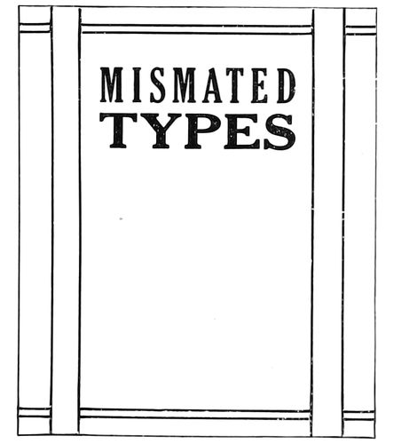
EXAMPLE 61 Type-faces and borders are mismated
Examples 66, 67 and 68 are studies in the proportion of a type-face to the page of which it is a part. In Example 66 the page is largely covered with type, treatment that is necessary on poster, dodger and other printed matter that must force its presence upon the public. In Example 67 the page consists mostly of blank space, the type standing modestly 56and apologetically in the midst of that space. This treatment is proper on dainty works of poetry or when the demands of extreme refinement are to be satisfied. Example 68 is the “happy medium,” the compromise—a strength of display that will be satisfactory in almost every case. This method of arriving at correct treatment emphasizes the need in the typographer of a judicial as well as an artistic temperament. The wise judge knows that truth is about midway between the claims of opposing counsel.
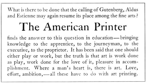
EXAMPLE 64
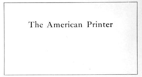
EXAMPLE 65 A display line surrounded by other type lines must be made larger than when alone on the page, to obtain proportionate emphasis
Balance is another important subject, as it has a big share in making typography good or bad. The builder works with plumb-line and spirit-level that his walls may be in perfect balance, tho sometimes he is tempted, as the printer is tempted, to work away from the center of gravity. In Italy there is a building, an architectural curiosity—the leaning tower of Pisa (Example 73) in the construction of which gravity has been defied to the limit, and in Canada only recently a bridge in course of construction on this gravity-defying principle, fell in a mass into the river. In typography, safety from blunder lies in type lines horizontally centered. Typographic experts experimenting with out-of-the-center balance, both succeed and fail. Compositors imitating them generally fail. Example 76 is an out-of-the-center arrangement that is fairly successful. Balance is saved by the type-lines in the upper left corner and by the border surrounding the page. Examples 69 and 75 show out-of-center balance adapted to a business card and a booklet cover.
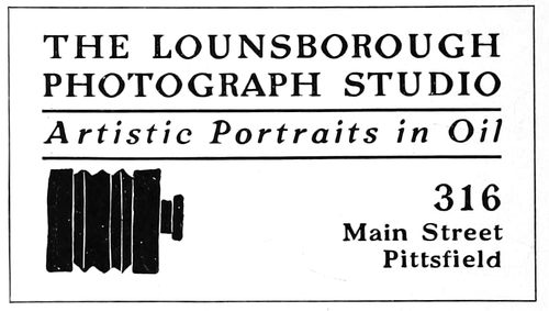
EXAMPLE 69 Out-of-center balance, adapted to a business card
While horizontally the center is the point of perfect balance, vertically it is not. Stick a pin thru the very center of an oblong piece of cardboard and twirl the card; when movement ceases the card may not hang uprightly. Mark off the card in three equal sections and stick the pin thru the horizontal center of the line separating the upper two thirds. After being twirled the card will cease to move in a perfectly upright position. Example 71 shows a word placed in exact center, yet it appears to be low. Example 72 shows a line above center at the point of vertical balance. On a title-page, business card, and on most jobs of printing 57the weight should come at this point. The principal line, or group, should provide strength necessary to give balance. Example 70 presents a page with type group and ornament placed unusually high. The typographer responsible was undoubtedly testing balance to the limit.
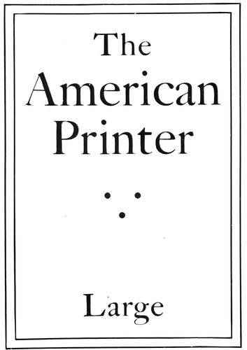
EXAMPLE 66 Type proportionately too large for the average page
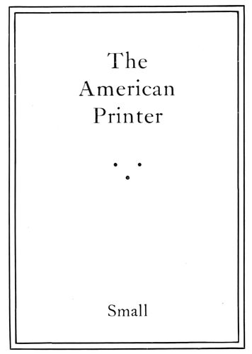
EXAMPLE 67 Type proportionately too small for the average page
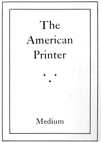
EXAMPLE 68 This proportion is about right for the average page
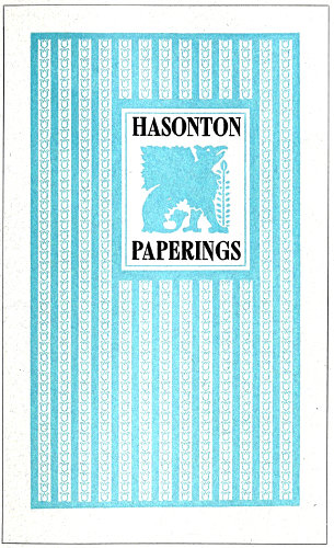
EXAMPLE 62 In which the lines of the design run in the proper direction. Arranged by Will Bradley
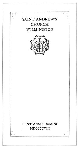
EXAMPLE 70 In which the upper type group is unusually high. Page by D. B. Updike
Sometimes the customer gets a notion he wants a type-line placed diagonally across the page in a manner like Example 74. Such arrangements generally show lack of imagination and are crudely freakish. There are so many orderly ways of arranging type that such poorly balanced specimens are deplorable.
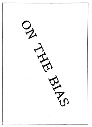
EXAMPLE 74 A disorderly arrangement
Spacing is seemingly one of the little things—merely incidental to the mechanical practice of typography. When the apprentice compositor is told to divide his spaces evenly among all the words in a line; not to thin space one line and double-thick space another; to transpose a two-point lead, or make some other what to him may appear to be trivial alteration in spacing, he judges his instructor to be over-particular. Yet the proper apportionment of space on a page determines the tone and the balance and aids in giving proportion and emphasis.
In type-making, when a font of type is designed, not only is each letter considered separately, but in combination with every other letter of the alphabet, that when the letters are assembled into words space may be evenly distributed. The designers of the best type-faces have given attention to this feature and have demonstrated that legibility is increased with proper space distribution. Because of the excessive open space it contains, the capital L gives the most trouble of any letter used as an initial. As part of the word “Millinery” the irregularity of spacing is particularly prominent (Example 79-a). Partly to overcome this irregularity the companion letters should be spaced as shown in 79-b. When the letters A T occur together, and the space between them should be decreased, it is necessary to file the metal in the upper right of the type A and the metal in the lower left of the type T.
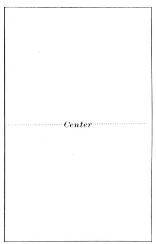
EXAMPLE 71 A word placed in exact center appears to be low
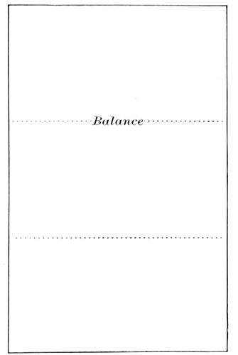
EXAMPLE 72 Showing the point of vertical balance
With roman type-faces, important words are usually emphasized by italics or small capitals. The Germans, using for body purposes a text letter which has no italic or small capitals, space the letters to get emphasis (Example 80-a). Letter-spaced words thus used are perhaps as neat as italic, and the idea may well be adapted to roman types (Example 80-b).
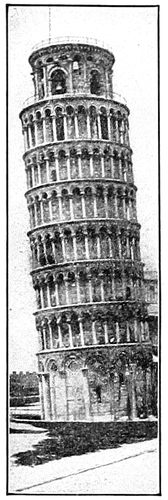
EXAMPLE 73 Balance out of center
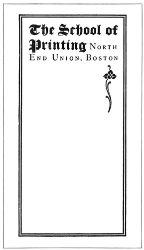
EXAMPLE 75 The ornament balances the design. Page by School of Printing, Boston
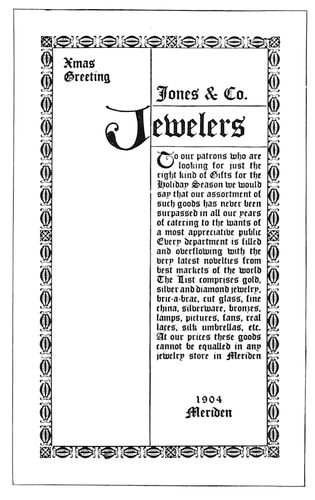
EXAMPLE 76 Out-of-center balance. Page by Will Bradley
The relation of lines to proportion, 58as illustrated by Examples 62 and 63, is also to be considered in the composition of plain reading pages. Example 77 shows how the effect of horizontal lines is given by narrow spacing between the words and wide spacing between the lines. This gives a result, like that of Example 63, contrary to the principles of proportion. How this may be overcome is illustrated in Example 78, which contains the same amount of space between the words as is between the lines. This treatment not only gives better proportion, but improves the tone of the page.
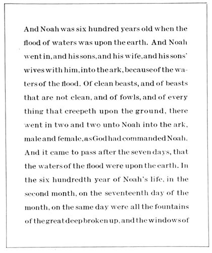
EXAMPLE 77 The effect of horizontal lines is given by narrow spacing between the words and wide spacing between the lines
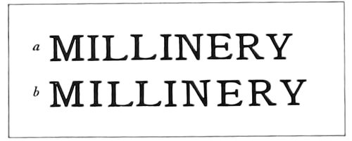
EXAMPLE 79 Other letters must be spaced because of the open appearance of the letter “L”
EXAMPLE 81 The erroneous and obsolete practice of spreading the lines over the page
Adapting this principle to display composition, Examples 81 and 82 are enlightening. Example 81 shows the manner in which some years ago display lines were erroneously distributed over the entire page, presenting in effect the faults of Example 77. The manner of rectifying these faults is demonstrated in Example 82, where main lines are grouped at the point of balance in the upper part of the page.
The narrow measure to which these words are set necessitates letterspacing. The resulting appearance is far from satisfactory yet it enables illustrations to be grouped pleasingly and makes possible a squaring of the pages which could not be done otherwise.
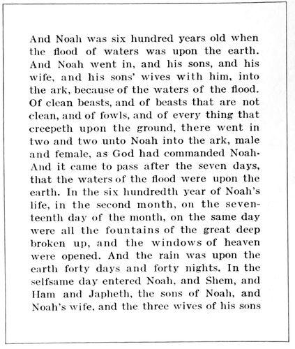
EXAMPLE 78 The effect of horizontal lines is avoided by having the space between the words approximate that between the lines
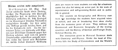
EXAMPLE 80 Emphasis obtained by letterspacing, in lieu of italics and small capitals
EXAMPLE 82 The correct modern practice of grouping the lines at the point of balance
It is not always that results are as perfect as we desire them. In New England there is a printer who, in the opinion of those fortunate to have viewed his work, is producing typography classically perfect; yet this man goes from his work at the close of the day almost discouraged because of the faults that are evident to his trained eye. The artist’s ideal always eludes him and the chase seems a hopeless one, yet he continues on lest he lose sight of it altogether. It is a good sign when one recognizes imperfections; it means that he is gaining ground on success.
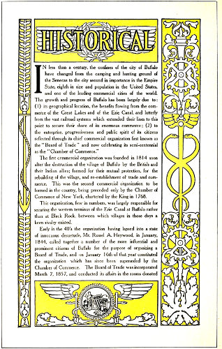
EXAMPLE 125 Illustrating the significance of ornamentation, as applied to a booklet. Design by the Matthews-Northrup Works, Buffalo, N. Y.
59
ORNAMENTATION
Offer a child the choice of two toys, alike excepting that one has a flower painted upon it, and he will doubtlessly select the ornamented one; proving that the human race has a natural liking for ornamentation. When the old-time trader visited savage countries, he took with him colored glass and brought back gold. The glass soon after ornamented the somber bodies of the savages, and the gold became rings and bracelets worn by the whites. There are those in this day who love the trees and the flowers and hear music in the brooks, but more find pleasure in artificially ornamented ball-rooms with music blown and sawn and hammered from brass and catgut and sheepskin.

EXAMPLE 83 The egg-and-dart ornament

EXAMPLE 84 The bead ornament
Man was created in a garden of flowers and trees pleasant to the sight, yet he has ever been yearning for a new Eden of pure gold, garnished with precious stones, forgetting that Solomon in all his glory was not arrayed like the lily of the field. Nature is the great artist, and man’s ornamentation at best is a poor imitation of natural things. The trees of the forest gave the motive for the stone columns and ornamental capitals of architecture, and the plant and animal world furnished themes for talented calligraphers in the days when books were literally written. The blue vault of the skies inspired Michelangelo to plan the great dome of St. Peter’s at Rome, as the sun furnished a model for the Indian while decorating his tepee, and the flowers of the field have provided inexhaustible color harmonies.
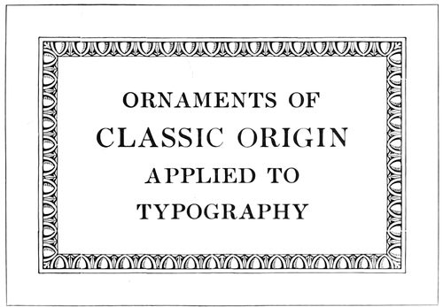
EXAMPLE 85 The egg-and-dart ornament as a typographic border
In the early days of this country most of the inhabitants devoted their working hours to the struggle for existence, and it has been only within recent years that the average man has given thought to art. Many a one has thrown off his lethargy to discover beautiful things all about which he had never before noticed.
Art galleries and libraries all over the United States are aiding greatly in the cultivation of taste for art, and the printer to whom these privileges are accessible, yet who does not avail himself of their advantages, is much like the man who was lost in the Adirondacks, not knowing he was but a half-mile from a railroad. China, who could conquer the world if she only knew her power, has been sleeping for centuries, while a little handful of intelligent people on a small island of Europe wields an influence that is felt wherever the sun shines.
EXAMPLE 86 The bead ornament as a typographic border
The printer and he of an allied vocation should take less thought of food and raiment and devote more thought to learning the things of today and yesterday with which he may be but little acquainted. If one knows just enough to “make a living” he will never make more than a living. A study of art, of history, of the larger things in the printing business, will result in the good things of the earth being added.
Is ornamentation necessary to art-typography? Ask one good printer and he will answer, yes. Ask another and he will answer, no. One of the meanings of ornament as given by the Standard dictionary is: “A part or an addition that contributes to the beauty or elegance of a thing.” A paper may be so pleasing in texture as to give beauty or elegance to an otherwise plain page of 60printing; in fact, it is sometimes a mistake to use type ornaments or other embellishment on a richly finished hand-made paper. On the contrary, a stock poor in quality or color had better be covered with decoration to divert attention from the paper.

EXAMPLE 87 Conventionalized papyrus plant (Egyptian)
EXAMPLE 88 The winged ball, an ornament much used by the Egyptians
EXAMPLE 89 The acanthus leaf, much used by the Greeks and Romans in ornamentation
EXAMPLE 90 Palm-like ornament, used by Greeks and Romans
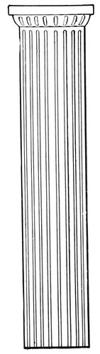
EXAMPLE 91 Plain and dignified. The Doric pillar
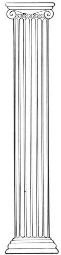
EXAMPLE 92 Slightly ornamental. The Ionic pillar
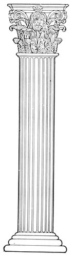
EXAMPLE 93 Elaborately ornamental. The Corinthian pillar
There are printshops in which all ornaments are kept under lock and key; a compositor wishing to use decoration must present good reasons before he gets it. Customers have become suspicious of type ornamentation because of the peculiar use to which printers sometimes put it. A young man some years ago became possessed of a desire to do artistic printing and had a number of type ornaments purchased with which to express his ideas. When one proof after another came from the customer with ominous blue marks upon the cherished ornaments, he realized the necessity of revising his ideas of art. For fully a year after that he worked without voluntarily using an ornament, meanwhile developing all the possibilities of good type-faces and appropriate paper stocks and color combinations. It has been claimed that fasting has a beneficial effect on the body; be that as it may, our friend certainly improved his artistic taste by his abstinence. When he again began using ornaments it was with discrimination and after study of their significance and appropriateness.
This leads to the subject of motive or reason in ornamentation. The styles of typography may be generally divided into two classes, one dominated by Roman or Italian influence and the other by Gothic or German influence. During the Middle Ages the Gothic influence was felt chiefly because the pointed style of architecture and embellishment was sanctioned by the Christian church. As art was practically dead outside the church, the art-workers absorbed the Gothic style.
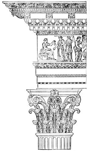
EXAMPLE 94 Ornamentation as used by the Romans on an entablature and a Corinthian pillar, showing egg-and-dart, bead, and acanthus ornaments
When typography was invented Gutenberg’s first book was based upon the Gothic style—the type-face a pointed black letter, such as was then used on manuscript books, and the ornamentation pointed foliage (done by hand). It was some years after this that typography came under the influence of the Italian Renaissance, and both type-faces and decoration assumed the Roman style. In the old days there was sympathy between the various arts and crafts, and it worked for harmony in effects. Building-decoration, metal-carving and wood-engraving were governed by the same artistic motive, and were often done by the same man, much as the printer at one time was compositor, pressman, binder, typefounder, ink-maker and paper-maker, all in one. Now, many a piece of printing goes wrong because the ideas of several people, inharmonious from lack of relation, are injected into the work during the several stages necessary for its production.
The relation of typography to architecture is plainly shown in the formation of the Roman and Gothic alphabets. The letters of the Roman alphabet, dignified in their straight strokes and symmetrical in their rounded lines, suggest features of Roman architecture (Example 106; also see Example 43 of a previous article). In the interesting picturesqueness of the pointed black Gothic letter may be seen reflections of the graceful arches of the cathedral pointing upward like hands in prayer—and of the pointed leaf ornamentation of the Gothic period. (Example 107.)
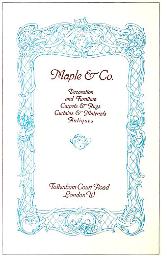
EXAMPLE 98 Dainty, elaborate rococo ornament, as applied to a program title-page. Compare with the chair, Example 97
61Ornamentation is both inventive and imitative. An ornament purely inventive or one purely imitative is seldom artistic. A child may make a jumble of lines that altho original means nothing; when it is older it may draw a flower so realistic and imitative that little is left to the imagination. When a flower or plant is used as a model in designing an ornament it is “conventionalized,” that is, it is blended with its environment. A flower in a garden surrounded by other vegetation should be as the other flowers, but as an ornament on the flat surface of paper it should be without perspective. Example 108-a shows how commonplace an ornament looks when its details are carefully shaded in perspective. Examples 108-b and 108-c show how more decorative an ornament is when either outlined or filled in. Sometimes shadows are merely suggested, as on the fruit basket and book ornaments in Example 113.
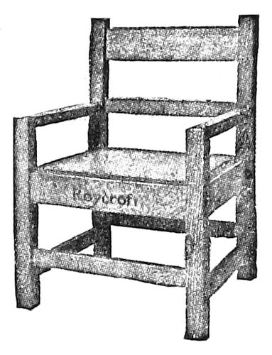
EXAMPLE 95 Square-lined, ornamentless furniture
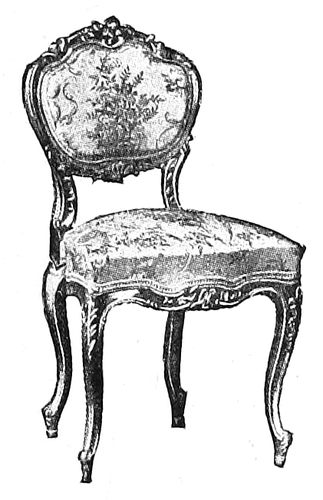
EXAMPLE 97 Dainty and elaborate rococo ornament, as applied to furniture. Compare Example 98
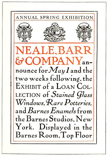
EXAMPLE 100 Slightly ornamental typography. Compare with chair opposite. Design by Will Bradley
In the conventionalized decorative art of all ages may be found traces of the things which have inspired the decorator. The lotus leaf, and the papyrus plant (which once gave writing material to the world) thousands of years ago influenced Egyptian design (Example 87). Religion dictated many of the decorative forms in ancient art. The winged-ball-and-asps (Example 88) was a favorite device in Egyptian decoration and has come to us by way of Roman mythology as the winged staff of the herald Mercury, the ribbons on the staff supplanting the Egyptian asps, but later evolving into serpents as in the decorative border of Example 125. The work of the best artists is full of meaning. The Egyptians considered certain animals sacred, and they were reproduced numerously in the picture-writing and ornamentation of the time. The sacred beetle as conventionalized was much used. In Example 125 the cog-wheel of commerce is conventionalized as the rim of the ball, which also contains a seal. The anchor and rope, hour glass, wreath, torch, acanthus leaves, all are conventionalized and blended pleasingly in outline drawing. The tone of the border approximates that of the type matter it surrounds.
EXAMPLE 96 Square-lined, ornamentless typography. Compare with chair opposite. Design by Fleming & Carnrick, New York
EXAMPLE 99 Slightly ornamental furniture
The acanthus leaf (Example 89) is the model for much of the elaborate leaf decoration found on the capitals of Corinthian columns and wherever rich imposing leaf ornament is desired. The anthemion (Example 90) is a palm-like ornament used by the Greeks and Romans, now frequently found in decorative work of an architectural nature.
It may not occur to the average printer that architecture is in any way allied with typography—that there is any connection between the ornamentation of a building and a job of printing. Fred W. Goudy, Bruce 62Rogers and D. B. Updike employ conventionalized architectural columns and arches to ornament title-pages of classic motives. The average typographer, tho, finds more inspiration in the ornamentation that is only an embellishment to architecture. There are several ornamental units that are used more frequently than others, and these are the egg-and-dart (Example 83) and the bead (Example 84). You, who are reading this, are invited to verify by observation this last statement. A printer who did so was astonished at the eggs, darts, and beads that were to be seen wherever he looked. Cut into the stone of buildings, carved into the wood of furniture, used on molding about doors and windows, on office partitions, on library lamps, in the ceiling panels of restaurants, about the prosceniums in theaters, around the mirror in the barber shop—wherever he looked there were the ornaments. It is remarkable how non-observant the average printer is. The hands of artists—Greeks and Romans—who lived thousands of years ago made similar designs, and yet a knowledge of history is counted non-essential by printers and others!