PART TWO (continued 3)
Reading edition
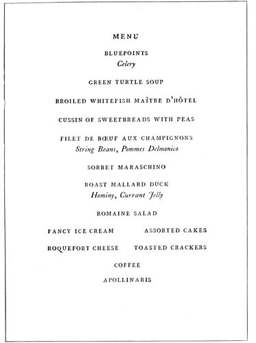
EXAMPLE 215 A classic menu page. Designed by D. B. Updike, Boston, Mass.
In the banquet program the printer has great opportunity to make use of his inventive faculties. No other kind of program allows of such varied treatment. There is no limit to the shapes, the type arrangements and the color treatments that are suitable for banquet programs. An association of leather merchants holds a dinner and the members may find beside their plates a program bound in a miniature hide, the sheets of the program attached by a leather thong.
Bankers meet and the program may be in the form of a checkbook.
For an athletic association an oval-shaped program suggesting a football will “score.”
Newspaper publishers will appreciate the menu list presented as a papier-mache matrix of the type form.
Commercial travelers would be pleased were their banquet programs designed in imitation of a mileage book.
A literary society dinner would be appropriately graced were the program printed on parchment and wound around a wooden or ivory rod, as “books” were bound in ancient times.
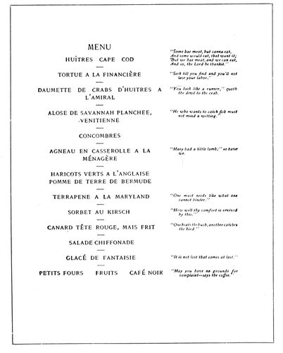
EXAMPLE 217 Dignified style for menu page. By the De Vinne Press, New York
Pyrography could be blended with typography in producing odd effects in banquet programs. One way of getting results by this method is to print the menu page on a piece of soft wood, say a quarter of an inch thick, and then, by means of the pyrographic writing tool, burn a decorative border around it. Type ornaments and borders could be printed on the wood as a guide for burning the designs.
Many effective menu forms could also be evolved with the assistance of the bookbinder. Pulp board covered with an artistic cover paper makes a handsome background for mounting the menu page, which should be printed on a harmonizing stock. Italian and Japanese hand-made papers are particularly suitable for such work, and when the style of typography is made to blend with the stock the effect is rich. Domestic manufacturers, too, make a large line of artistic papers applicable to the purpose.
Example 209.—This page is from a booklet program, and is companion to Example 125 inserted in a preceding chapter. It sets forth the value of the decorative border on programs. The arrangement of the type matter is the customary one. The minor dishes are set in small type, while the damp stuff from the wine cellar is represented at the left in rubricated text letters.
Example 210.—A halftoned decorative background in olive was a feature that lent value to this page, which is one of a number of similarly treated pages in a booklet program. The classic panel design makes a good background for a menu page. The idea is applicable in many other ways.
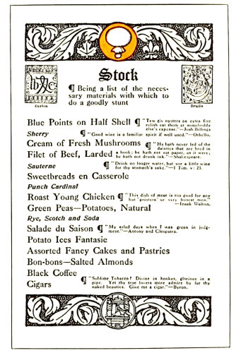
EXAMPLE 216 A menu program used by master printers. By Charles Edward Peabody, Toronto, Ont.
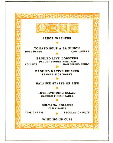
EXAMPLE 218 Treatment simulating woodcut decoration
Example 211.—This chapter would be incomplete without one or two Bradley specimens. Here is an 96idea in menu printing born while he was with the American Type Founders Company in 1905. It took the form of a small booklet 2¾ by 4¾ inches, eight pages and cover, and each page was devoted to one of the dishes on the menu. Below the name of the dish was a chap-book ornament. Altho the small booklet has been little used as a form for menu purposes, it has possibilities for development that should not be overlooked by the printer.
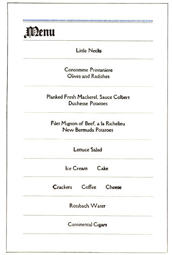
EXAMPLE 219 The missal style adapted to a menu program. By Will Bradley
Example 212.—Here is a novel banquet program. Each dish on the menu was presented in the form of a check on the “Printers’ Bank of Dyspepsia,” and the “bank” was ordered to pay to the order of the guest a portion of food or drink, in this instance oysters on the half-shell. The checks were signed by appropriate names, “A. Shellgame” in this instance. The entire lot of checks was bound in the customary checkbook style.
Example 213.—In this program the menu is termed “Hash” and the toasts “Rehash.” The treatment is unique, especially in the arrangement of the list of palate ticklers.
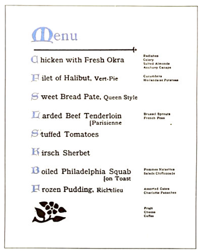
EXAMPLE 220 Unique treatment of a menu page in which the minor dishes are arranged at the right
Example 214 (Insert).—Suggested for a menu page in two colors. Banquets are occasions of gayety and enjoyment, and humor is appreciated. Displaying choice drinks prominently, and then in a note at the foot calling attention to the fact that they can be had at the bar at regular rates, is a bit of fun that has not been widely perpetrated. Typographically the page is refined, yet is sufficiently decorative to appeal to a large class of customers.
Example 215.—A classic menu page by Updike. Roman capitals and italic lower-case only are used. Perhaps this is the way Aldus would set the page were he alive today. The page as a mass is symmetrical.
Example 216.—This page is from a program used at a master printers’ banquet, all pages being treated in a style appropriately humorous. The word “Stock” tops the page instead of the usual “Menu.” “Make-up” heads the list of officers, and in this manner were the guests’ funny-bones agitated.
Example 217.—Here is a program for those accustomed to eat in a foreign language. The typographic treatment is refined and dignified, the roman capitals and the italic blending classically. Little side hits such as those to the right are always appreciated, especially when carefully selected.
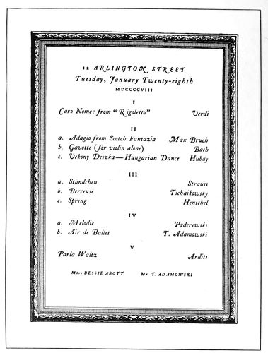
EXAMPLE 222 Refined entertainment program page. Design by D. B. Updike, Boston, Mass.
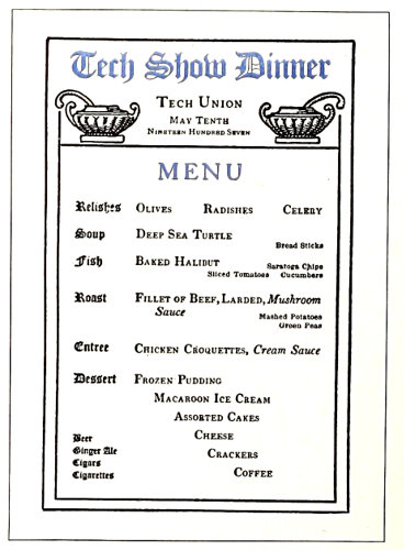
EXAMPLE 221 Excellent typographic treatment. By Harry Haime, Boston, Mass.
Example 218.—An artistic treatment simulating woodcut decoration suitable for many occasions is presented by this page. The four initial letters give the appearance of a decorative heading and blend well with the border. It is appropriate that capitals should be used thruout 97the page and that the type-face should be Old-Style Antique. The florets dividing the dishes distribute the color pleasingly. The fact that this program was used by an organization of mechanical engineers explains the queer wording of the list of good things to be eaten.
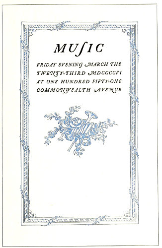
EXAMPLE 223
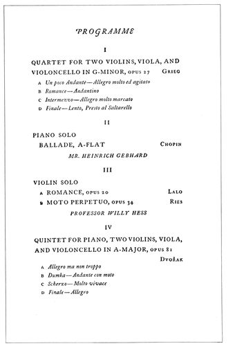
EXAMPLE 224 These two pages are from an entertainment program by Bruce Rogers, Cambridge, Mass., and furnish interesting material for study
Example 219.—Bradley suggests another good arrangement in this page. It is simply constructed, yet possesses interest and style. The original was in black and light-brown inks on buff antique stock.
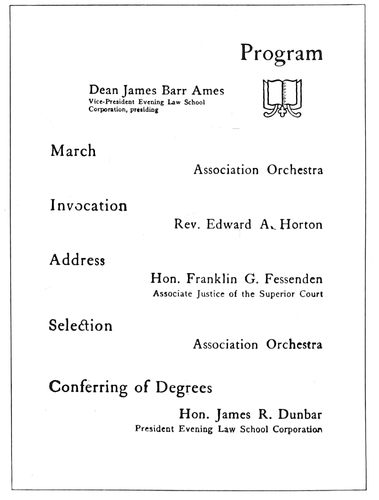
EXAMPLE 225 A program page in lower-case. By Stetson Press, Boston, Mass.
Example 220.—This page has the merit of being unique while containing elements of the artistic. The important dishes are set forth prominently, the minor dishes appearing in small type grouped at the right. Uncial initials blend with the Old-Style Antique type. The horizontal rule and the large flower ornament play necessary parts in obtaining a balance.
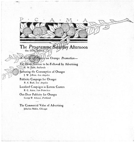
EXAMPLE 226 The decoration was in color. By Fred S. Lang, Los Angeles, Cal.
98Example 221.—The treatment of the titles at the left side and the symmetrical arrangement at the foot of this example are highly commendable. The details of the entire page denote the finished typographer. The combination of capitals and small capitals is pleasing, and the manner in which variety has been secured in a design of orderly arrangement is commendable.
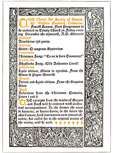
EXAMPLE 227 Program in the Gothic style. Designed by Merrymount Press, Boston, Mass.
Programs for entertainments and exercises, while not allowing the unrestrained workings of the fancy that those for banquets do, are yet proper vehicles for carrying artistic ideas. The program should be artistic. The commonplace program is a disappointment to the intelligent auditor and an evil in that it influences the public taste towards mediocrity. The printer who cannot produce a good entertainment program has need to study art principles and observe the artistic programs being produced by others.
Example 222.—A refined program page by Updike. In the original the border was printed from a copper intaglio plate on smooth-surfaced hand-made paper, the reading portion being printed clearly and sharply from type. Updike’s work is noted for the clearness of the print. Just enough ink is carried to prevent the print being called gray. Of course the type must be clean and unaffected by wear, the ink well ground and the impression firm. This specimen is almost entirely in italic, with “swash” or decorative capitals that add interest to a page of dignified typography. Swash italic capitals properly used are valuable aids in securing attractive yet refined typographic effects.
Examples 223 and 224.—These two pages by Bruce Rogers should have interest for every printer who loves good typography. The zinc reproductions of these pages, also that of the preceding example, fail to present the sharp print of the originals. Roman lower-case is absent from this program. Rogers and Updike, with Aldus, have demonstrated that roman lower-case is not essential to typography. Perhaps that is why their work has distinction—other printers set most of their type from the roman lower case.
On the title-page the features of particular interest are the long s in the word “music,” the swash italic capitals and the woodcut ornament.
The program page is interesting in its construction and its details should be studied closely. Unless suitable ornamentation is available, program pages had better be treated plainly as here, with such attention to the details of the type arrangement as will obtain finished results. It is a test of typographic ability in the production of a program page to compose work that, without the friendly aid of decoration, is pleasing to look upon.
Example 225.—This page shows admirable treatment of a brief program. The various sizes of type are well distributed, and the consistent use of roman lower-case is pleasing.
Example 226.—The type in this page overprinted the decoration which was in pale orange and pale green. The decoration was appropriate in that the program was for a meeting held on the fruit-growing Pacific Coast.
Example 227.—The Gothic style dominates this page. Excepting the two uncial initials, only one size of type has been used. That fact alone is interesting, as the result is remarkably finished. Decoration of quality for similar effects can be obtained by having historic decorative borders from old books photographed and redrawn upon the photograph with such alterations as are desired. The face of the photograph can then be washed away, leaving only the drawing, from which the plate is made.
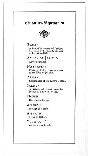
EXAMPLE 228 A well-arranged page. By Stetson Press, Boston, Mass.
Example 228.—The list of characters in a dramatic entertainment is here displayed in an unusual manner. It is so easy for compositors to set copy such as this in the conventional type-leader-type method, but this compositor has arranged it to conform to the proportion of the page.
The program containing small advertisements, especially the theater program, is possible of much improvement. Such typography should be given better attention, as theater programs exert large influence in forming public taste.
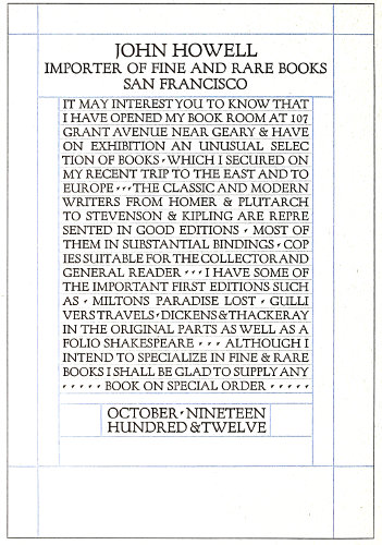
EXAMPLE 229 Classic capitals combined with rules. Suitable for announcements having to do with art, architecture, literature and music
99
ANNOUNCEMENTS
Publicity is doubtlessly essential to success in every business and profession. The public is interested in the man who does things, but this interest is obviously confined to the man who it knows does things. The great men are advertised men. The great deeds of history are those advertised by poets and historians. Shakespeare made famous many ancient characters, as did Plutarch before him, and the most famous acts of the American Revolution are those performed near the homes of poets and writers. We would not be familiar with the rides of Paul Revere and “Phil” Sheridan had they not been advertised by means of printers’ ink.
Several years ago in New York an influential art society recognized the work of a mural painter by awarding him a medal. In accepting it the artist sadly remarked that the recognition came too late in life for him to “use it as a help to live with,” which proves that in the heart of the most proud and sensitive artist or professional man there is a feeling that he needs publicity—recognition, if that word is less offensive—in order that his life work may be successful.
It is fashionable for prominent persons to employ press agents, and goings and comings and doings are told to the public at every opportunity. In the days before the development of newspapers and other typographical mediums for advertising, the people depended upon the public crier to make all sorts of announcements. He would attract a crowd by sounding blasts with a horn or by ringing a bell, and then make known his message.
The modern representative of the crier is the printed announcement. It is not confined to any definite size or shape, often consisting of one page only, printed on card or paper stock.
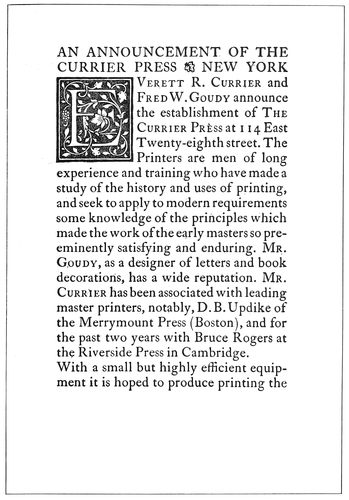
EXAMPLE 230
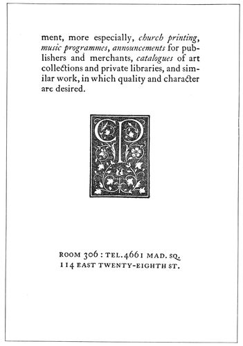
EXAMPLE 231 Two pages from a dignified, refined and artistic announcement folder, printed in black ink on brown-tinted hand-made paper
The announcement form may be considered the most 100personal of the printed mediums of publicity. It presents a direct, individual appeal or invitation, and the recipient, influenced by this fact, is likely to give it more consideration than some other form of advertising. Recognition is flattering to all of us, and upon receipt of an announcement we are apt to feel pleased that our patronage or personality is thus recognized.
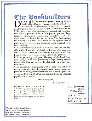
EXAMPLE 232 Announcement in Colonial style. By A. F. Mackay
The printer is depended upon by most customers to furnish suggestions for the physical make-up of the announcement, and he is also frequently asked for advice in regard to the phraseology. This places a responsibility upon him that he cannot well ignore, and he should be able to respond with proper suggestions. Being thus qualified to assist the customer has many times led to further and profitable business. The printer possessing the confidence of his customers has an asset of great value.
The most common form of typographic announcement is that printed from roman, text, gothic or script type-faces in imitation of engraved intaglio printing. The styles of this form of announcement change slightly with the fashions in copperplate effects. Printers desiring to do such work would do well to obtain samples from one of the leading society stationers and follow them closely in arrangement, spacing of words and lines, and size and kind of stock. This class of work allows of little original or decorative treatment. If other forms or treatments are desired a standard type-face, such as Caslon or Cloister, should be used. Many compositors err in combining copperplate-engravers’ faces with rules and borders, or in other ways misusing them; for such results are “neither flesh, fish nor fowl,” as the saying goes.
If the customer requests an imitation copperplate effect, give it to him as closely as you can; that is good business policy, and is in accordance with the sound advice to “Do your best, no matter what the circumstances,” reminding one of the old rhyme:
If I were a cobbler, it would be my pride
The best of all cobblers to be;
If I were a tinker, no tinker beside
Should mend an old kettle like me.
But, whenever possible, get on higher ground. If you must be a tinker, be a good one, but rather be a producer of new things than a builder of patches and something that is “as good as new.” Printers should test their earnestness with tasks that develop their art instincts and, accompanied by proper financial return, bring that satisfaction which comes from work well done.
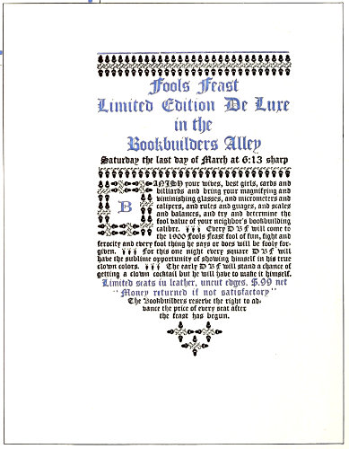
EXAMPLE 233 Odd treatment of an announcement. By T. M. Cleland
Example 229 (Insert).—Usually the printer should not set an advertising page all in capitals, nor should he use many rules in its composition; 101but when the typographic designer has skill and artistic taste in addition to a developed sense of fitness and refinement, the warnings and “thou-shalt-nots” that apply to most printers are not for him. Mr. Nash, with the use of Fred W. Goudy’s Forum type-face and rules that suggest the guide lines of old manuscript books, has produced an announcement that is classic in composition, pleasant to look upon, and a page that carries the message in an especially effective and appropriate manner. The original was printed on hand-made paper. This type-face has been modeled on ancient Roman lettering and for that reason has a classic character that makes it suitable for announcements and other printing having to do with art, architecture, literature and music.
Examples 230 and 231.—These are the first and third pages of an announcement originally printed in black ink on brown-tinted hand-made paper. The type-face, Caslon, was sharply impressed into the stock. It may be advisable to state here that all Caslon romans are not alike. The face usually sold by typefounders has the descenders shortened, that the letters may conform to the system of alignment adopted some years ago in America. This shortening of descenders, seemingly a trivial matter, affects the general appearance of the type-face. Attempts to “improve” the Caslon face are apt to end disastrously to the effectiveness of the letter. It has characteristics that are essential to its beauty, and shorn of any of those characteristics it loses attractiveness proportionately. This announcement folder is of a quality seldom attained in printing, depending as it does upon detail in typesetting and presswork. The reproduction cannot present these points, because the finish of the paper, the clearness of the print, the spacing, the apportionment of margins, the tone, all counted in the finished result.
Example 232.—This circular announcement in its original form was 9½ × 12½ inches in size, the paper upon which it was printed being gray-green laid hand-made. The positions of the groups of type matter and the sizes of margins are features worthy of study. Other points of interest are: the treatment of heading and initial, the use of florets at the beginning of each paragraph, and the committee signatures. The last-named lines are set in italic lower-case with roman capitals, Aldus style. The border was printed in dull red, close to the edge of the paper.
Example 233.—This meeting announcement is of the same series as the preceding example, but, set all in black text letter without border, the effect is totally different. The peculiar black and gray tones of the Caslon ornaments blend well with similar characteristics presented in the massed black letter. The page was printed in vermilion and black on buff laid hand-made stock. The effectiveness of this style of announcement is due not alone to the typography and stock, but to the generous size of the sheet used—good paper and plenty of it. This announcement was mailed without envelops, the double sheet being folded into thirds and the lower end inserted into the upper end.
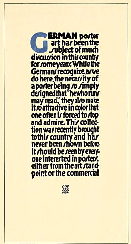
EXAMPLE 234
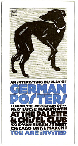
EXAMPLE 235 These specimens are lettered in a style that suggests the sturdy masculine character of the lettering developed with the new German decorative poster art. Designed by Oswald Cooper, Chicago
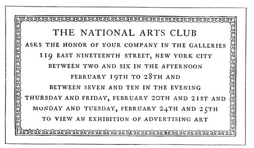
EXAMPLE 236 A classic arrangement based upon the architectural inscription plate. By Benjamin Sherbow, New York
102
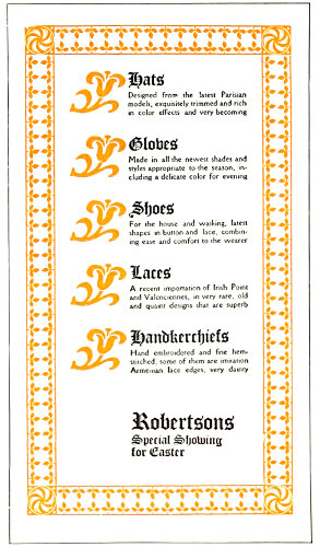
EXAMPLE 237 Ornaments as eye-attracters. An idea that could be adapted to many jobs of printing. Designed by Will Bradley
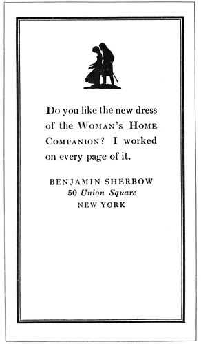
EXAMPLE 238 Postal-card announcement, the typography of which is attractive, not because of what is put on, but because of what is left off
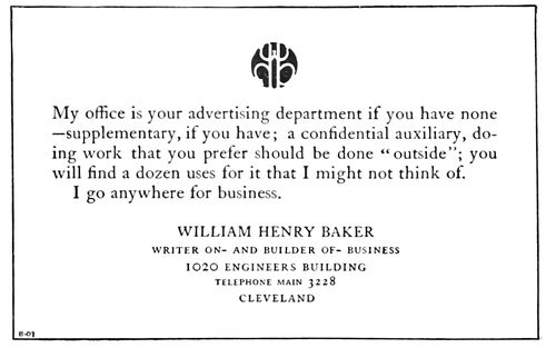
EXAMPLE 239 Good advertising typography. Type groups and blank space well proportioned, and an interesting decorative spot of color
Example 234.—This announcement page is lettered in a style that suggests the sturdy masculine character of the lettering that has been developed with the new German decorative art. Typographers should not make the mistake of assuming that a page set in the so-called gothic types of the typefounders would give this effect. While the letters are without serifs, as are the gothic types, yet they have not the mechanical perfection of those types. Type-faces, lettering and drawing of any kind seem to be better liked when they possess the human quality of imperfection. I once called on Boardman Robinson, then cartoonist of the New York Tribune, and found him at work on a cartoon for the day. I noticed that he had considerably altered the picture on which he was working, and I asked him about it. With a smile, he stated that he had been working on the cartoon for several hours in order to make it look as if it had been drawn in fifteen minutes. German typefounders have made type-faces that carry the qualities of this poster style of lettering. The young printer should not infer from this that careless and unfinished typographic work is preferable to a careful, finished product. It will be found that the artist or printer who can best give this little touch of human nature to designs is one who first learned to do the work as perfectly as possible.
Example 235.—This design was the first page of a folder of which Example 234 was the third page. Oswald Cooper, who lettered this announcement, used the figure of a dog that had been drawn by the German poster artist Hohlwein, but gave him due credit in the upper left corner. This style of lettering, as has already been mentioned, is appropriate to the subject of German posters and in harmony with the poster illustration used. Heavy treatment of this kind offers a rich opportunity for the use of strong and harmonious colors. Light-faced type is very unsatisfactory as a carrier of color, but the broad strokes of this style of lettering make possible a liberal showing of color on the page. An extra color has been introduced, altho the original announcement was entirely in brown on a brown-tinted card.
Example 236.—From the viewpoints of art and dignity an announcement card such as this one is always in good taste. Its style is classic, being arranged along the lines of an architectural inscription plate. The border is the reliable egg-and-dart pattern and the type-face is Caslon. Capitals are essential to best results in this sort of design.
Example 237.—The idea suggested in this page, of using ornaments as eye-attracters, is a good one. While the design as a whole is decorative in character, the advertising element is not overlooked. The several articles of merchandise are prominently displayed, as is also the name of the store. In the series of type designs of which this was a part, the designer strongly emphasized ornamentation. There was a reason for his doing this, as he was engaged in introducing new typographic decorative material, but printers working for the commercial public are engaged in a different vocation. In attempting such designs as this, compositors should decrease the prominence of the ornaments and border and increase that of the reading portion of the page.
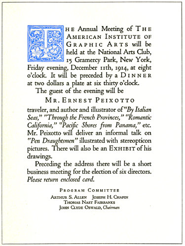
EXAMPLE 240 Showing the use of roman, italic and spaced small capitals on an organization announcement
103
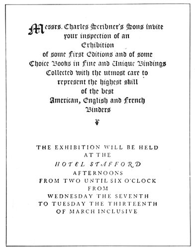
EXAMPLE 241 Unusual division into two groups, providing for fold. By the Calumet Press, New York
Example 238.—This announcement was printed in black ink on a Government postal card. The young compositor will, no doubt, recognize the small amount of actual typesetting necessary for this page; however, he should not overlook the fact that the results were really secured by one-tenth manual labor and nine-tenths brain exercise. A specimen such as this is good not because of what is put on but because of what is left off. There are only a rule border, a small silhouette illustration and four lines of type exclusive of the signature, yet the busy man gets the message and experiences pleasure in getting it. The type in the original was no larger than was necessary to be easily read. Compositors frequently forget that announcements of this kind are read at a distance of only a foot from the eyes, and that twelve-point type is really large enough for the purpose. It is usually a mistake to make the type-face very large or very small. One is an unnecessary size and the other is an illegible size.
Example 239.—This is another announcement set in twelve-point type, with a liberal distribution of blank space. The personal mark of Mr. Baker adds a decorative touch of color that attracts attention and helps to make the page distinctive.
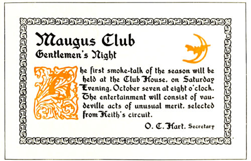
EXAMPLE 243 Harmony of type-face and decoration
Example 240 (Insert).—This announcement has typographic interest in that it shows how variety and advertising emphasis can be obtained by the proper use of italic and small capitals with lower-case roman, especially with a type-face such as Cloister Oldstyle. The small capitals are letterspaced; they usually respond pleasingly to such treatment. Typographers who have studied the matter of spacing have found that capitals and small capitals can be letterspaced with good results, and that roman and italic lower-case seldom look well if the letters are separated by spacing. It is probably an exaggeration to say that lower-case should never be spaced, as typographic artists such as Will Bradley have produced very effective results with letterspaced lower-case; but the average compositor had better adhere to the rule of never letterspacing lower-case letters. It will be noticed that on this announcement the name of the organization, the words “Dinner” and “Exhibit” and the name of the guest, are set in capitals and small capitals with letterspacing. The names of the books, the title of the talk, and the request to return a card, are in italic. Only one size of type has been used, excepting for the committee group at the foot. In order that the words “Program Committee” should not look exactly like the other lines in this group, they were letterspaced.
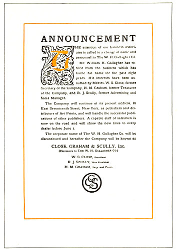
EXAMPLE 242 A study in tone values and margins
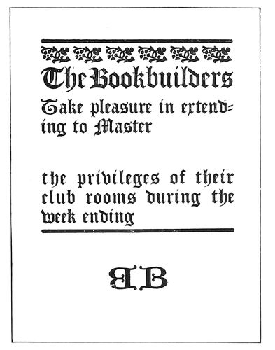
EXAMPLE 244 Artistic form for brief announcement. By A. F. Mackay, New York
Example 241.—This announcement form, like No. 240, 104is conventional in size, the paper upon which the original was printed measuring 5½ × 7 inches. The arrangement of the type page was designed to provide for the fold which horizontally crossed the center of the page. The division into two groups, each in a different type-face, is unusual, and the manner in which this has been accomplished is instructive to the student of typography. The use of a large initial gives distinction to the upper group, and spacing of the Caslon capitals in the lower group maintains a distinction there. This page illustrates two points recognized by good typographers—that the printed effect of old-style roman capitals is usually improved by a slight increase of space between letters, and that, on the other hand, the printed effect of text letters would be impaired by increased space between them. There is danger of too great contrast of tone in a page, and had this example been executed less skilfully, it would have failed in effect.
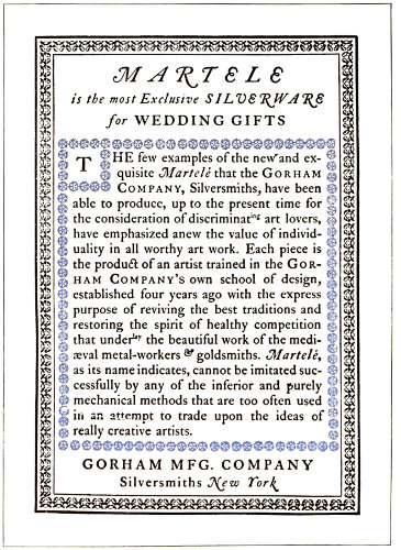
EXAMPLE 245 Colonial treatment of an announcement page. By the Calumet Press, New York
Example 242.—This announcement circular affords a study in tone values, especially in the original size, which was 9 × 12½ inches. The type, Old Style Antique, was twelve-point, with six-point slugs between lines. The black tone of the type-face and the liberal spacing found relationship in the black tone and open lines of the initial letter at the head. This harmony was carried out in the entire page, the black and white tones contrasting thruout. No gray lines were used; even the monogram at the foot was constructed of strong lines. In obtaining an effect like this it is necessary that the type-face be of medium black tone somewhere between the gray tone of the Caslon face and the heavy black tone of the John Hancock or other extra-black faces. It may be well to call attention to the margins inside the rule border. The artist avoids monotony in margins. In old books the four margins surrounding a type page differed. The foot margin was the largest, the others being smaller in this order: outer side, head, inner side. In this announcement page the foot margin is larger than the others, and the head presents the smallest amount of marginal space. The side margins were made equal because, unlike the paired book page, this page stands alone.
Example 243.—Harmony of type-face and decoration is the chief attraction of this announcement card. Some of the characteristics of Washington Text in tone and stroke are also found in the initial letter and border, and to this the harmony is due. Placing of the initial letter so low on the page was a bit of daring, yet balance is retained, due to the heading.
Example 244.—While only a little folder, 3½ × 4½ inches in size, this job was exceedingly effective. It was printed in black on white antique stock. Such a form could well be adapted to many brief announcements.
Example 245.—This form was set in type during the Colonial revival that interested good printers about the year 1900. Caslon type and Colonial decoration give an individual character to the page. Colonial effects are not so common just at this time, which fact is quietly digested by the wise typesetter as he recognizes his opportunity.
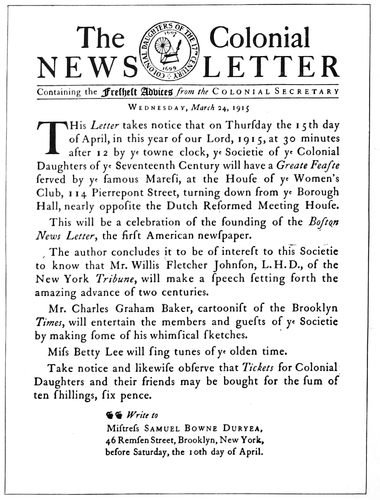
EXAMPLE 246 An announcement literally treated in Colonial typography, even to the use of the long “ſ”
105
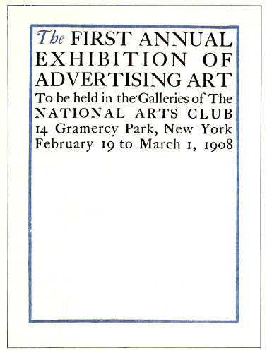
EXAMPLE 247
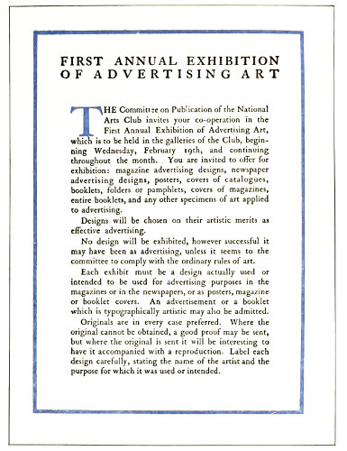
EXAMPLE 248 First and second page of an artistic, unembellished announcement circular. Designed by Benjamin Sherbow, New York
Example 246.-This announcement demonstrates the possibilities of typography along the lines of appropriateness. A Colonial organization wished to announce a meeting at which would be celebrated the founding of the first American newspaper, and desired something in Colonial style. The printer looked up a reproduction of an early newspaper and set the heading in a style such as was given the headings of newspapers in the early days. The society had an emblem or seal engraved in the serifless and characterless style of lettering that the average engraver will give an organization. The printer had the emblem redrawn, giving instructions to the artist to draw the entire design in freehand and to be careful that the lines and lettering be not too regular. Instructions were also issued to have serifs on the lettering and to have it contain the contrasted light and heavy strokes of the roman type-face of the Colonial period. As will be seen by the example herewith, the idea was well carried out by the artist. The society had appropriately phrased the announcement. The printer carried the idea along by using a small size of “e” in the word “ye,” and a long “s,” made by cutting a part of the cross from the “f.” A suitable hand-made paper was selected and the paper was dampened before printing it. The announcement was then folded up and sealed in the style of Colonial times, without an envelop.
Examples 247 and 248.—These are the first and second pages of a large circular announcement printed in black and light olive-brown on buff-tinted laid antique paper. No embellishment is used, nor is any needed, the treatment being sufficiently artistic. The arrangement of the first page is uncommon. The lack of margins around the type group and the absence of print on three-fifths of the page would be counted by some printers as mere eccentricities, yet to others these things spell art. Compositors interested in this arrangement should notice how the type lines fit the phraseology. The advertising element has been considered by the designer along with æsthetic requirements. The double line of capitals at the head of the second page was duplicated on the third. The second page shows simplicity and legibility that are admirable, the liberal margins and the three-line initial being noteworthy features.
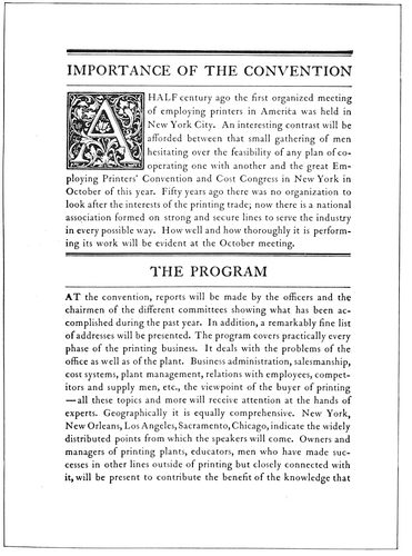
EXAMPLE 249 One of four pages of a convention announcement, showing the attractiveness of rules when properly used with headings
Example 249.—This is the second page of a convention announcement and is evidence of the success that is possible with the proper use of a well-designed type-face, an 106appropriate initial, and rules to separate the headings. A combination of a heavy- and light-faced rule has always looked well with the Caslon style of type-face.
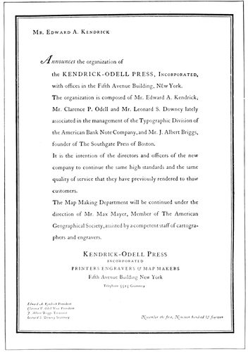
EXAMPLE 250 Announcement designed by an artist who believes in the liberal leading of type lines
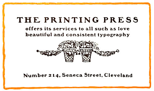
EXAMPLE 252 Blotter announcement in rugged Colonial style
Example 250.—This announcement, originally printed on hand-made paper, all in black ink, was designed by a famous New York artist-typographer, who believes that there is greater legibility when the lines are separated by a liberal use of leads than when they are “set solid.” The arrangement is unusual in several respects—the placing of the name in the far-off upper corner, the use of the initial “A” in the midst of a sentence, the setting of the names of the officers in italic and their titles in roman, and the liberal leading previously referred to.
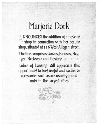
EXAMPLE 251 Announcement in black and gray on gray fabric-finished stock, illustrating harmony of type-face and decoration
Example 251.—This specimen also has the feature of an initial in the midst of a sentence, and it may be well to suggest to young compositors that it is better not to use an initial in this manner. This page would probably be even more effective if the entire word “announces” were in lower-case. The announcement was printed in black and gray on a light-gray stock. The foundry that made this series of type also made ornaments that would harmonize with it and thus enabled the printer to produce an artistically pleasing page. This letter is one of a few that closely suggest good hand-lettering. The selection of type sizes and the arrangement and apportionment of margins help to make a result that reflects credit on the printer’s art.
Example 252.—A blotter was the vehicle that carried this announcement, which is in the rugged Colonial style of typography of the year in which this piece of work was produced. The tone is pleasing, as is also the contrast of white and black. The ornament blends in shape and style with the accompanying typographical treatment.
In the production of his own announcement forms the printer is not hampered by the requirements of customers. He works with the unrestricted freedom of a Michelangelo and there is little reason why his work should not be of the best, if he will read and study books and trade magazines.
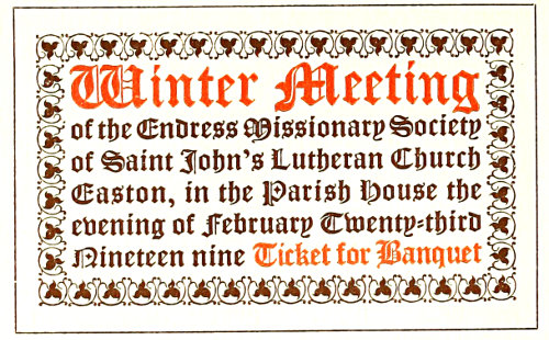
EXAMPLE 257 The historic Gothic, or pointed style
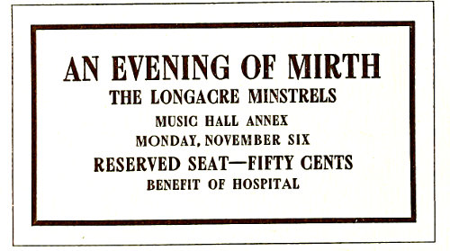
EXAMPLE 258 Strong treatment, the motive of modern origin
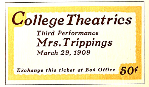
EXAMPLE 259 A striking effect that should please the college student
107
TICKETS
It is said of printers who make no attempt to learn the principles governing art typography, that once or so in a lifetime they produce an artistic job of printing. They become much elated at the phenomenon, not realizing that it was brought on by the unconscious introduction into their product of art principles. The experience may be likened to that of a child who accidentally touches an electric button, causing the room suddenly to be illuminated. The child knows the light is there, but does not comprehend how it got there.
Now instead of being the cause of an oriental handshake, a good job of printing ought to be an everyday occurrence, and the stirring of the waters should be left for the bad job of printing when, unfortunately, it happens along.
Lack of interest is the reason for the non-development of many printers in the art side of typography. Because, to many compositors, printing is merely a means of making a living, only enough knowledge is acquired to enable them to “hold their jobs,” or, in the cases of employers, to retain their customers. Time spent in the printshop is considered drudgery and the pleasures of life come after the whistle has blown. There are young printers who know comparatively nothing about good typography, yet are authorities on the rules of pinocle, baseball, or other pastimes. And there are older printers, too, who could write a book about chicken-raising, yet do not know when type-faces harmonize.
Any man who is not interested in his vocation is to be pitied. Unless his heart is in his work, a lawyer, preacher, editor, ad-writer, artist or printer will not be successful.
Interest may be developed. If the typographer will devote a portion of the time now spent on outside matters to the study of his craft, and especially the art side of printing, his work will become lighter and the hands on the clock will chase each other. The same concentration of thought now devoted to unimportant side interests would bring large dividends if invested in the study of typography. Efficiency is a guarantee of steady work and good pay to the employee, and an assurance of steady customers and better prices to the employer.
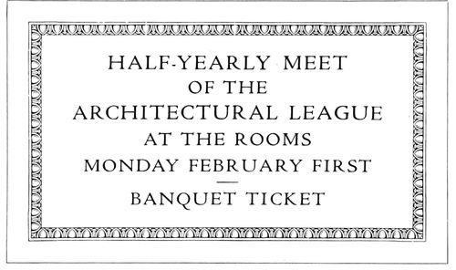
EXAMPLE 256 Classic, refined treatment, for art and literary purposes
The typographer who prefers freedom from care, and the blissfulness of ignorance, is a poor member of society. He should line up among the world’s workers and accept some of the responsibilities. The first things he observes, should he become a student, are the imperfections of his own product. Work that before looked good to him, now, viewed in a new light, is defective, and finally the old verdict is reached, “There is none perfect, no, not one.” While to the experienced art-printer expectations of absolutely perfect results are known to be futile, he tries for one hundred per cent just the same. A man lacks something in his make-up when he is satisfied to be rated as a twenty-five or fifty per cent printer.
Tickets, altho only a minute part of the printing-office product, afford opportunity for the practice and development of art printing. In typography there are many themes and styles and their incorporation into type-designs is an interesting and instructive study. The compositor or layout man should know and understand these various styles, that he may be able to adapt himself to any demand made for “something different.” Resourcefulness is a valuable characteristic for any printer to possess, and close examination of the nineteen ticket forms, and careful reading of what follows, should serve to develop that quality. These forms were designed by the author especially for this chapter.
Example 256.—It is fitting, in commencing a series of type arrangements, first to show one based upon a classic motive. The design is old to students of art, yet may be new to printers in general. The arrangement has been used for many years by leading architects on inscription tablets, and the idea itself comes from ancient Rome. The egg-and-dart border is a standard embellishment in architectural designing. The roman type-face is historically proper, especially the adherence to capitals, as originally there was none but what we call capitals, the small “lower-case” or minuscule letters having been evolved during the Middle Ages. The letters of roman type-faces usually set very close together and to get certain results the capitals should be slightly spaced. One-point spaces have been used in this example. White cardboard is preferable to a colored one on which to print this design.
Example 257 (Insert).—The historic Gothic or church style furnished the motive for the treatment of this ticket. Both border and type-face possess characteristics peculiarly Gothic—notably the pointed form of the letters and floret. There is also blend of tone, and similar contrast of heavy and light strokes in letter and border. 108Ancient features are consistently carried out in the arrangement. The lines are set close to the border and made full length. Contrast is obtained by the use of color and the emphasis in type size of two important phrases. This style of treatment is appropriate for tickets used by churches or kindred organizations.
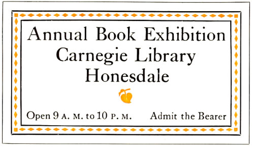
EXAMPLE 260 Modern treatment based upon the Colonial
Example 258 (insert).—The style of this ticket is a modern conception and originated in the art revival of the latter part of the last century. The motive is masculine and its features are contrast of tone, massing of lettering, and liberal blank space. It will be noticed that while in this specimen the margin inside of border is wide, on the previous specimen (Example 257) there is practically no space inside of the border. These features are necessary in the correct interpretation of the respective styles. The motive of the specimen under consideration is particularly applicable to tickets for minstrel performances, smokers, club outings, and other affairs in which men are interested.
Example 259 (Insert).—The color border on this specimen suggests a means of varying the treatment of tickets, the extension of the border into two of the corners adding distinction. Such a design as this is likely to meet approval among college students, as they welcome odd and striking effects. The strong italic lower-case is a relief from the many more familiar roman faces used on such tickets. Emphasis of important parts is obtained by increasing the type sizes until proper contrast is obtained.
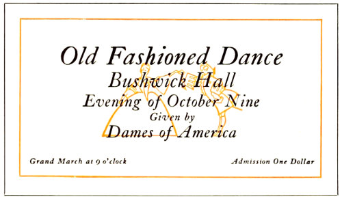
EXAMPLE 262 Daintily appropriate in type-face and illustration
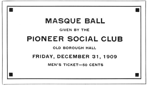
EXAMPLE 263 The secession or mission style applied to ticket composition
Example 260.—The treatment of this example may be described as modern based upon the Colonial. The Caslon type-face furnishes a Colonial atmosphere, and the border treatment of color inside surrounding rules blends with the type-face. Only two sizes of type are used and lower-case is consistently adhered to. The shape of the main group gives a pleasing symmetry to the arrangement, the floret serving well to complete this result. The effect as a whole is bookish, and may be adapted to various literary and art purposes. White or buff stock would be suitable, antique finish preferred.
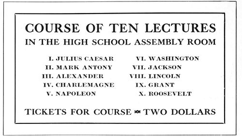
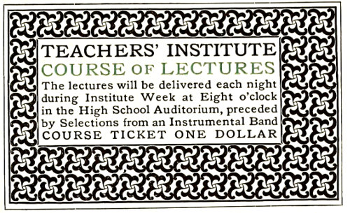
EXAMPLE 261 Suggested for course tickets. Coupons should be attached
Example 261.—There may be an idea here for course tickets in which a number of lectures are listed. The form as shown is not complete, the idea including the attachment at one side of coupons containing the names and dates of the lectures. Only capitals are used and the three main lines are aligned at each end of the measure. The narrow border gives a finish to the general design, which is well suited for printing in black ink on white stock.
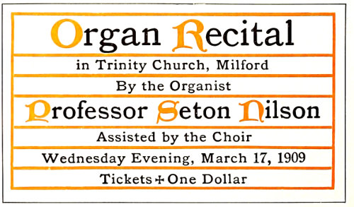
EXAMPLE 264 The ecclesiastical or missal style well adapted
Example 262.—Here we have a ticket of peculiar interest to women and the treatment is daintily appropriate. Caslon italic is an admirable letter for the purpose, as it is graceful and neat. Bold treatment and large type have been avoided, the main portion of the copy being grouped in the center and surrounded by liberal blank space. The outline illustration underprinting the type group gives added interest to the ticket and may have 109advertising value in the suggestion it presents of the evening’s pleasure. White card would be proper, and a buff or gray-blue stock might also look well.
EXAMPLE 265 Perhaps Morris would have set a ticket this way
Example 263.—This ticket presents the geometric, or so-called secession style; a mild example, tho. Because straight lines form its motive, some call it the mission style. There are possibilities in it for the typographer looking for fresh ideas with which to vary his work. Right here it may be well to warn compositors against becoming enthusiastic over every new style of type arrangement that may come to his notice. There are men who in their endeavors to do something to win fame—something astonishing and entirely original—set out on unknown seas without rudder or compass. The result usually is shipwreck. The printer who starts out to produce typography not founded on some proved and tried base builds a house in the sands that may come tumbling down at the first test of endurance. A type-face of squared shape such as the capitals of lining gothic is best fitted to accompany the squares and angular ornaments of the mission or secession style. A gray stock on which to print this example would be a wise selection.
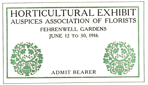
EXAMPLE 267 Modern application of classic type effects
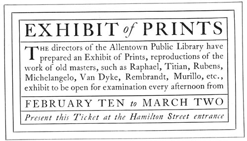
EXAMPLE 268 Patterned after Colonial treatment of title-pages
Example 264.—This specimen will be recognized as an adaptation of the missal or mass-book style of treatment, mentioned in a previous chapter. It is an accepted ecclesiastical arrangement, and proves as pleasing on a ticket as on a title-page. Uncial initials (as are here shown in color) may be had of typefounders in slight variations. White or buff card admirably supports missal treatment.
Example 265.—Inspiration for ticket designs may even be drawn from the work of William Morris and the Italian printers who used the black-toned decorative border, altho this style should not be undertaken unless the proper border is available. The one here adapted carries out the idea fairly well. Old Style Antique set snugly to fill the panel gives the proper results, the capital lines also being necessary to this style. Tickets for educational and art functions especially lend themselves to this treatment and white card should be used.
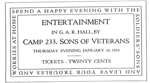
EXAMPLE 266 The medieval art worker furnished a motive for this ticket
Example 266.—The motive for this ticket form came from observing that art workers during the Middle Ages frequently engraved inscriptions around the margins or borders of plates, slabs, doors, and like objects. This suggested the adoption of the idea to carry a few pertinent words on an entertainment ticket. Cardboard of almost any color could be used.
Example 267.—Perhaps this arrangement could be described as a modern application of classic type effects. The display lines are in Cheltenham, a face that approximates some of the ancient Roman lettering, and the treatment of the ticket as a whole is chaste. The ornaments, surrounded as they are by blank space, emphasize the classic simplicity of the ticket. The type group is tapered to give proper symmetry.
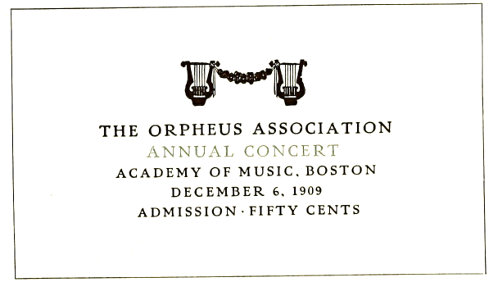
EXAMPLE 269 A dainty, refined effect suited to many occasions
Example 268.—This is purely a Colonial effect and 110closely follows the arrangements found on title-pages of the seventeenth and eighteenth centuries. Hair-line rules well separated by space were common in those days. The type here used is Caslon, a letter cut in the eighteenth century, and one especially suited to Colonial typography. Antique-finished card in white and buff is appropriate.
Example 269.—Dainty, refined effects are demanded by certain customers. This specimen demonstrates the effectiveness of such treatment on a ticket. Two sizes of type (Pabst), all capitals and slightly spaced, give the proper results. The ornaments are used as symbolic decoration.
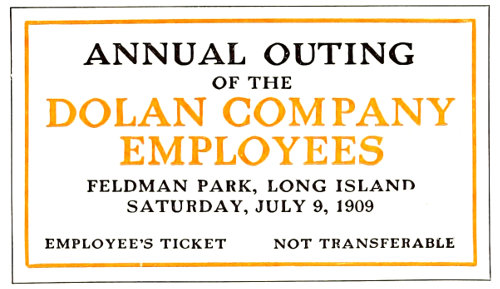
EXAMPLE 270 Robust treatment of an outing ticket
Example 270.—The typography of this ticket is distinctly masculine. This result has been obtained by the use of capitals of a robust type-face, so distributed in size as strongly to emphasize the important phrases. Had this form been printed in one color, the two type lines now in color should have been reduced a size. It is well for compositors to keep in mind that when orange is used in combination with black, the portion printed in orange will be lighter in tone than that in black, unless the difference is provided for by bolder or larger type-faces. Any color of stock excepting dainty tints would do for this ticket.
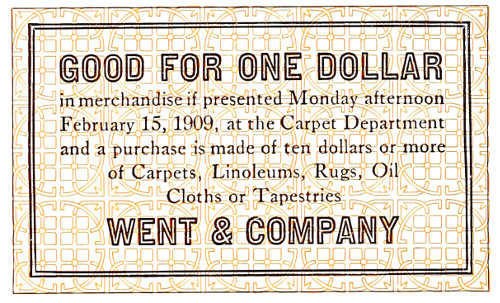
EXAMPLE 272 Treatment that should prevent easy counterfeiting
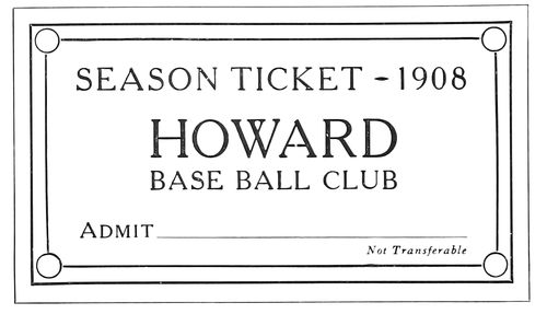
EXAMPLE 273 Corner decoration suitable to the subject
Example 271.—This unusual arrangement was dictated by the nature of the cab ornament. The shapes of the type groups are built about it. Were the cab ornament not used, another arrangement would be necessary. There are social clubs of all kinds in every city, and balls are frequently held for which tickets are needed. An element of interest such as is given by the cab ornament would surely be appreciated by such customers.
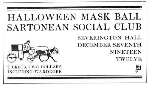
EXAMPLE 271 The cab ornament dictated the type formation
Example 272.—Occasionally there comes to the printshop a customer wanting a ticket which cannot easily be duplicated by any one with a press and a few fonts of type. Instead of referring the customer to a lithographer the printer should ascertain if he is not in a position to produce such a ticket. The style of the one here shown is suggested for such emergencies. A type border printed in color forms the background. Over this print the reading matter, and for the display lines use a type-face that happens not to be possessed by other printers in the same city. In providing a border for this ticket a rule with double lines has been used, thus blending it with the double lines of the type-face. White stock should be selected for this ticket.
Example 273.—The corner decoration is in keeping with the subject of this ticket, and the arrangement as a whole is suggested for similar purposes. Any color of cardboard is suitable.
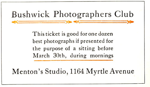
EXAMPLE 274 This arrangement has an old French motive
Example 274.—The decoration of early French books furnished the motive for the typographical treatment of this ticket. It is submitted simply to demonstrate that ideas for arrangement can be picked up in many quarters, and as a suggestion that typographers go thru the world with eyes open.
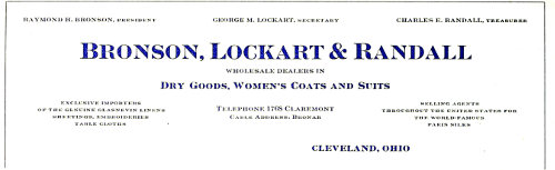
EXAMPLE 275 Neat, conventional treatment of a letterhead containing a large amount of copy. The bold-face type lends variety to the heading and brings out important points
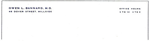
EXAMPLE 276 Professional stationery must be treated with dignity and refinement. The type should be small
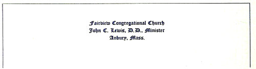
EXAMPLE 277 Suggested treatment for church stationery of the conventional kind. A text letter is appropriate and is usually satisfying
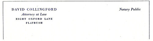
EXAMPLE 278 As a change from the style shown in Example 276, professional stationery could be treated in this manner in one body size of a modern job type
111
LETTERHEADS & ENVELOPS
Is there a standard size of letter sheet and envelop for commercial correspondence? A look thru the letter files of any business house will reveal the interesting fact that most of the letters are on sheets measuring 8½ × 11 inches. Letter sheets of about this size have been in use for many years. From De Vinne’s Price List of 1871 we learn that 10 × 16 inches (8 × 10 folded) was the favorite size of letter sheet, and that for commercial letters the size 10¾ × 17 inches (8½ × 10¾ folded) was sometimes required.
Note sheets were then in two sizes: Commercial note, 8 × 10 inches (5 × 8 folded); and packet note, 9 × 11¼ inches (5⅝ × 9 folded).
The typewriter and modern commercial requirements have since developed use of the single leaf, altho for personal correspondence and certain refined business purposes the folded note sheet is proper.
In passing it might be noted that in the price list above mentioned the printer is urged to charge an increased price when “brass or French flourishes are used in excess.” The composition of “one plain heading, of not more than four straight lines,” was to be charged at seventy-five cents; “one ornamental heading with curved lines,” twenty-five or fifty cents additional.
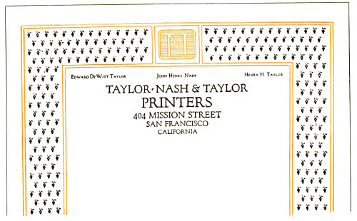
EXAMPLE 279 This elaborate border continued around the entire sheet. In the original the colors were subdued and harmonious and on a brown-gray hand-made paper
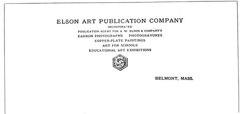
EXAMPLE 280 A suitable type-face symmetrically arranged, with a harmonious decorative device
As has been stated, the standard size of the present-day commercial letterhead is 8½ × 11 inches. Strange to say, the standard size of envelop (known as No. 6¾ Government) used for the carrying of these letter sheets measures 6½ × 3⅝, tho if a snug fit were required the envelop would be about 5¾ × 3 inches. The standard size, however, should usually be selected, as all sorts of enclosures are made to fit it.
The large “official” envelop is also used extensively for business purposes, the most common size (No. 10 Government) measuring 9½ × 4⅛ inches. It takes a letter sheet of two parallel folds, and also provides for business and advertising enclosures larger than those planned for the standard envelop of smaller dimensions.
Distinction is given business stationery by folding the standard letter sheet twice so that, folded, it measures 5½ × 4¼ inches, and by using an envelop (Baronial) that measures an eighth or a quarter of an inch larger each way. For private or semi-private purposes this kind of envelop is preferred, especially if the letter sheet is used as a double note sheet. The heading is frequently printed on the fourth page of the double note sheet, so that when the message is written on the fourth and first pages and the sheet is opened, the letter appears as two pages in a book.
Another size of men’s personal correspondence sheet measures 5 × 8 inches folded once. After being written upon the sheet is again folded, and it then measures 5 × 4 inches. When the customer is willing to pay a price for which the best quality of stationery may be furnished, the printer should secure from houses specializing in society stationery envelops that are made with a more stylish flap than those commonly used for business purposes.
Another size of letter sheet, used for men’s personal correspondence and for giving an exclusive appearance to commercial stationery, measures about 7¼ × 10½ inches. The paper is given two parallel folds and fits in an envelop that measures about 7½ × 4 inches.
112
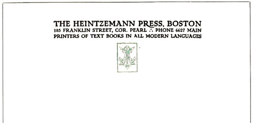
EXAMPLE 281 Artistic treatment in squared effects
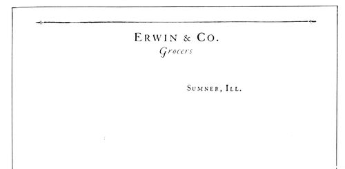
EXAMPLE 282 A simple treatment of a heading with little copy. Capitals have been letterspaced a trifle
Since the typewriter is in such general use, ruled letter sheets are seldom called for; in fact, ruled correspondence sheets of any kind are now in poor taste.
The old-time notehead is also little used, the half-letter sheet (8½ × 5½ inches), and the two-thirds letter sheet (8½ × 7⅓ inches), printed the broad way, taking its place for brief business messages.
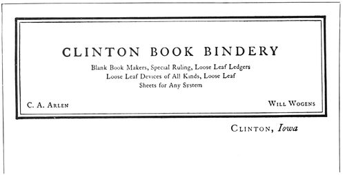
EXAMPLE 284 The heavy border effect of the Colonial style of typography gives character to this heading. By Arthur Nelson
The typographical treatment of letterheads and envelops should have some relation, and it is now generally conceded that the paper should be the same in both cases. A good grade of paper is now considered essential for bona-fide correspondence, a cheaper grade being allowed for form letters. A light-weight paper of a high grade is preferable over a heavy-weight paper of a low grade. Quality isn’t a matter of weight, altho if it can be afforded the heavier weight is not in the least objectionable. Twenty-pound folio (17 × 22) seems to be most easily obtained in the various papers.
As to the style of typographic treatment, the printer must in all cases consider the tastes of his customers, and especially the business or profession for which the stationery is to be used. As an instance, the style of typographic treatment of doctors’ and lawyers’ stationery seldom changes.
It should be kept in mind that simple, neat, refined typography is appropriate for almost every order of stationery, while elaborate typography in many cases is inappropriate.
Color is seldom well used on stationery. Most letterheads that the writer has seen which have been treated in three or four colors would have been more pleasing if given but one printing. A test of typographic skill is to design a letterhead that in one printing will look attractive and distinctive. The heading should usually be printed in black or some darkened color, and if another impression is desired a very small part of the design printed in orange or vermilion will add a touch of bright color.
All the reproductions shown are reduced in size, those on the inserts being only slightly smaller.
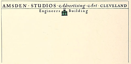
EXAMPLE 283 There is a great deal of character in this simple letterhead design. The lantern is really a monogram. By Charles R. Capon
Example 275 (Insert).—Lithographers and steel-die printers really furnish the styles for the conventional arrangement of letterheads. They work along standardized lines and usually produce well-balanced, appropriate headings. Typographical printers should study stationery produced by these processes and observe how the parts of headings are grouped and the advertising points emphasized; for a letterhead is one form of advertising. There are limitations, however, in the copying of such letterhead arrangements. Only plain designs should be studied for this purpose. Imitations of shaded and ornamental lettering are seldom successful. Example 275 demonstrates how a good letterhead can be designed along lithographic lines. The effectiveness of this heading depends a great deal upon the use of both light- and dark-faced type. Where there is a great deal of matter, as in this instance, the heading 113would likely appear flat and uninteresting and would lose some of the advertising qualities it possesses if the light-faced type were used thruout. This is no argument for bold-faced type on stationery headings as a usual thing, but refers to the kind of heading here shown. The parts in the dark-faced type include the firm name, the nature of its business and the city in which the firm is located. The names of the officers are arranged in the upper part of the heading, and this position of the names seems to be satisfactory in most instances. The telephone number and cable address are in the center near the date line. The type used in this heading is Card Litho and Card Light Litho.
Example 276 (Insert).—Professional stationery must be treated with dignity and refinement, and the type should be small. Treatment such as this would undoubtedly meet with approval from the professional customer. It would be a mistake to apply to professional stationery the variety of attractive and interesting arrangements that are applicable to stationery used for many business and advertising purposes. The printer would save resetting of the work and more surely please his customers if, in filling orders for doctors, lawyers, architects, engineers and other professional men, he attempted nothing but the conventional dignified treatment illustrated by this example. The type is an imitation engravers’ gothic slightly letterspaced to give the effect usually found on steel-die work.
Example 277 (Insert).—Ministers, included as they are in the professional class, like to have their stationery dignified and neat. At the same time they do not object to the use of text type, as it has a churchly suggestion. This type, too, must be small, that used here being eight-point in size.
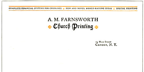
EXAMPLE 287 Suggestion of the ecclesiastic in the design of a letterhead for a church printer
Example 278 (Insert).—Stationery for a lawyer, like that for a doctor, should be dignified and refined. It is well to give him the professional customer’s style of typography such as that of the doctor’s heading, but if a departure is to be made from the imitation steel-engraved lettering, it is possibly well to use a modern style of type such as the Bodoni, and letterspace the capitals, as was done in this example. But one size of type-face has been used here (eight-point), capitals, italic, and small capitals being utilized.
Example 279.—Practically never should a letterhead be treated with the elaborateness of this one unless the customer expressly desires such treatment and is willing to pay for it, or the letterhead is the printer’s own, as in this instance. The reproduction, unfortunately, does not present the rich qualities of the original, which was printed in green-gray and red-gray on a gray hand-made paper. The typography was merged with the paper stock, and there was not the contrast found in the reproduced specimen.
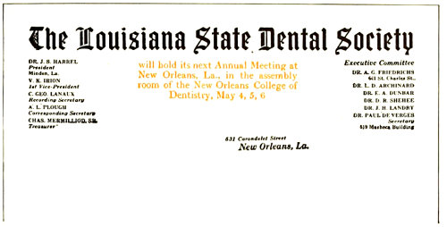
EXAMPLE 285 On which a meeting is advertised
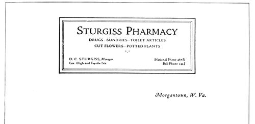
EXAMPLE 286 A panel, when well treated, gives distinction to stationery. By Arthur Nelson
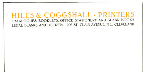
EXAMPLE 288 Artistic yet simple arrangement, the feature of which are the three lines of equal length. By Leon I. Leader
Example 280.—Old-Style Antique, as this heading shows, is a good type-face for the letterhead of an art publication company. Capitals have been used thruout and grouped so as to form a symmetrical arrangement that harmonizes well with the decorative device placed 114under it. A feature of this heading is that all matter is included in the one group, excepting the name of the city, which is placed to receive the date line.
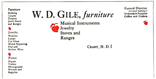
EXAMPLE 289 Letterhead for a storekeeper selling a general line of goods
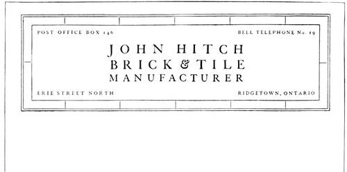
EXAMPLE 290 Panel treatment that suggests the business. By Arthur Nelson
EXAMPLE 292 Unique arrangement of a distinctive heading. By Harry A. Anger
Example 281.—Successful treatment of a heading like this depends upon the typographer’s ability so to arrange the copy, without resorting to letterspacing, that all lines are the same length. It is necessary also to use all capitals of an old-style face of dark tones in which the letters set fairly close together, a result such as can be had with Old-Style Antique or Cloister Oldstyle. The decorative device in its shape harmonizes with the formation of the group of type lines above it. The liberal blank space that surrounds this heading is an important factor in its attractiveness. The original was on brown paper.
Example 282.—When the printer receives copy as brief as that used for this letterhead he experiences difficulty in producing an effect that will be attractive. With the customary engravers’ type-faces nothing very satisfactory is possible, but by using a type-face of character, such as Caslon Oldstyle in its original form, as was done here, artistic interest can be added. Two sizes of capitals, spaced, were used for the firm name. Italic was selected for the word “Grocers,” with a swash or decorated capital that accompanies the old Caslon type-face. Capitals and small capitals were utilized for the date line. A touch of decorative interest was added to the heading by the use of a rule, on each end of which was placed a dagger, such as is usually a part of book fonts. This treatment could be made even more effective by printing the letterhead on a white bond paper of good quality.
Example 283.—This letterhead is offered as a suggestion for artistic treatment when not much copy is furnished and it is possible to use a small decorative device. The type-face should have old-style qualities of an artistic nature and should be slightly letterspaced. The lantern device on this heading is really a monogram, cleverly designed. The original was in black and orange on buff-tinted paper, and as shown by the reproduction, the heading was placed very high on the sheet.
EXAMPLE 291 Dignified yet novel treatment
Example 284.—For some reason a border made of a heavy line and a light one harmonizes with the type matter in Caslon Oldstyle, especially when liberal blank space separates the type and the border, as in this instance. It is well usually not to have the border darker in tone than the type matter, but on this heading it would be a mistake to lighten the border, which, however, would look well printed in vermilion or orange ink. A buff-tinted paper of an antique finish would blend with the Caslon typography. It is a departure from conventional methods to place the names of the firm members in the lower part of the panel. This was probably done so that the name of the bindery would stand out without interference from type matter above it, but as a concession to conventionality it would probably be well to place the names in the upper part of the panel.
115Example 285.—The printer is frequently called upon to arrange for an organization a letterhead which contains an announcement of the next meeting of the society. The example under consideration shows how this may be done; the meeting announcement is presented plainly, yet a letterhead appearance is retained. The name of the society crosses the letter sheet and is joined on each end by a group of officers. The reference to the meeting occupies the space directly under the name of the society. In the original the main part of the heading, which now stands out so strongly, was subdued by the use of gray ink.
Example 286.—There is suggestion of the architectural panel about the arrangement of this heading. The suggestion is continued by the use of a classic Roman type-face mainly in capitals. Panels are not as successful on letterheads as they would be if more judgment were used in forming them. This heading should prove helpful in working out the panel idea. Its proportions could be smaller with good results. The original was printed with green-black ink on a primrose color of bond paper, but would also look well on white stock.
Example 287.—A letterhead is successful if by its treatment it suggests the line of business for which it is used. This one measures up in that respect. By the use of the old text type and Maltese crosses an ecclesiastical touch is given. The old church missal books of the manuscript days were brilliant in rubrication, a feature of which were ruled lines, crosses and initials in vermilion. The arrangement of this heading is also one that could be used for many purposes. Some of the facts about the business are blended with rules in a decorative band that gives breadth to the heading.
EXAMPLE 295 Neatness and dignity in letterhead designing
Example 288.—Letterheads arranged so that all lines are the same length, especially if such arrangement allows proper emphasis of the firm name, usually look well and have artistic interest. This heading is one such as almost any printer with a good old-style type-face could produce. Like Example 281, this treatment requires the use of capitals. Lower-case in square or block formation does not shape up harmoniously. Capitals exclusively should be used when such effects are planned.
Example 289.—A letterhead for a general store invariably presents a problem to the printer who wishes to produce a harmonious and well-balanced heading. It is difficult properly to display copy which includes such a variety of articles as furniture, jewelry, stoves and coffins. The typographer responsible for this letterhead set it in Caslon Oldstyle, grouped it as well as he could, and introduced decorative value by means of florets printed in color. The name of the merchant was given the most prominence, and “Furniture” was featured for the reason that it seemed to constitute the principal part of the business. The printer who objects to this arrangement should try his hand at resetting it. As copy, this heading is in strong contrast to that supplied for Example 282.
EXAMPLE 293 Individuality obtained by means of decorative initials
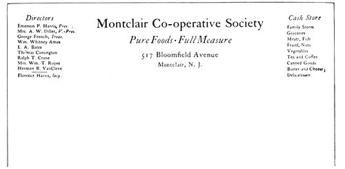
EXAMPLE 294 Just a neat typographical arrangement
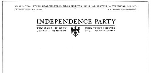
EXAMPLE 296 A heading in two groups. By Harry A. Anger
Example 290.—This example is a resetting of a letterhead on which the printer had imitated bricks by using oblong border units printed in 116red. His effort was too literal, and in rearranging the heading the purpose was merely to suggest bricks and tiles in a light-printing border. Spaced Caslon capitals completed an effect that is unusual and distinctive. The line “Brick and Tile” could be printed in color.
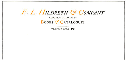
EXAMPLE 297 A neat letterhead and uncommon distribution of color. By Leon I. Leader
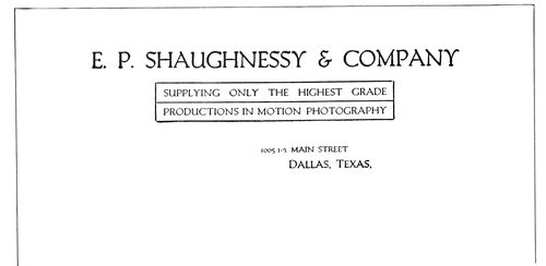
EXAMPLE 298 Double-panel treatment that is unusual
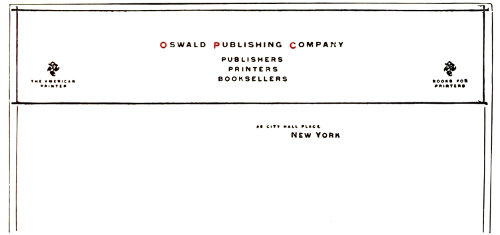
Example 291.—There is a dignified yet novel attractiveness about this heading. The light cross-rules give shape, and individuality is injected by slightly spacing the letters and confining the color to three small initials. Gothic (sans-serif) type looks well treated in this manner. As will be seen, liberal blank space is necessary for a right effect. The original was printed in black and vermilion ink on gray bond paper.
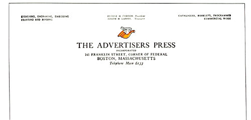
EXAMPLE 300 A letterhead in Caslon roman capitals and italic lower-case, with touch of color in the distinctive shop mark
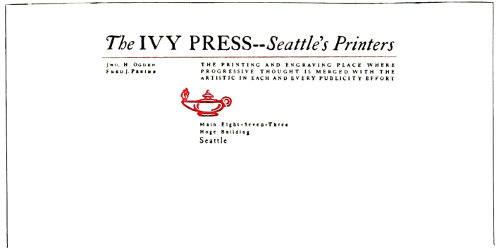
Example 292.—The designer of this letterhead planned to get something different and succeeded. He did it, too, with the good old Caslon type-face. This type has proved its worth in commercial job work, and there seems to be no limit to its usefulness. By spacing the letters in this heading a peculiar tone has been obtained which gives the letterhead much of its character. The position of the lamp ornament is odd. Black and orange ink and white paper were used.
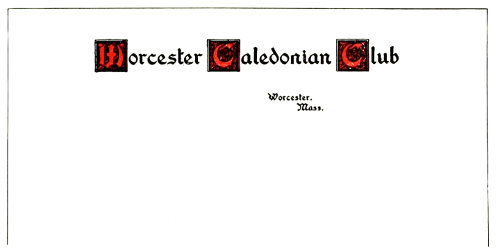
Example 293.—While it is safer to print club stationery in the conventional style of professional stationery, there are clubs which will appreciate any individuality and attractiveness the printer may introduce on the letter sheet. This heading is a suggestion of what might be done in this direction. Washington Text has been combined with decorative initials.
Example 294.—The problem here was to produce a letterhead for men who appreciate typographic neatness, and the problem was met by setting the heading in Caslon lower-case and introducing italic in several places where it would be of the most value. As will be seen, the names of the officers were grouped on the left, and balanced on the right by a group that tells of the things the store has to sell. It is likely that copy such as this would meet with different treatment from the average compositor, who would be inclined to distribute the copy over all parts of the letterhead. The lesson to be learned is that the several parts of copy should be orderly apportioned to positions on the letter sheet, as in this instance.
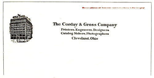
Example 295.—This is an excellent example of a good letterhead, originally produced by the incised copperplate method. Study of its details would benefit the typographic printer for the reason that, as mentioned in the beginning of this chapter, designers of letterheads produced by lithographic and intaglio processes have given much thought to letterhead arrangement. The main part of the heading is symmetrically arranged in a group in which attention has been given to spacing. The illustration is disposed of at the left, and an added line has been placed in the upper right corner and printed in red. The neatness and dignity of this letterhead are an inspiration.
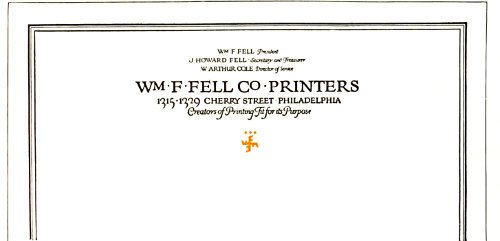
EXAMPLE 299 Distinction in letterhead design. The rule border, which extended around the entire sheet, was in a shade of ink lighter than that used for the type
Example 296.—The copy of this letterhead presented a problem which was solved by making two distinct groups of the type matter. In the main group were placed the matters of national 117importance, and in the upper group in smaller type such copy as refers to the state organization. Compositors should observe how the “Y” at the end of the main line has been extended into the margin so that the group alignment might be retained. The printing combination was black ink and white paper.
Example 297.—Perhaps the use of italic capitals exclusively would have been more consistent, yet the one line of roman capitals does not detract from the pleasure the neatness of this heading affords the admirer of good printing. The distribution of color is uncommon. The italic short-and (&) adds a touch of decoration to the heading. Typographers will find that these old-style italic short-ands look well in display lines substituted for the spelled-out “and.” The roman short-and (&) is severe in character and is not so pleasing.
Example 298.—Occasionally it is advisable to inclose type matter in a panel, altho in most instances the typographer will find that a letterhead is neater if no rule panel is used. However, there is something attractive and different about the panel treatment of this letterhead. Without the rules the heading would be neat, but would lose a distinction that is now given it by the rules. The type-face, Packard Oldstyle, possesses a quality found in hand-lettering and looks well on this heading.
Example 299.—A line border finishing off the edges of the letter sheet adds a quality to the appearance of the stationery that makes it worth while when the printer uses the idea on his own stationery or a customer is willing to pay the increased cost necessary for such an effect. On the Fell letterhead the border was in a shade of ink lighter than that used for the type. The arrangement of the heading is worthy of study, especially the disposition of the officers’ names, which are placed one under another instead of being conventionally arranged in a line at the top of the sheet. While this heading is hand-lettered, it is suggestive of similar effects that could be produced with good type-faces of an old-style design.
Example 300.—Another letterhead in the Caslon type-face, roman capitals and italic lower-case being used. Much of the attractiveness of the heading is due to the spot of decorative color made by the shop device, which in design blends well with the type-face and because of its position brings the eye to the title of the press. The names of the officers are placed above the center, and the service rendered by the press is outlined in the end groups.
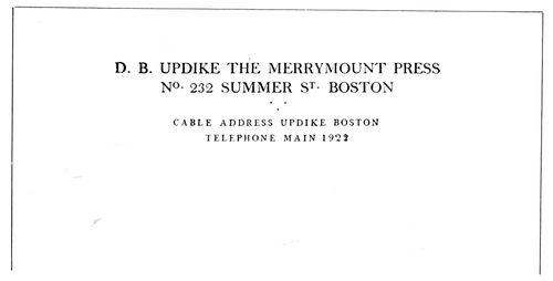
EXAMPLE 303 Type arrangement as used by a noted typographer. Printed on the fourth page of a folded note sheet
Example 301.—The cross-line panel is here adapted to letterhead purposes with some success. The decorative border is a suitable one for such arrangement and affords relief from the plain brass rule. However, it only departs from the plain rule sufficiently to add an interesting touch of irregularity to the lines. Text type has been used for the center, and where Caslon capitals are found in the panel they are letterspaced.
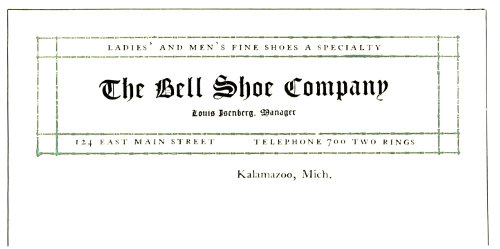
EXAMPLE 301 The crossed-line panel successfully adapted to letterhead purposes. By Adams-Brander Company
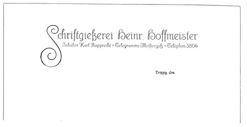
EXAMPLE 302 A German idea in letterhead treatment
Example 302.—While German treatment in advertising design and typography is usually thought to be strong and forceful, yet certain classes of work are produced in a dainty yet characteristic style. This letterhead is presented because of the interest it will doubtless have to American printers.
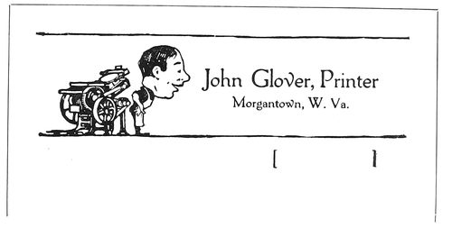
EXAMPLE 304 Humor in a notehead is exceptional
Example 303.—This notehead printed in two sizes of capitals is interesting in that it is the work of a noted book typographer. The larger capitals are not letterspaced, but the smaller ones are. A triangular formation of periods 118adds a touch of decoration between groups. This notehead was printed on the fourth page of a folded sheet in dull-finished black ink on white bond paper.
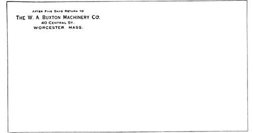
EXAMPLE 305 Conventional treatment of an envelop corner
Example 304.—Humor in a notehead is questionable and should be used only in exceptional cases. Mr. Glover, however, has used it to good advantage. Printing has always been such a serious business that customers may welcome a printer who can smile even on his note sheets.
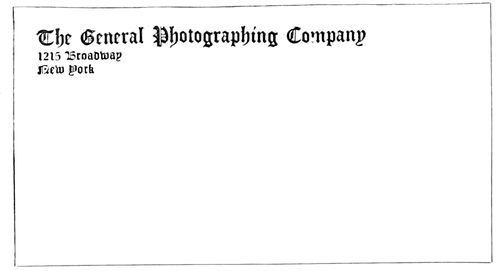
EXAMPLE 307 Envelop corner prominently treated in a decorative letter
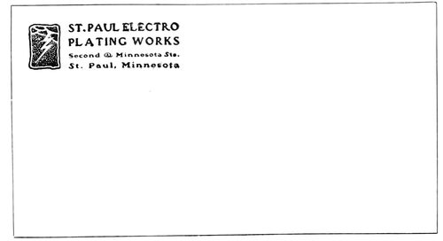
EXAMPLE 308 Harmony of device and type treatment. By Ray Greenleaf
The envelop is an acknowledged convenience in correspondence. It not only protects the letter from being soiled or tampered with, but is a convenience to the post-office and a means of advertising. The first use that the printed part of an envelop has is to inform the postal authorities of the name and address of the sender so that if a letter cannot be delivered it can be returned. On government-printed envelops this information is given in the briefest and plainest possible way. However, the greater number of business men recognize the advertising possibilities of the envelop, and not only have the paper match that used for letterheads, but see to it that the typographic treatment is also in accord with that on the letter sheet. The treatment of the face of the envelop should be neat. It is not only in poor taste to cover the envelop with printing, but is against the post-office regulations. There are those who prefer to print the type matter on the flap of the envelop, and others who print the type matter in the usual corner and the trademark on the flap.
Example 305.—This is a specimen of a conventionally treated envelop corner in imitation steel-engraved lettering. The old-fashioned “After five days return to” as here used is not much in vogue, and printers would do well to omit it unless the customer insists upon its inclusion. This envelop corner is in the same style of typography as the letterhead that accompanied it.
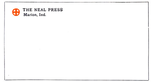
EXAMPLE 306 Distinctive and artistic treatment
Example 306.—Artistic interest of a medieval character has been given this envelop corner by the use of Old-Style Antique, and especially by the decorative device in color. The design of this envelop is distinctive, and mail from this source would easily be recognized after one or two letters had been received.
Example 307.—Occasionally it is good policy to bring out the name of the business in a prominent way, especially if it can be treated in a decorative letter such as the one used in this instance. Not every business will allow of such prominent treatment, and in this matter the printer needs to use judgment. The type has been aligned at the left.
Example 308.—It is seldom that an envelop corner is treated so harmoniously and artistically as the one under consideration. The general character of the decorative device is matched by the style of the type-faces used. The squaring of the type group also adds shape harmony. This corner card, designed some years ago, is proof of the fact that good work is always good.
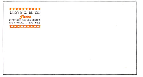
EXAMPLE 309 An elaborate envelop corner
Example 309.—Seldom should an envelop corner card be as elaborate as this one, but when such an arrangement is allowable, as in this case, the design shown is worthy of consideration. The type-face is Caslon with Caslon Text, and the bands are made by using square ornaments with alternating blank space inside of rules.
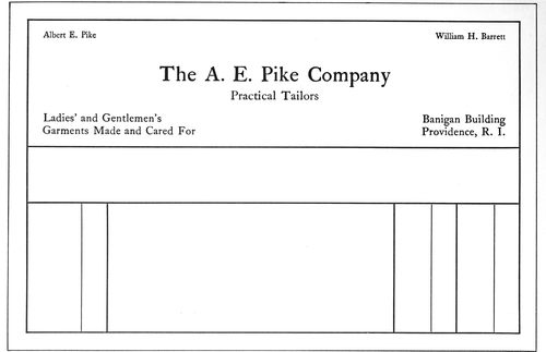
EXAMPLE 312 The non-stock-ruled type of billhead, with a panel in which name, date and other items are recorded. Showing use of roman lower-case
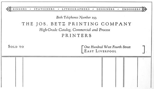
EXAMPLE 313 Remove the words “Sold to” and the rule work, and this could be used as a letterhead. Showing use of italic lower-case with spaced roman capitals
119
BILLHEADS & STATEMENTS
The printer called on to produce a billhead has a responsibility seldom fully realized. He has a duty to himself, to his customer and to those who come after, which is best carried out by suitable and dignified type composition. A business house has been known to use the same design of billhead for fifty years, and it is a fact that many merchants cannot be persuaded to change the style of the billhead, no matter how homely it may be.
Billheads and statements should correspond in style to that of letterheads and other forms of stationery, and in changing the design it must not be forgotten that these other forms should also be altered to harmonize. The paper should be of the same finish and color, and the main features of type arrangement similar. The type-face must be the same on all.
The standard sizes of billheads for commercial purposes are:
8½ × 5½ inches, 8 out of a sheet 17 × 22.
8½ × 7 inches, 8 out of a sheet 17 × 28.
8½ × 9⅓ inches, 6 out of a sheet 17 × 28.
8½ × 14 inches, 4 out of a sheet 17 × 28.
Professional billheads are usually an inch or two smaller than the smallest size of commercial billheads.
There is a variety of sizes in statements. Popular sizes are those cut out of folio (17 × 22 inches), which then measure 5½ × 5⅝ inches, and 5½ × 8½ inches.
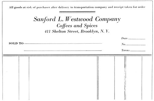
EXAMPLE 310 In which are presented the principal features of the average commercial invoice, or billhead. The customer’s name is placed in the lower left corner
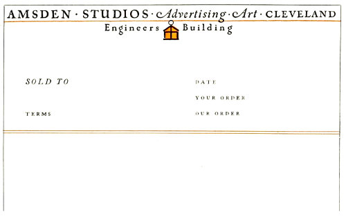
EXAMPLE 311 How a letterhead may be converted into a billhead. The upper portion is also shown as Example 283 in the chapter on letterheads
Whether ruled or not, it is customary to allow about 2¾ inches for the printed heading on both billhead and statement.
Because of the extensive use of “window” envelops, the heading should be so arranged that the name and address of the customer can be placed in the lower left part of the billhead. The exact position can be ascertained by placing a billhead over such an envelop and jogging the two at the head and left side. When held to the light the opening in the face of the envelop can be traced on the billhead. The billhead is folded to fit the envelop and inserted so that the name and address can be seen.
Use of the typewriter and window envelops has brought a change in the arrangement of billheads, and printers, whenever they have opportunity, should alter the old billhead arrangement to conform to the new requirements.
Most billheads a quarter of a century ago contained in the upper right corner in script (usually) a date line, and under it at the left was a dotted line beginning with a large script M. Immediately following came the firm name (usually rather large) flanked on the left by the word “To,” and on the right by the abbreviation of debtor, “Dr.” So the apprentice boy was taught, and he would then be further instructed to place the words “Dealers in” (or their equivalent) in small type, centered; then to display the words indicating the line of goods carried. In a small line at the lower right corner was the street address, and aligned opposite were the mystic words “Terms Cash.”
120Sometimes the words “Bought of” were substituted for “To” and “Dr.” The older printers will remember the logotypes in various fancy designs of the phrase “Bought of” that the typefounders furnished in those days, which logotypes were set against type lines of double great primer caps. Now “Bought of” has been supplanted on billheads by “Sold to,” which directs attention to the fact that John Smith has sold goods to Thomas Brown, rather than that Thomas Brown has bought goods of John Smith—a distinction without a difference, one might say, yet there is interest in noting the change.
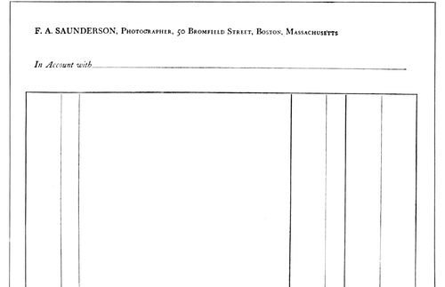
EXAMPLE 314 A billhead, or statement, in a classic non-display style of typography that suggests early printing. By D. B. Updike
The probable reason for the “M” being discarded in recent years on commercial billheads is that many business houses are now corporations, which fact makes “Mr.” and “Messrs.” no longer suitable as forms of address.
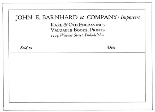
EXAMPLE 316 A suitable billhead with interesting border treatment. No guide lines have been used
Example 310.—This specimen presents the main features of the average commercial invoice, or billhead. Usually there are conditions of sale which can be placed at the top of the heading with a rule underneath, altho they are sometimes arranged at the side or at the foot of the invoice. The name of the company is given most prominence, followed by mention of the commodity or product. The number, street and city naturally should be displayed so that the customer’s location can be referred to quickly in correspondence. “Sold to” precedes the space left blank for the customer’s name, and this, as has been explained, should be in the lower left corner. Blanks for the date, terms, invoice number, ledger number, customer’s order number and other notations of record may be grouped in convenient open spaces.
Example 311.—The composition of a billhead really begins with the composition of a letterhead. It should be possible to take any letterhead and by adding a few lines convert it into a billhead. The specimen under consideration shows how this is done. The original of this billhead was exhibited as Example 283 in the preceding chapter. The conventional phrase “Sold to” is placed in its customary position and the other phrases added at suitable spots. Printers should keep this suggestion in mind and, when laying out a billhead, design the upper part as they would a letterhead.
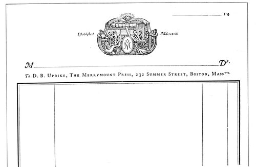
EXAMPLE 315 Typographic art and good taste, as demonstrated by this specimen, have a place on billheads as well as on books
Example 312 (Insert).—This is an interesting representative of the non-stock-ruled heading, and it also illustrates the changes the typewriter has wrought in billhead printing. When bills were written in by hand, script type and dotted rule prevailed, but because of the use of typewriters, script and horizontal guide lines are gradually disappearing from the face of billheads. The example under consideration also demonstrates the effectiveness of Caslon lower-case for billhead purposes. When every line is in roman lower-case there is harmony, but sometimes there is also monotony. In this instance, however, the introduction of italic and small caps would alter the plan of the heading and detract from its distinction. The rule border and the panel for the insertion of customer’s name and address give distinction.
121Example 313 (Insert).—There is here another demonstration of the transformation of a letterhead into a billhead. Remove the words “Sold to” and the ruling at the foot and the form is ready for the letter sheet. Kennerley type, altho primarily a book face, is also usable on stationery where neat, distinctive effects are desired. Capitals are spaced (as in the old books of Aldus), and italic is used with the capital lines, this use of italic also being suggested by the work of the Aldine Press. However, the specimen is not intended to be in the classic spirit of Aldus; it is merely a modern commercial suggestion.
Example 314.—Here is a billhead, or statement, in classic typography that suggests the style of the fifteenth century. The heading is practically in one size of type. Advertising distinction is obtained by using capitals for the name, capitals and small capitals for the business name and address, and italic for “In account with.” There is not much that is striking about this billhead, yet, printed on a fine quality of writing paper, it would make one really glad to receive a bill of this kind.
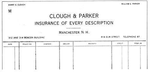
EXAMPLE 318 Invoice with lower portion divided into columns, as sometimes used in business
Example 315.—D. B. Updike makes plain by this specimen, as well as by the preceding one, that typographic art and good taste can be used in the designing of a billhead as well as in the designing of a book. The woodcut device has the same good quality as the typography. The old-fashioned “M” and “Dr.” are used, and blend well with the old dignity of the heading. The ruling on the lower part of both of these headings was printed from rules. There are other good printers who prefer brass rule to the ruling machine for billhead purposes. Machine ruling is convenient, but is not in good taste for billheads, statements and letterheads of really fine quality.
Example 316.—The stationery of a book dealer should have a bookish character—that is, the typography should be inspired by the same skill and taste evinced in the treatment of a good book. A well-designed type-face should be selected, and there should not be a great contrast in the sizes used. When it is possible to have two printings, the extra impression could take the form of a simple rule border in color, as on this specimen. The first type line runs almost from border to border at the head, and another portion of the copy is arranged directly under it in three even lines. The “Sold to” occupies its approved position. No guide lines are provided for the accountant’s part of the bill, as with a typewriter the various items can better be filled in without them, and a billhead really looks neater without the rules.
Example 317.—For printing on colored stock strong treatment is sometimes advisable—treatment such as has been given this heading. On white paper the type sizes should be kept small, as the light background illuminates the print. White and black form the greatest contrast. There is not much contrast between blue ink and blue paper, for instance, and it is necessary to strengthen the print by the use of a larger or bolder type-face. The arrangement shown is unconventional. A full line has been made of the business title, the name itself being slightly emphasized by printing it in color and giving an initial effect to the first letter. Other parts of the copy are grouped at suitable points, “Sold to” occupying the usual lower left corner.
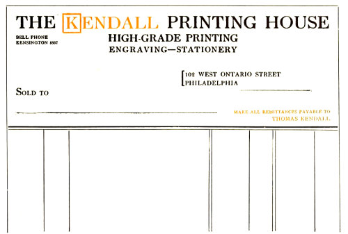
EXAMPLE 317 Large treatment that would look well in harmonious colors on colored paper
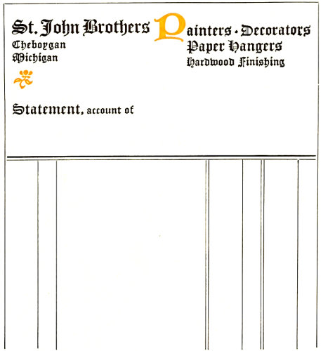
EXAMPLE 319 Decorative type treatment suitable for the business of painting and decorating
122Example 318.—Many invoices and billheads now have the lower part divided into columns for taking care of the various items peculiar to the business, as in this instance. The customer usually decides when he wishes to depart from the conventional ruled effect, and it is just as well for the printer not to suggest a change of this sort, as it means extra composition for which the customer may be disinclined to pay. The type-face on this well-arranged example is a good one for plain commercial headings. It would be well, for convenience, to place the “M” in the lower left corner and move the building address to the right corner, over the street address.
Example 319.—A decorator’s stationery seems to offer opportunity for effects away from the customary plain treatment of the average heading. This statement, in the same style as a letterhead that accompanied it, shows a decorative type-face and an arrangement that could possibly be called decorative. The upper two type groups are joined by the uncial initial, and the two groups at the left are connected by the flower ornament.
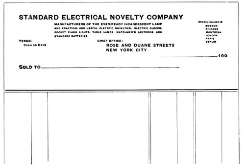
EXAMPLE 320 An uncommon arrangement. The main type line tells the story, as the company’s title describes the business
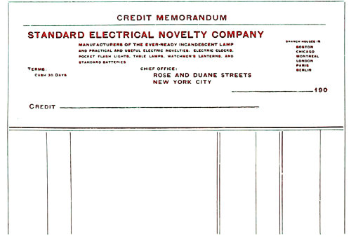
EXAMPLE 321 Credit bill made from the preceding billhead by adding a line at the head and changing “Sold to” to “Credit”
Example 320.—This is an unusual arrangement for a billhead. As the business is stated in the firm name, there is not the usual necessity for a second display line. While this arrangement could be carried out in some other type-face, the serifless “block” letter as here used is not displeasing. The grouping of the branch houses is good, and other groups are also well placed.
Example 321.—Most business houses find need for credit bills, to be used when goods are returned or some error has been made in billing. Such forms are easily provided by using the billhead, adding the words “Credit Memorandum” at the head and changing “Sold to” to “Credit.” In order that credit bills may look unlike regular bills, they should be printed in color as is here shown.
Example 322.—All professional stationery should be refined. The sizes of paper and type should be small and the whole effect restrained and polite. Such work seldom changes in style, and consequently there is little variety. The form shown here would probably prove acceptable for many years to men of the medical and similar professions.
It may not be out of place to remind the reader that an invoice (or bill) is a list sent to a purchaser or consignee, containing the items and charges of merchandise that have been forwarded to him.
As to the statement: It is a common practice to send each customer at the first of the month a statement showing the debit balance of his account to date, whether it is due or not, enabling him to compare the statement with the ledger account. In order to call the attention of customers to the fact that payment is desired, many business houses send a statement whenever a bill is due (when goods are purchased on January 10, as an instance, at ten days, a statement is sent January 20).
There are numerous other forms used in business, such as checks, deposit slips, drafts, promissory notes, bills of lading and the like, but there is not space to show them here.
Such forms, if possible, should be in harmony with the style of the letterheads, billheads and other stationery. The same type-face should be used and the arrangement of display parts should have similarity.
EXAMPLE 322 On professional bills the paper and type should be small and the treatment restrained and polite
EXAMPLE 323 A label that catches the attention at a distance and looks well on the background of wrapping paper
EXAMPLE 324 A label of classic simplicity for small packages and a business that emphasizes daintiness and delicacy
123
PACKAGE LABELS
The effect of an attractive package is recognized to be of such importance that a widely known manufacturing concern recently sued a competitor for imitating the appearance of its packages and labels. However, not all business men feel this way about it.
After spending time and money in the production of merchandise of high quality, it is more than foolish to economize on the packing.
It is possible, with good clothes well selected, to make an unattractive person attractive, and it is also possible to make an attractive person unattractive by poor clothes ill selected. Apply this.
The wrapping paper should be strong, and of color and finish suited to the article to be wrapped. Some stylish city dry-goods houses use paper with distinctive stripes or small monograms printed over its surface. A well-known haberdasher wraps his hats in soft black paper.
The selection of the wrapping stock should of course be governed by the character of the business and the class of customers, but as in similar instances, it is dangerous to underestimate the taste of one’s customers. The persons who lack appreciation of a neatly wrapped and attractive package are very few indeed.
Among merchants, druggists are known to wrap the neatest packages. This seems to be due in part to their professional training. Not many printers give their product a similar attractiveness at the time of delivery.
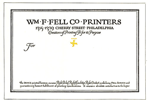
EXAMPLE 325 A hand-lettered design for typographic study
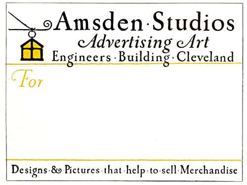
EXAMPLE 326 Another label rich in suggestion
The art of making a good impression also includes the fastening of the wrapper. Cord and twine are commonly used, and interest is sometimes added by selecting appropriate colors. Linen tape for a business of an exclusive nature gives distinction.
Gummed-paper tape, while convenient, seldom looks well, and when printed on looks worse.
Corrugated board when properly used adds both neatness and protection to the package. Some printers have cartons made from this board, in which their product is packed and delivered.
The printed label is of the most interest, as it affords a spot of attraction and furnishes information needed in the delivery of packages. All labels should be planned with the wrapping paper as a background. A label may look well alone, yet when placed on the package may appear weak and uninteresting.
In order to test this, two labels of contrasting treatment are pictured mounted on a sheet of conventional wrapping paper.
It will be admitted that the stronger label is more striking and catches the attention. There are those who will prefer the weaker label because of its neatness and beauty, yet we must not lose sight of the fact that labels, unlike business cards and letterheads, are not usually seen at close range when on packages. A business card is examined a few inches from the eyes, while a label on a package is frequently viewed from a point several feet away.
124
EXAMPLE 327 Ruled lines for the address, in panel
EXAMPLE 328 A mass of black lettering with contrasts
EXAMPLE 329 Artistic quality and interest through typography
There does not seem to be any standard size for labels. They vary from four, five and six inches wide to three, four and five inches high. When The American Printer conducted a label competition it specified the size as five by four inches, and this seems to be a good average size.
The paper on which the label is printed should be stock that pastes easily. White is used to the greatest extent, altho a cream-tinted color such as comes in Japan vellum is preferred by some persons of good taste.
Example 323 (Insert).—As has been said, this label shows the effectiveness of heavy effects. A design such as this has advertising value. It can be seen and read at some distance, yet is not offensive in appearance. The red border is attractive, and merges the label with the wrapping background. The type-face has decorative quality. The combination of black, red and cream in strong contrasts is worthy of study. As will be noticed, all capitals have been used, and there is not much space between the lines or between border and type-face.