PART TWO (continued 2)
Reading edition

EXAMPLE 101 Regularity of repeat

EXAMPLE 102 Variety of repeat

EXAMPLE 103 Monotony

EXAMPLE 104 Less monotony

EXAMPLE 105 Contrasted shapes prevent monotony
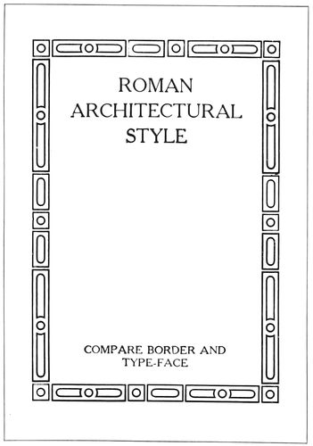
EXAMPLE 106 Type border of Roman architectural ornament. Compare the straight and curved lines with the Roman type-face
Let us apply the egg-and-dart and bead ornaments as borders in typography, and notice how admirably they serve the purpose. Example 85 shows the egg-and-dart ornament perhaps too carefully drawn as to detail; and Example 86 demonstrates how the bead ornament may be adapted to panel work.
From early times there seems to have been a triple division of taste regarding ornament. In the days of Rome these divisions were given expression in the treatment of supporting columns, the three styles being known respectively as Doric, Ionic and Corinthian. The Doric column is severely plain, the Ionic slightly ornamental, and the Corinthian elaborately ornamental.
The Doric style (Example 91) is emblematic of dignity, simplicity and strength, and appeals to the man preferring these qualities in printing.
The Ionic style (Example 92) represents refinement in ornament, and pleases the man able to discriminate between the severely plain and the over-ornamented—a quality of judgment worth cultivating by every typographer.
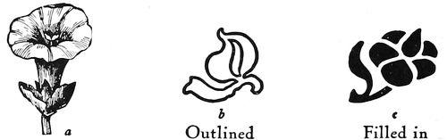
Outlined Filled in Illustration, not ornament Ornaments without perspective EXAMPLE 108
The Corinthian style (Example 93) expresses the preference of many who delight in ostentation and elaboration in ornament. The elaborate, showy acanthus leaf usually forms the chief decoration for the capital surmounting the column, and the entablature (Example 94) is particularly rich in ornamentation.
The Doric pillar has been called masculine and the Ionic feminine, the sturdiness of the one and the grace of the other also being likened to the warlike Spartans who emphasized the development of the body and the artistic Athenians who especially developed the intellect.
This difference in ideals and preferences has come down the centuries to our time. A few years after Cromwell, plain, blunt, and even disapproving of sculpture and painting, was ruling England, across the channel Louis XIV. strutted in corsets and on high red heels amid gilt and glamour in the courts of France.
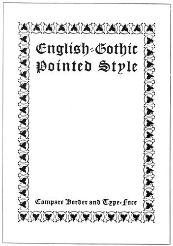
EXAMPLE 107 Type-border of English-Gothic pointed ornament. Compare the black pointed effects with the Gothic type-face
Monks and nuns lived plainly in the company of bare walls and squarely cut chairs, and dressed in subdued browns and blacks, while at Rome surrounded by the art works of Michelangelo and Raphael the higher dignitaries 63were clothed in brilliant reds, and gold and white.
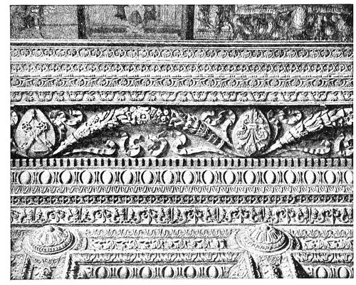
EXAMPLE 109 Extravagant wall border ornamentation, designed during the Renaissance in Italy
Morris loved an old worn-out house, squarely-cut furniture, burlap, and subdued colors; while the Newly-riches boast of the magnificence of their mansions, Louis Quinze ball-rooms and imported tapestry.
Only recently two church buildings were remodeled. In one were placed ornamental brass railings, lectern, pulpit and candelabra, and stained-glass pictorial windows; the walls were covered with gilt fleurs-de-lis on maroon backgrounds, and the entire effect was one of cheap magnificence. The other church had been an old Colonial structure of square proportions. Dignified mahogany furnishings were selected, the walls were ornamented in pure geometric designs, pale gold on tinted backgrounds, and the windows were made of small panes of glass subdued in color, in harmony with the architecture of the building, with a result that spoke good taste and refinement.
Examples 95, 96, 97, 98, 99, 100, present the three divisions of taste—the plain, ornamentless; the slightly ornamental, and the elaborately ornamental—applied to typography and reflected in furniture. The typographer should learn that the arts are related, that the styles of home-furnishings and architecture influence the styles of typography. A few years ago mission furniture was introduced and along with it came architecture that called for exposed roof supports, squarely-cut moldings, coarse fabric wall coverings, subdued green and brown tapestries. And before they knew the reason, printers were using heavy brass rules, rugged type-faces and printing on dark-hued antique papers. Example 96 is a program page produced under these influences. Compare it with the so-called “mission” chair (Example 95) and note the resemblance of motive. Both are rugged, angular and plain.
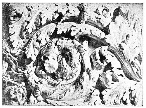
EXAMPLE 110 Roman scroll ornament cut in stone
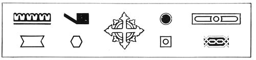
EXAMPLE 111 Type ornament based upon geometric lines
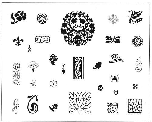
EXAMPLE 112 Type ornament based upon foliage
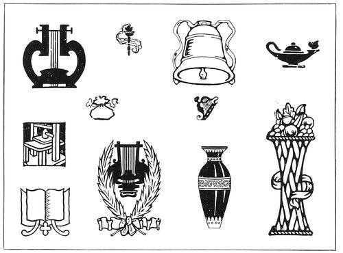
EXAMPLE 113 Type ornament based upon the inanimate
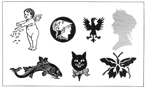
EXAMPLE 114 Type ornament based upon the animate
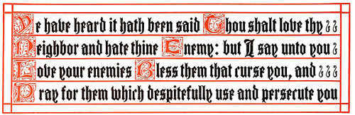
EXAMPLE 115. Ornamental hand-lettered effect; obtained by initials, text letter and rule
Now for contrast, compare them with 64the dainty, elaborately ornamental chair (Example 97) and the title-page (Example 98). Both chair and title-page designs are based upon the frivolous rococo style of the period known as Louis XV. (or Louis Quinze). In that period, shells and leaves conventionalized into graceful, golden curves were blended with a profusion of roses and other flowers. Straight lines were avoided, and furniture and architecture took on curves even to the extent of causing structural weakness.
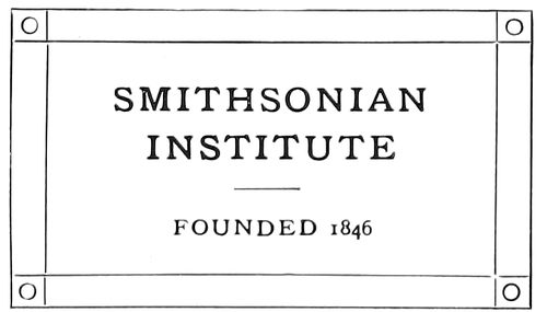
EXAMPLE 116 Corner ornaments may have been suggested by the bolts on inscription plates or by the cross lines on books
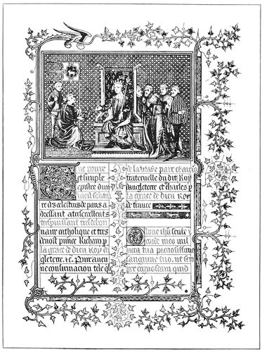
EXAMPLE 117 Ivy-leaf ornamentation, and spaces filled in by decoration. From an old manuscript book
Because a majority of type-faces are built upon horizontal and vertical lines, rococo type ornamentation is seldom successful in typography. The pen-and-ink border design (Example 98) is a clever adaptation of the Louis XV. rococo style. There is not an absolutely straight vertical or horizontal line in the border, and with the curves and flowers, ribbons, lattice-work and cupids it makes an appeal to women. The type-face combined with the border has similar characteristics—a freedom of line and an abundance of curves.
Examples 99 and 100 show a chair and an announcement page, both slightly ornamented to please those folks who like neither the severely plain nor the elaborately ornamental.
Ornament is secondary to the real purpose of the thing it embellishes; it should not be so lavish as to distract attention from the more important object. A booklet is issued to convey a message, and should the reading matter be overshadowed by ornamentation, this purpose may not be accomplished. A “flowery” oration may entertain and please an audience, but it may not convince. In 1896 Bryan stampeded a convention by his extemporaneous eloquence and metaphor, but when he came to the “enemy’s country” and faced an audience which wanted facts, he read his address from carefully prepared manuscript.
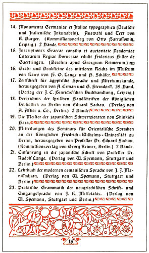
EXAMPLE 118 Filling blank spaces with ornamentation, as was done on manuscript books. Page by Government Printshop, Berlin, Germany
During the Middle Ages, when nations were fighting for existence and necessities of life were barely obtainable, there was little ornamentation except in isolated instances, but when, about the fifteenth century, the Renaissance came, art received an enthusiastic reception. Ornamentation was indulged in to excess, the artists using all the classic forms and inventing new ones. Example 109, showing wall border decoration, 65looks to the printer like a specimen sheet of type borders. This brings to mind that there is always the temptation to over-ornament when an artistic job is desired, and the necessity of advising printers to restrain themselves and save a few ornaments for other work. Our brethren of the cloth like to repeat the story of the theological student preaching his first sermon before the Seminary authorities. He began at Genesis and took his hearers thru the entire Bible to Revelation. When he had finished an old professor gravely asked what he would preach about the next Sunday.
The famous designer Chippendale, first made his furniture serviceable and then added ornament, from which fact the printer should profit. Have a printed job serve its purpose, and ornament it only so far as is consistent to this end. It is frequently advisable to omit decoration and let the type talk without interruption.
Ornamentation when used for border purposes has two features which may not be apparent to the superficial glance—regularity in repetition and variety in repetition. Example 101 shows repeated strokes of the same length. In Example 102 by alternating the length of the strokes the design is made more interesting. Examples 103, 104 and 105 illustrate this principle in rounded forms. In the first there is monotonous repetition, in the second there is less monotony because the oval form is less regular than the circle, and in Example 105, by contrasting the forms in both size and shape the design acquires new decorative interest. This principle of contrast and variety is exemplified in most border designs. In Example 107 the light scroll lines contrast with the black leaves, and in Example 106 curves are contrasted with angles. Contrast is sometimes obtained with color, as shown in Example 123.
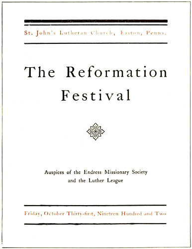
EXAMPLE 119 Semi-ornamental ecclesiastic style
Ornament as used by the printer may be divided into four classes: Ornament based upon geometric lines (Example 111), ornament based upon foliage (Example 112), ornament based upon the inanimate (Example 113) and ornament based upon the animate (Example 114). The center ornament in Example 111 contains the cross and circle, ecclesiastic devices, and its conventionalized pointed leaves would also admit it to the group shown as Example 112—ornament based upon foliage. Leaves and flowers from the beginning have been a prolific source of inspiration to artists. Before the invention of typography the decorator of manuscript books reveled in foliage, as will be seen by Example 117, and today when decoration is added by the process of printing the same liberal use of foliage is evidenced (Example 118). In both examples should be noticed the custom of filling blank spaces with decoration.
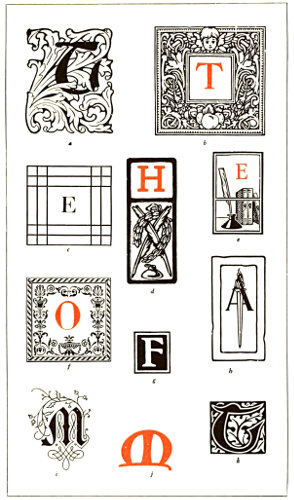
EXAMPLE 120. INITIALS a—Foliage decoration based on the acanthus leaf b—Imitation of mortised woodcut initials c—Simple geometric treatment d—Rugged Colonial style e—Suggesting literary use f—Italian ornamentation g—Plain black and white effect h—Modern adaptation of Roman torch i—German scroll decoration j—Based upon the uncial character k—Woodcut effect as used by Morris
The inanimate (Example 113) lends itself better for ornamental purposes than does the animate (Example 114), and the less familiar the subject the better ornament 66it makes. An ornament based upon the animate is shown in Example 124, and as will be seen it is not as pleasing as the one in Example 121, which is based upon the inanimate.
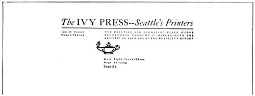
EXAMPLE 121 Simple ornamentation applied to letterhead. Design by Harry A. Anger, Seattle, Wash.
Initials afford a convenient means of ornamentation (Example 120). An initial well chosen as to tone and appropriateness often satisfies all demands in this line. The mortised Colonial initial indicated by b looks well with Caslon roman and printed on antique paper. The acanthus design a looks well with Washington Text; the Italian design f, with a letter such as Bodoni. Initials are used in a highly decorative manner in Example 115, after the style found in ecclesiastical manuscripts. The possibilities of type and rule are here well set forth.
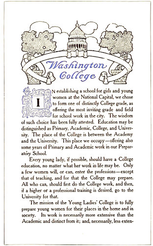
EXAMPLE 122 Appropriate ornamentation applied to the modern booklet. Page by the Munder-Thomsen Company, Baltimore, Md.
Sometimes ornaments in the corners of a plain rule border (Example 116) are sufficient decoration. These effects may have been suggested by the corner bolts with which brass plates are fastened to walls.
In the booklet decoration (Example 122) the artist has taken his motive from the word “Washington” making the capitol dome and its supports the central figure in the design, which is Colonial in character. Drawing a line down thru the center of the design it will be found that with a few minor exceptions the right half is a duplicate in reverse of the left half. The effect is frequently found in decorative work, as it gives balance and differentiates between illustration and decoration. An illustrative design, showing an actual scene, would not be effective.
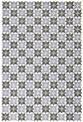
EXAMPLE 123 Effect of alternating colors, for covers and end-leaves of booklets and catalogs
Wall paper and linoleum designs are made in patterns that repeat at intervals and for this reason answer the purpose of decoration.
Example 119 presents a program page, which, while attractive, has but one ornament, an ecclesiastic design. The arrangement of bands above and below the main display assists in forming a decorative effect.
Type decoration in use today shows a preference for forms from Italian sources. Several years ago the Colonial spirit had influenced a preference for Gothic-English forms. The work of Goudy, Cleland and others has had a part in developing taste for the Italian.
In closing this chapter it may be well again to warn the printer not to over-ornament. The relation of ornament to typography is well covered in the caution of an experienced architect to a novice: “Ornament construction, but do not construct ornament.”
The best art is that which is concealed, and which unobtrusively adds effectiveness to a piece of printing.
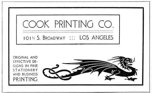
EXAMPLE 124 This ornament, based upon the animate, not well suited for business purposes
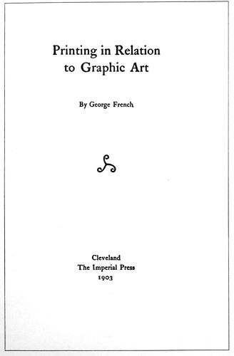
EXAMPLE 126
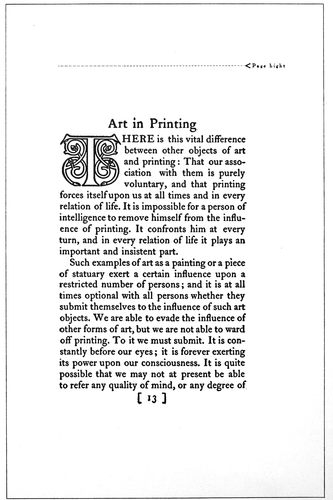
EXAMPLE 127 These pages are model specimens of book typography. Shown here in the actual size of the originals, from zinc etchings
67
THE TYPOGRAPHY OF BOOKS
Good taste, a quality essential to the successful production of all kinds of printing, is of great importance in the typography of books. In the matter of good taste most of us are specialists—we perfect our judgment in some one respect and let it remain erratic in others. A musician or other artist may stand high in his class and yet, perhaps, show poor taste in dress and manners.
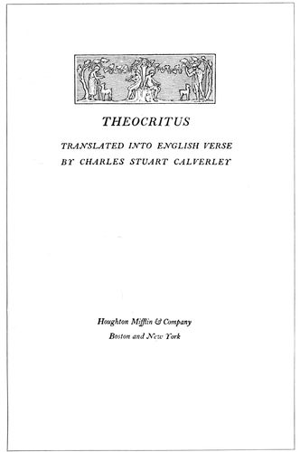
EXAMPLE 128 Appropriate title-page of a book of classic poems. By Bruce Rogers
A person of good taste is usually conservative. He weighs all new things in the balance of judgment, and allows enthusiastic faddists to push him off the sidewalk rather than join the crowd and shout with it. He knows the fickleness of mobs and remembers that in a week hosannas have been changed to shouts of bitter invective. The merchant catering to the whims of fashion ever has unsalable stock on his shelves. In the days of militant Rome the crowd which one day cheered Sulla, the next day crowned Marius with laurel.
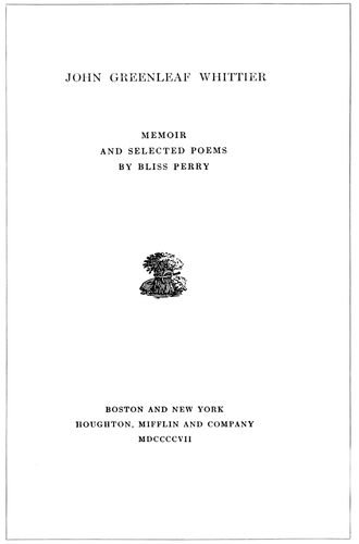
EXAMPLE 129 Title-page with a nineteenth century motive. By Bruce Rogers
The natural tendency of humanity is radical. The conservatives are in the minority, yet their influence is great because their opinions are generally based upon sure foundations. Of course a person can be progressive and possess a present-day mind without being either radical or conservative. The natural tendency of job printers is radical. Left much to their own whims and fancies they produce printed things which may please only for the moment. The test of gold is not in its appearance when purchased, but in years of wear. Because a job of printing is made for short service is no reason why it should not be as well done as book composition is required to be. All the art-reasons in book typography 68are equally applicable to job typography. The two methods should not be judged by separate standards—a thing is good, or it is not. At the present time educational work is elevating the standard of job typography, and the designer of job composition, drawing closer to his book brother, is beginning to notice the faults and flaws in the latter’s work.
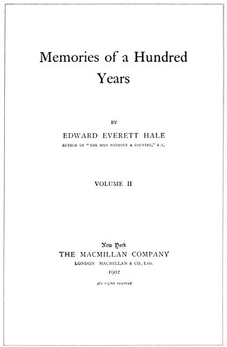
EXAMPLE 130
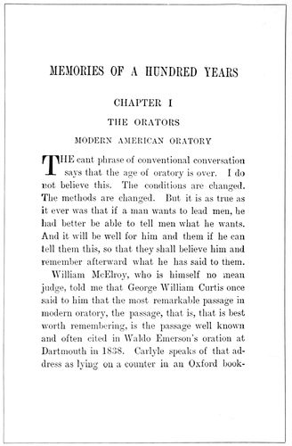
EXAMPLE 131 Poor examples of book typography. Two pages which set forth the common practice of inharmonious type treatment, the title-page containing old-style type-faces and the text-page modern type-faces. The type-face should be of the same design
The book typographer, like the lawyer, is governed by precedent. When the legal man presents an argument he cites Doe v. Doe, and Smith v. Jones, and with each new discovery of precedent is increasingly happy. The common law under which we in America are governed originated in England centuries ago, and the radicals who would dispense with this law catalog themselves as anarchists. The right-thinking man is constructive. When a new thing has been proved good he believes in adding it to what has already been constructed. The radical is destructive in that he would destroy what has been constructed and without always setting some new thing in its place. Attics have been known to hold masterpieces which have been discarded for new, frivolous things that from an art viewpoint are worthless.
William Morris set out to change book typography, and in contrast to the typography of the day his ideas may have seemed radical. What he really offered was the good things found in the works of the old masters of Venice and Nuremberg—typography and decoration that had well stood the test of centuries. Book pages produced fifty years ago by Pickering and Whittingham look well today; not because they are old, but because they were in good taste then, and are in good taste now. Pages set by their contemporaries in condensed roman look abominable now, because they were contrary to true art principles then.
The book industry in America is tremendous—so much so that because of its magnitude quality in typography is likely to be lost sight of. In New York City in one year eight million books are read or consulted thru its public library system! Could the monk, with his mere score of books chained to shelves, have had a vision of this, what would have been his thoughts? Or, Benjamin Franklin, as he founded the first circulating library? Andrew Carnegie, ridiculed when announcing his intention to use his wealth in providing buildings for public libraries, lived to see himself acknowledged a benefactor of mankind.
Next to providing books is the necessity of providing good books and of printing them according to the laws of art and good taste. Continual association develops a taste for the things associated with. If the majority of books are poorly composed or poorly printed, they will unconsciously be taken as standards of book style by the reading public. The style of book typography, averaged in this way, is today far from flattering. It is rarely that the reading pages, title-page and cover harmonize in style and motive. On the average volume the text-pages seem to have been set in any face that chanced to be on the composing machine at the time; the title-page is in some type foreign in style and design to the face used 69on the body of the book, and the cover (usually the only part of the work given artistic attention) is designed without regard to what is on the inside. The whole effect reminds one of a box of berries with only the healthy members of the family in view. Many a time I have picked up a book in artistic binding, only to lay it down disappointed at the typographical treatment of the inside pages. Even a book should be honestly what it seems, and not a wooden nutmeg.
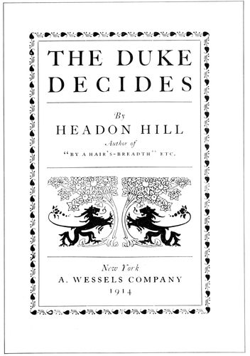
EXAMPLE 132
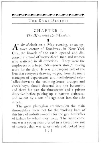
EXAMPLE 133 Two pages of composite Colonial and modern typography. Relation is established between the title-page and text-page thru use of the same kind of decoration
The book-page reproductions used in connection with this chapter may prove more valuable if each is considered separately in the order of its appearance.
Examples 126 and 127 (Insert).—The title-page and an inside page of a book which in its way is a model. From the viewpoints of art, legibility, good taste, typography, printing, and binding, the book is very satisfactory. The classic restraint of the Italian school and the human interest of the Gothic are here blended harmoniously. These pages will please the lover of lower-case letters, as from the label-title on the cover to the last paragraph of this volume not a line has been set in capitals. The type-face is a handsome old-style roman based upon the Caslon model, and in the book itself is printed upon a hard hand-made paper in a dense and clear black ink. The only decoration used in the book is found in the chapter initials, altho decoration is suggested in the use of brackets on each side of the page numbers. Only two sizes of type are on the title-page, and the chapter headings cling to the type-page in a manner that helps the tone effect of the whole. The reproduced pages are shown in the actual positions of the originals. The margins of a full reading page measure five picas at the fold, six picas at the head, seven-and-a-half picas at the outer edge, and eleven picas at the foot. The type-page covers slightly more than one-third of the surface of the leaf upon which it is printed. The type-page in proportion measures diagonally twice its width, a point illustrated in Example 50 of a previous article.
Example 128.—A reduced facsimile of the title-page of a limited edition of classic poems, produced at the Riverside Press under the supervision of Bruce Rogers. This typographer stands among those in America who are giving themselves to the work of steering the printing craft back to the waters in which it sailed in the days of Aldus Manutius. Bruce Rogers came from Indiana with no technical knowledge of typography, but artistic talent soon enabled him to gather the details, and for a number of years he designed books for the Riverside Press that brought him fame and helped to raise the standard of printing in America.
Example 129.—There is one feature of Bruce Rogers’ work which stands out prominently, and that is his regard for the appropriate. The literary motive of a book gives the cue for its typographic treatment, and he prints as if he were living in the period so presented, and influenced by its tastes. The “John Greenleaf Whittier” title-page suggests a product of the middle nineteenth century, when Whittier lived, and Example 128 is imbued with the spirit of the Greek Theocritus. But two sizes of type are used in the Whittier page, and these are apportioned according to the importance of the wording.
70
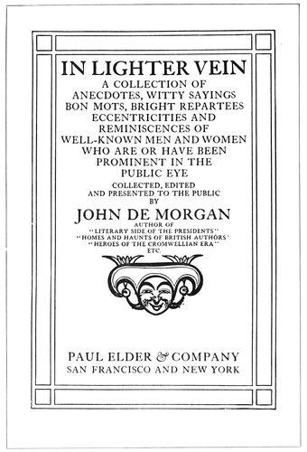
EXAMPLE 134
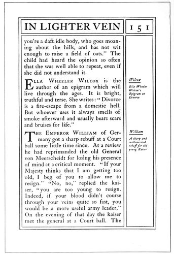
EXAMPLE 135 Two pages, the typography of which shows unusual care and consideration for detail. Typography by J. H. Nash
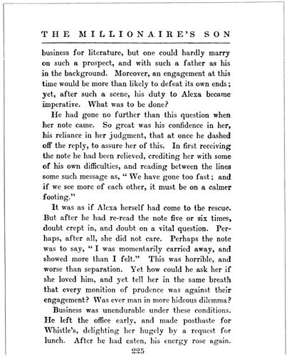
EXAMPLE 136 A text-page in modern roman. By Colonial Press
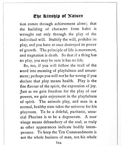
EXAMPLE 137 A text-page in old-style type-faces. By Colonial Press
Examples 130 and 131.—Two pages from a book issued by a prominent publishing house and printed by a prominent press. They are reproduced for the purpose of pointing 71out a fault common to a majority of books of the present day—inharmonious typography. While the text pages are consistent in the use of plain modern roman, the title-page with no regard for the face used on the text pages is composed in Caslon roman and modernized old-style. It would seem that, true to the title, the printer had aimed to present three representative type-faces used during a hundred years. And, to make matters worse, the cover contains an elaborate twentieth century design. Why do not publishers realize that these things are wrong? Why do not printers realize it? After the six hundred pages of this book had been set in modern roman, the cost of setting a title-page also in modern roman would have been ridiculously small. Printers doing work for publishers should provide display faces to match their machine letters, or else when buying matrices of a body face, assure themselves that display faces may also be had. Artists, too, should be cautioned to make their design not only after the motive suggested by the literary contents of the book, but also after the typography (which should of course be based upon the literary motive).
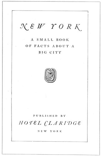
EXAMPLE 138 Title-page with an Italian motive. By Oswald Press, New York
Examples 132 and 133.—Two pages in style composite Colonial and modern. Relation between the reading pages and the title-page is established thru use of type of the same series and also by adapting the flower decoration to the running head. Certain books lend themselves to decoration; this is one of them, because it is of the entertaining sort. Serious books, such as those on the subjects of law, medicine and science, should have no decoration. The wise book typographer will not use decoration unless he comprehends just what he is doing.
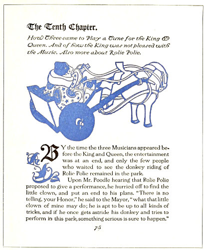
EXAMPLE 139 Page from a children’s book, designed and written by Will Bradley
Examples 134 and 135.—J. H. Nash, who designed the typography of the book of which these two pages are a part, produced results that are exceptionally good from a typographic point of view. The border as seen in Example 134 was used on the title, introduction and contents pages, and the border in Example 135 was used thruout the text pages. The crossed-line border effect was even adapted to the frontispiece. The title-page is an excellent example of consistent typography; not a line of lower-case is to be found on the page, and prominence is proportionately given the title of the book and the names of author and publishers. The reading matter is set within six points of the rule border, that the page should have but one margin. If the space between type and border were larger it would give the appearance of another margin. The initial letters assist the reader in locating the beginning of each story.
Example 136.—This page is in a style associated with the modern novel and was set on the linotype in eleven-point Scotch Roman; the lines twenty picas wide, leaded with two-point leads. The running head is in capitals of the body letter, separated from the reading page by a half-point rule, and the page number is centered at the foot.
Example 137.—A good example of modern book composition, set on the linotype in twelve-point Caslon Old Style, the lines twenty picas wide, separated by four points. The running head is in a black text letter suited to a book of this kind. An amount of space equal to a line of type and the leading following it, has been placed between the running head and the reading page.
Example 138.—No style of typography is in such good taste as that which is based on the old Italian, in which but one 72style of type-face, usually the Caslon, is used, and the capitals letterspaced a trifle. This style has been worked into a symmetrical page and an ornament included that because of its Italian treatment blends neatly with the typography. It might be interesting to note that the illustrations in this book were in line, and where emphasis was needed in side headings small capitals were used and the letters separated by slight spacing.
Example 139.—A page from a book for children, written and illustrated by Will Bradley. The type-face is a wide, legible letter and was specially designed by Mr. Bradley. Each chapter is begun with a line of old English black letter, followed by several lines of highly decorative italic. The illustrations are interpreted in the grotesque decorative style that Bradley does so well. The running heads and page numbers are in the italic.
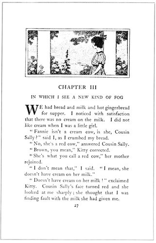
EXAMPLE 140 Harmony in tone of type-face and decoration. Typography by the Trow Press, New York
Example 140.—A page notable for the harmony between the tone of the type-face and decoration. The illustration has been treated by Beatrice Stevens in a decorative spirit, and is very effective. The capitals of the body matter are used for the “Chapter III” line, and smaller capitals for the descriptive line under it. The plain initial is more effective than an ornamental one would have been.
Example 141.—A title-page of classic design in Scotch Roman type. The anchor and dolphin, originally the device of Aldus, as enlarged in outline has much to do with the effectiveness of the page. The dignified beauty of this page makes it worthy of close study.
Example 142.—A further demonstration of the beauty of classic typography. Fred. W. Goudy has done many things worth while, but none better than this. He not only designed the smaller type-faces and lettered the large lines in harmony, but arranged the page and, in its original form, printed it. American typography owes much to Mr. Goudy and it is a pleasure to include this page here.
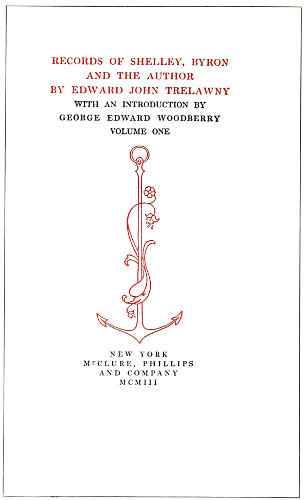
EXAMPLE 141 A title-page of classic design, with an Aldine anchor device. By William Aspenwall Bradley
Example 143.—This is a page from one of the Roycrofters’ serious efforts in bookmaking. It was printed in dense black ink on white stock, the large text initials standing forth in pleasing contrast.
Example 144.—This is a page from a book by Theodore L. De Vinne, and probably presented his personal ideas in book typography. Notice the spacing around the subheading, and the treatment of footnotes. The first line under the subheading is not indented.
Examples 145 and 146.—D. B. Updike, of the Merrymount Press, is responsible for the typography of these pages, which are a portion of a book containing the ceremony of marriage as performed in the Protestant Episcopal Church. The type is a special letter based upon early forms. The book was printed in black and vermilion. Mr. Updike, with Rogers, Goudy and others, believes that the way to improve typography in America is to do typography as well as it can be done. He established the Merrymount Press in 1898, and has arranged and printed many fine volumes, in addition to much high-grade small work.
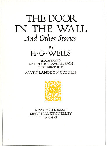
EXAMPLE 142 Classic feeling expressed in a modern title-page. Designed by Fred. W. Goudy
Example 147.—Books of poetry are usually treated in a typographic style that is light and dainty. The typographer 73who has the spirit of the artist in him puts more into a book than is required by the traditions of the craft and endeavors to express with type and decoration the spirit of the poet’s message. The verses of Edgar Allan Poe, with their suggestion of dark shadows and pathos, make the book designer’s task difficult, but in this example Mr. Nash has given the work a decorative treatment that in its dark tone helps to beautify the sad spirit of the great American poet. Washington Text shows forth admirably as a type for these pages and the decorative panel harmonizes with it in both tone and design. In its original form the book was printed in dull black and dull red inks on a toned hand-made paper. The liberal margins assisted in giving that touch of exclusiveness and taste that is essential in good book-printing.
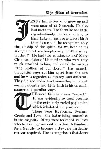
EXAMPLE 143 Text-page of a de luxe volume. By the Roycrofters, East Aurora, N. Y.
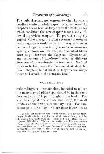
EXAMPLE 144 Text-page from a book by De Vinne. Note treatment of running titles, sub-headings and footnotes
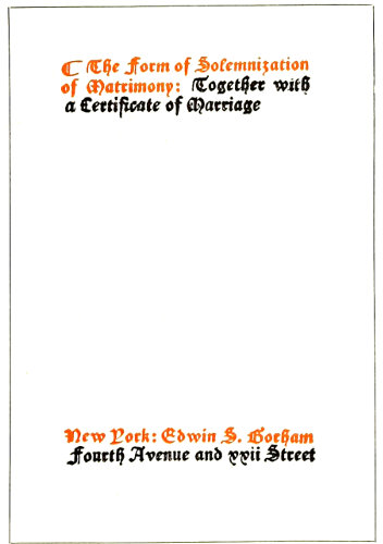
EXAMPLE 145
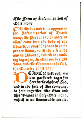
EXAMPLE 146 Two pages from a small ecclesiastical book. By D. B. Updike
Example 148.—French title-pages of the eighteenth century are furnishing motives for the designing of cover and title-pages for the uses of 74publishing and advertising, and to many this page by Bruce Rogers will have considerable interest. The design carries the spirit of an age when decoration was rampant and when architecture and books were festooned and adorned with cupids. The decorative lettering used in the main title shows such influence. This book in its first edition was printed in 1789, and when recently reprinted the typographic spirit of the old volume was incorporated in it. It does not measure up to the recently accepted ideas of tone-harmony and shape-harmony, yet the element of appropriateness is so strong that those shortcomings are not to be held against it.
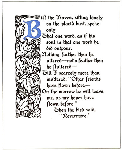
EXAMPLE 147 Gothic treatment of a book of poetry. Typography designed by J. H. Nash for Paul Elder & Company
Custom has developed a law for the arrangement of the several parts of a book. There is first a blank leaf known as the fly-leaf, followed by a leaf with the title of the volume in small type slightly above center or placed toward the upper right corner. The frontispiece, if one is used, is then inserted. The next leaf contains the title-page, which usually gives the title of the work, name of author or editor, place of origin, name of publisher and date of issue. On the back of this leaf, slightly above center, is the copyright notice, and in the lower center or right corner the imprint of the printer. The table of contents and the table of illustrations follow, taking as many pages as are necessary. The preface, or author’s introduction, is next, after which another half-title may be inserted ahead of the first chapter. The dedication, at one time occupying a page in the fore part of the book, is occasionally used. The index is inserted in the rear of the book. This rear-index is not found in novels, but in books on technical subjects and those used for reference purposes.
It is customary to number book pages with Arabic numerals beginning with the first chapter, all pages in advance of the first chapter being numbered with lower-case Roman numerals. The page numbers, when at the foot, should be separated from the type-page by the same amount of space used between the lines. There is tendency among inexperienced printers to place the numbers too far from the type-page.
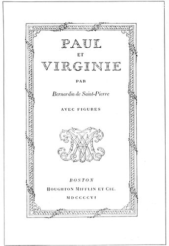
EXAMPLE 148 Where a French style of treatment is appropriate. Designed by Bruce Rogers
There is a rule that the running title should be separated from the type-page by space equivalent to a quad line of the size of body-type used, altho the best typographers prefer only about half that amount of space.
Pages containing chapter headings are lowered at the head below the regular page hight. Example 127 shows a lowering of five picas space. Other books show more or less than this amount of space, but the space allowed in this example is pleasing.
When an initial is used the space between it and the type should be the same, both at the right side and foot of the initial.
The position of a book page should be toward the binding and the head. In elaborate books of wide margins this inclination should be great, but in the conventional book of narrower margins it should be less noticeable—say six points toward the binding and eighteen points toward the head.
The use of an em-quad between sentences on a book page is encouraged by many printers, but the new-thought compositor uses two three-to-em spaces or less. By referring to example 127 it will be found that the same amount of space separates all words in one line. The capital letter seems sufficient indication of the beginning of a sentence. In the first book printed from separate types (see reproduction of page from Gutenberg’s Bible in the chapter on “The Origin of Typography”) there was no space used between sentences, the period in the judgment of the printer separating the words sufficiently.
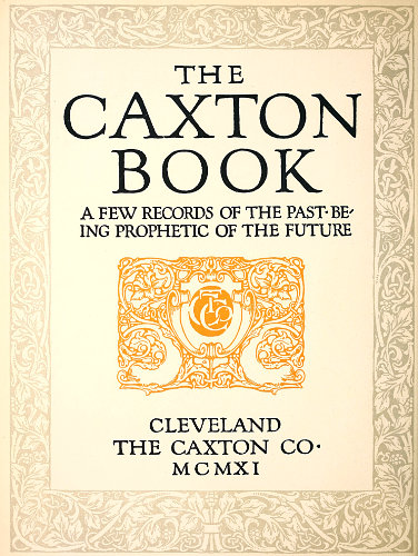
EXAMPLE 149 Title-page lettering and decoration by F. W. Goudy, for the Caxton Co., Cleveland, O.
75
BOOKLETS, PAMPHLETS, BROCHURES, LEAFLETS
Did I wish to be flippant I would open this chapter by asking, “When is a booklet not a booklet?” and might even be pardoned for doing so, for no other word has been so misused as has “booklet.”
A booklet, the dictionaries tell us, is just a little book, as is indicated by the suffix “-let,” which termination forms diminutives from French and English nouns. Yet “booklet” has been used to designate not only little books, but big books, and has led to the rather tautological description, “a little booklet.” When does a booklet cease to be little, and is its littleness in its dimensions, in the number of printed sheets, or in some other feature not recognized in a hurried consideration of the subject?
Going back to the lexicons—
A booklet, as has been said, is a little book.
A leaflet, according to the Standard Dictionary, is “a little leaf; also a tract.” Webster says it is “a sheet of small pages which are folded, but not stitched; a folder.”
A pamphlet, we understand from the Standard, is “a printed work stitched or pasted, but not permanently bound; a brief treatise or essay.” Webster says it is “A book of a few sheets of printed matter, or formerly of manuscript, commonly with a paper cover; specifically, sometimes, any such work not in excess of eighty pages, and not bound.” The word “pamphlet” was derived from a popular Latin poem, “Pamphilus,” of the twelfth century.
“Brochure” is a French word often used for “pamphlet.” Webster gives its meaning as “a printed and stitched book containing only a few leaves; a pamphlet; a treatise or article published in such form.”
A circular is a letter or a note, usually printed.
However, for the purposes of this chapter, while I shall endeavor so far as possible to use one of the above approved terms in designating the various examples of printing, the word “booklet” in some instances may have a wider application than “a little book.”
EXAMPLE 150
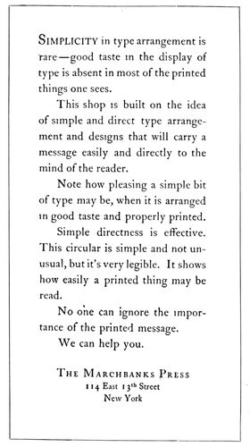
EXAMPLE 151 Two pages from a leaflet designed without decoration or color, a noteworthy exponent of simplicity in typography. By the Marchbanks Press, New York
The chap-books sold in the seventeenth century, containing abbreviated stories, were, perhaps, prototypes of the booklet; but as now used the booklet is a modern conception. It is a result of development in æsthetical knowledge among advertisers and the buying public, who have learned to discriminate and to demand artistic, tasteful workmanship. When the “dodger” or handbill ceased to be effective as a publicity auxiliary to the newspaper, the booklet was born. State laws consider a few placards or publication in one or two obscure newspapers sufficient notification to the public, but the advertiser knows the futility of such obsolete methods and gets his message to the public in numerous ways—traveling salesmen, newspapers and magazines, trade, technical and class publications, house-organs, catalogs, booklets, circulars, posters, novelties, car cards, electric signs, etc. To an extent the booklet’s mission is educational; it introduces the business house, gives authoritative answers to questions that the prospective buyer would naturally ask, explains advantages and gives reasons for superiority. The booklet is best if written 76in a style that is non-technical, and should be treated by the artist and printer in a manner that will interest the recipient.
EXAMPLE 152
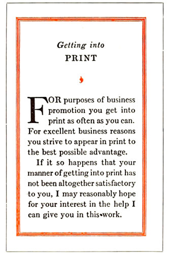
EXAMPLE 153
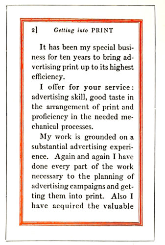
EXAMPLE 154 Three pages from an easily read booklet in Scotch Roman, showing the typographic style of Benjamin Sherbow, New York
EXAMPLE 155
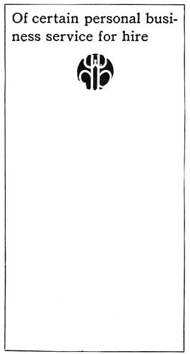
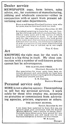
EXAMPLE 156 Two pages from an eight-page leaflet, in which the typography was relied upon for results. The rule borders were printed close to the edges of the paper. By William Henry Baker, Cleveland, O.
Among the users of the booklet as a publicity medium are railroads, cities, hotels, real-estate companies, banks, clothiers, educational institutions, printers, and manufacturers of automobiles, musical instruments, cameras, and tools and equipment of many kinds. If one wishes to purchase intelligently a piano or other expensive article he obtains a booklet on the subject, and whether he buys or not depends largely upon the impression obtained from the booklet; if it is well written, informative, carefully illustrated and handsomely printed, it will be likely to exert an influence in favor of a sale. The printer’s share in producing such a booklet is large, altho he is called upon to work in conjunction with the writer, the artist and the engraver.
Much of the booklet printing is planned by advertising writers and commercial artists. The best results are obtained when artist and writer blend their ideas harmoniously; this is possible only when the writer has artistic tastes and a definite understanding of typography. In many booklets the text matter does not fit the decoration. I have in mind an instance in which the artist laid out sixteen pages of marginal illustrative decoration, and the writer supplied only about half the copy necessary to fill the sixteen pages. To overcome the deficiency the printer set the text matter in an excessively large size of type, but even then the space left for the reading matter was only partly filled. If the writer was unable to fill the space, the artist should have decreased the number of decorative pages or else planned his decoration to cover more surface.
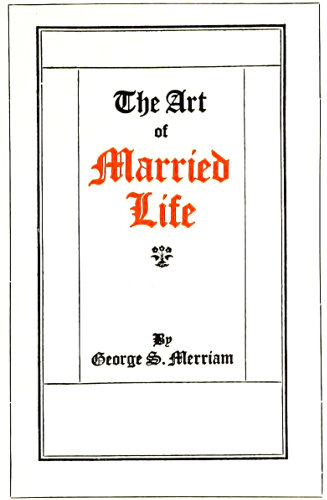
EXAMPLE 157
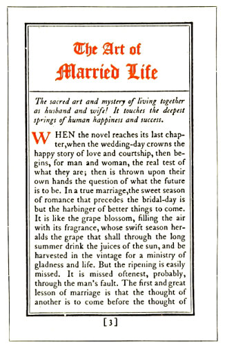
EXAMPLE 158
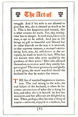
EXAMPLE 159 Three pages that demonstrate the possibilities of type and rule in obtaining effective results. By Barnard J. Lewis, Boston, Mass.
Those houses that have made a success of booklet printing produce a job that is harmonious 77and complete. Reading matter, illustrations, decoration, paper, ink and color treatment, all blend on their booklets. There is a central motive around which all concerned in the make-up of the booklet weave their ideas.
Altho such a condition is ideal, it is not absolutely necessary, and it is not always profitable, for a printshop to have under its roof a complete equipment for producing every detail of a booklet. One of the successful producers of booklets—an artist with associates able to interpret his ideas—had in his artistic suite of offices a palm which he enjoyed showing to visitors who asked to see the “plant.” On the other hand, there is the head of a large printing concern producing high-class booklets who has artistic ideas but who depends upon the open field of artists and engravers to develop and perfect his plans. He manages to meet a prospective customer and from conversation with him learns something of his tastes and preferences. This printer then selects an artist whose style of work will most likely appeal to the customer and be best for the purposes of the booklet. He assumes that the most successful artists are those who have specialized on some one kind of work—classic Roman lettering and decoration; seventeenth-century French decoration; Old English or American colonial effects; modern German coloring and decoration; art-nouveau creations, the serious and the humorous; illustrations of child life, or of the Civil War period. While there are versatile artists like Will Bradley who can do good work in many styles, they are not numerous.
Some printers retain typographic artists who serve clients by the hour. These artists sometimes are advertising writers who have studied the art side of printing and know that much depends upon the type-face used.
To plan a booklet properly the commercial printer must know something of the principles of art and advertising and of good book typography. Booklet printing is really the connecting link between job printing and book printing. The unconventionality of job typography and the dignity and conservatism of book typography can successfully be blended in the booklet.
Example 149 (Insert).—This style of title-page is appropriate for a booklet or brochure in which the typography plays an important part in the production. The printer having plates of this kind delivered to him should for the remaining pages endeavor to use a type-face which has some relation in style to the lettering found in this example. The page having been drawn by Frederick W. Goudy, one of his type-faces would, of course, be most harmonious, but other old-style letters such as Cloister Oldstyle, Caslon Oldstyle and Old-Style Antique would also be suitable. Some of the pages would possibly include initial letters drawn in the same style as the decoration, and thruout the work the motif established by the title-page should be maintained. An antique-finished paper blends best with the general decorative plan, but if coated stock must be used it should be of a dull finish. Art work of the quality of this example cannot be procured from every artist. This example is expressive of the personal taste and talent of Goudy.
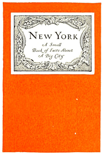
EXAMPLE 160 A label pasted on a brilliant cover stock is striking. Designed by Thomas Maitland Cleland for the Oswald Press, New York
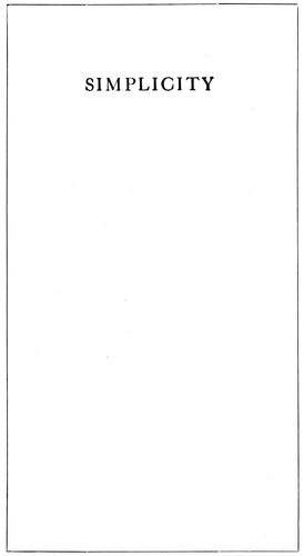
Examples 150 and 151.—The printer in the main must be his own artist, and he can best serve himself and his customers on such occasions by providing pure typographical effects. This is difficult. The printer must have studied good typography—he must know typography not only as a worker at the trade but as a student of the art. He must be thoroly acquainted with type-faces. His type equipment usually shows his knowledge in this regard; if it consists of odds and ends of type-faces aimlessly selected, he is not in a position to give his customer the proper service, but if his 78equipment mainly consists of those type-faces that have been approved by the leading typographers and type designers of the country, he will not only render good service to his customer but will confer a benefit on every one who receives a copy of the printed matter. The public learns to like whatever is served to it most frequently, and if it is provided with good printing and especially good typography, the tone of printing generally will be elevated and further dignity given to the business. The examples under consideration are from a nationally known printing office which confines its type equipment to three series and at one time practically used but one series on all its work. The leaflet was made to fit a business envelop. The stock was Japan vellum and there was no decoration—only a standard approved type-face of a readable size (fourteen-point). Such a leaflet attracts attention above most advertising matter because of its simplicity. It is good more because of what is left off than for what is put on.
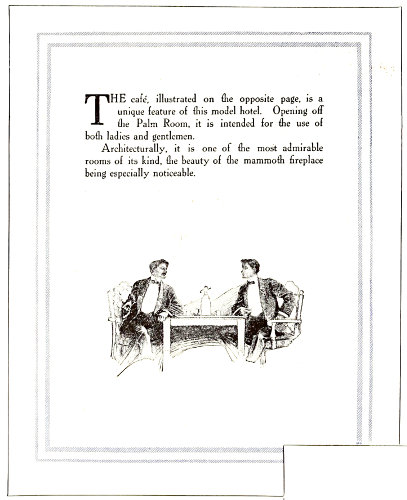
EXAMPLE 161 Admirable treatment for a small amount of reading matter. Both pages by Edward Everett Winchell, New York
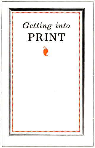
Examples 152, 153 and 154.—These are the cover-page and first and second text pages of a booklet which is purely a typographical product. There was also a title-page similarly treated. The first two words of the title, “Getting into Print,” were on each of the four pages set in italic lower-case, and the word “Print” was in roman capitals. Scotch Roman was used, and Mr. Sherbow has produced other effective booklets with this type-face. He has a preference for the eleven- and twelve-point sizes and frequently separates his lines with a two-point lead. The result, especially in the narrow measure made necessary by the smallness of the booklet, is a page that one likes to read. There is a freshness, an individuality, about his type arrangement, which quality is probably due to the fact that he never was a practical printer. He began as an advertising writer and studied typography and its use for advertising purposes unrestrained by the traditions of the craft as handed down from compositor to apprentice. His work, however, is influenced by the study he has made of the work of typographers and calligraphers of the past five or six centuries. By this study he has obtained a knowledge that most printers lack because of their reluctance to explore the past. The borders surrounding these pages are made from typefounders’ brass rule, and otherwise the only ornamentation is a floret on the cover and a smaller one on the first text page. Perhaps no new note is struck in the arrangement of the cover-page, but the treatment of the upper part of the first text page is different from that which would be given by the average good compositor.
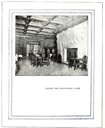
EXAMPLE 162 A good way to arrange a page when the photograph is of proportions different from those of the booklet page. Note treatment of caption
EXAMPLE 163
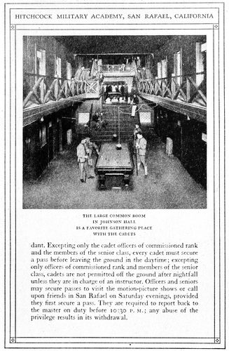
EXAMPLE 164 Two booklet pages in which typography was the chief dependence in securing artistic results. The borders were made with brass rule and the illustration was tipped on. By Taylor & Taylor, San Francisco, Cal.
Examples 155 and 156.—These are from an eight-page leaflet, and, like the previous examples, 79they give evidence of an understanding of typography that comes from study of the subject. Mr. Baker in these pages provides practically no margins outside or inside the rule border. This border is merely a one-point rule which serves a good purpose without forcing itself upon the attention. The type-face is Old-Style Antique, which as the years go by does not seem to lose its “flavor.” It is a readable type-face and one that is at its best when used on antique-finished paper, as in this case. The leaflet was printed in black ink on a greenish cream-tinted paper. Mr. Baker’s personal device adds decorative value to the title-page. It will be noticed that the headings are set in a larger size of the body type and lined at the left. There is no indention excepting for the reprinted letters, which are set in a small size of the same type. These letters treated in this manner are only incidentally made a part of the advertising argument.
Examples 157, 158 and 159.—Caslon Oldstyle and Caslon Text are factors in the effectiveness of the booklet of which these three pages are representative. These three examples are additional evidence that type alone when properly used is almost as effective from an advertising point of view as if supported by the best decoration and illustration. It might be said that good typography is to be preferred at all times to poor art work, altho really good art work properly subordinated will undoubtedly add attractiveness and interest to a booklet otherwise well treated typographically. The border of contrasted heavy and light rule adds typographic value to the booklet under consideration, and the use of the light rule in other ways on the title-page and under the headings in Examples 158 and 159 also has an influence for good. A two-line initial in color at the beginning of each paragraph and the setting off of one paragraph from another by blank space are distinctive features in the make-up of the pages. Ornaments are used in the running headings, and they are the same design as that used on the title-page. The size of this booklet was 3½ × 5½ inches. It should be noticed that Mr. Lewis in these pages places no more space between sentences than between the various words of the line, altho Mr. Sherbow and Mr. Baker on the preceding examples use more. There is difference of opinion among good printers as to the amount of space between sentences. Some of them prefer the em-quad, which has been used by the average printer for a great many years. Others believe with the ancient printers that the period and the capital are sufficient indication of the beginning of a new sentence without the insertion of a square of white space that affects the tone of the page. It should be noted in Mr. Lewis’s pages that while he has allowed fair margins around the outside of the rule border, he has arranged for very little margin inside, and to this is due a certain compactness that is agreeable.
Example 160.—This is the cover of a small book of information. The cover stock was deep red in color and the title was printed on Japan vellum stock and pasted as a label on the cover. The label design is by Thomas Maitland Cleland, whose carefully formed lettering offers suggestions to good printers who know the value of dignity in lettering and decoration. A title label, especially when dark cover stock is used, makes it possible to include a typographic effect on the cover, thus insuring harmony 80consistent with the type-face that may be used on the inside of a booklet. The title-page that was a part of this small book was shown as Example 138 of the chapter on books.
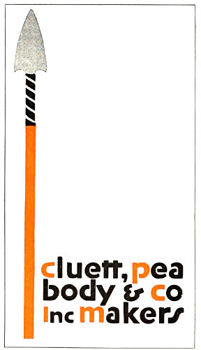
EXAMPLE 165
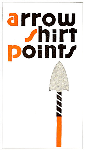
EXAMPLE 166 Attractive rear and front cover designs of an unconventional booklet. The arrowheads in the original were in emerald-green ink. By E. G. Jacobson, New York
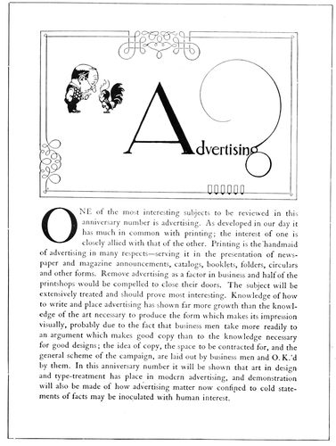
EXAMPLE 167 One of the eight pages of a prospectus for “The American Printer.” The initial “A” was in color. By Will Bradley
Examples 161 and 162.—Two facing pages from a booklet designed by Edward Everett Winchell and presenting the attractive features of a large New York hotel. There is but a small amount of descriptive matter, confined mostly to two pages in the front of the book, yet the treatment is such that more words would have spoiled it. The plain rule border gives uniform shape to the pages and pleasingly contrasts with the liberal white space inside. In Example 161 the descriptive matter is grouped at the head of the page in Avil, an interesting old-style roman type-face. The fading of the vignetted edges of the halftone into the surrounding white space is effective. Example 162 demonstrates how an illustration which is out of proportion to the page may be placed to get good results. The caption, set in capital letters slightly spaced, is in keeping with the squared style of the page. Compositors should study the position of this caption. Many would be inclined to center it directly under the illustration; this would cause the lower part of the page to seem empty and unfinished. By moving the caption down, so as to break into the white space and divide it, the sense of vacancy is not experienced.
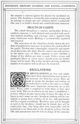
Examples 163 and 164.—These are two pages from a booklet in which typography was the chief dependence of the printer in securing artistic effects. The border is made of brass rules and four small ornaments; a decorative initial is introduced at frequent intervals thruout the booklet; otherwise, the effect is due to care in the details of typesetting. The space between sentences is the same as that between the words of a line, and widely spaced lines are not to be found. It should be kept in mind that the best typography is that in which the spacing between words is not excessive. Carelessness in typesetting and in the operation of composing machines is responsible for unpleasant effects produced by wide spacing and by “rivers” running thru the page. In Example 164 the illustration was tipped on. The paper used in this book was a buff antique, the tipped-on prints being on dull-coated stock. The dark-brown ink used for the text pages was also used for the prints, making a pleasing color harmony.
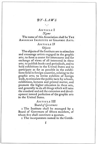
EXAMPLE 168
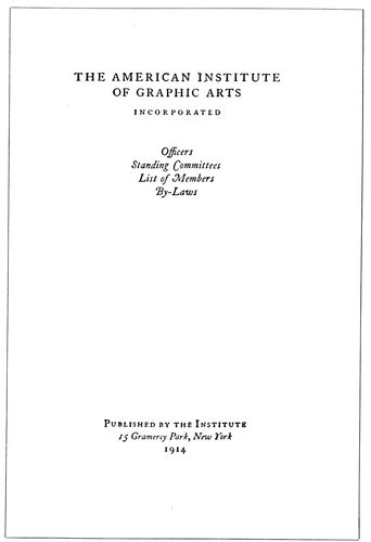
EXAMPLE 169 Two pages from a booklet in which no decoration was used, the decorative quality of the type-face impressed on hand-made paper having been depended on to provide a dignified beauty. By the Oswald Press, New York
Examples 165 and 166.—These are rear and front booklet covers, the design of which is striking because of the disregard for conventionality. No capital letters are used, an idea that should be adopted with reluctance by printers unless their customers approve of the innovation. Most buyers of printing are slaves to conventionality and hesitate to accept typography or especially drawn work which is bizarre or in any way a departure from the usual methods of treating printed work. The activity of German, 81Austrian and French artists in this country, however, has caused some business and advertising men to be more tolerant in these things, as the bright coloring, dashing decoration and the newness of it all seem to get attention where conventional effects fail. It might be said in reference to the lettering on these examples that the designer has not produced anything really new so far as the use of the so-called lower-case letters instead of capitals is concerned. There was a period in the development of the modern alphabet when its characters were neither “capitals” nor “lower-case” as we know them—a period in which the minuscules were being evolved from the ancient Roman capitals or majuscules. Altho modernized, the lettering here used can be traced historically to the uncial lettering of the days of manuscript books. The arrowheads were in emerald green.
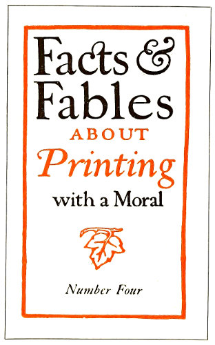
EXAMPLE 170 A hand-lettered cover-page. By the Blanchard Press, New York
Example 167.—This page, designed for the prospectus of the twenty-fifth anniversary number of The American Printer, in my opinion is among the best things that Will Bradley has done. There were eight pages and on all the decorative headings were similar, altho each had sufficient change in the treatment to give special interest to the page. The fine line decorative borders were in pleasing contrast to the dark-toned illustrations and the liberal apportionment of blank space. Fourteen-point Caslon Oldstyle, the kind with the long descenders, was used for the text matter. The large Caslon initial added another interesting spot of black. The decoration and type matter were printed in black ink on buff-tinted dull-coated paper, and the large drawn initial on each page was in sepia brown. The original size of this pamphlet was 6¾ × 9½ inches.
Examples 168 and 169.—No decoration of any kind was used in this booklet, unless the period groups may be counted as such. The purpose was to produce artistic printing in good taste by depending upon the type-face and the paper for results. Decorative interest (usually welcome in a mild way) was supplied by the swash capitals of the italic and by letterspacing capitals and small capitals wherever they appeared. The chapter headings of all the pages in this book were aligned with one another and not “sunk” as is sometimes done. The pages are made interesting by the varied use of italic lower-case and roman capitals. The size of this booklet 82in the original was five by eight inches, and the margins were made to conform to those used on good book composition, each margin increasing in this order: Head, inner side, outer side, foot.
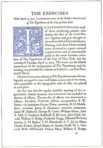
EXAMPLE 171 Page from a typographically treated commemoration book
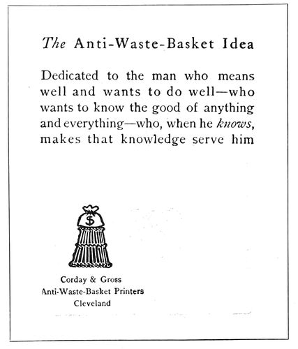
EXAMPLE 172 Unconventional arrangement of a booklet page. By Corday & Gross, Cleveland, O.
Example 170.—Lettering, as has been pointed out, has an important place in booklet designing along with decoration, illustration and typography, and from well-lettered designs the printer can obtain valuable suggestions. This example was printed on hand-made paper, and the deckle edges and rough surface of the paper blended with the freehand drawing of letters and border. There was a further blend of the hand-lettering and the Caslon type-face used on the inside pages. The lettering was based upon the same model as the Caslon, which is standard for old-style effects. Here is a hint for printers: Distinction will be added to booklets otherwise printed from Caslon or similar type-faces if the cover and the display headings are hand-lettered. This may be done with fair results by setting them first in Caslon type. After the type has been arranged satisfactorily, take a print in blue tint on paper suitable for drawing with ink. The letters may then be traced freehand with black india ink over the blue print and any desired ruggedness or variation introduced. As light-blue ink will not reproduce when a zinc etching is made, the blue proof need not be carefully adhered to. Italic and small capitals should be introduced in such lettered designs.
Example 171.—This is a page from a souvenir booklet containing an account of the exercises held in commemoration of the fiftieth anniversary of the New York Typothetæ. Almost the entire book was set in fourteen-point Cloister Oldstyle and Italic and printed in black and orange ink on a white antique-finished paper of good quality. The cover was a domestic vellum-like paper which contained the words, “Golden Anniversary of the Typothetæ,” set in Cloister Italic with swash initials, the two lines being deeply stamped into the paper on gold leaf. In this manner strict typographic harmony was maintained thruout the booklet. Large decorative initials were introduced in several instances and two-line initials of Cloister capitals were used in a minor way. This page should offer suggestions to printers who are called upon to print souvenir volumes; in fact, much work of this kind can be created by the printer suggesting the publishing of such volumes after historic or memorial meetings are held in his city.
Example 172.—This is the first inside page of a booklet, the stock of which consisted of a thin straw-colored Japanese paper, printed on one side only. The cover, a heavy, rough dark-green paper, contained only the wastebasket illustration printed on both front and rear in gold ink set into the stock by a heavy impression. The simplicity of the typography accords with the treatment as a whole.
Printers will accomplish the most in booklet printing, as in other branches of the craft, if they live in an artistic atmosphere. Sir Joshua Reynolds, the great English painter, said: “The more extensive your acquaintance is with the works of those who have excelled, the more extensive will be your powers of invention.” That is the reason painters haunt Italy and other art centers where the works of the old masters are accessible. The printer should take journals such as The American Printer, devoted to the art of typography; for these journals bring to the great army of craftsmen specimens of the work of famous printers and of those who are contributing their mite to the cause of good typography.
The helpful atmosphere of the trade papers can be supplemented by specimen booklets for study purposes. These booklets can be obtained by writing to the printers producing them, or to the advertiser; and many can be had from retail houses selling the articles advertised in the booklets.
The printer must learn more than he now knows about art or he will become only a caddie in the game of booklet printing, with the artist and ad.-writer making all the puts. The printer is depending too much upon the artist and too little upon himself. The possibilities of type arrangement have not been exhausted and never will be, yet many workers at the printing trade act upon the assumption that good printing is impossible without the artist’s initiative and co-operation. Many a good job of printing has been spoiled by inferior lettering or decoration, the work of a poor artist.
Withal, there is nothing more ideal than a good printer and a good artist working together to produce perfect printing.
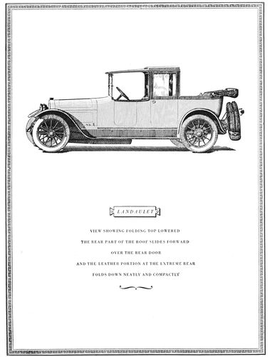
EXAMPLE 175 Page from an automobile catalog designed by Thomas Maitland Cleland. The caption is grouped in spaced capitals of Bodoni Book. The illustration is from a pen-and-ink drawing
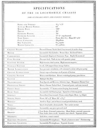
EXAMPLE 176 Unusual treatment of a specifications page. Words in capitals are letterspaced. Rules are used to add character to the page. These reproductions are one-half the size of the originals
83
CATALOGS
Ruskin, enumerating three branches of architectural virtue, requires of a building (1) that it act well, and do the things it was intended to do, in the best way; (2) that it speak well, and say the things it was intended to say, in the best words; (3) that it look well, and please us by its presence, whatever it has to do or say.
These three requirements, like many others that are important in the eyes of the architect, can be applied to the illustrated catalog, which most printers at one time or another are called upon to produce:
(1) The catalog should act well; it should be constructed in a manner fitting the purpose for which it is issued. If, say, it contains a list of plumbers’ supplies, it should be bound in strong stock of a color that will not easily soil. If it contains a list of jewelry and is for retail purposes, it could be bound delicately in light stock.
(2) The catalog should speak well; the illustrations should be faithful presentations of the articles to be sold, and the descriptive matter should be well written, accurate and informative.
(3) The catalog should look well; the type-faces, paper, ink, binding and other elements should be harmonious; the illustrations and descriptive matter should be arranged with regard to balance and proportion, and the treatment as a whole should be pleasing and interesting.
There was a time when catalogs were printed without attention to these things, or if the first two requirements were complied with the third was ignored. It will necessitate no effort for the reader to recall the days when merchants had no orderly plans for displaying their wares—when the average storeroom and window looked like a curiosity shop. Those were the days when the catalog was a heterogeneous collection of woodcuts and type-faces, packed on the pages to the very edge of the paper.
Now many show windows and salesrooms are delights to the eye, and similar care and taste are shown in the printing of the catalog.
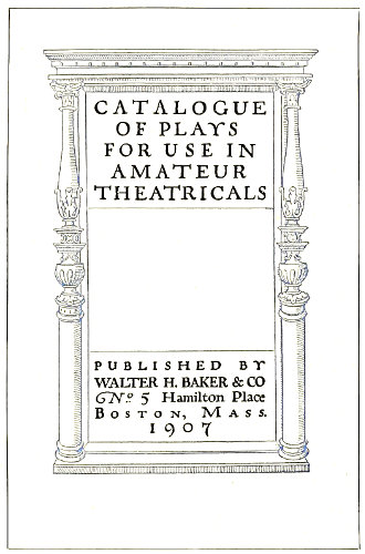
EXAMPLE 177 Architectural title treatment by Will Dwiggins. The lettering contains typographical suggestions
The catalog is a portable showcase and from it the customer makes selection, often without seeing the article itself. These facts make it essential that goods be displayed invitingly and in good taste. An article well displayed requires few words to sell it.
Place a girl of plain features, but handsomely dressed, in the midst of beautiful colors and lights, and a dozen millionaires will want to marry her—an extreme illustration of the power of attractive display, emphasizing the necessity of “playing up” the ordinary to create the desire of possession. It is possible, also, to accomplish this purpose by different methods. It is told of Josephine that, wishing to gain the admiration of Napoleon, she appeared at a reception in a gown of pure white, without ornament. The contrast of her simple dress with the elaborate costumes of the other women and with the elegant furnishings of the room was such as to draw compliments from the emperor. It should be remembered, however, especially by the typographer, that mere plainness of dress did not win Josephine her triumph, but that artistic simplicity did. A block of marble rough-hewn from the quarry is plain, but, carved into statuary by a Rodin, is far more than that.
This point is worthy of meditation by all who wish to produce the effective and attractive catalog.
Efforts have been made to standardize the dimensions of catalogs; it would be well for printers and others to assist in accomplishing this purpose. A committee of the American Society of Mechanical Engineers, after investigating the sizes of catalogs in common use, recommended that the standard size of catalogs be six by nine inches. The recommendation was also made that the size of bulletins and large catalogs be eight and a half by eleven inches.
Other suggestions by the committee were: Paper-covered catalogs intended to be permanently filed should be trimmed to exact size, cover and all, barring deckle edges. Overlapping covers are favored only when the covers are stiff enough to support the catalog’s weight when standing on edge. Titles should be printed on the exposed backs of the catalogs, reading from top downward. The date of publication should appear on the title-page. 84An index card of standard size (three by five inches), containing the title and character of the contents, should be inclosed in every catalog.
EXAMPLE 178
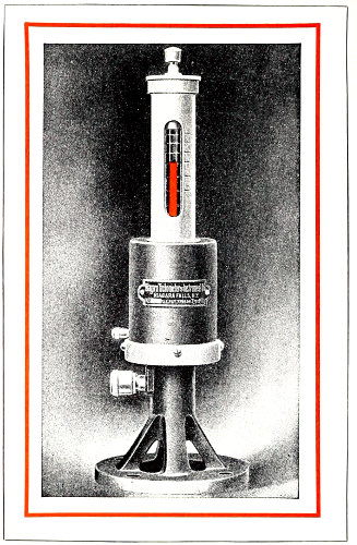
EXAMPLE 179 Facing pages that show effective results obtained in a simple way. The plain, legible typography ably supports the strong illustration and attractive border treatment. By the Matthews-Northrup Works, Buffalo, N. Y.
Before proceeding with the composition of a catalog the printer should insist that the copy be legible, orderly prepared, and all points settled as to type-face, headings and position of illustrations. A dummy page should be planned and set up, and it should be studied and discussed by customer and printer before work is begun on the catalog as a whole.
If the catalog is to be elaborately treated, all drawings should be approved and plates made before the type work is commenced. If the printer is assisting in the general preparation of the catalog, he should keep before the customer the fact that decoration is merely supplemental, and should urge first attention to the type matter and illustrations.
Example 175.—This catalog is one of those productions which in style so closely express the personality of an individual that they are not a direct help in teaching typography or catalog planning to others. Most typographers must proceed according to defined requirements and plan their work with regard to set styles. Mr. Cleland and a few other typographic artists in this country carry out their ideas without the assistance of an advisory board. The average typographer or artist, on the other hand, must not only incorporate the suggestions of half a dozen persons, but must submit to the deletion of most of the little things that to his way of thinking give his work character and make it worth while—the penalty of being merely an average typographer. Mr. Cleland is a student of the best printing of past centuries, and his refined taste and wonderful skill with the pen enable him to produce effects that would be envied by the master printers of old.
On this page he has used Bodoni Book, slightly spacing the capital letters and grouping the matter so that it dominates the blank space in the lower portion of the page.
The cartouche, or panel, as here used for the car name was in favor in Bodoni’s day, a hundred or more years ago. The horizontal position of the illustration adds to the pleasure in examining the catalog, for when an illustration runs the long way of such a page the necessary turning of the book is an annoyance.
Example 176.—Brass rules are seldom well applied in typographic work, but when they are, as in this instance, the results are pleasing. This page, because of its tabular nature, was doubtlessly difficult to arrange, and every compositor, appreciating that fact, will admire what Mr. Cleland has accomplished. It should be noticed that words of roman capitals have in every instance been letterspaced, while those in lower-case have not. This treatment gives effects that are unusual and well liked by persons of good taste.
Example 177.—This shows the cover of a catalog of plays. Will Dwiggins in his usual clever manner has made a design full of character, human in the absence of the mechanical. The lettering contains suggestions for effects that could be approximated with some well-designed type-face. It will probably be well to warn against 85the careless use of typographic ornaments in any attempts that may be made to imitate the effect of this decorative border. Architectural designs formed with the average printshop material seldom look well. Simple rule effects would be better.
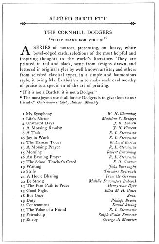
EXAMPLE 180
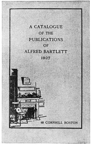
EXAMPLE 181 Inside page and cover of a publication catalog designed by D. B. Updike. The typographic treatment of these two pages is suitable and pleasing. The cover stock was green-gray of a rough antique finish
Examples 178 and 179.—In many catalogs a page illustration is faced with a page of reading matter describing it. In this instance the descriptive matter is small in amount and for that reason presented a problem in typography. The printer, however, solved the difficulty by using a type-face fairly large in size, but of good design, and placing the group in the upper part of the page aligned with the top of the illustration. It is well to keep in mind that in booklets, catalogs and similar work good results are frequently obtained by aligning all pages at the head. The effectiveness of these two pages is helped also by the fact that a red border surrounds each page and the halftone has a dark background.
Example 180.—There is evidence in this specimen that it is possible to obtain variety and interest by simple means. The italic, especially with the decorative quality found in swash letters, is a factor, and the rule at the head, with bits of decoration at the ends, also helps. It will be noticed that no leaders have been used; their omission is sometimes advisable, at other times not. An antique-finished white paper is best for old-style effects such as this.
Example 181.—This cover-page has been built on the small illustration. From the old fireplace the view of the room fades into the paper stock. After the border line is extended from the drawing, there remains a large amount 86of blank space, on which the title, in a well-balanced position, is arranged in type. The address neatly fitted in the space at the foot finishes the design at that point.
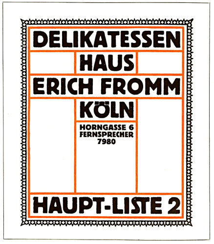
EXAMPLE 182 German poster type on a grocery catalog with characteristic block grouping
EXAMPLE 183
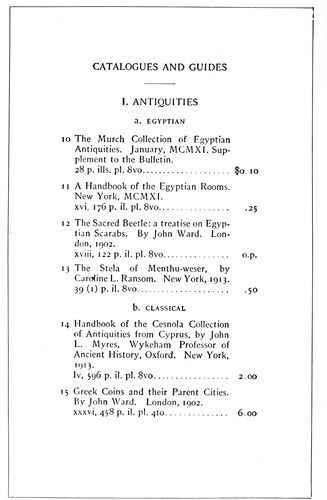
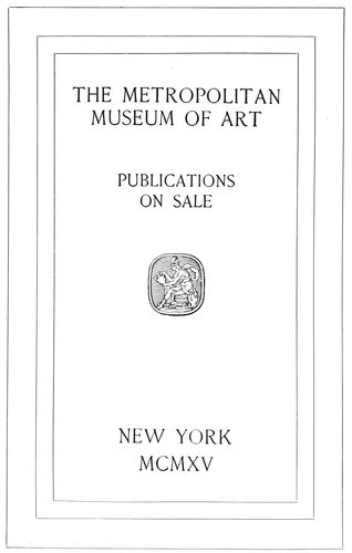
EXAMPLE 184 Typographic arrangement of the title-page and one of the inside pages of a museum catalog. The proportions of this type-face blend harmoniously with the dimensions of the page. Example 184 shows some details of catalog composition
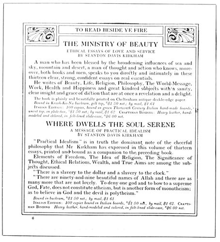
EXAMPLE 185 Rules add a decorative quality to this book catalog. By J. H. Nash
Example 182.—Modern German typographical ideas have found expression in this grocery-catalog page. The lettering is type, the black tone and decorative form of which were probably inspired by strong lettering designed for poster purposes. Rules seem to have a place in the building of modern German art effects, as will be seen by this design. Bold type as used here is possibly unnecessarily forceful, but when color is to be shown in its true values it is desirable. Color never shows to advantage in thin lines, while broad lines bring out the color qualities of the ink. This is why colored inks printed from light-faced types seem to lack the brilliancy of the prints from flat-surfaced plates in ink-makers’ sample books.
Examples 183 and 184.—Every printer at some time is called on to produce catalogs in which books or other published articles are listed and priced, and on such occasions wishes to see what “the other fellow” has done in this line. For this reason the two pages are of interest. They show a title-page and a representative inside page from a catalog issued by the Metropolitan Museum of Art, New York. The type-face is of the class usually designated as French Oldstyle, and its proportions blend harmoniously with the dimensions of the page. The distribution of blank space on the title is pleasing; the type lines are so grouped as to secure value from the background of white. In Example 184 the heads and subheads are pleasingly contrasted by the use of capitals in some cases and small 87capitals in others. Each item is grouped, and the technical details are kept orderly by being placed in a line with the price. No period is used after the item number.
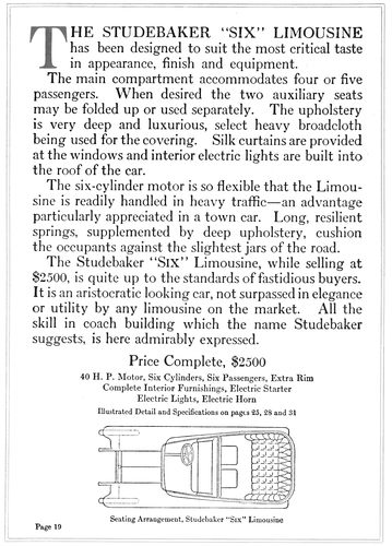
EXAMPLE 186 An automobile catalog page in which the type matter was prominently treated. The original page (about twice this size) was printed in dark-gray and orange inks on white antique paper. By the Robert L. Stillson Company, New York
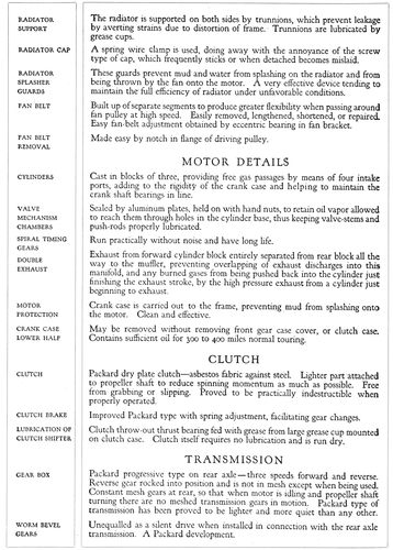
EXAMPLE 187 Unusual treatment of an automobile catalog page. The original was more than twice this size. The matter is liberally supplied with headings, the arrangement in the panel at the left taking care of most of them. By the Cadillac Printing Company, Detroit, Mich.
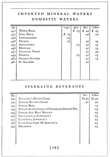
EXAMPLE 188 Page in reduced size from a wine list designed by T. M. Cleland for the Oswald Press. Interesting use of rules in tabular style
Example 185.—Scotch Roman type is used to excellent advantage in this book-catalog page. The title in each case is in large capitals, the sub-title and the name of the author are in smaller capitals, the explanatory matter in roman lower-case and the technical details in small italic. It will be seen that the advertising points have been carefully considered. A rule border and two ornaments add decorative quality. The closeness of the border to the type matter merges it with the page in an attractive manner. As in this case, decorative treatment should be a part of the general design and not something separate.
Example 186.—On automobile catalogs typography seldom receives the attention it deserves. Illustration and decoration are given great attention, and what type matter is used seems to be like a guest invited at the eleventh hour. However, this example is from a catalog in which type acts an important part. In its original form this page was about twice the size of the reproduction and was printed in dark gray and orange on white antique paper. It will be seen that beginning with a colored initial the reader can without effort or eyestrain read the descriptive matter, which is followed by technical details in smaller type and a line illustration of the car. Scotch Roman was used, and it was not found necessary to introduce italic.
Example 187.—The treatment of this page is uncommon for catalog purposes. A Goudy type-face was printed in dark brown (border rules in light brown) on an Italian hand-made paper. The size was more than twice that shown here. Sub-headings have all been grouped in the panel at the left, each so placed as to be opposite the paragraph to which it belongs. The effect was one of richness and suggestive of quality. Illustrations of the cars were of page size printed by the gravure process.
Example 188.—Few printers would use rules in tabular form for a high-class wine list; tabular work is supposed to offer no opportunity for art expression. We know of the stone rejected by the builder which became the headstone of the corner. We have also heard of Michelangelo carving a masterpiece from an ill-shaped block of stone that had been discarded by other sculptors. Mr. Cleland did an equally interesting thing when he selected rules to give decorative quality to this wine list, supplementing characteristically drawn head- and tail-pieces. Caslon Oldstyle was used and the paper was hand-made. A pleasing effect was obtained by letterspacing the capitals in the headings.
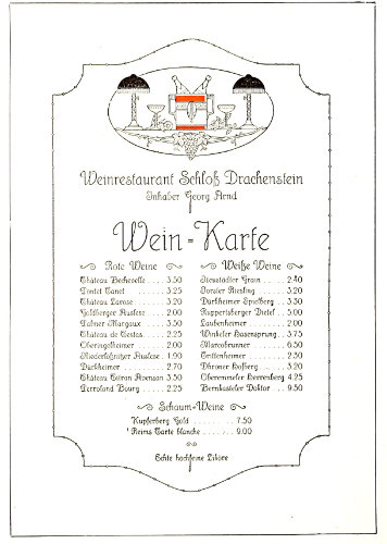
EXAMPLE 189 German treatment of a wine list, showing neat typography and attractive decoration
Example 189.—We usually expect strong, masculine effects from German typographers and decorators, and when we come across a wine list as dainty as this one we are surprised and pleased. There is remarkable harmony of type-face, decoration and illustration. The type-face is uncommonly legible for so ornamental a letter, and the light decorative lines of the illustration and border reflect the qualities of the type-face. In the original there was an additional border around the one here shown, and it was printed in a very light gray-brown tint. The tint also appeared in parts of the illustration.
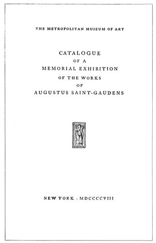
EXAMPLE 190
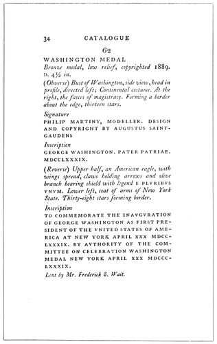
EXAMPLE 191 Title-page of a catalog of exhibits, and a page showing the use of capitals and italic for the descriptions. By D. B. Updike
Examples 190 and 191.—These pages are from an exhibition catalog. D. B. Updike is responsible for the typography, hence the pages afford an interesting study. The catalog is printed in four sizes of type, altho a cursory view of the pages would lead to the impression that a less number is used. There are three sizes of capitals and one 88size of italic. A fact that makes the catalog unique is the absence of roman lower-case. It is difficult to visualize an eighty-two-page book without roman lower-case, but here is one. The title-page (Example 190) is composed in three closely related sizes of capitals, corresponding to the sizes used on the inner pages. The important words, “Catalogue,” “Memorial Exhibition” and “Augustus Saint-Gaudens,” are set a size larger than the minor words “of a” and “of the works of,” altho the difference is but a point. The small woodcut is an appropriate accompaniment of the classic style of the type composition, and the harmony is further enhanced by printing in a clear black ink on thin white antique paper. Example 191 shows a page from the body of the catalog, the features of which are worth noting. All lines excepting the exhibit number are set flush at the left, and the paragraphs or groups are separated by space. The title of the exhibit is set in the larger capitals, the descriptive matter in italic lower-case, and quoted words in the smaller capitals. Punctuation at the ends of lines is sometimes omitted and sometimes used. The rule adopted by modern typographers—to omit punctuation points at the ends of display lines—leads to nice distinctions when a page such as this one is to be treated. As a help in deciding on proper marginal distribution on work of this sort, it is well to mention that the size of the leaf of this catalog was 4¾ × 7¾ inches, the type pages measuring 2⅝ × 5½ inches or less, the type pages not being of regular length. The margin at the head was ⅝ inch; at the binding edge, ⅞ inch; at the outer edge, 1¼ inches; at the foot, 1⅝ inches or more.
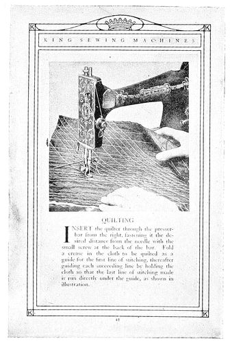
EXAMPLE 192 Interesting page from a sewing-machine catalog. By Matthews-Northrup Works, Buffalo, N. Y.
Example 192.—This shows a page from a catalog of sewing machines and sewing-machine parts. The workings of the machine were pictured in such a realistic manner that the effect was almost equivalent to a demonstration on the machine itself. The border did not force itself on the attention, yet furnished the decorative element to the page. The type matter, in Caslon roman, was stylishly arranged in harmony with 90illustration and border, and was notable because it was probably given as much consideration as the designing and plate-making.
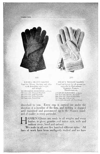
EXAMPLE 193 Neat typography on an attractive background. Glove catalog by the Hall-Taylor Company, Milwaukee, Wis.
EXAMPLE 195 Clever treatment of tabular matter in a catalog page. By the Chasmar-Winchell Press
EXAMPLE 194 An artistic treatment of a commercial catalog showing what is possible in typography. By Taylor & Taylor, San Francisco, Cal.
Example 193.—This firm has gloves to sell and in a particularly pleasing and artistic manner catalogs them for the information of the buying public. By means of the four-color process the gloves are shown in their natural colors, and placed in the “spotlight,” as it were, by the gradual fading away of the dark background about them. A general talk on the subject of gloves is carried from page to page, while the number and description are placed in smaller type directly beneath the articles.
Example 194.—In commercial catalog work the illustration of the article to be sold is of the same importance as the article on the counter in the salesroom. The usual method of selling is to show the customer the article and then by giving information about it and telling of its good qualities to persuade the customer to buy. The illustration, then, is important, and by looking on Example 194, we can see how one printer recognized this fact. The roll of yarn is prominent in the page and the name of the yarn is second in seeking attention. The goods are displayed attractively in surroundings that are interesting. The decorative border (made of rule) has merged with it the name of the manufacturer.
Example 195.—It requires the skill of a typographer and the talent of an artist to make a good-looking page from tabular matter. Where this combination is lacking the result is commonplace and unsatisfactory. It was not lacking on this example, for one seldom sees a tabular page so attractively arranged.
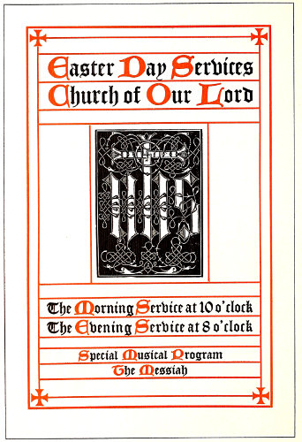
EXAMPLE 200 Program cover page in ecclesiastical style
91
PROGRAMS
“Let all things be done decently and in order.” These words of Paul, while possible of wide application, have peculiar significance applied to the program. The program exists because of recognition of the necessity of orderly procedure “where two or three are gathered together.” Historically, the program has come to us from the early times, when all knowledge was transmitted by word of mouth. Church services are the result of evolution from ancient ceremonies, and other exercises for which programs are used originated in the far past.
Programs familiar to printers could be divided into four classes: Programs of sacred services, dance programs, banquet programs, and programs for various entertainments. In this order they will be considered.
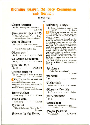
EXAMPLE 201 Excellent arrangement for economizing space on a program containing numerous small titles
The historical side of the program of sacred services should not be overlooked. It is a mistake for printers to produce church programs in the same style of typography employed on secular forms. Church programs, more than any other line of printing, offer opportunity for artistic treatment, and their production is pleasure to the artist-printer who believes significance is an important element in good typography.
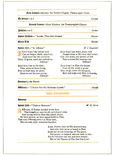
EXAMPLE 202 An almost perfect specimen of church-program printing, showing the missal style
The key to the proper treatment of ecclesiastical printing lies in the old manuscript books written in the monasteries. Black ink was commonly used for the main portion of books, and vermilion, a red earth (rubrica), for titles and important parts of the text. In the writing of Missals (containing services of the celebration of mass), of Psalters (containing the psalms), and of Books of Hours (containing prayers and offices for the several hours of the day), maltese crosses and uncial capitals were written in vermilion. Uncial capitals are now made by several type foundries as Missal initials, Caxton initials, Sylph initials, etc., and maltese crosses are easily procured. As black text letters were also used on these missals and psalters, the type-faces now known as Caslon Text, 92Cloister Black, Flemish Black, etc., being copies of these early text letters, are appropriate faces for display portions of church programs. Text letters were long ago discontinued for body purposes in English printing, hence they have become unfamiliar to the general reader and it is not desirable to use them for such purposes. A roman letter such as Caslon is the best companion for these black text letters.
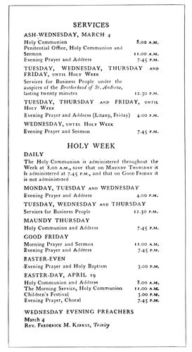
EXAMPLE 203 Classic treatment of church-program page. By D. B. Updike, Boston, Mass.
The Church of England, the American branch of which is known as the Protestant Episcopal Church, deserves much credit for the modern development of an ecclesiastical style of printing. Because of the custom of using red ink in forms of service, for the parts giving direction as to the conduct of the services, these parts have become known as “rubrics.” It is necessary to mention to printers generally that when colors are used on programs or books of service the “rubrics” should be in red. This treatment is illustrated in the page from the marriage service shown as Example 146 in the chapter on “Books” which also shows an uncial initial. When only black is used it is customary to set the rubrics in italic.
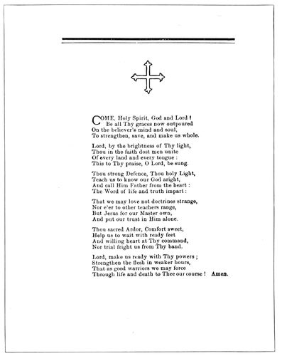
EXAMPLE 205 Generous margins on a church program are pleasing
Example 200 (Insert).—This title-page presents a modern interpretation of the historic ecclesiastical treatment. The black type-face is Caslon Text, and is a copy of one of the early manuscript letters, as before mentioned. As pointed Gothic is usually accepted as the style of church architecture, so pointed Gothic type-faces have been adopted for church printing by typographers who know. Uncial rubricated initials as used on this title-page are known commercially as Caxton initials. The red lines which are a prominent part of the page have historic significance. Now grown to possess decorative value, they originated thru the necessities of writers of manuscript books, and were originally guide lines for writing. They designated the position of the page and the lines of letters. With the ancient churchmen the maltese cross was the symbol of Christ, and today also these crosses have that significance, altho to a great extent they are now considered merely as ecclesiastical decoration. The square device in the center is in the Celtic style of ornament. The significance of the design lies in the decorative cross and the letters I. H. S. (Iesus Hominum Salvator, Latin, meaning “Jesus Saviour of Men”). It may be well to suggest that treatment of church printing should be varied sometimes with the denomination for which the work is done. The majority of clergymen will be pleased with printing treated in the accepted ecclesiastical style, yet there are some, prejudiced against “high church” liturgies and emblems, and others with individual ideas of what is appropriate, who must be considered. The writer recalls an instance in which the customer, an Episcopal clergyman, objected to what he called a “Latin” cross, used as an ornament on a title-page, and was satisfied when a maltese cross was substituted for the purpose. Many church programs which now appear commonplace would take on a churchly aspect if rubricated, even tho that be possible only on the title-page.
The example under consideration (No. 200), it will be noticed, is constructed on squared lines, a shape dictated by the large decorative device. While the page as arranged is interesting and fairly harmonious, the pointed letters in the type lines would blend better with a device of the pointed Gothic kind; or, again, the squared device would be in closer harmony with a squared type effect such as could be obtained with roman capitals.
EXAMPLE 204 Program cover-page in semi-missal style. By Lee Crittenden, New York
Example 201.—This page 93presents an excellent suggestion for the arrangement of a program in which numerous small titles appear. If each title were set in a measure the full width of the type page, as is frequently done, the matter would not come into one page. The arrangement as shown not only economizes space but gives symmetry and tone, which otherwise would not be had. The portions in red are well selected for printing in that color. There is artistic value in the shape formed by the vertical dividing rule and the page heading.
EXAMPLE 206 A dance card by Edward W. Stutes, Spokane, Wash.
EXAMPLE 208 Unconventional treatment of a dance program
Example 202.—This page has not the compactness of the preceding one, yet esthetically it is more pleasing. It is an almost perfect specimen of church-program printing. As already mentioned, the horizontal red lines and the black text letter used for titles have an ecclesiastical motive. Careful disposition of blank space has given a pleasing tone to the page, which is also helped by the position of the second stanza of the hymn at the foot. The type-faces are harmonious, the use of black text, old-style roman and italic affording a pleasing variety. By including in the color the initial letters and the title “Holy Communion,” all parts of the page are blended and related.
Example 203.—The printer may be naturally curious to know how a typographer such as D. B. Updike, who is known to specialize on ecclesiastical typography, treats church programs. Here is an Updike page, from a program of Lenten services, arranged in the simple, classic style of typographic treatment that he always renders so well. As will be noticed, the main portion of the type page is aligned at the left. The manner of using capitals, small capitals, lower-case and italic is an interesting study. While examining the page it is enlightening to note that A.M. and P.M. are in small capitals, and that no space other than furnished by the period is placed between these abbreviations or the degrees D.D., Ph.D., etc.
EXAMPLE 207 Page from a booklet program. By C. R. Beran, Denver, Colo.
Example 204.—This is the title-page of a small program which was in booklet form, a page being devoted to each event on the program. The title-page is in missal style, with cross rules and uncial initials. The spaced Pabst capitals at the foot are not sufficiently strong in tone to balance the upper part of the page. Perhaps the effect would be better had the missal style of treatment been extended to the lower portion of the page.
Example 205.—This is the second page of a small program used at the laying of the corner-stone of a new church building. It would have been possible to get all the type matter on one page, but crowding into small space is often done at the sacrifice of beauty, and this program profits by the liberal margins. The rule lines at the head were used to obtain uniformity of page width and hight. The outline type ornament gives ecclesiastic dignity to the program. The two-line initial at the beginning of each hymn adds style and finish to the typography.
The dance program is a far step from the church program. The contrast between the subdued and reverent atmosphere of the house of worship and the gayety and frivolity of the brilliantly lighted ball-room emphasizes the necessity of printers using their best powers of discrimination in treating the various programs that come to their shops.
94The dance program should be dainty. White seems to be more acceptable than colored stock on which to print the order of dancing. The type and ink treatment should be neat and delicate. If a bold type-face be used, it should be printed in a light tint of ink, such as gray, pale blue, pale green, and the like. It is possible for printers to produce attractive dance programs with the material generally found in the shop, yet stock folders may save wear of the thought machinery and probably be more satisfactory to the customer. Young people are imitative and may be suspicious of a dance program which does not resemble those they have seen before; it has got to “look like a dance program.” For fifty years or more dance programs have consisted of folded cardboard with tassel and pencil dangling therefrom. The stock folder is to be had in a variety of designs printed or embossed on the first page, appropriate for many occasions. However, there are shown three typographic dance programs.
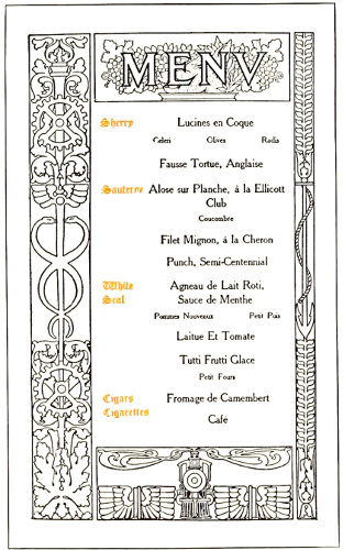
EXAMPLE 209 The decorative border on a banquet program. By Edward Everett Winchell, New York
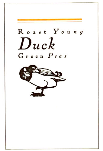
EXAMPLE 211 Page from a booklet program. By Will Bradley
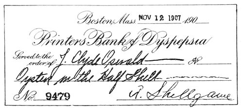
EXAMPLE 212 The banquet program in the form of a checkbook
Example 206.—An Indian border was used around this dance card, but its strong lines were softened by printing in gray and red. White stock was used. In the headline, instead of the customary periods, dots are centered decoratively. Artists often place a dot or small ornament between words of a lettered design for the purpose of benefiting the tone. More often practically no space at all is placed between words if in lower-case beginning with capital letters.
Example 207.—A part of an outing program, this page carries the style of all the other pages as regards border and head panel. It illustrates the effectiveness and economy of uniform border treatment on a program. There are very few programs that would not be benefited by decorative borders in color. But one border need be set in type, duplicates being obtained by electrotyping. If there are to be only a few hundred programs, two borders may be set in type and printed on all the sheets, running only two pages on. If desired, a hand-drawn decorative border could be engraved and afterward duplicated by electrotyping.
Example 208.—There is nothing conventional in the design of this dance program. It is different from most others. The rule lines extend to the border, and the heading “Dances” sets slightly to the right of center, supported underneath by the graceful flower ornament. Punctuation is omitted. This page is recommended for dance cards, when the printer desires to have the job exclusively typographic.
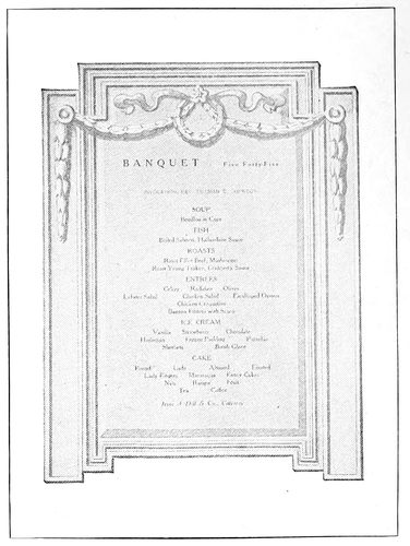
EXAMPLE 210 A halftone decorative background on a program. Design by Griffith-Stillings Press, Boston, Mass.
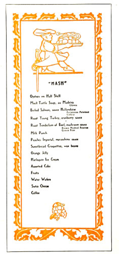
EXAMPLE 213 Humorous treatment of titles and odd menu arrangement. Design by the Griffith-Stillings Press, Boston, Mass.
The banquet program not so many years ago here in America and in England was commonly called a bill of fare. Now only the cross-roads hotel and the cheap city eating house have bills of fare. The polite title is now “menu,” pronounced men-yu or meh-noo. Some writers claim the word came to us from “Manu,” a mythical sage said to have sprung from the god Brahma. Yet the dictionary would seem to indicate that the word is French, meaning small, and was derived from the Latin minutus, little. It is possible that the small portions now served in many restaurants suggested the use of “menu” because of the contrast with the generous “helpings” of the old-fashioned meal. In 1512 a 95“shore dinner” for an individual consisted of “a quart of beer, a quart of wine, salt fish, red herring, white herrings and a dish of sprats.”
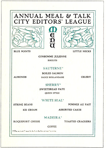
EXAMPLE 214 Suggestion for a menu page, introducing a bit of fun