PART TWO (continued 4)
Reading edition
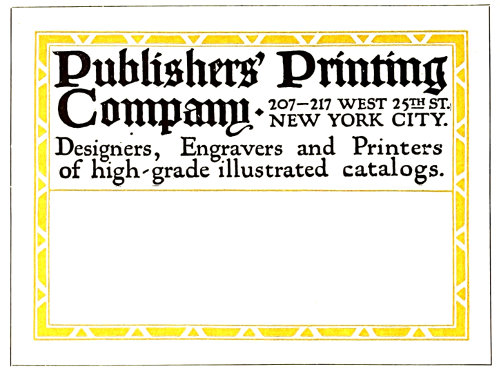
Example 324 (Insert).—For small packages and for a business that places emphasis on daintiness this label treatment would be just the thing. The classic simplicity of its design and the mere touch of color should appeal to many. The main line is set in fourteen-point capitals and the other three lines in twelve-point small capitals. Letterspacing adds decorative interest and merges the letters with the background by allowing the paper to show thru. The type-face is Goudy Oldstyle. The dots between the words are hyphens slightly cut. The border is arranged to suggest an architectural panel. This label and the preceding one have been composed merely to suggest possible effects. It would not be difficult to adapt most label copy to the styles shown.
Example 325.—This and other hand-lettered labels included in this chapter are presented as studies for the typographer. Hand-lettered designs by good artists are usually arranged with much thought, and the details give many ideas to those who have trained themselves to grasp them. It will be noticed that the border of this label is composed of three lines, a heavy and light line close together and a light line a trifle removed. At the head are two lines of roman capitals and one of italic. Do not overlook the smaller capitals “M” and “O,” and the close spacing of the words in italic. The device is small and in color. The use of roman lower-case, capitals and small capitals and italic in the lower group should be examined carefully. While it is not possible to obtain exactly these same results with type, they can be approximated effectually. It is well, however, to emphasize at this point that in approximating the effects of any good piece of lettering it makes a difference what type-face is used. It will be noticed that the italic capitals in this specimen have a decorative quality. Such an effect can be imitated in a small way by the use of the swash letters that are furnished with some old-style italics.
Example 326.—This is another lettered design that is rich in suggestion. No border is used, and the lettering is arranged close to the 125edges of the paper. Contrary to the treatment of the preceding example, the lettering is all slightly spaced. While it is well for the young compositor not to letterspace lower-case, such practice is allowable when the results are good. The effect here is one of antiquity, especially since the letters are not perfectly formed (note the “m” in the word “Amsden”). Caslon Oldstyle should be used in planning this style of work. An unusual feature is that a part of the copy is placed at the foot of the label so that the address is written between two groups of lettering. The same plan is found in the preceding example.
Example 327.—There is suggestion of Italian art in this label. Similar effects could be closely approximated with typefounders’ material. Attention is called to the manner in which the letters are treated so as to avoid an excess of blank space in such groups as the “ATA” in “catalogue.” Rule guide lines in a panel are provided for the address. This space is usually left blank on modern labels, altho conservative houses are inclined to retain the rules. In line with old ideas, the “M” is included in the address portion. This letter is usually omitted on labels for the same reason that it is left off of billheads.
Example 328.—Closely spaced black-toned lettering is still liked by some persons, and there is no use denying that when it is well rendered the effect is pleasing. This example presents a mass of black lettering in three lines of equal length, the lines merging with one another to preserve the mass effect. The border, formed of a heavy and a lighter line, is drawn with human irregularity that is in keeping with the character of the design as a whole. The “For” in italic affords contrast in both form and color. Also note the treatment of “St.,” which is made small and placed in a position above the base of the other letters. This treatment is typical of antique typography.
Example 329.—That artistic quality and interest may be put in a label form by means of typography is proved by this example. The lacelike border, the spaced Kennerley types and the words and rule in red blend attractively. Advertising value is present, yet it is so merged with the general composition and the label that it is not offensive. In fact, it adds decorative qualities. This label form would look well clearly printed on a rough-finished paper of good quality—a hand-made paper if possible.
Example 330.—Another typographic label of character, a study in black and white. The border (a combination of a heavy and a light rule) was made intensely black to contrast with the white background, an effect as of color. A type-face (Bodoni Bold) with similar strong contrasts was then selected, arranged with liberal margins in the upper part. A suitable ornament in dark tones added the picture element, and the words “Deliver to” were widely letterspaced, as they were used decoratively. This and the other typographic specimens indicate the possibilities that are present in the everyday tools of the printer and the material that is available. Many printers feel that they are not able to produce typographic work of real quality, assuming that special equipment is needed. The truth is that many are not able to produce good printing because their type equipment and decorative material have not been well selected. The fact that there is a lack of suitable type-faces usually reveals itself to them after they have learned that one type-face is not so good as another. In the finished work there is nothing seen of the presses, of the imposing stones, or of the composing frames, but the print of the type-face is on every sheet.
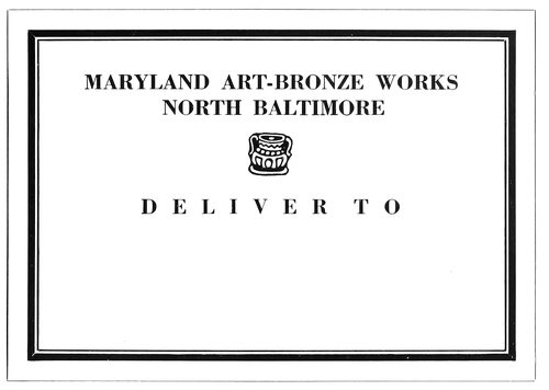
EXAMPLE 330 A typographic study in black and white
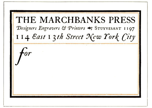
EXAMPLE 331 A Caslon specimen, with decorative interest
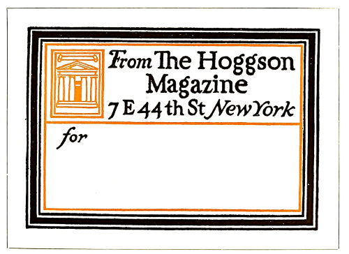
EXAMPLE 332 Harmony of border, decorative device and lettering
126
EXAMPLE 333 Possible of typographic improvement
EXAMPLE 334 Freedom of treatment that is distinctive
EXAMPLE 335 Label used for a special list
Example 331.—A specimen in Caslon, in which roman capitals and italic lower-case (the Aldine combination) make up an interesting label. The swash italic capitals add a specific decorative quality. The large lower-case “f” gives a graceful touch to the “for.” Dotted rule inside the black border is a change from the conventional continuous line. This form was printed on Japan vellum.
Example 332.—This is another hand-drawn label with qualities that can be approximated in typography. Border, decorative device and lettering are in the same key, and the harmony is agreeable. There are those who thoughtlessly condemn black borders as funereal, a judgment that is based on prejudice and not on an understanding of their use. It is well, however, to caution the young compositor against abuse of the black border; it would be well if he were to use no black borders until he had developed taste in the practice of typography.
Example 333.—An unusual label design that could probably be improved with careful typography. The initials of the text lettering are not exactly harmonious, and the space between words in the lower group is excessive. Printers should practice on the improvement of the design.
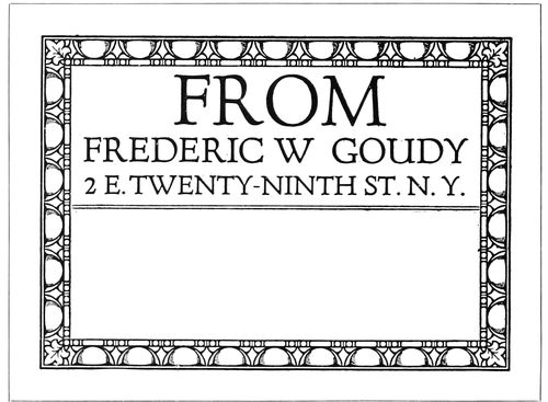
Example 334.—A characteristic Goudy type arrangement, with a freedom of treatment that is distinctive. How many printers would give the prominence to “From” that it has here? This suggests the custom of printers of the sixteenth century in starting a title-page with a large size of type regardless of the importance of the word or words.
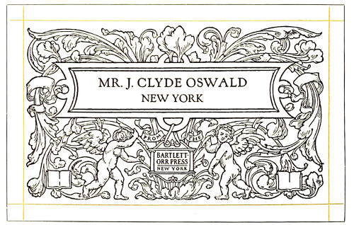
Example 335.—This label was used in mailing to a special list some fine pieces of printing. The name of each addressee was printed in with type as shown by the reproduction, and, needless to state, attracted attention. The treatment of this label is uncommon in another respect—the modest inconspicuousness of the phrase, “From the Bartlett-Orr Press, New York.”
It would do no harm if printers also studied the stock labels manufactured by certain stationery houses. They will find much that is poor and commonplace and little that should be directly copied, but there are many suggestions in label making that could be adapted. The “reverse-plate” idea is one. The label is set in type and a proof sent to the photo-engraver, who makes a plate in which the letters show white and the background black. This plate can then be printed in color on gummed paper and the paper trimmed so as to “bleed” the edges of the printed background.
EXAMPLE 338 Forceful business-card treatment exemplified by band-lettering
EXAMPLE 339 Gray-brown stock is suitable for unconventional effects of this kind
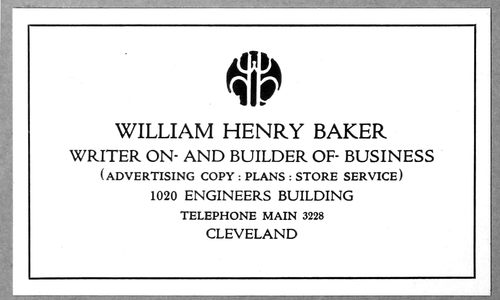
EXAMPLE 340 The black monogram has much to do with this card’s attractiveness
127
BUSINESS CARDS
Polite society requires that a visitor shall be announced by a card bearing his or her name, and the courtesies of business call for this same formality. The man called on unexpectedly is placed at a disadvantage if he has not understood the visitor’s name and has no idea of his business. A card that clearly tells both name and business prevents embarrassment and misunderstanding.
The card makes it unnecessary for the caller to explain who he is. Without the printed information he would likely need to introduce himself thus: “I am James Johnson. I am president of the Johnson Manufacturing Company. We manufacture machinery for the making of paints. Our office is at 320 Broadway. Our telephone number is Worth 4653.” But with all this neatly printed or engraved on a card, dignity is maintained and embarrassment avoided.
The sizes of business cards are far from being standardized. Examination of about one hundred business cards showed a range of sizes from 3 × 1½ to 4 × 2½ inches. The size of which there were most and which gave an indication of standardization was 3½ × 2 inches. Fully one-quarter of the cards were of that size. From this investigation it would seem logical for printers to use that size unless the customer orders otherwise.
White cards predominated in the lot examined, and this suggests that it is in good taste for the printer to use white stock on most of the business cards that he is called on to print.
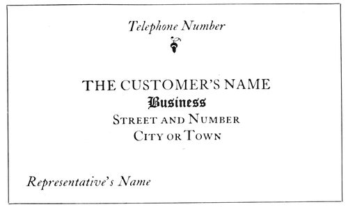
EXAMPLE 336 The probable result of an attempt to standardize the contents and arrangement of a business card
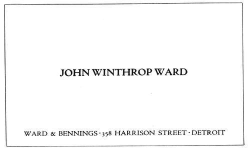
EXAMPLE 337 Dignified treatment for the card of a well-known house. The firm name and address are subordinated to the name of the person using the card. No business is mentioned, an omission open to discussion
Example 336.—If an effort were made to standardize the contents and arrangement of a business card, the plan presented by this example would probably result. The customer’s name is placed at the point of greatest prominence, a trifle above the center of the card. The words describing the business are second in position under the customer’s name. The street and number are taken care of on the next line, and under the street and number is the name of city or town. In the lower left corner is provision for the representative’s name. The telephone number, for which a business card is frequently preserved, finds place in the upper part of the card. A variant for the position of the street and number and the name of the city or town is in the lower right corner.
Example 337.—Here is a card that is a model of dignity and of simple business-card treatment. A good word can be said in favor of using the individual’s name in the center of the card and the firm name in a less prominent position. When a card is handed to a business man, he looks at it first for the purpose of finding out who it is that wishes to see him. A card of this kind tells him instantly. In many cases the individual’s name alone would be sufficient. No business is mentioned, as it is one of those cases in which it is assumed that the name of the firm provides sufficient identity. In omitting mention of the business, one should make sure that the firm is as well known as he assumes it is. If the name is not familiar to the person receiving it, he will be perplexed, not knowing if the visitor desires to sell him books, insure his life, or buy a bill of goods. In the typographic treatment of this card Cloister Oldstyle, capitals, has been used for the smaller line and Cloister Bold, capitals, for the larger line. This slight contrast in the strength of lettering in many instances gives quality and legibility to steel-engraved and lithographed business cards and stationery. The printer by having a well-designed type-face in two strengths will be able to introduce similar good qualities in his work. The spacing between words on this card is closer than that usually allowed by compositors. Close spacing between words is a quality found in good lettering and in good typography.
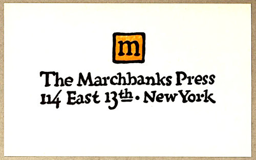
Example 338 (Insert).—While 128the main purpose of this chapter is to encourage the use of typography on business cards, a specimen of hand-lettering is used to point out forceful treatment that, aided by good printing, liberal blank space and high-class card stock, may sometimes be effective for business-card purposes. The printer using a card of this kind would see to it that it was not presented to a prospective customer who had a dislike for anything unconventional.
EXAMPLE 341 The monogram in color adds distinction
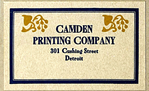
Example 339 (Insert).—Conceding that a conventional arrangement on a white cardboard is best for most purposes, it cannot be denied that a design of the strength and interest of this one would often be received with pleasure by the man in the business office. It is not unlikely that the thought would occur to him that the printer who can produce a card of this kind is qualified to design and print publicity matter equally attractive for other purposes. Bewick Roman is the decorative type-face shown. The border and ornaments used are essential to the good results in this design. The card would not be as pleasing with the ornaments or the border taken off. This card, by the way, is one of the good things arranged by Will Bradley back in 1905.
EXAMPLE 343 High-hat-and-frock-coat treatment
EXAMPLE 344 A business card in blocked capitals, with monogram of harmonious shape
Example 340 (Insert).—Quality is added by an attractive black monogram on a background of white supplemented by the gray formed by the type group. This is an interesting specimen of business-card typography, suggestive of architectural panel treatment. The lines (in Cloister Title) are graded in size according to their importance, the telephone line occupying an unusual position between the street address and the name of the city. Because of its position, it also adds a bit of legibility and prominence to both of these lines.
Example 341.—This treatment is similar to the preceding example, with the decorative device in color.
EXAMPLE 342 An uncommon typographic effect
Example 342.—This card is an interesting contrast to those that have just been considered.
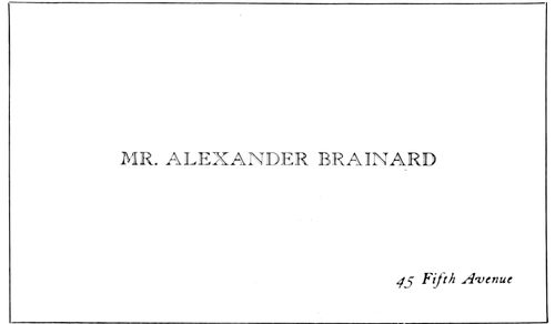
Example 343.—Here is a card French in motive and of a style that emits exclusiveness. It almost pictures the high hat and frock coat of the man who would probably use it. All the formalities are observed, the abbreviation “Mr.” preceding the name. The man who uses a card of this kind would no more think of mentioning his business on a card than he would of putting a business sign on his residence. The open-face type is College Title and the italic is Caslon.
Example 344.—An unusual arrangement in blocked Caslon capitals slightly letterspaced. Arrangements of this kind are difficult for the compositor and should not be attempted unless he is not hurried and can experiment with the details of the composition. The shape of the monogram lends itself to the general arrangement.
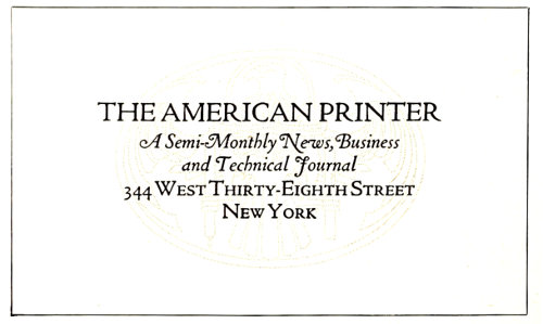
EXAMPLE 345 Arrangement as suggested in Example 336 with an underprinting decorative device
Example 345.—This is a compact arrangement built 129somewhat after the scheme outlined in Example 336. The decorative device in the original was printed in a tint so like the stock that it suggested a watermark.
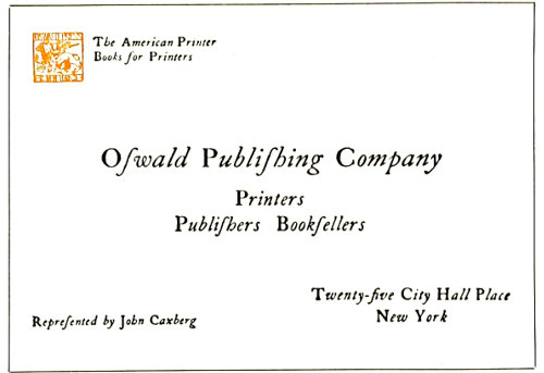
EXAMPLE 346 Roman capitals with italic lower-case
Example 346.—This card would better please the average person if italic capitals were substituted for the roman. However, there was a historical motive for treating it in this manner. When Aldus Manutius introduced the slanting style of type we know as italic, only lower-case letters were cast, and roman capitals were used with them.
Example 347.—The Germans in the designing of business cards seem to have abolished conventionality, as they endeavor to have each card in its design possess distinct advertising value. This example is representative of such effects.
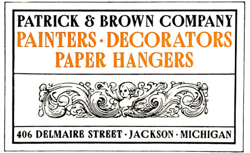
EXAMPLE 348 Decorative treatment suggested by the business
Example 348.—The designer of this business card took his cue from the word “decorators” and endeavored to form a card with decorative values. This was the reason for the selection of Bewick Roman for the type-face and the Italian ornament to occupy space that is usually left blank on business cards.
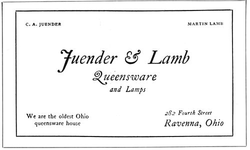
EXAMPLE 349 Italic is pleasing on some cards
Example 349.—When dainty effects are desired, Caslon italic, as used on the greater portion of this card, almost always looks well.
Example 350.-A strong ornamental effect, such as appears on this card, is liked by some people, but the printer would make a mistake to use it unless he was sure that the customer would care for it. The typographic treatment is simple and compact and lacks nothing in legibility. The shape of the border corners fits into the space left by the contour of the type group.
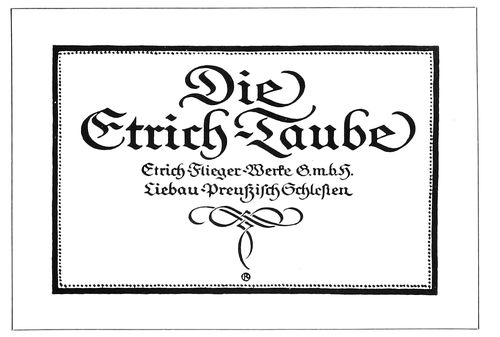
EXAMPLE 347 Modern German business-card treatment
Example 351.—An arrangement that has a suggestion of the classic. All lines are in one size and in capitals. This treatment should not be used excepting in special cases, as it would not meet the approval of most customers.
Example 352.—In the amount of matter it contains this card contrasts strongly with Example 343. Some small business men find it good advertising to give as much information on their cards as the size of the card will allow. This example shows how a great deal of copy was treated so that the general effect was not displeasing. In order to accommodate this amount of copy, it is usually necessary to enlarge the size of the card a trifle. Bodoni was used for all excepting two lines, the firm name and address, which were set in Bodoni Bold.
Example 353.—A decorative card that could be merged in color treatment with an antique-finished stock of some suitable tint.

EXAMPLE 350 A strong design for special purposes
Example 354.—Horizontal lines crossing the face of a card are rarely successful because they usually separate 130connecting phrases, but in this instance the lines are a necessary part of the design and divide the type matter at a suitable place.
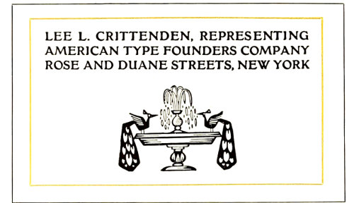
EXAMPLE 351 Classic arrangement in one size of type
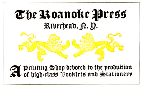
EXAMPLE 353 Highly decorative, with possibilities for harmonious color effects
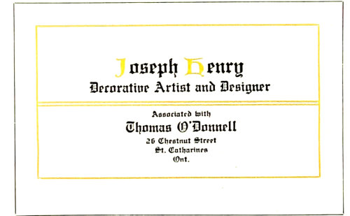
EXAMPLE 354 The horizontal lines are well employed
Example 355.—This card in Bodoni and Bodoni Bold capitals, letterspaced, with the use of a few rules, has distinction that could be successfully carried to other forms of stationery. The contrasting heavy and light rules blend with the heavy and light lines of the Bodoni Bold.
These specimens will convince both printer and user that there is more than “one right way” to design business cards. Typography is the interesting study that it is because, to paraphrase the words of Shakespeare, age cannot wither nor custom stale its infinite variety. Some style of typographic treatment is available to meet the likes and dislikes, preferences and prejudices, of every one using business cards. The strictly conventional person can be supplied with a strictly conventional card, proper in all details. The artistic person, he of the flowing tie, can obtain a card with sympathetic qualities. The noisy huckster can be supplied with a typographic effect that almost shouts the message it contains. In fact, character and personality can be expressed typographically on the business card, and the printer will find this matching of typography with human nature an interesting study.
A large city wholesale house cannot afford to circulate the cheap-looking, inharmonious cards that some owners of small shops on side streets seem pleased to use.
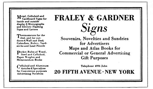
EXAMPLE 352 A business card with a large amount of copy
More than an ordinary amount of thought should be given to the physical construction of a business card. Because of the present great interest in all forms of advertising, more individuality is permissible than formerly. As typography can give distinction and attractiveness to business cards, printers should study the use of type on this class of printing, and give their customers the best possible service.
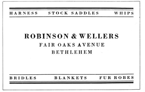
EXAMPLE 355 Distinctive treatment adaptable for general stationery
Printers are producing cards in imitation of intaglio work to satisfy customers who do not consider that a truly typographic design “looks like a business card.” There is no use denying that copperplate engravers set the style for much of the business-card printing. Shops doing this imitation work should have samples of the best card work done by engravers, so that their imitations may be as accurate as possible, so far as concerns style, face and arrangement. There is little pleasure in being an imitator unless you are a good one, and here is opportunity to gain a reputation for the clever printing of imitation engraved work. Good stock, a dense-black ink and perfect types are means to this end. Pleasing results have also been obtained by using green-black ink or dull gray-black ink, which assists in conveying the soft, pleasing effects of lithography.
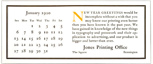
EXAMPLE 356 This size of blotter will cut twelve out of a sheet of standard blotting stock. The copy includes a calendar and is representative of the conventional copy usually supplied for blotters. The calendar is arranged without rules. The initial furnishes a spot of attraction, separates the two groups and carries the eye to the beginning of the message
131
THE BLOTTER
Blotters have a place in modern business which, while not so important as that of business cards, is fairly well established.
Business cards are left with customers as reminders, and altho blotters are sent for the same purpose, they have the added quality of usefulness. The treatment of a blotter should be as well thought out as that of a business card. In a sense the blotter represents the business house sending it, and while it may show less restraint and dignity than the business card, coarseness should be avoided in the handling of both type and illustration.
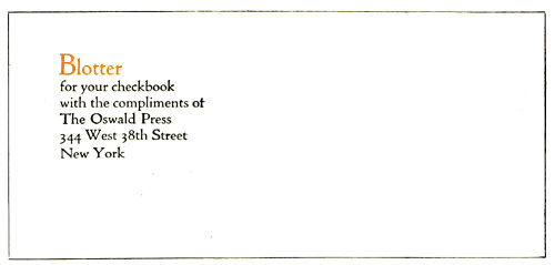
EXAMPLE 357 A modest amount of copy and neat treatment
The blotter as a means of publicity much used by advertisers is no longer an experiment; it is a familiar form in the printshop.
The advertising value of a blotter seems to lie in its ability to do one of two things—strongly and favorably to attract attention when received, or thru attractive simplicity to grow in favor during use. The former may be likened to a rocket which compels attention and pleases for a moment, and the latter to a star whose beauty attracts forever.
In planning a blotter it is well to keep in mind its utilitarian character and make it as useful as possible.
The size is determined by the sheet of stock out of which blotters are cut. As the stock measures 19 × 24 inches, most printers cut blotters a trifle less than 9½ × 4 inches, thus securing twelve blotters to a sheet of stock. There are others who prefer the blotters not so wide and make them 8 or 8½ inches.
Another reason for the blotter size of a trifle less than 9½ × 4 inches is that it fits nicely in a standard No. 10 Government envelop, which measures 9½ × 4⅛ inches.
A size of blotter that is also much used measures about 6 × 3¼, and fits in a No. 6¾ Government envelop, which measures 6½ × 3⅝. This size is most convenient for inclosing with everyday business mail, and it is possible that most of those actually using blotters prefer the smaller size.
The blotter with an enameled surface on one side is probably the best for use. A person naturally rubs his hand over the blotter to absorb the wet ink, and an enameled surface feels more pleasant to the touch. When not many blotters are on hand in a business office those with absorbent surfaces on both sides render the greater service, but usually advertisers keep offices well supplied.
From a printing point of view the blotter stock with one side enamel-finished is better for illustrations or small type, while rough-finished stock is suited to typographic treatments that require antique effects.
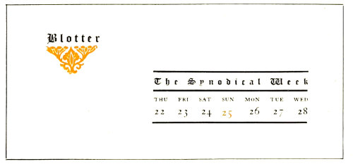
EXAMPLE 358 Blotter used in the writing room of a convention hall
Example 356 (Insert).—This blotter represents not only the size of a great many blotters but the contents, as it is customary to include a monthly calendar. Too frequently forms of this character are made inharmonious because stock calendar plates are utilized and are accompanied by type-faces of another design. This lack of harmony is seldom necessary, as the printer in his typography should match the style of type used for the stock calendar plate. Sometimes in addition to the calendar plate a stock illustration is also introduced, with consequent duplication of spots of attraction. Either the calendar plate or the illustration should be used; not both. The typographic arrangement of blotters oftentimes is of a poor kind because the copy is separated into numerous display parts. In so far as it is possible, the treatment should be simple, and in order to suggest such treatment this example has been prepared. It will be noticed that the entire blotter has been set in one design of type-face—all 132roman, and mostly lower-case. This manner of handling the typography will give good results in almost every instance in which it is tried. The message of the advertiser is presented in a plain, legible paragraph introduced by an initial in color. The blank space liberally distributed is restful, and the dark-printing qualities of the heavy-and-light-line border contrast with the blank background, the rubricated initial and the mass of gray in the type matter. No rule lines appear in the calendar section, and the result is an appearance of natural freedom.
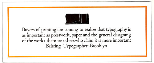
EXAMPLE 359 Simple typographic arrangement with strong but pleasing contrasts
Example 357.—Most blotters contain too much type matter. The business man would probably appreciate a modest little announcement and consider it a relief from the sledge-hammer advertising that too often forces itself on his attention in an unwelcome way. As one rubs over the average blotter he finds it almost necessary to close his eyes because of the strong character of the design or color treatment. The arrangement of this example is a suggestion for a little blotter that would doubtless be welcomed by many. It could be of a size that would fit in the personal checkbook. Because of the intimate character of its use the typography should be confined to a simple paragraph or to a group arrangement as shown. Both the message and the treatment here given are in good taste for such a purpose, and, as has been suggested, it is likely that similar treatment on a larger blotter would win approval.
Example 358.—This blotter was used in the writing room of a convention hall and was prepared for a state meeting of a church organization. It will be noticed that only the week of the convention is given in the calendar, and that it begins on Thursday and ends on Wednesday. Some of the factors that make this blotter pleasing are the liberal blank space, the black lines of the rules, and the ornament in color. Text type is used because of the religious character of the convention, and it is letterspaced. As a general rule it is well not to letterspace text type, but here in order to obtain a certain distinctive effect it has been done with good results.
Example 359.—Here is a suggestion for a simple typographic arrangement with strong but pleasing contrasts. The color of the rule border contrasts with the white of the background and the black of the illustration. The gray effect of the type group is a harmonizing factor that softens the contrasts. Only one face of type—Cloister Oldstyle—is used, and that of a size that makes it possible for the business man to read the message as he blots his 133signature. The treatment is masculine and will please a great many because of its style.
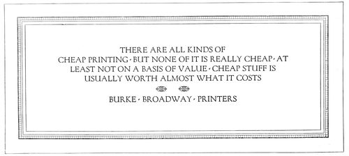
EXAMPLE 360 A blotter arrangement suggestive of an architectural panel
143
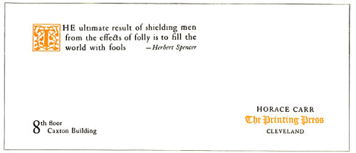
EXAMPLE 361 Blotter treatment that survives the test of time
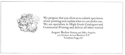
EXAMPLE 362 Neat, refined arrangement of type matter and illustration
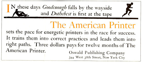
EXAMPLE 363 In which the type matter fills the blotter
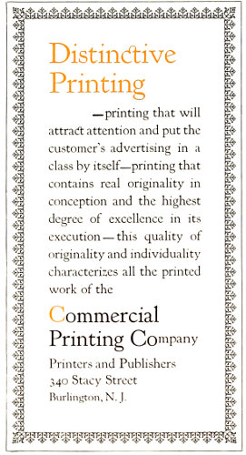
EXAMPLE 364 A decorative blotter arranged the narrow way
Example 360.—This blotter has the character of an architectural panel, a motif that is adaptable to many forms of typography. The general gray effect of the Forum Title and the architectural border is satisfying, especially as the type group and border are separated by a liberal amount of blank space. The shape of the type group suggests a keystone. This is one of those blotters that the business man should find pleasure in using and looking at frequently. It will be noticed that the spacing between the words is less than the en-quad which the typographer would customarily use in capital lines. It would be a mistake to separate these Roman capitals with more space than that used here.
Example 361.—It has been said that two important factors in good typography are the material that is used and the material that is not used. Horace Carr has done many good things with the Caslon type-face, but none more pleasing than this blotter. It is a model of good taste in blotter typography and the sort of treatment that has proved to be good blotter advertising. This particular example was received by the author some years ago and was then reproduced. Testing it with careful examination after all this time, it looks as well as ever.
Example 362.—Here is suggested a neat, refined arrangement, in which type group and illustration are placed practically in the center of the blotter and surrounded with blank space that accentuates its neatness.
Example 363.—This blotter—one that was submitted several years ago in a blotter competition—shows treatment which calls for the use of large type that occupies almost the entire surface of the blotter. While an effect such as that of the previous example is preferable for most purposes, there are times when it is desirable to have the typography arranged on a large scale.
Example 364.—It is customary to design a blotter the broad way, but occasionally printers desire for the sake of novelty to arrange it the narrow way, as is done on this example. The blotter has decorative quality because of the use of the gray border and the lower-case of Kennerley Oldstyle. Lower-case properly used is usually attractive.
EXAMPLE 365 Appropriate trademark and harmonizing typography
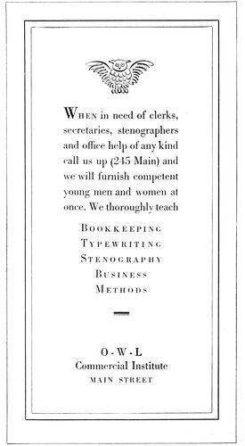
Example 365.—A touch of appropriateness is given to this blotter by the use of the scroll decorative piece, and the harmony is further carried out by the selection of Bodoni Book for the type portion.
EXAMPLE 366 Typographic poster in Roman capitals by Frederic W. Goudy
135
POSTERS, CAR CARDS, WINDOW CARDS
Poster printing is a specialty in large cities, where plants are equipped for the economical and effective production of such work. However, consideration of the subject in this chapter will be confined to the interest it may have for the general commercial printer, he who is called upon at one hour to print a business card and at another to produce a window card, car card or other form of poster printing.
The type equipment of the poster specialist includes strong gothic and Clarendon faces, of a variety of widths that enable him to make a full line of almost any word or combination of words. When such strong-printing capital letters are used, most of the lines should be full, as the general effect should be one of compactness. A very little amount of spacing is sufficient. No extended reference will be made here to the conventional poster that carries these heavy types, as its arrangement is merely one that emphasizes in a plain manner the various important parts of the copy. Skill is necessary, but not the skill of an artist.
The wood-type equipment of the general commercial printer need not he elaborate, but it should be well selected. There should be a blending of styles in type-faces from the smallest size of metal type to the largest wood letter. The wood-type makers duplicate most of the standard job faces, so that harmony in this respect need be no idle dream.
EXAMPLE 367 A lettered poster by Harvey Hopkins Dunn that should be studied by the typographer
Among poster printers a sheet 29 × 39 inches is taken as a unit and is known as a “one-sheet.” “Four-sheet,” “twelve-sheet,” etc., are terms designating the number of units or “one-sheets” in the whole display. On the other hand, the commercial printer’s “sheet” poster is generally the full 25 × 38-inch paper, a “half-sheet” being 19 × 25 inches and a “quarter-sheet” 12½ × 19 inches.
The size of car cards—the advertisements used in trolley, elevated and subway cars—is usually 11 × 21 inches.
The most common sizes of window cards—advertisements placed in store windows by courtesy of the merchants—are quarter-sheets (11 × 14 inches) and half-sheets (14 × 22 inches), the unit of which is the standard sheet of cardboard (about 22 × 28 inches).
Posters in their most attractive form are designed in pleasing combinations of decorative illustration, lettering and harmonious coloring. The printer with type alone cannot give the picture element, but he can give color and lettering.
What a poster authority has said of the pictorial poster can to some extent be said of the typographic poster: “The poster should be simple, clever, attractive, perhaps sparkling, spontaneous, appropriate, sometimes humorous, but in good taste, and should tell the story at a glance. It should not be elaborate in detail or labored; the designer should know where to stop. The coloring should be brilliant, yet simple; when many colors are used most of them are wasted, as the eye does not see them all. As detail in a poster is lost at a distance, it is unnecessary. The best posters have no background and not much lettering, as small lettering cannot be seen across the street, which is the test.”
It is assumed that the typographic poster is viewed at closer range, as in its smaller sizes it is usually hung in stores and offices or posted in convenient locations that permit of easy reading; yet the printer who sets the work, as well as the man who writes the copy, should keep before him the manner in which the poster, car card or window card is to be used. A person sitting on the opposite side of the car should be able to read the 136car card, and the person passing a store window should find it possible to obtain the principal points of information from the window card. On store cards, such as used during special sales, the price should be prominently displayed.
EXAMPLE 368 A lettered arrangement that has suggestion
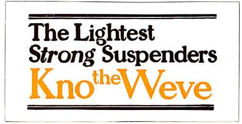
EXAMPLE 369 A few words of copy and strong contrasts
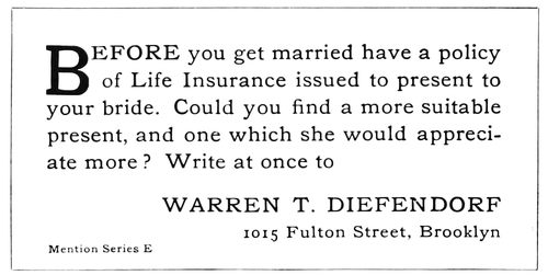
EXAMPLE 370 A typographic style unique among insurance advertising in cars
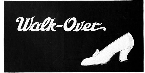
EXAMPLE 371 Simplicity that is worthy of adaptation
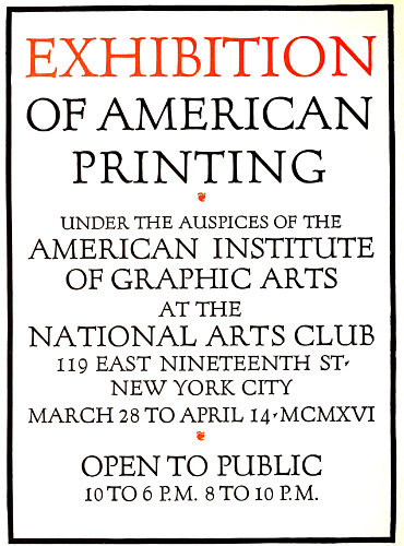
Example 366 (Insert).—The possibilities of typographic effects in poster printing are to be seen in this example, arranged by Frederic W. Goudy. Forum Title, designed by him, was selected as the type-face. In order to obtain the larger sizes, the type was set in a smaller size, a clear proof pulled and a photo-engraving made. This poster measures up to the qualities outlined by the poster authority previously quoted. It is “spontaneous, appropriate, simple, clever, attractive.”
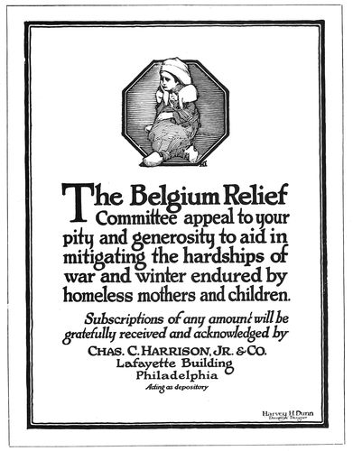
Example 367.—Altho this design is lettered, it should prove of great value to the typographer as a study of composition. In the production of this effective poster Mr. Dunn has given of his talent as an illustrator as well as of his skill as a letterer. The apportionment of blank space in the margins and at the head is pleasing, and it helps to make effective the black masses of lettering and the octagonal illustration. The border of thick and thin lines ties the design together.
Example 368.—Most cards in urban cars are made up greatly of design and illustration, but in this one we find the illustration taking a minor position. The lettering is the main feature, and it should suggest treatment with type that could be almost as effective.
Example 369.—The strong contrast of black, red and white in this car card could be approximated with bold, well-designed wood type. The trade name is given most prominence, altho the remainder of the copy is also strongly presented. A suggestion of decoration is to be found in the ruled lines at the head and foot.
Example 370.—Seldom is copy such as this furnished for car cards, yet its conversational style probably caused it to be read more than other cards. As an advertisement it is an improvement over the common method of merely stating name and business. It presented opportunity to the printer to use types in a sane, simple manner, and he did so. A two-line initial letter starts the reading pleasantly, and the name in capitals has sufficient prominence.
Example 371.—At an exhibit of German modern-art posters the design that stood out most strongly was one which contained only a name lettered and an article illustrated. There was no detail to detract, and the effect was altogether pleasant. This shoe card is planned along similar lines, and the idea could well be put to further use.
Example 372 (Insert).—This is a presentation of a three-sheet poster which attracted the attention of the writer a few years ago because of its simplicity. For such effects as this, which carry but little copy, lower-case letters are appropriate. It is seldom, however, that the commercial printer is provided with so few words for his posters. Lower-case display, to look well, requires plenty of surrounding blank space, while capitals accommodate themselves to close quarters.
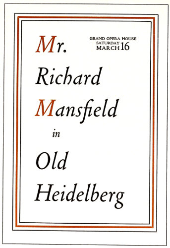
EXAMPLE 372 Refinement in theatrical printing. Was a large three-sheet poster
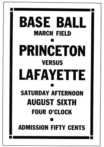
EXAMPLE 373 A border such as this blends with gothic type-faces
137Example 373 (Insert).—The “Secession” style of border and ornament blends well with monotone type-faces without serifs, such as the type commonly known as gothic. As the wood-type equipment of most printshops very likely includes gothic faces, the style of treatment shown by this specimen may be produced successfully. A border such as this is easily procured, or can be made by the printer if he desires.
Example 374.—Printers seldom take advantage of the opportunities offered for unusual effects. This copy did not suggest anything to the compositor who first set it and the result was commonplace, with nothing to excite anything but ordinary interest. The fact that the birth of Franklin was to be celebrated should have been sufficient to suggest an arrangement such as is here presented, but it did not. Benjamin Franklin purchased his type in England, some of it at the old letter foundry of the Caslons; and what is more interesting than a poster announcement of a Franklin dinner set in the style of type-face that Franklin himself used? This has been done in the example under consideration. Roman, italic, capitals and lower-case have been blended in the interesting manner in which this was done in the eighteenth century. The long s (ſ) of Franklin’s time is also used, to carry along the interest; it appears, as will be noticed, in all cases excepting at the end of words. A Caslon ornamental band is at the head and foot.
Example 375.—This is another instance where the copy furnished a motif that could be developed typographically. Reproductions from the First Folio of Shakespeare’s works were available and from them an initial and two decorative bands were enlarged to the desired size. The typography of Shakespeare’s time was then studied and worked into the poster. The Caslon type-face is not exactly the same as that used in the seventeenth century, but there is sufficient similarity to make it suitable. Many persons of the present day will shy at the use of a single capital letter immediately following the initial, but that is the way it was done in the old days. Typographers should early begin to accumulate a library of books. They should frequent the second-hand bookstores, and occasionally purchase some old volume that shows the style of typography of fifty, one hundred or more years ago. The best printers do this.
Example 376.—It should be an easy matter to produce attractive window cards or paper hangers in this style. Selections from the many artistic and odd cover papers obtainable, supported by harmonizing color combinations, make possible any number of attractive effects. Only one size of type should be used, and the border should be one that reflects the character of the type-face. Plain rules for border purposes are more successful in obtaining harmony than is decoration. As most letters contain two widths of line, a rule border matching the wider line, or both lines, is pleasing.
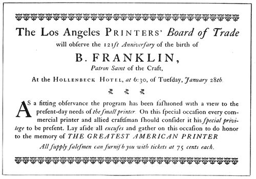
EXAMPLE 374 Type treatment that suggests Franklin’s time
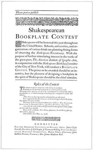
EXAMPLE 375 Poster in Shakespearean typography
Example 377.—The Colonial style of type arrangement is here adapted to window-card purposes. The window card has the same advertising reason for its existence as the paper 138poster, and is printed on cardboard to enable it to stand upright. The treatment of this card is such that the word “Pinafore” and the decoration stand out most prominently, taking for granted that a person interested by the sight of this word will come close to the card and read it. Such an arrangement should not be attempted unless the copy is suitable. Forcing unsuitable copy in full-line Colonial arrangements results in illegibility and dissatisfaction.
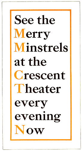
EXAMPLE 376 A simple typographic treatment that offers possibilities for attractive posters or window cards
Example 378.—Sunday-school excursions furnish copy for many window cards. The printer may appreciate this suggestion for an arrangement of such a job. It is sufficiently unconventional to attract attention, at the same time providing a simple way of arranging the matter that usually comes in with such orders. The arrangement has merit from an advertising point of view, the information being given concisely and legibly.
It is probably true that the majority of printers have given no thought whatever to the arrangement and treatment of posters. It is even likely that there are job printers who feel that poster composition is beneath their dignity. In view of these conditions, it is to be hoped that what has here been written regarding the poster will serve to create new interest in that line of work.
Years ago the author knew an old printer who had the reputation of being the best sale-bill compositor in the county. His work was confined almost entirely to the setting of posters announcing sales of farm goods, yet he did it so carefully and efficiently that residents of the county traveled miles to place an order with the concern for which this man worked.
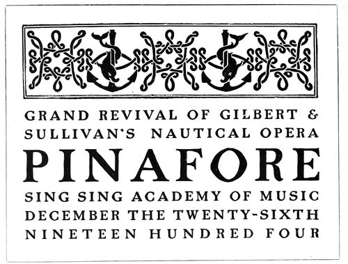
EXAMPLE 377 The Colonial style used on a window card
Poster printing should not be attempted unless the equipment is such that the work can be done profitably. Lack of sufficient wood type will result in poor printing and makeshift arrangements. However, absence of equipment did not worry a certain printer who did business some years ago. He had no wood type at all, yet he accepted orders for posters and, taking advantage of the craft courtesies of those days, borrowed all the type lines from a competitor. It frequently happened that when the competitor desired to set up a bill he found that the type was mostly in the possession of the borrowing printer.
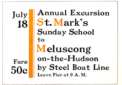
EXAMPLE 378 Suggestion for an excursion window card
The large two-sheet and three-sheet posters look very big indeed to the printer in the small shop whose product is confined to the output of his platen presses, yet poster printing is merely printing on a larger scale. The builder of the New York subways was once asked how he found it possible to put through such a large undertaking. He replied that he knew he could build a cellar, and a subway was merely a multiplication of cellars. The printer who learns how effectively to produce a small piece of printed advertising matter should be able, by developing and enlarging on his ideas, to produce good poster work.
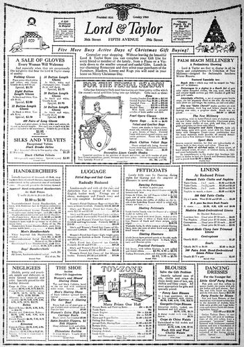
EXAMPLE 381 A city department-store advertisement of the good kind
139
ADVERTISEMENTS
Not every business man can write an advertisement well. Not every printer can set an advertisement well.
Of the poor advertisements that mar newspapers and periodicals, fifty per cent of the ineffectiveness should be blamed on those who write them and fifty per cent on those who set them.
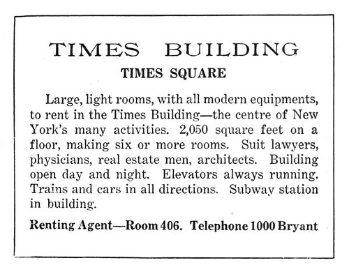
EXAMPLE 379 Newspaper advertisement arranged without thought. See 380
In this chapter we are interested not in writing the advertisement, but in properly treating it typographically after it has been written.
Some day advertising typography may become so standardized that a compositor can be told in a few words just how he shall arrange it. Meanwhile as there is more than one way to set type for advertisements, we must for the present depend on the study of good type work, the advice of those who have theories, and our own judgment.
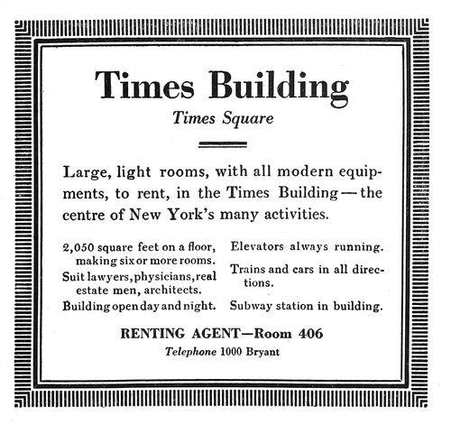
EXAMPLE 380 Easier to read and more pleasing to look at than 379
It is possible, however, to learn something about advertising typography by giving thought to the ways of the orator, who swayed human beings long before printing was invented. We have all listened to oratory in the church pulpit, the public square and the Chautauqua tents, and in halls on the occasion of political gatherings and organization conventions. Our most agreeable recollections are of those moments when we were so pleased and impressed with what the speaker was saying that we did not think of his manner of saying it. Probably the most successful printed matter is that which pleases and impresses without one’s being immediately aware of the cause.
A good speaker will enunciate clearly and speak in a moderate tone that can be heard.
A good typographic advertisement will be set in a legible type-face and in a size that can be easily read.
Print can be too small or too large, too gray or too black.
If a speaker is addressing an exclusive group of persons, he lowers his voice and talks in polite diction.
If he addresses a large crowd, many of whom are of less fastidious tastes, he raises his voice, perhaps using all his power, and most likely mixes with his English a little popular slang.
Thus advertising printing of the exclusive kind would likely be set in type smaller and in design more classic than that used for publicity matter that has wide and promiscuous circulation.
The typographer must keep in mind that while bluntness and forcefulness are liked by some, they give offense to others.
There are orators so eloquent and flowery that one is led away from the message by pleasure and admiration for qualities that should merely carry the message.
There are advertisements so attractive in decorative beauty that one sometimes forgets to read them.
And then there is the heavy-voiced orator who emphasizes every statement. He startles and he tires, and is as unsuccessful as the speaker who croons his audience to sleep with uninteresting monotones. How like such 140speakers are the excitable, over-displayed advertisement, and the large advertisement monotonously set without emphasis, in one size of type!
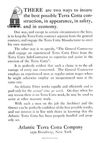
EXAMPLE 382 The conversational style of page advertisement
The speaker who gracefully accentuates his talk at important points has the same good judgment as the typographer who neatly displays or emphasizes significant parts of his copy—not forgetting the orator who gets applause at the wrong time, and the printer who by carelessness in arrangement suggests the wrong thought.
Many speakers use the same words that Shakespeare used, but “they phrase them differently,” just as printers arrange type differently.
The orator has a message, and he tries to “get it over.” The advertiser has a message too, and he calls on the typographer to assist him in gaining customers. The problems are not unlike.
EXAMPLE 384 One word is thoroly advertised
Examples 379 and 380.—These two advertisements picture the difference between setting type with a stick and setting it with the head. It would be illogical to assume that any thought at all was given to the type composition of Example 370. It not only is unpleasant to look at, but is difficult to read, notwithstanding the size of type used for the text. Benjamin Sherbow, who has given much time to the training of type to act for the advertiser, took the same material the newspaper compositor had to work with, and at the crack of his whip the words assumed a new formation. Keep in mind that Mr. Sherbow was not attempting to improve the looks of the advertisement; he did improve the appearance, but what he started out to do was to make the message easy to read. He labored from the viewpoint of the reader and not from that of the advertiser or printer. The difficulty usually is that the merchant and typographer are too close to the details of their own daily occupations and fail to view the advertisement as does the prospective customer.
The important first sentence was emphasized by subordinating the type below. The smaller type is nevertheless easier to read than the same words as originally arranged. The border serves to catch the reader’s attention, as in the newspaper this little advertisement dominated the page.
Example 381 (Insert).—The department-store advertisement as represented by this example is really a multiplication of small advertisements. It is necessary for the writer and printer to give attention in detail to each of the small paneled advertisements, but someone must assemble them into a harmonious whole. This is usually done by first making a layout in actual size. Such a layout as planned for the Lord & Taylor page under consideration probably looked just as this advertisement would look if everything but the panel borders, headlines and illustrations were removed. Each panel was numbered, and the copy in each instance contained a corresponding numeral.
EXAMPLE 383 The name and the trademark depended on to sell goods
The style of lettering used for the firm name (Caslon italic) is a sort of trademark, as it is to be found on the store’s stationery, on its building and on its delivery cars. The ornamental border, especially the festoon effect at the head, 141is used in all the newspaper advertising. It will be noticed that two of the panels have been accentuated with stronger borders, larger headlines and with decorative illustrations. They are so placed in the general group as to balance pleasingly. Prices are emphasized, but not as they usually are by department stores that appeal more to the class of people who for economical reasons find it necessary to take advantage of bargains. The names of articles in the Lord & Taylor advertisement are set in a neat, bold type-face.
EXAMPLE 385 Interesting use of white space
Example 382.—This is one of those easily read, conversational styles of advertisement set in Caslon Oldstyle. The first paragraph, in type a size larger than the rest, invites the attention of the reader. The ornament in the upper left corner adds attraction at the introductory point.
EXAMPLE 387 A study in advertising values
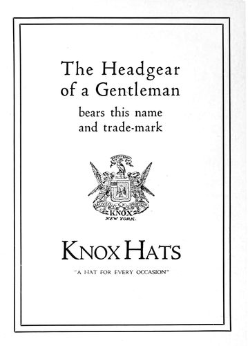
Example 383.—Like the house of Tiffany, the makers of Knox hats do not have much to say in their advertisements. The name and the trademark are depended on to sell the hats. Cloister Oldstyle, the type-face, surrounded by liberal blank space, is effective.
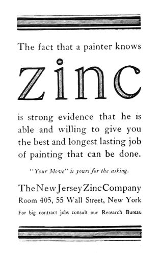
Example 384.—The purpose of this advertisement is to popularize zinc, and for this reason that word stands out so prominently. The rule band at the head and foot attracts the attention, and the Caslon type-face makes the advertisement readable.
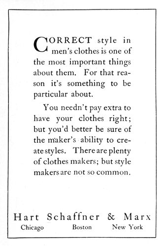
Example 385.—An easily read advertisement, due to the size and kind of type and the use of blank space. Hart, Schaffner & Marx appreciate the value of good typography. The two-line initial at the head guides the eye to the beginning of the message. The signature at the foot is so placed that it is not forced on the attention, yet it cannot be missed after the two large paragraphs have been read.
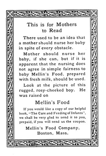
EXAMPLE 386 A bordered advertisement
Example 386.—This arrangement of an advertisement shows a style liked by the Mellin’s Food Company. The decorative border confines the attention to the reading matter it contains, which is presented in Old-Style Antique, a dark-toned, interesting, 142legible type-face. The display lines are emphasized just enough to make them stand out from the main portion of the text.
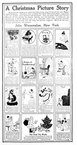
EXAMPLE 388 This pictorial department-store advertisement attracted a great deal of attention in New York newspapers during the holidays
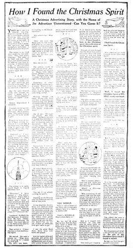
EXAMPLE 389 The store name does not appear in this large department-store advertisement published in the New York City newspapers
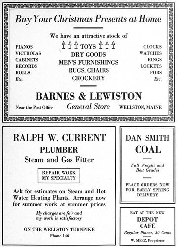
EXAMPLE 390 Four country-newspaper advertisements, showing slight variation in border treatment
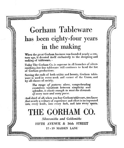
Example 387.—The principal points in this advertisement are the name of the company (which is accentuated to catch the eyes of the many who know this house) and the three lines at the head (which are informative to those who may not know the Gorham company). This advertisement serves well as a study in advertising typography. Careless handling of it in the composing-room would have spoiled its effectiveness. The border has probably been used to attract attention, yet it does not interfere with the reading of the advertisement, as the typographer has maintained a liberal margin around the type matter.
Example 388.—This is one of the many clever advertisements that are inserted in newspapers by John Wanamaker, and is different from most others because it is a picture-story of the goods on sale. The type matter is secondary thruout excepting in the introductory panel at the head, which is displayed merely to call attention to the style of the advertisement and to the name of the advertiser.
Example 389.—Few printers have seen a department-store advertisement just like this one. It does not contain the name of the advertiser, and there is practically no display. It looks more like a story in a general magazine. A few circular illustrations are so placed as to relieve the monotony of the columns of text, and a decorative piece is placed on both sides of the heading. The page is also made interesting by the use of space between paragraphs.
EXAMPLE 391 A good-looking page advertisement that was easily read
EXAMPLE 392 Typography and shape of this four-column advertisement suggested by the architecture of the tall building pictured
Example 390 (Insert).—The most difficult copy to arrange well is probably that supplied country newspapers by their advertisers. There is seldom much to the copy, and it is almost always necessary to use display unsupported by the solid paragraphs of text that soften the contrast in advertisements that appear in city dailies. Here are four advertisements different in size and representative of small-town business. Some one has urged that fancy borders be not used in the small-town newspaper, and that the rules for borders be the same thruout. This advice is probably wrong, as it was tried in this instance and the effect was found to be monotonous and uninteresting. The same rule border is used around each advertisement, but to obtain contrast an additional rule has been added to the coal advertisement and a holiday border and another rule to the general-store advertisement. These slight variations in border treatment add a great deal of interest to the page. Each advertiser is entitled to an individual hearing, 144and this is only possible when there is some distinct feature found in his advertisement alone. In the city newspapers each department store usually has a distinctive type-face which appears in no other advertisement. In the small-town newspaper it may not be possible for the publisher to render such service, but an effort in the same direction can be made by varying the border treatment. The type-faces used in this example are Bodoni and Bodoni Bold. With the use of the Bold, emphasis is given at proper points in each of the four advertisements. In the largest one it is used for the name of the firm, in the smallest one it sets forth the name of the café, and in the other two advertisements it emphasizes the name of the business. There may be another way to arrange the names of the articles in the general-store advertisement, but it is doubtful if any other arrangement would make reading easier. Typographers who are inclined to treat lightly the problems of the small-town printer should attempt to improve these advertisements.
EXAMPLE 393 A page in which attractive typography was possible in spite of a long list of agents
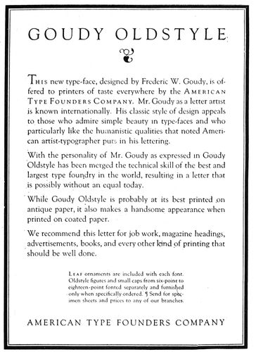
Example 391.—The style of treatment of this trade-journal advertisement is influenced to some extent by the article advertised, yet there is no reason why this treatment would not be suitable for many advertisements of another kind. The heavy-and-light-line rule border is of a darker tone than the type page and for this reason adds color and interest. There is sufficient blank space between the border and type matter to allow for the text being read without interference. The capitals in the headings are letterspaced, the letterspacing not only giving them character, but making them more legible. The text matter is introduced with an initial that extends upward from the first line instead of downward as most initials are placed. This advertisement is of the conversational style, arranged for easy reading.
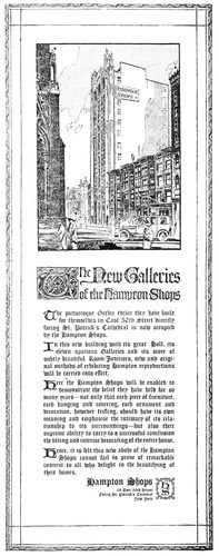
Example 392.—Some one has decreed that text types shall not be used in advertisements, but fortunately those responsible for the planning of this advertisement paid no attention to the decree. The advertisement was inserted in newspapers for the purpose of calling attention to the new building in the Gothic style of architecture erected for the Hampton Shops. Any one who has studied the details of a Gothic structure such as this or the Woolworth Building has felt the influence of the long, narrow lines found in Gothic architecture. The shape of this advertisement and the thin, pointed character of the text type used are in splendid harmony with the general idea.
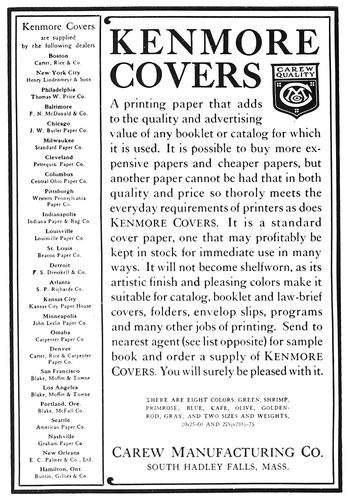
Example 393.—There was presented to the designer of this advertisement the problem of including in legible size a long list of cities and agents and yet reserving sufficient space in which to give due prominence to the text matter. The solution of the problem was the long, narrow panel at the left. While the entire advertisement is easily read, especially in its larger form, and probably has the approval of those who insist on legibility in advertising composition, there is yet something about it that will also interest those who maintain that typography should be built on art principles. The border, trademark and name of the article advertised blend in tone, while the remaining type matter shows a pleasing gray. Inserting the trademark in the space left by the shorter words of the heading makes the effect unusual.
EXAMPLE 394 An advertisement planned to sell high-priced cars
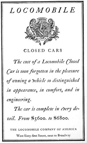
Example 394.—This is one of a series of newspaper advertisements prepared for the Locomobile Company by T. M. Cleland. Planned to sell automobiles costing five or six thousand dollars, it naturally is treated differently 145from an advertisement that would sell cheaper cars. The decorative crest is a factor in the effectiveness of this advertisement, and the italic with the swash capitals helps to give a touch of exclusiveness. It is an advertisement that will stand out on the average newspaper page.
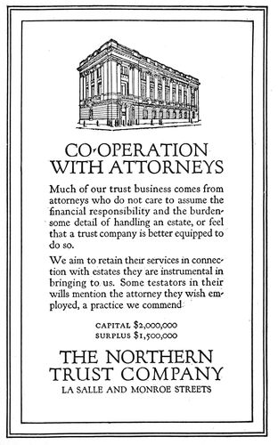
EXAMPLE 395 Roman lettering and Roman architecture
Example 395.—This advertisement has qualities similar to those of Example 392, the typography of which was suggested by the architecture of a building. Here we have an illustration of a building in Roman architecture, hence it is suitable that the type should be Forum, which is based on Roman carved lettering, and that the border should contain lines that suggest an architectural panel. Of course, this matter of harmonizing the plan of an advertisement with the architecture of a building can be overdone. An advertisement is not necessarily a good advertisement because of such harmony, yet if an advertisement is readably presented, harmonious type selection and arrangement should add effectiveness.
Example 396.—This advertisement in a way suggests Example 385, and in contrast with that example furnishes a study in the use of blank space. In the Hart, Schaffner & Marx advertisement the margin is equal on both sides, and monotony is avoided by having the margin at the foot of the type group more than on the sides. In this Kodak page the text group is courageously pushed to the extreme upper right corner, and all of the blank space is assembled at the left and at the foot. The use of so much space is probably for the purpose of attracting attention, which it undoubtedly does. Nevertheless, it is possible that the advertisement would look better if the text group were treated as in Example 385.
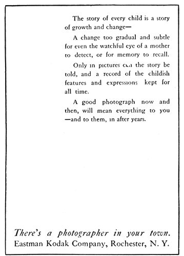
EXAMPLE 396 Uncommon placing of blank space to attract attention
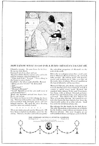
EXAMPLE 397 The modest display of a large magazine advertisement
146Example 397.—This advertisement has been reduced considerably, as it originally occupied a large magazine page. For effectiveness the typographic treatment was depended on, and, as will be seen, it is unusually neat. The headline and the name of the company are the only suggestions of display on the page. The illustration, of course, is to catch the reader’s attention.
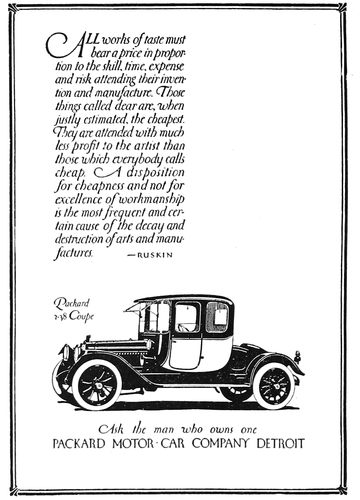
EXAMPLE 398 The blank space emphasizes the illustration
Example 398.—Altho this is a lettered advertisement, it is a good example of blank space used to attract attention not only to the advertisement, but to the illustration, which here is really of the most importance. It should be noticed how the blank space in the upper right portion clears the way for a view of the automobile. Many advertisers are using a strip of white space in their advertisements, at the right or at the left.
Example 399.—The treatment of this advertisement proves that it is not absolutely necessary to have the typography of country-newspaper advertisements as formal as that presented in Example 390. For general newspaper use Bodoni modern might have preference over the more interesting Cloister Oldstyle, yet a newspaper treated entirely in old-style type-faces would be likable. If this advertisement were placed on the average newspaper advertising page, it would stand out strongly because of the blank space used around the type group, the restful and pleasing type-face and the dark-toned border.
Example 400.—The manner in which this page of advertisements is treated should have suggestion for newspaper and periodical publishers who wish to make their classified-advertising sections more interesting. This page, from a trade publication (The American Printer), was set in eight-point type instead of the six-point that some publications usually use. It is a mistake to use type smaller than eight-point for matter that is supposed to be read. The expense and the time necessary to put in initials at the beginning of each advertisement are avoided by capitalizing the first word and setting it flush with the end of the line. Instead of using the stereotyped “Help Wanted” and “Situations Wanted” headings, human interest was introduced by phrasing each heading as a question, as would likely be done on a larger advertisement.
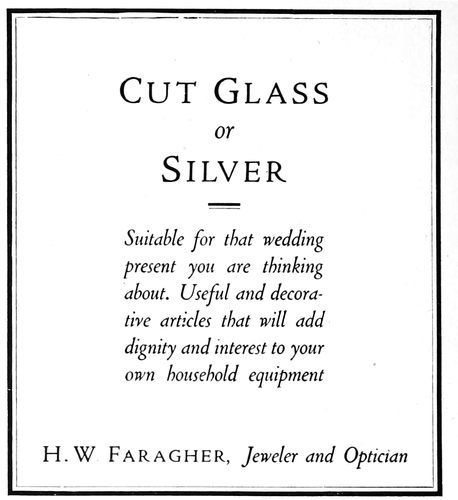
EXAMPLE 399 A country-newspaper advertisement
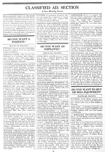
EXAMPLE 400 Suggested for treatment of classified ad. sections
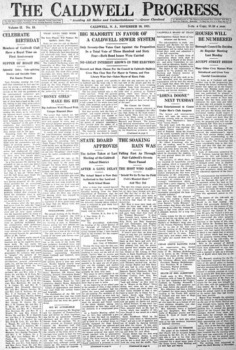
EXAMPLE 403 The neat typography and well-balanced make-up of a suburban newspaper
147
NEWSPAPERS
We are all familiar with the modeling clay with which children amuse themselves. They take a portion of gray clay, mold it into some shape, and decorate it with small portions of red, yellow and blue clay. After they tire of their production they knead it with their fingers and lo! the bright colors disappear and there remains only the neutral gray.
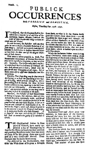
EXAMPLE 401 The first and only number of America’s first newspaper
The only way the typographical appearance of the average newspaper can be improved is by first reducing the glaring headlines and heterogeneous assortment of type-faces to a neutral gray. Upon this drab background the details of suitable and harmonious typographic form can be built.
However, it is easier to assert that the typography of newspapers can be improved than it is to improve it. In the early days of newspaper publishing the problem was a simple one, but today the newspapers of the large cities have hundreds of thousands of readers to serve, and much of the prevailing poor typography has resulted from efforts to present the news to these readers in a way that editors assume will please them best, without giving any thought to technical defects in the type work.
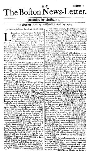
EXAMPLE 402 First number of the first American newspaper issued regularly
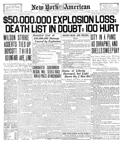
EXAMPLE 404 Front-page make-up of a Hearst newspaper on the occasion of a big story. All of the display headings are probably too large
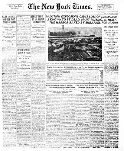
EXAMPLE 405 The same news story, featured by the conservative “Times.” Headings are mostly well balanced. Note the use of panels
148The ideal newspaper would probably be one in which the reader finds it easy to locate and read the articles in which he is interested, and in which the contents are presented in an orderly, good-looking, well-balanced and harmonious manner.
The Title.—The name of the newspaper at the head of the front page should be distinctive in design, and it would probably add interest if the style of the letters composing the title bore some relation to that used at the time the publication was founded. Unfortunately, on most newspapers the headings are altered every time a new type dress is adopted.
For titles, most publishers of city newspapers seem to have a liking for English or German text letters. Such letters are doubtless good for the purpose, as they are different from any that appear elsewhere in newspapers. The New York Sun, as an instance, uses a black German text letter, altho on its first issue in 1833 the title head appeared in modern roman capitals.
It has become a practice to make use of the blank space on both ends of the title line, and in such spaces will now be found weather forecasts, slogans such as “All the News That’s Fit to Print,” and edition names. (See Example 405.) It was the custom at one time, and is today to some extent, to print under the title a quotation which defined the newspaper’s editorial policy. (See Example 403.)
A type line under the title separated by rules on both sides contains the name of the city, the date, the volume number, and information regarding the price. (See Example 403.) Usually the rules have a double line, altho some newspapers use single rules for this purpose.
The Text.—The main desire of newspaper publishers, besides preparing the news, seems to be to have the matter set in the smallest size of type that can possibly be read. The large city dailies habitually use a seven-point type-face, which is the smallest that should appear on any newspaper. (See Example 406.) During the recent prevailing high cost of print paper some publishers began to use six-point in order to save paper, but they found that this move was a mistake. Newspapers are published to be read, and everything possible should be done to make the reader’s task an easy one. Experiments by an educational body in England resulted in determining that ten-point should be the minimum size of type used for educational purposes. From this it will be seen that the seven-point type used on newspapers is too small and a cause of eyestrain.
The narrow width of the columns of newspapers—twelve and a half or thirteen picas—makes reading of the small type fairly easy, however. The eye has been tested scientifically and the discovery made that a person actually sees at a glance less than an inch of a line of type. Hence long lines require extreme side movements of the eyeballs or of the head. It is a mistake, as will be seen, to set editorials in a measure that extends over two columns, as is done on some publications.
Space between lines also helps the reader in locating the beginning of the next line, for which reason, and also to give them prominence, editorials are usually leaded. The beginning of an important article is sometimes leaded.
Lengthy excerpts or quotations are usually set in the same size of type but indented one em at the right and left ends of the line. (See Example 405, third column.)
The Headings.—The first newspaper continuously published in this country was a letter (see Example 402), and the items it contained were not set off with headings. As the quantity of news increased and newspapers became larger in size, headings were added. During the middle of the last century most of these were side headings joined to the first paragraph. When it became possible to print news promptly more attention was given to displaying the headings. As the Civil War developed, newspaper headlines grew, and with the Spanish War came front-page headings of poster proportions.
Headlines not only advertise the contents of the text pages, but assist the reader quickly to absorb the news. As the reader cannot in these busy days read the entire paper, headings assist him in locating the items in which he is interested.
The error of using thrilling scareheads for comparatively unimportant events was made evident when the European War started. Some of the publications had cried “Wolf!” so frequently that there was no emphasis left for a really big story.
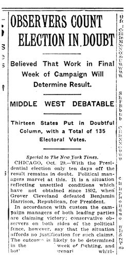
EXAMPLE 406 Actual size of a well-treated four-deck Heading
Head-letter type should not be intensely black, unless the reader is expected to read only the headlines. It is irritating to attempt to read the text matter in an article if strong black headlines continually glare at you. (See Example 404.) The head letter should be just a trifle darker in tone than the background of text type, or if liberal leading is possible a letter the same tone as the text is suitable.
Because of the narrowness of newspaper columns it is necessary that type for headlines shall be slightly condensed, especially for the large lines. As few type-faces are legible in a condensed form, it is a problem to select a type-face for this purpose. Probably the most successful type-face of this kind has proved to be Latin Antique Condensed, a letter that has been in such use for a number of years. (See Example 406.)
It is, of course, best to have all type-faces harmonious in design, but the requirements of the newspaper are so unusual that in order to secure contrast this rule must be 150violated. In Example 403 will be seen the neat and restful effect that is possible by using thruout type that is harmonious, yet there is a monotony to the page that could probably be overcome by substituting, say, italic for roman in several of the headings. On the page of the New York Times (Example 405) will be found headings in italic. Lower-case italic looks well used for the main lines of a double-column heading.
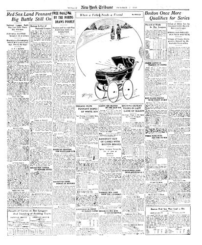
EXAMPLE 407 The sporting page of the New York “Tribune,” showing interesting make-up
It is well first to harmonize the newspaper page, as in Example 403, and then add needed contrast, as in most newspapers attempts at contrast are so frequent that the result is confusing.
Paneled headings also add variety; specimens of such headings will be found in Examples 404, 407 and 408.
Restraint in the use of display headings by the New York Times, as compared with the noisy scareheads of the New York American used in reporting the same news, will be seen by comparing Example 405 with Example 404.
What is called a four-deck single-column heading, as used by the New York Times, is shown actual size in Example 406. Latin Antique Condensed is used for the first two lines and Newspaper Gothic for the other three decks. This heading as it stands is perhaps the most pleasing and legible of those used by metropolitan newspapers. A four-deck heading should present in the first deck the feature of the story; the first deck, and if possible every other deck in the heading, should contain a verb. The third deck is really the second in importance, and, like the first one, is usually set in capitals. The size of the lower-case used for the fourth deck is usually smaller than that used for the second. It would be a mistake to use capitals for the second and fourth decks, as the result would be monotonous and illegible. The small section of text matter accompanying the head also shows a seven-point face on an eight-point slug, as used by the Times.
The Make-up.—In the make-up of a newspaper the sometimes derided “art tenets” should not be neglected. A good-looking newspaper has well-balanced headings, properly placed illustrations, and the various typographic details treated according to the requirements of good taste. Large display headings are usually alternated at the head of the page with small headings, which arrangement not only looks well, but enables the reader to peruse one heading without interference from another.
It is the practice of most good newspapers not to have advertisements appear on the front page, which is given over to the important news of the day. As will be seen by Examples 404 and 405, the article of most importance, no matter how large the heading given to it, appears in the furthermost right column, whence it is usually continued to the second page. Example 403 also shows how an important article can be featured in the center of the page.
Interest and variety are also obtained by the use of a one-point rule around a portion of the news, as will be seen on Examples 404 and 405. The type matter on the inside is set close to, but not against, the rule panel.
The editorials on most newspapers are to be found on the sixth page, and on the same page letters to the editors are also placed. There is a movement, begun by the Hearst newspapers, to have the editorials appear on the last page so that they may be read without the necessity of locating them in the paper.
The sporting page has also come to be an important feature of the newspaper. An attractively arranged sporting page is shown in Example 407.
It is customary to build advertisements from the lower right corner of the page in a step or pyramid arrangement. (See Example 408.) This allows most of the text matter to appear at the left and in the upper portion of the page, and also makes it easy to give position next to reading matter as required by some advertisers.
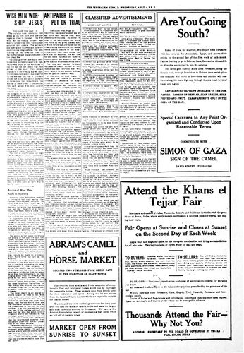
EXAMPLE 408 So-called pyramid make-up of a newspaper’s advertisements. A “make-believe” newspaper
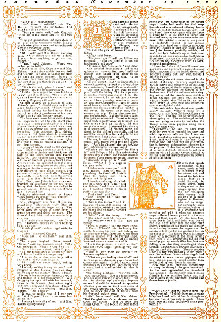
EXAMPLE 409 Church book decorative treatment by Will Bradley Featured on a Thanksgiving number of “Collier’s”
151
PERIODICALS
The typography and the make-up of periodicals in the century last past were sedate and uninteresting to most Americans. As a consequence there came a change, and publishers endeavored to make their publications more attractive to readers. The letterer and the decorator were permitted to let their fancies run free over the magazine pages, and assuming that their readers had poor taste and weak eyesight the publishers of trade journals splattered their pages with ugly black circus poster type.
So long as there is poor printing (we read in the Good Book: “For ye have the poor always with you”) there will be periodicals typographically poor. Yet, thanks to those who have trained themselves as typographic advisors, many American periodicals are now good to look at and at the same time easy to read.
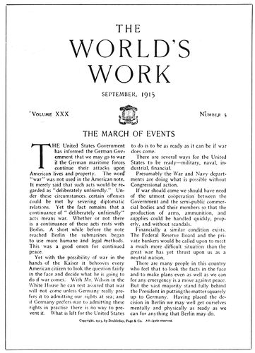
EXAMPLE 410 Dignity in make-up and type treatment. By Walter Gilliss
We will consider the dimensions of the publication, the front cover, number of columns, the margins, type-faces for the text and for the headings, make-up of the illustrations, arrangement of headings, the captions, the editorial pages, features, and the advertisements.
The Dimensions.—Whim has much to do with the selection of sizes for periodicals, and precedent, or what the other fellow is using, has some influence also. Assembled and stood on end, several dozen periodicals gathered at random present the appearance of a platoon of “rookie” soldiers before they have been ranged according to hight.
Sixty-six business and technical publications were recently measured by the writer, and the dimensions of about half of them approximated 9 × 12 inches. The other half varied from 6 × 9 to 10 × 15 inches.
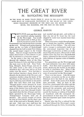
EXAMPLE 411 Harmony of the type-faces used for heading and text
Examination of about two score of magazines revealed three groups of dimensions: 7 × 10, 9 × 12 and 11 × 14 inches. These dimensions are approximate, few magazines measuring 152exactly the same, the variations amounting to half an inch in some instances and several inches in others.
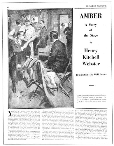
EXAMPLE 412 Advertising the story to the readers
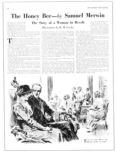
EXAMPLE 414 Style of make-up of these three pages suggested by Benjamin Sherbow
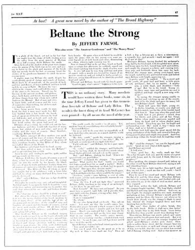
EXAMPLE 413 Interesting heading treatment and inserted feature panel
Scribner’s is a type of the magazine in the 7 × 10 class (the actual measurement being a trifle minus); the Independent, of the 9 × 12 class (actual measurement 8¾ × 12 inches); and the Saturday Evening Post, of the 11 × 14 class, measuring exactly that size.
There has been a movement among magazines away from the smaller dimensions toward the larger, for the purpose of better displaying features and of enabling reading matter to be placed alongside of advertisements.
To a similar extent the business and technical publications have experienced reductions from the very large sizes that originally were probably inspired by the bigness of newspapers.
There are also a few small pocket magazines of the Philistine size that Elbert Hubbard made popular.
The Front Cover.—Typography has little to do with the average cover of the general magazine in America. The foundation of the design is usually a painting, the subject being seasonable or otherwise appropriate. Lettering and decoration are added by an artist other than the one drawing the picture. In such cases the design is changed with every issue. Some magazines, the more conservative ones, use a design containing lettering and decoration only, and with each issue merely change such lettering as refers to editorial features.
The European custom of printing a paid advertisement on the front cover of periodicals has extended to America, and, while such advertisements will not be found on the general magazines, some business and technical periodicals have succumbed to the temptation thus offered for increased revenue.
When the front cover is sold, only an inch or so is retained for the title of the periodical. One publisher did stipulate that no color in the cover advertisement should come within two inches of the title; but even this rule is now disregarded on his periodicals. The time may yet come 153when the title of a publication will appear at the foot of the front cover in six-point.
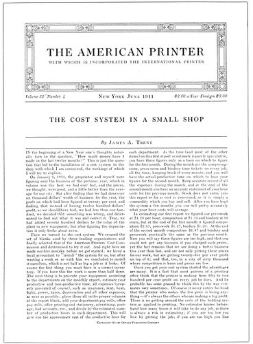
EXAMPLE 415 Headings and text matter in the same face of type, Scotch Roman
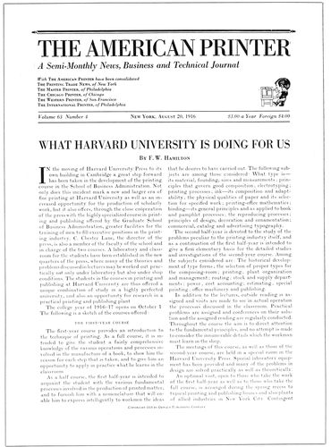
EXAMPLE 416 Type of medium strength and use of a small illustration in heading
154
EXAMPLE 410-A Section of text matter from the “World’s Work” (Monotype No. 22-E, 10-point on 11-point body, 10 set)
A weekly technical periodical in every issue has some appropriate view made into halftone and uses it inside a large panel under the title, and a photographic journal prints a reproduction of an artistic photograph on the cover, changing the subject with each issue.
Columns.—The number of columns to a page should be decided by the size of type used. Seven-point and eight-point type should be confined in columns twelve or thirteen picas wide. Ten-point, eleven-point and twelve-point type can be read even if the columns are sixteen or more picas wide. However, no column in a book or periodical should exceed twenty-four picas. Neither should a column be unreasonably narrow.
Scientific tests show that the eye is strained in the reading of wide columns. The column should be of such width that reading of the matter can be accomplished with only slight movements of the eyes to the right, after they have been focused at the beginning of the line to fit the size of type. When the column is too wide the head must be moved to the right and left with the reading of every line or the eyes may be injured from the strain and repeated change of focus.
A look over the examples of periodical pages in this chapter will show practically an acceptance of these requirements—three columns in the periodicals of large size and two columns in those of smaller size. For pocket magazines one column is naturally sufficient. In several instances (Examples 417 and 418) three columns instead of two would have been advisable.
Gutenberg, when he planned the pages of his famous Bible, arranged for two columns each about twenty picas wide, altho his type was large—about twenty points in size.
EXAMPLE 424-A Section of text matter from the “Saturday Evening Post” (Monotype No. 20-A, 8-point on 9-point body, 8¾ set)
It is a great mistake to set, as some business publications do, six-point type in lines twenty-five or thirty picas wide. To require the reader’s eyes, after being focused on such small type, to travel back and forth that distance is almost an invitation not to read the matter.
The Margins.—Blank space surrounding the printed pages in periodicals should be apportioned as it is in good books—the smallest margin at the binding side and increasing in amount in this order: Head, outer side, foot. Even when the total amount of margin is small it should be apportioned in this manner.
The rule can be stated in another way: the largest margin at the foot, with the type page inclining toward the bound side.
Periodical binderies do not always give the publisher good margins, even after he has planned for them. Unevenly cut paper, careless folding and inaccurate trimming will prevent the securing of desired results.
In measuring margins the running headings should be ignored if they are small, but in any event the printed page should have the appearance of being a trifle high on the leaf.
Type-Faces for the Text.—Type-faces for the text matter of most periodicals must be chosen for reasons different from those governing the selection of type-faces for other purposes, because of the small size, usually eight-point or nine-point.

EXAMPLE 422-A Section of text matter from the “Independent” (Monotype No. 20-A, 9-point on 10-point body, 9¾ set)
Type-faces that are legible and good-looking in twelve-point may prove illegible and ill-looking in eight-point. This is to some extent true of Caslon Oldstyle when printed on calendered surfaces. Such illegibility may be due to the hairlines, which almost disappear in the small sizes.
Commendable letters for periodicals that require small type-faces are the dark-printing kind represented by Century Expanded. Examples 422 and 424 are set in letters of this kind. (See also Examples 422-A and 424-A for type matter as actually used.)
As these types have short descenders the text matter is made more legible by separating lines with one-point leads or, in machine composition, by casting a face on a body a point larger (as in Example 424-A, which shows an eight-point face cast on a nine-point body, and in Example 422-A, which shows nine-point on ten-point body).
French Oldstyle (especially Cadmus) is not only fairly legible in small sizes but good-looking. A representative of this style of type will be found in Examples 410 and 411, and is shown actual size in Example 410-A.
Modern or old-style type-faces that are legible when printed on news paper or antique paper are sometimes not so when printed on calendered surfaces. A type-face such as Caslon Oldstyle was designed for printing on dampened paper of an unfinished surface, and it is no wonder that it does not appear at its best in small sizes on calendered paper.
155
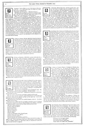
EXAMPLE 417 Box headings are conspicuous on this editorial page
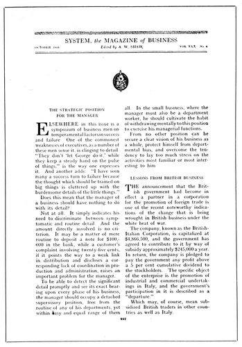
EXAMPLE 419 Excellent typography of an editorial page
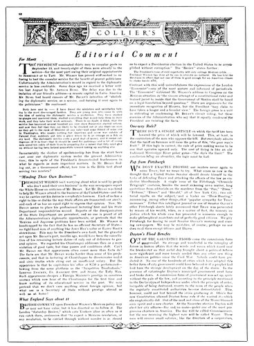
EXAMPLE 418 Another way to feature the editorials
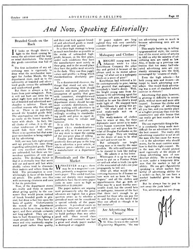
EXAMPLE 420 Novel use of rules on an editorial page. By Sherbow
156
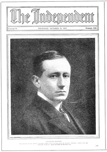
EXAMPLE 421 News photograph on the front page
It is absolutely necessary that the text matter of a periodical be easily read, yet the type-face should not be selected for that reason alone. It should be well formed and pleasing to look at, and, if possible, be a face that makes feasible some harmony in design between text type and head letter.
In publications that have text matter in eleven-point or twelve-point a letter such as Caslon Oldstyle would doubtless be satisfactory, and on small publications Old-Style Antique or Cushing Oldstyle render excellent service.
Scotch Roman, notwithstanding the fact that it contains hairlines, gives fairly good results, provided the paper is not highly calendered.
Letters with hairlines when printed on calendered paper lack the little legibility that they otherwise possess. Many letters could be made more legible, especially those composed on machines, by cutting the matrices so that the print of the thin lines is a trifle stronger.
The chapter on “Type-Faces” should be read in this connection.
Type-Faces for the Headings.—An ideal condition in periodical make-up is one which makes possible the use for headings of the identical design of type that has been selected for the text matter, as in Examples 410 and 411, where a French Oldstyle has been used, and in Example 415, where Scotch Roman is the type-face.
It is not possible always to use the very same design of type-face for both headings and text matter. After a text letter has been chosen for legibility or other reason, the identical type in larger sizes may prove to be too plain for the sort of periodical on which it is to appear. And there are sometimes special reasons, regrettable but unavoidable, an instance of which is this volume, wherein the text matter is in Scotch Roman (a modern letter with some relation to old-style) and the headings and captions in a type-face of old-style form. This combination is not ideal, and the explanation follows. In order that “The Art and Practice of Typography” could be published at a price that would enable it to be widely circulated, the chapters, as soon as each was prepared, were first printed in The American Printer. The type-face used for the text matter and headings in that publication was Scotch Roman, hence it was felt necessary to use Scotch Roman for the text of this volume. However, it was believed that a darker type-face of old-style formation would be more pleasing for the headings, and a Goudy letter was selected.
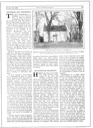
EXAMPLE 422 Fine specimen of typographic make-up
A modern type-face (Bodoni Bold) appears on the headings in Example 412, 413 and 414. Bodoni (not the bold) is also used for headings in Examples 416 and 427.
Caslon Oldstyle is to be found used for both headings and text in Examples 426 and 430. Old-Style Antique appears in Example 431.
The Saturday Evening Post for many years made use of an old-style letter for its headings that as a type-face was known as Post Oldstyle. The italic, outlined and filled in with gray-printing lines, is shown in Example 424.
A Gothic decorative letter is not out of place on a Christmas number of Collier’s (Example 425), but is not recommended for general use on periodical pages.
Large, bold, black type-faces for headings in periodicals should be avoided.
Interest can be added, in the treatment of department 157headings of technical publications, by using slightly decorative panels, but such decoration should be light or slight, and not the commonplace sort sometimes found in ill-treated job work.
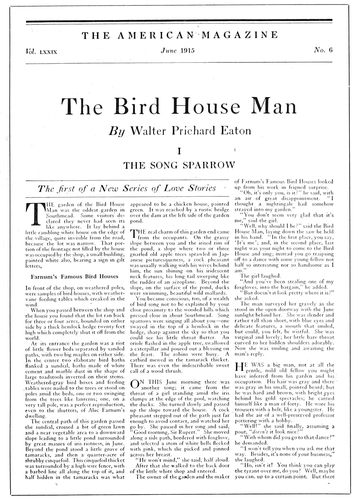
EXAMPLE 423 An attractive first text page. By Lester Douglas
Editorial and title headings in typographic treatment should blend with other parts of the text pages and not look, as some do, like quarter-page advertisements inserted in reading matter. Example 429 shows good treatment.
Make-up of the Illustrations.—When planning to use illustrations on periodicals both facing pages should be before the person doing the planning. The text matter of the two pages forms a background of gray, and the problem is to place illustrations, headings and initials in positions that will not only be well balanced but so assembled that one will not interfere with another.
Usually there should be some text matter between illustrations; they should be placed toward the outer side of the page (see Example 422). The center position is practicable when there are three columns and the illustration is but a single column in width, or when the expense of running around may be incurred (see Example 424).
Illustrations frequently look better separated from the heading, as in Example 414, than when joined with the heading, as in Example 412.
The same style of illustration should, if possible, be used on facing pages. Make-up that shows a line plate on one page and a halftone on the adjoining page is inharmonious and not so pleasing as when all illustrations on facing pages are of the same character. They should be, say, either line like that in Example 414 or halftone like that in Example 412.
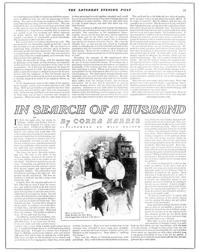
EXAMPLE 424 Illustration placed in center, necessitating running around
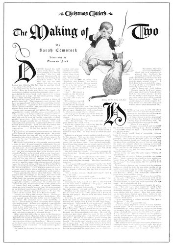
EXAMPLE 425 Feature page of a Christmas number
When an illustration appears on a text page, initial letters 158should be plain and small, as in Example 414; but when no illustration appears the initial can be large, as in Example 411, or even decorative. For regular purposes initials as used on Examples 409 and 425 are inadvisable.
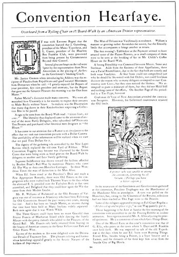
EXAMPLE 426 Convention feature page of a technical journal
Pleasing use of a vignette style of illustration is to be seen in Example 430. It lends interest to the first text page and at the same time illustrates the leading article.
The illustration in Example 429 is also effectively placed.
Arrangement of Headings.—Headings, in a way, advertise or “sell” the contents of a periodical, and their arrangement depends on how far the editor or layout man wishes to go in advertising or “selling” the contents. The American people have so much reading matter available that it is probably necessary in most instances almost to force them to read the various articles in periodicals. Encyclopedias are read even if there are no display headings and the type is in six-point, and there are periodicals that are read without urging; but it may as well be conceded that articles are read more when they are well advertised.
A well-advertised story will be found in Example 413. The title is brought out prominently in a large, bold type, as is the name of the author. The italic line above the title smacks of real advertising, as does the group of type inserted in the upper part of the text. The display in Example 412 is frankly advertising in its appearance.
The Saturday Evening Post heading (Example 424) is large, but there is no descriptive advertising, and there is little of the nervous fear of going unread so evident in Examples 412 and 413.
Calm, yet pleasing, treatment of headings is to be found in Examples 411 and 423. It is well to give attention to the presentation of article headings, but sometimes in the place where the heading should go there is so much noise and so much talking that, as a means of resting the nerves, the leaf is quickly turned or the periodical laid aside.
EXAMPLE 427 News headings and make-up
Periodical titles, as they appear on the first text page of each issue, are variously treated. The small, neat effect of Example 423 is commendable. It is in Scotch Roman and harmonizes with the article heading and text type. Title headings on a larger scale will be found in Examples 410, 415 and 416. Special lettering is sometimes pleasing, as in Examples 421 and 430.
The news department of trade and business periodicals requires numerous headings. Example 427 is suggestive. There the news articles are in narrow columns and have a newspaper style of heading.
Caslon Oldstyle looks well on any class of publication. Roman capitals and lower-case and italic may be used in the same line, as on Example 429.
The Captions.—It is customary to set captions centered under illustrations in a size smaller of the type-face used for the text matter and to arrange the caption in one or more lines no wider than the illustration.
When the caption is in two parts the first part is usually set in capitals and the second part in lower-case, both centered. The lower-case is sometimes roman and sometimes italic.
Seldom do captions receive the special decorative treatment that has been accorded them in Examples 412 and 414. Even two-line initial letters have been used with them.
The plain double caption in roman capitals and lower-case is to be found in Examples 421 and 422. A single caption 159in italic lower-case is shown inside a rule that surrounds the illustration in Example 424.
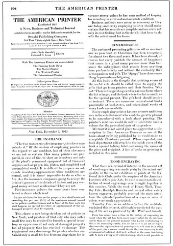
EXAMPLE 428 A conservative and readable editorial page
Arrangement of captions in lines of the same length, making a block of type (as in this book) is liked by many. However, the caption is to be read and its shape is not of more importance than its legibility. It is a mistake to arrange a caption in several lines of capitals and then letterspace some of the words to obtain the block effect. Such letterspacing advertises the effort as unsuccessful and also disfigures the page.
The Editorial Pages.—In periodicals, editorial pages are treated variously. There is no standard style such as is found in most newspapers. All five editorial pages reproduced here, in make-up and typographic treatment, differ from one another.
The Ladies’ Home Journal (Example 417) has the title of each editorial in a small rule panel along with the publication’s trademark, and the matter is set in two wide columns. The first clause beginning each editorial is composed in capitals and small capitals. The page is surrounded by a double-line border.
Collier’s (Example 418) begins each editorial with an initial letter, followed by several words in capitals, and the title in a dark-faced italic is set at the left end of the line. A decorative symbolic heading is placed above all.
System (Example 419) has a neat, readable editorial page, arranged in an interesting manner. The name of the magazine, of the editor, and the month and volume are neatly placed at the top, and the blank space that follows, occupied solely by the small black decorative mark, gives pleasure. Each editorial is introduced by a heading in small capitals and by an initial, which is larger in the first article. The editorial page of Advertising and Selling (Example 420), by Sherbow, is unlike any of the others. Rules are used between columns, on both sides of headings, and above and below the page heading. The result is pleasing, and invites reading of the page.