PART TWO (continued 5)
Reading edition
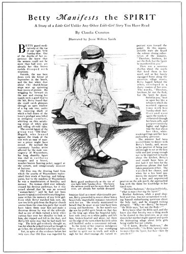
EXAMPLE 429 Caslon headings and an old-style text type
The style of make-up of The American Printer editorial page (Example 428) was purposely patterned after that of the conventional newspaper editorial page. The editorials of conservative metropolitan newspapers are probably read more regularly than any other part of the publications, and such reading has possibly been invited by the restful style of the typography. There is reason to believe that this somewhat old-fashioned treatment and its lack of affectation have really accomplished what was intended.
The editorial page should be unlike the other pages of a periodical, and these examples should assist printers and editors in determining suitable typographic treatment.
Features.—Typography can have much to do with the playing up of features in periodical make-up. An instance is the page reproduced as Example 426, which consists of what would ordinarily be the notes of the convention. In this instance the notes were written in a style that suggests the quaint diction of Colonial days. Some of the words of the text were capitalized, as was done in those times. In the page heading a few of the letters were tilted to give an irregularity caused in old composition by defective typefounding. Even the brass rules were nicked (brass rule was seldom in good condition in the old days). A crude initial of ancient vintage and an illustration simulating an old woodcut added decorative interest. This page was a change from the routine style of the other pages.
The page from Collier’s (Example 409, Insert) was 160one of the features of a Thanksgiving number. Its decorative border suggests the treatment found in Books of Common Prayer (see page 27).
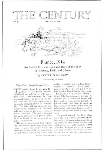
EXAMPLE 430 Caslon typography on a magazine. By Will Bradley
Christmas feature treatment is also found in Example 425, also by Will Bradley. The text letter used in this example for initials and headings is hardly suitable for use generally in periodicals, but for occasional features it is not out of place.
Verse when used will usually look more interesting set in italic, especially when the italic has a decorative quality. One of the important general magazines sets verse in Kennerley italic in a decorative panel broken into the text page at a suitable point.
Important parts of an article reprinted in an attractive panel on the same page would call attention to the article and invite reading.
A certain amount of restraint is necessary when planning typographic features for periodicals. Type-faces should be selected with knowledge and care, and seldom should large sizes be used. “Jobby” display effects are never in order on the text pages of periodicals.
The Advertisements.—The typographic details of the editorial section of a national periodical in the field of advertising were recently revised and made more pleasing, yet when made up and printed the work that had been done was so overshadowed and counteracted by the bold types on the advertising pages that the general result was disappointing.
It is useless to attempt good typography on periodicals so long as advertisements are inserted in text pages or occupy facing positions; that is, it is useless unless the periodicals set or reset the advertisements neatly in good taste as is done by the Curtis publications.
Advertisements should not be mingled with text matter. According to old-fashioned ideas, the reader buys a periodical for the text matter, and it is for him to determine whether or not he shall read the advertising pages. In some publications the text pages are yet to be found intact, altho preceded and followed by sold space; in others good resolves peter out as text meets advertisement toward the rear, and in others—a majority perhaps—advertisements dominate almost all of the text pages.
Treatment of advertisements in periodicals need not necessarily be shy and timid; neither need it be blustering and noisy. Where advertisements are neatly treated and not unduly forced on the attention, readers are likely to give as much time to their perusal as to the text pages. A gentlemanly solicitor who talks clearly in low tones is more likely to sell goods than one who disturbs the entire office by his loud talk and boisterous demeanor. Apply this to the typography of the advertising pages.
Editorially, it is to be regretted that advertising must go “alongside of reading,” but it is to be deplored that in so many periodicals, especially of the business and technical class, reading matter is seemingly written and placed for the purpose of accommodating the advertising.
The successful publication of a periodical, as of a newspaper, depends on liberal patronage from advertisers; yet these advertisers are best served when the publication is planned with first consideration for the text features, and the advertisements are prepared to harmonize and not clash with the typography of the text matter.
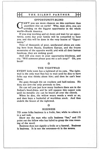
EXAMPLE 431 Good typography of a pocket magazine
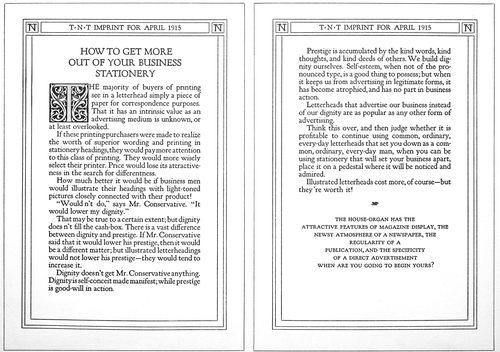
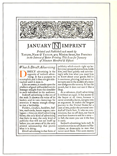
EXAMPLE 432.—A house-organ by Taylor, Nash & Taylor, San Francisco, that features typography
161
HOUSE-ORGANS
The house-organ is the little brother of the periodical and newspaper. It is published most frequently as a means of communication between a business house and buyers of that house’s product. Sometimes the publication is circulated only among the house salesmen or other employees.
Examination of more than one hundred house-organs revealed a condition that prevails in every department of publishing—lack of standardization in dimensions. The smallest house-organ measured about 3 × 5 inches and the largest 9 × 12 inches. The dimensions grew, from the smallest to the largest, by quarter inches and half inches. There are many small pocket house-organs, some of which fit commercial envelops and others fit baronial envelops. If there is a favorite size for house-organs, it is 6 × 9, which dimensions are those of Examples 432, 436, 437, 441, 447 and 448, illustrated in this chapter. Another favorite size is 7 × 10 inches, which are the dimensions of Examples 444 and 449. House-organs planned in the style of newspapers and containing four or eight pages are usually 8 × 11 or 9 × 12 inches in size.
A different stock is frequently used for the covers of house-organs, but equally popular is the self-cover style—the first page of an eight- or sixteen-page form containing the cover design. The practices that govern the use of cover designs on periodicals apply to some extent to house-organs, although typographic covers are more often found on the last-mentioned kind of publication.
Example 441 shows a typographic cover in which most of the page is given over to a table of contents—not a bad idea when the contents are abundant.
Should a house-organ consist of only two or four leaves, it is unnecessary to give over the entire first page to a cover design, as the title could be treated as in Examples 436, 438, 439, 448 and 452. If the cover page is to be lettered, it is well to have it treated in a style that will harmonize with the typography of the inner pages. See Example 435.
Seldom is there any reason for a house-organ to contain more than four or eight pages. Few of the more ambitious house-organs survive the first one or two issues, or are profitable if they do. A house-organ to be effective should be published regularly. Too many instead of being periodicals are “spasmodicals.” There is more likelihood of a house-organ being published regularly if it be modest in plan and brief in contents. Printers err when they suggest elaborate and bulky house-organs to their customers. The smaller kind, neat and stylish in typography, attractive in make-up, good to look at and easy to read, are more desirable under average conditions.
EXAMPLE 433
EXAMPLE 434
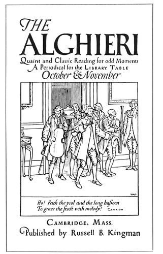
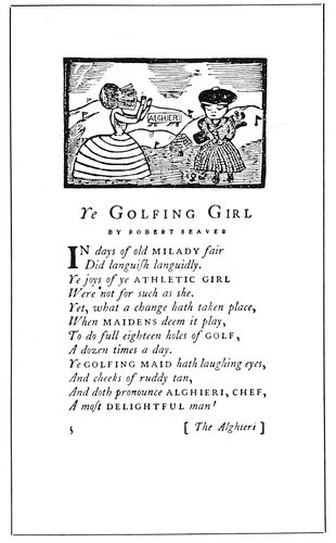
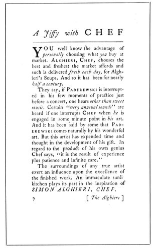
EXAMPLE 435 Pages from a quaintly-treated house-organ, by the Seaver Howland Press, Boston. Both type and illustration suggest the “good old days”
162
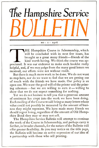
EXAMPLE 436 Distinctive lettering and typography
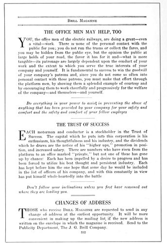
EXAMPLE 437 Interpolated paragraphs in italic
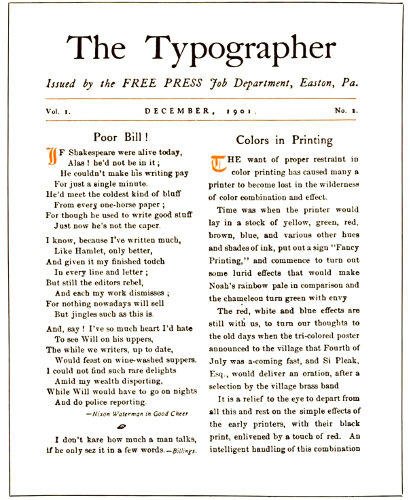
EXAMPLE 438 A house-organ in miniature
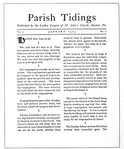
EXAMPLE 439 Planned after the printer’s house-organ at the left
The titles of house-organs are not usually as conventional 163and dignified as those of magazines and other periodicals, although those who have a liking for the conventional select the word “Bulletin,” adding to it as part of the title a word which connects it with the business. Hence we have the “Linotype Bulletin,” the “Hampshire Service Bulletin” (Example 436) and the “Ad.-League Bulletin” (Example 440). Printers, for their house-organs, use a variety of titles that include “Typographica,” “Imprint” (Examples 432, 442, 445, 446, 450 and 451), “The Typographer” (Example 438), “Pica” (Example 448), “Type Talks” (Example 452), “Warde’s Words” (Example 447). In other lines are to be found “Drug Topics,” “Statler Salesmanship,” “The Constructive Banker,” “The Wallace” (Example 444), “Poor Richard’s New Almanack,” “Selling Sense” and “The Ambassador” (Example 455).
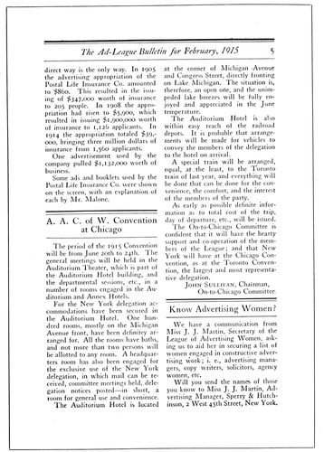
EXAMPLE 440 Attractive rule treatment of headings
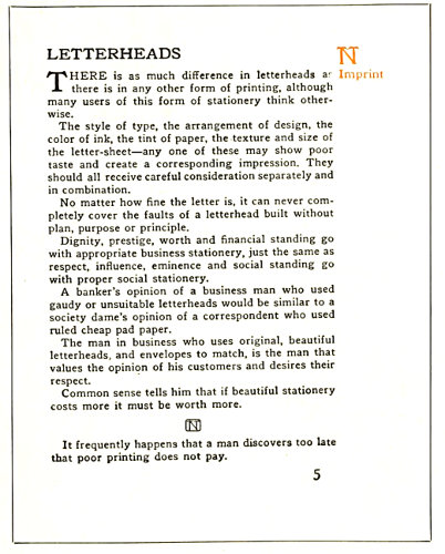
EXAMPLE 442 Simple, effective typography
The number of columns that should be used in house-organs depends, of course, on the size of the page. One column is sufficient for the small pocket publication (Examples 433, 434, 435, 445, 446, 453, 458 and 459). The page should be made up in two columns when the size is about 6 × 9 (Examples 438, 439, 440, 444, 448, 449, 450 and 451). The purpose of more than one column is to make reading easier and not just to provide a narrow column. On some house-organs the columns are made so narrow that it is as difficult to read them as when they are very wide.
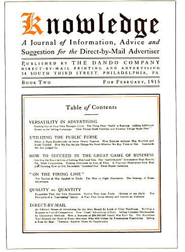
EXAMPLE 441 Contents outlined on the cover
The margins on the house-organs should be of the same proportions as on periodicals and booklets—the most margin at the foot, with the type-page inclining toward the head and binding side. In fact, such margins should be found on all printing in which there are two facing pages.
The type-faces used on house-organs should be legible and at the same time good-looking. Caslon Oldstyle is suitable for house-organs as well as most other purposes. The Caslon style of type is used on Examples 433, 434, 436, 440, 441, 448, 450, 451, 453, and 455. Other faces used on the house-organs here reproduced are Kennerley Oldstyle (Examples 432, 445, 446), Old-Style Antique (Examples 442 and 447), Cloister Oldstyle (Example 452), Bodoni Book (Examples 164457 and 458). These and other good faces are available for house-organ purposes.
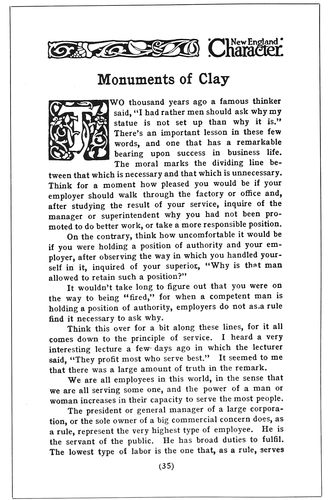
EXAMPLE 443 Dark-toned typography by Griffith-Stillings Press, Boston
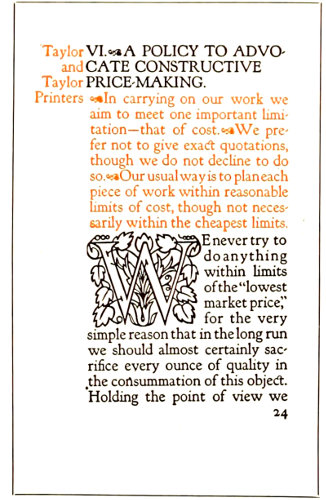
EXAMPLE 445
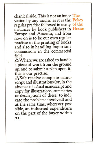
EXAMPLE 446 Rubricated typography by Taylor & Taylor, San Francisco
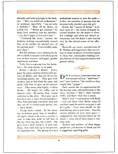
EXAMPLE 444 Suitable treatment for this silverware publication
What has been said in the chapter on “Periodicals” about the suitability of type for headings applies as well to house-organs. In most of the pages here reproduced it will be seen that the head letter is the same kind of type as the text letter or is harmoniously similar.
The treatment of display announcements or house advertising should be such as to carry out the purpose for which the house-organ is issued. If, as an instance, the publication is issued for the purpose of presenting the attractive wares of a stationery house, it would be well to devote half of the pages to illustrations, descriptions and prices of stationery supplies. Sometimes when the display announcements are as numerous as the text pages, an announcement is placed on the left page facing a text page at the right. When this is done, the typography should be neat in appearance; the type sizes should not be large, and the type itself not any blacker than, say, Caslon Oldstyle. Especially is it a mistake to use dark faces when illustrations of merchandise are a part of the page. Dark type-faces subordinate and render ineffective such illustrations.
A house-organ designed entirely—display announcements included—in the original Caslon Oldstyle by someone who knows how to get the best out of the type, would be ideal. The capitals, small capitals and lower-case of roman, and the capitals and 165lower-case of italic, can be manipulated so as to produce an abundance of typographic variety and interest.
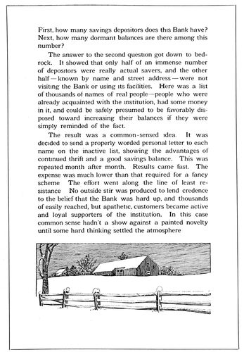
EXAMPLE 447 Easily read and pleasingly illustrated. By the Warde Press, Pittsburgh
While house-organs should be edited with the purpose of presenting useful technical and business information to customers, there should be sufficient light matter and features to maintain interest. Not unimportant is the typography of such features. In the make-up of all house-organs are spaces at the end of articles that are available for feature purposes. Example 432 shows how one bit of blank space was made attractive by well-arranged small capitals, and in Example 450 similar use has been made of italic.
Articles of merchandise that are old-fashioned in their appeal furnish a motif for typographic treatment that can be made a feature. Examples 433 and 434 show Colonial typographic treatment, the use of italic and spaced small capitals, added to which is a feature page topped by an old-fashioned woodcut.
There is a suggestion of ancient rubricated books in the typographic handling of Example 445, appropriate for a printer who does typography especially well.
Borders around the text pages of house-organs can be made to act as features if they are designed with proper restraint, as was done in Examples 432 and 450.
Rules and decorative borders, ornaments and initials are not out of place on house-organs when used as they are in Examples 440, 443, 444 and 445.
When the house-organ is issued monthly an old-fashioned “almanack,” with appropriate matter interpolated, makes a good feature, as in Example 457.
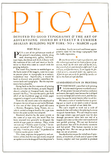
EXAMPLE 448 A typographic house-organ
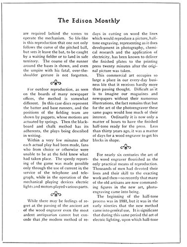
EXAMPLE 449 An editorial page of typographic neatness
166
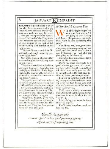
EXAMPLE 450 Attractive use of rules and italic
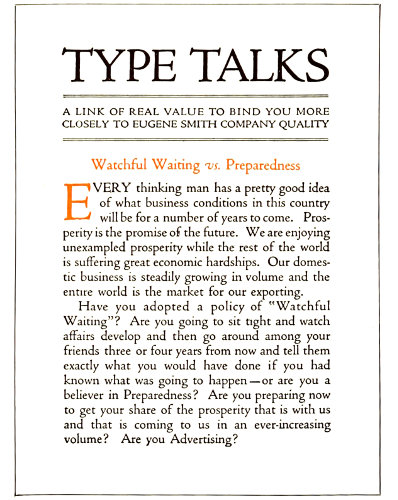
EXAMPLE 452 A page in Cloister type
EXAMPLE 451 An elaborate house-organ title-page
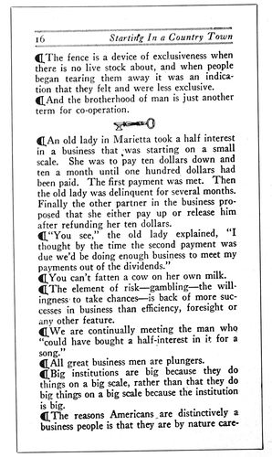
EXAMPLE 453 Use of paragraph marks. From Cottrell’s Magazine
As a novelty, house-organs have been printed on blotter stock. The general treatment for blotter house-organs is 167not different from that of other kinds. The appearance of a publication is maintained and the matter is merely adapted to the dimensions of the blotter.
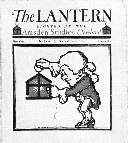
EXAMPLE 454 A good specimen of house-organ cover
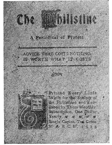
EXAMPLE 456 Cover of “The Philistine” issued about two months before Elbert Hubbard went down with the “Lusitania”
House-organs are sometimes successful when laid out in newspaper style for four pages about 9 × 12 inches in size. The text matter is planned for three columns, the text type being eight- or nine-point, such as is customarily found on machines. Headings are graduated on the newspaper plan according to their importance. Illustrations are included at suitable points in such newspaper-like house-organs.
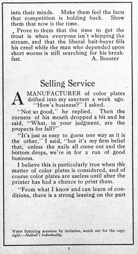
EXAMPLE 455 Blank space used to good advantage. Text page from “The Ambassador”
There is suggestion for a novel house-organ treated in old-time newspaper style in the reproductions of the first two newspapers published in America. (See Examples 401 and 402 of the chapter on “Newspapers.”)
A western printer, who has found the house-organ to be effective in his business, expressed himself in these words:
Nowadays children are entertained as they are taught, and they learn unconsciously and much more readily than when study was made a task and a hardship. That is the principle we must embody in a house-organ—entertain and instruct simultaneously. Make your readers smile and enjoy themselves while they are learning the value of good printing, prompt service and square dealing. Create in them a desire to be as particular about their printing as they are about their company or the set of a collar, but keep them entertained and interested the while. Of course this can be overdone, so don’t make the mistake of having too much outside matter, but keep to your subject in a tactful way.
The day is past when business secrets can be kept from the buying public. During the past ten years magazine and general advertising policies have educated consumers along entirely new lines, and now they insist on knowing why they pay special prices for specific articles. They not only want to know why, but what it is, where it comes from, who makes and sells it, and how. The sooner we tell them these things, just that much sooner will confidence be established and buyers of printing acquire a knowledge that will enable them to buy intelligently, to distinguish between the economy in good service and the extravagance in poor service. In a house-organ there is unlimited opportunity for preaching the gospel of good service and for educating the public to the fact that that kind of service is the cheapest.
168
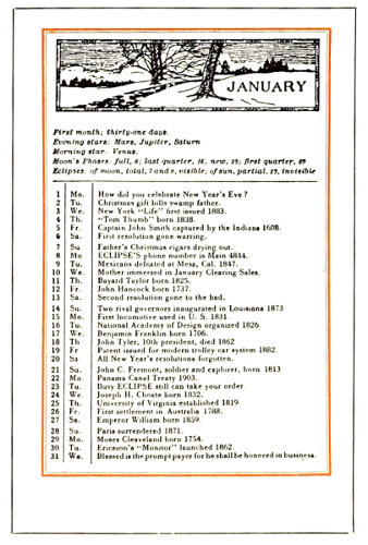
EXAMPLE 457 An “almanack” feature
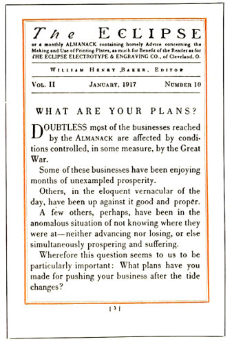
EXAMPLE 458 Bodoni typography
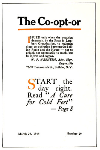
EXAMPLE 459 Cover of a small house-organ
I consider the establishment of this confidence between the printer and customer one of the strongest pulling features of a house-organ. I do not mean by that that one should open his books to the public, but give enough information to let your readers know that you are in a business that requires capital for its conduct, that it is a dignified business, that you give efficient service, and that such efficiency costs you proportionately as much as it costs him. Having let your readers into this much of your business secrets, keep hammering away on your service and efficiency, but do it in a tactful way. Don’t bore him. Entertain him. Remember the old proverb, “He who tries to prove too much proves nothing.” So give it in homeopathic doses, but mighty regular ones.
A feature of the house-organ as issued by a printer should be specimens of actual work. Small cover designs and pages from booklets and other specimens can be saved and collected from overruns and presented in the house-organ. It would be better to use but one or two specimens in each issue than to overload the publication. Only creditable work should be included in this manner. If, say, a bit of four-color process work is produced, it should not be used as an exhibit merely because there is color in it, but it should be tested by answering these questions: Is it a good drawing? Are the colors properly blended, or is there an unpleasant predominance of red and yellow? Are the plates in good condition? Have they been properly printed? Unless the answer is affirmative, it would be better to include neat, modest black-and-white specimens.
Many house-organs are made ineffective by the anxiety of the business house issuing it to include everything possible. A number of issues should be planned and each should contain a limited amount of text matter and illustration. Many of those to whom the house-organ is sent also receive dozens of others, and examination and reading of the publication should not be discouraged. When there is too much of an abundance, the house-organ is either thrown in the waste basket or laid aside and never looked at again.
Loose inclosures should not be numerous. Attention is frequently taken away from the house-organ itself by the variety of envelop slips, calendars and blotters that are included in the mailing. There should be nothing but a return post card, and this should be clipped to the inside of the rear cover and not tucked in on top of the title-page, as is too often done. Several return cards are reproduced (Examples 460, 461 and 462). When these post cards are planned the postal regulations governing their use should be investigated. It may be well to quote from the United States Postal Guide:
Post cards manufactured by private persons, consisting of an unfolded piece of cardboard in quality and weight substantially like the Government postal card, not exceeding in size 39⁄16 by 59⁄16 inches, nor less than 2¾ by 4 inches, bearing either written or printed messages, are transmissible without cover in the domestic mails (including the possessions of the United States), and to Canada, Cuba, Mexico, Republic of Panama, and city of Shanghai (China), at the postage rate of 1 cent each, and in the foreign mails at the rate of 2 cents each, to be paid by stamps affixed.
Advertisements and illustrations may appear on the back of the card and on the left half of the face. The right half of the face must be reserved for the address, postage stamps, postmark, etc.
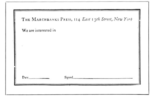
EXAMPLE 460
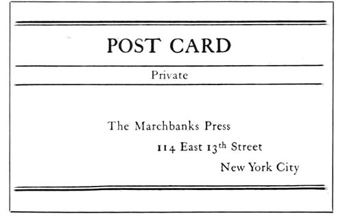
EXAMPLE 461
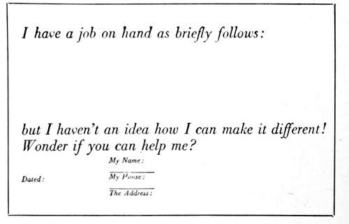
EXAMPLE 462 Suggestions for treatment of the return post cards that usually accompany house-organs
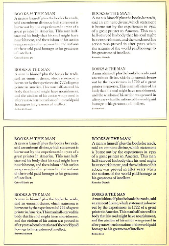
EXAMPLE 463 Comparison of the same type forms printed on a hard-finished paper, and also on a soft-finished paper. The good qualities of these type-faces (Caslon Oldstyle, Baskerville Roman, Kennerley Oldstyle and Bodoni Book) are more evident and the print of the types more legible on the soft-finished paper
169
TYPE-FACES
TYPE-FACES, at first acquaintance, are no more easily remembered than the faces of people we meet. Many persons look alike and many type-faces look alike, until we get to know them intimately and are able to distinguish their characteristics. The average man or woman is unable to identify Caslon Oldstyle, Scotch Roman, Bodoni Modern, or any specific letter used in printing, altho there are those who have a vague idea of the existence of types known as “old-style” or “modern.”
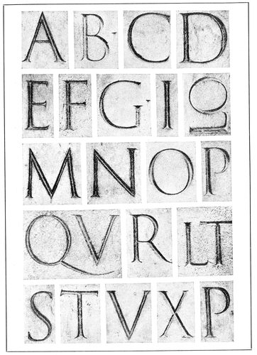
EXAMPLE 464-A Roman alphabet from the inscription on the base of the Trajan column, Rome, about A. D. 114. From Johnston
The fact that there are thousands of type-faces on the market adds to the difficulty of recognizing and naming them, and the situation is further involved by the practice of composing-machine makers in using only numbers to designate type-faces and by various typefounders giving different names to the same design of type. The special type-faces of private presses are usually given the name of the work on which they are first used.
Six Representative Standard Roman Type-Faces
Believing that such a service would be appreciated by printers and users of typography, the author made a study of the thousands of Roman type-faces on the market, with the purpose of selecting a half-dozen representative standard faces. It was felt that these type-faces should be legible and good-looking, and possess character; that their merits should be acknowledged by authorities, and that the types should be capable of wide serviceability on both book and job work.
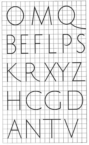
EXAMPLE 464-B Proportions of Roman capitals as found in the Trajan alphabet, and a few additional letters
170
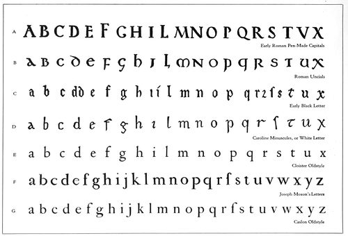
EXAMPLE 465 Evolution of Roman lower-case type-faces. (A) Pen-made Roman capitals. (B) Development into Minuscules or lower-case thru rapid lettering. (C) Black Letter or German Text developed from Roman Uncials. (D) White Letter, the open, legible Caroline Minuscules, on which Jenson based his Roman type-face of 1470. (E) A recent type-face closely modeled on Jenson’s Roman types. (F) Joseph Moxon’s letters of 1676. (G) Caslon’s type-face of 1722
The face first selected—and without hesitation—was Caslon Oldstyle as originally designed. Scotch Roman was the second selection, Cheltenham Oldstyle the third, Cloister Oldstyle the fourth, Bodoni Book the fifth, and French Oldstyle the sixth. (All shown in Example 467.)
Type-faces designed and cut for private use were not considered in making these selections, as it was believed best to adhere to type-faces that are procurable from most foundries and that are available for machine composition. It may be well to inject here a warning that most so-called Caslon Oldstyles are not as good as the one selected (Example 467-B); that Jenson Oldstyle is inferior to Cloister Oldstyle (Example 467-A) as a representative of the original Jenson type. However, good representatives of Scotch Roman (Example 467-D) are obtainable under the name of Wayside, of National Roman, etc.
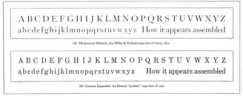
EXAMPLE 466 Two standard type-faces that rate high in legibility, but that are colorless in the mass and lacking in the pleasing irregularities of form that characterized Roman type-faces before the nineteenth century. The various qualities of legibility found in Modernized Oldstyle have been converted to narrower letter shapes and more “modern” form in Century Expanded
171
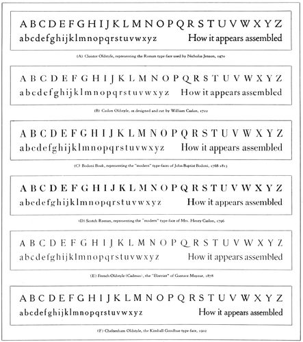
EXAMPLE 467 Six standard representative Roman type-faces, approved by authorities for both beauty and legibility, and selected by the author from the thousands of type-faces available for hand and machine composition
Selection of these faces was also made just as a person makes a wise selection of records for a Victrola—for permanency and investment. As standard records can be selected which will “wear” for a long time, so standard type-faces can be selected which will look well for many years. Good type-faces are like good music.
We will discuss these six faces.
Cloister Oldstyle.—Use in American printing of a standard type-face based on the Roman letter cut by Nicholas Jenson about 1470 has been retarded by the fact that typefounders in this country some years ago used as a model Morris’s interpretation of the Jenson face instead of going direct to the original letter. Jenson’s face had been copied by Bruce Rogers, T. J. Cobden-Sanderson, Frederic W. Goudy and others, and the fonts used privately, but for general use it was not until 1914 that a creditable copy of the face was made available by the good judgment displayed by the American Type Founders Company in bringing out Cloister Oldstyle. This is probably the best rendition of the spirit of an old Roman type-face that a modern type foundry has made. If there is a fault, it is that the lower-case letters set a trifle too close.
172
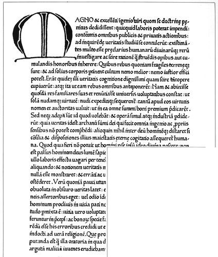
EXAMPLE 468 Type-face used in Italy by Sweinheim and Pannartz in 1465. From De Vinne
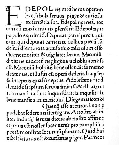
EXAMPLE 469 The Roman types of John and Wendelin of Spires, Venice, 1469. Greek letters were to be written in the line now half blank. From the original in Typographic Library and Museum, Jersey City, N. J.
173
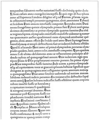
EXAMPLE 470 The beautiful “White Letter” Roman type-face of Nicholas Jenson, 1470, from “Eusebius,” the first book printed by him at Venice. The dot over the “i,” small and slightly to the right, is found, also, in the manuscript specimen here inserted. From the original in the Typographic Library and Museum, Jersey City, N. J.
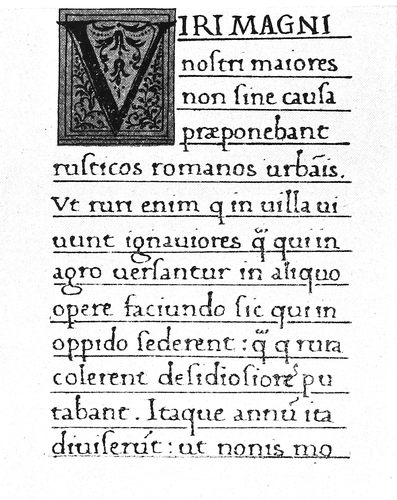
EXAMPLE 471 Section of manuscript of the fifteenth century, in the Charlemagne “White Letter” on which Jenson may have modeled his Roman type-face. From Humphrey
Jenson’s face was not the first Roman type made, as is 174sometimes supposed; others had previously been used (Example 469), but it was the first Roman type to meet the approval of those who preferred the Italian White Letter to the Gothic Black Letter.
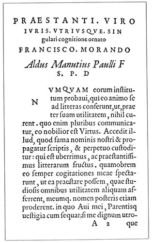
EXAMPLE 472 Type-face used by Paul Manutius at Venice in 1566
Sweinheim and Pannartz were German printers who, in 1465, began to print near Rome. Until this time the black Text letter such as Gutenberg had printed with ten years before was the only one used in typography, but book buyers in Italy wanted Italian lettering. The German printers attempted to cut an Italian face, but in appearance they did not advance far from Gothic lettering (Example 468).
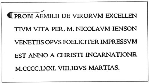
EXAMPLE 473 Cloister Oldstyle set in imitation of the Jenson title on page 14. Printed and zinc-etched, as was the original
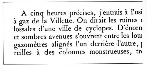
EXAMPLE 474 Type-face cut in 1693, now used by the National Printing Office, Paris. Notice slight projection on lower-case “l,” a decorative feature used by Gutenberg in his types
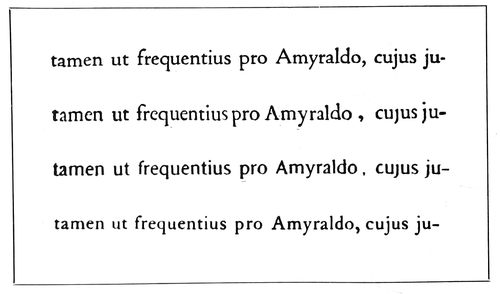
EXAMPLE 475 The first line is set in Cloister Oldstyle; second reproduced from Elzevir page opposite; third set in Cadmus; fourth in Caslon Oldstyle. These lines are zinc-etched
John and Wendelin of Spires, Germans, began to print at Venice in 1469 with a type-face that was more Italian in character, yet it had Gothic characteristics. Nicholas Jenson, a Frenchman, who began to print in 1470 at Venice, was more successful, and he gave to the world the fine Roman type-face that he used on his first book, shown, together with a sample of contemporary lettering of similar design, as Example 470. More facts about Jenson will be found on page 14.
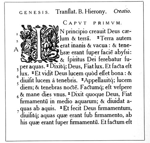
EXAMPLE 476 Cheltenham Oldstyle, with the capitals a size smaller, set in imitation of the Plantin typography on page 16
175
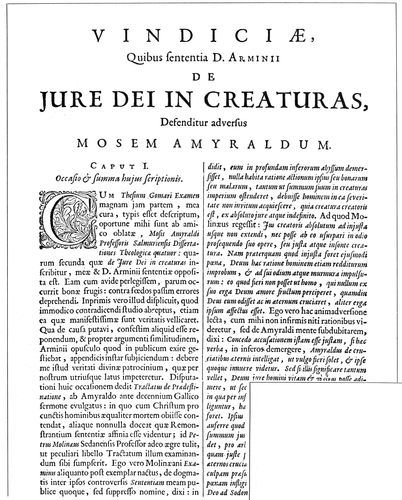
EXAMPLE 477 Type-faces used by Daniel Elzevir at Amsterdam in 1675. From “The American Printer” library
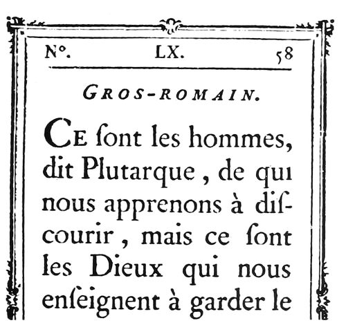
EXAMPLE 478 The Roman types of Fournier, the French founder, taken from his type book of 1766
176
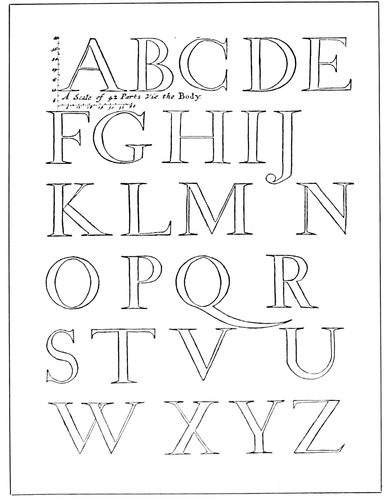
EXAMPLE 479 A capital alphabet drawn by Joseph Moxon (1676) to a scale of forty-two small squares
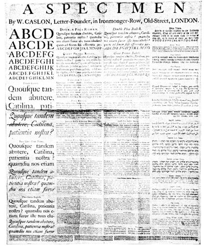
EXAMPLE 481 Earliest known specimen sheet of printing types, issued by William Caslon in 1734
As time went on, printers and typefounders made changes in the Jenson design, but these alterations were not numerous (the cross stroke in the lower-case e was one, Example 495), and fairly close resemblance to the Jenson types is found in the Roman types of Paul Manutius, 1566 (Example 472), Daniel Elzevir, 1675 (Example 477), and Fournier, 1766 (Example 478).
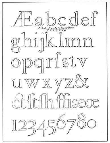
EXAMPLE 480 Moxon’s lower-case alphabet, which he says was patterned after the letters of a Dutch punch cutter
In selecting a page from Jenson’s book, “Eusebius,” to be photographed, the writer had great difficulty in finding one of sufficient evenness and clearness of print. It may be that Jenson, in his endeavor to enhance the “White Letter” effect of his types, used a minimum of ink, and, under these circumstances it was perhaps more difficult for him to maintain consistent page color than it was for Gutenberg to do so with his “Black Letter” pages. Bruce Rogers’s printing of his Jenson-like pages of typography would be a revelation to the old-time Venetian printer.
Jenson made his Roman letter in only one size, and that fairly large (about sixteen-point), so that the open design of the characters would admit white light from the paper background. When, some years later, he was required to print cheap devotional books, he cut and used a compact Black Letter Text type for the purpose.
There is now a movement away from the mechanical style of type-face, restricted in design by arbitrary craft rules, in the direction of the graceful, interesting yet legible faces represented by Cloister Oldstyle.
This type will be found in use in Examples 171, 240, 256, 266, 286, 316, 337, 340, 341, 345, 357, 359, 372, 383, 399 and 452.
The Italic that accompanies Cloister Oldstyle is based on the Italic of Aldus Manutius.
Caslon Oldstyle.—This is a historic American type-face. It was used by that renowned American printer, Benjamin Franklin; it appears on eighteenth-century school books, and even our paper money was printed with it. It was the type-face used by John Dunlap, the Philadelphia printer, in setting up and printing the first published 177copies of the Declaration of Independence, a few hours after it had been passed by Congress, July 4, 1776. (See facsimile that appears as a frontispiece to this book). It was one of these copies that was read to the Continental Army.
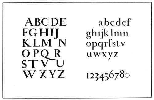
EXAMPLES 479-A and 480-A The Moxon alphabets inked in and reproduced in a smaller size
Today, nearly two hundred years after the first font was cut, Caslon Oldstyle has the approval of the good printers of America, who regard it, in its original form, as the best and most useful Roman type-face available, as it is one of the few old faces the punches and matrices of which have been preserved and placed at the disposal of all printers.
The Caslon foundry in England now casts the original letter as “Caslon Old-face.” In this country, all typefounders make some sort of Caslon, and it may be procured practically in its original form, with long descenders, kerned f and j, old special characters, decorated Italic capitals and all, from the American Type Founders Company, which has named it “Caslon Oldstyle 471” (Example 517).
Other foundries are preparing to furnish the letter more in its original form, and composing-machine makers are doing likewise. The monotype company, after cutting several faces in imitation of imitations of Caslon’s type, finally copied the original fairly successfully, and this, as now obtainable, is known as Caslon Oldstyle No. 337. The linotype company is recutting its Caslons and is making a sincere effort to reproduce the original letter as closely as possible. Mechanical difficulties prevent an exact duplication in every detail of the Caslon type in machine composition, yet the companies that are attempting it show a spirit that augurs well for the future quality of printing in America.
Caslon Oldstyle is not at its best printed on a smooth, highly-calendered surface.
When properly composed and printed, it presents as a page a dark-gray tone, formed of a pleasant mixture of black ink and white paper; its letters show more of a contrast in thick and thin strokes than do the Roman types of Nicholas Jenson, and have more color and interest than the modernized old-styles of the nineteenth century. In the sizes above ten-point it measures up in legibility and beauty to the requirements of the best printers and other students of typography.
Caslon did not create an entirely new Roman letter, but with the elements that had already been provided by Jenson and the type designers of Holland he did, with good taste and skill, build a type-face that is distinctive, legible and beautiful. The illustration of the evolution of Roman lower-case in Example 465 furnishes opportunity for study of this point.
The story of the designing of Caslon Oldstyle has been often told, yet a few brief facts may be of interest here.
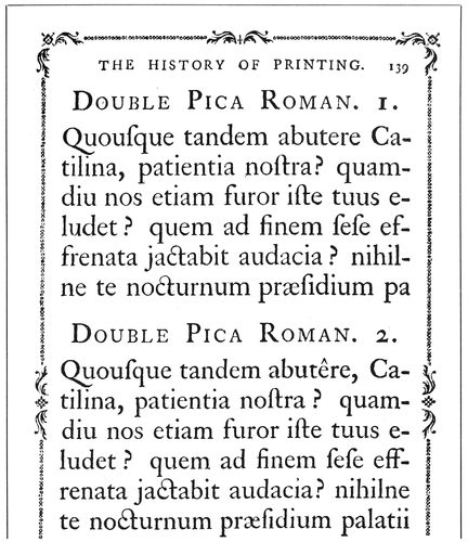
EXAMPLE 482 There were two slightly different faces to many of the Caslon fonts. From the specimen pages in Luckombe’s “History of Printing,” published in 1770
Typefounding and printing had deteriorated in England, and the product of the printing press was pathetically poor (the author was surprised, in examining important volumes printed in England about 1700, at the consistently poor work of typefounder, compositor and pressman), when, in 1720, William Caslon, an engraver on metal, was called upon to cut a font of Arabic characters, to be used in printing a New Testament for the poor Christians in Palestine and Arabia. At the same time, for use at the foot of the proofs of his Arabic types, he cut his own name in Roman, pica size. (This was at the time when Benjamin Franklin was working as a journeyman at Watt’s printing office.)
The pica size, however, was not cast immediately. So far as is known, the size of Roman first to be cast by Caslon was that called “English” (about fourteen-point), which he cut in 1722. Additional sizes followed, and at about the period of his death, in 1766, there were at least thirty fonts of Roman (pearl to five-line pica), nineteen fonts of Italic, ten fonts of Black Text, and various fonts of Greek, Hebrew and other alphabets, together with more than a half-hundred fonts of flowers and bands.
The fonts that have been preserved to us, and that are purchasable, do not include all. There were Nos. 1 and 2 faces in nonpareil, brevier, bourgeois, long-primer, small-pica, pica, english and double-pica (two-line small-pica). The No. 1 face in each case was a trifle larger than that of No. 2, and a third face, still larger, was made in bourgeois and long-primer.
178These faces were all shown, in honor of the memory of William Caslon and as a tribute to the merit of the type, in Luckombe’s “History of Printing,” published by Adlard & Browne, London, in 1770 (Example 482).
It is probably the smaller and lighter No. 2 faces that have been preserved to us in the ten-point (long-primer) sizes and under. The lighter, more open eighteen-point (great-primer) Italic (Example 517), so different from the Italic of the other sizes, is as Caslon made it. In some respects it is better than the Italic of other sizes.
While the general appearance of all sizes of the Roman is the same (and of the Italic also, with the exception noted), there are slight differences in details of design in the various sizes. For this reason, when Caslon Oldstyle is compared with the original letters, the comparison should be with the same size in each instance.
De Vinne, perhaps influenced by the prejudices and practices of nineteenth-century typefounders, in one of his books points out as defects in the original Caslon types features that typefounders and composing-machine makers are today restoring to the face as used in America. The “defects” were supposed to be: “Too long a beak to the f and j; unnecessary narrowness in the s and a, and in some capitals; too great width of the c, o and v.”
Typefounders and composing-machine makers have filled the type cases of the printers of this country with Caslons that have been improved (!), recut, modified, adjusted to “lining” systems, made bold, disfigured, sawed-off and ill-treated generally; and as they bring out good copies of the original letter, it is to be hoped that, so far as possible, sale of the defective and offending type-faces and matrices will be discontinued.
William Caslon died in 1766, and the business was continued by William Caslon the second, and then by William Caslon the third. Mrs. Henry Caslon conducted the business in 1796, when was brought out the modernized Caslon (Example 484-B) that was probably the model for the type we know as Scotch Roman. This modernization was a concession to the demand for types in the new style that had been designed by Giambattista Bodoni, an Italian typefounder.
The influence of Bodoni’s ideas in type design was such that Caslon Oldstyle was not included in the 1805 specimen book of the Caslon foundry, and did not again appear therein until 1860, a year after the face had been reintroduced to America by a Philadelphia foundry.
The story of the revival of Caslon Oldstyle in England has been told in these words:
In the year 1843, Mr. Whittingham, of the Chiswick Press, waited on Mr. Caslon to ask his aid in carrying out the then new idea of printing, in appropriate type, “The Diary of Lady Willoughby,” a work of fiction, the period and diction of which were supposed to be of the reign of Charles I. The original matrices of the first William Caslon having been fortunately preserved, Mr. Caslon undertook to supply a small font of great-primer. So well was Mr. Whittingham satisfied with the result of his experiment that he determined on printing other volumes in the same style, and eventually he was supplied with a complete series of all the old fonts.
America took part early in the revival of Caslon’s old-style types, for in 1858 matrices were brought to the United States by the Johnson Type Foundry, afterward MacKellar, Smiths & Jordan, now the Philadelphia branch of the American Type Founders Company.
The first size made in this country was brevier, which was announced in the “Typographic Advertiser,” the company’s house-organ, of January, 1859. Six months later thirteen sizes were shown, and in 1865 Caslon Oldstyle was made in sizes from pearl to six-line pica.
The decorative Italic types, known as Swash letters, were not until 1916 included in the American fonts, but these, redrawn by T. M. Cleland, are now procurable.
Selection of Caslon Oldstyle, in 1892, for the text and advertisements of Vogue, the use of the letter by Will Bradley at the Wayside Press, in 1896, and the general old-style revival, influenced by the work of William Morris, of the Kelmscott Press, in England, were causes that led to the present popularity of Caslon Oldstyle.
This Caslon style of type-face is one of the few standard letters that has practically unlimited usefulness. Properly treated, it looks well on any class of printing, from a business card to the text and advertising pages of periodicals. It may be seen in action in this book by referring to Examples 18, 34, 64, 65, 66, 67, 68, 81, 82, 86, 96, 119, 121, 126, 127, 132, 133, 134, 135, 138, 150, 151, 167, 168, 169, 172, 178, 180, 188, 190, 191, 195, 203, 215, 221, 222, 223, 224, 225, 228, 230, 231, 232, 236, 239, 245, 246, 247, 248, 249, 250, 260, 262, 268, 274, 282, 284, 287, 289, 290, 292, 294, 296, 297, 300, 374, 375, 382, 384, 385, 393, 394, 396, 426, 429, 430, 433, 434, 436, 438, 439, 440, 441, 448, 450, 451, 453, 455, 459, 460 and 461; the frontispiece; upper specimen, page 21; reproductions, page 23; insert opposite page 32; upper specimen, page 33.
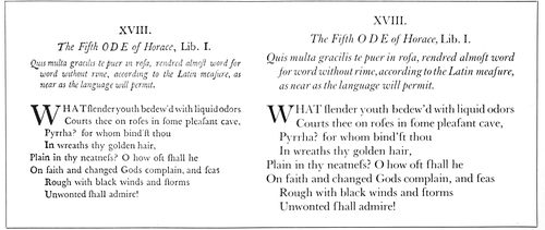
EXAMPLE 483 On the left is a reduced reproduction (from Reed) of Baskerville’s types used in a book of 1758, and on the right, for comparison, is the same matter set in Baskerville Roman, twelve-point size, introduced to America in 1917
179
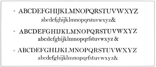
EXAMPLE 484 The possible descent of Scotch Roman. (A) Baskerville Roman, based on Baskerville’s letter of 1758. (B) Mrs. Caslon’s “modern” Roman of 1796. (C) Scotch Roman, as we know it today
Bodoni Book.—When a representative of the Bodoni type family was selected for a place in the group of standard faces, Bodoni Book was chosen for its refinement and legibility. In its lower-case, especially when printed on other than gloss-surfaced paper, it seems to have more of the qualities of the best types of the Parma printer than does Bodoni, the first series brought out by the American Type Founders Company. Scientific tests have demonstrated that in the small sizes usually used for text purposes, type-faces with considerable contrast of hairlines and heavy strokes strain the eyes. The contrast found in Bodoni Book is moderate.
John Baptist Bodoni was born in Italy twenty years after William Caslon cut his first font of Roman letter. Bodoni’s subsequent career as a printer and typefounder doubtless resulted from his entrance, when eighteen years old, to the printing house of the Propaganda, in Rome. He began his important work in Parma in 1768.
The print of his books is remarkable for clearness, and in both type-cutting and printing he was skilful to a high degree. His types are not quite so regular in design as the recent Bodonis, and were given additional character by being impressed firmly in paper that did not have the enameled surface so much in use in our day.
His type-faces were a change from those previously used—different from the type-faces of Jenson, the Elzevirs and Caslon. The change was principally in the serifs, which were straight, thin strokes; and the general character of the letters was also distinctive. He used a few fonts in which the straight serifs were rounded by being filled in slightly at the corners, and these fonts probably suggested to Scotch, English and American founders the style known as “modern,” as compared with the “old-style” faces in use before Bodoni’s time.
The reader can compare for himself the resemblance of Bodoni Book to one of the text types of Bodoni as used in 1789. In order that the comparison could be fairly made, the Bodoni Book (Example 486) was printed on antique paper and etched on zinc, as the original Bodoni page had been (see page 26). This type is not only lighter, but other details are different from a 1790 type of Bodoni (Example 487-A), which may have served as a model for the present-day type-face called Bodoni. Compare the capital Rs, and notice that the cross stroke on the lower-case t in the 1783 alphabet is low and distinct, while on the 1789 page it is high and joined with the upper end of the vertical stroke. The latter treatment prevails on many of Bodoni’s types, as it does on practically all type-faces. Excepting for the straight serifs, many of Bodoni’s types have some general resemblance to other Roman types of the seventeenth and eighteenth centuries.
In designing the present-day Bodoni, the typefounders gave it much of the “finish” in design that was given type-faces by Scotch and American founders during the nineteenth century. Typefounders seldom succeed in faithfully reproducing old type-faces, for the reason that they “correct the faults” of the old faces, and in doing so lose much of the humanistic spirit of the original. Were it not that the punches of some of William Caslon’s types were preserved, we would not have the true rendering of this old-style that we now possess. Modernized Oldstyle represents the Caslon face corrected and improved as the typefounders of the nineteenth century thought it should be. Some American founders, however, are making excellent progress in reproducing the spirit of old type-faces, and it is possible that we may yet have a satisfactory copy of the famous “silver” types of the Elzevirs.
Bodoni types are shown in use on page 26, and in Examples 26, 36, 48, 175, 176, 194, 278, 310, 322, 330, 352, 355, 365, 387, 390, 412, 413, 414, 416, 428, 437 and 458.
Scotch Roman.—During the nineteenth century English, Scotch and American typefounders took Bodoni’s type-faces, redesigned them more along mechanical lines, filled in the corners of his straight serifs so as slightly to round them, and gave to the English-speaking world what are best known to printers as the modern Romans.
Looking over the specimen books of the type foundries of the last century—those of Bruce, MacKellar, Smiths & Jordan, and others—one marvels at the wonderful skill in the cutting of the hairlines and the general mechanical excellence of the modern Romans.
Because of their continued use on newspapers and in books of reference, these letters are in wide use today, altho there is a movement away from them.
The most generally used type-face on small city newspapers in America is the linotype company’s Modern Roman No. 2 (Example 489). In the hand-set days this broad, open-faced letter was so made for the reason that it would stereotype easier than would the narrower letters. It was adopted by the ready-print and plate houses, and when the newspapers installed linotypes they naturally 180selected the same face, so that the type matter thruout the publication would match. The larger city dailies give more attention to the details of the faces they use for body purposes. If No. 2 is selected, or the leaner No. 1, modifications are frequently made in some of the letters or figures. The No. 1 Modern Roman is used by the New York Times (Example 406).
However, instead of the selection of a severe letter, such as the so-called Scotch-cut Modern Roman as a representative type-face in the group of six standard Roman letters, the more interesting Scotch Roman won the place. This type-face was first made in America by A. D. Farmer & Son, and the eight-point and ten-point sizes were used as body type by The American Printer first in April, 1902. In September of that year there appeared in that publication showings of the eight-point, ten-point, eleven-point, twelve-point and fourteen-point sizes, with the statement that other sizes were in preparation. The name, “Scotch Roman,” probably comes from the fact that Miller & Richard, the Edinburgh typefounders, made a similar letter in sizes from eight-point to twelve-point. However, they call it “Old Roman.”
Scotch Roman is the link that connects the graceful old-style and the severe modern Roman. Compare it with the letter (Example 484-B) made at the foundry owned by Mrs. Henry Caslon in 1796, and notice the resemblance. (As a further study, there is added an alphabet of Baskerville Roman, recently introduced to America.) Scotch Roman is also procurable under the names of Wayside Roman and National Roman.
Scotch Roman has been used in Examples 38, 39, 77, 78, 85, 143, 152, 153, 154, 185, 186, 238, 271, 317, 400, 420, 423, 427, 428 and 444.
French Oldstyle.—This is the title by which is known among printers a style of type-face made, under the name of “Elzevier,” by the Gustave Mayeur foundry of Paris in 1878. Its design, M. Mayeur tells us, was suggested by types used in a book printed in Leyden by the Elzevirs in 1634.
In 1889, Farmer, Little & Co. of New York procured drives of five sizes from France and began making the letter in America, naming it “Cadmus.” The type foundry of Phelps, Dalton & Co. of Boston had as early as 1884 made a similar and rather pleasing letter in capitals only, which it called French Oldstyle.
Theodore L. De Vinne was the first to use the Mayeur French Oldstyle in America. It was a favorite with Walter Gilliss, who adopted it in remodeling the catalogs and other printed matter used by the Metropolitan Museum of Art, New York.
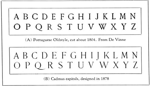
EXAMPLE 485 A study of the French Oldstyle design of Roman capitals
The capitals of French Oldstyle are especially pleasing, and when this letter is employed they should be used in display with frequency. The Mayeur letter would be even more attractive if the proportions of its capitals were nearer those of early Roman lettering (Example 464-B), as are some other French Oldstyles.
French Oldstyle is tall and formed with liberal space between the strokes of the lower-case letters. It should always be leaded, as its open character and large lower-case demand that it shall not be crowded. Like Cheltenham, it is best suited for pages that are narrow and long, such as the 12mos issued in the seventeenth century by the Elzevirs.
The Mayeur French Oldstyle has a slight resemblance to the type-faces found in the Elzevir seventeenth-century books (Example 475), but is a rather free rendering of those types. The capitals of the Elzevirs are more in the proportions of Jenson’s (see Cloister Oldstyle, Example 467-A), and the small letters (o) of the lower-case are not so large in comparison with the tall letters (l) as they are in French Oldstyle. The Mayeur letter also contains the shortened descenders and short-kerned f of the nineteenth-century typefounders. In fact, both ascending and descending strokes have been shortened.
Examples 45, 183, 184, 217, 410, 411, and the Jacobi specimen on page 33 show French Oldstyle in use.
Cheltenham Oldstyle.—This extremely popular type-face was designed in America and here developed into the most numerous family known to typefounding—at least thirty series. A pamphlet issued in 1905 by the Mergenthaler Linotype Company tells the story of its origin. Ingalls Kimball, director of the Cheltenham Press, New York, was commissioned to suggest and supervise the making of a letter that would have both beauty and legibility. Cheltenham Oldstyle resulted, the drawings of which were made by Bertram G. Goodhue.
It was realized by the designers of this type-face that space between lines increases legibility, and experiments seem to show that the upper half of lower-case letters are easier to read than the lower half. For this reason the lower-case was then designed with long ascending strokes and short descending strokes. While the theory regarding the superior legibility of the upper half was announced as a new one, it had been put forth about 1882 by Dr. Émile Javal, a Parisian oculist. (See the demonstration in Example 508-G.)
The first announcement by the American Type Founders Company of Cheltenham Oldstyle in The American Printer, January, 1903, showed eleven sizes—eight-point to forty-eight-point. Claim was made that it was a “compact and legible book type,” and that it would become the most popular job type.
Because of its lean formation and close set it has been frequently used for narrow booklets.
A Roman type-face entirely new in design would be a freak and unreadable in the mass. As a completed design, Cheltenham Oldstyle was different from others in use in 1903, yet it is made up of features of Roman type design in vogue between the designing of Jenson’s letter and Caslon’s types. Study Examples 470, 472, 476, 477 and 478. Compare with the Portuguese capitals, especially G, P, W, in Example 485.
Cheltenham Oldstyle has strength, readability, and a certain amount of beauty. Its capitals are awkwardly large in comparison with its lower-case. It is shown in use with smaller capitals in Example 476.
Because of the smallness of most of the lower-case and the close set of the letters, very little space is needed between words; yet, as used by printers generally, much of the legibility the type-face possesses is lost by wide spacing between words, especially on machines.
Because the eye, as a rule, gives less attention to the lower part of a line of reading matter, the descenders 181were cut off almost entirely in the designing of Cheltenham. It would be as reasonable, because the eye usually sees only the upper part of a man, to amputate his legs. This amputation of the legs of type-faces by modern founders has maimed many other letters, notably Caslon Oldstyle as we most frequently see it.
The serif, which is supposed to distinguish modern types from old-style, is very small in Cheltenham Oldstyle, and is more like the serif found in modern types. The general character of Cheltenham, however, is extremely old-style.
This letter has been used in the composition of Examples 35, 40, 47, 106, 122, 125, 209, 267, 273 and 350.
Development of the Roman Type-Face
In the beginning, Roman letters were in capitals only (Example 464-A), and, carved on stone, were at their best about the beginning of the Christian era. The present so-called Roman, Italic and Text types are descended from them.
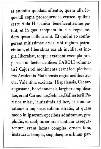
EXAMPLE 486 Resetting in Bodoni Book of the 1789 Bodoni specimen on page 26. Like the original, this specimen was printed and then zinc-etched
Use of the pen and brush in lettering and the tendency to letter rapidly finally gave us the lower-case type of today. The evolution is pictured in Example 465. “A” shows the Roman capital alphabet as made with the pen (compare with the chiseled letters of Example 464-A). In “B” we have the result (known as uncials) of hurried writing of the Roman capitals, and one can see how the lower-case letters were forming. At about this point in the development, the minuscules, or lower-case letters, took two separate growths—one in the direction of the “Black Letter” or German Text types of today, and the other toward the “White Letter” of the Caroline Minuscules, which, as Roman lower-case, are now used almost exclusively in America, England, France and other countries in North and South America and Europe, the notable exception being Germany.
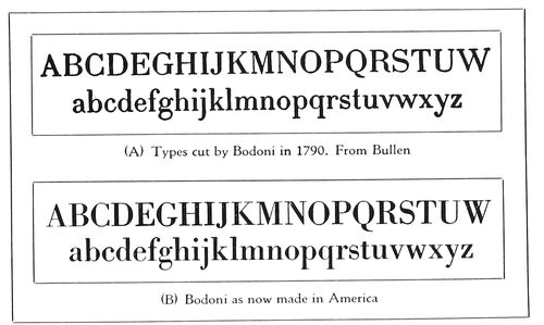
EXAMPLE 487 Comparison of one of Bodoni’s alphabets with a new type-face. Both are rough, having been zinc-etched
When Gutenberg began to print he used a black Text type designed after the bold lettering of the German manuscript books, and when Germans went to Italy to print they had difficulty in rendering into types the character of Italian lettering. Example 468 shows the efforts in this direction by Sweinheim and Pannartz in 1465, and in Example 469, types by John and Wendelin of Spires, an improvement is noticed.
It remained, however, for the Frenchman, Jenson, to design and cut a letter that is the alpha of Roman type-faces (Example 470). Jenson was fortunate in the selection of a model, and it is interesting to include in the corner for comparison a section of an Italian manuscript of the same century. Development of the Roman letter into the beautiful and legible form known as “Caroline Minuscules” was due to the encouragement of Charlemagne. Why it is called “White Letter” in contradistinction to “Black Letter” may be seen by comparing the light-gray tone of the Jenson page (Example 470) with the missal specimen opposite page 14. It may be well to explain that the seeming disfigurement of the capitals in the Jenson page is due to the custom that book decorators had of placing a stroke of vermilion over the capitals. In the reproduction these strokes came out black. Both the Spires and the Jenson specimens were reproduced from the original volumes in the Typographic Library and Museum at Jersey City.
Example 465 also shows, for comparison with the style of lettering known as the Caroline Minuscules, a type-face based on Jenson’s letter of 1470, following which are Moxon’s and Caslon’s lower-case alphabets.
The faithfulness with which Jenson’s type-face was followed in the designing of Cloister Oldstyle may be seen by comparing the Cloister alphabet (Example 467-A) with the Jenson letters as they are found in Example 470. A very interesting comparison can also be made of Jenson’s capitals, on page 14, and Cloister Oldstyle, in Example 473. If a comparison of present-day type-faces with very old faces is to have any value, the present-day type-faces should be printed on antique-finished paper dampened if possible. And if the old face is reproduced by zinc etching from an old book the other type-face should also be zinc-etched. Printing and zinc etching were resorted to in the case of this example and in other instances in this chapter.
In some works reproductions of type-faces are valueless and misleading, for the reason that they have been retouched by an artist, redrawn, or cut in wood.
182

EXAMPLE 488 Modern Romans of the nineteenth century in three tones
The influence of the Jenson style of Roman was seen for some years, but in 1566 (Example 472) we find a change of form. The type is more condensed, and instead of a diagonal stroke on the lower-case e there is a horizontal stroke close to the top of the letter. This style, as used by Paul Manutius in 1566, seems to have been maintained with little alteration in the work of Daniel Elzevir a hundred years later (Example 477) and two hundred years later in the types of Fournier, the French founder (Example 478). This style of letter was also used by Plantin, the Antwerp printer, in 1569, and for the interest there may be in it the reproduction of a bit of his work (see page 16) should be compared with Example 476. This last-mentioned example has been set in Cheltenham Oldstyle. However, ten-point capitals have been used with twelve-point lower-case. It may be that the appearance of most reading matter would be improved if the capitals were a trifle lower in hight than the ascending strokes of the lower-case letters b, d, f, h, k, l.
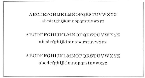
EXAMPLE 489 Modern Roman as it is used on many American newspapers. Six-point, seven-point and eight-point Linotype Roman No. 2. A readable but not a handsome type-face
The National Printing Office at Paris is using on some of its productions a type-face designed in 1693 by Grandjean. While it is greatly like other letters of that period, it has peculiarities, one of which is a slight dot on the left center of the lower-case l, a feature also present in the Black Letter of Gutenberg, and in the types of Fust and Schœffer (see inserts opposite pages 7 and 12).
We have a key to the formation of the Roman types of the seventeenth century in the alphabets drawn by Joseph Moxon, an English typefounder, and published in 1676 (Examples 479 and 480). These are here reproduced from Moxon’s “Mechanick Exercises,” as reprinted, under the supervision of Theodore Low De Vinne, by the New York Typothetæ in 1896. Moxon says these letters are copied from the letters of Christopher van Dijk, a punch cutter of Holland. As will be seen by the scale in the upper left corner of Example 479, he attempted to show how the shapes of letters were “compounded of geometric figures, and mostly made by rule and compass.” Each letter was to be plotted on a framework of small squares, forty-two squares in hight and of a proportionate width. Passing up this idea as impractical, De Vinne said:
It is admitted that the characters are rudely drawn, and many have faults of disproportion; but it must not be forgotten that they were designed to meet the most important requirement of a reader—to be read, and read easily. Here are the broad hair line, the stubby serif on the lower-case and the bracketed serif on the capitals, the thick stem, the strong and low crown on letters like m and n, with other peculiarities now commended in old-style faces and often erroneously regarded as the original devices of the first Caslon.
The writer was curious to see how these letters of Moxon’s made up into type, and for this purpose had the outlined alphabets inked in and reproduced in smaller size (Examples 479-A and 480-A).
When William Caslon, in 1720, cut his first Roman letter he may have had Moxon’s Roman alphabet before him. There are some resemblances, but that he did not slavishly follow the Moxon letters may be seen by comparing both type-faces (Examples 465-F and 465-G).
We could be more familiar with the types of Baskerville than we are, but now that the typefounders are reproducing them (Example 483) we shall come to a realization that they rival the letters of Caslon in beauty and readability. John Baskerville, the English typefounder and printer, spent six years and thirty thousand dollars in designing and cutting his first font of type. In 1758 he had cut eight fonts of Roman, but other printers would not buy his types, preferring those of Caslon. Two years later he attempted to sell his types and retire from the printing business. After his death, in 1775, his widow sold all his type and type-making material and they were removed to Kehl, near Strassburg. There is a legend that the types finally reached France and were melted into bullets for the French Revolution. It is a pity that Baskerville’s original punches are not available, like those of Caslon, so that printers of today could make use of the splendid type-faces that were unappreciated in his lifetime. However, Baskerville Roman is a satisfactory reproduction of the types of John Baskerville.
Like Caslon Oldstyle, however, it should be printed on other than gloss-surfaced paper (Example 463), as then, especially in the smaller sizes, the good qualities of the letter are brought out and it is made more legible.
When Mrs. Henry Caslon, in 1796, “Bodoni-ized” the types of William Caslon the first, she was probably influenced as much by the types of Baskerville as by those of Bodoni. This is borne out by the comparisons in Example 484. In “A” is shown an alphabet of Baskerville Roman as now made in America, and in “B” Mrs. Caslon’s Modern Roman. The third type-face (C) is Scotch Roman, one of the six selected representative type-faces (Example 467-D).
John Baptist Bodoni made some very good type-faces, but it is not difficult to lay at his door the responsibility for throwing typography out of gear for almost a century. Thru his influence and the desire of Scotch typefounders to improve on his work, the nineteenth century was inflicted with those stiff “Modern Romans” (Example 488) that in all their inhuman “perfection” yet abide with us and are still liked by Victorian persons of staid tastes. Many of our school children are being brought up on them, and in lighter form (Example 489) they are being fed to millions of Americans thru the homely typography of most newspapers. This double influence works for a lowering of typographic taste among printers and buyers of printing that for many years will keep the general standard of printing below what it should be.
To return to Bodoni. This Italian typefounder’s types, as a rule, were not so faultlessly finished as are the 183recent types that bear the name. There may be seen in Example 487 the alphabet of a type-face cut by Bodoni in 1790, together with an alphabet recently cut in America. The Bodoni type of the American foundry is a clever copy of the original, yet there is in the copy much of the modernization of the Scotch founders of the nineteenth century. Bodoni Book is a better-looking and more readable type-face.
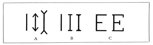
EXAMPLE 491 (A) Optical changes caused by adding Vs at end of strokes. (B) Appearance of vertical stroke altered by adding small horizontal strokes, or serifs, and by joining both with curved line. (C) Cross strokes or serifs added to E
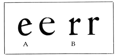
EXAMPLE 495 (A) The diagonal stroke of the first Roman type-faces. (B) The lower cross stroke or serif extended to right on the Roman type-face of Jenson
The Scotch typefounders also attempted to improve the types of William Caslon, and the result of their labors is known as Modernized Oldstyle (Example 466-A). This kind of type was first made about 1852 for Miller & Richard of Edinburgh, Scotland. With Caslon Oldstyle unknown, Modernized Oldstyle would be a rather satisfactory letter, but with Caslon Oldstyle procurable there seems to be no need of the Scotch letter. There was brought out in 1884 by the MacKellar, Smiths & Jordan Company a decorative Modernized Oldstyle under the name of Ronaldson Oldstyle.
Characteristics of Roman Type-Faces
The Serif.—The serif is that portion of a type-face indicated by the small black sections in Example 492. It has a powerful influence in determining the character and style of a face of type.
As an experiment, we will make three vertical lines exactly the same length (Example 491-A), leaving one as it was first drawn, but on the other two adding V-shaped marks, because of which the character of the line is changed and the length seemingly affected.
However, the serif, when properly used, has a decorative quality and is to type what the capital is to the column and the cornice to the building in architecture.
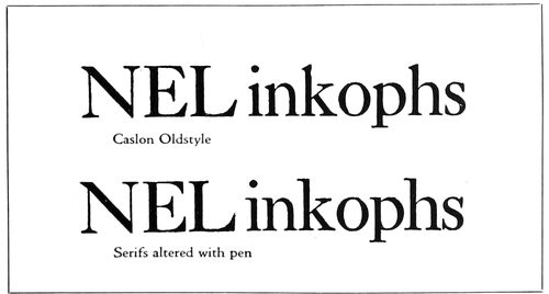
EXAMPLE 493 By altering the serifs, “old-style” type is changed into “modern.” From Bullen
After further experimenting with three vertical lines that we will now identify as capital Is (Example 491-b), there can be no doubt that the serif is necessary as a finishing stroke. The serifless I suggests a man in the public streets without hat or shoes. The crudest manner of adding a serif is to place a small horizontal stroke at the head and foot of the long vertical line, but the sharp angles thus formed can be softened and one stroke joined to another by a curve, with the corner filled in, as is shown. These two illustrations of the serif are merely for the purpose of introducing the novice to the subject. The fact that there are so many different faces of type is due somewhat to the manipulation of the serif—changes of length, thickness, direction and curve.
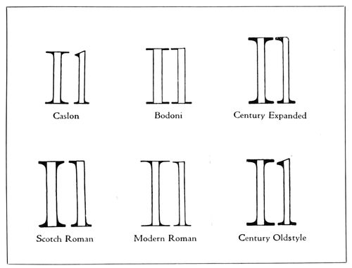
EXAMPLE 492 The black sections indicate the serifs, and show the differences in serif construction on several well-known type-faces. From Bullen
It is by the serif that in most cases old-style types are distinguished from the so-called modern Romans. An interesting demonstration of this was made by Henry L. Bullen with Century Expanded, a modern Roman (Example 494). The first line shows the letter unchanged. As the serifs in most old-style faces project diagonally, he, in the second line, altered the modern serifs to conform to this idea. The third line shows Century Oldstyle as it actually appears in type.
There is, of course, more to a true old-style face than mere change of serifs, and in the actual cutting of the types other minor alterations were made, as will be seen by study of the third line.
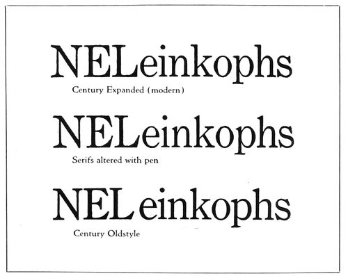
EXAMPLE 494 By altering the serifs “modern” type is changed into “old-style.” From Bullen
184

EXAMPLE 496 In most Roman alphabets all vertical strokes are thick, excepting in M, N, U. Horizontal strokes are thin. Diagonal strokes running down from left to right are thick and from right to left are thin, excepting Z, z.
This process was reversed by Mr. Bullen, and in Example 493 certain serifs of Caslon Oldstyle are in the letters i, n, k, p, h made horizontal, and in the letters E, L, s made vertical. Modernized in this manner, Caslon Oldstyle resembles Scotch Roman (Example 484-C).
Thick and Thin Strokes.—The inbred good taste and instinct for beauty possessed by the Roman calligrapher which directed him to add the serif to his lettering also impelled him to vary the width of the strokes (Example 464-A).
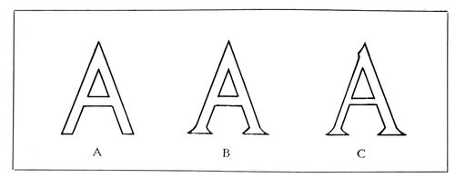
EXAMPLE 497 (A) No serifs or stroke contrast. (B) Serifs added. (C) With serifs and thick and thin strokes
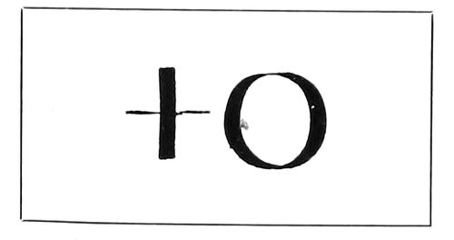
EXAMPLE 498 Vertical thick strokes were made with pen held straight
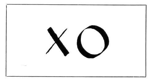
EXAMPLE 499 Diagonal thick strokes were made with pen held at a slant
The most uninteresting kind of lettering is that which is not only serifless but without contrast in the width of its strokes—lettering that is known to the printer as Block, or Gothic (Example 497-A). Dignity and something of good looks are given to it by adding serifs (Example 497-b), yet it is not eligible for admission to the select society of pure Roman type-faces until the various strokes show, properly proportioned, a difference in thickness (Example 497-C). The difference should be at least as two to one. It is about that in Cloister Oldstyle, but in Baskerville Roman (Example 496) it is as six to one. When the difference in thick and thin lines is exaggerated, as was done in the nineteenth century, the result is a caricature and type that is almost impossible to read, even in large sizes.
EXAMPLE 500 Heavy strokes in the lower left and upper right part of curves
EXAMPLE 501 Heavy strokes in vertical positions
Generally the distribution of thick and thin lines in Roman letters, as shown in Example 496, is as follows: All vertical strokes are thick (excepting in M, N, U). Horizontal strokes are thin. Diagonal strokes running down from left to right are thick, and from right to left are thin (excepting Z, z).
When this rule is reversed, as was actually done by a nineteenth-century typefounder in a weird attempt at novelty, there is begotten a monstrosity. Good typography requires that basic principles be adhered to.
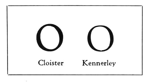
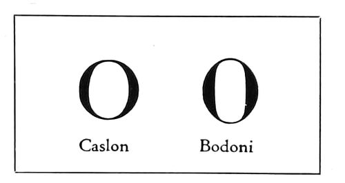
In the recent recutting of the Roman type-face of Nicholas Jenson, the founders went all the way back to his type for their models, and did not content themselves, as they did near the end of the last century, with copying Morris’s type or the faces of other foundries. As Jenson based the design of his types closely on Italian manuscripts, we have in such a face as Cloister Oldstyle many of the characteristics of the pen-made letters, one of which is the position of the thick strokes on round letters. The thick strokes on the O, as an instance, instead of being vertical, are diagonal. This is due to the manner of holding the pen when lettering. When held to write vertically and horizontally, the pen makes lines as in Example 498; when held at a slant, the pen makes thick lines diagonally as in Example 499. The Caroline Minuscules, upon which the lower-case types of Jenson were based, were written with a slanted pen.
In Example 500 are to be seen two well-known type-faces on which the slanted-pen thick strokes are used. In Example 501 are two faces that could be made by writing vertically. It was Mr. Goudy who reintroduced into type forms a characteristic of Jenson’s Roman—that of having the lower serifs extend more to the right than to the left, as shown by Example 495-B.
Ascenders and Descenders.—Not a little of the beauty of Roman type-faces lies in the ascending and descending strokes, and one reason why our types are becoming more beautiful is that we are going thru a period of restoration—the long-missing ascenders and descenders are being given back to us, after an absence of many years.
What should be the length of these strokes? Edward Johnston, in “Writing and Illuminating and Lettering,” illustrates this point (Example 503), and says: “The lines in massed writing are kept as close together as is compatible with legibility. The usual distance apart of the writing lines is about three times the hight of the letter o. The descending strokes of the upper line must clear the ascending strokes of the lower line.”
Bodoni, the Italian typefounder, had a system of measurement for the proportions of his lower-case letters: “Divide the body of the type into seven parts and let two at the top and two at the bottom be for the ascenders and descenders and the three in the middle for the other letters.”
The ascenders and descenders, as found in Cloister Oldstyle and in the original Caslon Oldstyle, approximate the proportions given by Bodoni.
Half the letters of the lower-case alphabet—thirteen—are 185of the hight of the o, and we will call them the small letters. The letters with ascending strokes number eight, with descending strokes five (Example 502). Because the descending letters are only five in number, they are most frequently picked out for mutilation. This sawing off of a portion of the descending strokes cripples the letters just as the sawing off of a portion of a man’s legs cripples his body. Not only is typography made imperfect by missing descenders, but, generally, the practice has worked toward the degeneration of type print, making it less easy to read, as the lines set too close together. When the descenders are of proper length they maintain a strip of blank space between lines, but when they are cut off the printer must add leads to recover the space—which he seldom does.
The printer and user of typography have been using false logic in favoring type-faces that have descenders cut off. They think they are getting more for their money when they obtain a normal twelve-point type-face on an eleven-point body, but as the one-point linear space must be restored by leading, there is nothing gained. Scientists, in the study of eye hygiene, have ascertained that a certain amount of space between lines is necessary to save eyestrain, and the descenders are essential in furnishing some of this needed space.
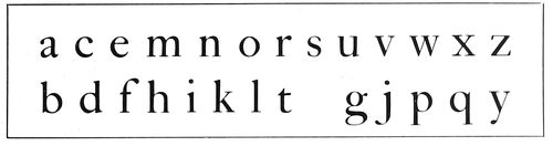
EXAMPLE 502 Of the twenty-six letters of the alphabet, eight have ascending strokes, five have descending strokes, and thirteen have neither
The descending curves of the lower-case g are a thing of beauty when allowed freedom (Example 504-A), but on the shortened plan they resemble a man cramped with rheumatism, in need of crutches.
Proportion of Letters.—One of the elements in the beauty of the ancient Roman stone-carved alphabet is the proportion of its letters. Goudy, drawing lettering and designing type-faces modeled after the inscription capitals of the Romans, has had a large influence in reviving good proportion in type. Cloister Oldstyle (Example 467-A), designed by L. M. Benton after Jenson’s letter, is an excellent study of the old proportions introduced in present-day type-faces. However, there is no type that has the beauty of proportion to be found in the Roman capitals (Example 464-A) reproduced from an inscription on the Trajan column at Rome. The author has endeavored, in plain lines, to trace these capitals and show their proportions on a background of squares. It will be seen that the width of the letters B, E, F, L, P, S is less than half their hight, and about half the width of O, M, Q, C, G and D. It is this contrast in width as well as in shape that makes the alphabet as a whole so pleasing.
Comparison of the capitals of the six standard faces in Example 467 will show that “old-style” faces tend toward the old Roman proportions and that “modern” types, such as Bodoni Book and Century Expanded (Example 466-B), reveal an effort to make the capitals as uniform in size as possible. Typewriter types are an example of what happens when this idea of uniformity is carried to its logical end. It is really not necessary to throw Beauty out of the back door as Utility is admitted at the front. Both can live happily under the same roof.
As will be seen by Example 507, the lower-case letters are made up of a variety of curved lines, and vertical, horizontal and diagonal strokes, the purpose being the same as that of having capitals of different widths, to make them when joined together in words readable and pleasant to look at. The word “minimum” is an example of unpleasant monotony in the repetition of similar forms.
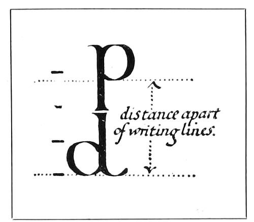
EXAMPLE 503 In good lettering, the descending strokes are as long as the ascending strokes. From Johnston
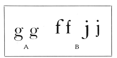
EXAMPLE 504 (A) How descenders are frequently cramped. (B) Compression of upper or lower ends of letters as found in “improved” Caslon Oldstyle
Legibility of Type-Faces
Type matter should be easy to read, and this end is attained not only in the designing of type-faces but in the manner of their use.
Many tests for legibility have been made in this country and in Europe, but none of them, so far as the writer knows, has considered the manner of printing the types and the character of the paper surface as factors in legibility, altho glossy paper has been condemned because of its reflection of light, and cream-white paper preferred to blue-white. There is shown as Example 463 a test made in the printing of the same type-faces on a hard-finished paper and on a soft-finished paper. The Caslon and Bodoni types are not only more legible on the soft-finished stock, but the character of the designs is brought out. The results of this demonstration should not be wondered at, as the original Caslon and Bodoni types were intended to be printed on soft-finished stock, and not on highly calendered coated paper.
Studies in legibility are presented in Example 508. As there are many details that count in the production of good-looking typography, so there are seeming trifles which go to make typography easily read. In “A” there are groups set in Cheltenham Oldstyle and Cloister Oldstyle. As Cheltenham is narrower in form and closely set, it is more suitable for long, narrow pages or columns. Cloister, on the other hand, conforms better to wider pages and columns. In lighter types (B) Bodoni Book and Caslon Oldstyle are similarly compared. For further illustrations of this point see Examples 509 and 510.
One of the tests previously referred to proved Gothic (C) the most legible type-face. This unshaded, serifless type, which has long been popular on sales bills and for advertisements in some newspapers and trade publications, is not approved by those who believe there should also be character in type-faces, as it lacks the two essentials of typographic beauty—serifs and contrasting thickness of strokes. Then, again, it is not as legible in the mass as in single lines.
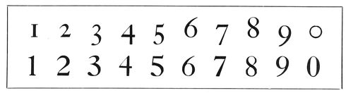
EXAMPLE 505 In the old-style Arabic numerals, five figures descended, two ascended and three did neither. The modern style is to have them of one hight
While bold-face types, especially those with decided 186contrasts in thickness of strokes, are legible when used in groups of two to a half-dozen words, they greatly tire the eye when used for entire pages of text. For this reason Bodoni Book is to be preferred over Bodoni for text purposes (D). The writer came to this conclusion when, during the reading of a book set in Bodoni, he found it necessary frequently to stop because of eye fatigue produced by the sharp contrasts and bewildering medley of light and shade.
It is generally conceded by authorities that lower-case types in the same size of letter are more legible than capitals (E) and should be used for headings and for display lines in advertising matter, where easy reading is essential.
Assuming that the largest possible face on the smallest possible type body results in legibility and allows more matter on a page, both users and makers of type have in many fonts caused the descending and ascending strokes to be shortened. The lower-case letters g, j, p, q and y have been the principal sufferers, as they are the only ones with descending strokes. The ascending strokes of letters b, d, f, h, k and l have been treated with more respect, and their principal ancestor, the Caroline Minuscule, would not have so much difficulty in recognizing them.
The left portion of section F of Example 508 shows what this practice has done to Caslon Oldstyle. It has also affected legibility by lessening the space between lines (see also Example 509), and reading, already difficult, is made still more so by the excess space that careless hand compositors and “speedy” machine operators place between words.
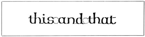
EXAMPLE 506 The space between words in good lettering, according to Johnston, is less than the width of letter “o” (lower-case)
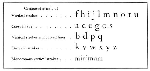
EXAMPLE 507 The lower-case letters grouped according to formation. As generally mixed in various combinations, distinctive word groups are formed. The word “minimum” is an exception
Space Between Words.—The eyes can, in the same space of time, read many more words if the words are narrowly spaced than if they are widely spaced. The early printers knew this and set type accordingly. When lower-case letters are widely spaced one letter must be read at a time (508-I). When words are widely spaced one word must be read at a time. A person accustomed to reading reads by thoughts—groups of words or sentences. Even in the schools they are discarding the long-used method of teaching the A-B-Cs, and instead of at first learning each letter separately, the child learns to know words by their formation and to read by word groups.
The present prevalence of wide spacing in the composition of books, catalogs, pamphlets, periodicals and newspapers is a legacy from the ante-machine period.
In hand-set days, job and book compositors, when they were called on to set so-called straight matter, were required to use great care in spacing. In the spacing out of a line the conscientious compositor would remove thick spaces and insert thin spaces rather than add much extra space between the words. The newspaper compositor, on the other hand—he usually being a piece worker—seldom thin-spaced, but liberally added space between words, especially on occasions when his “take” was to “meet” that of another compositor. When machine composition was introduced the spacing practices of the news-room hand compositor were passed along to the machine, with the result that today a page of machine matter set in the average careless way shows open spaces running irregularly down the page, resembling a trench map of a modern battlefield.
Close spacing and the resultant neat and readable appearance of the page are possible in machine composition, as many users of these machines are obtaining such results; but the general standard, due not a little to the demand for rapidity and somewhat to ignorance of the fundamentals of good typography, is humiliatingly low.
The design and form of the type-face, of course, determine the amount of space between words. Johnston tells letterers that “the average space between two words is less than the width of the letter o.” Example 506 is illustrative.
A newspaper editor some years ago asked the hand compositors to thin-space, as there was a great deal of copy that day, whereupon the printers all laughed in ridicule of the lay notion that such a procedure would be of much use. That the request was not such an impractical one was recently borne out by an experience of a periodical publisher, who, on the machines in his own shop, produced close-spaced matter. In an emergency an outside machine-composition house was called on to set a part of the copy. When the work of making up was completed, it was found that there were several galleys of matter that could not be used, altho there was no more copy than usual. By again referring to Example 508-F it will be seen that in the left group spacing between words is lavish, while in the right group there is no waste of such spacing. Altho there is more space between the lines of the right group, it contains three more words than the left group.
In the lower part of Example 508 is the word “Typography” set in small six-point, and near the word is the lone letter a, same size. It is difficult for a person without excellent eyesight to identify the small six-point “a,” but he can more easily and as quickly read the word made in the same size from ten letters. When the letters of the word “Typography” are widely spaced (even in larger size, as shown) they must be read one letter at a time, but when closely assembled they can be seen at a glance and read ten times as rapidly.
An experienced proofreader does not read a galley letter by letter, but recognizes a wrong type because the natural formation of the word has been broken.
Carrying the experiment further, place in “open formation” the words “Art and Practice of Typography,” and they must be read slowly one word at a time, but group the words closely, as has been done in the lower left of the same Example 508, and the entire group of words can be read practically at a glance. Just as an illiterate person laboriously reads letter by letter, a young child beginning to read will see only one word at a time. While on rudimentary primers the words should be isolated, there is no necessity for wide spacing between words in text matter intended for adults.
187
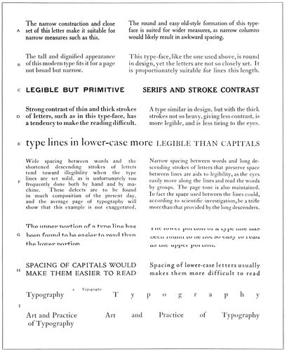
EXAMPLE 508 Legibility and other qualities illustrated
Length of Lines.—This leads to consideration of the effect length of lines has on reading.
The Board of Education of the city of New York disqualifies textbooks in which the length of line is more than 100 millimeters (about twenty-four picas, or four inches). The maximum length of line recommended by the British Association for the Advancement of Science in 1912 is about the same. Professor Huey, in “The Psychology and Pedagogy of Reading” (1907), says: “There is a general consensus in favor of the shorter as against the longer lines, with a tendency to favor 90 millimeters as a maximum, some placing the maximum at 100 millimeters.” Dr. Javal, the French oculist, who thirty-five years ago made tests in typography, believes the maximum should be considerably below 90 millimeters (about 21 picas).
It would be well, in order to arrive somewhere in determining 188the proper length of line, to consider the size and kind of type that makes up the line.
The author asks consideration of Examples 509 and 510. The length of line is limited by authorities because the eye finds it difficult to read a long line of comparatively small type. Isn’t it true that healthy eyes can read a line of type twelve inches long set in fifty-four-point Caslon Oldstyle, say, with the same ease as a line four inches long set in eighteen-point Caslon Oldstyle?
By the same reasoning, the line of twelve-point Caslon Oldstyle set three inches wide (Example 509) is as easily read, after the eyes are focused on it, as the line of eighteen-point Caslon set four inches wide.
The author suggests, then, that the proper length of type lines be ascertained by measuring one-and-a-half alphabets of the lower-case of the desired type, as is demonstrated in Example 510.
Let us try out the top group—Caslon Oldstyle. (This type-face seems smaller, according to body sizes, than Scotch Roman, for the reason that its descending strokes have not been cut off, while those of the Scotch Roman group have been shortened; but of this more later.)
A lower-case alphabet-and-a-half of twelve-point Caslon Oldstyle (with long descenders) measures 17½ picas in length, as will be seen in Example 510. How it appears set in words in two lines of the same measure is to be seen in the upper part of Example 509. According to the working out of the plan, 17½ picas is the ideal length of line for books using this twelve-point type. By referring back to Example 127 in the chapter on “Books,” the theory will be found borne out in practical use on a model book page.
Testing the length of lines by reading (Example 509), it will be found, if the distance between the eyes and book is lengthened as the sizes grow larger, that the line is short enough not to necessitate a hunt for the beginning of the second line after the first is read.
The optical disadvantage of using in one piece of printing type-faces of any great contrast in sizes may be proved by focusing the eyes so as easily to read the eighteen-point size and then changing quickly to the eight-point size, attempting to read the latter without again focusing the eyes to fit the smaller type.
There is a technical as well as an optical reason for determining the length of line by measurement of the types themselves. It will be seen by Example 509 that the copy adjusts itself to the various lengths of lines, or, in the vernacular of the printer, “works out line for line.” If fourteen-point type, instead of twelve-point type, were set in lines measuring fifteen picas in length, the compositor would have more difficulty in adjusting the spaces between words, as these spacing points would number two less. This difficulty is usually solved by regrettable wide spacing between words or more regrettable spacing between letters.
Testing types used on newspapers, selecting for the purpose the most used newspaper linotype face (see lower part of Example 510), we find that the length of line for six-point should be thirteen picas and for seven-point fourteen picas. As actually used in newspapers, the length of line is usually twelve and a half or thirteen picas.
Approved Type Sizes and Space Between Lines.—The type in the upper part of Example 509 also illustrates the sizes of type and the amount of space between type lines that investigators have determined are minimum for use on schoolbooks.
Dr. Cohn, whose findings in these matters have been practically indorsed by educational boards and writers on school hygiene, stipulates that for first-year school children the vertical measurement of the lower-case o should be at least 2.6 millimeters, with space between lines (measuring vertically between a lower-case o in one line and a lower-case o in the line above or below) of 4.5 millimeters. Twenty-two-point Caslon Oldstyle, with long descenders (not shown here), conforms to these measurements.
For the second and third years, the measurement of the o should be at least 2 millimeters, with space between lines of 4 millimeters. Eighteen-point Caslon Oldstyle, with long descenders (as shown in Example 509), conforms to these measurements.
The fourteen-point size meets the requirements for the fourth school year—at least 1.8 millimeters, with space between lines of 3.6 millimeters.
After the fourth school year the type should measure not less than 1.6 millimeters, with space between lines of 3 millimeters, to which twelve-point Caslon Oldstyle, with long descenders, conforms.
The descending strokes are sufficiently long in the eighteen-point size to maintain between the lines of type the amount of spacing stipulated by Dr. Cohn, but in the fourteen-point size it was necessary to add a two-point lead and in the twelve-point size a one-point lead.
In comparing one font of type with another, it is not accurate to compare, say, eleven-point with eleven-point. Not infrequently one type-face has been pronounced more readable than another, when the preferred type-face was really a twelve-point face on an eleven-point body, with the descending strokes mutilated to allow for such an arrangement. The faces should be compared by the Cohn method given above.
The panel inserted in Example 509 is illustrative.
The three letters (Hdp) at the left are twenty-four-point “lining” Caslon; the three letters (Hdp) at the right are thirty-point Caslon Oldstyle No. 471. The economical printer too often prefers the “lining” fonts, as he does not need to buy waste (?) metal. It is the same sort of reasoning that sees in the park spaces of the cities real-estate waste.
The laws of compensation in good typography require, where one point or two points or more are unwisely removed by shortening descenders, that these points shall be restored by leading. So where is the gain by mutilation?
Italic Types
Italic, the graceful, inclined, feminine type that is now mated with most Roman types, was not known by Jenson or his contemporaries. It made its appearance for the first time in 1501 on a book printed and published at Venice, Italy, by Aldus Manutius. In that volume, an edition of Virgil, Aldus gave credit for the cutting of the face to “Francia of Bologna,” who has since been identified as the great painter and contemporary of Leonardo da Vinci.
The legend has been passed along for many years that Italic was fashioned after the handwriting of the Italian poet Petrarch, but specimens of his handwriting do not bear the proper resemblance, and there are now those who scoff at the story.
However, the Aldus Italic is not, as one writer declares, merely an inclined Roman. As it has been recut by the American Type Founders Company and mated with Cloister, the recut Roman letter of Jenson, there is opportunity to compare Italic and Roman lower-case, which is done in Example 515. It will be seen that, while there is a family resemblance, there are many differences other than that of mere inclination. Italic capitals, however, are inclined Roman letters, but it should be remembered that Aldus and Francia did not make or use Italic capitals, but that with the slanting lower-case letters Aldus used small Roman capitals. Example 513 shows how this was done, and this example, by the way, is a resetting in 189Cloister Italic and Roman small capitals of the Aldus page, reproduced on page 15 of the chapter on “The Spread of Typography.” In that chapter are included further facts about this famous printer.
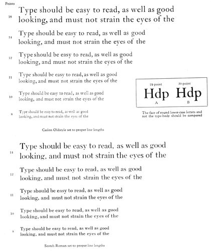
EXAMPLE 509 The various sizes of type set to lengths determined by measuring as in Example 510. Also showing the space between lines needed for easy reading. The size of type-face and space between lines of the eighteen-point, fourteen-point and twelve-point of the Caslon group have been authoritatively recommended for schoolbook printing (Read page 188)
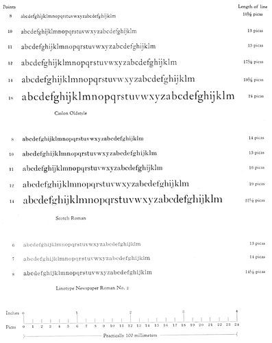
EXAMPLE 510 Ascertaining the proper optical length of line by measuring a lower-case alphabet-and-a-half of each size and style of type. This method furnishes a practical rule for determining lengths of line. (Read pages 187 and 188.) The accompanying scales may be used for measurements
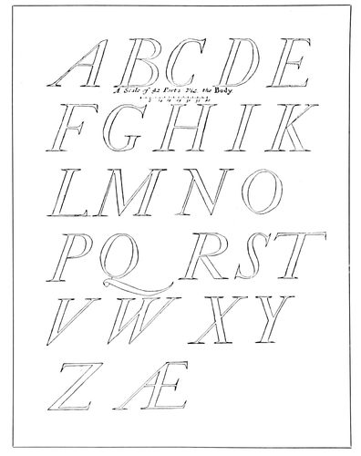
EXAMPLE 511 Moxon’s Italic capitals of 1676
Examples 511, 512 and 514 are reproductions of Moxon’s drawings (1676) of the Italic types of a Dutch punch cutter. They show the character of Italic used in the seventeenth century. The long s of that time is included in Example 512, and Example 514 shows the decorated Italic capitals that we know as “Swash letters.”
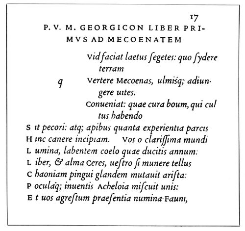
EXAMPLE 513 Resetting in Cloister types of an example on page 15 of this book of the original Italic types of Aldus and Francia
Swash Italic capitals and the old-style long s are to be had with Caslon Oldstyle. See Example 517. The Italic mates of a few of the present-day Romans are shown in Example 516.
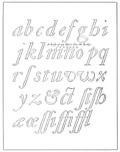
EXAMPLE 512 The Italic lower-case of Moxon, with long “s” (ſ)
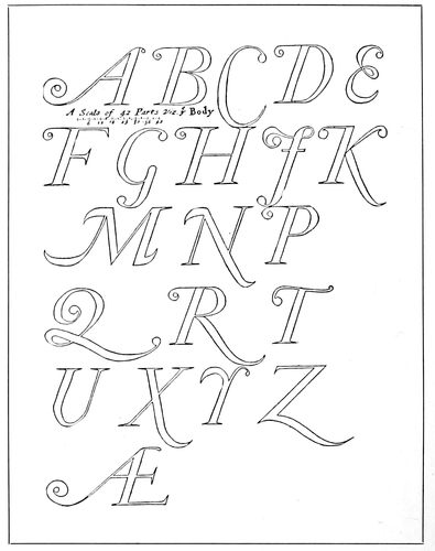
EXAMPLE 514 Decorated capitals, or Swash letters, as drawn by Moxon from Dutch sources
190
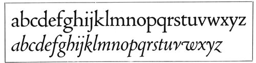
EXAMPLE 515 The first Italic was not made merely by inclining the Roman lower-case letters. Cloister Oldstyle (upper line) is modeled after one of the first Roman types, that of Jenson, cut in 1470. Cloister Italic is modeled after the first Italic type of Aldus and Francia, 1501
Italic types, besides the instances previously mentioned, may be seen in use on pages 17, 18, 19, 20, 22, 23, 24, 25, 26, 32, and in Examples 45, 98, 100, 128, 138, 139, 144, 152, 158, 168, 169, 170, 171, 180, 185, 191, 215, 222, 223, 224, 232, 240, 245, 246, 250, 262, 282, 292, 294, 297, 299, 310, 311, 313, 314, 315, 316, 325, 326, 329, 331, 332, 336, 342, 343, 345, 346, 349, 363, 372, 374, 375, 384, 387, 390, 394, 396, 398, 399, 401, 402, 404, 405, 406, 412, 413, 414, 418, 420, 423, 424, 426, 428, 429, 472, 477, 481 and 483.
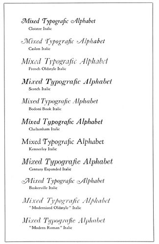
EXAMPLE 516 A few Italic type-faces
Text Types
Gutenberg and other German printers who followed him fashioned their type-faces after Black Letter, the formal writing of the German scribes, as Jenson fashioned his type-face after White Letter, the formal writing of the Italian scribes. The White Letter of Jenson grew into the Roman types that today are used almost exclusively in France, England and Italy and in our own country, while Black Letter developed into the German types that are almost exclusively used in the German Empire. As this is being written, the Great War is being fought. America has just entered it, and it is a coincidence that the countries favoring White Letter are on one side in the struggle and the countries favoring Black Letter on the other side. The years that follow the war may see, so far as general reading purposes are concerned, the gradual elimination of the letter we know as Text and the largely increased use of Roman characters in the books and newspapers of all races. The Germans are already favoring a Roman half Text in character (Example 521).