Chapter II · On the Law of Simultaneous Contrast of Colours in relation to Paper-Hangings with Figures, Landscapes, or large Flowers of varied Colours.
John Spanton translation
376. The study which I recommend to artists occupied in fabricating paper-hangings, is in some measure that immediately applicable to every pictorial composition, or, in other words, the tapestry of figures and landscapes. But, whatever be the merit of paper-hangings of this category, they are not sought by persons of refined taste, and they do not appear to me destined to be any more so in future, for the twofold reason that the taste for arabesques, painted upon walls, or upon wood, and that for lithographs, engravings, and paintings, is spreading every day. These last three objects exclude, at least, all those papers with figures and coloured landscapes.
377. The applications of the law of contrast to this class of paper-hangings are easy, when we thoroughly understand the divisions of the book to which I referred above. In order to prove the advantage to be derived from the knowledge of this law, I need only refer to the bad effect presented by contiguous bands of two tones of the same scale of grey (serving as the ground to the figure of an infant), in consequence of the contrast of tone arising from their juxtaposition (321).
378. On the Law of Simultaneous Contrast of Colours in relation to Paper-hangings with Designs in a Single Colour, or in Colours but slightly varied.
The remarks in 372 are applicable here also, as are those of 374. The best executed, and in the best taste, are those with black figures, or of figures much darker than the ground.
Paper-hangings, I do not say the most tasteful, but those most convenient for use, present very light grounds, with white or grey figures.
379. Grey patterns, upon papers tinted of a light colour, exhibit the phenomenon of maximum contrast; that is to say, the grey appears coloured with the complementary of the ground.
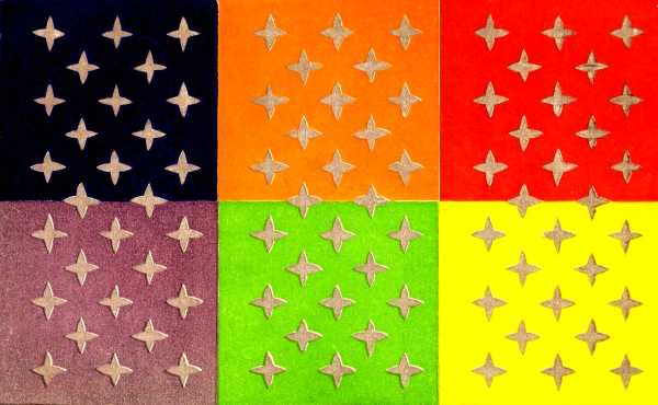
PLATE XIV.
Thus, conformably to the law, (Plate 14)
Grey patterns upon a Rose ground appear Green.
” ” ” an Orange ” ” Blue.
” ” ” a Yellow ” ” Violet or Lilac.
” ” ” a Green ” ” Rose.
” ” ” a Blue ” ” Orange-grey.
” ” ” a Violet ” ” Yellow.
380. I mention these examples to instruct artists, for, in manufactories of paper-hangings, disputes arise between the proprietors and the preparers of the colours. For instance, a few years ago, the proprietors of one of the first manufactories in Paris, wishing to print grey patterns upon grounds of apple green and of rose, refused to believe that his colour preparer had given any grey to the printer, because the designs printed on these grounds appeared coloured with the complementaries of the colour of the ground. It was only when the colour preparer, having attended a lecture I gave for M. Vauquelin, at the Museum of Natural History, and hearing me speak of the mistakes that these contrasts of colours might occasion, suspected the cause of the effects which he had unconsciously produced, and which had really caused him much annoyance.
OF THE LAW OF SIMULTANEOUS CONTRAST OF COLOURS RELATIVELY TO THE BORDERS OF PAPER-HANGINGS.
381. Every paper of one colour, or one belonging to the second category, should receive a border generally darker and more complex in design and colour than the paper which it frames.
The assortment of two papers exercises a very great influence on the effects they are capable of producing; for each of them may be of a fine colour, ornamented with designs in the best taste, yet their effect will be mediocre, or even bad, because the assortment will not be conformable to the law of contrast.
382. The ground of a border contributes greatly to the beauty of the pattern, whether this be of flowers, ornaments, or any other object. As we cannot treat of this influence in an absolute or methodical manner, I shall select a certain number of remarkable facts which I have had occasion to observe, and I shall principally dwell on those from which we can deduce conclusions, which, apparently not flowing from previous observation, might escape many readers, in spite of the great interest they have in knowing them. Besides, the exhibition of these facts will give me occasion to apply the law of contrast to designs presenting many tones of the same scale, and of different hues, and also often of different scales, more or less distant from each other. I shall not treat of simple borders, presenting black or grey designs upon a uniform ground, for I have already spoken of the modifications which in this case black designs undergo (374), and grey designs also (379).
383. The design of a border, either of ornaments, flowers, or any other object, being cut out and pasted upon a white card, designs identical with the preceding, which had been pasted upon cardboard, were then cut out, and placed upon grounds of black, red, orange, yellow, green, blue, and violet; then compared, not only by myself, but also by many persons whose eyes are much accustomed to seeing colours. When we had perfectly agreed upon their value, the results were noted as follows:—
1.—BORDER OF EIGHT INCHES IN HEIGHT, REPRESENTING GILT ORNAMENTS UPON DIFFERENT GROUNDS.
Plate 15.
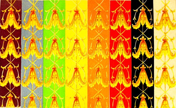
PLATE XV.
384. These ornaments, executed by the ordinary processes of paper-staining, contained no particle of metallic gold; yellow, lakes, and orange, of different tones and hues, had been exclusively employed in their production. After having stated the modifications which the painted gilt ornaments experience from the colour of the grounds, I shall indicate those which the metallic gilt ornaments receive comparatively from the same grounds; this comparison presenting results which appear to me interesting.
Black Ground.
385. Painted gilt ornaments placed upon black ground, compared with the same ornaments placed on a white ground, appear much more distinct than the latter; because the yellows and orange-yellows, colours eminently luminous, and the black ground, which reflects no light, give rise to contrast of tone, which the white ground, essentially luminous, cannot give with the colours which are themselves luminous. (See 53.)
We perceive thus, that the colours placed upon black are lowered in tone; but it must be noted that yellows and orange-yellows, far from being weakened (58), would only cause the black to gain in purity.
In considering more particularly the effects of two grounds, we see that a black imparts a red to the ornaments, and it is important to remark that the brightness of this red, instead of reddening the yellows, really gilds them. (See 394.)
We may thus understand how black, in taking away some grey, imparts brilliancy, and how this grey, which may be considered as a tarnished or subdued blue, may, with yellow, produce an olive colour. It is also necessary to remark, that the gilt ornaments in question present an olive-grey tint, which, far from being diminished by the white ground, is exalted by it.
Although the black ground lowers the tone of the colours, while white heightens them, it lowers yellow more in proportion than red, and consequently renders the ornaments redder than they appear upon a white ground; and, in taking away the grey, it purifies the colours, and acts also by giving them some red, or by taking away some green.
Metallic Gilt Ornaments.
386. Gilt ornaments stand out better from black than from white, but the orange colour is weakened and really impoverished. The black ground then does not purify the real gilt ornaments as it does the painted imitation of gold.
Deep Red Ground.
The yellows are more luminous, the whole effect with the painted ornament is clearer, more brilliant, less grey than upon a white ground.
Red much deeper than the ornament, lowers the tone of it; and this effect is also augmented by the addition of its complementary, green, a bright colour.
This example is of much importance, enabling us to see how the red, which appears as though it could be of but little advantage to ornaments, because it tends to weaken them by making them greener, is notwithstanding favourable, because the lightening or weakening of the colour is more than compensated for by the brilliancy of the complementary of the ground which is added to the yellow. We shall return to this effect in a moment. There is this analogy between the influence of the red ground and that of the black ground, that the tone of the colour is lowered; but there is this difference, that the ornaments become green on the first, while they become orange upon the second.
387. The red ground is not so advantageous for gilt ornaments as it is for the painted imitations of them, because the metal loses too much of its orange colour, and appears inferior to gold upon a black ground.
The red ground appears darker, and more violet than the ground upon which painted ornaments are placed.
Grounds of a light-red are still less favourable to the gold than red grounds of a dark tone.
Orange Ground deeper than the Ornaments.
388. The painted ornaments are bluer or rather greener than upon a white ground. The yellow and orange are singularly lower in tone.
This ground, then, is very disadvantageous to ornaments, as might have been expected.
389. Orange is not favourable to metallic gilt. The metal becomes too white, while the orange ground is redder and more vivid than that upon which the painted ornaments are placed.
Yellow Ground of Chromate of Lead more brilliant than the Yellow of the Ornaments.
390. The yellow of the painted ornaments is excessively enfeebled by the complementary of the ground which is added to it, the ornaments appear grey in comparison with those upon a white ground.
391. The yellow ground is not so unfavourable to gilt ornaments as it is to painted ones. The first assortment may, in certain cases, be recommended.
The yellow appears more intense, and perhaps greener.
Bright Green Ground.
392. Painted ornaments are darker upon a bright green ground than upon a red or white ground. They have acquired some red, but not the brilliant tint which is given to them by black—it is a brick-red tint.
393. It follows from the comparison of the effects of ornaments upon red and upon green grounds, that the first is much more advantageous than the second, because it adds an essentially brilliant tint to the colour of the ornaments, while the latter, adding red, or taking away green, produces a brick-red.
394. Upon a bright green ground, metallic gilt ornaments acquire red, as the painted ornaments do, while the red, not sensibly diminishing the brilliancy of the metal, but, on the contrary, augmenting the intensity of its colour, produces an excellent effect.
The green ground is more intense and bluer than the same ground upon which the painted ornaments are placed.
395. The study of the effects of red and of green grounds upon painted ornaments, on the one hand, and upon gilt ornaments on the other, is extremely interesting to paperstainers and decorators; it demonstrates to them the necessity of taking into consideration, in the juxtaposition of bodies which it is proposed to associate, the brilliancy which these bodies naturally possess, and the brilliancy we wish to impart to them, if they have none. The preceding examples (386, 394) explain why the paperstainer will choose dark red instead of green for his gilt ornaments, and why a decorator will prefer green to red for the colour of the hangings of a show-room of gilt bronzes, gilt clocks, &c.
Blue Ground.
396. Observation agrees perfectly with the law that it is really upon a blue ground, that painted ornaments, whose dominant colour is the complementary of blue, show themselves to the greatest advantage with respect to intensity of the gold-yellow colour. This effect more than compensates for the slight difference which may result from the red ground giving a little more brilliancy. The ornaments upon the latter ground, compared with those on the blue, are less coloured and appear whiter.
With metallic gilt ornaments the blue ground is deeper and less violet than with painted ornaments.
Violet Ground.
397. Conformably to the law, the violet ground giving greenish-yellow to the painted ornaments, is favourable to them; they appear on this ground less olive-grey, more brilliant than upon the white ground, and less green than upon the red ground.
Metallic gilt ornaments stand out quite as well, the ground is raised in tone, and the violet appears bluer or less red.
398. It is remarkable that gilt ornaments, compared with their painted imitations, heighten all the grounds upon which they are placed. We cannot say that this metal causes the grounds to lose their brilliancy, for orange gaining some red, by the juxtaposition of the gold, appears, nevertheless, more brilliant than the orange in juxtaposition with the painted ornaments. The gold, by its orange colour, gives also some blue, its complementary, to bodies which surround it.
2.—BORDER OF FOUR INCHES IN BREADTH PRESENTING ORNAMENTS COMPOSED OF FESTOONS OF BLUE FLOWERS, OF WHICH THE EXTREMITIES ARE HELD BY GREY LEAVES OF ARABESQUES.
Plate 16.
399. These ornaments are opposed in some respects to the preceding by their dominant colour, which is blue.
Black Ground.
400. Grey lowered three tones in comparison with grey; upon white less reddened.
Blue flowers lowered two tones at least.
Red Ground.
401. The grey is greenish, while upon white it is reddish.
The blue flowers are lowered three tones, and the blue inclines to green.
Orange Ground.
402. Grey much lowered; less red than upon white. Flowers paler, and of a blue less red or less violet, than upon a white ground.
Yellow Ground.
403. Grey higher than upon white ground, more violet.
Flowers of a more violet-blue, less green than upon a white ground.
Green Ground.
404. The grey is reddish, while upon a white ground it appears greenish.
The blue gains red or violet, but it loses much of its vivacity; it resembles some blues of the silk-vat, which, giving yellow to the water, become slaty-blue-violet.
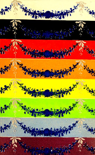
PLATE XVI.
Blue Ground.
405. The blue ground being fresher than that of the ornament, it follows that it gives orange to the blue of the flowers; that is to say, it greys them in the most disagreeable manner.
The grey ornament is oranged, and lighter than upon the white ground.
Violet Ground.
406. Grey lowered, yellowed, impoverished. Blue tends to green, and is impoverished.
3.—BORDER OF FIVE INCHES AND A HALF IN BREADTH, REPRESENTING ROSES WITH THEIR LEAVES.
Plate 17.
407. This border is particularly useful as an example of the effect of two colours, red and green, which are very common in the vegetable world, and often represented upon paper-hangings.
Black Ground.
The green is less black, lighter, fresher, and purer, and its brown tones redder than upon a white ground. With respect to its lighter tones, I see them yellower, while, on the contrary, they appeared bluer to three persons accustomed to observe colours. This difference, as I at last found, arose from my comparing the general effect of leaves upon a black ground with that of leaves upon a white ground; while the other persons instituted their comparison more particularly upon the browns and the light tones of green, placed upon the same ground. This difference in the manner of seeing the same objects will be the subject of some remarks hereafter.
Rose lighter, yellower than upon a white ground.
Dark Red Ground.
408. Green more beautiful, less black, lighter than upon a white ground.
Rose more lilac, perhaps, than upon a white ground. The good effect of the border upon this ground is due chiefly to the greatest part of the rose not being contiguous to red, but to green; because the border and the ground exhibit flowers, the rose of which contrasts with the green of their leaves; while the same green contrasts with the red of the ground, which is deeper and warmer than the colour of the flowers.
Orange Ground.
409. The green lighter, a little bluer than upon a white ground.
Red much more violet than upon a white ground.
The general effect not agreeable.
Yellow Ground.
410. Green bluer than upon a white ground.
Rose more violet, purer than upon a white ground.
The whole exhibits a good effect of contrast.
Green ground, the tone of which is nearly equal to that of the lights of the leaves, and the hue of which is a little bluer.
Green of the leaves lighter, yellower than upon a white ground.
Rose fresher, purer, more velvety than upon a white ground.
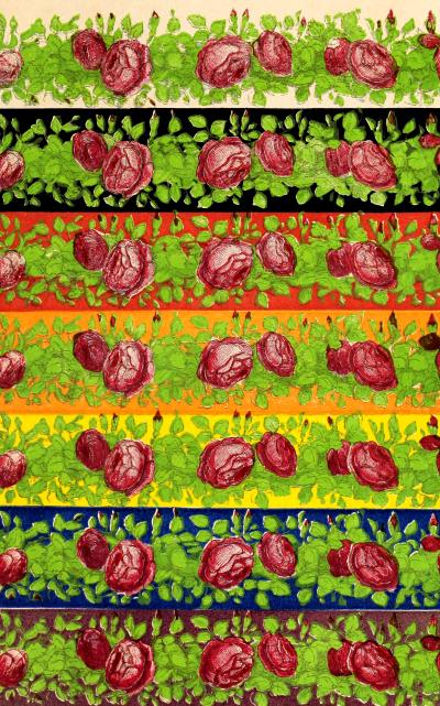
PLATE XVII.
Ground of an agreeable effect from harmony of analogy with the colour of the leaves, and from harmony of contrast with the rose of the flowers.
Blue Ground.
411. Green lighter, more golden than upon a white ground.
Rose yellower, less fresh than upon a white ground.
Although the green leaves do not exactly produce a bad effect upon the ground, yet the roses lose much of their freshness, and the appearance of the whole is not agreeable.
Violet Ground.
412. Green yellower, lighter than upon a white ground.
Rose faded.
If the ground does not injure the green of the leaves, yet it injures the rose so much that it is not agreeable.
4.—BORDER OF SIX INCHES IN BREADTH, REPRESENTING WHITE FLOWERS, AS CHINA ASTER, POPPY, LILY OF THE VALLEY, ROSES; SOME RED FLOWERS, AS THE ROSE-WALLFLOWER SOME SCARLET OR ORANGE, AS THE POPPY, POMEGRANATE, TULIP; BIGNONIA AND VIOLET FLOWERS, AS LILAC, VIOLETS, AND TULIPS WITH GREEN LEAVES.
413. This border was remarkable for the pleasing combinations of the flowers among themselves, and of the flowers with their leaves. In spite of the multiplicity of colours, and of the hues of red and violet, there was no disagreeable juxtaposition, except that of a pomegranate next to a rose; but the contact only took place at one point, and the two flowers were in very different positions.
Black Ground.
414. The whole lighter than upon a white ground.
Orange finer, brighter than upon a white ground.
White the same.
Green lighter, redder. The roses and the violets gain nothing from the black.
Red-Brown Ground.
415. The whole lighter than upon a white ground.
Whites and greens of fine effect. An orange-flower contiguous to the ground, for the reason explained above (407), acquires a brilliancy which it has not upon a white ground.
Orange Ground.
416. The whole more sombre, duller than upon a white ground. Orange-flowers and roses dull, lilacs bluer.
This assortment is not good.
Yellow Ground.
417. The orange-flower contiguous to the ground evidently loses vivacity in comparison with the white ground.
The whites are less beautiful than upon a red ground.
The greens are bluer than upon a white ground.
The roses become bluer, the violets acquire some brilliancy.
The whole effect is good, because there is but little yellow in the border, and but little orange contiguous to the ground.
Green Ground.
418. The ground being fresher than the green of the leaves, had not a good effect, relatively to them. On the other hand, the green in the border was in too small a quantity to produce a harmony of analogy, and it had not sufficient red for a harmony of contrast.
Blue Ground.
419. The oranges have a fine effect, the greens were reddened as well as the whites. The roses and the lilacs lost some of their freshness.
This arrangement did not produce a good effect, because there was not sufficient yellow or orange in the border.
Violet Ground.
420. Orange more beautiful than upon a white ground.
Roses, and violets especially, less beautiful than upon a white ground. A poor assortment.
Grey Ground.
421. As might be easily foreseen, this ground was extremely favourable to all the colours of the border.
422. The examination we have just made of four sorts of borders enables us to verify the exactness of the conclusions which are directly deducible from the law of simultaneous contrast of colours, and presents to us effects which we could scarcely have deduced from the same law without the aid of experiment. I now speak—
1. Of the influence which a complementary exercises by imparting brilliancy to the colour to which it is added.
2. Of the very different manner in which not only different people, but even the same person, will judge of the colours of a more or less complex pattern, having a certain number of colours, according to the attention the spectator gives at a certain moment to different parts (407).
423. Our examination of the border of roses with their leaves (No. 3), and especially of that of the border of flowers varied in their forms and hues (No. 4), shows the necessity of a knowledge of the law of contrast to assort the colours of objects represented upon a border with the colour which serves as a ground to them. The examination of the border No. 4 has demonstrated experimentally that this assortment presents so much the more difficulty as we wish to have purer tints for the ground, and more varied colours in the objects we intend placing on it; besides, in demonstrating the good effect of grey as a ground for these latter objects, it has furnished an example of a fact which may be deduced from the law, and which is in perfect accordance with what practice taught us long ago.
PRINTED OR WRITTEN CHARACTERS ON PAPERS OF DIFFERENT COLOURS.
424. Having made it a rule in this work never to state any observations which I have not myself verified, I must mention that, not possessing every requisite for the examination of the subject of this section, I am obliged to develop certain points of it only.
We must regard—
1. The duration of the reading, and
2. The kind of light which illuminates the printed or written paper.
A.—INFLUENCE OF DURATION IN THE READING.
425. From the different conditions in which the eyei s found when it is apt to perceive the phenomena of simultaneous, successive, and mixed contrasts of colours (77 et seq.), it may be conceived that in order to judge of the effect upon the sight of the assortments of the colour of the letters and that of the paper as to the degree of facility that they respectively present for reading, it may happen that one assortment will be more favourable during a brief reading, while the contrary will take place if the reading be prolonged during several hours. Besides, an assortment presenting the greatest contrast will be more favourable to a reading of short duration, while it will be less so to a prolonged reading; because, in consequence of the intensity of its contrast, it will fatigue the eye more.[2]
B.—INFLUENCE OF THE KIND OF LIGHT ON PRINTED OR WRITTEN PAPER.
426. The light we employ to supply the place of that of the sun, changing the relations of colour under which the same bodies appear to us illumined by daylight, it is evident that if we neglected this difference of relation it would give rise to error; because any assortment of colours favourable to read in diffused daylight, might be less so by the light of a lamp, &c.
427. I will now examine—
The influence of different assortments of the colours of writing and printing for reading by diffused daylight.
ON THE ASSORTMENT OF COLOURS FOR READING BY DIFFUSED DAYLIGHT.
Reading of a Few Minutes’ Duration.
428. Letters upon paper can be read without fatigue only when there is a marked contrast between the letters and the ground. This contrast may be of tone, or of colours, or both.
429. Contrast of tone is the most favourable condition for distinct vision, if we consider white and black as the two extremes of a scale, comprehending the gradations from normal grey; in fact, black letters upon a white ground present the maximum of contrast of tone, and may be read in a perfectly distinct manner without fatigue by diffused daylight. Indeed, all whose sight is enfeebled by age require the utmost contrast of tone.