THE PRESS AND ITS WORKING. (continued 2)
Reading edition
If the extremities are engraved much lighter than the central parts, underlays should be pasted on the middle of the block, which will give a firmer impression to the central parts of the subject. It would save trouble and aid in getting a good impression if the block were engraved a little rounded on the face.
When highly finished engravings on wood are worked separately, woollen cloth, however fine, should never be used for blankets, as it causes too much impression; a sheet or two of hard smooth paper between the tympans is better; sometimes even a piece of glazed pasteboard is used inside the outer tympan. The parchments ought to be in good condition, stretched tight, of a smooth surface, thin, and of regular thickness, so as to enable the pressman to obtain an impression as nearly as possible from the surface only of the engraved lines.
The rollers must be kept in perfect order; and the pressman should be very particular in taking ink and inking the block. He ought to use the best ink that can be procured.
When a wood-cut left on the press all night has become warped, lay it on its face upon the imposing-stone, with a few thicknesses of damp paper underneath it, and place over it the flat side of a planer, with sufficient weight upon it: in the course of a few hours the block will be restored to its original flatness. This method is preferable to steeping the block in water; as the steeping swells the lines of the engraving, and, consequently, affects the impression. To preserve the original effect of the cut as it came from the hands of the artist, the block should never be wet with water; and, when it has been worked in a form with types, it should be taken out before the form is washed.
To prevent warping during the dinner-hour or the night, turn the tympan down upon the form, run the carriage in, and, pulling the bar-handle home, fasten it so that it will remain in this position during the interim.
However long boxwood may be kept in the log, it will always twist and warp when cut into slices for engraving, on account of fresh surfaces being exposed to the air. Large blocks may be restored to their flatness in the course of a night by laying them on a plane surface, with the hollow side downward, without any weight on them.
A fine engraving on wood should never be brushed over with ley: the best method is to wipe the ink off with a fine sponge damped with spirits of turpentine, and, if it get foul in working, clean it with a soft brush and spirits of turpentine; then wipe the surface dry and pull two or three impressions on dry waste paper. Spirits of turpentine take off the ink quicker, and affect the wood less, than any other article. The facility with which the block is again brought into a working state more than compensates for the trifling additional expense incurred.
When a few proofs only are wanted from a small engraving, good impressions may be obtained with little trouble on dry India paper, with about six thicknesses of the same sort of paper laid over it, and pulled without the tympan. If proofs are wanted from large ones, it will be found advantageous to put the India paper for a few minutes into a heap of damp paper.
To do full justice to an engraving, the pressman should get a good impression from the engraver and place it before him as a pattern, and then arrange the overlays, &c. till he produce a fac-simile in effect. Better still is it for an unpractised hand to obtain the assistance of the artist at the press-side, to direct him in making ready the cut.[21]
CARD PRINTING
Has, since the introduction of enamelled or polished cards, made rapid strides toward perfection; the fine absorbing quality of the enamel, under proper management, producing the most beautiful results,—in many cases scarcely discernible from copperplate. A card, to be well printed, requires as careful treatment as a wood engraving, (see p. 280,) so far as making ready is concerned, and in working without blankets and using the finest ink. Having made a light impression on the tympan-sheet, place the pins so as to bring the impression as nearly as possible in the centre of the card, one pin at the lower side and two at the off side, taking care that the head of the pin does not come in contact with the types. The impression should be exceedingly light until properly regulated,—at no time more than is actually necessary to bring up the face of the type. Cards are now mostly printed on small card-machines, at the rate of one, two, and even ten thousand per hour. All cards should be printed dry.
A small quantity of varnish put on the rollers and well distributed will prevent the enamel from peeling. The addition of a little ultramarine blue will beautifully intensify the black ink used in printing enamelled cards.
The patent extension feed guides, or tympan gauge pins, shown on page 310, will be found very convenient and useful.
GOLD PRINTING.
The types being made ready for press in the usual manner, the surface is covered in the ordinary way with gold size instead of ink, and the impression taken upon the paper. For a large job, remove only the back from a book of leaf-gold; for a small one, lay a straight edge across the book, and cut it through, of the size required, with the point of a sharp penknife. This must be done before using the size. Slightly wet the end of the forefinger of the right hand, and, placing the thumb of that hand on the pile of gold, raise the edge of the paper with the forefinger sufficiently to dampen it with the moisture of that finger; then press the moistened edge of the paper on the gold, and it will adhere sufficiently to enable the fingers to lift gold and paper together and place it on the impression. Proceed thus until the size is entirely covered; gently pat the gold with the balls of the fingers, or any soft, pliable substance, until it is set; then, with a very soft hat-brush, remove the superfluous gold, when a clear and beautiful impression will appear. Its sharpness will depend on the judgment of the printer in applying the size to the type.
BRONZE PRINTING
Is used more extensively than gold printing, being attended with far less expense in the cost of the material. The method of printing is the same, except that, instead of laying on the gold-leaf, the impression is rubbed over with the bronze, by dipping a small block, covered with a short, fine fur, or a small wad of raw cotton, into the powder, and brushing off the superfluous bronze with a soft brush, as in gold printing. Bronze can be procured of various colours, and when laid on with judgment the effect is beautiful. The palest bronze is best. To produce a finished effect after bronzing, take finely-powdered soapstone, and apply in the same manner as bronze.
PRINTING IN COLOURS.
When red and black are to be printed on the same sheet,—the same process being applicable to all other colours,—the form is made ready in the usual way, and a chalk-line is traced around the outside of the chase on the press-bed, to show the exact situation in which the form must be replaced after having been lifted. The form is then laid with its face downward on a letter-board covered with the press-blankets. The words marked in the proof to be printed red are then forced down, and Nonpareil reglets nicely fitted into the vacancies, which raise the red lines and words an equal distance from the other matter. A sheet of paper is then pasted on the form, to keep the Nonpareil underlays in their proper places. The form is again laid on the press, observing the utmost care in placing it in its original position as indicated by the marks before made on the bed.
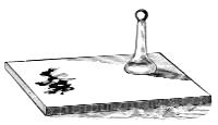
INK STONE AND MULLER.
It must then be made perfectly fast to the corner irons, as it is highly important that it remain firm and immovable during its stay on the press. The frisket (which is covered with strong paper) is then put on, the form rolled over with the red ink, and an impression made on it. The red words are then cut out with a sharp-pointed penknife, with so much nicety as not to admit the smallest soil on the paper from the other matter.
The red being finished and the form washed, the compositor unlocks it, (this should be done on the imposing-stone, as the pressman can easily lay it agreeably to the marks made on the press,) and draws out the red lines, filling up the space with quadrates. When this is done, the pressman cuts out the frisket for the black. An extra pair of points are used to prevent the black from falling on the red, or, as it is technically termed, riding. Generally, when a great number is to be printed, as many forms are used as there are colours to be printed. Another method of placing the underlays is adopted for broadsides, &c. with large letter and with but two or three lines of red. The red lines are taken out on the press, and underlays are put in, upon which the lines are placed, and the frisket is cut out as before mentioned.
A more expeditious method can be employed for forms in which the lines of one colour are not too numerous to be easily lifted. After the form is ready, and the various colours are marked on the proof, a skeleton form is made up, with labour-saving quotation furniture or wood furniture fitted into the spaces of all the lines except those of the colour to be first printed. When the first colour is printed, its lines are lifted from the form, and the spaces filled with furniture, and the lines for the next colour are set in their proper places and printed; and so on till the job is completed.
The custom of printing broadsides, &c. with several colours is so common that ink-makers generally now manufacture coloured inks; consequently the printer can be supplied without the delay and labour of making. We give the following particulars, however, for the benefit of those who wish to prepare their own colours.
Varnish is the common menstruum adopted for all colours in printing. Red is the colour generally used with black. Trieste or English Vermilion, with a small portion of lake, produces a beautiful red, which should be ground with a muller on a marble slab till it be perfectly smooth. If it be in the smallest degree gritty, it clogs the form, and consequently produces a thick and imperfect impression; no pains should, therefore, be spared to render it perfectly smooth; it may then be made to work as clear and free from picks as black. A cheaper red, but not so brilliant, may be prepared with orange mineral, rose pink, and red lead.
Prussian blue makes also an excellent colour, but will require much time and labour to make it perfectly smooth. It is also ground with the best varnish, but made considerably thicker, by allowing a greater portion of colour with the same quantity of varnish than the red; it will then work clear and free from picks. As this colour dries rather rapidly, the rollers should be frequently washed.
Other colours may be made,—viz., lake and Indian red, which produce a deep red; verditure and indigo, for blues; orpiment, pink, yellow ochre, for yellows; verdigris and green verditure, for green, &c. All these colours should be ground with soft varnish, being in themselves driers, or they will choke up the form. The consistency of the ink must be governed by the quality of the work to be executed. For a posting-bill or coarse job, the ink should be very thin, the proportion of varnish being much greater than required for fine work. Should the work be a wood-cut, or small type, the pigment should be made as thick as possible.
The best colours for printing are those of the lightest body and brightest colour.
HOW TO USE DRY COLOURS.
To produce fine qualities of coloured printing inks by mixing pure dry colours with varnish, the printer will do well to give heed to the following particulars:—
1. No more should be mixed at a time than will be required for the job in hand.
2. Coloured inks should be mixed upon a slate or marble slab, by means of the muller, and never upon an iron or other metallic table. The table, before mixing, should be thoroughly clean, and perfectly free from the slightest soil or trace of other inks.
3. For working coloured inks, the roller should not be too hard, and should possess a biting, elastic face. When change of colour is required, it should be cleaned with turpentine, and a moist sponge passed over the face, allowing a few minutes for the roller to dry before resuming its use.
For bronze printing, the roller should have a firm face, or the tenacity of the preparation may destroy it; yet it must have sufficient elasticity to deposit the preparation freely and cleanly on the type.
4. Various shades may be produced by observing the following directions:—
Bright Pink Ink.—Use carmine or crimson lake.
Deep Scarlet.—To carmine add a little deep vermilion.
Bright Red.—To pale vermilion add carmine.
Deep Lilac.—To cobalt blue add a little carmine.
Pale Lilac.—To carmine add a little cobalt blue.
Bright Pale Blue.—Cobalt.
Deep Bronze Blue.—Chinese.
Green.—To pale chrome add Chinese blue; any shade can be obtained by increasing or diminishing either colour.
Emerald Green.—Mix pale chrome with a little Chinese blue, then add the emerald until the tint is satisfactory.
Amber.—To pale chrome add a little carmine.
Deep Brown.—Burnt umber, with a little scarlet lake.
Pale Brown.—Burnt sienna; a rich shade is made by adding a little lake as above.
5. Gold Preparation. Print as with ordinary ink, then put on the bronze powder with a broad camel-hair brush; allow the impressions to remain a short time for the preparation to set, then clean off the superfluous bronze: the impressions will be much improved if passed through rollers.
HOW TO MULTIPLY COLOURS.
A printer who has on hand a stock of yellow, carmine, blue, and black inks, may produce other colours and shades by intermixing as follows:—
Yellow and carmine, mixed, will give Vermilion.
Carmine and blue Purple.
Blue and black Deep blue.
Carmine, yellow, and black Brown.
Yellow and blue Green.
Yellow and black Bronze green.
Yellow, blue, and black Deep green.
Lighter shades may be obtained by adding proper proportions of white ink.
CONTRAST OF COLOURS.
It is wrongly supposed that the art of arranging colours so as to produce the best effects in printing is entirely dependent on the taste of the operator; for harmony is determined by fixed natural laws. The increasing demand for decorative or ornamental work renders it of some importance to the letter-press printer to make himself acquainted with these laws; as, without some attention to them, the most elegant designs of the type founder, and the finest inks that can be made, may yield but an indifferent, if not a decidedly unpleasing, result.
The following remarks will be of use to persons to whom the subject is new; but for a thorough explanation of it they should refer to Chevreul on Colours,—a valuable work in the French language, which has been translated into English.
I. We may, in the first place, consider WHITE LIGHT as composed of three primary colours—blue, red, and yellow—duly blended; these three, in an infinite variety of proportion, serving to produce all the hues in creation. If we take any two of these primaries and mix them, we have a secondary colour. Thus, blue and red form violet, blue and yellow give green, red and yellow make orange. Each of these secondary colours harmonizes perfectly with the primary which does not enter into its composition. Violet, for instance,—itself a mixture of red and blue,—harmonizes with yellow; green, having no red in its composition, agrees well with red; orange, in the same way, forms a perfect contrast with blue. Either of these contrasts has the effect of mutually brightening the colours employed; a red and a green, &c. being more beautiful when placed side by side than when viewed singly. This is termed the HARMONY OF CONTRAST OF COLOURS; and a good example of it is seen in the scarlet geranium, or the holly; the one showing a light green leaf opposed to a bright red flower, and the other a deep green leaf with a dark red berry.
The mixing of colours is a very different thing from contrasting them; for strange as it may seem, although one combination of the primary colours gives white, yet another proportion will produce black. While, then, red and green look beautiful side by side, it does not generally answer to print red ink on green paper. The reason is, that as the ink is slightly transparent, some of the green shows through it, and appears somewhat black, and thus lowers the brilliance of the red in the same degree as so much black ink would, if mixed with it. This remark will apply to orange or yellow on a blue paper, &c. The darker and fuller the body of colour used, the less it is affected in this manner.
The most perfect contrasts are those above mentioned, which are formed by the complementary colours; yet the primaries blue, red, and yellow also agree well together. But if such colours as are not in harmony are placed near each other, the effect is very damaging to their brightness. While red is made more brilliant by the proximity of green, it is dimmed and spoiled by placing it next an orange. Neither blue nor red contrasts well with violet, because the latter contains each of these colours in its composition. In any case where they must come into juxtaposition, the unpleasant effect may be lessened by adding a little of the opposite colour: so, if a violet is to contrast with red, it will be well to give it a shade of blue, making it more purple; if, on the other hand, it is to contrast with blue or green, it should be made redder.
II. Colours with Black. In all contrasts, the depth of the colour is an important element, but especially so in such as are to be affected by the presence of black. In but few instances will the latter bear the neighbourhood of a very deep colour to advantage, while it harmonizes with the lighter ones by contrast of tone. Yellow, from its near approach to white, should always be worked “full;” orange and green should also be full, and moderately deep in tone, to contrast with black. If a blue is employed, it should be light, or it will impoverish the black and be weakened itself. A very light blue border, with a broad margin of white between it and the body of matter enclosed, will give a clean, bright look to black ink, and whiteness to the paper. A light pink (such as carmine reduced with flake-white or with clear varnish) is also good; yet perhaps the preceding is preferable. Dark and heavy borders are frequently a positive injury to printing, where the working in a light shade would have secured a good effect; for the border should always be so far secondary to the matter enclosed as not to draw off the attention too much to itself.
III. Colours on Tinted Papers and Tinted Grounds. Besides the kind of harmony already mentioned, there is another, which is produced by the contrast of light and dark shades of the same colour. This might be employed in letter-press more frequently than it is at present, with some advantage, as the effects it is capable of yielding are very chaste and pleasing. In a photograph or an engraving, all the effect is dependent on difference of tones of one colour; and the beauty of a wood in summer consists chiefly in the contrast displayed by a variety of shades of green only. A deep green ink on a paper of a light tone of the same colour is especially good, if a heavy letter is used; and indeed in most printing in colours, full, solid-faced letter should be preferred to outlines or shaded ones, which are difficult to work, and have at best but an inferior appearance unless the darkest tones are employed. A deep blue on a light blue ground, or against a light blue border, is also good; and without the latter accompaniment it is not unpleasant on a blue wove writing-paper. To secure the proper effect, however, the tints should be of the same hue; that is, if the groundwork is of a bluish green, the colour that is to be worked upon it should also be a green inclining to blue; if, on the other hand, the ground is of a yellower green, the body of ink should also be yellower; and so on. This may easily be managed by adding a small portion of ink of the colour required, until the hue is matched.
IV. Neutral Tints. In selecting borders for the more chaste description of printing, it is a pretty safe rule to avoid such as cover much surface, if they are to be worked in any strong colour or in black. When lighter tints are used, they will bear extension over a larger surface; and in this case a pale gray or neutral border will have a beneficial effect on any body with which it is contrasted, as well as on black itself, which is purified by its proximity. If the central printing is in black only, or in black and yellow, a lavender gray may be substituted for the border. And in any case in which the central matter is all in one colour, it will improve it to have a border of gray which is slightly tinged with the complementary of such colour. Thus, if the body be red, a very small portion of green may be added to the gray; and so forth.
It must be remembered that in ornamental printing absolute cleanliness is indispensable. The same roller should never be used for different colours, even after it has been washed. Instead of hanging exposed to dust and to the air, rollers should be kept in a tightly-closed box; and in this manner they will remain a long time in good order. The tins of ink should be similarly preserved, and the lids never left off except at the moment of using from them. These are small matters; but it is only by patient attention to minute details that excellence can be attained in printing.
OILING A PRESS.
Excessive lubrication is wasteful, unclean, and hurtful to a press. A small quantity of oil should be used at a time, as a large amount will overrun on the press, and hold the dust and grit caused by sweeping the floor; these, working into the journals, will wear the press more than use. The best oil should be used, whether sperm, lard, or coal. Kerosene may be used to clean the ways of a press when they have become gummed by the use of improper oil. Presses should always be kept scrupulously clean.
HOW TO TREAT WOOD TYPE.
To prevent warping, all very large wood type should be set up on the edge when put away, so that both sides may be equally exposed to the air. In cleaning it, neither ley nor water should be employed under any circumstances. Turpentine, camphene, benzine, or kerosene oil may be used; but turpentine and camphene are the best. Procure a small, shallow pan; lay the form flat on a board; pour about six tablespoonfuls of turpentine into the pan; touch the face of the brush to the turpentine, and pass it quickly over the form before it evaporates. Six to eight spoonfuls of fluid will be found sufficient to clean a large form, if thus used.

PALETTE KNIFE.