IMPLEMENTS OR TOOLS OF THE ART.
Reading edition
TYPES.
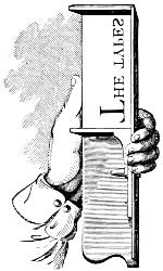
The types or letters generally used for printing in Europe and America are termed Roman, Italic, and Old English, or Black Letter.
ROMAN LETTER.
Roman letters were employed in MSS. from the fifth to about the close of the twelfth century, when what are called Gothic letters (afterward Old English) came gradually into use; these continued for several centuries, when, in most countries, they were superseded by the Roman characters. All printing was in black letter down to 1465, when Sweinheim & Pannartz, in Subiaco near Rome, produced a volume entitled Lactantius, in a character approaching to the actual forms of our modern types. In 1467, they made an improved set of characters, and printed about forty volumes within the five years following. About 1469 John of Spires, in Venice, made a great advance in improving the form of the Roman character, and printed the Natural History of Pliny: the execution of this work is very remarkable. But Nicholas Jenson may fairly be considered the father of the style of Roman letter now in vogue. He printed in Venice four works in the year 1470, the first of which was Eusebii Præparatio Novorum, &c., in types which were cut by him, more perfect in form than those of any earlier printer. The printers named above were all of them Germans.
The Roman letters consist of circles, arcs of circles, and straight lines; and, therefore, on the score of simplicity, precision, and elegance, they certainly deserve to be adopted as the standard for all nations.
A printer, in choosing type, should not only attend to the cut of the letter, but should also observe that its shank is perfectly true, and that it lines or ranges with accuracy, and is of equal height. The quality of the metal of which it is composed and the finish of the letter demand particular attention, as the competition among some of the smaller foundries (which have sprung into existence through the facilities afforded of multiplying matrices by the electrotype process) has led them to use an inferior metal, and produce types without due regard to nicety of finish and exactness of body and standing.
It is important that types should have a deep face, with strong, bevelled bases or foundations under the ceriphs or hairlines, and that the letters should have a deep nick, which should be different from other founts of like body in the same house.
ITALIC LETTER.
Aldo Manuccio, born at Bassano, succeeded Jenson at Venice and turned to good account the latter’s admirable founts of type. He also made many advances in the art of printing, the most notable of which is the invention of the style of type now known as Italic. It was first used in an octavo edition of Virgil issued by him in 1501, and Pope Leo X. gave him a letter of privilege, entitling him to the sole use of the type he had invented. It was said to be founded on the handwriting of Petrarch, which it closely resembles.
Italic was largely employed to distinguish such parts of a book as might be considered appendages, as Prefaces, Introductions, Annotations, &c., all of which were formerly printed in this character; so that perhaps two-fifths of a fount was composed of Italic letter.
At present it is used more sparingly, being superseded by the more elegant mode of enclosing extracts within inverted commas, and by setting poetry and annotations in a smaller-sized type. It is very appropriately used to distinguish the head or subject-matter of a chapter, and is serviceable in grammars and other school-books as well as scientific works. The frequent use of Italic words among Roman in ordinary matter impairs the beauty of the page, and ought to be avoided; yet authors sometimes stubbornly insist on the gratification of their whimsies, even at the sacrifice of every principle of correct taste.
BLACK LETTER.
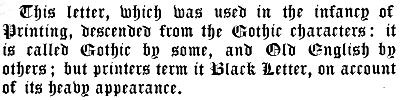
This letter, which was used in the infancy of Printing, descended from the Gothic characters: it is called Gothic by some, and Old English by others; but printers term it Black Letter, on account of its heavy appearance.
In Germany, the letters in common use are founded on the Gothic character; but even there scientific works are printed in the German language with Roman letters.
The Dutch adhere to the black letter in books of devotion and religious treatises; while they make use of the Roman in their curious and learned works.
SAXON CHARACTERS.
The Saxon characters originated probably from the Gothic, but were altered or modified after the Latin ones which the Saxons found in use in England in the fifth century. The first Saxon types were cut by John Daye, under the patronage of Archbishop Parker, about the year 1567. We give the Lord’s Prayer in modern Anglo-Saxon types:
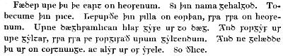
Fæder ure þu þe eart on heofenum. Si þin nama gehalgod. Tobecume þin rice. Cepurðe þin pilla on eorþan, spa spa on heofenum. Urne dæghpamlican hlaf gyfe us to dæg. And forgyf us ure gyltas, spa ssa pe forgifað urum gyltendum. And ne gelædde þu ur on costnunge. ac alys us of yfele. So ðlice.
NAMES AND SIZES OF TYPE.
The principal bodies to which printing letters are cast in England and America are the following:—
1. Diamond.
2. Pearl.
3. Agate.
4. Nonpareil.
5. Minion.
6. Brevier.
7. Bourgeois.
8. Long Primer.
9. Small Pica.
10. Pica.
11. English.
12. Columbian.
13. Great Primer.
14. Paragon.
15. Double Small Pica.
16. Double Pica.
17. Double English.
18. Double Great Primer.
19. Double Paragon.
20. Canon.
Besides the foregoing, a smaller size than Diamond, called Brilliant, is now cast in the foundry of MacKellar, Smiths & Jordan of Philadelphia, the body of which is just one-half of Minion. Even this is surpassed in smallness by a music type cast in the same foundry, named Excelsior, which is precisely one-half the size of Nonpareil. Another size omitted in the list is Minionette, (equivalent to six of the Didot points,) which is next above Nonpareil.
Canon is conceded to have been first produced by a French artisan, and was probably used in some work relating to the canons of the church; to which the German title, Missal, alludes.
Two-line Great Primer, Two-line English, and Two-line Pica, owe their names to the respective bodies of which the depth of two em quadrates answers to one of the double sizes.
Paragon was probably first cut in France. It is known as Text by the Germans.
Pica is universally considered as the standard type, and by it furniture, quotations and labour-saving rules are graduated. A line 83 Pica ems long is equivalent to 35 centimeters. The twelfth part of Pica is the unit, called a Point, by which type-bodies are measured. MacKellar, Smiths & Jordan cast their new borders, ornaments, and job type on Pica, and its subdivisions of Nonpareil, (½ Pica,) and Excelsior, (¼ Pica,) and their multiples.
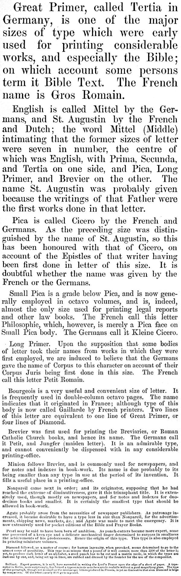
Great Primer, called Tertia in Germany, is one of the major sizes of type which were early used for printing considerable works, and especially the Bible; on which account some persons term it Bible Text. The French name is Gros Romain.
English is called Mittel by the Germans, and St. Augustin by the French and Dutch; the word Mittel (Middle) intimating that the former sizes of letter were seven in number, the centre of which was English, with Prima, Secunda, and Tertia on one side, and Pica, Long Primer, and Brevier on the other. The name St. Augustin was probably given because the writings of that Father were the first works done in that letter.
Pica is called Cicero by the French and Germans. As the preceding size was distinguished by the name of St. Augustin, so this has been honoured with that of Cicero, on account of the Epistles of that writer having been first done in letter of this size. It is doubtful whether the name was given by the French or the Germans.
Small Pica is a grade below Pica, and is now generally employed in octavo volumes, and is, indeed, almost the only size used for printing legal reports and other law books. The French call this letter Philosophie, which, however, is merely a Pica face on Small Pica body. The Germans call it Kleine Cicero.
Long Primer. Upon the supposition that some bodies of letter took their names from works in which they were first employed, we are induced to believe that the Germans gave the name of Corpus to this character on account of their Corpus Juris being first done in this size. The French call this letter Petit Romain.
Bourgeois is a very useful and convenient size of letter. It is frequently used in double-column octavo pages. The name indicates that it originated in France; although type of this body is now called Gaillarde by French printers. Two lines of this letter are equivalent to one line of Great Primer, or four lines of Diamond.
Brevier was first used for printing the Breviaries, or Roman Catholic Church books, and hence its name. The Germans call it Petit, and Jungfer (maiden letter). It is an admirable type, and cannot conveniently be dispensed with in any considerable printing-office.
Minion follows Brevier, and is commonly used for newspapers, and for notes and indexes in book-work. Its name is due probably to its being smaller than any type in use at the period of its invention. It fills a useful place in a printing-office.
Nonpareil came next in order; and its originator, supposing that he had reached the extreme of diminutiveness, gave it this triumphant title. It is extensively used, though mostly on newspapers, and for notes and indexes for duodecimo books and smaller. It is certainly the smallest type that should be allowed in book-work.
Agate probably arose from the necessities of newspaper publishers. As patronage increased, it became desirable to have a type less in size than Nonpareil, for the advertisements, shipping news, markets, &c.; and Agate was made to meet the emergency. It is now extensively used for pocket editions of the Bible and Prayer Books.
Pearl may be said to have been born of ambition. As punch-cutters became more expert, some one possessed of a keen eye and a delicate mechanical finger determined to surpass in smallness the achievements of his predecessors. Hence the origin of this type. This type is also employed in printing miniature volumes.
Diamond followed, as a matter of course; for human ingenuity, when provoked, seems determined to go to the utmost verge of possibility. This type is so minute that a pound of it will contain more than 3300 of the letter i; yet, to produce each letter of an alphabet, a steel punch has to be cut and a matrix made, in which the types are cast one by one, and, being set up in lines, are rubbed and dressed by the founder for the use of the compositor.
Brilliant. Expert penmen, it is said, have succeeded in writing the Lord’s Prayer upon the edge of a sheet of paper. A type-setter in Berlin, most surprisingly, has formed a type so minute as to be scarcely readable without a good magnifying glass. The type of this paragraph, though not so small as the microscopic letters produced in Prussia, is yet so diminutive that even Diamond is large by comparison. Of the letter i nearly 4600 go to a pound.
GRADATION OF TYPES.
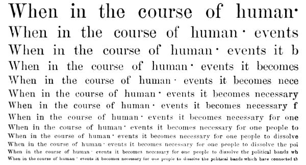
The following specimen shows the proportion which one size of type bears to another in width; but it is necessary to observe that it must be taken with certain limitations, because each founder has letter of every size that will either drive out or get in with others of the same body, some faces being more extended and others being more condensed than the standard width of type. The scale contains thirteen sizes in order of gradation, viz., Great Primer, English, Pica, Small Pica, Long Primer, Bourgeois, Brevier, Minion, Nonpareil, Agate, Pearl, Diamond, and Brilliant.
POINT SYSTEM OF TYPE-BODIES.
In 1882, MacKellar, Smiths & Jordan began to make type on the proportional system of bodies. The Pica em, being the eighty-third part of thirty five centimetres, was divided into twelve parts, or points. This system of exact proportional type-bodies was approved of and adopted by the American type-founders generally. It has been favourably received by printers in this country, and all printing offices will in due time be fully equipped with types of this description.
The standard for the height of type was fixed at 2⅓ centimetres.
In some European countries printing offices had their types cast to a height to suit the proprietor’s whim. Some of the foreign founders have sent young men to Philadelphia to be educated in the American system of heights and bodies, and at least two foundries in Germany have adopted the American plan.
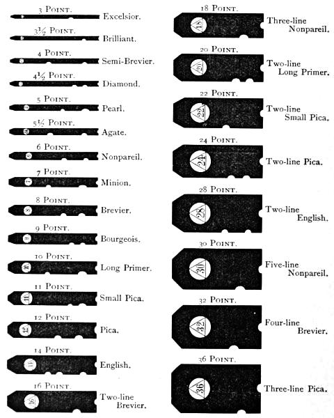
The following table shows the systematic gradation of bodies and position of nicks in the point system, one point being equivalent to 1/12 of a Pica em.
3 Point. Excelsior.
3½ Point. Brilliant.
4 Point. Semi-Brevier.
4½ Point. Diamond.
5 Point. Pearl.
5½ Point. Agate.
6 Point. Nonpareil.
7 Point. Minion.
8 Point. Brevier.
9 Point. Bourgeois.
10 Point. Long Primer.
11 Point. Small Pica.
12 Point. Pica.
14 Point. English.
16 Point. Two-line Brevier.
18 Point. Three-line Nonpareil.
20 Point. Two-line Long Primer.
22 Point. Two-line Small Pica.
24 Point. Two-line Pica.
28 Point. Two-line English.
30 Point. Five-line Nonpareil.
32 Point. Four-line Brevier.
36 Point. Three-line Pica.
A BILL OF PICA.
The following is reckoned by the founders a regular fount, complete in all its sorts:—
A BILL OF 800 LBS. OF PICA.
a 8500
b 1600
c 3000
d 4400
e 12000
f 2500
g 1700
h 6400
i 8000
j 400
k 800
l 4000
m 3000
n 8000
o 8000
p 1700
q 500
r 6200
s 8000
t 9000
u 3400
v 1200
w 2000
x 400
y 2000
z 200
& 200
ff 400
fi 500
fl 200
ffl 100
ffi 150
æ 100
œ 60
— 150
⸺ 90
⸻ 60
, 4500
; 800
: 600
. 2000
- 1000
? 200
! 150
’ 700
( 300
[ 150
* 100
† 100
‡ 100
§ 100
∥ 100
¶ 60
1 1300
2 1200
3 1100
4 1000
5 1000
6 1000
7 1000
8 1000
9 1000
0 1300
é 200
à 200
â 200
ê 200
All other accents, each. 100
A 600
B 400
C 500
D 500
E 600
F 400
G 400
H 400
I 800
J 300
K 300
L 500
M 400
N 400
O 400
P 400
Q 180
R 400
S 500
T 650
U 300
V 300
W 400
X 180
Y 300
Z 80
Æ 40
Π30
A 300
B 200
C 250
D 250
E 300
F 200
G 200
H 200
I 400
J 150
K 150
L 250
M 200
N 200
O 200
P 200
Q 90
R 200
S 250
T 326
U 150
V 150
W 200
X 90
Y 150
Z 40
Æ 20
Π15
Spaces.
Thick 18000
Middle 12000
Thin 8000
Hair 3000
Em Quads 2500
En Quads 5000
Large Quadrates, about 80 lbs.
Italic, one-tenth of Roman.
Owing to the varying styles of authors and the diverse subjects of books, some letters will now and then run short in a fount, whatever the proportions may have been at first. A new fount of type may run evenly on a work in general literature written in the third person, while a novel filled with dialogues in the first person will rapidly exhaust certain letters, and require sorts to render the fount serviceable to its full general capacity. So with scientific and other books. Even in the case of two authors writing on the same subject, there is no certainty that the fount will run alike. The master-printer, therefore, to keep the entire letter in use, is compelled to order sorts, and his fount is thus constantly growing larger.
A FOUNT OF TYPE.
A complete fount of type may be comprised under the following heads:—
CAPITALS.
A B C D E F G H I J K L M N O P Q R S T U V W X Y Z Æ Œ &
SMALL CAPITALS.
A B C D E F G H I J K L M N O P Q R S T U V W X Y Z Æ Œ &
LOWER CASE.
a b c d e f g h i j k l m n o p q r s t u v w x y z æ œ ff fi ffi fl ffl
ITALIC CAPITALS.
A B C D E F G H I J K L M N O P Q R S T U V W X Y Z Æ Œ &
ITALIC LOWER CASE.
a b c d e f g h i j k l m n o p q r s t u v w x y z æ œ ff fi ffi fl ffl
FIGURES AND FRACTIONS.
1 2 3 4 5 6 7 8 9 0 ¼ ½ ¾ ⅓ ⅔ ⅛ ⅜ ⅝ ⅞
POINTS AND REFERENCES.
, ; : ? ! - ’ ( ) [ ] * † ‡ § ∥ ¶
BRACES, DASHES AND COMMERCIAL SIGNS.
$ £ ° ` ´ - – — ⸺ ☞ ☜ @ ⅌ ℔


Four kinds of spaces; en, em, two and three em quadrates.
Accents.
These are the ordinary sorts cast to a fount, and are classified by founders as long, short, ascending, descending, kerned, and double letters.
Long Letters fill the whole depth of the face of the body, and are both ascending and descending, such in the Roman as Q and j, and in the Italic f.
Short Letters have the face cast on the middle of the body, (by founders called shank,) as a, c, e, m, n, o, r, s, u, v, w, x, z, all of which will admit of being bearded above and below the face, both in Roman and Italic.
Ascending Letters are all the Roman and Italic capitals; in the lower case, b, d, f, h, i, k, l, t.
Descending Letters are g, p, q, y, in Roman and Italic.
Kerned Letters are types that have part of the face hanging over either one or both sides of the body. In Roman, f and j are the only kerned letters; but, in Italic, d, g, j, l, y are kerned on one side, and f on both sides of its face. Most Italic capitals are kerned on one side of the face.
The Double Letters in modern use are ff, fi, ffi, fl, ffl; and these are so cast to prevent the breaking of the beak of the f when used before a tall letter. The diphthongs æ and œ may be classed among double letters.
Printers divide a fount of letter into two classes.
1. The upper case } sorts.
2. The lower case
The upper case sorts are capitals, small capital letters, references, dashes, braces, commercial signs and fractions.
The lower case consists of small letters, double letters, figures, points, spaces and quadrates.
CAPITALS.
Lindley Murray gives the following judicious directions in regard to the use of capital letters:—
It was formerly the custom to begin every noun with a capital; but as this practice was troublesome, and gave the writing or printing a crowded and confused appearance, it has been discontinued. It is, however, very proper to begin with a capital,—
1. The first word of every book, chapter, letter, note, or any other piece of writing; and,
2. The first word after a period; and, if the two sentences are totally independent, after a note of interrogation or exclamation. But if a number of interrogative or exclamatory sentences are thrown into one general group, or if the construction of the latter sentences depends on the former, all of them, except the first, may begin with a small letter: as, How long, ye simple ones, will ye love simplicity? and the scorners delight in their scorning? and fools hate knowledge?—Alas! how different! yet how like the same!
3. The appellations of the Deity: as, God, Jehovah, the Almighty, the Supreme Being, the Lord, Providence, the Messiah, the Holy Spirit.
4. Proper names of persons, places, streets, mountains, rivers, ships: as, George, London, the Strand, the Alps, the Thames, the Seahorse.
5. Adjectives derived from the proper names of places: as, Grecian, Roman, English, French, Italian.
6. The first word of a quotation, introduced after a colon, or when it is in a direct form: as, Always remember this ancient maxim: “Know thyself.”—Our great Lawgiver says, “Take up thy cross daily, and follow me.” But when a quotation is brought in obliquely after a comma, a capital letter is unnecessary: as, Solomon observes, “that pride goes before destruction.”
The first word of an example may also very properly begin with a capital: as, Temptation proves our virtue.
7. Every substantive and principal word in the titles of books: as, Johnson’s Dictionary of the English Language; Thomson’s Seasons; Rollin’s Ancient History.
8. The first word of every line in poetry.
9. The pronoun I and the interjection O are written in capitals: as, I write: Hear, O earth!
Other words, besides the preceding, may begin with capitals when they are remarkably emphatical, or the principal subject of the composition.
The method of denoting capital letters in manuscript is by underscoring them with three distinct lines.
SMALL CAPITALS.
Small Capitals are in general cast to Roman founts only, and are used for the purpose of giving a stronger emphasis to a word than that conveyed by Italic. They are likewise used for running heads, heads of chapters, &c. The first word of every section or chapter is commonly put in small capitals; but when a two-line initial letter is used, the remainder of the word should be in capitals.
The small capitals C, O, S, V, W, X, Z so closely resemble the same letters in the lower case, that care is required to prevent intermixing.
In manuscript, small capitals are denoted by two lines drawn under the words.
Italic words are designated by a single stroke underneath.
POINTS.
Points consist of a comma, semicolon, colon, period or full-point, mark of interrogation, and mark of admiration. Shortly after the invention of printing, the necessity of stops or pauses in sentences for the guidance of the reader produced the colon and full-point. In process of time, the comma was added, which was then merely a perpendicular line, proportioned to the body of the letter. These three points were the only ones used till the close of the fifteenth century, when Aldo Manuccio gave a better shape to the comma, and added the semicolon; the comma denoting the shortest pause, the semicolon next, then the colon, and the full-point terminating the sentence. The marks of interrogation and admiration were introduced many years after.
Perhaps there never existed on any subject a greater difference of opinion among men of learning than on the true mode of punctuation. Some sprinkle the page with commas almost as promiscuously as if from a pepper-box, and make the pause of a semicolon where the sense will bear only a comma; while others are extremely careless, and omit points even when they are needed to give the true sense of a passage at the first reading.
The lack of an established practice is much to be regretted. The loss of time to a compositor occasioned by altering points arbitrarily is a great hardship. Manuscripts are often placed in the printer’s hands without being properly prepared: either the writing is illegible, the spelling incorrect, or the punctuation defective. Unless the author will take entirely on himself the responsibility of the pointing, it will be better to omit every point in the copy, except at the end of a sentence, rather than confuse the mind of the compositor by commas and semicolons placed indiscriminately, in the hurry of writing, without any regard to propriety.[10]
The Comma [,] divides the clauses of a long or involved sentence, and commonly marks the shortest pause in reading.
Commas are used to denote extracts or quotations from other works, dialogue matter, or passages or expressions not original, by placing two of them inverted before the first word of the passage quoted, the ending being denoted by two apostrophes. A thin space is used to keep the inverted commas free from the matter. The method of running them down the sides to the end of the quotation has been found inconvenient, especially where a quotation occurs within a quotation, or a speech within a speech: the proper method of distinguishing these is by placing a single inverted comma before the extra quotation, and concluding with a single apostrophe. Where both quotations end together, put three apostrophes, observing after the first to place a thin space.
Inverted commas were first used by Guillemet, a Frenchman, to supersede the use of Italic letter in emphasized words. As an acknowledgment, his countrymen call them after his name. French founders cast them double, thus [«»]. MacKellar, Smiths & Jordan, Philadelphia, furnish them in this way when desired.
A single comma inverted is improperly used as an abbreviation of the word Mac, as in M’Gowen: c is preferable, as McGowen.
The Semicolon [;] denotes a pause greater than that of a comma, and is used between dependent clauses of compound sentences.
The Colon [:] is employed in a sentence between clauses less connected than those which are divided by a semicolon, but not so independent as separate, distinct sentences.
The Period or Full-Point [.] serves to indicate the end of a complete sentence. When used in abbreviations, it has no effect as a full stop in the punctuation, unless at the end of a sentence. In some works this point is discarded as a mark of abbreviation, as in Mr Dr &c.
Full-points are sometimes used as leaders in tables of contents, figure-work, &c.; but dotted rules or leaders are more economical for this purpose, as they save considerable time in the composition.
The sign of Interrogation [?] is used to denote a question. Every interrogation or question should begin with a capital letter, (unless several questions follow one another in connected succession,) according to the method observed in the Bible, where questions and responses, and the beginning of sayings, &c. are denoted by a capital letter.
The sign of Admiration or Exclamation [!] denotes surprise, astonishment, rapture, and other sudden emotions of the mind, whether of joy or sorrow. This sign is put after the interjections Ah! Alas! Oh! &c.; but there are exceptional cases, as, Ah me! Alas the day! &c.
All the points, except the comma and the period, should be preceded by a hair-space; the comma and full-point do not require any space to bear them off.
The em dash [—], though not ranked as a point, is often used by careless writers as a substitute for a comma or semicolon. It may be properly employed in parenthetical sentences, and in rhapsodical writing abounding in disconnected sentences.
A dash stands for a sign of repetition in catalogues of goods, where it implies ditto; and in catalogues of books, where a dash signifies ejusdem, instead of repeating the author’s name with the title of every separate treatise of his writing. A sign of repetition should never appear at the top of a page, but the name of the author, or of the merchandise, should be set out again at length.
A dash likewise stands for to; as, chap. xvi. 3-17; that is, from the third to the seventeenth verse inclusive. At other times it serves for an index, to give notice that what follows it is a corollary of what has preceded; thus:—
APOSTROPHE.
The apostrophe [’] is a comma cast on the upper edge of a type, and is used as a sign of contraction or abbreviation of words in poetry or familiar conversation, as We’re, o’er, don’t, &c. In poetry, it should not be employed where the verb ends with e, as love, change, &c., but only in cases where the verb concludes with a consonant, as, reign, obtain, &c. It also marks the elision of a vowel at the beginning of words, as, ’scape, or of a syllable, as, ’prentice.
The monosyllables though and through are sometimes shortened to tho’ and thro’, but very improperly, as they retain the same sound, and the abbreviation cannot in the slightest degree assist the versification.
Words in the possessive case are generally known by having ’s for their termination.
All quotations which are denoted at the beginning by inverted commas are closed with apostrophes. There is no space required between the apostrophe and the matter.
HYPHEN.
A hyphen is a sign of connection, and denotes that the part of a word at the end of a line belongs to the portion at the beginning of the next line.
A compositor who studies propriety and neatness in his work will not allow an unnecessary division, even in a narrow measure, if he can avoid it by overrunning two or three lines of matter. In large type and narrow measures, the division of words cannot be avoided; but care should be taken that hyphens do not occur at the end of successive lines. In small type and wide measures, the hyphen may frequently be dispensed with, either by driving out or getting in the word, without interfering with the regularity of the spacing. The compositor who is careful on this point will find his advantage in the preference given to his work, and in the respect attached to his character as a master of his business. Numerous divisions down the side of a page and irregular spacing are the two greatest defects in composition.
It is proper, if possible, to keep the derivative or radical word undivided: as, occur-rence, gentle-man, respect-ful, &c. In other cases, printers generally divide on the vowel, which is an excellent method.
The hyphen is also used to connect compound words, which are formed of two substantives, as, bird-cage, love-letter, &c.; also what are termed compound adjectives, as, well-built house, handsome-faced child, &c.
The prepositions after, before, over, &c. are often connected with other words, but do not always make a proper compound: thus, before-mentioned is a compound when it precedes a substantive, as, in the before-mentioned place; but when it comes after a noun, as, in the place before mentioned, it should be two distinct words.[11]
PARENTHESIS AND BRACKET.
The use of the Parenthesis ( ) is to enclose interpolated words or sentences which serve to strengthen the argument, although the main sentence would be complete without the interpolated matter.
Parentheses are not as much used as formerly: authors place their intercalations between commas,—frequently with a dash at the beginning and ending,—which make them quite as intelligible as though they were enclosed between parentheses.
Brackets [ ] are seldom made use of, except to indicate that the word enclosed within them had been carelessly omitted in the old MS. or copy, and was now inserted by the editor.
REFERENCES.
References are marks and signs employed to direct the attention of the reader to notes in the margin or at the bottom of a page.
The characters technically known by printers as references are the following, which are used in the order here given:—
Asterisk *
Dagger †
Double Dagger ‡
Section §
Parallel ∥
Paragraph ¶
In Roman church-books, the Asterisk divides each verse of a psalm into two parts, and marks the place where the responses begin: this in the Book of Common Prayer is denoted by a colon placed between the two parts of each verse. Asterisks also denote an omission, or an hiatus in the original copy; the number of asterisks being multiplied according to the extent of the omission.
The Dagger, originally termed the Obelisk, or Long Cross, is frequently used in Roman Catholic church-books, prayers of exorcism, at the benediction of bread, water, and fruit, and upon other occasions, where the priest is to make the sign of the cross; but the square cross (✠) is the proper symbol for the purpose. The square cross is used, besides, in the pope’s briefs, and in mandates of archbishops and bishops, immediately before the signature of their names. It is not placed among references.
Besides its use as a reference mark, the Paragraph is now employed chiefly in Bibles, to show the parts into which a chapter is divided. In Common Prayer Books, paragraphs are put before the lines that direct the order of the service, and which are called the Rubrics because they were formerly printed in red.
The neatest references, when many are required in books, are either superior letters or superior figures,—thus, ¹, ², ³, or thus, ᵃ, ᵇ, ᶜ. Superior letters are used chiefly in Bibles and other books which have more than one sort of notes, and therefore require different references. When thus used, the letter ʲ should be omitted, as, from its similarity to the ⁱ, the reader might at times be led into error.
ACCENTED LETTERS.
Letters called accented by printers are the five vowels, marked thus:—
Acute á é í ó ú
Grave à è ì ò ù
Circumflex â ê î ô û
Diæresis ä ë ï ö ü
Long ā ē ī ō ū
Short ă ĕ ĭ ŏ ŭ
We may include the French ç, the Spanish ñ, the Portuguese ã and õ, the Swedish and Norwegian å and ö, and the Welsh ŵ and ŷ.
NUMERAL LETTERS.
The Greeks at first employed the letters of the entire alphabet to express the first twenty-four numbers; but the system was cumbrous, and they adopted the happy expedient of dividing their alphabet into three portions, using the first to symbolize the 9 digits, the second the 9 tens, and the third the 9 hundreds; and, as their alphabet contained only twenty-four letters, they invented three additional symbols. Their list of symbols then stood as follows:—
Units. Tens. Hundreds.
α represents 1 ι represents 10 ρ represents 100
β 2 κ 20 σ 200
γ 3 λ 30 τ 300
δ 4 μ 40 υ 400
ε 5 ν 50 φ 500
ϝ (introduced) 6 ξ 60 χ 600
ζ 7 ο 70 ψ 700
η 8 π 80 ω 800
θ or ϑ 9 Ϟ or ϟ (introduced) 90 ϡ, , (introd’d) 900


By these symbols, only numbers under 1000 could be expressed; but, by putting a mark called iota under any symbol, its value was increased a thousand-fold: thus, ᾳ = 1000, κͅ = 20,000; or, by subscribing the letter Μ, the value of a symbol was raised ten thousand-fold. For these two marks, single and double dots were afterward substituted. This improvement enabled them to express with facility all numbers as high as 9,990,000,—a range sufficient for all ordinary purposes.
It has been supposed that the Romans used M to denote 1000 because it is the first letter of Mille, which is Latin for 1000; and C to denote 100, it being the first letter of Centum, the Latin term for 100. Some also suppose that D, being formed by dividing the old M in the middle, was therefore appointed to stand for 500,—that is, half as much as the M stood for when it was whole; and that L being half a C, was, for the same reason, used to denominate 50. But the most natural account of the matter appears to be this:—
The Romans probably put down a single stroke, Ⅰ, for one, as is still the practice of those who score on a slate, or with chalk; this stroke they doubled, trebled, and quadrupled, to express two, three, and four: thus, ⅠⅠ, ⅠⅠⅠ, ⅠⅠⅠⅠ. So far they could easily number the strokes with a glance of the eye; but they found that if more were added it would be necessary to count the strokes one by one: for this reason, when they came to five, it was expressed by joining two strokes together in an acute angle, thus, Ⅴ.
After they had made this acute angle, Ⅴ, for five, they then added single strokes to the number of four, thus, ⅤⅠ, ⅤⅠⅠ, ⅤⅠⅠⅠ, ⅤⅠⅠⅠ, and then, as the strokes could not be further multiplied without confusion, they doubled their acute angle by prolonging the two lines beyond their intersection, thus, Ⅹ, to denote two fives, or ten. After they had doubled, trebled, and quadrupled this double acute angle, thus, ⅩⅩ, ⅩⅩⅩ, ⅩⅩⅩⅩ, they then, for the same reason which induced them to make a single angle first, and then to double it, joined two single strokes in another form, and, instead of an acute angle, made a right angle, Ⅼ, to denote fifty. When this was doubled, they then doubled the right angle, thus, ⊏, to denote one hundred, and, having numbered this double right angle four times, thus, ⊏⊏, ⊏⊏⊏, ⊏⊏⊏⊏, when they came to the fifth number, as before, they reverted it, and put a single stroke before it, thus, Ⅰ⊐, to denote five hundred; and, when this five hundred was doubled, then they also doubled their double right angle, setting two double right angles opposite to each other, with a single stroke between them, thus, ⊏Ⅰ⊐, to denote one thousand: when this note for one thousand had been repeated four times, they then put down Ⅰ⊐⊐ for five thousand, ⊏⊏Ⅰ⊐⊐ for ten thousand, and Ⅰ⊐⊐⊐ for fifty thousand.
The corners of the angles being cut off by transcribers for despatch, these figures were gradually brought into what are now called numerical letters. When the corners of ⊏Ⅰ⊐ were made round, it stood thus, ⅭⅠↃ, which is so near the Gothic ന that it soon deviated into that character; so that Ⅰ⊐ having the corners made round stood thus, ⅠↃ, and then easily deviated into D. ⊏ also became a plain C by the same means: the single rectangle, which denoted fifty, was, without any alteration, a capital L; the double acute angle was an X; the single acute angle, a V; and a plain single stroke, the letter I. And thus these seven letters, M, D, C, L, X, V, I, became numerals. As a further proof of this assertion, let it be considered that ⅭⅠↃ is still used for one thousand, and ⅠↃ for five hundred, instead of M and D; and this mark, ന, is sometimes used to denote one thousand, which may easily be derived from this figure, ⊏Ⅰ⊐, but cannot be deviations from, or corruptions of, the Roman letter M. The Romans also expressed any number of thousands by a line drawn over any numeral less than one thousand: thus, V̅ denotes five thousand, L̅X̅ sixty thousand; so, likewise, M̅ is one million, M̅M̅ two millions, &c.
Upon the discovery of printing, and before capitals were invented, small letters served for numerals; not only when Gothic characters were in vogue, but when Roman had become the prevailing character. Thus, in early times, i b x l c d m were, and in Roman type are still, of the same signification as capitals when used as numerals. Though the capital J is not a numeral letter, yet the lower-case j is as often and as significantly used as the vowel i, especially where the former is employed as a closing letter, in ij iij bj bij biij dcij, &c. In Roman lower-case numerals, the j is not regarded, but the i stands for figure 1 wherever it is used numerically.
During the existence of the French Republic, books were dated in France from the first year of the Republic: thus An. XII. (1803,) or twelve years from 1792.
ARITHMETICAL FIGURES.
The arithmetical or Arabic numerals are 0, 1, 2, 3, 4, 5, 6, 7, 8, 9. Properly they should be styled Hindu or Indian numerals; for the Arabs borrowed them, along with the decimal system of notation, from the Hindus. They were probably first introduced from the East into Italy about 1202; yet they did not come into general use before the invention of printing. Accounts were kept in Roman numerals up to the sixteenth century. Figures are usually made one en thick; but of late a broader figure is cast for newspaper use, which is two-thirds or six-sevenths of an em in width.
OLD STYLE FIGURES.
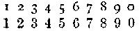
Though uniform in height and appearance, we do not deem the modern figures an improvement on the variously-lining figures formerly in vogue, and now happily coming again into use. The latter can be caught by the eye with greater ease and certainty, just as lower-case letter can be read with more facility than continuous lines of capitals. In the new style the 3 and 8 may easily be mistaken for each other, and so with the 6, 9, and 0; but in the old style figures such errors are quite unlikely to happen, as some of them occupy the centre of the body only, and others are ascending or descending characters. The example here given will show the justice of our remarks:
1 2 3 4 5 6 7 8 9 0
1 2 3 4 5 6 7 8 9 0
SCRATCHED OR CANCELLED FIGURES
1̷ 2̷ 3̷ 4̷ 5̷ 6̷ 7̷ 8̷ 9̷ 0̷
Are used in arithmetical matter when certain figures require to be crossed over in an operation.
FRACTIONS.
Common Fractions, or broken numbers in arithmetic, are cast solid to all sizes of type. A great improvement has been introduced by casting the numerator and denominator separately, on bodies of half size, with the line on the under figure, so that odd fractions of any amount may be readily formed, thus: ¹ ² ³ ⁄₂ ⁄₃ ⁄₄ ½ ⅔ ¾.
SIGNS.
COMMERCIAL SIGNS.
⅌ Per, each.
@ At or to.
% Percentum.
℀ Account.
¢ Cent.
$ Dollar or dollars.
£ Libra, libræ, pound or pounds sterling.
/ Solidus, solidi, shilling or shillings.
MATHEMATICAL, ALGEBRAICAL, AND GEOMETRICAL.
+ plus, or more, is the sign of real existence of the quantity it stands before, and is called an affirmative or positive sign. It is also the mark of addition: thus, a+b, or 6+9, implies that a is to be added to b, or 6 added to 9.
− minus, or less, before a single quantity, is the sign of negation, or negative existence, showing the quantity to which it is prefixed to be less than nothing. But between quantities it is the sign of subtraction: thus, a−b, or 8−4, implies b subtracted from a, or 8 after 4 has been subtracted.
= equal. The sign of equality, though Des Cartes and some others use this mark, ∝: thus, a=b signifies that a is equal to b. Others use the mark = to denote identity of ratios.
× into or with. The sign of multiplication, showing that the quantities on each side the same are to be multiplied by one another: as, a×b is to be read, a multiplied into b; 4×8, the product of 4 multiplied into 8. Wolfius and others use a dot between the two factors: thus, 7·4 signifies the product of 7 and 4. In algebra the sign is commonly omitted, and the two quantities put together: thus, bd expresses the product of b and d. When one or both of the factors are compounded of several letters, they are distinguished by a line drawn over them: thus, the factum of a+b-c into d is written, d × a̅+̅b̅-̅c̅. Others distinguish the compound factors by including them in parentheses: thus, (a+b-c)d.
÷ by. The sign of division: thus, a÷b denotes the quantity a to be divided by b. Wolfius makes the sign of division two dots; 12:4 denotes the quotient of 12 divided by 4 = 3.
> or ⫍ are signs of majority: thus, a>b expresses that a is greater than b.
< or ⫎ are signs of minority,—when we would denote that a is less than b.
∞ is the character of similitude used by Wolfius, Leibnitz, and others. It is used in other authors for the difference between two quantities when it is unknown which is the greater of the two.
∷ so is. The mark of geometrical proportion disjunct, and is usually placed between two pair of equal ratios: as, 3∶6∷4∶8 shows that 3 is to 6 as 4 is to 8.
∶ or ∴ is an arithmetical equal proportion: as, 7.3∶13.9; i. e. 7 is more than 3, as 13 is more than 9.
⬜ quadrate, or regular quadrangle,—viz. ⬜AB=⬜BC; i. e. the quadrangle upon the line AB is equal to the quadrangle upon the line BC.
△ triangle: as, △ABC=△ADC.
∠ an angle: as, ∠ABC=∠ADC.
⟂ perpendicular: as, AB⟂BC.
▭ rectangled parallelogram, or the product of two lines.
∥ the character of parallelism.
⧧ want of parallelism.
≚ equiangular, or similar.
⫨ equilateral.
▱ rhomboid.
◠ concentrix.
○ circle.
∟ right angle.
∫ integration, (summa or sum).
° denotes a degree: thus, 45° implies 45 degrees.
´ a minute: thus, 50´ is 50 minutes; ´´, ´´´, ´´´´, denote seconds, thirds, and fourths; and the same characters are used where the progressions are by tens, as it is here by sixties.
∺ the mark of geometrical proportion continued, implies the ratio to be still carried on without interruption: as, 2, 4, 8, 16, 32, 64 ∺ are in the same uninterrupted proportion.
√ When used without a figure above it, indicates the square root, and is called the radical sign. Any other root is expressed by the index figure placed above the sign. √16 is the square root of 16, ∛27 the cube root of 27, &c.
≅ difference equal.
∹ the difference, or excess.
Q or q, a square.
C or c, a cube.
QQ, the ratio of a square number to a square number.
In algebraical work, authors should be very exact in their copy, and compositors as careful in following it, so that no alterations may be necessary after it is composed, the over-running of this kind of matter being troublesome and costly.
CELESTIAL AND ASTRONOMICAL SIGNS.
The Twelve Signs of the Zodiac.
♈ Aries.
♉ Taurus.
♊ Gemini.
♋ Cancer.
♌ Leo.
♍ Virgo.
♎ Libra.
♏ Scorpio.
♐ Sagittarius.
♑ Capricornus.
♒ Aquarius.
♓ Pisces.
The Sun and Major Planets.
☉ Sun.
☿ Mercury.
♀ Venus.
🜨 Earth.
♂ Mars.
♃ Jupiter.
♄ Saturn.
⛢ Uranus.
♇ Neptune.
⚳ Ceres, ⚴ Pallas, ⚵ Juno, ⚶ Vesta, Astræa, Hebe, Iris, and the other asteroids, or minor planets, are now commonly designated by a circle enclosing a number which indicates the order of their discovery: thus, ①, ②, ③, &c.


Lunar Signs.
🌚 New Moon.
🌛 First Quarter.
🌝 Full Moon.
🌜 Last Quarter.
Aspects and Nodes.
☌ Conjunction; happens when two planets stand under each other in the same sign and degree.
☍ Opposition; happens when two planets stand diametrically opposite each other.
△ Trine; happens when one planet stands from another four signs, or 120 degrees, which make one-third of the ecliptic.
□ Quartile; happens when two planets stand three signs from each other, which make 90 degrees, or the fourth part of the ecliptic.
⚹ Sextile; is the sixth part of the ecliptic, which is two signs, and make 60 degrees.
☊ The Dragon’s Head, or ascending node, and
☋ The Dragon’s Tail, or descending node, are the two points in which the eclipses happen.
Planets that denote the Seven Days of the Week.
Dies Solis—Sunday.
Dies Lunæ—Monday.
Dies Martis—Tuesday.
Dies Mercurii—Wednesday.
Dies Jovis—Thursday.
Dies Veneris—Friday.
Dies Saturni—Saturday.
Many signs and symbols have been invented by pseudo-astronomers to impose upon the credulity of the ignorant; among which are signs to give notice on what day it is proper to let blood, to bathe and to cup, to sow and to plant, to take physic, to have one’s hair cut, to cut one’s nails, to wean children, and many other absurdities; as well as symbols that serve to indicate hail, thunder, lightning, or any occult phenomena.
ECCLESIASTICAL SIGNS.
℟ Response, used in prayer-books.
℣ Versicle, used in prayer-books to denote the part recited by the priest.
✠ or ✝ A sign of the cross employed by Roman Catholic ecclesiastical dignitaries before their signatures. In Roman Catholic prayer-books, it also denotes the place where the priest is to make the sign of the cross.
* Used in Roman Catholic prayer-books to denote the place in a single verse where the response begins.
MEDICAL SIGNS AND ABBREVIATIONS.
℞ stands for Recipe, or Take.
ā, aa, of each a like quantity.
℔ a pound.
℥ an ounce.
ʒ a drachm.
℈ a scruple.
j stands for 1; ij for 2; iij for 3; and so on.
ss. signifies semi, or half.
gr. denotes a grain.
P. stands for particula, a little part, and means so much as can be taken between the ends of two fingers.
P. æq. stands for partes æquales, or equal parts.
q. s. quantum sufficit, or as much as is sufficient.
q. p. quantum placit, or as much as you please.
s. a. secundem artem, or according to art.
METAL RULES OR DASHES.
Metal Rules or dashes, [⸺] like quadrates, are commonly cast from one em to three ems in length. When cast to line and join accurately, they may be used instead of brass rule.
BRACES.
Braces [⏞] are used chiefly in tables of accounts, botanical and geological tables, and similar matter. They are placed before or after a series of items of similar import; and are sometimes used horizontally in the margin, to cut off a chronological or other series from the proper notes or marginal references of the work. Braces, two, three, and four ems in length, are now cast for all sizes of common type.
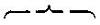
Middles and ends are also cast, [] which can be filled out with dashes to any length required for the brace. Middles and ends are convenient in genealogical tables, in which they are used the flat way, and in which the directing point is not always in the middle.
Brass braces of any length, for music and jobbing purposes, are furnished by type-founders.
SPACES.
Spaces are short blank types, and are used to separate one word from another. To enable the compositor to space even and to justify with nicety, they are cast to various thicknesses,—viz. five to an em, [] or five thin spaces; four to an em, [] or four middle spaces; three to an em, [] or three thick spaces; and two to an em, [] or two en quadrates, which may with propriety be reckoned among the number of spaces. Besides these, there is what is called the hair-space, which is cast extremely thin, and is found useful in justifying lines and assisting uniformity in spacing.


TWO-LINE LETTERS
Are equal in depth to two lines of the type in which they are to be used, and of proportionate width. They form the almost only proper type for principal lines in title-pages, and are used at the beginning of chapters and newspaper advertisements.
QUADRATES.
An em quadrate [■] is a short blank type, in thickness equal to the square of the letter of the fount to which it belongs; an en quadrate [▮] is half that size.
The first line of a paragraph is usually indented an em quadrate; but when the matter is leaded or the measure is wide, an em and en, or two or even three ems may be used. An em quadrate is the proper space after a full-point when it terminates a sentence in a paragraph.
En quadrates are generally used after the semicolon, colon, &c., and sometimes after an overhanging letter. They are useful in spacing.
Em and en quadrates, and figures as well, should be entirely exact and uniform in body, as even a trifling variation will be apparent when they are arranged in table or figure-work; and no ingenuity on the part of a compositor can rectify the zigzag appearance caused by irregular types.
The inconvenience arising from founts of the same body not agreeing in depth is great, where the quadrates, through necessity, are sometimes mixed. The founts cast by MacKellar, Smiths & Jordan are not liable to this charge, as their moulds for all regular type of a specific size harmonize perfectly, and the quadrates and spaces work together.
QUOTATIONS.
Quotations are large blank type used for filling up considerable spaces at the beginning or end of a chapter, and also for job-work. They are cast to two sizes, and are called broad and narrow. They vary in size according to the standard of the foundry where they are cast. They are being superseded, however, by
LABOUR-SAVING QUOTATION FURNITURE.
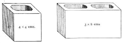
This is cast with great accuracy to Pica, of assorted widths and lengths; and, as its name imports, it serves not only for quotations in general job-work, but also for furniture.
STANDARD METAL FURNITURE.
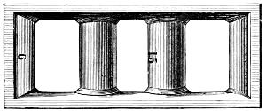
Owing to the large assortment of sizes contained in this furniture, it is useful for blanking out all varieties of work, from the card or circular to the large hand-bill or poster. As the above metal furnitures are not liable to warp or shrink, they form a highly economical substitute for wooden reglet.
HOLLOW QUADRATES
Answer many of the purposes of quotations, but are principally useful as frames or miniature chases for circular or oval jobs. The sizes are graduated from 5 × 8 to 12 × 18 Pica ems.
CIRCULAR QUADRATES.
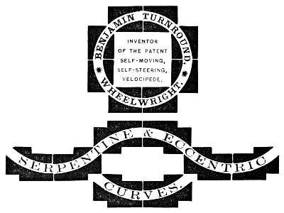
These are made of various sizes, so as to form circles or parts of circles from one to twenty-four inches in diameter. Each piece is exactly one-eighth of a full circle, and, when combined with similar pieces, will form quarter, half, three-quarter, and full circles. By reversing the combination of some of the pieces, serpentine and eccentric curves may be made of any length or depth.
There are two kinds: inner quadrates, with convex surface, and outer quadrates, with concave surface. The curved line is produced by placing the convex and concave surfaces parallel to each other, so that when locked up firmly they hold the type inserted between them. The other sides of the quadrates are flat and right-angled, to allow a close introduction of type, and an easy justification with common quadrates.
As these quadrates are perfect segments of a large circle, they cannot be increased or diminished without destroying the truth of the curve. If the thin ends are pieced out with common quadrates, good justification will be rendered impossible; if they are shortened by cutting off, they are ruined. Bits of lead or short pieces of card between the curved surfaces are also wrong: they destroy that exact parallelism which is necessary for the security of the type. Very accurate justification of the outer extremities of the quadrates is also indispensable. If the curved surfaces are kept parallel, and the flat surfaces kept square, no difficulty will be found in using them, and they will prove a valuable aid in ornamental printing.
LABOUR-SAVING CURVATURES, &c.
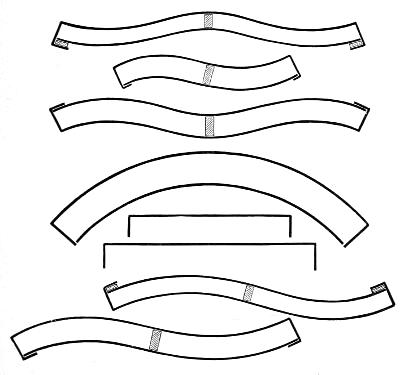
Morris’s Adjustable Line Formers, or Labour-Saving Curvatures, do away with bent leads, plaster, wax, and other methods of making curved lines. Their economical advantages, and the neatness and exactitude of curve secured by their use, will be appreciated at a glance by all practical job printers.
LEADS.
Leads form an essential part of a printer’s outfit, since it is scarcely possible to set up a single page or job in which they may not be usefully employed; but their chief purpose is for spreading the lines apart so as to reduce the amount of matter in a page. Fine works are always thus leaded. They are usually cast by letter-founders in a long mould, and then cut to the required lengths. The bodies are regulated by Pica standard, and they are usually cast four, six, or eight to Pica, but are occasionally varied from one down to fourteen to Pica. Leads for jobbing purposes are now cut to graduated lengths, like labour-saving rule.
FLOWERS AND BORDERS.
The flowers and borders designed and cast at the present time far surpass any made by founders of earlier days. Their richness and variety enable printers to execute delicate and elaborate work, rivalling plate engraving, and afford a wide scope for the display of taste and artistic skill. The combination borders are especially valuable from being cast on uniform bodies, thus rendering them susceptible of a vast number of changes.
The ancient practice of ornamenting pages with head and tail pieces of flowers and odd designs seems to be coming in vogue again, particularly in works printed in the old-style type.
BRASS RULES.
Rules are required mainly for table-work, and for pages which contain two or more columns. They are also useful in titles and jobs. Brass rules should never be more than type height, unless for perforating purposes, to divide railroad checks, &c. A shade lower would be often better, as the pressman would be enabled to bring off their impression more clearly. In table-work, the rule and figures should be separated by a lead, and all the rules should fit closely and accurately.
The lately-invented
BRASS LABOUR-SAVING RULE
is of immense economical advantage to the printer. Being cut to a graduated scale, from one em to fifty ems Pica in length, advancing in the shorter pieces by ens and in the longer by ems, all waste in cutting is avoided by the printer, as rules of any length can be formed by employing two or more pieces. This rule is put up in regular founts, of various styles, with sufficient mitred pieces for outside bordering.
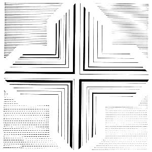
Metal space-rules, cast by type-founders, are commonly used for cross-rules in table-work; but the shorter pieces of labour-saving rule will answer as well.
On the next page we insert a plan of a case for labour-saving rules, with boxes suited for the various sizes, in which the rule should be kept when not in use.
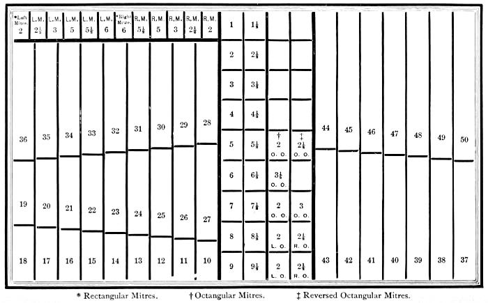
IMPROVED LABOUR-SAVING RULE CASE.
EARLIEST WRITTEN SOUNDS.
The hieroglyphic is the most ancient form of written sounds. The earliest known monuments containing phonetic hieroglyphics date about forty centuries ago, or six hundred years before the time of Moses, who is supposed to have been versed in the knowledge of the hieroglyphs. Yet nothing worthy of the name of an alphabet existed till a later period, when the Phœnicians invented a purely alphabetic system, but suppressing the vowels, and from this has originated all the modes of alphabetic writing now used.[12] The Greeks introduced the vowels into their graphic system, and so brought to perfection the invaluable invention of alphabetic writing.
The discovery of the Rosetta stone furnished a clue to the method of deciphering the Egyptian hieroglyphics; and Dr. Young and Champollion were the first to make use of the suggestive opportunity. The words Ptolemy and Cleopatra were made out; and these served as a key or incentive to further investigations; and extensive and curious volumes have been devoted to the interpretation of Egypt’s mysterious inscriptions on monuments and writings on papyrus.
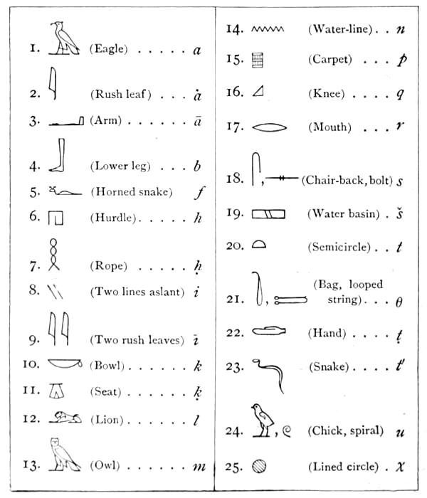
Among those who have investigated the Egyptian hieroglyphs, Mr. R. Lepsius is one of the most practical, for he has reduced the ancient characters to typographical uses for the behoof of the delvers into the earth’s earliest lore. He began the work soon after his return from a scientific expedition to Egypt during the years 1842-46, and his hieroglyphic types now completed number more than thirteen hundred. The Prussian government furnishing the needful pecuniary means, his first task was to ascertain the forms of hieroglyphic signs which would be most suitable for typographical purposes, and here the labour was immense. After laborious research, he reached the conclusion, that as European print had been formed, not from the monumental characters of the Greeks and Romans, but essentially from the current handwriting of documents on parchment and paper, so the hieroglyphic type should follow, not the chiseled or painted characters on the monuments, but the style of those written on papyrus. The style and proportions having been established, the punch-cutting was mostly executed by Mr. Ferdinand Theinhardt, the excellent Prussian type-founder, who for a series of years has been skilfully engaged in producing the matrices. We are indebted to Mr. Theinhardt for the specimens here given; the first of which is the hieroglyphic alphabet, and the second is the beginning of an ancient text found in a leather roll of the Royal Museum of Berlin, referring to the foundation of the temple of the Sun at On or Heliopolis in Egypt.
HIEROGLYPHIC ALPHABET.
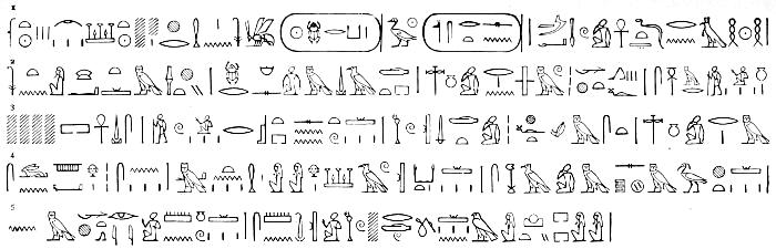
1 Renpt III ȧbeṭ III šat . . . xer ḥen n suten xet xeper-qu-rā sa-rā usertesen maā-xeru ānx tétta r neḥ:
2 suten xāt m sexti, xeper ḥemes m tȧṭet, netńu re n ȧmu-xetef, semer nu
3 . . . ānx utȧ senb, seru r ȧst senentu, utu téṭet xeft setem set netńu re m
4 seun ḥer-sen. Mā-ten ḥen-a ḥer šau qat, sexa m sep m xut;
5 n-mxet ȧrí-ȧ mennu, semen-ȧ utu reṭu n ḥer xuti.
TRANSLATION.
Done in the month of Hatoor of the third year of the King of Upper and Lower Egypt Kheperkara Usertesen I.—the blessed and eternally living.
The King, wearing the double crown, sat in the royal hall. There was held a council of his attendants, the counsellors of the apartments of the Pharao (may he live!) and the great (chiefs) for the site of the foundation. Speeches were made, while they listened; and they deliberated, stepping forward. “Well!” said the King, “let me order the work and fittingly commemorate deeds of glory. Henceforth I will erect buildings and lasting steles to the double Horus,” that is to the god of the rising and setting Sun, etc.
RUNIC ALPHABETS.
Runes were the earliest alphabets in use among the Teutonic and Gothic nations of Northern Europe. The exact period of their origin is not known. The name is derived from the Teutonic rûn, a mystery; whence runa, a whisper, and helrûn, divination; and the original use of these characters seems to have been for purposes of secrecy and divination. Scandinavian and Anglo-Saxon tradition agree in ascribing the invention of runic writing to Odin or Wodin. The countries in which traces of the use of runes exist include Denmark, Norway, Sweden, Iceland, Germany, Britain, France, and Spain; and they are found engraved on rocks, crosses, monumental stones, coins, medals, rings, brooches, and the hilts and blades of swords. Runic letters were also often cut on smooth sticks called rûn-stafas, or mysterious staves, and used for purposes of divination. But there is no reason to believe that they were at any time in the familiar use in which we find the characters of a written language in modern times, nor have we any traces of their being used in books or on parchment. We have an explanation of the runic alphabet in various MSS. of the early middle ages, prior to the time when runes had altogether ceased to be understood.
The systems of runes in use among the different branches of the Teutonic stock were not identical, though they have a strong general family likeness, showing their community of origin. The letters are arranged in an order altogether distinct from that of any other alphabetical system, and have a purely Teutonic nomenclature. Each letter is, as in the Hebrew-Phœnician, derived from the name of some well-known familiar object, with whose initial letter it corresponds. Runes, being associated in the popular belief with augury and divination, were to a considerable extent discouraged by the early Christian priests and missionaries, whose efforts were directed to the supplanting of them by Greek and Roman characters. But it was not easy suddenly to put a stop to their use, and we find runes continuing to be employed in early Christian inscriptions. This was to a remarkable extent the case in the Anglo-Saxon kingdoms of Northumbria, Mercia, and East Anglia, where we have traces of runic writing of dates varying from the middle of the seventh to the middle of the tenth century. Runes are said to have been laid aside in Sweden by the year 1001, and in Spain they were officially condemned by the Council of Toledo in 1115.
The different systems of runes, all accordant up to a certain point, have been classed as the Anglo-Saxon, the German, and the Norse, each containing different subordinate varieties. The Norse alphabet is generally considered the oldest, and the parent of the rest. It has sixteen letters corresponding to our f, u, th, o, r, k, h, n, i, a, s, t, b, l, m, y, but has no equivalent for various sounds which exist in the language, in consequence of which the sound of k was used for g, d for t, b for p, and u and y for v: o was expressed by au, and e, by ai, i, or ia; and the same letter otherwise was made to serve for more than one sound. Other expedients came, in the course of time, to be employed to obviate the deficiency of the system,—as the addition of dots, and the adoption of new characters. But the runic system received a fuller development among the Germans and Anglo-Saxons, particularly the latter, whose alphabet was extended to no fewer than forty characters, in which seem to have been embraced, more nearly than in any modern alphabets, the actual sounds of a language. The table on the following page exhibits the best known forms of the Anglo-Saxon, German, and Norse runic alphabets, with the names and the power of the several letters.
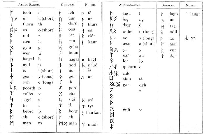
The Anglo-Saxon runes, as here given, are derived from a variety of MS. authorities, the most complete containing forty characters, while some only extend as far as the twenty-fifth or twenty-eighth letter. Neither the name nor the power of some of the later letters is thoroughly known, and they are without any equivalents in the Norse runic system. The German runes are given from a MS. in the conventual library of St. Gall, in Switzerland. Though the various runic alphabets are not alike copious, the same order of succession among the letters is preserved, excepting that, in the Norse alphabet, laugr precedes madr, although we have placed them otherwise, with the view of exhibiting the correspondence of the three systems. The number of characters in the Anglo-Saxon alphabet is a multiple of the sacred number eight; and we have the evidence both of a Swedish bracteate containing twenty-four characters, and of the above mentioned St. Gall MS., that there was a recognized division of the alphabet into classes of eight letters,—a classification which forms the basis of a system of secret runes, mentioned in that MS. Of these secret runes, there are several varieties specified: in particular, 1. Iis-runa and Lago-runa (of which specimens exist in Scandinavia), consisting of groups of repetitions of the character iis or lago, some shorter and some longer, the number of shorter characters in each group denoting the class to which the letter intended to be indicated belonged; the number of longer ones, its position in the class. 2. Hahal-runa, where the letters are indicated by characters with branching stems, the branches to the left denoting the class, and those to the right the position in that class. There is an inscription in secret runes of this description at Hackness, in Yorkshire. 3. Stof-runa, in which the class is indicated by points placed above, and the position in the class by points below, or the reverse.
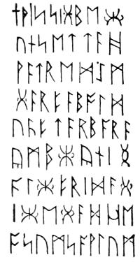
The best-known inscriptions in the Anglo-Saxon character are those on two grave-stones at Hartlepool, in Northumberland, on a cross at Bewcastle, in Cumberland, and on another cross at Ruthwell, in Dumfriesshire. The inscription on the west side of Bewcastle cross, which we give as a specimen of Anglo-Saxon runes, is a memorial of Alcfrid, son of Oswiu, who was associated with his father in the government of the kingdom of Northumbria, in the seventh century.
RUNES.
It has been thus deciphered into the Anglo-Saxon dialect of the period:—
+ THIS SIGBECUN SETTÆ HWÆTRED EM GÆRFÆ BOLDU ÆFTÆR BARÆ YMB CYNING ALCFRIDÆ GICEGÆD HEOSUM SAWLUM.
Or, in Modern English:—
This memorial Hwætred set and carved this monument after the prince after the king Alcfrid pray for their souls.
The inscription on the Ruthwell cross, after being long a puzzle to antiquaries, was first deciphered in 1838 by Mr. John M. Kemble, an eminent Anglo-Saxon scholar. It is written alternately down one side of the stone and up another, and contains a portion of a poem on the subject of the Crucifixion. Mr. Kemble’s interpretation received a very satisfactory confirmation by the discovery of a more complete copy of the same poem in a MS. volume of Anglo-Saxon homilies at Vercelli.
Mr. D. M. Haigh, whose researches have added much to our knowledge of Anglo-Saxon runes, has endeavoured to set up for them a claim of priority over the Norse characters. Instead of considering the additional Anglo-Saxon letters as a development of the Norse system, he looks on the Norse alphabet of sixteen letters as an abridgment of an earlier system, and finds occasional traces of the existence of the discarded characters in the earliest Norse inscriptions, and in the Scandinavian Iis-runa and Hahal-runa, where the letters are classified in accordance with the Anglo-Saxon groups of eight.
The Scandinavian kingdoms contain numerous runic monuments, some of them written boustrophedon, or with the lines beginning alternately from the right and left; and there are many interesting inscriptions on Swedish gold bracteates. The Celtic races, from their connection with the Scandinavians, became acquainted with their alphabet, and made use of it in writing their own language; and hence we have, in the Western Islands of Scotland and in the Isle of Man, runic inscriptions, not in the Anglo-Saxon, but in the Norse character, with, however, a few peculiarities of their own. Some of the most perfect runic inscriptions are in Man; others of similar description exist at Holy Island, in Lamlash Bay, Arran; and there is an inscription in the same character on a remarkable brooch dug up at Hunterston, in Ayrshire. Dr. D. Wilson considers that the Celtic population of Scotland were as familiar with Norse as the Northumbrians with Saxon runes.
We sometimes find the Norse runes used to denote numerals, in which case the sixteen characters stand for the numbers from 1 to 16; ar combined with laugr stands for 17, double madr for 18, and double tyr for 19. Two more letters are used to express higher numbers, as ur ur, 20; thurs thurs os, 34.[13]
ANGLO-SAXON ALPHABET.
The Anglo-Saxon alphabet, and the forms and sounds of the letters, are shown in the following table:—
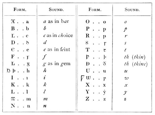
Two useful Anglo-Saxon letters have disappeared from modern English,—namely, Þ or þ th (thin), and Ð or ð th (thine).
The Anglo-Saxon letters which vary from those now used were doubtless mere corruptions of the Roman forms,—viz. the capitals A, C, E, G, H, M, S, and W, and the small letters d, f, g, i, r, s, t, and w. Several marks of abbreviation were used by the Saxons, as ꝥ that, ⁊ and, &c. These were not original members of the alphabet, but were introduced probably for despatch.
About the year 1567, John Daye, who was patronized by Archbishop Parker, cut the first Saxon types which were used in England. In this year, Asserius Menevensis was published by the direction of the archbishop in these characters; in the same year, Archbishop Ælfric’s Paschal Homily; and in 1571, the Saxon Gospels.
On the two following pages will be found a plan of cases for Saxon types.
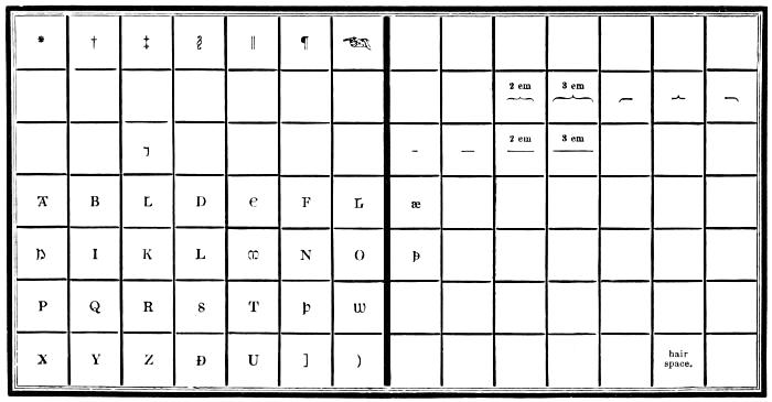
SAXON UPPER CASE.
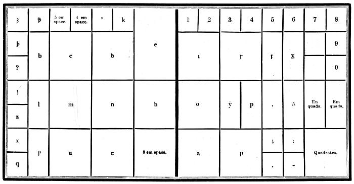
SAXON LOWER CASE.
GERMAN ALPHABET.
Outside of Germany, there is perhaps no country in which German printing is so extensively carried on as in the United States. We present a table of German characters, with their names, and their corresponding forms in English.
German Form. English Form. German Name.
A a A a ah
B b B b bay
C c C c tsay
D d D d day
E e E e a
F f ff F f ff ef, ef-ef
G g G g gay
H h ch H h ch hah, tsay-hah
I i I i e
J j J j yot
K k ck K k ck kah, tsay-kah
L l L l el
M m M m em
N n N n en
O o O o o
P p P p pay
Q q Q q koo
R r R r er
S ſ s ſſ S s s ss es, es-es
ſz ſt sz es-tset, es-tay
T t T t tay
U u U u oo
V v V v fōw
W w W w vay
X x X x iks
Y y Y y ipsilon
Z z tz Z z tz tset, tay-tset
ä ë ü ä ö ü or æ œ ue
Several of the German letters, being somewhat similar in appearance, are liable to be mistaken one for another. To aid the learner, we give such letters together, and point out the difference.
B (B) and V (V).
The latter is open in the middle, the former joined across.
C (C) and E (E).
E (E) has a little stroke in the middle, projecting to the right, which C (C) has not.
G (G) and S (S).
S (S) has an opening above, G (G) is closed, and has besides a perpendicular stroke within.
K (K), N (N), R (R).
K (K) is rounded at the top, N (N) is open in the middle, R (R) is united about the middle.
M (M) and W (W).
M (M) is opened at the bottom, W (W) is closed.
b (b) and h (h).
b (b) is entirely closed below, h (h) is somewhat open, and ends at the bottom, on one side, with a projecting hair-stroke.
f (f) and ſ (s).
f (f) has a horizontal line through it, ſ (s) on the left side only.
m (m) and w (w).
m (m) is entirely open at the bottom, w (w) is partly closed.
r (r) and x (x).
x (x) has a little hair-stroke below, on the left.
v (v) and y (y).
v (v) is closed, y (y) is somewhat open below, and ends with a hair-stroke.
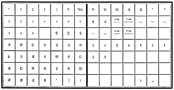
GERMAN UPPER CASE.
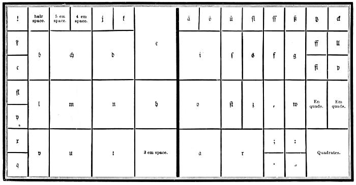
GERMAN LOWER CASE.
GREEK.
A small amount of Greek types is indispensable in every considerable book printing-office. The Greek alphabet contains twenty-four letters, which we give in the following table, with the name of each character expressed in Greek and English, and its sound and numerical value.
THE GREEK ALPHABET.
Forms. Names in Greek and English. Sounds. Numerical Value.
Α α Άλφα Alpha a 1
Β β ϐ Βῆτα Beta b 2
Γ γ Γὰμμα Gamma g 3
Δ δ Δέλτα Delta d 4
Ε ε Ἒψῖλόν Epsīlon ĕ short 5
Ζ ζ Ζῆτα Zeta z 7
Η η Ἦτα Eta ē long 8
Θ ϑ θ Θῆτα Theta th 9
Ι ι Ἰῶτα Iōta i 10
Κ κ Κάππα Kappa k c 20
Λ λ Λάμβδα Lambda l 30
Μ µ Μῦ Mu m 40
Ν ν Νῦ Nu n 50
Ξ ξ Ξῖ Xi x 60
Ο ο Ὀμῖκρόν Omĭcron ŏ short 70
Π π Πῖ Pi p 80
Ρ ρ Ῥῶ Rho r 100
Σ σ ς Σίγμα Sigma s 200
Τ τ Ταῦ Tau t 300
Υ υ Ύψῖλόν Upsīlon u 400
Φ φ Φῖ Phi ph 500
Χ χ Χῖ Chi ch 600
Ψ ψ Ψῖ Psi ps 700
Ω ω Ὠμεγα Omĕga ō long 800
From a desire, probably, to imitate Greek manuscript, a multitude of ligatures, abbreviations, and contractions of letters, as well as duplicates, were cast by the early type-founders. These, however, with two or three exceptions, have been quite discarded; and a fount of modern Greek is readily accommodated in a single pair of cases. The only duplicated characters in the preceding table are β and ϐ, ϑ and Θ, and σ and ς. β looks best when used as an initial letter, and ϐ as a medial. ϑ and Θ are used indiscriminately; but ς is employed as a final letter only.
There are twelve diphthongs or compound vowels in Greek, viz.:—
Six proper,—αι, αυ, ει, ευ, οι, ου; and
Six improper,—ᾳ, ῃ, ῳ, ηυ, υι, ωυ. The point under the first three letters denotes the iota, and is therefore called the subscript iota.
ACCENTS AND ASPIRATES.
᾿ Lenis.
῾ Asper.
´ Acute.
` Grave.
῀ Circumflex.
῎ Lenis acute.
῍ Lenis grave.
῞ Asper acute.
῝ Asper grave.
῏ Circumflex lenis.
῟ Circumflex asper.
¨ Diæresis.
΅ Diæresis acute.
῭ Diæresis grave.
Accents are nothing more than small marks which have been introduced into the language to denote the pronunciation of words, and aid its acquisition by learners. The ancient Greeks never used them, as is demonstrated from Aristotle, old inscriptions, and ancient medals. It is not easy to tell the date when the practice of writing with accents first obtained, though it is probable not till after the Romans began to learn the Greek tongue and to send their children to study at Athens,—that is, about or a little before the time of Cicero.
Accents—by the Greeks called τόνοι, tones—show the rising or falling of the voice in pronouncing; either separately in distinct syllables, or conjunctively in the same syllable.
Wherefore there are two sorts of accents: two simple, viz. the acute, ὀξύς, figured thus [´], which denotes the elevation of the voice; and the grave, βαρὺς, shaped thus [`], to signify the falling or depression of the voice: and the circumflex, περισπώμενος which was formed first of these two lines or points joined together thus [῍] and afterward was changed into a round sort of a figure like an inverted upsilon, thus [], but at length came to be figured like an s drawn crosswise [῀].[14]

The acute accent raises the voice, and affects one or more of the last three syllables of a word, if it has so many.
The grave depresses the voice, and affects the last syllable only.
The circumflex lengthens the sound, and affects either the last syllable of a word or the last but one.
There are two spirits, or breathings: the asper [῾], which is equivalent to the modern letter h; and the lenis [᾿], which has no perceptible power, and indicates the bare opening of the mouth and simple emission of the voice.
All the words that begin with a vowel have one of these breathings over them; but the vowel upsilon admits of no other than the spiritus asper at the beginning of a word.
In diphthongs the spiritus is put over the second vowel: as αὐτὸς, not ἀυτὸς.
The letter ρ, at the beginning of a word, has an asper over it, as, ῥέω; and where two ρs meet in a word, the first has a lenis, and the other an asper.
The apostrophe [’] is used for cutting off the vowels α, ε, ι, ο, and the diphthongs αι and οι, when they stand at the end of a word and the next word begins with a vowel: as, παρ’ αὐτῷ for παρὰ αὐτῷ; πάντ’ ἔλεγον for πάντα ἔλεγον.
Sometimes the apostrophe contracts two words into one: as, κᾳ’γὼ for καὶ ἐγὼ; ἐγῶ’μαι for ἐγῶ οἴμαι; κᾳ’κεῖνος for καὶ ἐκεῖνος.
Sometimes an apostrophe supplies the place of the first vowel beginning a word: as ὦ ’γαθὲ for ὦ ἀγαθὲ; ποῦ ’ςι for ποῦ ἐςι. This is chiefly used in poetry.
But the prepositions περὶ and πρὸ suffer no apostrophe though the next word begin with a vowel; for we write περὶ υμῶν, πρὸ ἐμοῦ; περὶ αὐτον, πρὸ ἐτῶν, &c.
The diæresis [¨] is put over the last one of two vowels that come together, to show that they must be pronounced separately, and not as a diphthong: thus, ἀϋτὴ with a diæresis makes three syllables; but without a diæresis αυ is a diphthong, and makes αὐτὴ two syllables.
Diastole [,] is put between two particles that would bear a different sense without it: thus, ὄ,τε ὄ,τι signify whatever; whereas ὁτε stands for as, and ὁτι for that. Τό,τε with a diastole implies and this; but when without, it answers to the adverb then.
The sign of interrogation, in Greek, is made by a semicolon [;].
The colon is made by an inverted full-point [·].
All other points are the same as in English.
The compositor will find it advantageous to bear in mind the following rules:—
1. No accent can be placed over any other than one of the last three syllables of a word.
2. The grave accent never occurs but on the last syllable; and, this being the case, the asper grave ῝ and lenis grave ῍ can be wanted only for a few monosyllables.
3. No vowel can have a spirit, or breathing, except at the beginning of a word.
4. The letter ρ is the only consonant marked by a breathing.
5. Almost every word has an accent, but very seldom has more than one; and, when this happens, it is an acute thrown back upon the last syllable from one of those words called enclitics (leaning back), which in that case has none, unless it be followed by another enclitic. In no other case than this can a last syllable have an acute accent, except before a full-point, colon, or note of interrogation, when the grave accent of the last syllable is changed to an acute,—a circumstance which has often led printers, who were ignorant of the reasons for accenting the same word differently in different situations, to think that there was an error in their copy, and thus to make one in their proof. Most errors, however, proceed from those who do not think at all about the matter.
PLAN OF GREEK CASES.
The following plan of cases for Greek type is probably more convenient than any other. A Roman case may readily be altered to accommodate the lower-case sorts. Compositors who aspire to a full knowledge of their art should by all means make themselves familiar with Greek and Hebrew letters and cases.
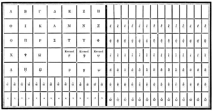
GREEK UPPER CASE.
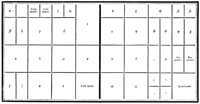
GREEK LOWER CASE.
HEBREW.
The Hebrew alphabet has twenty-two letters. Column No. 1 of the following table indicates the force of Hebrew letters when read without points. Column No. 2 gives their force when the language is printed with the Masoretic points or vowels, which are of later date than the letters. The names and numerical value of the characters are also shown.
THE HEBREW ALPHABET.
Names. No. 1. No. 2. Numer. Value.
א Aleph Sounded a in war (vowel) A gentle aspirate 1
ב Beth ... Bh 2
ג Gimel g hard Gh 3
ד Daleth ... Dh 4
ח He a in hate (vow.) A rough aspirate 5
ו Vau u vowel, or before a vowel, w ... 6
ז Zain ... Ds 7
ה Cheth ... Hh 8
ט Teth Th ... 9
י Jod Like ee in English (vowel) j consonant, or the softer y 10
כ ך final Caph k or c hard ... 20
ל Lamed ... ... 30
מ ם final Mem ... ... 40
נ ן final Nun ... ... 50
ס Samech ... Soft s 60
ע Ain o long (vowel) hg, or hgh, the roughest aspirate 70
פ ף final Phe ... ... 80
צ ץ final Tzaddi j soft ... 90
ק Koph k or qu ... 100
ר Resch ... ... 200
ש Shin or Sin ... s hard 300
ת Thau ... ... 400
LETTERS THAT HAVE A LIKENESS TO OTHERS.
Beth ב
Caph כ
Daleth ד
Caph ך
Resch ר
Vau ו
Zain ז
Jod י
Nun ן
Mem ם
Samech ס
Gimel ג
Nun נ
He ה
Cheth ח
Thau ת
Teth ט
Mem מ
Ain ע
Tzaddi צ
The dividing of Hebrew words not being permitted, the five following letters are cast broad to enable the compositor to justify the lines without irregular spacing:—
Aleph ﬡ
He ﬣ
Lamed ﬥ
Mem ﬦ
Thau ﬨ
Hebrew has no capitals, and therefore letters of the same shape, but of a larger body, are used at the beginning of chapters and other parts of Hebrew works.
Hebrew reads from the right to the left, which is the case with all other Oriental languages, except Ethiopic and Armenian. In composing it, the general method is to place the nick of the letter downward, and after putting the points to the top, to turn the line and set the points that come under the letters. If the letter has but one leg, the point is placed immediately under it; but where the letter has two legs, it is put under the centre.
The Masoretic points or vowels are subjoined under the consonant בּ (beth).
1. The Long Vowels.
Kametz ׇ aa בָּ baa
Tzeri ֵ ee בֵּ bee
Long Chirek י ii בִּי bii
Cholem וֹ oo בּבּוֹ boo
Shurek וּ uu בּוּ buu
2. The Short Vowels.
Patach ַ a בַּ ba
Sœgol ֶ e בֶּ be
Little Chirek ִ i בִּ bi
Kametz-chataph ָ o בָּ bo
Kibbutz ֻ u בֻּ bu
3. Shevas, which imply a Vowel to be wanting.
Simple Sheva חְ
Patach furtive חַ
Chataph Patach חֲ a
Chataph Sœgol חֱ e
Chataph Kametz חֳ o
The last three are called compound shevas; and, in fact, they are only the short vowels, to which the simple sheva [ְְ] is joined.
ACCENTS.
Hebrew accents are either mere points, or lines, or circles.
Those which are mere points or dots consist of one or two or three such points, and are always placed above the middle of the accented letter, thus,
That consisting of One, called rebia, ב֗ , i.e. sitting over.
Two, called royal zakeph katon, ב֔, or, the little elevator, from its figure, which is composed of upright points.
Three, called royal segolta, ב֒, an inverted [ ֶ].
The lines are either upright, inclined, or transverse.
The upright is either solitary or with points or dots.
The solitary is either between two words, ב׀ב, termed pesick, or musical pause, and terminating a song.
or under a word, Metheg, בֽ or bridle, an euphonic accent at the beginning of a word.
Royal silluk, בֽ, end, which is placed before [׃], sophpasuk, i.e. toward the end.
With points, namely, two, above the letter, royal zakeph gadhol, ב֕, the great elevator, strains the sound.
one, below the letter, royal tebhir, ב֛, broken sound, from its figure and tone.
Inclined lines hang either above or below.
Above, toward the right Leader pashta, ב֙, extension, extends the voice or sound, and is placed above the last letter of the word.
Subservient kadma, ב֨, antecedent, to the leader geresh; and is placed above the penult or antepenult letter.
the left Leader geresh, ב֜, expulsion, is sung with an impelled voice.
Gereshajim, ב֞, two expellers, from the figure being doubled.
Below, toward the right Leader tiphcha, ב֖, fatigue, from the song or note.
the left Of subservient merca, ב֥, lengthening out, from its lengthening out the song or note.
Merca kephula, ב֦, a double lengthening out, from its music and figure.
The transverse line is either right or curved: thus, ־ ֮ .
The right line is placed between two words, connecting them together, thus, ב־ב, and is called maccaph, i.e. connection.
The curved or waved line, ב֮, is called leader, zarka, or the disperser, from its modulation and figure.
Circles are either entire or semi.
The entire circle is placed always above, and has a small inclined line attached to it.
Either on the left, when it is placed at the head of the word, ב֠, and is called leader telisha the greater, or the great evulsion.
Or on the right, when it is placed at the end, ב֩, and is called subservient telisha the less.
On both together, ב֟, called leader karne para, the horns of the heifer, from its modulation and figure.
The semicircle is either solitary or pointed.
The solitary is either angular or reflected.
The angular is on the right Subservient hillui, ב֬, elevated, from the elevation of the voice.
Munach, ב֣, placed below, from its position.
on the left Leader jethith, ב֚, drawing back, from its figure.
Subservient mahpach, ב֤, inverted, also from its figure.
The reflected is either single subservient darga, ב֧, a degree.
or double, leader, shalsheleth, ב֓, a chain, from its figure and modulation.
When joined with other points, it is either above or below the letter.
When above the letter, it has a small line attached to it on the left, ב֡, leader paser, the disperser from the diffusion of the note.
When below the letter, it is pointed either downward, ב֑, called royal athnach, respiration, as the voice must rest upon it, and respire; or upward, ב֢, subservient, jerah-ben-jomo, the moon of its own day, from its figure.
PLANS OF HEBREW CASES.
The first plan shows a common case for Hebrew without points; the second exhibits a pair of cases with points.
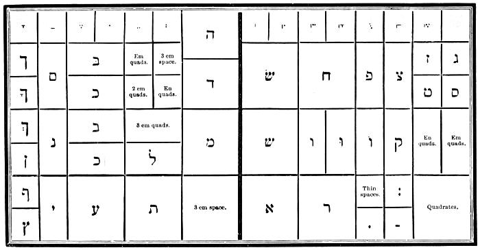
HEBREW LOWER CASE.
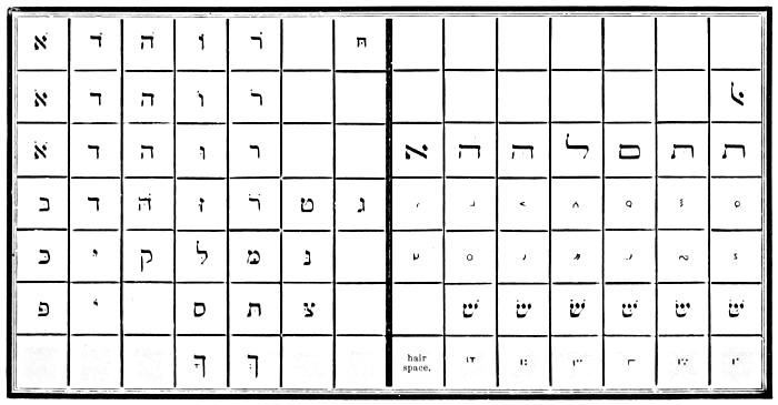
HEBREW UPPER CASE.
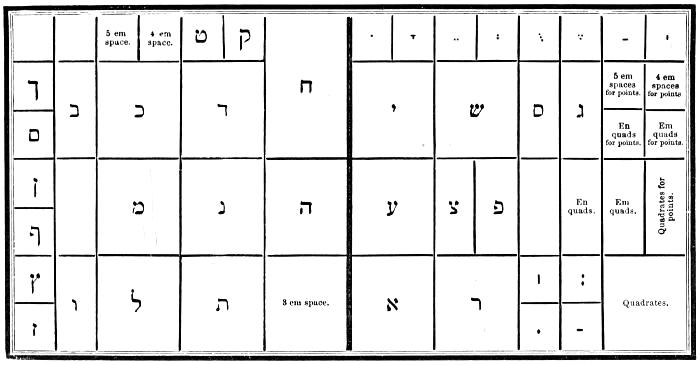
HEBREW LOWER CASE.
RUSSIAN ALPHABET.
Form. Sound.
А а ah, a.
Б б b.
В в v.
Г г g, gh.
Д д d.
Е е yai or ai.
Ж ж zsh.
З з z.
И и ee.
І і ee.
К к k.
Л л l (guttural).
М м m.
Н н n.
О о o or ah.
П п p.
Р р r.
С с hard s or ss.
Т т t.
У у oo.
Ф ф f, ph.
Х х kh, ch.
Ц ц ts.
Ч ч ch, tch.
Ш ш ch.
Щ щ sh-tch.
Ъ ъ mute e.
Ы ы we, ee.
Ь ь half-mute e.
Ѣ ѣ yai or ai.
Э э ai.
Ю ю you, ew.
Я я yah.
Ѳ ѳ f, ph.
Ѵ ѵ e.
Й й short e.
г, х, е, л, щ, ъ, ы, ь, ѣ, я, о, й, are the only letters whose pronunciation offers any difficulty.
Г has a sound nearly like g in the English word goose, as in гру́ша, a pear; read groòshah. But it has a guttural sound not found in English, and which nearly resembles that of the German ch. This sound is especially perceivable in the middle of a word when the г is followed by a consonant, also at the end of a word, as in но́гти, the nails; read nòchtee. In inflections аго, яго, ого, его, of adjectives and pronouns, the letter г is pronounced as v; as in кра́снаго, of beautiful; read kràsnavah.
Е has three different sounds: 1. In Russian words, and in all syllables in which it is preceded by a vowel, е has a sound like that of yai, when the y is nearly sunk in the pronunciation, as in ему́, to him; read yaimoò. 2. At the beginning of words from foreign languages, and at the middle and end of a word when preceded by a consonant, it has the sound of e in met, as in берегу́, I guard; read bayregoò. 3. In the termination екъ of diminutives, in all the characteristic inflections of cases in the nouns, and of persons in the verbs, in fact, in almost all words, this letter when accented has a sound nearly like that of short yo or o; as in куле́къ, a little sack; веде́шь, thou leadest; медъ, the honey; read koolyòk, vaidyòsh, myod. This sound yo or o of the letter е is commonly distinguished by a diæresis over the vowel, as кулёкъ, ведёшь, мёлъ.
Л has a guttural sound nearly analogous to the English w. Писарлъ, he wrote, read pisaw or pisou.
Ль has a soft sound, as in the French word bouillon.
Х corresponds to the German ch. It is a strong aspiration that nearly resembles the sound k when pronounced hastily from the throat; as in хвала́, the praise; read khvahlàh.
Щ unites the sound of ш and ч, as in щитъ, the shield; read shtcheet.
Ъ. This letter has no sound; the preceding consonant, the last letter of the word, ought to be pronounced a little hollow, as in боо́ъ, a bean; read bop.
Ы has a sound nearly like we when the w is pronounced rapidly; as in бу́квьшы, the letters, read boòkwe. It has this sound after the consonants б, в, м, п, ф; but after another consonant it is a thick e, as in сынъ, the son; read seen.
Ь. This letter at the end of a word has a sound nearly like that of the very short e. When followed by a consonant in the middle of a word it is mute, but is pronounced when followed by a vowel; as in знатъ, to know; read znaht.
Ѣ at the beginning of a word has the sound of yai; as in Ѣсть, to eat; read yaist. In the middle of a word it is pronounced yai, the sound of y being almost sunk; as in нѣтъ, no; read nyaitt. At the end of a word it is sounded ay.
Я when accented has the sound of the diphthong yah; as in я́ма, a pit; read yàhmah. But if not accented it is pronounced yai, as in ядро́, a ball; read yaidrò. The pronoun ея́, of her, is pronounced yaiyò, and the syllable ся of pronominal verbs is pronounced sah, as in стара́ться, to exert one’s self; read stahràhtsah.
О is pronounced as English o; but if unaccented it takes the sound of ah, as in ко́локолъ, a bell; колокола́, bells; read kòlahkall, kahlakahlà.
Й is a short e, pronounced very rapidly, as in дай, give; read dàï or die, giving utterance to a short e after the vowel.
In general the pronunciation of Russian words depends especially upon the tonic accent, which is no longer printed in Russian books, except to distinguish some homonymous words, or some grammatical inflections of similar forms; as за́мокъ, a castle, and замо́къ, a lock; read zàhmok and zahmòk.
MUSIC TYPE.
In no department of letter-founding has the progress of improvement been more decided and satisfactory than in the production of music type. The finest work of the music-stamper cannot surpass the ingenious combinations of the type-founder and printer. The music of which specimens are here given is cast on the centre of the body, and any intelligent workman may learn to compose it with facility. Brass lines are now furnished with founts when desired.
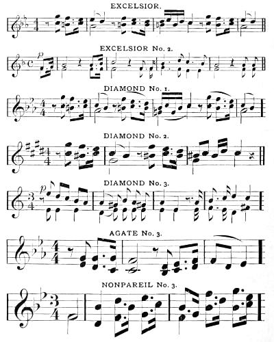
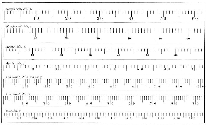
COMPARATIVE TABLE OF BODIES.
MUSIC COMPOSITION.
A knowledge of the rudiments of the art of music is essential to the correct composition of music type; for, unless the compositor is acquainted with the relative time-values of the notes and rests, he cannot space them properly.