Front matter (continued 4)
Reading edition
In the year 1492, when the form of the Florentine woodcuts had become fairly fixed, Savonarola was called to the death-bed of Lorenzo the Magnificent, only to refuse him absolution. His Amore di Gesù and Trattato dell’ Umiltà were printed in June of that year by Miscomini, each decorated with a single cut. During the six years ending with his execution in May, 1498, some twenty-three different tracts from his pen, illustrated with one or more woodcuts, were printed at Florence, most of them in several different editions. In the De Simplicitate Christianae vitae (1496) a friar is shown writing in his cell; in other cuts we see a friar preaching, or visiting the convent of the “Murate” or Recluses of Florence, or talking with seven Florentines under a tree, but in no case has any attempt been made at portraiture. This is true also of the Compendio di Revelatione (1495), in which there are some charming cuts showing Savonarola escorted by four holy women representing Simplicity, Prayer, Patience, and Faith, on an embassy to the Blessed Virgin. In the first of these they meet the devil attired as a hermit; in the second they arrive at the gate of the celestial city of which the wall is crowded with saints and angels; in the third they are ushered forth by S. Peter. A tract by Domenico Benivieni in defence of Savonarola, besides a cut of the usual size representing Benivieni arguing with his opponents, has a full-page one of the river of blood flowing from Christ’s wounds and sinners cleansing themselves in it and marking their foreheads with the sign of the cross. One of the finest cuts in the Savonarola series represents a citizen of Florence in prayer before a crucifix. But almost all of them are good.
Besides the Savonarola tracts the miscellaneous religious treatises illustrated with one or more woodcuts are very numerous. In some cases outside models were still sought. One of the most important of these books is the Meditatione sopra la Passione attributed to S. Bonaventura, of which two undated editions were issued, one with eight cuts, the other with twelve, three of the additional cuts in the second edition—the Entry into Jerusalem, Christ before Pilate, and Procession to Calvary (see Plate XVI)—being exceptionally fine. The earlier designer probably had the Venetian edition of 1489 before him, but used it quite freely. Two of the three cuts in the 1494 Florentine edition of the Libro delli commandamenti di Dio of Marco del Monte S. Maria are improved copies of those in the Venetian edition of 1486. The third cut, which appears also in the same author’s Tabula della Salute (also of 1494), representing the Monte della Pietà, is copied on a reduced scale from a large copper engraving attributed to Baccio Baldini, of which an example is in the Print Room of the British Museum. Of the thirty-four cuts in Cardinal Capranica’s Arte del benmorire, eleven are imitated from the well-known series in the German block-books.
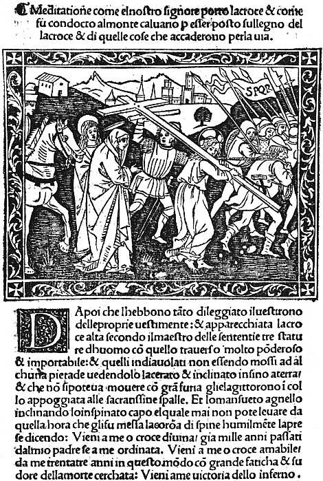
XVI. FLORENCE, MISCOMINI, C. 1495 BONAVENTURA. MEDITATIONE. THE PROCESSION TO CALVARY
For the Rappresentazioni or miracle-plays in honour of various saints originality was more imperative, and numerous cuts were designed, only a few of which have come down to us in editions of the fifteenth century, most being known as they survive in reprints of the second half of the sixteenth. Our example (Plate XVII) is from an undated edition of La Festa di San Giovanni, in which, as on many other titlepages, an angel is shown above the title-cut as the speaker of the Prologue. Purely secular literature in the shape of Novelle was no doubt plentiful, despite the influence of Savonarola, but most of it has perished, thumbed to pieces by too eager readers. A volume of Novelle at the University Library, Erlangen, is illustrated with delightful cuts, and others survive here and there in different libraries. Of more pretentious quartos Angelo Politiano’s La Giostra di Giuliano di Medici (first edition undated, second 1513) is very finely illustrated, and Petrarch’s Trionfi (1499) has good versions of the usual six subjects.
Many of the best of the quartos and all the illustrated folios were financed by a publisher, Ser Piero Pacini of Pescia, who was succeeded early in the sixteenth century by his son Bernardo. Pacini in 1495 began his career with a very ambitious venture, a folio edition of the Epistole et Evangelii et Lectioni as they were read in the Mass throughout the year. This has a decorative frontispiece, in the centre of which stand SS. Peter and Paul, while small cuts of the four evangelists are placed in the corners. The text is illustrated with 144 different woodcuts, besides numerous fancy portraits of evangelists, prophets, etc. A few of the cuts are taken from the Meditationes of S. Bonaventura, and one or two, perhaps, from other books already published; but the enormous majority are new, and from the consistency of the portrait-types of Christ, S. Peter, S. John, etc., appear all to have been designed by the same man. Some are less successful than others, but the average is exceptionally high, and the best cuts are full of movement and life. An Aesop followed in 1496, Pulci’s Morgante Maggiore in 1500, and the Quatriregio, a dull poem in imitation of Dante by Bishop Frezzi, in 1508. It has been conjectured, however, that an earlier edition of the Quatriregio may have been printed in the fifteenth century with the same illustrations, and there is considerable reason to doubt whether any fresh cuts in the old style were made at Florence after the temporary cessation of publishing brought about by the political troubles of 1501. On the other hand, the old cuts went on being used, sometimes in the originals, sometimes in copies, throughout the greater part of the sixteenth century, and it is only in these reprints that many of them are known to survive.
At no other Italian town was there any outburst of book-illustration at all comparable to those at Venice and Florence in the last decade of the fifteenth century. At Ferrara, after a fine cut of S. George and a much ruder one of S. Maurelius in a Legenda of the latter saint printed in 1489,36 no illustration appeared until 1493, when the Compilatio of Alfraganus was adorned with a picture of the astronomer instructing a diminutive hermit. After this, in 1496 we have a fine cut of the Virgin and Child in the De ingenuis adolescentium moribus, and in 1497 two important folio books, both from the press of Lorenzo Rossi, the De claris mulieribus of Jacobus Philippus Bergomensis (29 April) and the Epistles of S. Jerome (12 October). The former of these is distinctly native work, with the exception of an architectural border, decorated chiefly with putti and griffins, etc., which is thoroughly Venetian in style, and was used again in the S. Jerome. There are two large illustrations, one showing the author presenting his book to the Queen of Hungary and Bohemia, the other containing eight scenes from the life of the Blessed Virgin. Fifty-six cuts in the text are made to serve as portraits of 172 different women, and under the strain of such repetition individuality perforce disappears. But at the end of the book are seven cuts of Italian ladies of the fifteenth century: Bona of Lombardy, Bianca Maria of Milan, Catherine Countess of Fréjus and Imola, Leonora Duchess of Ferrara, Bianca Mirandula, Genebria Sforza, and Damisella Trivulzia, and these, some of them fair, some rather forbidding, appear all to be genuine portraits. The cutting is mostly rather stiff and heavy (Damisella Trivulzia is exceptionally tenderly treated), and much use is made of black grounds.
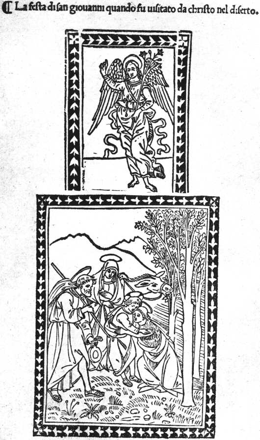
XVII. FLORENCE, BART. DI LIBRI, C. 1495 LA FESTA DI SAN GIOVANNI. (TITLE)
In contrast to those in the De claris mulieribus, the cuts in the Epistulae of S. Jerome are distinctly Venetian in style. As one of the two architectural borders is dated 1493, it is possible that the book was at first intended to be issued at Venice, but was transferred to Ferrara when Venetian interest in small column-cuts was found to be on the wane. It possesses in all over 160 of these, those illustrating conventual life in the second part of the book being much the most interesting.
At Milan the Theorica Musicae of Franchino Gafori, printed in 1492 by Philippus Mantegatius, has a title-cut of a man playing the organ, and four coarsely cut pictures, together occupying a page, showing primitive musical experiments. Four years later the same author’s Practica Musicae was issued by another printer, Guillaume Le Signerre, with a title-cut illustrating the different measures and the Muses and signs of the Zodiac to which they belong, and with two fine woodcut borders surrounding the opening pages of Books I and III, and II and IV. In 1498 Le Signerre produced two much more profusely illustrated books, the Specchio dell’ Anima of Ludovicus Besalii and an Aesop, some of the cuts of the former being used again in 1499 in the Tesoro Spirituale of Johannes Petrus de Ferrariis. After this he migrated to Saluzzo, and in 1503 produced there a fine edition of the De Veritate Contritionis of Vivaldus, with a frontispiece of S. Jerome in the desert. At Modena in 1490 Dominicus Rocociola printed a Legenda Sanctorum Trium Regum, with a rather pleasing cut of their Adoration of the Holy Child; and two years later, at the same place, the Prognosticatio of Johann Lichtenberger, printed by Pierre Maufer, was illustrated with three full-page quarto cuts and forty-two half-page ones, careful directions for each picture being supplied in the text, but the cuts being modelled on those in the German editions at Ulm and Mainz. At Aquila in 1493 an Aesop was produced, copied from the Naples edition of 1485. At Pavia in 1505 the Sanctuarium of Jacobus Gualla was illustrated with seventy woodcuts and some excellent initials. At Saluzzo in 1508 another work by Vivaldus, printed by Jacobus de Circis and Sixtus de Somachis, was decorated with three large woodcuts of very exceptional merit: a portrait of the Marquis Ludovico II (almost too striking for a book-illustration), a picture of S. Thomas Aquinas in his cell, and another of S. Louis of France. The treatise of Paulus de Middelburgo on the date of Easter, printed by Petruzzi at Fossombrone in 1513, contains some very fine borders, and the Decachordum Christianum of Marcus Vigerius, printed at Fano in 1507 by Hieronymus Soncinus, has ten cuts by Florio Vavassore, surrounded with good arabesque borders. To multiply isolated examples such as these would turn our text into a catalogue. Here and there special care was taken over the decoration of a book, and worthy results produced. But throughout Italy the best period of illustration had come to an end when the sixteenth century was only a few years old.
31 In the masterly work of the Prince d’Essling on Les livres à figures Vénitiens, the discovery of this interesting fact is inadvertently ascribed to Mr. Guppy, the present librarian of the John Rylands Library. It was made by his predecessor, Mr. Gordon Duff, a note by whom on the subject was quoted in my Italian Book-Illustrations (p. 18), published in 1894.
32 The same trick is used in the Rudimenta astronomica of Alfraganus, printed at Ferrara by Andreas Bellfortis in 1493.
33 Also used in an undated edition of the Flores Poetarum.
34 Mr. Berenson prefers to call him “Alunno di Domenico,” Ghirlandajo’s pupil.
35 Introduction to the Roxburghe Club edition (presented by Mr. Dyson Perrins) of the Epistole et Evangelii of 1495.
36 There were two issues or editions of this book in 1489, one of which is said to have only the cut of S. Maurelius.
CHAPTER IX
EARLY FRENCH AND SPANISH ILLUSTRATED BOOKS
Although interrupted by the death of its veteran author, Claudin’s magnificent Histoire de l’imprimerie en France, in the three volumes which he lived to complete, made it for the first time possible for students to trace the early history of book-illustration at Paris and Lyon, the two great centres of printing in France. No illustrated books were printed at the Sorbonne, nor by its German printers when they set up in the rue S. Jacques, nor by their rivals there, Keysere and Stoll, and the French printers at the sign of the Soufflet vert. In January, 1476-7, in the first French book printed at Paris, the Chroniques de France or de S. Denis, Pasquier Bonhomme so far recognized the possibility of illustration as to leave a space for a miniature on the first page of text,37 but he used no woodcuts himself, and his son Jean suffered himself to be anticipated in introducing them by Jean Du Pré. Although he worked on rather narrow lines, Du Pré was the finest of the early Parisian printers, and possessed far better taste than the prolific publisher, Antoine Vérard, of whom so much more has been written. His first book, a Paris Missal issued in partnership with Didier Huym, 22 September, 1481, has a large picture of the Père Éternel and the Crucifixion. Although this is fairly well cut, it is baldly handled, and was far surpassed two months later (28 November) in a similar missal for the diocese of Verdun, by a really fine metal-cut of a priest and other worshippers at prayer at an altar. From the priest’s uplifted hands a little figure of a man is rising up to a vision of the Père Éternel, seen with His angels against the background of a sky full of stars. The little figure is the priest’s soul, and the cut (often confused with pictures of the Mass of S. Gregory, in which the Host is seen as a figure of Christ) illustrates the opening words of the introit: “Ad te levavi animam meam.” In the same Missal are a number of smaller cuts which look as if they had been prepared for a Horae, and may indeed have been used for one now entirely lost. The “Ad te levavi” cut reappears in many of the later Missals of Du Pré, and subsequently of Wolfgang Hopyl. Du Pré’s first secular book to be illustrated was an edition of Boccaccio’s De la ruine des nobles hommes, completed 26 February, 1483-4, and of peculiar interest to English bookmen because the woodcuts were acquired by Richard Pynson, and used in his edition of Lydgate’s Falles of Princes, an English verse-rendering of the same work. They are well designed and clearly cut, if rather hard, and till their French origin was discovered were justly praised as “some of the very best” English woodcuts of the fifteenth century. Only a few weeks later Jean Bonhomme (12 May, 1484) issued Maistre Jacques Millet’s L’Histoire de la destruction de Troye la Grant, illustrated with a number of cuts rather neater and firmer, but of much the same kind, and possibly from the same workshop. They passed almost at once into the possession of Vérard, and cuts from the series illustrating battles, landings, councils, audiences, and other romantic commonplaces are found in his Végèce of 1488 and Les Commentaires Iules César of about the same date (see Macfarlane’s Antoine Vérard, cuts vi-ix). A new edition of Millet’s book was printed by Jean Driard for Vérard 8 May, 1498. Two of the best of the cuts are those of the lamentation over the dead body of Hector and the sacrifice of Polyxena on the tomb of Achilles. The only other illustrated book published by Jean Bonhomme was his edition of the Livre des ruraulx prouffitz du labeur des champs, a French version of Crescentius, with a frontispiece of the translator presenting his book to Charles VII (15 October, 1486). Meanwhile, a new publisher of illustrated books had arisen, Guyot Marchant, who in September, 1485, issued a Danse macabre which went through several editions. Its grim fantastic pictures (executed with unusual skill and delicacy, see Plate XVIII) of Death as a grinning skeleton claiming his prey from every class of society seem to have become quickly popular, and additional cuts were made for later editions, including one in Latin (15 October, 1490), in which the Dance is called Chorea ab eximio macabro versibus alemanicis edita. A Danse macabre des femmes followed (2 May, 1491), but the figures in this are mostly less good, as are those of a third part (the Debate between Soul and Body, and other pieces), despite the vivacity with which they represent the tortures of the damned. Akin to the Danse Macabre is the Compost et Kalendrier des Bergers (also of 1491), a medley of weather-lore, rules for health, and moral and religious instruction, liberally illustrated with cuts of shepherds, of Moses, Christ and the Apostles, and of the tortures of the damned. This in its turn was followed, in 1496, by a similar book for the Shepherdesses, of which a new edition appeared in 1499, with added pastoral cuts, some of which have unusual charm. Besides Guyot Marchant, Pierre Levet began book-illustration in 1485, but most of his work was done for Vérard. His earliest venture, an Exposition de la salutation angélique, has a cut of the Annunciation, the shading in which suggests that he may have imported a cutter from Lyon.
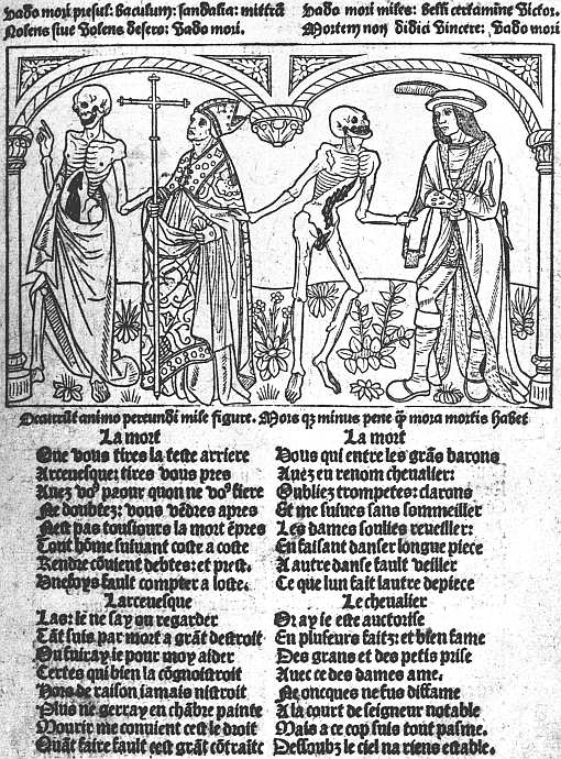
XVIII. PARIS, MARCHAND, 1491 DANSE MACABRE (5a). DEATH AND THE ARCHBISHOP. (REDUCED)
In 1486 Jean Du Pré was very busy. At Paris he completed in June a Vie des anciens Saintz Pères, with a large cut of S. Jerome writing in a stall and the holy fathers passing before him, also numerous very neat column-cuts and capital letters. Meanwhile, at Abbeville Du Pré was helping Pierre Gérard to produce one of the finest French books of the fifteenth century, the magnificent edition of S. Augustine’s Cité de Dieu. Early in 1486 Gérard had already printed there an edition of La somme rurale, but this had only a single woodcut, and it was probably mainly in connection with the illustrations that he now enlisted the help of Du Pré. In the first volume of the Cité de Dieu (finished 24 November, 1486) there are eleven woodcuts, in the second (finished 12 April, 1486-7) twelve, i.e. a woodcut at the beginning of each of the twenty-two books and a frontispiece of S. Augustine writing, and the translator, Raoul de Preules, presenting his book to the King of France. The subjects and general design of the cuts correspond with greater or less closeness to those in Royal MS. 14 D. 1 at the British Museum (Books I-XI only), so that the same original was probably followed by both. One of the most effective pictures is that to Book XIV, which shows a man seated in a tree, offered a crown by an angel and a money-chest by a devil, while Death is sawing the tree asunder, and two dragons wait at its foot. Another shows S. Augustine writing, while five devils play with his books, and an angel protects his mitre. The cutting throughout is excellent, and the pictures, though sometimes fantastic, are very effectively drawn. There can be little doubt that they were the work of Paris craftsmen. As for Pierre Gérard, in 1487 he printed by himself, still at Abbeville, an edition of Le Triomphe des Neuf Preux, with rather childishly conventional cuts of the legendary heroes, but for Bertrand Du Guesclin a portrait which at least faithfully reproduces his bullet head. We find Du Pré forming a similar alliance two years later with Jean Le Bourgeois of Rouen, for whom he completed at Paris the second volume of a Roman des Chevaliers de la Table ronde, 16 September, 1488, while Le Bourgeois was still struggling at Rouen with Vol. I, which ultimately got finished 24 November. This has some large cuts of the Feast at the Round Table, etc. In 1489 Du Pré produced a Legende dorée, a companion volume to his Vie des Saintz Pères of 1486. But by this time he was already producing Horae, which will be spoken of later on, and Horae and Missals were his main occupations for the rest of his career, though he produced a fine edition of the allegorical romance Le Chevalier Délibéré by Olivier de la Marche, Bonnor’s Arbre des Batailles (in which he used some of the same cuts), 1493, Les vigilles du roi Charles VII and some other secular books.
The great Paris publisher Antoine Vérard started on his busy career in 1485, and the history of book-illustration at Paris is soon immensely complicated by his doings. Many of the printers at Paris printed for him; illustrations originally made for other men gravitated into his possession and were used occasionally for new editions of the book for which they had been made, much more often as stock cuts in books with which they had nothing to do; while if another firm brought out a successful picture-book, Vérard imitated the cuts in it with unscrupulous and unblushing closeness. The monograph of my late friend and colleague John Macfarlane38 describes some 280 books published by Vérard between 1485 and 1512, and like most bibliographical work done at first hand by personal examination of the books themselves gets at the root of the matter, although the absence of information as to Vérard’s predecessors and contemporaries, such as has since been supplied by M. Claudin, prevented the author from pressing home some of his points. Thus in his estimate that sets of blocks had been “expressly cut to adorn some thirty editions,” Macfarlane did not make sufficient allowance for the cases in which these apparent sets were themselves not original, having been acquired by Vérard from earlier owners. Nevertheless, he had no difficulty in finding support for his contention that “the illustrations in Vérard’s books, when closely examined, hardly bear out their reputation.” Thus he showed that “besides being repeatedly used in book after book, it not uncommonly happens that the same cut is used again and again in the same book,” and gave as an extreme instance of this the repetition no fewer than twenty times of the same cut in the Merlin of 1498.39 He pointed out, moreover, that some far-fetched plea is nearly always needed to justify the presence of a cut in any but the work it was designed for. “For instance, in the Josephus of 1492 the spoliation of a country is represented by the burial of a woman, the death of Samson by a picture of the Temple, and the Sacrifice of Isaac helps the reader to conceive the execution of a malefactor, while a mention of the sea brings out a cut of Noah’s Ark.” However crowded a book may be with cuts, if the cuts are mostly irrelevant it cannot truly be said to be illustrated, and the number of Vérard’s books which a rigorous application of this principle would condemn is very large. An explanation of at least some of these incongruities may be found in Vérard’s early training as an illuminator, and his habit of preparing special copies on vellum for Charles VIII of France, Henry VII of England, the Comte d’Angoulême, and other royal and noble patrons. A woodcut in itself quite inappropriate to the text might save an illuminator some trouble by suggesting the grouping of the figures in a picture, and a cut of Saturn devouring his children was actually used in this way in one of the Henry VII books in the British Museum as a ground plan for an illumination of a Holy Family. If King Henry ever held that illumination up to the light he would have had no difficulty in seeing the scythe of Chronos and the limbs of a child protruding from Saturn’s mouth, but I have never seen a paper copy of this book, and can only wonder whether the same cut was allowed to appear in it.
Vérard’s earliest book was the translation of Boccaccio’s Decamerone by Laurent du Premierfait, completed 22 November, 1485, and illustrated with a single cut of the author writing in an alcove looking out on a garden where the storytellers are seen seated. An edition of Les dits moraux des philosophes of Guillaume de Tignonville (Caxton’s Dicts and Sayings of the Philosophers) followed in April, 1486, and the Livre des ruraulx prouffitz, translated from Crescentius, with a few small cuts, not so good as those in the edition just issued by Jean Bonhomme, in the following July. His first important illustrated book was the Cent nouvelles nouvelles, of Christmas Eve, 1486, with two large cuts, very alike in style, of an author presenting his book to a king, and forty column-cuts, most of them used several times, occasionally with mutilations intended to erase features unsuitable to the later stories. The next important book was a Chevalier Délibéré of 8 August, 1488, with some excellent cuts which reappear frequently in later books. Passing over many inferior books, we come in 1492 to a really fine one, containing four separate treatises: (1) Art de bien mourir, illustrated with copies of the old German block-book; (2) Traité des peines d’enfer (otherwise known as L’Aiguillon de crainte divine), with grotesque but striking cuts of the tortures of the damned; (3) Advenement de antichrist and fifteen Tokens of Judgment, very poorly illustrated compared with the other parts of the book; and (4) L’Art de bien vivre, copiously decorated with scenes from Bible history, an oblong set, illustrating the Adoration of the Virgin and Child, the Lord’s Prayer, Commandments, Apostles, etc.; (5) a very fine set of cuts illustrating the Sacraments.
In June, 1493, Vérard published in three large folio volumes, printed for him by Jean Morand, Les Croniques de France, with pictures of a coronation, royal entry into a town, a king sitting in judgment, etc. etc., the cutting being only of average delicacy, but good enough to do justice to the vigour of some of the designs. From this point onwards his interest seems more and more to have centred in his illuminated copies, and almost all the later Vérard illustrations in M. Claudin’s great work are taken from these. Along, however, with many old cuts in his undated Bible historiée there are two very fine ones specially made for the work, one of Adam and Eve in Eden, a round cut placed, below the roots of a tree, in a square of black, from which it stands out with extraordinary vividness (see Plate XIX), and a picture of the Trinity and the four evangelists. In an undated Terence en francois, printed about 1500, Vérard availed himself of an idea already exploited by Grüninger and some of the Low Country illustrators, the use of blocks made up of five or six pieces used in different combinations, so as to give an effect of great variety at very small expense. Many of the individual blocks, though the figures are not at all Terentian, are very charming, and a few of them were freely copied for the English market, where they may be traced for over a century. About the same time as this Vérard published a Livre des Ordonnances de la Prevosté des Marchans et Eschevinage de la Ville de Paris, with numerous small illustrations of different crafts and a most interesting picture of the court of the Prevosté with its judges and officials. After the first few years of the sixteenth century Vérard seems to have relied more than ever on his stock of old cuts, and does not seem to have produced any notable new books.
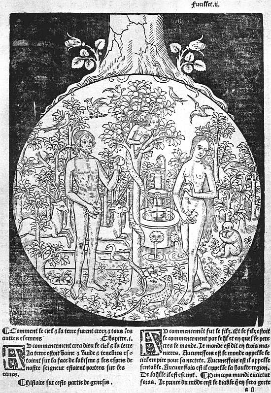
XIX. PARIS, VÉRARD, 1505 BIBLE EN FRANCOYS (2a). ADAM AND EVE. (REDUCED)
A few books printed or published by less prolific firms remain to be noticed before we speak of the Horae which form so important a section among Paris illustrated books as to require separate treatment. One of Vérard’s printers was Pierre Le Rouge, a member of a family which worked also at Chablis and at Troyes. In July, 1488, and February, 1488-9, Le Rouge printed “pour Vincent Commin Marchand libraire” La mer des histoires in two great folios with large cuts of the kind Vérard subsequently used in his Chroniques de France, and on the titlepage a particularly fine capital L. Philippe Pigouchet, mainly a printer of Horae, produced in 1499 for his usual publisher, Simon Vostre, a charmingly illustrated edition of a dull poem, Le Chasteau de Labeur, attributed to the playwright of Victor Hugo’s Notre Dame de Paris, Pierre Gringore. Wolfgang Hopyl printed some fine Missals, mostly after 1500; Le Petit Laurens, besides working for Vérard, printed for G. Marnef La nef des folles, with a few cuts by one of the most skilled of Paris craftsmen, and these were rivalled by Jean Treperel in an undated Paris et Vienne; Gillet Couteau and Jean Ménard printed a Danse Macabre in 1492 (not so good as Gui Marchant’s) and a new version of the Biblia Pauperum entitled Les figures du vieil testament et du nouveau; Jean Lambert, in 1497, produced La nef des folz du monde, with cuts imitating those in the Basel editions. It would be easy to mention other books, but not without turning our pages into a catalogue.
We must turn now to the Paris Horae. As already noted, among the pictures in Jean Du Pré’s Verdun Missal of November, 1481, there are a set of cuts which seem to have been designed for a Horae, though if they were even put to this use no copy of the edition in which they appeared has been recorded. The earliest illustrated Horae of which copies exist are three editions published by Vérard, in February 1485-6, August 1486, and July 1487, all of them small and with insignificant cuts, and all known only from single copies, of which that of the earliest edition (in private hands) is imperfect, while the woodcuts in the other two, both at the Bibliothèque Nationale, are heavily coloured.
Vérard’s Horae of 1486 and 1487 are said to have been printed for him by Jean Du Pré, and in the next group of editions Du Pré on his own account seems to have played the chief part, with Levet and Caillaut as subordinate actors. It is probable that the group may have been started by a Psalter printed by Levet 23 September, 1486, and reprinted 19 February, 1488-9, the cuts of these appearing in an undated Horae ad usum Romanum, printed by Du Pré, now in the British Museum. This measures about 45⁄8 × 3¼ inches, and of the same size, but with different woodcuts, are another undated Horae by Du Pré in the Bodleian, and a third, with Caillaut’s mark at the end, in the Bibliothèque Nationale. The cuts in all three are delightfully simple and naive, and those in the Bodleian Du Pré edition show really delicate work. The group, which comprised other editions only known from fragments, seems to be continued by two dated respectively 10 May, 1488, and 4 February, 1488-9, each measuring about 55⁄8 × 35⁄8 inches, the illustrations in which are distinctly stated to have been cut on copper (les vignettes de ces presentes heures imprimees en cuyvre). The illustrations especially referred to are the borderpieces, which are of great importance as containing the earliest examples of a series of small Horae cuts continued from page to page, in this case depicting incidents in the life of Christ and their prefigurements, on the plan of the old block-book Biblia Pauperum. Lastly, in 1490, we have a Du Pré Horae, with very fine cuts and with some of the miscellaneous borderpieces of the editions just mentioned, which is of exceptional interest in the history of French book-illustration and printing, since the cuts and borders in it are printed in different colours, faint red, blue and green, two colours (laid on the same block and printed at the same time) usually appearing together. The British Museum possesses one of two known copies of this Horae, and the late Prince d’Essling bought the other.
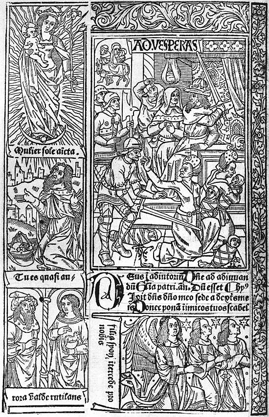
XX. PARIS, VÉRARD, 1490 GRANDES HEURES (SIG. C 6 VERSO). MASSACRE OF THE INNOCENTS
In the Horae of the group we have been describing the subjects of the larger cuts became fairly well settled, in accordance with the normal contents of the prayer book. For the Kalendar there is the figure of a man with an indication of the parts of his body presided over by the different planets: for the sequence of the Gospels of the Passion, sometimes a Crucifixion, sometimes a picture of S. John; for the Hours of the Blessed Virgin, the Annunciation, Visitation, Nativity, Shepherds, Magi, Circumcision, Massacre of the Innocents or Flight into Egypt, and Assumption of the Blessed Virgin; for the Hours of the Cross, a Crucifixion; for the Hours of the Holy Spirit, His Descent at Pentecost; for the Penitential Psalms, David’s fall (Bathsheba bathing or the death of Uriah) or repentance; for the Office of the Dead, either a Funeral, Dives and Lazarus, or the three Gallants and three Skeletons (les trois vifs et trois morts); for the Suffrages, small pictures of various saints. Any edition might have one or more additional cuts with less usual subjects, but those named occur in almost all.
Passing on, we come now to Vérard’s countermove to Du Pré’s group, Horae measuring 6 inches or a little under by about 3½. Editions of these were issued in April, 1488-9, and in January, February, and April of the following year. The last of these, completed 10 April, 1489-90, I wrongly described, in an article in Vol. III of Bibliographica, as having a titlepage bearing the words Les figures de la Bible. It has such a titlepage in the copy in the British Museum, but I have now woke up to the fact that it is a modern fabrication, added either by an artful bookseller or an artless owner. In these Horae the borders are made up of four pieces, one of which extends along most of the outer and lower margins, and shows children wrestling with each other, or playing with hobbies or go-carts. On 10 July, 1493, these are found in a Horae issued by Laurens Philippe. Vérard could the better afford to part with them, since in August, 1490, perhaps earlier, he had substituted much larger borders, the subjects in which seem imitated from those of Du Pré’s metal-cuts, the printed page now measuring about 8 × 5 inches, and thus winning for them the title Grandes Heures, by which they are generally known (see Plate XX). The large cuts, of which, though not all appear in every edition, there seems to have been seventeen, illustrate the following subjects:—
1. Prayer to the Virgin; 2. Anatomical Man; 3. A chalice the circumference of which represents the measurement of Christ’s wound; 4. Fall of Angels; 5. Creation of Eve and Fall; 6. Controversy in heaven between Mercy, Justice, Peace, and Reason, and Annunciation; 7. Reconciliation of Joseph and Mary, and Visitation; 8. Nativity and Adoration by the Shepherds; 9. Angels and Shepherds, Shepherds dancing; 10. Magi; 11. Circumcision; 12. Massacre of Innocents; 13. Coronation of the Virgin; 14. David’s choice of punishments; 15. Hearse in a Chancel; 16. Invention of the Cross; 17. Pentecost.
The cutting is good and the pictures are both quaint and decorative, their larger size enabling them to avoid the overcrowding which had damaged the effect of the earlier sets. These cuts continued in use till 1498, successive editions in May, July, and October of that year, from the press of Jean Poitevin, showing their gradual replacement by copies of Philippe Pigouchet’s second set.
This famous printer-illustrator was certainly printing as early as 1488, though Mr. Proctor in his “Index” makes the Horae for the use of Paris, finished 1 December, 1491, his earliest book. Although not his earliest book, I still believe that this was Pigouchet’s earliest Book of Hours, and regret that M. Claudin, while rejecting supposed editions of 1486 and 1487, should have accepted as authentic one of 16 September, 1488, said to have very rude and archaic cuts, while owning that he could not trace a copy. Until the book can be produced I shall continue to believe that this edition of 16 September, 1488, is a ghost begotten of a double crime, a bookseller’s manipulation of the date of one of Pigouchet’s best-known editions, that of “le xvi iour de Septembre Lan Mil cccc.iiii.xx et xviii,” by omitting the x in xviii, and a bibliographer’s endeavour to make this imaginary edition of 16 September, 1488, more credible by assuming—and asserting—that its cuts were rude and archaic because over three years earlier than any authenticated Horae from Pigouchet’s press. His edition of 1 December, 1491, was printed partly for sale by himself, partly for de Marnef, who subsequently owned the blocks. Besides the usual illustrations for the Hours, it has pictures of S. John writing and of the Betrayal for the Gospels of the Passion, of David’s choice of punishments for the Penitential Psalms, and of Les trois vifs et trois morts, and Dives and Lazarus for the Office for the Dead; also a small cut, with a criblé background of the Vision of S. Gregory, and numerous small cuts of saints. The sidepieces, which are marked with letters to indicate their sequence, illustrate the Creation, the prophecies of the Sibyls, and the subjects of the Biblia Pauperum. During the years 1491 and 1495 at least eight or ten Horae for various uses were printed by Pigouchet, mostly for Simon Vostre. Of most of these a good many copies have survived printed on vellum and often illuminated for wealthy purchasers. The paper copies, which presumably formed the bulk of each edition, are now far rarer, and to students of book-illustration much preferable to the coloured vellum copies. Good vellum copies with the pictures and borders uncoloured, but with their pages brightened by illuminated capitals and coloured paragraph marks, are the pleasantest to possess.
At the end of 1495 or early in 1496 Pigouchet began replacing the woodcuts of this series of editions with a new set much more graceful and less stiff, a few changes being made in the subjects. At the same time he substituted new borderpieces for the old, among the new blocks being a fine series of the Dance of Death, which were brought into use as they were completed, so that we can trace the increase of them from month to month, so frequent now were the editions. In 1497 and 1498 further additions were made to the large pictures by the addition of new metal cuts with criblé backgrounds for the Anatomical Man, chalice, Stem of Jesse, Adoration by the Shepherds, Descent from the Cross, Death of Uriah, and the Church Militant and Triumphant. By the end of 1499 new criblé borderpieces had been added, illustrating the life of Joseph, history of the Prodigal Son, history of Susanna, Fifteen Tokens of Judgment, Christ Seated in Judgment, the Cardinal Virtues, and woodland and hunting scenes. From August, 1498, to the end of 1502 Pigouchet’s editions were at their finest. Meanwhile the cuts of his second set were slavishly copied in editions printed for Vérard. From 1497, moreover, he had to face serious competition from Thielman Kerver, who issued closely similar editions with pictures and borders by cutters little, if at all, inferior either in technical skill or charm. On 5 April, 1503, Jean Pychore and Remy de Laistre completed an edition, in which Pigouchet probably had a hand, with three very large cuts of the Annunciation, Nativity, and Adoration by the Magi, and eight smaller ones surrounded by architectural framework, representing S. John before the Latin Gate, the Crucifixion, the Emperor Octavian and the Sibyl, the Massacre of the Innocents, Descent of the Holy Spirit, Death of the Virgin, and Raising of Lazarus, some of them showing strong traces of the influence of Dürer. From this point onwards the Renaissance spirit became increasingly powerful in these prayer books, and while in almost all their advances to meet it the work of Pigouchet himself, and of Thielman Kerver, continues interesting (though the mixture of old and new styles in their editions is often confusing), in the numerous editions poured forth by Germain and Gillet Hardouyn, many of them printed for them by Guillaume Anabat, and again in those printed by Nicolas Higman for Guillaume Eustace, the cuts are very inferior, so that they look best when most heavily illuminated. In a few editions published by the Hardouyns spaces appear to have been left for the illuminator to work unaided. In most of these late editions only the pages with cuts have borders, and these of the nature of picture frames, as contrasted with the old historiated borders.
In 1525 Geoffroi Tory, a native of Bourges (born about 1480), who at this period of his life was at once a skilled designer, a scholar, and a printer, completed a Horae which, though somewhat thin and unsatisfying compared with the richer and more pictorial work of Pigouchet at his best, far surpassed any edition produced at Paris for the previous twenty years. Part of the edition was taken up by the great publisher of the day, Simon Colines, and while the body of the book was only printed once, differences in the titlepages and colophons and in the arrangement of the almanac and privilege constitute altogether three different issues. Whereas the best earlier editions had been printed in gothic letter this is in roman, and both the borders and the twelve illustrations aim at the lightness and grace necessary to match the lighter type. The vase-like designs of the borders are meaningless, but the pictures, despite the long faces and somewhat angular figures, have a peculiar charm. They were used again, with some additions, in a Horae completed 20 October, 1531. An edition of 1 October, 1527, described by Tory’s chief biographer, Auguste Bernard, as printed, “chez Simon de Colines en caractères romains avec des vignettes de même genre, mais beaucoup plus petites,” I have never seen. Three weeks later Tory printed in gothic letter a Paris Horae with borders of birds and fruits and flowers rather in the style of some of the Flemish manuscripts. In February, 1529, he produced a much smaller Horae in roman type without borders, but with some very delicate little cuts, used again by Olivier Mallard, who married his widow, in 1542. Tory appears to have died in 1533, and attributions of later work to him on the ground of its being marked with a “cross of Lorraine” (i.e. a cross with two transverse strokes) should be received with caution, unless the cuts are found in books by Tory’s widow or her second husband. It is not quite clear that the cross is not the mark of a wood-cutter rather than a designer, and if it really marks the designer we must believe that it was used by others beside Tory, so various is the work on which it is found.
Illustrated books were published at Lyon somewhat earlier than at Paris, and in point of numbers, if the comparison be confined to secular books with sets of cuts especially appropriated to them, the provincial city probably equalled, if it did not surpass, the metropolis. But if it must be reckoned to the credit of Lyon that it had no Antoine Vérard, reckless in his use of unsuitable stock cuts, it must be noted, on the other hand, that strikingly good illustrations are rare and bad ones numerous. Inasmuch as Lyon, before it welcomed the art of printing, had established some reputation for the manufacture of playing-cards, the number of rude and badly cut illustrations is indeed surprisingly large. The first Lyonnese printer to use pictorial woodcuts in a dated book was Martin Huss, who issued a Miroir de la Rédemption, 27 August, 1478, with the aid of blocks previously used (1476) by Bernard Richel at Basel; cuts of surgical instruments appeared in the following March, 1478-9, in the Chirurgia of Guido de Cauliaco printed for Barth. Buyer by Nicolaus Philippi and Marcus Reinhart, and the same printers’ undated Legende dorée with very rude pictures is probably contemporaneous with this. The earliest woodcut of any artistic interest and of Lyonnese origin is a picture, occupying a folio-page, of the Blessed Virgin, with the Holy Child in her arms, standing in front of a curtain. This is found in the Histoire du Chevalier Oben qui vouloist acuplir le voiage de S. Patrix, printed by Leroy about 1480, of which the only known copy is at the British Museum.
After 1480 all the firms we have named continued to issue illustrated books of varying merit. On 30 September, 1483, Leroy completed a Livre des Eneydes with cuts which are often grotesque, though sometimes neat and sometimes giving evidence of a vigour of design too great for the wood-cutter’s skill. In 1485 he found a Lyonnese cutter able to copy for him the Paris cuts of Jean Bonhomme’s edition of the Destruction de Troye la Grant quite competently, though in a much heavier style. In May, 1486, he printed a Livre des Sainctz Anges with a figure of Christ in a mandorla (perhaps suggested by the engraving of the same subject in Bettini’s Monte Santo di Dio), and this, despite a certain clumsiness in the face, is quite good. In the same year, in an edition of Fierabras, Leroy went back to cuts of incredible rudeness, while about 1490 in Les Mysteres de la Saincte Messe, we find him employing for a cut of the Annunciation a skilled craftsman, signing himself I. D. (Jean Dalles?), whose work, though lacking in charm, is neatness itself. Some shaded cuts in his romance of Bertrand Du Guesclin (undated, but c. 1487) are among the best work in any book by Leroy. Among his other undated illustrated books are editions of Pierre de Provence, Melusine, and the Roman de la Rose.
Nicolaus Philippi and Marcus Reinhart in 1482 illustrated a Mirouer de la vie humaine (from the Latin of Rodericus Zamorensis) with Augsburg cuts purchased from the stock of Günther Zainer40, and copied a Paris edition in their Vie des Saintz pères hermites and German originals in their Mandeville and Aesop. Their edition of the Postilla Guillermi (c. 1482) has rather a fine Crucifixion and some primitive but vigorous illustrations of the gospels.
Martin Huss issued an undated Exposition de la Bible with rude cuts and a French Belial (version of Pierre Ferget), first printed in November, 1481, and at least five times subsequently. After his death in 1482 his business was carried on by a kinsman, Mathieu Huss, who became a prolific publisher of illustrated books, with cuts of very varying merit. Two of his earliest ventures were the Proprietaire des Choses (2 November, 1482), a French version of the De proprietatibus rerum of Bartholomaeus Anglicus, and a Fasciculus temporum (1483), both with very rude cuts. During a partnership with Johann Schabeler he issued (about 1484) a French version of Boccaccio’s De casibus illustrium virorum, the pictures in which are hard, stiff, and a little grotesque, but not without character. Of his later books several are illustrated with cuts borrowed or copied from other editions; but beyond a Legende dorée with shaded column-cuts, frequently reprinted, he does not seem to have commissioned any important illustrated book.
While the pictorial work of the Lyonnese presses was thus largely imitative, at least two very important books were first illustrated there. The earlier of these was the Roman de la Rose, of which the first printed edition, decorated with eighty-six cuts mostly small and rudely executed, but which at least have the merit of intelligently following the text, is now attributed to the press of Ortuin and Schenck at Lyon about 1481.41 These primitive pictures were quickly copied by a cutter of somewhat greater skill but much less intelligence, who “improved” the original designs without troubling to understand them. This new set of cuts was used twice at Lyon, by Jean Syber (about 1485) and by Leroy (about 1487), and was then acquired (less one of the two larger cuts) by Jean Du Pré of Paris, who issued an edition about 1494. About 1497, and again a few years later, new editions were issued in which most of the same cuts reappear, Jean Petit having a share in both editions and Vérard in the first, despite the fact that he had issued a rival edition about 1495.42
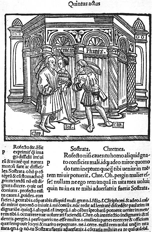
XXI. LYON, TRECHSEL, 1493 TERENCE (SIG. A 7 VERSO)
The other famous Lyonnese illustrated book was an annotated edition of Terence “with pictures prefixed to every scene” printed in 1493 by Johann Trechsel. This has a curious full-page picture at the beginning, giving the artist’s idea of a Roman theatre, with a box for the aediles at the side and a ground floor labelled “Fornices.” The text is illustrated by 150 half-page cuts, a little hard, but with abundance of life (see Plate XXI). These certainly influenced the Strassburg edition of Grüninger (1496), and through Grüninger’s that published at Paris by Vérard about 1500, and to an even greater extent the illustrated editions issued at Venice.
How eagerly Lyonnese publishers looked out for books to imitate may be seen from the rival Lyonnese renderings of Breidenbach’s Peregrinationes and Brant’s Narrenschiff. Of the Breidenbach, Michel Topie and Jac. de Herrnberg issued in November, 1480, an adaptation by Nicolas Le Huen with copies on copperplate of the maps and on wood of the smaller pictures, both very well executed. Rather over a year later, in February, 1490, a translation by “frere iehan de Hersin” was published by Jacques Maillet with the original Mainz blocks. As for the Ship of Fools, Jacques Sacon, the leading publisher at the end of the century, issued an edition of Locher’s Latin version with close copies of the Basel cuts in June, 1498, and in the following August a French edition was published by Guillaume Balsarin with cuts so hastily executed that in many cases all the background has been omitted.
A few illustrated incunabula were issued at Chambéry, and isolated books elsewhere, but with the exception of Lyon and Abbeville no French provincial town produced any notable work. In Spain the fine gothic types and frequent use of woodcut capitals give a very decorative appearance to most of the incunabula, but pictorial illustrations are rare, and of the few sets of cuts known to us several are borrowed or copied from French or German editions. The earliest Spanish illustrated book known to me is a Fasciculus Temporum, printed by Bart. Segura and Alfonsus de Portu at Seville in 1480, with a dozen metal-cuts of the usual stock subjects; the earliest with original illustrations, the Marquis of Villena’s Trabajos de Hercules, printed by Antonio de Centenera at Zamora, 15 January, 1483, with eleven extraordinarily rude cuts of the hero’s adventures. In 1484 and 1485 an unidentified printer at Huete produced editions of the Copilacion de Leyes of Diaz de Montalvo, with some striking metal-cut pictorial capitals, illustrating the subjects of the successive books. In one copy of the 1484 edition I have seen a very fine full-page cut, but could not satisfy myself as to whether this belonged to the book, or was an insertion. An edition of Martorell’s romance, entitled Tirant lo blanch, printed at Valentia in 1490 by Nic. Spindeler, has a decorative metal-cut border to the first page of text, and during the following decade illustrated books become fairly numerous. At Saragossa Paul Hurus issued in 1491 a Spanish version of the Speculum humanae vitae of Rodericus Zamorensis, with cuts copied from the Augsburg edition, another in 1494 of Boccaccio’s De claris Mulieribus, with seventy-two cuts, copied from the editions printed by Johann Zainer at Ulm, and four from some other source, another in 1498 of Breidenbach’s Peregrinatio, and other books, not known to me personally, but which from their titles almost certainly contain copies of foreign cuts. In 1500, when his press had been taken over by three partners, Coci, Hutz, and Appentegger, there issued from it an Officia quotidiana, ornamented with some fifty pictures and many hundreds of fine capitals.
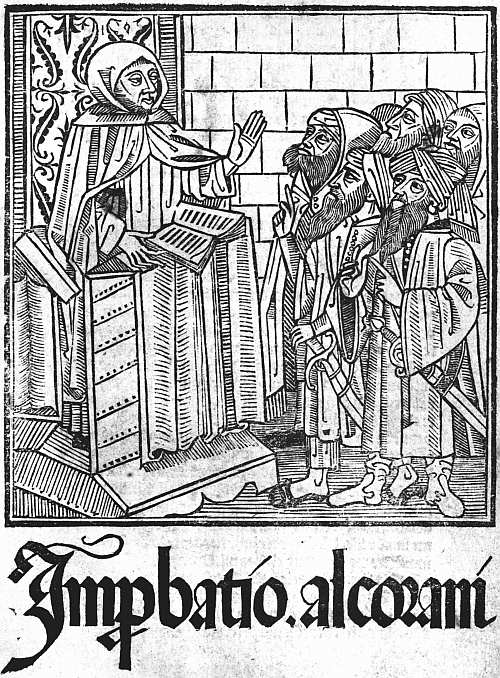
XXII. SEVILLE, STANISLAUS POLONUS, 1500 RICOLDUS. IMPROBATIO ALCORANI. (TITLE)
At Barcelona several illustrated books were printed by Juan Rosenbach, one of the earliest of them, the Carcel d’Amor of Diego de San Pedro (1493), having sixteen original cuts, characteristically Spanish in tone and showing good craftsmanship. In or about the same year Friedrich Biel of Basel (usually quoted as Fadrique de Basilea, or Fadrique Aleman) headed an edition of the Passion de Christo with a striking metal-cut of Christ standing upright in the tomb, watched by the B. Virgin and S. John. For his Spanish Aesop of 1496 he presumably copied the German cuts, and he certainly did so for his Exemplario contra engaños of 1498, the 116 cuts of which are all careless copies of those in Prüss’s edition of the Directorium humanae vitae. Even when in (or about) the next year he was issuing the first edition of the Celestina or Tragicomedia de Calisto y Melibea, he could not do so without German models, and based his sixteen little pictures on some of those in Grüninger’s Terence, while for his Stultiferae naues of Badius Ascensius he went, of course, to the charming French cuts of De Marnef.
As a rule, these Spanish versions of foreign cuts have the interest which always attaches to a free rehandling by a craftsman with a characteristic touch and style of his own. None the less it is refreshing to turn to more original work, and at least a little of this (though some one with wider knowledge than myself may further minimize the statement) is to be found at Seville. Here in 1494 Ungut and Stanislaus Polonus issued a Regimiento de los principes, translated from the Latin of Aegidius Columna, with a fine title-cut of a young prince (his hair is long) seated in a chair of state, holding a sword and royal orb. The same partners were responsible for another striking titlepage in 1495, that of the Lilio de Medicina, Bernardus de Gordonio, where two angels are seen upholding seven lilies in a pot; they also issued in the same year the Contemplaciones sobre el Rosario de Nuestra Señora, a fine and typically Spanish book, printed in red and black, with good capitals, two large cuts and fifteen smaller ones, enclosed in borders of white tracery on a black ground. In the last year of the century they issued an Improbatio Alcorani with a swart picture of a disputation on the titlepage, not easily forgotten (see Plate XXII). It was at Seville also that in 1498 Pedro Brun printed in quarto the romance of the Emperor Vespasian, illustrated with fourteen excellent cuts, some of them full of life and movement; but for these a foreign model is quite likely some day to be discovered. On the other hand, at Valentia also there was at least a little work indisputably of native origin, as in the case of the title-cut to the De regimine domus of S. Bernard, printed by Nic. Spindeler about 1498, and (less certainly) another to the Obra allaors de S. Christofol, issued by Peter Trincher in the same year. Pictorial title-cuts are not so common in Spanish books as in those of other countries, because of the Spanish fondness for filling the titlepage with an elaborate coat of arms. But nearly all their early bookwork is strong and effective, and the printer who placed a cut on a titlepage nearly always secured a good one. Is it too much to hope that Dr. Conrad Haebler, who has already done such admirable work in recording Spanish incunabula and printing facsimiles of their types, will some day complete his task by publishing a similar volume of facsimiles of Spanish cuts?
37 Similar spaces were left in the typographically anonymous French version of Valerius Maximus, printed about the same date.
38 Antoine Vérard. By John Macfarlane. Illustrated monographs published by the Bibliographical Society. No. VII. Printed at the Chiswick Press, September, 1900.
39 So in the Lucain Suetonne et Saluste of 1490, five cuts of battle-scenes, all borrowed from the Mer des Histoires, printed by Lerouge in 1488, are made to do duty sixty-four times.
40 In 1491 these are found at Saragossa in an edition printed by Hurus.
41 It has also been attributed to Jean Croquet at Geneva, but there is only a typographical argument for this ascription, whereas on the side of Lyon, in addition to (rather weaker) typographical arguments, we have to reckon with Lyonnese paper, the similarity of the illustrations to those of a cutter employed by Martin Huss, and the fact that the book was copied in two editions undoubtedly Lyonnese. See F. W. Bourdillon’s The Early Editions of the Roman de la Rose (1906).
42 Only a few of the cuts in this were specially designed for it, all the later ones being taken from stock in Vérard’s most haphazard fashion.
CHAPTER X
LATER FOREIGN BOOKS
One of the chief charms of the books of the fifteenth century is that they are so unlike those of our own day. In the first year of its successor a great step was taken towards their modernization by the production of the first of the Aldine octavos, and the process went on very rapidly. In the early days of printing all the standard works of the previous three centuries that could by any possibility be considered alive were put on the press. By 1500 men were thinking of new things. New editions of many of the old religious and didactic treatises, the old poems and romances, continued to be printed, though mostly in a form which suggests that they were now intended for a lower class of readers, but the new publishers would have little to do with them. Scholarship, which till now had been almost confined to Italy, spread rapidly to all the chief countries of Europe, and amid the devastation which constant war soon brought upon Italy, was lucky in being able to find new homes. With the new literary ideals came new forms for books, and new methods of housing them. Before 1500 several publishers had found it worth their while to print editions in five huge volumes of the Speculum of Vincent de Beauvais, each volume measuring eighteen inches by thirteen and weighing perhaps a dozen pounds, though paper in those days was not yet made of clay. These great volumes had been cased in thick wooden boards, covered with stout leather and protected with bosses or centre-pieces and corner-pieces of metal. They were not intended to stand on shelves like modern books, but were laid on their sides, singly, on shelves and desks, and from pictures which have come down to us we can see that the library furniture of the day included a variety of reading-stands with the most wonderful of screws. The men for whom Aldus catered wanted books which they could put in their pockets and their saddlebags, and it was not long before the publishers of Paris and Lyon outdid Aldus in the smallness and neatness of their editions. Of course large books continued to be issued. The Complutensian Polyglott will not easily be got either into a pocket or a saddlebag, but it is a good deal smaller than the Speculum of Vincent de Beauvais, and, speaking generally, small folios took the place of large folios, and octavos the place of quartos, and in a little time the octavos themselves were threatened by the still smaller sextodecimos. There is, indeed, no stop till in the seventeenth century we come to the tiny Elzevirs, which remained the last word in book-production until the diamond editions of Didot and Pickering.
Aldus Manutius, who led the revolution, has often been wrongly praised. He can hardly be called a great printer. He burdened Greek scholarship for three centuries with a thoroughly bad style in Greek types, and the cursive substitute which he provided for the fine roman founts for which Italy had been famous almost drove them from the field. Both the Greek type and the italics were the outcome of confused thinking. They were based upon styles of handwriting which Aldus and his scholarly friends doubtless found more expeditious than the formal book-hands which had previously been in use. Quickness in writing is an excellent thing. But a sloping type takes just as long to set up as an upright one, and absolutely nothing is gained by the substitution of an imitation of a quicker hand for the imitation of a slower one.
Aldus had begun publishing at Venice early in 149543 with an edition of the Greek grammar of Lascaris, an earlier edition of which, issued at Milan in 1476, had been the first book wholly in Greek to obtain the honour of print. The Idylls of Theocritus and the poem of Hesiod called Works and Days had been printed at the same place in 1479 and a Greek Psalter in 1487. At Florence the famous first edition of Homer was printed (by Bartolommeo Libri) in 1488, and was followed in the years 1494-6 (i.e. about the time that Aldus began work) by five books printed entirely in majuscules on the model of the letters used in inscriptions. Among these books were the Greek Anthology, four plays of Euripides, and an Apollonius Rhodius. The printing of the Greek classics had thus made a start, although a slow one. Aldus now greatly quickened the pace, producing his great Aristotle in four (or, as it is sometimes reckoned, five) volumes, between the years 1495 and 1498, and following it up with nine comedies of Aristophanes in 1498, Thucydides, Sophocles, and Herodotus in 1502, Xenophon’s Hellenics, and the plays of Euripides in 1503 and Demosthenes in 1504. The service which he thus rendered to Greek scholarship was incalculable, but it was accompanied by a very serious drawback, the evil effects of which lasted for nearly three centuries. The Greek quotations in many books printed in Italy before this time had been printed in types imitating the writing in fairly old Greek manuscripts, handsome in appearance and fairly free from contractions; Aldus is said to have taken as his model the handwriting of his friend Marcus Musurus, with all its crabbed and often fantastic ligatures, and the simplicity of the Greek alphabet was thus intolerably complicated.
As we have seen, the introduction of the Aldine italics, though in themselves a better fount than the Greek type, was almost as mischievous in its effects. On the other hand, the service which Aldus rendered to scholarship by his cheap and handy series of the Latin and Italian classics was very great. The first book which he printed in his new type was a Virgil, and this was quickly followed by works by Petrarch and Dante and a whole series of similar editions. Aldus had powerful supporters in these ventures, among them being Jean Grolier, the famous bibliophile, who for many years was resident in Italy as Treasurer of the Duchy of Milan. Despite this encouragement he did not find printing very profitable, partly, no doubt, on account of the wars in which Venice was at this time engaged.
On the death of Aldus in 1515 his business was for some time carried on by his father-in-law, Andrea de Torresani, an excellent printer, but with little of Aldus’s scholarship. In 1533, at the age of twenty-one, Paulus Manutius, the youngest son of Aldus, took over the management of the firm, and proved himself an even finer scholar than his father. Financially he was no more successful, and when he was made printer to the Pope the anxiety of carrying on business at Rome as well as at Venice only added to his difficulties. On his death in 1574 his son, Aldus Manutius the younger, succeeded him and worked till 1597, but without adding anything to the reputation of the firm, perhaps because he had been pushed on prematurely in his boyhood, as is witnessed by his compilation of a volume of elegant extracts at the age of nine.
The family of printers and publishers which came nearest to rivalling the fame of the Aldi in Italy during the sixteenth century was that of the Giunta. Springing originally from Florence, members of it worked for some time simultaneously at Florence and Venice, and Lucantonio Giunta, the earliest member of it to rise into note, was already one of the foremost publishers at Venice in the closing years of the fifteenth century, and subsequently printed for himself instead of always employing other men to print for him. The speciality of this Venetian firm was at first illustrated books of all kinds, afterwards the production of large and magnificent missals and other service books of the Roman Church, and these they continued to publish until nearly the end of the sixteenth century.
At Florence, Filippo Giunta competed with Aldus of Venice in printing pretty little editions of the classics, his competition sometimes taking the form of unscrupulous imitation.
At Rome, Eucharius Silber and his successor Marcellus were the chief printers from 1500 to 1516. A little later the Bladi took their place, and under the auspices of the Council of the Propaganda of the Faith a press was set up for printing in Syriac, Armenian, and other Oriental languages. The output also of the presses in other Italian cities was still considerable. Nevertheless, from the same causes which produced her political decay Italy rapidly ceased to be the head-quarters of European printing, yielding this honour to France about the end of the first quarter of the century, and by some thirty or forty years later becoming quite uninfluential.
To the German printing trade, also, the sixteenth century brought a notable decline of reputation. In its first two decades Johann Schoeffer (son of Peter) produced some fine books at Mainz; at Strassburg Grüninger poured forth illustrated books, and Johann Knoblouch and Matthias Schürer were both prolific. The importance of Cologne diminished, though the sons of Heinrich Quentell had a good business. Augsburg, on the other hand, came to the front, the elder and younger Schoensperger, Johann and Silvanus Otmar, Erhard Oglin, Johann Miller, and the firm of Sigismund Grim and Marcus Wirsung all doing important work. At Nuremberg the chief printing houses were those of Hieronymus Hölzel, Johann Weissenburger, and Friedrich Peypus. Leipzig and Hagenau both greatly increased their output, and with the advent of Luther, Wittenberg soon became an important publishing centre. Luther’s activity alone would have sufficed to make the fortunes of any publisher had it not been for the fact that as each pamphlet from his pen was produced at Wittenberg by Hans Lufft, or some other authorized printer, it was promptly pirated in other cities, often with the retention of the original imprint. Many of these Luther tracts had ornamental borders, and, as will be narrated in another chapter, the German book-illustrations of this period were often very finely designed, but the paper used, even in important books, was poor compared to that found in German incunabula, and the presswork too often careless. These defects are found intensified in almost all the German books published after this date, and German printing soon lost all its technical excellence, though the output of its presses continued to be large, and the great annual fair at Frankfort during the course of the sixteenth century became the most important event in the book-trade of Northern Europe.
A little before Germany gave herself up to theological strife, the conjunction at Basel of the great printer Johann Froben and the great scholar Erasmus temporarily raised that city to importance as an intellectual centre. Froben had begun printing at Basel in 1491, but until he formed his friendship with Erasmus in 1513 published only a few editions of the Bible, some of the papal Decretals, the works of S. Ambrose, and a few other books of no special interest. From 1513 onwards his output increased rapidly both in quantity and importance, so that by the time of his death in 1527 he had printed over three hundred books, including almost all the works of Erasmus and many books in Greek. During this period, also, border-pieces and initials were designed for him by the two Holbeins (Hans and Ambrosius) and other skilful artists, and he was entitled to rank as the greatest printer-publisher in Europe in succession to Aldus. After his death in 1527 the supremacy of European printing rested for the next generation indisputably with France.
During the fifteenth century printing in France had developed almost entirely on its own lines. Vernacular books of every description had poured from the presses of Paris and Lyon, and many of them had been charmingly illustrated in a style worthy of the great French school of illustrators of manuscripts. In the first half of the sixteenth century the publication of these popular books—romances, poetry, and works of devotion—still continued, though with some loss of quality, the print and paper being less good and the illustrations often consisting of a medley of old blocks, or where new ones were made being executed in a coarser and heavier style. But to the vernacular literature there was now added a learned and scholarly literature which soon rose to great importance. As early as 1492 Johann Trechsel, a printer of Lyon, had possessed himself of sufficient Greek type to print quotations in that language, and in the following year he issued the profusely illustrated edition of Terence, the cuts in which were imitated by Grüninger at Strassburg. Trechsel’s press corrector and general editor was a young scholar named Josse Bade, of Asch, near Ghent, better known by the Latin form of his name as Jodocus Badius Ascensius, or Ascensianus. In 1503, after Trechsel’s death, Ascensius started business for himself in Paris, and his editions of the classics, well known from the device of a printing-press found on many of their titlepages, obtained a considerable reputation. Almost simultaneously, in 1502, Henri Estienne, the first of a famous family of scholar-printers, had started in business by an expedient of which we hear a great deal in the annals of English printing, that of marrying a printer’s widow. Of Henri Estienne’s three sons the eldest, François, became a bookseller, Robert a scholar-printer, and Charles, in the first instance, a physician. In the technical side of his business Henri had been helped by Simon de Colines, who, on his employer’s death, in 1520, became his widow’s third husband, and carried on the business until 1526, when he handed it over to Robert Estienne, and started on his own account in another house in the same street. Thus, just as the co-operation of Erasmus with Froben, which began shortly before the death of Aldus, brought the Basel press into prominence, so this duplication, just before the death of Froben, of the business of Henri Estienne with the two firms of Robert Estienne and Simon de Colines materially aided the rivalry of Paris. Greek printing, which by this time had become essential to a printer’s reputation for scholarship, had at last begun there with the publication of a Greek Grammar in 1507, and had increased somewhat, though not very rapidly. In 1539 François I appointed Robert Estienne royal printer for Latin and Hebrew, and Conrad Neobar, a German from the diocese of Cologne, his printer for Greek. It was soon after this that plans were formed for the printing of Greek texts from manuscripts in the royal library, and the preparation for this purpose of a special fount of Greek type. Neobar died from overwork the following year, and the office of royal printer in Greek was added to Robert Estienne’s other honours, and with it the supervision of the new Greek type. For this Angelus Vergetius, a celebrated Greek calligrapher, had probably already made the drawings, and the cutting of the punches was entrusted to Claude Garamond. By 1544 a fount of great primer had been completed and a book printed in it, the Praeparatio Euangelica of Eusebius. A smaller type, of the size known as pica, was next put in hand, and a pocket Greek Testament in sextodecimo printed with it in 1546. Lastly, a third fount, larger than either of the others, was produced and used for the text of a folio Greek Testament in 1550, the other two founts appearing in the prefatory matter and notes. These royal Greek types became very famous and served as a model to all designers of Greek characters for nearly two centuries. Technically, indeed, they are as good as they could be, showing a great advance in clearness and dignity upon those of Aldus, from which nevertheless they inherited the fatal defect of being based on the handwriting of contemporary Greek scholars, instead of on the book-hand of a nobler period of Greek writing.
While the name of Robert Estienne is thus connected with these royal Greek types he was himself distinctly a Latinist, and his own personal contribution to scholarship was a Latin Dictionary (Thesaurus Linguae Latinae) published in 1532, which remained a standard work for two centuries. He published, too, as did also Simon de Colines, many very pretty little editions of Latin classics in sextodecimo, some in italics, others in roman type, thus carrying a step further the triumphant march of the small book, which Aldus had only taken as far as octavos. Simon de Colines, while sharing in work of this kind, did not neglect other classes of literature, and, as has already been noted, joined with Geoffroi Tory, another scholar-printer, who was also a scholar-artist, in producing some remarkable editions of the Hours of the Blessed Virgin.
This scholar-artist, Geoffroi Tory, was a native of Bourges, who had been a professor at several of the Paris colleges and was at one time proof-reader to Henri Estienne. His career as a printer began in 1522 and ended with his death in 1533, after which his business was carried on by Olivier Mallard, who married his widow. Tory printed a few scholarly books and wrote and published a curious work, to which he gave the name Champfleury, on the right forms and proportions of the letters of the alphabet. It is, however, by his Books of Hours that he is now chiefly remembered.
While all this good work was going on in Paris the printers at Lyon were no less busy. At the beginning of the century Aldus had been justly annoyed at the clever counterfeits of his italic octavos which were put on the market at Lyon. But in Sebastian Gryphius (a German, born in 1491 at Reutlingen) Lyon became possessed of a printer who had no need to imitate even Aldus. After printing one or two works in the four preceding years his press got into full swing in 1528 and, by the time of his death in 1556 he had issued very nearly a thousand different editions, mostly in Latin, and many of them in the dainty format in sextodecimo which Estienne and de Colines were using in Paris. In 1534 the luckless Etienne Dolet, soon to be burnt as a heretic, arrived at Lyon, and with some friendly help from Gryphius printed between 1538 and 1544 some seventy editions. In 1546 Jean de Tournes, who had been a journeyman in the office of Gryphius, started business for himself, and soon proved a worthy rival to his master. Meanwhile excellent popular work was being done by other printers, such as François Juste, Claude Nourry, Macé Bonhomme, and Guillaume Roville. From the old Lyonnese firm of Trechsel proceeded in 1538 two books illustrated by Holbein (the Dance of Death and Historiarum Veteris Testamenti Icones, see p. 192), and numerous other Lyonnese books were charmingly illustrated and also, it may be added, charmingly bound, a very pretty style of trade bindings being just then in vogue.
Against the pretty bindings and vignettes and the popular books to which they were applied little or no opposition was raised, and they continued to be issued till the taste for them died out about 1580. But against all the scholarly work of the French presses the leaders of the Church took up an attitude of unrelenting hostility. Foremost in this opposition, regretful that their predecessors had introduced printing into France, were the theologians of the Sorbonne, who forbade the study of Hebrew as dangerous and likely to lead to heresy, and looked with eyes almost as unfriendly on that of Greek. In 1546 (just after the iniquitous campaign against the Vaudois) Etienne Dolet was hanged on a charge of atheism, and his body cut down and burnt amid a pile of his books. In 1550, despite his position as a royal printer, Robert Estienne, who had just completed his fine folio edition of the Greek Testament, was obliged to seek safety by flying to Geneva, and a generation later Jean de Tournes the younger, of Lyon, was obliged to follow his example. The kings of France and their advisers at this period were determined to be rid of both Huguenots and Freethinkers at all costs, and French scholarship and French printing were both the recipients of blows from which it took them some generations to recover.
When Robert Estienne fled to Geneva, his brother, the physician, Charles, was allowed to succeed to his office at Paris, and he in turn was followed by a younger Robert, who died in 1571. Meanwhile Robert I had taken with him a set of matrices of the royal Greek types, and with these and other founts printed at Geneva until his death in 1559. His son, Henri Estienne II, then took over the business, but was of too restless and roving a disposition to conduct it with success. As a scholar he was even greater than his father, excelling in Greek as Robert had in Latin, and producing in 1572 a Greek dictionary (Thesaurus Graecae Linguae) which became as famous as the Latin one which Robert had published forty years earlier. Henri Estienne the younger died in 1598, but the Estienne tradition was kept up by his son Paul (1566-1627) and grandson Antoine (1592-1674), the latter bringing back into the family the office of royal printer at Paris, and printing an edition of the Septuagint.
Under the discouraging conditions of the middle of the sixteenth century French printers gradually ceased to be scholars and enthusiasts, but Christopher Plantin, a Frenchman, born in the neighbourhood of Tours in 1514, built up by his energy and industry a great business at Antwerp, the memory of which is preserved in the famous Plantin Museum. He had started at Antwerp in 1549 as a binder, but about six years later turned his attention to printing, in consequence (it is said) of an accident which disabled him for binding-work. The most famous of his books is the great Antwerp Polyglott edition of the Bible in eight volumes, published between the years 1569 and 1573. Over this he came so near to ruining himself that the Spanish Government granted him special privileges for the production of service-books by way of compensation. The sack of Antwerp by the Spaniards in 1576 was another heavy financial blow, and for a time Plantin removed to Leyden, and also for a time kept a branch business at Paris. But he ultimately returned to Antwerp, and his premises remained in the possession of the descendants of one of his sons-in-law, Joannes Moretus, until they were purchased in 1877 for £48,000 as the Musée Plantin.
After Plantin’s death the branch business which he had left at Leyden was carried on by another of his sons-in-law, Franciscus Raphelengius, who printed some pretty little editions of the classics and other good books. Plantin’s own work as a printer was costly and pretentious rather than beautiful, and the bad style of his ornaments and initials exercised a powerful influence for evil on the printers of the ensuing century.
The mention of Plantin’s Antwerp Polyglott may remind us that the first Polyglott edition of the Bible had been printed between 1514 and 1518 at Alcalà, in Spain, under the auspices of Cardinal Ximenes. The Latin name of Alcalà being Complutum, this edition is generally quoted as the Complutensian Polyglott. Among the notable features in it is the use of a singularly fine Greek type in the New Testament. Absolutely different from the Aldine and all the other Greek types imitating the rapid handwriting of the Greek scholars of the sixteenth century, this was based on the book-hand used in some early manuscript, possibly the one which the Pope had lent from the Vatican to aid Cardinal Ximenes in forming his text. It was on this Greek type that Mr. Robert Proctor, shortly before his death, based his own fount of Greek, supplying the majuscules which (with a single exception) are wanting in the original and making other improvements, but keeping closely to his model and thus producing by far the finest Greek type ever cast. This has been used to print notable editions of the Oresteia and Odyssey, the former at the Chiswick, the latter at the Clarendon Press.
Save for the Complutensian Polyglott there is nothing striking to record of the Spanish printing of the sixteenth century, which retained its massive and archaic character for some decades, and then became as dull and undistinguished as the printing of all the rest of Europe tended to be towards the end of the century. The enthusiasm with which the new art had at first been received had died out. Printers were no longer lodged in palaces, monasteries, and colleges; Church and State, which had at first fostered and protected them, were now jealous and suspicious, even actively hostile. Thriving members of other occupations and professions had at one time taken to the craft. A little later great scholars had been willing to give their help and advice, and at least a few printers had themselves been men of learning. All this had passed or was passing. Printing had sunk to the level of a mere craft, and a craft in which the hours appear to have been cruelly long and work uncertain and badly paid. In the eighteenth century the Dutch journeymen were certainly better paid than our own, and it may be that it was through better pay that they did better work in the seventeenth century also. It seems certain, moreover, that the improvements in the construction of printing presses which were introduced in that century originated in Holland. The primacy of the Dutch is proved by the large amount of Dutch type imported into England, and indeed the Dutch books of the seventeenth century are neater and in better taste than those of other countries. It was in Holland also that there worked the only firm of printers of this period who made themselves any abiding reputation. The founder of this firm, Louis Elzevir, was a bookseller and bookbinder at Leyden, where, in 1583, he began printing on his own account, and issued between that year and his death in 1617 over a hundred different books of no very special note. No fewer than five of his seven sons carried on his business, and the different combinations of these and of their successors in different towns are not a little bewildering. Bonaventura Elzevir with his nephew Abraham issued pretty little editions of the classics in very small type in 12mo and 16mo, of which the most famous are the Greek Testament of 1624 and 1633, the Virgil, Terence, Livy, Tacitus, Pliny, and Caesar of 1634-6, and a similar series of French historical and political works and French and Italian classics. After the deaths of Abraham and Bonaventura in 1652 the business was carried on by their respective sons Jean and Daniel, who issued famous editions of the Imitatio Christi and the Psalter. Meanwhile Louis Elzevir (another grandson of the founder) had been working at Amsterdam, and in 1654 was joined there by Daniel, the new partnership producing some fine folio editions. Other members of the family went on working at Utrecht and Leyden until as late as 1712, so that its whole typographical career extended over a hundred and thirty years. But it is only the little classical editions, and a French cookery book called Le Pastissier François, that are at all famous, and the fame of these (the little classics being troublesome to read and having more than a fair share of misprints, though edited by David Heinsius) probably rests on a misconception. These small classical editions were the last word for two centuries in that development of the Small Book which we have already traced in the Aldine editions at Venice, those of De Colines and Robert Estienne of Paris, of Sebastian Gryphius at Lyons, and of the successors of Plantin at Antwerp. Now the small books of the Elzevirs were produced at a very important period in the history of bookbinding, and when we hear of large sums having been paid for an Elzevir it will mostly turn out that the excellence of its binding has had a good deal to do with the price. The cookery book is an exception, the value of this, though often enhanced by a fine binding, being yet considerable, even in a shabby jacket. But the interest in this case is due to the antiquarian instincts of book-loving gourmets, and not in any way to the printing. The little classics, even when of the right date and with all the right little headpieces and all the right misprints, have never been worth on their own merits more than a few pounds, while shabby, cropped copies have no selling value whatever.
43 He was born at Bassiano in the Papal States in 1450.
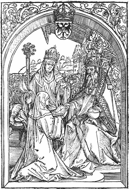
XXIII. NUREMBERG, SODALITAS CELTICA. 1501 HROSWITHA. OPERA (4b). HROSWITHA AND THE EMPEROR OTHO (ATTRIBUTED TO DÜRER)
CHAPTER XI
FOREIGN ILLUSTRATED BOOKS OF THE SIXTEENTH CENTURY
As we have already said, the charm of the woodcut pictures in incunabula lies in their simplicity, in their rude story-telling power, often very forcible and direct, in the valiant effort, sometimes curiously successful in cuts otherwise contemptibly poor, to give character and expression to the human face, and as regards form in the harmony between the woodcuts and the paper and type of the books in which they appear. In the book-illustrations of the sixteenth century the artist is more learned, more self-conscious, and his design is interpreted with far greater skill by the better trained wood-cutters of his day. More pains are taken with accessories, and often perhaps for this reason the cut does not tell its story so quickly as of old. It is now a work of art which demands study, no longer a signpost explaining itself however rapidly the leaf is turned. Lastly, the artist seems seldom to have thought of the form of the book in which his work was to appear, of the type with which the text was to be printed, or even of how the wood-cutter was to interpret his design. Book-illustration, which had offered to the humble makers of playing-cards and pictures of saints new scope for their skill, became to the artists of the sixteenth century a lightly valued method of earning a little money from the booksellers, their better work being reserved for single designs, or in some cases for the copperplates which at first they executed, as well as drew, themselves. Thus the book-collector is conscious, on the one hand, that less pains have been taken to please him, and on the other that he is separating by his hobby one section of an artist’s work from the rest, in connection with which it ought to be studied. He may even be in some doubt as to where his province ends, since many of the illustrated books of the sixteenth century, although they possess a titlepage and are made up in quires, are essentially not books at all, the letterpress being confined to explanations of the woodcuts printed either below them or facing them on the opposite pages. The bibliographer himself, it may be added, feels somewhat of an intruder in this field, which properly belongs to the student of art, although in so far as art is enshrined in books and thus brought within the province of the book-collector, bibliography cannot refuse to deal with it.
Although we have taken off our caps in passing to Erhard Reuwich and Michael Wolgemut for their admirable work, the one in the Mainz Breidenbach, the other in the Schatzbehalter and Nuremberg Chronicle, it is Albrecht Dürer who must be regarded as the inaugurator of the second period of German book-illustrations. During his Wanderjahre Dürer had produced at Basel for an edition of S. Jerome’s Epistles, printed by Nicolaus Kesler in 1492 (reprinted 1497), a rude woodcut of the saint extracting a thorn from his lion’s foot. Dürer’s important bookwork begins in 1498, when his fifteen magnificent woodcuts illustrating the Apocalypse (which influenced all later treatments of this theme) were issued twice over at Nuremberg, in one edition with German title and text, in the other with Latin. Stated in their colophons to have been “printed by Albrecht Dürer, painter,” neither edition bears the name of a professional printer. The types used in each case were those of Anton Koberger, Dürer’s godfather, and the effect of the artist’s personal superintendence, which the colophons attest, is seen in the excellence of the presswork. The following year Koberger published an illustrated edition of the Reuelationes Sanctae Birgittae (German reprint in 1502), and Dürer has been supposed to have helped in this, but the theory is now discredited. In 1501 he probably contributed two woodcuts to an edition of the comedies of Hroswitha, a tenth century nun of the Benedictine Abbey at Gandersheim. Conrad Celtes had unearthed these comedies some years previously in a Ratisbon library, and they were now printed under his editorship for the Sodalitas Celtica at Nuremberg. The illustrations to the comedies themselves, which vie in heaviness with their subjects, are attributed by Mr. Campbell Dodgson to Wolfgang Traut.44 One of the cuts assigned to Dürer represents Celtes offering the book to Frederick III, Elector of Saxony; the other shows Hroswitha herself presenting her plays to the Emperor Otto I (see Plate XXIII). In 1502 Dürer designed another cut of a presentation and an illustration of Philosophy (both very feebly rendered by the cutter) for the Quatuor libri Amorum of Celtes. In 1511 the Latin Apocalypse was reprinted, and three other sets of woodcuts by Dürer appeared in book form, in each case with Latin text by Benedictus Chelidonius. One of these commemorated in twenty designs the life of the Blessed Virgin (Epitome in Diuae Parthenices Marie Historiam ab Alberto Durero Norico per Figuras digestam cum versibus annexis Chelidonii), the other two the Passion of Christ, the Great Passion (Passio domini nostri Jesu ex hieronymo Paduano, Dominico Mancino, Sedulio et Baptista Mantuano per fratrem Chelidonium collecta cum figuris Alberti Dureri Norici Pictoris, in folio) in twelve large woodcuts, the Little Passion (Passio Christi ab Alberto Durer Norembergensi effigiata cū varij generis carminibus Fratris Benedicti Chelidonij Musophili, in quarto) in thirty-seven smaller ones. After this Dürer was caught up by the Emperor Maximilian and set to work on some of the various ambitious projects for illustrating his reign, as to which more will be said later. His later bookwork includes a Crucifixion and S. Willibald for an Eichstätt Missal (Nuremberg, H. Hölzel, 1517), some large designs for the Etliche vnderricht zu befestigung der Stett Schloss vnd flecken (Nuremberg, 1527), and his own book on the Proportion of the Human Body, which was issued both in German and in a Latin translation by Camerarius.
Several borders and illustrations formerly ascribed to Dürer are now attributed to one of his pupils, Hans Springinklee, who lived in Dürer’s house at Nuremberg, where he worked from about 1513 to 1522. Most of Springinklee’s bookwork was done for Anton Koberger, who published some of it at Nuremberg, while some was sent to the Lyon printers, Clein, Sacon, and Marion, who were in Koberger’s employment. A border of his design bearing the arms of Bilibaldus Pirckheimer is found in several works which Pirckheimer edited (1513-17). In a Hortulus Animae, printed by J. Clein for Koberger at Lyon, 1516, fifty cuts are by Springinklee. The Hortulus Animae was as popular in Germany as the illustrated Horae in France and England. In 1517 another edition appeared with Erhard Schön as its chief illustrator, and only a few of Springinklee’s cuts. The next year Springinklee produced a new set of cuts, and Schön’s work was less used. Springinklee and Schön were also associated in Bible illustrations printed for Koberger by Sacon at Lyon, and to Springinklee are now assigned two full-page woodcuts in an Eichstätt Missal (H. Hölzel, Nuremberg, 1517), and a border to the Reuelationes Birgittae (F. Peypus, Nuremberg, 1517), formerly ascribed to Dürer. A woodcut of Johann Tritheim presenting his Polygraphia to Maximilian, formerly attributed to Holbein as having been printed at Basel (Adam Petri, 1518), is now also placed to the credit of Springinklee, who, moreover, worked for the Weisskunig and probably for other of the artistic commemorations of himself which Maximilian commissioned.
Hans Sebald Beham is best known as a book-illustrator from his work for Christian Egenolph at Frankfurt am Main, which began in 1533. But he belonged to the Nuremberg school, had worked for ten or twelve years for Merckel, Peypus, Petreius and other Nuremberg firms, and has had the honour of having some of his single cuts attributed to Dürer. His most important books for Egenolph were the Biblische Historien, a series of small illustrations to the Bible, first printed in 1533, which went through many editions in German and Latin, and another series illustrating the Apocalypse, of which the first edition appeared in 1539, the texts of the Latin Historiae and also to the Apocalypse cuts being supplied by Georgius Aemilius. A set of medallion portraits of Roman emperors by him also appeared in several German and Latin chronicles published by Egenolph.
Between the Nuremberg book-illustrators and those of Augsburg, to whom we must now turn, a connecting link may be found in the person of Hans Leonhard Schäufelein, born about 1480, soon after his father, a Nördlingen wool merchant, had settled at Nuremberg. He worked under Dürer, and his earliest book-illustrations were made for Dr. Ulrich Pinder, the owner of a private press at Nuremberg. Several unsigned cuts in Der beschlossen gart des rosenkrantz Marie (Pinder, 1505), and thirty out of thirty-four large cuts in a Speculum Passionis (Pinder, 1507), are ascribed to Schäufelein, his associate in each book being Hans Baldung. About 1510 Schäufelein removed to Augsburg, and, despite his return to his paternal home at Nördlingen where he took up his citizenship in 1515, he worked for the chief Augsburg publishers for the rest of his life, though between 1523 and 1531 nothing is known as to what he was doing.
Among the earlier Augsburg books with illustrations attributed to Schäufelein are Tengler’s Der neu Layenspiegel (1511), Henricus Suso’s Der Seusse (1512), Heiligenleben (1513), Geiler’s Schiff der Penitentz (1514), and the Hystori und wunderbarlich legend Katharine von Senis (1515), all published by J. Otmar. In 1514 he had illustrated for Adam Petri of Basel a Plenarium or Evangelienbuch, which went through several editions. Another Evangelienbuch, printed by Thomas Anshelm at Hagenau in 1516, contains several cuts with Schäufelein’s signature, but in a different style, probably partly due to a different wood-cutter; these were used again in other books.