Front matter (continued 3)
Reading edition
After about 1480 roman types in Italy enter on a second stage. They no longer have the appearance of being founded directly on handwriting. Doubtless the typecutters were so used to their work that they no longer needed models, but designed new types according to their own ideas. Naturally the letters are more uniform and regular than in the earlier founts, but naturally also they have less charm, and the ordinary close-set Venetian type of the end of the century is singularly dull. Even the large roman type used by Aldus to print the Hypnerotomachia Poliphili is no real exception, as the letters are narrow for their height. A far finer fount is the large text type used by the Silbers at Rome, on both sides of 1500. This is well proportioned and beautifully round, and it is surprising that it has not yet been imitated by any modern typecutter.
When we pass from roman to gothic types there is a bewildering field from which to choose. Here again dull commercialism gained the upper hand about 1480, and towards the end of the century an ugly upright text-type of 80 mm. to twenty lines, with a fantastic headline type of twice its size, or a little more, found its way all over Germany. But types with a twenty-line measurement ranging round 120 mm., such as those of Peter Schoeffer or the Printer of Henricus Ariminensis, are often extraordinarily handsome. Both of Schoeffer’s earlier small types and the small type of Ulrich Zell at Cologne are engagingly neat, and at the opposite end there is the magnificently round gothic used by Ulrich Han at Rome.
Most of the finest gothic types were used for Latin books of law and theology, the peculiar appropriateness of roman type being considered to be confined to works appealing to classical scholars. In Germany, for some time, not much distinction was observed, but there was a tendency in classical books to use an f and long ſ starting from the level of the line, whereas in most vernacular books the tails of these letters came below the line, giving a strangely different appearance to the type. In the ’nineties a distinctively cursive type called Schwabacher, usually measuring 93 mm. to twenty lines, makes its appearance all over Germany. In Italy, both at Naples and by Ulrich Han at Rome, a very small text type, which is certainly cursive in its affinities, was used at the very outset, but found no favour. The typical vernacular French types are also very often on a slope. The small cursive type cut for Aldus in 1501 by Francesco da Bologna was thus not quite so great a revolution as is sometimes represented. Its clearness in proportion to its size, its extreme compactness, and the handiness of the small octavos with which it was at first specially connected, gained for it a great success, and it gradually, though only gradually, usurped the name of italic, the upright Italian bookhand being distinguished from it as roman. Few treatises on printing or the development of books give any idea of the immense popularity of italics during the sixteenth century. About 1570 they seemed to have established themselves as the fashionable vernacular type both in Italy and France, and even in England whole books were printed in them. In Switzerland also and Germany they gained some hold; but gradually the tide turned, the upright bookhand regained its predominance, and italics now survive chiefly for emphasis and quotations—in the seventeenth and eighteenth centuries they were often used for proper names—giving to the page on which they occur an unpleasantly spotty appearance. Their occasional use in prefaces and dedicatory letters is much more appropriate.
The completion of books at first by a colophon, afterwards by a titlepage, may be illustrated in the same way as that by which we have traced the evolution of the text from incompleteness to completeness and the development of different classes of types. At least one printer, Johann Mentelin of Strassburg, seems to have considered the addition of colophons as the proper business of the rubricator. While printed colophons in his books are exceptionally rare, several copies have come down to us in which full colophons have been added by hand, e.g. in a vellum copy of the Speculum Morale in the Bibliothèque Nationale, after praise of the book, we read:
Impressumque in inclyta vrbe Argentinensium ac nitide terse emendateque resertum per honorandum dominum Dominum Iohannem Mentelin artis impressorie magistrum famosissimum. Anno a partu virginis salutifero millesimo quadringentesimo septuagesimo sexto. die mensis nouembris sexta.
Despite a few instances of this kind, however, it is certain that the majority of printers who omitted to print colophons to their books did so, not in the expectation that they would be supplied by hand, but in imitation of the manuscript books to which they were accustomed, in which it is distinctly exceptional to find any mention of the name of the scribe. But the men who took a pride in their new art, and who thought that their work was good enough to bring more custom to their press if their name were associated with it, took the opposite course, and so colophons from 1457 onwards are common in the best books, and may perhaps be found in about 40 per cent of the incunables that have come down to us. By the men who were skilful in using red ink they were often thus printed, and whether in red or in black, they frequently had appended to them the printer’s mark or device, which gave a very decorative finish to the book.
Nowadays, when we have been accustomed all our lives to the luxury of titlepages, it may well seem to us merely perverse to hide the title of a book, the name of the author, and information as to where, when, and by whom it was printed in a closely set paragraph at the end of the book. But if we think for a moment of how the manuscript books to which the early printers were accustomed had been produced we shall see that it was the most natural thing in the world. A scribe would take his quire of paper or vellum, and if he were a high-class scribe, mindful of the need of keeping his text clean, he would leave his first leaf blank and begin at the top of his second. But here he would begin to write straight away, sometimes with the first words of his text, sometimes with a preliminary paragraph, which may be called the Incipit, from the important word in it. In this paragraph he would give either the name of his book or, almost as commonly, the name of the first section of it, introducing the title only incidentally.
Incipit Racionale diuinorum officiorum.
Incipiunt Constitutiones Clementis pape V una cum apparatu Ioannis Andree.
Marci Tullii Ciceronis Arpinatis consulisque Romani ac oratorum maximi Ad M. Tullium Ciceronem filium suum Officiorum liber incipit.
Incipit epistola sancti Hieronimi ad Paulinum presbiterum de omnibus diuine historie libris.
That it did not occur to him to devote his blank page to a displayed title of the book he was copying was due to the fact that every medieval manuscript was the direct descendant, through many or few stages, of the author’s own original draft, and that this was the most pretentious way and least natural in which any author could begin to write a book. So the scribes imitated the author in his normal beginning, and the early printers imitated the scribes, and because an author was more inclined to relieve his feelings at the end of a book than to express them volubly at the beginning, it was only when books multiplied so greatly that purchasers wanted to see at a glance what was the name of the book at which they were looking that titlepages superseded colophons. The proof of this explanation being the true one is that titlepages become common just about the time (1480 to 1490) that book-production was beginning to be divided up between publishers and printers, and that the publisher very quickly claimed them for his own.
The earliest titlepages, those of the Mainz Bul zu deutsch des bapst Pius II (1463), Rolewinck’s Sermon for the Feast of the Presentation (Cologne: Arnold ther Hoernen, 1470), the Flores Sancti Augustini (Cologne, 1473), and the Kalendarium of Joannes de Monteregio and its Italian translation (Venice: Ratdolt and partners, 1476), were all more or less of the nature of “sports.” When titlepages came to stay, a year or two later than the last of these precursors, they everywhere took the form of labels, a single sentence containing the short title of the book, printed sometimes in large, sometimes in small type, but with no other information. The label title, being usually printed high up on the page, left two-thirds, or thereabouts, blank beneath it, and this space was soon filled, sometimes by a pictorial woodcut, sometimes by a mark or device, which at first might be either that of the printer or publisher, but gradually came to be much more often the publisher’s. The short title and device taken together filled the page sufficiently for decorative purposes, but they left room for a further paragraph of type to be added if desired, and the advantage of filling this with the name and address of the firm from whom the book might be obtained was so obvious that the “imprint,” as it is rather loosely called, soon made its appearance and gradually became recognized as an essential part of the titlepage. When printers and publishers lost pride in their work and ceased to care to decorate their titlepages with pictures or devices, the title was displayed in a series of single lines and made to straggle down the page till it came nearly low enough to meet the imprint.
If we go back to the habits of the scribes it is easy to understand another point in the early history of books, their make-up into quires and the marking of these quires by signatures and catchwords. The word quaire or quire is a shortened form of the Latin quaternio, the name devised for four sheets of paper folded down the middle so as to form eight leaves. A gathering of five sheets making ten leaves was called a quinternion, and this, though it has yielded no modern word, was for generations such a popular form that quinterniones was sometimes used as a general expression for manuscripts. Gatherings of three sheets, making six leaves, were called terniones; gatherings of two sheets, making four leaves, duerniones. A few, but only a few, books exist—nearly all of those which I have seen are either block-books or thin folios of poetry of the reign of Charles II—which are made up in single sheets not placed one within the other, but following consecutively. But the system of gathering from two to five or more sheets together into quires was practically universal both before and after the invention of printing, and this for the excellent reason that it reduced the quantity of sewing necessary in binding a book, and reduced also the risk of the sewing cutting through the paper or vellum, as it would be very likely to do if there were only a single thickness to resist it.
When the scribe had arranged his quire or gathering he wrote first page by page on all the leaves on the left hand until he came to the middle of the quire, when he proceeded to write page by page on all the leaves on the right hand. Thus in a quire of four sheets the left half of the first sheet would be leaf 1, pages 1 and 2, and the right half would be leaf 8, pages 15 and 16, so that the same sheet formed the beginning and end of the quire. In the earliest printed books the quires were printed page by page exactly as the quires of a manuscript had been written. But early in the ’seventies (Peter Schoeffer can be proved to have adopted the practice between 1471 and September, 1474) the advantage was perceived of printing both the pages on the upper or lower side of a sheet at the same time, i.e. in a quaternion, page 16 together with page 1. As soon as a printer had learnt to print two folio pages together, it became easy to print four quarto pages, or eight octavo pages, or sixteen sextodecimo pages. In each case the amount of type to be printed at a pull would be approximately the same. It thus ceased to be disadvantageous to print small books, whereas so long as each page had to be pulled separately it was obviously wasteful to make that page a very small one.
Even when the printers had learnt how to print two folio pages at the same time the presswork remained very laborious. The earliest presses were worked with only a single screw, and when the pressman had pulled the lever one way to bring the platen down on the type, he had to push the lever back again in order to raise the platen and release the paper. Thus in order to print a large book quickly four or six sets of pressmen had to work on it at once, each at a different press. To avoid mistakes, therefore, the practice was to allot one section of the book to each press. Thus if a book were calculated to run to 288 leaves, six presses might begin simultaneously at leaves 1, 49, 97, 145, 193, and 241. What more often happened was that either to follow the natural sections of the book, or because some of the printers were engaged on other tasks and not ready to begin at once, the sections were of much less regular lengths, and we can sometimes prove that the first press was far advanced in its section before the fifth and sixth had begun. Now in all these cases, unless they were reprinting an earlier book, page for page, it is obvious that some nice calculations would be needed to make each section end with the end of a quire so as to be able to join on with the beginning of the quire containing the next section without any gap or crowding. Hence the striking irregularities in the make-up of many early books. Instead of a book being printed in a succession of quinternions or a succession of quaternions we have many a make-up which can only be expressed by a cruelly mathematical formula, such as this, which represents the quiring of the Forty-two Line Bible.
a-i10; k10+1 lm10 n6+1; o-z10 10 10+1; A-F10 G4: aa-nn10; oo pp10 qq10+1; rr-zz AA-CC10; DD12 EE10+1; FF GG10 HH4+1 II10.


In this the index-letter shows the number of leaves in the quire, a-i10 being a short way of stating that each of the nine quires a b c d e f g h i has ten leaves in it. In the tenth quire (k) there is an extra leaf, and again in the thirteenth (n) the printer found that he had too much copy for six leaves and not enough for eight, and was therefore obliged to put in an odd one, because another press had already printed off the beginning of the next quire (o). Not infrequently it would happen that the odd amount of copy for a section was very difficult to fit exactly into a leaf even when the printer had compressed it by using as many contractions as possible, or eked it out by using no contractions at all. This accounts for the occurrence of a blank space, large or small, at the end of some sections without any break in the text, as the printer was sometimes careful to explain by the printed notice “Hic nihil deficit,” or as in our page from Ulrich Zell, “Vacat.”
As has been already noted, in a moment of enthusiasm Mr. Proctor once said to the present writer that it was impossible to find a fifteenth century book that was really ugly. This was certainly putting the case for his beloved incunables a peg too high, for there were plenty of bad printers before 1500, and even such a master as Jenson was by no means uniformly careful as to the quality of his presswork. But one of the legacies which the early printers received from the scribes was the art of putting their text handsomely on the page, and the difference which this makes in the appearance of a book is very marked, little as many modern printers and publishers attend to it. But in the books of the best printers of our own day, as well as in those of the best of the fifteenth century, from 65 per cent to 72 per cent of the height of the page is devoted to the text, from 28 per cent to 35 per cent being reserved for the upper and lower margins, of which at least two-thirds is for the lower and not more than one-third for the upper. As compared with the height of a page of type the breadth is usually in the proportion of about 45 to 70 (a trifle more in a quarto), and here again the outer margin is at least twice as great as the inner. Thus in a book with a page measuring 10 by 7¼ inches, the type-page should measure about 7 by 4¾ inches, with a lower margin of about 2 inches, an upper of 1 inch, an outer of 1¾ inches, and an inner of ¾ inch.
It will be greatly to the advantage of book-buyers to bear these proportions in mind, in order to measure how much a book offered to them has been cut down, and also to be able to instruct their binders as to how to reduce the absurd margins of some modern “Large Paper” copies to more artistic dimensions. Whether it is legitimate further to reduce the margins of an old book which has already been mangled by a binder in order to get the proportions better balanced is a nice question of taste. If a two-inch lower margin has been halved and a one-inch upper margin left intact, if the upper margin is reduced, the book will become a pleasant “working copy” instead of an obviously mangled large one, and the collector must settle in his own conscience whether this be a sufficient justification for snipping off a centimetre of old paper.
Exactly why the proportions here laid down, with their limits of variation, are right for books cannot easily be set forth. It is easiest to see in the case of the relation between the inner and outer margins. As William Morris was never tired of insisting, the unit in a book is, not a single page, but the two pages which can be seen at the same time. The two inner margins separate the two type-pages by a single band of white, which, if each inner margin were as large as the outer, would become insufferably conspicuous. As for the proportions between the lower and upper margins, the explanation may lie in the angle at which we habitually read books, or by the need for leaving room for the reader to hold the book in his hands. But whether it be a matter of inherent rightness or merely of long-established convention, the pleasure of handling a book with correct margins is very great, and a collector who secures an uncut copy of even a poorly printed book of the period when margins were understood, will find that it presents quite a pleasing and dignified appearance. And so in regard to other points, any book which illustrates the relations of the early printers to the scribes, the difficulties which they experienced in their work and the expedients by which they were surmounted deserves, whatever its date or present price, to be reckoned as a real incunable, and the collector who gets together a few dozen books of this kind will have far better sport for his outlay than he who is tied down too rigorously by chronology.
27 It will be so much the better if the collector can add to them a copy of one of the early books printed at Rome (the German ones are too rare) in which there still survives the text of the rubrics, printed not in their appropriate places, but on a separate leaf or quire for the guidance of the rubricator.
28 By Jenson and many early printers in Italy, and by Husner and a few others in Germany, the majuscules of the founts used in the text were massed together in headings with admirable effect. But for a time the heavy heading types carried all before them.
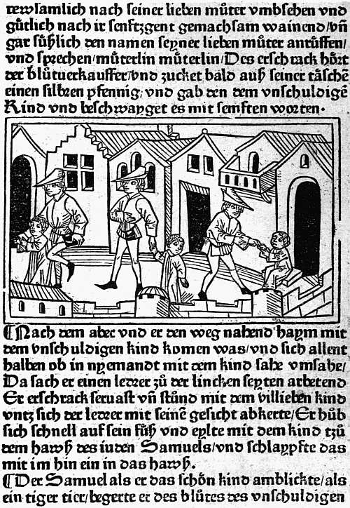
VIII. AUGSBURG, G. ZAINER, C. 1475 TUBERINUS. GESCHICHT VON DEM SELIGEN KIND SYMON
CHAPTER VII
EARLY GERMAN AND DUTCH ILLUSTRATED BOOKS
The natural method of illustrating a book printed with type is by means of designs cut in relief, which can be locked up in the forme with the type, so that text and illustrations are printed together by a single impression29 without any special preparation of the paper. So long as the design to be printed stands out clearly on the block it matters nothing whether it be cut on wood or on soft metal. Even as between the design cut by hand and the process line-block which has as its basis a photograph taken direct from a pen drawing, the difference can hardly be said to be one of better and worse. We lose the individuality of the wood-cutter or wood-engraver, but we are brought into closer touch with the individuality of the artist, and whether we gain or lose depends on the ability of the artist to dispense with a skilled interpreter. The one requisite for success is that either the artist, or an interpreter for him, should recognize the limits within which his work can be effective. The reproductions of the artist’s designs will be looked at, not in isolation, but as part of an ensemble made up of two pages printed in a type which, perhaps with a little trouble, can be ascertained beforehand, and they will be printed not as proofs on a special press by a special workman on paper chosen solely to suit them, but with average skill and care in an ordinary press and on paper the choice of which will be dictated by several considerations. Whenever relief blocks have been used for any length of time as a method of book-illustration the rivalry of artists has tended to cause these restrictions to be forgotten. In our own day line-blocks have been almost driven out of the field by “half-tones,” which cannot be printed without the aid of paper specially coated, or at least rolled or “calendared.” Shortly before the process line-block was perfected the extreme fineness of the American school of wood-engraving had induced a nearly similar result. The successors of Bewick worked with equal disregard of the need for clearly defined lines, and when we travel back to the first half of the sixteenth century we find the Holbeins, Burgkmair, Weiditz, and other artists producing designs far too delicate for the conditions under which they were to be reproduced. Thus the charm of the woodcuts in books of the fifteenth century is by no means confined to that “quaintness” which is usually the first thing on which the casual observer comments. The “quaintness” is usually there, but along with it is a harmony between print, paper, and woodcut which has very rarely since been attained.
The claim made in the last paragraph must be understood as applying only to books honestly illustrated with blocks specially made for them. Books decorated with a job lot of cuts, as was often the case, especially after about 1495, may accidentally be delightful and often possess some of the charm of a scrapbook. It is good sport, for instance, to take one of Vérard’s later books and trace the origin of the cuts with which that cheaply liberal publisher made his wares attractive. But the incongruity is mostly manifest, and collectors might well be more fastidious than they show themselves and refuse to waste the price of a good book with homogeneous illustrations in buying half a dozen dull little volumes with an old Horae cut at the beginning and the end of each.
A second exception must be recognized in the books illustrated by untrained wood-cutters. In Germany and the Low Countries few, if any, quite untrained wood-cutters were employed, and this is true also of Paris and Florence. But at Lyon and other provincial towns in France (the Abbeville cutters, who probably came from Paris, are strikingly good), in a few books printed at Rome and Venice, here and there in Spain, and in one or two of Caxton’s and several of Wynkyn de Worde’s books in England, the cutting is so bad that, though it is possible sometimes to see that excellent designs underlie it, the effect is either ludicrous or repellent. Only fanatics could admire such pictures as we find in the early Lyonnese Quatre fils d’Aymon (s.n., but about 1480), in the Opuscula of Philippus de Barberiis printed by Joannes de Lignamine (Rome, 1481), in a large number of the cuts of the Malermi Bible of 1490 (Venice, G. Ragazzo for L. A. Giunta, 1490), in Los doze trabajos de Ercules (Zamora, 1483), in Caxton’s Aesop or in Wynkyn de Worde’s Morte d’Arthur (1527). Books such as these (the Malermi Bible is on a different footing from the rest owing to the wonderful excellence of the good cuts) may be bought as curiosities, or for the light they throw on the state of the book trade when such work could be put on the market, but no artistic merit can be claimed for them.
In Germany good work began early, because, to supply the demand for playing-cards and pictures of saints, schools of wood-cutters had grown up, more especially at Augsburg and at Ulm. Block-books also had come into existence in the district of the lower Rhine, and these, which in their earliest forms can hardly be later than 1460, must be divided between the Low Countries and Germany and prove the existence of competent workmen. The earliest type-printed books which possess illustrations are the little handful printed by Albrecht Pfister at Bamberg in and about 1461, described in Chapter V, but it was at Augsburg in the early seventies that book-illustration first flourished. As has been mentioned in Chapter V, trade difficulties at first stood in the way, but by the arbitration of Melchior Stanheim, abbot of the local monastery of SS. Ulrich and Afra, these were settled on the sensible basis that printers might have as many illustrations in their books as they chose to provide, but that they must be designed and cut by Augsburg craftsmen. The series seems to have begun with some tolerably good column-cuts to an edition of the Lives of the Saints in German, of which the first part was issued in October, 1471, and the second in April, 1472. In Das guldin spiel of a Dominican writer, Ingold, finished on 1 August of the latter year, we find for the first time real power of characterization. Lovers of woodcuts owe some gratitude to the medieval trick of attaching edifying discourses to matters of everyday interest and amusement, for whereas the edifying discourses themselves could hardly carry illustrations, hunting, chess, or, as here, seven games which could be likened to the seven deadly sins, gave opportunities for showing pictures by which the natural man would be attracted. Another important book of this year, only known to me in Bämler’s plagiarism of it, was the first edition of the Belial, the amazing book which tells the story of Christ being summoned for the trespass committed in harrowing Hell.
In 1473 the heavy gothic type which Zainer used in these illustrated books was put at the disposal of the Abbot of SS. Ulrich and Afra and used to print a Speculum Humanae Saluationis, to which was added a summary in verse by Frater Johannes, an inmate of his monastery. This book was illustrated by 176 different cuts of Biblical subjects, of varying degrees of merit. In the same year, and again in 1474, Zainer printed an illustrated Plenarium, i.e. the Epistles and Gospels for the round of the Church’s year. In or shortly after 1475 he printed and illustrated a narrative of great contemporary interest, the story, written by one Tuberinus, of a child named Simon, who was supposed to have been slain by the Jews out of hatred of the Christian faith and desire to taste Christian flesh. The tale appears to contain internal evidence of its untruth, and the unhappy Jews who were cruelly executed had much better claims to be regarded as martyrs than “das susses Kind” Simon. But some of the pictures are quite animated, especially one (see Plate VIII) of the hired kidnapper beguiling the child through the streets and then deftly hurrying him into the house of doom with a touch of his knee.
In 1475 or 1476, and again with the date 1477, Zainer produced editions of the German Bible in large folio, illustrated with great pictorial capitals at the beginning of each book. But his greatest achievement was in an undated book of this period, the Speculum Humanae Vitae of Rodericus Bishop of Zamora, in the German translation of Heinrich Steinhowel. If this Mirror of Man’s Life had been written by a man with his eyes open instead of by a vapid rhetorician it should have been one of the most valuable documents for the social life of the fifteenth century, since it professes to contrast the advantages and evils of every rank and occupation of life, from the Pope and the Emperor down to craftsmen and labourers. There is but little joy to be gained from its text, but the Augsburg artist has atoned for many literary shortcomings by his vivid and charming pictures of scenes from the social life of his day, though it is not to be supposed that German judges took bribes quite so openly as he is pleased to represent. In addition to fifty-four woodcuts of this kind, there is a large genealogical tree of the House of Hapsburg, which is a triumph of decorative arrangement.
Two other early Augsburg printers devoted themselves to illustrated work, Johann Bämler and Anton Sorg. The former at first contented himself with prefixing a full-page frontispiece to his books, as in the Summa of Johannes Friburgensis and Die vier und zwanzig goldenen Harfen, both of 1472, and again in the picture of S. Gregory and Peter the Deacon in the Dialogues of the former printed for the monastery of SS. Ulrich and Afra, and that of the dying Empress in the Historie von den sieben weisen Meistern of the following year. In the Belial of 1473 and Plenarium of 1474 Bämler was content for most of the cuts to borrow or copy from the editions of Zainer, but in the Alexander der Grosse of the former year and Melusine and Sieben Todsünden of the latter he himself led the way with some excellent sets of woodcuts, which were copied by others. Again, in Das Buch der Natur of 1475 we find a dozen specially designed full-page cuts, one to each book, illustrating man, the spheres, beasts, birds, mermaids, serpents, insects, etc.; in the Chronica von allen Kaisern and Königen of 1476 there are four large cuts, showing Christ in glory, the dream of the Emperor Sigismund, the vision of S. Gregory at Mass, and S. Veronica holding before her the cloth with the imprint of Christ’s face. It was perhaps in this same year that Bämler issued, without dating it, Jacob Sprenger’s Die Rosenkranz Bruderschaft, with two very striking cuts, one of the offering of garlands to Our Lady, the other of Christ’s scourgers looking back mockingly as they leave Him. A dated edition appeared in 1477. Another book of 1476 with a good set of cuts was the romance of Apollonius, King of Tyre. In 1477 Bämler issued a Buch der Kunst, which, like the Buch der Natur, went through several editions; it must be noted, however, that there is no such contrast between Art and Nature as the short title of this book might suggest, the full title being Buch der Kunst geistlich zu werden. The illustrations for the most part represent a soul in different situations, but there are also many of Biblical subjects. The last book of Bämler’s which need be mentioned is the Turken-Kreuzzüge of Rupertus de Sancto Remigio, which has an effective frontispiece of the Pope preaching to the Crusaders and some vigorous smaller cuts.
Anton Sorg began printing in 1475 and issued his first illustrated book the next year. He was a prolific printer, and issued many close imitations of books originated by Günther Zainer and others. The most famous work specially connected with his name is Ulrich von Reichenthal’s Das Conciliumbuch geschehen zu Costencz (1483), illustrated with forty-four larger cuts, all in the first ninety leaves, and 1158 coats of arms of the various dignitaries present at the Council. The larger cuts show the knighting of the Burgermeister of Constance, processions, a tournament, and the martyrdom of Huss (despite his safe conduct) and the scattering of his ashes over a field. The later Augsburg illustrated books, issued by the elder Schoensperger, Johann Schobsser, Peter Berger, and Hans Schauer, though they maintain a respectable level of craftsmanship, have less interest and individuality than these earlier ones. One Augsburg printer, Erhard Ratdolt, who had made himself a reputation by ten years’ work at Venice (1476-86), shortly after his return issued a notable illustrated book, the Chronica Hungarorum of Thwrocz. His main business was the production of missals and other service books, in some of which he made experiments in colour-printing.
At the neighbouring city of Ulm, where also the wood-cutters had long been at work, illustrated books began to be issued in 1473 by Johann Zainer, no doubt a kinsman of Günther Zainer of Augsburg. His chief books are (1) Latin and German editions of Boccaccio’s De claris mulieribus (1473), with a fine borderpiece of Adam and Eve and numerous spirited little pictures which, though primitive both in conception and execution, are full of life, and (2) an Aesop which was reprinted at Augsburg and copied elsewhere in Germany, and also in France, the Netherlands, and England. From 1478 onwards he seems to have been in continual financial trouble. He was apparently able, however, to find funds to issue two rather notable books about 1490, the Prognosticatio of Lichtenberger, and a Totentanz. The blocks of both of these passed to Meidenbach at Mainz.
Most of the forty books of a later printer, Conrad Dinckmut (1482-96), have illustrations. His Seelenwurzgarten (1483) appears at first sight to be a most liberally decorated book, crowded with full-page cuts, but of its 133 illustrations only seventeen are different, one, representing the tortures of the damned, being used as many as thirty-seven times, a deplorable waste of good paper, which the printer had the good sense to reduce in a later edition. Dinckmut’s most famous book is a German edition of the Eunuchus of Terence “ain maisterliche vnd wolgesetzte Comedia zelesen vnd zehören lüstig und kurtzwylig, die der Hochgelert vnd gross Maister und Poet Therencius gar subtill mit grosser Kunnst und hochem Flyss gesetzt hat.” This has twenty-eight nearly full-page cuts in which the characters are well drawn, the setting for the most part showing the streets of a medieval town. A Chronik, by Thomas Lirer, issued about the same time, was begun to be illustrated on a generous scale with eighteen full-page cuts in the first twenty-eight leaves, but was hastily finished off with only three more cuts in the remaining thirty-six. They are less carefully executed than those of the Eunuchus, but show more variety, and are on the whole very pleasing.
Another Ulm printer, who began work in 1482, Leonhard Holl, printed in that year a magnificent edition of Ptolemy’s Cosmographia, with woodcut maps (one signed “Insculptum est per Iohannē Schnitzer de Armszheim”) and fine capitals. The first of these, a pictorial N, shows the editor, Nicolaus Germanus, presenting his book to the Pope.
Of later Ulm books by far the most important are two by Gulielmus Caoursin, published by Johann Reger in 1496, and both concerned with the Knights of St. John of Jerusalem at Rhodes. One volume gives their Stabilimenta or Constitution, the other Obsidionis urbis Rhodiae descriptio, an illustrated history of their defence of their island against the Turks and their subsequent dealings with the infidel, who at one time were so complaisant as to present them with no less valuable a relic than the arm of their patron, which was duly honoured with processions and sermons. Altogether the two books contain fifty-six full-page pictures, rather roughly cut, but full of vigour and bringing the course of the siege and the character of the wild Turkish horsemen very vividly before the reader. William Morris was even tempted to conjecture that the designs may have been made by Erhard Reuwich, the illustrator of the Mainz Breidenbach, of which we shall soon have to speak.
At Nuremberg book-illustration begins with the Ars et modus contemplatiuae vitae, six leaves of which partake of the nature of a block-book. In or about 1474 Johann Müller of Königsberg (whose variant names, Johannes Regiomontanus, Johannes de Monteregio, have trapped more bibliographers into inconsistencies than those of any other fifteenth century author) issued calendars and other works with astronomical diagrams, and prefixed to his edition of the Philalethes of Maffeus Vegius a woodcut (for which Dr. Schreiber suspects an Italian origin) showing Philalethes in rags and Truth with no other clothing than a pair of very small wings. In June, 1475, Sensenschmidt and Frisner illustrated their folio edition of Justinian’s Codex, with ten charming little column-cuts; the following month Sensenschmidt produced a Heiligenleben, with more than 250 illustrations, which, according to Dr. Schreiber, are very noteworthy as they stand, and would have been more so had not the wood-cutter been hurried into omitting the backgrounds in the later cuts, those to the “Pars aestiualis.” Sensenschmidt also printed an undated German Bible with pictorial capitals.
In 1477 Creussner issued the travels of Marco Polo with a woodcut of the traveller, and about the same time Latin and German editions of the tract of Tuberinus on the supposed fate suffered by “Das Kind Simon” at the hand of the Jews.
In 1481 Anton Koberger published his first illustrated book, Postilla super Bibliam of Nicolaus de Lyra, with forty-three woodcuts, which were imitated not only at Cologne, but at Venice, though their interest is not very great. In his German Bible of 1483 he himself was content to acquire blocks previously used at Cologne. The next year he prefixed to his edition of the Reformation der Stadt Nuremberg a notable woodcut of S. Sebald and S. Laurence in the style of Michael Wolgemut. The 252 cuts in his Heiligenleben of 1488 are mainly improved rehandlings of previous versions; of his Schatzbehalter and Schedel’s Chronicle we speak later on.
At Basel Martin Flach was the first printer of illustrated books, ornamenting his 1473 edition of the Ackermann von Böhmen with a woodcut of Death, the labourer, and the dead woman, his Cato with the usual picture of a master and scholar, his Rosenkranz with a cut of a traveller beseeching the Virgin’s protection from robbers, and another of a scene in heaven, and his Streit der Seele mit dem Korper (these and the two preceding are undated) with eight illustrations of various moments in the dispute. More important than these are three profusely illustrated books from the press of Bernhard Richel. The first of these, his 1476 Spiegel Menschlicher Behaltnis, has 278 woodcuts, the work of two different hands, the earlier of the two showing less technical skill, but much more vigour and originality.30 The other two books are undated editions of the romance of Melusina, with sixty-seven cuts, in which suggestions from the first Augsburg edition have been improved on by an abler workman, and a Mandeville with 147 cuts, most of which passed into the hands of M. Hupfuff at Strassburg, who used them in 1501. After this Richel turned his attention to liturgies, and is credited by Dr. Schreiber with being the first printer to insert in his Missals the woodcut of the Crucifixion, which thenceforth is so frequently found facing the first page of the Canon.
After the publication of these works illustration seems to have languished for some years at Basel, but was taken up again about 1489 by Johann von Amerbach, Lienhart Ysenhut, and Michael Furter, the work of the two latter being mainly imitative. Johann Froben, who began work about this time, was too learned a publisher to concern himself with woodcuts, catering chiefly for students of the University. One of the professors, however, at the University was far from sharing this indifference to pictures. Born at Strassburg, Sebastian Brant was educated at Basel, and it was while holding there the Professorship of Laws that he ensured the popularity of his Narrenschiff (1494) by equipping it with 115 admirable illustrations. The original edition from the press of Johann Bergmann von Olpe was published in February, and before the end of the year Peter Wagner at Nuremberg, Greyff at Reutlingen, Schoensperger at Augsburg had all pirated it with copies of the Basel cuts. When the Latin translation by Brant’s friend, Jakob Locher, was published by Bergmann in 1497, the success of the book became European, and probably no other illustrated work of the fifteenth century is so well known.
Probably in the same year as the Narrenschiff was first issued, Bergmann printed for Brant his In laudem gloriosae virginis Mariae, with sixteen woodcuts by the same hand. In 1495 Brant supplied him with two works in honour of the Emperor Maximilian, one celebrating the alliance with Pope Alexander VI, illustrated with coats of arms, the other the Origo bonorum regum, with two woodcuts, in which the Emperor is shown receiving a sword from heaven. Brant was now in high favour with Maximilian, and his appointment as a Syndic and Imperial Chancellor at Strassburg led to his return and a consequent notable quickening of book-illustration in his native city.
At Strassburg Johann Mentelin had used woodcuts for diagrams in an undated edition of the Etymologiae of S. Isidore, printed about 1473, but the first producer of books pictorially illustrated was Heinrich Knoblochtzer, who worked from 1476 to 1484, and issued over thirty books with woodcuts. Most of these were copies from other men’s work, e.g. his Belial and Melusina from Bämler’s, his Philalethes from the Nuremberg edition of Johann Müller, his Aesop and Historie der Sigismunda from Johann Zainer’s, his Leben der heiligen drei Königen probably from an anonymous edition by Johann Prüss. Early in his career in 1477 he issued two books on the great subject of the hour, the death of Charles the Bold, Peter Hagenbach und der Burgundische Krieg and the Burgunderkrieg of Erhard Tusch, in both of which he used eight woodcuts, most of them devoted to incidents of the Duke’s ill-fated campaign. An anonymous edition of the Euryalus und Lucretia of Aeneas Sylvius (Pope Pius II) has nineteen cuts, which were apparently commissioned by Knoblochtzer, but he did not secure the services of a sufficiently skilled wood-cutter. It should be said, however, that his “historiated” or pictorial capitals are apparently original and mostly good.
To Johann Prüss at Strassburg are now assigned editions in High and Low German of the Lives of the Fathers and of Antichrist, which Mr. Proctor, though he had a shrewd suspicion of their origin, left floating about among the German “adespota.” The cuts to the former reach the average of early work; those to the Antichrist vary greatly, that of Antichrist preaching before a queen being extraordinarily successful as a presentation of a type of coarse spiritual effrontery. The acknowledged work of Prüss includes editions of the travels of Mandeville, of the Directorium Humanae Vitae, and of the Flores Musicae of Hugo Reutlingensis, with a rather famous cut showing how musical notes are produced by the wind, by a water wheel, by tapping stones, and hammering on an anvil. Prüss also printed several illustrated editions of the Hortus Sanitatis.
Far more prolific than either of the foregoing Strassburg printers was Johann Reinhard of Grüningen, usually called Grüninger after his birthplace. Setting up his press in 1483, he began book-illustration two years later with a German Bible with woodcuts copied from those in the Low German Bibles printed at Cologne and used in 1483 at Nuremberg by Koberger. Some minor books followed, and in 1491 he issued the Antidotarius Animae of Nicolaus de Saliceto, with rather rude borders to each page and a woodcut of the Assumption. This, however, like some of his earlier illustrated books, appears to have been a commission, and in a reprint of 1493 the decorations disappear. It was not until 1496, under the influence of Sebastian Brant, that he undertook any important original illustrated work on his own account. In that year he produced his first illustrated classic, the comedies of Terence (Terentius cum directorio), with a large woodcut of a theatre and eighty-seven narrow cuts of the dramatis personae, or of scenery, used five at a time in 150 different combinations. Critically examined, the cuts are rather unpleasing, and were regarded at the time as likely to provoke mirth otherwise than by expressing the humorous intent of the playwright, but another edition and a German translation similarly decorated appeared in 1499, and Grüninger issued on the same plan a Horace (edited by Locher) in 1498, and the De consolatione philosophiae of Boethius in 1501. His full strength was reserved for the Virgil of the following year, which was superintended by Brant, and is crowded with wonderful pictures, in which on the very eve of the Renaissance Virgil is thoroughly medievalized. Besides these classics, Grüninger printed many other illustrated editions, minor works by Brant, medical treatises by Brunschwig, an Evangelienbuch, a Legenda S. Katherinae in Latin and also in German, editions of the Hortulus Animae, the romance of Hug Schapler, etc., in the fifteenth century, and in the sixteenth a sufficient number of illustrated books to bring his total up to about 150 editions. These may be said to form a school by themselves, distinguished by a certain richness of effect partly due to heavy cutting, but with less power of characterization and fewer gleams of beauty than are to be found in the best work of other towns, the figures being often unpleasing and notably lean in the legs. Martin Scott, Hupfuff, and Kistler were other Strassburg printers of the fifteenth century who also used illustrations.
At Cologne book-illustration began in 1474 with editions of the Fasciculus Temporum of Werner Rolewinck, from the presses of ther Hoernen and Nicolaus Götz. But with the notable exception of two great Bibles issued by Heinrich Quentell, illustrated books before 1490 are neither important nor numerous. Even in 1490 the edition of the Historia Septem Sapientum of Johannes de Hauteselve, issued by the elder Koelhoff, was adorned with cuts obtained from Gerard Leeu at Antwerp. Quentell issued a few stock cuts in one book after another, and Johann Landen, Martin von Werden (if he be rightly identified with the printer “Retro Minores”), and Cornelis von Zierickzee all used a few cuts, some of the latter’s having a curiously Italian appearance. But the only important illustrated book, other than the Bibles, is the Cologne Chronicle, issued (not to his profit, since he was imprisoned for it) by the younger Koelhoff in 1499, with armorial cuts and a few pictures of kings and queens somewhat too frequently repeated. Quentell’s Bibles in High and Low German are in curious contrast to all this work. They are illustrated with 125 large oblong pictures, firmly if rather coarsely cut, and full of story-telling power, several successive incidents being sometimes brought into the same picture in true medieval fashion. The book was imitated at Nuremberg and elsewhere, and the illustrators of the Venetian Malermi Bible of 1490, and even Hans Holbein himself, did not disdain to take ideas from it.
At Lübeck a finely decorated edition of the Rudimentum Noviciorum, a universal history, was issued by Lucas Brandis as early as 1475, with some good pictorial capitals, and pictures beginning with the Creation and coming down to the life of Christ. In 1484 we come to a Levend S. Jeronimi, printed by Bartholomaeus Ghotan and illustrated by an anonymous artist whose work can be traced during the next ten years in other books of Ghotan’s, in several very interesting editions by the unidentified “Poppy-Printer” (so called from his mark), including a Dodendantz (1489 and 1496), Imitatio Christi, Bergitten Openbaringe (1496), Reynke de Vos (1498), Schakspil, etc., and in the splendid Low German Bible printed in 1494 by Stephan Arndes, with cuts which improve on those in the Cologne editions.
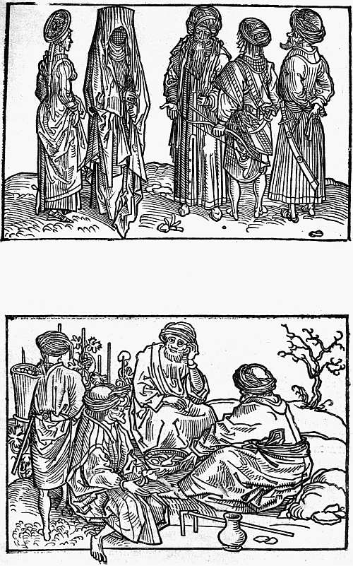
IX. MAINZ, ERHARD REUWICH, 1486 BREIDENBACH. PEREGRINATIO IN MONTEM SYON SARACENS AND SYRIANS
At Mainz, which led the way so energetically in typography, book-illustration is not represented at all until 1479, and then almost accidentally in the Meditationes of Cardinal Turrecremata, printed by Johann Neumeister “ciuem Moguntinensem,” with thirty-four curious metal-cuts imitating on a smaller scale the woodcuts in the editions printed at Rome by Ulrich Han. Two years later these metal-cuts were used by Neumeister at Albi, and they are subsequently found at Lyon. That this book was printed at Mainz was made practically certain by the type appearing subsequently in the possession of Peter von Friedberg, but that the cuts were executed at Mainz seemed to me improbable until the publication of Dr. Schreibers work on German illustrated books acquainted me with the existence of an Agenda Moguntinensis of 29 June, 1480, also attributed to Neumeister’s press, with a metal-cut of S. Martin and the beggar, and the arms not only of Archbishop Diether and the province of Mainz, but of Canon Bernhard von Breidenbach, of whom we shall soon hear again. The Agenda and its metal-cuts are thus firmly fixed as executed at Mainz, and the metal-cuts of the Meditationes must therefore be regarded as Mainz work also.
In 1486 Mainz atoned for her long delay in taking up illustrated work, with the Peregrinationes in Montem Syon of the aforesaid Canon Bernhard von Breidenbach, printed with type of Schoeffer’s, under the superintendence of Erhard Reuwich of Utrecht, the illustrator. The text of Breidenbach’s book is full of interest, for he gives a vivid account of the voyage and of the hardships and extortions to which pilgrims were exposed. In his preface he states that Reuwich was expressly taken on the expedition to illustrate the narrative, and he certainly had ample skill to justify the engagement. Unfortunately, far too much of his labour was spent on great maps or views of Venice, Parenzo, Rhodes and other places passed on the way. These are certainly interesting, as they mark all the chief buildings and are very decoratively drawn. But in the text of the book there are just a few sketches from the life, Jewish moneylenders and groups of Saracens, Syrians (see Plate IX), Indians, etc., and these are so vivid and vigorous that we may well regret that the labour bestowed on the great maps left time for very few of them. They are interesting, moreover, not only as designs, but also for their cutting, as they introduce cross-hatching for the first time, and that very effectively, and are handled with equal firmness and freedom. At the end of the book is a jest, a full-page woodcut subscribed “Hec sunt animalia veraciter depicta sicut vidimus in terra sancta,” among the animals thus certified as having been seen personally in the Holy Land being a unicorn and a creature (name unknown—non constat de nomine) with a great mane of hair and long tail, which might well serve for the missing link between a man and a gorilla. The frontispiece of the book, on the other hand, is a striking design of a woman (symbolizing the city of Mainz?) standing on a pedestal surrounded with the arms of Breidenbach and the two friends who went with him, decoratively treated, while above her is a canopy of trelliswork amid which children are joyously climbing. With the Mainz Breidenbach we feel that we have passed away from the naive craftsmanship of the earliest illustrated books into a region of conscious art.
Naturally craftsmanship was not extinguished by the arrival of a single artist. We find it at work again in the charming and little known cut to a Leipzig edition of the Eclogues of Theodulus, printed in 1491, which the delight of recent discovery tempts me to show here (see Plate X), and at Mainz itself in the simple cuts to the Hortus Sanitatis, printed by Meidenbach, also in 1491, though here again there is an advance, as instead of plants and animals drawn out of the illustrator’s head merely for decorative effect we find in many of the cuts fairly careful copies made from the life.
In Conrad Botho’s Cronecken der Sassen, printed by Schoeffer the following year, most of the armorial illustrations and pictures of the foundation of towns are merely decoratively treated, but in one cut in which a rather wild-looking Charlemagne with lean legs is shown seated in a chair of state surmounted by an eagle, an idol crushed under his feet, the designer has given free play to his imagination.
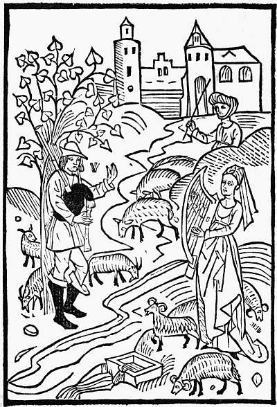
X. LEIPZIG, CONRAD KACHELOFEN, 1489 THEODULUS. EGLOGA (Ib)
The transition to different ideals of illustration thus begun at Mainz was carried on at Nuremberg, where Michael Wolgemut illustrated two important works, the Schatzbehalter in 1491 and the famous Nuremberg Chronicle in 1493, this latter with the help of his stepson, Wilhelm Pleydenwurff, and no doubt also of several inferior designers. The Schatzbehalter, of which the text is ascribed to Stephanus Fridelinus, a Nuremberg Franciscan, is one of several examples of a too ambitious scheme of decoration perforce abandoned for lack either of time or of money. In the first half there are ninety-two different full-page woodcuts, mostly illustrating Scripture history, but in some cases allegorical; in the second half the number is no more than two. The pictures executed before the scheme was thus cut down vary greatly in quality, from the fine design of Christ kneeling before the throne of the Father and pointing to the emblems of the Passion, which prepares us for the work which Dürer, who was then being trained in Wolgemut’s studio, was soon to execute, down to the amusing but uninspired craftsmanship of the picture of Solomon and a selection of his wives banqueting. For the Liber Chronicarum of Hartman Schedel plans had been much more carefully worked out than for the Schatzbehalter, and by studying economy a seemingly profuse system of illustration was maintained to the end. The industry of Mr. Sydney Cockerell has evolved for us the exact figures as to the illustration of this book. Real liberality is shown in the large, double-page topographical cuts of twenty-six different cities, for many of which sketches must have been specially obtained, and not one of these is used a second time; but twenty-two other large cuts of cities and countries were made to serve for sixty-nine different subjects, and when we come to figures of emperors, kings, and popes we find ninety-six blocks used 598 times, or on an average half a dozen times apiece. Mr. Cockerell’s grand totals are 1809 pictures printed from 645 different blocks, so that the repetitions number no fewer than 1164. Both in the designs and their execution there is great inequality, but no single picture can compare with that of Christ kneeling before the Father in the Schatzbehalter, and both books, fine as their best work is, must be regarded rather as the crown of German medieval craftsmanship in book-building than as belonging to the period of self-conscious artistic aim which is heralded by the Mainz Breidenbach but really begins with Dürer.
With this Nuremberg work we may perhaps class that in the one book printed at the Cistercian monastery at Zinna, near Magdeburg, the Psalterium Beatae Mariae Virginis, of Hermann Nitschewitz, the most richly decorated German book of the fifteenth century, executed in honour of the Emperor Frederick and his son Maximilian, who in the page here shown (Plate XI) are both represented.
Primitive Dutch and Flemish book-illustrations when compared with German ones exhibit just the general likeness and specific differences which we might expect in the work of such near neighbours. The Low Country wood-cutters are on the whole more decorative than the Germans, they were more influenced by the work of the engravers on copper, and they were attracted by different types of the human figure, the faces and bodies of the men and women they drew being often long and thin, and often also showing a slightly fantastic touch rarely found in German work. Unfortunately, these Low Country illustrated books are even rarer than the German ones, far fewer of them have found their way to England, and no attempt has been made to reproduce a really representative selection of them in facsimile. In 1884 Sir W. M. Conway, as the result of prolonged studies on the Continent, wrote an excellent account of these illustrations and the makers of them under the title, The Woodcutters of the Netherlands in the Fifteenth Century, which was unhappily allowed to appear without any facsimiles to elucidate the text. Thus the study of these Low Country illustrated books is still difficult.
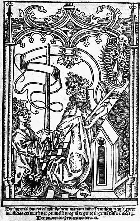
XI. ZINNA. MONASTERIUM CISTERCIENSE, C. 1493 NITSCHEWITZ. PSALTERIUM BEATAE MARIAE VIRGINIS FREDERICK AND MAXIMILIAN
In the production of the early block-books (see Chapter II) the Low Countries had played a principal part, and we meet again with traces of them in later illustrated books, cuts from the Biblia Pauperum being used by Peter van Os at Zwolle in his Episteln ende Evangelien of 5 January, 1487, and one from the Canticum Canticorum in his edition of Mauberne’s Rosetum Exercitiorum Spiritualium in 1494. Two cut-up pieces from the block-book Speculum Humanae Saluationis were used by Veldener in his Episteln ende Evangelien completed at Utrecht 19 April, 1481, and all the old blocks, each divided in two, in a new edition of the Speculum printed at Kuilenburg 27 September, 1483, with twelve new cuts added to them. Sir W. M. Conway has also shown that a set of sixty-four cuts used in a Boec van der Houte or Legend of the Holy Cross, issued by Veldener at Kuilenburg earlier in 1483 (on 6 March), must have been obtained by dividing in a similar manner the double cuts of a block-book now entirely lost.
The first printer in the Low Countries who commissioned a woodcut for a book printed with movable type was Johann of Paderborn (John of Westphalia) at Louvain, the cut being a curious little representation of his own head, shown in white on a black oval. This he used in his Institutiones of Justinian of 21 November, 1475, and a few other books, and a similar but even better likeness of his kinsman, Conrad, appeared the next year in the Formulae Epistularum of Maneken (1 December, 1476). Although Johann of Paderborn thus led the way in the use of cuts, he only resorted to them subsequently for a few diagrams, and towards the end of his career for some half-dozen miscellaneous blocks for devotional books.
The portrait of Johann of Paderborn being used only as a device, book-illustration begins, though on a very small scale, with Veldener’s edition of the Fasciculus Temporum (29 December, 1475), with its handful of poor little cuts modelled on those of the Cologne editions. Five years later Veldener reprinted the Fasciculus with a few new cuts, the originals of which have been found in the Lübeck Rudimentum Noviciorum. The only picture which seems to have been specially designed for him was a folio cut in his Passionael (Utrecht, 12 September, 1480), where in delicate simple outline a variety of martyrdoms are shown as taking place in the hollows of a series of hills. Mention has already been made of his two Kuilenburg reprints of block-books. In the same place he issued Dutch and Latin Herbals with cuts copied from Schoeffer’s Mainz Herbarius, and this completes the story of his illustrated ventures.
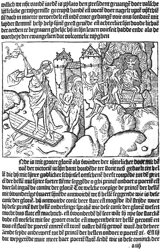
XII. HAARLEM, BELLAERT, 1484 JACOBUS DE THERAMO. BELIAL (4a) THE HARROWING OF HELL
We come now to Gerard Leeu, who on 3 June, 1480, issued at Gouda the first completely illustrated book from a Dutch press, the Dialogus creaturarum moralisatus, a glorified version of the old bestiaries, full of wonderful stories of animals. This was illustrated with 121 specially designed cuts (mostly about four inches by two), and Leeu’s liberality was rewarded by the book passing through nine editions, six in Latin and three in Dutch, in eleven years. The first page is decorated with a picture of the Sun and Moon, a large capital, and an ornamental border of foliage, but the merit of the book lies in the simple skill with which the craftsman, working entirely in outline, has reproduced the humour of the text. To the same hand are attributed ten cuts for Leeu’s vernacular Gesta Romanorum (30 April, 1481), four for an undated Historia Septem Sapientum, and four others, of the Four Last Things, which, to our puzzlement, appear first in a French edition printed by Arend de Keysere at Audenarde, and then (23 August, 1482) in a Dutch one of Leeu’s. In the previous month he had brought out a Liden ende passie ons Heeren with thirty-two quarto cuts, part of a set of sixty-eight made for editions of the Devote Ghetiden or Dutch version of the Horae, the first of which (unless a Gouda one has perished) appeared after his removal to Antwerp. During the following nine years he made good use of his old blocks. For his Dutch Aesop of October, 1485, and Latin edition of September, 1486, he used cuts copied from the original Ulm and Augsburg set. These he bought from Knoblochtzer of Strassburg and sold to Koelhoff of Cologne. In 1487 he issued an illustrated Reynard the Fox, of which only a fragment survives, and the pleasant romance of Paris and Vienne, with twenty-five fairly successful cuts, with the help of which five editions were sold, the first in French, the next three in Dutch, and the last (23 June, 1492) in English. According to Sir W. M. Conway these Paris and Vienne cuts were the work of a Haarlem craftsman, who from 1483 to 1486 had worked for Jacob Bellaert, whose press was intimately connected with Leeu’s, type and cuts passing freely from one to the other. Bellaert had begun by using some of Leeu’s Passion cuts for a Liden ons Heeren, but seems soon to have discovered his Haarlem wood-cutter, with whose aid he produced (15 February, 1484) Der Sonderen troest, The Sinners’ Trust, a Dutch version of that remarkable work the Belial or Consolatio peccatorum of Jacobus de Theramo, of which the Augsburg edition has already been mentioned. This begins with a full folio-page cut combining in one panorama the Fall of Angels and of Adam and Eve, the Flood, the Egyptians overtaken in the Red Sea, and the Baptism of Christ. Six of the other cuts fill half-pages and show the Harrowing of Hell (here reproduced, Plate XII), Devils in consultation, Satan kneeling before the Lord, the Last Judgment, Ascension and Descent of the Holy Spirit. The remaining half-page pictures are all composite, made up of different combinations of eight centre-pieces and seventeen sidepieces. The centre-pieces for the most part represent the different judges before whom the trials are heard, the side-pieces the messengers and parties to the suit. The combinations are occasionally a little clumsy, but far less so than in the Strassburg books printed by Grüninger in which the same labour-saving device was adopted, and in excellence of design and delicacy of cutting this Dutch Belial ranks high among illustrated incunabula.
Later in 1484 (25 October) Bellaert issued a Boeck des Golden Throens with four-column cuts, often repeated, of an Elder instructing a maiden; in May, 1485, Le Fèvre’s Jason, and a little earlier than this an undated edition of the same author’s Recueil des histoires de Troie, both in Dutch and both profusely illustrated; on Christmas Eve in the same year a Dutch De proprietatibus rerum, and in 1486 versions of Pierre Michault’s Doctrinal, in which a dreamer is shown the schools of virtue and of vice, and of Guillaume de Deguilleville’s Pélérinage de la vie humaine, the medieval prototype of Bunyan’s Pilgrim’s Progress. The De proprietatibus is the only one of these books of 1485-6 that I have seen, and its full-page cuts are notable both for their own sake and as having been widely copied, although they illustrate only eleven of the nineteen books.
No other Low Country printer showed anything like the enterprise of Leeu and Bellaert in commissioning long sets of original woodcuts from competent craftsmen, but several fine illustrated books were produced by other firms. Beginning in 1484 Peter van Os printed numerous illustrated books at Zwolle, few of which attain excellence. Yet one of the earliest of them, the Sermons of S. Bernard, has a frontispiece of the Virgin and Child and the Saint gazing at them which is unequalled by any other single cut in the Low Country book in its large pictorial effect. At Gouda, in 1486, Gottfried van Os issued the Chevalier Délibéré of Olivier de la Marche, with sixteen large cuts, in which the author’s minute instructions for each picture are faithfully carried out with extraordinary freedom and spirit, though the ambitious designs are more suitable to frescoes than to book-illustrations. About the end of the century the book was reprinted at Schiedam with the same cuts, from which facsimiles were made in 1898 by Dr. Lippmann and published by the Bibliographical Society.
At Louvain in 1487 Egidius van der Heerstraten issued the De praeclaris mulieribus of Boccaccio with copies of the cuts of the Ulm edition of great interest for the differences in handling revealed when the two are compared. A little later than this another Louvain printer, Ludovicus de Ravescot, published the De anno die et feria Dominicae Passionis of Petrus de Rivo, with a title-cut of the author kneeling before the Virgin and Child, and three large cuts of the Last Supper, Crucifixion, and Resurrection, somewhat in the temper of the illustrations in the Cologne Bibles, but with characteristic Low Country touches. Lastly, mention must be made of the clumsy outline cuts in the Bruges edition of Ovid’s Metamorphoses, issued in 1484 by Caxton’s partner Colard Mansion. Mansion certainly, and possibly Caxton also, were among the early experimenters with copperplate illustration, but the story of these will be told in Chapter XV.
29 Dr. Schreiber, in the introduction to Tome V of his Manuel de l’amateur de la gravure sur bois au xve siècle, dealing with German book-illustrations, shows that some little difficulty was found at first in effecting this. In Boner’s Edelstein (Bamberg, 1461), probably the first illustrated book printed in Germany, the cuts were printed after the text. In Zainer’s Heiligenleben, the first illustrated book printed at Augsburg, the cuts must have been printed first, as part of the text is sometimes printed over them.
30 A set of proofs of cuts to this book, previously in the possession of the Marquis of Blandford and Mr. Perkins, was among the favourite possessions of William Morris, and is now owned by Mr. Morgan. An illustrated Plenarium, assigned by Dr. Copinger to Richel, appears to be a “ghost,” due to some confusion with this Spiegel.
CHAPTER VIII
EARLY ITALIAN ILLUSTRATED BOOKS
As a frontispiece to this chapter (Plate XIII) we give a page from the 1487 edition of the Devote meditatione sopra la Passione del Nostro Signore, printed at Venice by “Jeronimo di Sancti e Cornelio suo Compagno,” the woodcuts in which, as already mentioned, are cut down from those in a block-book of some twenty or five-and-twenty years earlier, and must thus rank as the earliest Italian illustrations. The illustration of books printed in movable type began in Italy as early as 1468, Ulrich Han issuing that year at Rome an edition of Cardinal Turrecremata’s Meditationes, decorated with thirty-one rude cuts chiefly from the life of Christ. A few of these have a coarse vigour, but in the greater number any merit in the original designs (professedly taken from the frescoes with which the Cardinal had decorated the cloisters of the Church of Santa Maria sopra Minerva) is lost in bad cutting. Notwithstanding this the work went through at least three editions (three new pictures being added to the second and one omitted), and served as a model for the metal-cuts of Neumeister’s editions at Mainz and elsewhere, and for the small neat woodcuts of one by Plannck. But though Han’s venture was thus successful beyond its deserts, it took Italy nearly twenty years to make up its mind to welcome printed illustrations. During this time nothing approaching a style of book-illustration emerges, though individual books of importance appeared at several towns. Thus at Verona the De re militari of Robertus Valturius (written not later than 1468) was printed in 1472 by a certain Joannes of that city, with over eighty woodcuts of weapons and implements of war, including a galley which looks more picturesque than seaworthy, chariots, and mangonels, all well drawn and well cut, but a little spoilt by paper and presswork much less good than was usual at this time. Eleven years later Latin and Italian editions with practically the same cuts were printed, also at Verona, by Boninus de Boninis. The only other early Veronese book with illustrations is an Italian version of one of the medieval collections of fables which sought shelter under the name of Aesop. This, which has some spirited cuts, was printed by Giovanni Alvise in 1479.
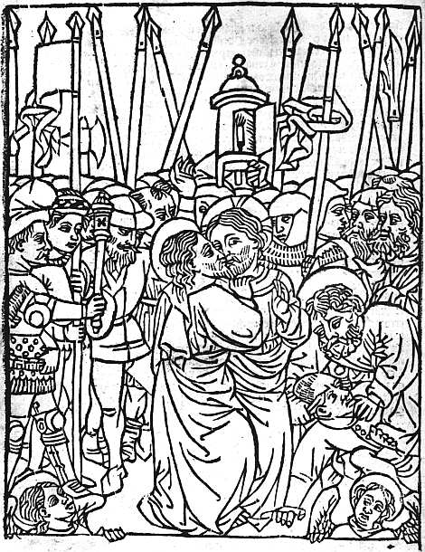
XIII. VENICE, GERONIMO DI SANCTI, 1487 BONAVENTURA. MEDITATIONE (14b REDUCED) THE BETRAYAL
At Naples, Sixtus Riessinger printed Boccaccio’s Libro di Florio et di Bianzefiore chiamato Filicolo in 1478, and also (without date) an Italian version of Ovid’s Heroides, both with numerous cuts, some of them by no means devoid of charm. In 1485 an illustrated Aesop was produced at the expense of a book-loving jurist, Francesco Tuppo, probably from the press of certain “fidelissimi Germani.” The cuts in this, which are hard and heavy but of considerable merit (see Plate XIV), may possibly be due to a mixture of Italian and German influences, but are more probably the work of a Spanish wood-cutter. A picture of an astronomer engaged on his calculations found in the Arte di Astrologia of Granollachs, probably also printed in 1485, may be from the same hand. In the Aesop each picture is placed in an architectural frame, in the upper sections of which there are representations sometimes of Hercules and a lion, sometimes of his wrestle with Antaeus, sometimes of a battle of mounted pygmies. The first page of text also has a fine decorative border, the design being in white on a black ground.
At Florence an ornamental capital in a Psalter printed in 1489 is the earliest woodcut in any extant dated book. But engravings on copper had been employed as early as 1477 for three pictures in Bettini’s Monte Santo di Dio, and in 1481 for nineteen in a Divina Commedia; as to these something will be said in Chapter XV.
Two books printed at Milan in 1479 contain illustrations, the Summula di pacifica conscientia of Fra Pacifico di Novara, being ornamented with three engravings; two of the degrees of consanguinity and the third of a crown bearing the names of the virtues of the Madonna, while the Breuiarium totius juris canonici of Paolo Attavanti printed by Pachel and Scinzenzeler has a little woodcut, which purports to be a portrait of the author.
In Venice book-illustration appears to have begun in the office not of a printer, but of an illuminator. Quite a number of books printed by various firms during the years 1470 to 1472 have a woodcut groundwork to their illuminated borders, and in the Spencer copy of the Italian Bible (Malermi’s translation), printed in 1471 by Adam of Ammergau, the six miniatures of the Creation, with which the blanks left on leaves 11 and 12 are filled, have in the same way rough woodcuts beneath their colouring.31 The workshop in which these decorated borders and miniatures were supplied seems to have closed or given up the practice in 1473, and until Erhard Ratdolt and his partners Löslein and Maler began publishing in 1476, no more woodcuts were produced at Venice. The work of the new firm was decorative rather than pictorial, consisting mainly of the fine borders and capital letters with which they ornamented their Calendars (1476, 1477, and 1482), their Appian, Gesta Petri Mocenici of Coriolanus Cepio and De situ orbis of Dionysius Periegetes, all in 1477, Arte di ben morire of the following year, and Euclid of 1482. With the exception of the earlier Calendars, where the borders to the titlepage (the first so decorated) are of flower-vases, these consist of highly conventionalized foliage (jasmine? vine, oak, etc.) or strapwork, some of them unequalled in their own kind until William Morris combined the same skill with a much bolder and richer treatment of his material. Illustration properly so called begins with Georg Walch’s edition (1479) of the Fasciculus Temporum, a chronological epitome by Werner Rolewinck of Cologne. This has a quaint little view of the Piazza of San Marco and other pictures, which Ratdolt, not at all handsomely, proceeded to copy the next year. In 1481 Ratdolt adorned the Tractatus de Actionibus oi Baptista de Sancto Blasio with rather a graceful little figure of a woman holding the stem of a tree. In 1482 he produced an edition of the Poeticon Astronomicon of Hyginus with some figures of the planets which, rude as they were, served as models for many subsequent editions. In the same year the Oratoriae artis epitomata of Jacobus Publicius was ornamented with some figures including a chessboard, cut in white on black, designed to assist the memory.
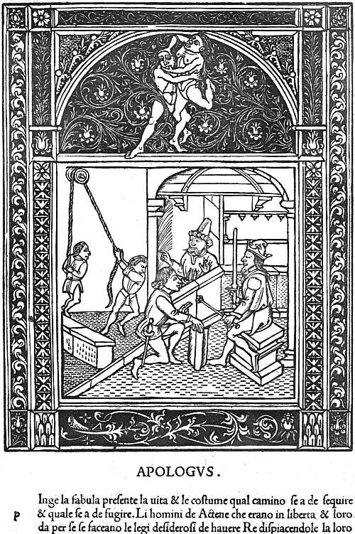
XIV. NAPLES, FRANCESCO TUPPO, 1485 AESOP. FABULA XXII., DE ATHENIENSIBUS PETENTIBUS REGEM
In the later years of his stay at Venice, Ratdolt seems to have lost interest in book-decoration, but the popularity of woodcuts steadily increased throughout the ’eighties, and by the end of the decade was in full tide. In 1484 Bernardinus Benalius gave some rough illustrations to the Fioretti of Saint Francis; in 1486 Pietro Cremonese bestowed a formal but quite interesting decorated titlepage on the Doctrinale of Alexander Gallus, with the title inscribed in a cartouche, above which rise an urn and lamps. In the same year we have in the Supplementum Chronicarum printed by Bernardinus Benalius a few cuts of some size “translated” into an Italian style from those on the same subject in Quentell’s Cologne Bible (c. 1480), also a little view of Venice copied in reverse from the Fasciculus Temporum. The Supplementum Chronicarum was re-issued several times (the author, Jacobus Philippus Bergomensis, bringing the statement of his age up to date in each edition which he revised), and changes were constantly made in the cuts. In 1486 also came an edition of the Libro de la divina lege of Marco del Monte S. Maria, with cuts of Mount Sinai and its desert, notable as having been copied by a much more skilful wood-cutter at Florence eight years later; 1487 produced the first of the Venetian illustrated Aesops, the cuts having borders of white scroll-work on a black ground and being influenced by the Naples edition of 1485. With this must be mentioned a Fior di virtu, with a title cut of a Friar plucking blossoms from a tree, which was thought good enough to be copied at Milan, but was replaced at Venice three years later by a delightful picture of a walled garden. It was in 1487 also that there appeared the edition of the Devote Meditatione sopra la Passione, with cuts taken from the old block-book (see p. 123). In subsequent editions (of 1489, etc.) these were replaced by new woodcuts of varying merit. A later edition still (1500) has a fine picture of the Entry into Jerusalem which Prince d’Essling connects with the Hypnerotomachia of 1499. In 1488 we come to the first illustrated edition of the Trionfi of Petrarch, printed by Bernardino de Novara. This has six large cuts, showing respectively the triumphs of Love, of Chastity, Death, Fame, Time, and the Divinity. All are well designed, but spoilt by weak cutting. In the same year appeared two other illustrated books, a Sphaera Mundi, with a few cuts not in themselves of great importance, and the De Essent et Essenta of S. Thomas Aquinas, with a striking little picture of a child lighting a fire by means of a burning-glass. By studying these books in conjunction Prince d’Essling has shown that they were designed by one of their printers, Johann Santritter, and executed by the other, Hieronymus de Sanctis, and that to the latter may thus be attributed the illustrations (one at least of them of unusual beauty) in an Officium Beatae Virginis which issued from his press 26 April, 1494.
The information on the last two pages is all epitomized from the Prince d’Essling’s great work Les livres à figures Vénitiens (1907, etc.), and is quoted here in some detail as showing that from the time of Erhard Ratdolt onwards book-illustrations are found with some frequency at Venice, a fact for which, until the Prince published the results of his unwearying researches, there was very little evidence available.
The event of 1490 was the publication by Lucantonio Giunta of an edition of Niccolo Malermi’s Italian version of the Bible, illustrated with 384 cuts, many of them charming, measuring about three inches by two. The success of this set a fashion, and several important folio books in double columns similarly illustrated appeared during the next few years, a Vite di Sancti Padre in 1491, Boccaccio’s Decamerone, Masuccio’s Novellino, and a Legendario translated from the Latin of Jacobus de Voragine in 1492, a rival Italian Bible and an Italian Livy in 1493, a Morgante Maggiore in 1494, and an Italian Terence in 1497, while in quarto we have a Miracoli de la Madonna (1491), Vita de la Vergine and Trabisonda Istoriata (1492), Guerrino Meschino (1493), and several others. In some of these books cuts are found signed with F, in others with N, in others with i or ia; in the Malermi Bible and some other books we sometimes find the signature b or .b. Such signatures, which at one time aroused keen controversy, are now believed to have belonged not to the designer, but to the workshop of the wood-cutters by whom the blocks were cut. In the case of the Malermi Bible of 1490 workmen of very varying skill were employed, some of the illustrations to the Gospels being emptied of all delight by the rudeness of their cutting. Where the designer and the cutter are both at their best the result is nearly perfect of its kind, and it is curious to think that some of these dainty little blocks were imitated from the large, heavy woodcuts in the Cologne Bibles printed by Quentell some ten years earlier. In the rival Bible of 1493 the best cuts are not so good, nor the worst so bad as in the original edition of 1490. In the other books (I have not seen the Masuccio) the cutting is again more even, but the designs, though often charming and sometimes amusing, are seldom as good as the best in the Bible. Most of these books have one or more larger cuts used at the beginning of the text or of sections of it, and these are always good.
Two editions of Dante’s Divina Commedia, both published in 1491, one by Bernardinus Benalius and Matheo Codeca in March, the other by Pietro Cremonese in November, must be grouped with the books just mentioned, as they are also illustrated with small cuts (though those in the November edition are a good deal larger than the usual column-cuts), and these are signed in some cases with the letter .b. which appears in the Malermi Bible of 1490. Neither designer has triumphed over the monotonous effect produced by the continual reappearance of the figures of Dante and his guide, and the little cuts in the March edition are far from impressive. On the other hand it has a good frontispiece, in which, after the medieval habit, the successive incidents of the first canto of the Inferno are all crowded into the same picture.
Popular as were the little vignettes, they were far from exhausting the energies of the Venetian illustrators of this decade. At the opposite pole from them are the four full-page pictures in the 1493 and later editions of the Fascicolo de Medicina of Joannes Ketham. These represent a physician lecturing, a consultation, a dissection, and a visit of a doctor to an infectious patient, whom he views by the light of two flambeaux held by pages, while he smells his pouncet-box. This picture (in the foreground of which sits a cat, afterwards cut out to reduce the size of the block) is perhaps the finest of the four, but that of the Dissection has the interest of being printed in several colours. Erhard Ratdolt had made some experiments in colour-printing in the astronomical books which he printed at Venice, and at Augsburg completed the crucifixion cut in some of his missals partly by printed colours, partly by hand. In 1490 a Venetian printer, Johann Herzog, had illustrated the De Heredibus of Johannes Crispus de Montibus with a genealogical tree growing out of a recumbent human figure, and had printed this in brown, green, and red. But the dissection in the Fascicolo di Medicina was the most elaborate of the Venetian experiments in colour-printing and apparently also the last.
With the illustrations to the Ketham may be mentioned for its large pictorial effect, though it comes in a quarto, the fine cut of the author in the Doctrina della vita monastica of San Lorenzo Giustiniano, first patriarch of Venice. The figure of San Lorenzo as he walks with a book under his arm and a hand held up in benediction is imitated from that in a picture by Gentile Bellini, but he is here shown (Plate XV) preceded by a charming little crucifer, whose childish face enhances by contrast the austerer benignity of the saint.
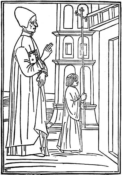
XV. VENICE, ANONYMOUS PRESS, 1494 LORENZO GIUSTINIANO. DELLA VITA RELIGIOSA PORTRAIT OF THE AUTHOR
However good the large illustrations in Venetian books, the merits of them are rather those of single prints than of really appropriate bookwork. The little column-cuts, on the other hand, are almost playful in their minuteness, and even when most successful produce the effect of a delightful border or tailpiece without quite attaining to the full possibilities of book-illustration. The feverish production of these column-cuts began to slacken, though it did not cease, in 1493, and about that date a few charming full-page pictures are found at the beginning and end of various small quartos. From the treatment of the man’s hair and beard it is clear that the delightful frontispiece to the Fioretti della Biblia of 1493 (Prince d’Essling, I, 161) was the work of the illustrator of the second Malermi Bible from which the small cuts in the text are taken. The three cuts to the Fioretti of S. Francis, completed 11 June in the same year, that of the Chome l’angelo amaestra l’anima of Pietro Damiani, dated in the following November, of an undated Monte de la Oratione, and again of the De la confessione of S. Bernardino of Siena, all in the same style, form a group of singular beauty (see Prince d’Essling, I, 284 sqq.; II, 191, 194, 195). Those of S. Catherine’s Dialogo de la divina providentia, 17 May, 1494 (D’Essling, II, 199 sqq.), were probably no less happily designed, but have lost more in their cutting, and with these must be grouped the picture of a Venetian school in the Regulae Sypontinae of Nicolaus Perottus, 29 March, 1492 (D’Essling, II, 86), used also in the De Structura Compositionis of Nicolaus Ferettus, printed three years later at Forlì. The style is continued in the Specchio della fede of Robertus Caracciolus, 11 April, 1495 (D’Essling, II, 260), in the headpiece of the Commentaria in libros Aristotelis of S. Thomas Aquinas, 28 Sept., 1496, and in the two admirable pictures of Terence lecturing to his commentators, and of a theatre as seen from the back of the stage, found in the Terentius cum tribus commentariis of July, 1497 (D’Essling, II, 295, and 277 sqq.). Still in the same style, but carelessly designed and poorly cut, are the illustrations to the well-known Ovid of April, 1497 (D’Essling, III, 220 sqq.), and this leads us on to the still more famous Hypnerotomachia Poliphili of Francesco Colonna, printed by Aldus for Leonardo Crassus, a jurisconsult, in December, 1499, and finally to the cut of Christ entering Jerusalem in the Devote Meditatione of the following April (D’Essling, I, 372), where the hand of the artist of the Hypnerotomachia is clearly visible, though he has surrounded his picture with a frame in the Florentine manner, which was then beginning to make its influence felt at Venice.
The primacy usually given to the Hypnerotomachia among all these books is probably in part due to considerations which have little to do with its artistic merit. The story is a kind of archaeological romance which appealed greatly to the dilettante, for whose benefit Leonardo Crassus commissioned Aldus to print it, but which was far from exciting the popular interest which shows its appreciation for a book by thumbing it out of existence. The Hypnerotomachia is probably almost as common a book as the Nuremberg Chronicle or the First Folio Shakespeare, and thus its merits have become known to all lovers of old books. It is impressive, moreover, from its size and the profusion of its 168 illustrations of various sizes, while the extraordinary variety of these and the excellence of their cutting are further points in its favour. The initial letters of the successive chapters form the sentence POLIAM FRATER FRANCISCUS COLVMNA PERAMAVIT, and this with the colophon assigning the completion of the book to May-Day, 1467, at Treviso, reveals the author as Francesco Colonna, a Dominican, who had taught rhetoric at Treviso and Padua, and in 1499, when his book was printed, was still alive and an inmate of the convent of SS. Giovanni and Paolo at Venice. The Polia whom he so greatly loved has been identified with Lucretia Lelio, daughter of a jurisconsult at Treviso.
The story of the Hypnerotomachia, or “Strife of Love in a Dream,” as its English translator called it, is greatly influenced by the Renaissance interest in antique architecture and art which is evident in so many of its illustrations. Polifilo’s dreams are full, as the preface-writer says, of “molte cose antiquarie digne di memoria, & tutto quello lui dice hauere visto di puncto in puncto & per proprii uocabuli ello descriue cum elegante stilo, pyramidi, obelisce, ruine maxime di edificii, la differentia di columne, la sua mensura, gli capitelli, base, epistyli,” etc. etc. But he is brought also to the palace of Queen Eleuterylida, and while there witnesses the triumphs or festivals of Europa, Leda, Danae, Bacchus, Vertumnus, and Pomona, which provide several attractive subjects for the illustrator. The second part of the book is somewhat less purely antiquarian. Lucrezia Lelio had entered a convent after being attacked by the plague which visited Treviso from 1464 to 1466, and so here also Polia is made to take refuge in the temple of Diana, whence, however, she is driven on account of the visits of Polifilo, with whom, by the aid of Venus, she is ultimately united.
One other point to be mentioned is that many of the full-page Venetian illustrations, both in quartos and folios, have quasi-architectural borders to them, the footpiece being sometimes filled with children riding griffins or other grotesques, while school-books were often made more attractive to young readers by a border in which a master is flogging a boy duly horsed for the purpose on the back of a schoolfellow. In two of the most graceful of Venetian borders, those to the Herodotus of 1494 (and also in the 1497 edition of S. Jerome’s Epistles) and Johann Müller’s epitome of Ptolemy’s Almagest (of 1496), the design is picked out in white on a black ground.
A few Florentine woodcut illustrations have borders of the kind just mentioned in which the design stands out in white on a black ground. In one of these borders there are rather ugly candelabra at the sides, at the top two lovers facing each other in a circle supported by Cupids, at the foot a shield supported by boys standing on the backs of couchant stags. Another has mermen at the top, a shield within a wreath supported by eagles at the foot, and floral ornaments and armour at the sides. In a third on either side of the shield in the footpiece boys are tilting at each other mounted on boars. In a fourth are shown saints and some of the emblems of the Passion, supported by angels. But as a rule, while nearly all Florentine woodcuts have borders these are only from an eighth to three-sixteenths of an inch in depth, and the pattern on them is a leaf or flower or some conventional design of the simplest possible kind. A very few cuts have only a rule round them, one of the largest a triple rule. A rude cut of the Crucifixion is found in Francesco di Dino’s 1490 edition of Cavalca’s Specchio di Croce surrounded by a rope-work border two-fifths of an inch deep, and this border, partly broken away, also surrounds a really beautiful Pietà (Christ standing in a tomb, His cross behind Him, His hands upheld by angels) in Miscomini’s 1492 edition of Savonarola’s Trattato dell’ Umiltà. When the same publisher used Dino’s Crucifixion cut, also in 1492, for Savonarola’s Tractato dell’ Amore di Gesù, he left it without either border or rule round it, the only instance of a Florentine cut so treated in the fifteenth century. Dr. Paul Kristeller, whose richly illustrated monograph on Early Florentine Woodcuts (Kegan Paul, 1897) is the standard work on the subject, suggests with much plausibility that these two cuts, of the Crucifixion and the Pietà, were originally made for earlier books now lost, and belong to an older school of wood-cutting, more akin to that which produced the few extant Florentine single prints.
The earliest work of the new school of illustration is the magnificent cut of the Virgin in a mandorla appearing to S. Jacopone da Todi as he kneels in prayer. This, surrounded by the triple rule already mentioned, is prefixed to an edition of Jacopone’s Laude printed by Francesco Buonacorsi and dated 28 September, 1490. Apparently the earliest dated cut with a typical Florentine border is that to the Lunare of Granollachs printed by Lor. Morgiani and Giovanni da Magonza in September, 1491. It measures more than 6 inches by 4, and is copied, and transfigured in the process, from the heavy cut in a Naples edition of 1485. Two months later the same firm issued the Soliloquii of S. Augustine with an extraordinarily fine title-cut of the saint (the same picture did duty in 1493 for S. Antonino) writing at a desk in his cell. This has a border, but with a white ground instead of a black. On 1 January, 1491-2, still from the same firm, we have surely the prettiest Arithmetic ever printed, that of Filippo Calandri, with delightful little pictures and border pieces, cut in simple outline, in the Venetian rather than the Florentine manner. On 20 March, Morgiani and his partner produced a new edition of Bettini’s Monte Santo di Dio with the three copperplates of 1481 (see Chapter XV) skilfully translated into duly bordered woodcuts, the first two filling a folio page, the third somewhat shorter. A Mandeville with a single cut followed in June, and in December the Trattati of Ugo Pantiera, also with a single cut, perhaps by the designer of the Calandri, since it employs the same trick of representing a master on a much larger scale than a disciple as is found in the picture of Pythagoras in the earlier book.32 One of the earliest (and also most delightful) of the title-cuts of another prolific publisher, the picture of a lecturer and his pupils in Antonio Miscomini’s 1492 edition of Landini’s Formulario,33 measures about 6 inches by 4. But after this the period of experiment was at an end, and with very few exceptions the woodcuts in Florentine books for the rest of the century all measure either a little over or a little under 3 inches by 4, and are all surrounded by a narrow border with some simple design in white upon a black ground.
Some pains have been taken to make clear both the experiments as to style, size, and borders in the Florentine book-illustrations of 1490-2, and the external uniformity in size and borders in the great bulk of the work of the next few years, because in the first number of the Burlington Magazine and subsequently in his fine book on Florentine Drawings, Mr. Bernhard Berenson put forward with considerable confidence the theory that nine-tenths of the Florentine book-illustrations of this period were made from designs supplied by a single artist whom he identifies with a certain Bartolommeo di Giovanni. This Bartolommeo contracted in July, 1488, with the Prior of the Innocents to paint before the end of October seven predelle (Innocenti Museum, Nos. 63-70) for an altarpiece of the Adoration of the Magi, the commission for which had been given to Domenico Ghirlandajo. Mr. Berenson believes that in addition to these predelle (the only works with which Bartolommeo is connected by any evidence other than that of style) he painted the Massacre of the Innocents, as an episode in Ghirlandajo’s altarpiece at the Innocenti, that he must have been one of the more famous painter’s apprentices in the years 1481-5, and subsequently helped him with altarpieces at Lucca and at the Accademia at Florence, and painted a fresco for the church of S. Frediano at Lucca and numerous fronts to the cassonì or ornamental chests, which were at this period the most decorative articles of Florentine furniture. As a minor painter Bartolommeo di Giovanni34 is pronounced by Mr. Berenson to have been “incapable of producing on the scale of life a figure that can support inspection”: in predelle and cassone-fronts he is “feeble, if vivacious, and scarcely more than pleasant,” yet with no authenticated work to build on except the predelle in the Innocenti, Mr. Berenson does not hesitate to assert that “in Florence between 1490 and 1500 few apparently, if any, illustrated books were published without woodcuts for which Alunno di Domenico34 furnished the designs,” and on the strength of this assumption bestows on him the praise, amply deserved by the Florentine school as a whole, that he was “a book-illustrator, charming as few in vision and interpretation, with scarcely a rival for daintiness and refinement of arrangement, spacing and distribution of black and white.” Mr. Berenson’s theories oblige him to credit Bartolommeo with having copied at least from Filippo Lippi, Botticelli, and Piero di Cosimo, as well as from Ghirlandajo, and push the licence accorded to “connoisseurship” to its extreme limit. As I have already acknowledged elsewhere,35 if any one man is to be credited with the whole, or nearly the whole of the Florentine book-illustrations of this decade, a minor artist used to painting predelle and cassone-fronts would be the right kind of man for the task, but on the very scanty evidence at present available I am personally more inclined to attribute such unity as can be traced in these Florentine cuts to their having all come from one large wood-cutter’s shop, without attempting to trace them back to a single designer.