Woodcut and Wood Engraving
Reading edition
It is necessary, before continuing, to distinguish clearly between the woodcut and the wood engraving, not only because early writers used these terms interchangeably, but also to determine exactly what Bewick contributed technically. The woodcut began with a drawing in pen-and-ink on the plank surface of a smooth-grained wood such as pear, serviceberry, or box. The woodcutter, using knife, gouges, and chisels, then lowered the wood surrounding the lines to allow the original drawing, unaltered, to be isolated in relief (see fig. 1). Thus the block, when inked and printed, produced facsimile impressions of the drawing in black lines on white paper. Usually an accomplished artist made the drawing, whereas only a skilled craftsman was needed to do the cutting; very few cutters were also capable of making their own drawings.
The wood engraving, on the other hand, started with a section of dense wood of a uniform texture, usually box or maple, and with the end-grain rather than the plank as surface. For larger engravings a number of sections were mortised together. The drawing was made on the block, not in pen-and-ink although this could be done (certain types of wood engraving reproduced pen drawings) but in gray washes with a full range of tones. The engraver, using a burin similar to that employed in copper plate work, then ploughed out wood in delicate ribbons (see fig. 2). Since the surface was to receive ink, the procedure moved from black to white: the more lines taken away, the lighter the tones would appear, and, conversely, where fewest or finest lines were removed the tones would be the darkest. In the finished print the unworked surface printed black while each of the engraved lines showed as white. It was the "white line" that gave wood engraving its special quality. On the smoother end-grain it could be manipulated with extreme fineness, an impossibility with the plank side, which would tear slightly or "feather" when the burin was moved across the grain. Tones and textures approaching the scale of copper plate engraving could be created, except, of course, that the lines were white and the impressions not so brilliant. But since grays were achieved by the visual synthesis of black ink and white paper, it mattered little whether the engraved lines were black or white so long as the desired tones could be produced.
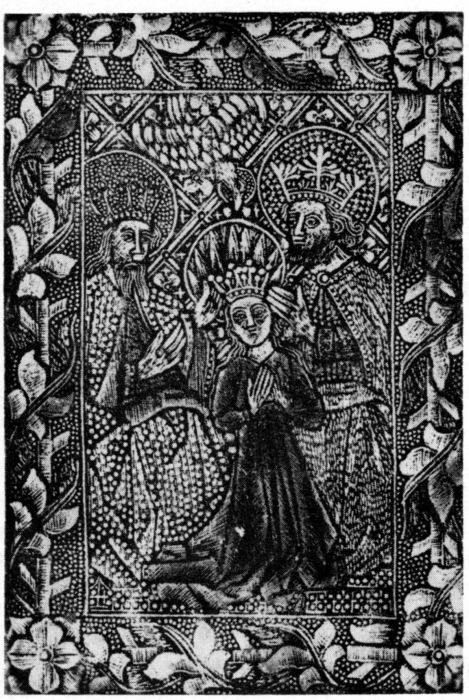
Figure 3.—Late 15th-Century White-Line Engraving "The crowning of the Virgin," in the "dotted manner" executed on metal for relief printing. Parts were hand colored.
For purposes of realism, this was an enormous improvement over the old black-line woodcut. Natural tones and textures could be imitated. The engraver was no longer a mere mechanical craftsman cutting around existing lines; special skill was needed to translate tones in terms of white lines of varying thickness and spacing. The opportunity also existed for each engraver to work his own tones in his own manner, to develop a personal system. In short, the medium served the same purpose as copper plate line engraving, with the added virtue that it could be printed together with type in one impression. If it failed artistically to measure up to line engraving or to plank woodcut, this was not the fault of the process but of the popular reproductive ends which it almost invariably served.
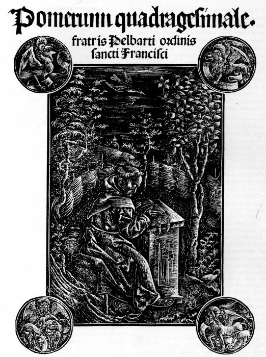
Actually, white-line engraving for relief printing dates from the 15th century. The most conspicuous early examples are the so-called "dotted prints" or "gravures en manière criblée," in which the designs were brought out by dots punched in the plates, and by occasional engraved lines (see fig. 3). Until Koehler's[10] study made this fact plain, 19th-century critics could hardly believe that these were merely white-line metal relief prints, inked on the surface like woodcuts. But a number of other examples of the same period exist which were also made directly on copper or type metal—the method, although rudimentary, being similar in intent to 19th-century wood engraving. One of these examples (fig. 4), in the collection of the U. S. National Museum, is typical. This was not simply an ordinary line engraving printed in relief rather than in the usual way; the management of the lights shows that it was planned as a white-line engraving. The reason for this treatment, obviously, was to permit the picture and the type to be printed in one operation.
The well-known wood engravings of soldiers with standards, executed by Urs Graf in the early 1500's, are probably the only white-line prints in this medium by an accomplished artist until the 18th century. But these are mainly in outline, with little attempt to achieve tones. No advantage was gained by having the lines white rather than black other than an engaging roughness in spots: the prints were simply whimsical excursions by an inventive artist.
Figure 4.—White-Line Engraving on Metal for Relief Printing, "The Franciscan, Pelbart of Temesvar, Studying in a Garden," from "Pomerium quadragesimale, fratris Pelbarti ordinis sancti Francisci," Augsburg, 1502.
Relief engraving on type metal and end-grain wood really got under way as a consistent process in England at the beginning of the 18th century. Chatto[11] gives this date as conjecture, without actual evidence, but a first-hand account can be found in the rare and little-known book, published in 1752, in which the combination of anonymous authorship and a misleading title obscured the fact that it is a digest of John Baptist Jackson's manuscript journal. This eminent woodcutter, who was born about 1700 and worked in England during the early years of the century, must be considered an important and reliable witness. The unknown editor paraphrases Jackson on the subject of engraving for relief purposes:[12]
... I shall give a brief Account of the State of Cutting on Wood in England for the Type Press before he [Jackson] went to France in 1725. In the beginning of this Century a remarkable Blow was given to all Cutters on Wood, by an Invention of engraving on the same sort of Metal which Types are cast with. The celebrated Mr. Kirkhal, an able Engraver on Copper, is said to be the first who performed a Relievo Work to answer the use of Cutting on Wood. This could be dispatched much sooner, and consequently answered the purpose of Booksellers and Printers, who purchased those sort of Works at a much chaper [sic] Rate than could be expected from an Engraver on Wood; it required much more Time to execute with accuracy any piece of Work of the same Measure with those carved on Metal. This performance was very much in Vogue, and continued down to this Day, to serve for Initials, Fregii and Finali; it is called a clear Impression, but often gray and hazy, far from coming up to that clear black Impression produced with cutting on the side of a piece of Box-wood or Pear-tree. Much about the same time there started another Method of Engraving on the end ways of Wood itself, which was cut to the height of the Letters to accompany them in the Press, and engraved in the same Manner as the Metal Performance; this Method was also encouraged, and is the only way of Engraving on Wood at present used in the English Printing-houses. These performances are to be seen in Magazines, News Papers, &c. and are the Remains of the ancient Manner of Cutting on Wood, and is the reason why the Curious concluded it was intirely lost.
This is important evidence that end-grain wood engraving was not only known in England in the early 18th century but was actually the prevailing style. In that country, where a woodcut tradition did not exist, the new method gained its first foothold. But it was not yet conceived in terms of white lines; it was merely a cheaper substitute for cutting with the knife on the plank. In European countries with long art and printing traditions, this substitute method was considered beneath contempt. Jackson[13] describes the aversion of French woodcutters for the newer and cheaper process:
From this Account it is evident that there was little encouragement to be hoped for in England to a Person whose Genius led him to prosecute his Studies in the ancient Manner; which obliged Mr. Jackson to go over to the Continent, and see what was used in the Parisian Printing-houses. At his arrival there he found the French engravers on Wood all working in the old Manner; no Metal engravers, or any of the same performance on the end of the Wood, was ever used or countenanced by the Printers or Booksellers in that City.
Figure 5.—Example of the Woodcut Style that Created Facsimile Drawings. Woodcut (actual size) by Hans Lutzelburger, after a drawing by Holbein for his "Dance of Death," 1538.
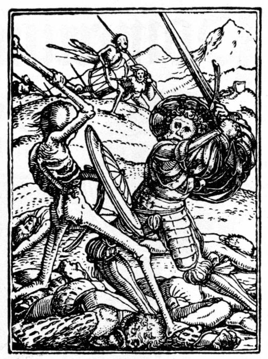
There were good reasons for the lack of development of a white-line style, even in England with its lower standards in printing and illustrative techniques. On the coarse paper of the period fine white lines could not be adapted to relief (typographical) presswork; they would be lost in printing because the ribbed paper received ink unevenly. Even the simple black lines of the traditional woodcut usually printed spottily when combined with type. The white lines, then, had to be broadly separated. This did not permit the engraving of delicate tones. If this could not be achieved, the effect was similar to woodcutting but with less crispness and accuracy in the drawing. A good woodcut in the old manner could do everything the wood engraving could do, before Bewick, with the added virtue that the black line was comparatively clear and unequivocal, as can be seen in figure 5.
Figure 6.—Woodcut Tailpiece by J. M. Papillon, from Traité historique et pratique de la gravure en bois, 1766. The cutting was done so minutely that some details were lost in printing. (Actual size.)
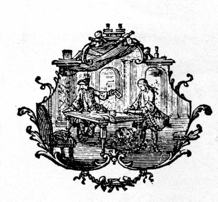
The woodcut, in the hands of a remarkable cutter, could produce miracles of delicacy. It could, in fact, have black lines so fine and so closely spaced as to take on the character of line engraving. It did not, of course, have the range of tones or the delicacy of modeling possible in the copper plate medium, where every little trench cut by the burin would hold ink BELOW the wiped-off surface, to be transferred to dampened paper under the heavy pressure of the cylinder press. In addition, the roughness of early paper, which was serious for the woodcut, created no difficulties for the line engraver or for other workers in the intaglio or gravure media.
But the influence of copper plate work was strong, and some skillful but misguided woodcut craftsmen tried to obtain some degree of its richness. French artists from about 1720, notably Jean M. Papillon, produced cuts so delicate that their printing became a problem (see fig. 6). Jackson, who had worked with the French artist in Paris, condemned his efforts to turn the woodcut into a tonal medium through the creation of numerous delicate lines because such effects were impossible to print. Jackson[14] is quoted in the Enquiry:
In 1728 Mr. Pappillon began his small Paris Almanack, wherein is placed Cuts (done on Wood) allusive to each Month, with the Signs of the Zodiack, in such a Minute Stile, that he seems to forget in that Work the Impossibility of printing it in a Press with any Clearness ... But alas! His father and M. le Seur [also woodcutters] had examined Impression and its Process, and saw how careful the Ancients were to keep a proper Distance between their Lines and hatched Works, so as to produce a clean Impression ... I saw the Almanack in a horrid Condition before I left Paris, the Signs of the Zodiack wore like a Blotch, notwithstanding the utmost Care and Diligence the Printer used to take up very little Ink to keep them clean.
It is clear that too thin a strip of white between black lines was not suitable for printing in the first half of the 18th century. But when Bewick's cuts after 1790 are examined we can see many white lines thinner than a hair. Obviously something had happened to permit him a flexibility not granted to earlier workers on wood. Bewick's whole craft depended upon his ability to control white lines of varying thickness. Why was he able to do this, and why could it be done without trouble by others after him?
Early paper, as already mentioned, had a ribbed grain because it was made on a hand mould in which wires were closely laid in one direction, but with enough space between to allow the water in the paper pulp to drain through. Crossing wires, set some distance apart, held them together. Each wire, however, made a slight impression in the finished paper, the result being a surface with minute ripples. The surface of this laid paper presented irregularities even after the glazing operation, done with hammers before about 1720 and with wooden rollers up to about 1825.[15]
In 1756 James Whatman began to manufacture a new, smooth paper to replace the laid variety that had been used since the importation of paper into Europe in the 12th century. Whether Whatman or the renowned printer John Baskerville was the guiding spirit in this development is uncertain.[16] Baskerville, who had been experimenting with type faces of a lighter and more delicate design, had been dissatisfied with the uneven surface of laid paper. Possibly he saw examples of the Chinese wallpaper on wove stock, made from a cloth mesh, which was a staple of the trade with the Orient. Hunter[17] describes the new mould:
The wove covering was made of fine brass screening and received its name because it was woven on a loom in about the same manner as cloth. It left in the paper an indistinct impression resembling a fabric. Baskerville had been in the japanning and metal-working trades before becoming a printer, so that he was naturally familiar with this material, metal screening having been used in England for other purposes before it was put to use as a material upon which to mould sheets of paper.
The first book printed in Europe on wove paper unquestionably was the Latin edition of Virgil produced by Baskerville in 1757. This was, however, partly on laid also. The actual paper was made in James Whatman's mill in Maidstone, Kent, on the banks of the river Len, where paper had been made since the 17th century. Whatman, who became sole owner of the mill in 1740, specialized in fine white paper of the highest quality. But while the book attracted considerable attention it did not immediately divert the demand for laid paper, since it was looked on more as an oddity than as a serious achievement. Baskerville was strictly an artist: he took unlimited time and pains, he had no regard for the prevailing market, and he produced sporadically; also, he was harshly criticized and even derided for his strange formats.[18] With such a reputation for impracticality the printer's influence was negligible during his lifetime although, of course, it was widely felt later.
About 1777 the French became acquainted with wove paper, which Franklin brought to Paris for exhibition. In 1779, according to Hunter,[19] M. Didot the famous printer, "having seen the papier vélin that Baskerville used, addressed a letter to M. Johannot of Annonay, a skilled papermaker, asking him to endeavour to duplicate the smooth and even surface of this new paper. Johannot was successful in his experiments, and for his work in this field he was in 1781 awarded a gold medal by Louis XVI."
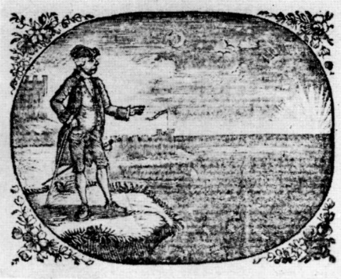
Figure 7.—Wood Engraving by Thomas Bewick, "The Man and the Flea," for Fables, by the late Mr. Gay, 1779. (Actual size.) Note how the closely worked lines of the sky and water have blurred in printing on laid paper. The pale vertical streak is caused by the laid mould.
Wove paper was so slow to come into use that Jenkins gives the date 1788 for its first appearance in book printing.[20] While he missed a few examples, notably by Baskerville, it is certain that few books with wove paper were published before 1790. But after that date its manufacture increased with such rapidity that by 1805 it had supplanted laid paper for many printing purposes.
The reasons for this gap between the introduction and the acceptance of the new paper are not clear; the inertia of tradition as well as the probable higher cost no doubt played a part, and we may assume that early wove paper had imperfections and other drawbacks serious enough to cause printers to prefer the older material.
Bewick's early work was printed on laid paper. Up to 1784 he had worked in a desultory fashion on wood, much of his time being occupied with seal cutting because there was still no real demand for wood engraving. In Gay's Fables, published in 1779, the cuts printed so poorly on the laid paper (see fig. 7) that Dobson[21] was moved to say:
Generally speaking, the printing of all these cuts, even in the earlier editions (and it is absolutely useless to consult any others), is weak and unskillful. The fine work of the backgrounds is seldom made out, and the whole impression is blurred and unequal.
Figure 8.—"The Spanish Pointer", illustration (actual size) by Thomas Bewick, from A general history of quadrupeds, 1790, in the collections of the Library of Congress.
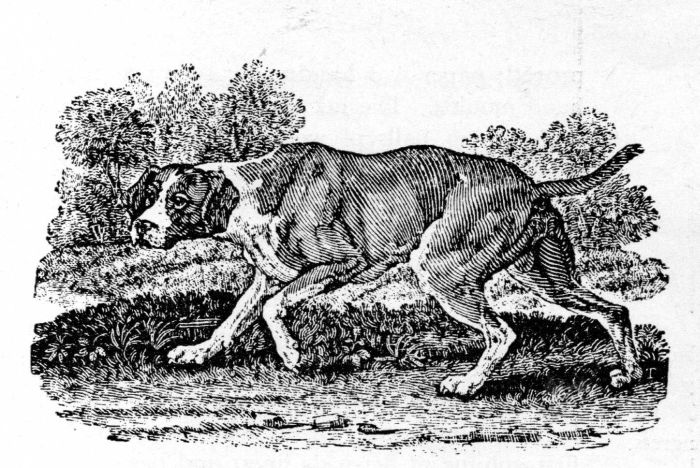
Even in the Select fables of Aesop and others of 1784, when Bewick's special gifts began to emerge, the cuts on laid paper appeared weak in comparison with his later work. Bewick was still using wood engraving as a cheaper, more quickly executed substitute for the woodcut. The designs were based upon Croxall's edition of Aesop's Fables, published in 1722, which was probably the best and most popular illustrated book published in England during the century up to Bewick's time. According to Chatto, the cuts were made with the burin on end-grain wood, probably by Kirkall,[22] but Bewick believed they were engraved on type metal.[23] It was not easy to tell the difference. Type metal usually made grayer impressions than wood and sometimes, but not always, nail-head marks appeared where the metal was fastened to the wood base. The Croxall cuts, in turn, were adapted with little change from 17th-century sources—etchings by Francis Barlow and line engravings by Sebastian Le Clerc. Bewick's cuts repeated the earlier designs but changed the locale to the English countryside of the late 18th century. This was to be expected; to have a contemporary meaning the actors of the old morality play had to appear in modern dress and with up-to-date scenery. But technically the cuts followed the pattern of Croxall's wood engraver, although with a slightly greater range of tone. Artistically Bewick's interpretation was inferior because it was more literal; it lacked the grander feeling of the earlier work.
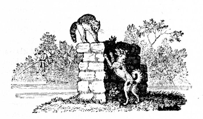
Bewick really became the prophet of a new pictorial style in his A general history of quadrupeds, published in 1790 on wove paper (see figs. 8, 9, and 10). Here his animals and little vignetted tailpieces of observations in the country announced an original subject for illustration and a fresh treatment of wood engraving, although some designs were still copied from earlier models. The white line begins to function with greater elasticity; tones and details beyond anything known previously in the medium appear with the force of innovation. The paper was still somewhat coarse and the cuts were often gray and muddy. But the audacity of the artist in venturing tonal subtleties was immediately apparent.
One of Bewick's old friends at Newcastle had been William Bulmer, who by the 1790's had become a famous printer. In 1795 he published an edition of Poems by Goldsmith and Parnell, which was preceded by an Advertisement announcing his intentions:
The present volume ... [is] particularly meant to combine the various beauties of PRINTING, TYPE-FOUNDING, ENGRAVING, and PAPER-MAKING.... The ornaments are all engraved on blocks of wood, by two of my earliest acquaintances, Messrs. Bewick [Thomas and his brother and apprentice John], of Newcastle upon Tyne and London, after designs made from the most interesting passages of the Poems they embellish. They have been executed with great care, and I may venture to say, without being supposed to be influenced by ancient friendship, that they form the most extraordinary effort of the art of engraving upon wood that ever was produced in any age, or any country. Indeed it seems almost impossible that such delicate effects could be obtained from blocks of wood. Of the Paper, it is only necessary to say that it comes from the manufactory of Mr. Whatman.
The following year, 1796, a companion volume, The Chase, a Poem, by William Somervile, appeared with cuts by Bewick after drawings by his brother John (see fig. 11). In both books, although no acknowledgment was given, there was considerable assistance from pupils Robert and John Johnson and Charlton Nesbit, as well as from an artist associate Richard Westall.[24] Bulmer was quite conscious that a new era in printing and illustration had begun. Updike[25] notes Bulmer's recognition of the achievements of both Baskerville and Bewick in giving the art of printing a new basis:
To understand the causes of the revival of English printing which marked the last years of the century, we must remember that by 1775 Baskerville was dead.... There seems to have been a temporary lull in English fine printing and the kind of type-founding that contributed to it. The wood-engraving of Thomas Bewick, produced about 1780, called, nevertheless, for more brilliant and delicate letter-press than either Caslon's or Wilson's types could supply. If Baskerville's fonts had been available, no doubt they would have served.... So the next experiments in typography were made by a little coterie composed of the Boydells, the Nicols, the Bewicks (Thomas and John), and Bulmer.
Figure 9.—Tailpiece by Thomas Bewick (actual size), from A general history of quadrupeds, 1790, in the collections of the Library of Congress.
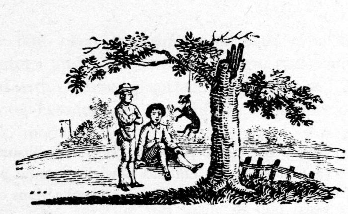
When the cuts in this book are compared with earlier impressions from wood blocks, the difference is quickly seen. The blocks are more highly wrought, yet every line is crisp and clear and the impressions are black and brilliant. When we realize that the only new technological factor of any consequence was the use of good smooth wove paper, we can appreciate its significance.
There were no other developments of note in the practice of printing during the 18th century. The old wooden hand press, unimproved except for minor devices, was still in universal use. Ink was little improved; paper was handmade; type was made from hand moulds. The ink was still applied by dabbing with inking balls of wool-stuffed leather nailed to wooden forms. The leather was still kept soft by removing it and soaking it in urine, after which it was trampled for some time to complete the unsavory operation. Paper still had to be dampened overnight before printing, and freshly inked sheets were still hung to dry over cords stretched across the room.
But with a more sympathetic surface for receiving ink from relief blocks, a new avenue for wood engraving was now open. In the following year, 1797, the first volume of Bewick's finest and best-known work was published. This was the History of British birds, for which he and his pupils did the cuts while Ralph Beilby, his partner and former master, provided the descriptions (see figs. 12, 13, and 14.) It achieved an immense and instantaneous popularity that carried the artist's name over the British Isles. The attractiveness of the subject, the freshness of the medium—which could render the softness of feathers and could be interspersed with text—the powerful and decorative little tail pieces, and the comparative inexpensiveness of the volumes, brought the Birds into homes everywhere.
Figure 10.—Tailpiece by Thomas Bewick (actual size), from A general history of quadrupeds, 1790, in the collections of the Library of Congress.
Actually, wood engraving was not immediately adopted on a wide scale. Having done without it for so long, printers and publishers made no concerted rush to avail themselves of the new type of cuts. Bewick's pupils found little of this kind of work to do before about 1830. Luke Clennell dropped engraving for painting; William Harvey restricted himself to drawing and designing; Charlton Nesbit and John Jackson remained engravers, as did a host of lesser individuals. Dobson says:[26]
The pupils who quitted him to seek their fortunes in London either made their way with difficulty, or turned to other pursuits, and the real popularization of wood-engraving did not take place until some years after his death.
One reason for delay in adopting the new technique may have been the danger of the block splitting, or of the sections of wood coming apart at the mortise-joints during the printing operation. If this happened, work had to be suspended until a new block was engraved, or until the sections were reglued. For periodicals with deadlines, this was a serious hazard.