Part 2 — PREPARING COPY FOR THE PRESS AND PROOF-READING
Reading edition
PREPARING COPY FOR THE PRESS AND PROOF-READING
I. PREPARING COPY
Our purpose in these few lessons is to give some explicit directions as to the general make-up of manuscripts intended for printing. Every person who has even a business card or a circular to print should have a knowledge of the common phraseology of a printing house.
As to paper, the size in most common use for manuscripts is what is known as letter. The sheets in any case should be of uniform size. Avoid all eccentricity and affectation in the preparation of your manuscript, or "copy," as printers call it. The more matter-of-fact and businesslike it is the better.
If at all possible have your manuscript type-written, and under no circumstances should you roll the sheets when preparing them for the mails. There are a number of large publishing houses which positively refuse to touch rolled manuscripts. The very first impression created by such a manuscript is one of extreme irritation. A rolled proof is pretty nearly as discouraging, yet many printers still follow the annoying practice of rolling their proofs.
Every printing establishment of any note has its methods and customs as regards orthography, the use of capitals and of punctuation. As a rule it is best to leave doubtful points to the printer. Any little deviation desired may be easily remedied in the proofs.
Paragraphs should be boldly indicated by setting the line well back in the "copy." Extract matter included in the text should be clearly shown, either by marking it down the side with a vertical line from beginning to end or by setting the whole well back within the compass of the text. Such matter is commonly set in slightly smaller type.
With regard to the corrections in the proofs it must be remembered that the more carefully an article is written the smaller the expense for author's corrections. This charge is often a great source of contention between the author and the printer, and, altogether, is an unsatisfactory item. A printer is bound, with certain reservations, to follow the "copy" supplied. If he does that and the author does not make any alterations there is no extra charge and nothing to wrangle about. A small correction, trivial as it may seem to the inexperienced, may involve much trouble to the printer. A word inserted or deleted may cause a page to be altered throughout, line by line, and a few words may possibly affect several pages. The charges made for corrections are based on the time consumed in making the necessary alterations.
II. ON THE NAMES AND SIZES OF TYPE
The beauty of printed matter depends very largely upon the selection of a suitable style of type. For books and newspaper work there are in use two general classes known as (a) old style, (b) modern. These names refer to the shape of the letter and not to its size. The several sizes of type commonly used in all plain work are as follows:
pearl.
agate.
nonpareil.
minion.
brevier.
bourgeois.
long primer.
small pica.
pica.
english.
great primer.
Pica is universally considered as the standard type, just as the foot is the standard of measurement. The twelfth part of a pica is the unit, called a point, by which type bodies are measured. In many printing offices the type is known as 6-point, 8-point, 10-point, etc., instead of as nonpareil, brevier, long primer, etc. The following specimens show the sizes of the type in common use:
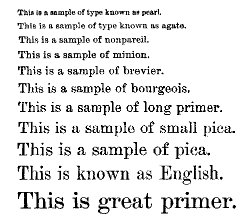
The student must bear in mind the fact that these names refer to the size of the type. For instance, there may be a dozen different styles of brevier or of pica; a particular specimen of printing may be entirely in long primer, yet some words may be capitals, others italic, others boldface, and so on.
Agate is the size of type used in measuring advertisements. There are fourteen agate lines in an inch.
A complete series of type of a particular size is called a font; as a font of brevier, or of pica. Such a font would include:
CAPITALS small capitals lower-case ITALIC CAPITALS italic lower-case.
Also figures, fractions, points, references, braces, signs, etc. Printers divide a font of letters into two classes:
1. The upper-case sorts. }
2. The lower-case
The upper-case sorts are capitals, small capitals, references, dashes, braces, signs, etc.
The lower-case sorts consist of small letters, figures, points, spaces, etc.
Type lines are often bulked out by the insertion of thin strips of lead, this being called leading. Where no leads are employed the matter is said to be solid.
III. THE TERMS USED IN PRINTING
Composition. This is the name given by printers to the work of setting the type. The compositor holds in his hand a composing-stick, into which he places the type letter by letter, adding the spaces where necessary. A great deal of the newspaper work of the present day is set by type machines.
Distributing. The type of a particular page or article after it has been used on the press or for electrotyping is distributed letter by letter in the cases. This work is much more rapid than composition. Type to be used a second time is said to be standing or is called standing matter.
Spaces. Spaces are short blank types and are used to separate one word from another. To enable a compositor to space evenly and to "justify" properly, these spaces are cast to various thicknesses. An em quadrat is a short blank type, in thickness equal to the letter m of the font to which it belongs. Quadrats are of various sizes.
Calendered Paper. This name is given to very highly rolled or glazed paper such as is used in illustrated work. Laid paper has a slightly ribbed surface. Antique paper is rough and usually untrimmed at the edges. It is made in imitation of old styles.
Caps. and Lower-case. These names are used to designate capitals and small letters.
Clarendon. This name is commonly given to a bold and black-faced type, such as used in text-books to bring out prominently particular words.
Dummy. An imitation in style and size of a book or pamphlet that is wanted, usually made up with blank paper.
Electrotype. Electrotype or stereotype plates are made from type. Books are usually printed from such plates.
Galley Proof. As the type is set up it is removed from the composing-stick to long forms called galleys. A proof taken of the whole galley at once is called a galley proof. Book work should be revised in galleys before it is made up into pages.
Impression. A flat-pull or first impression is a simple proof usually pulled in job offices by laying a sheet of damp paper on the inked type and pounding with a flat-surfaced weight to get the impression.
Indent. To set a line some distance forward, as in the case of a new paragraph.
Letterpress. Printed matter from type as distinguished from plate printing.
Make-up. To measure off type matter into pages.
Off-set. It frequently occurs that as the result of insufficient drying or from other causes the impression of one sheet appears on the back of another; such work is said to off-set.
Overlays. In making ready for the press the pressman finds it necessary to add here and there, by pasting, thicknesses of paper to his roller to bring out properly the light and shade of an illustration or to get an even ink impression from the type or plates. This work is called making overlays. In expensive illustrated work specialists are engaged solely for the purpose of making overlays.
Press Proof. The final proof passed by the author or publisher.
Process-blocks. Blocks produced by the photoengraving and other mechanical processes.
Query. A mark made on a proof by the printer to call attention to a possible error, sometimes expressed by a note of interrogation (?).
Register. The exact adjustment of pages back to back in printing the second side of a sheet.
Signature. The letter or figure at the foot of a sheet to guide the binder in folding; also used by printers to identify any particular sheet.
The various marks and signs used by printers will be explained in the lesson on proof-reading.
IV. MARKS USED IN PROOF-READING
The most important of the signs used in making corrections for the printer are as follows:
1. Delete or expunge.

2. A turned letter.

3. Wrong-font letter.

4. Change capital to small letter, ("lower-case").

5. Insert period.

6. Transpose words or letters as indicated.

7. Change roman to italic.

8. Change italic to roman.

9. Space to be inserted.

10. Matter wrongly altered to remain as it was originally. Dots are placed under the matter.

11. A bad or battered letter.

12. Space to be reduced.

13. Close up.

14. Push down space or lead.

15. New paragraph.

16. Something foreign between the lines, or a wrong-font space making the type crooked.

17. Line to be indented one em of its own body.

When letters or words are set double or are required to be taken out a line is drawn through the superfluous word or letter and the mark No. 1, called dele, placed opposite on the margin. (Dele is Latin for take out.)
A turned letter is noted by drawing a line through it and writing the mark No. 2 on the margin.
If letters or words require to be altered to make them more conspicuous a parallel line or lines must be made underneath the word or letter—namely, for capitals, three lines; for small capitals, two lines; and for italic, one line; and on the margin opposite the line where the alteration occurs the sign caps., small caps., or ital. must be written.
Where a letter of a different font is improperly introduced into the page it is noted by drawing a line through it and writing w. f. (wrong font) on the margin.
Where a word has been left out or is to be added a caret must be made in the place where it should come in and the word written on the margin. A caret is made thus: ^
Where letters stand crooked they are noted by a line, but where a page hangs lines are drawn across the entire part affected.
Where a faulty letter appears it is denoted by making a cross under it and placing a similar mark on the margin.
Where several words are left out or where new matter is to be added the added matter is written wherever convenient, and a line is drawn from the place of omission to the written words.
In making a correction in a proof always mark the wrong letter or word through and insert the alteration in the margin, not in the middle of the printed matter, because it is liable to be overlooked if there is no marginal reference to the correction. To keep the different corrections distinct finish each off with a stroke, thus /; and to make the alterations more clear or less crowded mark those relating to the left-hand portion on the left margin and those relating to the right-hand portion on the right margin.
The hints given here are intended for the general public and not for the printer, and to the student of these lessons let us say that the first essential of good proof-reading is clearness. Be very sure that the printer will understand the changes which you desire him to make. Quite often it is an advantage if you wish a particular style of type used to cut out a sample of that style and paste it on your copy or on your proof, indicating that you want it to be used. Instructions to the printer written either on the copy or on the proof should be surrounded by a line to separate them from the text, or to prevent any confusion with other written matter intended as copy or as corrections.
When the corrections have been duly made and approved by the author or editor it is customary to write the word "press" on the top of the first page. If intermediate proofs are wanted, mark on the proofs returned to the printer "Send revise." The final or "press" proof is always retained by the printer in case of any dispute. It is his voucher, and he retains it for future reference.
It is a good plan to make corrections in a different coloured ink from that used by the printer's proof-reader. If you are having a pamphlet or book printed the different proofs will reach you in the following order:
Galley proofs.
Revised proofs (if any).
Page proofs.
Foundry proofs.
A printer's proof.
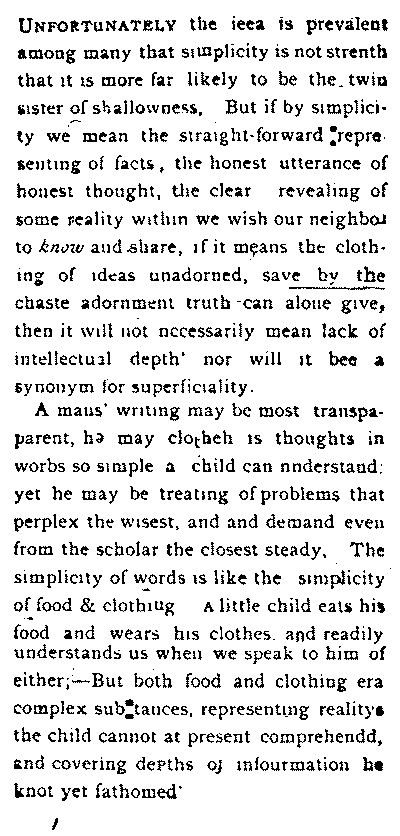
So far as possible, make all the necessary changes while the type is in galleys. Once made up into pages, a very slight change, particularly such a change as the crossing out or addition of a sentence, may make a great deal of trouble. When the pages are passed upon they are sent to the foundry for casting. The foundry proofs are the last proofs pulled. Corrections made on these make it necessary to alter the electrotype plates, which is rather an expensive process. To change a word, a piece of the metal plate has to be cut out and another with the new word soldered in.
A printer's corrected proof.
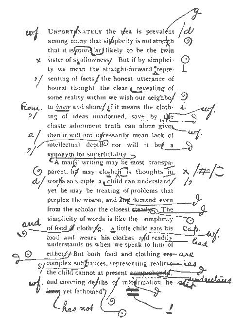
A page is said to overrun if it is too long. If the space to be occupied is limited it is a good plan to adapt your copy to it by counting the words and by comparing the count with that of some printed page in the same size of type.
Return proofs to your printer or publisher as promptly as possible. As a rule printing houses cannot afford to keep type locked up and unused waiting for the return of proofs. There are many imperfections in typography, such as wrong-font and inverted letters, awkward and irregular spacing, uneven pages or columns, crooked words and lines, etc., which it is the business of the printing house to correct. No book or pamphlet, therefore, ought to go to press until it has been read and revised by an experienced reader.
Strict uniformity should always be preserved in the use of capitals, in spelling, and in punctuation.
Where authors have their manuscripts type-written and make two or three revises upon the type-written sheets before their copy is turned over to the publishing house, the labour of proof-reading and the expenses of corrections are reduced to a minimum.
The errors shown in our illustration are more numerous than are likely to appear in any proof sent out from a publishing house.
Transcriber's Notes
Page
• favorable changed to favourable 35
• favor changed to favour 49
• (5) changed to 5. 65
• contantly changed to constantly 115
• Ierland changed to Ireland 130
• battle-ships changed to battleships 150
• BREAD-STUFFS changed to BREADSTAFFS 152
• duplicated "from" deleted 162
• bread-stuffs change to breadstuffs 163
• June, 1898 changed to June 30, 1898 205
• proportiona t changed to proportion at 208
• duplicated "in" deleted 223
• typewritten changed to type-written 259
• everyday changed to every-day 350
• comma added after figures 384
• colored changed to coloured 389
• nessary changed to necessary 390
Illustrations that appear on pages 117, 199, 216 and 241 in the original publication do not coincide with page numbers in this eBook due to the positioning of illustrations and footnotes at beginning and/or end of paragraphs.