Spacing Capital Letters
Reading edition
Words in capitals need wider spacing than those in lower-case of the same size. Capitals occupy more space on the type body than small letters and consequently they need a little more openness between the words and between the lines to give them a proportionate relief of white space for legibility.
Roman capitals of the standard faces are often sufficiently spaced with the en quad if the words are short. Long words in a headline may need double 3-spaces, while lines of round open capitals in an open area may need the em quad.
A simple rule to follow is to space wide letters with wide spaces, and thin or condensed letters with narrow spaces. This may be put another way by saying that the spacing should approximate the average width of the letters used, taking an entire alphabet as the basis. Thus, if the alphabet of capitals measures 18 ems, the average width of the letters would be 18⁄26ths, or approximately 2⁄3 of the em.
Like all rules, this is subject to modifications in special cases. The shapes of the letters which end and begin the words may make it desirable to increase or decrease the spaces in some places. Word endings like ——L T—— and ——Y A—— should have a little thinner space than is used between those ending and beginning with full-bodied upright letters like ——M R——.

In small types the inequalities in white space around letters of different shapes may not be readily seen, but in large sizes these differences increase in noticeable degree. A careful compositor will select his spaces to equalize these little differences and thus avoid the numerous inconsistent defects sure to result from mere mechanical justification of the lines.
Combinations of capitals like the following example show distinctly uneven white spaces between the letters of the word. These should be equalized wherever possible by the use of thin leads or cards between the close-fitted letters.

This differential spacing will also be desirable in a line having abbreviations or initials. The following example spaced with en quads in every place shows an excess of white between the initials because of the presence of the periods.

A thinner space between the initials gives uniform spacing through the line.
Large initials used in groups, as in college degrees and military titles, are often set close together with simply the period for separation. This style is preferred in any close-spaced matter; though for more open matter a thin space may be used after the periods.
Two or more lines of capitals of the same size should be spaced as nearly alike as possible. The disproportionate spacing of the following three lines is sometimes seen, but is not pleasing:
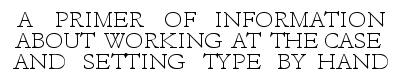
Lines of small capitals of normal size are often sufficiently spaced with the 3-space and slightly wider when in paragraph form. When used in headings and open-leaded matter en-quad spacing is required.




