Front matter (continued 2)
Reading edition
Figure 5.—Diagram illustrating method of projecting a map.
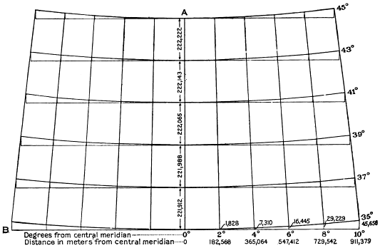
In projecting a map first select a convenient measuring scale for setting off the dimensions given in the tables, or if no scale is at hand one may be constructed. Measuring scales are made, however, bearing divisions for miles and kilometers and finer subdivisions of 6 to 100 parts. They include the ratios of 1:31,250, 1:31,680, 1:48,000, 1:62,500, 1:63,360, 1:125,000, 1:250,000, 1:500,000, 1:1,000,000, and others. On a map drawn on the scale of 1 to 63,360, for example, 1 inch would represent 1 mile; on a map drawn on the scale of 1 to 1,000,000, 1 millimeter would represent 1 kilometer, and so on. It will be seen that the use of a scale that shows in ratios, such as those just given, the actual distance on the ground as compared with the unit representing the same distance on the map will reduce the possibility of error.
The method of projecting a map, illustrated in the accompanying diagram (fig. 5), is as follows: First draw a straight vertical line (A) through the middle of the sheet to represent the central meridian of the map and a line (B) at the lower end of this line exactly at right angles to it to represent the bottom of the map. Then set off on the line showing the central meridian the distances between parallels given in Table 6 on page 36 of "Geographic tables and formulas" (Bull. 650). It should be noted that the figures in these tables give the distance, in meters and statute miles, of 1° on a meridian measured 30' each way from a point where the meridian is intersected by a parallel. The exact distances between parallels as measured on the ground are given in the Coast and Geodetic Survey tables, or they may be computed from Table 6 of "Geographic tables and formulas" by adding the sum of the figures given for any two latitudes 1° apart and dividing by 2.
The distance between parallels that are 2° apart, as shown in the diagram, may be computed from Table 6 of "Geographic tables and formulas," as follows:
Meters. Meters.
1° of latitude on 37th parallel = 100,975.1 ÷ 2 = 55,487.5
1° of latitude on 36th parallel = 110,956.2
1° of latitude on 35th parallel = 110,937.6 ÷ 2 = 55,468.8
True distance from 35° to 37° latitude = 221,912.5
The distances given in the diagram were obtained by adding the figures given in the Coast and Geodetic Survey tables, which yield the same results. Other tables in Bulletin 650 give the true distances in inches on maps of certain standard scales.
Through the points thus obtained on the central meridian draw lines at right angles to the vertical line. Along these horizontal lines lay off the dimensions in the column headed X, Table 6 (pp. 39-47) of "Geographic tables and formulas" as required for each individual map—in the diagram every alternate degree. Draw vertical lines at these points and set off the distance Y in the same table in a similar manner, and the points so found will be the points of intersection of the respective meridians and parallels. Figures are given on the diagram for the thirty-fifth parallel only.
DETAILS OF BASE MAPS.
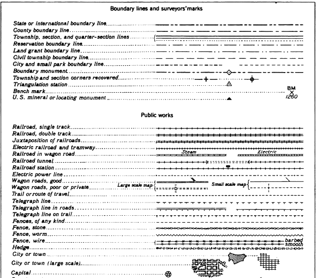
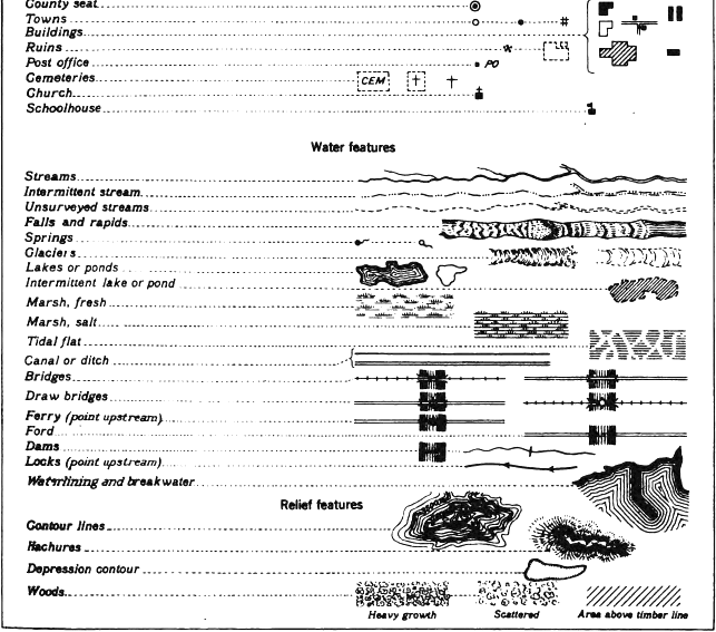
Anyone who attempts to draw a base map must, first of all, know how each feature or part of the map should be represented. Most of the conventional symbols for features shown on base maps are well established and should invariably be used; for instance, a line composed of alternate long and short dashes (not dashes and dots) represents a county boundary, and a line or two parallel lines across which short lines are drawn at regular intervals represents a railroad. If he finds that two or more symbols have been widely used to represent the same feature the draftsman should select the one that is best suited to the map in hand. The correct forms of the conventional symbols or features to be used in preparing miscellaneous maps are shown in Plate IV, but the size and weight of each line or symbol must depend on the size and character of the map.
TRANSFERRING OF COPYING.
TRACING.
The oldest method of transferring a map or parts of a map or other drawing to another sheet is that of copying it by means of tracing paper. This method, though still used for simple work, has given way to quicker and more effective methods. By one of these methods a piece of thin, fairly smooth paper (not necessarily transparent) is coated with graphite by rubbing over it a soft pencil. When the graphite has been evenly distributed over it, this sheet is laid upon the drawing paper, coated side down, the map or other subject to be copied is laid upon the graphite-coated sheet, and the two outer sheets—the drawing paper and the map—are securely fastened together. By a steel tracing point or very hard pencil the lines and other details of the matter to be copied are then firmly and carefully traced and thus transferred to the clean drawing paper beneath.
For maps that show several features in different colors sheets rubbed with blue, orange, brown, or green pencils may be used, one after another, for tracing each set of the features. Red should not be used, as it is not easily erased. This method insures distinctive lines for the separate features and prevents the confusion that might result from the use of one color only. Exact register of the features shown in the several colors used may be insured by fastening one edge of the drawing to be copied to the drawing paper by mucilage or thumb tacks. The colored sheets may then be slipped in and out without altering the position of the lines or symbols for one set of data with relation to those for the others.
In the final preparation of a base map to be engraved and printed in colors—for example, black, blue, and brown—tracings of the three colors appearing on the original base should generally be transferred, as described above, to one sheet of paper and thus worked up into a three-colored map. It is usually unnecessary and undesirable to draw each color on a separate sheet. The preparation of separate drawings may facilitate reproduction, but if they are made on tracing cloth the usual uneven shrinking or stretching of the cloth may produce misregister in the printing; therefore it is safer to make a single drawing, so that the photolithographer can make three negatives and separate the colors by painting out or "opaquing" the colors not wanted on each negative. A map drawn on a single sheet is also less bulky and can therefore be more conveniently handled and compared with proof.
If for any reason separate tracings for the different colors to be used on a map are considered desirable they should be made on linen cut from one roll and in the same direction according to the warp and woof.
CELLULOID TRANSFERRING.
In the celluloid method of transferring a map or parts of a map to paper upon which a complete new map is to be drawn the map or part of the map to be copied is photographed to the exact scale of the new drawing and reproduced in graphite on thin sheets of celluloid.
The celluloid sheet is then laid face down in the correct position on the drawing paper and firmly rubbed on the back with a steel burnisher, which makes a perfect offset of the map on the paper. After the parts desired are inked over the rest of the graphite print is easily erased with an ordinary rubber.
By using this method it is possible to get absolute scale and more satisfactory results than by tracing over a photographic print line for line or by using a pantograph.
Requisitions for celluloid prints are made on the form used for requesting photolithographic work.
SKETCHING BY RETICULATION.
If the sheet bearing the design or matter to be copied may be marred without objection it is ruled lightly into pencil squares of equal size. Corresponding squares of the same size, larger, or smaller, according to the size of the new drawing, are then ruled on the drawing paper, and the work is sketched square by square. If the original sheet may not be marred the same result can be obtained by drawing the lines on a transparent oversheet. This method is serviceable for enlarging or reducing simple work that includes no great amount of detail; if great precision of detail is required the original should be enlarged or reduced by photography or by the pantograph.
THE "SHADOWLESS DRAFTING TABLE."
One of the most useful contrivances that has been made for tracing a drawing on the same scale is called by its manufacturers the "shadowless drafting table." The essential features of this table are a wooden box inclosing strong incandescent lights and bearing a ground-glass top. A drawing placed on the ground glass can be so illuminated as to make its lines conspicuous and readily traceable even through relatively thick paper. The table is particularly useful for tracing sheets upon, which the lines are indistinct and would not be discernible under tracing paper with reflected light. It is also useful in preparing drawings in which certain features must register perfectly over each other. In fact any drawing that does not require enlarging or reducing can be traced with great facility by the use of this drafting table, and it is particularly useful for tracing faint lines on old and poorly preserved prints or drawings.
Such a table has been installed in the section of illustrations, where it can be used by authors and others.
TOPOGRAPHIC FEATURES.
RELIEF.
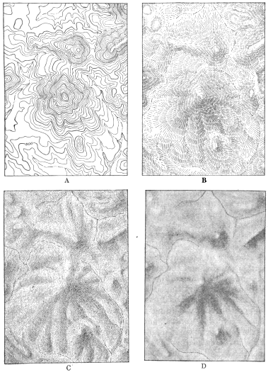
The effect of relief is expressed on a map by three methods—by contours, by hachures, and by shading. (See fig. 6.) The first method does not give pronounced pictorial expression of relief, though it gives correct shape and exact elevation; the others are mow pictorial, but they do not give exact elevation.
Contours.—As contoured maps are originally prepared from actual surveys the draftsman should simply follow the copy furnished by the topographer or such original matter as may be given to him for redrawing. If the area mapped is large and the contours are close together the original may be transferred by celluloid tracing (see p. 47), or it may be transferred by tracing with graphite-coated paper (see p. 46). After the contour lines have been transferred they should be traced in ink, in lines of even thickness, except those that represent certain fixed intervals and are to be numbered, which should be made slightly thicker. (See fig. 6, A.) In drawing these lines some draftsmen use an ordinary ruling pen, others the swivel pen; but considerable practice is required in the use of either before it can be controlled to follow precisely the penciled lines. Still other draftsmen use the Shepard pen or an ordinary drawing pen. The swivel pen, if expertly handled, produces a firm and even line.
Italic numbers should be used to indicate the elevation of a contour and should be placed in an opening in the line, never between lines. Where the lines run close together great care should be taken that they do not touch unless the interspaces are so narrow that they must touch and combine. The lines should be firm and even, and if the copy or original map shows that they are uniformly very close together it should be enlarged before the tracing is made in order to give more freedom in drawing; but if the enlarged map is to be much reduced care should be taken to make the lines proportionate to the reduction. A photo-engraving of a map on which the contour lines are drawn very close together is likely to be unsatisfactory because, though the spaces between the lines are reduced in width, the lines themselves may show no corresponding reduction in thickness.
Figure 6.—Methods of expressing relief: (A) by contour lines, (B) by hachures, (C) by shading on stipple board, and (D) by a brush drawing. The four examples given represent the same area. The drawings were made twice the size of the printed cuts.
Certain contour lines are commonly accentuated on a map, generally every fourth or fifth line—that is, for a 10-foot interval every 50-foot line, for a 20-foot interval every 100-foot line, for a 25-foot interval every 100-foot line, for a 50-foot interval every 250-foot line, and for a 100-foot interval every 500-foot line.
Hachuring.—The effect of relief can be produced satisfactorily by hachuring but only by a draftsman who has had considerable well-directed practice in that kind of drawing. In a hachured map the light should seem to come from the west or northwest—that is, the darker parts should be on the east or southeast side of an elevation and the lighter parts on the west or northwest The highest elevation should be represented by the darkest shade on the right and by a corresponding high light on the left. The hachuring should begin at the crest of a peak, range, or butte and be worked downward toward the gentler slopes, the lines being drawn farther apart and made thinner until the floor of the valley is reached and the effect of shadow is lost by fewer and lighter lines. On a hachured map that is made from a contoured map somewhat definite differences of elevation may be indicated by the intervals between the strokes, and abrupt changes in slope may be indicated by shorter and heavier lines. The strokes should be disjointed, and they should trend at right angles to the upper margin of a cliff and should radiate from a peak. Figure 6, B, represents satisfactory hachuring.
Hill shading.—Relief is more easily expressed by shading than by hachuring. (See fig. 6, C, D.) The draftsman can best express it by this means after he has studied contoured maps or photographs of the region mapped, if they are available, in order that he may obtain an idea of the details of its topography.
The special means used to produce hill shading will depend on the character of surface of the paper on which the drawing is to be made, the size of the map, the amount of detail and refinement of execution desired, and the amount of reduction to be made in reproducing the drawing. For maps on which it is desired to show some refinement of drawing and detail, a lithographic or wax crayon can be used on paper which has a grained surface. The draftsman must express relief according to the information he has at hand, whether detailed or general, and must employ methods that accord with the purpose of the map and the mode of reproduction selected. If a shaded relief map is to be prepared for direct reproduction by photolithography and the shading is to be printed in a separate color the base map should be completed first and a light photographic or blue print obtained on which to add the relief in black lithographic crayon, to insure perfect fitting of the relief and the base; or the relief can be prepared on an oversheet—a semitransparent white paper with sufficient "tooth" or grain to cut the shading up into minute dots. The shadowless drafting table (see p. 47) is especially useful for this purpose. On this oversheet register marks should be placed at the four comers and at several other points, particularly at the intersection of parallels and meridians.
For relief shading on small black and white maps Ross's hand-stipple drawing paper may be used. (See p. 24.) By rubbing a black wax crayon or pencil over the surface of the paper the desired effect is produced in fine dots or in stipple, which may be varied in density of shade at the will of the draftsman. (See fig. 6, C.) High lights can be produced by scraping away the chalky surface of the paper. A lithographic or wax crayon is the best medium to use on this stipple paper, as on the paper referred to in the preceding paragraph, for the shading produced by it is not so easily smeared as that produced in pastel or by a graphite pencil. The object of using either the rough paper or Boss's stipple paper for drawings that are to be reproduced by photo-engraving is to produce a shading that is broken up into dots of varying sizes, which is essential in such reproduction.
Belief shading for maps can also be made with a brush in flat washes of either india ink or lampblack. Such shading should be made only over a blue print or an impression of some kind from the map upon which the shading or relief is to be overprinted. If the relief is expressed on the author's original by contours the general shapes of the relief and the drainage lines can be traced and transferred lightly in blue lines to form a base on which to model the shading and at the same time to make the shading fit the streams. Such a drawing can be photographed through a screen and reproduced by half tone (see fig. 6, D) or mezzotint as a separate plate made to overprint the map in another color.
HYDROGRAPHY.
General directions.—The drainage features of a map should be so drawn as to suggest the natural courses of the streams. Streams should not be drawn in straight, hard lines, as such lines are decidedly unnatural and produce a crude effect. The course of a river may be straight in general, but it is likely to be somewhat sinuous in detail. If the streams shown on a preliminary map are drawn in a clumsy or characterless fashion they should be redrawn with a freehand effect or made slightly wavy, in order that they may appear more natural. The gradual widening of streams from source to mouth should also be shown in the drawing. On small-scale maps, where the eye can at once see a stream through its full length, this almost imperceptible widening can be expressed by a line of almost uniform weight except for the stretch near the source, where it should grow thinner and taper off. On maps which are to be reproduced directly from drawings in black and white and which are to show both contour lines and drainage the lines representing the streams and other water bodies should generally be drawn freehand and slightly heavier than the contour lines, which should be sharper and more precise.
The names of all streams or other bodies of water should be in italic letters, those of the larger streams being lettered in capitals and those of the smaller streams in capitals and lower-case letters. (See "Lettering," p. 53.)
Water lining.—The use of water lining on black and white maps should be limited to maps on which the water areas are not readily distinguishable from the land areas. In rough drawings that are to serve only as copy for engravers a flat color may be used for water areas and its conversion into water lines specified. In base maps to be reproduced in three colors a light-blue tint may be used in lieu of water lining, and it can be printed either flat or in a fine ruling transferred to the stone that is to print the drainage. The engraving of water lines is expensive, and the flat blue color should generally be preferred.
Water lining usually consists of 30 to 45 lines on engraved or large maps, but on small maps and sketch maps the number may be reduced as desired. Care should be taken that the lines are as nearly parallel as they can be made freehand and of even weight or thickness. The first three to six lines outside the coast line should be somewhat closer together than those farther out and should conform closely to the coast line, but the spacing between the lines should increase and the lines should become almost imperceptibly less conformable to the coast line as they reach their outer limit, the last three to six being made with the greatest care and refinement. Water-lined maps that are to be reproduced by photographic processes should be drawn at least twice publication size. The reduction will bring the lines closer together, and the reproduction will show a more refined effect than could possibly be produced by the most skillful drawing.
Good examples of water lining, such as are shown on the topographic atlas sheets of the Survey, should be studied by draftsmen before they undertake such work.
U. S. GEOLOGICAL SURVEY
PREPARATION OF ILLUSTRATIONS PLATE IV
SYMBOLS USED ON BASE MAPS
CULTURAL FEATURES.
The cultural features represented on a map include "the works of man"—not only cities, towns, buildings, bridges, railroads, and other roads, but State, county, and other boundary lines—in short, all that part of a three-color base map which is shown in black, the engraved plate for the black being called the culture plate. The features named in the list below are the cultural features referred to. (See Pl. IV for corresponding symbols.)
Aqueduct mains. Aqueduct tunnels. Bench marks. Boundary Lines. Boundary monuments. Breakwaters. Bridges. Buildings. Cable Lines. Camps. Canal locks. Canals. Cemeteries. Churches. Cities. County lines. Dams. District lines. Ditches. Electric power lines. Fences. Ferries. Fords. Gas wells. Hedges. Hospitals. Jetties. Land-grant lines. Land-section Lines. Levees. Mains. Mineral monuments. Mine tunnels. Mines. National forests. National parks. Oil tanks. Oil wells. Open cuts. Park boundaries. Paths. Pits. Post offices. Precinct lines. Prospects. Province lines. Quarries. Quarter-section lines. Railroads, steam or electric. Ranches. Reservation boundaries. Reservoirs. Roads. Ruins. Schoolhouses. Section comers. Section Lines. Settlements. Shafts. Streets. Telegraph Lines. Towns. Township comers. Townships. Trails. Tramways. Triangulation stations. Tunnels. Villages. Water mains. Water wells. Waterworks. Windmills.
LETTERING.
GENERAL DIRECTIONS.
The cultural features are named on maps by letters of two distinct styles—slanting gothic for public works and roman for habitations and civil divisions. The size of the letters used should indicate in a general way the relative importance of the feature or group to which they are applied, but on some maps the county seats, State capitals, and large cities may be distinguished by different symbols. The names of civil divisions are lettered in sizes depending on their relative grade and the size of the area or space in which the names are to appear.
The features shown on a topographic map may be broadly separated into four groups and are lettered as follows:
Civil divisions (countries, States, counties, townships, land grants, reservations, cities, towns, villages, settlements, schools, lodges, ranches, etc.), roman capitals or capitals and lower case.
Public works (railroads, tunnels, roads, canals, ferries, bridges, fords, dams, mains, mines, forts, trails, etc.), slanting gothic capitals (light) or capitals and lower case.
Hydrographic features (oceans, seas, gulfs, bays, lakes, ponds, rivers, creeks, brooks, springs, wells, falls, rapids, marshes, glaciers, etc.), italic capitals or capitals and lower case.
Hypsographic features (mountains, ranges, peaks, plateaus, cliffs, buttes, canyons, valleys, peninsulas, islands, capes, etc.), upright gothic capitals (light) or capitals and lower case.
The essential principles of lettering have been described in numerous treatises and are well understood by most draftsmen. The correct form of each letter may be learned from such treatises, but spacing and arrangement are best learned by observation and experience. Good lettering will not strongly attract attention, but even slight imperfections of form, spacing, slant, and shading will be quickly detected and criticized. Map letterers should note that the name of a place or the number of a symbol should be put to the right of the symbol if possible and a little above or below it—not to the left and directly on a line with it, as Tucsono, 17o, Dallaso, Carsono. Names indicating large areas, if written from west to east, should curve with the parallels, and all names should be so lettered that "if they should fall they would fall on their feet." Every name should be distinctly legible but not so conspicuous as to subordinate the feature it designates. Lines should therefore not be broken in order to make the lettering clear except where there is possible danger that the smaller spaces may be filled up in printing. The lettering on a map should always be so spaced that it will properly fit the area it is intended to designate. In names consisting of two or more words the letters should not be closely spaced if wide spaces are left between the words. In numbers, except those used to indicate elevations on contour Lines or elsewhere, thousands should always be set off by commas.
Draftsmen often draw bad forms for commas, quotation marks, apostrophes, and question marks. The following forms are correct: Comma , ; quotation marks "" ; apostrophe ' ; question mark ? .
LETTERING BY TYPE.
Names and short notes printed from type on paper, to be cut out and pasted in proper positions on maps or other drawings, now furnish a large proportion of the lettering on the Survey's illustrations. The strips are likely to become detached by the repeated handling of a drawing, however, unless they are securely pasted on. The best results can be obtained by having the type printed on a special brand of "noncurling" gummed paper, from which the lettering is cut in squares or strips, which are dampened and applied to the proper places on the drawing. In handling such strips a pair of dentist's tweezers is useful. When mucilage is applied to printed strips of ordinary paper the moisture causes the paper to warp or curl, often so much as to affect the reproduction of the drawing. This printed lettering is generally used, however, only for headings, titles, notes, and other matter that stands alone; it should not be used for the geographic names in the body of a map unless only a few names are to appear, for the strips of paper bearing the names may obscure parts of the map. The reproduction of this lettering by photo-engraving or photolithography gives results superior to those obtained from hand lettering unless each letter is made with the utmost care, work which is considered a waste of time.
U. S. GEOLOGICAL SURVEY
PREPARATION OF ILLUSTRATIONS PLATE V
Click on image to view larger size.
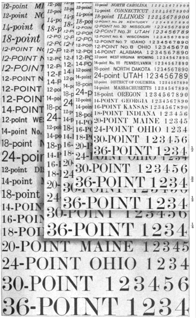
REDUCTION SHEET USED IN LETTERING ILLUSTRATIONS. The largest size shows the letters unreduced; the other sizes show the letters reduced as indicated in the margin.
Type is used also for printing lettering directly on a drawing exactly in proper position, by a special type holder, somewhat like a self-inking stamp.
Most of the styles and sizes of type now used on maps in the Survey's reports are shown in Plate V.
If a drawing is to be reduced one-half the smallest type used should be about 2 millimeters in height; if it is to be reduced one-third the smallest type used should be about 1.5 millimeters in height; and so on. No letter whose vertical height after reproduction would be less than about 1 millimeter should be used, and the larger lettering should bear a proper relation to the smaller. Sheets showing the styles of type in use by the Survey, in full size and reduced one-fourth, one-third, two-fifths, one-half, three-fifths, two-thirds, and three-fourths, will be furnished on request. If a drawing is to be reduced one-half, for example, the sheet that has been reduced one-half will show the size of the lettering on the printed plate, so that the draftsman, by referring to the sheet showing the reduction he desires, can select type of a size that will be legible. Plate V shows a part of this reduction sheet.
ABBREVIATIONS.
The following are the correct forms for abbreviations used on maps and other illustrations:
A Arroyo B. M Bench mark Bdy Boundary Br Branch, bridge C Cape Can Canal, canyon Cem Cemetery Co County Cr Creek E East El Elevation Est Estuary Fk Fork Ft Fort, foot Gl Gulch, glacier Hrb Harbor I Island Is Islands Jc Junction L Lake Lat Latitude Ldg Landing L. S. S Life-saving station L. H Lighthouse Long Longitude M. P Milepost M. M Mineral monument Mt Mount Mtn Mountain Mts Mountains N North Pen Peninsula Pk Peak P. O Post office Pt Point R Range, river Res Reservation, reservoir R. H Road house S South Sd Sound S. H Schoolhouse Sta Station Str Stream T Township Tel Telegraph W West.
Words like mount, river, point should not be abbreviated where they form a part of the name of a city or town, as Rocky Mount, Fall River, West Point. Neither the word nor the abbreviation for railroad or railway should be placed on a map; the chartered name (or initials of the name) and the road symbol are sufficient.
Names of States and Territories should be abbreviated, where abbreviation is necessary, as follows:
Ala. Ga. Minn. N. J. Tenn.
Ariz. Ill. Miss. N. Mex. Tex.
Ark. Ind. Mo. N. Y. Va.
Calif. Kans. Mont. Okla. Vt.
Colo. Ky. Nebr. Oreg. Wash.
Conn. La. Nev. Pa. W. Va.
D. C. Mass. N. C. R. I. Wis.
Del. Md. N. Dak. S. C. Wyo.
Fla. Mich. N. H. S. Dak.
Alaska, Guam, Hawaii, Idaho, Iowa, Maine, Ohio, Samoa, and Utah should be written in full.
The abbreviations used on the margins of maps for subdivisions of land should be as follows (note punctuation): T. 2 N., E. 3 W. On large-scale plats the marginal lettering should be as follows: N. 1/2 NE. 1/4 sec. 1, T. 7 N., K 2 W.; fractional secs. 2 and 35, Tps. 7 and 8 N., R. 2 W.; NW. 1/4 sec. 20, T, 7 N., R. 2 W. In spelling fractions use half and quarter, not one-half and one-quarter.
The abbreviated forms of such names as North Fork and South Fork should be N. Fork and S. Fork, not North Fk. and South Fk.
Additional abbreviations used on illustrations are as follows:
N. for north, NE. for northeast, NNE. for north-northeast, etc. Capitalize directions affixed to street names, as NW., SE. (1800 F St. NW.).
Sec. and secs. for section and sections before a number. Capitalize only at the beginning of a line or sentence.
a. m. and p. m. for antemeridian and postmeridian, as 4.30 p. m. Lower-case unless in line of caps.
& in names of corporations or companies. On Survey miscellaneous maps "and" is spelled out in railroad names.
B. t. u. for British thermal units.
bbl., bbls. for barrel, barrels.
bu. for bushel or bushels.
c. c. for cubic centimeter.
cm. for centimeter.
cwt. for hundredweight.
dwt. or pwt. for pennyweight
oz. for ounce or ounces.
etc. (not &c.) for et cetera.
ft. for foot or feet.
H. m. s. for hours, minutes, and seconds. (Use capital H.)
in. for inch or inches.
kw. for kilowatt or kilowatts.
£ s. d. for pounds, shillings, and pence.
per cent (omitting period) for per centum. Spell out percentage.
ser. for series.
St. for Saint or street
U. S. Army for United States Army, as distinguished from United States of America (U. S. A.).
yd., yds. for yard, yards.
U. S. GEOLOGICAL SURVEY
PREPARATION OF ILLUSTRATIONS PLATE VI
Click on image to view larger size.
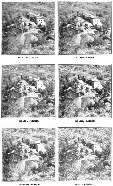
HALF-TONE CUTS SHOWING EFFECT OF SEVERAL STANDARD SCREENS IN THE REPRODUCTION OF THE SAME DETAIL.
The names of certain months may in some places be abbreviated; those of others should invariably be spelled out. The following are the correct forms:
Jan. Apr. July Oct.
Feb. May Aug. Nov.
Mar. June Sept Dec.
The abbreviations for number and numbers before figures are No. and Nos. The o should never be raised, as in No. The abbreviation for Mac is Mc, not Mc.
All periods should be omitted from abbreviations used in the body of a map unless their omission would cause misunderstanding. They are generally unnecessary, and if used on some maps they are likely to be mistaken for symbols representing certain features, such as houses or flowing wells, if either is shown. Periods used on drawings that are to be reproduced "direct" or photomechanically should always be slightly exaggerated.
NAMES OF RAILROADS.
The names of railroads may be written in full or abbreviated, in accordance with the kind of map and the space available. On a sketch map in black and white the initial letters are generally sufficient. On a more detailed map, if there is room enough, the names may be spelled out. As already stated, neither the words "railroad" and "railway" nor the abbreviations R. R. and Ry. should be used on a map.
MAKE-UP OF MAPS.
FORMS FOR CERTAIN FEATURES.
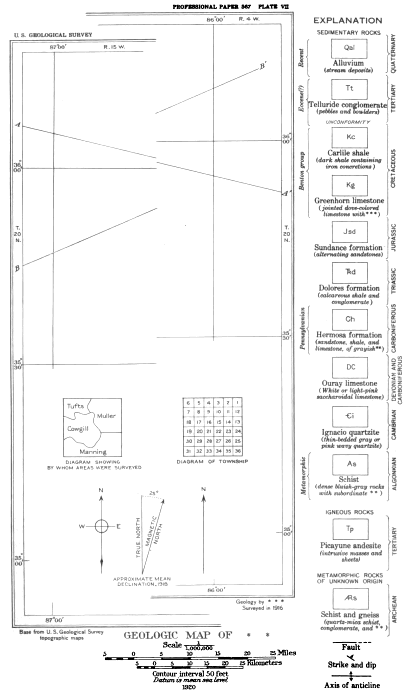
The proper forms for certain features of maps, such as the borders, titles, explanations, bar scales, captions, arrows indicating true north and magnetic declination, source, and authorship, are shown in Plate VII. Note particularly the style and position of the marginal matter.
BORDER.
A finished map border is used or omitted according to the kind of map prepared. Diagrammatic maps and maps on which no parallels and meridians appear do not need finished borders. On a map that shows complete areal geologic or other coloring, such as a map in a Survey geologic folio, the border lines tend to destroy the simple effect of the whole map. On a map that is not completely colored and on all very large maps borders are really necessary. If borders are used, however, the space between the neat line and the outer line of the border should be only sufficient to provide proper space for the numbers showing latitude and longitude or township and range. A simple rule[8] for determining the width of this space is as follows: Divide the sum of the dimensions of the map by 2 and find the square root of the quotient, which will represent the width of the border in sixteenths of an inch. Example: Map is 20 by 30 inches; (20 + 30)/2 = 25; square root of 25 = 5; width of border = 5/16 inch.
The numbers showing latitude and longitude should be in shaded arabic numerals and those showing township and range in gothic. The symbols for degree, minute, and second should not be crowded. On a map that has no added border lines the numbers should be in hair-line gothic.
TITLE.
The title of a map should be in roman letters and if placed at the lower margin should generally be arranged in two lines, unless it is short. If it forms two or more lines the lines should be well balanced. The first line should describe the position of the area; the second line should state the purpose of the map, as
MAP OF BUTTE AND VICINITY, MONTANA SHOWING LOCATION OF MINES AND PROSPECTS.
A title placed inside the border of a map should be arranged in a series of lines, generally beginning with "Map of" or "Geologic map of." and the line showing the dominant part of the title should be emphasized by larger lettering, thus:
MAP OF THE VICINITY OF BUTTE MONTANA SHOWING LOCATION OF MINES AND PROSPECTS.
The name of the author or compiler of a map or of the person supplying the geologic or other data shown on it may be placed either beneath the title or in the lower right corner, just below the border line, and the names of the topographers or the source of the base should be stated in the lower left corner, just below the border line. If the title is placed inside the border all notes giving credit for any part or features of the map may be placed beneath the title or scale. (See PI. VII.)
U. S. GEOLOGICAL SURVEY
PREPARATION OF ILLUSTRATIONS PLATE VII
Click on image to view larger size.
DETAILS OF THE MAKE-UP OF A GEOLOGIC MAP
EXPLANATION.
The symbols, patterns, or colors used on a map should be given in a series of rectangles or "boxes," accompanied by explanatory terms in the form shown in Plate VII, headed "Explanation." If the explanation is small a convenient place for it on some maps may be found within the neat lines. If no space is available there, or if it is so large that there is not room to place it there without obscuring other details, it may be placed either vertically along the right margin, as shown in Plate VII, or horizontally under the title. A geologic explanation should preferably be arranged vertically, as in Plate VII, so as to show the relative age of the formations by the positions of the boxes. This explanation should be carefully worked out in pencil by the draftsman and approved by the committee on geologic names before it is drawn in ink, in order to save time in making corrections.
In lettering the explanation roman letters or type should be used for the titles under the boxes and italic of smaller size for the subtitles or descriptive detail, which should be inclosed in parentheses. The names of geologic periods and systems should be in gothic capitals, the names of series or groups should be in italic lower case, and the limit of each period, system, or group should be indicated by braces. The general style and arrangement shown in the Survey's geologic folios should be followed, and this and the arrangement of other matter is shown in Plate VII. Care should be taken not to crowd the explanation, and if corrections are necessary they should be so made that each line of the matter in which they appear will be properly spaced.
The explanation for a map that is to be engraved or to be reproduced by lithography need only be sketched in to show general style and arrangement. The engraver or the lithographer will supply such matter in proper form according to specifications. For direct reproduction, however, as by photolithography or zinc etching, the lettering must either be carefully drawn with pen or printed from type on slips, which are pasted on the drawing.
GRAPHIC SCALES FOR MAPS.
A bar scale for miles or feet should be given on every map, and if the map is of international interest the metric scale should be given just beneath the scale of miles or feet. The accepted designs for these scales are shown in figure 7. The scale should be accompanied W any necessary statement pertaining to the base map, such as "Contour interval 20 feet," "Datum is mean sea level." The fractional scale (, for example) should be given on all except the more simple kinds of maps, and the date of publication should also appear just below the scale or scales. The single-line bar scale should be used only on small or simple maps. The length of the bar scale must depend on the size of the map and the space available. Those shown in figure 7 were made over blue prints from scales used by the Survey.

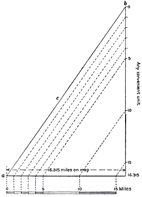
To make a bar scale for a map of unknown scale that shows only a single meridian and parallel, or for a map on which no meridians or parallels are shown, first ascertain the distance between two points shown on the map by reference to other authentic maps. If, for example, the distance between two such points is 16.315 miles draw a horizontal line (a in fig. 8) representing this distance on the map, and at its end, at right angles to it, draw another line (b) actually measuring 16.315 units of any convenient denomination. Draw a straight line (c) diagonally between the ends of lines a and b. Then set off on line b any convenient number of the units selected, say 5 or 10, and project from the points set off lines exactly parallel with line c to line a. The distance and the number of the units thus marked on line a will indicate the number of miles covered by that distance on the map, as shown in figure 8.
Figure 7.—Designs for bar scales.
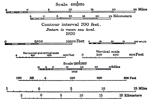
Figure 8.—Method of making a bar scale for a map of unknown scale.
U. S. GEOLOGICAL SURVEY
PREPARATION OF ILLUSTRATIONS PLATE VIII
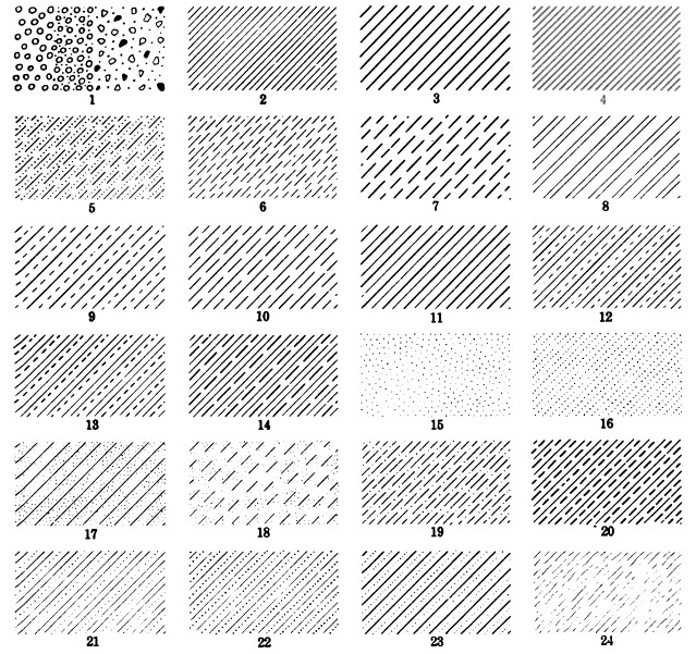
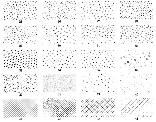
PATTERNS USED TO SHOW DISTINCTIONS BETWEEN AREAS ON BLACK AND WHITE MAPS Contrasts may be increased by varying the direction and spacing of Lines
SYMBOLS.
Symbols should be drawn with as much care as letters, though to a critic they may not appear so bad as poor lettering unless he finds them glaringly large or so small that he can discover or identify them only with difficulty. The size of a symbol must depend on its importance on the map bearing it. On a map that shows numerous mines, for instance, the crossed hammers or the symbols for shafts should be not only visible but conspicuous. The draftsman who is to make such a map must know beforehand how much his drawing will be reduced in reproduction and must make the symbols in proportion to the reduction. The symbols shown in Plate II (p. 20) should be used in all the Survey's illustrations where they are appropriate.
AREAL PATTERNS FOR BLACK AND WHITE MAPS.
The conventional patterns used on a map to distinguish separate areas, chiefly geologic, are shown in Plate VIII. The patterns shown represent the proper combinations of lines, dots, and other forms and should be spaced openly or closely according to the size of the area covered, the contrast needed between areas, and the general clearness and effect desired. If a map is to show both small and large areas dense or closely spaced patterns should generally be used for the smaller areas, even if they may be required for some fairly large areas representing the same formation or condition. On the other hand, open patterns should be used for large areas. Again, it may be necessary to make certain areas more conspicuous than others, and this effect can be best produced by drawing the lines closer together rather than by making them heavier, unless the area covered is small or unless a closely spaced similar pattern has been or will be used elsewhere on the map. Heavy-line patterns or bars are not desirable. The lines forming a pattern should generally be drawn at an angle of 45° to the sides of the map; they should be drawn vertically or horizontally only in small areas or in areas not crossed by meridians or parallels or by other lines running in the same direction. The lines should preferably run across the long axis of an area, not parallel to it, and the predominating trend or general direction of the areas of one geologic formation on a map should decide the direction of the lines for all areas of that formation on the same map, even if the rule must be violated on some of the minor areas.
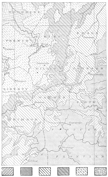
An effort should always be made to produce a pattern that is subordinate in strength to the main lines of the base map on which it is drawn. In black and white maps, as in colored maps, unlike patterns should be placed next to each other. If they are so placed it may not be necessary to rule the lines on two adjacent areas in opposite directions to produce needed distinctions. A section liner or other ruling device should be used in drawing line patterns in order to produce uniformly even spacing. The application of six of these conventional patterns to a base map is shown in figure 9.
Click on image to view larger size.
Figure 9.—Map bearing six areal line patterns.
STANDARD COLORS FOR GEOLOGIC MAPS.
The standard series of colors for systems of sedimentary rocks is shown on the maps in the Survey's geologic folios but is subject to modifications for use on maps in other Survey reports. Each system is represented by a different color, and if there are two or more formations in one system they are generally distinguished by using different patterns composed of straight parallel lines in the same color. The patterns for subaerial deposits (chiefly Quaternary) are composed of dots or circles, or combinations of both, and may be printed in any color, but the color most often used is yellow or ochraceous orange. No specific colors are prescribed for igneous rocks, but if only a few areas are shown red or pink is preferred. The colors used for igneous rocks are generally more brilliant and purer than those used for sedimentary rocks. For small areas they are used "solid"; for large areas they are reduced in tone by the use of a suitable cross-line pattern or "reticle." Metamorphic rocks are represented by short dashes irregularly placed. These dashes may be in black or in color over a ground tint or over an uncolored area, or they may be in white on a ground tint or pattern. The standard colors used for the sedimentary series covering the 12 systems recognized by the Geological Survey are: Quaternary (Q), ochraceous orange; Tertiary (T), yellow ocher and isabella color; Cretaceous (K), olive-green or rainette-green; Jurassic (J), blue-green or niagara-green; Triassic (), light peacock-blue or bluish gray-green; Carboniferous (C), blue or columibia-blue; Devonian (D), gray-purple or heliotrope-gray; Silurian (S), purple or argyle-purple; Ordovician (O), red-purple or rocellin-purple; Cambrian (), brick-red or etruscan red; Algonkian (A), terra cotta or onion-skin pink; Archean (), gray-brown or drab.[9]


REDUCTION OF ENLARGEMENT OF MAPS.
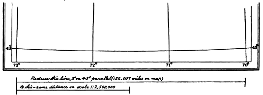
The following is the simplest and most accurate method of marking the reduction or enlargement of a map to a selected scale: Measure the distance between the extreme meridians along one of the parallels. (See fig. 10.) Convert this distance into miles by multiplying the number of degrees it covers (say 3) by the number of miles in a degree. A degree on the forty-third parallel, for example, is 50.669 miles, [10] which multiplied by 3 equals 152.007 miles. Then draw a line on the margin of the map, outside the border, the exact length of the 3 degrees, and just below this line draw another line representing the same number of miles (152.007) on the scale to which the map is to be reduced or enlarged. Then mark to reduce or enlarge the upper line to the lower line, as shown in figure 10. A long line will reduce error and give greater accuracy than a short one, and therefore as great a distance should be set off as possible. The number of miles represented by both lines and the fractional scale to which it is to be reduced should be stated on the drawing, for permanent record.
Maps that will bear reduction without affecting the clearness of the details they show may be reduced to fit the book in which they are to appear, regardless of definite scale. The reduction for such maps is best marked in fractions, as "1/2 off," "1/3 off," "2/3 off." If the size needed is not exactly represented by these fractions it should be indicated in inches, as "Reduce this line to 71/2 inches," or "Reduce to 43/8 inches in width."
Click on image to view larger size.
Figure 10.—Diagram showing method of marking maps for reduction or enlargement (for record).
DIAGRAMS.
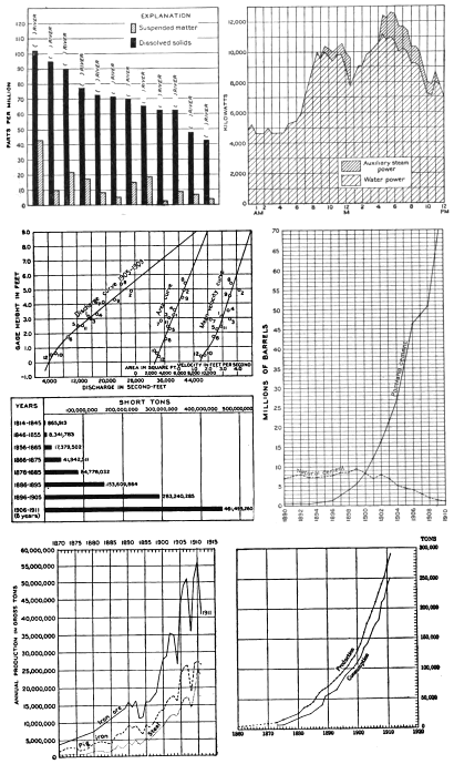
In preparing a diagram a draftsman should endeavor to make its parts and relations perfectly clear to the reader. He should study the drawing or material furnished by the author until he fully understands it and should endeavor to reproduce it simply and legibly. Any lettering that may be needed should generally be in plain upright or slanting gothic type (see Pl. IX), or it may be in roman.
A diagram should generally be drawn on bristol board or on blue-lined section paper and should be marked for reduction to the minimum size. It should bear no title, as the title will be set up in type by the printer.
SECTIONS.
The sections used in geologic reports are of two widely different kinds. One shows only the broader relations of parts; the other shows details of structure as well as relations. One is diagrammatic; the other is more realistic and graphic. The draftsman should prepare all sections strictly according to the copy supplied by the author but should use proper symbols and make a more finished drawing. The various kinds of sections, most of them geologic, are described on pages 29-30, and the conventions used to express lithologic character are shown in Plate III.
U. S. GEOLOGICAL SURVEY
PREPARATION OF ILLUSTRATIONS PLATE IX
DIAGRAMS AND CURVES.
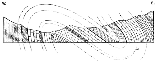
Detailed drawings of this kind, though entirely conventional, can be so prepared as to give a satisfactory expression of nature. The draftsman should study well-prepared sections in Geological Survey reports and should learn the details of folding and faulting from textbooks. He should first ascertain whether or not the vertical scale in the original section has been unduly exaggerated, and if so he should confer with the author with a view to reducing the exaggeration as much as possible. He should submit to the author all questions as to doubtful points, as well as all suggestions for improvement in expression, before he makes any changes, and he should make corrections only on the author's approval. A seeming inaccuracy in an author's drawing may be a faithful representation of natural conditions. For example, a formation that seems to be omitted by inadvertence in drawing may really "pinch out" at a point represented in the section. (See a on fig. 11.)
Click on image to view larger size.
Figure 11.—Structure section showing method of determining the secession of folds.
Penciled lines corresponding to those shown by dots in figure 11 should be carefully added in redrawing a roughly sketched section that shows complex folding. An original indefinite sketch that shows complicated structure affords opportunities for error in preparing the new drawing, and omissions may be detected by following the formations as they would be continued above and below the section, as shown by the dotted lines in the figure.
PLANS AND CROSS SECTIONS OF MINES.
Plans of mines, like diagrams, should not be elaborate, and their lettering should be plain and legible, yet it should not be so conspicuous as to obscure other details. Gothic letters should generally be used, but some plans require different styles of lettering, especially for geographic or other names that should be coordinate with those on maps or other illustrations in the book. Unless there are good reasons, however, for varying the styles of lettering, plain gothic capitals, or capitals and lower-case letters, either upright or slanting, should be used. Abbreviations for the numbers of levels should generally be given thus: 3d level, 6th level, 200-foot level, etc., or the shorter terms may be spelled out, as third level, sixth level. The same general scheme of lettering should be used on all plans and cross sections that are to appear in one publication or in one series of similar papers.
The reduction of such drawings to the minimum scale consistent with clearness is always advisable.
DRAWINGS OF SPECIMENS OF ROCKS AND FOSSILS.
METHODS USED.
Drawings of specimens or other objects were once made with brush and pencil or with pen and ink, by means of measurements taken with dividers or by viewing the specimen through a camera lucida. Each of these methods is still used, but by using the camera lucida in sketching: the outlines and details more accurate proportions and relations can be produced, whether the object is to be enlarged or reduced, than by any other means except photography.
BRUSH AND PENCIL DRAWINGS.
In all drawings or photographs of specimens, except photomicrographs of thin sections, the light should appear to come from the upper left quarter. A disregard of the well-established rule that the direction of illumination should be uniform throughout a series of drawings would cause confusion or uncertainty in the interpretation of the relief shown in them.
Reynolds's three-ply and four-ply bristol board affords a satisfactory surface for brush and pencil drawings. Its surface is smooth and hard and, being free from coating of any kind, permits satisfactory erasures without great injury; its color is pure whits; and it is durable.
Boss's relief hand-stipple paper is also well adapted to many kinds of brush drawings as well as to its primary use for producing stippled effects. Very delicate gradations of color or light and shade can be produced on its surface with brush and lampblack or with india ink, and high lights can be made by scraping off the chalky surface.
The draftsman who is preparing brush and pencil drawings should have first of all a knowledge of the principles of light and shade, of reflected light, and (for drawing specimens) of shadow perspective. He should also have delicacy of touch and ability to see and interpret form and to reproduce the soft blending of light and shade shown in a good photograph. He should be provided with pencils equal in quality to the Koh-i-noor B, F, 4H, and 6H; the best quality of red sable brushes of the sizes of Winsor & Newton's Nos. 3, 4, and 6; the best quality of stick india ink; a cake or pan of lampblack; and a porcelain saucer or slab.
In drawings of fossils and of some other specimens a combination of pencil and brush work produces satisfactory results and tends to increase speed. The gloss produced by penciling, however, is objectionable and should be obviated by a preponderance of brush work. Stick India ink is the best pigment to use in delicate wash drawings, and lampblack is preferable for large work on which the softer tones of the shading are not so important and for drawings that are to be considerably reduced when engraved. Gouache (an opaque mixture of Chinese white and lampblack) may also be used, but it is best suited for large work.
In making corrections on brush drawings the parts to be corrected should be carefully washed out with a small short-cropped brush and water and still further cleaned by using a rubber eraser over an erasing shield or an opening cut in a piece of celluloid. Erasures should not be made on delicate work with a knife or a sand rubber, as either will injure the surface and affect reproduction. In measuring a specimen with dividers the draftsman should be careful not to injure the specimen or to puncture the paper on which he is preparing the drawing.
PEN DRAWINGS.
A draftsman who is preparing drawings of specimens with pen and ink should have a good assortment of pens equal to Gillott's Nos. 291, 290, and 170, liquid waterproof ink equal to that manufactured by Higgins, good pencils, hard and soft rubber erasures, plain dividers, and Reynolds's bristol board. A glass eraser is also useful.
Good pen drawings of specimens are much more difficult to make than brush drawings. They can be prepared only by a draftsman who has had some artistic training and experience in pen work. Few draftsmen can prepare pen drawings that faithfully represent both the detail and the texture of specimens; the shading on many such drawings confuses and destroys both detail and texture.
The pencil sketch over which a pen drawing of a specimen should be made must be prepared in much the same manner as the sketch for a brush drawing, though the outlines need not be so delicate. This sketch is generally made on bristol board. The pen work should begin with the outlines and should then be carried to the details, and finally to the shading, whether in lines or stipple. The texture of a specimen is the best key to the proper shading. If the specimen is decidedly granular, stippling is appropriate; if it is smooth or polished, finely drawn parallel lines, varied in spacing and character according to depth of shade and texture, are preferable. Erasures can be made with a hard-rubber eraser, other parts being protected by a shield, or with a very sharp knife or a glass eraser, and the parts erased can be resurfaced with an agate burnisher.
RETOUCHING PHOTOGRAPHS OF SPECIMENS.
Photographs of specimens, particularly fossils that have been coated to destroy local color, should be printed on velox paper, in a tone somewhat lighter than that of ordinary photographs. The details and relief should, however, be strong enough to enable the draftsman to see them clearly, so that by retouching them and strengthening the shadows and high lights he can make them sufficiently strong for reproduction. This he can do by a combination of pencil and brush work, the pencil being used sparingly because the gloss produced by the graphite is likely to affect reproduction. A No. 3 Winsor & Newton's red sable brush and lampblack are preferable for the greater part of this work, and a 4H and a 6H pencil for the fine details and as a possible aid in producing the finer gradations of shading. The details should be retouched or strengthened under a reading glass to insure accuracy; the broader effects can be best produced without the aid of a magnifier.
Erasures on photographs of specimens should be made very carefully with a hard rubber that is free from sand, and the parts not to be disturbed should be protected with a shield. High lights may be added by carefully scraping or rubbing the surface of the paper.
LANDSCAPE DRAWINGS FROM POOR PHOTOGRAPHS.
A poor photograph or one that has become injured and can not be retouched for direct reproduction can be utilized by making from it, as described below, a pen drawing or a brush or crayon drawing, which will be almost photographically correct.
PEN DRAWINGS MADE OVER PHOTOGRAPHS.
A pen and ink drawing may be made over a blue print or a bromide print (preferably a blue print) and the photographic image then bleached out. The blue print should be larger than publication size and should not be so dark that the draftsman can not see his lines. If the negative is available a bromide enlargement can be obtained; otherwise the picture should be rephotographed in larger size, preferably twice publication size. The enlargement will give the draftsman greater freedom in drawing details and will make his work appear finer and better in the reduced illustration. If the photographic print is of a subject requiring the use of instruments it should be securely fastened to a drawing board, square with the board, so that any horizontal and vertical lines in it may be ruled by the use of a T square and triangle. For specimen or landscape work it need not be fastened.
For bleaching blue prints a saturated solution of oxalate of potassium (K2C2O4 + H2O) has been used with good results. For bleaching bromide prints cyanide of potassium (KCN) to which a few drops or flakes of iodine have been added should be used. Neither kind of print should be bleached until the drawing has been completely finished in every detail, because bleaching loosens the fibers of the paper, so that the ink of any added lines is likely to spread. The print should be placed in a hard-rubber pan, the bleaching solution poured on it, and the pan rocked until the image disappears. The print should then be carefully removed, thoroughly washed in running water, placed between clean white blotters to dry, and finally mounted on cardboard. For temporary, hurried work on drawings that are not to be retained for future use the blue print may be mounted first and bleached by pouring the bleaching fluid over the mounted print.
BRUSH DRAWINGS FROM POOR PHOTOGRAPHS.
Brush drawings may be made directly from photographs by working over an enlarged print with gouache, or by making a pencil tracing and sketch of the photograph and working it up with lampblack or india ink. The photograph should be larger than publication size to permit greater freedom and breadth in drawing details. The larger size will also afford a more refined and better engraving when reduced. If lampblack or india ink is used and the subject is small, bristol board is recommended, but if the photograph is larger than, say, 8 by 10 inches, Whatman's hot-pressed double elephant or similar paper, laid down with thumb tacks, will prove satisfactory.
If gouache is used over a print a preliminary drawing is of course unnecessary, but the photograph should be an unglazed print of a size that will require considerable reduction, and the finished drawing should be protected by an oversheet. If lampblack or india ink and not gouache is used the photograph should be traced and a fairly complete pencil sketch should be made before the brush is used.
Plates I, IV, A, V, B, and VII, B, Monograph 34, were made from gouache drawings. Plates III, A, VII, A, X, XI, XII, XIII, XX, XXVIII, and XXX, in the same publication, were made from lampblack or india-ink wash drawings. The originals can be examined at any time.
OUTDOOR SKETCHES.
The art of sketching from nature is one in which few but professional artists excel. Not many geologists are able to make sketches from nature that are suitable for direct reproduction. An artistic draftsman should be able to redraw the geologist's sketches, however, in their true perspective and relations, with the skill necessary to make them satisfactory illustrations.
In most crude outdoor sketches the important features are usually shown with sufficient clearness to follow. If they are not the draftsman should ascertain what those features are and prepare the new drawing in such a way as to display them properly. The new drawing should be made with pen and ink, generally for reduction to a text figure, which is the most appropriate form for such an illustration.
In all sketches of this kind the lines should be drawn in such a way as to produce natural effects and at the same time to make good printing plates. Good examples of pen and ink sketches of this class can be found in Monograph 34, already referred to, and in the Seventh Annual Report, especially Plates XXVIII and XXXVIII; Ninth Annual Report, Plates XLIII and XLIV; Tenth Annual Report, Plates XIV and XIX and figure 58; Eleventh Annual Report, Plates XV, XXVII, XXXV, LII, and LIV and figures 18, 30, 31, 67, 98, and 99.
DRAWINGS OF CRYSTALS.
A crystal should generally be drawn in outline with straight lines. The invisible rear side of a crystal, if shown, should be represented by dashed lines. The outer boundary line of a crystal should be slightly heavier than the inside lines, which should all be of the same weight. Striations should be shown by straight lines; broken or uneven surfaces by irregular lines. A twinning line, if an intersection edge, should be solid; if not an intersection edge it should be broken into dashes. Italic, Greek, German, and Old English letters are used to mark crystal faces. All faces of a given form should be marked by the same letter but may be differentiated, if necessary, by primes or numerals, thus: m, m′, m″, m‴, mIV. "Leaders" should be short full lines, or, if these are likely to be confusing, they should be dashes. Numbers may be used in place of letters for specific purposes. Letters indicating twin faces are underscored; a second twin is doubly underscored or overscored, thus: m, m, m. Twin units may be differentiated by the use of roman numerals.
RETOUCHING PHOTOGRAPHS.
An author, of course, selects his photographs to illustrate some special features; he does not always consider their fitness for reproduction. Photographs that are blurred or out of focus, those in which the shadows are too black or lack transparency, and those which have local defects, such as bad skies or spots, must be worked over to make them suitable for reproduction. In order to remedy these defects and produce natural results the draftsman doing work of this sort should be able to see and interpret nature properly and to supply natural effects in a manner corresponding with those produced photographically. He should be sufficiently expert with the brush and pencil and in handling an air brush to duplicate the delicate and soft tones in the photograph, and he should know how the pigments he uses will "take" when the subject is reproduced.
The retoucher should have access to an air brush and should provide himself with a jar of photo white or blanc d'argent and a color box containing indian red, crimson lake, yellow ocher, lampblack, and ultramarine—colors with which he can duplicate those shown in any photograph. He should also have the best grade of red sable brushes, ranging in size from No. 3 to No. 8, a stack of porcelain saucers, and a jar of oxgall. By mixing the colors to match exactly the shades of a photograph and using a red sable brush he can strengthen details, "spot out" flaws, and remove imperfections, except those in skies or other large, flat areas, for which he must use an air brush.
The air brush has become a necessary adjunct to a retoucher's outfit. Smooth, even gradations of flat tones can not be successfully applied to photographs without it, and it is therefore indispensable, especially for retouching skies and covering other large areas.
Before retouching a photograph the draftsman should mix in a saucer a tint that will match the color of the part that is to be retouched and should try this tint and note its effect after it has dried and change it, if necessary, until it matches the color exactly. If he is to retouch a number of photographs that have the same local color he may with advantage make up enough of the tint for the entire lot, thoroughly mixing it and seeing that it is not too thin. In making this tint he should use only pigments of the best grade, and if he finds that the Chinese or other white he is using does not photograph well, or that it does not hold its color, he should discard it at once and use another brand. Photographs that are to be retouched should be large enough to permit sufficient reduction to soften the effects of retouching.
In order to eliminate the lines of junction between two or more photographs that are joined together to form a panorama some adjustment or fitting of details by retouching is generally required before the group is rephotographed to obtain a new print of the whole on one piece of paper. As it is often desirable to increase the width of such an illustration the photographer should be instructed to print the photograph on a strip of paper that is wider than the negative, so that, if necessary, the retouching may be carried above or below the new print to add depth to the illustration.
Panoramas may also be drawn from photographs with either pen or brush in the manner described on pages 68-69.
PART III. PROCESSES OF REPRODUCING ILLUSTRATIONS.
METHODS EMPLOYED.
The preliminary work in producing illustrations includes the preparation, from originals submitted by authors, of drawings and other kinds of "copy" in such a way that the copy can be reproduced in multiple by printing.
Several processes are used for preparing plates for printing illustrations, and each has its peculiar features of excellence. One process may render fine details with facility but may fail in uniformity in large editions; another may be cheap and effective on the whole but may not reproduce fine details; and still another may give fine color or tone effects but may be too expensive. Therefore a knowledge of the varied uses and results and of the cost of the several processes of reproduction and, on the other hand, of the kinds of originals that are best suited for reproduction by any one of the processes is essential to effectiveness and economy in planning, preparing, and reproducing an illustration.
The following condensed descriptions of processes are intended mainly to aid in determining the kind of copy that is appropriate for each process and the kind and quality of reproduction to be expected, so that only the principal operations or stages in each process are described. Wood engraving, which was used in making printing plates for many of the illustrations in the early publications of the Geological Survey, is described here only to compare that laborious and "indirect" method of engraving cuts with the more modern kinds of relief engraving. In 1892 it gave way to photo-engraving.
PHOTO-ENGRAVING.
GENERAL FEATURES
The term "photo-engraving" is applied to processes by which a black and white line drawing, photograph, or like original is reproduced in relief on a metal plate from which prints may be made on an ordinary printing press, in distinction from processes that print from flat or relatively flat surfaces, such as the lithographic and photogelatin processes. The photo-engraving processes that are most generally used are those called "zinc etching" and "half-tone engraving." These processes depend on the discovery that gelatin or similar organic material, if treated with potassium or ammonium bichromate and exposed to the action of light, is made insoluble in water. If a metal plate coated with bichromatized gelatin or albumen is exposed to light under a negative the parts acted upon by light become insoluble and those not acted upon remain unchanged and may be washed away so as to expose the metal, which is then etched with acid in order to give relief to the unexposed parts and make of them a printing surface.
ZINC ETCHING.
Zinc etching is adapted to the direct reproduction of a pen and ink drawing composed of lines, dots, or solid black areas. On the finished metal plate these lines, dots, and solid areas form the printing surface, and the spaces between them, which have been etched away, represent the white or blank parts of the picture. The process is cheap and is almost universally used for reproducing small drawings designed for text illustrations. It is also well adapted to the reproduction of maps and diagrams measuring in print not more than about 10 by 14 inches. One of the chief advantages of this and of all other direct (photographic) processes of engraving is that they reproduce a drawing in facsimile, whereas the "personal equation" must enter into all engravings made by an indirect method—that is, by hand—such as wood engraving, wax engraving, and engraving on stone or copper, which make it necessary to compare every detail of the proof with every detail of the drawing before the engraving can be approved. The pen drawing to be reproduced, which should preferably be considerably larger than the completed engraving, is first photographed to the proper size or scale on an ordinary negative film. The film is then stripped from the negative and reversed in order that the etched plate may print the design as in the original and that the film may be grouped with other films on one large glass and all printed at the same time. The negative (whether a single film or several) is then placed in a specially constructed printing frame in contact under pressure with a sensitized zinc plate and exposed to light.
After the zinc plate has been removed from the printing frame (in the dark room) the plate is rolled with printer's transfer ink, which resists acid, and placed in a shallow tray containing water, in which it is rocked for several minutes, and then taken out and rubbed gently with cotton. The parts of the coating of the plate that were acted on by light have become insoluble and will therefore be unaffected by the water, but the parts of the coating not acted on by light and therefore not hardened will be removed by the washing, which will expose the metal and leave the parts acted on by light—the picture—in black lines, dots, etc. The plate is then dusted with "topping powder," a resinous substance which adheres only to the parts carrying the ink. The plate is then heated so that the resin and the ink that remain fuse together and form, when cooled, a resistant surface which will not be affected by the acid to be used later in etching the unprotected parts of the plate.
The plate is now ready for a preliminary etching in a fluid consisting of water and a few drops of nitric acid. It is placed in a tray, rocked gently for a short time, and then removed, washed well in running water, drained, and dried with gentle heat. "Dragon's blood," a resinous powder that resists the action of acid, is next applied to the plate, in order to protect the sides of the lines and the dots from the acid, and the plate is then heated just sufficiently to melt the powder and units it with the ink. A small quantity of nitric acid is now added to the etching bath, and the plate is subjected to its first thorough biting or etching. It is then removed from the bath, washed under a tap, carefully wiped with a damp rag, and dried with gentle heat.
The plate is thus treated three or more times until it is etched deep enough to insure satisfactory printing, and it is then ready for finishing, which consists of deepening the larger open spaces between the lines with a routing machine and of cutting away with hand gravers lines that are improperly connected or that are so close together that they will not print separately. The routing machine is provided with a cutting tool mounted on a revolving spindle that projects downward into the engraved plate, which is securely fastened. The movement of the arm that holds the cutter is universal and can be controlled with great precision. The plate is then "proved" that is, a proof is taken from it on paper and if the proof is satisfactory the plate is nailed to a block of wood on which it will be "type high" (0.918 inch), for printing.
Most drawings for zinc etching are made with a pen in black ink and consist of lines, dots, or masses of black, but drawings may also be prepared by using some medium that will produce a fine stipple, such as a black crayon on rough paper or Ross's stipple paper. (See p. 24.) The drawing should be one and one-half to two or three times as large as the printed illustration, for it is impossible to obtain a satisfactory reproduction of a pen and ink drawing without some reduction. If the drawing has not been reduced the lines appear heavier in the reproduction than in the drawing, and imperfections thus become more noticeable; if it has been properly reduced, imperfections are diminished and the lines and dots become thinner and finer than those in the drawing. In making a drawing that is to be reduced the draftsman can also space his lines farther apart and work out his details more easily.
An author should carefully examine and approve the finished drawings, which can, of course, be greatly altered, if necessary, before they are engraved; but similar corrections can not be made on proof sheets of zinc cuts, which should not be marked for alterations except by eliminating parts. Minor changes can be made in such a cut by an expert "finisher," but if the cut is small it is generally cheaper to correct the drawing and have a new cut made.
Zinc etchings cost about 10 to 25 cents a square inch, the cost being varied according to a standard scale which is based upon the ascertained cost of reproduction. The minimum charge for a single cut is $2.
COPPER ETCHING IN RELIEF.
Copper etching, which produces a line cut in relief, requires the same kind of copy that is most often marked for zinc etching and is used to obtain deeper etching and a more permanent cut. It is said to produce better printing plates than those etched on zinc and is used largely for reproducing script lettering and other fine work. As copper plates will hold up longer in printing than zinc, a cut etched on copper may not need to be electrotyped.
The chemical part of the process is practically the same as that employed for etching half-tone plates, described under the next heading.
The cost of etching on copper is considerably greater than the cost of etching on zinc. This process is not often used in reproducing illustrations for publications of the Geological Survey.
HALF-TONE ENGRAVING.
The half-tone process is, in name at least, familiar to almost everyone who has had any connection with the making of books, whether as author, editor, illustrator, or printer. The invention of a photomechanical process of reproducing a line drawing to make a metal plate that could be printed along with type on an ordinary printing press naturally led to attempts to reproduce similarly a photograph. It was known that the intermediate shades between white and black in a photograph—the half tones—can be reproduced on an ordinary printing press only by breaking them up into dots or lines that will form a good printing surface and that by their variation in size or density will give for each shade the effect of a uniform tone. In the half-tone process this effect is produced by photographing the picture or object through a screen.
The half-tone screen consists of two plates of glass, on each of which lines running generally at an angle of 45° to the sides of the plate have been engraved, cemented together so that the lines cross at right angles. The lines, which are minute grooves filled with an opaque black pigment, thus appear as a series of black crossed lines on a white ground. The screen is placed in the camera in front of the negative. Screens are made that show from 60 lines to an inch for the coarser newspaper illustrations to 250 lines or more to the inch for fine book work. The screens used for magazine illustrations generally show 120 to 150 lines. Those used for Survey publications show 150 to 175 lines, and for reproducing delicate drawings and photographs of fossils screens bearing 200 lines to the inch are sometimes specified; but these finer screens require the use of highly super-coated papers, some of them made of cheap fiber and not known to be permanent. For a half tone that is to be printed in the text a 100-line or a 120-line screen is specified. (See Pl. VI, p. 56.)
The method of etching a half-tone plate does not differ greatly from that used in zinc etching, and there are several kinds of half-tone plates, though most of them are etched on copper, not on zinc, those etched on zinc being used principally for newspaper illustrations. The half-tone screen is used also in other processes to obtain a negative.
When a half-tone negative hag been made the film is stripped from the glass plate and reversed, as in the zinc-etching process, though some half-tone engravers use a mirror box or prism by which the picture is so disposed on the negative that it does not need stripping and reversing. A perfectly flat, clean, and highly polished copper plate, generally large enough to accommodate several such films, is then coated with a sensitive film according to one of several formulas, all based on the fact that gelatin or some similar body, if sensitized with certain chromic salts, becomes hardened and insoluble in water on exposure to light. This plate is then placed in the printing frame in contact, under pressure, with the glass negative plate and is exposed to light in the usual manner. The copper plate is then removed from the frame in the dark room and made ready for etching.
For etching half-tone plates on copper a saturated solution of perchloride of iron is used instead of the solution of nitric acid used for zinc etching. The time of etching ranges from about 5 to 15 minutes, according to the strength of the solution. One etching is generally sufficient, but it may be necessary to give the plate another "biting" if it has not been etched deep enough, or to re-etch it in order to strengthen contrasts. If, for instance, the sky in a half-tone plate shows too dark or is uneven in tint it can be made lighter or more even by re-etching. On the other hand, if certain features on a plate are too light they can be darkened by burnishing—rubbing the surface with a highly polished steel burnisher under just sufficient pressure to flatten slightly the fine points that form the printing surface of the plate. When the plate leaves the hands of the etcher it is turned over to the finisher, who with a graver removes spots or any other imperfections that may appear on it. Sometimes a roulette is used to lighten parts, and other tools are used for special purposes.
After a plate that shows two or more pictures has been etched and finished it is divided by sawing them apart. Each one is then put into a beveling machine, where its edges are trimmed and the usual border is made, if it is desired. The separate plates are then ready to be proved and mounted on blocks of wood which make them type high, ready for printing.
The half-tone process is used almost exclusively for reproducing photographs and wash drawings, though it will produce a facsimile of any kind of copy, such as impressions from type, old manuscripts, or typewriting, but a shade composed of minute black dots will appear over the entire print and there will be no absolutely whits areas unless they are produced by routing the plate or cutting out the high lights. (See p. 74.) The reproduction of an ordinary outdoor photograph requires very little handwork, except for re-etching, burnishing, and cutting the borders. In the reproduction of copy that is made up of separate parts, such as groups of photographs of specimens that are to appear on a white ground, the half-tone "tint"—or more properly shade—between and around the several figures must be removed and numbers must be added. This operation requires two negatives—one half tone and one line—and produces what is called a "combination" plate. Therefore the difference in the cost of making a half-tone cut from a single photograph of a landscape and from a cut made from "copy" of the same size consisting of a number of small photographs or drawings, to which numbers or letters are added, is considerable (about 50 per cent greater) and depends upon the amount of additional work involved. Routing, when needed, must be done with extreme care lest the edges of a figure be marred, and this work requires skill that can be gained only by experience.
Copy for the half-tone process should be as nearly perfect as possible. Only the best photographs should be selected. Prints on semimat velox and glossy haloid papers are regarded as the best photographic copy for reproduction. Every part of the photograph or drawing should be absolutely clean. If any part that should be pure white becomes soiled or stained the defects will be reproduced. If a photograph needs retouching it should be retouched with great care and just sufficiently to correct defects and to bring out or strengthen the important details. In many photographs the skies may be "muddy" or uneven in tone, and this defect can be corrected by the use of an air brush, the only medium that will produce an almost even tone. As already stated, half-tone plates can be improved by re-etching and tooling, but tooling tends to destroy the effects of nature and produces an artificial appearance in the print. One who is preparing wash drawings for reproduction by the half-tone process should remember that brush marks and other inequalities of tone will be reproduced with as much fidelity as other details. Such drawings should therefore be made two or three times larger than the engraved cut in order to subdue all unnatural effects and to soften the general tones.
Line drawings are not generally suitable copy for the half-tone process, but it is occasionally desirable to use that process instead of zinc etching for reproducing a line drawing that has been inexpertly prepared if the cost of redrawing would more than offset the difference in cost between zinc etching and the more expensive half-tone process. In reproducing a pen drawing by half tone the lines become softened and represent the details and shading only; but the pen drawing may be further developed by brush work. Examples of this type of reproduction are Plates V, A, VI, A, and XV, figure 10, and other illustrations in Survey Monograph 34.
Vignetting, which consists of a skillful grading off of the edges of a picture, as well as extensive tooling or hand engraving, is often employed for artistic effect but should be specified only for exceptional illustrations. The plates made for the Survey are either "square trimmed" or the ground tint is entirely omitted or routed away; they are not usually tooled or vignetted.
Half-tone cuts etched on copper cost 20 to 60 cents a square inch, the cost being varied according to a standard scale based on the ascertained cost of reproduction. Those that require a screen finer than 150 lines cost 25 per cent additional. The minimum charge for a single cut is $3.
Half tones etched on zinc (100-line screen or coarser) cost 25 per cent less than those etched on copper.
THREE-COLOR HALF-TONE PROCESS.
The three-color process is practically an adaptation of the half-tone process to color printing based on the theory that all colors or hues in nature can be reproduced by combinations of three colors of the spectrum—red, blue, and yellow. The process differs from the ordinary half-tone process particularly in the use of color filters in making the negatives and in the character of screens and diaphragms used. This process, like all others, is worked somewhat differently in different establishments. In what is called the indirect method, the one most commonly used, twelve photographic operations are necessary to produce one illustration, or the three plates or cuts from which one illustration is to be reproduced by printing. These twelve operations produce three chromatic negatives, each representing one color; three transparencies or positives, made from the chromatic negatives; three half-tone negatives, made from the positives; and finally three contact prints, made on sensitized metal plates. In what is called the direct method the half-tone screen is placed in front of the photographic plate so that it becomes also a half-tone negative from which a print is made on a sensitized metal plate. Thus the photographic operations in the direct method are reduced to six, but the interference to the passage of light offered by the half-tone screen and by the prism used to reverse the image on the negative lengthens the time of exposure.
Unfortunately, no pigments have been found that can reproduce in purity the colors of the spectrum, and to this fact is due the failure of the process to reproduce exactly all the colors, tints, and shades of an original. When a drawing in black on white paper is photographed only the white paper affects the negative film. The transparent parts of the developed negative thus represent the black, and the opaque parts, which have been acted upon by light, represent the whits. Theoretically, when a chromatic negative is made for the yellow plate a purple-violet filter cuts out all the yellow and allows the red and blue rays to affect the plate; when a negative is made for the blue plate an orange filter similarly cuts out the blue and allows the yellow and red rays to affect the plate; and when a negative is made for the red plate a green filter cuts out the red and permits the blue and yellow rays to affect the plate. These color filters, which are usually made of transparent stained gelatin, are generally placed in front of the lens. When printing plates like those used in the half-tone process have been made from the three negatives and the plates have been inked with yellow, blue, and red ink, respectively, a combined impression from them will produce a close approximation of the subject photographed. The colored inks often used are light yellow, peacock or prussian blue, and bright, transparent crimson.
The ordinary half-tone screen, which bears lines cut at an angle of 45° to the sides of the plate, is rectangular, but the screens used for three-color work are made circular in order that they may be turned in the camera to make the lines intersect at other angles, the angles being varied to avoid producing an undesirable pattern or a moire effect. Turning the screen also prevents the exact coincidence or superposition of the red, blue, and yellow dots, which would produce black. In other respects the screens do not differ essentially from those used in ordinary half-tone work.
As special experience is necessary in printing three-color plates the engraver generally delivers the printed illustrations to the purchaser instead of the plates, which he furnishes for other kinds of relief printing.
The copy for this process may consist of anything in color, such as specimens, objects, paintings, or properly colored photographs. The process does not usually reproduce all the colors and tints of an original with equal exactness and is not used by the Survey for work that demands precise reproduction of color, but it is satisfactory for reproducing most colored drawings, colored photographs of specimens, or the specimens themselves if they show individual variations in color. As the process is entirely photomechanical it gives more scientific accuracy in detail than chromolithography, in which there is much hand work, and it is much less expensive. If the colors shown in proofs are not satisfactory they can be modified.
The four-color process, in which four color plates are used, gives a closer approximation of true color values than the three-color process, and at a comparatively small increase of cost. The additional color used is generally a neutral gray or black.
WAX ENGRAVING (THE CEROTYPE PROCESS).
The wax or cerotype process does not require finished drawings and is especially suitable for making text illustrations and small maps, although it may be used also for large work. For this process blue prints, pencil sketches, old prints, or rough copy of any kind may be submitted—that is, it is not necessary to furnish carefully prepared drawings in black ink, as it would be for photo-engraving, for the wax engraver will reproduce in proper form any illustration in which the copy and the instructions show what is wanted, just as an experienced draftsman will make a good drawing from the rough original furnished by an author. Full and clear instructions should always be given, however, as to the size of the cut wanted and what it is to show.
In this process a polished copper plate is coated with a film consisting of beeswax, a whitening medium, and other ingredients, and the coating, which varies in thickness according to the nature of the copy, is sensitized as in the ordinary photographic processes. The map or other design to be engraved is first photographed to publication size and a contact print is made on the wax coating from the negative. The lines and other parts of the photographed image are then traced or cut through the wax to the copper plate with steel tools and straightened or perfected by the engraver, but the lettering is set in printer's type, which is pressed into the wax until it also touches the metal plate. After the work of cutting through the wax has been completed the larger open spaces between the lines are "built up" by the addition of wax to give greater depth to the plate, so that the wax plate thus built up corresponds to an electrotype mold. The plate is then dusted with powdered graphite and suspended in a solution containing copper, where by electrolytic action a copper shell is formed over its surface. When this shell is sufficiently thick it is removed from the solution and reinforced on the back with metal, and proofs are taken from it. If the proofs are satisfactory the plate is blocked type-high.
Wax-engraved plates may be used for printing colored maps or diagrams, in which variations of tint are produced by various kinds of machine rulings. The effect of some of the colors thus produced is almost a "flat" tint, in which a pattern can be detected only by close scrutiny. Some color work is printed from a wax base plate in combination with half-tone color plates.
The price of a wax engraving depends entirely on the size of the cut, the amount of work involved, and the character of the original copy, but it should not exceed very much the cost of a carefully prepared pen drawing plus the cost of a zinc etching made from it. Cuts engraved by the wax process, like zinc and half-tone plates, are delivered to the purchaser. If colored work is ordered, however, the printed sheets, not the cuts, are delivered.
WOOD ENGRAVING.
Wood engraving was once the universal method of producing cuts for illustrations that were designed to be printed on an ordinary press. It is said to be the oldest of all methods of engraving illustrations. The engraving is made on a block of boxwood, a very dense, hard wood of a light-yellow color. The block is cut type-high across the grain, and the engraving surface is made perfectly smooth by nibbing it with pumice or other stone. When a cut is to be larger than 3 or 4 inches square the wood block is made up of pieces securely dovetailed or joined together to prevent splitting and warping. A woodcut is not used for printing but is electrotyped and the electrotype is used in the press.
Originally the smoothed surface of the wood block was coated with prepared chalk or Chinese whits, and on this coating a finished drawing was made with a brush and pencil by an illustrator. According to more recent practice the surface of the wood is covered with a sensitized coating, on which the drawing or design to be engraved is photographed. The engraver then, with various kinds of gravers and other tools, cuts out the parts of the picture that are to be represented by white paper and leaves the lines, dots, and black areas as a printing surface, thus translating the shades and tints of the picture into a system of lines and dots which exactly duplicate, in effect, the details and tones of the original design. In order to produce a line effect of an area in which the tone is intermediate between whits and black the engraver must space his lines so that one-half the area will remain as printing surface and the other half as white spaces, and he must give character and direction to his lines, so that, if he is skillful, he can reproduce not only the delicate tones but the texture and details of the original picture. Many wood engravers became noted for their artistic rendering of magazine illustrations, of famous paintings, and of other works of art.
The Survey began to abandon this method of engraving in 1884, when the Sixth Annual Report was in press, substituting for it the cheaper photomechanical processes, zinc etching and half-tone engraving, and entirely abandoned its use in 1892.
Many good examples of wood engraving may be found in the early monographs and annual reports of the Geological Survey. Monograph 2 contains numerous examples.
PHOTOGELATIN PROCESSES.
Bichromatized gelatin is used in several photomechanical processes of reproducing illustrations, but in the photogelatin processes the gelatin not only receives the image by exposure to light through a negative but becomes a printing surface on a plate from which prints are made somewhat as in lithography. The several photogelatin processes are much the same as the original collotype process and are best known by the names collotype, heliotype, albertype, artotype, and the German name lichtdruck.