Chapter XXI · IN BLACK AND WHITE
Reading edition
In no other branch of pictorial art was there so much activity during the whole of the period, and, on the whole, so much undisputed excellence, as in the various pen and pencil drawings which blossomed from innumerable books and periodicals. To a considerable extent this remarkable efflorescence of an art which had remained passive for so many years was an offshoot of the renaissance of decorative art. But not entirely was this so, for there were notable developments also among those artists who were content to illustrate a theme in the usual nineteenth-century manner without any regard for the appearance of the printed page. These artists were not concerned with the ultimate balance and proportion of a book as a work of art; their business was interpretative, and their medium, pictures, and they considered it an achievement to make drawings which, whilst serving their immediate illustrative purpose, remained in themselves separate and even independent pictures. The two tendencies in black and white art had existed side by side in the past; generally, however, one was degenerating whilst the other was developing in power. But in the Nineties both achieved a distinction rarely, if ever, attained before, either individually or together. The Italian Renaissance had its great decorated books, and many years later the Victorian period produced a group of ingenious and capable wood-engravers, who often strove to recapture the lost decorative sense, but without much success. Whilst the Renaissance had no illustrators as we understand them, the Victorian period could boast such masterly comic artists in black and white as John Leech, Charles Keene and George du Maurier. But at no other time were there existing in this country such book decorators as William Morris, Walter Crane, Charles Ricketts, Laurence Housman and Aubrey Beardsley, together with such illustrators as Phil May, S. H. Sime, Bernard Partridge, Linley Sambourne, Harry Furniss, Raven Hill and E. J. Sullivan. It was left for the final decade of the nineteenth century to show, in an outburst of ability as prolific as it was varied, the full strength of our native genius for all forms of black and white art, just as earlier in the century we exhibited a similar facility in the art of landscape painting.
The idea of book decoration which developed to so great an extent in the Nineties was, of course, closely related to the Arts and Crafts movement and the revival of good printing. But with the exception of William Morris and Charles Ricketts few designers had facilities for that intimate association with reproductive methods which was considered so essential. The application of photography to pictorial, reproductive processes further aided in widening this breach between designer and producer and helped to create a separate class of decorative book illustrators who were personally independent of the crafts of reproduction. The weaknesses of the decorated books of the period are due rather to this separation of art and craft than to any absence of capacity on either side. The aim of the book decorators, as in the case of the best printers, was to produce designs which should not be beautiful merely in themselves but beautiful in their relationship to the whole of the book—both from the point of view of appearance and idea. “I think,” wrote Walter Crane, in Decorative Illustration (1896), “that book illustration should be something more than a collection of accidental sketches. Since one cannot ignore the constructive organic element in the formation—the idea of the book itself—it is so far inartistic to leave it out of account in designing work intended to form an essential or integral part of that book. I do not, however, venture to assert that decorative illustration can only be done in one way—if so, there would be an end in that direction to originality or individual feeling. There is nothing absolute in art, and one cannot dogmatise, but it seems to me that in all designs certain conditions must be acknowledged, and not only acknowledged but accepted freely, just as one would accept the rules of a game before attempting to play it.” In short, the desire of those illustrators who were at all conscious of any special desire as designers was for formality within the convention and circumstances of the printed book.
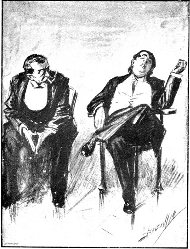
A Voluptuary
“To rise, to take a little opium, to sleep till lunch, and after again to take a little opium, and sleep till dinner, that is a life of pleasure.”
By L. Raven Hill
Throughout the greater part of the century the tradition of the decorated book had been allowed to lapse. The actual renaissance of book decoration began when the leaders of the Pre-Raphaelite Brotherhood, Dante Gabriel Rossetti, John Everett Millais and Holman Hunt, made their illustrations for the famous edition of Tennyson’s Poems, published by Moxon in 1857. This book was not, however, a decorated book in the true sense, but its illustrations were essentially designs in spirit. The modern decorated book itself was not born until 1861, when Rossetti designed the title-page of his Early Italian Poets. No great enthusiasm was shown for the revived art, and for some years the deliberate arrangement of book illustrations in the form of design was practically confined to the admirable series of children’s books invented by Kate Greenaway and Walter Crane and, to some extent, those of Randolph Caldecott. During the late Eighties and early Nineties The English Illustrated Magazine helped to satisfy a growing taste for formal illustration, and Herbert Horne and Selwyn Image anticipated somewhat the future glories of the Kelmscott and Vale presses, in the handsome and dignified pages of The Hobby Horse. Then came the books of the presses named, as recorded in an earlier chapter, and presently publishers were competing with one another in the production of decorated books, a remarkable and distinguished number being issued during the years under review.
It was Walter Crane more than any other artist who consistently and indomitably carried the torch of book decoration through the dark days preceding the full revival. Influenced by Durer and the early German wood-engravers, he developed mastery and individuality of his own. The decorative sense is given freedom in his work, with the result that his drawings are always uncompromising designs in strict relation to the book of which they become parts. There are no illustrated books of the Nineties which satisfy the demands of decorative art more eloquently than Crane’s Faerie Queene, Reynard the Fox and The Shepherd’s Calendar. In each of these the achievement is greater because the artist succeeds in freeing himself from the convention of the decorated manuscripts by fashioning his design to that of the modern printed page. He thus escaped the archaic tendencies of William Morris and Burne Jones and became more definitely associated with the younger school of draughtsmen who were striving to put the spirit of modernity into their work. His designs were also used in an effective series of Socialist cartoons, notable among which is the fine processional work “The Triumph of Labour,” designed to commemorate the International Labour Day, 1st May 1891, and other examples of his black and white drawings are to be found on the covers of books, and in several notable devices for publishing and other trading concerns.
Walter Crane’s decorative drawings had a marked effect on the younger men of the period, but the influence stimulated the general decorative movement in regard to illustration rather than imitation of the master.
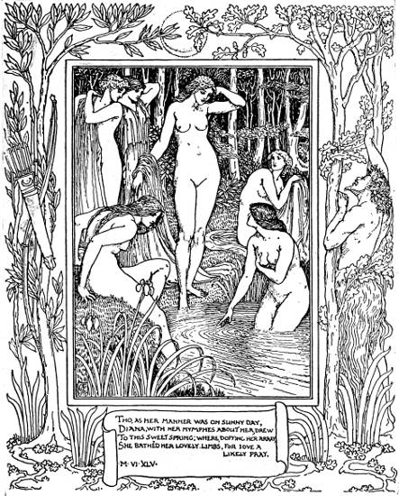
Illustration from “The Faerie Queene”
By Walter Crane
Book decoration was striving to become modern at the time the Kelmscott Press was started just as vigorously as Morris strove to link it with tradition. There was no set contest between the conflicting ideas and the original Pre-Raphaelite, and Arts and Crafts influences were too recent for the clear definition of any line of demarcation by intrinsically contending factions. The whole of the decorative revival was under the spell of Morris and the group of painters and poets who in turn influenced him. Walter Crane, though so closely associated with William Morris, came less under his influence as a book decorator than might have been expected, and both Charles Ricketts and C. H. Shannon worked out original ideas in design. So modern a designer as Aubrey Beardsley came, however, under the prevailing influence; and Laurence Housman could hardly have decorated so well had not Morris and Ricketts preceded him. The arabesque borders of William Macdougal were more modern in spirit, though less satisfying in effect, and the happy pictures and head-pieces and tail-pieces of Charles Robinson, as well as the vigorous Japonesque decorations of Edgar Wilson, were altogether novel and appropriate, as were those also of H. Granville Fell. But it was R. Anning Bell who caught the more fanciful decorative spirit of the times with his drawings for A Midsummer Night’s Dream (1895), and other books, including a volume of Keats’ Poems. In these drawings Anning Bell departed from the luxuriant effects of Morris, Crane, Ricketts and Beardsley, and, working in the realm of fancy, succeeded in producing illustrations which bridged the decorative and the pictorial methods, whilst retaining a designed balance with the printed page.
Whilst the decoration of books was striving for modern expression in this country, the Scottish group of artists, working with Patrick Geddes at Edinburgh, produced many designs which were at once strong and new, although in some instances based in curious and remote arabesques of Runic origin. Symbolism was the aim of these artists, and the clever head-pieces and tail-pieces of The Evergreen were faithfully drawn “after the manner of Celtic ornament.” Excellent and more illustrative designs were contributed to the same publication by Charles H. Mackie, Robert Burns, Pittendrigh Macgillivray and John Duncan. Later in the period the fantastic work of Jessie M. King came from Scotland, revealing a novel sense of fanciful design based largely upon the Japanese and showing also the influence of Beardsley. Ireland produced no group of Celtic designers, but the work of Althea Giles, with its curiously exotic symbolism, won the enthusiastic appreciation of W. B. Yeats, and the poet’s brother, Jack Yeats, began to make those excellent and delightful wood-blocks which have all the qualities of designs without losing any of the characteristics of pictures. Nor had definite symbolism in black and white decorative art many exponents in this country. The most notable, and he comes hardly within the definition of a decorator, was W. T. Horton, who, with extraordinary economy of materials, the briefest of lines and the flattest masses of black, produced startling revelations of human types in the very few designs he published.
A notable contribution to the ornamental book decorations of the period was made by a group of artists in the Midlands. Originally students at the Birmingham School of Art, these young men and women, inspired by the work and ideals of the elder group of the Arts and Crafts movement, worked diligently within the limits of conventional design. They discountenanced any book illustrations of a realistic type by relegating these to the portfolio or the picture frame. Many books of fairy tales, old romances and poetry were decorated by them, with varying success, and their aims and aspirations were set forth in a magazine of their own, called The Quest. William Morris thought so highly of the Birmingham School of decorators that he engaged three of its draughtsmen, E. H. New, C. M. Gere and Arthur Gaskin, to design illustrations for some of the Kelmscott Press books. In the main the artists of this school had little connection with modern life. The bulk of their designs were deliberately archaic, being based upon the work of the fifteenth and sixteenth century wood-engravers, and what modern spirit they possessed was little more than an echo of the Pre-Raphaelite movement and its associates and dependants. Among the more notable members of the group, besides the three artists named above, were Inigo Thomas, Henry Payne, L. Fairfax Muckley, Bernard Sleigh, Mary Newill, Celia Levetus and Mrs Arthur Gaskin. There can be small doubt, however, that the most satisfying and most original draughtsman of the group was E. H. New. His studies of old streets and buildings united the ideas of book decoration and illustration in a successful and altogether pleasing way, and they remain something more than the expressions of a revived method of decoration.
The revival of conventional book decoration did not pass unchallenged, as may be imagined at a time when there were so many vigorous black and white artists of all types striving for recognition. One of the most authoritative and most reasonable pronouncements of the opposition was that made by Joseph Pennell in the 1897 edition of Pen Drawing and Pen Draughtsmen. “Decoration is appropriateness,” he wrote, “and it really makes no difference whether it is realistic or conventional, so long as it improves the appearance of the page. But at the same time I consider the modern thoroughly developed realistic work in its best form superior to that of the old men, because it shows most plainly the advances we have made in knowledge and technique.... Nowhere for the moment will such a statement be questioned, except in this country. But here, within the last thirty years, people have been continuously taught to believe that book decoration, like all other art work, to be artistic must have a spiritual, moral, social, political, literary or sixteenth-century value, while beauty of line and perfection of execution have been subordinated to these qualities; as a result the many pay no attention to the real artistic merits or defects of a drawing, but simply consider it from an entirely inartistic standpoint. The excuse is the elevation of the masses and the reformation of the classes. Art will never accomplish either of these desirable ends, its only function being to give pleasure, but this pleasure will be obtained from good work produced in any fashion. If the work is equally well, or, as usually happens, better done in a modern style, it will give more pleasure to a greater number simply because it will be far more widely understood.” But the distinction was not finally between realistic and conventional decoration; it was between the ideas of decoration in the abstract and illustration in the abstract. During the Nineties there were few naturalistic decorators of books, and this was due probably to the emphasis which had been laid upon the independence of all naturalistic art from anything but its own materials and its own rules of excellence. The problem of filling the space of a book-page in such a way as to produce harmony and pleasing proportion was therefore left to the decorative reformers who, to a man, were inspired by a mediæval idea. The results are to be seen in the archaic but admirably illustrated books of the time, which, in their own realm of decoration, are sufficient defences against any criticism that has been, or may be, passed upon them.
The other branch of the art was none the less remarkable in its own sphere, and under conditions of almost unlimited personal freedom in choice of method it naturally encouraged originality undreamt of (and seemingly undesired) in the purely decorative schools. Every phase of life found its pictorial exponents, in spite of the serious limitations imposed by the introduction of photography into press and book illustrations. Where the camera could not operate, in for instance the realm of character study and humour, the modern genius for pen drawing produced surprising and masterly results. The most notable of these, and admittedly the finest pen draughtsmanship of the time, were the drawings of Phil May.
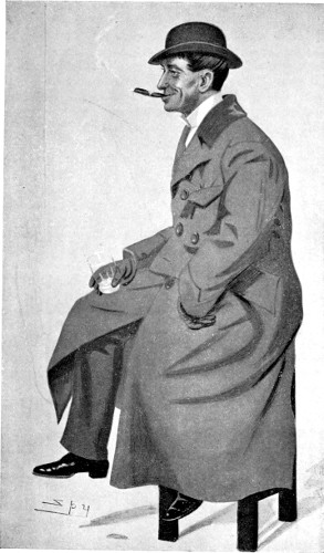
Phil May
By Spy
This universally appreciated artist, born at New Wortley, Leeds, in 1864, was the son of an engineer. His earliest ambition was to be a jockey, but the wish was not gratified, for when quite a child he was employed as timekeeper in a foundry. There were theatrical associations in the family on his mother’s side, and these led to the boy, whose aptitude with the pencil developed early, being employed as an assistant scene painter and odd-job boy at a Leeds theatre. Subsequently he became an actor, playing juvenile parts in a touring company. At the age of fifteen he set out for London and fortune, but hardship drove him back to Leeds, where he practically began his association with pictorial journalism by contributing drawings to a local paper called Yorkshire Gossip. He married at the early age of nineteen, and again returned to try his fortune in London, where ill luck greeted him once more. After suffering extreme poverty, a caricature of his, depicting Bancroft, Irving and Toole leaving the Garrick Club, which was published by a print-seller in Charing Cross Road, attracted the attention of Lionel Brough, the actor, who bought the original and introduced May to the editor of Society. This led to work and opened up avenues for the further development of his career in the pages of The St Stephen’s Review, where some of the best of his early drawings appeared. But the artist’s health broke down, and he was forced to leave England for Australia. There he remained from 1885 to 1888, becoming one of the most popular contributors to The Sydney Bulletin. On his return to Europe he studied art for a while in Paris, and from there renewed his connection with The St Stephen’s Review, contributing his first popularly successful series of drawings, “The Parson and the Painter.” This series appeared as a book in 1891. When he returned to London in 1892 he found himself a famous humorous artist, and started the immensely popular Winter Annuals, which were published regularly for eleven years. He now contributed drawings to many papers, including The Graphic, The Daily Graphic, The Pall Mall Budget, The Sketch, Pick-me-up, and in 1896 he joined the staff of Punch. Among his more important separate publications were, Phil May’s Sketch Book (1895); Guttersnipes (1896); Graphic Pictures (1897); Fifty Hitherto Unpublished Pen and Ink Sketches and The Phil May Album (1899). During the greater part of this time Phil May was the undisputed king of pictorial humorists in this country. His sketches were a characteristic of the period, and probably no other black and white artist ever won such ungrudging appreciation from both his brother artists and all classes of the public. So severe a critic as Whistler said: “Modern Black and White Art could be summed up in two words—Phil May.” His weekly contributions to Punch came to be anticipated and discussed as a pleasurable event of the first order. This high fame was practically achieved and concluded in the Nineties, for Phil May died in 1903, just before entering his fortieth year. After his death several volumes of his drawings were published, including Sketches from Punch and A Phil May Picture Book (1903); and a Folio of Caricature Drawings and Sketches and Phil May in Australia (1904).
The two outstanding qualities of Phil May’s drawings are their simplicity and their humour. No draughtsman before him had ever succeeded in expressing so much with such apparent ease and such economy of means. He translated the brevity of wit into black and white art, for although he was fundamentally a humorist, and often a humorist of a very primitive type, the most successful of his drawings are as witty as they are funny. His capacity for wit is also revealed in those early caricatures of his, which, if they had been continued, would have won him fame in another direction. But it is as a humorous artist that he will be remembered and loved. Not since Charles Keene had the distinctive qualities of our native humour been caught with such unerring exactitude and force. At the same time May achieved a far greater versatility than Keene. His mind ranged over every phase of the life of his time, and his amazing skill recorded the funniness of Whitechapel or Mayfair with equal inevitability. The wonderful simplicity of these drawings augmented their popular success, and it provoked as well an equally persistent legend about his art, for it was customary to attribute May’s simplicity of line to the belief that whilst he was in Australia he was forced to evolve a simple method of drawing owing to the limitations of local reproductive processes. This illusion had no basis in fact, for the style was as much the man in Phil May’s case as in that of any other artist of equal skill. “For May’s view of life,” wrote his friend and fellow-artist, G. R. Halkett, “with its sharp emphasis of character, and its expression always of the type rather than the individual, an overloading of detail would mean, even in its completeness, a lack of certainty and a halting expression of his idea. In the result, May’s work was always that of the brilliant sketcher who records only those essentials which express ‘the soul’ of the object before him. The accessories he put behind him with no lack of appreciation, and certainly with no lack of study, because he was concerned with deeper things, from which, with unerring instinct, he knew how to discard the merely superfluous.”
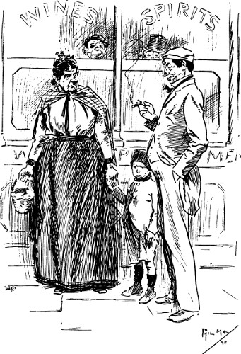
A Lecture in Store
“Are you comin’ ’ome?”
“I’ll do ellythikt you like in reason, M’ria—(hic)—but I won’t come ’ome.”
By Phil May
Next to the directness of his appeal the easy familiarity of his humour made him universally acceptable. It was fundamental, primitive and native humour, reflecting feelings which exist in most adults without respect to class or opinion. And above all it was easier of acceptance because of its whole-hearted geniality and amiable tolerance of human foibles. It never aroused superior laughter; cynicism was as absent as attempt to score off the inferiorities of others; one could laugh and feel comfortable with him, as one could with, say, Charles Dickens or Dan Leno. Phil May made his appreciators feel as they looked and laughed at one of his quaint or preposterous creations that “there, but for the grace of God, go I.” By making you laugh with him at something he had observed or imagined he thus forced you to laugh good-humouredly and with amiable fatalism at yourself. But in spite of all this undoubted geniality the subject of his humour was more often than not fitter for tears than laughter. His “guttersnipes,” his ragamuffins, and all the degraded and unfortunate class-less folk he delineated with such genius in all sorts of laughable situations, might just as easily have been the subjects of weeping or, better, of wrath. In some of the finest of these drawings the humour miscarries in the triumph of a tragic realism; and in most of his studies of low life—studies of drunkards, ragged, dirty and half-starved children, inept old men and unkempt women of all ages—the laughter provoked can be little more than the protective covering of merriment against the pains of impotent sympathy. How far Phil May felt this paradox of his own, and, perhaps, all humour, we do not know; but the misfortunes of his own life, due mainly to personal foibles, must have developed in him that kindly and indifferent fatalism which pervades his work.
The best of the new men worked for Pick-me-up in its early days, and also for The Butterfly and Eureka, and in those publications realism, satire, humour, cynicism and caricature flourished with all the spriteliness of a lively age and keen artistic enthusiasm. In many directions one can trace the influence of Phil May both in technique, which is chiefly the concern of the draughtsmen themselves, and in point of view. But many artists developed a métier of their own, and most of them had sufficient originality of technique and subject to arouse critical interest. The renaissance of black and white drawing was not, however, confined to the regular artists in that medium, it gained supporters from among painters, many of whom, such as Dudley Hardy, Walter Sickert, Maurice Greiffenhagen and Sidney H. Sime, doing work which held its own among the best work of the regular pen and pencil draughtsmen. And in this connection the long series of lithographic portraits by William Rothenstein[10] must be remembered, and the early line-drawn caricatures of Max Beerbohm. Cecil Aldin was contributing clever animal studies in wash to the popular illustrated journals, and etchers like Joseph Pennell and painter-etchers like Alfonse Legros and William Strang made incursions into the popular realms of black and white illustrations; and even so essential a colourist as Charles Conder came under the same spell.
Variety was a marked characteristic of the black and white art of the Nineties, and it has to be admitted that apart from the two main schools of illustration—the decorative and the illustrative, which correspond with the romantic and realistic schools of painting—little of the work was other than normal, and, save for the circumstances of the moment, possible during any recent decade. Individual talent, of course, had its say in all directions, and every manifestation of genius and skill found appreciators. The list of draughtsmen whose work is distinctive after the critical winnowing of more than fifteen years, and, in some instances, twenty, is still impressive, including, as it does, such names as Raven Hill, C. E. Brock, F. H. Townsend, G. R. Halkett, Frank L. Emanuel, H. R. Millar, E. J. Sullivan, R. Spence, O. Eckhardt, A. S. Hartrick, Gilbert James, J. W. T. Manuel, Hilda Cowham, E. T. Reed, Charles Pears, Patten Wilson and Bernard Partridge, all of whom either published their first work during the decade or produced such good work as to give them repute. And in addition to this varied array of ability newer men were also coming forward. Among these may be named Henry Ospovat, Carton Moore Park, Gordon Craig, Dion Clayton Calthrop and Joseph Simpson, each of whom published their early work at the close of the period, but whose main work in varied directions belongs to succeeding decades.
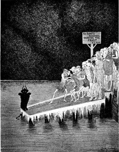
The Banks of the Styx
By S. H. Sime
All the ideas and “movements” of the time had their devotees among the black and white artists—decadence in Aubrey Beardsley, realism in Phil May, Raven Hill and J. W. T. Manuel; romanticism in Maurice Greiffenhagen, and that urbanity which I have dealt with under the heading of “The New Dandyism,” in Max Beerbohm, Dion Clayton Calthrop and others. Besides these phases there were several artists who combined the realistic and romantic points of view in their work, and, in the true spirit of the moment’s complex intellectualism, added to it that cynicism and doubt of convention which characterises so much of modern thought. Chief among these artists stands Sydney H. Sime, whose contributions to Pick-me-up, The Butterfly, Eureka and The Idler reveal one of the most original and most gifted artists of the time.
All the varieties of fin de siècle black and white drawing found a capable and prodigal exponent in this artist, who was equally at home with pen, pencil or brush. Few artists of the time had his versatility, and still fewer his mental range. His line drawings illustrating “Jingle’s” theatrical notes in Pick-me-up reveal not only a draughtsman of distinction, but an exact observer of life, and a humorist to boot; some of his covers for Eureka, particularly the “White-eyed Kaffir,” prove that he might have won fame as a poster designer had he wished, whilst his little landscapes in the medium of wash, which appeared from time to time in The Butterfly, have all the qualities of fine pastel-work. But the phase of Sime’s work which most nearly expresses a distinctive mood of the period is that which reveals him as a sardonic critic of humanity and conventional faith.
From time to time he published drawings in Pick-me-up, and elsewhere, which represented a new type of caricature for this country. He could, and did, caricature personality in the traditional manner; but, interesting as these works proved to be, they were not sufficiently distinctive to command more than passing attention. His outstanding work in caricature was independent of personality. It did not pass satiric or humorous comment upon this or that man of note; it said its say about man as man, and about man’s most cherished ideas and beliefs. Sime once described caricature as in the nature of a sarcastic remark, and there is sarcasm enough in these irreverent drawings of his. But neither sarcasm nor irreverence is their aim or outcome. They are obviously the work of an artist and thinker, of one who did not choose to mask his contempt of human weakness. His satires of Heaven and Hell, funny as they are, do not end as jokes. He sees in these popular conceptions of the hereafter mere substitutes for thought and imagination and courageous living, and his attitude resembles that of Rudyard Kipling in “Tomlinson,” which work, significantly enough, he desired above all things to illustrate, although he never produced more than two or three drawings towards that end.
The restless spirit of the time thus found varied expression in its black and white art. From Phil May’s laughter at tragedy to Sime’s laughter at humanity is a far cry; and it is still further to Aubrey Beardsley’s decorated cynicism. Yet each point of view is typical of the period, each in its way an expression of that thirst for reality which characterised the whole art work of the decade.
In the work of no single artist was a final interpretation of reality attained. The art of the time was perhaps too personal for that; just as it was too personal for work within prescribed conventions or formalities. The age favoured experiment and adventure, and it even looked not unkindly upon the various whims of the inquisitive, on the assumption doubtless that discovery was as often the result of accident as of design. In this large tolerance the spirit of renaissance worked through mind and imagination inspiring artists with a new confidence in themselves and courage to take risks. The results were not always happy; but that does not make the spirit in which the risks were taken less admirable, for those who make great effort contribute to life as well as those who achieve.