LETTER III.
Reading edition
ON COLOUR AND COMPOSITION.
My Dear Reader:—
If you have been obedient, and have hitherto done all that I have told you, I trust it has not been without much subdued remonstrance, and some serious vexation. For I should be sorry if, when you were led by the course of your study to observe closely such things as are beautiful in colour, you had not longed to paint them, and felt considerable difficulty in complying with your restriction to the use of black, or blue, or grey. You ought to love colour, and to think nothing quite beautiful or perfect without it; and if you really do love it, for its own sake, and are not merely desirous to colour because you think painting a finer thing than drawing, there is some chance you may colour well. Nevertheless, you need not hope ever to produce anything more than pleasant helps to memory, or useful and suggestive sketches in colour, unless you mean to be wholly an artist. You may, in the time which other vocations leave at your disposal, produce finished, beautiful, and masterly drawings in light and shade. But to colour well, requires your life. It cannot be done cheaper. The difficulty of doing right is increased—not twofold nor threefold, but a thousandfold, and more—by the addition of colour to your work. For the chances are more than a thousand to one against your being right both in form and colour with a given touch: it is difficult enough to be right in form, if you attend to that only; but when you have to attend, at the same moment, to a much more subtle thing than the form, the difficulty is strangely increased—and multiplied almost to infinity by this great fact, that, while form is absolute, so that you can say at the moment you draw any line that it is either right or wrong, colour is wholly relative. Every hue throughout your work is altered by every touch that you add in other places; so that what was warm a minute ago, becomes cold when you have put a hotter colour in another place, and what was in harmony when you left it, becomes discordant as you set other colours beside it; so that every touch must be laid, not with a view to its effect at the time, but with a view to its effect in futurity, the result upon it of all that is afterwards to be done being previously considered. You may easily understand that, this being so, nothing but the devotion of life, and great genius besides, can make a colourist.
But though you cannot produce finished coloured drawings of any value, you may give yourself much pleasure, and be of great use to other people, by occasionally sketching with a view to colour only; and preserving distinct statements of certain colour facts—as that the harvest-moon at rising was of such and such a red, and surrounded by clouds of such and such a rosy grey; that the mountains at evening were in truth so deep in purple; and the waves by the boat's side were indeed of that incredible green. This only, observe, if you have an eye for colour; but you may presume that you have this, if you enjoy colour.
And, though of course you should always give as much form to your subject as your attention to its colour will admit of, remember that the whole value of what you are about depends, in a coloured sketch, on the colour merely. If the colour is wrong, everything is wrong: just as, if you are singing, and sing false notes, it does not matter how true the words are. If you sing at all, you must sing sweetly; and if you colour at all, you must colour rightly. Give up all the form, rather than the slightest part of the colour: just as, if you felt yourself in danger of a false note, you would give up the word, and sing a meaningless sound, if you felt that so you could save the note. Never mind though your houses are all tumbling down—though your clouds are mere blots, and your trees mere knobs, and your sun and moon like crooked sixpences—so only that trees, clouds, houses, and sun or moon, are of the right colours. Of course, the discipline you have gone through will enable you to hint something of form, even in the fastest sweep of the brush; but do not let the thought of form hamper you in the least, when you begin to make coloured memoranda. If you want the form of the subject, draw it in black and white. If you want its colour, take its colour, and be sure you have it, and not a spurious, treacherous, half-measured piece of mutual concession, with the colours all wrong, and the forms still anything but right. It is best to get into the habit of considering the coloured work merely as supplementary to your other studies; making your careful drawings of the subject first, and then a coloured memorandum separately, as shapeless as you like, but faithful in hue, and entirely minding its own business. This principle, however, bears chiefly on large and distant subjects; in foregrounds and near studies, the colour cannot be had without a good deal of definition of form. For if you do not map the mosses on the stones accurately, you will not have the right quantity of colour in each bit of moss pattern, and then none of the colours will look right; but it always simplifies the work much if you are clear as to your point of aim, and satisfied, when necessary, to fail of all but that.
Now, of course, if I were to enter into detail respecting colouring, which is the beginning and end of a painter's craft, I should need to make this a work in three volumes instead of three letters, and to illustrate it in the costliest way. I only hope at present to set you pleasantly and profitably to work, leaving you, within the tethering of certain leading-strings, to gather what advantages you can from the works of art of which every year brings a greater number within your reach;—and from the instruction which, every year, our rising artists will be more ready to give kindly, and better able to give wisely.
And, first, of materials. Use hard cake colours, not moist colours: grind a sufficient quantity of each on your palette every morning, keeping a separate plate, large and deep, for colours to be used in broad washes, and wash both plate and palette every evening, so as to be able always to get good and pure colour when you need it; and force yourself into cleanly and orderly habits about your colours. The two best colourists of modern times, Turner and Rossetti,[234] afford us, I am sorry to say, no confirmation of this precept by their practice. Turner was, and Rossetti is, as slovenly in all their procedures as men can well be; but the result of this was, with Turner, that the colours have altered in all his pictures, and in many of his drawings; and the result of it with Rossetti is, that, though his colours are safe, he has sometimes to throw aside work that was half done, and begin over again. William Hunt, of the Old Water-colour, is very neat in his practice; so, I believe, is Mulready; so is John Lewis; and so are the leading Pre-Raphaelites, Rossetti only excepted. And there can be no doubt about the goodness of the advice, if it were only for this reason, that the more particular you are about your colours the more you will get into a deliberate and methodical habit in using them, and all true speed in colouring comes of this deliberation.
Use Chinese white, well ground, to mix with your colours in order to pale them, instead of a quantity of water. You will thus be able to shape your masses more quietly, and play the colours about with more ease; they will not damp your paper so much, and you will be able to go on continually, and lay forms of passing cloud and other fugitive or delicately shaped lights, otherwise unattainable except by time.
This mixing of white with the pigments, so as to render them opaque, constitutes body-colour drawing as opposed to transparent-colour drawing and you will, perhaps, have it often said to you that this body-colour is "illegitimate." It is just as legitimate as oil-painting, being, so far as handling is concerned, the same process, only without its uncleanliness, its unwholesomeness, or its inconvenience; for oil will not dry quickly, nor carry safely, nor give the same effects of atmosphere without tenfold labour. And if you hear it said that the body-colour looks chalky or opaque, and, as is very likely, think so yourself, be yet assured of this, that though certain effects of glow and transparencies of gloom are not to be reached without transparent colour, those glows and glooms are not the noblest aim of art. After many years' study of the various results of fresco and oil painting in Italy, and of body-colour and transparent colour in England, I am now entirely convinced that the greatest things that are to be done in art must be done in dead colour. The habit of depending on varnish or on lucid tints transparency, makes the painter comparatively lose sight of the nobler translucence which is obtained by breaking various colours amidst each other: and even when, as by Correggio, exquisite play of hue is joined with exquisite transparency, the delight in the depth almost always leads the painter into mean and false chiaroscuro; it leads him to like dark backgrounds instead of luminous ones,[235] and to enjoy, in general, quality of colour more than grandeur of composition, and confined light rather than open sunshine: so that the really greatest thoughts of the greatest men have always, so far as I remember, been reached in dead colour, and the noblest oil pictures of Tintoret and Veronese are those which are likest frescos.
Besides all this, the fact is, that though sometimes a little chalky and coarse-looking, body-colour is, in a sketch, infinitely liker nature than transparent colour: the bloom and mist of distance are accurately and instantly represented by the film of opaque blue (quite accurately, I think, by nothing else); and for ground, rocks, and buildings, the earthy and solid surface is, of course, always truer than the most finished and carefully wrought work in transparent tints can ever be.
Against one thing, however, I must steadily caution you. All kinds of colour are equally illegitimate, if you think they will allow you to alter at your pleasure, or blunder at your ease. There is no vehicle or method of colour which admits of alteration or repentance; you must be right at once, or never; and you might as well hope to catch a rifle bullet in your hand, and put it straight, when it was going wrong, as to recover a tint once spoiled. The secret of all good colour in oil, water, or anything else, lies primarily in that sentence spoken to me by Mulready: "Know what you have to do." The process may be a long one, perhaps: you may have to ground with one colour; to touch it with fragments of a second; to crumble a third into the interstices; a fourth into the interstices of the third; to glaze the whole with a fifth; and to reinforce in points with a sixth: but whether you have one, or ten, or twenty processes to go through, you must go straight through them, knowingly and foreseeingly all the way; and if you get the thing once wrong, there is no hope for you but in washing or scraping boldly down to the white ground, and beginning again.
The drawing in body-colour will tend to teach you all this, more than any other method, and above all it will prevent you from falling into the pestilent habit of sponging to get texture; a trick which has nearly ruined our modern water-colour school of art. There are sometimes places in which a skilful artist will roughen his paper a little to get certain conditions of dusty colour with more ease than he could otherwise; and sometimes a skilfully rased piece of paper will, in the midst of transparent tints, answer nearly the purpose of chalky body-colour in representing the surfaces of rocks or buildings. But artifices of this kind are always treacherous in a tyro's hands, tempting him to trust in them; and you had better always work on white or grey paper as smooth as silk;[236] and never disturb the surface of your colour or paper, except finally to scratch out the very highest lights if you are using transparent colours.
I have said above that body-colour drawing will teach you the use of colour better than working with merely transparent tints; but this is not because the process is an easier one, but because it is a more complete one, and also because it involves some working with transparent tints in the best way. You are not to think that because you use body-colour you may make any kind of mess that you like, and yet get out of it. But you are to avail yourself of the characters of your material, which enable you most nearly to imitate the processes of Nature. Thus, suppose you have a red rocky cliff to sketch, with blue clouds floating over it. You paint your cliff first firmly, then take your blue, mixing it to such a tint (and here is a great part of the skill needed), that when it is laid over the red, in the thickness required for the effect of the mist, the warm rock-colour showing through the blue cloud-colour, may bring it to exactly the hue you want; (your upper tint, therefore, must be mixed colder than you want it;) then you lay it on, varying it as you strike it, getting the forms of the mist at once, and, if it be rightly done, with exquisite quality of colour, from the warm tint's showing through and between the particles of the other. When it is dry, you may add a little colour to retouch the edges where they want shape, or heighten the lights where they want roundness, or put another tone over the whole; but you can take none away. If you touch or disturb the surface, or by any untoward accident mix the under and upper colours together, all is lost irrecoverably. Begin your drawing from the ground again if you like, or throw it into the fire if you like. But do not waste time in trying to mend it.[237]
This discussion of the relative merits of transparent and opaque colour has, however, led us a little beyond the point where we should have begun; we must go back to our palette, if you please. Get a cake of each of the hard colours named in the note below[238] and try experiments on their simple combinations, by mixing each colour with every other. If you like to do it in an orderly way, you may prepare a squared piece of pasteboard, and put the pure colours in columns at the top and side; the mixed tints being given at the intersections, thus (the letters standing for colours):
bcdef&c.
aabacadaeaf
b—bcbdbebf
c——cdcecf
d———dedf
e————ef
&c.
This will give you some general notion of the characters of mixed tints of two colours only, and it is better in practice to confine yourself as much as possible to these, and to get more complicated colours, either by putting a third over the first blended tint, or by putting the third into its interstices. Nothing but watchful practice will teach you the effects that colours have on each other when thus put over, or beside, each other.
Fig. 29.
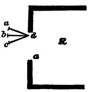
When you have got a little used to the principal combinations, place yourself at a window which the sun does not shine in at, commanding some simple piece of landscape; outline this landscape roughly; then take a piece of white cardboard, cut out a hole in it about the size of a large pea; and supposing R is the room, a d the window, and you are sitting at a, Fig. 29., hold this cardboard a little outside of the window, upright, and in the direction b d, parallel a little turned to the side of the window, or so as to catch more light, as at a d, never turned as at c d, or the paper will be dark. Then you will see the landscape, bit by bit, through the circular hole. Match the colours of each important bit as nearly as you can, mixing your tints with white, beside the aperture. When matched, put a touch of the same tint at the top of your paper, writing under it: "dark tree colour," "hill colour," "field colour," as the case may be. Then wash the tint away from beside the opening, and the cardboard will be ready to match another piece of the landscape.[239] When you have got the colours of the principal masses thus indicated, lay on a piece of each in your sketch in its right place, and then proceed to complete the sketch in harmony with them, by your eye.
In the course of your early experiments, you will be much struck by two things: the first, the inimitable brilliancy of light in sky and in sunlighted things: and the second, that among the tints which you can imitate, those which you thought the darkest will continually turn out to be in reality the lightest. Darkness of objects is estimated by us, under ordinary circumstances, much more by knowledge than by sight; thus, a cedar or Scotch fir, at 200 yards off, will be thought of darker green than an elm or oak near us; because we know by experience that the peculiar colour they exhibit, at that distance, is the sign of darkness of foliage. But when we try them through the cardboard, the near oak will be found, indeed, rather dark green, and the distant cedar, perhaps, pale gray-purple. The quantity of purple and grey in Nature is, by the way, another somewhat surprising subject of discovery.
Well, having ascertained thus your principal tints, you may proceed to fill up your sketch; in doing which observe these following particulars:
1. Many portions of your subject appeared through the aperture in the paper brighter than the paper, as sky, sunlighted grass, &c. Leave these portions, for the present, white; and proceed with the parts of which you can match the tints.
2. As you tried your subject with the cardboard, you must have observed how many changes of hue took place over small spaces. In filling up your work, try to educate your eye to perceive these differences of hue without the help of the cardboard, and lay them deliberately, like a mosaic-worker, as separate colours, preparing each carefully on your palatte, and laying it as if it were a patch of coloured cloth, cut out, to be fitted neatly by its edge to the next patch; so that the fault of your work may be, not a slurred or misty look, but a patched bed-cover look, as if it had all been cut out with scissors. For instance, in drawing the trunk of a birch tree, there will be probably white high lights, then a pale rosy grey round them on the light side, then a (probably greenish) deeper grey on the dark side, varied by reflected colours, and over all, rich black strips of bark and brown spots of moss. Lay first the rosy grey, leaving white for the high lights and for the spots of moss, and not touching the dark side. Then lay the grey for the dark side, fitting it well up to the rosy grey of the light, leaving also in this darker grey the white paper in the places for the black and brown moss; then prepare the moss colours separately for each spot, and lay each in the white place left for it. Not one grain of white, except that purposely left for the high lights, must be visible when the work is done, even through a magnifying-glass, so cunningly must you fit the edges to each other. Finally, take your background colours, and put them on each side of the tree-trunk, fitting them carefully to its edge.
Fine work you would make of this, wouldn't you, if you had not learned to draw first, and could not now draw a good outline for the stem, much less terminate a colour mass in the outline you wanted?
Your work will look very odd for some time, when you first begin to paint in this way, and before you can modify it, as I shall tell you presently how; but never mind; it is of the greatest possible importance that you should practice this separate laying on of the hues, for all good colouring finally depends on it. It is, indeed, often necessary, and sometimes desirable, to lay one colour and form boldly over another: thus, in laying leaves on blue sky, it is impossible always in large pictures, or when pressed for time, to fill in the blue through the interstices of the leaves; and the great Venetians constantly lay their blue ground first, and then, having let it dry, strike the golden brown over it in the form of the leaf, leaving the under blue to shine through the gold, and subdue it to the olive green they want. But in the most precious and perfect work each leaf is inlaid, and the blue worked round it: and, whether you use one or other mode of getting your result, it is equally necessary to be absolute and decisive in your laying the colour. Either your ground must be laid firmly first, and then your upper colour struck upon it in perfect form, for ever, thenceforward, unalterable; or else the two colours must be individually put in their places, and led up to each other till they meet at their appointed border, equally, thenceforward, unchangeable. Either process, you see, involves absolute decision. If you once begin to slur, or change, or sketch, or try this way and that with your colour, it is all over with it and with you. You will continually see bad copyists trying to imitate the Venetians, by daubing their colours about, and retouching, and finishing, and softening: when every touch and every added hue only lead them farther into chaos. There is a dog between two children in a Veronese in the Louvre, which gives the copyist much employment. He has a dark ground behind him, which Veronese has painted first, and then when it was dry, or nearly so, struck the locks of the dog's white hair over it with some half-dozen curling sweeps of his brush, right at once, and forever. Had one line or hair of them gone wrong, it would have been wrong forever; no retouching could have mended it. The poor copyists daub in first some background, and then some dog's hair; then retouch the background, then the hair, work for hours at it, expecting it always to come right to-morrow—"when it is finished." They may work for centuries at it, and they will never do it. If they can do it with Veronese's allowance of work, half a dozen sweeps of the hand over the dark background, well; if not, they may ask the dog himself whether it will ever come right, and get true answer from him—on Launce's conditions: "If he say 'ay,' it will; if he say 'no,' it will; if he shake his tail and say nothing, it will."
Whenever you lay on a mass of colour, be sure that however large it may be, or however small, it shall be gradated. No colour exists in Nature under ordinary circumstances without gradation. If you do not see this, it is the fault of your inexperience; you will see it in due time, if you practise enough. But in general you may see it at once. In the birch trunk, for instance, the rosy grey must be gradated by the roundness of the stem till it meets the shaded side; similarly the shaded side is gradated by reflected, light. Accordingly, whether by adding water, or white paint, or by unequal force of touch (this you will do at pleasure, according to the texture you wish to produce), you must, in every tint you lay on, make it a little paler at one part than another, and get an even gradation between the two depths. This is very like laying down a formal law or recipe for you; but you will find it is merely the assertion of a natural fact. It is not indeed physically impossible to meet with an ungradated piece of colour, but it is so supremely improbable, that you had better get into the habit of asking yourself invariably, when you are going to copy a tint,—not "Is that gradated?" but "Which way is it gradated?" and at least in ninety-nine out of a hundred instances, you will be able to answer decisively after a careful glance, though the gradation may have been so subtle that you did not see it at first. And it does not matter how small the touch of colour may be, though not larger than the smallest pin's head, if one part of it is not darker than the rest, it is a bad touch; for it is not merely because the natural fact is so, that your colour should be gradated; the preciousness and pleasantness of the colour itself depends more on this than on any other of its qualities, for gradation is to colours just what curvature is to lines, both being felt to be beautiful by the pure instinct of every human mind, and both, considered as types, expressing the law of gradual change and progress in the human soul itself. What the difference is in mere beauty between a gradated and ungradated colour, may be seen easily by laying an even tint of rose-colour on paper, and putting a rose leaf beside it. The victorious beauty of the rose as compared with other flowers, depends wholly on the delicacy and quantity of its colour gradations, all other flowers being either less rich in gradation, not having so many folds of leaf; or less tender, being patched and veined instead of flushed.
4. But observe, it is not enough in general that colour should be gradated by being made merely paler or darker at one place than another. Generally colour changes as it diminishes, and is not merely darker at one spot, but also purer at one spot than anywhere else. It does not in the least follow that the darkest spot should be the purest; still less so that the lightest should be the purest. Very often the two gradations more or less cross each other, one passing in one direction from paleness to darkness, another in another direction from purity to dullness, but there will almost always be both of them, however reconciled; and you must never be satisfied with a piece of colour until you have got both: that is to say, every piece of blue that you lay on must be quite blue only at some given spot, nor that a large spot; and must be gradated from that into less pure blue—greyish blue, or greenish blue, or purplish blue, over all the rest of the space it occupies. And this you must do in one of three ways: either, while the colour is wet, mix it with the colour which is to subdue it, adding gradually a little more and a little more; or else, when the colour is quite dry, strike a gradated touch of another colour over it, leaving only a point of the first tint visible: or else, lay the subduing tints on in small touches, as in the exercise of tinting the chess-board. Of each of these methods I have something to tell you separately: but that is distinct from the subject of gradation, which I must not quit without once more pressing upon you the preëminent necessity of introducing it everywhere. I have profound dislike of anything like habit of hand, and yet, in this one instance, I feel almost tempted to encourage you to get into a habit of never touching paper with colour, without securing a gradation. You will not in Turner's largest oil pictures, perhaps six or seven feet long by four or five high, find one spot of colour as large as a grain of wheat ungradated: and you will find in practice, that brilliancy of hue, and vigour of light, and even the aspect of transparency in shade, are essentially dependent on this character alone; hardness, coldness, and opacity resulting far more from equality of colour than from nature of colour. Give me some mud off a city crossing, some ochre out of a gravel pit, a little whitening, and some coal-dust, and I will paint you a luminous picture, if you give me time to gradate my mud, and subdue my dust: but though you had the red of the ruby, the blue of the gentian, snow for the light, and amber for the gold, you cannot paint a luminous picture, if you keep the masses of those colours unbroken in purity, and unvarying in depth.
5. Next note the three processes by which gradation and other characters are to be obtained:
A. Mixing while the colour is wet.
You may be confused by my first telling you to lay on the hues in separate patches, and then telling you to mix hues together as you lay them on: but the separate masses are to be laid, when colours distinctly oppose each other at a given limit; the hues to be mixed, when they palpitate one through the other, or fade one into the other. It is better to err a little on the distinct side. Thus I told you to paint the dark and light sides of the birch trunk separately, though in reality, the two tints change, as the trunk turns away from the light, gradually one into the other: and, after being laid separately on, will need some farther touching to harmonize them: but they do so in a very narrow space, marked distinctly all the way up the trunk; and it is easier and safer, therefore, to keep them separate at first. Whereas it often happens that the whole beauty of two colours will depend on the one being continued well through the other, and playing in the midst of it: blue and green often do so in water: blue and grey, or purple and scarlet, in sky; in hundreds of such instances the most beautiful and truthful results may be obtained by laying one colour into the other while wet; judging wisely how far it will spread, or blending it with the brush in somewhat thicker consistence of wet body-colour; only observe, never mix in this way two mixtures; let the colour you lay into the other be always a simple, not a compound tint.
B. Laying one colour over another.
If you lay on a solid touch of vermilion, and, after it is quite dry, strike a little very wet carmine quickly over it, you will obtain a much more brilliant red than by mixing the carmine and vermilion. Similarly, if you lay a dark colour first, and strike a little blue or white body-colour lightly over it, you will get a more beautiful grey than by mixing the colour and the blue or white. In very perfect painting, artifices of this kind are continually used; but I would not have you trust much to them; they are apt to make you think too much of quality of colour. I should like you to depend on little more than the dead colours, simply laid on, only observe always this, that the less colour you do the work with, the better it will always be:[240] so that if you have laid a red colour, and you want a purple one above, do not mix the purple on your palette and lay it on so thick as to overpower the red, but take a little thin blue from your palette, and lay it lightly over the red, so as to let the red be seen through, and thus produce the required purple; and if you want a green hue over a blue one, do not lay a quantity of green on the blue, but a little yellow, and so on, always bringing the under colour into service as far as you possibly can. If, however, the colour beneath is wholly opposed to the one you have to lay on, as, suppose, if green is to be laid over scarlet, you must either remove the required parts of the under colour daintily first with your knife, or with water; or else, lay solid white over it massively, and leave that to dry, and then glaze the white with the upper colour. This is better, in general, than laying the upper colour itself so thick as to conquer the ground, which, in fact, if it be a transparent colour, you cannot do. Thus, if you have to strike warm boughs and leaves of trees over blue sky, and they are too intricate to have their places left for them in laying the blue, it is better to lay them first in solid white, and then glaze with sienna and ochre, than to mix the sienna and white; though, of course, the process is longer and more troublesome. Nevertheless, if the forms of touches required are very delicate, the after glazing is impossible. You must then mix the warm colour thick at once, and so use it: and this is often necessary for delicate grasses, and such other fine threads of light in foreground work.
C. Breaking one colour in small points through or over another.
This is the most important of all processes in good modern[241] oil and water-colour painting, but you need not hope to attain very great skill in it. To do it well is very laborious, and requires such skill and delicacy of hand as can only be acquired by unceasing practice. But you will find advantage in noting the following points:
(a.) In distant effects of rich subjects, wood, or rippled water, or broken clouds, much may be done by touches or crumbling dashes of rather dry colour, with other colours afterwards put cunningly into the interstices. The more you practise this, when the subject evidently calls for it, the more your eye will enjoy the higher qualities of colour. The process is, in fact, the carrying out of the principle of separate colours to the utmost possible refinement; using atoms of colour in juxtaposition, instead of large spaces. And note, in filling up minute interstices of this kind, that if you want the colour you fill them with to show brightly, it is better to put a rather positive point of it, with a little white left beside or round it in the interstice, than to put a pale tint of the colour over the whole interstice. Yellow or orange will hardly show, if pale, in small spaces; but they show brightly in firm touches, however small, with white beside them.
(b.) If a colour is to be darkened by superimposed portions of another, it is, in many cases, better to lay the uppermost colour in rather vigorous small touches, like finely chopped straw, over the under one, than to lay it on as a tint, for two reasons: the first, that the play of the two colours together is pleasant to the eye; the second, that much expression of form may be got by wise administration of the upper dark touches. In distant mountains they may be made pines of, or broken crags, or villages, or stones, or whatever you choose; in clouds they may indicate the direction of the rain, the roll and outline of the cloud masses; and in water, the minor waves. All noble effects of dark atmosphere are got in good water-colour drawing by these two expedients, interlacing the colours, or retouching the lower one with fine darker drawing in an upper. Sponging and washing for dark atmospheric effect is barbarous, and mere tyro's work, though it is often useful for passages of delicate atmospheric light.
(c.) When you have time, practice the production of mixed tints by interlaced touches of the pure colours out of which they are formed, and use the process at the parts of your sketches where you wish to get rich and luscious effects. Study the works of William Hunt, of the Old Water-colour Society, in this respect, continually, and make frequent memoranda of the variegations in flowers; not painting the flower completely, but laying the ground colour of one petal, and painting the spots on it with studious precision: a series of single petals of lilies, geraniums, tulips, &c., numbered with proper reference to their position in the flower, will be interesting to you on many grounds besides those of art. Be careful to get the gradated distribution of the spots well followed in the calceolarias, foxgloves, and the like; and work out the odd, indefinite hues of the spots themselves with minute grains of pure interlaced colour, otherwise you will never get their richness of bloom. You will be surprised to find, as you do this, first the universality of the law of gradation we have so much insisted upon; secondly, that Nature is just as economical of her fine colours as I have told you to be of yours. You would think, by the way she paints, that her colours cost her something enormous: she will only give you a single pure touch just where the petal turns into light; but down in the bell all is subdued, and under the petal all is subdued, even in the showiest flower. What you thought was bright blue is, when you look close, only dusty grey, or green, or purple, or every colour in the world at once, only a single gleam or streak of pure blue in the centre of it. And so with all her colours. Sometimes I have really thought her miserliness intolerable: in a gentian, for instance, the way she economises her ultramarine down in the bell is a little too bad.
Next, respecting general tone. I said, just now, that, for the sake of students, my tax should not be laid on black or on white pigments; but if you mean to be a colourist, you must lay a tax on them yourselves when you begin to use true colour; that is to say, you must use them little and make of them much. There is no better test of your colour tones being good, than your having made the white in your picture precious, and the black conspicuous.
I say, first, the white precious. I do not mean merely glittering or brilliant; it is easy to scratch white seagulls out of black clouds and dot clumsy foliage with chalky dew; but, when white is well managed, it ought to be strangely delicious—tender as well as bright—like inlaid mother of pearl, or white roses washed in milk. The eye ought to seek it for rest, brilliant though it may be; and to feel it as a space of strange, heavenly paleness in the midst of the flushing of the colours. This effect you can only reach by general depth of middle tint, by absolutely refusing to allow any white to exist except where you need it, and by keeping the white itself subdued by grey, except at a few points of chief lustre.
Secondly, you must make the black conspicuous. However small a point of black may be, it ought to catch the eye, otherwise your work is too heavy in the shadow. All the ordinary shadows should be of some colour—never black, nor approaching black, they should be evidently and always of a luminous nature, and the black should look strange among them; never occurring except in a black object, or in small points indicative of intense shade in the very centre of masses of shadow. Shadows of absolutely negative grey, however, may be beautifully used with white, or with gold; but still though the black thus, in subdued strength, becomes spacious, it should always be conspicuous; the spectator should notice this grey neutrality with some wonder, and enjoy, all the more intensely on account of it, the gold colour and the white which it relieves. Of all the great colourists Velasquez is the greatest master of the black chords. His black is more precious than most other people's crimson.
It is not, however, only white and black which you must make valuable; you must give rare worth to every colour you use; but the white and black ought to separate themselves quaintly from the rest, while the other colours should be continually passing one into the other, being all evidently companions in the same gay world; while the white, black, and neutral grey should stand monkishly aloof in the midst of them. You may melt your crimson into purple, your purple into blue and your blue into green, but you must not melt any of them into black. You should, however, try, as I said, to give preciousness to all your colours; and this especially by never using a grain more than will just do the work, and giving each hue the highest value by opposition. All fine colouring, like fine drawing, is delicate; and so delicate that if, at last, you see the colour you are putting on, you are putting on too much. You ought to feel a change wrought in the general tone, by touches of colour which individually are too pale to be seen; and if there is one atom of any colour in the whole picture which is unnecessary to it, that atom hurts it.
Notice also, that nearly all good compound colours are odd colours. You shall look at a hue in a good painter's work ten minutes before you know what to call it. You thought it was brown, presently, you feel that it is red; next that there is, somehow, yellow in it; presently afterwards that there is blue in it. If you try to copy it you will always find your colour too warm or too cold—no colour in the box will seem to have any affinity with it; and yet it will be as pure as if it were laid at a single touch with a single colour.
As to the choice and harmony of colours in general, if you cannot choose and harmonize them by instinct, you will never do it at all. If you need examples of utterly harsh and horrible colour, you may find plenty given in treatises upon colouring, to illustrate the laws of harmony; and if you want to colour beautifully, colour as best pleases yourself at quiet times, not so as to catch the eye, nor to look as if it were clever or difficult to colour in that way, but so that the colour may be pleasant to you when you are happy, or thoughtful. Look much at the morning and evening sky, and much at simple flowers—dog-roses, wood hyacinths, violets, poppies, thistles, heather, and such like—as Nature arranges them in the woods and fields. If ever any scientific person tells you that two colours are "discordant," make a note of the two colours, and put them together whenever you can. I have actually heard people say that blue and green were discordant; the two colours which Nature seems to intend never to be separated and never to be felt, either of them, in its full beauty without the other!—a peacock's neck, or a blue sky through green leaves, or a blue wave with green lights though it, being precisely the loveliest things, next to clouds at sunrise, in this coloured world of ours. If you have a good eye for colours, you will soon find out how constantly Nature puts purple and green together, purple and scarlet, green and blue, yellow and neutral grey, and the like; and how she strikes these colour-concords for general tones, and then works into them with innumerable subordinate ones; and you will gradually come to like what she does, and find out new and beautiful chords of colour in her work every day. If you enjoy them, depend upon it you will paint them to a certain point right: or, at least, if you do not enjoy them, you are certain to paint them wrong. If colour does not give you intense pleasure, let it alone; depend upon it, you are only tormenting the eyes and senses of people who feel colour, whenever you touch it; and that is unkind and improper. You will find, also, your power of colouring depend much on your state of health and right balance of mind; when you are fatigued or ill you will not see colours well, and when you are ill-tempered you will not choose them well: thus, though not infallibly a test of character in individuals, colour power is a great sign of mental health in nations; when they are in a state of intellectual decline, their colouring always gets dull.[242] You must also take great care not to be misled by affected talk about colour from people who have not the gift of it: numbers are eager and voluble about it who probably never in all their lives received one genuine colour-sensation. The modern religionists of the school of Overbeck are just like people who eat slate-pencil and chalk, and assure everybody that they are nicer and purer than strawberries and plums.
Take care also never to be misled into any idea that colour can help or display form; colour[243] always disguises form, and is meant to do so.
It is a favourite dogma among modern writers on colour that "warm colours" (reds and yellows) "approach" or express nearness, and "cold colours" (blue and grey) "retire" or express distance. So far is this from being the case, that no expression of distance in the world is so great as that of the gold and orange in twilight sky. Colours, as such, are absolutely inexpressive respecting distance. It is their quality (as depth, delicacy, &c.) which expresses distance, not their tint. A blue bandbox set on the same shelf with a yellow one will not look an inch farther off, but a red or orange cloud, in the upper sky, will always appear to be beyond a blue cloud close to us, as it is in reality. It is quite true that in certain objects, blue is a sign of distance; but that is not because blue is a retiring colour, but because the mist in the air is blue, and therefore any warm colour which has not strength of light enough to pierce the mist is lost or subdued in its blue: but blue is no more, on this account, a "retiring colour," than brown is a retiring colour, because, when stones are seen through brown water, the deeper they lie the browner they look; or than yellow is a retiring colour, because when objects are seen through a London fog, the farther off they are the yellower they look. Neither blue, nor yellow, nor red, can have, as such, the smallest power of expressing either nearness or distance: they express them only under the peculiar circumstances which render them at the moment, or in that place, signs of nearness or distance. Thus, vivid orange in an orange is a sign of nearness, for if you put the orange a great way off, its colour will not look so bright; but vivid orange in sky is a sign of distance, because you cannot get the colour of orange in a cloud near you. So purple in a violet or a hyacinth is a sign of nearness, because the closer you look at them the more purple you see. But purple in a mountain is a sign of distance, because a mountain close to you is not purple, but green or grey. It may, indeed, be generally assumed that a tender or pale colour will more or less express distance, and a powerful or dark colour nearness; but even this is not always so. Heathery hills will usually give a pale and tender purple near, and an intense and dark purple far away; the rose colour of sunset on snow is pale on the snow at your feet, deep and full on the snow in the distance; and the green of a Swiss lake is pale in the clear waves on the beach, but intense as an emerald in the sunstreak, six miles from shore. And in any case, when the foreground is in strong light, with much water about it, or white surface, casting intense reflections, all its colours may be perfectly delicate, pale, and faint; while the distance, when it is in shadow, may relieve the whole foreground with intense darks of purple, blue green, or ultramarine blue. So that, on the whole, it is quite hopeless and absurd to expect any help from laws of "aërial perspective." Look for the natural effects, and set them down as fully as you can, and as faithfully, and never alter a colour because it won't look in its right place. Put the colour strong, if it be strong, though far off; faint, if it be faint, though close to you. Why should you suppose that Nature always means you to know exactly how far one thing is from another? She certainly intends you always to enjoy her colouring, but she does not wish you always to measure her space. You would be hard put to it, every time you painted the sun setting, if you had to express his 95,000,000 miles of distance in "aërial perspective."
There is, however, I think, one law about distance, which has some claims to be considered a constant one: namely, that dullness and heaviness of colour are more or less indicative of nearness. All distant colour is pure colour: it may not be bright, but it is clear and lovely, not opaque nor soiled; for the air and light coming between us and any earthy or imperfect colour, purify or harmonise it; hence a bad colourist is peculiarly incapable of expressing distance. I do not of course mean that you are to use bad colours in your foreground by way of making it come forward; but only that a failure in colour, there, will not put it out of its place; while a failure in colour in the distance will at once do away with its remoteness: your dull-coloured foreground will still be a foreground, though ill-painted; but your ill-painted distance will not be merely a dull distance,—it will be no distance at all.
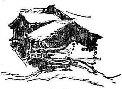
I have only one thing more to advise you, namely, never to colour petulantly or hurriedly. You will not, indeed, be able, if you attend properly to your colouring, to get anything like the quantity of form you could in a chiaroscuro sketch; nevertheless, if you do not dash or rush at your work, nor do it lazily, you may always get enough form to be satisfactory. An extra quarter of an hour, distributed in quietness over the course of the whole study, may just make the difference between a quite intelligible drawing, and a slovenly and obscure one. If you determine well beforehand what outline each piece of colour is to have; and, when it is on the paper, guide it without nervousness, as far as you can, into the form required; and then, after it is dry, consider thoroughly what touches are needed to complete it, before laying one of them on; you will be surprised to find how masterly the work will soon look, as compared with a hurried or ill-considered sketch. In no process that I know of—least of all in sketching—can time be really gained by precipitation. It is gained only by caution; and gained in all sorts of ways: for not only truth of form, but force of light, is always added by an intelligent and shapely laying of the shadow colours. You may often make a simple flat tint, rightly gradated and edged, express a complicated piece of subject without a single retouch. The two Swiss cottages, for instance, with their balconies, and glittering windows, and general character of shingly eaves, are expressed in Fig. 30., with one tint of grey, and a few dispersed spots and lines of it; all of which you ought to be able to lay on without more than thrice dipping your brush, and without a single touch after the tint is dry.
Fig. 30.
Here, then, for I cannot without coloured illustrations tell you more, I must leave you to follow out the subject for yourself, with such help as you may receive from the water-colour drawings accessible to you; or from any of the little treatises on their art which have been published lately by our water-colour painters.[244] But do not trust much to works of this kind. You may get valuable hints from them as to mixture of colours; and here and there you will find a useful artifice or process explained; but nearly all such books are written only to help idle amateurs to a meretricious skill, and they are full of precepts and principles which may, for the most part, be interpreted by their precise negatives, and then acted upon, with advantage. Most of them praise boldness, when the only safe attendant spirit of a beginner is caution;—advise velocity, when the first condition of success is deliberation;—and plead for generalisation, when all the foundations of power must be laid in knowledge of specialty.
And now, in the last place, I have a few things to tell you respecting that dangerous nobleness of consummate art,—Composition. For though it is quite unnecessary for you yet awhile to attempt it, and it may be inexpedient for you to attempt it at all, you ought to know what it means, and to look for and enjoy it in the art of others.
Composition means, literally and simply, putting several things together, so as to make one thing out of them; the nature and goodness of which they all have a share in producing. Thus a musician composes an air, by putting notes together in certain relations; a poet composes a poem; by putting thoughts and words in pleasant order; and a painter a picture, by putting thoughts, forms, and colours in pleasant order.
In all these cases, observe, an intended unity must be the result of composition. A paviour cannot be said to compose the heap of stones which he empties from his cart, nor the sower the handful of seed which he scatters from his hand. It is the essence of composition that everything should be in a determined place, perform an intended part, and act, in that part, advantageously for everything that is connected with it.
Composition, understood in this pure sense, is the type, in the arts of mankind, of the Providential government of the world.[245] It is an exhibition, in the order given to notes, or colours, or forms, of the advantage of perfect fellowship, discipline, and contentment. In a well-composed air, no note, however short or low, can be spared, but the least is as necessary as the greatest: no note, however prolonged, is tedious; but the others prepare for, and are benefited by, its duration; no note, however high, is tyrannous; the others prepare for and are benefited by, its exaltation: no note, however low, is overpowered, the others prepare for, and sympathise with, its humility: and the result is, that each and every note has a value in the position assigned to it, which by itself, it never possessed, and of which by separation from the others, it would instantly be deprived.
Similarly, in a good poem, each word and thought enhances the value of those which precede and follow it; and every syllable has a loveliness which depends not so much on its abstract sound as on its position. Look at the same word in a dictionary, and you will hardly recognise it.
Much more in a great picture; every line and colour is so arranged as to advantage the rest. None are inessential, however slight; and none are independent, however forcible. It is not enough that they truly represent natural objects; but they must fit into certain places, and gather into certain harmonious groups: so that, for instance, the red chimney of a cottage is not merely set in its place as a chimney, but that it may affect, in a certain way pleasurable to the eye, the pieces of green or blue in other parts of the picture; and we ought to see that the work is masterly, merely by the positions and quantities of these patches of green, red, and blue, even at a distance which renders it perfectly impossible to determine what the colours represent: or to see whether the red is a chimney, or an old woman's cloak; and whether the blue is smoke, sky, or water.
It seems to be appointed, in order to remind us, in all we do, of the great laws of Divine government and human polity, that composition in the arts should strongly affect every order of mind, however unlearned or thoughtless. Hence the popular delight in rhythm and metre, and in simple musical melodies. But it is also appointed that power of composition in the fine arts should be an exclusive attribute of great intellect All men can more or less copy what they see, and, more or less, remember it: powers of reflection and investigation are also common to us all, so that the decision of inferiority in these rests only on questions of degree. A. has a better memory than B., and C. reflects more profoundly than D. But the gift of composition is not given at all to more than one man in a thousand; in its highest range, it does not occur above three or four times in a century.
It follows, from these general truths, that it is impossible to give rules which will enable you to compose. You might much more easily receive rules to enable you to be witty. If it were possible to be witty by rule, wit would cease to be either admirable or amusing: if it were possible to compose melody by rule, Mozart and Cimarosa need not have been born: if it were possible to compose pictures by rule, Titian and Veronese would be ordinary men. The essence of composition lies precisely in the fact of its being unteachable, in its being the operation of an individual mind of range and power exalted above others.
But though no one can invent by rule, there are some simple laws of arrangement which it is well for you to know, because, though they will not enable you to produce a good picture, they will often assist you to set forth what goodness may be in your work in a more telling way than you could have done otherwise; and by tracing them in the work of good composers, you may better understand the grasp of their imagination, and the power it possesses over their materials I shall briefly state the chief of these laws.
1. THE LAW OF PRINCIPALITY.
The great object of composition being always to secure unity; that is, to make out of many things one whole; the first mode in which this can be effected is, by determining that one feature shall be more important than all the rest, and that the others shall group with it in subordinate positions.
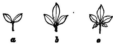
This is the simplest law of ordinary ornamentation. Thus the group of two leaves, a, Fig. 31., is unsatisfactory, because it has no leading leaf; but that at b is prettier, because it has a head or master leaf; and c more satisfactory still, because the subordination of the other members to this head leaf is made more manifest by their gradual loss of size as they fall back from it. Hence part of the pleasure we have in the Greek honeysuckle ornament, and such others.
Fig. 31.
Thus, also, good pictures have always one light larger or brighter than the other lights, or one figure more prominent than the other figures, or one mass of colour dominant over all the other masses; and in general you will find it much benefit your sketch if you manage that there shall be one light on the cottage wall, or one blue cloud in the sky, which may attract the eye as leading light, or leading gloom, above all others. But the observance of the rule is often so cunningly concealed by the great composers, that its force is hardly at first traceable; and you will generally find that they are vulgar pictures in which the law is strikingly manifest. This may be simply illustrated by musical melody; for instance, in such phrases as this:

one note (here the upper G) rules the whole passage, and has the full energy of it concentrated in itself. Such passages, corresponding to completely subordinated compositions in painting, are apt to be wearisome if often repeated. But in such a phrase as this:
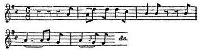
it is very difficult to say, which is the principal note. The A in the last bar is lightly dominant, but there is a very equal current of power running through the whole; and such passages rarely weary. And this principle holds through vast scales of arrangement; so that in the grandest compositions, such as Paul Veronese's Marriage in Cana, or Raphael's Disputa, it is not easy to fix at once on the principal figure; and very commonly the figure which is really chief does not catch the eye at first, but is gradually felt to be more and more conspicuous as we gaze. Thus in Titian's grand composition of the Cornaro Family, the figure meant to be principal is a youth of fifteen or sixteen, whose portrait it was evidently the painter's object to make as interesting as possible. But a grand Madonna, and a St. George with a drifting banner, and many figures more, occupy the centre of the picture, and first catch the eye; little by little we are led away from them to a gleam of pearly light in the lower corner, and find that, from the head which it shines upon, we can turn our eyes no more.
As, in every good picture, nearly all laws of design are more or less exemplified, it will, on the whole, be an easier way of explaining them to analyse one composition thoroughly, than to give instances from various works. I shall therefore take one of Turner's simplest; which will allow us, so to speak, easily to decompose it, and illustrate each law by it as we proceed.
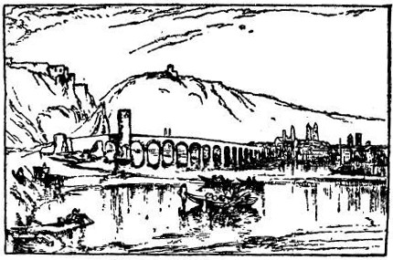
Figure 32. is a rude sketch of the arrangement of the whole subject; the old bridge over the Moselle at Coblentz, the town of Coblentz on the right, Ehrenbreitstein on the left. The leading or master feature is, of course the tower on the bridge. It is kept from being too principal by an important group on each side of it; the boats, on the right, and Ehrenbreitstein beyond. The boats are large in mass, and more forcible in colour, but they are broken into small divisions, while the tower is simple, and therefore it still leads. Ehrenbreitstein is noble in its mass, but so reduced by aërial perspective of colour that it cannot contend with the tower, which therefore holds the eye, and becomes the key of the picture. We shall see presently how the very objects which seem at first to contend with it for the mastery are made, occultly to increase its preëminence.
Fig. 32.
2. THE LAW OF REPETITION.
Another important means of expressing unity is to mark some kind of sympathy among the different objects, and perhaps the pleasantest, because most surprising, kind of sympathy, is when one group imitates or repeats another; not in the way of balance or symmetry, but subordinately, like a far-away and broken echo of it. Prout has insisted much on this law in all his writings on composition; and I think it is even more authoritatively present in the minds of most great composers than the law of principality. It is quite curious to see the pains that Turner sometimes takes to echo an important passage of colour; in the Pembroke Castle for instance, there are two fishing-boats, one with a red, and another with a white sail. In a line with them, on the beach, are two fish in precisely the same relative positions; one red and one white. It is observable that he uses the artifice chiefly in pictures where he wishes to obtain an expression of repose: in my notice of the plate of Scarborough, in the series of the "Harbours of England," I have already had occasion to dwell on this point, and I extract in the note[246] one or two sentences which explain the principle. In the composition I have chosen for our illustration, this reduplication is employed to a singular extent. The tower, or leading feature, is first repeated by the low echo of it to the left; put your finger over this lower tower, and see how the picture is spoiled. Then the spires of Coblentz are all arranged in couples (how they are arranged in reality does not matter; when we are composing a great picture, we must play the towers about till they come right, as fearlessly as if they were chessmen instead of cathedrals). The dual arrangement of these towers would have been too easily seen, were it not for a little one which pretends to make a triad of the last group on the right, but is so faint as hardly to be discernible: it just takes off the attention from the artifice, helped in doing so by the mast at the head of the boat, which, however, has instantly its own duplicate put at the stern.[247] Then there is the large boat near, and its echo beyond it. That echo is divided into two again, and each of those two smaller boats has two figures in it; while two figures are also sitting together on the great rudder that lies half in the water, and half aground. Then, finally, the great mass of Ehrenbreitstein, which appears at first to have no answering form, has almost its facsimile in the bank on which the girl is sitting; this bank is as absolutely essential to the completion of the picture as any object in the whole series. All this is done to deepen the effect of repose.
Symmetry or the balance of parts or masses in nearly equal opposition, is one of the conditions of treatment under the law of Repetition. For the opposition, in a symmetrical object, is of like things reflecting each other; it is not the balance of contrary natures (like that of day and night) but of like natures or like forms; one side of a leaf being set like the reflection of the other in water.
Symmetry in Nature is, however, never formal nor accurate. She takes the greatest care to secure some difference between the corresponding things or parts of things; and an approximation to accurate symmetry is only permitted in animals because their motions secure perpetual difference between the balancing parts. Stand before a mirror; hold your arms in precisely the same position at each side, your head upright your body straight; divide your hair exactly in the middle, and get it as nearly as you can into exactly the same shape over each ear, and you will see the effect of accurate symmetry; you will see, no less, how all grace and power in the human form result from the interference of motion and life with symmetry, and from the reconciliation of its balance with its changefulness. Your position, as seen in the mirror, is the highest type of symmetry as understood by modern architects.
In many sacred compositions, living symmetry, the balance of harmonious opposites, is one of the profoundest sources of their power: almost any works of the early painters, Angelico, Perugino, Giotto, &c., will furnish you with notable instances of it. The Madonna of Perugino in the National Gallery, with the angel Michael on one side and Raphael on the other, is as beautiful an example as you can have.
In landscape, the principle of balance is more or less carried out in proportion to the wish of the painter to express disciplined calmness. In bad compositions as in bad architecture, it is formal, a tree on one side answering a tree on the other; but in good compositions, as in graceful statues, it is always easy, and sometimes hardly traceable. In the Coblentz, however, you cannot have much difficulty in seeing how the boats on one side of the tower and the figures on the other are set in nearly equal balance; the tower, as a central mass uniting both.
3. THE LAW OF CONTINUITY.
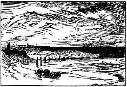
Another important and pleasurable way of expressing unity is by giving some orderly succession to a number of objects more or less similar. And this succession is most interesting when it is connected with some gradual change in the aspect or character of the objects. Thus the succession of the pillars of a cathedral aisle is most interesting when they retire in perspective, becoming more and more obscure in distance; so the succession of mountain promontories one behind another, on the flanks of a valley; so the succession of clouds, fading farther and farther towards the horizon; each promontory and each cloud being of different shape, yet all evidently following in a calm and appointed order. If there be no change at all in the shape or size of the objects, there is no continuity; there is only repetition—monotony. It is the change in shape which suggests the idea of their being individually free, and able to escape, if they liked, from the law that rules them, and yet submitting to it. I will leave our chosen illustrative composition for a moment to take up another, still more expressive of this law. It is one of Turner's most tender studies, a sketch on Calais Sands at sunset; so delicate in the expression of wave and cloud, that it is of no use for me to try to reach it with any kind of outline in a woodcut; but the rough sketch, Fig. 33., is enough to give an idea of its arrangement. The aim of the painter has been to give the intensest expression of repose, together with the enchanted lulling, monotonous motion of cloud and wave. All the clouds are moving in innumerable ranks after the sun, meeting towards the point in the horizon where he has set; and the tidal waves gain in winding currents upon the sand, with that stealthy haste in which they cross each other so quietly, at their edges: just folding one over another as they meet, like a little piece of ruffled silk, and leaping up a little as two children kiss and clap their hands, and then going on again, each in its silent hurry, drawing pointed arches on the sand as their thin edges intersect in parting; but all this would not have been enough expressed without the line of the old pier-timbers, black with weeds, strained and bent by the storm waves, and now seeming to stoop in following one another, like dark ghosts escaping slowly from the cruelty of the pursuing sea.
I need not, I hope, point out to the reader the illustration of this law of continuance in the subject chosen for our general illustration. It was simply that gradual succession of the retiring arches of the bridge which induced Turner to paint the subject at all; and it was this same principle which led him always to seize on subjects including long bridges where-ever he could find them; but especially, observe, unequal bridges, having the highest arch at one side rather than at the centre. There is a reason for this, irrespective of general laws of composition, and connected with the nature of rivers, which I may as well stop a minute to tell you about, and let you rest from the study of composition.
Fig. 33.
All rivers, small or large, agree in one character, they like to lean a little on one side: they cannot bear to have their channels deepest in the middle, but will always, if they can, have one bank to sun themselves upon, and another to get cool under; one shingly shore to play over, where they may be shallow, and foolish, and childlike, and another steep shore, under which they can pause, and purify themselves, and get their strength of waves fully together for due occasion. Rivers in this way are just like wise men, who keep one side of their life for play, and another for work; and can be brilliant, and chattering, and transparent, when they are at ease, and yet take deep counsel on the other side when they set themselves to their main purpose. And rivers are just in this divided, also, like wicked and good men: the good rivers have serviceable deep places all along their banks, that ships can sail in; but the wicked rivers go scoopingly irregularly under their banks until they get full of strangling eddies, which no boat can row over without being twisted against the rocks; and pools like wells, which no one can get out of but the water-kelpie that lives at the bottom;—but, wicked or good, the rivers all agree in having two kinds of sides. Now the natural way in which a village stonemason therefore throws a bridge over a strong stream is, of course, to build a great door to let the cat through, and little doors to let the kittens through; a great arch for the great current, to give it room in flood time, and little arches for the little currents along the shallow shore. This, even without any prudential respect for the floods of the great current, he would do in simple economy of work and stone; for the smaller your arches are, the less material you want on their flanks. Two arches over the same span of river, supposing the butments are at the same depth, are cheaper than one, and that by a great deal; so that, where the current is shallow, the village mason makes his arches many and low; as the water gets deeper, and it becomes troublesome to build his piers up from the bottom, he throws his arches wider; at last he comes to the deep stream, and, as he cannot build at the bottom of that, he throws his largest arch over it with a leap, and with another little one or so gains the opposite shore. Of course as arches are wider they must be higher, or they will not stand; so the roadway must rise as the arches widen. And thus we have the general type of bridge, with its highest and widest arch towards one side, and a train of minor arches running over the flat shore on the other; usually a steep bank at the river-side next the large arch; always, of course, a flat shore on the side of the small ones; and the bend of the river assuredly concave towards this flat, cutting round, with a sweep into the steep bank; or, if there is no steep bank, still assuredly cutting into the shore at the steep end of the bridge.
Now this kind of bridge, sympathising, as it does, with the spirit of the river, and marking the nature of the thing it has to deal with and conquer, is the ideal of a bridge; and all endeavours to do the thing in a grand engineer's manner, with a level roadway and equal arches, are barbarous; not only because all monotonous forms are ugly in themselves, but because the mind perceives at once that there has been cost uselessly thrown away for the sake of formality.[248]
Well, to return to our continuity. We see that the Turnerian bridge in Fig. 32. is of the absolutely perfect type, and is still farther interesting by having its main arch crowned by a watch-tower. But as I want you to note especially what perhaps was not the case in the real bridge, but is entirely Turner's doing, you will find that though the arches diminish gradually, not one is regularly diminished—they are all of different shapes and sizes: you cannot see this clearly in 32., but in the larger diagram, Fig. 34., opposite, you will with ease. This is indeed also part of the ideal of a bridge, because the lateral currents near the shore are of course irregular in size, and a simple builder would naturally vary his arches accordingly; and also, if the bottom was rocky, build his piers where the rocks came. But it is not as a part of bridge ideal, but as a necessity of all noble composition, that this irregularity is introduced by Turner. It at once raises the object thus treated from the lower or vulgar unity of rigid law to the greater unity of clouds, and waves, and trees, and human souls, each different, each obedient, and each in harmonious service.
4. THE LAW OF CURVATURE.
There is, however, another point to be noticed in this bridge of Turner's. Not only does it slope away unequally at its sides, but it slopes in a gradual though very subtle curve. And if you substitute a straight line for this curve (drawing one with a rule from the base of the tower on each side to the ends of the bridge, in Fig. 34., and effacing the curve), you will instantly see that the design has suffered grievously. You may ascertain, by experiment, that all beautiful objects whatsoever are thus terminated by delicately curved lines, except where the straight line is indispensable to their use or stability: and that when a complete system of straight lines, throughout the form, is necessary to that stability, as in crystals, the beauty, if any exists, is in colour and transparency, not in form. Cut out the shape of any crystal you like, in white wax or wood, and put it beside a white lily, and you will feel the force of the curvature in its purity, irrespective of added colour, or other interfering elements of beauty.
Fig. 34.
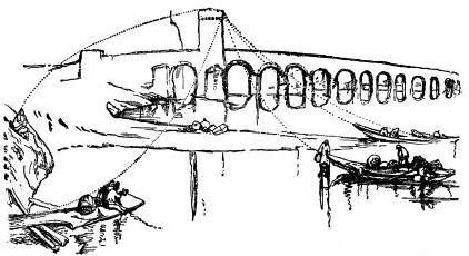
Well, as curves are more beautiful than straight lines, it is necessary to a good composition that its continuities of object, mass, or colour should be, if possible, in curves, rather than straight lines or angular ones. Perhaps one of the simplest and prettiest examples of a graceful continuity of this kind is in the line traced at any moment by the corks of a net as it is being drawn: nearly every person is more or less attracted by the beauty of the dotted line. Now it is almost always possible, not only to secure such a continuity in the arrangement or boundaries of objects which, like these bridge arches or the corks of the net, are actually connected with each other, but—and this is a still more noble and interesting kind of continuity—among features which appear at first entirely separate. Thus the towers of Ehrenbreitstein, on the left, in Fig. 32., appear at first independent of each other; but when I give their profile, on a larger scale, Fig. 35., the reader may easily perceive that there is a subtle cadence and harmony among them. The reason of this is, that they are all bounded by one grand curve, traced by the dotted line; out of the seven towers, four precisely touch this curve, the others only falling back from it here and there to keep the eye from discovering it too easily.
Fig. 35.
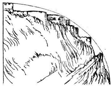
And it is not only always possible to obtain continuities of this kind: it is, in drawing large forest or mountain forms essential to truth. The towers of Ehrenbreitstein might or might not in reality fall into such a curve, but assuredly the basalt rock on which they stand did; for all mountain forms not cloven into absolute precipice, nor covered by straight slopes of shales, are more or less governed by these great curves, it being one of the aims of Nature in all her work to produce them. The reader must already know this, if he has been able to sketch at all among the mountains; if not, let him merely draw for himself, carefully, the outlines of any low hills accessible to him, where they are tolerably steep, or of the woods which grow on them. The steeper shore of the Thames at Maidenhead, or any of the downs at Brighton or Dover, or, even nearer, about Croydon (as Addington Hills), are easily accessible to a Londoner; and he will soon find not only how constant, but how graceful the curvature is. Graceful curvature is distinguished from ungraceful by two characters: first, its moderation, that is to say, its close approach to straightness in some parts of its course;[249] and, secondly, by its variation, that is to say, its never remaining equal in degree at different parts of its course.
This variation is itself twofold in all good curves.
Fig. 36. a b
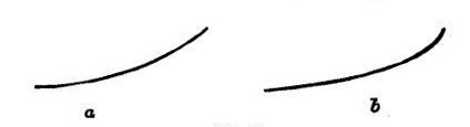
A. There is, first, a steady change through the whole line from less to more curvature, or more to less, so that no part of the line is a segment of a circle, or can be drawn by compasses in any way whatever. Thus, in Fig. 36., a is a bad curve, because it is part of a circle, and is therefore monotonous throughout; but b is a good curve, because it continually changes its direction as it proceeds.
Fig. 37.
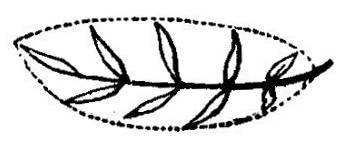
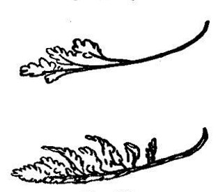
The first difference between good and bad drawing of tree boughs consists in observance of this fact. Thus, when I put leaves on the line b, as in Fig. 37., you can immediately feel the springiness of character dependent on the changefulness of the curve. You may put leaves on the other line for yourself, but you will find you cannot make a right tree spray of it. For all tree boughs, large or small, as well as all noble natural lines whatsoever, agree in this character; and it is a point of primal necessity that your eye should always seize and your hand trace it. Here are two more portions of good curves, with leaves put on them at the extremities instead of the flanks, Fig. 38.; and two showing the arrangement of masses of foliage seen a little farther off, Fig. 39., which you may in like manner amuse yourself by turning into segments of circles—you will see with what result. I hope, however, you have beside you by this time, many good studies of tree boughs carefully made, in which you may study variations of curvature in their most complicated and lovely forms.[250]
Fig. 38.
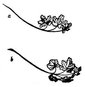
Fig. 39.
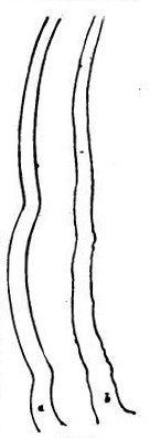
B. Not only does every good curve vary in general tendency, but it is modulated, as it proceeds, by myriads of subordinate curves. Thus the outlines of a tree trunk are never as at a, Fig. 40, but as at b. So also in waves, clouds, and all other nobly formed masses. Thus another essential difference between good and bad drawing, or good and bad sculpture, depends on the quantity and refinement of minor curvatures carried, by good work, into the great lines. Strictly speaking, however, this is not variation in large curves, but composition of large curves out of small ones; it is an increase in the quantity of the beautiful element, but not a change in its nature.
5. THE LAW OF RADIATION.
Fig. 40.
We have hitherto been concerned only with the binding of our various objects into beautiful lines or processions. The next point we have to consider is, how we may unite these lines or processions themselves, so as to make groups of them.
Now, there are two kinds of harmonies of lines. One in which, moving more or less side by side, they variously, but evidently with consent, retire from or approach each other, intersect or oppose each other: currents of melody in music, for different voices, thus approach and cross, fall and rise, in harmony; so the waves of the sea, as they approach the shore, flow into one another or cross, but with a great unity through all; and so various lines of composition often flow harmoniously through and across each other in a picture. But the most simple and perfect connexion of lines is by radiation; that is, by their all springing from one point, or closing towards it: and this harmony is often, in Nature almost always, united with the other; as the boughs of trees, though they intersect and play amongst each other irregularly, indicate by their general tendency their origin from one root. An essential part of the beauty of all vegetable form is in this radiation: it is seen most simply in a single flower or leaf, as in a convolvulus bell, or chestnut leaf; but more beautifully in the complicated arrangements of the large boughs and sprays. For a leaf is only a flat piece of radiation; but the tree throws its branches on all sides, and even in every profile view of it, which presents a radiation more or less correspondent to that of its leaves, it is more beautiful, because varied by the freedom of the separate branches. I believe it has been ascertained that, in all trees, the angle at which, in their leaves, the lateral ribs are set on their central rib is approximately the same at which the branches leave the great stem; and thus each section of the tree would present a kind of magnified view of its own leaf, were it not for the interfering force of gravity on the masses of foliage. This force in proportion to their age, and the lateral leverage upon them, bears them downwards at the extremities, so that, as before noticed, the lower the bough grows on the stem, the more it droops (Fig. 17, p. 295.); besides this, nearly all beautiful trees have a tendency to divide into two or more principal masses, which give a prettier and more complicated symmetry than if one stem ran all the way up the centre. Fig. 41. may thus be considered the simplest type of tree radiation, as opposed to leaf radiation. In this figure, however, all secondary ramification is unrepresented, for the sake of simplicity; but if we take one half of such a tree, and merely give two secondary branches to each main branch (as represented in the general branch structure shown at b, Fig. 18., p. 296), we shall have the form, Fig. 42. This I consider the perfect general type of tree structure; and it is curiously connected with certain forms of Greek, Byzantine, and Gothic ornamentation, into the discussion of which, however, we must not enter here. It will be observed, that both in Figs. 41. and 42. all the branches so spring from the main stem as very nearly to suggest their united radiation from the root R. This is by no means universally the case; but if the branches do not bend towards a point in the root, they at least converge to some point or other. In the examples in Fig. 43., the mathematical centre of curvature, a, is thus, in one case, on the ground at some distance from the root, and in the other, near the top of the tree. Half, only, of each tree is given, for the sake of clearness: Fig. 44. gives both sides of another example, in which the origins of curvature are below the root. As the positions of such points may be varied without end, and as the arrangement of the lines is also farther complicated by the fact of the boughs springing for the most part in a spiral order round the tree, and at proportionate distances, the systems of curvature which regulate the form of vegetation are quite infinite. Infinite is a word easily said, and easily written, and people do not always mean it when they say it; in this case I do mean it; the number of systems is incalculable, and even to furnish any thing like a representative number of types, I should have to give several hundreds of figures such as Fig. 44.[251]
Fig. 41.
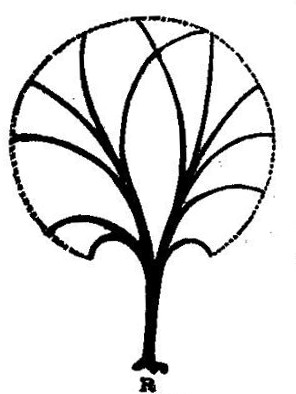
Fig. 42.
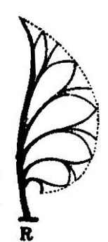
Fig. 43.
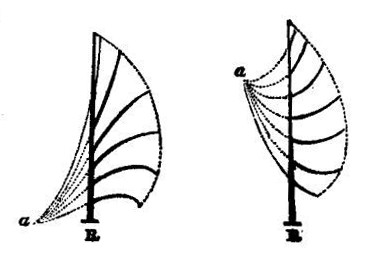
Fig. 44.
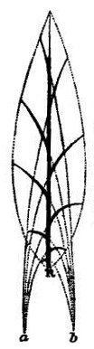
Thus far, however, we have only been speaking of the great relations of stem and branches. The forms of the branches themselves are regulated by still more subtle laws, for they occupy an intermediate position between the form of the tree and of the leaf. The leaf has a flat ramification; the tree a completely rounded one; the bough is neither rounded nor flat, but has a structure exactly balanced between the two, in a half-flattened, half-rounded flake, closely resembling in shape one of the thick leaves of an artichoke or the flake of a fir cone; by combination forming the solid mass of the tree, as the leaves compose the artichoke head. I have before pointed out to you the general resemblance of these branch flakes to an extended hand; but they may be more accurately represented by the ribs of a boat. If you can imagine a very broad-headed and flattened boat applied by its keel to the end of a main branch,[252] as in Fig. 45., the lines which its ribs will take, and the general contour of it, as seen in different directions, from above and below; and from one side and another, will give you the closest approximation to the perspectives and foreshortenings of a well-grown branch-flake. Fig. 25. above, page 316., is an unharmed and unrestrained shoot of healthy young oak; and if you compare it with Fig. 45., you will understand at once the action of the lines of leafage; the boat only failing as a type in that its ribs are too nearly parallel to each other at the sides, while the bough sends all its ramification well forwards, rounding to the head, that it may accomplish its part in the outer form of the whole tree, yet always securing the compliance with the great universal law that the branches nearest the root bend most back; and, of course, throwing some always back as well as forwards; the appearance of reversed action being much increased, and rendered more striking and beautiful, by perspective. Figure 25. shows the perspective of such a bough as it is seen from below; Fig. 46. gives rudely the look it would have from above.
Fig. 45.
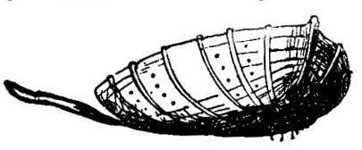
Fig. 46.
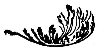
You may suppose, if you have not already discovered, what subtleties of perspective and light and shade are involved in the drawing of these branch-flakes, as you see them in different directions and actions; now raised, now depressed; touched on the edges by the wind, or lifted up and bent back so as to show all the white under surfaces of the leaves shivering in light, as the bottom of a boat rises white with spray at the surge-crest; or drooping in quietness towards the dew of the grass beneath them in windless mornings, or bowed down under oppressive grace of deep-charged snow. Snow time, by the way, is one of the best for practice in the placing of tree masses; but you will only be able to understand them thoroughly by beginning with a single bough and a few leaves placed tolerably even, as in Fig. 38. page 372. First one with three leaves, a central and two lateral ones, as at a; then with five, as at b, and so on; directing your whole attention to the expression, both by contour and light and shade, of the boat-like arrangements, which in your earlier studies, will have been a good deal confused, partly owing to your inexperience, and partly to the depth of shade, or absolute blackness of mass required in those studies.
One thing more remains to be noted, and I will let you out of the wood. You see that in every generally representative figure I have surrounded the radiating branches with a dotted line: such lines do indeed terminate every vegetable form; and you see that they are themselves beautiful curves, which, according to their flow, and the width or narrowness of the spaces they enclose, characterize the species of tree or leaf, and express its free or formal action, its grace of youth or weight of age. So that, throughout all the freedom of her wildest foliage, Nature is resolved on expressing an encompassing limit; and marking a unity in the whole tree, caused not only by the rising of its branches from a common root, but by their joining in one work, and being bound by a common law. And having ascertained this, let us turn back for a moment to a point in leaf structure which, I doubt not, you must already have observed in your earlier studies, but which it is well to state here, as connected with the unity of the branches in the great trees. You must have noticed, I should think, that whenever a leaf is compound,—that is to say, divided into other leaflets which in any way repeat or imitate the form of the whole leaf,—those leaflets are not symmetrical as the whole leaf is, but always smaller on the side towards the point of the great leaf, so as to express their subordination to it, and show, even when they are pulled off, that they are not small independent leaves, but members of one large leaf.
Fig. 47.
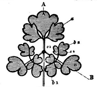
Fig. 47., which is a block-plan of a leaf of columbine, without its minor divisions on the edges, will illustrate the principle clearly. It is composed of a central large mass, A, and two lateral ones, of which the one on the right only is lettered, B. Each of these masses is again composed of three others, a central and two lateral ones; but observe, the minor one, a of A, is balanced equally by its opposite; but the minor b1 of B is larger than its opposite b2. Again, each of these minor masses is divided into three; but while the central mass, A of A, is symmetrically divided, the B of B is unsymmetrical, its largest side-lobe being lowest. Again b2, the lobe c1 (its lowest lobe in relation to B) is larger than c2; and so also in b1. So that universally one lobe of a lateral leaf is always larger than the other, and the smaller lobe is that which is nearer the central mass; the lower leaf, as it were by courtesy, subduing some of its own dignity or power, in the immediate presence of the greater or captain leaf; and always expressing, therefore, its own subordination and secondary character. This law is carried out even in single leaves. As far as I know, the upper half, towards the point of the spray, is always the smaller; and a slightly different curve, more convex at the springing, is used for the lower side, giving an exquisite variety to the form of the whole leaf; so that one of the chief elements in the beauty of every subordinate leaf throughout the tree, is made to depend on its confession of its own lowliness and subjection.