Jackson and His Tradition
Reading edition
The Woodcut Tradition
Although the woodcut is the oldest traditional print medium it was the last to win respectability as an art form. It had to wait until the 1880’s and 1890’s, when Vallotton, Gauguin, Munch, and others made their first unheralded efforts, and when Japanese prints came into vogue, for the initial stirrings of a less biased attitude toward this medium, so long considered little more than a craft. With the woodcut almost beneath notice it is understandable that Jackson’s work should have failed to impress art historians unduly until recent times. Although he bore the brunt as an isolated prophet and special pleader between 1725 and 1754, his significance began to be appreciated only after the turn of the 20th century, first perhaps by Martin Hardie in 1906, and next and more clearly by Pierre Gusman in 1916 and Max J. Friedländer in 1917, when modern artists were committing heresies, among them the elevation of the woodcut to prominence as a first-hand art form. In this iconoclastic atmosphere Jackson’s almost forgotten chiaroscuros no longer appeared as failures of technique, for they had been so regarded by most earlier writers, but as deliberately novel efforts in an original style. The innovating character of his woodcuts in full color was also given respectful mention for the first time. But these were brief assessments in general surveys.
If the woodcut was cheaply held, it was at least acceptable for certain limited purposes. But printing pictures in color, in any medium, was considered a weakening of the fiber—an excursion into prettification or floridity. It was not esteemed in higher art circles, except for a short burst at the end of the 18th century in France and England. This was an important development, admittedly, and the prints were coveted until quite recently. They are still highly desirable. But while Bartolozzi stipple engravings or Janinet aquatints in color might have commanded higher prices than Callots or Goyas, or even than many Dürers and Rembrandts, no one was fooled. The extreme desirability of the color prints was mostly a matter of interior decoration: nothing could give a finer 18th century aura. It was not so much color printing that mattered; it was late 18th century color printing that was wanted, often by amateurs who collected nothing else.
The worship of black-and-white as the highest expression of the graphic arts1 automatically placed printmakers in color in one of two categories: producers of abortive experiments, or purveyors of popular pictures to a frivolous or sentimental public. This estimate was unfortunately true enough in most cases, true enough at least to cause the practice to be regarded with suspicion. As an indication of how things have changed in recent years we can say that color is no longer the exception. It threatens, in fact, to become the rule, and black-and-white now fights a retreating battle. A comparison of any large exhibition today with one of even 20 years ago will make this plain.
At first glance Jackson seems to be simply a belated 18th-century worker in the chiaroscuro process. If to later generations his prints had a rather odd look, this was to be expected. Native qualities, even a certain crudeness, were expected from the English who lacked advantages of training and tradition. And Jackson was not only the first English artist who worked in woodcut chiaroscuro, he was virtually the first woodblock artist in England to rise beyond anonymity2 (Elisha Kirkall, as we shall see, cannot positively be identified as a wood engraver) and he was the only one of note until Thomas Bewick arose to prominence about 1780. He was, then, England’s first outstanding woodcutter. We will find other instances of his significance from the English standpoint, but his being English, of course, would have a small part in explaining the importance of his prints.
Jackson made, in fact, the biggest break in the traditions of the woodcut since the 16th century. He broadened the scope of the chiaroscuro print and launched
But Jackson’s grand ambition to advance the woodcut beyond all other graphic media had little public or private support and finally led him to ruin. His efforts were made with insufficient means and with few patrons. As a consequence, he rarely printed editions after the blocks were cut and proofed. The Venetian set is well known because it was printed in a substantial edition. A few additional subjects were also sponsored by patrons, but most of Jackson’s other chiaroscuros were never published—they were limited to a few proofs. Editions were postponed, no doubt, in the hope that a patron would come along to pay expenses in return for a formal dedication in Latin, but this did not often happen. Most subjects exist in a few copies only; of some, single impressions alone remain. Others have entirely disappeared.
With a large part of Jackson’s work unknown, his reputation settled into an uneasy obscurity which, it must be granted, has not prevented his work from being collected. The chiaroscuros, especially the Venetian prints, can be found in many leading collections in Europe and the United States, but the full-color sheets after Ricci are excessively rare, particularly in complete sets.
Jackson has long been considered an interesting figure. His Essay on the Invention of Engraving and Printing in Chiaro Oscuro...,3 with its bold claims to innovation and merit, his adventurous career as an English woodcutter in Europe, his adaptation of the color woodcut to wallpaper printing and his pioneering efforts in this field, and Papillon’s immoderate attack on him in the important Traité historique et pratique de la gravure en bois4 will be discussed later. For the moment we can say that the Essay was the first book by an Englishman with Book of St. Albans of 1486, with its heraldic shields in three or four colors, and the first book with block-print plates in naturalistic colors.5
Although critics have been interested in Jackson as an historical figure, they have been uncertain about the merit of his work. Opinions vary surprisingly. Most judgments were based on the Venetian chiaroscuros and depended upon the quality of impressions, many of which are poor. Criticisms when they have been adverse have been surprisingly harsh. It is unusual, to say the least, for writers to take time explaining how bad an artist is. To do this implies, in any case, that he warrants serious attention; space in histories is not usually wasted on nonentities. We can see now that Jackson was misunderstood because the uses of the woodcut were rigidly circumscribed by tradition.
Status of the Woodcut
After the 15th century the woodcut lost its primitive power and became a self-effacing medium for creating facsimile impressions of drawings and for illustrating and decorating books, periodicals, and cheap popular broadsides. At its lowest ebb, in the late 17th century, and in the 18th, it was used to make patterns for workers in embroidery and needlework and to supply outlines for wallpaper designs to be filled in later by “paper-stainers.”
The prime deficiency of the woodcut as an art form lay in the division of labor which the process permitted. Draughtsmen usually drew on the blocks; the main function of the cutter was to follow the lines precisely and carefully. Small room existed for individual style or original interpretation; there was little in the technique to distinguish one cutter from another. In spite of these limitations,
The attitude of the print connoisseur was clearly stated as early as 1762 by Horace Walpole:6
I have said, and for two reasons, shall say little of wooden cuts; that art never was executed in any perfection in England: engraving on metal was a final improvement of the art, and supplied the defects of cuttings in wood. The ancient wooden cuts were certainly carried to a great heighth, but that was the merit of the masters, not of the method.
William Gilpin in 1768 went even further. Describing the various contemporary print processes he omitted the woodcut entirely as not worthy of consideration. He acknowledged that “wooden cuts” were once executed by early artists but made no additional reference to the medium.7
As late as 1844 Maberly8 cautioned print amateurs to steer clear of block prints:
Prints, from wooden blocks, are much less esteemed, or, at least, are, generally speaking, of greatly less cost than engravings on copper; and there are connoisseurs who may, perhaps, consider them as rather derogatory to a fine collection.
Specialized histories of wood engraving, written mainly by 19th-century practitioners and bibliophiles, have tended to emphasize literal rendition rather than artistic vision. The writers favored wood engraving executed with the burin on the end grain of hard dense wood, such as box or maple, because it could produce 9
... The poorest workman may suffice for an excellent chiaroscuro. I do not depreciate the artistic value as chiaroscuros of the various prints here noted nor underestimate the difficulty of production; but my business has been solely with the not difficult knifecutting and graver cutting of the same.
The Chiaroscuro Tradition
The chiaroscuro woodcut was originally designed to serve a special purpose, to reproduce drawings of the Renaissance period. These were often made with pen and ink on paper prepared with a tint or with brush and wash tones on white or tinted paper. Highlights were made and modeled with brush and white pigment; the result had something of a bas-relief character. Neither line engraving nor etching was suited to reproducing these spirited drawings, but the chiaroscuro woodcut could render their effects admirably. Its nature, therefore, was conceived as fresh and spontaneous, as printed drawing, in fact.
Chiaroscuros were usually of two types, the German and the Italian. The Germans specialized in reproducing line drawings made on toned paper with white highlights. The woodcuts, however, could stand by themselves as black-and-white prints; the tones required separate printing. The typical German chiaroscuro was therefore from two blocks. The earliest dated print in this style is Lucas Cranach’s Venus, with “1506” appearing on the black block. But the brown tint
The Italian style originated with Ugo da Carpi, who in 1516 petitioned the Senate in Venice to grant him exclusive rights to the chiaroscuro process, which he claimed to have invented. For many years, until Bartsch adduced proof in favor of the Germans, da Carpi was conceded to be the founder of this process. His first work dates from 1518 but obviously he produced prints earlier—how much earlier is uncertain. Working mainly after the loose, fresh wash drawings of Raphael and Parmigianino he developed a method of reducing their tonal constituents to two or three simple areas plus a partial outline, each of which was cut on a separate block. The blocks were then inked with transparent tones and printed one over the other to achieve gradations. White highlights were imitated, as in the German manner, by cutting out lines on a tone block to let the white paper assert itself. The result was a broadly treated facsimile of the original drawing. Some liberties were occasionally taken in interpretation, and sometimes fanciful changes were made in color combinations.
This technique was followed in Italy during the remainder of the 1500’s, the most prominent early workers being Antonio da Trento (Fantuzzi), Domenico Beccafumi, and Giuseppe Niccolò Vicentino. Late in the century Andrea Andreani acquired a large number of blocks by previous Italian chiaroscurists and reissued them, adding his own monogram. By multiplying these subjects he reduced their rarity and emphasized their distinct character, their difference from other types of prints. The Italian term “chiaroscuro,” meaning light and dark, has persisted as a generic name for this class of work.
The Italian and German techniques were often pursued in variant styles. The Germans sometimes used three blocks, with outlines not only in black but in a tone and white as well. Burgkmair’s Death as a Strangler (B. 40)10 and Wechtlin’s Alcon Freeing his Son from the Serpent (B. 9) are of this type.
The Italians, in turn, often used two blocks in the German fashion, reproducing a complete crosshatched pen drawing with one tint block. Even da Carpi used this procedure more than occasionally, as in St. John Preaching in the Desert The Harvest after Giulio Romano (B. XII). Most other Italian chiaroscurists made frequent use of this method which had the virtue of simplicity. Outstanding exponents included Niccolò Boldrini, who worked chiefly after drawings by Titian, and in the early 17th century the brothers Bartolomeo and G. B. Coriolano. Andreani’s prints were usually in a more independent style which employed a clear outline in gray or soft brown with three tints blocks. While technical procedures were identical in Italian and German chiaroscuros after pen drawings, the Italian work tended to be looser than the German, which was more careful and methodical.
The Italian style, then, strictly interpreted, was simply the da Carpi style. Less rigorously considered, it included the free Italian variants of the German process.
Hendrick Goltzius of Haarlem, whose first chiaroscuros date from 1588, combined both Italian and German influences with marvelously crisp drawing and cutting and sharper color combinations than were common. Paulus Moreelse, a Dutch artist in the first half of the 17th century, employed a dark block in clear outline but modeled his forms internally in the da Carpi manner. The technical procedure was therefore close to Andreani’s.
A number of other well-known artists including Simon Vouet and Christoffel Jegher, and quite a few anonymous ones, also turned out occasional pieces in the first half of the 17th century, generally in the manner of da Carpi or Goltzius. Perhaps the most prolific was Ludolph Businck, who created prints in France especially after drawings by George Lallemand.
After this period little was done in the medium until 1721, when Count Antonio Maria Zanetti in Venice made his first chiaroscuro woodcut. He worked consistently for almost thirty years and sent proofs to his friends in Europe, mostly important connoisseurs, through whom the prints became widely known. For the most part they were in the da Carpi style, to which he added a light charm. Between 1722 and 1724 Elisha Kirkall in London published twelve chiaroscuros after Italian masters. The prints were done in a combination of media—etching and mezzotint with relief blocks in either wood or metal—and were outside the woodcut tradition, but they attracted attention to the old process. In about 1726 Nicolas and Vincent Le Sueur in Paris produced some chiaroscuros, and a year later Jackson made his first example. The Le Sueurs followed da Carpi’s method while Jackson used a
One characteristic was shared in common by all early chiaroscurists; their work always reproduced drawings, usually in exact size. Jackson added a new dimension to the medium in 1735 by beginning to work after oil paintings.11 His attempt to convey their scale, solidity, and tonal range, while retaining the woodcut’s breadth of execution, was perhaps carrying the chiaroscuro into complexities for which it was not suited. The method called for extraordinary talents in planning, drawing, cutting, and printing, and it resulted in impressions that could not escape a certain heaviness of effect when compared with traditional work. Jackson’s prints in this style are both daring and original, but no later woodcutter had either the desire or the temerity to follow his example. The method remained a dead end in chiaroscuro.
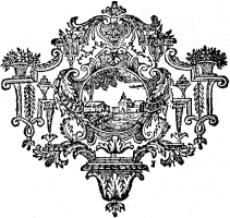
Tailpiece in L’Histoire naturelle éclaircie dans une de ses parties principales, l’oryctologie, by D. d’Argenville, De Bure, Paris, 1755. This is one of the cuts Jackson made between 1725-1730. Actual size. Enlarged view.