PROOFREADER’S MARKS
Reading edition
When correcting or marking proof, make use of the marks reproduced on the following page which are understood by all printers and machine operators. The marks should be used with care. Always be sure that your correction is clear, or that you have marked a change or alteration so that it will be understood immediately.
There are two ways of marking proof. If the work is fussy, as on textbooks, expensive cloth-bound books, and so on, the proofreader may go very slowly. Corrections are usually marked within the line: a caret showing an omission, a line drawn through a letter to be deleted or for which some other letter or character is to be substituted, etc. The actual correction—mark for “delete,” letter or character to be inserted or substituted, punctuation to be inserted or substituted, etc.—is then put in the margin, either at the left or right, whichever is the more convenient. If there is more than one correction in one line, each correction in the margin should be separated from any other by a diagonal line. This method of marking proof is shown in the back of Webster’s New International Dictionary, and in Funk and Wagnalls New Standard Dictionary in the vocabulary under the word proof. It would be well for the student to study these plates.
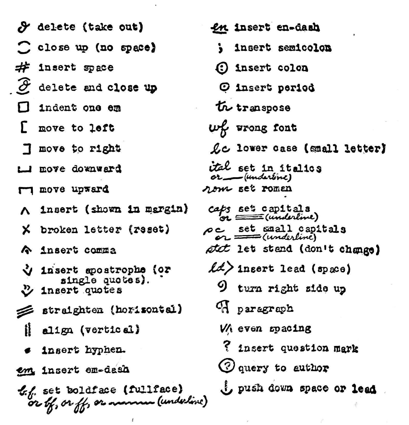
Proofs for book-publishers are usually to be marked in ink. The proofs are pulled on paper which will take ink without smearing or blotting. Proofs for newspapers are commonly marked rather hastily with pencil. Many proofreaders, working rapidly, do not follow the long-established proofreader’s marks exactly. Instead of making a caret or line within the line, to show the exact spot of the correction, and writing the correction in the margin opposite the line, these proofreaders put their pencil where the correction belongs and draw out a line to the margin, placing the correction at the end of this guide-line. “Delete” is then indicated by simply putting a “pig’s tail” (an upward curl, like the script letter e) on the end of the line so drawn out. The symbol used for “delete” by more carefully precise proofreaders is the Greek letter delta (script). The “pig’s tail” is all that remains of the curl in the Greek delta, in the markings of many modern proofreaders.
A word should be said—that, so far as this humble author knows, has never yet been said—about the samples of proofreading given in the dictionaries. In both Webster’s New International and the New Standard, in the short specimens shown, dozens of errors are marked. They are, if one may be frank, just howlers. To correct these specimens, many marks are necessary, and it is also necessary to reset the entire matter in each case, from first line to last. If a proofreader in practice were presented with such a dirty piece of type to read, he would, of course, not trouble to mark it. He would mark it “Kill,” and send the copy back to be reset! And what is more, the typesetter would probably lose his job!
Printer’s proofreaders sometimes indicate any corrections or alterations that are changes from copy by circling them. This shows the composing-room foreman that his typesetter is not responsible for all the errors marked. If this is not done, and many changes are made, the foreman might tell the typesetter to get his hat and coat and look elsewhere for work. A typesetter is expected to make some mistakes, but he is not by any means permitted to run wild.
It is difficult to state what is the average percentage of errors a proofreader may expect. In general, short lines (sixteen ems wide or less), contain fewer errors than long lines (20 to 30 or 40 ems), as is to be expected. Matter set in short lines is consequently easier to proofread. Straight text, set in clear roman type, is easier to read between the sizes of eight- and twelve-point, than is type smaller than eight or larger than twelve (or perhaps fourteen-point). The proofreader should adjust his time and attention accordingly. Matter set throughout in italics, or in small capitals or capitals, is usually somewhat harder to read carefully than clear roman type. Such matter should therefore be given more concentrated attention.
The manner of reading proof depends upon the idiosyncrasy of each reader. Good light, a comfortable chair, a desk at the right height—these are essentials. Some readers find it helpful to run a card down the page or galley disclosing a line at a time. A proofreader of the author’s acquaintance had the habit of rolling an octagonal pencil down the galleys, uncovering a line and pausing as each line was read. Other readers use no such guidance, but read as they would read a book, only more slowly.
A reader must develop a “proofreader’s eye.” The ordinary raeder of papers or books reads much more rapidly than a proofreader can let himself read. The ordinary reader forms the habit of grasping entira words and groups of words. Frequently the eye of such a reader will accept the apparent form of a word for the word itself; this is shown by misreadngs that everyone constantly makes. Many typographical errors persist in books, but few readers ever notice them there; though this is no excuse for proofreaders to leave them there! As a test for you, the reader of this book, at least three typographical errors have been allowed to stand in this paragraph up to this point—how many of them did you notice?
A few words may be helpful as to wrong fonts. A wrong font (marked “w.f.,” or, often, “wf”) is a letter of a type-style or size that does not belong. A wrong font may be an italic letter in roman type, an eight-point letter in seven- or nine-point type, a boldface letter in roman type, etc. If you are the first proofreader, reading directly after the matter is set, you must call a wrong font to the attention of the typesetter immediately (if it is machine composition). Otherwise the wrong font letter will persist throughout the matter at regular intervals. Note: An italic letter in roman type is a chance occurrence, and need not be called to the attention of the operator if italics are a part of the font; similarly with boldface wrong fonts. However, a boldface letter may get into an italic font of the same size and style—this should, of course, be called to the operator’s attention. Some wrong fonts are exasperatingly difficult to detect: you must train your eyes to catch them. Familiarize yourself with type styles to help you in this.
Modern machine line-composition cannot have letters upside down—it is mechanically impossible. The proofreader’s mark for an inverted letter, therefore, would be of use only in correcting handset or monotype composition. An entire line may, however, be inserted upside down, especially in revised proofs.