APPENDICES
Reading edition
125
APPENDIX A DEFINITIONS
ABSOLUTE COLORS: see Local Colors.
ADVANCING COLORS: those of the longer wave lengths; those that seem to come forward; but each color only advances or recedes according to its relation to some other color. See Luminosity.
ANALOGOUS HARMONY: see Harmony.
BEAM OF LIGHT: a linear portion[16] of light made of a number of rays.
BRIGHTNESS: see Luminosity.
BROKEN COLOR: a color changed by the addition of black and white or gray.
COLD COLORS: those of the shorter wave lengths, such as green, blue, and violet.
COLOR: an internal sensation, produced by various causes, chiefly by waves of incomplete light acting on the eye; as used by artists, the rich, harmonious effect, or full appearance produced by certain combinations of colors.
COLOR CHART: a systematic arrangement of colors in a geometrical design such that every variation and 126combination of hue, tint, and shade is in its proper place and in correct relation to all other hues, tints, and shades.
Advancing Colors, see under Advancing;
Bright „ „ „ Brightness;
Broken „ „ „ Broken;
Cold „ „ „ Cold;
Complementary „ „ „ Complement;
Complements of „ „ „ „
Constants of „ „ „ Constants;
Contrast of „ „ „ Contrast;
Harmony of „ „ „ Harmony;
Hue of „ „ „ Hue;
Intense „ „ „ Saturated;
Local „ „ „ Local;
Luminosity of „ „ „ Brightness;
Luminous „ „ „ Luminous;
Neutral „ „ „ Neutral;
Normal „ „ „ Normal;
Opaque „ „ „ Opaque;
Pigment „ „ „ Pigment;
Primary „ „ „ Primary;
Prismatic „ „ „ Prismatic;
Pure „ „ „ Pure;
Quality of „ „ „ Constants;
Saturated „ „ „ Saturated;
Secondary „ „ „ Secondary;
Spectral „ „ „ Normal;
127Tertiary „ „ „ see under Tertiary;
Transparent „ „ „ Transparent;
Value of „ „ „ Values;
Warm „ „ „ Warm.
COMPLEMENTS or
COMPLEMENTARY COLORS: any color and the color of its after-image; any two colors which when mixed make white.
COMPOUND or MIXED COLOR: a color changed or neutralized by the addition of another color or colors.
CONSTANTS or QUALITIES OF COLORS: Hue, Purity, and Luminosity.
CONTRAST: see Simultaneous Contrast, page 53.
CONTRASTED HARMONY: see Harmony.
DIFFRACTION GRATING: a polished metal or brass surface ruled with fine lines and used instead of a prism to divide a ray of light and produce a spectrum.
DOMINANT HARMONY: see Harmony.
DOMINANT HUE: see Hue.
HARMONY: the pleasing effect due to the action upon each other of colors improved and made more beautiful by being put together; such an agreement between the different hues, tints, or shades of a design as will produce unity of effect.
Analogous Harmony: an agreeable combination of colors that are related to a fundamental color.
Complex Harmony: an agreeable combination of three 128or more colors, or with the addition of black or white, or gray, or gold, or silver, or any or all of them.
Contrasted or Complementary Harmony: an agreeable combination of any pair of complementary colors, or of their tints or shades, or tints and shades.
Dominant Harmony: an agreeable combination of colors in which one color predominates by modifying all the other colors, by serving as a ground, or by being added in small portions all over the design.
One-color Harmony, also called a Harmony of Self-tones: an agreeable combination of one color used in tints or shades, or tints and shades, or hue and tints, or hue and shades, or hue, tints, and shades.
HUE: color, by wave length, much the same as color; the chief quality by which one color differs from another color, as red differs from blue or green.
Dominant Hue: the hue which predominates through the larger part of a design or composition.
INTENSE: see Saturated.
LIGHT: the chief agent that produces vision.
LOCAL COLOR: the actual color of an object unaffected by shadows or reflected lights.
LUMINOSITY: the strength of the light sent to the eye by any color; a luminous color sends more than a non-luminous one.
LUMINOUS COLORS: those which reflect light in large quantities; the colors of the long wave lengths are more luminous than those of the short ones.
129NEUTRAL COLORS: a term often incorrectly applied to black, white, gray, gold, and silver.
NORMAL, SPECTRAL, PRIMITIVE, or PRISMATIC COLORS: those seen in the rainbow and the solar spectrum are generally accepted as such and are used as the standard for the study of colors. Pigment colors can only imitate these colors imperfectly.
OIL COLORS: pigments ground in oil.
OPAQUE COLORS: pigment colors which are so thick that paper or canvas cannot be seen through them.
PIGMENTS: materials from which paints, inks, dyes, and stains are made.
PIGMENT COLORS: paints, inks, dyes, and stains used in the fine and industrial arts.
PRIMARY COLORS: red, blue, and yellow; so called because it was supposed that all other colors could be made from them.
PRIMITIVE COLORS: see Normal Colors.
PRISM: a triangular or three-sided bar of clear glass.
PRISMATIC COLORS: those that appear when a ray of white light shines through a prism. See Normal Colors.
PURE COLORS: those unmixed with white light or any other color; those of the spectrum.
PURITY OF COLORS: the absence of an admixture of any other color or colors, or white or black.
QUALITIES OF COLORS: see Constants of Colors.
RAY OF LIGHT: a small linear portion or streak of light which may be white or any color.
130RECEDING COLORS: those which seem to retire or recede from the eye; those of the short wave lengths.
RETINA: a thin inner lining of the eye. See page 20.
SATURATED or INTENSE COLORS: colors that are pure and luminous to their greatest extent; without any mixture of white light.
SECONDARY COLORS: orange, green, and violet; so called because it has been thought they were made from combinations of the primary colors.
SELF-TONES: see Tone.
SHADE: a tone of a color darkened by the addition of black pigments to paints, inks, dyes, and stains, or by the action of diminished light on immaterial colors.
SHADOW: about the same as shade, as generally used, but for the sake of clearness it is best to designate by shadow those parts of an object which do not receive any direct rays of light, while those surfaces which receive but little direct light, and are thus intermediate in value between the light and the shadow, are called shade surfaces. Then the term cast-shadow denotes the shadow projected by one body on another body or surface.
SOLAR SPECTRUM: see Spectrum.
SPECTRAL COLORS: see Normal Colors.
SPECTRUM: the result of the decomposition of a ray of sunlight into all the colors which form it; the streak of colors formed by a ray of light that has passed through a prism or over a Diffraction Grating.
STANDARD COLORS: those of the spectrum.
131TERTIARY COLORS: citrine, olive, and russet, so called because it has been thought that they were made from combinations of the secondary colors.
TINT: a tone of a color produced by the addition of white to oil, water to water, and white light to immaterial colors.
TONE: the given state of a color as it may be pure, luminous, broken, compound, a tint, or a shade.
Self-tones: tones of the same color.
TRANSPARENT COLORS: those in which the color tints the paper or canvas, which shows through the color, thus helping to produce the effect.
VALUES: the relative amount of light contained in the different colors of a picture, design, or composition; the lightest or most luminous being called the highest in value.
WARM COLORS: those of the longer wave lengths, as yellow, orange, and red.
WATER COLORS: pigments prepared to be used with water.
WAVE LENGTHS OF COLORS: objects having no color in themselves possess the power of reflecting waves of light; waves of light of varying lengths give us the effect of color. Either the amount of motion of the ether, or height of the wave, produces the intensity or brightness of the light, and the length of the wave produces the color; red has a wave length of about 7000/250,000,000 of an inch, orange 5979/250,000,000, yellow 5802/250,000,000, green 5272/250,000,000, blue 4732/250,000,000, and violet 4059/250,000,000.
133
APPENDIX B
As whatever may be of value in this little work on a theme so large and complex as color must of necessity be drawn largely from what has been written before, the following list of books and authors is given, partly as having been referred to during its preparation, and partly as a suggestion for further reading to any student of color who can afford the time and labor necessary to the acquisition of a larger and wider comprehension of a subject which can be treated only scantily enough within the scope of a single small volume.
Although no pretence is here made to completeness as bibliography, yet it is believed that the fifty works enumerated below fairly cover the history of color and of its ever-growing relation to Art and Manufacture. For the sake of convenience the list is chronologically arranged.
134A Treatise on Painting. By Leonardo da Vinci. (London, 1835: Nichols & Sons.) (Translation.)
Colour. By M. E. Chevreul. (London, 1839: Geo. Bell & Sons.) (Translation.)
Theory of Colour. By J. W. von Goethe. (London, 1840: J. Murray.) (Translation, with notes, by Sir Chas. Eastlake.)
Rudiments of the Painter’s Art; or a Grammar of Colouring. By George Field. (London, 1850: Weale.)
Darstellung der Farbenlehre und optische Studien. By W. H. Dove. (Berlin, 1853.)
Researches on Colour-blindness. By G. Wilson. (Edinb., 1855: Sutherland & Knox.)
Grammar of Ornament. By Owen Jones. (London, 1856.)
On Colour (ETC.). By Sir J. S. Wilkinson. (London, 1858: J. Murray.)
Die Farbenharmonie in ihrer Anwendung auf die Damentoilette. By R. Adams. (Leipzig, 1862: J. J. Weber.)
Practical Hints on Colour in Painting. By John Burnet. (London, 1865: J. & J. Leighton.)
Des Couleurs au Point de Vue Physique, Physiologique Artistique et Industriel. By Ernst Bruecke. (Paris, 1866: J. B. Baillière & fils.)
The Principles of the Science of Colour. By William Benson. (London, 1868: Chapman & Hall.)
Color. By M. É. Cavé. (New York, 1869.) (Translation.)
Manual of the Science of Colour. By W. Benson. (London, 1871: Chapman & Hall.)
135The Theory of Colouring. By J. Bacon. (London, 1872: G. Rowney & Company.)
L’Ornement Polychrome. By A. Racinet. 2 vols. Fo. (Paris, 1873–86: Firmin Didot.)
A Grammar of Colouring applied to Decorative Painting and the Arts. By George Field. (London, 1875: Lockwood & Company.)
Theory of Color. By Dr. Wilhelm von Bezold. (Boston, 1876: L. Prang & Company.) (Translation.)
Die geschichtliche Entwickelung des Farbensinnes. By Hugo Magnus. (Leipzig, 1877: Veit.)
The Principles of Light and Color. By E. D. Babbitt. (New York, 1878: Babbitt & Company.)
Complément des Études sur la Vision des Couleurs par E. Chevreul. By M. E. Chevreul. (In Institut de France. Académie des Sciences—Memoires. T. 41, partie 2.) (Paris, 1879.) (English translations exist.)
Modern Chromatics, with Application to Art and Industry. By O. N. Rood. (New York, 1879: D. Appleton.)
The Colour Sense: its Origin and Development. By Grant Allen. (London, 1879: Trübner & Company.)
Color-Blindness. By B. Joy Jeffries. (London, 1879.)
A Handbook for Painters and Art Students on the Character and Use of Colours. By W. J. Muckley. (London, 1880: T. & C. Baillière.)
Sight; an Exposition of Monocular and Binocular Vision. By Joseph Le Conte. (New York, 1881: D. Appleton & Company.)
136Untersuchungen über den Farbencontrast vermittelst rotirender Scheiben. By G. B. T. Schmerler. (Leipzig, 1882: W. Engelmann.)
La Grammaire de la Couleur. By E. Guichard. 3 vols. (Paris, 1882: H. Cagnon.)
Die Farbenwelt. By Max Schasler. (Berlin, 1883: C. Habel.)
The Laws of Contrast of Colour and Their Application to the Arts and Manufactures. By M. E. Chevreul. (London, 1883: Routledge.) (Translation.)
Colour. By A. H. Church. (London, 1887: Cassell & Company.)
Il Libro dei Colori. Segreti del Secolo XV. Da O. Guerrini & C. Ricci. (Bologna, 1887: Romagnoli Dall’ Acqua.)
Colour, An Elementary Treatise. By C. T. Whitmell. (Cardiff, 1888: W. Lewis.)
F. C. Schroeder’s “Systematic Index.” By F. C. Schroeder. (Boston, 1888: F. C. Schroeder.)
Iris: Studies in Colour and Talks about Flowers. By A. F. Dielitzsch. (Edinburgh, 1889: T. & T. Clark.) (Translation.)
Répertoire Chromatique. By Charles La Couture. (Paris, 1890: Gauthier, Villars & Fils.)
The Chemistry of Paints and Painting. By A. H. Church. (London, 1890: Seeley & Company.)
Colour in Woven Design. By R. Beaumont. (London, 1890: Whittaker & Company.)
137Colour-Blindness and Colour-Perception. By F. W. Edridge Green. (London, 1891: Kegan Paul, Trench, Trübner & Company.)
A Text-Book of Physiology. By M. Foster. (London, 1891: Macmillan & Company.)
Flowers of Japan and the Art of Floral Arrangement. By Condor. (Yokohama, 1891: Kelly & Walsh.)
Colour Measurement and Mixture. By W. de W. Abney. (London, 1891.)
Harmonious Colouring. 3 vols. Fo. By C. H. Wilkinson. (Manchester, 1891: Harmonious Colouring Company.)
Colour Vision. By E. Hunt. (Glasgow, 1892: Smith.)
On a Color System. By O. N. Rood. (New Haven, 1892.)
Students’ Text-Book of Color; or, Modern Chromatics. By O. N. Rood. (New York, 1892: D. Appleton & Company.)
Colour Vision. By W. de W. Abney. (London, 1895; Low.)
Color-Vision and Color-Blindness. By J. E. Jennings. (Phila., 1896: Davis Company.)
Colour in Nature. A Study in Biology. By M. I. Newbegin. (London, 1898: J. Murray.)
I
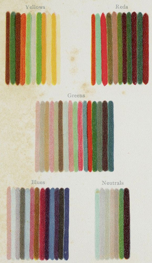
Plate I WOOLS AS SORTED BY A COLOR-BLIND MAN
II
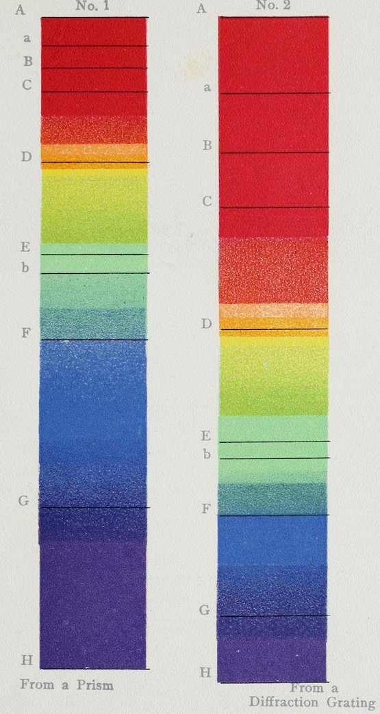
Plate II SOLAR SPECTRA
III
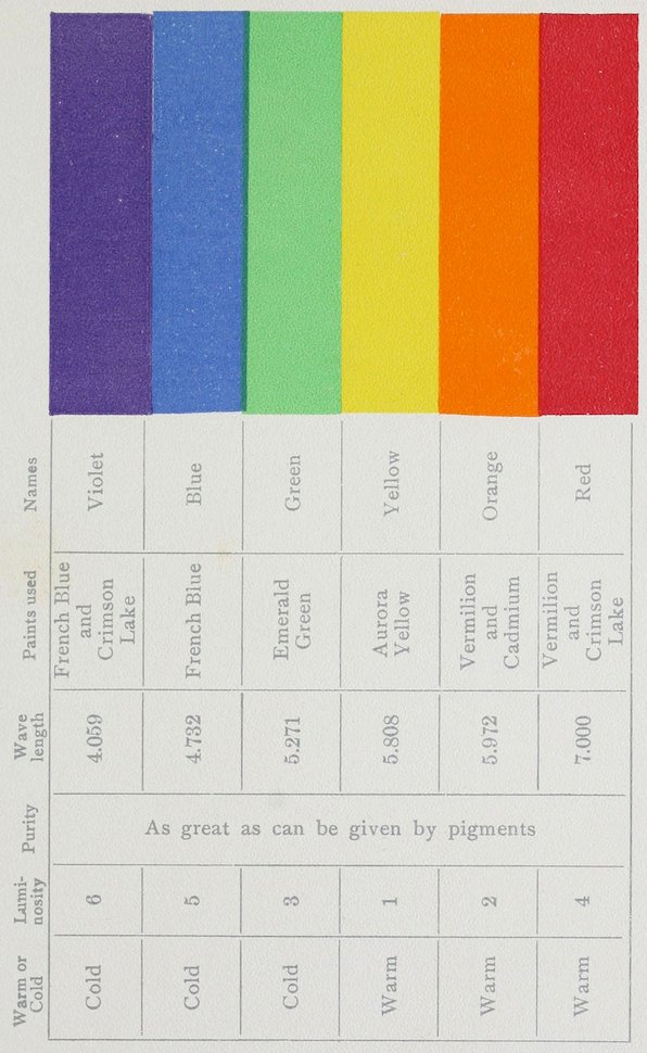
Plate III
TABLE OF SPECTRAL COLORS
Names Paints used Wave length Purity Luminosity Warm or Cold
Violet French Blue and Crimson Lake 4.059 As great as can be given by pigments 6 Cold
Blue French Blue 4.732 5 Cold
Green Emerald Green 5.271 3 Cold
Yellow Aurora Yellow 5.808 1 Warm
Orange Vermilion and Cadmium 5.972 2 Warm
Red Vermilion and Crimson Lake 7.000 4 Warm
IV
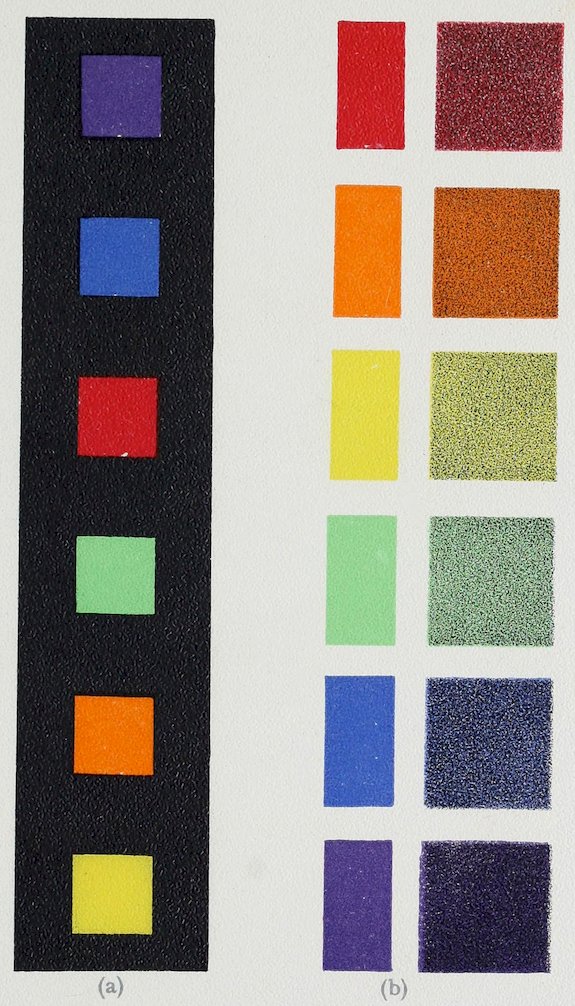
Plate IV THE SPECTRAL COLORS
(a) In their order of Luminosity
(b) Pure and Grayed
V
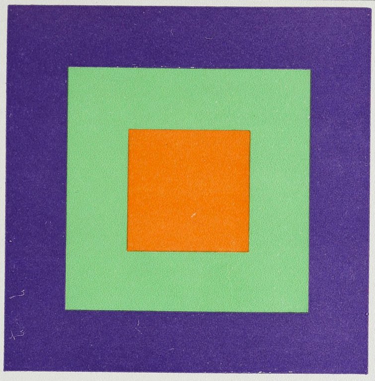
Plate V ADVANCING AND RETIRING COLORS
VI
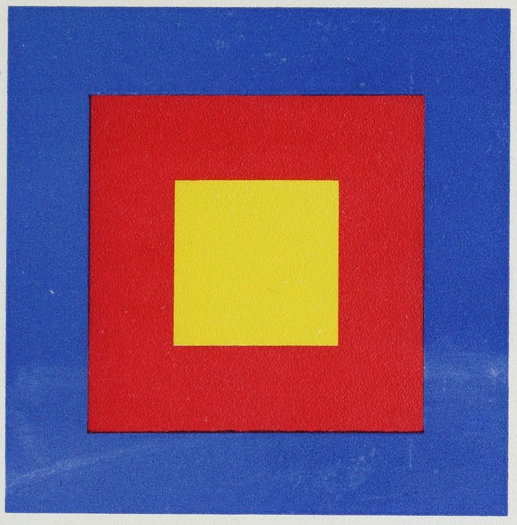
Plate VI ADVANCING AND RETIRING COLORS See page 99. The color screens at end of volume are for use with this plate.
VII
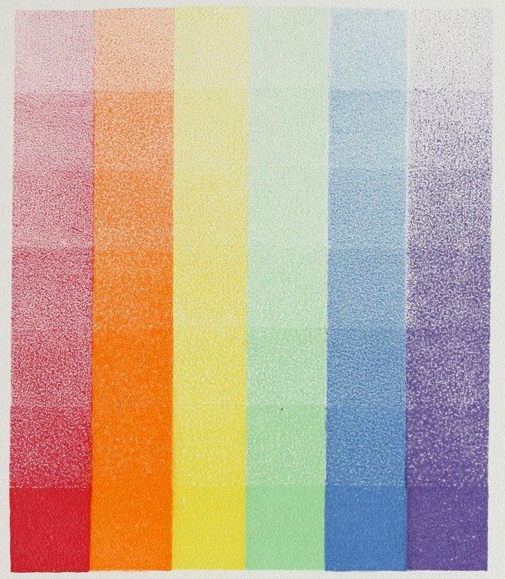
Plate VII TINTS
VIII
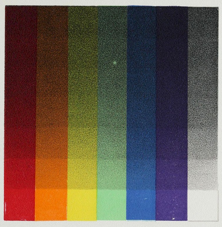
Plate VIII SHADES
IX
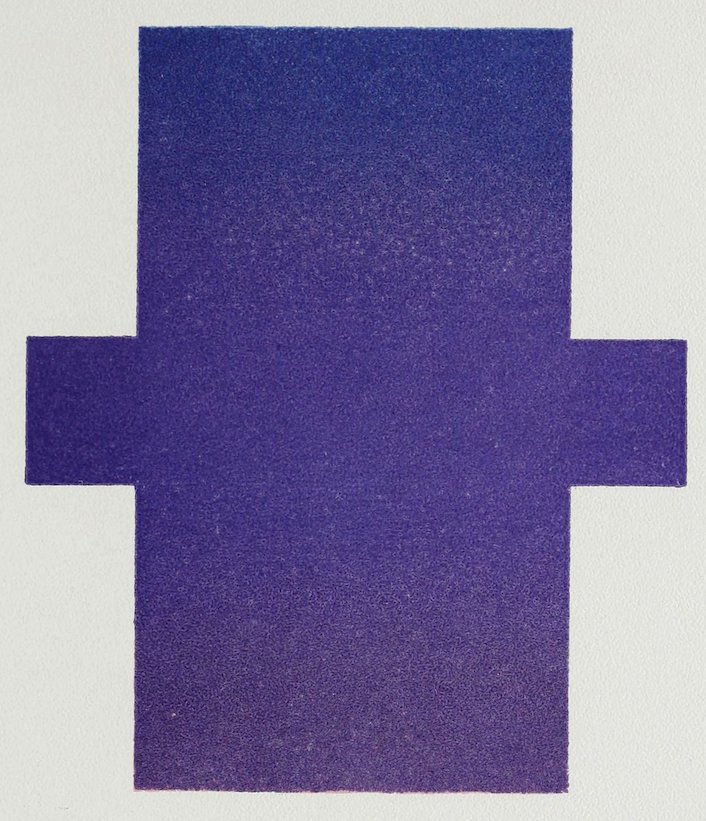
Plate IX VIOLET with its extremes
X
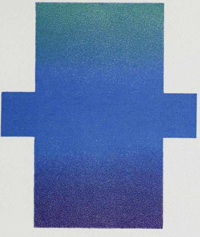
Plate X BLUE with its extremes
XI
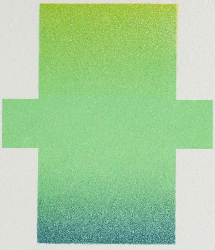
Plate XI GREEN with its extremes
XII
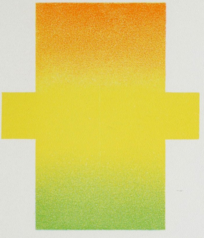
Plate XII YELLOW with its extremes
XIII
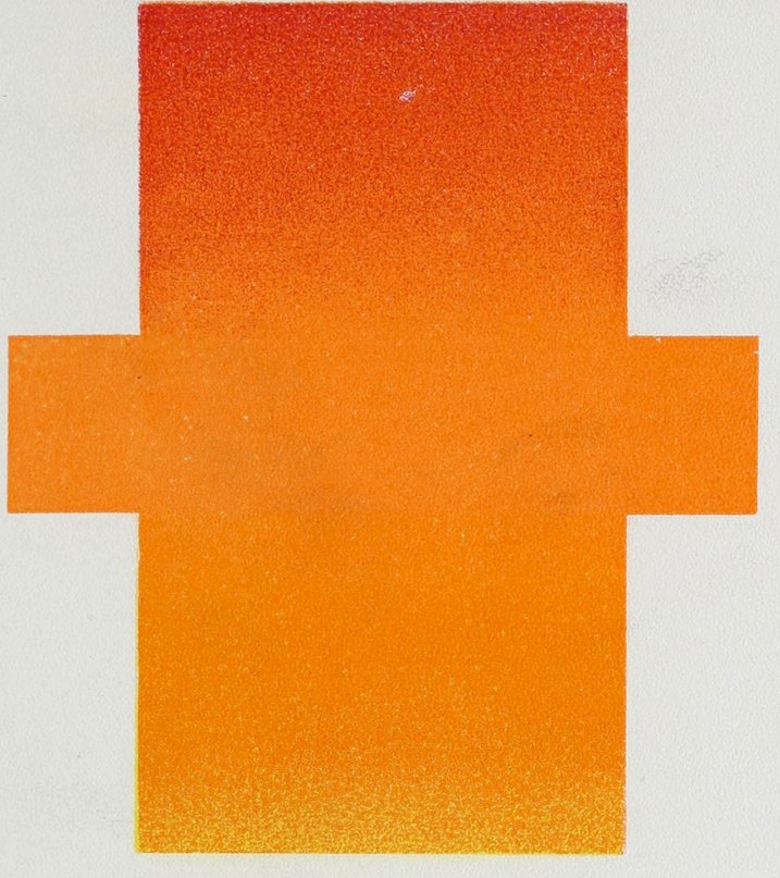
Plate XIII ORANGE with its extremes
XIV
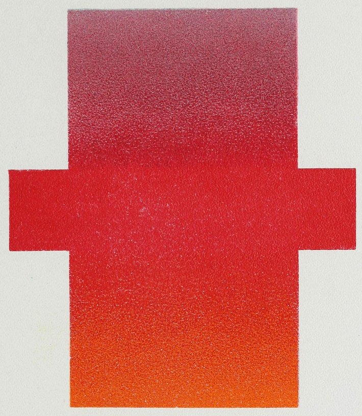
Plate XIV RED with its extremes
XV
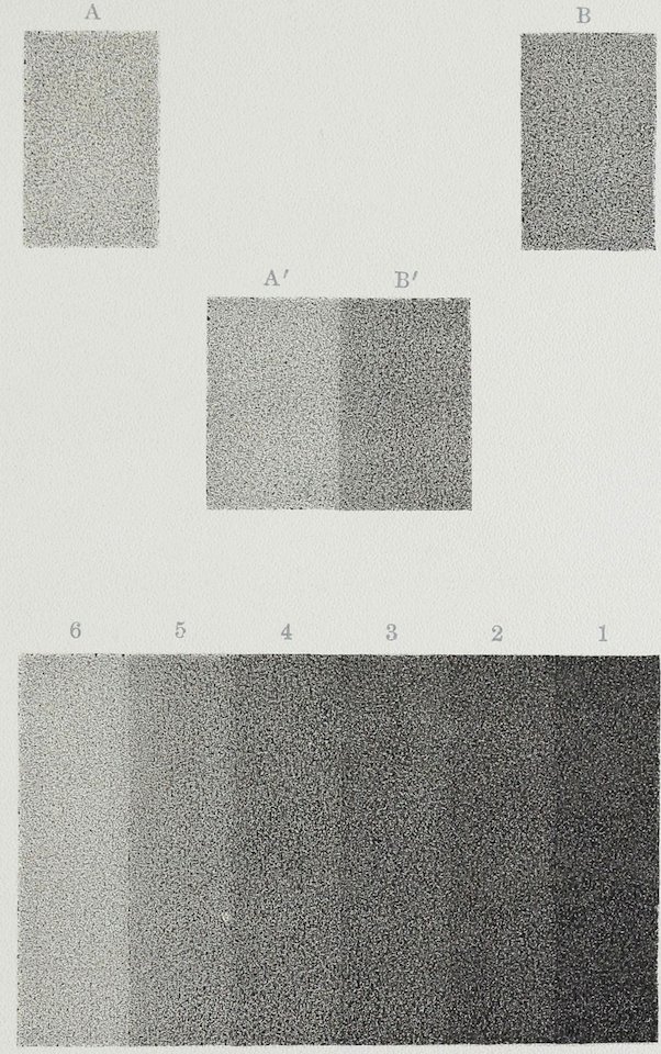
Plate XV SHADES BY CONTRAST
XVI
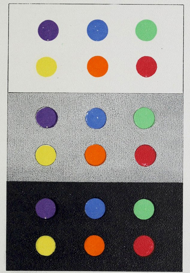
Plate XVI SPECTRAL COLORS ON BLACK, WHITE AND GRAY
XVII
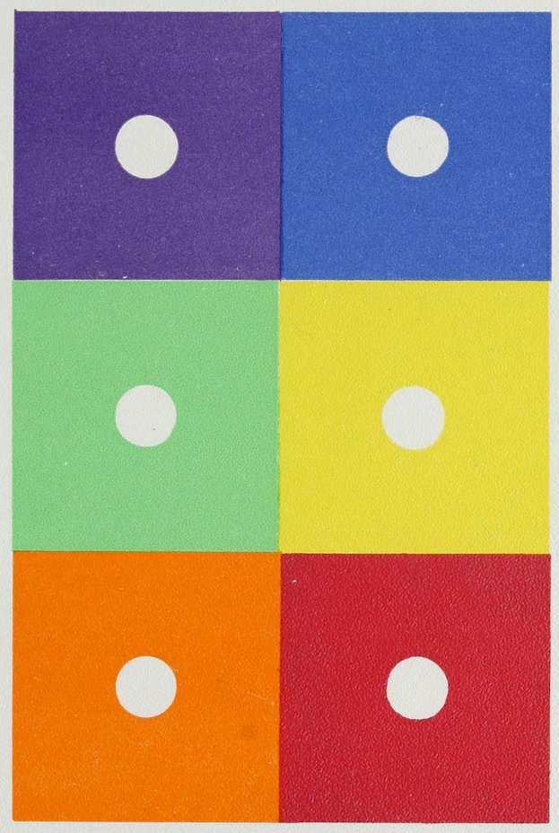
Plate XVII WHITE ON SPECTRAL COLORS
XVIII
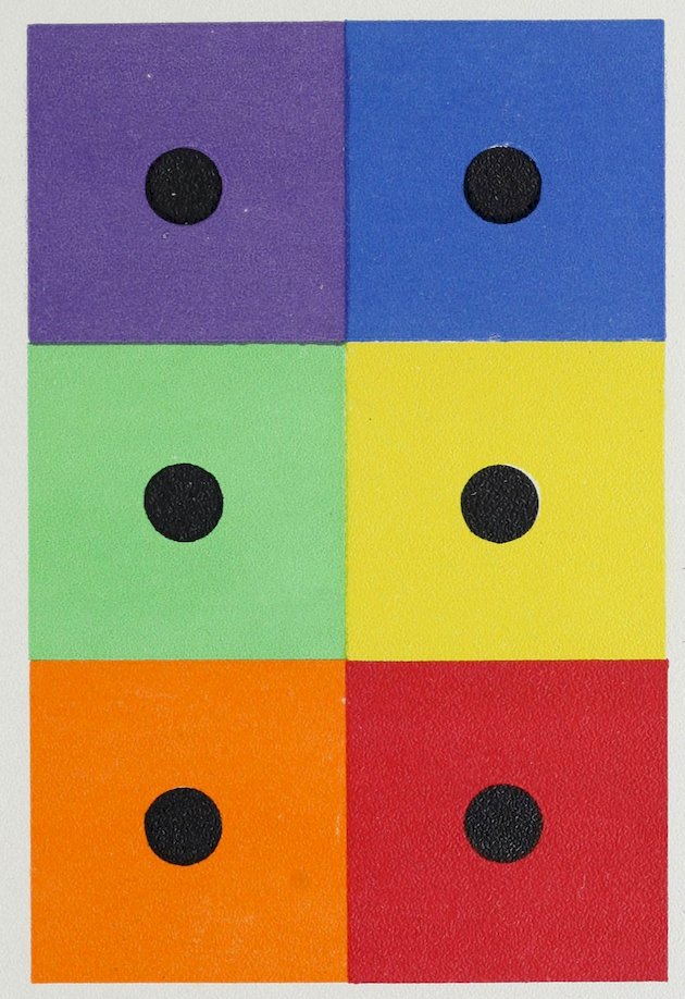
Plate XVIII BLACK ON SPECTRAL COLORS
XIX
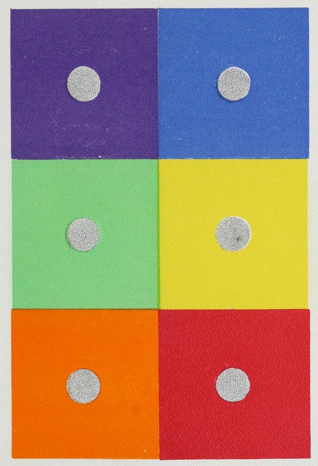
Plate XIX GRAY ON SPECTRAL COLORS
XX
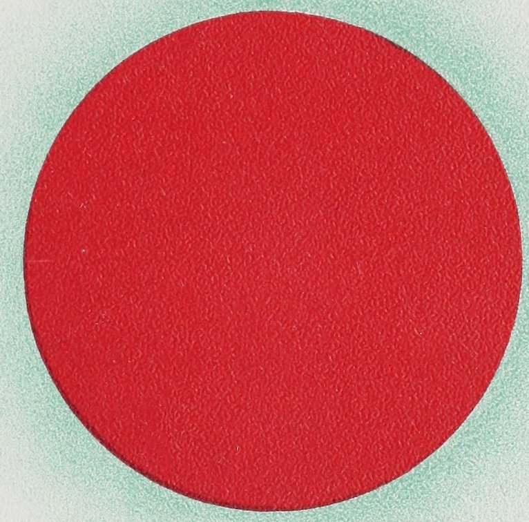
Plate XX SPECTRAL RED WITH ITS COMPLEMENT N. B. The blue-green complementary is here imitated as closely as possible, but when spontaneously called up by the eye it is really brighter than the white paper.
XXI
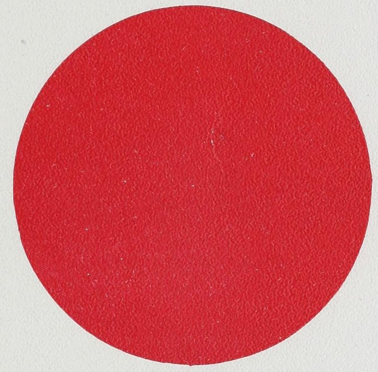
Plate XXI SPECTRAL RED DISK FOR EXPERIMENT IN COMPLEMENTS Gaze steadily at the red disk for three minutes, cover it quickly with the preceding blank page without removing the eyes and you will see its complementary image.
XXII
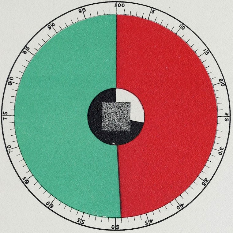
Plate XXII SPECTRAL RED AND ITS COMPLEMENT, BLUE-GREEN, IN THEIR RELATIVE PROPORTIONS The gray in the centre of this Plate is the gray produced by the above two complements when mixed on a color wheel, and corresponds exactly to the gray produced by the given amounts of black and white. (N. B. The above proportions were obtained in an average light. They will vary with all variations in the quality and quantity of the illumination. This applies as well to the following four Plates.)
XXIII
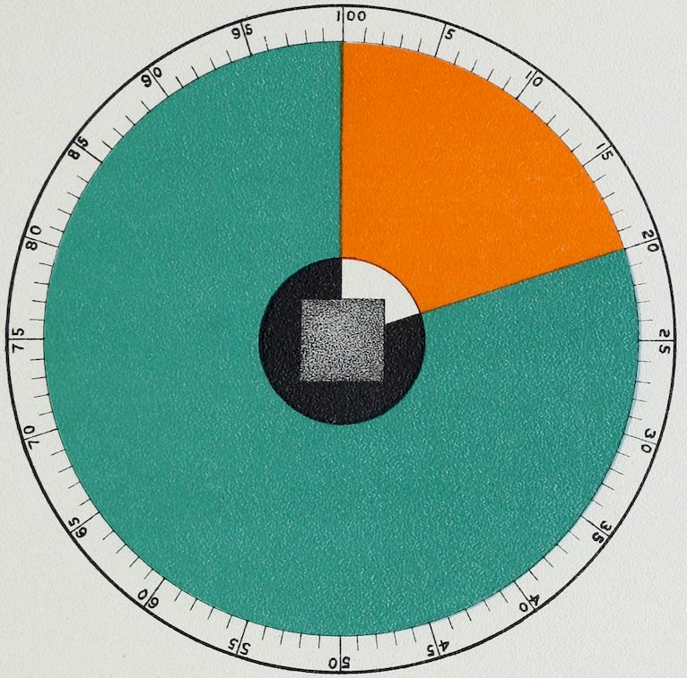
Plate XXIII SPECTRAL ORANGE AND ITS COMPLEMENT, GREEN-BLUE, IN THEIR RELATIVE PROPORTIONS The gray in the centre of this Plate is the gray produced by the above two complements when mixed on a color wheel, and corresponds exactly to the gray produced by the given amounts of black and white. (N. B. The above proportions were obtained in an average light. They will vary with all variations in the quality and quantity of the illumination.)
XXIV
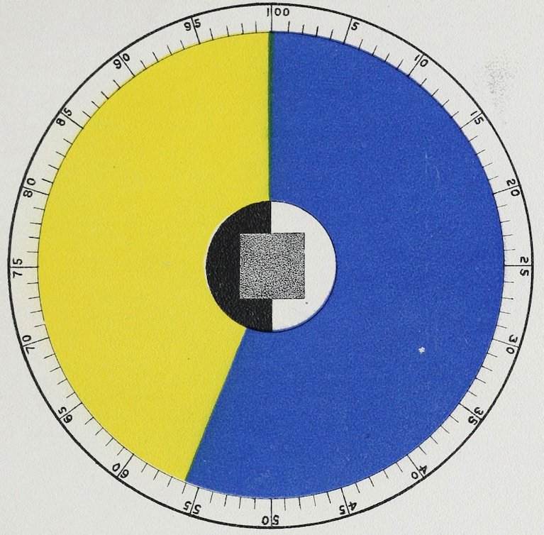
Plate XXIV SPECTRAL YELLOW AND ITS COMPLEMENT, SPECTRAL BLUE, OR SPECTRAL BLUE AND ITS COMPLEMENT, SPECTRAL YELLOW, IN THEIR RELATIVE PROPORTIONS The gray in the centre of this Plate is the gray produced by the above two complements when mixed on a color wheel, and corresponds exactly to the gray produced by the given amounts of black and white. (N. B. The above proportions were obtained in an average light. They will vary with all variations in the quality and quantity of the illumination.)
XXV
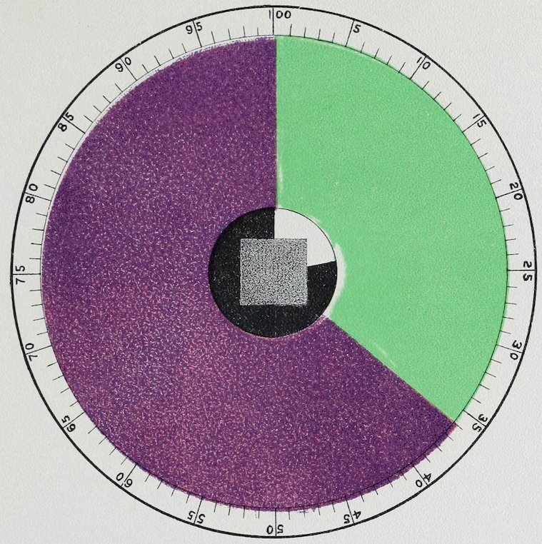
Plate XXV SPECTRAL GREEN AND ITS COMPLEMENT, PURPLE, IN THEIR RELATIVE PROPORTIONS. The gray in the centre of this plate is the gray produced by the above two complements when mixed on a color wheel, and corresponds exactly to the gray produced by the given amounts of black and white. (N. B. The above proportions were obtained in an average light. They will vary with all variations in the quality and quantity of the illumination.)
XXVI
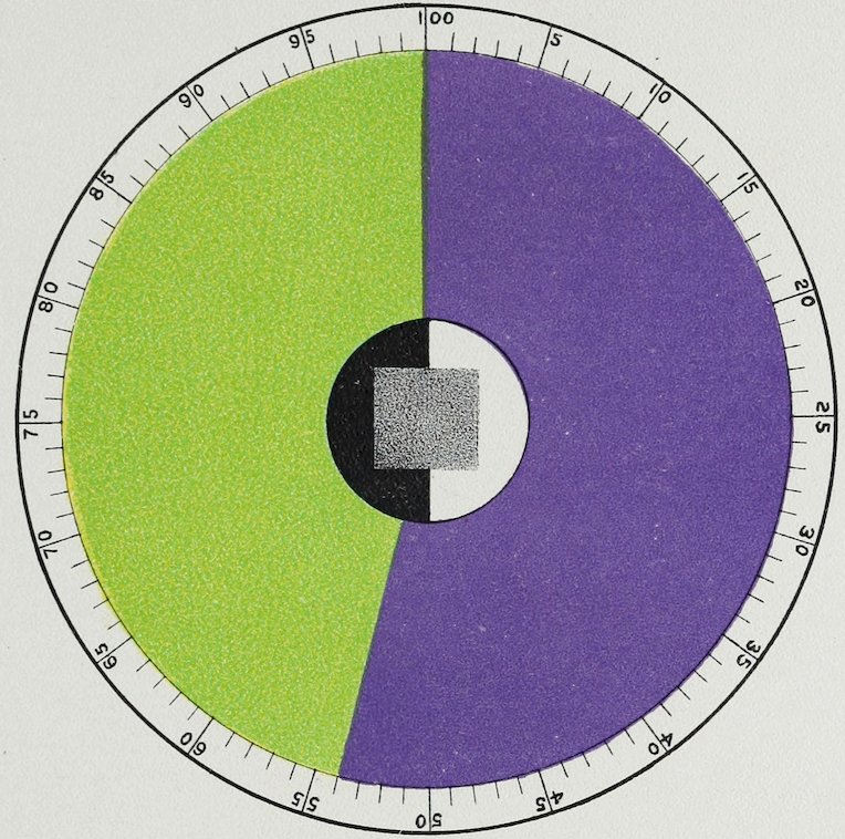
Plate XXVI SPECTRAL VIOLET AND ITS COMPLEMENT, YELLOW-GREEN, IN THEIR RELATIVE PROPORTIONS The gray in the centre of this plate is the gray produced by the above two complements when mixed on a color wheel, and corresponds exactly to the gray produced by the given amounts of black and white. (N. B. The above proportions were obtained in an average light. They will vary with all variations in the quality and quantity of the illumination.)
XXVII
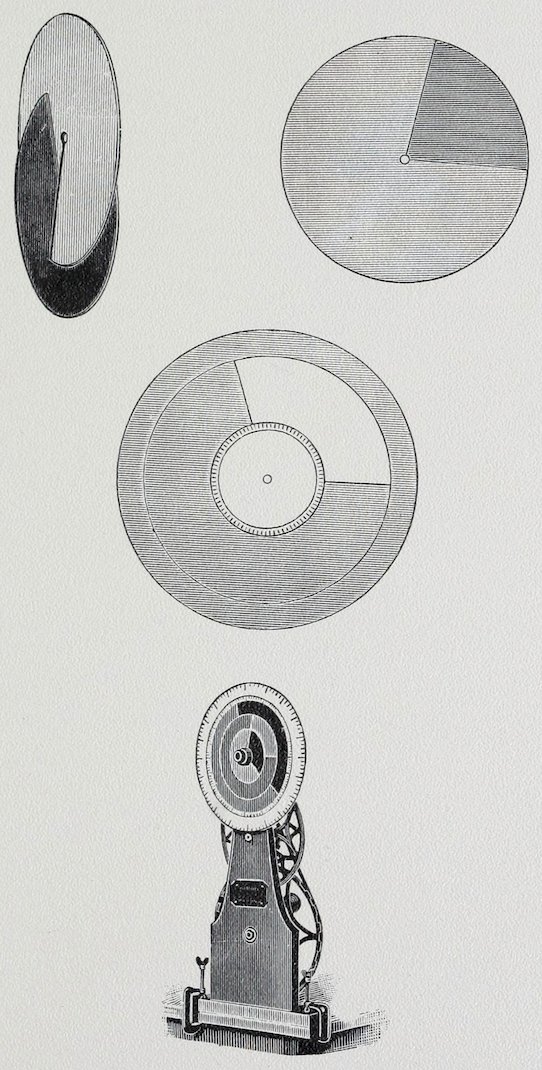
Plate XXVII MILTON-BRADLEY COLOR MACHINE
XXVIII
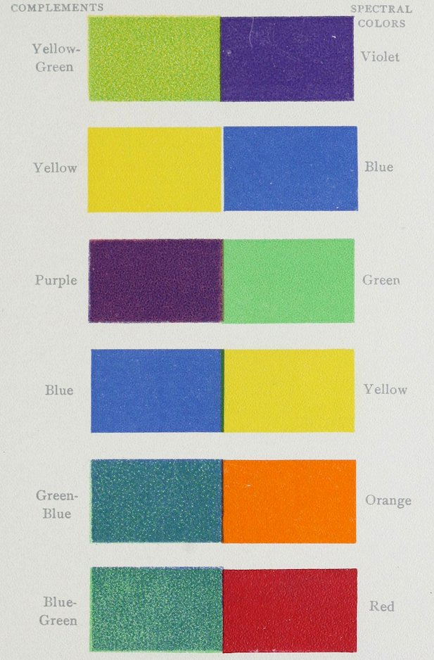
Plate XXVIII TABLE OF COMPLEMENTS ARRANGED IN PAIRS
XXIX
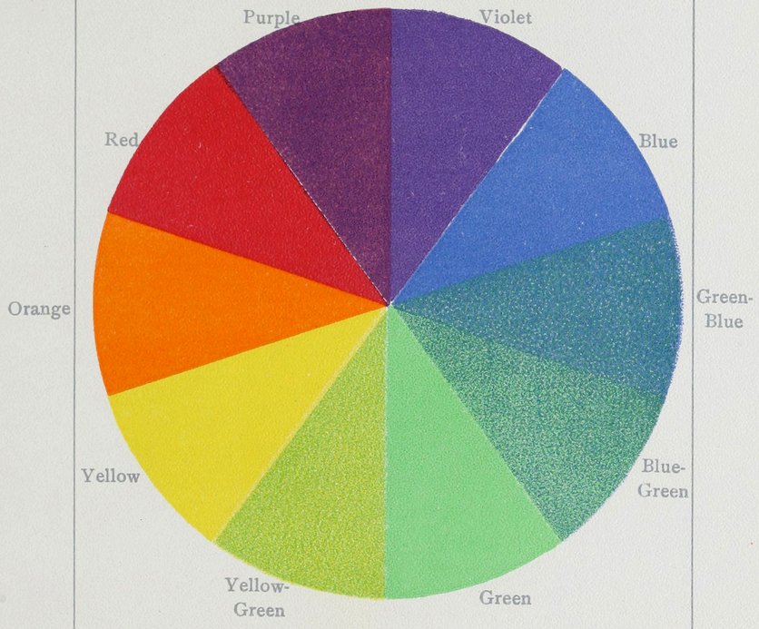
Plate XXIX TABLE OF COMPLEMENTS ARRANGED IN A CIRCLE
XXX
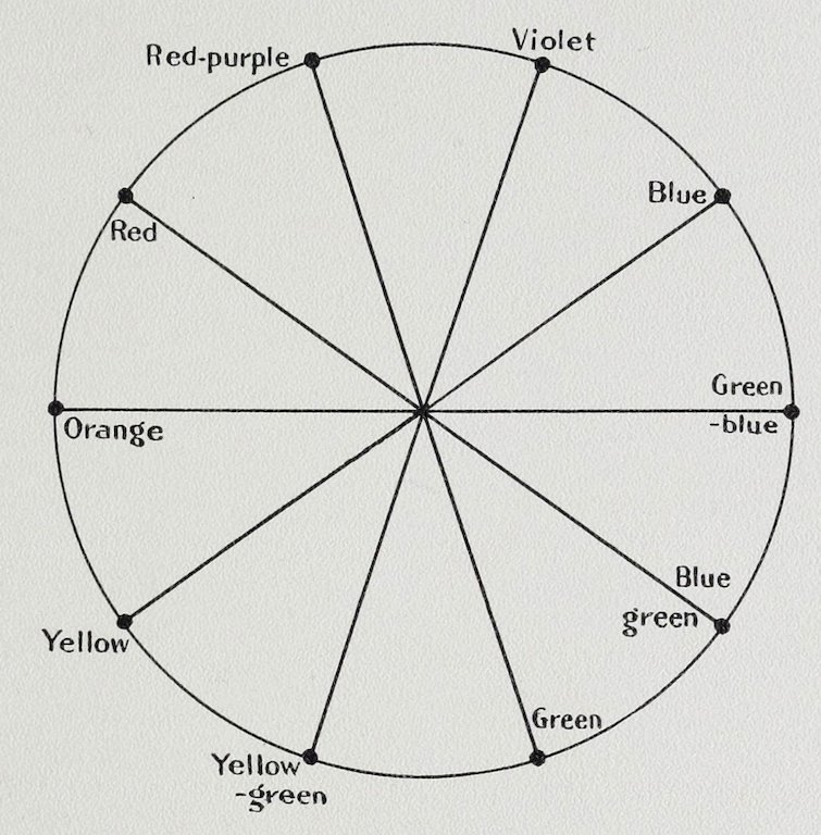
Plate XXX CONTRAST DIAGRAM See page 58. Transparency accompanying the volume is for use with this plate.
XXXI
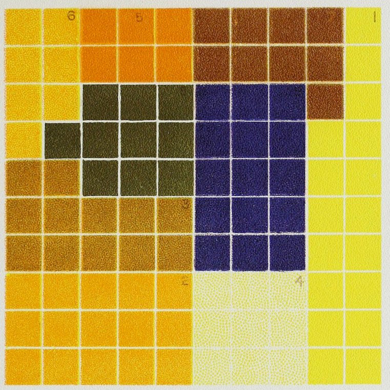
Plate XXXI COLOR ANALYSIS FROM A PRIZE DINNER TABLE A harmony of yellow and blue. See page 70.
XXXII
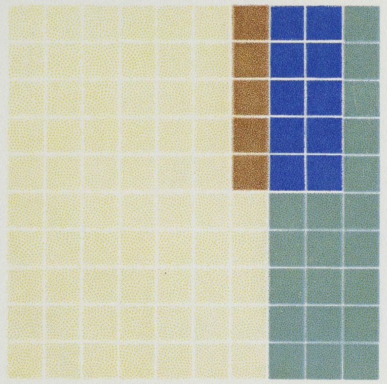
Plate XXXII
COLOR ANALYSIS FROM TEACUP AND SAUCER
Yellow Tint 65
Yellow Shade 5
Blue Tint 20
Spectral Blue 10
100
XXXIII
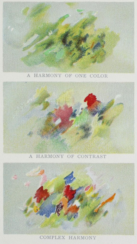
Plate XXXIII
XXXIV
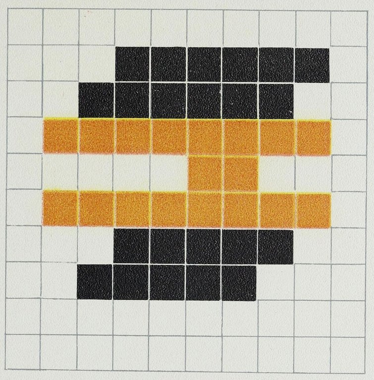
Plate XXXIV
COLOR ANALYSIS OF A BOOK ADVERTISEMENT
White 60
Black 22
Yellow 18
100
XXXV
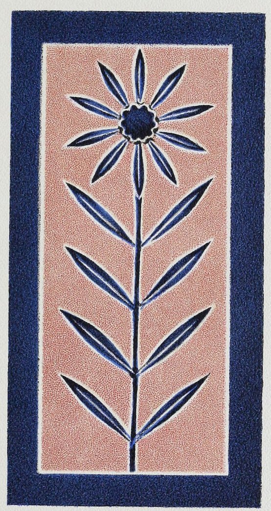
Plate XXXV HARMONY HELPED BY OUTLINE
XXXVI
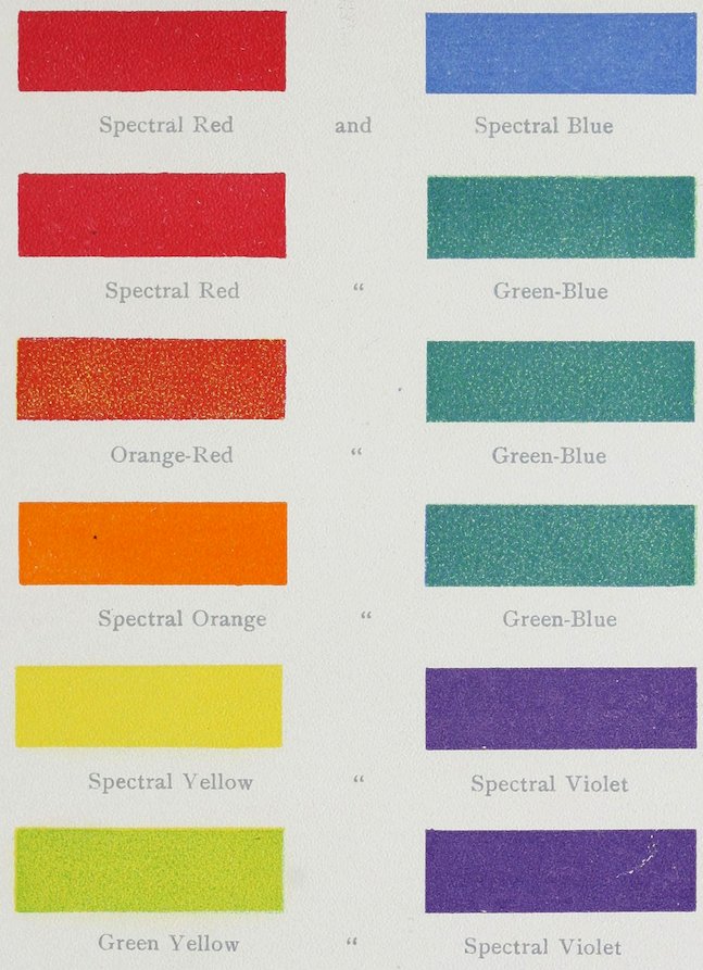
Plate XXXVI GOOD DYADS OR PAIRS
XXXVII
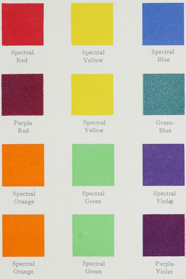
Plate XXXVII GOOD TRIADS
XXXVIII
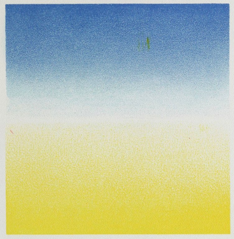
Plate XXXVIII HARMONY BY GRADATION
XXXIX
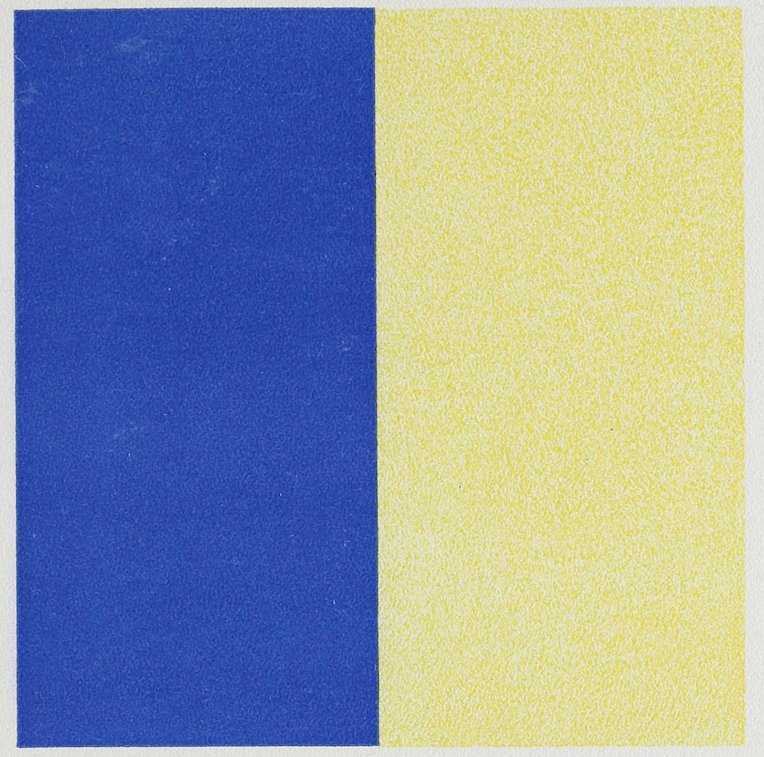
Plate XXXIX HARMONY BY CHANGE OF QUALITY (In the yellow.)
XL
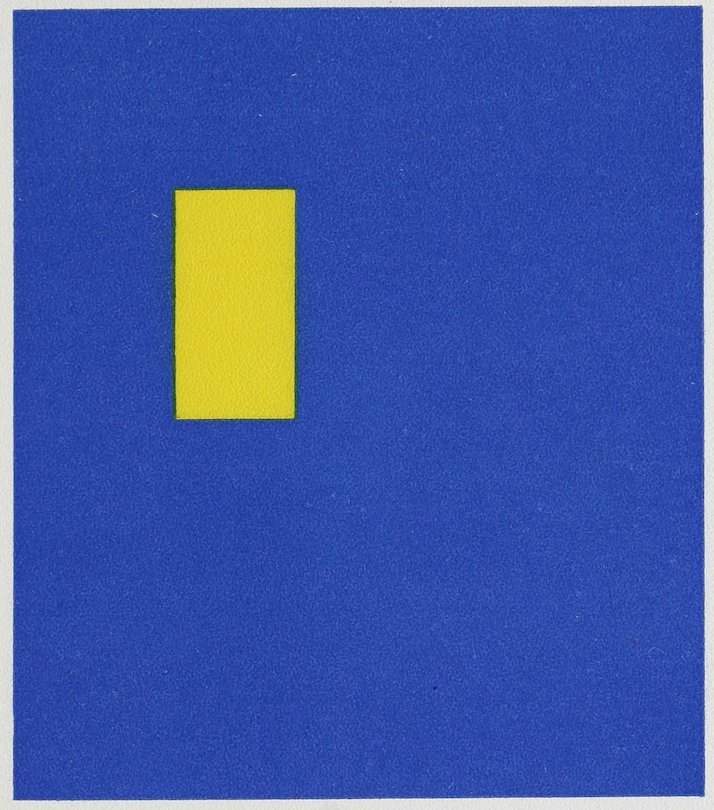
Plate XL HARMONY BY CHANGE OF QUANTITY
XLI
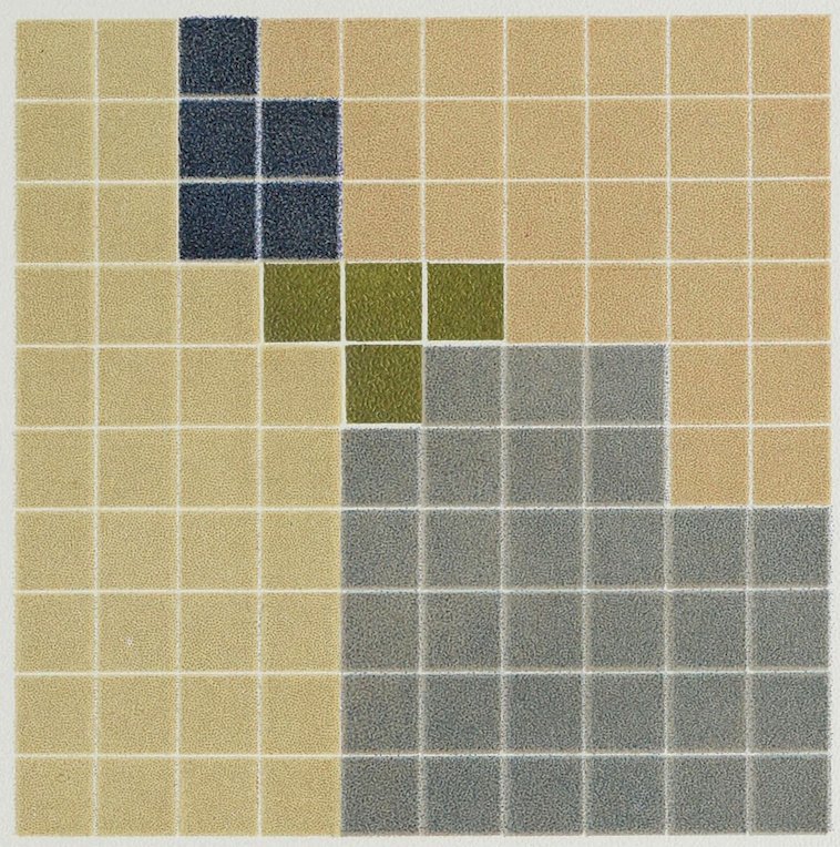
Plate XLI HARMONY BY CHANGE OF BOTH QUANTITY AND QUALITY Three yellows, two blues.
XLII
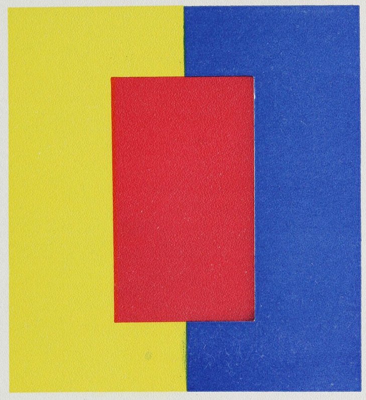
Plate XLII HARMONY BY THE ADDITION OF ANOTHER COLOR
XLIII
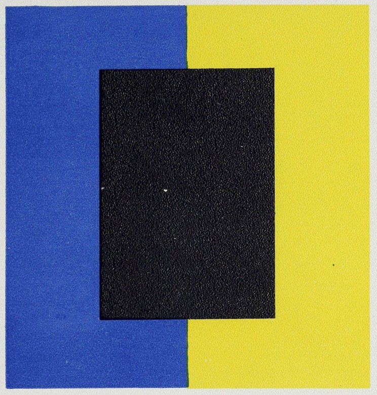
Plate XLIII HARMONY BY THE ADDITION OF BLACK
XLIV
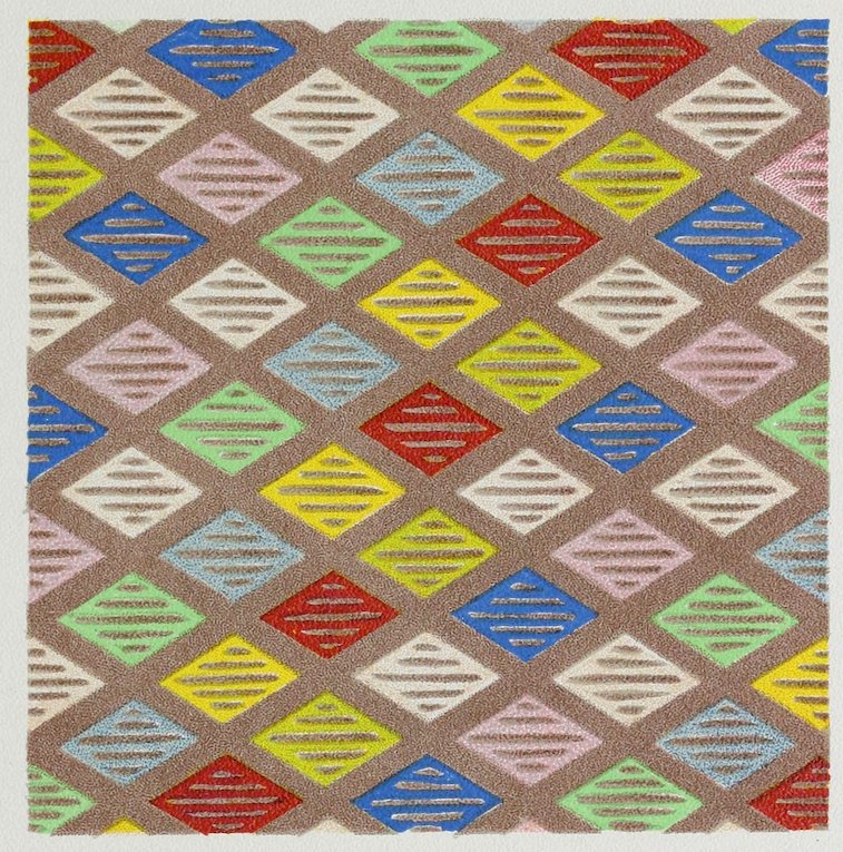
Plate XLIV HARMONY FROM A DOMINANT HUE
XLV
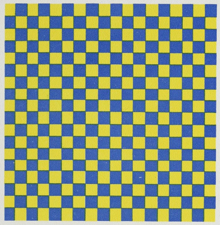
Plate XLV HARMONY BY INTERCHANGE
XLVI
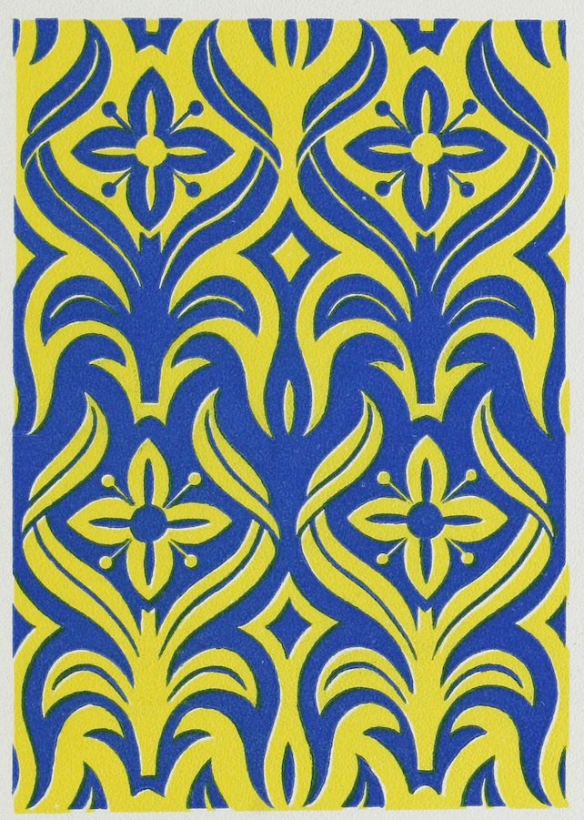
Plate XLVI HARMONY BY COUNTERCHANGE
XLVII
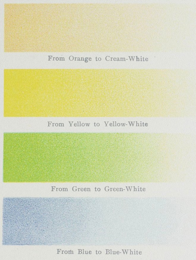
Plate XLVII THE TRUE CHARACTER OF SOME OF THE SO-CALLED “WHITES” (which are really pale tints)
XLVIII
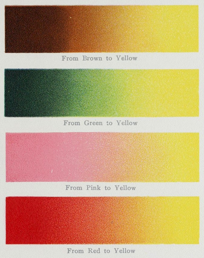
Plate XLVIII SOME CHANGES BY GRADATION FROM ONE COLOR TO ANOTHER
XLIX
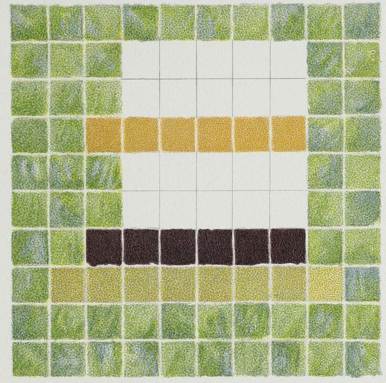
Plate XLIX
COLOR ANALYSIS FROM ASSYRIAN TILES
Blue-Green Ground 60
Greenish Yellow 3
Orange 6
Purple-Brown 6
White 20
100
The variation of color in the blue-green tiles is especially fine.
L
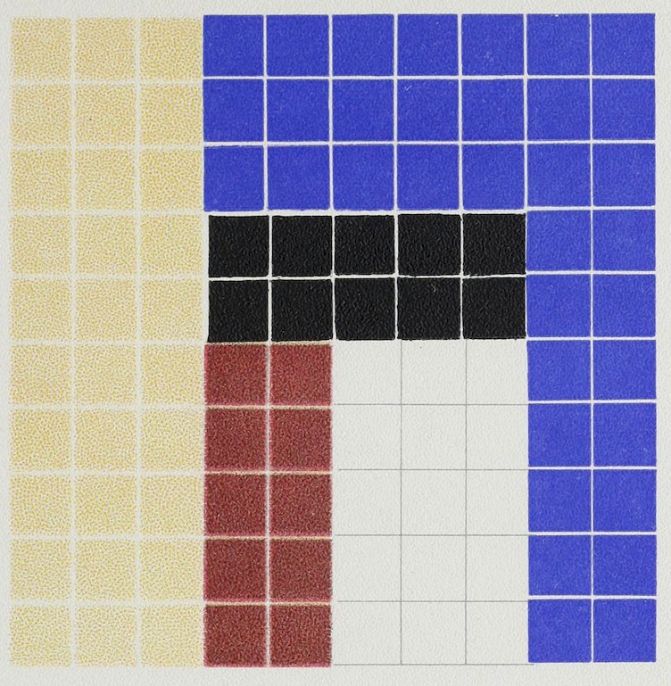
Plate L
COLOR ANALYSIS FROM ASSYRIAN TILES
Blue 35
Yellow 30
White 15
Dull Red 10
Black 10
100
LI
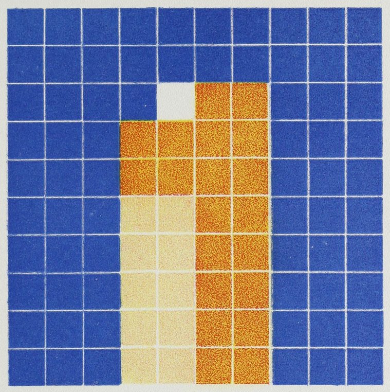
Plate LI
COLOR ANALYSIS FROM ASSYRIAN TILES
Blue 69
Deep Yellow 20
Light Yellow 10
White 1
100
LII
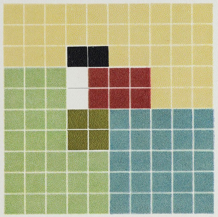
Plate LII
COLOR ANALYSIS FROM A MUMMY COVER
Pale Yellow 34
Green 27
Blue 25
Red 6
Gold 4
Black 2
White 2
100
LIII
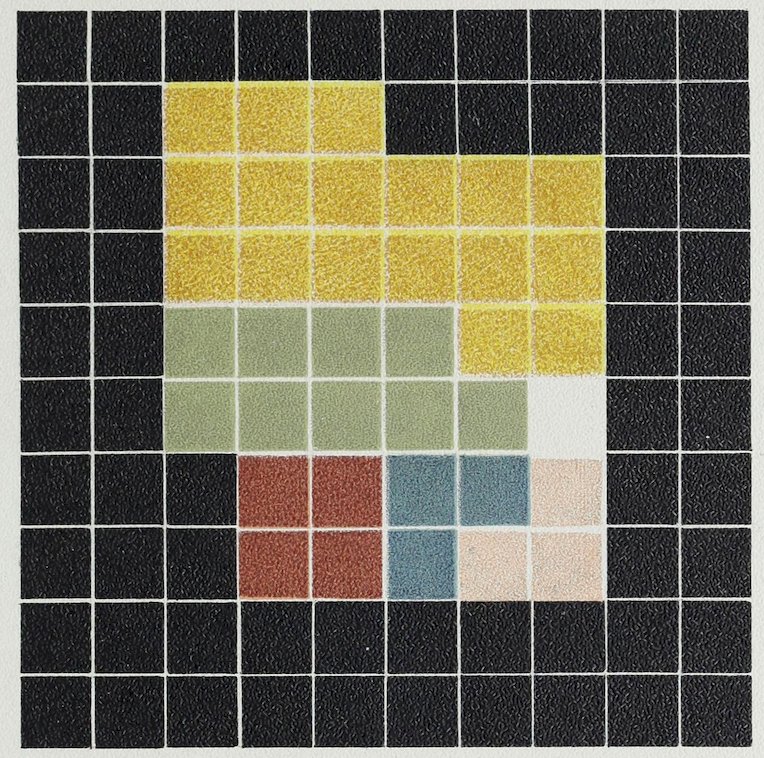
Plate LIII
COLOR ANALYSIS FROM AN EGYPTIAN MUMMY CASE
Black Ground 63
Yellow (all through design) 17
Green 9
Red 4
Light Red 3
Blue 3
White 1
100
LIV
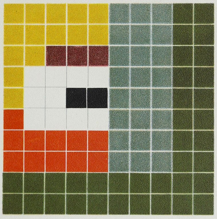
Plate LIV
COLOR ANALYSIS FROM A MUMMY CASE
Green 36
Blue-Green 24
Yellow 14
Red 11
White 10
Dull Red 3
Black 2
100
Much like a parrot’s plumage.
LV
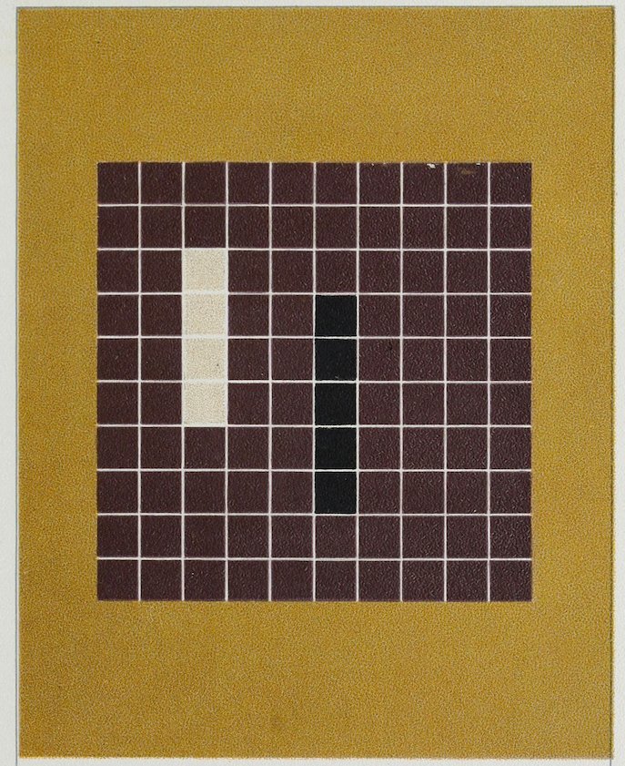
Plate LV
COLOR ANALYSIS FROM A MUMMY CLOTH
Purple Red 91
Black 5
Pale Gray 4
100
Dull yellow ground.
LVI
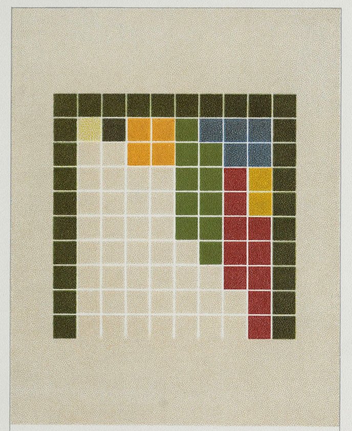
Plate LVI
COLOR ANALYSIS FROM A MUMMY CLOTH
Dull Green 29
Bright Green 10
Red 10
Blue 5
Orange 4
Yellow 2
Ground Color 40
100
LVII
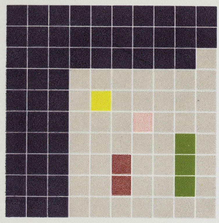
Plate LVII
COLOR ANALYSIS FROM A MUMMY CLOTH
Deep, Dull Blue 50
Gray 43
Green 3
Dull Red 2
Pale Red 1
Yellow 1
100
LVIII
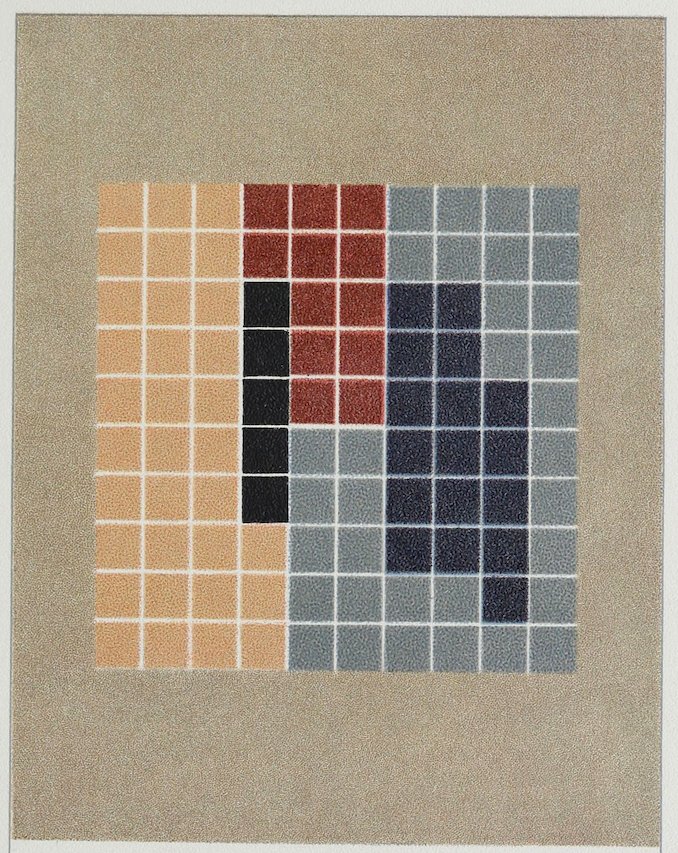
Plate LVIII
COLOR ANALYSIS FROM A MUMMY CLOTH
Light Blue 32
Dark Blue 17
Light Red 33
Dark Red 12
Black Stems 5
100
Gray ground; the ornament a stripe of embroidered leaves and stems.
LIX
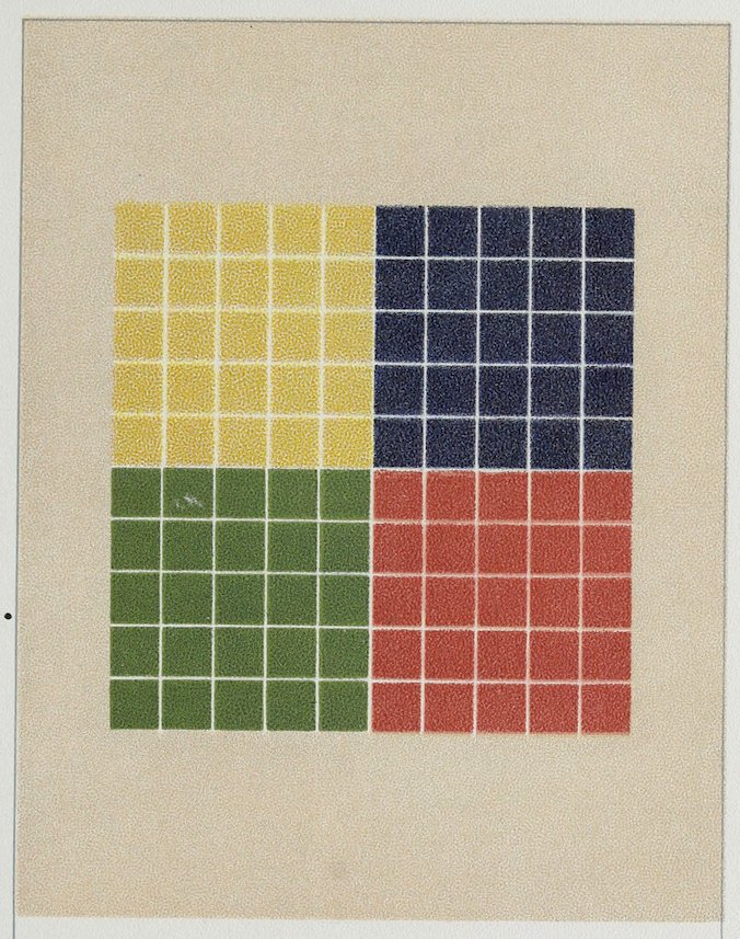
Plate LIX
COLOR ANALYSIS FROM A MUMMY CLOTH
Red 25
Green 25
Yellow 25
Blue 25
100
Gray ground.
LX
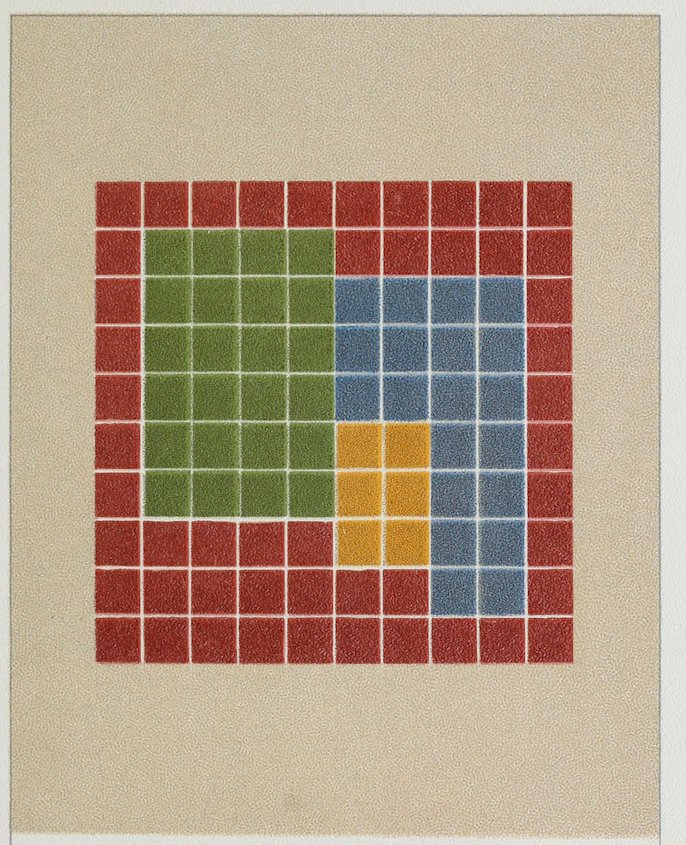
Plate LX
COLOR ANALYSIS FROM A MUMMY CLOTH
Red 50
Green 24
Blue 20
Orange 6
100
Light gray ground.
LXI
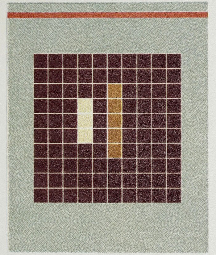
Plate LXI
COLOR ANALYSIS FROM A MUMMY CLOTH
Maroon 92
Dull Yellow 5
Cream White 3
100
Green linen ground with red border. Cream and yellow runs through design in small portions.
LXII
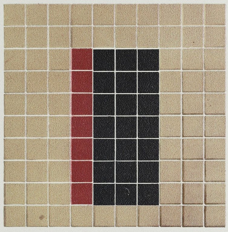
Plate LXII
COLOR ANALYSIS FROM AN EARLY GREEK VASE
Gray 72
Black 21
Dull Red 7
100
LXIII
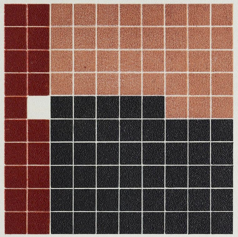
Plate LXIII
COLOR ANALYSIS FROM A GREEK VASE
Light Red 35
Dark Red 19
Black 45
White 1
100
The Ground partly red, partly black, white in fine outlines or small dotted outlines.
LXIV
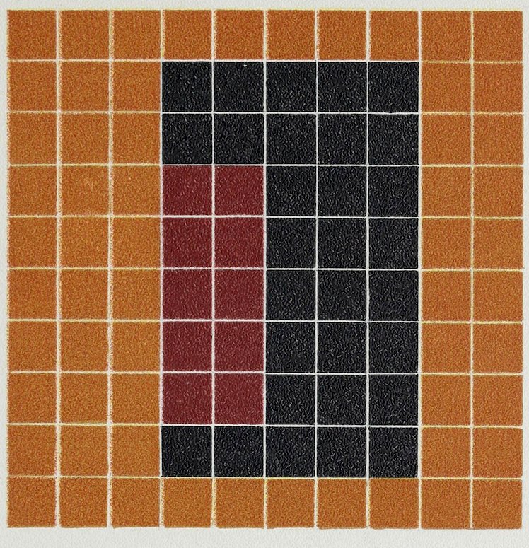
Plate LXIV
COLOR ANALYSIS FROM A GREEK VASE
Dull Orange 60
Dull Red 10
Black 30
100
LXV
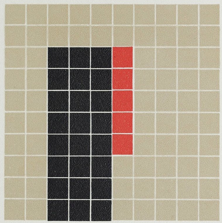
Plate LXV
COLOR ANALYSIS FROM A GREEK VASE
Gray Ground 71
Black 24
Red 5
100
LXVI
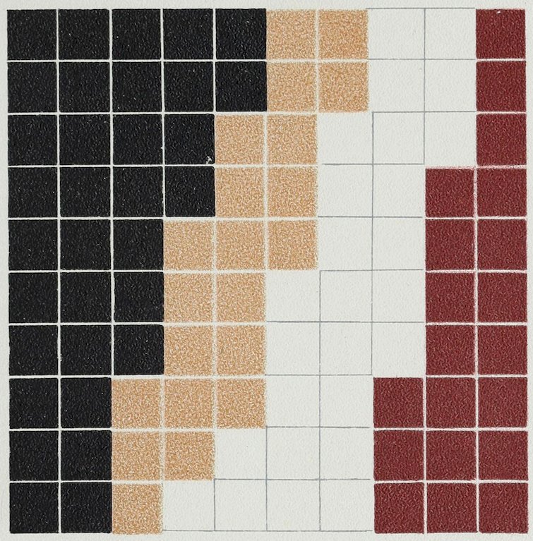
Plate LXVI
COLOR ANALYSIS FROM ARAB MOSAICS
Black 33
White 26
Light Red 21
Dull Red 20
100
LXVII
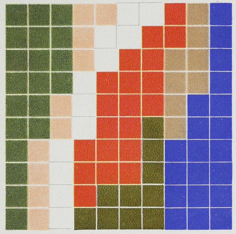
Plate LXVII
COLOR ANALYSIS FROM ARABIAN ILLUMINATION
Blue 20
Green 20
Red 20
Pale Red 10
Gray 8
Gold 10
White 12
100
LXVIII
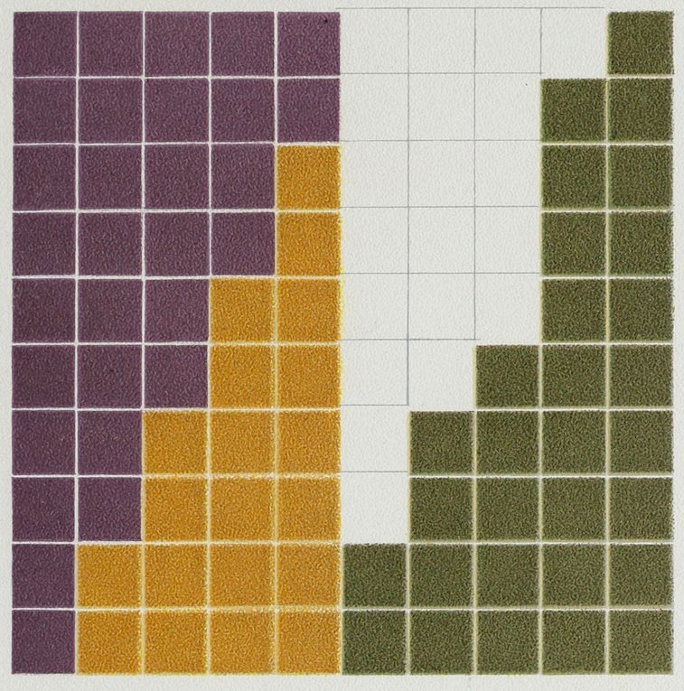
Plate LXVIII
COLOR ANALYSIS FROM MOORISH TILES
Olive-Green 30
White 20
Yellow 20
Violet 30
100
LXIX
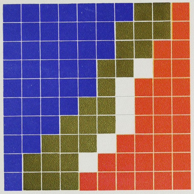
Plate LXIX
COLOR ANALYSIS FROM A PANEL OF THE ALHAMBRA
Blue 40
Red 30
Gold 24
White 6
100
LXX
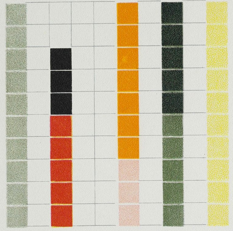
Plate LXX
COLOR ANALYSIS FROM A PANEL OF THE TAJ MAHAL, INDIA
White Ground 52
Pale Yellow 10
Deep Yellow 7
Red 5
Pale Green 10
Medium Green 5
Dark Green 5
Black 3
Pale Pink 3
100
Lilies and leaves on white ground.
LXXI
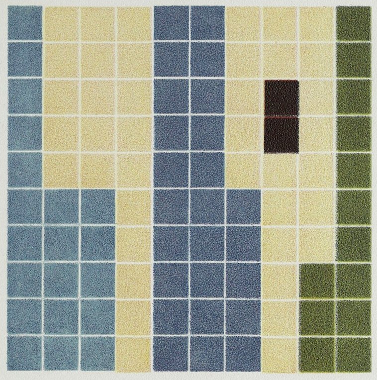
Plate LXXI
COLOR ANALYSIS FROM DAMASCUS TILES
Pale Yellow Ground 40
Deep Cool Blue 25
Light Blue 20
Green 13
Brown 2
100
LXXII
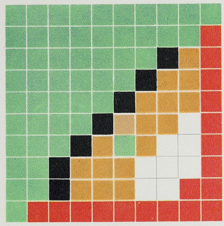
Plate LXXII
COLOR ANALYSIS FROM CELTIC ORNAMENT
Green 50
Red 18
Yellow 17
Black 7
White 8
100
LXXIII
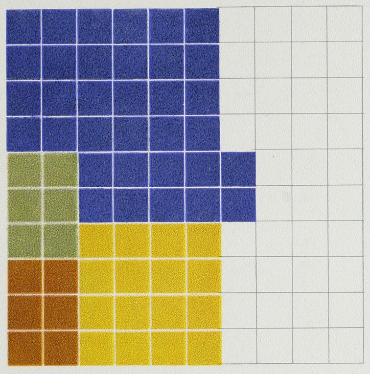
Plate LXXIII
COLOR ANALYSIS FROM ITALIAN MAJOLICA VASE
White Ground 38
Deep Blue 34
Yellow 16
Dark Yellow 6
Green 6
100
LXXIV
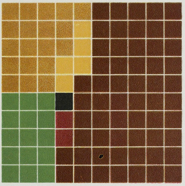
Plate LXXIV
COLOR ANALYSIS FROM PANEL OF DUTCH INLAID CABINET OF THE 15TH CENTURY
Brown Wood 58
Light „ 19
Yellow „ 5
Green „ 15
Dull Red „ 2
Black „ 1
100
LXXV
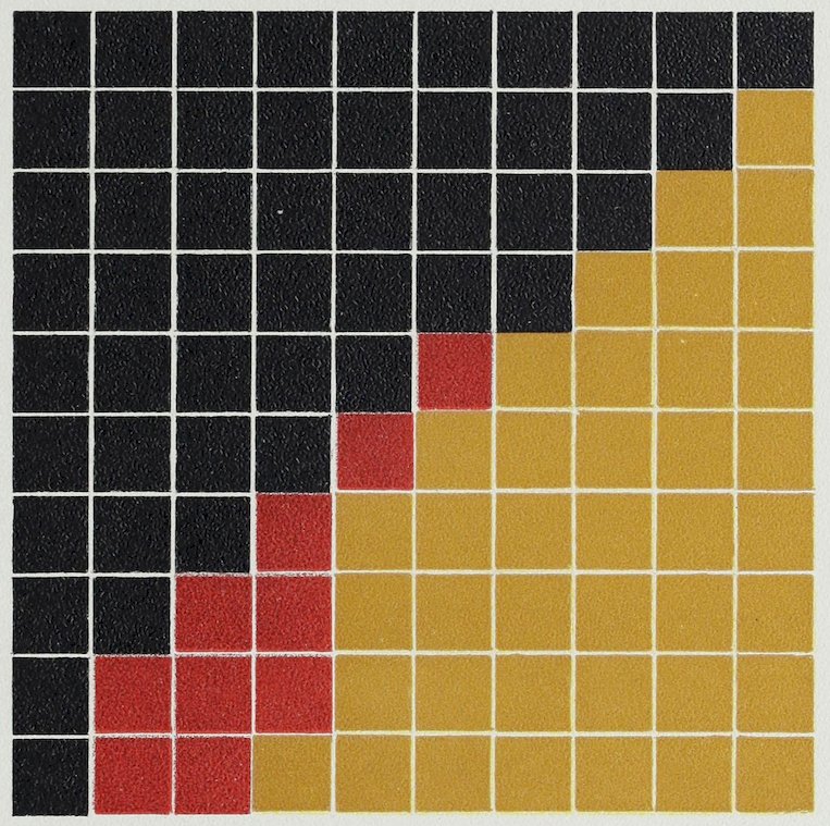
Plate LXXV
COLOR ANALYSIS FROM SPANISH EMBROIDERY
Black Ground 50
Yellow Design 40
Red in Design 10
100
LXXVI
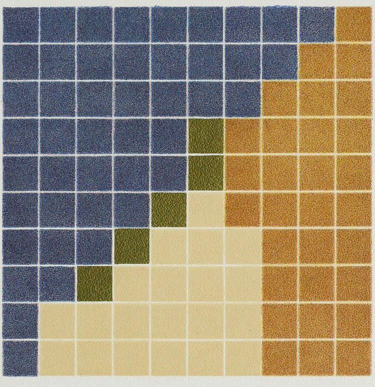
Plate LXXVI
COLOR ANALYSIS FROM SPANISH EMBROIDERY
A harmony of contrast.
Blue Ground 45
Dark Neutral Yellow 30
Pale Yellow 20
Gold 5
100
LXXVII
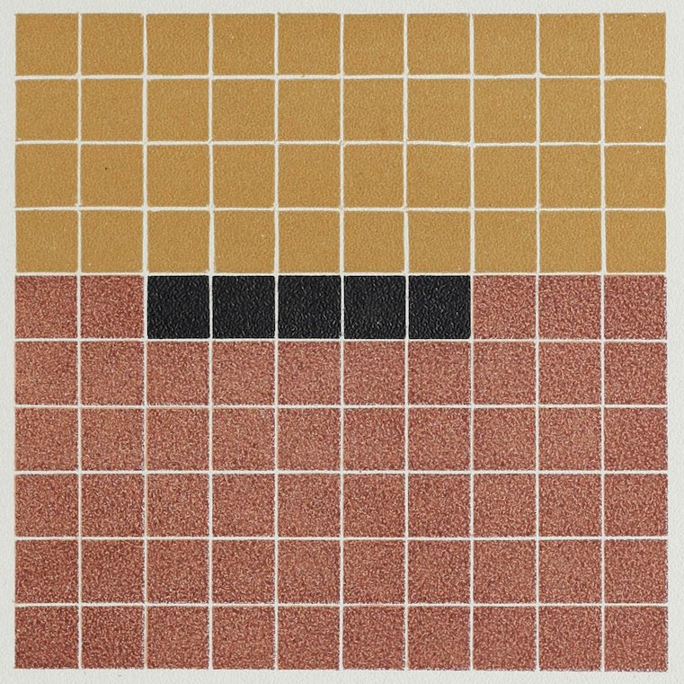
Plate LXXVII
COLOR ANALYSIS FROM AN ANTIQUE PERSIAN RUG
Old Rose 55
Old Yellow 40
Black 5
100
The black was used in fine outlines between the rose and
yellow to harmonize them.
The following eight examples have had their harmony greatly increased by time which has toned their colors.
LXXVIII
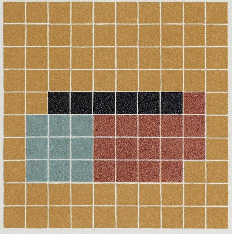
Plate LXXVIII
ANALYSIS FROM AN ANTIQUE RUG
Old Yellow 70
Old Rose 15
Green-Blue 9
Black 6
100
LXXIX
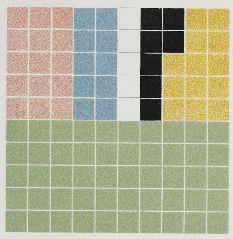
Plate LXXIX
COLOR ANALYSIS FROM AN ANTIQUE RUG
Pale Green Tint Ground 50
Yellow-Pink 15
Yellow 13
Blue 10
Black 7
White 5
100
Black used in fine lines.
LXXX
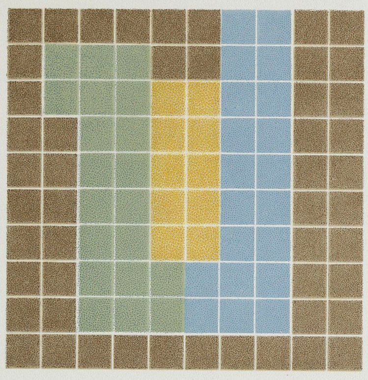
Plate LXXX
COLOR ANALYSIS FROM AN ANTIQUE RUG
Camel’s-Hair Gray 50
Cool Blue Tint 20
Green 20
Yellow 10
100
LXXXI
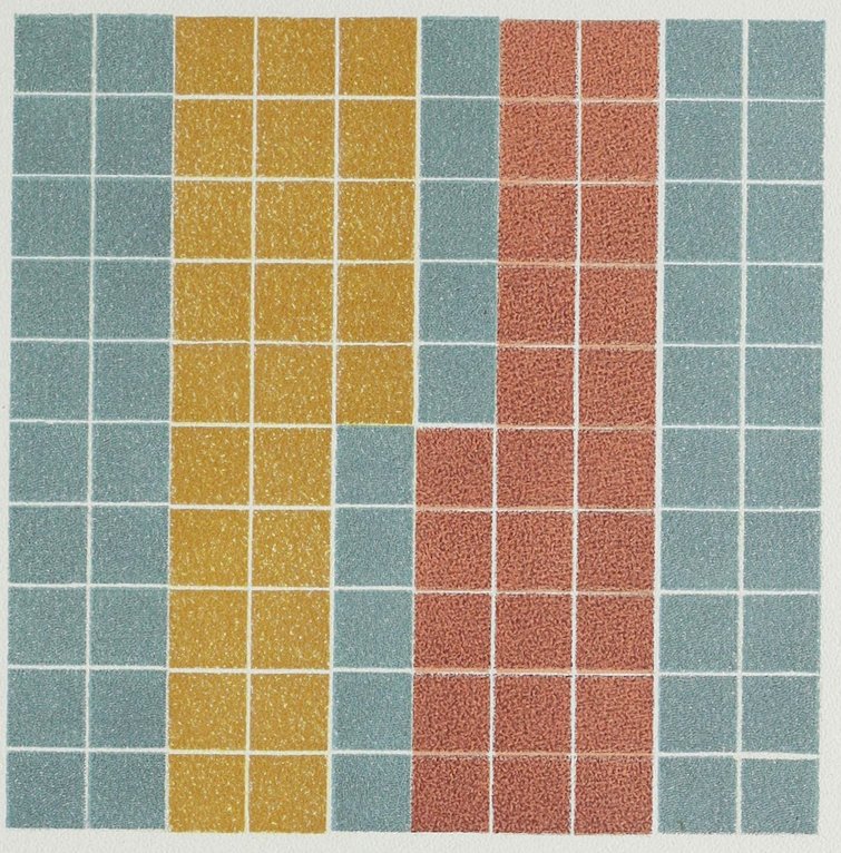
Plate LXXXI
COLOR ANALYSIS FROM AN ANTIQUE RUG
Green-Blue Ground 50
Red Tint 25
Yellow 25
100
LXXXII
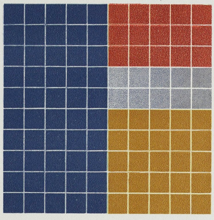
Plate LXXXII
COLOR ANALYSIS FROM AN ANTIQUE RUG
Blue Shade 50
Yellow Shade 25
Red 15
Light Blue Tint 10
100
LXXXIII
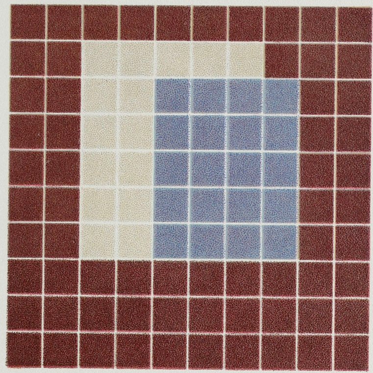
Plate LXXXIII
COLOR ANALYSIS FROM AN ANTIQUE RUG
Neutral Red 65
Cold Blue 20
Silver 15
100
LXXXIV
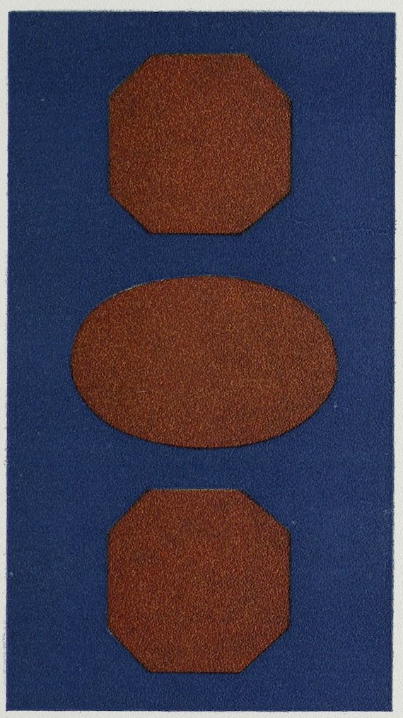
Plate LXXXIV THE COLOR SCHEME OF AN ANTIQUE RUG FROM WHICH PLATE LXXXV IS AN ANALYSIS
LXXXV
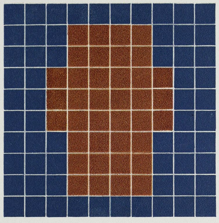
Plate LXXXV
ANALYSIS OF AN ANTIQUE RUG
(See Plate LXXXIV)
Dull Blue Shade 62
Dull Yellow Shade 38
100
LXXXVI
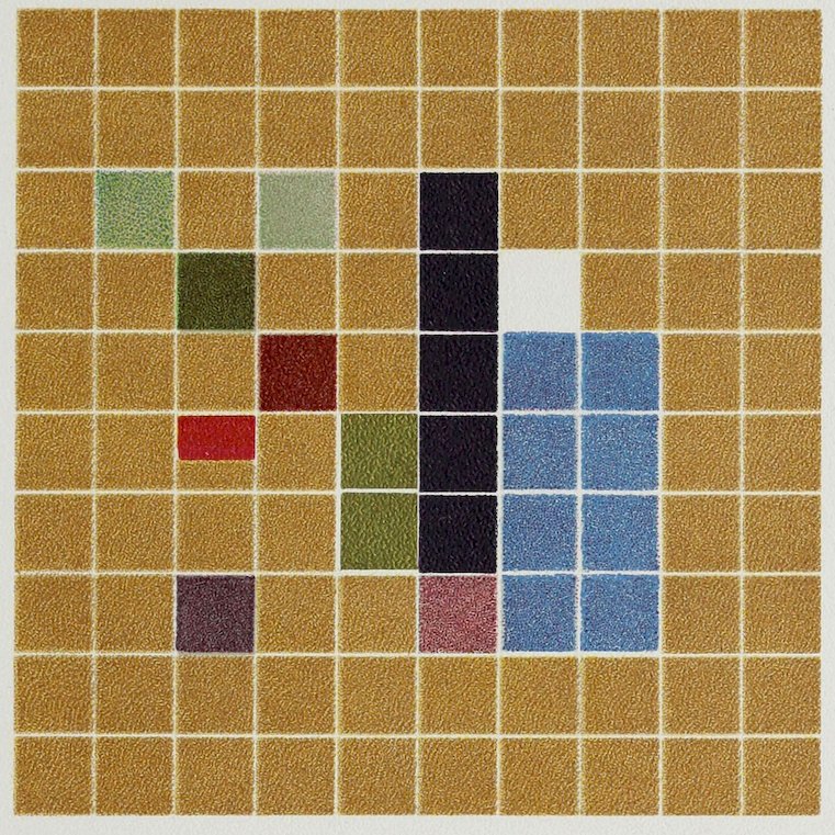
Plate LXXXVI
COLOR ANALYSIS FROM JAPANESE SILK TAPESTRY
Old Gold Ground 77.5
Blue 8
Brown 5
Light Brown 1
Gray 1
Dark Green 1
Light Green 1
Gray-Green 1
Dull Red 1
Light Red .5
Gold 2
White 1
100
LXXXVII
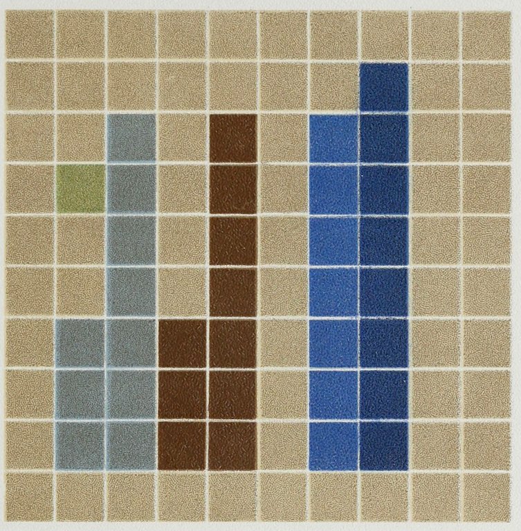
Plate LXXXVII
COLOR ANALYSIS FROM JAPANESE SILK TAPESTRY
Gray Ground 64
Dark Blue 8
Light Blue 7
Gray-Blue 10
Brown 10
Green 1
100
LXXXVIII
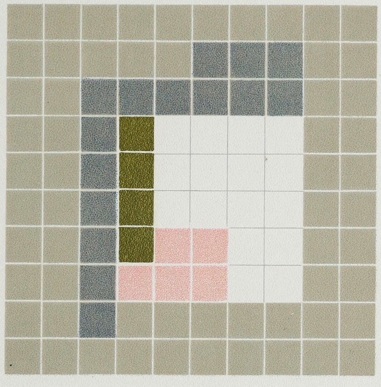
Plate LXXXVIII
COLOR ANALYSIS FROM JAPANESE SILK BROCADE
Yellow-Gray Ground 60
Blue-Gray Leaves 15
White Daisies 16
Pink Tips to Daisies 5
Gold Veins to Leaves and Centres to Daisies 4
100
LXXXIX
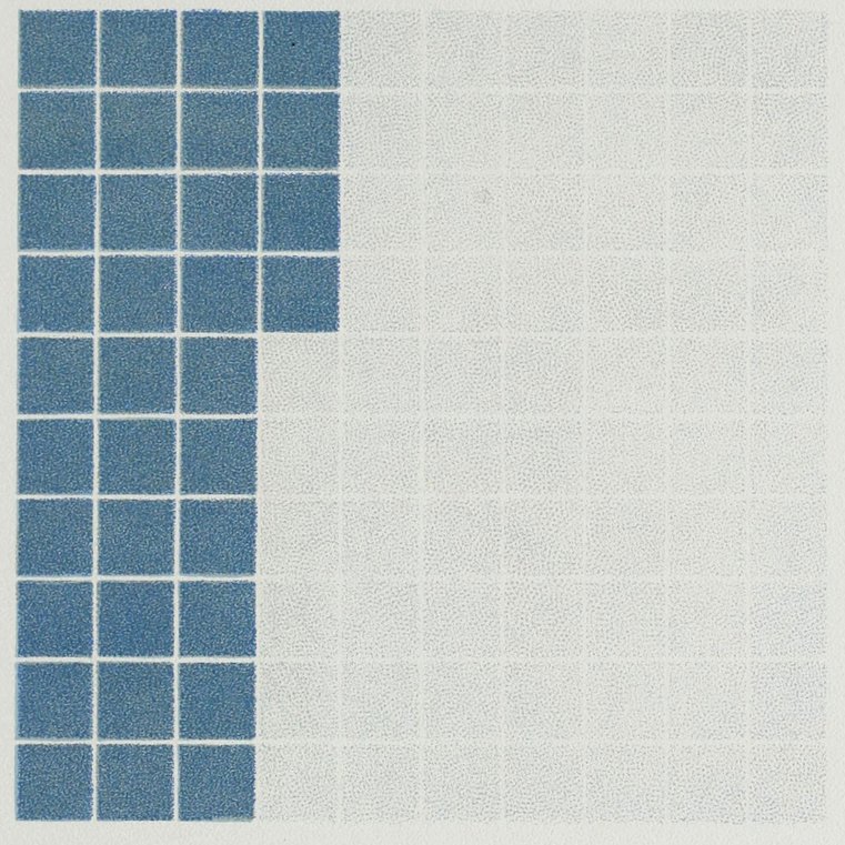
Plate LXXXIX
COLOR ANALYSIS FROM BORDER OF JAPANESE CLOISONNÉ VASE, Pl. XC
Greenish White 66
Blue 34
100
XC
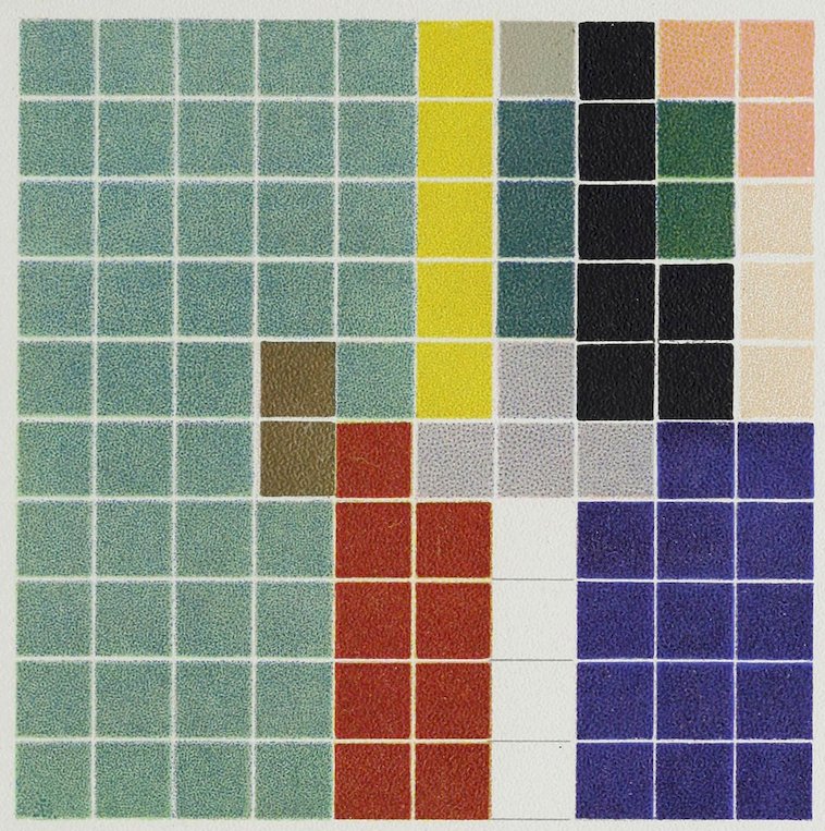
Plate XC
COLOR ANALYSIS FROM JAPANESE CLOISONNÉ VASE
Green-Blue Ground 43
Dark Blue 14
Black 7
Red 9
Yellow 5
Violet 4
White 4
Light Red 3
Lightest Red 3
Greenish Blue 3
Green 2
Gray 1
Brass 2
100
The fine brass outlines add much to the harmony.
XCI
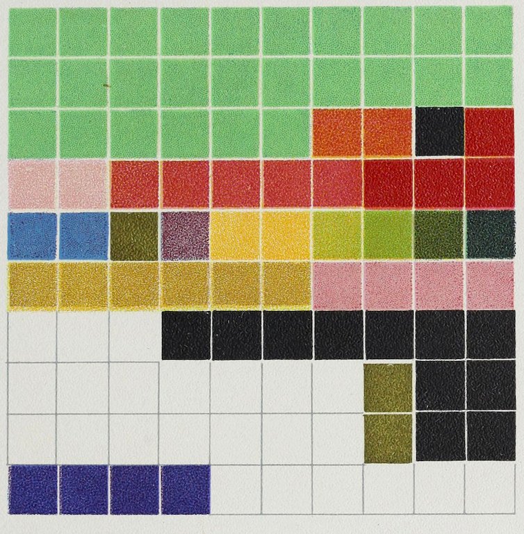
Plate XCI
COLOR ANALYSIS FROM A JAPANESE SKIRT PANEL
Border
White Ground 23
Black 11
Gold Edge 2
Purple-Blue 4
Dull Gold 6
Dull Pink 4
Centre
Green Ground 26
Shades of Red 11
Yellow 2
Blue 2
Greens 4
Lavender 1
Gold Edge 1
Black 1
Orange 2
100
XCII
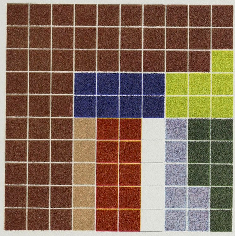
Plate XCII
COLOR ANALYSIS FROM JAPANESE BROCADE
Brown 50
Red 10
Dark Blue 8
Dark Green 8
Light Blue 7
Light Green 7
Light Brown 5
White 5
100
Fine example of a harmony of a dominant hue.
XCIII
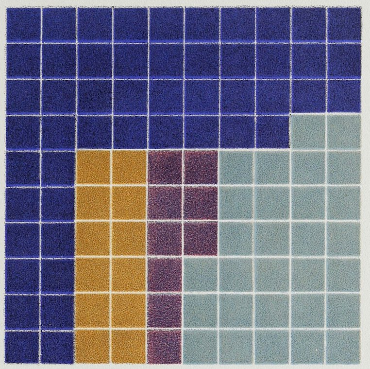
Plate XCIII
COLOR ANALYSIS FROM CHINESE PORCELAIN
Deep Lapis Lazuli Blue Ground 50
Turquoise Blue 29
Ochre Yellow 12
Violet 9
100
Plates XCIII to XCVII inclusive are from Chinese porcelain, the colors having remained brilliant.
XCIV
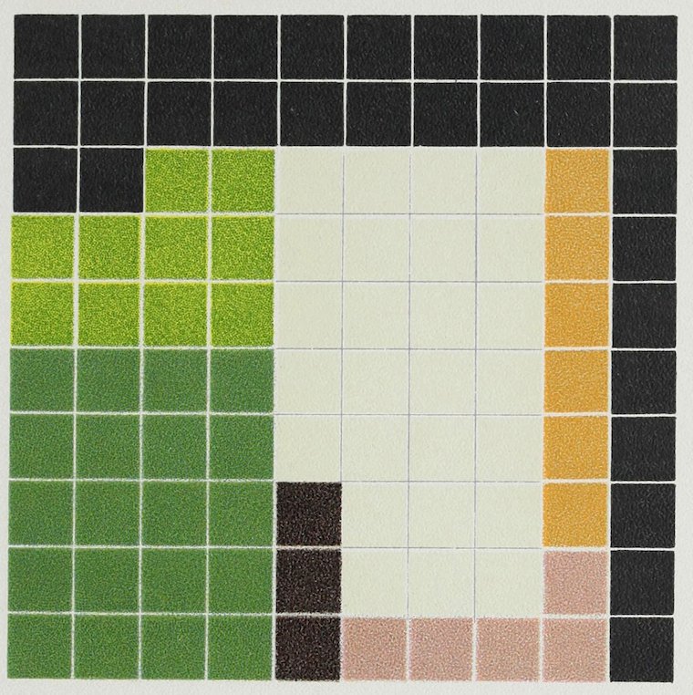
Plate XCIV
COLOR ANALYSIS FROM A “BLACK HAWTHORN VASE”
Black Ground 30
Green-White Flowers 26
Green Leaves 20
Yellow-Green Leaves 10
Brown Stems 3
Pale Red Flowers 5
Yellow „ 6
100
XCV
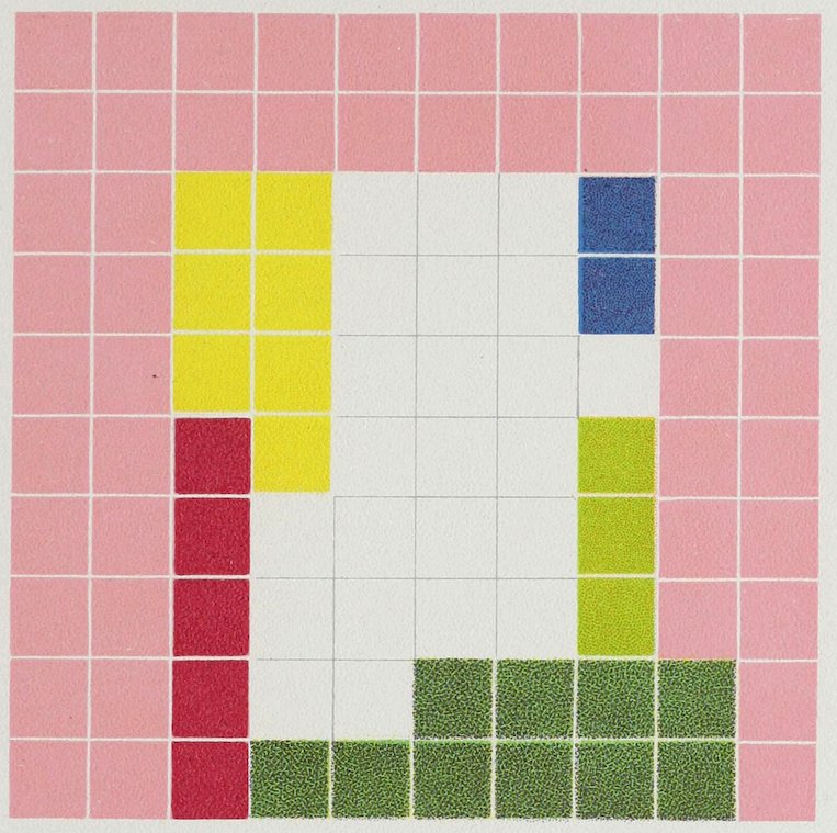
Plate XCV
COLOR ANALYSIS FROM A ROSE-COLORED VASE
Rose Ground 50
White Panel 23
Blue-Green 10
Yellow-Green 3
Yellow 7
Deep Pink 5
Blue 2
100
XCVI
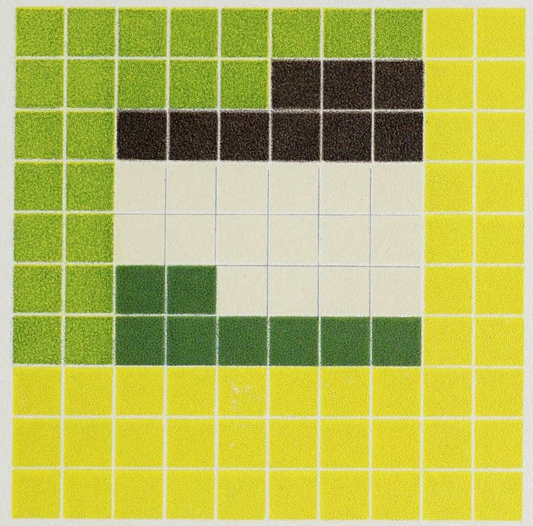
Plate XCVI
COLOR ANALYSIS FROM YELLOW CHINESE PORCELAIN VASE
Yellow Ground 44
Light Green Leaves 23
Dark Green „ 8
Cream White Flowers 16
Brown Stems 9
100
XCVII
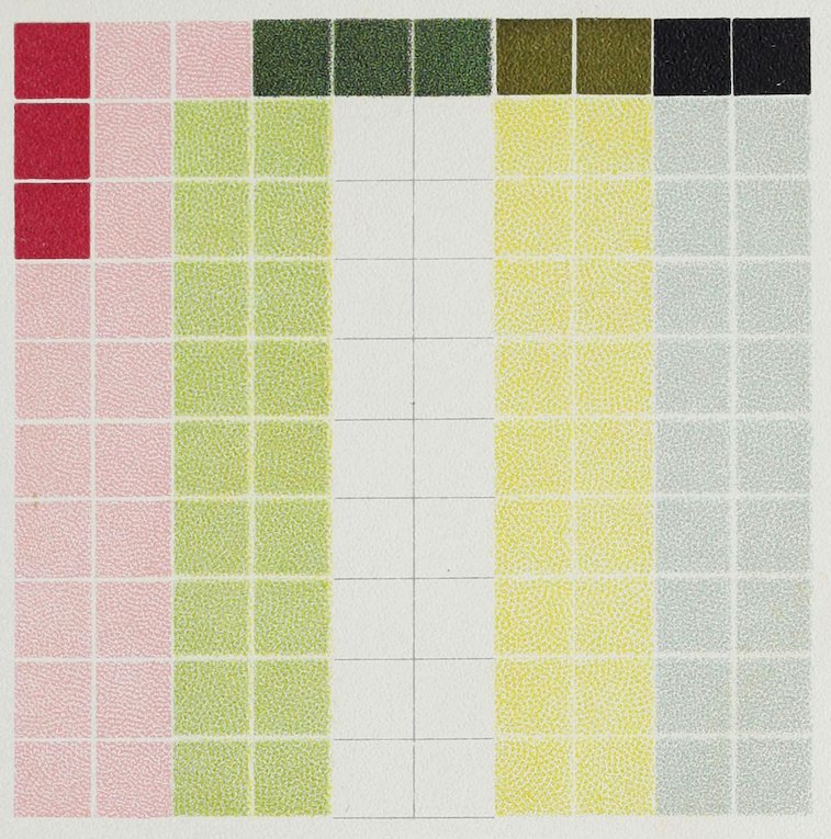
Plate XCVII
COLOR ANALYSIS FROM A CHINESE “EGGSHELL” PLATE
Blue 18
Yellow 18
White 18
Green 18
Pink 18
Dark Pink 3
Dark Green 3
Black 2
Gold 2
100
Pale tints with delicate decoration in strong tones.
XCVIII
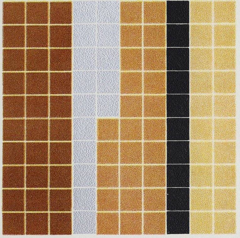
Plate XCVIII
COLOR ANALYSIS FROM A BUTTERFLY
Dark Yellow Shade 30
Medium Yellow 25
Light Yellow 20
Silver 15
Black 10
100
The black was well placed to contrast with the light tones, the silver to contrast with the dark tone.
XCIX
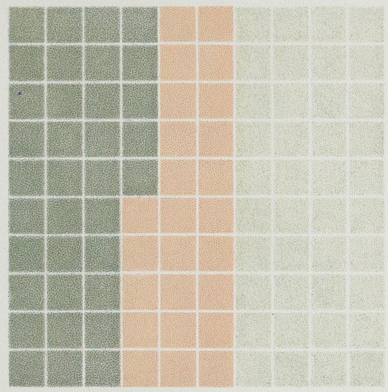
Plate XCIX
COLOR ANALYSIS FROM A STONE
Pale Gray-Green 40
Gray-Green 35
Pale Red 25
100
Ground, pale green.
C
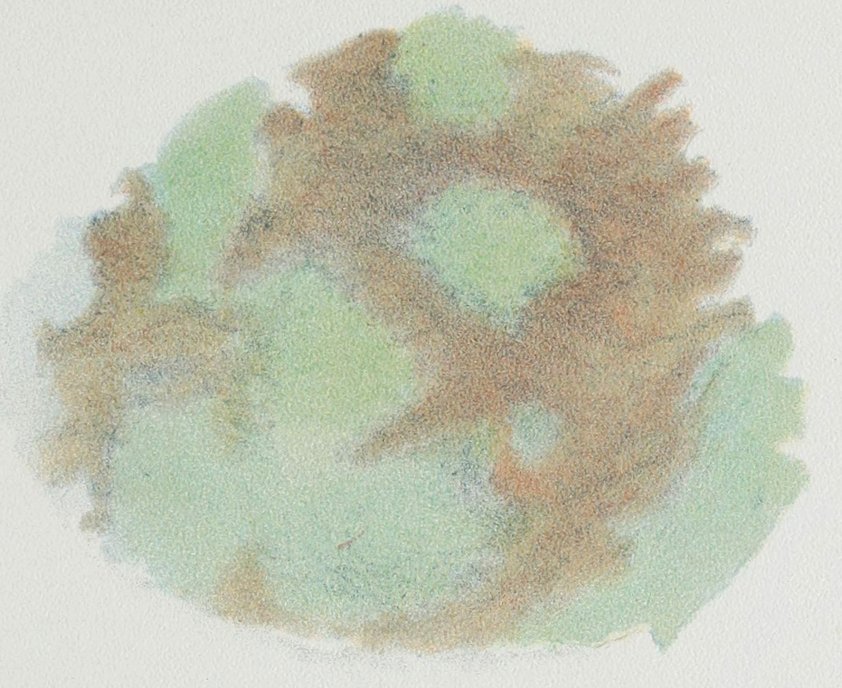
Plate C COLOR NOTE FROM AN OLD AND PARTLY DISCOLORED PROPELLER FLANGE
CI
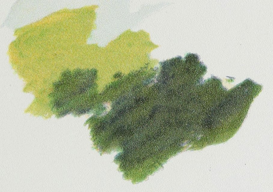
Plate CI COLOR NOTE FROM LEAVES ON A TREE The sun glancing across the smooth leaves makes a cool gray, and shining through them makes a warm green. The shaded leaves are a deep green.
CII
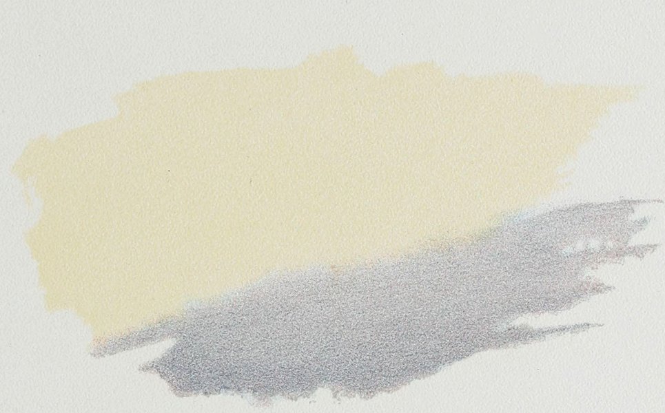
Plate CII COLOR NOTE FROM A SUNSET SKY
CIII
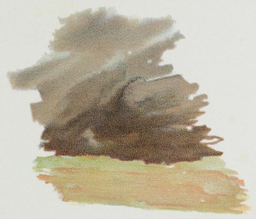
Plate CIII COLOR NOTE FROM BARE WOODS ON THE EDGE OF A MEADOW
CIV
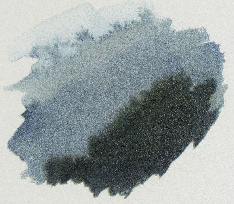
Plate CIV COLOR NOTE FROM EVERGREENS AGAINST A GRAY-BLUE RAIN CLOUD
CV
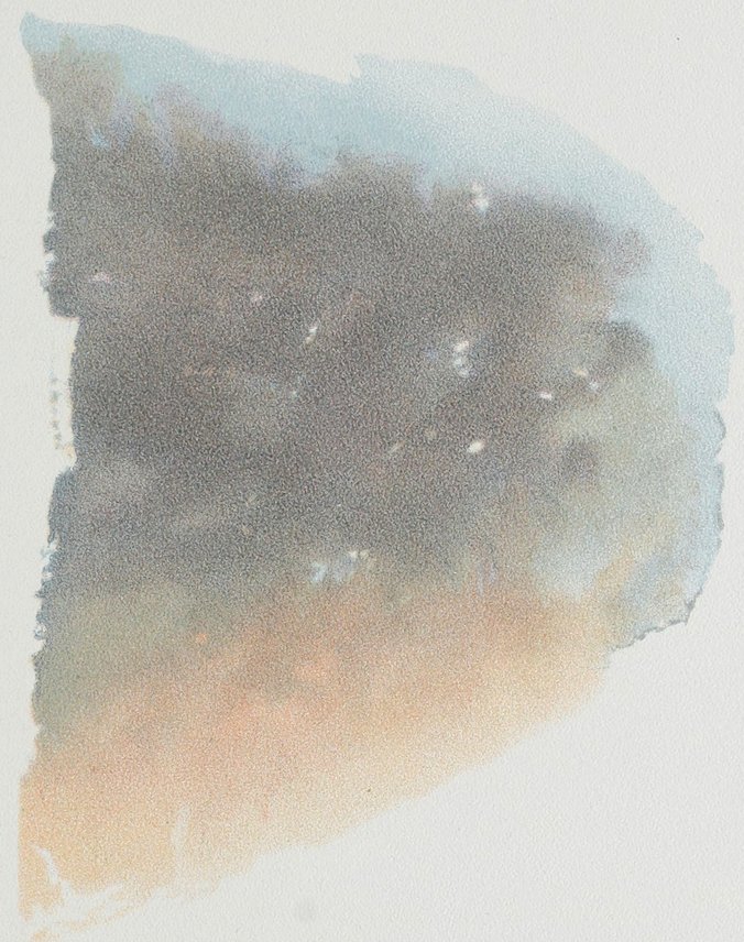
Plate CV COLOR NOTE FROM A SHADOW ON WHITE GROUND
CVI
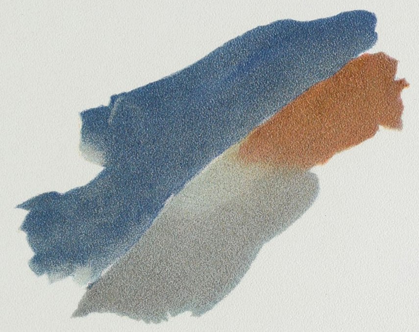
Plate CVI COLOR NOTE FROM A BLUEBIRD A harmony of cobalt and light red.
CVII
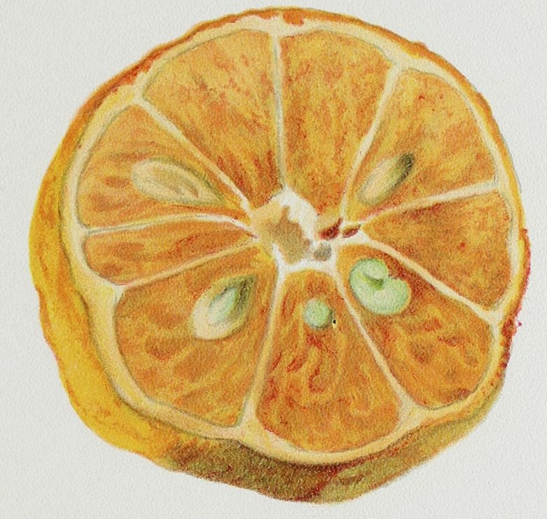
Plate CVII COLOR NOTE FROM A SLICE OF AN ORANGE
CVIII
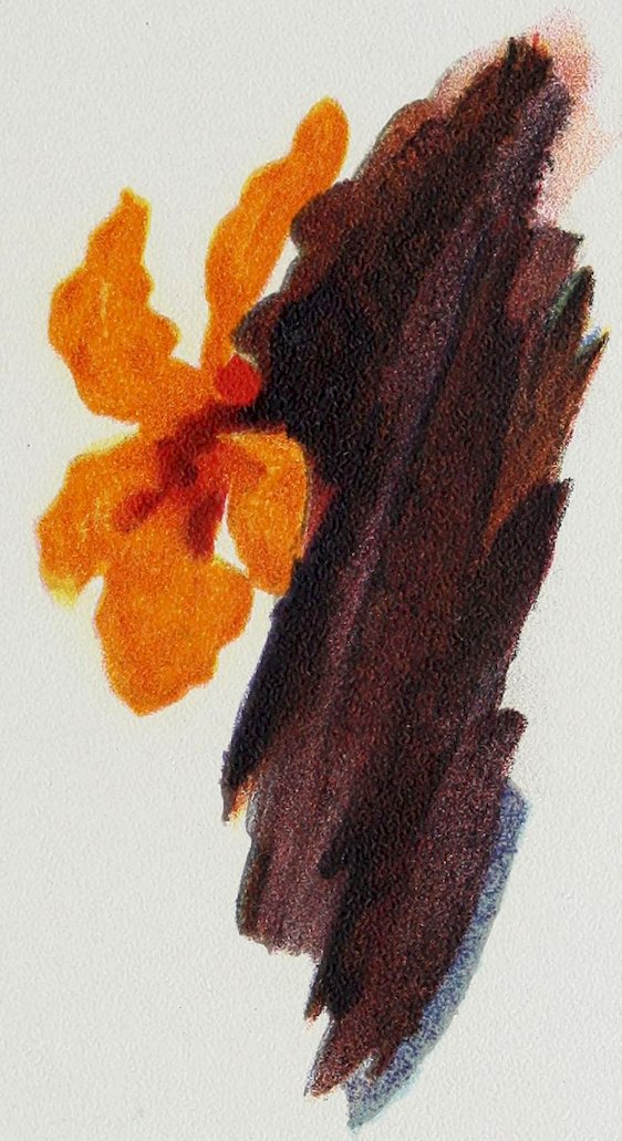
Plate CVIII COLOR NOTE FROM ORANGE CANNA BLOSSOM with part of leaf
CIX
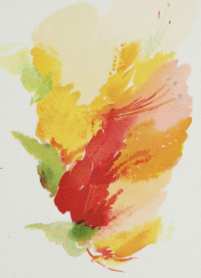
Plate CIX COLOR NOTE FROM A BUNCH OF AZALEAS
CX
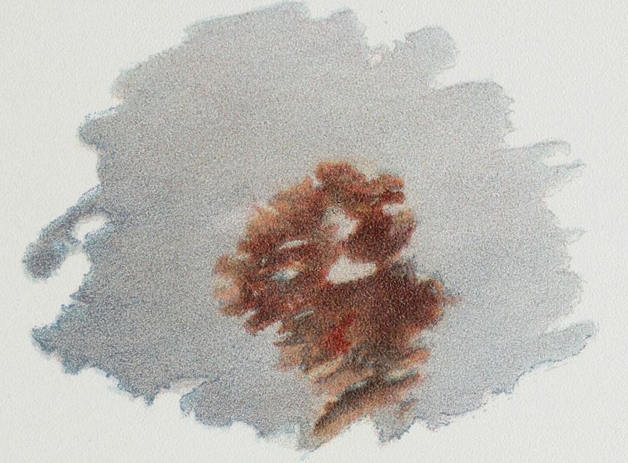
Plate CX COLOR NOTE FROM OAK LEAVES AGAINST A DISTANT HILLSIDE
CXI
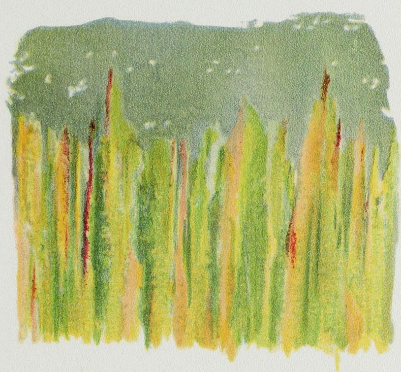
Plate CXI COLOR NOTE FROM OATS SEEN FROM THE EDGE OF THE FIELD So the top was a mass of soft blue-gray-green, while the stalks were highly colored.
CXII
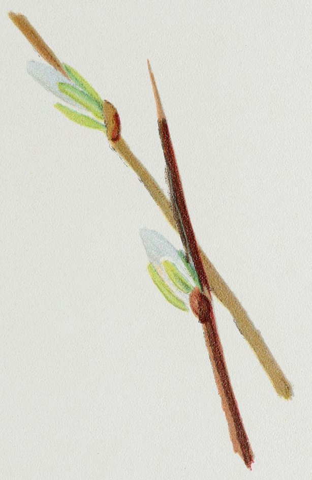
Plate CXII COLOR NOTE FROM A PUSSY WILLOW
CXIII
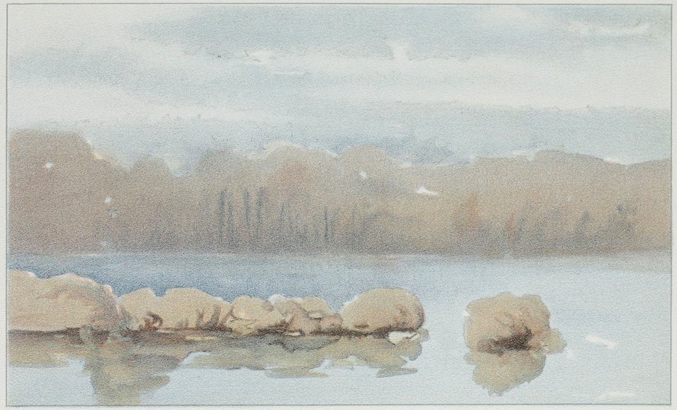
Plate CXIII COLOR NOTE FROM A TROUT POND
CXIV
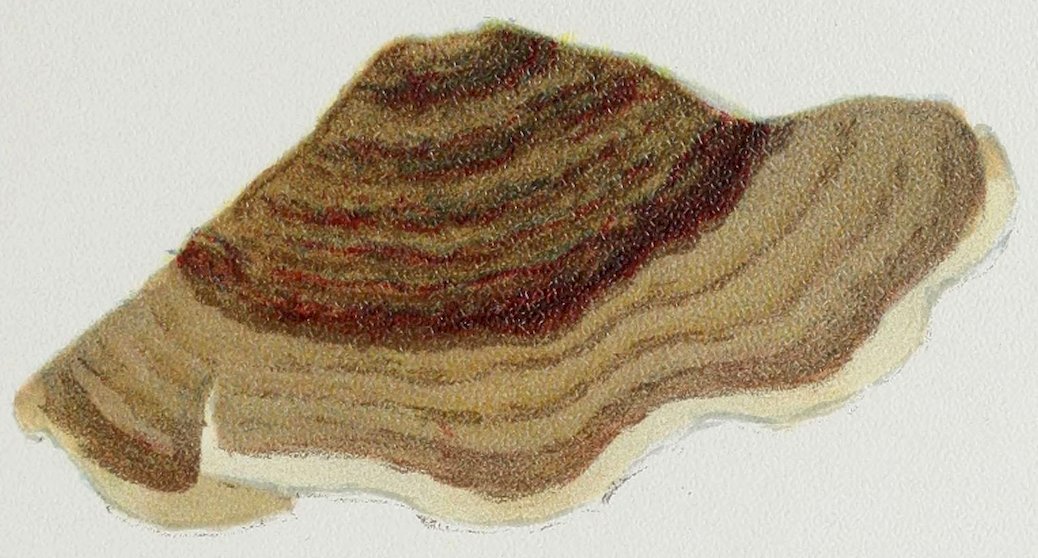
Plate CXIV COLOR NOTE FROM A TREE FUNGUS Texture like velvet.
CXV
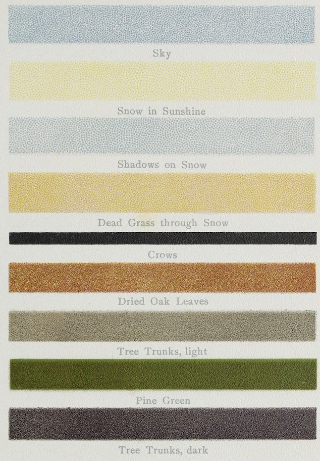
Plate CXV COLOR SCHEME FROM WINTER LANDSCAPE BETWEEN BALTIMORE AND WASHINGTON
CXVI
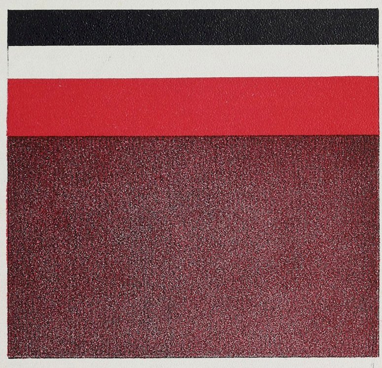
Plate CXVI SPECTRAL RED NEUTRALIZED BY BLACK AND WHITE
CXVII
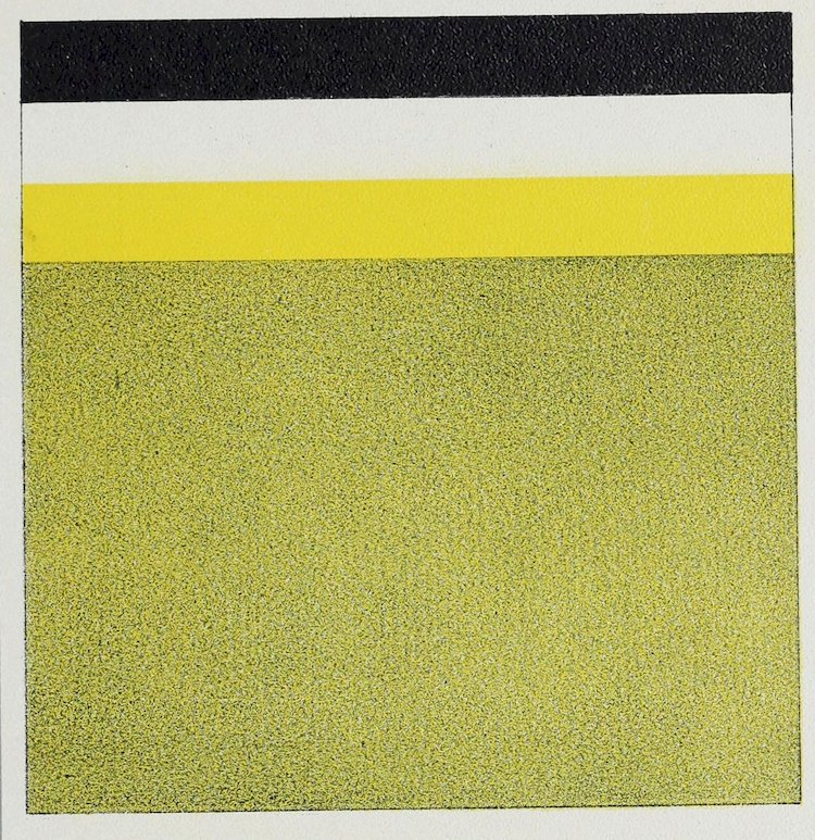
Plate CXVII SPECTRAL YELLOW NEUTRALIZED BY BLACK AND WHITE
CXVIII
TRANSCRIBER’S NOTES
Typos fixed; non-standard spelling and dialect retained.
Used numbers for footnotes, placing them all at the end of the last chapter.