Part 1 — CHAPTER XV
Reading edition
Lettering—Blind Tooling—Heraldic Ornament
LETTERING ON THE BACK
Lettering may be done either with separate letters, each on its own handle, or with type set in a type-holder and worked across the back as a pallet. Although by the use of type great regularity is ensured, and some time saved, the use of handle letters gives so much more freedom of arrangement, that their use is advocated for extra binding. Where a great many copies of the same work have to be lettered, the use of type has obvious advantages.
A great deal depends on the design of the letters used. Nearly all bookbinders’ letters are made too narrow, and with too great difference between the thick and thin strokes. At fig. 90 is shown an alphabet, for which I am indebted to the kindness of Mr. Emery Walker. The long tail of the Q is meant to go under the U. It might be well to have a second R cut, with a shorter tail, to avoid the great space left when an A happens to follow it. I have found that four sizes of letters are sufficient for all books.
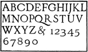
Fig. 90.
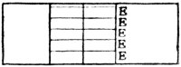
Fig. 91. Fig. 92.
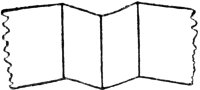
To make out a lettering paper for the back of a book, cut a strip of good thin paper as wide as the height of the panel to be lettered. Fold it near the centre, and mark the fold with a pencil. This should give a line exactly at right angles to the top and bottom of the strip. Then make another fold the distance from the first of the width of the back; then bring the two folds together, and make a third fold in the exact centre. The paper should then be as shown at fig. 91. Supposing the lettering to be THE WORKS OF ROBERT LOUIS STEVENSON, select the size of letter you desire to use, and take an E and mark on a piece of spare paper a line of E’s, and laying your folded paper against it, see how many letters will go in comfortably. Supposing you find that four lines of five letters of the selected size can be put in, you must see if your title can be conveniently cut up into four lines of five letters, or less. It might be done as shown at fig. 93. But if you prefer not to split the name STEVENSON, a smaller letter must be employed, and then the lettering may be as at fig. 94.
To find out the position of the lines of lettering on a panel, the letter E is again taken and impressed five times at the side of the panel, as shown at fig. 92, leaving a little greater distance between the lowest letter and the bottom of the panel, than between the letters. The paper is then folded on the centre fold, and, with dividers set to the average distance between the head of one letter and the head of the next, five points are made through the folded paper. The paper is opened, turned over, and the points joined with a fine folder worked against the straight-edge. It should leave on the front five raised lines, up to which the head of the letters must be put.
Fig. 93. Fig. 94.


The letters in the top line are counted, and the centre letter marked. Spaces between words are counted as a letter; thus in “THE WORKS,” “W” will be the centre letter, and should be put on the paper first, and the others added on each side of it. Some thought is needed in judging where to put the centre, as the difference in the width of such letters as “M” and “W” and “I” and “J” have to be taken into account.
As a general rule, lettering looks best if it comfortably fills the panel, but of course it cannot always be made to do this. The greatest difficulty will be found in making titles of books that consist of a single word, look well. Thus if you have “CORIOLANUS” to place on a back which is not more than 5⁄8-inch wide, if it is put across as one word, as at fig. 95 (1), it will be illegible from the smallness of the type, and will tell merely as a gold line at a little distance. If a reasonably large type is used, the word must be broken up somewhat, as at (2), which is perhaps better, but still not at all satisfactory. The word may be put straight along the back, as at fig. (3), but this hardly looks well on a book with raised bands, and should be avoided unless necessary.
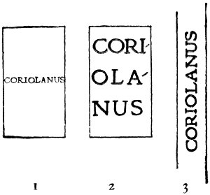
Fig. 95.
The use of type of different sizes in lettering a book should be avoided when possible, and on no account whatever should letters of different design be introduced. Occasionally, when the reason for it is obvious, it may be allowable to make a word shorter by putting in a small letter, supposing that only thus could reasonably large type be used. It is especially allowable in cases where, in a set of volumes, there is one much thinner than the others. It is generally better to make some compromise with the lettering of the thin volume, than to spoil the lettering of the whole set by using too small a letter throughout (see fig. 115).
On very thin books it is sometimes hardly possible to get any lettering at all on the back. In such cases the lettering is best put on the side.
In the case of some special books that are to have elaborately decorated bindings, and are on that account sufficiently distinct from their neighbours, a certain amount of freedom is permissible with the lettering, and a little mystery is not perhaps out of place. But in most cases books have to be recognised by their titles, and it is of the utmost importance that the lettering should be as clear as possible, and should fully identify the volume.
For lettering half-bindings and other books on which much time cannot be spared, it would take too long to make out a paper, as described for extra bindings, nor is there on such work much occasion for it. For such books the lettering should be written out carefully, the whole panel prepared and glaired in, and the gold laid on. Then with a piece of fine silk or thread lines may be marked across the gold as a guide to the finisher, and the letters worked from the centre outward, as described for making out the paper pattern. Of course this method does not allow of such nice calculation and adjustment as when a paper pattern is made out; but if a general principle of clear lettering is recognised and accepted, very good results may be obtained.
BLIND TOOLING
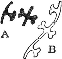
Fig. 96.
At the end of the book characteristic examples of blind-tooled books are given (pages 321-25). It will be seen that most of the tools form complete designs in themselves. Although the use of detached die-sunk tools was general, there were also simple tools used, which, when combined, made up more or less organic designs, and allowed more freedom to the finisher (see figs. 96 and 97).
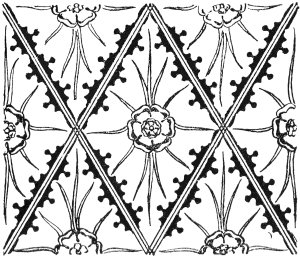
Fig. 97.
Some use may also be made of interlaced strap-work designs, either worked with gouges, or a small fillet. A book bound in oaken boards, with a leather back with knotted decoration, is shown at page 330. I have found that such binding and decoration is more satisfactory in scheme for old books, than most forms of modern binding.
If a design is simple, the cover is marked up with dividers, and the tools impressed direct upon the leather; or, if it is elaborate, a paper pattern is made out, and the tools blinded through the paper, as described for gold tooling. The leather is then damped with water, and the impressions retooled.
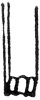
Fig. 98.
The panel lines on most of the bindings before 1500 show evidence of having been put in with a tool which has been pushed along the leather, and not with a wheel. I have found that a tool guided by a straight-edge, and “jiggered” backwards and forwards, makes by far the best lines for blind-tool work. It should be borne in mind that the line is formed by the raised portion of leather, and so the tool should be cut somewhat as at fig. 98. This should leave three ridges on the leather. Blind tooling may be gone over and over until it is deep enough, and may be combined with various other methods of working. For instance, in tooling such a spray as is shown at fig. 99, the leaf would be formed by five impressions of the second tool, shown at A, the extremity of the impressions could be joined with gouges, the stalk and veining could either be run in with a fillet or worked with gouges. The grapes would best be worked with a tool cut for the purpose. One edge of all gouge or fillet impressions can be smoothed down with some such tool as shown in section at B. This has to be worked round the gouge lines with a steady hand, and may be fairly hot if it is kept moving. At C is shown a section of a gouge impression before and after the use of this tool. The ground can be dotted in, or otherwise gone over with some small tool to throw up the pattern.
Blind tooling can sometimes be used in combination with gold tooling.
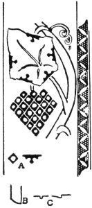
Fig. 99.
In the fifteenth century the Venetian binders used little roundels of some gesso-like substance, that were brightly coloured or gilt, in combination with blind tooling (see p. 325). This is a method that might be revived.
What is known as “leather work” is a further development of blind tooling. This method of decoration has been revived lately, but not generally with success. “Leather work” may be divided into two branches; in one the surface of the leather is cut to outline the pattern, and in the other the leather is embossed from the back, while wet, and the pattern outlined by an indented line. Sometimes the two methods are combined. As embossing from the back necessitates the work being done before the leather is on the book, it is not very suitable for decorating books. Leather first decorated and then stuck on the book, never looks as if it was an integral part of the binding. The cut leather work, which may be done after the book is bound, and leaves the surface comparatively flat, is a better method to employ for books, provided the cuts are not too deep, and are restricted to the boards, so as not to weaken the leather at the back and joints. Much of the leather used for “leather work” is of very poor quality, and will not last; for modelling it must be thick on the side of the book, and for the book to open it must be pared thin at the joint, thus making it necessary to use a thick skin very much pared down, and consequently weakened (see p. 155). Another very common fault in modelled “leather work” is, that the two sides and the back are often worked separately and stuck together on the book, necessitating a join, and consequently a weak place in the hinge, where strength is most wanted. Again, in most modern “leather work,” those who do the decoration do not, as a rule, do the binding, and often do not understand enough of the craft to do suitable work.
All those engaged in leather work are advised to learn to bind their own books, and to only use such methods of decoration, as can be carried out on the bound book.